digital analytics: visualization (lecture 5)
TRANSCRIPT

Information Technology Program
Aalto University, 2015
Dr. Joni Salminen
[email protected], tel. +358 44 06 36 468
DIGITAL ANALYTICS
1

DIGITAL…….ANALYTICS Dr. Joni Salminen
Aalto University
ITP 2015
1
Welcome back!
Here’s what we have left:
1. Data visualization (hip!)
2. Analytics problems (hip!)
3. Optimization (hooray!)
4. A word about Big Data (wow)
5. Building and managing an analytics team (’nuff)
6. Future of analytics (dude…)
7. Wrap-up (& goodbye!)
2
CAN’T WAIT,
CAN’T WAIT!!!1

VISUALIZATION
3

Contents (today & tomorrow)
a. principles of visualization
b. chart types & how to choose them
c. tools: GA, Tableau (fun fun)
d. lying with data (ooohhh)
4

Exercises in Tableau
Why Tableau?
Tableau is one of the most used business tools for
analyzing and visualizing ”big data”. The learning curve
to get started is low, yet the software is super powerful
(almost as powerful as R :)
5
Exercises in Tableau
What to do first:
1. Go to www.tableau.com/tft/activation
2. Download and install Tableau Desktop software
3. Go to Basecamp: download license key (text file)
and exercise files (three documents)
6
Exercises in Tableau
• We will go through the use of Tableau in the class
with the help of example exercises
• You can use it for making analyses and visualisations
for your GA audit report (not mandatory, but gives
extra point).
7

Instructions: Click on the link and select Get
Started. On the form, enter your university
email address for “Business email”; and
under "Organization", please input the name
of your school.
8

What is this?
9

What is this? (It’s a representation of a pipe)
10
In a same way, data (or its visualization) is
not reality – it’s a representation of reality.
And representations have all kinds of
sketchy features, as we’re about to see…
11
”No chart is reality” –Jones, 2013

What is visualization?
Visualization is a form of data presentation. The
visualizer holds power of inclusion and exclusion of
relevant data, as well as portraying various visual
cues, such as size (relative and absolute), coloring,
positions, and so on.
The viewers of visualization are subject to cognitive
limitations, and will draw conclusions based on what
they are shown.
12

(Famous) examples
13

March on Moscow (Minard, 1869)
14
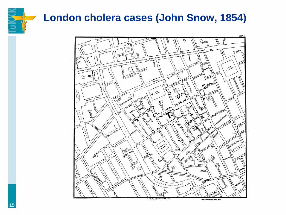
London cholera cases (John Snow, 1854)
15
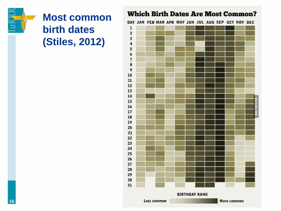
Most common
birth dates
(Stiles, 2012)
16

The point of visualization is to simplify data,
i.e. make something complex more easily
understandable (cf. dashboards).
17

From this:
18
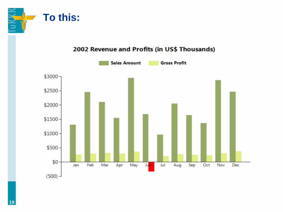
To this:
19

Why visualize? (Anscombe, 1973)
20

Visualization shows relationships
(Anscombe, 1973)
21
Which is more impressive?
Version A: ”Population grew exponentially throughout
the 20th century.”
22
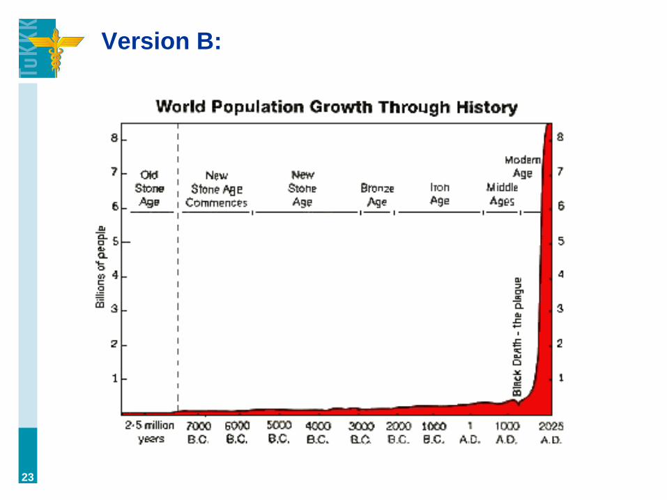
Version B:
23
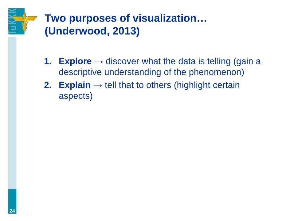
Two purposes of visualization…
(Underwood, 2013)
1. Explore → discover what the data is telling (gain a
descriptive understanding of the phenomenon)
2. Explain → tell that to others (highlight certain
aspects)
24
The workflow of statistical analysis
First visualize, then create hypotheses.
a. visualization = exploration
b. hypotheses = testing
25

Why visualize? Data brings credibility
26
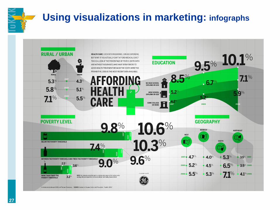
Using visualizations in marketing: infographs
27
Data can be visualized in many ways. Let’s
start from charts which are a form of
graphs. We’ll look at some charts and
graphs, and discuss their properties as we
go along.
28
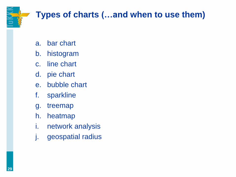
Types of charts (…and when to use them)
a. bar chart
b. histogram
c. line chart
d. pie chart
e. bubble chart
f. sparkline
g. treemap
h. heatmap
i. network analysis
j. geospatial radius
29

Bar chart: a common way to visualize
30
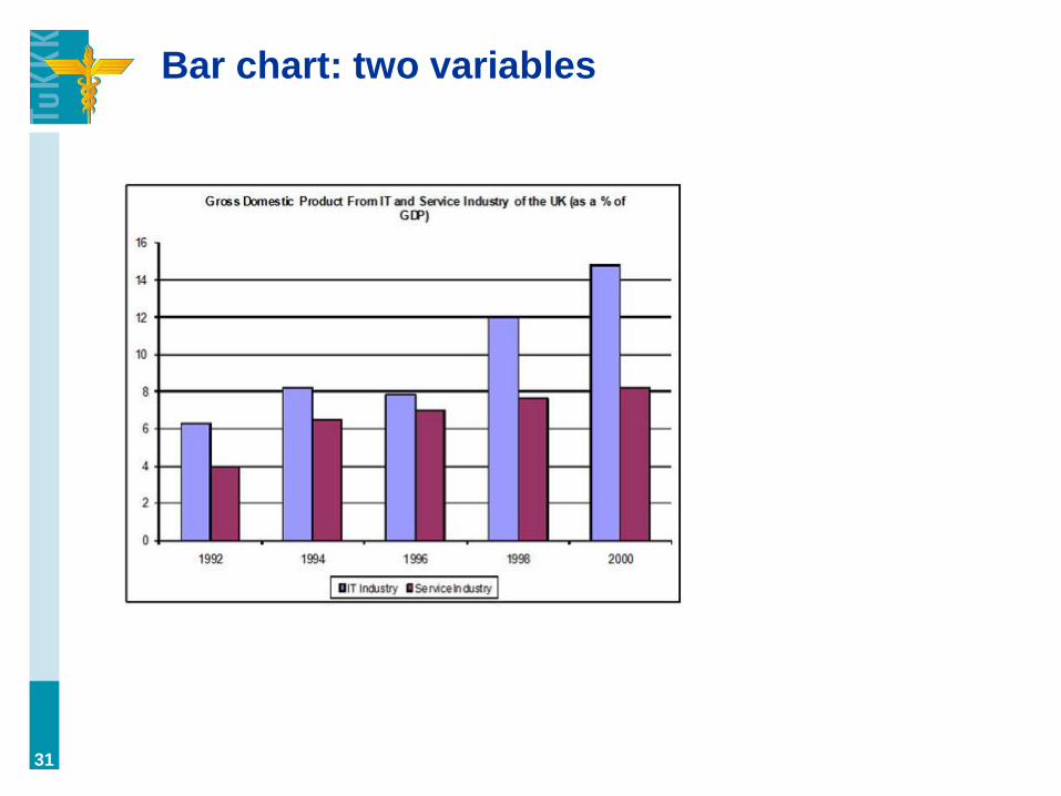
Bar chart: two variables
31
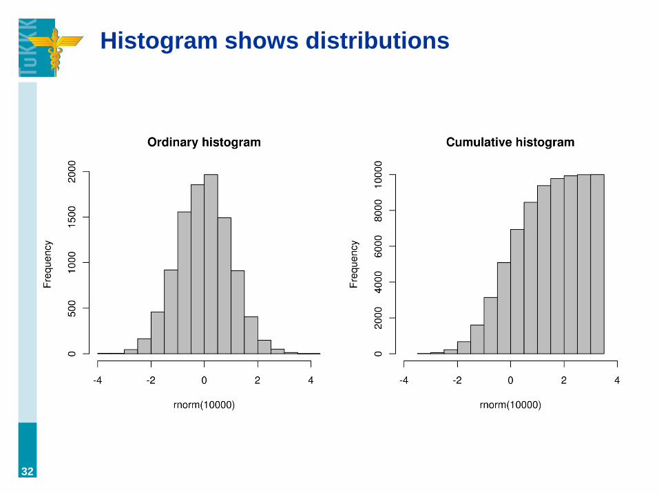
Histogram shows distributions
32
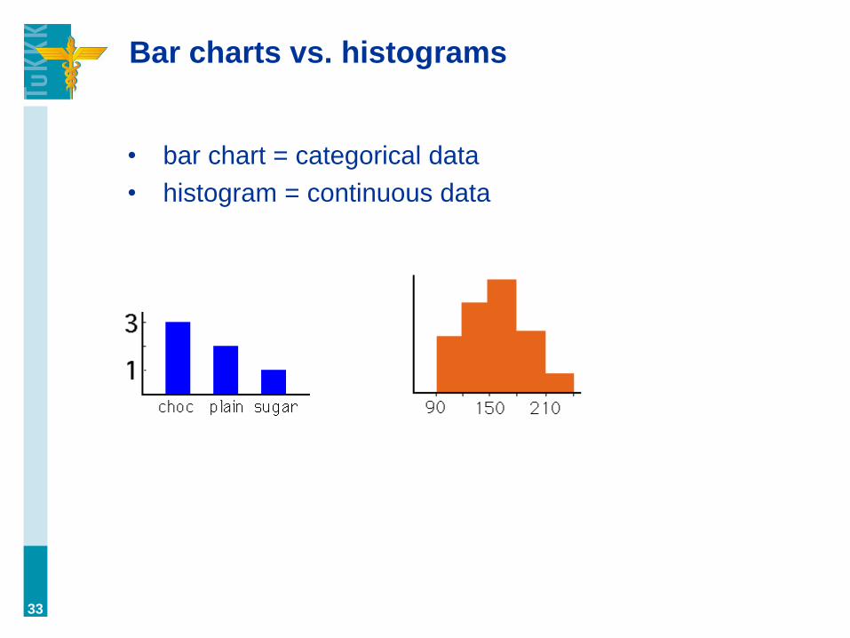
Bar charts vs. histograms
• bar chart = categorical data
• histogram = continuous data
33
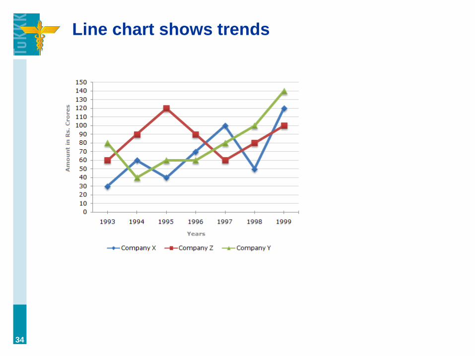
Line chart shows trends
34

Pie charts (Whitelaw-Jones, 2013)
35
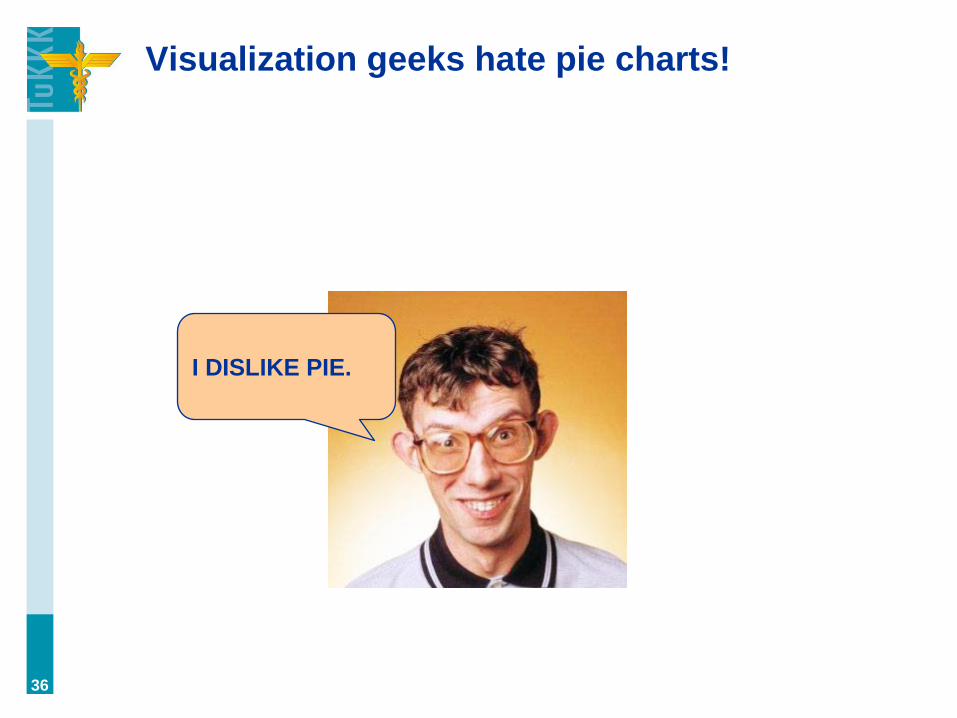
Visualization geeks hate pie charts!
36
I DISLIKE PIE.

“Pie charts are terrible at showing trends in
absolute numbers.” (Holllins, 2013)
37 (Hollins, 2013)
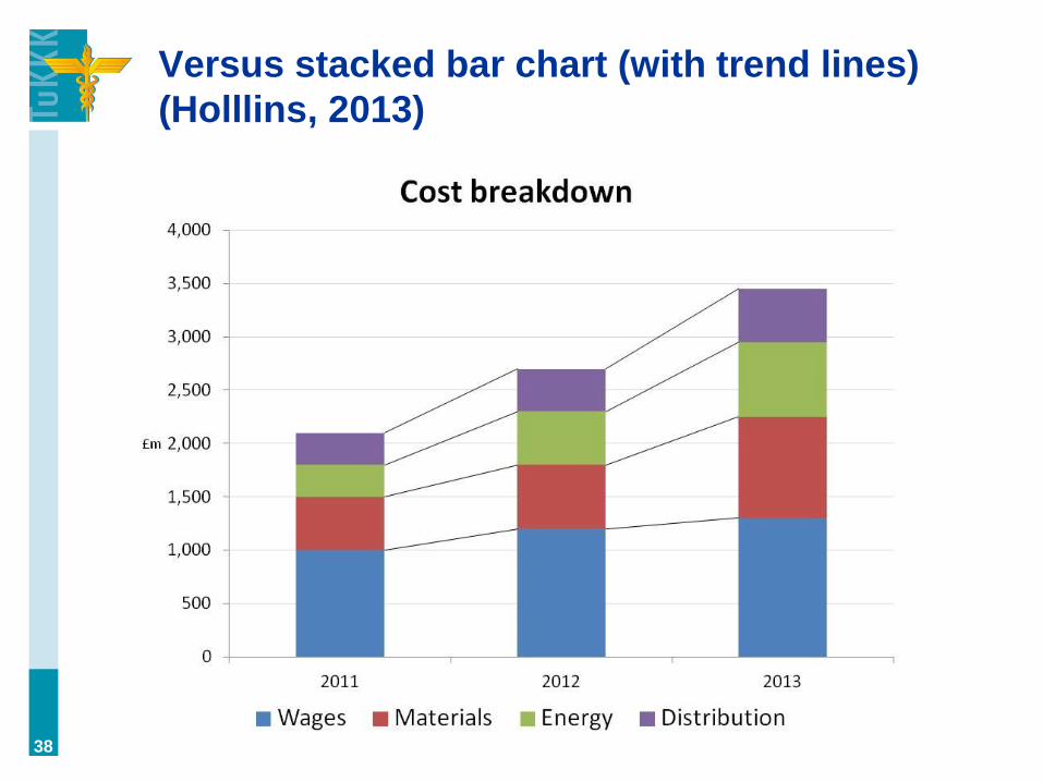
Versus stacked bar chart (with trend lines)
(Holllins, 2013)
38

From this:
39
(Hollins, 2013)
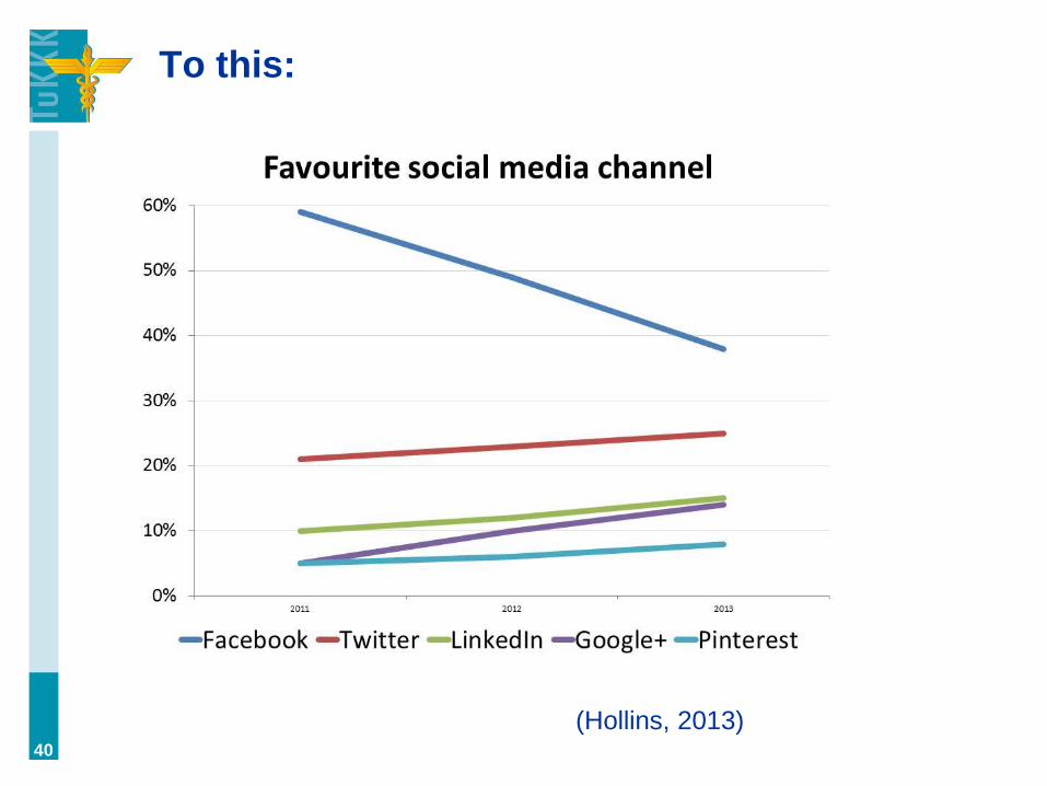
To this:
40
(Hollins, 2013)

Pie charts are bad (?)
““Pie charts (or any kin thereof) = bad” was the
message. I don’t really want to fight about whether they
are good, nor bad—the reality is probably in between.
(Tufte, the most cited source to the ‘pie charts are bad’
rhetoric, never really said pie charts were bad, only that
given the space they took up they were, perhaps
less informative than other graphical choices.) Do
people have trouble reading radians? Sure. Is the
message in the data obscured because of this? Most of
the time, no.” (Whitelaw-Jones, 2013)
41
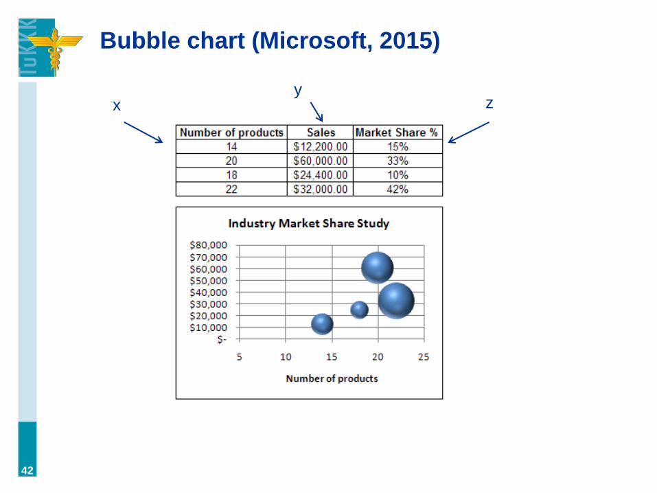
Bubble chart (Microsoft, 2015)
42
x y
z

Sparklines (Sparkline.com, 2013)
43
Effective
in using
space.

Treemaps (GA)
44

When to use tree maps?
45
”Use Treemaps to display large numbers of values that
exceed the number that can effectively be shown in a
bar graph.” (Underwood, 2013)

Treemaps & principles of visualization
(Kaushik, 2014)
46

Treemaps & principles of visualization
(Kaushik, 2014)
47

Treemap: example in digital marketing
”When we are doing a keyword analysis for an
SEO/SEM client, we present it in a TREEMAP. When
you are working with a Fortune 100 client that has
thousands of potential target keywords, the best way to
present that data is in the form.” (Stewart, 2014)
48
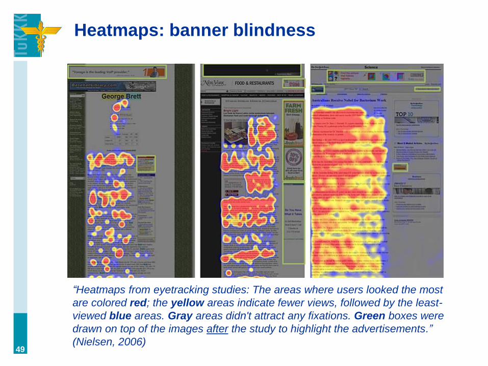
Heatmaps: banner blindness
“Heatmaps from eyetracking studies: The areas where users looked the most
are colored red; the yellow areas indicate fewer views, followed by the least-
viewed blue areas. Gray areas didn't attract any fixations. Green boxes were
drawn on top of the images after the study to highlight the advertisements.”
(Nielsen, 2006) 49
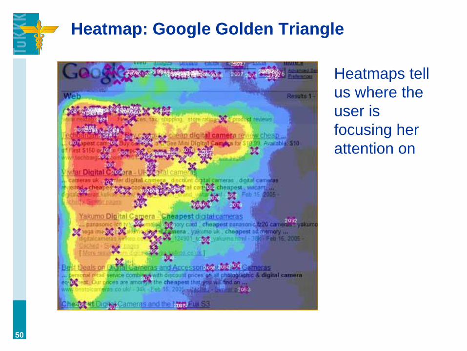
Heatmap: Google Golden Triangle
50
Heatmaps tell
us where the
user is
focusing her
attention on
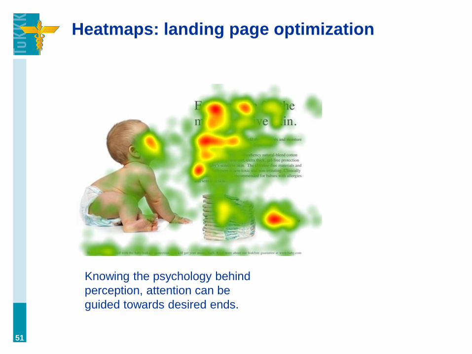
Heatmaps: landing page optimization
51
Knowing the psychology behind
perception, attention can be
guided towards desired ends.

Alternative ways to accomplish heatmaps
a. Click maps (e.g., Google Analytics)
b. Eye-tracking (costly but more data)
52

Heatmaps: in-page analysis in GA
• [JONI SHOWS]
53
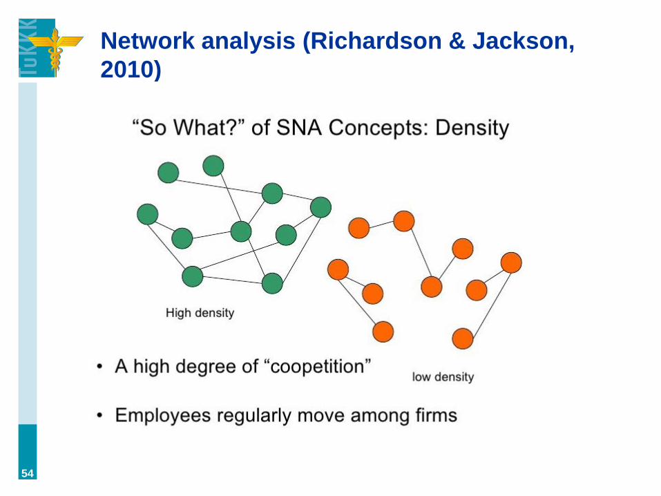
Network analysis (Richardson & Jackson,
2010)
54
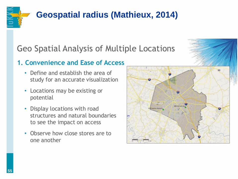
Geospatial radius (Mathieux, 2014)
55

Geospatial radius (Mathieux, 2014)
56
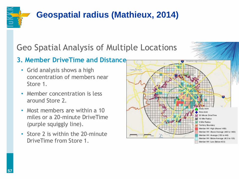
Geospatial radius (Mathieux, 2014)
57

Geospatial radius (Mathieux, 2014)
58

Choosing the right chart type
59
Tools: they are not the most important thing
(the most important thing is knowing how to
use them ;)
60
Visualization options in Google Analytics
• [JONI SHOWS]
• pie chart, bar, pivot, motion graph
• ”plot rows” option
61

Behavior flow (GA)
62

Goal flow (Google, 2015)
63
What’s the difference between goal flow
and conversion path?

Conversion path (SearchEngineLand.com, 2013)
64
(there can be many sources for one
conversion; together they form a path,
and these paths can be examined in
conversion path report.)