digital brand guidelines accessibility
TRANSCRIPT

Digital brand guidelinesAccessibility
April 2021Created by TheTin
PwC
Contents
Other considerations45 Moving content46 Miscellaneous
Further information36 Key reference documents37 Contacts
2
Actionable elements 24 Overview25 Device orientation and movement 26 Buttons and actionable elements27 Content on Hover or Focus28 Touch target size 29 Consistent components30 Pointer Gestures & Cancellation31 Identify Input Purpose32 Status messages33 Character Key Shortcuts34 Timeouts 25 Dos and don’ts
Multimedia content37 Overview38 Audio39 Transcripts40 Short-form vs long-form video41 Embedded videos42 HTML5 video accessibility43 Dos and don’ts
Accessibility
Introduction 03 Introduction 04 Dos and don’ts
General advice06 Overview 07 The principles of WCAG 2.108 WCAG 2.1 at a glance09 Comparison with WCAG 2.0
Colour contrast and readability11 Overview 12 Digital colour palette 13 Text colours 14 Non-text Contrast15 Pixel density 17 Ppi awareness and CSS Px 18 Large scale text 19 Styling and readability20 Reflow21 Text Spacing22 Dos and don’ts

PwC
Web accessibility refers to the inclusive practice of removing barriers that prevent interaction with, or access to websites, by people with disabilities. When sites are correctly designed, developed and edited, all users have equal access to information and functionality.
Making sure online content meets accessibility standards levels the playing field for all Internet users, whether they have disabilities or not and regardless of what technology they are using.
Always ensure that your website meets Level AA Conformance to Web Content Accessibility Guidelines 2.1.
3
These guidelines will be modified as our accessibility standards evolve, so please obtain an updated version each time you begin a new project.
These guidelines cover the aspirational standards of accessibility. Individuals should always comply with local regulations and check in with their legal department.
Please note that this document includes requirements set out in Web Content Accessibility Guidelines (WCAG) 2.0 and 2.1. WCAG 2.2 is scheduled to be published later in 2021.
Introduction
With more and more of our working life and client communication happening on screen, it’s never been more important as a business to make sure all of the content we create takes into account the needs of as many users as possible.
WCAG version overview
WCAG 2.2 Working Draft
New or updated for WCAG 2.1

PwC 4
Introduction
Dos and don’ts
Do ensure that your site meets Level AA Conformance to Web Content Accessibility Guidelines 2.1
Do ensure there is enough colour contrast on text and background elements.
Do make actionable elements clearly distinguishable, and make sure all focusable elements have a visible state change.
Do make sure that video content is presented in a responsive video player (resizes to fit the content area) that is HTML5, fully keyboard accessible and never allows auto play.
Do provide captions for video content when possible and remember that different viewers may have different needs.
Don’t use white font colour on yellow or tangerine – use instead black or dark grey.
Don’t use rose (#db536a) for the web or other digital purposes.
Don’t use rose (digital) for print or other non-digital purposes.
Here is some general guidance to give you an overview of the basics of accessibility and how it relates to us and our users.
Further on in this document you will find more specific dos and don’ts for colour contrast, actionable elements and multimedia.

General advice● Overview● The principles of WCAG 2.1● WCAG 2.1 at a glance● Comparison with WCAG 2.01

PwC 6
Introduction
Overview
New features in WCAG 2.1
How do we define accessibility?
Accessibility is categorised into three levels: A, AA and AAA.
As well as complying with the law there are other benefits to websites and apps – and therefore our business – such as increased usability for all and better SEO. This means that our sites can appear higher in search engine results pages.
The main goal of ensuring our content is accessible is to be able to hand control over to the user. Each user has their own set of needs for how they access the Internet, depending on the technology they have available or whether they have a handicap or disability. It’s estimated that about 1/5 of the population have some form of disability. Though not every disability has an impact on browsing the web, it would not be in our best interest, as a business, to exclude up to 20% of potential customers or users.
These guidelines cover the aspirational standards of accessibility. Individuals should always comply with local regulations and check in with their legal department.
The most basic level of web accessibility
Solves the biggest and most common issues for users with disabilities
The highest and most complex level of web accessibility
A
AA
AAA
Users with physical or motor disabilities
Users who suffer from blindness
Users on the autistic spectrum
Users with low vision
Users with dyslexia
Users who are deaf or are hard of hearing

PwC 7
Introduction
The principles of WCAG 2.1
WCAG 1.0 has been superceded by WCAG 2.1, which focuses the guidelines on core principles rather than technology.
By doing this they have created a structure that is more sustainable for the future.
This document is an interpretation of the guidelines, based on the four principles; perceivable, operable, understandable and robust.
New features in WCAG 2.1
Perceivable
Online content that is ‘perceivable’ takes into account the senses that people need to use when browsing the Internet. The three senses that are addressed in WCAG 2.1 are sight, sound and touch.
By putting accessibility into practice our users should be able to perceive all the content and functionality on our sites even if they need to use assistive technology, such as screen readers, to access them.
Understandable
Making a website ‘understandable’ is a slightly different task to the first two principles.
A ‘perceivable’ and ‘operable’ website means nothing if our users can’t understand it. A PwC website must use clear terms, have simple instructions and explain any complex issues.
Our websites must function in a way that our users understand, by avoiding unusual, unexpected or inconsistent functions. AA)
Operable
The principle of a website being ‘operable’ is about the actions people take when browsing. This covers the different ways in which our users browse the web. Some of them may have motor difficulties, which means they use their keyboard to navigate, rather than their mouse or trackpad, and some users who have sight impairments often prefer to use a keyboard too.
The main issues for making a PwC website operable are, ensuring good keyboard-only navigation, avoiding setting time limits for our users and helping them out if they make errors entering information in forms.
Robust
A ‘robust’ website is one that third-party technology (like web browsers and screen readers) can rely on.
Our websites must meet recognized standards, such as using clean HTML and CSS. This minimizes the risk of our users relying on technology that cannot correctly process our websites.

PwC 8
Introduction
WCAG 2.1 at a Glance
Perceivable• Provide text alternatives for non-text content.• Provide captions and other alternatives for multimedia.• Create content that can be presented in different ways,
including by assistive technologies, without losing meaning.• Make it easier for users to see and hear content.
Operable• Make all functionality available from a keyboard.• Give users enough time to read and use content.• Do not use content that causes seizures or physical reactions.• Help users navigate and find content.• Make it easier to use inputs other than keyboard.
Understandable• Make text readable and understandable.• Make content appear and operate in predictable ways.• Help users avoid and correct mistakes.
Robust• Maximize compatibility with current and future user tools.
WCAG 2.1 was published in 2018 and serves as an extension, not to deprecate or supercede, WCAG 2.0 which was originally published in 2008.
While WCAG 2.0 still remains a valid W3C Recommendation, the W3C encourages using WCAG 2.1 to maximize future applicability of accessibility efforts.
The ‘at a glance’ descriptions for the four principles (Perceivable, Operable, Understandable, Robust) have been amended for WCAG 2.1 and are outlined on the right.
WCAG 2.1 At a Glance
“WCAG 2.0 at a Glance” has two differences from WCAG 2.1, both which are within the ‘Operable’ principle:
• “Do not use content that causes seizures or physical reactions.” does not include “or physical reactions”.
• It does not include “Make it easier to use inputs other than keyboard.”.
New or updated for WCAG 2.1

PwC 9
Introduction
Comparison with WCAG 2.0
WCAG 2.1 aims to improve and build upon accessibility guidance for three main groups. These include users with:
• Cognitive or learning disabilities• Low vision• Disabilities on mobile devices
WCAG 2.1 provides an extension to the success criteria in 2.0, and so is backwards compatible. This new version includes 17 additional features, and all of those from 2.0 are exactly the same in 2.1.
Please note that due to its limitations, some AAA success criteria is not currently possible to apply to DPE webpages, so custom implementations may need to be considered.
New features in WCAG 2.1
• Orientation (AA)
• Identify Input Purpose (AA)
• Identify Purpose (AAA)
• Reflow (AA)
• Non-Text Contrast (AA)
• Text Spacing (AA)
• Content on Hover or Focus (AA)
• Character Key Shortcuts (A)
• Timeouts (AAA)
• Animation from Interactions (AAA)
• Pointer Gestures (A)
• Pointer Cancellation (A)
• Label in Name (A)
• Motion Actuation (A)
• Target Size (AAA)
• Concurrent Input Mechanisms (AAA)
• Status Messages (AA)
The following 17 additions and their compliance level (A, AA or AAA) are new in WCAG 2.1:
New or updated for WCAG 2.1

Colour contrastand readability● Overview● Digital colour palette● Text colours● Non-text contrast (new in WCAG 2.1)● Pixel density● Ppi awareness and CSS Px● Large scale text● Styling and readability● Reflow (new in WCAG 2.1)● Text spacing (new in WCAG 2.1)● Dos and don’ts
2New or updated for WCAG 2.1

PwC 11
Overview
An accessible web page needs to have enough contrast between text and its background so that it can be read by people with moderately low vision (who do not use contrast-enhancing assistive technology). For people without color deficiencies, hue and saturation have minimal or no effect on legibility as assessed by reading performance.
Text that is larger and has wider character strokes is easier to read at lower contrast. The contrast requirement for larger text is therefore lower. This allows authors to use a wider range of color choices for large text, which is helpful for design of pages, particularly titles. 24px text or 19px bold text is judged to be large enough to require a lower contrast ratio.
SC 1.4.3. allows for different contrast ratios for large text. Allowing different contrast ratios for larger text is useful because larger text with wider character strokes is easier to read at a lower contrast. This allows designers more leeway for contrast of larger text, which is helpful for content such as titles.
The ratio of 24px text or 19px bold text described in the SC 1.4.3 was judged to be large enough to enable a lower contrast ratio for web pages displayed on a 15-inch monitor at 1024x768 resolution with a 24-inch viewing distance. Mobile device content is viewed on smaller screens and in different conditions so this allowance for lessened contrast on large text must be considered carefully for mobile apps.
Always follow PwC digital colours guidance to make sure there’s enough colour contrast to align with AA standards.
The WCAG 2.1 success criteria related to the issue of contrast are:
• 1.4.3 Contrast (Minimum) (Level AA) which requires a contrast of at least 4.5:1 (or 3:1 for large-scale text) and
• 1.4.6 Contrast (Enhanced) (Level AAA) which requires a contrast of at least 7:1 (or 4.5:1 for large-scale text).
• 1.4.11 Non-text Contrast (Level AA) requires a contrast of at least 3:1 for user interface components and graphical objects.
Colour contrast and readability

PwC
Digital colour palette
These are our updated core digital colours.
They’ve been specially selected to work well on their own, together and alongside our logo.
The colour rose (digital) has been updated for digital, to make it darker to meet Level AA accessibility compliance.
Digital restrictions
Some colours have been updated to make sure they meet AA accessibility compliance, but others have certain usage restrictions:
• Don’t use white font colour on yellow or tangerine – use instead black or dark grey.
• When using white type on rose and orange in web/digital applications, please use rose digital (#D93954) and orange digital (#D04A02) to ensure AA compliance.
For further guidance, please contact the Global Brand team.
R: 255 R: 242 R: 222G: 255 G: 242 G: 222B: 255 B: 242 B: 222# ffffff # f2f2f2 # dedede
Light grey (sections)
New digital colours
Background coloursMedium Grey Light grey For digital projection,grey presentation and web,
only the colours specifiedhere can be used asbackgrounds for colouredtype.
Always check the colour
R: 70 R: 125 R: 222contrast using WebAim to make sure your chosen
G: 70B: 70
G: 125B: 125
G: 222B: 222
combination is accessible.
# 464646 # 7d7d7d # dedede
R: 208G: 74B: 02# d04a02
R: 217G: 57B: 84# d93954
R: 0G: 0B: 0# 000000
R: 45G: 45B: 45# 2d2d2d
R: 235G: 140B: 0# eb8c00
Tangerine Orange Rose digital
Black Dark grey
Light greyWhite
R: 255G: 182B: 0# ffb600
Yellow
R: 224G: 48B: 30# e0301e
Red
R: 255G: 255B: 255# ffffff
White
R: 70G: 70B: 70# 464646
Medium grey
R: 45G: 45B: 45# 2d2d2d
Dark grey
R: 0G: 0B: 0# 000000
Black
Colour contrast and readability

PwC
Text colours
Text content is required to have a contrast ratio of 4.5:1 for normal text and 3:1 for large text.
Click here to check your background and text colour configuration.
Colour restrictions
• When displaying text over solid colour background, text must be white (exception yellow and tangerine – text must be black or dark grey).
• Never use large paragraphs of text on a solid colour background.
• When displaying longform copy on a white background, such as blog, use darkgrey(#2D2D2D) rather than pure black. This is because pure black on white is too luminous for users to sustain longform reading.
Colour contrast and readability
Heading style Desktop Mobile
Heading 1ITC Charter – Regular38, 40, 45px (changes between header components),line-height – 1.3em
ITC Charter24px, line-height – 1.2em
Heading 2 ITC Charter – Regular 38px, line-height – 1.3em
ITC Charter – Regular 24px, line-height – 1.2em
Heading 3 Helvetica Neue – Bold 28px, line-height – 1.3em
Helvetica Neue – Bold 22px, line-height – 1.3em
Heading 4 Helvetica Neue – Bold 24px, line-height – 1.3em
Helvetica Neue – Bold 20px, line-height – 1.3em
Heading 5 Helvetica Neue – Bold 20px, line-height – 1.4em
Helvetica Neue – Bold 18px, line-height – 1.4em
Lead Helvetica Neue – Regular / Bold 20px, line-height – 1.6em
Helvetica Neue – Regular / Bold 17px, line-height – 1.5em
BodyHelvetica Neue – Regular / Bold 16px, line-height – 1.7em.18px for screens above 1920px
Helvetica Neue – Regular / Bold 15px, line-height – 1.7em

PwC 14
Non-text Contrast
People with low vision and/or color blindness often have difficulty seeing graphics with low contrast. Ensuring non-text elements are a contrast ratio of at least 3:1 can help to make them more distinguishable if the person does not see a full range of colours.
Guidance for Non-text Contrast was added in WCAG 2.1 (SC 1.4 .11). This relates to ensuring there is sufficient colour contrast in user interface component and graphical objects against adjacent colours, of which the minimum ratio is 3:1.
User Interface Components
Visual information required to identify that a control is present, such as buttons, text fields and checkboxes.
For example, both the internal background of a text field and external background can be white, but a dark grey border must be applied to allow sufficient contrast between adjacent colours.
Graphical Objects
This refers to stand alone icons with no text, such as an ‘upload’ icon, and elements which help the user understand the content of a diagram like a connecting arrow.
A good example would be to present graphical objects in data visualisations as either black, dark grey, orange, red or rose against a white background.
Dynamic elements
When we require interaction from the user to change the state of an element, such as focussing on a pie chart segment to present more information, there must be contrasting colours in order to find the graphics.SC 1.4.11 Non-text Contrast (AA)
A focused state on a bubble chart.Comparing colour contrast on icons
New or updated for WCAG 2.1Colour contrast and readability

PwC 15
Pixel density
Pixel density refers to how many pixels have been squeezed into a physical amount of space (often an inch). The higher the number, the smaller the size of the pixels, so graphics are perceived as more crisp and less pixelated.
Screen technology has evolved tremendously and now even the most basic computer screens are somewhere in the 115 to 160 pixel per inch (“ppi”) range. In order to calculate the exact amount of pixels that a point represents, it’s crucial to take into account the pixel density of each device and establish font-size in relative units (em, points).
Points
At the beginning, coordinates of all drawings are specified in points. Points are abstract units, they only make sense in this mathematical coordinate space.
Physical pixels
The device screen may have lower pixel resolution than the image rendered in previous step. Before the image can be displayed, it must be downsampled (resized) to lower pixel resolution
• Pixels (A picture element: a single dot of colour on a screen)• Screen sizes (In inches)• Resolutions (A width and height – e.g. 320w x 480h)• DPI/PPI DPI (Dots Per Inch) or PPI (Pixels Per Inch) refer to the number of device pixels per inch, also called
“pixel density”. The higher the number, the smaller the size of the pixels, so graphics are perceived as more crisp and less pixelated. In more recent terminology, DPI is often used for the actual device pixels and Dots Per Pixel (dppx) for the amount of device pixels per CSS pixel (e.g. in Retina displays this will be 2).
• Points (An abstract measurement, there are 72 points per inch)• Cssppi (CSS pixels per inch)• Density Independent Pixels (A similarly abstract measurement for Android)
Rendered pixels
Point-based drawings are rendered into pixels. This process is known as rasterization. Point coordinates are multiplied by scale factor to get pixel coordinates. Higher scale factors result in higher level of detail.
Physical device
Finally, computed pixels are displayed on the physical screen.The PPI number tells you how many pixels fit into one inch and thus how large the pixels appear in the real world
Colour contrast and readability

PwC 16
Pixel density
Points allow designers to specify “this button should be 44 points tall” and then any device can just multiply that by its own pixel density ratio… like 1x or 2x. Or 3x in the case of Apple’s plus-sized iPhone, and models including iPhone X and above.
Pixels and points are static measurements – they don’t change based on other factors:
• 1 pixel is always 1 pixel and is the smallest piece of a screen that can display colours.• 1 point is always 1 point and is an abstract unit, only having meaning when referenced in relation to other
points.
Pixels and points are static measurements – they don’t change based on other factors:
• On the iPhone, 1 point is equal to 1 pixel when the resolution is 163DPI. This was the case for all the iPhones before the Retina era.
• At 326DPI, like the iPhones 4–8, 1 point is equal to 2 pixels across and 2 pixels down, or 4 total pixels. Meaning your 100x100 image will render a quarter the size on a retina device if rendered by counting pixels alone.
• At 401DPI like the iPhone 6+, 1 point is equal to 3 pixels across and 3 pixels down, or 9 total pixels.
1x1 point = 1 pixel(Original iPhones)
2x1 point = 4 pixel(iPhone 4–8 and XR models)
3x1 point = 9 pixel(Plus-sized models and iPhone X onwards)
Colour contrast and readability

PwC 17
Should a button always be the same physical size across devices?
The general consensus is that it depends.
• It depends on the precision of the input method (i.e. touch vs. cursor)
• It depends on the physical size of the screen
• And it depends on your distance from the screen
CSS pixel and CSS ppiA physical pixel is not a reference pixel. Mobile devices, in Responsive Web Design, relate to a core value which is the value of CSS width or (“device-width”), in CSS Device Independent Pixels, which depends both of the browser and user zoom settings.
The reference pixel is the visual angle of one pixel on a device with a pixel density of 96dpi and a distance from the reader of an arm’s length. For a nominal arm’s length of 28 inches, the visual angle is therefore about 0.0213 degrees. For reading at arm’s length, 1px thus corresponds to about 0.26 mm (1/96 inch).
Note AIf the anchor unit is the pixel unit, the physical units might not match their physical measurements. Alternatively if the anchor unit is a physical unit, the pixel unit might not map to a whole number of device pixels.
Note BThis definition of the pixel unit and the physical units differs from previous versions of CSS. In particular, in previous versions of CSS the pixel unit and the physical units were not related by a fixed ratio: the physical units were always tied to their physical measurements while the pixel unit would vary to most closely match the reference pixel. (This change was made because too much existing content relies on the assumption of 96dpi, and breaking that assumption breaks the content.)
Ppi awareness and CSS Px
Viewer
28 inches71 cm
140 inches3.5 m
0.26 mm
1.3 mm
Laptop/Computer
Mobile
Colour contrast and readability
Pixels Per Inch Awareness and CSS Px)

PwC 18
Large scale text
On mobile, when large text is required, this must be: 19px bold and/or 24px = 1.2 and 1.5em or to 120% or 150% of the default size for body text.
Orange, red and rose (digital) fail AA on normal text when used on a light grey background (#f2f2f2). When these colours are used on #f2f2f2, font size on mobile must be h2 or bigger.
NoteThe actual size of the character that a user sees is dependent both on the author-defined size and the user’s display or user-agent settings. For many mainstream body text fonts, 19 and 24px is roughly equivalent to 1.2 and 1.5em or to 120% or 150% of the default size for body text (assuming that the body font is 100%), but authors would need to check this for the particular fonts in use. When fonts are defined in relative units, the actual point size is calculated by the user agent for display.
The pixel size should be obtained from the user agent, or calculated based on font metrics as the user agent does, when evaluating this success criterion. Users who have low vision would be responsible for choosing appropriate settings.
24px or higher is needed for regular text when using red, orange or rose on #F2F2F2.
Colour contrast and readability

PwC 19
Content must still be readable when styling is unsupported or removed.
Older mobile devices may have poor support for fonts, colours and styles. Additionally assistive technology cannot draw meaning from styling and some users with disabilities will change device settings (fonts, styles, colours etc.) to suit their needs.
When background colours, images, layout, or features are missing, the user must still be able read content and perform functionality.
Styling and readability
Mobile
Use of rems
Browse and device settings may impact design, for example, when users set ‘large text’ to be rendered in their browsers. This feature increases the font size of the web page, causing issues when text containers have fixed dimensions in pixels.
It’s recommended to use proportional units such as em and rem. These are flexible, scalable units which are translated by the browser into pixel values, depending on the font size settings in your design.
Background images
Informational background images must have a visible alternative.
Background images are not perceivable to screen reader users and not supported on phones with basic support for CSS.
It is not possible to directly assign alternative text to a CSS background image – a method must be used that provides the same information visibly, textually, and in a way that is programmatically determinable.
Colour contrast and readability

PwC 20
Mobile
14
Responsive design
Reflow is also a benefit for those consuming content in mobile devices, in other words, the website becomes responsive. In a desktop browser at it’s default scale at 100%, content can appear in multiple columns. Zooming in will eventually trigger a changing in layout, resulting in fewer columns. When the browser zoom is used to scale content to 400%, the content is presented in one column, so that scrolling in more than one direction is not necessary
Exceptions for reflow
There are exceptions to enabling reflow to retain the meaning of the content, such as:
• Data tables – these require a two-dimensional relationship between headings and regular cells• Images – creating slices of an image and stacking them vertically as blocks would render the content
unusable. This of course applies to media that shouldn’t be cut up, such as photography. However, If the content still retains its meaning, infographics that adopt a landscape dimension could be cut up and stacked.
Reflow
Guidance for Reflow was added in WCAG 2.1 (SC 1.4.10) in order to support users with low vision who need to enlarge text and read it in a single column.
This relates to content appearing without loss of information or functionality, and without the need to scroll in two dimensions for:
• Vertical scrolling content at a width equivalent to 320 CSS pixels.
• Horizontal scrolling content at a height equivalent to 256 CSS pixels.
New or updated for WCAG 2.1Colour contrast and readability
SC 1.4.10 Reflow (AA)

PwC 21
Mobile
14
Benefits
• People with low vision who require increased space between lines, words and letters are able to read the text more legibly.
• People with dyslexia may adapt spacing to increase their reading speed.• Although it’s not a requirement in this success criteria, providing white space between blocks of text can
help people with cognitive disabilities distinguish between different sections and call outs.
Effects of not allowing for spacing override
The following bullets show some outcomes that may occur if the author does not take into account that users may need to override spacing settings.
• Text becoming cut off horizontally and/or vertically within the bounding box• Text overlap – e.g. the bottom part of of one text style may overlap and merge into the paragraph below.
Text Spacing
Offering users the ability to increase spacing between lines, words letters and paragraphs may assist them with effectively reading the text
Guidance for Text Spacing was added in WCAG 2.1 (SC 1.4.12). Each of the following four requirements helps to ensure that users can override the default spacing to adapt their reading experience, without loss of content or functionality.
• Line height (line spacing) to at least 1.5 times the font size;
• Spacing following paragraphs to at least 2 times the font size;
• Letter spacing (tracking) to at least 0.12 times the font size;
• Word spacing to at least 0.16 times the font size.
New or updated for WCAG 2.1Colour contrast and readability
SC 1.4.12 Text Spacing (AA)

PwC 22
Dos and don’ts
Do ensure enough contrast on text elements.
Do use high contrast section backgrounds when combined with text elements.
Do use white text on solid colour backgrounds.
Do take into account the pixel density of each device and establish font-size in relative units.
Do consider how colour contrast accessibility may change depending on device size.
Do check your background and text colour configuration at http://webaim.org/resources/contrastchecker/
Don’t use white font colour on yellow or tangerine – use instead black or dark grey.
Don’t use rose (#db536a) for the web or other digital purposes.
Don’t use rose (digital) for print or other non-digital purposes.
Don’t use yellow or tangerine on text.
Here are some guidelines for creating accessible online content in regards to colour contrast.
Colour contrast and readability

Actionable elements● Overview● Device orientation and movement (new for WCAG 2.1)● Buttons and actionable elements● Content on Hover or Focus (new for WCAG 2.1)● Touch target size
○ updated for 2.5.5 Target Size)● Pointer Gestures & Cancellation (new for WCAG 2.1)● Identify Input Purpose (new for WCAG 2.1)● Consistent components● Dos and don’ts
3New or updated for WCAG 2.1

PwC 24
Overview
Buttons and actionable elements can be used as triggers for actions (link to a page, submit a form, start a download, etc) or to communicate to users about the different states of a component or tool. Buttons contain a combination of label and background colour/appearance.
Actionable elements must be clearly distinguishable. When focused, all actionable and focusable elements must have a visible state change. The focus, hover and touch states can all use the same style.
All navigational items need to be fully keyboard accessible, with no keyboard traps.
When additional content is triggered, such as tooltips, users should have sufficient time to digest always have a way to dismiss the content to help minimise interference.
Buttons, gestures and other actionable elements are a key part of our digital style.
There are four different types of buttons and linksThese depend on the importance of the content. From top to bottom:
• CTA button (headers and specific uses)• primary button• secondary button• text link.
Actionable elementsNew or updated for WCAG 2.1

PwC 25
Actionable elements
Device orientation and movement
Some websites and apps are restricted to portrait or landscape and expect users will respond by rotating their device. This can create issues for users who cannot change their screen orientation as they may have their device mounted and fixed in a specific way, or have enabled ‘Portrait Orientation Lock’ on their device.
Guidance for Orientation was added in WCAG 2.1 (SC 1.3.4) so that content does not restrict its view and functionality to a specific orientation, unless essential.
As specified in 2.5.4 Motion Actuation (Level A), functionality that is operated by device motion must also be operated by user interface components, and motion can be disabled to prevent users from accidentally triggering sensors.
New or updated for WCAG 2.1
SC 1.3.4 Orientation (AA)
SC 2.5.4 Motion Actuation (A)
PwC 26
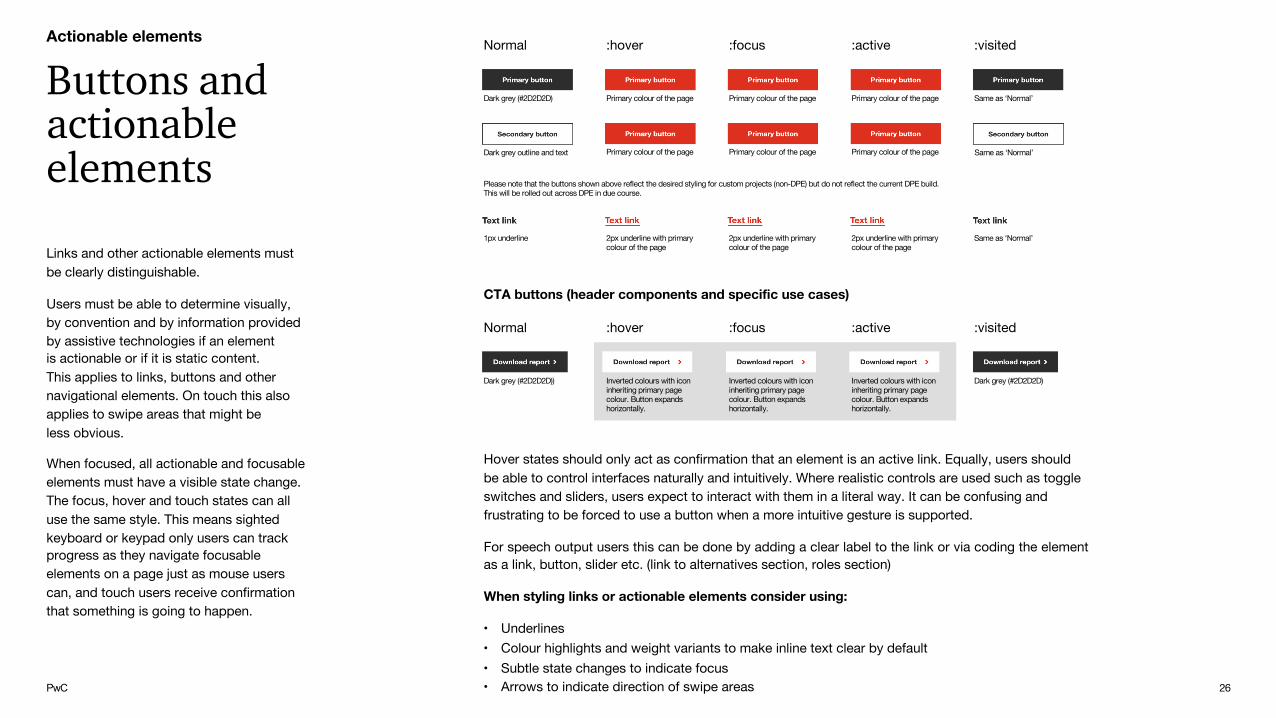
Hover states should only act as confirmation that an element is an active link. Equally, users should be able to control interfaces naturally and intuitively. Where realistic controls are used such as toggle switches and sliders, users expect to interact with them in a literal way. It can be confusing and frustrating to be forced to use a button when a more intuitive gesture is supported.
For speech output users this can be done by adding a clear label to the link or via coding the elementas a link, button, slider etc. (link to alternatives section, roles section)
When styling links or actionable elements consider using:
• Underlines• Colour highlights and weight variants to make inline text clear by default• Subtle state changes to indicate focus• Arrows to indicate direction of swipe areas
Links and other actionable elements must be clearly distinguishable.
Users must be able to determine visually, by convention and by information provided by assistive technologies if an element is actionable or if it is static content. This applies to links, buttons and other navigational elements. On touch this also applies to swipe areas that might be less obvious.
When focused, all actionable and focusable elements must have a visible state change. The focus, hover and touch states can all use the same style. This means sighted keyboard or keypad only users can track progress as they navigate focusable elements on a page just as mouse users can, and touch users receive confirmation that something is going to happen.
Buttons and actionable elements
Actionable elements
Dark grey (#2D2D2D)
Normal :hover
Primary colour of the page
:focus
Primary colour of the page
:active
Primary colour of the page Same as ‘Normal’
:visited
Dark grey outline and text Primary colour of the page Primary colour of the page Primary colour of the page
Please note that the buttons shown above reflect the desired styling for custom projects (non-DPE) but do not reflect the current DPE build.This will be rolled out across DPE in due course.
1px underline 2px underline with primary colour of the page
2px underline with primary colour of the page
2px underline with primary colour of the page
Same as ‘Normal’
Dark grey (#2D2D2D))
Normal :hover
Inverted colours with icon inheriting primary page colour. Button expands horizontally.
:focus
Inverted colours with icon inheriting primary page colour. Button expands horizontally.
:active
Inverted colours with icon inheriting primary page colour. Button expands horizontally.
Dark grey (#2D2D2D)
:visited
CTA buttons (header components and specific use cases)
Same as ‘Normal’

PwC 27
14
Dismissable
Users who can only navigate a site with a keyboard need a method to dismiss content if it is obscuring their focal point. This can often be the case for users using magnified settings as the viewport is more restricted. Two ways to help prevent interference include:
• Display additional content, such as tooltips, outside of the clickable area.• Provide a mechanisms to easily dismiss additional content, such as by pressing Esc with a keyboard.
Hoverable
Content can be difficult to read if a user is required to keep their cursor on the target area. This can be difficult for users with an increased cursor size.
If the content of a tooltip is displayed below the hoverable area and a large cursor is obscuring the content, the tooltip itself should also be able to be hovered so the user can move their cursor to read the tooltip text.
Persistent
Users with disabilities may require more time to read additional content after is appears as they may need to change magnification, move their cursor or bring content into their visual field. Once new content is triggered, content should remain persistent until:
• The user removes hover/focus from the trigger and content area• The user dismisses content by enabling the mechanism provided by the author – e.g. by pressing
Esc on a keyboard• The information conveyed by the additional content becomes invalid – e.g. a ‘busy’ message that
is no longer required.
Authors may wish to include additional content which can appear and disappear on hover and focus, such as tooltips, sub-menus and other non modal pop-ups.
However, this can sometimes lead to obscuring content or interfering with the user completing a task if the user has enabled magnification, increased cursor size, has low vision or cognitive disabilities. This can be frustrating to users if they have not intended to trigger the interaction or may not realise new content has appeared.
Guidance for Content on Hover or Focus was added in WCAG 2.1 (SC 1.4.13). If authors choose to include additional content that appears with hover and focus, three conditions must be met:
• Dismissable• Hoverable• Persistent
Content on Hover or Focus
Actionable elements
SC 1.4.13: Content on Hover or Focus
New or updated for WCAG 2.1

PwC 28
Touch targets must be large enough to touch accurately.
Choose a touch size
Thumb8mm target 2mm boundary
Finger7mm target 1mm boundary
The recommended range of touch targets is 7 – 10mm (see the Android Design Guidelinesfor details). This range is essentially no smaller than the smallest average finger. For users with disabilities or people who are older this size requirement becomes even more importantas it may not be possible to touch elements accurately.
Elements can be set at a minimum of 5mm with an exclusion zone of 7mm preserved around it or elements should be at least 7mm deep.
All users benefit from larger touch targets however so a recommendation is to provide bigger ones where possible.
If there are elements that are related consider grouping them in one touch target as this increases the touch area. For example, group a heading, image and synopsis for a news iteminto one block rather than a single link on the text or two separate links on the image and headline
Content must be large enough to read as well as have a large enough target area to tap comfortably with one finger.
For example, on an A-Z listing the letters should be placed in a container that is linked rather than just have the letter linked.
Guidance for Target Size (AAA) was updated in WCAG 2.1 (SC 2.5.5). The size of the target for pointer inputs must be at least 44 by 44 CSS pixels. Whilst this is the defined minimum size, it’s recommended to use larger sizes, particularly if the following are true:
• A control is used frequently.• Results of the interaction cannot easily be
undone, e.g. ‘Submit’ Vs ‘Cancel’.• Positioned in a difficult to reach area, e.g.
near the edge of the screen.• The control is part of a sequential task
Touch target size (mobile)
Android Design Guidelines
SC 2.5.5 Target Size (AAA)
Actionable elementsNew or updated for WCAG 2.1

PwC 29
To help users orientate themselves within content,navigational aids should be provided such as back buttons, arrows, next and previous buttons. Back buttons should always move the user back to the previous step and act like a breadcrumb trail. Next and Previous buttons could be used in addition to simply scrolling left or right to perform the same action. Providing multiple ways to navigate is always helpful especially when scrolling left/right or up/down might not be as discoverable as explicit links to carry out the same function.
Navigation should also be clear; the visual appearance of a control, object or element should inform the user how to interact with it. For example, do not use links that are styled to look like buttons as this can be confusing for users of assistive technology such as speech input or screen readers.
Equally describing gestures in an alternative, tooltip, or hint should be avoided as the gesture or action might be different for assistive technology users than users with no assistive technology.
Additionally, always use common gestures for commonly used design patterns:
• Slideshows and carousels should support horizontal scrolling or swipe gestures• Toggle and slider elements can be dragged, and they fully support touch gestures as a fallback• Scrolling elements support native (inertia) scrolling
Components should be communicated consistently regardless of software or sense that is used to perceive the content. The visual display should allow users to predict where to find information and how to use it. Consistent and logical layouts will help sighted and non-sighted touch screen users predict where they should touch in order to perform a task.
Consistent components(mobile)
Actionable elements

PwC
Some people cannot perform gestures in a precise manner, or may need to use specialised pointing tools which lack the capability or accuracy to perform multipoint or path-based gestures, such as swiping and pinching.
WCAG 2.1 adds guidance on how to ensure content can be controlled with a range of pointing devices, abilities and technologies.
Pointer Gestures & Cancellation
Actionable elementsNew or updated for WCAG 2.1
Examples of alternative functionality when users cannot adapt gestures include:
• A map that supports a pinch-to-zoom gesture should also include plus and minus buttons to zoom in and out of the map content.
• A carousel or scrollbar that supports horizontal swiping should include left and right arrows to click through
Users should also be given the ability to cancel or undo a pointer input. Giving feedback when an item is clicked can help the user discover if they have selected the wrong item.
This can help people with visual impairments, cognitive and motor disabilities reduce the chance that a control is incorrectly selected. People may become disorientated navigating a web page if they are unable to detect any content changes after completing an input.
SC 2.5.1 Pointer Gestures (A)
SC 2.5.2 Pointer Cancellation (A)
30

PwC
Forms can be difficult to complete for some people so you should ensure that users can easily understand the context of a form field.
Identify Input Purpose
Actionable elementsNew or updated for WCAG 2.1
SC 2.5.3 Label in Name (A)
SC 1.3.5 Identify Input Purpose (AA)
SC 1.3.6 Identify Purpose (AAA)
Some examples to help people complete forms easier include:
• Autofill formsText fields can be auto-filled with common information that the user has used before on their browser, such as name, address, telephone number and email. This can be beneficial for users with cognitive and memory related disabilities to reduce the chance of forms being filled out incorrectly. People with motor impairments can also reduce the need to input details manually when filling out forms
• A contact form using iconsPeople with communication and learning and disabilities somes prefer images to text labelling to help decipher the purpose of a field should be visually. Using familiar icons to represent a person’s name, address, telephone number and email can help to provide the user with visual cues.
• Accessible NamesMost controls, are accompanied by a visible text label which also have a accessible name within the code, this is so that they can be activated through speech input or users who use screen readers. If the visible and accessible names do not match up it can be frustrating for users as it adds extra cognitive load for those users to absorb different names for the same control.
Please note that new success criteria, 1.3.6 Identify Purpose (AAA), was added in WCAG 2.1. Although it could be built with custom code, guidance on including markups so users to add icons for text links is not currently possible to implement in DPE.
PwC
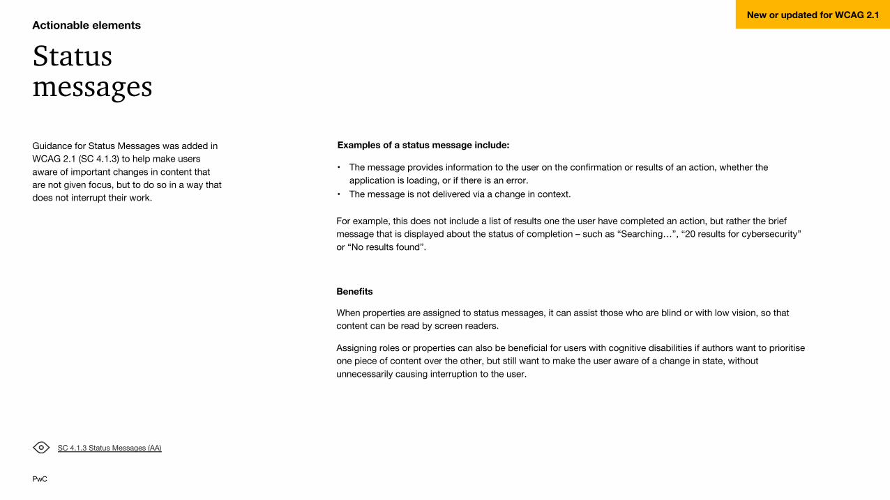
Guidance for Status Messages was added in WCAG 2.1 (SC 4.1.3) to help make users aware of important changes in content that are not given focus, but to do so in a way that does not interrupt their work.
Status messages
Actionable elementsNew or updated for WCAG 2.1
Examples of a status message include:
• The message provides information to the user on the confirmation or results of an action, whether the application is loading, or if there is an error.
• The message is not delivered via a change in context.
For example, this does not include a list of results one the user have completed an action, but rather the brief message that is displayed about the status of completion – such as “Searching…”, “20 results for cybersecurity” or “No results found”.
Benefits
When properties are assigned to status messages, it can assist those who are blind or with low vision, so that content can be read by screen readers.
Assigning roles or properties can also be beneficial for users with cognitive disabilities if authors want to prioritise one piece of content over the other, but still want to make the user aware of a change in state, without unnecessarily causing interruption to the user.
SC 4.1.3 Status Messages (AA)

PwC
Shortcuts are helpful to many keyboard users, but can be frustrating for those who are prone to accidentally hit keys and speech input users. Authors must allow users to remap or turn off shortcuts.
Guidance for Character Key Shortcuts was added in WCAG 2.1 (SC 2.1.4) to help reduce accidental activation of keyboard shortcuts.
Character Key Shortcuts
Actionable elementsNew or updated for WCAG 2.1
SC 2.1.4 Character Key Shortcuts (A)
Users who use voice recognition software use speech input programmes that can switch between dictation and command mode, but this can reduce efficiency if the user needs to change modes too often. Users can use an all-encompassing mode which recognise both voice commands from dictation as this improves efficiency when writing longer passages of text.
Single-key shortcuts might be appropriate for keyboard users but aren’t for speech users – e.g. when viewing emails, constructing a reply, the user wants to write ‘a’ in a sentence but could accidentally archive an email instead because they have triggered the shortcut.
Equally, single-key shortcuts (e.g. ‘P’ for Print) can be problematic for keyboard users if they are prone to accidentally hitting keys. Authors should allow users to reconfigure or turn off the shortcut.
Allowing users to reconfigure their shortcuts are beneficial to both keyboard and speech users.

PwC
Actionable elementsNew or updated for WCAG 2.1
SC 2.2.6 Timeouts (AAA)
This success criteria can help people with a range of cognitive disabilities, including those relating to language, memory, focus and attention.
When a user knows how much time is left for a task, they will know if they can take a break and come back to the page later, so the user can decide beforehand if they can manage the task within the timeframe.
The WCAG 2.1 guidelines recommend:
• Setting a session timeout to occur after a minimum of 20 hours of inactivity
• Storing user data for more than 20 hours
• If it’s not practical to store user data, you should provide a timeout warning of user inactivity at the start of a task.
It’s worth noting that this success criteria only applies to timeouts that are within the author’s knowledge or control – e.g. the guidance relating to timeouts doesn’t apply if the user closes a web browser or device and the content within the page has not yet been submitted. It’s good practice to include a dialog that warns users that their data will be lost if they decide to close their browser.
Timeouts
Guidance for Timeouts was added in WCAG 2.1 (SC 2.2.6) to ensure that when a timeout is applied, users are aware of the duration of inactivity before the page will time out.
If users aren’t aware of how much time they have, it can be frustrating if they have lost their work because page times out before they are finished.
The WCAG 2.1 guidelines suggest a keeping users’ data for at least 20 hours before the page times out. This ensures that if they need to take a break for a while, the user is more likely to return and complete their task.

PwC 35
Dos and don’ts
Do make sure all navigational items are fully keyboard accessible, with no keyboard traps.
Do make actionable elements clearly distinguishable.
Do make sure all actionable and focusable elements have a visible state change.
Do consider using underlines, colour highlights, weight variants, subtle state changes and arrows when styling links or other actionable elements.
Do make sure any touch targets on mobile devices are large enough to touch accurately.
Do provide navigational aids such as back buttons, arrows and next/previous buttons to help users orientate themselves within the content.
Do use common gestures for commonly used design patterns, e.g. slideshows and carousels, toggle and slider elements and scrolling elements.
Do allow users to turn off or remap shortcut keys.
Don’t use links that are styled to look like buttons as this can be confusing for users of assistive technology such as speech input or screen readers.
Here are some guidelines for creating accessible online content in regards to actionable elements.
Actionable elementsNew or updated for WCAG 2.1

Multimedia content● Overview● Audio● Transcripts● Short-form vs long-form video● Embedded videos● HTML5 video accessibility● Dos and don’ts4

PwC 37
Overview
These requirements involve technical rules, production best practices and design guidelines.
This section gathers the most important guidelines on how to achieve AA compliance on video, audio and other content.
Video content must be presented in a responsive video player (resizes to fit the content area) that is HTML5, fully keyboard accessible and never allows auto play. Provide captions when possible and remember that different viewers may have different needs.
When creating accessible multimedia content, there are certain considerations that you need to keep in mind.
Viewers have different needs
Multimedia content
I need to hear the narration of the visuals
I need to read the captions
I need a sign language interpretaion
I need to read a text version
I need to get all thecontrols by keyboard

PwC 38
Audio
WCAG 2.0 guidelines state that audio alternatives must be provided for users who are hard of hearing.
Audio description – required only for relevant visuals not already covered in what’s said.(Audio description says what’s in the visuals, so it’s available to people who are blind.) Most W3C video won’t need audio description. For example, you do not need audio description for talking heads only, or for text on slides as long as the slide text is woven into what you say.
Captions – nice to have for most W3C media, required for some.Captions are essentially the transcript synchronized with the video or audio. Captions are text versions of the spoken word presented within multimedia. Captions are not subtitles. Subtitles are a direct translation of the speech (and the speech only) from one language to another. Subtitles do not include any other sounds that are in the video. Captions allow the content of web audio and video to be accessible to those who do not have access to audio.
Though captioning is primarily intended for those who cannot hear the audio, it has also been found to help those that can hear audio content, those who may not be fluent in the language in which the audio is presented, those for whom the language spoken is not their primary language, etc.
Transcript – required.Transcripts allow anyone that cannot access content from web audio or video to read a text transcript instead. Transcripts do not have to be verbatim accounts of the spoken word in a video. They should contain additional descriptions, explanations, or comments that may be beneficial, such as indications of laughter or an explosion.
Transcripts allow deaf/blind users to get content through the use of refreshable Braille and other devices. For most web video, both captions and a text transcript should be provided. For content that is audio only, a transcript will usually suffice.
They also allow the content of your multimedia to be searchable, both by computers (such as search engines) and by end users.
Multimedia content

PwC 39
Benefits:
More people get your audio and video info with transcripts online
• People who might not listen to the audio or watch the video• People who are deaf or hard of hearing.• People who won’t spend the time to listen to the audio or watch the video, but will skim a transcript.• People who have difficulty processing auditory information, , because of cognitive disability.• People who are not proficient in the language who find it easier to read than listen.• People with low bandwidth connections who don’t want to download the larger audio or video file.• People who pay for bandwidth usage and thus don’t want to download the larger audio or video file. This is
often an issue with phones and other mobile devices.• People who cannot play the audio because they are in a noisy environment and they can’t hear it.• People who cannot play the audio because they are in a quiet environment and they don’t want to disturb
others.
More people get your audio and video info with transcripts online
• SEO – search engine optimization. Search engines can index the transcript, not the audio or video.• It’s easier for people to link to a transcript than some audio or video files.• It’s easier for people to pull a quote from a text file than try to create one from the audio or video.
Transcripts
Transcript are excellent for SEO, UX and accessibility.
Transcripts provide a textual version of the content that can be accessed by anyone. They also allow the content of your multimedia to be searchable, both by computers (such as search engines) and by end users. Screen reader users may also prefer the transcript over listening to the audio of the web multimedia. Most proficient screen reader users set their assistive technology to read at a rate much faster than most humans speak.
This allows the screen reader user to access the transcript of the video and get the same content in less time than listening to the actual audio content.
Multimedia content

PwC 40
Anything below 5 minutes can be considered a short form video.
It’s good practice to include transcript in the body of the page. However, for long form video (above 5min), if you have properly set up your video landing page, site visitors should feel like they’re in a video environment (i.e. the video is the primary purpose of the page). It’s important for Google to classify your page as a video page rather than a text page. A video page has the advantage of being displayed as a rich snippet with a thumbnail in search results.
According to ReelSEO, results with a video thumbnail have a 41% higher click-through rate than their plain text counterparts.
Short-form vs long-form video
Search results
Here’s an example of Google’s search results when searching for a specific video.
Despite displaying two different pages, there is a seamless user experience with focus on video player, but enriched with interactive transcripts, captions, and other features.
Placing your transcript
You should promote the video on transcript page and link to relevant content and keywords in the transcript. Paginate transcript if it’s too long and remember to include transcript pages in your sitemap.
Multimedia content

PwC 41
When embedding videos, best practices are to:
• Include captions and provide a link to transcript (captions take no space from you web page and they can be output as transcripts easily. It’s recommended to provide a fallback link to a transcript, either a video page with interactive/plain transcript, a text based page containing only the transcript or even a transcript download.)
• Include an interactive video panel that can be expanded/collapsed.
Embedded videos
Multimedia content

PwC 42
Please refer to the following guidelines with regards to HTML5 video requirements.
HTML5 video accessibility
Multimedia content
HTML5 Video Accessibility: Updates, Features and Guidelines
• For multimedia, there are two types of requirements: alternative technologies (examples: captioning, described video, transcripts) and system requirements (examples: access to interactive controls and menus, use of viewport, secondary screens)
• Authoring requirements for video to be Web Content Accessibility Guidelines (WCAG) 2.0 AA compliant: captions, video descriptions, and transcripts
• Captions include not only the spoken words, but speaker identification, sound effects, and where present, music descriptions
• Captions should appear about at the same time as the video on screen.• Closed captions are the captions many people are familiar with: there’s a button or CC icon that you can
enable/disable. Open captions are burned into the video, and can’t be turned off.• Some captions are starting to be positioned on different parts of the screen, side-by-side panes with the video in left
pane and captions in the right pane• Best known caption format is Web Video Text Tracks Format (WebVTT), which has the best browser support for
HTML5 video captions• Though audio descriptions for video are a WCAG 2.1 AA recommendation, it’s one of the video features most forgotten• Transcripts is similar to a screenplay, describing the action and the audio.• Keep in mind deaf-blind and others consume the transcripts separate from the video.• Create your transcripts using headings and labels• Clean audio, where background noise is removed, is helpful to people with reduced hearing• With HTML5, there’s no longer a need to have embedded or plug-in video player• Most HTML5 players today are adding controls to meet organization design and branding requirements• Ensure controls and menus are device independent and available to all users; not everyone uses a mouse• Easiest way to connect to the accessibility API is by using ARIA• Three things to keep in mind when you’re creating and hosting accessible video: production of the video, streaming
your accessible video and components, and managing the video library
HTML5 Video Accessibility – webinar from 3Play Media
PwC 43
Dos and don’ts
Do make sure video content is presented in a responsive video player that resizes to fit the content area.
Do include interactive transcript with text fallback.
Do provide captions for your video.
Do include synchronized audio descriptions on a separate audio track.
Do make sure your video is HTML5.
Do make your video fully keyboard accessible, with no keyboard traps.
Do properly set up your video landing page so that site visitors feel like they’re in a video environment (i.e. the video is the primary purpose of the page). It’s important for Google to classify your page as a video page rather than a text page.
Do promote the video on transcript page.
Do link to relevant content and keywords in the transcript.
Do paginate transcript if it’s too long.
Do include transcript pages in sitemap.
Do include a search tool within transcripts/captions if possible. This is good UX practice.
Do include an interactive video panel that can be expanded/collapsed when embedding videos
Don’t allow autoplay.
Here are some guidelines for creating accessible online content in regards to multimedia content.
Multimedia content
Other considerations● Moving content● Miscellaneous5

PwC 45
Moving content
Level AA compliance sets that users need to be in control of any animated assets that last longer than 5 seconds.
WCAG 2.1 Guidelines specify that:
2.2.2 Pause, Stop, Hide (Level A): For moving, blinking, scrolling, or auto-updating information, all of the following are true:
Moving, blinking, scrolling: For any moving, blinking or scrolling information that (1) starts automatically, (2) lasts more than five seconds, and (3) is presented in parallel with other content, there is a mechanism for the user to pause, stop, or hide it unless the movement, blinking, or scrolling is part of an activity where it is essential; [...]
DPE doesn’t include any controls for users to pause or stop video backgrounds. When in need to display a video background, and especially when they last longer than 5 seconds, consider custom implementations that provide users some way to pause it.
Controlling mediaUpdating media or animated content must have a pause, stop or hide control.
All content that moves, updates, scrolls, or blinks must be able to be stopped, hidden, or paused to allow users to review the content before it changes.
This can be an issue for screen reader users or users with cognitive disabilities who may not be able to read the content before it changes. Decorative updating content is also applicable as it can be a distraction.
Considerations
• This guidance affects video background, parallax effects, pinned content, graphic and infographic animations
Animation should almost always be user controlled or very short in duration. Images that continually animate can cause the rest of the page to be more difficult, or for users with very high levels of distractibility, totally inaccessible.
Other considerations
• Provide controls to pause/stop moving content (including video) if it lasts more than 5 seconds.
• Video background should always be muted.• Do not include any flashing content.• Ensure that the text is readable when any colour
appears underneath (colour contrast ratio of 4:5:1 for normal text; 3:1 for large text)
• Do not use video backgrounds with very bright content.
• Always provide an alternative image (static image).• Do not use looped videos.• When content is used over video backgrounds,
ensure that once the video is finished, the final frame or substitute image is dark enough to make the content legible.SC 2.2.2 Pause, Stop Hide (A)
SC 2.3.3 Animation from Interactions (AAA)

PwC 46
Miscellaneous
These guidelines have considered the key aspects of accessibility compliance. Please also keep the following in mind when designing and building pages.
Other considerations
Javascript alternatives
All functionality must be available without the use of JavaScript.
JavaScript may not be supported on lower end mobile devices or by some assistive technologies as such content and functionality must be available without the use of HTML 5 and without relying on WAI ARIA.
This standard may only be applicable depending on the targeted region of the content.
Decorative content
Decorative images must be hidden from assistive technology.
Hidden or inactive content that is, for example, behind another window should not be visible to users of assistive technology as users may think they can interact with this content.
For non-images this can be done by setting the appropriate properties or states on an object or element so it is properly indicated to assistive technology as off-screen, obscured, or hidden.

Further information● Key reference documents and links● Contacts6

PwC 48
Key reference documents and links Brand site
Developer Portal
Brand clearinghouse
https://accessibilityinsights.io
WCAG 2.0 guidelines in full
WCAG 2.1 additions (June 2019)
The principles (WCAG 2.0)
W3C - Large scale text
Pixels per inch awareness and CSS Px
Android design guidelines
A guide to video accessibility - PDF
HTML5 Video accessibility - webinar from 3Play Media
WebAIM: World Laws - Introduction to laws throughout the worldhttp://webaim.org/articles/laws/world/
Government accessibility standards and WCAG 2https://www.powermapper.com/blog/government-accessibility-standards/
Here is a list of all the resources referenced in this document.
Further information

PwC 49
Contact
You can get further help and advice from colleagues in all regions, both globally and locally. Find a full list of contacts on the Brand Center or contact the Global brand team.
Further information
Benefits:
https://brand.pwc.com/HomeCMS.aspx?pageId=2814ff5f-a0a4-42e3-b7c8-1dfb66ce494f
Global brand team: