digital graphics evaluation pro forma
TRANSCRIPT

Graphic Narrative Evaluation
Use this template to help you evaluate your project.
You should give specific details about your work.
You should provide both written and visual examples to explain your project.
You should find areas to praise in your work. Be specific about why you think they are good or why you are proud of them.
You should also find areas that could be improved. Look for areas that you could make better if you went back to them. Be specific about what you would improve.
Add additional slides as you need to. Don’t be restricted by what is here.
Any blank slides should be deleted before submission.

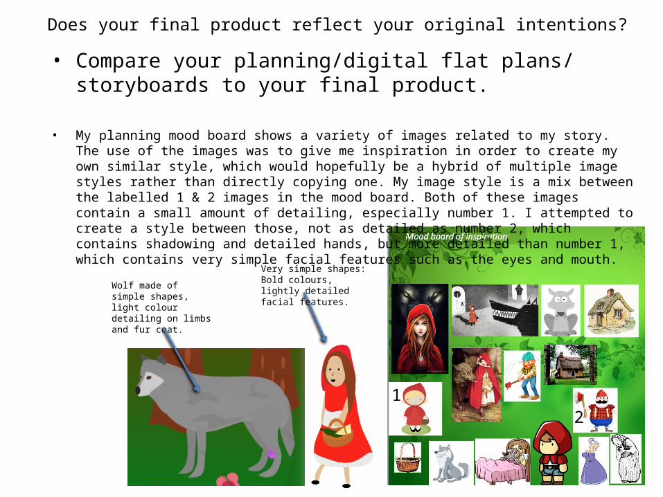
Does your final product reflect your original intentions?
• Compare your planning/digital flat plans/ storyboards to your final product.
• My digital flat plans differ from my final product quite significantly. The main cause for difference is that I used the same scene very frequently in the flat plans, this was due to a limited number of backgrounds on the online storyboard builder I used, where as when making my final product I had much more freedom, there for it looks significantly different. For example, I used the same bedroom scene 6 times in a row in the digital flat plans, where as every scene in the final product is at least cropped and refocused if not completely different.
• The character style is also very different between the flat plans and my final product. This is again due to the limitations of the online storyboard builder. The storyboard builder allowed me to use the characters I was looking for, but they all appeared in different styles, such as the wolf who looks half stick figure and half cartoony, and the hunter, who was a more realistic cartoon.
• The detailing between the flat plans and the final product are very different. The flat plan objects and environments contain much more detail than the final product, as I wanted the simplicity to be exaggerated in the final product as I believe too much detail doesn’t look good in a children's book. I have used a light gradient in my final product, and some light blurring to give the image depth. The flat plans contain shadowing and some depth based on detail rather than a lens blur effect.
Blurred character creates depth and difference between similar scenes.
Wolf has stick figure arms and detailed paws.
The wolf is made of bold shapes of colour in order create the shape of his face.
The image is flat and has an infinite focus, making it visually un-interesting.
Depth effect created by distance related simplicity.
Subtle shadow details give image depth.
Focal blur creates image depth. (Foreground & Background)
Simple repetitive shapes in background + blurred grass (foreground) creates a sense of depth.
Does your final product reflect your original intentions? • Compare your planning/digital flat plans/ storyboards to your final
product.
• My planning mood board shows a variety of images related to my story. The use of the images was to give me inspiration in order to create my own similar style, which would hopefully be a hybrid of multiple image styles rather than directly copying one. My image style is a mix between the labelled 1 & 2 images in the mood board. Both of these images contain a small amount of detailing, especially number 1. I attempted to create a style between those, not as detailed as number 2, which contains shadowing and detailed hands, but more detailed than number 1, which contains very simple facial features such as the eyes and mouth.
12
Very simple shapes: Bold colours, lightly detailed facial features.Wolf made of simple
shapes, light colour detailing on limbs and fur coat.

How well have you constructed your images?• How well have you constructed your images? You could talk about
the overall visual appearance and well as the use of texture and colour.
• My images have been constructed using mainly the shaping method. I used the shaping in order to give my images a look and feel of plumpness and softness which I believed is much visually enriching to children than sharp, over detailed images. I have also tried to use bold colours that stand out on top of the bold and basic shapes that make up the characters. I used the shaping method on all of my characters, except for the grandmother-regrettably. I believe that rota-scoping the grandmother character rather than shaping her has created an unhealthy and ugly contrast between 2 different artistic themes. The detailed rota-scoping doesn’t appear natural out of the mainly shaped environment and characters on page 11.
Grandmother: Rota-scoped face & features + the pattern on her dress. -Looks out of place and too realistic in comparison to the rest of the image.
Little Red Riding Hood: Shaped face & features + apparel.-Appears natural and comfortable in the image environment.
Originally the grandmother was made 100% by rota-scoping with the lasso tool. The reason I did this was partly because it makes her look ill and frail as she is supposed to, compared to a plump and healthy character made by shaping. In an attempt to integrate her into the story, I shaped around her arms, legs, and body, yet she still looks out of place.

How well have you constructed your images?• How well have you constructed your images? You could talk about the overall
visual appearance and well as the use of texture and colour.
• The majority of objects in my book are made by shaping, such as the trees and houses. The reason I have done this on inanimate objects is to make sure they suit the simplistic theme, and to make sure that they aren’t too detailed as they may visually overpower the characters, especially if they are larger than the characters. For example, one of the objects I didn’t use shaping on, and instead used rota-scoping, was the bedside table and the wolfs teeth. These objects are not very significant size wise, the rota-scoping on each was applied for different reasons, and both create different effects. The rota-scoped bedside table is small in size, and is within close proximity to the main character (little red riding hood). Because the table is small, it means I can use the rota-scoping to show off the geometrics of it, because it is rare that a bedside table has curved – smooth edges. The table also catches the eye and brings focus towards little red riding hood, who may not stand out greatly as the used artistic style is shaping, the same as her surroundings. Other objects were made from rota-scoping, such as the book case. The reason I made the book case from rota-scoping is because the shapes are not easy to make from pre-set shapes and warping.
Altogether I think that my images have been conclusively well constructed, there are definitely improvements to be made, but the overall style and colour theme has been strictly followed almost perfectly, apart for the grandmother mistake.
Shaped Image looks very bubbly and fun (apart for the silhouettes) .
Bold colours and shadows + blur create a large image depth.
Rota-scoped corners are sharp and edges are detailed.
The lamp on the table is glowing with a warm gradient = depth/realism

How well have you used text to anchor your images
• You should talk about the combination of words, images and text.
• The amount of text on my pages varies greatly, depending on how long a certain section of story stretches. Each page and illustration is supposed to be based on a new section of the story, such as when the wolf attacks the granny, or when the hunter storms in. Sometimes these significant sections can last 3 sentences and some can last 6, it totally depends on how long the event lasts.
• Each page contains an image, and then an equally narrow set of text below it. This allows the reader to instantly focus on the image, and carry visual information into the text that they are reading, to assist in the image their minds are creating via the text.
• I have used a red font colour to suit the books name “Little red riding hood”. The exact font I have used is called “Janda Manatee Solid”. I have used this font because it is bold and appears fun and joyful. It is also easy to read which means that children should not have a problem understanding the text. I also used text controls in Photoshop to edit how the text looks, for example, I created larger spacing between words, horizontally and vertically. This makes every word more defined and clear to the reader
Spacing between text and image.
Narrow paragraph fits perfectly below the image.
Bold colour stands out from white background. Spacing between texts
allows for clearer words.

Is your product suitable for your audience?
• Reference your proposal• Give an audience profile and describe suitability in reference to content.
• My proposal appears to have matched my final product quite precisely. The proposal states that my story will be aimed at those who are aged 7-9, and all genders. The children will likely be from western families as the story originated in the west and will likely be most popular amongst those who were born/live there. My audience will be from middle class families (ABC1). The reason for this particular social class audience is for a number of reasons. The book is cheap and easily affordable by the majority of British families. The book is also one to be read by the child and an adult at the same time, this is why I have a target audience of middle class as it is likely the parents will be home in the evening to read the book to their child. My book sticks to the traditional storyline with more digital graphics, rather than traditional hand sketches seen in older books. This is definitely suitable for my target audience as they will likely know the traditional story relatively well, but may have not enjoyed the dull and grimy looking sketches in many older story books.
Modern Traditonal
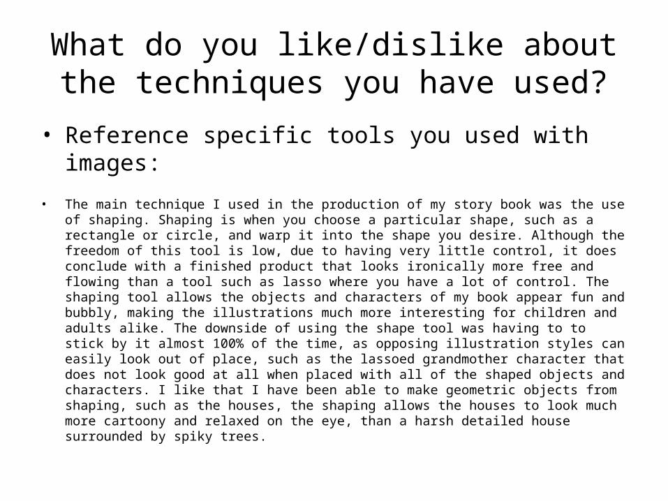
What do you like/dislike about the techniques you have used?
• Reference specific tools you used with images:
• The main technique I used in the production of my story book was the use of shaping. Shaping is when you choose a particular shape, such as a rectangle or circle, and warp it into the shape you desire. Although the freedom of this tool is low, due to having very little control, it does conclude with a finished product that looks ironically more free and flowing than a tool such as lasso where you have a lot of control. The shaping tool allows the objects and characters of my book appear fun and bubbly, making the illustrations much more interesting for children and adults alike. The downside of using the shape tool was having to to stick by it almost 100% of the time, as opposing illustration styles can easily look out of place, such as the lassoed grandmother character that does not look good at all when placed with all of the shaped objects and characters. I like that I have been able to make geometric objects from shaping, such as the houses, the shaping allows the houses to look much more cartoony and relaxed on the eye, than a harsh detailed house surrounded by spiky trees.

I used the Ellipse tool most often throughout the production of my books illustrations. The reason I used this tool was because it had no defined corners giving me the power to choose where they belong.
I liked that the Ellipse tool gave me more control than any of the other shaping tools could provide, yet continued to look fun and bubbly. I didn’t like that although it allowed the most control when warping, it still wasn’t as much as I would have liked, as there are only 16 points in the circle that are moveable, and once they have been adjusted it is very hard to remember which point is controlling each particular piece of warp.
The lasso tool allowed me to select around particular shapes that may be too complex for warping, such as objects that need a higher level of detail to be clear to the reader. I used the lasso occasionally throughout the book, regrettably on the grandmother, but for certain reasons.
One of the objects I used the lasso tool for was the bedside drawer in the grandmothers bedroom. Using the lasso was a lot easier than warping as it was a quicker, more efficient process, but also allowed me to show the geometrics of the object better, as it was almost completely made of squares and rectangles.
One of the techniques I used was the lasso, but I only used this on one of the characters, as I wanted her to appear rough and scraggly, rather than smooth and bubbly from using the shaping tool. But once I had placed the grandmother into the image with the other characters and objects, I quickly realized that she appeared very out of place. Using 2 graphic techniques, especially when they are placed so close together, was a big mistake. Using the two styles created a very ugly contrast, as if the grandmother was created for a very graphically different book. In an attempt to integrate the grandmother more subtly into the illustration I created shaped arms, body, and legs. Although his improved the appearance, there are still parts which look out of place, such as; the detailed facial blemishes, the hair shadows, the dress pattern and the hands – which look like actual hands.
Although the shaping technique was mostly useful for objects and characters that did were not geometrically complex, I was still able to use them to a great standard on objects that rely greatly on rectangles and triangles. It would have definitely been easier to make the houses from the lasso tool, but I was determined to stick to the bubbly shaping style, especially for large objects that make up most of a particular illustration. Using the lasso tool on a smaller geometric shape would have been alright as it does not stand out amongst everything else in the illustration.

What do you like/dislike about how your final product looks?
• The visuals of my final product are good in my opinion, apart for a few mistakes that I would definitely like to improve upon, although on the other hand there are parts that I am really happy with.
• One of my favourite parts of my book is the use of focal virtual focal lengths and Gaussian blur to give the image a new dimension, rather than being flat and infinitely focused. The different crops of the images and blurs mean that I can really focus on important parts of the image, and to make the reader feel like there is more depth and complexity in the illustrations which make them much more engaging. Its almost like the reader is in the illustration and moving around, experiencing different angles and proximities to the subjects, giving them a much more visually diverse experience as opposed to simply sticking to the usual wide angle shot.
• I also like the colours I have used, the ability to stick to relatively natural colours throughout the book, nothing is a crazy luminous yellow or pink unless it has to be. I thinks the colours are all very calm and relaxed, without getting too dull. There are definitely scenes where the image is more colourful than another, but that is totally dependent on the surrounding environment. Such as dimmer colours in the woods and brighter when Little Red Riding Hood is leaving her house.
• There are obviously parts of my book that I dislike too. For example, I have used the same and very similar facial expressions throughout the entire book by Little Red’ and I have used very little for the wolf as well, but still more than I have for Little Red’. I also think I should have included slightly more detail in the characters, such as giving the characters real hands, and maybe some more apparel detailing, as it is maybe slightly too minimalist. When I planned my book, I decided that each illustration would be surrounded by a fading effect, but as I got further and further into the book I began to regret it, but it was too late. I ended up having the idea of having the objects/characters reaching out of the image border for a 3D style illustration, but having already created the illustrations I realised it would be impossible to accomplish with the amount of lesson time remaining.
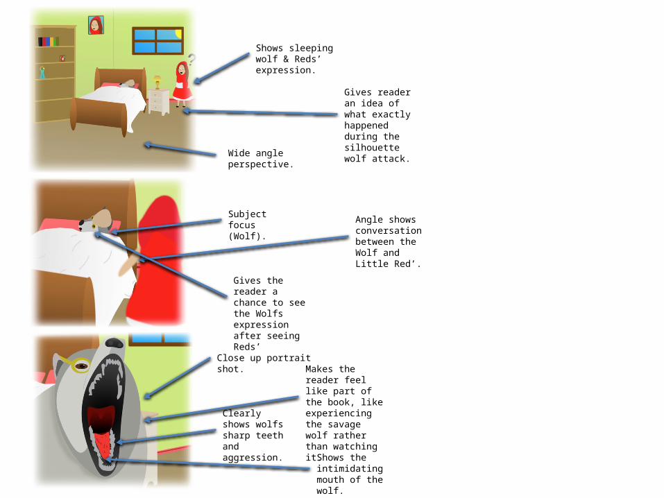
Wide angle perspective.
Shows sleeping wolf & Reds’ expression.
Gives reader an idea of what exactly happened during the silhouette wolf attack.
Subject focus (Wolf). Angle shows
conversation between the Wolf and Little Red’.
Gives the reader a chance to see the Wolfs expression after seeing Reds’
Close up portrait shot.
Shows the intimidating mouth of the wolf.
Clearly shows wolfs sharp teeth and aggression.
Makes the reader feel like part of the book, like experiencing the savage wolf rather than watching it.
Why did you include the content you used?
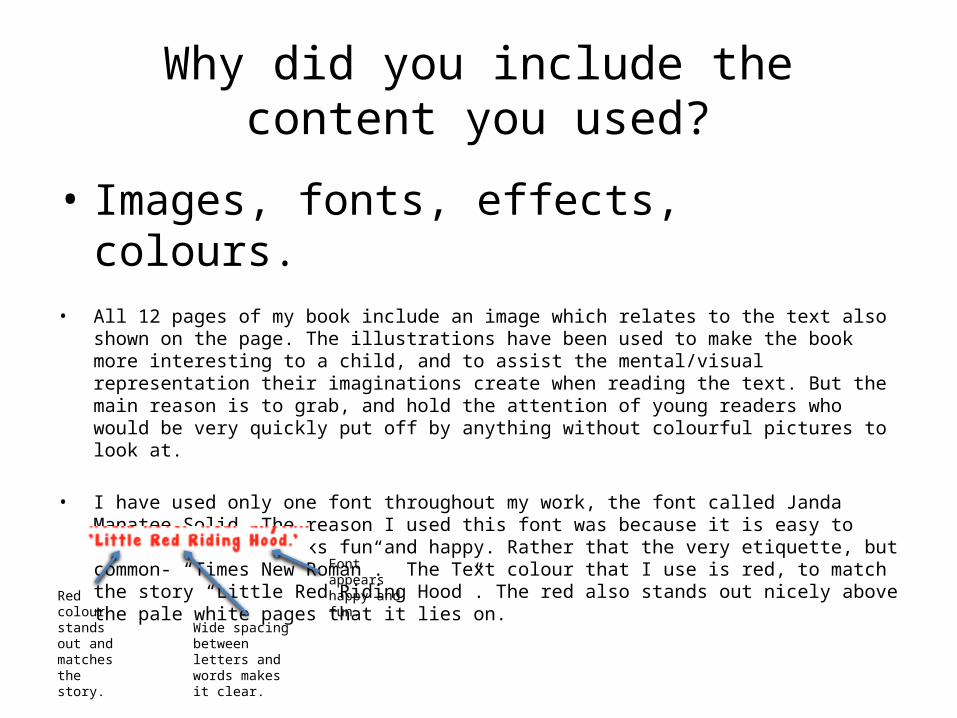
• Images, fonts, effects, colours.• All 12 pages of my book include an image which relates to the text also shown on the page. The
illustrations have been used to make the book more interesting to a child, and to assist the mental/visual representation their imaginations create when reading the text. But the main reason is to grab, and hold the attention of young readers who would be very quickly put off by anything without colourful pictures to look at.
• I have used only one font throughout my work, the font called Janda Manatee Solid. The reason I used this font was because it is easy to read, bold, and looks fun and happy. Rather that the very etiquette, but common- “Times New Roman”. The Text colour that I use is red, to match the story “Little Red Riding Hood”. The red also stands out nicely above the pale white pages that it lies on.
Wide spacing between letters and words makes it clear.
Red colour stands out and matches the story.
Font appears happy and fun.

What signs, symbols or codes have your used in your work?
• Choices of colour, style, locations, character design and tone all give additional meaning to your work.
In my book I have used a lot of natural greens and browns as my main colour palette. The reason I have done this is because I wanted to keep the traditional colour palette that I saw in the older versions of the story book. The natural colours are also a lot calmer, as they don’t burst out at you making the book a much more relaxed, and more of a bed time read.
There is only one page in my book where the colours stray from the calmer greens and browns, that page being page 2, where little red riding hood leaves her house and begins her journey into the woods. The reason I have done this is to show that outside of the forest is bright and happy, where as inside it, things become a little dark and gloomy.
There are 3 locations in my book, Little red riding hoods house, the woods, and the grandmothers house. The vast majority of scenes are based in the woods and in the grandmothers house, where as only a few are based in and around Reds house.

What signs, symbols or codes have your used in your work?
• Choices of colour, style, locations, character design and tone all give additional meaning to your work.
I have attempted to create all of my characters in a happy, bubbly way, using basic shapes and curves in order to make them look relaxed and fun. The reason I decided to do this was because many of the old little red riding hood illustrations where very sketchy and rough looking, they also did not look like they would be very appealing to a younger audience. For this reason I decided to go for a more fun and modern style, by warping shapes to create the characters.
I have strategically made sure that non of my other characters are as colourful or as deeply saturated at the little red riding hood character. The reason I have done this is to make sure that the attention is almost always on little red, for example on page 5 she walks off into the distance, and even though I have placed a blur effect upon her, she is still very quickly noticeable by the reader.
What representations can be found in your work?
• How are men, women or children shown in your work? Does your work feature different ages, races, social groups or religions? Does a lack of any variety of character types create its own representation?
• There is one child, 1 old woman, one man, and one animal in my book. Each have a relatively stereotypical representation of the way they act and what they do. The child, who is also the main character, is the typical young sweet girl with brown hair and blue eyes. She loves her granny and wants to bring her treats to make her well. This is a very common representation of a sweet young girl, and a good one too. The second main character is the wolf, the evil creature that is out to kill and eat those who enter the woods. The wolf is the typical bad guy in a story, evil, sneaky, and mischievous. The granny is very typically represented as well, she is tired and lonely, and passively lets the wolf in, who is pretending to be little red. She also puts up no fight against the wolf, as expected of an old person. Next is the hunter, the hunter is male, as typically shown in story books, especially the more traditional ones. The hunter comes in and saves the day, meaning that he is the typical man represented as strong, smart, and heroic.
• My book does not represent particular races, social groups or religions. This is likely due to the story originally being made with no religious-moral content, or with any particular race being involved. Although my research so far has only come up with white characters being involved in the stories. This could easily be related to where the story is told most frequently or where the books are published and illustrated.
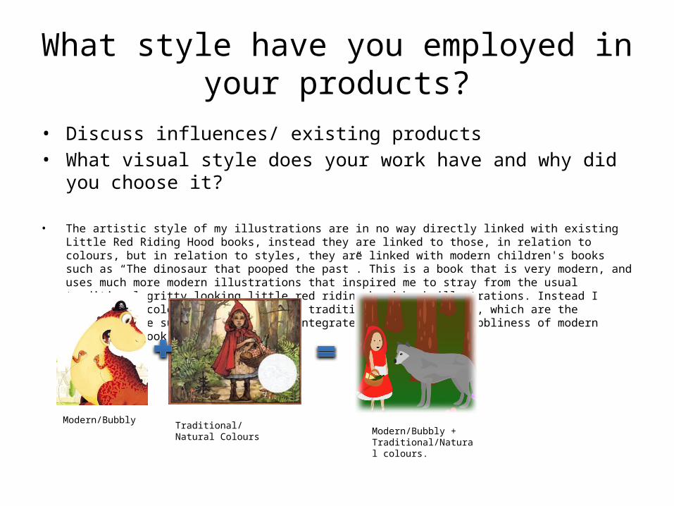
What style have you employed in your products?
• Discuss influences/ existing products• What visual style does your work have and why did you choose it?
• The artistic style of my illustrations are in no way directly linked with existing Little Red Riding Hood books, instead they are linked to those, in relation to colours, but in relation to styles, they are linked with modern children's books such as “The dinosaur that pooped the past”. This is a book that is very modern, and uses much more modern illustrations that inspired me to stray from the usual traditional gritty looking little red riding hood book illustrations. Instead I adopted the colour palette from the traditional illustrations, which are the natural, more subtle colours, and integrated that with the bubbliness of modern children's book illustrations.
Modern/Bubbly Traditional/ Natural Colours Modern/Bubbly + Traditional/Natural colours.
What style have you employed in your products?
• Discuss influences/ existing products• What visual style does your work have and why did you choose it?
• The visual style of my illustration include natural colours and bubbly shapes. This style allows me to create a story that is visually impressive to younger and older audiences, plus include the calm and relaxed colour scheme that makes the book perfect for being read to children before they go to sleep, as viewing bright colours before sleep has been proven to cause an increase in restlessness, especially in children.
• The style of my children’s book is definitely aimed at those who have been brought up to enjoy the more modern style of books, rather than the more traditional hand sketched illustrations that follow traditional fairytales strictly. It is much more likely that the style of my book will be admired by those who have read books such as “The dinosaur that pooped the past” or “There’s a shark in the bath” as opposed to titles such as “Usborne Myths & Stories from around the world”. The large difference between these types of books is that one style is modern/imaginative and the other is traditional and usually based totally around the moral aspects of the story. Such as the boy who cried wolf – which teaches children not to lie because people will never believe them again.

What were the strengths and weaknesses of the pre-production and planning
• How did the planning and research help• How well did you manage your time• Reference specific examples
• Pre-production planning is supposed to assist the time management of the project, as well as assisting the creation of ideas for the story. For example, the pre-production that we created included page sizes, fonts, colours, illustration styles, illustration colour schemes, time management (day to day aims), the script, and more. The pre-production allowed us to be prepared to hit the ground rolling when the real project begins, rather than having to create ideas out of the blue, and right scripts and choose fonts etc, when production time is limited. The main sections of the pre-productions included the fonts & colours, and the digital flat plans. Fonts had to be finely selected to be attractive to a younger audience, but they also had to be readable, which meant a lot of scouring for particular qualities in multiple fonts. The flat plans I made where created on a comic strip designing website, this allowed me to use multiple pre-set environments, and have some control over the look of my characters. This allowed me to create every scene that would be included in my book. Although in the end a lot of my flat plans became obsolete as I realised that a customised re-make of each scene would not be good enough, I had to instead include multiple different scene angles and effects to reach the standard I was aiming for.

With a lot of research on “dafont” for a particular font that shown the qualities of being easily readable, bold and clear, and also interesting rather than plain and simple. It was hard to find a font which displayed all of these qualities, but I eventually compiled those that appealed to me into a PowerPoint slide. I then came to the conclusion that “Janda Manatee” was the favoured font for the children’s book, as it matches all of the qualities I wished for.
The digital flat plans I created where useful until the 6th page where I quickly decided that I would rather stray from them, as they are much to basic for my work standard. The reason the post page 6 illustrations appear so basic is because they are all from the exact same angle, meaning there is no diversity in what the reader would see. Such a lack would make the illustrations boring and repetitive which I definitely do not want in my book.
Historical and cultural context
• How does your work compare to what has come before? What other similar products have existed in the past? What current products exist?
• I have tried to make my book unlike any other particular books, by creating a hybrid of the traditional storyline with the modernistic computer created illustrations. Current products exist mainly from each particular section; modern, and traditional.
• Similar ‘modern’ products include “The dinosaur that pooped the past” and “Giraffes can’t dance”. These books include modern illustrations, and modern storylines that are supposed to be fun and comedic, yet usually include a moral side to the story too. The modern illustrations included in those books are similar to those included in mine in order to make my book more attractive to the younger audiences of today.
• There are many traditional story books that are still available today. Those stories include “A first book of fairytales” and “365 bed time stories”-a mix of traditional style stories. The similarities between those books and my own is the storyline. My book keeps to the traditional moral storyline that has been used for centuries, in western culture. By keeping the traditional storyline the book will be and memorable read for parents and children alike, as the story will likely be recognised by both, especially the parent.

Peer Feedback
• Summarise peer feedback and discuss– Responses you agree with– Responses you disagree with
