digital graphics evaluation
TRANSCRIPT

Graphic Narrative Evaluation

Does your final product reflect your original intentions?
I based my final product around my flat plans by using them as a basis for each page, this can be seen to the right, and then adding improvements from there be it positioning or inserting new items. My storyboards are also accurate when compared to both the finished work as well as the flat plans, however in the storyboard Poppy was depicted as female and then male in the final book, this is due to my own misconception at the time as in the original Candle Cove.

I did not use the storyboards at all in the final production, as they were not the easiest to follow because of the makeshift scenery repeated characters etc. to improve this I would have done the storyboard on paper as appose to the comic’s as they were very limited in their selection of characters, also if I had my storyboard as a physical document it would be far easier to refer to as appose to multiple windows scattered across the Mac.

I will next look at the Laughingstock and the Fun-Taker’s ship. Firstly the Laughingstockwhich is based off of the original story in which the ship of the Laughingstock crew was called Ms. Laughingstock and was also the leader (right), her appearance was the basis of my version however it is not identical because the original could be potentially frightening to a younger child.When making the Laughingstock I made sure that the deck would be somewhat similar to the deck that was present in the previous pages (bottom right) the way Imade this happen is I took the stairs from the bottom Page and then made them smaller and rotated them tofit the ship I had made. I got this by rotoscoping an Image of a ship from above.
Overall I believe I have constructed my images very wellbecause, as mentioned previously, there is no canon Visual images for Candle Cove as it is a text based story so by working off of only fan works and text based descriptions I believe I have been able to create a convincing book all while keeping faithful to the original story.
How well have you constructed your images?
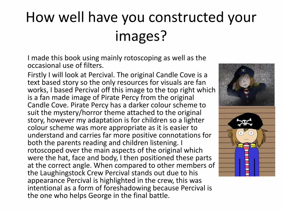
I made this book using mainly rotoscoping as well as the occasional use of filters.Firstly I will look at Percival. The original Candle Cove is a text based story so the only resources for visuals are fan works, I based Percival off this image to the top right which is a fan made image of Pirate Percy from the original Candle Cove. Pirate Percy has a darker colour scheme to suit the mystery/horror theme attached to the original story, however my adaptation is for children so a lighter colour scheme was more appropriate as it is easier to understand and carries far more positive connotations for both the parents reading and children listening. I rotoscoped over the main aspects of the original which were the hat, face and body, I then positioned these parts at the correct angle. When compared to other members of the Laughingstock Crew Percival stands out due to his appearance Percival is highlighted in the crew, this was intentional as a form of foreshadowing because Percival is the one who helps George in the final battle.
How well have you used text to anchor your images
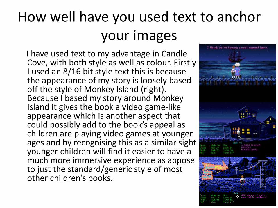
I have used text to my advantage in Candle Cove, with both style as well as colour. Firstly I used an 8/16 bit style text this is because the appearance of my story is loosely based off the style of Monkey Island (right). Because I based my story around Monkey Island it gives the book a video game-like appearance which is another aspect that could possibly add to the book’s appeal as children are playing video games at younger ages and by recognising this as a similar sight younger children will find it easier to have a much more immersive experience as appose to just the standard/generic style of most other children’s books.

The colouring of text is also a key aspect to the success of my book’s appearance as I ever so slightly darken colours through the pages (below) as an indication that the story is getting darker. As shown below even on the final few pages which have a darker backdrop my text is not a simple white it is a very light shade of grey as this adds to the readability, it also carries on the recurring theme of the colour grey, as seen below. I have chosen a contrasting stroke for all my text, black on white, white on black etc. as this ensures the text is readable to both children and parents as this book is designed for children however it is most likely that the parents will be reading the story to them so as long as the text is visible to both it will make the book more enjoyable.
Is your product suitable for your audience?
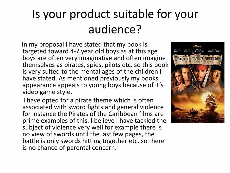
In my proposal I have stated that my book is targeted toward 4-7 year old boys as at this age boys are often very imaginative and often imagine themselves as pirates, spies, pilots etc. so this book is very suited to the mental ages of the children I have stated. As mentioned previously my books appearance appeals to young boys because of it’s video game style.I have opted for a pirate theme which is often associated with sword fights and general violence for instance the Pirates of the Caribbean films are prime examples of this. I believe I have tackled the subject of violence very well for example there is no view of swords until the last few pages, the battle is only swords hitting together etc. so there is no chance of parental concern.
What do you like/dislike about the techniques you have used?
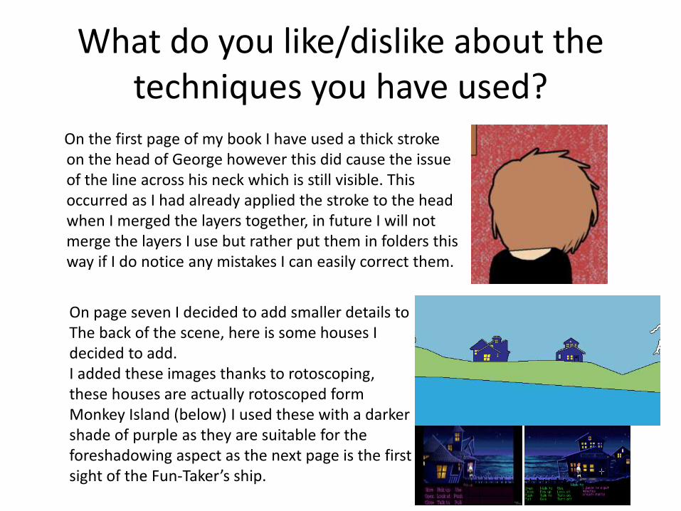
On the first page of my book I have used a thick stroke on the head of George however this did cause the issue of the line across his neck which is still visible. This occurred as I had already applied the stroke to the head when I merged the layers together, in future I will not merge the layers I use but rather put them in folders this way if I do notice any mistakes I can easily correct them.
On page seven I decided to add smaller details to The back of the scene, here is some houses I decided to add.I added these images thanks to rotoscoping, these houses are actually rotoscoped form Monkey Island (below) I used these with a darker shade of purple as they are suitable for the foreshadowing aspect as the next page is the firstsight of the Fun-Taker’s ship.

For every page that was on the ship I used an image of the sea and for the background, the sea was a blue paintbrush area.The image of the sea I used was edited using the cutout filter and then applying the threshold, I believe this suits the book’s overall appearance as the cutout effect helps the image to possess the cartoon-like appearance as appose to a photo realistic which would most likely confuse a child if everything else is a cartoon.
Finally on page ten I needed the book’s appearance to be significantly darker than the others due to the scenario and events however when I applied the filter to an image of a raincloud it did not run smoothly alongside the dark blue sky in the background (bottom image), to eliminate this problem I added a colour overlay of dark blue and turned the opacity to 34% this then helped the clouds to blend in with the skies colour as appose to contrasting with it (top image).

What do you like/dislike about how your final product looks?
I like the way I have altered the look of the cabins on both ships in order to work toward the atmosphere of the scenes. I had the Laughingstock ship have a slightly worn appearance to suit the stereotypical pirate-like lifestyle, however I made the Fun-Taker’s ship identical in layout yet completely destroyed in comparison as this shows a clear distinction between the two and also gives a slight feeling of unease as what was before a nice/appealing setting has now become the complete opposite.

I am very happy with the appearance of my characters however I do not like the way that there is not much room for variation in terms of expressions position etc. The only character that is able to change is Percival due to his wide open eyes and his position with the sword. I have moved Percival’s pupils around in certain pages for some form of variation. If I were to do this again I would give the characters a different style of eye as this way they can be changed as appose to just staring in the same position all of the book.
Also in terms of variation I do not like the way the Fun-Taker maintains the same stance in every scene he is in, this is because the model of the Fun-Taker is a rotoscoped image of a skeleton walking forward. To improve this flaw I would firstly lower the Fun-Taker’s arm when he first appears as he is only asking a question as appose to threatening to fight George. Next I would have the Fun-Taker reach for his sword as George get’s his as for the battle page this is the same position as the previous page.

Why did you include the content you used?
The book begins in George’s bedroom and this has a noticeably simplistic appearance both with it’s content, Bed, door TV and clock as well as it’s simplistic blue and red colour scheme. All of the previously mentioned aspects are to show George’s boredom with daily life. George’s room has scattered pirate toy’s, posters etc. and these a break from the boring look of his room for the reader and are clearly George’s method of escapism
Directly after George’s bedroom we see the deck of the Laughingstock which is a complete switch in scenery as the deck is a much brighter coloured area in comparison to George's bedroom it also shares the blue of the background but this time It is a wide open scene in order to symbolize the freedom George Is feeling
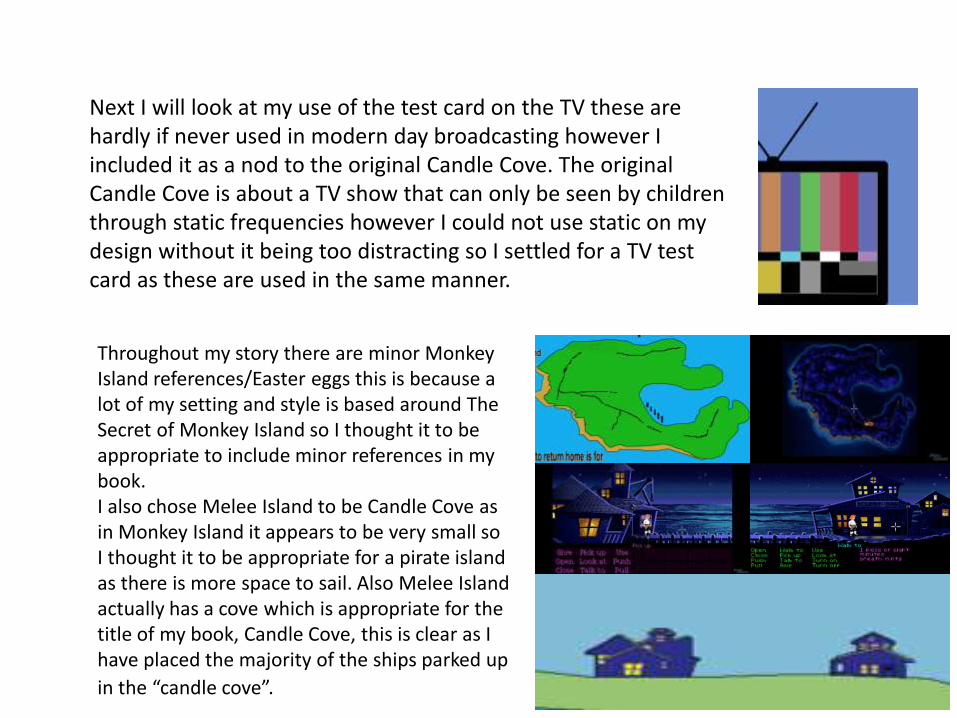
Next I will look at my use of the test card on the TV these are hardly if never used in modern day broadcasting however I included it as a nod to the original Candle Cove. The original Candle Cove is about a TV show that can only be seen by children through static frequencies however I could not use static on my design without it being too distracting so I settled for a TV test card as these are used in the same manner.
Throughout my story there are minor Monkey Island references/Easter eggs this is because a lot of my setting and style is based around The Secret of Monkey Island so I thought it to be appropriate to include minor references in my book.I also chose Melee Island to be Candle Cove as in Monkey Island it appears to be very small so I thought it to be appropriate for a pirate island as there is more space to sail. Also Melee Island actually has a cove which is appropriate for the title of my book, Candle Cove, this is clear as I have placed the majority of the ships parked up
in the “candle cove”.

What signs, symbols or codes have your used in your work?
I have used pathetic fallacy in my book toward the very end as this is a simple association for children to make by this I mean bad weather means bad things could happen. The original idea was to use rain as well as thunder, however this did not translate very well into the cartoon appearance of my book so I settled for the black clouds and the lightning strikes as well as darkening the sky as the story progressed.
Next I will look at the character of George and the symbolism attached to him. George has the appearance stereotypical of an outcast e.g. the long hair, the black shirt etc. he also does not smile and hardly talks throughout the book until the very end which adds a positive meaning to George’s endeavor, as mentioned previously, this is George’s idea of escapism coming to life which toward the end has completely altered his emotion and appearance

Next I will look at George’s collection of pirate style items which on page 2 (top image) has a large bare spot on the wall however on page 12 (bottom image) the space is filled with Percival’s sword. This imagery of filling in a space is almost like a picture of George’s mind as at the beginning he only imagined life as a pirate and not being able to live out this fantasy and it has made him quite sad over it however this hole is then fixed both physically and mentally for George when he visits Candle Cove as is seen in the comparison image what was once only a small corner of his life has now become one of the largest parts of it.

What representations can be found in your work?
My story only contains male characters visually
which is a representation of the stereotypical pirate being only male which has been the case for a long time until recently with the Pirates of the Caribbean films which do contain at least one female pirate despite it only being one it shows more gender diversity than my story.
Another representation is that of Captain Silver (left) who clearly has a different appearance from the other crew members as he is a lot more presentable and neat for instance he is wearing a similar outfit to Poppy however Poppy has his jacket undone and appears to be slouching where as Captain Silver has his jacket done up and is standing straight which is a representation of how a leader/captain “should be”.

What style have you employed in your products?
My book has adapted a video game look, as mentioned previously, Monkey Island is at the top of these influences in terms of appearance due to it’s similar setting and premise I have used similar colour schemes to Monkey Island in order to give my book both the video game and pirate appearance and feel.
The point and click genre has been a large role in the appearance of my story I have used the same speech presentation as Monkey Island and Day of the Tentacle (left) which is no speech bubbles just text near the character.
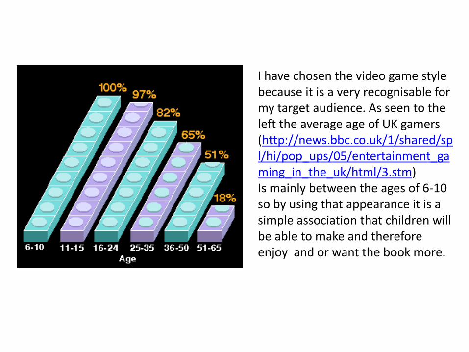
I have chosen the video game style because it is a very recognisable for my target audience. As seen to the left the average age of UK gamers (http://news.bbc.co.uk/1/shared/spl/hi/pop_ups/05/entertainment_gaming_in_the_uk/html/3.stm) Is mainly between the ages of 6-10 so by using that appearance it is a simple association that children will be able to make and therefore enjoy and or want the book more.
What were the strengths and weaknesses of the pre-production and planning
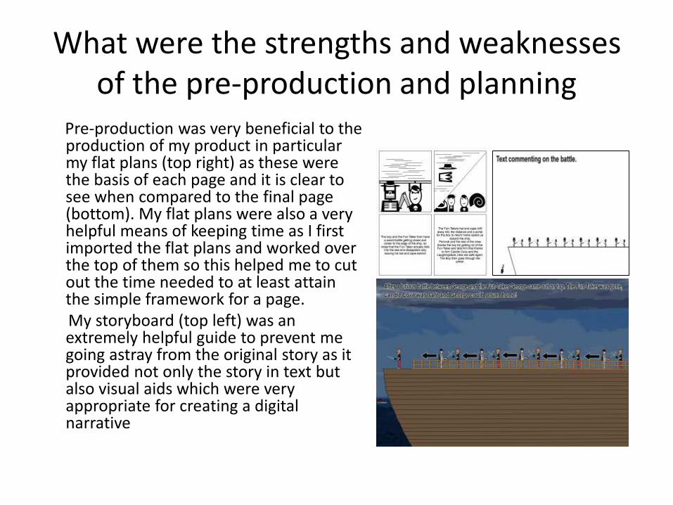
Pre-production was very beneficial to the production of my product in particular my flat plans (top right) as these were the basis of each page and it is clear to see when compared to the final page (bottom). My flat plans were also a very helpful means of keeping time as I first imported the flat plans and worked over the top of them so this helped me to cut out the time needed to at least attain the simple framework for a page. My storyboard (top left) was an extremely helpful guide to prevent me going astray from the original story as it provided not only the story in text but also visual aids which were very appropriate for creating a digital narrative
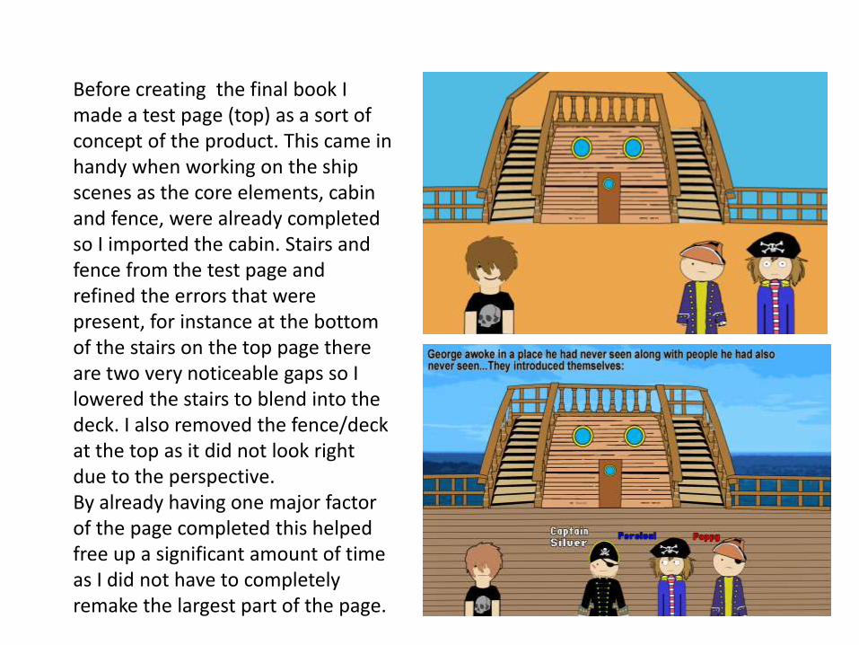
Before creating the final book I made a test page (top) as a sort of concept of the product. This came in handy when working on the ship scenes as the core elements, cabin and fence, were already completed so I imported the cabin. Stairs and fence from the test page and refined the errors that were present, for instance at the bottom of the stairs on the top page there are two very noticeable gaps so I lowered the stairs to blend into the deck. I also removed the fence/deck at the top as it did not look right due to the perspective. By already having one major factor of the page completed this helped free up a significant amount of time as I did not have to completely remake the largest part of the page.

Historical and cultural context
My story is based around a short internet horror story (or “Creepypasta”) released in 2009 and of the same name, the story is about: “a group of people who are reminiscing on an online message board about a scary show they had watched as children before it was revealed that the show never existed” -http://knowyourmeme.com/memes/candle-coveMy adaptation of the story is significantly different as the original sees adults talking about the show as appose to a story within the show’s universe whereas I have used the ideas of the Candle Cove TV show and tailored them to be far more suitable to a younger audience which included firstly changing the name of the villain from the Skin-Taker to the Fun-Taker and generally creating a more positive atmosphere and conclusion.
As mentioned previously my books style lends it’s speech style from LucasArt’s adventure games such as Sam and Max, Day of the Tentacle etc. Which means my book and LucasArt’s games share a very similar appearance (Monkey Island especially) however not so much in stories.
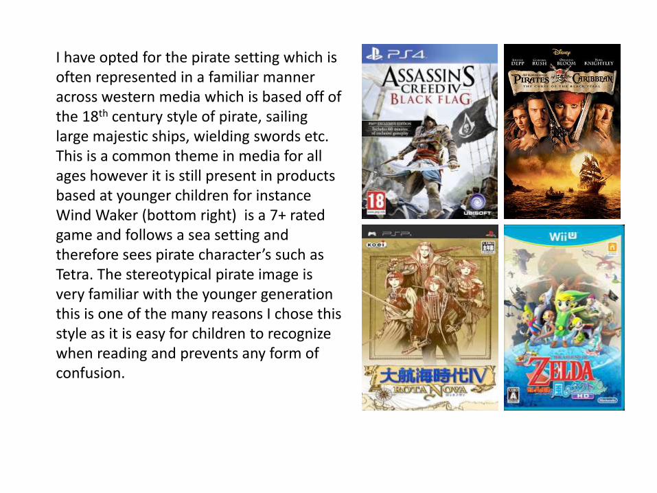
I have opted for the pirate setting which is often represented in a familiar manner across western media which is based off of the 18th century style of pirate, sailing large majestic ships, wielding swords etc. This is a common theme in media for all ages however it is still present in products based at younger children for instance Wind Waker (bottom right) is a 7+ rated game and follows a sea setting and therefore sees pirate character’s such as Tetra. The stereotypical pirate image is very familiar with the younger generation this is one of the many reasons I chose this style as it is easy for children to recognize when reading and prevents any form of confusion.