displaying data frequency distributionsfrequency distributions ◦athletic shoe survey histograms...
TRANSCRIPT

Displaying Data Frequency Distributions
◦ Athletic Shoe Survey
Histograms◦ Capital Credit Union
Joint Frequency Distributions◦ Capital Credit Union
Joint Relative Frequencies◦ Capital Credit Union
More Examples

Displaying Data Bar Charts
◦ Bach, Lombard & Wilson
Line Charts◦ McGregor Vineyards
Scatter Diagrams◦ Personal Computers
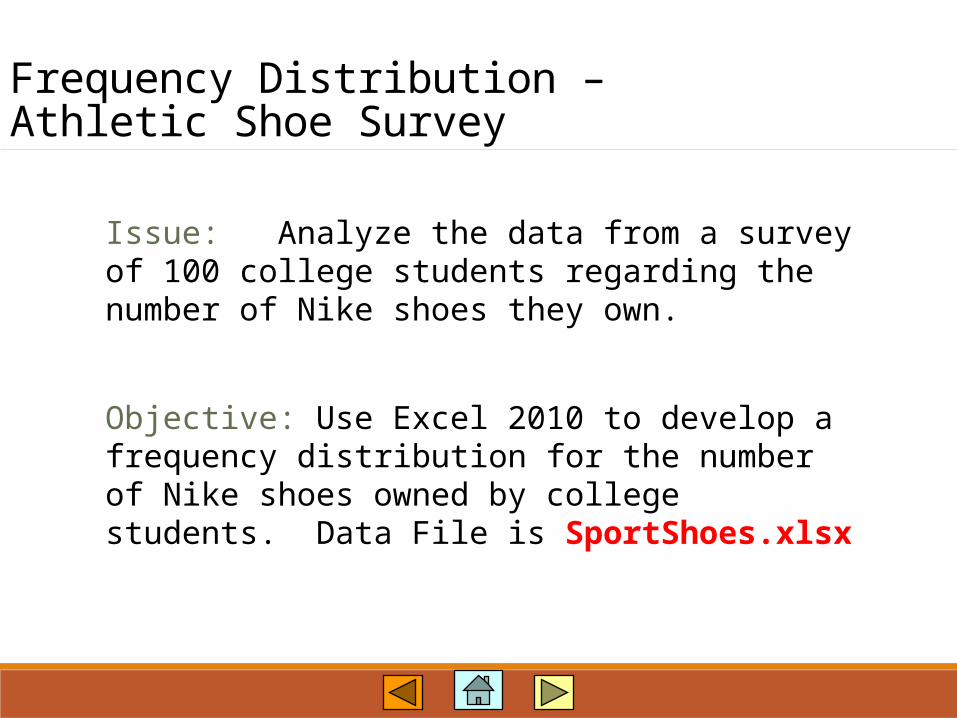
Frequency Distribution –Athletic Shoe Survey
Issue: Analyze the data from a survey of 100 college students regarding the number of Nike shoes they own.
Objective: Use Excel 2010 to develop a frequency distribution for the number of Nike shoes owned by college students. Data File is SportShoes.xlsx

Frequency Distribution –Athletic Shoe Survey
File contains 100 observations.Last row is 102.Column E contains the Numberof Nike Shoes Owned.
Open File: SportShoes.xlsx

Frequency Distribution –Athletic Shoe Survey
Enter the Possible Values for the Variable:
Number of Nikes Owned
Select the cells tocontain the Frequency
values

Frequency Distribution –Athletic Shoe Survey
Select theFormulas tab
Click on button
SelectStatistical
SelectFREQUENCY
function

Frequency Distribution –Athletic Shoe Survey
Enter the rangeof data
Enter the binrange (the cellscontaining the
possible numberof shoes) Results are
shown here
PressCtrl-Shift-Enter
Do not press OK!

Frequency Distribution –Athletic Shoe Survey
Frequencies are shown here.

Histograms –Capital Credit Union
Issue: Consider Capital Credit Union (CCU) in Mobile, Alabama, which recently began issuing a new credit card. Managers at CCU have been wondering how customers use this card, so a sample of 300 customers was selected.
Objective: Use Excel 2010 to develop a histogram for the credit card balances. Use 10 class intervals.Data File is Capital.xlsx

Histograms –Capital Credit Union
File contains 300 observations.Last row is 301.Column B contains balances.
Open File: Capital.xlsx

Histograms –Capital Credit Union
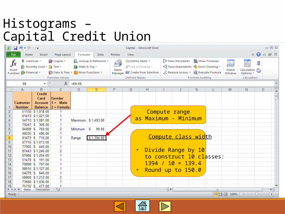
Use Excel’s MAXfunction to determine
the largest value.

Histograms –Capital Credit Union
Use Excel’s MINfunction to determine
the largest value.
Histograms –Capital Credit Union
Compute rangeas Maximum - Minimum
Compute class width
• Divide Range by 10to construct 10 classes:1394 / 10 = 139.4
• Round up to 150.0

Histograms –Capital Credit Union
Set up an area on the worksheet for the binsand be sure to includea label such as “Bins”
Histograms –Capital Credit Union
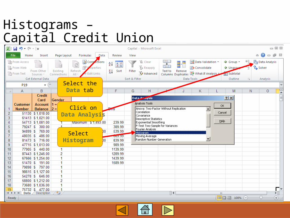
Select theData tab
Click onData Analysis
Select Histogram
Histograms –Capital Credit Union
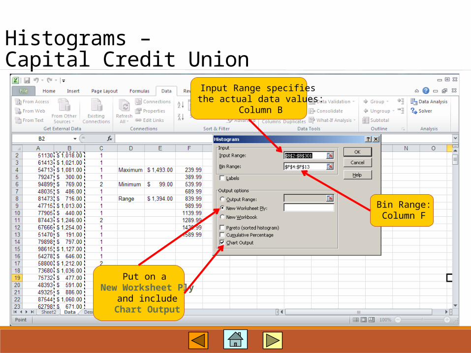
Input Range specifies the actual data values:
Column B
Bin Range:Column F
Put on a New Worksheet Ply
and includeChart Output

Histograms –Capital Credit Union
“Bins” title was replacedby “Balances”, and“Frequency” legend
was removed..
Excel’s default on a histogram is to include a More category. Remove the More category from the chart. Select the chart, right-click, Select Data, Edit Frequency. In the Edit Series
dialog box, change Series Values to $B$11 rather than $B$12.

Histograms –Capital Credit Union
• Right-click on any ofthe bars in the Histogram
• Select Format DataSeries

Histograms –Capital Credit Union
Set Series Overlap and Gap Width to 0%
to format the Histogram as shown

Histograms –Capital Credit Union
To put border colors around the bars of the histogram , select
Border Color, choose Solid line, select the Color arrow, and choose
Dark Blue, Text 2 Theme Color.

Histograms –Capital Credit Union
Change the bins categories to 0-239.99,240-389.99, etc. and delete the More
bins and frequency.
Change the Histogram title to Credit Card Balances.
See next slide for final result.

Histograms –Capital Credit Union

Joint Frequency Distributions –Capital Credit Union
Issue: Consider Capital Credit Union (CCU) in Mobile, Alabama, which recently began issuing a new credit card. Managers at CCU have been wondering how customers use this card, so a sample of 300 customers was selected. Analyze the credit card balances by gender of the card holder.
Objective: Use Excel 2010 to develop a joint frequency distribution for the credit card balances by gender. Data File is Capital.xlsx

Joint Frequency Distributions –Capital Credit Union
File contains 300 observations.Last row is 301.Column B contains balances.Column C contains gender.
Open File: Capital.xlsx

Joint Frequency Distributions –Capital Credit Union
Select theInsert tab
SelectPivot Table
Table/Rangeselected
automatically.
SelectNew Worksheet
Place cursoranywhere in
the data

Joint Frequency Distributions –Capital Credit Union
On the Options tabselect Options in
the Pivot Table group.

Joint Frequency Distributions –Capital Credit Union
Select the Display taband check the
Classic Pivot Table layout.

Joint Frequency Distributions –Capital Credit Union
Drag Credit Card Account Balanceto “Drop Row Fields Here” area.

Joint Frequency Distributions –Capital Credit Union

Joint Frequency Distributions –Capital Credit Union
Right-click in Credit Card Account Balance numbers and click Group.

Joint Frequency Distributions –Capital Credit Union
Change:Starting at to 90
Ending at to 1589By to 150
Drag Genderto “Drop Column Fields Here” area.
Drag Credit Card Account Balanceto “Drop Value Fields Here” area.
Joint Frequency Distributions –Capital Credit Union

Joint Frequency Distributions –Capital Credit Union
Place cursor inthe Data Item area.
Right-click.
Select SummarizeValues By
Select Count

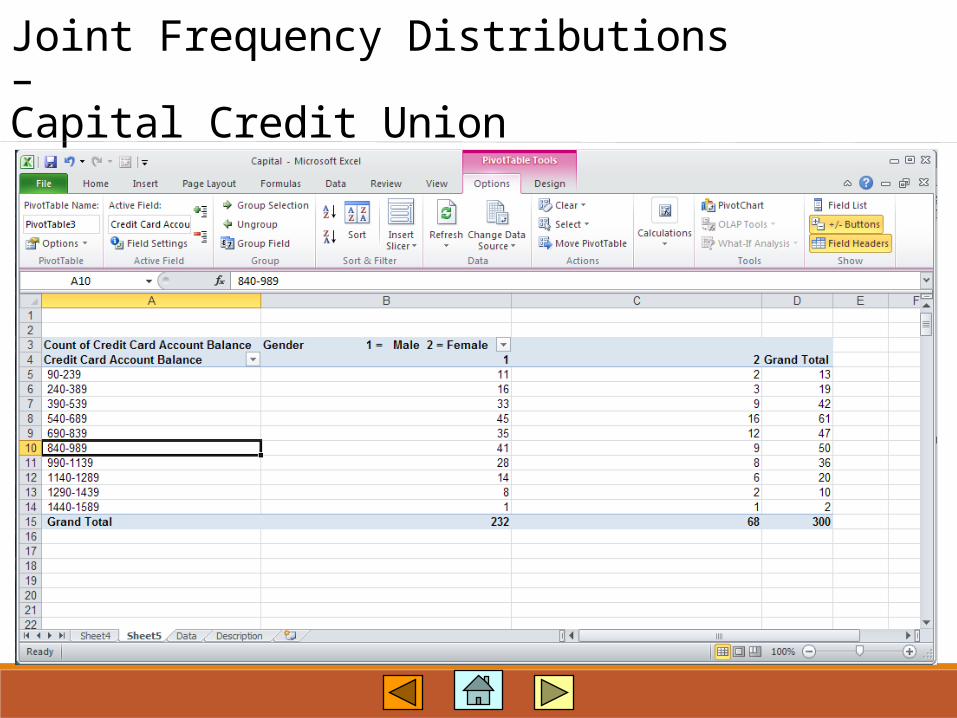
Joint Frequency Distributions –Capital Credit Union
Completed!
Joint Relative Frequencies –Capital Credit Union
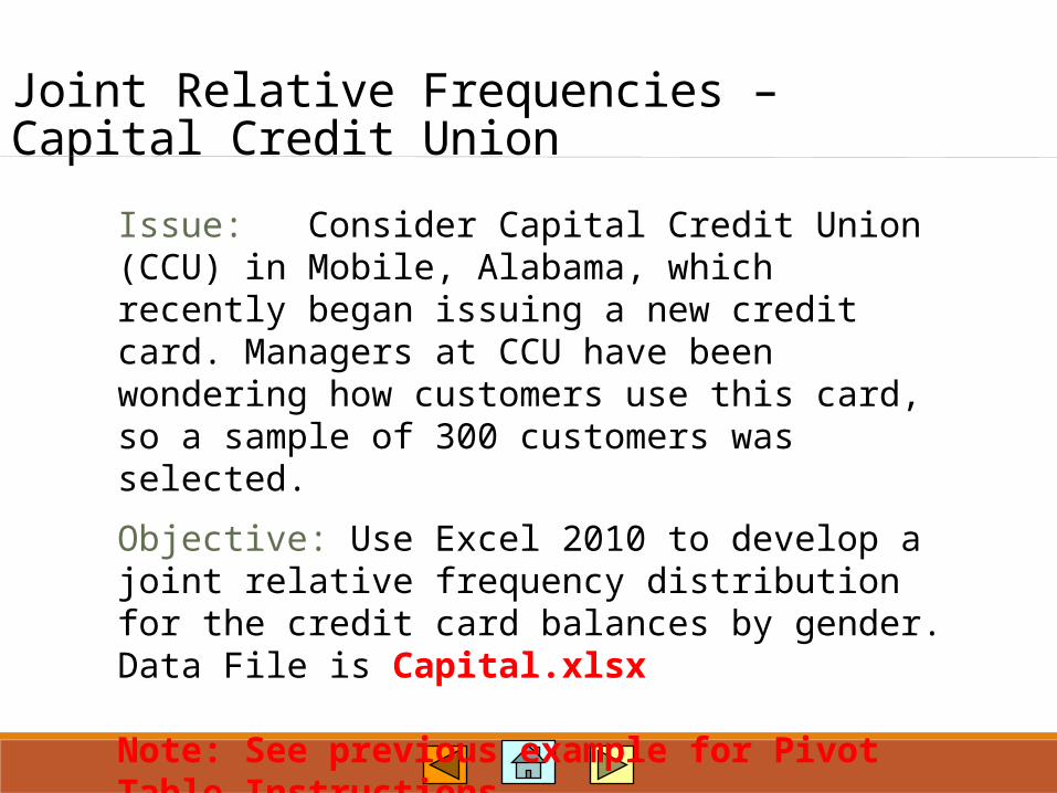
Issue: Consider Capital Credit Union (CCU) in Mobile, Alabama, which recently began issuing a new credit card. Managers at CCU have been wondering how customers use this card, so a sample of 300 customers was selected.
Objective: Use Excel 2010 to develop a joint relative frequency distribution for the credit card balances by gender. Data File is Capital.xlsx
Note: See previous example for Pivot Table Instructions.

Joint Relative Frequencies –Capital Credit Union
Right-click anywhere in the
values of thepivot table.
Select Value Field
Settings
Joint Relative Frequencies –Capital Credit Union
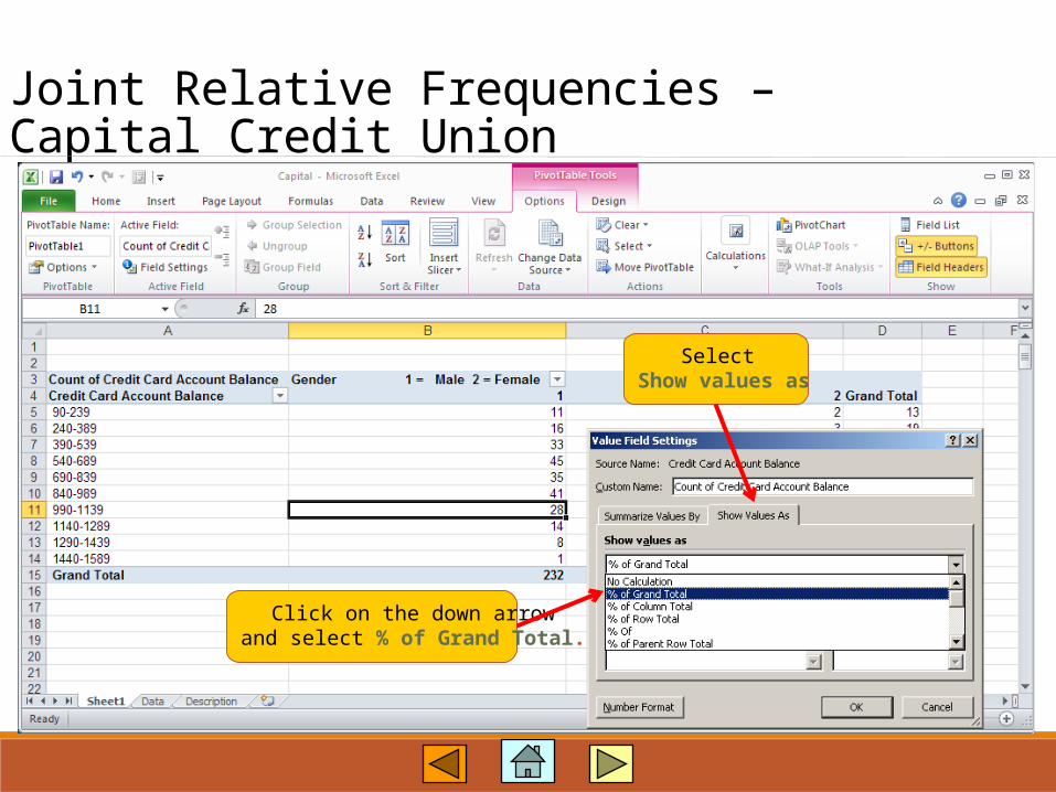
Click on the down arrowand select % of Grand Total.
Select Show values as
Joint Relative Frequencies –Capital Credit Union
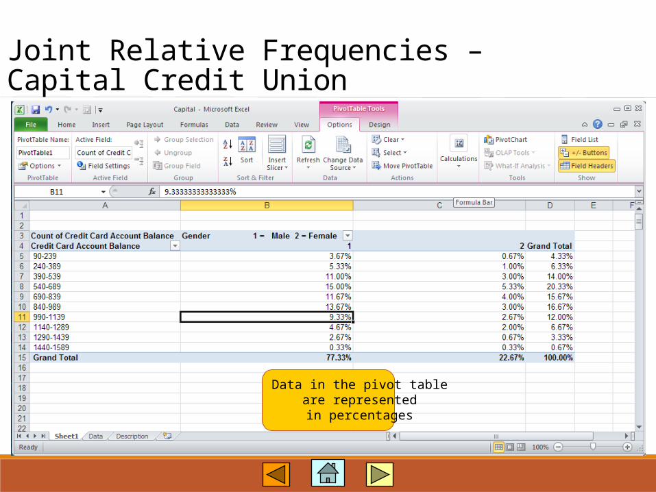
Data in the pivot tableare representedin percentages

Bar Charts –Bach, Lombard & Wilson
Issue: Consider Bach, Lombard & Wilson, a New England law firm. Recently, a firm handled a case in which a woman was suing her employer, a major elecronics firm, claiming the company gave a higher starting salaries to men than to women.
Objective: Use Excel 2010 to develop bar chart for the starting salary data for males and females. Data File is Bach.xlsx

Bar Charts –Bach, Lombard & Wilson
Open File: Bach.xlsx

Bar Charts –Bach, Lombard & Wilson
Select the datain columns B and C
Select theInsert tab Select
Column
Select 2-D Paired
Column

Bar Charts –Bach, Lombard & Wilson
Click onSelect Data
Bar Charts –Bach, Lombard & Wilson
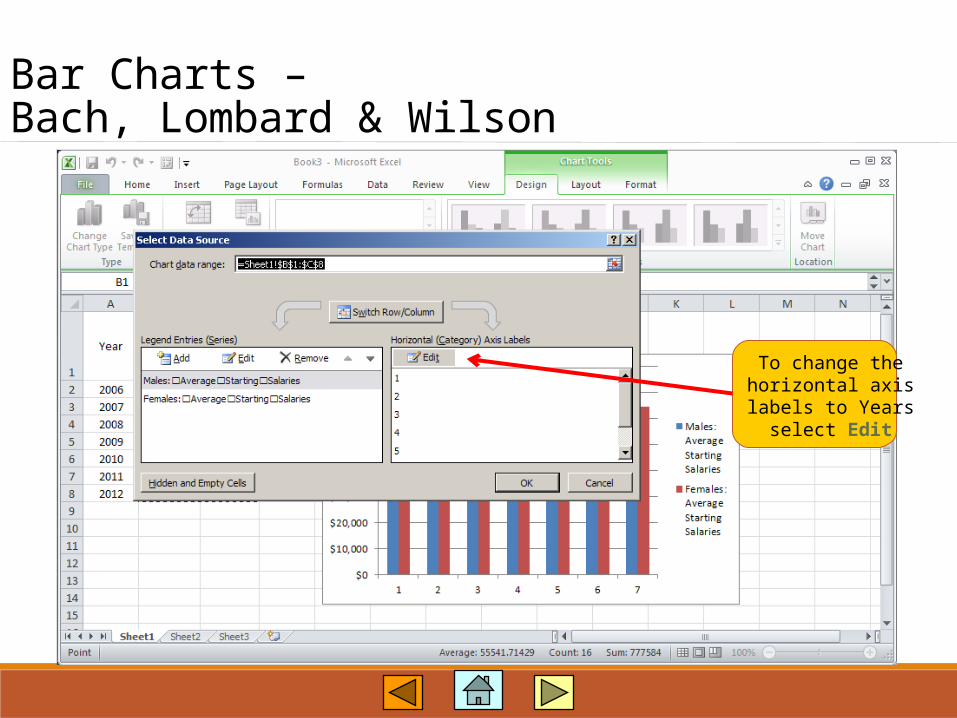
To change thehorizontal axislabels to Years
select Edit
Bar Charts –Bach, Lombard & Wilson
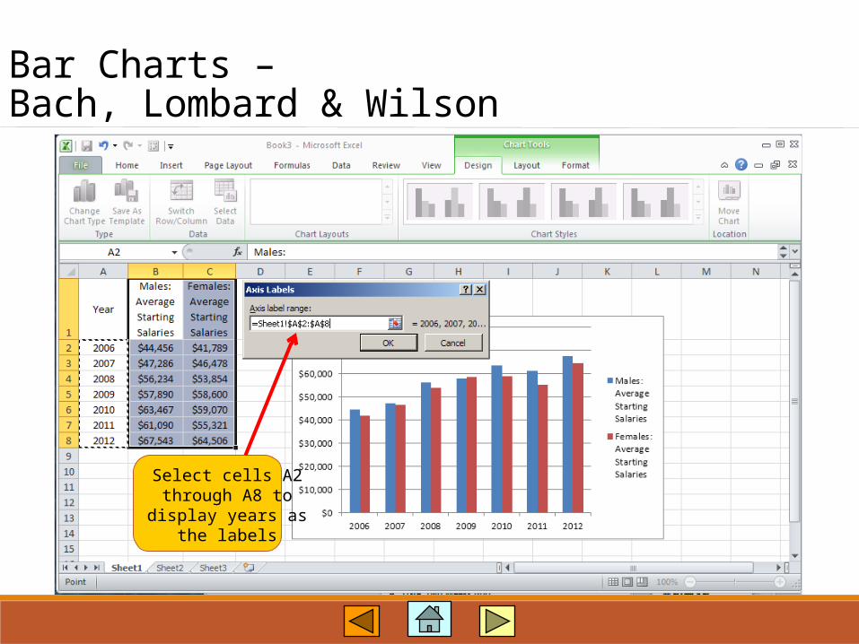
Select cells A2through A8 to
display years asthe labels

Bar Charts –Bach, Lombard & Wilson

Line Charts –McGregor Vineyards
Issue: McGregor Vineyards owns and operates a winery in the Sonoma Valley in Northern CaliforniaAt a recent company meeting, the financial manager presented weekly profit and sales data.
Objective: Use Excel 2010 to develop line charts to analyze weekly sales and profits. Data File is McGregor.xlsx

Line Charts –McGregor Vineyards
File contains 20 weeks ofhistoric data. The last row is 21.
Open File: McGregor.xlsx

Line Charts –McGregor Vineyards
Select the datain column B
Select theInsert tab
Select Line
Select 2-D Line
with Markerssample
line chart

Line Charts –McGregor Vineyards
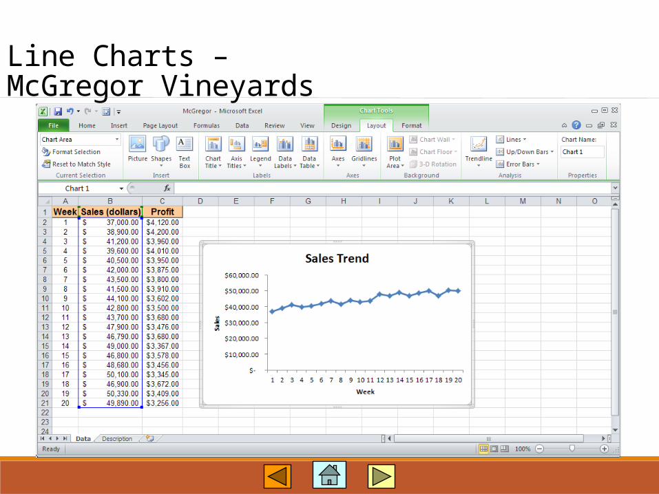
• Change the title (clickthe title and replace itwith Sales Trend)
• Delete the legend Sales (dollars) (clickthe legend and pressDelete)
• Add x-axis andy-axis titles
• Remove the gridlines
Line Charts –McGregor Vineyards
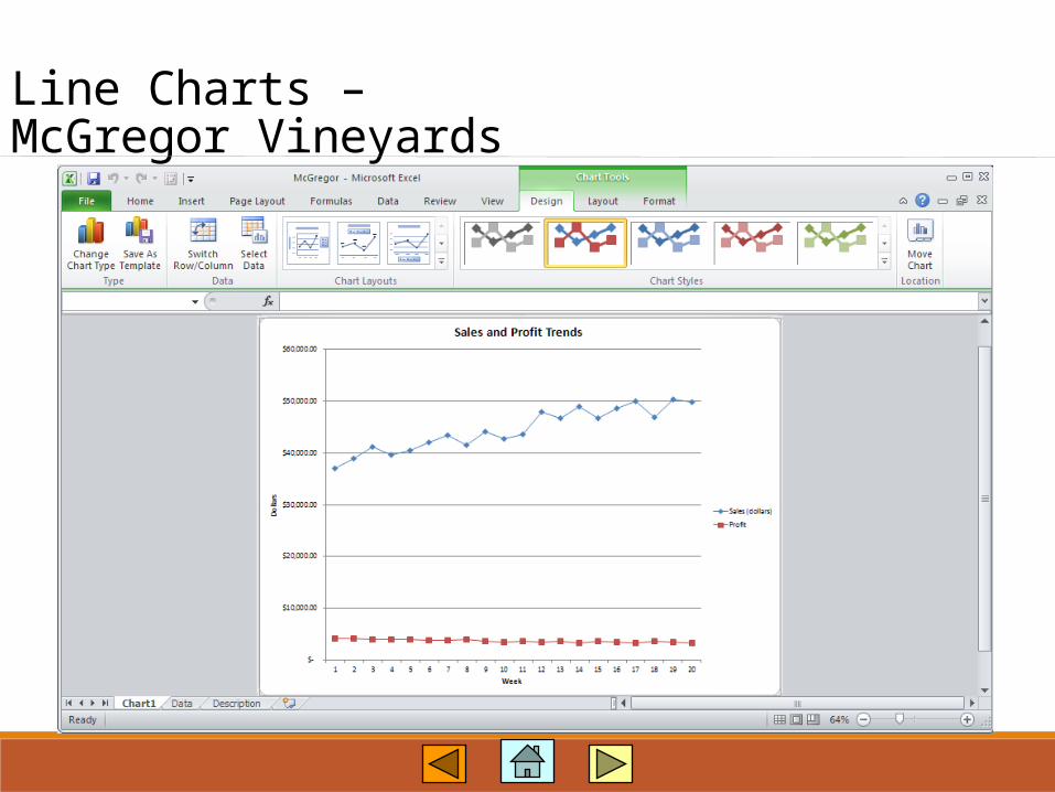
Line Charts –McGregor Vineyards
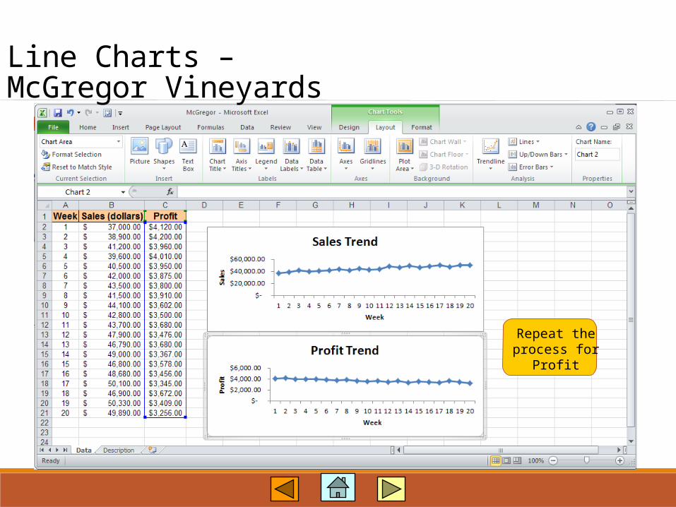
Repeat theprocess for
Profit
Line Charts –McGregor Vineyards
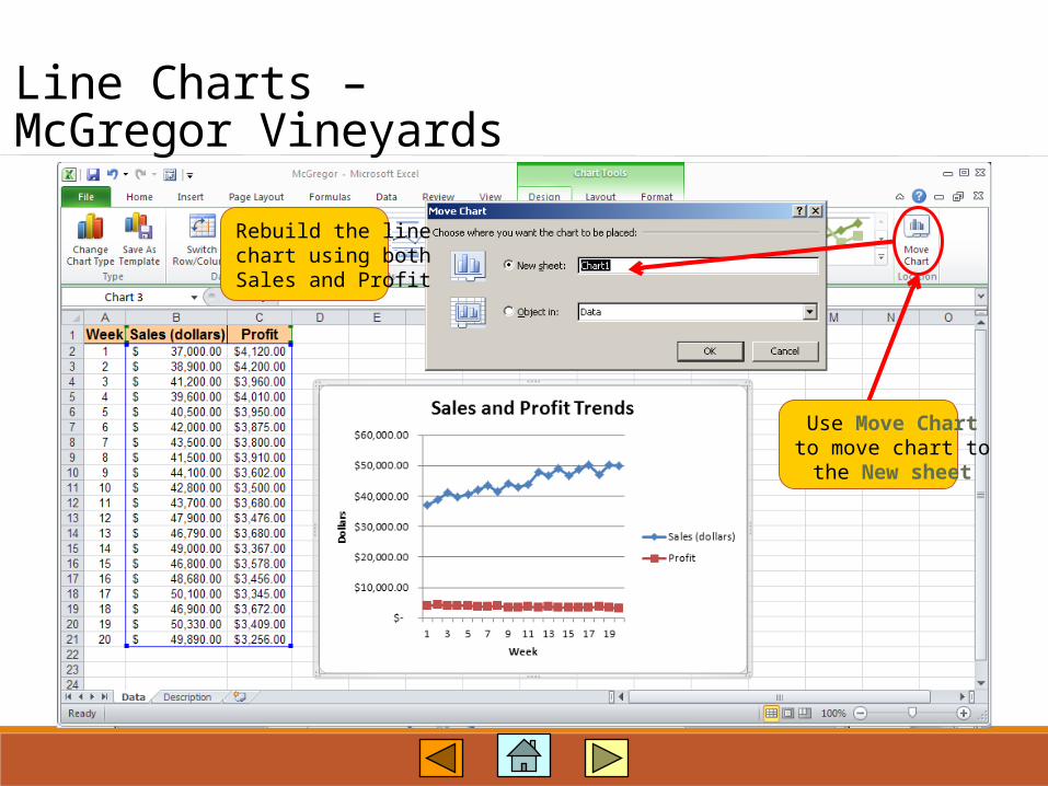
Rebuild the linechart using bothSales and Profit
Use Move Chartto move chart tothe New sheet
Line Charts –McGregor Vineyards

Line Charts –McGregor Vineyards
Improve the scaling.Select Profit Line
on graph andright-click.
Select FormatData Series.

Line Charts –McGregor Vineyards
SelectSecondary Axis.Click on Layout
and add titlesas desired.

Line Charts –McGregor Vineyards

Scatter Diagrams –Personal Computers
Issue: A few years ago, we examined various Web sites looking for the best prices on personal computers. We collected data about 13 personal computers prices, processor speed and other characteristics.
Objective: Use Excel 2010 to develop a scatter diagram for PC price and processor speed. Data File is Personal Computers.xlsx

Scatter Diagrams –Personal Computers
File contains data about 13 PCs.Processor speed is located in Column C, price – in Column G
Open File: Personal Computers.xlsx
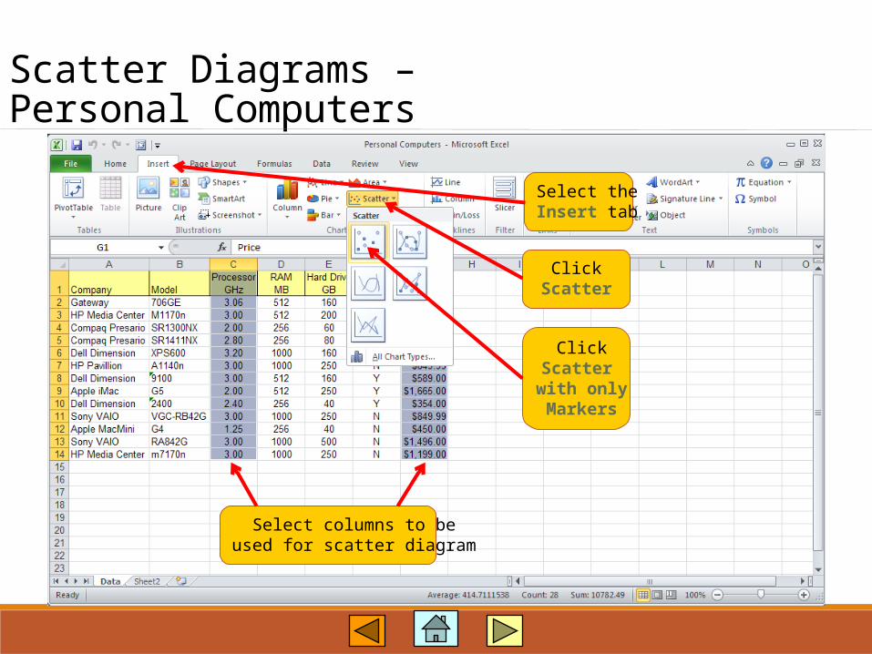
Scatter Diagrams –Personal Computers
Select columns to beused for scatter diagram
Select theInsert tab
ClickScatter
ClickScatter
with onlyMarkers

Scatter Diagrams –Personal Computers
• Use the Design tab to putdiagram to a new sheet.
• Use the Layout tab to add titles and remove grid lines.