double page spread progress
TRANSCRIPT

Double page spread progressElla Duncan
MediaAS level

First Draft I created a first draft for my Double page spread on two A4 pages and
placed them together as a way of putting my initial ideas down. This helped me as I was able to make sure I had enough space for everything I wanted to include, what font I wanted, sizes, colours and photos I was aiming to include in the product.

Creating the second draft
Once I had created the first draft, I then went onto photo shop and started to create a second draft with the ideas that I had chosen on the first draft. This allowed me to make sure that the ideas I chose on the first draft, would look the best it can on the photo shop programme.
Firstly, I used the bucket tool to create a plain white background.

Next I used the quick selector tool to select the areas of the main image on the page that I wanted to delete. This made the photo stand out more and look more professional because there was no background for the photo.
Next, I moved the image onto the white background that I had previously created. Then using “Ctrl” and “T” I was able to enlarge the image and move it to where I wanted the photo to be placed.

Next, I added all of the text and using my first draft, changed the fonts, sizes and colours to match my initial ideas.

After the interview was inserted in, I placed pictures behind the text of the artists and reduced the opacity down so that the writing could still be read clearly but also so that the image could still be seen.

Next I inserted the headline to the double page spread, making the font size 100pt, colour blue and Stencil Std.

Finally, I added signatures at the bottom of the page to make it look like the artists had signed the page. I did this by choosing fonts from “ dafont.com “ then I typed the text I wanted to include, print screened it then placed in on a PowerPoint, saved it as a JPEG then I inserted each one onto the photo shop document.

Feedback- Chloe Lavall
Clear Easy to read Looks to simple, maybe add a background
colour that matches the house style that is portrayed in the Front cover and the contents page.
Add some text at the top to introduce the artists
The headline looks to stretched out
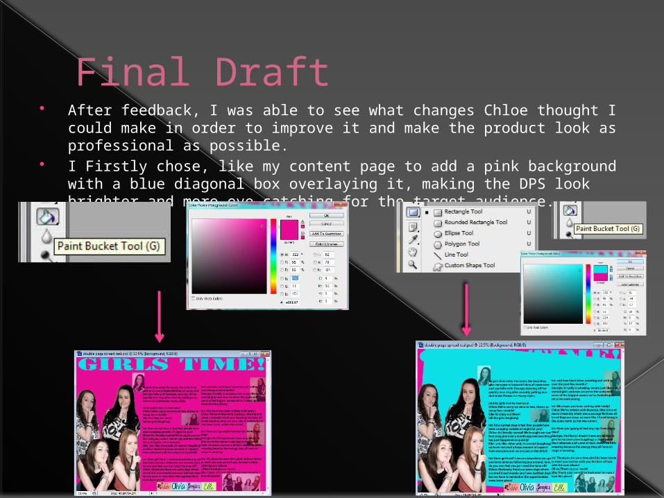
Final Draft After feedback, I was able to see what changes Chloe thought I could
make in order to improve it and make the product look as professional as possible.
I Firstly chose, like my content page to add a pink background with a blue diagonal box overlaying it, making the DPS look brighter and more eye-catching for the target audience.

Next I added a pink coloured oval and placed the headline inside this which made the text clear compared to the second draft and meant that I could insert text introducing the artists as well.

Finally, I added some text to the top of the document in order to introduce the artist's allowing the reader to be introduced to what the interview is about. I inserted text using the text tool and changing the font to Myriad Pro. Size 30pt colour pink.

Final Draft