1
PLAGIARISM DECLARATION
1. I know that plagiarism means taking and using the ideas, writings, works or inventions of another as if they were one’s own. I know that plagiarism not only includes verbatim copying, but also the extensive use of another person’s ideas without proper acknowledgement (which includes the proper use of quotation marks). I know that plagiarism covers this sort of use of material found in textual sources and from the Internet.
2. I acknowledge and understand that plagiarism is wrong.
3. I understand that my research must be accurately referenced. I have followed the rules and conventions concerning referencing, citation and the use of quotations as set out in the Departmental Guide.
4. This assignment is my own work. I acknowledge that copying someone else’s assignment, or part of it, is wrong, and that submitting identical work to others constitutes a form of plagiarism.
5. I have not allowed, nor will I in the future allow, anyone to copy my work with the intention of passing it off as their own work.
Name……………………………………………… Student #...............................................
Signed ……………………………………………. Date …………………………………….

2
Remembering Nostalgia: Trends of Nostalgia within Contemporary
Animated films.
By: Jessica Bowyer
Student Number: 482224
Supervisor: Stephen Cloete
Word Count: 26 800
3
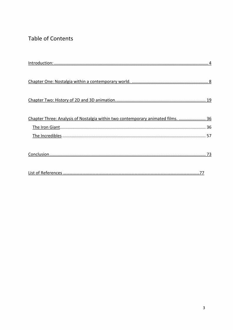
Table of Contents
Introduction: ................................................................................................................................... 4
Chapter One: Nostalgia within a contemporary world. ................................................................. 8
Chapter Two: History of 2D and 3D animation. ............................................................................ 19
Chapter Three: Analysis of Nostalgia within two contemporary animated films. ....................... 36
The Iron Giant ............................................................................................................................ 36
The Incredibles .......................................................................................................................... 57
Conclusion ..................................................................................................................................... 73
List of References ………………………………………………………………………………………………………………77
4
Introduction:
The use of 2D animations visual designs within contemporary 3D animated films has
become more popular and wide-spread, with many big animation companies (such
as Pixar and Disney) releasing numerous films since 1995 that demonstrate a re-
emergence of 2D nostalgia in animation. I believe this is a result of a desire in
audiences for more nostalgic aesthetics, in the form of 2D aesthetics within
contemporary 3D animated films. This 2D aesthetic has appeared in modern
animation companies visual style choices, as well as in the storylines and character
designs. This research report will be attempting to explore this contemporary trend of
nostalgia specifically within the animation industry, by looking at two modern
animated films, The Iron Giant (1999) and The Incredibles (2004), highlighting the
visual designs and signifiers that I believe incorporate this current trend of nostalgia.
I will not, however, be looking at nostalgia as a broad based cultural phenomenon,
but rather looking at the aesthetics of nostalgia in terms of my two case studies and
feature film animation.
Nostalgia in contemporary animation has become a main theme in many modern
animated films, a phenomenon seen in the constant making of sequels, and the use
of 2D visual techniques and aesthetics in these films, something that is noted in the
work of Simon Reynolds. Those of us in the Western world have discovered a
growing obsession for objects and signifiers from specific moments in our own
history as well as that of our parents’ or nation’s which we romanticise because we
remember that moment in time as surpassing our current climate (Reynolds xxix).
Another Nostalgia author, Svetlana Boym defines it as “a yearning for a home that
no longer exists/or has never existed, as well as a longing for a time in one’s
personal history” (Boym 1). Helen Haswell, in her paper on nostalgia within modern
Pixar short films, talks about nostalgia as being “feelings of longing for something
that is lost and playing on one’s wanting to recover a time, place or object that has
been lost” (Haswell 7). She believes that the Pixar animation studio is now
experimenting with an organic aesthetic to bring an older animation visual design
back into the world of 3D animation, something that I will be looking for in my choice
of films by Brad Bird (Haswell 7). I believe that nostalgia became a kind of vehicle for
Bird for exploring certain aesthetic styles and themes, from the Golden Age, in which
he became a kind of cultural critic. I suggest that he may have done this in the two

5
films I will be looking at because he wanted to draw attention to the cultural
situations in America at the time of the release of each film.
In this study I will mostly be making use of the definition of nostalgia given by Linda
Hutcheon in her paper Irony, Nostalgia, and the Postmodern: A Dialogue, and Simon
Reynolds definition in his book, Retromania (2011). Hutcheon, like Reynold and
Boym, speaks of nostalgia as a longing for the past, but not just a place from the
past, but rather as a longing for a specific time from the past. She talks about how
this longing could be a projection of what the modern generations wish their lives
could be like now (Hutcheon 19). As a result, they take this longing for the perfect
present and project it into the past, an ideal past, that in reality never existed
(Hutcheon 20). She states that the aesthetics of nostalgia may be less a matter of
simple memory than of complex projection: the result of wanting to create a partial,
idealised history which has merged with a dissatisfaction with present times
(Hutcheon 20). She considers that nostalgia may in fact depend on the irretrievable
nature of the past for its emotional impact and general appeal to modern generations
(Hutcheon 20). Hutcheon’s definition of nostalgia in contemporary media focuses on
the feelings that contemporary audiences have for the signs and signifiers that
remind them of easier times. These are feelings that can never truly be solved as it is
impossible realistically to travel back to these idealised times, a longing which in turn
strengthens the desire of audiences for more nostalgic aesthetics within the media,
films and television shows which they see today. As a result of these feelings of
nostalgia within western audiences, it is possible that film creators are now relying on
creating visual representations of a nostalgic past to return viewers to this preferred
past. This is the definition that I will be dealing with when I discuss the nostalgic
aesthetic of my two case studies, by looking at the nostalgic visual signifiers that film
makers, like Brad Bird, are using to create feelings of nostalgia in movie-goers.
I believe that this infatuation with the past has resulted in a growing demand among
the general consumer public / audiences for films that resonate with their pasts and
inspire nostalgia within them, though it has also been said by critics in the industry
(Reynolds included) that this is perhaps as a direct result of the fact that the modern
film industry is running out of new and fresh ideas (Reynolds ix). Whilst I agree with
this where live action films are concerned, I will be trying to show that, when it comes
to animated films, these themes of nostalgia are not merely a lack of new ideas, but

6
stem from a desire to pay homage to the classical 2D animation aesthetic and
themes from the Golden Age of animation, specifically in my two case studies. I will
be analysing these two films to support my argument for the aesthetic basis of the
use of 2D animation in modern animated films, as I believe there is a growing desire
in modern audiences to engage with media that reminds them of an idealised past.
This tribute to 2D aesthetic can clearly be seen in both my case studies, the more
traditional 2D Iron Giant and the contemporary 3D animated film The Incredibles,
with both showing a more traditional feel of animation within the simplistic design of
the characters and flat, 2D aesthetic of the textures being used on the environment
and characters.
In The Iron Giant we find a kind of visual aesthetic that honours the classical,
illustrative style of Disney films from the Golden Age of animation in America. Brad
Bird is trying to engage with these modern feelings of nostalgia in a way that is not
just superficial or purely keyed towards making money, but rather as a way to
comment on and analyse the American way of life, or how it is perceived to be. It is
a film that I believe is filled with sentimental signifiers, creating a sense of nostalgia
within its target audiences. In The Incredibles, we can see a similar analysis of the
American Idea of their past while we also see a 3D world whose animators have
gone to great lengths in order to give it a more organic 2D aesthetic feel. This can be
seen in the simplified and graphic design of the characters, as well as in the design
of the environment in which the characters interact.
I plan to make use of the definitions surrounding nostalgia from Linda Hutcheon,
Simon Reynolds, Svetlana Boym, and to some extent Helen Haswell, and apply
these to two, hybrid 3D / 2D animated films, highlighting how the characters and
scenes within the films speak directly to the sense of nostalgia within modern
animated films. In her book, Art in Motion: Animation Aesthetics (2008), Maureen
Furniss talks about animation aesthetics in terms of the certain styles found in
animated films and what it was that influenced the 'aesthetic' of these films, causing
them to look like they do (Furniss 7). She is looking at the contributing factors that
influenced the overall aesthetic of animated films. I will argue that this re-emergence
of the 2D aesthetic in modern films is caused not only by the developments within 3D
animation, which have allowed for a more expressive use of 2D animation inside of
the medium, but also because of feelings of nostalgia that are prevalent in

7
contemporary media. I hope to show in this paper that these are the main
‘influences’ on the visual design of my two case studies.
I will endeavour to show that 2D animation has not died, but is rather returning in a
more stylised form, largely driven by the nostalgia for a time when it was a
fundamental staple of the animation industry. I will be expanding on Haswell's thesis
by looking at examples of animated feature films from different animation companies,
as opposed to short films from just one animation company. After defining nostalgia,
I will look at the history of 2D and 3D animation, and how the developments within
these two mediums resulted in the aesthetic of my case studies. I will be identifying
and discussing my chosen case studies in terms of the nostalgia that can be found
within them. I will be using my next chapter to explore the sentimental nostalgia that I
believe is evident in my two case studies, The Iron Giant and The Incredibles - by
looking at and identifying the visual indicators within these two films. I will show that
the aesthetic of these films is a direct result of the nostalgia that contemporary
audiences and animation studios have for a specific aesthetic of animation, as well
as the lifestyle associated with it, from a time that embodies this: 1950s and 60s
America.

8
Chapter One: Nostalgia within a contemporary world.
In her paper “Irony, Nostalgia, and the Postmodern: A Dialogue”, Linda Hutcheon
tries to differentiate between looking at postmodernism in terms of either irony or
nostalgia. In terms of both mass culture and high art, it seems that nostalgia has
become an obsession whether by the choice of the relevant audiences or by the
prompting of the media (Hutcheon 18). Hutcheon gives a few explanations of this
commercialisation of the past, such as economic cynicism and moral superiority. She
points out that what most of these explanations have in common is a dissatisfaction
with present times, and a desire to go back to simpler and more appealing times
(Hutcheon 19). She goes on to mention where the term nostalgia got its beginnings
in the medical field during the late 17th century, but the most interesting part of her
discussion of nostalgia comes after this. At the point where nostalgia became less
about a physical illness and more a psychological condition; it went from being
‘curable’ illness to being an incurable state of mind or the spirit (Hutcheon 19). As
she puts it “Nostalgia was no longer simply a yearning to return home”. She
mentions how, as early as 1798, philosophers such as Emmanual Kant had noted
that those who had been diagnosed with nostalgia and told to return home, would be
disappointed by what they found, because they did not what to return to a place, as
much as a certain time in their history that they felt was better (Hutcheon 19). Time is
dissimilar to space by the fact that it can never be returned to. As such, Hutcheon
believes that Nostalgia is the sad reaction we have to this fact. It could be said that it
is the irreversible nature of time and the inability to return to the idealised time of
youth that gives nostalgia its “emotional impact and appeal” (Hutcheon 19-20).
As Simon Reynolds says in his book, during the late 1990s into the 2000s modern
generations have seen an increase in nostalgia within popular culture. He points out
that it “is now thoroughly entwined with the consumer entertainment complex: we
feel pangs for the products of yesteryear, the novelties and distractions that filled up
our youth," (Reynolds xxix) meaning that modern generations have strong feelings of
melancholic longing for the world of their childhood, and for times which they believe
were superior. This is because people see the years of their youth as being happier
9
and far simpler, feelings that can clearly be seen in contemporary mass media1
(Reynolds xxix) and It could even be said that nostalgia has become a central part of
contemporary culture, from music and clothing, to art and films (Reynolds xii-xxii).
Reynolds claims that contemporary culture has become obsessed with the objects
and symbols of our past, and that we adhere to all things 'retro,' which he defines as
a "self-conscious fetish for period stylisation (in music, clothes, design) expressed
creatively through pastiche and citation...to describe pretty much anything that
relates to the relatively recent past of popular culture" (Reynolds xii-xiii). By this he
suggests that audiences of the western world have developed this romantic
obsession because they believe these past times to supersede their current reality
(Reynolds xii-xiii). This can be seen in animation with audiences who experience a
longing for the style of animation that was popular in their youth, or, in terms of this
study, for the animation aesthetic of the Golden Age of animation. Reynolds also
defines it another way, by stating that it is a "wistful pining for a halcyon lost time in
one's life" (Reynolds xxv). This can be seen in many contemporary animated films
with their specific choices in visual techniques and appearances, as in the 1999 film
The Iron Giant. This can be seen in the film’s use of an older 2D animation aesthetic
in the design of the characters, who have been simplified and dealt with in a manner
similar to cartoons from the Golden Age of animation.
As mentioned previously, in her paper on the hand-drawn aesthetic of modern Pixar
short films, Helen Haswell gives a definition of nostalgia from author Pam Cook, who
defines it as a “state of longing for something that is known to be irretrievable” or
“one’s longing to recover what has been lost” (Haswell 7). She applies this thinking
to the work of the Pixar animation studio, by saying that traditional animation was
‘displaced’ by the arrival of Pixar's own "cutting edge digital technology". She uses
the term ‘organic aesthetic’, “a look that is altogether non-artificial, analogue and
nostalgic”, to describe the resulting aesthetic that Pixar has been attempting to inject
back into its contemporary films (Haswell 7). She states in her paper that Pixar is
now experimenting with this organic aesthetic to bring this older animation visual
design back into the aesthetic of 3D animation, to recover what was lost (Haswell 7).
This may also be a result of them wanting to make 3D animation more marketable,
1 Reynolds gives examples from the music world (reunion tours of old bands), film industry (remakes of films
like; Alfie, Ocean’s Eleven, Casino Royale), Theatre (Plays like Spamalot) and Fashion (It’s become popular to reuse the styles made popular in previous genertions)

10
to expose it to "wider-ranging, intergenerational audiences", which may now include
the older generations of audiences who may have been potentially at odds with the
aesthetic style of contemporary 3D animation (Haswell 7).
Author Svetlana Boym’s definition of nostalgia, which Haswell also made use of, can
be elaborated on in terms of cinema specifically, as being a kind of “double
exposure, or a superimposition of two images—of home and abroad, of past and
present, of dream and everyday life” (Boym 7). To me, she is referring here to the
double standard of nostalgia in media, where modern consumers want to be able to
experience the past, while still being firmly planted in the future (Boym 7). Either they
want to experience their past, but in a new way, by trying to embody the best of both
worlds, or by wishing to experience the past exactly as they remember it, so in a
way, going back in time. This line of thinking is an avenue that I examine in my two
case studies as I feel it is a theme director Brad Bird was interested in exploring: the
theme of wanting to experience an ideal idea of the past. As such, Boym puts
emphasis on defining nostalgia as a longing for a place, she also believes that it is a
“yearning for a different time—the time of our childhood, the slower rhythms of our
dreams” (Boym 8). She, like Reynolds, puts emphasis on the importance of a
specific time in a person’s, or in their culture’s, history. It is this nostalgia that I will be
seeking in my two case studies: a nostalgia for a time in history long past, either
personal of cultural, and the signifiers that represent that time and, in the case of my
two films, the aesthetic of the films.
Nostalgia can be traced back to when it was first coined in 1688 by the young Swiss
doctor Johannes Hofer, literally referring to a “longing to return home” (Reynolds
xxv). This definition came about to define the feelings of soldiers fighting for the first
time away from home who were confronted by feelings of depression and sadness,
longing for the comforts and normality of their homelands (Reynolds xxv). Reynolds
describes this kind of nostalgia as "a longing to return through space, rather than
across time; it was an ache of displacement" (Reynolds xxv). Nostalgia as a medical
aliment did not last into the 1900s, however, as it came to refer instead to all feelings
of longing and wistfulness for those memorabilia of our youth, including times that we
perceived as being superior (Cross 6-10). It changed from the longing to return to a
place, into a longing rather to return to a specific time, something that Hutcheon also
discusses.
11
Morris B. Holbrook, a professor of marketing at Columbia University, also deals with
nostalgia within contemporary culture. Unlike Reynolds, he paints it as less of a
negative and more of a natural occurrence in human nature, pointing out that it has
happened before in the neo-classic art movement that began in the late 18th century,
and was an unadorned and composed form of art that harked back to the opulence
of ancient Greece and Rome (Holbrook 245). Essentially, he talks about the fact that
this desire to breathe life back into the old, to re-experience it, is not new or unique
to the current generation, but has in fact happened before with the rediscovery of the
art works of ancient Greece and Rome, which essentially resulted in the
Renaissance movement within Europe (Holbrook 245). Holbrook might have been
compelled to say that in terms of modern animated films, this re-visitation of the past
can also be seen in contemporary animated films like the 2004 Pixar film, The
Incredibles. In the film, Bird and his team made sure to base their character designs
on the work of comic book artists and caricaturists like Al Hirschfeld, who were active
predominately during the 1940s, 50s, and 60s in America, while also giving the films
overall aesthetic a nostalgic feel. One of the reasons that they chose to revisit an
older style of animation, one from the Golden Age of animation in America, as well
as the caricaturists of this same time, could have been to remind audiences of a time
in their past, one which they may reminisce as superseding present times.
As covered by Holbrook, nostalgia refers to a longing for yesteryear, or for
possessions and activities connected with days which have long since gone by
(Holbrook 245). Another way to define ‘simple’ nostalgia is as "a positively toned
evocation of a lived past" involving a negative feeling toward the present or future as
manifested by a "belief that things were better … then than now" (Holbrook 246).
Expanding on this view, Holbrook also defined it as "a preference (general liking,
positive attitude, or favourable affect) toward objects (people, places, or things) that
were more common (popular, fashionable, or widely circulated) when one was
younger (in early adulthood, in adolescence, in childhood, or even before birth)"
(Holbrook 245). This is a reiteration of the previous definition, but from a different
angle, looking more at a viewer’s personal history of a time or place that they felt
exceeded current times. This is something that I explore in my two case studies, as I
believe that these are both cases making use of these feelings of nostalgia which
modern audiences have for a happier time in their history.
12
It is Reynolds who claims that the main reason "nostalgia for the past" did not fade
away, but rather intensified as the world came into the twentieth century, was
because the world was changing faster than ever (Reynolds xxvi). Reynolds asserts
that it was a reaction to the fact that nothing was permanent any more. Things that
might have been popular in childhood were gone or 'out of fashion' by teenage years
(Reynolds xxvi). As a result, once the new generations reached middle age, they
were tired of the fast-passing, ever-changing world of the present, and instead
reminisced about the simpler times of their youth (Reynolds xxvi). Thus, Americans
today fantasise about a time in American history that was easier and less jaded;
modern generations possess a certain degree of dissatisfaction with the world that
they now find themselves in, this world that is the result of the industrial revolution,
capitalism, and the Western world’s move towards Urbanisation (Reynolds xxvii).
The technological innovations, economic transformations, and socio-cultural shifts
meant that for the first time in human history the differences between the world that
people were growing up in and the world that they were growing old in were
becoming progressively more severe (Reynolds xxvi). A good example of this is how
the American populous became paranoid and distrustful of anything new and
different, claiming that these innovations were designed to undermine the ‘American
way’2 because of the Cold War, while also being at odds with the American political
ideology. This can be seen in the 1999 animated film The Iron Giant, which portrays
America in the 1950s at the height of paranoia, where all things foreign were
perceived as dangerous because of the Cold War that started in 1947.
Reynolds says that this romanticising of the past in recent years has, however,
resulted in a constant ‘re-hashing' of old ideas into 'updated' versions, something that
he feels is not always a good thing (Reynolds xiii). We have seen this predominantly
in the last few decades, in the remaking of old classic films like Ocean's Eleven
(1960, 2001) and War of the Worlds (1953, 2010), or like the many Disney animated
classics that are/have been re-imagined into modern, live action, special effects
monsters like Sleeping Beauty / Maleficent (1959, 2014), Cinderella (1950, 2015),
The Jungle Book (1967, 2016) and 2017’s Beauty and The Beast, which is just the
latest in a string of live-action films based on old Disney animated classics. In other
areas of live-action cinema there have been numerous remakes, or tribute films, to
2 Such things as foreign music, Books and even films. Some banned books to be viewed as communist in nature
were Robin Hood, Henry David Thoreau's Civil Disobedience and John Steinbeck's The Grapes of Wrath.
13
the 'classics' of old, such as the 2015 Sci-Fi film Jurassic World (2015) which was, to
me, a director paying tribute to a franchise that may have been a large part of his
childhood. 2015 was apparently a good year for these kind of directorial 'love
letters,' with other films like Star Wars: The Force Awakens (2015) and Creed (2015)
being released within months of each other. These remakes have, regardless of how
Reynolds might feel, resulted in an almost unprecedented success in the box office,
which tells me that there is not only a market for these kinds of films, but also a
passionate thirst for movies that create a sense of deep nostalgia within modern
audiences.
It is not unusual for Hollywood to recycle its hit films within contemporary media, as it
is a trend that has been occurring for the last 60 years3. The overall unoriginality of
current films has never been so important within the film industry. In the past, films
were hardly ever deliberately formulated to be as pleasingly predictable as they have
been in these above-mentioned examples. The film Jurassic World even went so far
as to have a character wearing a “Jurassic Park” t-shirt, the possible message being
that it is acceptable for the viewer to be thinking of a previously made film. Animated
films like The Iron Giant and The Incredibles, however, are stories that had not been
seen on screen before, but were original storylines that managed to make use of
nostalgia within the aesthetic of the animation of the films.
I believe that the reason that audiences have responded so passionately to these
nostalgia-filled films of late, is that the films are completely and undeniably lacking in
cynicism, and speak to a time that was uncomplicated as defined by Boym and
Hutcheon. The directors of modern films like Creed (2015), Jurassic World (2015),
and the new Star Wars VII (2015) are undoubtedly true fans of the original films
Rocky, Star Wars I-VI and the Jurassic Park trilogy. Animated films like The Iron
Giant can, in my opinion, also be classified under the truly ‘un-cynical’ as, although it
may have shone a light on some of the more negative parts of America’s feelings of
anti-communism and paranoia, it also showed a more innocent side of the past in the
1950s, before the fear of the possible nuclear holocaust really began to take hold.
3 for example films such as War of the Worlds (1953, 2005) and Dracula (1922, 1931, 1958, 1969... the list goes
on)

14
Nostalgia in animated films often makes use of fables and fairy tales to create a
longing for simpler times. Many of the animated films of the last few decades make
use of stories that are chosen specifically to garner attention from intended
audiences, and elicit certain positive feelings in them, such as nostalgia (Zipes 191-
210). The use of fables and fairy tales within animated films is common, as it is these
stories that will resonate more powerfully with audiences (Zipes 191-210). Looking at
Disney studio’s animation films, we find a popular trend of choosing stories that are
well-known as bedtime stories for example, Snow White and the Seven Dwarfs, The
Little Mermaid, and Pinocchio (Zipes 191-210).
Disney’s Snow White is based on a fairy tale from one of the Brothers Grimm stories
that first appeared in their book Kinder-und Hausmarchen (Children's and Household
Tales) in 1812, and it was a well-established story by the time Disney decided to
make his 1937 version (Zipes 191-210). Disney has made use of fables and fairy
tales over and over again with great success, examples of these are the above-
mentioned films as well as Cinderella, Alice in Wonderland, The Jungle Book, and
Peter Pan, which were all based on popular books, while others were based on older
fables, such as The Sword in the Stone - the story of King Arthur which was
hundreds of years old by the time Disney chose to use it for one of its animated films
(Zipes 191-210). Disney is a company that is proficient in making use of specific
stories to connect with audiences: stories that have meaning to these audiences
because they have a place in their own personal histories to some extent. The Iron
Giant emulated Disney studio’s successful use of existing stories to resonate with its
target audiences. The Iron Giant was based on a book called The Iron Man by Ted
Hughes, which was released in 1968. It was adopted and adapted by Brad Bird and
his team to fit into an American setting, in a time in American history that is idealised
today by many Americans, even those who have not lived through it personally.
These general feelings of nostalgia also resulted in the desire to own pieces of the
past, something that Cross calls 'consumed nostalgia' (Cross 2). Cross defines
consumed nostalgia as "a longing for the goods of the past that came from a
personal experience of growing up in the stressful world of fast capitalism," referring
to the feelings of nostalgia people have for objects from their own past, instead of
places or people (Cross 2). It is this consumed nostalgia that resulted in the booming
industry based on memorabilia. This is the reproduction of long-forgotten items from

15
people’s past that hold a special place in their memories and have become a huge
part of modern culture since 1990.
As a result, I believe it is worth mentioning how memorabilia has taken a front row in
the contemporary nostalgic culture. Gary Cross points out that even though most
modern generations, since the last World War in fact, have been focused on moving
forward and looking to the future, and reaching the "fullness of life”4, they are also
the generations that are more likely to collect objects from their past as a way to
remember. These can often take the forms of toys from their youth or odd knick-
knacks with their favourite characters stamped on the side (Cross 1). Cross calls the
current generation the "nostalgiacs", those who run away from the un-modern,
embracing an accelerated pace of life while still craving that that was once "novel"
(Cross 2). It is these “nostalgiacs” who make up the majority of modern audiences
today. I believe this is why so many film and animation companies are making use of
nostalgia within their story lines.
The success of ‘consumer satisfaction’ makes the pursuit of nostalgia a major
industry and, like all other industries that create things to meet a certain demand, the
companies that make use of nostalgia to make millions also have a hand in
nourishing the need of the general populaces for all things nostalgic, creating new
ways to increase sales with each season (Cross 6). The film and animation
companies of today have a hand in this too, by creating films that attract audiences
with feelings of nostalgia for objects or places from their past, or a past that is
deemed to be better. These millions made at the box office alone, when hundreds of
thousands of people rush to cinemas to relive the past. However, companies do not
always have to employ nostalgia for existing stories or the distant past to achieve
this. Take Pixar’s Cars franchise, originally made in 2006. Pixar has since gone on to
make two other sequels5 and two spin-off films in the same “car universe”6 all playing
on the original love that audiences had for the first film. In a sense they are making
use of audience’s feelings of nostalgia for a film released in their immediate past.
This nostalgia for the original Cars film has resulted in a huge memorabilia industry
for Pixar which extends from toy cars to lunch boxes, and stickers to children’s
clothing. 4 By which he means reached adulthood.
5 Cars 3 to be released in June 2017.
6 Planes (2013) and Planes: Fire and Rescue (2014)
16
Memorabilia within the animation world, or the making of money off products that
depict popular characters from older films and cartoons, is a direct result of modern
man’s obsession with the past. Cartoon characters like Felix the Cat and Betty Boop
can still be found in popular culture today in the many forms of memorabilia that are
still in production, even though no new cartoons have been created in recent years.
It has been 80 years since the last original Betty Boop cartoon was made (Cross 5).
From clothing to bags and mugs, the skimpily-dressed figure of Betty and the
grinning face of Felix are still being sold today by manufacturers wishing to profit by
riding on the coattails of these early popular cartoons. Like the film industry in
Hollywood which is profiting from the hit films of old by recreating or adding sequels,
so is the consumer merchandise industry banking on audiences feelings of nostalgia
for days gone by to make millions off the modern consumer public (Cross 6). This is
even occurring in generations that have never actually watched the original cartoons.
Instead they have inherited the love for them passed down by previous generations.
This revisiting of these early-animated stars has resulted in them becoming pop
icons once again to modern generations. Again, this can be seen in the animation
industry: Disney’s Snow White and The Seven Dwarfs has not been shown in
cinemas for nearly 90 years, and yet the characters from the film7 are still well-known
by modern generations, because they have been introduced to modern audience by
the generation that came before them.
This transforming of animated characters into still images to be superimposed onto
numerous commodities has been in use since the early days of animation, with the
creators of Felix the Cat being some of the first to use the animated star’s image to
cash in on huge amounts of money from the consumer public (Canemaker 10). Many
animation companies used the revenue off these commodities to prolong their ability
to create animations, with the money made from selling these goods to the public
going towards making the next cartoon (Cross 6). Perhaps the best example of this
is the merchandising of the Astro Boy anime of the 1960s (Satsumaimo 2015). The
animators from the Mushi Production studio, the creators of Astro Boy, otherwise
known as ‘The Mighty Atom’ or ‘Tetsuwan Atomu’ in Japan, pioneered this, by
creating the connection between the still image of the manga comic to the limited
movement of the anime cartoon and back again to the still images8. It was a media
7 Especially the dwarfs
8 Often produced in sticker form
17
mix that played on the nostalgia that audiences felt towards the original manga
series which they were used to reading (Satsumaimo 2015). This merchandising
allowed the animation company to thrive. They played on their audiences’ need to
‘own’ a piece of the Astro Boy world to fund their company, and Astro Boy is now
one of the most recognisable faces from the Japanese animation industry
(Satsumaimo 2015).
Another prime example of the use of merchandising in the western world is the Star
Wars franchise. From the very first, director George Lucas knew that, for his films to
be successful, there needed to be a great deal of press and advertising to go along
with the release of the films (Block 2012)9. This has meant that, with each
consecutive film, there seems to be a landslide of merchandising, everything from t-
shirts, posters, and lunch boxes, to special-edition razors and toys. In the forty years
since the first Star Wars film appeared, over $20 billion dollars in licensed goods
have been sold worldwide, this being on top of the $4.4 billion in tickets and $3.8
billion in home entertainment products (Block 2012). With spin-off animated series
like Cartoon Network’s Clone Wars series, and the line of Lego Star Wars themed
products, the Star Wars franchise has not only made billions for Lucas Films, but has
also helped to revive other companies by just having the name plastered on the side
of products (Block 2012). This merchandising of nostalgia proves that modern
audiences have an innate love for remembering the past, for watching films and
collecting memorabilia.
Nostalgia in modern animation has become a dominant theme, seen in the constant
making of sequels, or the use of 2D visual techniques and by using the nostalgic
aesthetic of older animated films. Many of us have developed an obsession for
objects and symbols from specific moments in history, either from our own history or
from a time that we idealise because we feel that that specific moment in time is
preferable to modern times (Reynolds xi-xii). This has resulted in numerous remakes
of cult classic films and sequels within the film industry to fulfil this demand.
Naysayers may say that this is because the film industry has run out of new ideas, or
does not wish to create any new ideas as it is easier to rather remake films or series
that have already proven to be successful. While I believe this to be true, I also
believe that, in the animated film industry specifically, the use of nostalgic 2D visual
9 something that Bird and his team did not have with the release of The Iron Giant which resulted in a poor showing at the box
office.

18
techniques and aesthetics is also largely driven by the sense of sentimental
nostalgia we as a generation have for 2D animation. My next chapter will seek to
highlight how the industry reached the point it is at today, where the limitations of the
technology no longer limit the art, by considering the history of 2D and 3D animation,
and how these developments in animation history lead to the creation of my two
case studies.

19
Chapter Two: History of 2D and 3D animation.
Throughout the history of Western European and North American art and design,
people have tried to find more believable ways of representing movement in
drawings. Archaeologists have been finding drawings and paintings of animals or
people in what might be called ‘action poses’ as far back as nearly 20 000 BC, with
examples like the painted images of running horses and cattle in the Lascaux caves
in France which date back to 17 000 BC (Zorich 2014). It could be said that mankind
has been trying to find ways to depict movement, or a body in motion, since people
first started painting images, with some scientists speculating that early man made
use of specific lighting alongside drawings to tell stories (Zorich 2014). This can also
be seen in some cultures outside of Europe and North America, for example with a
bronze-age pottery bowl found in Shahr-e Sukhteh, Iran, which seems to be
depicting a goat in the process of leaping into the air. This has been shown in
separate panels below that, once the bowl is turned, it would give the illusion of the
animal moving (Suren-Pahlav 2008). These examples show that the Western world
has had an interested in representing or recreating movement in drawings and
images for thousands of years, with two of the more current and sophisticated
expressions of this being animation and live action films.
Figure 1 Lascaux cave paintings retrieved from www.thalo.com/articles/view/627/the_cave_paintings_of_lascaux_field_museum
Figure 2Shahr-e Sukhteh Bronze-age bowl retrieved from “CHTHO's Cultural Blunder and Documentary Production on World's Oldest Animation” website, 20th of January 2017. www.cais-
soas.com/News/2008/March2008/04-03.htm
20
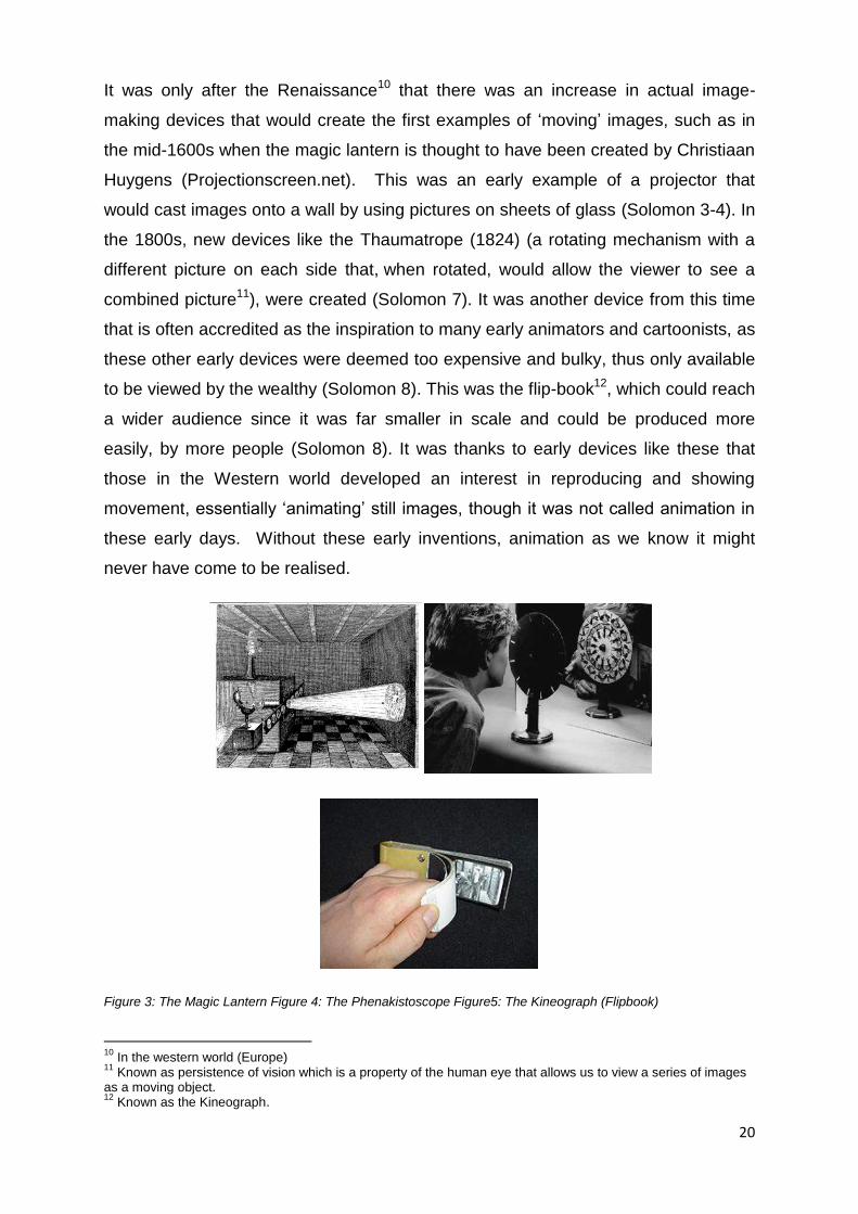
It was only after the Renaissance10 that there was an increase in actual image-
making devices that would create the first examples of ‘moving’ images, such as in
the mid-1600s when the magic lantern is thought to have been created by Christiaan
Huygens (Projectionscreen.net). This was an early example of a projector that
would cast images onto a wall by using pictures on sheets of glass (Solomon 3-4). In
the 1800s, new devices like the Thaumatrope (1824) (a rotating mechanism with a
different picture on each side that, when rotated, would allow the viewer to see a
combined picture11), were created (Solomon 7). It was another device from this time
that is often accredited as the inspiration to many early animators and cartoonists, as
these other early devices were deemed too expensive and bulky, thus only available
to be viewed by the wealthy (Solomon 8). This was the flip-book12, which could reach
a wider audience since it was far smaller in scale and could be produced more
easily, by more people (Solomon 8). It was thanks to early devices like these that
those in the Western world developed an interest in reproducing and showing
movement, essentially ‘animating’ still images, though it was not called animation in
these early days. Without these early inventions, animation as we know it might
never have come to be realised.
Figure 3: The Magic Lantern Figure 4: The Phenakistoscope Figure5: The Kineograph (Flipbook)
10
In the western world (Europe) 11
Known as persistence of vision which is a property of the human eye that allows us to view a series of images as a moving object. 12
Known as the Kineograph.
21
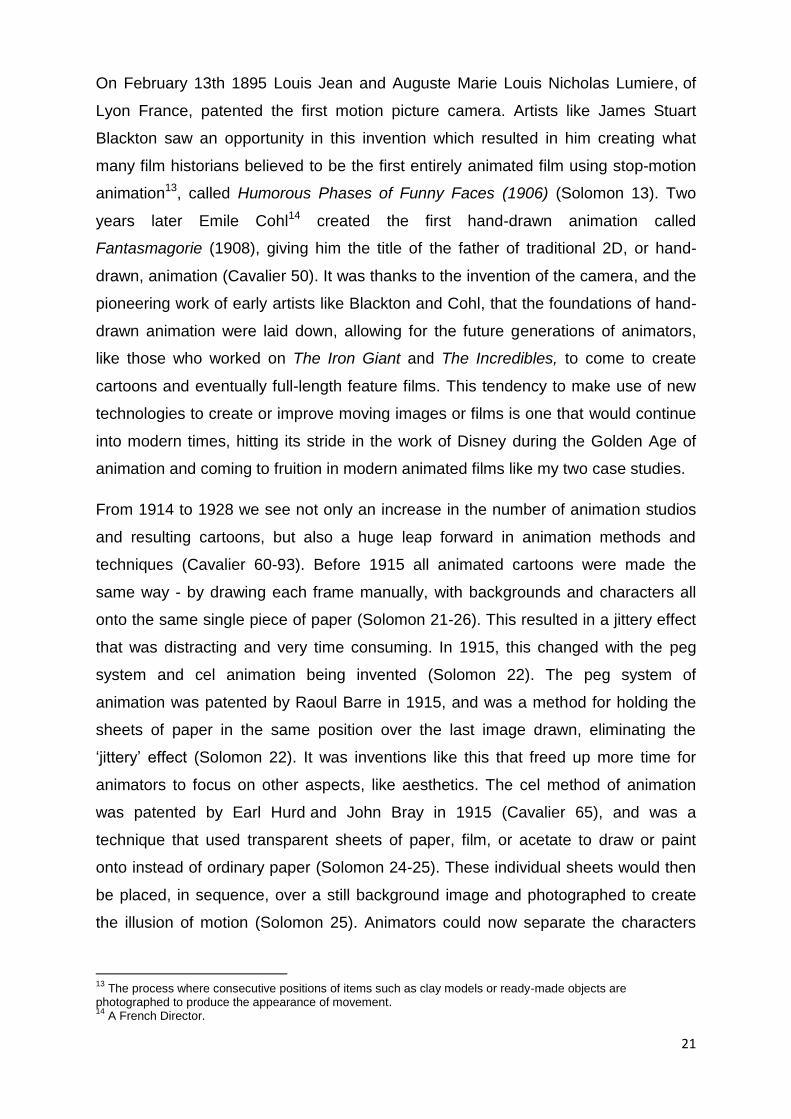
On February 13th 1895 Louis Jean and Auguste Marie Louis Nicholas Lumiere, of
Lyon France, patented the first motion picture camera. Artists like James Stuart
Blackton saw an opportunity in this invention which resulted in him creating what
many film historians believed to be the first entirely animated film using stop-motion
animation13, called Humorous Phases of Funny Faces (1906) (Solomon 13). Two
years later Emile Cohl14 created the first hand-drawn animation called
Fantasmagorie (1908), giving him the title of the father of traditional 2D, or hand-
drawn, animation (Cavalier 50). It was thanks to the invention of the camera, and the
pioneering work of early artists like Blackton and Cohl, that the foundations of hand-
drawn animation were laid down, allowing for the future generations of animators,
like those who worked on The Iron Giant and The Incredibles, to come to create
cartoons and eventually full-length feature films. This tendency to make use of new
technologies to create or improve moving images or films is one that would continue
into modern times, hitting its stride in the work of Disney during the Golden Age of
animation and coming to fruition in modern animated films like my two case studies.
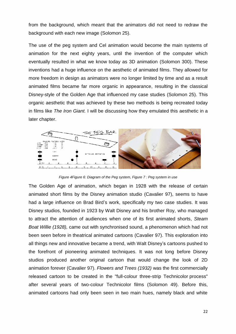
From 1914 to 1928 we see not only an increase in the number of animation studios
and resulting cartoons, but also a huge leap forward in animation methods and
techniques (Cavalier 60-93). Before 1915 all animated cartoons were made the
same way - by drawing each frame manually, with backgrounds and characters all
onto the same single piece of paper (Solomon 21-26). This resulted in a jittery effect
that was distracting and very time consuming. In 1915, this changed with the peg
system and cel animation being invented (Solomon 22). The peg system of
animation was patented by Raoul Barre in 1915, and was a method for holding the
sheets of paper in the same position over the last image drawn, eliminating the
‘jittery’ effect (Solomon 22). It was inventions like this that freed up more time for
animators to focus on other aspects, like aesthetics. The cel method of animation
was patented by Earl Hurd and John Bray in 1915 (Cavalier 65), and was a
technique that used transparent sheets of paper, film, or acetate to draw or paint
onto instead of ordinary paper (Solomon 24-25). These individual sheets would then
be placed, in sequence, over a still background image and photographed to create
the illusion of motion (Solomon 25). Animators could now separate the characters
13
The process where consecutive positions of items such as clay models or ready-made objects are photographed to produce the appearance of movement. 14
A French Director.
22
from the background, which meant that the animators did not need to redraw the
background with each new image (Solomon 25).
The use of the peg system and Cel animation would become the main systems of
animation for the next eighty years, until the invention of the computer which
eventually resulted in what we know today as 3D animation (Solomon 300). These
inventions had a huge influence on the aesthetic of animated films. They allowed for
more freedom in design as animators were no longer limited by time and as a result
animated films became far more organic in appearance, resulting in the classical
Disney-style of the Golden Age that influenced my case studies (Solomon 25). This
organic aesthetic that was achieved by these two methods is being recreated today
in films like The Iron Giant. I will be discussing how they emulated this aesthetic in a
later chapter.
Figure 4Figure 6: Diagram of the Peg system, Figure 7 : Peg system in use
The Golden Age of animation, which began in 1928 with the release of certain
animated short films by the Disney animation studio (Cavalier 97), seems to have
had a large influence on Brad Bird’s work, specifically my two case studies. It was
Disney studios, founded in 1923 by Walt Disney and his brother Roy, who managed
to attract the attention of audiences when one of its first animated shorts, Steam
Boat Willie (1928), came out with synchronised sound, a phenomenon which had not
been seen before in theatrical animated cartoons (Cavalier 97). This exploration into
all things new and innovative became a trend, with Walt Disney’s cartoons pushed to
the forefront of pioneering animated techniques. It was not long before Disney
studios produced another original cartoon that would change the look of 2D
animation forever (Cavalier 97). Flowers and Trees (1932) was the first commercially
released cartoon to be created in the "full-colour three-strip Technicolor process"
after several years of two-colour Technicolor films (Solomon 49). Before this,
animated cartoons had only been seen in two main hues, namely black and white
23
with some varying shades of grey amongst these monochromatic tones (Solomon
49).
I feel that looking at the style of films from this Golden Age is essential to my
discussion of the films The Iron Giant and The Incredibles because it is an aesthetic
that is closely mimicked within both films. Disney’s aesthetic during this period
represented a very specific movement in animation design that is closely linked to a
broader cultural and ideological framework of the time. Specifically, it is linked to the
cultural ideology of America and the American way of life in the first half of 20th
century. Bird’s use of this specific nostalgic aesthetic within the two animated films
that I will look at later, was possibly a way for him to comment on the cultural
framework of the America of his two animated worlds. I wish to discuss these
cultural implications of the Golden Age of animation and its relationship with
American nostalgia in terms of his two films, The Iron Giant and The Incredibles that
exemplify this specific nostalgic aesthetic style. This period in animation history is
important to my case studies as it is a specific aesthetic movement in animation that
is well documented and is a style that is easily recognisable. I believe it to be the
best way to link my aesthetic analysis of a modern animated film to a historical
context and ideas about nostalgia.
Many in the animation industry believe that it is thanks to Disney’s continued
obsession with innovation within the art of animation, that the animated cartoon
could develop and progress at an immense rate, resulting in cartoons becoming
more vibrant and appealing to audiences within just a few decades. It was Disney
who developed a new department that he called the ‘story department’, where the
‘storyboard artists’ were separated from the general animators for them to focus
exclusively on story development (Solomon 54). This decision would prove
worthwhile when the Disney studio released Three Little Pigs in 1933. This was one
of the first animated short-films to feature more than one well-developed character,
and was a hit with audiences across the country - though it must be said that its
popularity was also attributed to the catchy soundtrack within it (Cavalier 105). The
development of the story is paramount to the production of a successful film, and is
something emphasised by the director of both my case studies, Brad Bird.
Another invention that was a stepping stone in helping Disney studios create far
more detailed and realistic animations was the multi-plane camera (1933) (Solomon
24
58). The multi-plane camera was used to add depth to animated cartoons by placing
the hand-painted scenes onto various layers of glass plates, with different parts of
the scene being placed on different layers (Solomon 58). As the camera would move
vertically towards or away from the painted scene, the camera's viewpoint would
then appear to move through the various layers of artwork in a created '3D' space
(Solomon 58). This technique was invented at Disney’s studios and was first used in
the 1937 short film The Old Mill, part of their Silly Symphonies series. They tested
this technique in this short film in preparation for the studio’s first foray into a full-
length animated film, Snow White and the Seven Dwarfs, which was released later
that same year (Solomon 58).
To put it simply, it was Disney who pioneered the techniques that helped to make
characters far more appealing to audiences (Cavalier 106). This dedication to
creating engaging personalities is also what made Disney characters so much more
memorable to audiences, so memorable that these characters are still popular with
audiences nearly ninety years later. Characters like Mickey Mouse, Goofy, and even
the dwarves from Snow White, have a certain amount of nostalgic appeal to
audiences who grew up watching films and cartoons that came from this Golden Age
of animation. Like many characters from this time, they possess a certain appeal not
only in their overall designs, which usually revolved around big eyes and
exaggerated features, but also in what they represented to the people alive during
this time, and even the generations that followed.
Figure 8: Mickey Mouse propaganda poster retrieved from Pinterest (za.pinterest.com/pin/93660867221283223/)
Take Mickey, for example: in the beginning he was the ‘little guy’ that always
seemed to know how to get out of a bad situation, while also being the one who
stood up to the ‘big guy,’ represented by another of the oldest running Disney
25
characters, ‘Peg-Leg Pete’ the cat (Thomas 47). As time went on Mickey came to
represent not only the entire Disney studio, but to be considered a representation of
America and the American way of life. This may also stem from war time
‘propaganda’ films created during the early 1940s, which helped to keep Disney
studios afloat when many other studios were closing, while also fostering patriotism
in Americans (Murray 143).
This time in animation history has become crucial to understanding the history of
animation and what would eventually come to be referred to as the Golden Age of
animation. This is because it was during this time that American animation went
through an unprecedented growth and transformation which, until that point, had
previously been unexplored. It is generally agreed upon by writers on the subject,
like Michael Barrier and Norman Klein, that this Golden Age began with the release
of Disney’s Steamboat Willie in 1928 and came to an end with the advent of the
televised cartoon of the 1950s and 60s, with its demise beginning in the mid-1940s
after the Second World War (Klein 3, 243). Norman Klein explores the rise and
decline of the seven-minute animated cartoon in depth in his book Seven Minutes:
The Life and Death of the American Animated Cartoon (1996), and I have made use
of his in-depth knowledge on the subject throughout my discussion of this period.
This vastly important period of animation history seems to have begun with the
release of a single cartoon. Is this because Disney animation was so superior to the
other studios of that time, like the Fleischer Bros. studio? Klein states that this is not
the case, and he believes that this time frame is used not to “privilege Disney’s work
above Fleischer’s” but rather simply as a way to separate the eras of animation from
one another (Klein 3). What made Steamboat Willie, the first cartoon in a new era, so
important was the novelty of being one of the first cartoons to successfully be put to
sound, something that had never been seen before (Klein 3). Audiences were
amazed as they experienced the ‘real time’ sound effects of Mickey Mouse using
various farmyard animals as instruments (Klein 3). Animation, as opposed to live
action films of the same era, took to sound with veritable ease, as the drawn
characters were not limited by how to act with sound. In fact, many silent film stars
could not make the transition to sound because of this (Klein 3).
In comparison, the animated short film was not only not limited by the addition of
sound, but was freed by it. The animated cartoon was able to achieve an immediate
26
“synthesis with sound” that the live action film would take decades to perfect (Klein
3). Like the live action film, however, there were a few casualties to the advent of
sound, with silent cartoon stars like Felix the Cat falling away (Klein 3-4). Unlike
Disney short films, the cartoons featuring the mischievous black cat from Sullivan’s
studios did not immediately transfer into sound and by the time the studio owner, Pat
Sullivan, made the change, Disney’s Mickey Mouse was already being established
as the new animated superstar (Klein 3-4). This addition of sound was one of the
factors that helped animation grow within the film industry from a sub-section of
special effects into its own medium, though still relatively small during the thirties and
forties (Klein 3-4). While the addition of sound to cartoons is a development that
happened right at the beginning of the Golden Age, it was the development that
allowed for exponential growth in the industry, leading to the time in animation
history of exponential growth which possesses the nostalgic appeal that most
modern audiences recognise. It is not the time that my case studies deal with
specifically, but it immediately foreshadows it.
For the next half dozen years, these seven-minute theatrical cartoons relied on the
novelty of sound and characters with voices to draw audiences into theatres. The
aesthetic style, however, remained relatively unchanged with the animators of this
time continuing a tradition of a graphic narrative which dated back to the eighteenth
century, but stemmed specifically from the illustrations of the nineteenth century
(Klein 3-18). This would not last, however, as only twelve years after the release of
Steamboat Willie, the feature length film Fantasia was released in 1940, possessing
many different styles of 2D animation (Barrier 279). This jump in style is so great
that it could be compared to painting jumping from the flat, conventional style of the
Byzantine icons to the rich 3D dimensionalities of a Rembrandt portrait in just over a
decade.
The few feature length Disney animated films that would come out of the 40s and
50s would also be influenced by the graphic style of the previous decade leading up
to them (Barrier 9-62). It was in the 30s that Disney’s studio laid out an aesthetic that
would dominate its films aesthetics for decades to come, arguably even into modern
times (Barrier 63-151). With the release of Snow White and the Seven Dwarfs in
1937, Disney’s aesthetic style morphed from the free-flowing, rubber hose style of
the early Mickey Mouse cartoons, to a fuller, more faithful style of animation that
27
sought to create characters that adhered more to the laws of physics, which was
seen more in the illustration style coming out of Europe at the time (Barrier 63-108).
As animation historian Michael Barrier said in his 1999 book Hollywood Cartoons:
American Animation in its Golden Age, “by the end of the 1930s, cartoon makers
could animate characters that all but dared their audiences not to believe in their
existence” (Barrier, 3). Snow White was also the first instance of Disney trying to
move away from the hard-black outlines that dominated early cartoons, instead
giving the characters coloured outlines that would blend into the main colours of the
characters. Films like Cinderella (1950s), Alice in Wonderland (1951), Peter Pan
(1953), Lady and The Tramp (1955) and Sleeping Beauty (1959), and eventually The
Iron Giant (1998), all attempted to continue in this specific aesthetic, which followed
the European illustration style that Disney had been after.
This immense growth in animation’s aesthetic can be attributed to the hard work and
dedication of Walt Disney and the talented artists he employed (Barrier 109-151).
This is because almost every tool and technique in 2D animation was discovered,
invented, or perfected in the Disney animation studio during this time (Barrier 109-
151). Systems like the peg bar and cel animation method were perfected at the
studio, and the multi-plane camera was invented there and used as a stepping stone
towards creating an illusion of depth in 2D films. Many animated films of today are
still judged by this standard of animation which those Disney artists created over half
a century ago. The Iron Giant and The Incredibles are examples of modern
animated films that still adhere to this aesthetic of animation from the Golden Age.
They did not just mimic the aesthetic of these older animated films like Peter Pan
(1953) but are indebted to them for setting out and perfecting the principles of
animation that are still used today. The Iron Giant is a continuation of the styles and
production methods implemented during this time at Disney, as they make use of
their animation aesthetics to create feelings of nostalgia in modern audiences. They
do this by using character designs and an organic softness in the overall look and
feel of the film, which is akin to that of characters and films from this period in
animation history, reminding audiences of the films that they were fond of during
their youth. They chose to create an organic aesthetic similar to the animated films
produced during the Golden Age of animation (see below).

28
Figure 9: Screen grab from Peter Pan (1953); Figure 10: Screen grab from The Iron Giant (1999)
The technological developments during this time and the use of specific principles of
animation helped Disney to establish the specific aesthetic that this period in
animation history is best known for. This is a look that leans more to a sense of
organic realism, employing accurate laws of physics which had not been seen before
in the theatrical cartoons of the previous decades. They could create appealing
characters that were not real, but still possessed enough realism to be believable on
screen. This dedication to realism, even in a caricatured form, clearly influenced my
two case studies. They both created fantastical stories that were still based in
realistic laws of physics to create a sense of believability within the stories. I believe
that the creators of The Iron Giant specifically wanted to recreate the overall feel of
the Golden Age of Disney films to exploit the feelings of nostalgia within audiences
for this period.
The development of new animating techniques did not end with the Golden Age with
other processes that came after also deserving to be mentioned. One of these is the
Xerography which was first tested in animations at the Disney studio during the late
1950s at the end of the Golden Age, starting with Sleeping Beauty (1959) by one of
its most talented animators, Ub Iwerks (Cavalier 182-183). It was then fully applied to
the next Disney film, One Hundred and One Dalmatians (1961). This copying
technique allowed for the animator’s hand drawn images to be copied directly onto
the transparent cels, which eliminated much of the ‘inking’ part of the ink-and-paint
process that Disney had perfected at that point, speeding up the process of inking
cels exponentially (Cavalier 182-83). The biggest drawback was the fact that they
could only ink the outlines in black which created an aesthetic similar to the cartoons
that predated the Golden Age, before colour and sound which resulted in the films of
this era losing the smooth organic aesthetic of their Golden Age (Cavalier 246) as It

29
was during the Golden Age that the outlines had begun to be done in darker tones of
the characters main colours. This problem with Xerography would eventually be
overcome when Disney's 2D department started using computer technology, by
using them to ink the outlines and colour in their drawn cels as another way to speed
up the animation process, eliminating the by-hand ink-and-paint process altogether
(Cavalier 246).
Figure 9: Screen Grab from Peter Pan (1953), Figure 10: Screen Grab from One Hundred and One Dalmatians (1961)
With the help of computers and digital inking and painting systems, Disney could
recreate the smooth and seamlessly blended colour outlines that they were originally
known for (Cavalier 246). As a result, Disney's animators were no longer limited in
the way that they could make the visual aesthetic of these new films appear. If they
now chose to create characters with strong outlines, it was an aesthetic choice,
rather than a limitation of technology (Solomon 309-316). As John Lasseter of Pixar
said, “The art challenges the technology, and the technology inspires the art” (Wells,
2006). This means that by the time the creators of The Iron Giant started to work on
their aesthetic style for the film, they had almost unlimited freedom when it came to
designing the film as they were no longer stunted by the technology. They chose to
go with an aesthetic that fit the timeline of the story, creating an organic aesthetic
similar to the animated films of the Golden Age. I believe they did this because, as
mentioned in my previous chapter, they were trying to tap into feelings of nostalgia
that American audiences have for the animation that era, as well as for the time
period in American history portrayed in the film. I will be exploring this use of a
certain aesthetic within the film in order to create feelings of nostalgia in my next
chapter on The Iron Giant.
As both of my main case studies make use of 3D / CGI animation I will now briefly
consider the history of this newer medium of animation by looking specifically at the
work of Pixar animation studio. 3D, or computer-generated imagery, is the method of
30
animating that entails taking digitally created objects and characters and making
them move within these programs (Furniss 173-174). Most animation today is done
using 3D as, generally, it has proved to be faster than traditional 2D animation during
the actual production phase, though many still prefer some form of 2D animation for
pre-production planning (Solomon 303). Today, the majority of animated films being
released are almost exclusively all 3D / CGI films, with a few noted exceptions being
the 2D manga coming out of Japan and the stop-motion animated films coming out
of companies like Laika animation studio.
In the beginning, 3D animation started out in the same way as 2D animation, with
limitations in what the studios could produce because of the technology that was
available to them at the time. They had to consider the kind of aesthetic that their
burgeoning technology would be able to produce. For example, in its early days the
Pixar animation studio could not produce realistic or appealing humanoid
characters15 (Price 1-45). As a result, Pixar chose to focus on producing characters
that were ‘stiff’ in appearance. They focused on toys and bugs as an adequate
replacement for humanoid or organic characters, until such time that they had
access to better technology that would allow for more organic kinds of characters
(Furniss 187). As they progressed, they were able to improve on their rendering
program, RenderMan, which is a program that tries to create multifaceted,
photorealistic images that are nearly indistinguishable from live action images, to
such a point that they could produce characters whose visual aesthetics was far
more appealing and believable (Pixar, ‘A Brief Introduction To RenderMan’). By the
time Monsters Inc. and Finding Nemo arrived on the scene in the early 2000s,
Pixar’s animating technology had reached a point where believable and appealing
organic characters could be produced (Cavalier 50). Add to this their explorations
into animating hair as well as characters under water, and Pixar (indeed all 3D
animation) had progressed to a similar place as Disney in the mid-1990s (Price 1-45)
just in time for the creation of their next feature film, The Incredibles.
There is an inherent difference between 2D / traditional animation and 3D / CGI
animation. 2D animation, as discussed, started with a method where images were
drawn first onto sheets of paper, then plastic transparent sheets called cels, and
finally in computer programs that did all the drawing, inking and painting for the
15
A good example of this being the blocky and downright scary 'Baby' from its 1988 short film Tin Toy (Furniss).
31
animator. 2D animation works on an X and Y axis while 3D animation works on the
X, Y and Z axis, meaning that one can see the 3D animated objects’ height, width
and depth (DBS Interactive 2010). 2D images, being hand-drawn, possessed a
specific aesthetic that was flat, organic and free flowing in nature. Once certain
developments like the peg system and cel sheets were invented, the process of 2D
animating was far freer, being able to portray anything if the animator could just
imagine and draw it (DBS Interactive 2010). An advantage with 2D animation is that,
to many, it is far easier to connect to a simple drawn representation of a character
than a more accurate and realistic representation of the same character. This has
something to do with a term coined by the author Scott McCloud, called the ‘picture
plane’.
In his book, Understanding Comics (1993) McCloud talks about how the mind
processes the language of comics or images when placed in sequence to each other
with the intent of producing an aesthetic response in viewers. When comparing non-
pictorial and pictorial icons, the non-pictorial icons have meanings that are fixed,
while the pictorial icons can be more fluid and variable and can differ to their real-life
counterparts. This applies to drawn images of faces, as, no matter how detailed a
drawing is of a face, it can never be a true replica of a human face (McCloud 28). In
terms of the drawn or comic face, why is it that a simplified representation of a face
is more appealing to people than a photograph or more realistic image of a face?
McCloud states that though we might abstract an image through cartooning, it does
not mean that we are eliminating details, but rather focusing on specific details that
we feel are more important (McCloud 29). Simply put, when drawing a human face,
a cartoonist is essentially “amplifying through simplification”; by simplifying an image
to its basic elements, a cartoonist can amplify its meaning in a way that realistic
drawings cannot (McCloud 30).
Another aspect to cartooning that is important to my examination of both case
studies is its ‘universality’ (McCloud 31). The more simplified a face is, the more
people it could be seen to represent. McCloud believes, and I agree, that we as
humans cannot help but see ourselves in everything, as we are a naturally self-
centred race (McCloud 32). The reason that we can relate more to a simplified
representation of a face is that when we look at a detailed drawing or photograph of
a face we see it as a depiction of a specific person, but when we look at a simpler
32
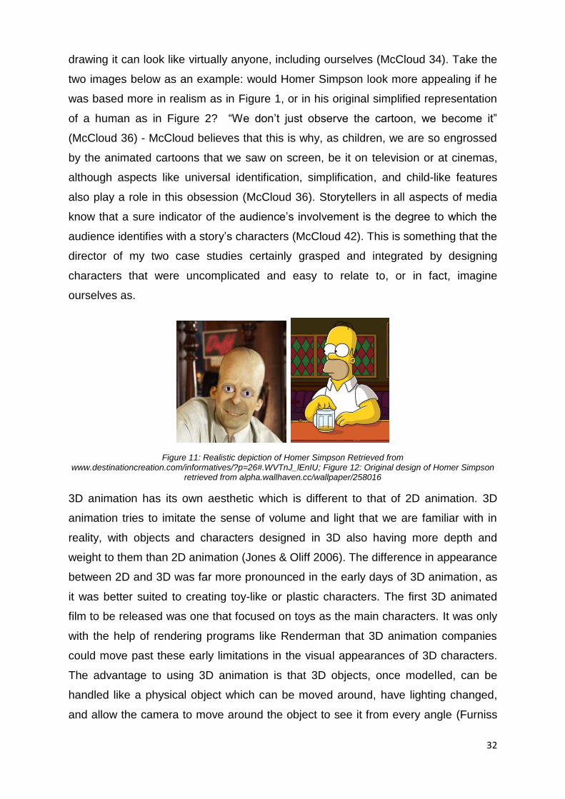
drawing it can look like virtually anyone, including ourselves (McCloud 34). Take the
two images below as an example: would Homer Simpson look more appealing if he
was based more in realism as in Figure 1, or in his original simplified representation
of a human as in Figure 2? “We don’t just observe the cartoon, we become it”
(McCloud 36) - McCloud believes that this is why, as children, we are so engrossed
by the animated cartoons that we saw on screen, be it on television or at cinemas,
although aspects like universal identification, simplification, and child-like features
also play a role in this obsession (McCloud 36). Storytellers in all aspects of media
know that a sure indicator of the audience’s involvement is the degree to which the
audience identifies with a story’s characters (McCloud 42). This is something that the
director of my two case studies certainly grasped and integrated by designing
characters that were uncomplicated and easy to relate to, or in fact, imagine
ourselves as.
Figure 11: Realistic depiction of Homer Simpson Retrieved from www.destinationcreation.com/informatives/?p=26#.WVTnJ_lEnIU; Figure 12: Original design of Homer Simpson
retrieved from alpha.wallhaven.cc/wallpaper/258016
3D animation has its own aesthetic which is different to that of 2D animation. 3D
animation tries to imitate the sense of volume and light that we are familiar with in
reality, with objects and characters designed in 3D also having more depth and
weight to them than 2D animation (Jones & Oliff 2006). The difference in appearance
between 2D and 3D was far more pronounced in the early days of 3D animation, as
it was better suited to creating toy-like or plastic characters. The first 3D animated
film to be released was one that focused on toys as the main characters. It was only
with the help of rendering programs like Renderman that 3D animation companies
could move past these early limitations in the visual appearances of 3D characters.
The advantage to using 3D animation is that 3D objects, once modelled, can be
handled like a physical object which can be moved around, have lighting changed,
and allow the camera to move around the object to see it from every angle (Furniss

33
178). This is not possible in traditional animation, as to ‘move’ a camera in 2D means
that the entire scene needs to be redrawn. Objects or characters in 3D animation
can also be far more realistic, as you can add real textures and lighting to them to
make them appear more solid, so much so that they can now be integrated almost
seamlessly into live video. Some earlier examples were films like Back to the Future
(1989), The Mask (2994), Jumanji (1995) and Jurassic Park (1993) (Furniss 181).
Figure 13: example of a 2D globe vs. a 3D globe
It was inventions like the cel animation method, the peg system, the multi-plane
camera and the Xerography machine which enabled animated cartoons to be
produced at a much faster rate than previous cartoons, resulting in an increase in the
number of cartoons and animated films being made during the twentieth century. It is
because of this newfound speed in production from inventions like these that there
was more of a chance for animators to focus on the aesthetic look of the cartoons as
well as focusing on developing the stories lines and appeal of the characters. These
early developments within the production of animated cinematic cartoons resulted in
an overall sense of freedom in the medium for the next eighty or so years. By the
time that The Iron Giant was put into production in the late 1990s, the animators of
the film could explore and experiment within the 2D medium as they were no longer
limited by time.
Many companies were now able to create numerous kinds of animated stories
because they were no longer limited by the technology of the time, allowing for great
freedom in the production of new 2D animated films (Solomon 325-330). Disney’s
animation studios had now been operating for over 60 years, and had reached a

34
point where they were able to experiment more with the actual look of the film
(Cavalier 282-314). As in its Golden Age, Disney’s studio was producing feature
length films that exceeded any previous successes: films like, The Little Mermaid
(1989), Beauty and the Beast (1991) and The Lion King (1994) were all produced
during this period and attracted unprecedented acclaim for the animation giant
(Cavalier 282-314). Though The Iron Giant and The Incredibles are not Disney films,
they very clearly exemplify the style of animation to come out of the studio from its
Golden Age in a homage to a more classical style of animation. I believe that this
referencing of an older aesthetic of animation is, again, the studio trying to play on
the audience’s sense of nostalgia for this older cartoon aesthetic.
3D animation, on the other hand, did in approximately 20 years what it had taken
Disney nearly 60 years to achieve. Although studios like Pixar basically had to create
its 3D programs from scratch, it must be said that Pixar may have had the advantage
over Disney; since Pixar had access to many ready-made tools that were mostly
complete (like the computers that allowed them to progress at a phenomenal rate)
and they were doing this at a time where animation was a serious part of the
cinematic world16. Disney, on the other hand, was creating a lot of its tools,
processes, and technologies from scratch in a period when animation was a by-
product of cinema instead of a serious category like it would become in Pixar's time
(Animation Academy 2011). It is because of the computer that 3D animation has so
much more freedom within the visual techniques and overall appearances of
contemporary animated films. Whether in the advancement within early 2D
animation, or the developments of advanced computer programs like RenderMan in
3D animation, these advancements within the medium of animation allowed the
freedom to choose the overall aesthetics of an animated film, be it focused on
realism or a more organic, cartoonish aesthetic (Animation Academy 2011).
These advancements in the animation industry, and the freedom in aesthetics that
they brought, meant that the creators of animated films like The Iron Giant and The
Incredibles could choose to create specific aesthetics that they felt would appeal to
audiences as they responded to the feelings of nostalgia that they felt for the
animation styles of their youth. Thanks to a number of innovations in animation
during its first few decades, contemporary animation companies have now
16
Like Disney, they also had massive funding from the military in their early days.

35
progressed to a point where the limitations of the technology no longer limit the
overall aesthetic of the films (Solomon 25). I have found that many modern animated
films have chosen to make use of specific aesthetics which tap into the nostalgia that
audiences have for specific themes and cartoon styles that they remember from their
youth, as defined by Reynolds in the previous chapter (Reynolds xii-xiii).
The theme of nostalgia is one that is not only used in animated films, but can
essentially be found in all walks of contemporary life and mass media (Reynolds xii-
xiii). From numerous live action films remaking older classics and pumping out
sequel after sequel, to old cartoon characters that are being printed onto
merchandise, contemporary music sampling older songs, to constant revivals of
fashion trends, nostalgia is everywhere in modern consumer culture as it is a trend
that has proven to be very lucrative to companies. The next chapter will be delving
into this theme of nostalgia, specifically within my two case studies, The Iron Giant
and The Incredible, and how the studios that created them were trying to recreate
the animation style of older animations to tap into the audience’s nostalgia for that
specific animation aesthetic.
36
Chapter Three: Analysis of Nostalgia within two contemporary animated films.
The Iron Giant
This chapter will look at scenes from the film The Iron Giant (1999) in terms of their
overall feel of nostalgia, and in terms of the of the animators’ desire to create a
specific 2D aesthetic which they were able to achieve thanks to the techniques they
used, these techniques having been perfected in traditional animation and now
applied to a 3D character. They did this by utilising new technologies, like a program
which allowed them to ‘wobble’ the lines of a 3D character to give it a more organic
2D animation feel. They generated a sense of nostalgic aesthetic within the film,
namely in the visual designs and the story itself, which were both heavily influenced
by the 2D animation that emerged from America in the 1940s, 50s, and 60s, which
located The Iron Giant in American history or Americans’ ‘idea’ thereof. The
aesthetic that Director Brad Bird creates in The Iron Giant is very indicative of that
sense of nostalgia. I wish to show that this film emanated from a sentimentality for a
certain animation style from a specific time in American history (the 1950s), and that
this nostalgia was not only seen in the mimesis of the film but also within the
nostalgic elements of the visual design which were injected into the film.
The Iron Giant is a hybrid animation film released by Warner Brothers studio in 1999
and is a science fiction / comedy-drama / action film that made use of not just 2D
‘traditional’ animation, but was one of the first 2D animated films to successfully
make use of 3D or CGI animation within it. As mentioned it was produced by Warner
Bros. animation studio which, at the time of its release, was a 2D animation studio.
The Iron Giant was released when 3D animation was just starting to boom, with the
first full 3D animated film having only been released four years earlier17 (Cavalier). It
was also the directorial debut of Brad Bird, who would go on to direct Pixar films
such as The Incredibles (2004), which I will be discussing later, and Ratatouille
(2007), both of which received critical acclaim and enormous box office success,
cementing Bird’s name in history as an immensely talented director.
Bird, who was the director and writer of the film, was given a huge opportunity when
it came to the making of The Iron Giant, namely the full backing of the Warner Bros.
17
Toy Story 1995
37
animation studio, while also maintaining the creative self-sufficiency and free spirit
that defines Bird as a ground-breaking animator and director (Warner Brothers Inc
1999). When interviewed, he stated that "Warner Bros. gave us the strongest
support to create ‘The Iron Giant’ and allowed us an unbelievable amount of creative
freedom to put our ideas up on the screen” (Warner Brothers Inc 1999). When it
came to the animation of the film, the animators of The Iron Giant had an
unprecedented amount of creative freedom. This was largely due to the failure of
Warner Bros. previous animated film Quest for Camelot (1998) which resulted in the
studio having to give the film both a smaller budget and a set timeframe in which to
finish18 (Warner Brothers Inc, 1999). Quest for Camelot failed because the only thing
the company was interested in was making a profit - this, along with the fact that the
animators were rushed to finish the film by a certain deadline, and that the second
director Frederik Du Chau decided to turn the film into a Disney-musical clone. All of
this lead to a film with no heart and an unappealing story. The Iron Giant also had a
time constraint, one that was even shorter than Quest for Camelot, which director
Brad Bird says essentially meant that they had "one-third of the money of a Disney
film and half of the production schedule" (Warner Brothers Inc 1999). But, for Bird it
was not the money that was important, it was what they could do with the medium
that was exciting and new. In an interview in the McKinsey Quarterly, Bird said that “I
want my films to make money, but money is just fuel for the rocket. What I really
want to do is to go somewhere. I don’t want to just collect more fuel.” (Hayagreeva,
Sutton, & Webb 2008)
To most people this would be a difficult situation for the animators to be in and most
other animators or directors would crumble under the pressure, like in The Quest for
Camelot; Bird, however, did not see it this way. He claimed that this, in fact, meant
that the studio basically left the animators to their own devices, unlike The Quest for
Camelot - as long as they showed company heads that they were producing the film
responsibly while getting it done on schedule (Warner Brothers Inc 1999). This
meant that he and his animators had more creative freedom, with Bird even claiming
that it was a film that was "fully-made by the animation team", which is not something
that could be said for most other animation studios of the time (Warner Brothers Inc
1999). This film was basically an ‘animator-driven’ film instead of the usual
18
The Quest for Camelot was released the year before, losing the studio over $40 million. (IMDd-
Quest for Camelot)

38
‘producer-driven’ film that is controlled by a few executives, which is what happened
with the previous Quest for Camelot (Warner Brothers Inc 1999). This meant that the
animators of The Iron Giant could focus on perfecting the overall 2D aesthetic of the
film, while paying homage to an older style of animation, without being pressured
into creating an aesthetic that did not fit the story that Bird had written.
The Iron Giant was based on the novel The Iron Man, written by Ted Hughes and
released in 1968 (Warner Brothers Inc 1999). The film follows the novel reasonably
closely with a few notable changes, the most important being that Bird chose to alter
it by setting it in America instead of England. This is a crucial change to the story as
it played into the nostalgic Golden Age American animation style that dominated the
aesthetic of the film. I believe that Bird chose to change the setting of the film from
late 1960s Britain to the North East of mid-1950s America to engage with the
nostalgia prevalent in the American mythos. I imagine that Bird did this because he
explicitly wanted to discuss this nostalgic element of American culture from this
specific time period, engaging American reminiscence - I believe he did this because
he wanted the audience to connect with the story and that time in American history
which he believed they idealised. He also changed the story by adding a few extra
characters, such as Kent Mansley as the main villain, a personification of the
paranoia that was rife in Cold War America, and Dean McCoppin as a friend and ally
to the main characters, Hogarth Hughes and the giant robot (Warner Brothers Inc
1999). As mentioned, the story is set in America during the beginning of the Cold
War in 1957, and is about a young boy (Hogarth) who discovers a gigantic metal
robot who has fallen from space. We watch as Hogarth tries to keep this 'metal man'
a secret, with the help of his beatnik friend Dean McCoppin, from the U.S. military
and the obsessed federal agent, Kent Mansley.
Warner Bros. animation studio began development on the film in 1994 as a musical,
like its predecessor Quest for Camelot. It was not until Brad Bird signed on as the
director in 1996 and hired the writer Tim McCanlies to write the screenplay that the
idea of a 2D Disney-styled musical was abandoned in favour of a more serious story
(Warner Brothers Inc 1999). It was created by use of traditional animation, with 3D
or CGI used to animate the main character, the Iron Giant himself (Warner Brothers
Inc 1999). In spite of being made in half the time and with half the usual budget, the
film went on to receive widespread critical acclaim from film and animation critics
39
worldwide. It was nominated for numerous awards and even won several19 (Warner
Brothers Inc 1999).
However, regardless of the numerous accolades that the film generated, and even
though The Iron Giant would go on to be considered a cult classic in later years, at
the time of its release it performed dismally at the box office, having only made
$31.3million against its $70.8million budget, an overall result that was blamed on its
poor marketing campaign (IMDb, Internet Movie Database). It was only later, in
home video releases and a television syndication, that the film became what is called
a ‘sleeper hit’ and gathered a cult following. Now it is regarded by many as a modern
animated classic with an extended and re-mastered version of the film being re-
released theatrically in 2015 (IMDb, Internet Movie Database). I believe that the
reason The Iron Giant became a sleeper hit was due largely to the overall nostalgic
appeal of not only the 2D animation aesthetic of the film, but because of the
nostalgic nature of the 1950s style narrative and design choices of the film.
Fundamentally, it was a sense of nostalgia for the older aesthetic of 2D animation
that drove the animators to try to completely integrate the 3D character of the giant
into the 2D nature of the film to maintain the overall nostalgic sense of the 1950s
style 2D animation. The obsession with this period in American was not only seen in
the functional 2D aesthetic style of the film, but is also evident in the narrative
elements that were injected into the story to mimic the nature of life and animation
popular in America in the 1950s and 60s.
The base of the story revolves around a very basic story arch, that of a boy and his
companion. It begins in America in 1957, during a time when the American populous
was extremely paranoid and suspicious of anything foreign and ‘un-American’, at the
beginning of the Cold War (Warner Brothers Inc 1999). The American public was
very interested in new technology and how it was going to change the world, but they
were also paranoid about its negative values. There’s a kind of inconsistent quality to
the general feel of that time, which is like modern feelings of xenophobia towards
foreigners. These feelings the American public had towards new or foreign things
during that period are similar to modern fears surrounding invasive online technology
and international terrorism, and could be why the 1950s in America is so interesting
19
It won nine Annie Awards out of the fifteen it was nominated for.

40
to modern audiences: as a comparison could be drawn between that time and our
own.
The entire film, from the style of the animation or aesthetics, to the story and design
of characters, reflects this time in America. Shortly after the launch of the first
satellite into space20, an unidentified object lands in the ocean just off the coast of
America near the fictional town of Rockwell in the state of Maine (Warner Brothers
Inc 1999). This object turns out to be a giant, metal-eating, metal robot that, while
destructive, is proved throughout the film to be harmless. Through the giant’s
friendship with the young Hogarth (thanks to Hogarth saving his life) we, as the
viewers, are shown that not all things that are different are bad, a fear that
dominated American life during the Cold War. By highlighting and revisiting the
everyday life of Americans during this period in history, Bird and his team could play
on audience’s nostalgia for that time. Though Bird is using the inherent nostalgia that
the American people have for this period in history and the animation aesthetic of
that time to create feelings of longing for that time, he is also dealing with the darker
side, using the film to critique that period. He uses the feelings of paranoia that the
American people had for the Soviets at that time by anthropomorphising it into the
form of the robot.
What follows is a story of discovering new friends and of a boy trying to protect this
friend. Alongside this is the theme that 'you can be whoever you choose to be' which
is repeated several times throughout the film by the main character Hogarth when he
tells the robot that "you are who you choose to be," meaning that the robot does not
need to be evil if he chooses not to (Warner Brothers Inc 1999). This would have
been a relevant part of the American ideology of that time, which was in apparent
opposition to the beliefs of the Soviet Union, their great enemy of that time. It is the
simplistic interpretation of the Soviet ideology that was sold to the American public
by their own propaganda engine. This is proved when the giant, whom Hogarth has
managed to keep hidden until this point, shows himself to the townspeople to save
the lives of two young boys. The theme finally comes to a climax at the end of the
film when the robot makes the choice to stop attacking the U.S. military and instead
sacrifices itself to save the humans who had just been attacking him. The robot
makes the choice to save his friends and the place he has been most happy, even
20
The Russian Sputnik on October 4th, 1957
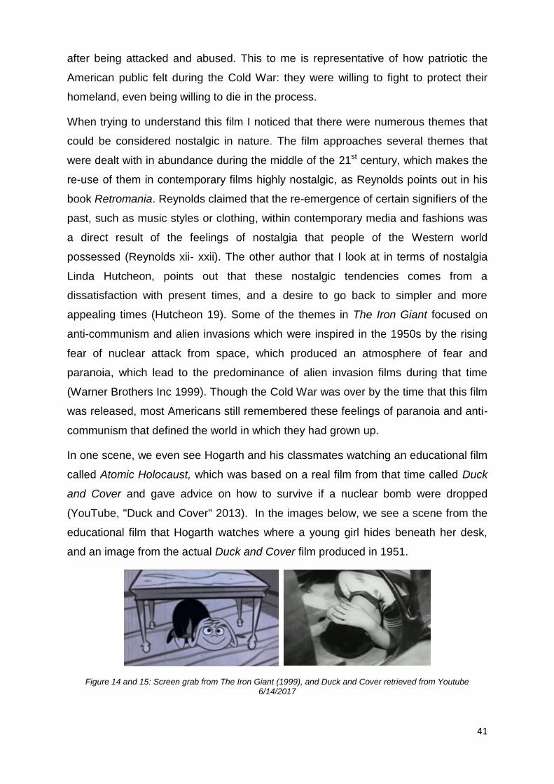
41
after being attacked and abused. This to me is representative of how patriotic the
American public felt during the Cold War: they were willing to fight to protect their
homeland, even being willing to die in the process.
When trying to understand this film I noticed that there were numerous themes that
could be considered nostalgic in nature. The film approaches several themes that
were dealt with in abundance during the middle of the 21st century, which makes the
re-use of them in contemporary films highly nostalgic, as Reynolds points out in his
book Retromania. Reynolds claimed that the re-emergence of certain signifiers of the
past, such as music styles or clothing, within contemporary media and fashions was
a direct result of the feelings of nostalgia that people of the Western world
possessed (Reynolds xii- xxii). The other author that I look at in terms of nostalgia
Linda Hutcheon, points out that these nostalgic tendencies comes from a
dissatisfaction with present times, and a desire to go back to simpler and more
appealing times (Hutcheon 19). Some of the themes in The Iron Giant focused on
anti-communism and alien invasions which were inspired in the 1950s by the rising
fear of nuclear attack from space, which produced an atmosphere of fear and
paranoia, which lead to the predominance of alien invasion films during that time
(Warner Brothers Inc 1999). Though the Cold War was over by the time that this film
was released, most Americans still remembered these feelings of paranoia and anti-
communism that defined the world in which they had grown up.
In one scene, we even see Hogarth and his classmates watching an educational film
called Atomic Holocaust, which was based on a real film from that time called Duck
and Cover and gave advice on how to survive if a nuclear bomb were dropped
(YouTube, "Duck and Cover" 2013). In the images below, we see a scene from the
educational film that Hogarth watches where a young girl hides beneath her desk,
and an image from the actual Duck and Cover film produced in 1951.
Figure 14 and 15: Screen grab from The Iron Giant (1999), and Duck and Cover retrieved from Youtube 6/14/2017
42
This film within the film is a more obvious element of nostalgia, as it is something
that most Americans would have been familiar with as either they, or their parents,
had seen this ‘educational film’ at some point in their lives. It tries to play into
audience’s feelings of nostalgia for the days of their youth, or for the days that their
parents told stories about when things were ‘better’. There are, of course, other
themes from the film that may not be nostalgic, themes that were more popular in
films all over the world at the time of The Iron Giant’s release. Some of these themes
dealt with nonviolence and individualism, such as how throughout the film, guns are
bad with Hogarth saying that "guns kill" and denying that the giant is just a giant
weapon, stating that "you are who you choose to be" (Brad Bird, The Iron Giant
1999). In one of the original pitches for the film, Bird even said that he described the
story of the film as "what if a gun had a soul" (Warner Brothers Inc 1999).
The first scene in The Iron Giant that I wish to examine in terms of its overall 2D
aesthetic and visual techniques, is the 'lake scene' in which the main characters
Hogarth, Dean and the Iron Giant decide to go for a swim in the local lake. I decided
to make use of this scene because it is a good example of where we see the 3D
character of the Iron Giant is seen interacting with the environment: the animators
went to great lengths to make sure that he was painted to fit into not only this scene,
but the entire film. Bird wanted to make sure that the character of the Iron Giant was
believable as a character, as well as fitting into the overall design of the film. When
bringing a 3D character into a 2D environment in a believable way, the creators of
the film did not want the audience to be able to see an obvious difference between
the main characters and the Iron Giant. As a result they spent a great deal of time
considering how to merge the 3D character of the giant into a 2D world (Warner
Brothers Inc 1999).
To me this is a clear example within this film of nostalgia for the older aesthetic of 2D
animation. Because Bird had a very specific visual design aesthetic in mind for this
film, he would not have wanted the main character to stand out as an ill-fitting
element of the film (Warner Brothers Inc 1999). However, it must be mentioned that
this dedication to creating a unified 2D aesthetic could be just that: ensuring that the
character of the Iron Giant fitted in with the aesthetic of the rest of the film to
guarantee a unified and well-integrated overall aesthetic. Nevertheless, I also believe
that Bird and the animators wanted to use these feelings of nostalgia for an older
aesthetic of animation that was more graphic in nature, and applied this style to the

43
film because they believed that audiences would respond to this kind of nostalgia.
Reynolds said that "A component of nostalgia can actually be a hankering for a time
before time," referring to the things that were popular when we or our parents were
children, which could include the animated television shows and cartoons that
audiences, and maybe even Bird and his animators, were watching when they were
children (Reynolds xxii), like cartoons made in the 40s and 50s in America that were
recycled repeatedly until recent times. These feelings of nostalgia were shared with
their target audience, who had grown up watching the same cartoons.
It is prudent to discuss why they chose put all this effort into making a 3D character
look 2D, instead of simply creating a 2D character to begin with. When considering
how to make the character of the Iron Giant, it was decided early on that they would
make use of 3D animating techniques to make the giant, as it was believed that
drawing the character in 2D would not give the character the sense of weight and
presence that Bird wanted (Warner Brothers Inc 1999). Bird states that "It is difficult
for a human to draw a big, solid metallic object. Animators excel at drawing
movement and living, fluid objects" (Warner Brothers Inc1999). Basically, Bird is
saying that although, 2D animators do extremely well at producing a drawing
showing flexibility and movement, they would still struggle to draw large, unyielding
metal objects like the giant (Warner Brothers Inc 1999).
Figure 16: Screen Grab from The Iron Giant (1999)
This nostalgic desire to hold the aesthetic of this film to a specific 2D design can be
seen in how the animators who worked on the colour of the giant made sure that the
giant would blend into the colours of the environment and the other characters. This
was possible because these colour artists were also working on the colour scheme
of the other characters, and could make sure they all fit together coherently (Warner
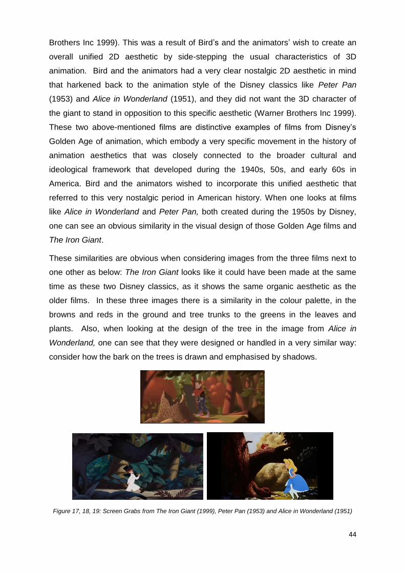
44
Brothers Inc 1999). This was a result of Bird’s and the animators’ wish to create an
overall unified 2D aesthetic by side-stepping the usual characteristics of 3D
animation. Bird and the animators had a very clear nostalgic 2D aesthetic in mind
that harkened back to the animation style of the Disney classics like Peter Pan
(1953) and Alice in Wonderland (1951), and they did not want the 3D character of
the giant to stand in opposition to this specific aesthetic (Warner Brothers Inc 1999).
These two above-mentioned films are distinctive examples of films from Disney’s
Golden Age of animation, which embody a very specific movement in the history of
animation aesthetics that was closely connected to the broader cultural and
ideological framework that developed during the 1940s, 50s, and early 60s in
America. Bird and the animators wished to incorporate this unified aesthetic that
referred to this very nostalgic period in American history. When one looks at films
like Alice in Wonderland and Peter Pan, both created during the 1950s by Disney,
one can see an obvious similarity in the visual design of those Golden Age films and
The Iron Giant.
These similarities are obvious when considering images from the three films next to
one other as below: The Iron Giant looks like it could have been made at the same
time as these two Disney classics, as it shows the same organic aesthetic as the
older films. In these three images there is a similarity in the colour palette, in the
browns and reds in the ground and tree trunks to the greens in the leaves and
plants. Also, when looking at the design of the tree in the image from Alice in
Wonderland, one can see that they were designed or handled in a very similar way:
consider how the bark on the trees is drawn and emphasised by shadows.
Figure 17, 18, 19: Screen Grabs from The Iron Giant (1999), Peter Pan (1953) and Alice in Wonderland (1951)

45
In the image below, can be seen the character of the giant sitting in the water of the
lake with Hogarth holding onto a tree nearby. It is quite clear from this shot that the
giant does not stand out from his environment by possessing the same look as other
3D characters from full 3D films, like the character of Buzz Lightyear from Toy Story.
Buzz was a plastic toy whose material portrayed this well by possessing an obvious
reflection, otherwise known as a ‘specular highlight’, or how some light plays on
specific surfaces and results in a hard-sharp edge that one might expect from a
plastic toy. The giant did not possess these hard, specular highlights, but was given
much softer lighting such as found in 2D animation, even though it was a 3D
character. He was also given a hand-painted texture that replicated the same style
as the other 2D characters in the film for him to merge with the overall 2D aesthetic
of the film more effectively.
Figure 20, 21: Screen Grabs from Toy Story (1995) and The Iron Giant (1999)
Bird took great care in bringing the giant into Hogarth's world as he did not want the
character to appear so foreign that it would not blend well into the scenes in and
around Rockwell, Maine in 1957. When discussing this with the animators, Bird told
them to imagine that they were, in fact, drawing this character in the 1940s, during
the Golden Age. He asked them, "How would you draw something like this by
hand?" (Warner Brothers Inc 1999). As a result, they ended up simplifying the
character’s main shapes while also analysing the qualities of their hand drawn

46
versions in comparison to the CGI versions, looking for ways to join the two mediums
better (Warner Brothers Inc 1999).
This shows how Bird and his team were dedicated to creating an animated film that
stayed true to the style of animation that was popular during the 1950s, and earlier in
America, namely the style of animation from Disney’s Golden Age. As discussed
before, this era was profoundly influenced by the cultural implications of the time,
with another big influencer on style being the advent of the television and the cartoon
shows which resulted from studios taking advantage of this new distribution medium;
I will examine this in my next chapter (Spigel 3). They began to create quick
animations that were easy and cheap to make, eventually resulting in the style of
animation know as ‘limited animation’ which was made famous, or infamous, by the
Hanna-Barbera animation studio. Pressure from the government resulted in many
film companies going out of their way to prove that they were loyal to American
ideals and capitalism. The animation world was no different, with Disney studios
being at the forefront of this movement during the 50s and 60s.
Many of Disney’s post-war short- and feature-length films tried to show their loyalty
to the ‘American Dream’. This was reflected in the animated films of the time,
especially in the aesthetic style and themes used in their stories. In fact, one of the
only reasons that the Disney studio could keep afloat during the war years was by
working on commissioned projects from the federal government. This influenced the
visual aesthetic of the cartoons made during that time, as they created a unified
aesthetic across different animation studios which were all trying to do the same
thing. This specific aesthetic that emerged from that period came to represent that
time in animation history, and was associated with 50’s and 60’s Americana and all
the cultural topics that came with that period in American history. The aesthetic from
cartoons like Peter Pan and Alice in Wonderland became symbolic of that time in
history. Bird accessed that aesthetic in The Iron Giant to enhance the audience’s
sense of nostalgia for that period in history. He actively took advantage of these
feelings of nostalgia to facilitate the theme of his animation.
Bird and his team chose to use 3D techniques and programs on the giant because
they wanted to make it seem like he came from another planet (Warner Brothers Inc
1999). Bird wanted the giant to appear to be 'alien' and felt that they could achieve
this effect by using the 3D animation to create the giant (Warner Brothers Inc 1999).

47
Doing the giant in CGI also meant that they could give the character the mass and
solidity expected of a giant metal robot, while also giving the impression that he was
from a different world (Warner Brothers Inc 1999). When asked about how they
managed to create a character that would fit into the overall design of the film, while
also giving the impression of something truly alien, Bird said that "the separation
between the 2D animation and the CGI is something that helped establish the fish-
out-of-water facet of the story" (Warner Brothers Inc 1999).
This contradiction within the film - wanting to create a giant robot character that
blended with the overall aesthetic of the film while remaining different enough to be
perceived as ‘alien’ - is also inherently found in the theme of nostalgia within films.
Essentially it is the desire to have something that is inherently old in either its story or
aesthetic, that is presented again to audiences in a way that had not been seen
before; having something old and new all at that same time. The character of the
giant is an excellent metaphor for this desire to see ‘both sides of the coin’
simultaneously. As covered by Svetlana Boym in the chapter on nostalgia, this is a
trend that permeates almost all areas of contemporary media (Boym 7). The giant’s
character is built in 3D to give him a sense of weight and presence that would have
been difficult to achieve in 2D, his outside appearance has been altered to a softer,
more organic aesthetic to fit the overall feel of the film, even going so far as to
develop new technologies to create this softened effect. As mentioned, they went so
far as to create a program that could ‘wobble’ the straight strong lines of the 3D giant
character, giving him the appearance of a traditional hand-drawn character, resulting
in him having the weight and presence of a 3D character, with the charm and organic
feel of a 2D character.
When trying to find a way to solve the inherent problems that came with mixing
classic animation and CGI animation, Bird and crew turned to artistic coordinator
Scott Johnston (Warner Brothers Inc 1999). As stated, Bird wanted the giant to have
an 'alien' feel to him, which is one of the reasons they chose to make use of CGI
techniques (Warner Brothers Inc 1999). Johnston agrees with Bird by saying that
"we wanted the giant to be an alien presence," but they also wanted to make sure
that the giant's form remained rigid and realistic, while still allowing for him to be able
to communicate a wide variety of emotions (Warner Brothers Inc 1999). To achieve
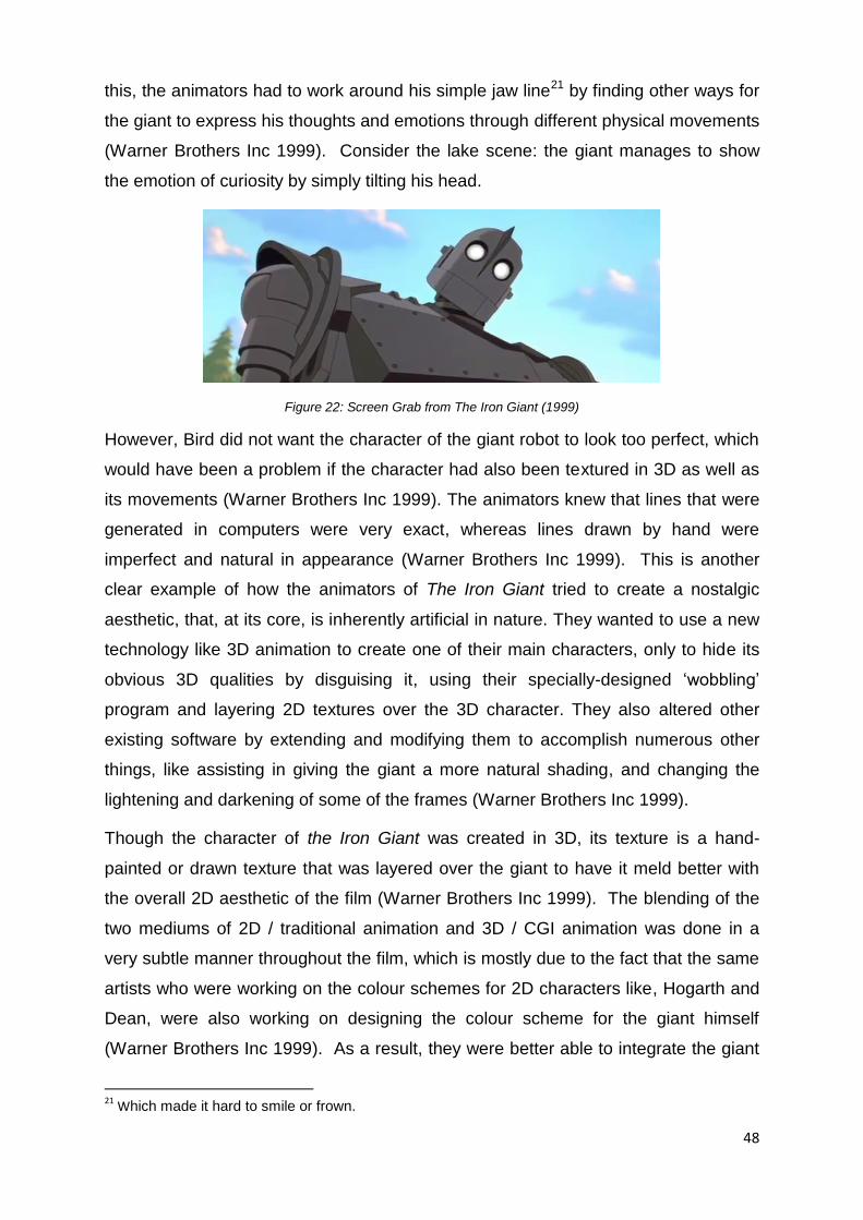
48
this, the animators had to work around his simple jaw line21 by finding other ways for
the giant to express his thoughts and emotions through different physical movements
(Warner Brothers Inc 1999). Consider the lake scene: the giant manages to show
the emotion of curiosity by simply tilting his head.
Figure 22: Screen Grab from The Iron Giant (1999)
However, Bird did not want the character of the giant robot to look too perfect, which
would have been a problem if the character had also been textured in 3D as well as
its movements (Warner Brothers Inc 1999). The animators knew that lines that were
generated in computers were very exact, whereas lines drawn by hand were
imperfect and natural in appearance (Warner Brothers Inc 1999). This is another
clear example of how the animators of The Iron Giant tried to create a nostalgic
aesthetic, that, at its core, is inherently artificial in nature. They wanted to use a new
technology like 3D animation to create one of their main characters, only to hide its
obvious 3D qualities by disguising it, using their specially-designed ‘wobbling’
program and layering 2D textures over the 3D character. They also altered other
existing software by extending and modifying them to accomplish numerous other
things, like assisting in giving the giant a more natural shading, and changing the
lightening and darkening of some of the frames (Warner Brothers Inc 1999).
Though the character of the Iron Giant was created in 3D, its texture is a hand-
painted or drawn texture that was layered over the giant to have it meld better with
the overall 2D aesthetic of the film (Warner Brothers Inc 1999). The blending of the
two mediums of 2D / traditional animation and 3D / CGI animation was done in a
very subtle manner throughout the film, which is mostly due to the fact that the same
artists who were working on the colour schemes for 2D characters like, Hogarth and
Dean, were also working on designing the colour scheme for the giant himself
(Warner Brothers Inc 1999). As a result, they were better able to integrate the giant
21
Which made it hard to smile or frown.

49
into their world, meaning that the giant does not look dramatically visually different to
the other characters, and is blended into the visual aesthetic of the environment very
successfully, serving to continue the overall nostalgic feel of the film (Warner
Brothers Inc 1999). I see this gargantuan effort to make the giant 'fit in' with the rest
of the 2D world as a clear indication of the overall nostalgic aesthetic of the film: they
definitely did not want the giant to look out of place in a 2D world and thus went to
great efforts to make him appear 2D.
This dedication to keeping the overall style of the film 2D, instead of just making use
of the built-in look of the new 3D medium, shows an appreciation for 2D's older
aesthetic, while also showing that the creators of The Iron Giant had a specific
aesthetic in mind when they created the film. It is possible that they felt that
everything needed to fit into that specific aesthetic, unlike the early 3D animated
films like Toy Story 1 and 2 whose aesthetics, as mentioned in my history chapter,
was defined and limited by the technology that they had available. Bird and the
animators of The Iron Giant chose to create a film that looked as though it could
have been made forty years earlier by highlighting the illustrative style of animation
that had been pioneered by Disney. They created a modern hybrid film that paid
homage to the classic animated films of their youth and before, even going so far as
to make a new medium, 3D animation, work within the classic style of 2D animation.
In terms of the nostalgia found within the design of the clothing worn by the
characters and the objects found in their world, a good example can be found in the
main battle scene between the giant and the army. It is this scene that achieves a
better feel for the world which the animators created, as well as the design choices
of the characters and environment. When the robot chases the army personnel back
into the city, we are shown a town that is very clearly stylised after small American
towns of the 1950s with people who are dressed for that era. Mansley himself is
dressed in a stereotypical 1950s outfit, with a beige trench coat, white collar shirt,
and red tie. These visual signifiers help the audience to identify the period in which
the film is set, alongside the visual design of the characters themselves, the
aesthetic of the animation which harkens back to the Golden Age. The clothing and
objects in this film are visual signifiers of that specific time in American history, and
help to connect the audience to the nostalgia they have for that era.

50
The nostalgia of this film can also be seen in the overall design of the giant himself.
The initial drawings of the giant were completed by Joe Johnston, who then went on
to work alongside Bird, production designer Mark Whiting, and supervising CGI
animator Steve Markowski in completing the look and feel of the giant (Warner
Brothers Inc 1999). It was Whiting who designed the giant’s look to better match the
rural landscapes that he had designed for the film, while Markowski was the one who
brought the giant to life with movement (Warner Brothers Inc, 1999). What made the
design of the giant nostalgic, however, was how the designers incorporated several
visual references that were from sci-fi films from the same era in which the film is set
(Warner Brothers Inc 1999). These sci-fi film references came from movies like "The
Day the Earth Stood Still" (1951) and were the animator's way of paying respect to
the giant robot films of the post-nuclear age.
Figure 23: Screen Grab from The Day The Earth Stood Still (1951); Figure 24, 25: Screen Grab From The Iron Giant (1999)
The first two images above show the scene in The Day The Earth Stood Still where
the alien first arrives and is confronted by the army, and the scene from The Iron
Giant where the army first encounters the giant. The portrayal of the giant in the
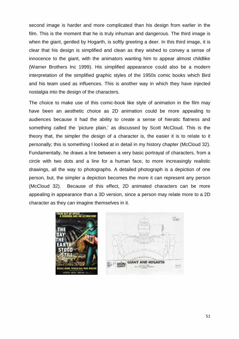
51
second image is harder and more complicated than his design from earlier in the
film. This is the moment that he is truly inhuman and dangerous. The third image is
when the giant, gentled by Hogarth, is softly greeting a deer. In this third image, it is
clear that his design is simplified and clean as they wished to convey a sense of
innocence to the giant, with the animators wanting him to appear almost childlike
(Warner Brothers Inc 1999). His simplified appearance could also be a modern
interpretation of the simplified graphic styles of the 1950s comic books which Bird
and his team used as influences. This is another way in which they have injected
nostalgia into the design of the characters.
The choice to make use of this comic-book like style of animation in the film may
have been an aesthetic choice as 2D animation could be more appealing to
audiences because it had the ability to create a sense of hieratic flatness and
something called the ‘picture plain,’ as discussed by Scott McCloud. This is the
theory that, the simpler the design of a character is, the easier it is to relate to it
personally; this is something I looked at in detail in my history chapter (McCloud 32).
Fundamentally, he draws a line between a very basic portrayal of characters, from a
circle with two dots and a line for a human face, to more increasingly realistic
drawings, all the way to photographs. A detailed photograph is a depiction of one
person, but, the simpler a depiction becomes the more it can represent any person
(McCloud 32). Because of this effect, 2D animated characters can be more
appealing in appearance than a 3D version, since a person may relate more to a 2D
character as they can imagine themselves in it.

52
Figure 5 26: Theatrical release poster of The Day The Earth Stood Still Retrieved from Wikipedia page en.wikipedia.org/wiki/The_Day_the_Earth_Stood_Still : Figure 27: Design of the Iron Giant Retrieved from www.iamag.co/features/the-iron-giant-100-original-concept-art-gallery/ ; Figure 28: image of a page from a Superman comic Retrieved from jimsworldandwelcometoit.com/2012/11/06/robots-i-have-known/ ; Figure 29: image of the cover of a Batman comic retrieved from www.ebay.com/b/Silver-Age-Batman-Comics/32727/bn_3116088
When looking at the colour and design of the scenery in the film, we can also see
frequent examples of nostalgic iterations in their design. Not long after they began
work on the film, Bird and staff travelled to Maine to gain a better impression of the
atmosphere of where the film was being set (Warner Brothers Inc 1999). The film's
producer, Allison Abbate, pointed out that Bird liked the idea of setting the film in
Maine for its inherent innocence and overall dissociation from the rest of the United
States, with its sprawling forests and mountain ranges. Maine was also a part of
America that, at the time, was less populated and starker than most other parts of
the country. Thus, the theory was that it would have been possible to hide an
enormous robot for a few days as there were not big cities or many people nearby
(Warner Brothers Inc 1999). It was also decided that they would set the film in the
middle of the 1950s because they believed that this was an era when people were
less jaded and cynical (Warner Brothers Inc 1999). The fact that Bird and his team
chose to set this story in Maine is very relevant to the theme of nostalgia in this film,
as it is part of the appeal of that period - that it was purer. It is a metaphor for how
the American public of today views the America of their past, even if not necessarily
accurately so.
The designers of the layout for the film also drew their inspiration from artists of that
time. They looked at artists such as Edward Hopper, Norman Rockwell, and N. C.
Wyeth, whose paintings showed a classical side of America in the first half of the
twentieth century (Warner Brothers Inc 1999). The designers of the scenery took a
great deal from the work of N. C. Wyeth, one of America’s greatest illustrators who
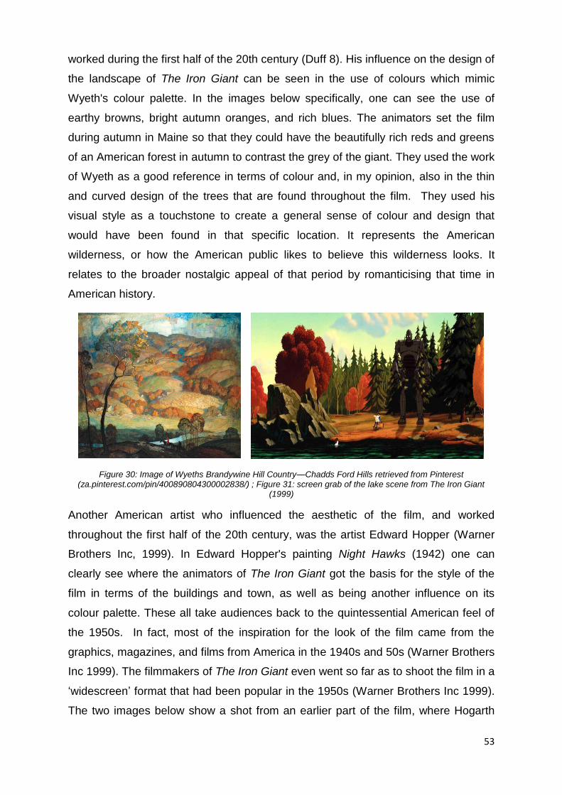
53
worked during the first half of the 20th century (Duff 8). His influence on the design of
the landscape of The Iron Giant can be seen in the use of colours which mimic
Wyeth's colour palette. In the images below specifically, one can see the use of
earthy browns, bright autumn oranges, and rich blues. The animators set the film
during autumn in Maine so that they could have the beautifully rich reds and greens
of an American forest in autumn to contrast the grey of the giant. They used the work
of Wyeth as a good reference in terms of colour and, in my opinion, also in the thin
and curved design of the trees that are found throughout the film. They used his
visual style as a touchstone to create a general sense of colour and design that
would have been found in that specific location. It represents the American
wilderness, or how the American public likes to believe this wilderness looks. It
relates to the broader nostalgic appeal of that period by romanticising that time in
American history.
Figure 30: Image of Wyeths Brandywine Hill Country—Chadds Ford Hills retrieved from Pinterest (za.pinterest.com/pin/400890804300002838/) ; Figure 31: screen grab of the lake scene from The Iron Giant
(1999)
Another American artist who influenced the aesthetic of the film, and worked
throughout the first half of the 20th century, was the artist Edward Hopper (Warner
Brothers Inc, 1999). In Edward Hopper's painting Night Hawks (1942) one can
clearly see where the animators of The Iron Giant got the basis for the style of the
film in terms of the buildings and town, as well as being another influence on its
colour palette. These all take audiences back to the quintessential American feel of
the 1950s. In fact, most of the inspiration for the look of the film came from the
graphics, magazines, and films from America in the 1940s and 50s (Warner Brothers
Inc 1999). The filmmakers of The Iron Giant even went so far as to shoot the film in a
‘widescreen’ format that had been popular in the 1950s (Warner Brothers Inc 1999).
The two images below show a shot from an earlier part of the film, where Hogarth

54
goes to the diner where his mother works. This shows the outside of the diner, which
has clean lines and bold colours that are comparable to the style of Edward Hopper’s
Night Hawks painting of a quintessential 1950s American bar.
Figure 32: Screen grab of diner scene from The Iron Giant (1999); Figure 33: Edward Hopper's Night Hawks (1942) retrieved from Wikipedia page en.wikipedia.org/wiki/Nighthawks.
Figure 34: Screen grab from Diner scene in The Iron Giant (1999)
This reference to the styles of mid-century artists can also be seen in the character
designs. These character designs can be compared to the style of 19th century artist
Norman Rockwell's paintings of children, from around the same era as when the film
is set (Warner Brothers Inc 1999). This can be seen in the design of Hogarth, from
his over-large ears to his small nose and haircut which are quite like the design of
Rockwell's young boy from his 1952 painting called The Facts of Life. This
exaggeration of features can be seen throughout the films characters, ranging from
slight differences in the design of Hogarth and Dean, to the over-exaggerated
designs of some of the town folk, like the fisherman who first saw the giant out at
sea. This constant referencing of the graphic style of the 1950s American artists and
illustrators in this film convinces me that the creators of The Iron Giant wanted to
create a film that would ring true to not only the 2D aesthetic of 1950s animated films
and cartoons, but also to the character designs and environment that would have
been found during that time in not merely the art of that time but also in the everyday
life of American citizens. This sampling of illustrative artists from the 1940s, 50s, and
60s was just another way that the animators of this film could inject a sense of

55
nostalgia into the film. It is a style that would have been familiar to many Americans
while they, or their parents, were growing up. They tapped into the audience’s
familiarity with this illustrative style to create a more profound sense of nostalgia for
this era in both American and animation history.
Figure 35: Norman Rockwell's “The Facts of Life” (1952) retrieved from www.allposters.com/-sp/Facts-of-Life-July-14-1951-Posters_i7553229_.htm ; Figure 36: Screen grab from the Diner scene in The Iron Giant (1999)
The Iron Giant was a hybrid animated film that was made at a time when 3D
animated films were just launching. Instead of switching completely over to 3D like
Pixar, they chose instead to stay within a mostly 2D aesthetic while incorporating 3D
animation to create one of their main characters (Warner Brothers Inc 1999). By
making use of this flat, illustrative aesthetic which is typical of Disney films of their
Golden Age, the creators of The Iron Giant may also have relied on the ‘picture
plane’, as already discussed and defined by Scott McCloud (McCloud 32). I believe
that they also chose to make use of this 2D aesthetic in the overall visual design of
the film because of feelings of nostalgia that they believed audiences might
experience for this older style of animation.
Bird and his team really tried to inject a sentimental nostalgia into all aspects of the
film, particularly for this time in American history that possessed a specific 2D
animation aesthetic to which they felt audiences would respond. This choice in the
medium could have also been because, at the time, 3D animating programs were
56
not able to reproduce appealing humanoid or organic characters, which accounted
for 90% of the characters. So, while 3D was ideal in creating a solid, artificial
character like the giant, it would not have been as successful in animating the human
characters. A good example is the positively scary baby from Pixar's short film Tin
Toy (1988) which was the inspiration for the 1995 Pixar film Toy Story. From the
visual aesthetics that paid tribute to the classical, illustrative animation style of
feature-length Disney films of the Golden Age, to the design choices of the
characters that were influenced by the comics, magazines, and films from America in
the 1940s and 50s, The Iron Giant is a modern animated film filled with sentimental
signifiers to invoke nostalgia within its audiences. Though its initial release was
unsuccessful in the box office, it has since attracted a cult-like following with
audiences appreciating the style of animation that reminds them of the traditional 2D
animations of their youth, responding to the overall feel of the film that awakens
these feelings of nostalgia within them. Bird’s preoccupation with this time in
American history and the animation aesthetic that was produced then, continues in
his later work and can be seen in the next film I discuss. My next case study, The
Incredibles, also endeavours to create this sense of nostalgia within the film by
making use of certain familiar signifiers from America’s cultural past. Also directed by
Brad Bird, it is different to The Iron Giant in one obvious and significant way: it was
done completely in 3D, with strong 2D influences.
57
The Incredibles
The second film I will be dealing with, as I feel it also possesses a nostalgic aesthetic
within its overall design, is the 2004 3D Pixar film The Incredibles. The film mimics
the 2D animation aesthetic of the 1950s and 60s in America, which I feel is the result
of Pixar and Bird wanting to attract audiences that have been influenced by feelings
of nostalgia for an older style of animation. I will be looking at the film, and briefly
mentioning some of the more successful scenes which I believe convey the 2D
aesthetic, which is found within the design choices of the film such as the
environment and the characters. I will be looking closely at specific scenes in terms
of the visual techniques and elements that I feel portray the organic feel of traditional
2D animation within this contemporary 3D animated film.
As mentioned, The Incredibles is a modern 3D animated, feature-length film that was
another creation of Brad Bird’s, who was brought onto the Pixar team by its co-
founder John Lasseter (Vaz et al. 8). Bird had, until this point, never worked in full
3D animation before. In The Iron Giant, it was only the character of the giant who
had been created in 3D, with the rest of the film staying in a traditional, Disney-
inspired, 2D animated style. Even though the giant was a three-dimensional
character, he was treated in such a way as to disguise and minimise his 3D qualities,
making him appear 2D in nature. Though most 3D animation companies would have
baulked at the idea of bringing on a director who had no previous experience in 3D
animation itself, Lasseter believed that Bird would bring new and exciting ideas to
the world of 3D animation, and more specifically to Pixar itself (Vaz et al. 9).
The co-founders of Pixar, Lasseter along with Ed Catmull and Steve Jobs, also
chose to bring Bird on as a new director because they were worried that Pixar
studios was becoming too complacent after so many successes with previous films
like Finding Nemo and Monsters Inc. and hoped that bringing Bird in would shake
things up (YouTube “Making of ‘The Incredibles’”). Having known Bird for years,
having studied together at Cal Arts, Lasseter knew that Bird had also studied the
classic principles of animation made famous by the Walt Disney studios, putting what
he learned to use while working at Disney studios during The Fox and the Hound
days, and later when he worked on the television cartoon series The Simpsons (Vaz
et al. 8). It is possible that Lasseter hoped that, by integrating Bird into the studio, he
58
would bring more of these 2D principles, ideas, and overall appeal that he had been
able to achieve in The Simpsons and The Iron Giant into future Pixar films.
Similarly to The Iron Giant, the animators of The Incredibles made use of certain
aspects of 2D animation within the film to emphasise the difference between worlds
to the viewer to a different place. As in The Iron Giant, they used the fact that the
appeal of 2D stylisation in the design of the world and characters of The Incredibles
would help to separate it from the everyday world, as well as being able to play on
feelings of nostalgia audiences might have for this style of animation from their
youth. When one looks at the over-exaggerated design of the characters and the
world they live in it is not overly realistic, and is rather situated in another time or
dimension where humans might look different (Vaz et al. 13). I believe that what is
important about the design of the characters in The Incredibles is the fact that their
design is suggestive of the visual design of cartoons from the 1950s and 60s
America. Their designs are therefore able to conjure memories of that specific time
in American history, as well as nostalgia in an audience that is well-versed in the
discourse of 20th century American cartoons.
In contrast to The Iron Giant, however, they did not combine 2D animation and 3D
animation within the film itself, unless one includes the credit rolls which were done
in a very graphic, comic-like 2D animation. Instead, the creators of The Incredibles
chose to give the film a 2D aesthetic by using 2D elements, like exaggeration within
the physical designing of the characters, giving them caricatured appearances like
the superheroes in comic books of old (Vaz et al. 59). An example of this can be
seen in the below images of 1950s comic book heroes like Superman and Captain
America compared to the characters designed for The Incredibles.
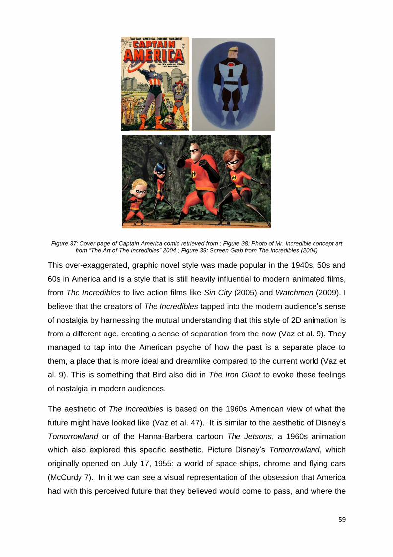
59
Figure 37; Cover page of Captain America comic retrieved from ; Figure 38: Photo of Mr. Incredible concept art from “The Art of The Incredibles” 2004 ; Figure 39: Screen Grab from The Incredibles (2004)
This over-exaggerated, graphic novel style was made popular in the 1940s, 50s and
60s in America and is a style that is still heavily influential to modern animated films,
from The Incredibles to live action films like Sin City (2005) and Watchmen (2009). I
believe that the creators of The Incredibles tapped into the modern audience’s sense
of nostalgia by harnessing the mutual understanding that this style of 2D animation is
from a different age, creating a sense of separation from the now (Vaz et al. 9). They
managed to tap into the American psyche of how the past is a separate place to
them, a place that is more ideal and dreamlike compared to the current world (Vaz et
al. 9). This is something that Bird also did in The Iron Giant to evoke these feelings
of nostalgia in modern audiences.
The aesthetic of The Incredibles is based on the 1960s American view of what the
future might have looked like (Vaz et al. 47). It is similar to the aesthetic of Disney’s
Tomorrowland or of the Hanna-Barbera cartoon The Jetsons, a 1960s animation
which also explored this specific aesthetic. Picture Disney’s Tomorrowland, which
originally opened on July 17, 1955: a world of space ships, chrome and flying cars
(McCurdy 7). In it we can see a visual representation of the obsession that America
had with this perceived future that they believed would come to pass, and where the
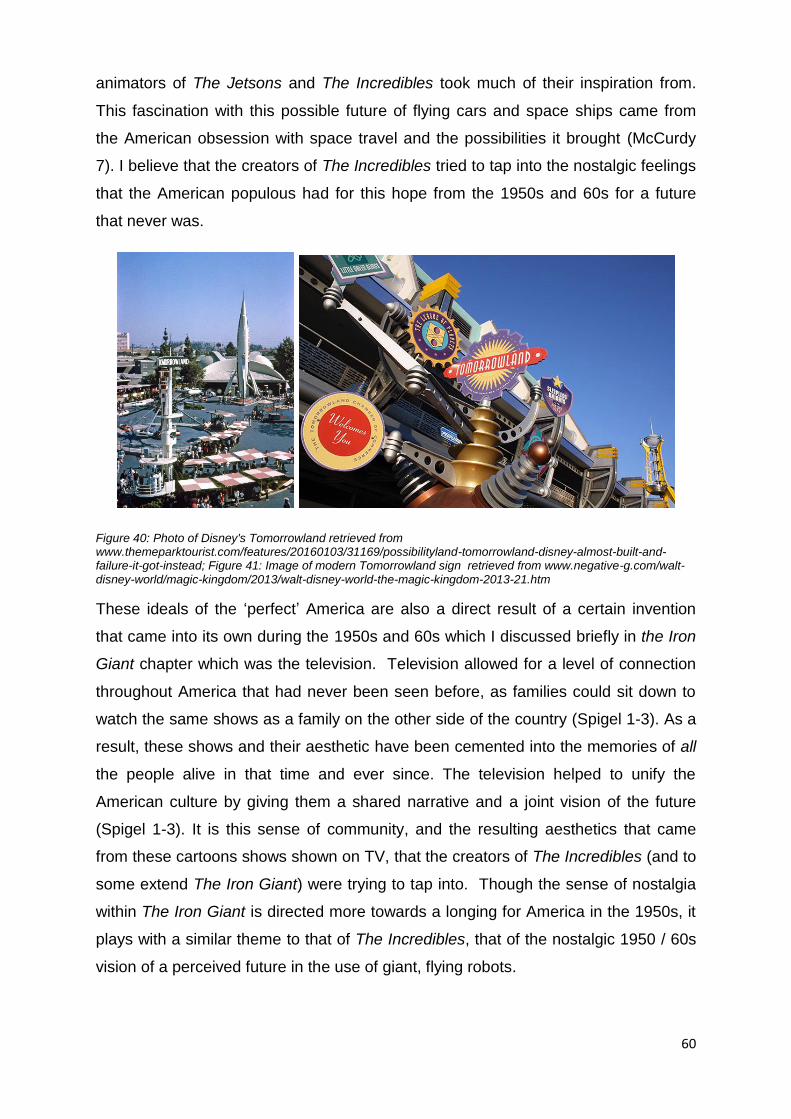
60
animators of The Jetsons and The Incredibles took much of their inspiration from.
This fascination with this possible future of flying cars and space ships came from
the American obsession with space travel and the possibilities it brought (McCurdy
7). I believe that the creators of The Incredibles tried to tap into the nostalgic feelings
that the American populous had for this hope from the 1950s and 60s for a future
that never was.
Figure 40: Photo of Disney's Tomorrowland retrieved from www.themeparktourist.com/features/20160103/31169/possibilityland-tomorrowland-disney-almost-built-and-failure-it-got-instead; Figure 41: Image of modern Tomorrowland sign retrieved from www.negative-g.com/walt-disney-world/magic-kingdom/2013/walt-disney-world-the-magic-kingdom-2013-21.htm
These ideals of the ‘perfect’ America are also a direct result of a certain invention
that came into its own during the 1950s and 60s which I discussed briefly in the Iron
Giant chapter which was the television. Television allowed for a level of connection
throughout America that had never been seen before, as families could sit down to
watch the same shows as a family on the other side of the country (Spigel 1-3). As a
result, these shows and their aesthetic have been cemented into the memories of all
the people alive in that time and ever since. The television helped to unify the
American culture by giving them a shared narrative and a joint vision of the future
(Spigel 1-3). It is this sense of community, and the resulting aesthetics that came
from these cartoons shows shown on TV, that the creators of The Incredibles (and to
some extend The Iron Giant) were trying to tap into. Though the sense of nostalgia
within The Iron Giant is directed more towards a longing for America in the 1950s, it
plays with a similar theme to that of The Incredibles, that of the nostalgic 1950 / 60s
vision of a perceived future in the use of giant, flying robots.
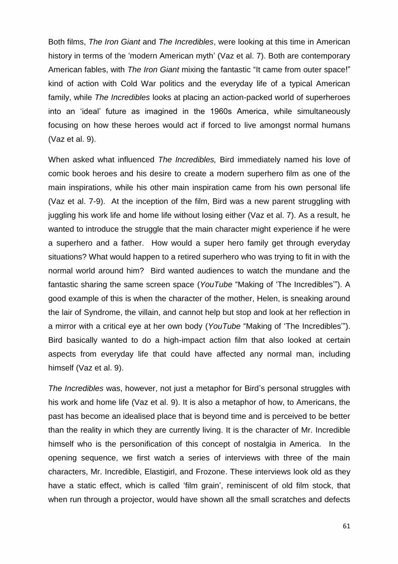
61
Both films, The Iron Giant and The Incredibles, were looking at this time in American
history in terms of the ‘modern American myth’ (Vaz et al. 7). Both are contemporary
American fables, with The Iron Giant mixing the fantastic “It came from outer space!”
kind of action with Cold War politics and the everyday life of a typical American
family, while The Incredibles looks at placing an action-packed world of superheroes
into an ‘ideal’ future as imagined in the 1960s America, while simultaneously
focusing on how these heroes would act if forced to live amongst normal humans
(Vaz et al. 9).
When asked what influenced The Incredibles, Bird immediately named his love of
comic book heroes and his desire to create a modern superhero film as one of the
main inspirations, while his other main inspiration came from his own personal life
(Vaz et al. 7-9). At the inception of the film, Bird was a new parent struggling with
juggling his work life and home life without losing either (Vaz et al. 7). As a result, he
wanted to introduce the struggle that the main character might experience if he were
a superhero and a father. How would a super hero family get through everyday
situations? What would happen to a retired superhero who was trying to fit in with the
normal world around him? Bird wanted audiences to watch the mundane and the
fantastic sharing the same screen space (YouTube “Making of ‘The Incredibles’”). A
good example of this is when the character of the mother, Helen, is sneaking around
the lair of Syndrome, the villain, and cannot help but stop and look at her reflection in
a mirror with a critical eye at her own body (YouTube “Making of ‘The Incredibles’”).
Bird basically wanted to do a high-impact action film that also looked at certain
aspects from everyday life that could have affected any normal man, including
himself (Vaz et al. 9).
The Incredibles was, however, not just a metaphor for Bird’s personal struggles with
his work and home life (Vaz et al. 9). It is also a metaphor of how, to Americans, the
past has become an idealised place that is beyond time and is perceived to be better
than the reality in which they are currently living. It is the character of Mr. Incredible
himself who is the personification of this concept of nostalgia in America. In the
opening sequence, we first watch a series of interviews with three of the main
characters, Mr. Incredible, Elastigirl, and Frozone. These interviews look old as they
have a static effect, which is called ‘film grain’, reminiscent of old film stock, that
when run through a projector, would have shown all the small scratches and defects
62
that were common before film went digital (Vaz et al. 62-63). These effects were
created on purpose to give the film a feel of an old-school interview, filmed some
time in the past on old celluloid film as opposed to a computer. This effort to make
these first scenes feel old is similar to how, in The Iron Giant, Bird and his team
created programs that would alter the appearance of the giant so that he would look
like a 2D character from the 1950s.
The film then jumps to a ‘live’ scenes where we watch Mr. Incredible going through a
day in his life while he was still a superhero in his prime: helping an old lady get her
cat out of a tree, stopping bank robbers, catching a suicidal man in mid jump, trying
to stop a super villain, and finally stopping a train crash (Bird 2004). These scenes
are vibrant and full of action with interesting gadgets, striking superhero costumes,
and adoring fans who still love Mr. Incredible (Vaz et al. 62-63). These scenes not
only represent Mr. Incredible’s golden past. They are also a metaphor for the
feelings of nostalgia that Americans have for their golden ‘ideal’ past. It ends with
him at his wedding, where he is marrying Elastigirl who says, “If we are going to
make this work, you have got to be more than Mr. Incredible,” which is prophetic as
we watch the next scene where Mr. Incredible, and eventually all other superheroes,
are sued for damages caused when rescuing innocent people (Bird 2004). The style
of these first scenes, both in the visual aesthetic of the animation and the action
depicted, is very reminiscent of the Golden Age of animation.
To protect the heroes, the government puts them into hiding, forcing them to live
normal lives like the rest of the population. Mr. Incredible must become an ordinary
man living out his life just like everyone else - a father, husband, and employee. This
is shown in the next scene when Mr. Incredible, as Bob Parr, is working in an
insurance company, sitting behind a desk every day. This scene, and many to follow
are starkly different to the ‘heydays’ scenes, with a monotonous feeling of everyday
life. The colours are muted, there is no more ‘action,’ and Mr. Incredible has become
a middle-aged man, with a big stomach and a receding hairline (Vaz et al. 62-63).
This scene stands in direct contrast to the previous scenes to show how the glory
days of his past are over. To me this is another metaphor for how modern Americans
feel about their own reality. These first scenes, the glory days vs modern day, are a
representation of the difference between the concept of the ideal American dream
and the reality of modern life.

63
Mr. Incredible is like an average man, but he also can be read as a metaphor for the
kind of nostalgic appeal to which Bird seems to keep returning in his films. The
Incredibles was another chance for him to create a film that continued to look at the
“free-floating dream stuff of pop-culture” that he had begun to deal with in The Iron
Giant (Vaz et al. 9). The Iron Giant, like The Incredibles, drew as much from 1950s
pop culture as it could from glorifying superheroes of the time by having the
characters interact with Superman comics, to showing cheesy science fiction
monster movies and Cold War health movies within the film. These signifiers of a
past long gone help audiences to connect to the characters and story, as they can
relate to them by remembering their own past, a past that seemed to be easier and
superior to modern times.
The actual design of the characters in The Incredibles ranged from a stylised take on
human and superhuman characters, to the aesthetics of early James Bond films
produced by Ken Adam and the distinctive style of the 1960s American notion of
what the future could look like (Vaz et al. 9). In the James Bond films of the 1960s
and 70s there were often gadgets and specialised vehicles used that did not actually
exist at the time. Mr. Incredible’s car in the ‘heydays’ scenes at the beginning of the
film is very similar to the cars that James Bond himself drove, possessing tracking
devices and rockets. The designers of The Incredibles also borrowed inspiration
from the Bond franchise when it came to the layout of the super-villain Syndrome’s
island lair (Vaz et al. 116-119). From the chrome and metal furniture to the
underground missile launch pad, the overall feel of Syndrome’s lair is reminiscent of
several Bond villains’ evil hideouts. This is just another way that the designers of The
Incredibles injected nostalgic elements into this film. The Bond franchise is one that
started in the late1950s and is continuing today. The early films from this franchise
also tried to play into the American idea of what the future could look like, including
gadgets and flying cars. Since these early Bond films are also a part of popular
culture in America stretching back as far as the 1950s, it is highly probable that most
Americans have seen these films and recognise their specific aesthetic. By
incorporating these designs within The Incredibles the designers could tap into
audience’s memories of and feelings of nostalgia for, their youth and these early
Bond films. When we look at the designs of the characters, however, it must be
mentioned that it was not just the style of comic book heroes, James Bond, or
caricatures that influenced their final designs.

64
Figure 42: Screen grab from The Incredibles (2004); Figure 43: Image from “You Only Live Twice” (1967) retrieved from www.jamesbondwiki.com/page/James+Bond+Production+Designers; Figure 44: Image from “The
Spy who Loved Me” (1977) retrieved from Pinterest- za.pinterest.com/pin/554576141583972655/
When designing the characters, the team at Pixar also chose to base their designs,
as well as their superpowers, on the character’s individual personalities. For
example, Mr. Incredible as the patriarchal main provider and protector was expected
always to be strong so he had super strength. The eldest child, Violet, was shy and
reserved so her powers took the form of the ability to disappear and create force-
fields. Then again, I believe the most dominant influence on their overall designs was
the teams, and Bird’s wish to create human characters with stylised designs that
would mimic the design of comic book heroes of the 1950s and 60s. At the same
time, they wanted to create characters that possessed a believable level of
complexity to keep them interesting (Vaz et al. 66). They wanted their characters to
look convincingly organic, and not plastic like previous humanoid characters from
older Pixar films.
As a result of wanting to create believably organic characters, Bird sought to
establish a definite difference between the real world and the fantastic, while still
making sure that both were firmly planted in the same reality (Vaz et al. 13). Bird and
65
his team also laboured to merge the worlds of hand-drawn and 3D animation in one
film (YouTube “Making of ‘The Incredibles’”). Because of this desire to create an
interesting caricatured world that remained believable, the team of the Pixar
technical department had their work cut out for them. One of the biggest
breakthroughs in the creating of The Incredibles was that they spent a large amount
of time trying to give the 2D animators that followed Bird controls within the 3D
programs that they would be familiar with, as they were “more native to their own 2D
knowledge” (YouTube “Making of ‘The Incredibles’”). Pixar was, at the inception of
this film, already renowned for their advances in 3D animation technology regarding
creating believable hair (Monsters Inc.) and animating characters in water (Finding
Nemo) (Vaz et al. 9/18).
It was in The Incredibles, however, that Pixar became the benchmark of innovation
in the animation industry, which was necessary to create the vast cast of believable
and appealing stylised characters in the film (Vaz et al. 9). To create these
individuals, the technical department at Pixar had to develope new ways of creating
human characters that would appeal to audiences, something that they had
struggled with before in earlier films like Toy Story 1 and 2. Creating appealing
human characters in 3D had been such a problem in the early days of the medium
that Pixar instead focused on creating stories that focused on inanimate objects,
bugs, fish, and even monsters. In The Iron Giant, early 3D animation was better
suited to creating ridged or inorganic characters. It was these advancements in
technology that Pixar developed during the making of The Incredibles that aided
them in animating in a way that was reminiscent of 2D animation from the Golden
Age of animation, which in turn enhanced the films comprehensive nostalgic appeal.
To create these realistic and credible human characters, the technical department at
Pixar studios created a new muscle rigging system that would allow for more
convincing motion and the right amount of performance that animation needed to
imbue in the characters to create an authentic illusion of life (Vaz et al. 9).
Developments such as this that meant that Pixar could create 3D animated
characters that had the appeal of older 2D cartoons as they could now animate
these 3D characters in a way that was suggestive of 2D animation. They believed
that it was not about how realistic all the small visual details were on a character, but
rather about the subtle acting details that made the characters more believable
66
(YouTube “Making of ‘The Incredibles’”). They tried to take advantage of all the great
things that character animation could do, like capturing caricatures of a character
(YouTube “Making of ‘The Incredibles’”). This meant that they could give the
characters of The Incredibles a level of subtlety in their movements which had not
been seen in previous human characters, a sense of reality while still being highly
caricatured in nature. Animation, to Bird, is the capturing of the essence of
something and then putting one’s own spin on it (YouTube “Making of ‘The
Incredibles’”).
Consider the scene where the main character, Mr. Incredible, is typing on a
computer in the early stages of the film: we can see the subtle movements of
muscles under the skin in his forearms similar to how muscles move in real life (Vaz
et al. 35). Another technological advancement that came out of this film was the use
of ‘subsurface scattering’ (Vaz et al. 28). This advancement allowed the light in a
scene to penetrate the skin of characters and shine back out again, creating a
realistic skin luminescence that is seen in real life. Before this, to create a realistic
human essence the characters had to have minute details, like wrinkles and hair on
the skin to give the illusion of real skin (Vaz et al. 28). With subsurface scattering this
was no longer needed, and the designers of the characters in The Incredibles could
get away with simpler designs (Vaz et al. 28). As a result, the designers from The
Incredibles could base the character designs on older graphic novel character
designs, that would remind audiences of the cartoons and comics that they had been
exposed to in their youth, which in turn enhanced the film’s general nostalgic appeal,
similar to what they did in The Iron Giant.
These revolutions in technology that emerged from Pixar through The Incredibles
meant that this film, as well as all others to come after, could come to life on the big
screen in a way that had never been seen before. These advancements were not
created for their own sake, however, but rather served to enhance the story and
world that had begun on paper years before. This is in direct opposition to the school
of belief that the goal of creating images or animations with computers is to produce
truly realistic human characters. Some animated films, like those from the Final
Fantasy franchise, tried to create characters that leaned more to the photo-realistic
side of design (Vaz et al. 20). Though these films were important in the development
of certain motion capture techniques, they were not well received by audiences as

67
they fell into the same category as films that focused too much on the visual, and not
enough on the story. The Incredibles was a film that used its advances in
technology to improve on the story. The technology helped them to animate in a 2D
fashion which helped to increase the film’s nostalgic appeal to modern audiences.
Another important issue within this film was showing superhuman characters
reacting to weight believably. How could they portray a superhuman character with
super-strength, lifting objects that still looked heavy and as though it took effort to lift
them? To achieve this sense of realism, Bird had the animators film many real-life
references to convey across a true sense of weight (YouTube “Making of ‘The
Incredibles’”). So often, when portraying super-strength, the action of lifting an object
can look unrealistic and faked. Bird wanted to avoid this, making sure that when Mr.
Incredible lifted large objects it looked realistic and not easy. One of the other ways
that Bird helped his animators to portray this realistic weight was to show them
examples from old Disney animated films. One of the clips that he showed them was
from the 1967 Disney film The Jungle Book, where the main character Mowgli is
being pushed up a tree by Bagheera the black panther (YouTube “Making of ‘The
Incredibles’”). The physics used in this old 2D animated scene were so realistic and
on point that it can still be used as reference today as a good example of lifting
objects. So even in the production stage, Bird and his animators often looked at
older 2D animated films for references on how to make certain actions seem more
convincing, using the 12 principles of animation that had been set out by the
animators of these early films (YouTube “Making of ‘The Incredibles’”). This use of
older 2D source material again helped the animators of The Incredibles create a film
that was evocative of Disney’s Golden Age 2D animation, which increased the film’s
nostalgic appeal.
Figure 45: Creen grab from "The Jungle Book" (1967); Figure 46: Screen grab from The Incredibles (2004)
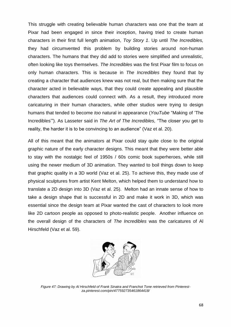
68
This struggle with creating believable human characters was one that the team at
Pixar had been engaged in since their inception, having tried to create human
characters in their first full length animation, Toy Story 1. Up until The Incredibles,
they had circumvented this problem by building stories around non-human
characters. The humans that they did add to stories were simplified and unrealistic,
often looking like toys themselves. The Incredibles was the first Pixar film to focus on
only human characters. This is because in The Incredibles they found that by
creating a character that audiences knew was not real, but then making sure that the
character acted in believable ways, that they could create appealing and plausible
characters that audiences could connect with. As a result, they introduced more
caricaturing in their human characters, while other studios were trying to design
humans that tended to become too natural in appearance (YouTube “Making of ‘The
Incredibles’”). As Lasseter said in The Art of The Incredibles, “The closer you get to
reality, the harder it is to be convincing to an audience” (Vaz et al. 20).
All of this meant that the animators at Pixar could stay quite close to the original
graphic nature of the early character designs. This meant that they were better able
to stay with the nostalgic feel of 1950s / 60s comic book superheroes, while still
using the newer medium of 3D animation. They wanted to boil things down to keep
that graphic quality in a 3D world (Vaz et al. 25). To achieve this, they made use of
physical sculptures from artist Kent Melton, which helped them to understand how to
translate a 2D design into 3D (Vaz et al. 25). Melton had an innate sense of how to
take a design shape that is successful in 2D and make it work in 3D, which was
essential since the design team at Pixar wanted the cast of characters to look more
like 2D cartoon people as opposed to photo-realistic people. Another influence on
the overall design of the characters of The Incredibles was the caricatures of Al
Hirschfeld (Vaz et al. 59).
Figure 47: Drawing by Al Hirschfeld of Frank Sinatra and Franchot Tone retrieved from Pinterest- za.pinterest.com/pin/477592735461864418/

69
Hirschfeld was an American caricaturist whose black and white drawings of
celebrities and Broadway stars from the 1920s onwards made him an essential part
of the American psyche of the twentieth century (Hirschfeld & Goodrich 1-3). His
over-exaggerated drawings would go on to be published in the New York Times for
over seven decades and as such came to be very familiar to most Americans then
and later. His work and style were unique, and he is often regarded as having been
one of the most influential figures in contemporary drawing and illustrating, having
influenced numerous illustrators, artists, and cartoonists (Hirschfeld & Goodrich 1-3).
The Incredibles is not the only modern animated film to have been influenced by
Hirschfeld’s embellished style, with even some of the characters from The Iron Giant
being influenced directly by his work or by the work of artists and illustrators who had
been influenced by him (Hirschfeld & Goodrich 1-3). Animation companies like the
United Productions of America made cartoons from the 1940s through to the 1970s,
and employed a style that imitated Hirschfeld’s typical inflation quite closely. Even
the Disney animation studio could not resist this style, so they eventually made use
of this free-flowing exaggeration in the design of the genie character from the 1992
film Aladdin, and in one of the short films from Fantasia 2000 called Rhapsody in
Blue.
Figure 47: Screen grab from Gerald McBoing Boing; Figure 48: Design of the Genie from Aladdin retrieved from disney.wikia.com/wiki/File:Tumblr_m5gvhwyibe1r1g8b3o1_500.jpg ; Figure 49: Screen grab from “Fantasia 2000”, Rhapsody in Blue

70
In the design of the characters from The Incredibles can clearly be seen the
influence that Al Hirschfeld had on their designs (Vaz et al. 59). From the
exaggerated physical features to the use of simple shapes, the designers of The
Incredibles made use of Hirschfeld’s renowned style in many aspects of their
characters. If one adds to this the style of comic book heros of the 1950s and 60s in
America and you can get an overall feel for the film’s design. A possible reason for
using Hirschfeld’s designs in this film would have been to depict a style similar to that
of the cartoons and comics that audiences would have been very familiar with.
Essentially this design style creates a sense of nostalgia within audiences for the the
kind of cartoons, comics, and illustrations that would be reminiscent of their, and
their parents, youth.
Figure 50, 51& 52: Concept art from "The Art of the Incredibles" 2004
If we now look at a specific scene, we can clearly see the design aspects that
identify this theme of nostalgia. Again, looking at the opening scenes, we watch as
the character of Mr. Incredible in his prime spend an afternoon rescuing people and
stopping villains. When we look at his general design, we can see that it is very
overstated, with a strong chin that protrudes far beyond his top lip and a brow so
prominent as to join with the bridge of his nose, without a dip between the eyes. The
design of Mr. Incredible, as well as the other characters in the film, strongly emulates
the inflated style of Al Hirschfeld’s graphic black-and-white portraits of famous
celebrities. The look of his skin-tight blue and black suit, and plain black eye mask
strongly references the style of old comic book heroes like The Phantom whose
comic was first released in 1936 and is still published today. The designers also
introduced aspects into this scene that remind the audience of the old James Bond
films, for instance in the design of Mr. Incredible’s car that transforms from an
ordinary vehicle into a ‘supercar’ with gadgets and rockets.
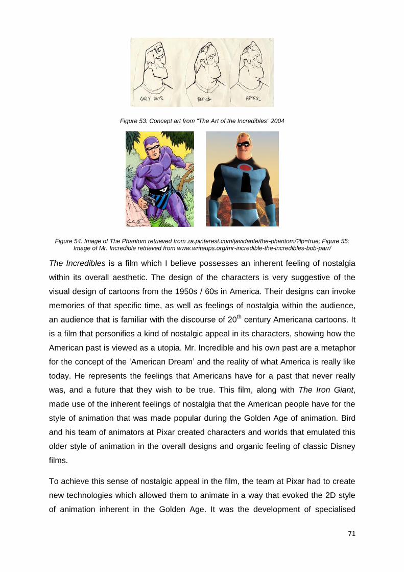
71
Figure 53: Concept art from "The Art of the Incredibles" 2004
Figure 54: Image of The Phantom retrieved from za.pinterest.com/javidante/the-phantom/?lp=true; Figure 55: Image of Mr. Incredible retrieved from www.writeups.org/mr-incredible-the-incredibles-bob-parr/
The Incredibles is a film which I believe possesses an inherent feeling of nostalgia
within its overall aesthetic. The design of the characters is very suggestive of the
visual design of cartoons from the 1950s / 60s in America. Their designs can invoke
memories of that specific time, as well as feelings of nostalgia within the audience,
an audience that is familiar with the discourse of 20th century Americana cartoons. It
is a film that personifies a kind of nostalgic appeal in its characters, showing how the
American past is viewed as a utopia. Mr. Incredible and his own past are a metaphor
for the concept of the ‘American Dream’ and the reality of what America is really like
today. He represents the feelings that Americans have for a past that never really
was, and a future that they wish to be true. This film, along with The Iron Giant,
made use of the inherent feelings of nostalgia that the American people have for the
style of animation that was made popular during the Golden Age of animation. Bird
and his team of animators at Pixar created characters and worlds that emulated this
older style of animation in the overall designs and organic feeling of classic Disney
films.
To achieve this sense of nostalgic appeal in the film, the team at Pixar had to create
new technologies which allowed them to animate in a way that evoked the 2D style
of animation inherent in the Golden Age. It was the development of specialised
72
muscle rigs and specular shading that allowed the film to possess this nostalgic
appeal. The Incredibles is a contemporary animated film which has successfully
employed elements of nostalgia that its target audiences feel for a period in
American history that was seen to supersede modern times. It managed this by
portraying the 1960s American population’s idea of what the future could hold. Like
The Iron Giant, it made use of these feelings of nostalgia in modern audiences to
create a successful film that resonated with their own past. The next and final
chapter will be concluding my discussion on nostalgic aesthetics with in the two films
of Birds which I chose to review.
73
Conclusion
In my exploration of the trend towards nostalgia in contemporary animated films, I
have found that this kind of nostalgic 2D aesthetic has indeed become popular,
mostly because of the prevailing feelings of nostalgia that the general populous, as
well as people in the animation industry, have. This is not just this older style of 2D
animation, but also for all things that are nostalgic in nature, such as the graphic
design of the characters in The Iron Giant and the feel of The Incredibles that
strongly resemble the animation of the Golden Age. This research report has
attempted to demonstrate this by looking at two examples of contemporary animated
films that deal with nostalgia in a way that audiences would respond to by replicating
the style and visual design of older animation that would be familiar from their youth.
The Iron Giant and The Incredibles are films produced in the last two decades, both
directed by Brad Bird, which made use of a 2D aesthetic and 3D technology. The
Iron Giant was a traditional 2D film that was very nostalgic in nature as it very closely
emulated the aesthetic of animated films from the Golden Age, like Alice in
Wonderland and Peter Pan. The visual design of the characters and environment
was also influenced by the illustrators and artists from the 50s in America, such as
Norman Rockwell, Edward Hopper, and N. C. Wyeth (Warner brothers Inc. 1999). I
believe that they created a film that emulated the style of these artists because they
wanted to harness the feelings of nostalgia that audiences harboured for that time in
American history. From the design of the characters to the colour palette used, the
film is packed with nostalgia for the aesthetic of Golden Age animation and the work
of the illustrative artists and painters of that era in American history. As defined by
Reynolds, they wanted to create sense of nostalgia for a time in American history by
emulating the aesthetic of cartoons from that period (Reynolds xii-xiii). The films
have gathered a cult-like following with audiences in America and around the world,
appreciating the style of animation that emulates the traditional 2D animations of
their youth, while also responding to the overall feel of the films which awaken these
feelings of nostalgia within them.
I considered nostalgia, trying to define its meaning, first in terms of Hutcheon and
Reynolds’ definition with regards to postmodernism and contemporary consumer

74
culture. In both cases the authors defined nostalgia in terms of feelings of nostalgia
in America or the Western world. Hutcheon talks of nostalgia as being a yearning for
the objects and signifiers of our societies past as well as our own past, not just as a
physical place from the past, but rather as a longing for a specific time from the past.
She speaks about how this longing for the past could be a romantic notion of what
the modern generation wish their lives could be like now (Hutcheon 19). As a result,
they take this longing for the perfect present and project it onto an idea of the ideal
past, that in reality never existed (Hutcheon 20). She states that the “aesthetics of
nostalgia might be less a matter of simple memory than of complex projection: the
result of wanting to create a partial, idealized history which has merged with a
dissatisfaction with present times” (Hutcheon 20).
We can see this in both of Birds films as he seems to want to create these visual
worlds that adhere to this idealised idea of the past, while also casting a critical eye
over the American way of life during that time. Reynolds agrees with Hutcheon’s
view on visual nostalgia by defining nostalgia in contemporary consumer culture as
an obsession with the signifiers, objects, symbols, or moments from our past,
because modern consumers believe that their past is superior to their current reality
(Reynolds xii-xiii). He puts emphasis on nostalgia being as a ‘pining’ for an
untroubled, bygone time in our own life or the life of our parents (Reynolds xxv).
Other authors like Helen Haswell have also stated that the recent upswing in 2D
aesthetics within contemporary 3D animated films has resulted from a sense of
nostalgia for an older aesthetic22 of animation (Haswell, 1). In terms of my two case
studies, I narrowed this definition down to feelings of longing that modern audiences
have for the visual appearance or visual signifiers of older cartoons, from a specific
time in 2D animation history which was the The Golden Age of animation in America.
This definition is also used and extended by Svetlana Boym, who describes the
nostalgia in media as a somewhat paradoxical double standard of trying to
experience the past while still living in the future (Boym 7). I found this in both of my
case studies, as Brad Bird used this wanting to see “both side of the same coin” in
both films as a way to comment critically on this ‘ideal’ idea of the past.
I considered the history of 2D and 3D animation briefly, focusing specifically on the
history of animation techniques and aesthetics by exploring how both mediums
22
Haswell refers to this aesthetic as being 'Organic'(Haswell 1)
75
developed to the point where the technology needed to create them no longer limited
the aesthetic of the films (Solomon 309-316). I discussed the advancements in
animation technologies in these early days of animation, and discovered that these
new methods of animating that were developed during this time and that were used
and perfected at Disney, were also crucial to the specific visual aesthetic that came
to represent the Golden Age of animation (Cavalier 97). As such I looked at the
history of The Golden Age which was essential to my discussion of my two case
studies as it is the period in time that they are both referring back to, and is the
foundation for the nostalgic visual design and appeal of Birds two films.
I found that the politics of that time also affected Disney, who was commissioned to
produce educational and propaganda films for the government and military, first
during the first World War and then during the Cold War, which impacted the visual
design of cartoons and animated films from this time (Murray 143). While another
reason that I believe Brad Bird chose to make use of this flat, simplified, and organic
aesthetic of older cartoons from Disney could have been because of the theory of
the picture plane from Scott McCloud.
In The Iron Giant, Bird looked at America’s obsession with the 1950s and how many
perceive it to be simpler and better, surpassing modern times and questioned it. He
did this by reproducing the visual style of animation that was popular during that time
in America in the design of the characters, and by giving the film a more organic
aesthetic. Bird went out of his way to recreate this visual style of animation from the
Golden Age. At the same time Bird questioned these feelings of nostalgia western
audiences have for this older style of animation by looking at the reality of that time
in American history in the storyline of the film. These metaphors are part of the film’s
nostalgic appeal, while also being how Bird critiqued contemporary culture’s
obsession with nostalgia.
In The Incredibles Bird engages with a similar method to create feelings of nostalgia
in audiences, but in a more personal way. In the film he has the character of Mr,
Incredible himself represent this contradiction of nostalgia, as Mr. Incredible
experiences the desire to relive the past. The film, like The Iron Giant, seeks to
create feelings of nostalgia in the audience by creating characters whose visual
designs remind audiences of the superhero films and comics that they watched and
read as children. Also like The Iron Giant, Bird manages to question in The

76
Incredibles the obsession with nostalgia modern audiences have by physically
showing that as much as you may desire to relive the ‘glory day’ of the past (like Mr
Incredible), it is not possible or realistic.
The Incredibles (2004), also sought to create this sense of nostalgia within the film
by using familiar aesthetics and signifiers from the American culture during the
1950s and 60s, like Bird did in The Iron Giant. Unlike The Iron Giant however, it was
a fully 3D animated film that emulated the style of older cartoons and comics from
the 50s and 60s in the design of the characters. The nostalgia for this specific
animation aesthetic came from the audience’s memory of the cartoons and comic
books that they related to while growing up.
In looking at these two films I found that the theme of nostalgia was used in excess
to create a nostalgic aesthetic that modern audience could relate to. Both films tried
to imitate the style of animation from the 1940s, 50s, and 60s to produce feelings of
nostalgia in modern audiences. Bird created metaphors within the films to comment
on these prevalent sentiments of nostalgia in contemporary culture, as both an
endearing look at the past and a critique of contemporary cultures obsession with
nostalgia.
As a result of feelings of nostalgia within western audiences, film creators like Brad
Bird have relied on creating visual representations of a nostalgic past in order to
draw in audiences. I looked at the nostalgic aesthetic of my two case studies, by
looking at the nostalgic visual signifiers that film makers, like Bird, made use of to
create these feelings of nostalgia in movie-goers. The maker of these two films went
out of his way to create this specific nostalgic aesthetic that resembled animations
from the Golden Age, generating nostalgia in audiences and even going so far as to
create new programs that would assist them in mimicking this flat and organic
aesthetic. These films, especially The Incredibles, were revolutionary to the
contemporary animation scene as they found new and innovative ways to recreate
the aesthetic of older 2D animated films within the modern medium of 3D animation.
It is thanks to contemporary animated films like these that the overall aesthetic feel
of older 2D films is not being lost to the ravages of time, but rather being
reinvigorated and re-injected into modern animated films in the use of visual designs
that reference this classic style of animation.
77
References
Animation Academy. ‘3D Animation History’. multimediamcc.com. N.p., 2011. Web.
13 June 2017.
Barrier, Michael. Hollywood Cartoons: American Animation in Its Golden Age. Oxford
University Press, 1999. Print.
Bird, Brad. The Incredibles. N.p., 2004. Film.
Brad Bird. The Iron Giant. 1999. Film
Block, Alex B. The Real Force Behind 'Star Wars': How George Lucas Built an
Empire. 2 September 2012. 20 February 2017.
<www.hollywoodreporter.com/news/george-lucas-star-wars-288513>.
Boym, Svetlana. "Nostalgia and its Discontents." Hedgehog Review 9.2 (2007): 7.
Retrieved from-http://www.iasc-culture.org/eNews/2007_10/9.2CBoym.pdf
Canemaker, John. Felix: The Twisted Tale of The World's most Famous Cat. New
York: Pantheon, 1991.
Cavalier, Stephen. The World History of Animation. Los Angeles: University of
California Press, 2011.
Cross, Gary. Consumed Nostalgia: Memory in the Age of Fast Capitalism. New York:
Colunbia University Press, 2015.
DBS Interactive. ‘What Is the Difference between 3D and 2D Animation?’ What is the
difference between 3D and 2D animation?. N.p., 29 Jan. 2010. Web. 19 June
2017.
Duff, J. An American Vision: Three Generations of Wyeth Art. Boston: Bulfinch
Press, 1987.
Furniss, Maureen. Art in Motion, Revised Edition: Animation Aesthetics. London:
John Libbey Publishing, 2008.

78
Haswell, Helen. "To Infinity and Back Again: Hand-drawn Aesthetic and Affection for
the Past in Pixar’s Pioneering Animation." Alphaville: Journal of Film and
Screen Media, Issue 8 (Winter 2014): 1-12.
Hayagreeva. R, Sutton. R, and Webb. A. P. ‘Innovation Lessons from Pixar: An
Interview with Oscar-Winning Director Brad Bird’. (2008): n. pag. Print.
Hirschfeld. A., Goodrich. L. The World of Hirschfeld. New York: Harry N. Abrams,
Inc., 1970. Print.
Holbrook, Morris B. "Nostalgia and Consumption Preferences: Some Emerging
Patterns of Consumer Tastes." Journal of Consumer Research, Vol.20, No.2
(1993): 245-256.
Hutcheon, Linda, and Mario J. Valdes. “Irony, Nostalgia, and the Postmodern: A
dialogue.” Poligrafías. Revista de Teoría Literaria y Literatura comparada 3 (1998).
IMBd, Internet Movie Database. The Iron Giant. 1990-2017. 21 January 2017.
<http://www.imdb.com/title/tt0129167/>.
Jones, Angie & Oliff, Jamie. Thinking Animation: Bridging the gap between 2D and
CG. Course Technology Press: Boston, 2006.
Klein, Norman M. Seven Minutes: The Life and Death of the American Animated
Cartoon. Verso, 1996. Print.
McCloud, Scott. Understanding Comics. New York: Tundra Publishing, 1993.
McCurdy, Howard E. Space and the American Imagination. JHU Press, 2011. Print.
Murray, Chris. ‘Popaganda: Superhero Comics and Propaganda in World War Two’.
Comics Culture: Analytical and Theoretical Approaches to Comics. Museum
Tusculanum Press & The Authors, 2000. 141–155. Print.
Pixar. "A Brief introduction to RenderMan". 1986-2017. 2 February 2017.
<renderman.pixar.com/view/brief-introduction-to-renderman>.
79
Price, David A. The Pixar Touch: The Making of a Company. New York: Vintage
Books, 2008.
Projectionscreen.net, Magic lanterns -. Magic lanterns - Projectionscreen.net. 2017.
2 feburary 2017. <www.projectionscreen.net/history/magic-lanterns/>.
Reynolds, Simon. Retromania: Pop Culture's Addiction to it's Own Past. New York:
Faber and Faber, Inc., 2011.
Satsumaimo, Rich. “Anime’s great deception – the difference between Anime and
cartoons.”. 1 July 2015. 15 January 2017.
<https://www.tofugu.com/japan/anime-vs-cartoons/>.
Solomon, Charles. The History of Animation: Enchanted Drawings. New York: Wings
Books, 1994.
Spigel, Lynn. Make Room for TV: Television and the Family Ideal in Postwar
America. University of Chicago Press, 2013. Print.
Suren-Pahlav, Shapour. CHTHO's Cultural Blunder and Documentary Production on
World's Oldest Animation. 4 march 2008. 20 january 2017. <www.cais-
soas.com/News/2008/March2008/04-03.htm>.
Thomas, Bob. Walt Disney, the Art of Animation: The Story of the Disney Studio
Contribution to a New Art. Simon and Schuster, 1958. Print.
Vaz, Mark Cotta, Brad Bird, and John Lasseter. The Art of The Incredibles. San
Francisco: Chronicle Books, 2004. Print.
Warner Brothers Inc. The Iron Giant. 1999. 4 Febuary 2017.
<http://irongiant.warnerbros.com/cmp/ig_how_movie.htm>.
Wells, Paul. The Fundamentals of Animation. Switzerland: AVA Publishing, 2006.
You Tube. “Making of " The Incredibles" (sub ESP)”. You Tube. 21st July 2014. Web.
16th May 2017.
80
You Tube. “Duck And Cover (1951 Cold War US Civil Defense Animated Short Film,
Directed By Anthony Rizzo)”. You Tube. published 21st Dec 2013. Film.
https://www.youtube.com/watch?v=IKqXu-5jw60
Zipes, Jack. Fairy Tales and the Art of Subversion. London and NewYork: Routledge
Classics, 2012.
Zorich, Zach. ‘Early Humans Made Animated Art’. Nautilus. N.p., 27 Mar. 2014. Web.
30 May 2017.


