Download - Developing for TV
Developing for TV
Daniel Davis@ourmaninjapanOpera Software
Developing for TV
Daniel Davis@ourmaninjapanOpera Software
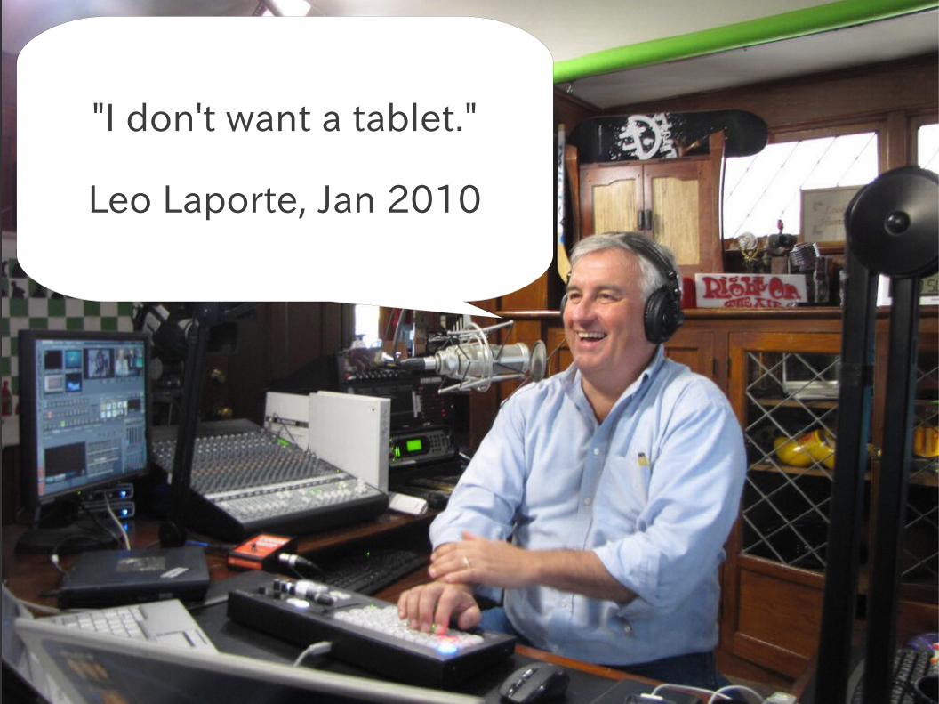
"I don't want a tablet."
Leo Laporte, Jan 2010

"I don’t use a laptop anymore."
Leo Laporte, April 2010
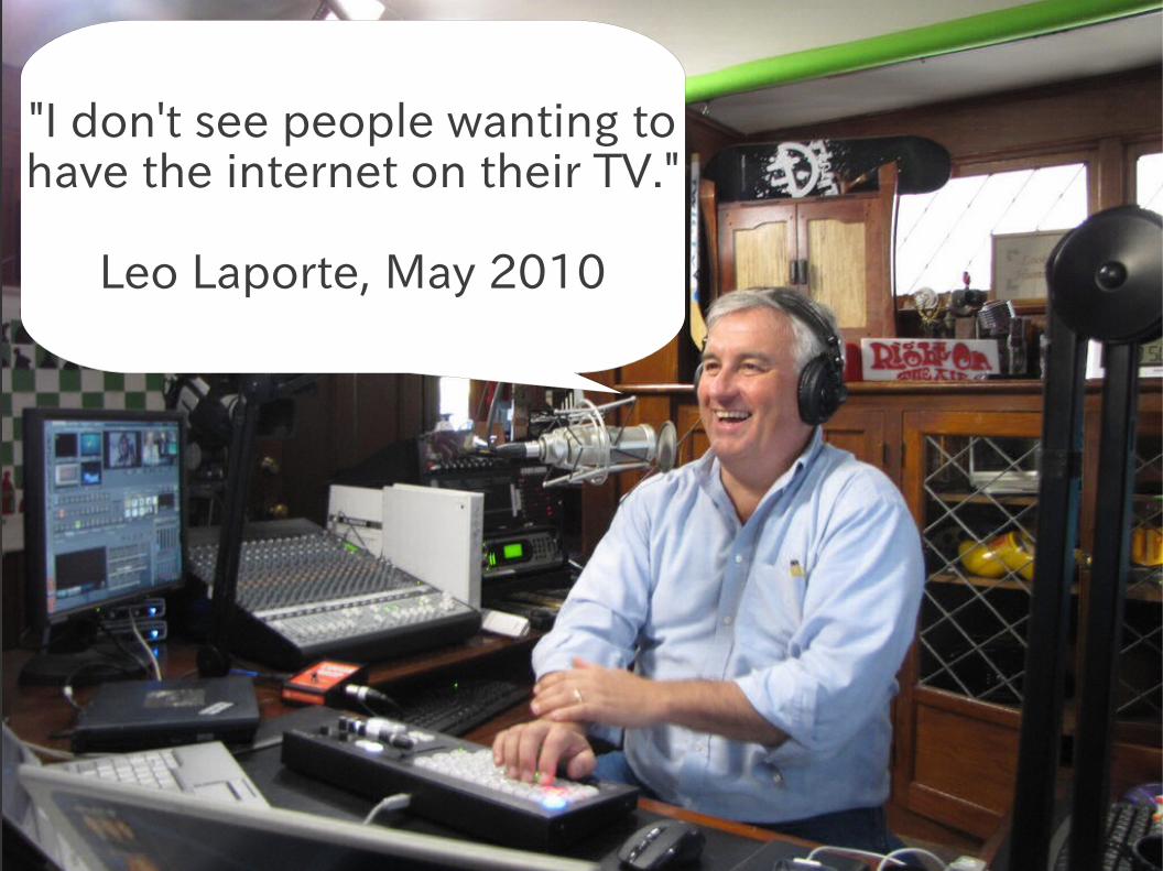
"I don't see people wanting tohave the internet on their TV."
Leo Laporte, May 2010
I play with TVs
:-)
I play with TVs
:-)
So muchto learn
:-(
So muchto learn
:-(

Text input is painfulText input is painful

Text input is painfulNavigation is painfulText input is painfulNavigation is painful

Text input is painfulNavigation is painfulReading text is painful
Text input is painfulNavigation is painfulReading text is painful

Text input is painfulNavigation is painfulReading text is painfulPage loading is painful
Text input is painfulNavigation is painfulReading text is painfulPage loading is painful
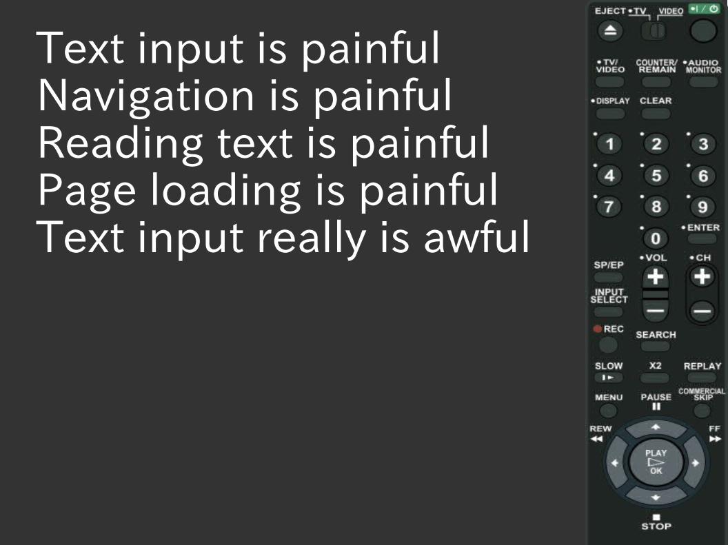
Text input is painfulNavigation is painfulReading text is painfulPage loading is painfulText input really is awful
Text input is painfulNavigation is painfulReading text is painfulPage loading is painfulText input really is awful

Wait a cotton pickin' minute...
Wait a cotton pickin' minute...

That's just like mobile!
That's just like mobile!

Yep.Yep.

So...So...

Utopia: Dedicated TV
pages
Utopia: Dedicated TV
pages

Compromise:TV-ify your
mobile pages
Compromise:TV-ify your
mobile pages

OK, OK.Just show me
the code!
OK, OK.Just show me
the code!
Calm down.Calm down.


So? Just zoom in already!
So? Just zoom in already!


body {-o-transform: scale(2);-moz-transform: scale(2);-webkit-transform: scale(2);-ms-transform: scale(2);transform: scale(2);
}
body {-o-transform: scale(2);-moz-transform: scale(2);-webkit-transform: scale(2);-ms-transform: scale(2);transform: scale(2);
}

body {font-size: 2em;
}
body {font-size: 2em;
}

body {font-size: 3em;
}
body {font-size: 3em;
}


The “tv” media type is not used
by TVs
The “tv” media type is not used
by TVs

Instead, use Media Queries
Instead, use Media Queries
Media Queries:“if” statements
for CSS
Media Queries:“if” statements
for CSS

@media (condition) {regular CSS
}
For example:
@media (max-width: 600px) {body {font-size: 2em;
}}
@media (condition) {regular CSS
}
For example:
@media (max-width: 600px) {body {font-size: 2em;
}}
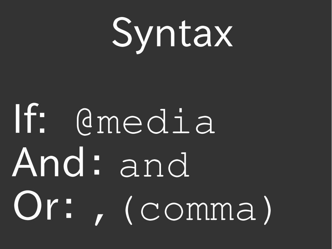
Syntax
If: @mediaAnd: andOr: ,(comma)
Syntax
If: @mediaAnd: andOr: ,(comma)

The perfect TV media query...The perfect TV media query...
(maybe)(maybe)

@media tv,(width: 1920px) and (height: 1080px),(width: 1280px) and (height: 720px) {body {Font-size: 2.5em;
}}
@media tv,(width: 1920px) and (height: 1080px),(width: 1280px) and (height: 720px) {body {Font-size: 2.5em;
}}
bit.ly/tvdevDaniel Davis
@ourmaninjapanOpera Software
bit.ly/tvdevDaniel Davis
@ourmaninjapanOpera Software


