
Final report for Ofcom
Impact analysis of socio-
economic factors and
broadband availability
30 May 2014
Matt Yardley, Ian Adkins, Khooshiram
Oodhorah, Declan Clancy
Ref: 37110-226
.

Ref: 37110-226 .
Contents
1 Executive summary 1
2 Introduction 8
2.1 Context, objectives and scope 8
2.2 Methodology 9
2.3 Report structure 10
3 Impact analysis: London 11
3.1 City overview 11
3.2 Broadband availability 11
3.3 Impact analysis findings 12
4 Impact analysis: Birmingham 23
4.1 City overview 23
4.2 Broadband availability 23
4.3 Impact analysis findings 25
5 Impact analysis: Manchester 36
5.1 City overview 36
5.2 Broadband availability 36
5.3 Impact analysis findings 38
6 Impact analysis: Glasgow 49
6.1 City overview 49
6.2 Broadband availability 49
6.3 Impact analysis findings 51
7 Impact analysis: Cardiff 62
7.1 City overview 62
7.2 Broadband availability 62
7.3 Impact analysis findings 64
8 Impact analysis: Belfast 75
8.1 City overview 75
8.2 Broadband availability 75
8.3 Impact analysis findings 76
9 Comparison of key city data 88
9.1 Overview of broadband availability 88
9.2 ‗<2Mbit/s‘ broadband connections 89
9.3 NGA broadband availability 93
9.4 Conclusions and recommendations 96
Annex A Methodology

Impact analysis of socio-economic factors and broadband availability
Ref: 37110-226 .
Copyright © 2014. Analysys Mason Limited has produced the information contained herein
for Ofcom. The ownership, use and disclosure of this information are subject to the
Commercial Terms contained in the contract between Analysys Mason Limited and Ofcom.
Analysys Mason Limited
Exchange Quay
Manchester M5 3EF
UK
Tel: +44 (0)161 877 7808
Fax: +44 (0)161 877 7810
www.analysysmason.com
Registered in England No. 5177472

Impact analysis of socio-economic factors and broadband availability | 1
Ref: 37110-226 .
1 Executive summary
Introduction
Ofcom‘s principal duty is to further the interests of citizens and consumers in relation to
communications matters. In order to adhere to that guiding principle, it has a number of strategic
objectives, including helping communications markets work for consumers, and contributing to
and implementing public policy as defined by Parliament.
To inform its work in these areas, Ofcom commissioned Analysys Mason to investigate potential
relationships between a selection of socio-economic factors1 (income, education and crime) and
broadband availability (the percentage of ‗less than 2Mbps‘ (‗<2Mbit/s‘) connections and NGA
broadband availability)2 in six UK cities. This work follows on from research Ofcom previously
commissioned Analysys Mason to undertake into the availability of communications services in 11
UK cities.3
The six cities that Ofcom has selected for investigation are:
England: London, Birmingham, Manchester
Scotland: Glasgow
Wales: Cardiff
Northern Ireland: Belfast.
To the best of our knowledge, this type of analysis has not been carried out before.
The analysis has revealed some interesting findings. We have found marked relationships between
the degree of socio-economic deprivation and broadband availability in cities, although in this
report we do not seek to prove causality. There are also exceptions to some trends; for these we
provide some potential reasons to explain the differences.
‘<2Mbit/s’ connections and NGA broadband availability
Using Ofcom‘s 2013 broadband availability dataset, the percentage of ‗<2Mbit/s‘ connections and
NGA broadband availability have been derived for each city studied, as summarised in Figure 1.1.
1 This study has not investigated inter-correlation between the selected socio-economic factors.
2 NGA broadband availability represents next-generation access broadband from any broadband operator in the UK.
3 See http://stakeholders.ofcom.org.uk/binaries/research/cmr/cmr13/cities-report.pdf
Impact analysis of socio-economic factors and broadband availability | 2
Ref: 37110-226 .
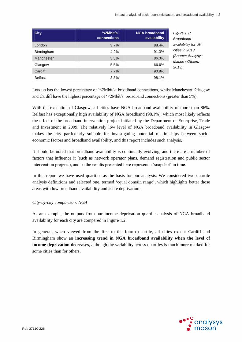
City
‘<2Mbit/s’
connections
NGA broadband
availability
Figure 1.1:
Broadband
availability for UK
cities in 2013
[Source: Analysys
Mason / Ofcom,
2013]
London 3.7% 88.4%
Birmingham 4.2% 91.3%
Manchester 5.5% 86.3%
Glasgow 5.5% 66.6%
Cardiff 7.7% 90.9%
Belfast 3.8% 98.1%
London has the lowest percentage of ‗<2Mbit/s‘ broadband connections, whilst Manchester, Glasgow
and Cardiff have the highest percentage of ‗<2Mbit/s‘ broadband connections (greater than 5%).
With the exception of Glasgow, all cities have NGA broadband availability of more than 86%.
Belfast has exceptionally high availability of NGA broadband (98.1%), which most likely reflects
the effect of the broadband intervention project initiated by the Department of Enterprise, Trade
and Investment in 2009. The relatively low level of NGA broadband availability in Glasgow
makes the city particularly suitable for investigating potential relationships between socio-
economic factors and broadband availability, and this report includes such analysis.
It should be noted that broadband availability is continually evolving, and there are a number of
factors that influence it (such as network operator plans, demand registration and public sector
intervention projects), and so the results presented here represent a ‗snapshot‘ in time.
In this report we have used quartiles as the basis for our analysis. We considered two quartile
analysis definitions and selected one, termed ‗equal domain range‘, which highlights better those
areas with low broadband availability and acute deprivation.
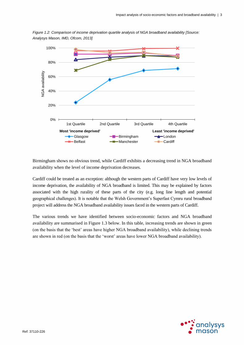
City-by-city comparison: NGA
As an example, the outputs from our income deprivation quartile analysis of NGA broadband
availability for each city are compared in Figure 1.2.
In general, when viewed from the first to the fourth quartile, all cities except Cardiff and
Birmingham show an increasing trend in NGA broadband availability when the level of
income deprivation decreases, although the variability across quartiles is much more marked for
some cities than for others.
Impact analysis of socio-economic factors and broadband availability | 3
Ref: 37110-226 .
Figure 1.2: Comparison of income deprivation quartile analysis of NGA broadband availability [Source:
Analysys Mason, IMD, Ofcom, 2013]
Birmingham shows no obvious trend, while Cardiff exhibits a decreasing trend in NGA broadband
availability when the level of income deprivation decreases.
Cardiff could be treated as an exception: although the western parts of Cardiff have very low levels of
income deprivation, the availability of NGA broadband is limited. This may be explained by factors
associated with the high rurality of these parts of the city (e.g. long line length and potential
geographical challenges). It is notable that the Welsh Government‘s Superfast Cymru rural broadband
project will address the NGA broadband availability issues faced in the western parts of Cardiff.
The various trends we have identified between socio-economic factors and NGA broadband
availability are summarised in Figure 1.3 below. In this table, increasing trends are shown in green
(on the basis that the ‗best‘ areas have higher NGA broadband availability), while declining trends
are shown in red (on the basis that the ‗worst‘ areas have lower NGA broadband availability).
0%
20%
40%
60%
80%
100%
1st Quartile 2nd Quartile 3rd Quartile 4th Quartile
NG
A a
va
ilab
ility
Most 'income deprived' Least 'income deprived'
Glasgow Birmingham London
Belfast Manchester Cardiff

Impact analysis of socio-economic factors and broadband availability | 4
Ref: 37110-226 .
Figure 1.3: Summary of impact of socio-economic factors on NGA broadband availability4 [Source: Analysys
Mason, IMD, Ofcom, 2013]
A consistent increasing trend (solid green arrow) means broadband availability increases every
quartile from the first to the fourth quartile, whereas an inconsistent increasing trend (green arrow
with hatched shading) means broadband availability increases from the first to the fourth quartile,
but there is a decrease between two of the quartiles. Using Figure 1.2 above as an example, NGA
availability increases in Glasgow between every quartile from the first quartile to the fourth
quartile (i.e. there is a ―consistent increasing trend‖), whereas for Manchester the trend is a general
increase from the first to the fourth quartile, but the fourth quartile value is slightly lower than that
for the third quartile (i.e. there is an ―inconsistent increasing trend‖). The same logic is applied to
the decreasing trends (red arrows).
From the above table, it can be observed that across the investigated cities, particularly if Cardiff is
considered as an exception:
there is generally an increasing trend in NGA broadband availability when the level of
income deprivation decreases
there is no overall obvious trend in NGA broadband availability when the level of education
deprivation decreases
there is generally an increasing trend in NGA broadband availability when the level of crime
rate decreases.
4 An ‘inconsistent’ trend reflects the anomaly whereby two quartiles contradict the general trend, but the anomaly
does not change the overall trend from the first to the fourth quartile.
Trend in
socio-economic
indicators
Trend in NGA broadband availability
Glasgow Birm’ham London Manchester Cardiff Belfast
When level of income
deprivation decreases
When level of education
deprivation decreases
When level of crime
decreases
Consistent increasing trend Inconsistent increasing trend
Consistent decreasing trendInconsistent decreasing trend
No obvious trendKey:

Impact analysis of socio-economic factors and broadband availability | 5
Ref: 37110-226 .
City-by-city comparison: ‘<2Mbit/s’
Similar trends are also observed between socio-economic deprivation factors and the percentage of
‗<2Mbit/s‘ broadband connections in a city. As an example, the outputs from our education
deprivation quartile analysis are compared in Figure 1.4 below, indicating the percentage of
‗<2Mbit/s‘ broadband connections for each city.
Figure 1.4: Comparison of education deprivation quartile analysis of ‘<2Mbit/s’ connections [Source: Analysys
Mason, IMD, Ofcom, 2013]
In general, when viewed from the first to the fourth quartile, all cities except Cardiff show a
decreasing trend in the percentage of ‘<2Mbit/s’ broadband connections when the level of
education deprivation decreases, although there is some variability between the second and third
quartiles for some cities.
Again, Cardiff could be considered as an exception: although the western parts of Cardiff have a
very low level of education deprivation they do have a relatively high percentage of ‗<2Mbit/s‘
broadband connections. This may be due to the reasons outlined above for NGA.
The various trends we have identified between the socio-economic factors and ‗<2Mbit/s‘
broadband connections are summarised in Figure 1.5 below. In this table, declining trends are
shown in green (on the basis that the ‗best‘ areas have the lowest percentage of ‗<2Mbit/s‘
broadband connections), while increasing trends are shown in red (on the basis that the ‗worst‘
areas have the highest percentage of ‗<2Mbit/s‘ broadband connections).
0%
5%
10%
15%
1st Quartile 2nd Quartile 3rd Quartile 4th Quartile
'<2
Mb
it/s
' bro
ad
ba
nd
co
nn
ectio
ns
Most 'education deprived' Least 'education deprived'
Glasgow Birmingham London
Belfast Manchester Cardiff

Impact analysis of socio-economic factors and broadband availability | 6
Ref: 37110-226 .
Figure 1.5: Impact of socio-economic factors on the percentage of ‘<2Mbit/s’ connections [Source: Analysys
Mason, IMD, Ofcom, 2013]
From the above table, it can be observed that across the investigated cities:
there is generally a decreasing trend in the percentage of ‗<2Mbit/s‘ broadband connections
when the level of income deprivation decreases
there is generally a decreasing trend in the percentage of ‗<2Mbit/s‘ broadband connections
when the level of education deprivation decreases
there is generally an increasing trend in the percentage of ‗<2Mbit/s‘ broadband connections
when the level of crime rate decreases.
Concluding remarks
The analysis has demonstrated marked relationships between socio-economic deprivation
factors and broadband availability.
It has also highlighted that individual cities have localities where there are acute deprivation
issues combined with low NGA broadband availability.
It is also seen that not all cities follow the general trends, but this may reflect the fact that
particular districts of each city have unique and sometimes highly localised characteristics that
have an impact on broadband availability.
We believe that policy makers seeking to identify ways to stimulate economic growth and
investment should investigate broadband-related issues, such as lack of NGA availability and
problems with ‗<2Mbits‘ connections, using data analysis comparable to that undertaken in this
report. An assessment of the links between broadband and socio-economic factors such as income,
education and crime can improve understanding of the problems faced by individual UK cities,
which are sometimes complex.
Trend in
socio-economic
indicators
Trend in ‘<2Mbit/s’ broadband connections
Glasgow Birm’ham London Manchester Cardiff Belfast
When level of income
deprivation decreases
When level of education
deprivation decreases
When level of crime
decreases
Consistent increasing trend Inconsistent increasing trend
Consistent decreasing trendInconsistent decreasing trend
No obvious trendKey:

Impact analysis of socio-economic factors and broadband availability | 7
Ref: 37110-226 .
The data analysis in this report has only been completed for six cities. Any policy development at
the national level would ideally be based on analysis of a wider sample of cities, conducted at a
suitably granular level; analysis at postcode level would be necessary as a minimum, but analysis
at street level should also be considered. Alternatively, any cities that wish to develop local
broadband policies and delivery plans should consider the implications of this analysis as part of
the policy development process. In addition, the data analysis could be extended to include other
factors which may influence broadband availability, such as unemployment, house prices and
existing broadband take-up.
Impact analysis of socio-economic factors and broadband availability | 8
Ref: 37110-226 .
2 Introduction
2.1 Context, objectives and scope
Ofcom‘s principal duty is to further the interests of citizens and consumers in relation to
communications matters. In order to adhere to that guiding principle, it has a number of strategic
objectives, including helping communications markets work for consumers, and contributing to
and implementing public policy as defined by Parliament.
To inform its work in these areas, Ofcom has commissioned Analysys Mason to investigate
potential relationships between a selection of socio-economic factors5 and broadband availability
(the percentage of ‗less than 2Mbps‘ (‗<2Mbit/s‘) connections and NGA broadband availability)6
in six UK cities (London, Birmingham, Manchester, Glasgow, Cardiff and Belfast), which were
researched in the Cities Project report.7
Consistent with the approach taken in the Cities Project report, the geographical area of each city is
determined by the boundaries used by the relevant city local authority. Although the use of local
authority boundaries provides a clear and consistent logic for defining city areas, the resulting areas
are not entirely consistent in terms of their nature and extent: in some cases, the local authority area
extends well beyond the main urban centre, and so includes less densely populated areas.
Information from the Index of Multiple Deprivation (IMD), which characterises deprivation on a
national basis, has been used to represent socio-economic factors, and was collected from the
government website of each nation.8,9,10,11
The IMD encompasses a number of ‗domains‘, of which
this study uses three: income, education and crime.
It is important to use appropriate care when interpreting the deprivation information presented in
this report. For example, a decreasing level of income deprivation would be interpreted as positive,
while an increasing level of income deprivation would be interpreted as negative.
The broadband data used for this impact analysis was collected by Ofcom from broadband
operators in 2013. The data presented in this report constitutes the most up-to-date information at
the time of writing, although it should be noted that the broadband availability and IMD datasets
are likely to evolve.
5 This study has not investigated inter-correlation between the selected socio-economic factors.
6 NGA broadband availability represents next-generation broadband from any broadband operator in the UK.
7 See http://stakeholders.ofcom.org.uk/binaries/research/cmr/cmr13/cities-report.pdf
8 See http://data.gov.uk/dataset/index-of-multiple-deprivation
9 See http://www.scotland.gov.uk/Topics/Statistics/SIMD
10 See https://statswales.wales.gov.uk/Catalogue/Community-Safety-and-Social-Inclusion/Welsh-Index-of-Multiple-
Deprivation/WIMD-2011
11 See http://www.nisra.gov.uk/deprivation/nimdm_2010.htm

Impact analysis of socio-economic factors and broadband availability | 9
Ref: 37110-226 .
When considering the impact analysis findings presented in this report, readers should note that:
The impact analysis does not consider key local factors that we would expect to influence the
roll-out strategies of broadband operators in a city (e.g. the cost of deployment,
population/premises density, existing broadband take-up, legacy infrastructure constraints) or
the commercial strategies of operators.
The data on broadband availability represents a snapshot in time across all broadband
operators and cannot reflect the fact that individual operators may have reached different
stages of their deployment plans.
2.2 Methodology
Analysys Mason has analysed the impact of three socio-economic factors (income, education and
crime) on broadband availability, using national IMD domain data and Ofcom‘s broadband
availability data. Broadband connections and availability have been derived for each Lower Super
Output Area (LSOA)12
in England and Wales, Data Zone13
in Scotland and Super Output Area
(SOA)14
in Northern Ireland.
Results have been produced for six cities (London, Birmingham, Manchester, Glasgow, Cardiff
and Belfast), contrasting the percentage of ‗<2Mbit/s‘ connections and NGA broadband
availability in each city with the IMD income, education and crime domain scores. In each case
the results are broken down by quartile. Two alternative quartile analysis methods have been
applied, as summarised in Figure 2.1.
Figure 2.1: Description of quartile analysis methods used [Source: Analysys Mason, 2013]
Method Description Example
Equal
domain
range
This method defines each quartile as the difference between
maximum and minimum values of scores in the IMD domain
divided by four. The upper and lower scores of each quartile
will be different for each city depending on its range of scores
for the given IMD domain. Therefore, the number of premises
in each quartile will be different. This method has been
chosen as a way of highlighting acute deprivation relative to
the rest of the nation
This method highlights the
NGA broadband availability
for areas of the city that fall
into the 25% most deprived
areas
Equal
premises
count
This method defines each quartile as the total number of
premises in a city divided by four. Therefore, the number of
premises in each quartile will be the same. This method has
been chosen as a way of highlighting the relative differences
in deprivation within a city
This method highlights the
NGA broadband availability
for areas that represent the
25% most deprived
premises in the city
12
An LSOA is a sub-ward geographical area averaging approximately 1500 people, as published by the Office of
National Statistics and widely used by local authorities across England and Wales.
13 A Data Zone is a group of small geographical areas with populations of between 500 and 1000 household residents,
as published by Scottish Neighbourhood Statistics and widely used by local authorities across Scotland.
14 An SOA is a group of wards taking into account measures of population size (lower and upper thresholds are 1300
and 2800 respectively, but with a target size of around 2000) and mutual proximity, as published by the Northern Ireland Statistics and Research Agency and widely used by local authorities across Northern Ireland.

Impact analysis of socio-economic factors and broadband availability | 10
Ref: 37110-226 .
Geographical maps based on quartile ranges have also been developed using these two methods.
These allow the most deprived and least deprived areas to be quickly identified from the colour
coding on the maps.
Key observations are drawn from the quartile analysis charts and geographical maps for each city,
and in some cases known local factors (such as public intervention) are used to provide potential
explanations for the analysis shown.
A full description of the methodology used for the analysis is provided in Annex A.
2.3 Report structure
The remaining sections of this report are structured as follows:
Section 3 contains the impact analysis for London
Section 4 contains the impact analysis for Birmingham
Section 5 contains the impact analysis for Manchester
Section 6 contains the impact analysis for Glasgow
Section 7 contains the impact analysis for Cardiff
Section 8 contains the impact analysis for Belfast
Section 9 contains a comparison of key city data.
In addition, Annex A provides a full description of the methodology used for quartile analysis.

Impact analysis of socio-economic factors and broadband availability | 11
Ref: 37110-226 .
3 Impact analysis: London
3.1 City overview
The city boundary of London is defined as the Greater London Authority (GLA) geographical
boundary, as shown in Figure 3.1 below.
Figure 3.1: London
geographical area
[Source: Analysys
Mason, 2013]
According to the 2011 census, London has a population of around 7.8 million and around
3.4 million premises, of which 3.2 million are residential premises.
3.2 Broadband availability
Using the Ofcom 2013 dataset, the percentage of ‗<2Mbit/s‘ connections is estimated as 3.7% of all
broadband connections across London, and NGA broadband availability is estimated to reach 88.4% of
all premises across London. Maps showing broadband availability in London are provided in
Figure 3.2 (‗<2Mbit/s‘ connections) and Figure 3.3 (NGA broadband availability) below.
Figure 3.2: ‘<2Mbit/s’
connections in London
[Source: Analysys
Mason, Ofcom, 2013]

Impact analysis of socio-economic factors and broadband availability | 12
Ref: 37110-226 .
Areas with the highest percentage of ‗<2Mbit/s‘ connections (worst areas), shown in red in
Figure 3.2, are mostly concentrated around the outskirts of London; most of the city has a low
percentage of ‗<2Mbit/s‘ connections (between 0% and 5%).
Low levels of NGA broadband availability (worst areas), shown using red in Figure 3.3, are
mostly concentrated in the city centre, while the rest of the city is well served with NGA
broadband. The low level of NGA broadband availability in these areas could be due to the
relatively high numbers of non-residential premises (which attract business-grade connectivity),
and a relatively low population density.
Figure 3.3: NGA
broadband availability
in London [Source:
Analysys Mason,
Ofcom, 2013]
Generally, the areas with a high level of ‗<2Mbit/s‘ connections do not correspond to areas with
low NGA broadband availability, so there does not seem to be a relationship between the two that
has affected NGA broadband availability in London.
It should be noted that this analysis of broadband availability provides a snapshot in time, because
it is expected that broadband roll-out will continue to evolve, provided that, for example:
investment conditions remain attractive for broadband operators, and
the demand stimulation intervention project in London‘s Super-Connected Cities programme
progresses.
3.3 Impact analysis findings
There are 4765 LSOAs in London, and the broadband availability for each LSOA is derived using
the Ofcom 2013 dataset. The impact analysis findings for the three measures of deprivation
(income, education and crime) are provided in this section, using both methods (equal domain
range and equal premises count).

Impact analysis of socio-economic factors and broadband availability | 13
Ref: 37110-226 .
3.3.1 Income
Equal domain range method
Figure 3.4 below shows the distribution of income deprivation across London, using the equal
domain range method.
Figure 3.4: Distribution
of income deprivation
across London using
equal domain range
method [Source:
Analysys Mason, IMD,
2013]
It can be seen that a much lower proportion of LSOAs are in the most ‗income deprived‘ quartile
(coloured in red, denoting the ‗0%–25%‘ range on the map) than in the other quartiles. In contrast,
there is a more even distribution of LSOAs across the other three quartiles.
Figure 3.5 below provides quartile analysis of the percentage of ‗<2Mbit/s‘ connections and NGA
broadband availability (left-hand vertical axis) by income deprivation. The right-hand vertical axis
represents the percentage of premises considered in each quartile, to highlight the difference
between the equal domain range and equal premises count methods of analysis.
Figure 3.5: Income deprivation analysis for London using equal domain range method [Source: Analysys
Mason, IMD, Ofcom]
Decre
asin
g le
vel
of d
ep
rivatio
n
83.9% 87.1% 89.3% 88.8%
4.3% 3.5% 3.6% 3.7%
0%
20%
40%
60%
80%
100%
0%
20%
40%
60%
80%
100%
1st Quartile 2nd Quartile 3rd Quartile 4th Quartile
% o
f p
rem
ise
s
Ava
ila
bil
ity
Most 'income deprived' Least 'income deprived'
NGA <2Mbit/s % of premises

Impact analysis of socio-economic factors and broadband availability | 14
Ref: 37110-226 .
From the chart above, it can be observed that when the level of income deprivation decreases
(representing areas with higher income) in London there is:
an inconsistent quartile-to-quartile decreasing trend in the percentage of ‗<2Mbit/s‘
connections (a difference of 0.6 percentage points between the most and least ‗income
deprived‘ quartiles)
— the percentage of ‗<2Mbit/s‘ connections increases slightly from the second to the fourth
quartile, and
an inconsistent quartile-to-quartile increasing trend in NGA broadband availability (a
difference of 4.9 percentage points between the most and least ‗income deprived‘ quartiles)
— NGA broadband availability decreases slightly from the third to the fourth quartile.
Equal premises count method
Figure 3.6 below shows the distribution of income deprivation across London using the equal
premises count method.
Figure 3.6: Distribution
of income deprivation
across London using
equal premises count
method [Source:
Analysys Mason, IMD,
2013]
It can be seen that the LSOAs are more evenly distributed across the quartiles than when using the
equal domain range method. In addition, it can be seen that the most ‗income deprived‘ areas of
London are mostly in the north-east of the city.
Figure 3.7 below provides quartile analysis by income deprivation using the equal premises count
method. The right-hand vertical axis represents the percentage of premises considered in each
quartile (which is the same for each quartile using the equal premises count method).
Decre
asin
g le
vel
of d
ep
rivatio
n

Impact analysis of socio-economic factors and broadband availability | 15
Ref: 37110-226 .
Figure 3.7: Income deprivation analysis for London using equal premises count method [Source: Analysys
Mason, IMD, Ofcom, 2013]
From the chart above, it can be observed that when the level of income deprivation decreases
(representing areas with higher income) in London there is:
no obvious quartile-to-quartile trend in the percentage of ‗<2Mbit/s‘ connections, and
an inconsistent quartile-to-quartile increasing trend in NGA broadband availability (a
difference of 2.1 percentage points between the most and least ‗income deprived‘ quartiles)
— NGA broadband availability decreases slightly from the third to the fourth quartile.
3.3.2 Education
Equal domain range method
Figure 3.8 on the following page shows the distribution of education deprivation across London
using the equal domain range method.
86.9% 89.1% 89.3% 89.0%
3.6% 3.6% 3.8% 3.7%
0%
20%
40%
60%
80%
100%
0%
20%
40%
60%
80%
100%
1st Quartile 2nd Quartile 3rd Quartile 4th Quartile
% o
f p
rem
ise
s
Ava
ila
bil
ity
Most 'income deprived' Least 'income deprived'
NGA <2Mbit/s % of premises

Impact analysis of socio-economic factors and broadband availability | 16
Ref: 37110-226 .
Figure 3.8: Distribution
of education deprivation
across London using
equal domain range
method [Source:
Analysys Mason, IMD,
2013]
It can be seen that the proportion of LSOAs in the least ‗education deprived‘ quartile (shown in the
darker green colour, denoting the ‗75%–100%‘ range on the map) is much higher than in the other
quartiles. In contrast, there is a more even distribution of LSOAs across the other three quartiles.
Figure 3.9 below provides quartile analysis of the percentage of ‗<2Mbit/s‘ connections and NGA
broadband availability (left-hand vertical axis) by education deprivation. The right-hand vertical
axis represents the percentage of premises considered in each quartile, to highlight the difference
between the equal domain range and equal premises count methods of analysis.
Figure 3.9: Education deprivation analysis for London using equal domain range method [Source: Analysys
Mason, IMD, Ofcom, 2013]
Decre
asin
g le
vel
of d
ep
rivatio
n
99.0%92.4% 88.7% 88.2%
5.0% 5.0% 4.1% 3.4%
0%
20%
40%
60%
80%
100%
0%
20%
40%
60%
80%
100%
1st Quartile 2nd Quartile 3rd Quartile 4th Quartile
% o
f p
rem
ise
s
Ava
ila
bil
ity
Most 'education deprived' Least 'education deprived'
NGA <2Mbit/s % of premises

Impact analysis of socio-economic factors and broadband availability | 17
Ref: 37110-226 .
From the chart above, it can be observed that when the level of education deprivation decreases
(representing areas with higher levels of educational attainment) in London there is:
a consistent quartile-to-quartile decreasing trend in the percentage of ‗<2Mbit/s‘
connections (a difference of 1.6 percentage points between the most and least ‗education
deprived‘ quartiles), and
a consistent quartile-to-quartile decreasing trend in NGA broadband availability (a difference
of 10.8 percentage points between the most and least ‗education deprived‘ quartiles).
Equal premises count method
Figure 3.10 below shows the distribution of education deprivation across London using the equal
premises count method.
Figure 3.10: Distribution
of education deprivation
across London, using
equal premises count
method [Source:
Analysys Mason, IMD,
2013]
It can be observed that the LSOAs are more evenly distributed across the quartiles than when
using the equal domain range method. In addition, it can be seen that the most ‗education
deprived‘ areas in London are concentrated in the north-east of the city.
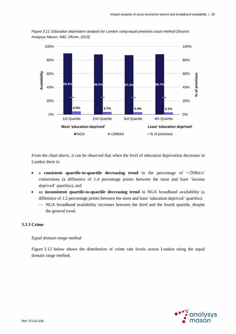
Figure 3.11 below provides quartile analysis for education deprivation using the equal premises
count method.
Decre
asin
g le
vel
of d
ep
rivatio
n
Impact analysis of socio-economic factors and broadband availability | 18
Ref: 37110-226 .
Figure 3.11: Education deprivation analysis for London using equal premises count method [Source:
Analysys Mason, IMD, Ofcom, 2013]
From the chart above, it can be observed that when the level of education deprivation decreases in
London there is:
a consistent quartile-to-quartile decreasing trend in the percentage of ‗<2Mbit/s‘
connections (a difference of 1.4 percentage points between the most and least ‗income
deprived‘ quartiles), and
an inconsistent quartile-to-quartile decreasing trend in NGA broadband availability (a
difference of 1.2 percentage points between the most and least ‗education deprived‘ quartiles)
— NGA broadband availability increases between the third and the fourth quartile, despite
the general trend.
3.3.3 Crime
Equal domain range method
Figure 3.12 below shows the distribution of crime rate levels across London using the equal
domain range method.
89.9% 88.5% 87.3% 88.7%
4.5% 3.7% 3.4% 3.1%
0%
20%
40%
60%
80%
100%
0%
20%
40%
60%
80%
100%
1st Quartile 2nd Quartile 3rd Quartile 4th Quartile
% o
f p
rem
ise
s
Ava
ila
bil
ity
Most 'education deprived' Least 'education deprived'
NGA <2Mbit/s % of premises

Impact analysis of socio-economic factors and broadband availability | 19
Ref: 37110-226 .
Figure 3.12: Distribution
of crime rate levels
across London using
equal domain range
method [Source:
Analysys Mason, IMD,
2013]
It can be seen that a much smaller proportion of LSOAs lie in the lowest crime rate level quartile
(shown in the darker green colour, denoting the ‗75%–100%‘ range on the map) than in the other
quartiles. However, there are a high proportion of LSOAs in the second-highest crime rate level
(coloured in yellow, denoting the ‗25%–50%‘ range on the map).
Figure 3.13 below provides quartile analysis of the percentage of ‗<2Mbit/s‘ connections and
NGA broadband availability (left-hand vertical axis) by crime rate level. The right-hand vertical
axis represents the percentage of premises considered in each quartile.
Figure 3.13: Crime deprivation analysis for London using equal domain range method [Source: Analysys
Mason, IMD, Ofcom, 2013]
Decre
asin
g le
vel
of d
ep
rivatio
n
88.6% 89.2% 89.1%
57.8%
3.4% 3.5% 3.9% 4.0%
0%
20%
40%
60%
80%
100%
0%
20%
40%
60%
80%
100%
1st Quartile 2nd Quartile 3rd Quartile 4th Quartile
% o
f p
rem
ise
s
Ava
ila
bil
ity
Highest crime rate Lowest crime rate
NGA <2Mbit/s % of premises

Impact analysis of socio-economic factors and broadband availability | 20
Ref: 37110-226 .
From the chart above, it can be observed that when the level of crime rate decreases in London
there is:
a consistent quartile-to-quartile increasing trend in the percentage of ‗<2Mbit/s‘
connections (a difference of 0.6 percentage points between the highest and lowest crime rate
level quartiles), and
an inconsistent quartile-to-quartile decreasing trend in NGA broadband availability (a
difference of 30.8 percentage points between the highest and lowest crime rate level quartiles),
which is surprising
— NGA broadband availability increases between the first and second quartile, despite the
general trend.
Equal premises count method
Figure 3.14 below shows the distribution of crime rate levels across London using the equal
premises count method.
Figure 3.14: Distribution
of crime rate levels
across London using
equal premises count
method [Source:
Analysys Mason, IMD,
2013]
It can be observed that the LSOAs are more evenly distributed across the quartiles than when
using the equal domain range method. In addition, it can be seen that the areas with the highest
crime rate levels in London are scattered across the city.
Figure 3.15 below provides quartile analysis for the crime rate level using the equal premises
count method.
Decre
asin
g le
vel
of d
ep
rivatio
n

Impact analysis of socio-economic factors and broadband availability | 21
Ref: 37110-226 .
Figure 3.15: Crime deprivation analysis for London using equal premises count method [Source: Analysys
Mason, IMD, Ofcom, 2013]
From the chart above, it can be observed that when the crime rate decreases in London there is:
an inconsistent quartile-to-quartile increasing trend in the percentage of ‗<2Mbit/s‘
connections (a difference of 0.8 percentage points between the highest and lowest crime rate
level quartiles)
— the percentage of ‗<2Mbit/s‘ connections does not change between the second and third
quartile, and
a consistent quartile-to-quartile decreasing trend in NGA broadband availability (a
difference of 4.1 percentage points between the highest and lowest crime rate level quartiles),
which is surprising.
3.3.4 Summary
As illustrated above, the two methods produce very similar results. However, since the equal
domain range method highlights acute deprivation problems relative to the country as a whole, it is
those results which are discussed in this section.
Key observations from the impact analysis of socio-economic factors on broadband availability for
London are summarised in Figure 3.16 below.
89.8% 89.5% 89.3% 85.7%
3.2% 3.7% 3.7% 4.0%
0%
20%
40%
60%
80%
100%
0%
20%
40%
60%
80%
100%
1st Quartile 2nd Quartile 3rd Quartile 4th Quartile
% o
f p
rem
ise
s
Ava
ila
bil
ity
Highest crime rate Lowest crime rate
NGA <2Mbit/s % of premises

Impact analysis of socio-economic factors and broadband availability | 22
Ref: 37110-226 .
Figure 3.16: Key observations on impact analysis for London using equal domain range method [Source:
Analysys Mason, 2013]
Socio-economic
factor
Key observations
Income
There is an inconsistent quartile-to-quartile decreasing trend in the
percentage of ‘<2Mbit/s’ connections when the level of income deprivation
decreases
There is an inconsistent quartile-to-quartile increasing trend in NGA
broadband availability when the level of income deprivation decreases
Education
There is a consistent quartile-to-quartile decreasing trend in the percentage
of ‘<2Mbit/s’ connections when the level of education deprivation decreases
There is a consistent quartile-to-quartile decreasing trend in NGA broadband
availability when the level of education deprivation decreases
Crime
There is a consistent quartile-to-quartile increasing trend in the percentage
of ‘<2Mbit/s’ connections when the crime rate decreases
There is an inconsistent quartile-to-quartile decreasing trend in NGA
broadband availability when the crime rate decreases, which is surprising
The analysis shows that there is a potential relationship between income and education deprivation
and the percentage of ‗<2Mbit/s‘ connections, because there is generally a decreasing trend in
‘<2Mbit/s’ connections when the levels of income and education deprivation decrease. In
addition, it appears that there is a potential relationship between crime rate levels and the
percentage of ‗<2Mbit/s‘ connections, because there is generally an increasing trend in
‘<2Mbit/s’ connections when the level of crime decreases.
Moreover, the analysis shows that there is a potential relationship between income deprivation and
NGA broadband availability, because there is an increasing trend in NGA broadband
availability when the level of income deprivation decreases. However, when levels of education
deprivation and crime rate decrease, the NGA broadband availability generally decreases. This
trend could be explained by the fact that NGA broadband availability is very low in the city centre
(which has a high number of non-residential premises and relatively low population density), and
levels of education deprivation and crime rate are also low in this area.
It should be noted that attempts to investigate potential relationships between socio-economic
factors and NGA broadband availability may be limited by the fact that London already has high
NGA broadband availability (88.4%). Also, it should be recognised that there are other factors
which influence broadband roll-out; for example, it is well established that issues related to cost
(e.g. premises density and line length) and take-up are significant considerations.

Impact analysis of socio-economic factors and broadband availability | 23
Ref: 37110-226 .
4 Impact analysis: Birmingham
4.1 City overview
The city boundary of Birmingham is defined as the Birmingham City Council geographical
boundary, as shown in Figure 4.1 below.
Figure 4.1: Birmingham
geographical area
[Source: Analysys
Mason, 2013]
According to the 2011 census, Birmingham has a population of around 1.0 million and around
445 000 premises, of which 427 000 are residential premises.
4.2 Broadband availability
Using the Ofcom 2013 dataset, the percentage of ‗<2Mbit/s‘ connections is estimated as 4.2% of
all broadband connections across Birmingham and NGA broadband availability is estimated as
reaching 91.3% of all premises across Birmingham. Maps showing broadband availability in
Birmingham are provided in Figure 4.2 (‗<2Mbit/s‘ connections) and Figure 4.3 (NGA broadband
availability).

Impact analysis of socio-economic factors and broadband availability | 24
Ref: 37110-226 .
Figure 4.2: ‘<2Mbit/s’
connections in
Birmingham [Source:
Analysys Mason,
Ofcom, 2013]
Areas with the highest percentage of ‗<2Mbit/s‘ connections (worst areas), shown using orange in
Figure 4.2, are scattered across the city; most of the city has a low percentage of ‗<2Mbit/s‘
connections (between 0% and 5%).
Figure 4.3: NGA
broadband availability
in Birmingham [Source:
Analysys Mason,
Ofcom, 2013]

Impact analysis of socio-economic factors and broadband availability | 25
Ref: 37110-226 .
Low levels of NGA broadband availability (worst areas), shown using red in Figure 4.3, are
concentrated in the city centre, while the rest of the city is well served with NGA broadband. The
low level of NGA broadband availability in these areas could be due to the relatively high numbers
of non-residential premises (which attract business-grade connectivity), and a relatively low
population density.
Generally, the areas with a high percentage of ‗<2Mbit/s‘ connections do not correspond to areas
with low NGA broadband availability, so there does not seem to be a relationship between the two
that has affected NGA broadband availability in Birmingham.
It should be noted that broadband availability provides a snapshot in time, because it is expected
that broadband roll-out will continue to evolve, provided that, for example:
investment conditions remain attractive for broadband operators
the demand stimulation intervention project in Birmingham‘s Super-Connected Cities
programme progresses.
4.3 Impact analysis findings
There are 641 LSOAs in Birmingham and the broadband availability for each LSOA is derived
using the Ofcom 2013 dataset. The impact analysis findings for the three measures of deprivation
(income, education and crime) are provided in this section, using both methods (equal domain
range and equal premises count).
4.3.1 Income
Equal domain range method
Figure 4.4 below shows the distribution of income deprivation across Birmingham using the equal
domain range method.
It can be seen that a much lower proportion of LSOAs are in the most ‗income deprived‘ quartile
(coloured in red, denoting the ‗0%–25%‘ range on the map) than in the other quartiles. In contrast,
there is a more even distribution of LSOAs across the other three quartiles.

Impact analysis of socio-economic factors and broadband availability | 26
Ref: 37110-226 .
Figure 4.4: Distribution
of income deprivation
across Birmingham
using equal domain
range method [Source:
Analysys Mason, IMD,
2013]
Figure 4.5 below provides quartile analysis of the percentage of ‗<2Mbit/s‘ connections and NGA
broadband availability (left-hand vertical axis) by income deprivation. The right-hand vertical axis
represents the percentage of premises considered in each quartile, to highlight the difference
between the equal domain range and equal premises count methods of analysis.
Figure 4.5: Income deprivation analysis for Birmingham using equal domain range method [Source: Analysys
Mason, IMD, Ofcom, 2013]
Decre
asin
g le
vel
of d
ep
rivatio
n
91.4% 91.4% 93.5% 89.4%
6.1% 5.0% 4.2% 3.6%
0%
20%
40%
60%
80%
100%
0%
20%
40%
60%
80%
100%
1st Quartile 2nd Quartile 3rd Quartile 4th Quartile
% o
f p
rem
ise
s
Ava
ila
bil
ity
Most 'income deprived' Least 'income deprived'
NGA <2Mbit/s % of premises

Impact analysis of socio-economic factors and broadband availability | 27
Ref: 37110-226 .
From the chart above, it can be observed that when the level of income deprivation decreases
(representing areas with higher income) in Birmingham there is:
a consistent quartile-to-quartile decreasing trend in the percentage of ‗<2Mbit/s‘
connections (a difference of 2.5 percentage points between the most and least ‗income
deprived‘ quartiles), and
no obvious quartile-to-quartile trend in NGA broadband availability.
Equal premises count method
Figure 4.6 below shows the distribution of income deprivation across Birmingham using the equal
premises count method.
Figure 4.6: Distribution
of income deprivation
across Birmingham,
using equal premises
count method [Source:
Analysys Mason, IMD,
2013]
It can be observed that the LSOAs are more evenly distributed across the quartiles than when
using the equal domain range method. In addition, it can be seen that the most ‗income deprived‘
areas of Birmingham are mostly concentrated around the city centre.
Figure 4.7 below provides quartile analysis by income deprivation using the equal premises count
method. The right-hand vertical axis represents the percentage of premises considered in each
quartile, which is the same for each quartile using the equal premises count method.
Decre
asin
g le
vel
of d
ep
rivatio
n

Impact analysis of socio-economic factors and broadband availability | 28
Ref: 37110-226 .
Figure 4.7: Income deprivation analysis for Birmingham using equal premises count method [Source:
Analysys Mason, IMD, Ofcom, 2013]
From the chart above, it can be observed that when the level of income deprivation decreases
(representing areas with higher income) in Birmingham there is.
an inconsistent quartile-to-quartile decreasing trend in the percentage of ‗<2Mbit/s‘
connections (a difference of 1.5 percentage points between the most and least ‗income
deprived‘ quartiles)
— the percentage of ‗<2Mbit/s‘ connections increases slightly between the third and the
fourth quartile, and
no obvious quartile-to-quartile trend in NGA broadband availability.
4.3.2 Education
Equal domain range method
Figure 4.8 below shows the distribution of education deprivation across Birmingham using the
equal domain range method.
It can be seen that the proportion of LSOAs in the most ‗education deprived‘ quartile (coloured in
red, denoting the ‗0%–25%‘ range on the map) is much lower than in the other quartiles. In
contrast, there is a more even distribution of LSOAs across the other quartiles.
90.8% 94.4%89.6% 90.4%
5.1% 4.7% 3.4% 3.6%
0%
20%
40%
60%
80%
100%
0%
20%
40%
60%
80%
100%
1st Quartile 2nd Quartile 3rd Quartile 4th Quartile
% o
f p
rem
ise
s
Ava
ila
bil
ity
Most 'income deprived' Least 'income deprived'
NGA <2Mbit/s % of premises

Impact analysis of socio-economic factors and broadband availability | 29
Ref: 37110-226 .
Figure 4.8: Distribution
of education deprivation
across Birmingham,
using equal domain
range method [Source:
Analysys Mason, IMD,
2013]
Figure 4.9 below provides quartile analysis of the percentage of ‗<2Mbit/s‘ connections and NGA
broadband availability (left-hand vertical axis) by education deprivation. The right-hand vertical
axis represents the percentage of premises considered in each quartile, to highlight the difference
between the equal domain range and equal premises count methods of analysis.
Figure 4.9: Education deprivation analysis for Birmingham using equal domain range method [Source:
Analysys Mason, IMD, Ofcom, 2013]
Decre
asin
g le
vel
of d
ep
rivatio
n
95.6% 95.3%86.9%
92.1%
8.8%5.1% 4.0% 3.2%
0%
20%
40%
60%
80%
100%
0%
20%
40%
60%
80%
100%
1st Quartile 2nd Quartile 3rd Quartile 4th Quartile
% o
f p
rem
ise
s
Ava
ila
bil
ity
Most 'education deprived' Least 'education deprived'
NGA <2Mbit/s % of premises

Impact analysis of socio-economic factors and broadband availability | 30
Ref: 37110-226 .
From the chart above, it can be observed that when the level of education deprivation decreases
(representing areas with higher levels of education) in Birmingham there is:
a consistent quartile-to-quartile decreasing trend in the percentage of ‗<2Mbit/s‘
connections (a difference of 5.6 percentage points between the most and least ‗education
deprived‘ quartiles), and
an inconsistent quartile-to-quartile decreasing trend in NGA broadband availability (a
difference of 3.5 percentage points between the most and least ‗education deprived‘ quartiles)
— NGA broadband availability increases from the third to the fourth quartile, despite the
general trend.
Equal premises count method
Figure 4.10 shows the distribution of education deprivation across Birmingham using the equal
premises count method.
Figure 4.10: Distribution
of education deprivation
across Birmingham
using equal premises
count method [Source:
Analysys Mason, IMD,
2013]
It can be observed that the LSOAs are more evenly distributed across the quartiles than when
using the equal domain range method. In addition, it can be seen that the most ‗education
deprived‘ areas in Birmingham are in the central and southern parts of the city.
Figure 4.11 below provides quartile analysis for education deprivation using the equal premises
count method.
Decre
asin
g le
vel
of d
ep
rivatio
n
Impact analysis of socio-economic factors and broadband availability | 31
Ref: 37110-226 .
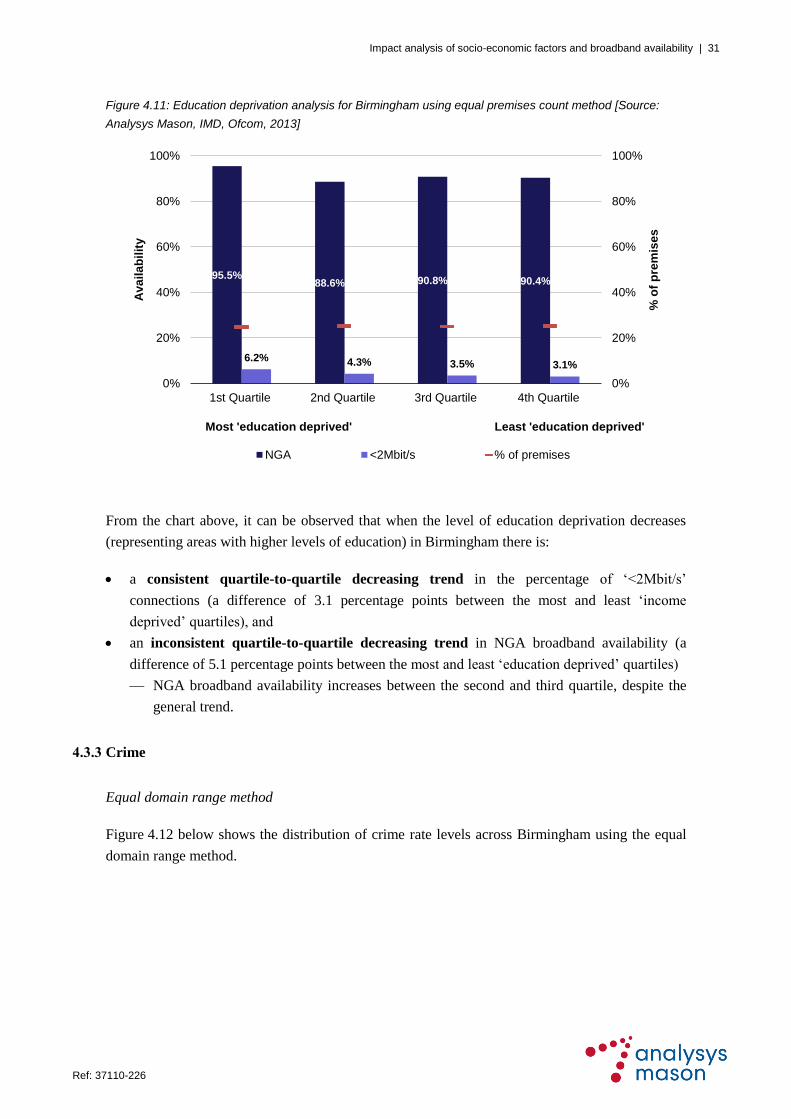
Figure 4.11: Education deprivation analysis for Birmingham using equal premises count method [Source:
Analysys Mason, IMD, Ofcom, 2013]
From the chart above, it can be observed that when the level of education deprivation decreases
(representing areas with higher levels of education) in Birmingham there is:
a consistent quartile-to-quartile decreasing trend in the percentage of ‗<2Mbit/s‘
connections (a difference of 3.1 percentage points between the most and least ‗income
deprived‘ quartiles), and
an inconsistent quartile-to-quartile decreasing trend in NGA broadband availability (a
difference of 5.1 percentage points between the most and least ‗education deprived‘ quartiles)
— NGA broadband availability increases between the second and third quartile, despite the
general trend.
4.3.3 Crime
Equal domain range method
Figure 4.12 below shows the distribution of crime rate levels across Birmingham using the equal
domain range method.
95.5%88.6% 90.8% 90.4%
6.2% 4.3% 3.5% 3.1%
0%
20%
40%
60%
80%
100%
0%
20%
40%
60%
80%
100%
1st Quartile 2nd Quartile 3rd Quartile 4th Quartile
% o
f p
rem
ise
s
Ava
ila
bil
ity
Most 'education deprived' Least 'education deprived'
NGA <2Mbit/s % of premises

Impact analysis of socio-economic factors and broadband availability | 32
Ref: 37110-226 .
Figure 4.12: Distribution
of crime rate levels
across Birmingham
using equal domain
range method [Source:
Analysys Mason, IMD,
2013]
It can be seen that a much lower proportion of LSOAs lie in the lowest crime rate level quartile
(shown in the darker green colour, denoting the ‗75%–100%‘ range on the map) than in the other
quartiles. In contrast, there is a more even distribution of LSOAs across the other three quartiles.
Figure 4.13 provides quartile analysis of the percentage of ‗<2Mbit/s‘ connections and NGA
broadband availability (left-hand vertical axis) by crime rate level. The right-hand vertical axis
represents the percentage of premises considered in each quartile.
Figure 4.13: Crime deprivation analysis for Birmingham using equal domain range method [Source: Analysys
Mason, IMD, Ofcom, 2013]
Decre
asin
g le
vel
of d
ep
rivatio
n
82.3% 91.6% 94.4% 97.1%
4.2% 4.3% 4.0% 3.4%
0%
20%
40%
60%
80%
100%
0%
20%
40%
60%
80%
100%
1st Quartile 2nd Quartile 3rd Quartile 4th Quartile
% o
f p
rem
ise
s
Ava
ila
bil
ity
Highest crime rate Lowest crime rate
NGA <2Mbit/s % of premises

Impact analysis of socio-economic factors and broadband availability | 33
Ref: 37110-226 .
From the chart above, it can be observed that when the crime rate decreases in Birmingham there is:
an inconsistent quartile-to-quartile decreasing trend in the percentage of ‗<2Mbit/s‘
connections (a difference of 0.8 percentage points between the highest and lowest crime rate
level quartiles)
— the percentage of ‗<2Mbit/s‘ connections increases slightly from the first to the second
quartile, and
a consistent quartile-to-quartile increasing trend in NGA broadband availability (a
difference of 14.8 percentage points between the highest and lowest crime rate level quartiles).
Equal premises count method
Figure 4.14 below shows the distribution of crime rate levels across Birmingham using the equal
premises count method.
Figure 4.14: Distribution
of crime rate levels
across Birmingham
using equal premises
count method [Source:
Analysys Mason, IMD,
2013]
It can be observed that the LSOAs are more evenly distributed across the quartiles than when
using the equal domain range method. In addition, it can be seen that areas with the highest crime
rate levels in Birmingham are scattered across the city.
Figure 4.15 below provides quartile analysis for the crime rate using the equal premises count method.
De
cre
asin
g le
ve
l
of d
ep
riva
tion

Impact analysis of socio-economic factors and broadband availability | 34
Ref: 37110-226 .
Figure 4.15: Crime deprivation analysis for Birmingham using equal premises count method [Source:
Analysys Mason, IMD, Ofcom, 2013]
From the chart above, it can be observed that when the crime rate decreases in Birmingham there is:
an inconsistent quartile-to-quartile decreasing trend in the percentage of ‗<2Mbit/s‘
connections (a difference of 0.6 percentage points between the highest and lowest crime rate
level quartiles)
— the percentage of ‗<2Mbit/s‘ connections increases slightly from the second to the third
quartile, and
an inconsistent quartile-to-quartile increasing trend in NGA broadband availability (a
difference of 7.5 percentage points between the highest and lowest crime rate level quartiles)
— NGA broadband availability increases between the third and fourth quartile, despite the
general trend.
4.3.4 Summary
As illustrated above, the two methods produce very similar results. However, since the equal
domain range method highlights acute deprivation problems relative to the country as a whole, it is
those results which are discussed in this section.
Key observations from the impact analysis of socio-economic factors on broadband availability for
Birmingham are summarised in Figure 4.16 below.
86.5%94.4% 94.4% 94.0%
4.6% 4.0% 4.1% 4.0%
0%
20%
40%
60%
80%
100%
0%
20%
40%
60%
80%
100%
1st Quartile 2nd Quartile 3rd Quartile 4th Quartile
% o
f p
rem
ise
s
Ava
ila
bil
ity
Highest crime rate Lowest crime rate
NGA <2Mbit/s % of premises

Impact analysis of socio-economic factors and broadband availability | 35
Ref: 37110-226 .
Figure 4.16: Key observations on impact analysis for Birmingham using equal domain range method [Source:
Analysys Mason, 2013]
Socio-economic
factor
Key observations
Income
There is a consistent quartile-to-quartile decreasing trend in the percentage
of ‘<2Mbit/s’ connections when the level of income deprivation decreases
There is no obvious quartile-to-quartile trend in NGA broadband availability
when the level of income deprivation decreases
Education
There is a consistent quartile-to-quartile decreasing trend in the percentage
of ‘<2Mbit/s’ connections when the level of education deprivation decreases
There is an inconsistent quartile-to-quartile decreasing trend in NGA
broadband availability when the level of education deprivation decreases
Crime
There is an inconsistent quartile-to-quartile decreasing trend in the
percentage of ‘<2Mbit/s’ connections when the crime rate decreases
There is a consistent quartile-to-quartile increasing trend in NGA broadband
availability when the level of crime rate decreases, which is not apparent with the
other socio-economic factors
The analysis shows that there is a potential relationship between the investigated socio-economic
factors and the percentage of ‗<2Mbit/s‘ connections, because there is a decreasing trend in the
percentage of ‗<2Mbit/s‘ connections when the level of deprivation decreases in all domains.
However, the analysis does not demonstrate that income deprivation has influenced the roll-out of
NGA broadband by fixed operators, because there is no obvious trend between this socio-
economic factor and NGA broadband availability. In addition, when the level of education
deprivation decreases, NGA broadband availability also generally decreases. This trend could be
explained by the fact that NGA broadband availability in the city centre (which has a high number
of non-residential premises and relatively low population density) is very low, as are levels of
education and crime deprivation. However, there is an increasing trend in NGA broadband
availability when the level of crime rate decreases.
It should be noted that attempts to investigate potential relationships between socio-economic
factors and NGA broadband availability may be limited by the fact that Birmingham already has
high NGA broadband availability (91.3%). Also, it should be recognised that there are other
factors that influence broadband roll-out; for example, it is well established that issues related to
cost (e.g. premises density and line length) and take-up are significant considerations.

Impact analysis of socio-economic factors and broadband availability | 36
Ref: 37110-226 .
5 Impact analysis: Manchester
5.1 City overview
The city boundary of Manchester is defined as the Manchester City Council geographical
boundary, as shown in Figure 5.1 below.
Figure 5.1: Manchester
geographical area
[Source: Analysys
Mason, 2013]
According to the 2011 census, Manchester has a population of around 0.5 million and around
229 000 premises, of which 217 000 are residential premises.
5.2 Broadband availability
Using the Ofcom 2013 dataset, the percentage of ‗<2Mbit/s‘ connections is estimated as 5.5% of
all broadband connections across Manchester, and NGA broadband availability is estimated as
86.3% of all premises across Manchester. Maps showing broadband availability in Manchester are
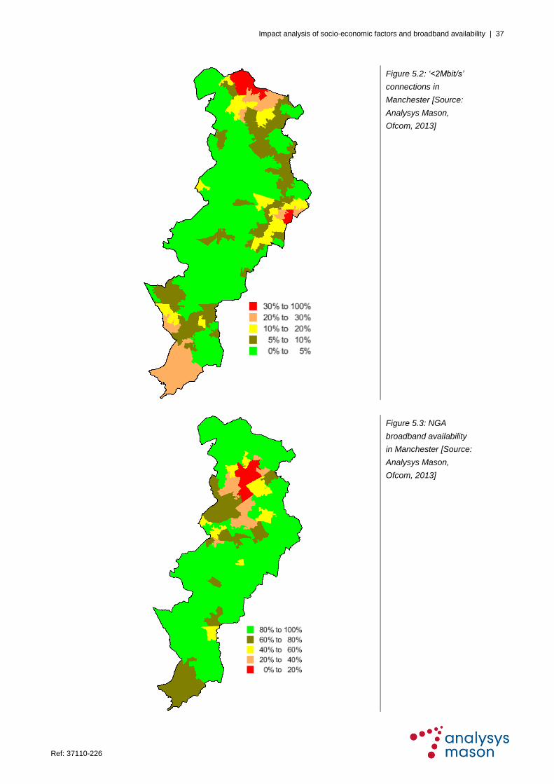
provided in Figure 5.2 (‗<2Mbit/s‘ connections) and Figure 5.3 (NGA broadband availability).
Areas with the highest percentage of ‗<2Mbit/s‘ connections (worst areas) are shown using red in
Figure 5.2; most of the city has a low percentage of ‗<2Mbit/s‘ connections (between 0% and 5%).
Impact analysis of socio-economic factors and broadband availability | 37
Ref: 37110-226 .
Figure 5.2: ‘<2Mbit/s’
connections in
Manchester [Source:
Analysys Mason,
Ofcom, 2013]
Figure 5.3: NGA
broadband availability
in Manchester [Source:
Analysys Mason,
Ofcom, 2013]

Impact analysis of socio-economic factors and broadband availability | 38
Ref: 37110-226 .
Low levels of NGA broadband availability (worst areas), shown using red in Figure 5.3, are
mostly concentrated in the city centre; the rest of the city is well served with NGA broadband. The
low level of NGA broadband availability in these areas could be due to the relatively high numbers
of non-residential premises (which attract business-grade connectivity), and a relatively low
population density.
Generally, the areas with a high percentage of ‗<2Mbit/s‘ connections do not correspond to areas
with low NGA broadband availability, so there does not seem to be a relationship between the two
that has affected NGA broadband availability in Manchester.
It should be noted that broadband availability provides a snapshot in time, because it is expected
that broadband roll-out will continue to evolve, provided that, for example:
investment conditions remain attractive for broadband operators
the demand stimulation intervention project in Manchester‘s Super-Connected Cities
programme progresses
the Corridor project15
in the Manchester Oxford area goes ahead.
5.3 Impact analysis findings
There are 259 LSOAs in Manchester, and the broadband availability for each LSOA is derived
using the Ofcom 2013 dataset. The impact analysis findings for the three measures of deprivation
(income, education and crime) are provided in this section, using both methods (equal domain
range and premises count).
5.3.1 Income
Equal domain range method
Figure 5.4 below shows the distribution of income deprivation across Manchester using the equal
domain range method.
15
The project is still awaiting State-aid approval.

Impact analysis of socio-economic factors and broadband availability | 39
Ref: 37110-226 .
Figure 5.4: Distribution
of income deprivation
across Manchester
using equal domain
range method [Source:
Analysys Mason, IMD,
2013]
It can be seen that a much lower proportion of LSOAs are in the most ‗income deprived‘ quartile
(coloured in red, denoting the ‗0%–25%‘ range on the map) than in the other quartiles.
Geographically, the other three quartiles appear to be more evenly distributed.
Figure 5.5 below provides quartile analysis of the percentage of ‗<2Mbit/s‘ connections and NGA
broadband availability (left-hand vertical axis) by income deprivation. The right-hand vertical axis
represents the percentage of premises considered in each quartile, to highlight the difference
between the equal domain range and equal premises count methods of analysis.
Figure 5.5: Income deprivation analysis for Manchester using equal domain range method [Source: Analysys
Mason, IMD, Ofcom, 2013]
Decre
asin
g le
vel
of d
ep
rivatio
n
69.0%
84.0%89.6% 87.1%
12.7%
5.6% 6.9%3.1%
0%
20%
40%
60%
80%
100%
0%
20%
40%
60%
80%
100%
1st Quartile 2nd Quartile 3rd Quartile 4th Quartile
% o
f p
rem
ise
s
Ava
ila
bil
ity
Most 'income deprived' Least 'income deprived'
NGA <2Mbit/s % of premises

Impact analysis of socio-economic factors and broadband availability | 40
Ref: 37110-226 .
From the chart above, it can be observed that when the level of income deprivation decreases
(representing areas with higher income) in Manchester there is:
an inconsistent quartile-to-quartile decreasing trend in the percentage of ‗<2Mbit/s‘
connections (a difference of 9.6 percentage points between the most and least ‗income
deprived‘ quartiles)
— the percentage of ‗<2Mbit/s‘ connections increases from the second to the third quartile, and
an inconsistent quartile-to-quartile increasing trend in NGA broadband availability (a
difference of 18.1 percentage points between the most and least ‗income deprived‘ quartiles)
— NGA broadband availability decreases from the third to the fourth quartile despite the
general trend.
Equal premises count method
Figure 5.6 below shows the distribution of income deprivation across Manchester using the equal
premises count method.
It can be observed that the LSOAs are more evenly distributed across the quartiles than when
using the equal domain range method. In addition, it can be seen that the most ‗income deprived‘
areas of Manchester are scattered across the whole city.
Figure 5.6: Distribution
of income deprivation
across Manchester
using equal premises
count method [Source:
Analysys Mason, IMD,
2013]
Figure 5.7 below provides quartile analysis by income deprivation using the equal premises count
method. The right-hand vertical axis represents the percentage of premises considered in each
quartile (which is the same for each quartile using the equal premises count method).
Decre
asin
g le
vel
of d
ep
rivatio
n

Impact analysis of socio-economic factors and broadband availability | 41
Ref: 37110-226 .
Figure 5.7: Income deprivation analysis for Manchester using equal premises count method [Source:
Analysys Mason, IMD, Ofcom, 2013]
From the chart above, it can be observed that when the level of income deprivation decreases
(representing areas with higher income) in Manchester there is:
an inconsistent quartile-to-quartile decreasing trend in the percentage of ‗<2Mbit/s‘
connections (a difference of 4.8 percentage points between the most and least ‗income
deprived‘ quartiles)
— the percentage of ‗<2Mbit/s‘ connections increases from the second to the third quartile,
and
an inconsistent quartile-to-quartile increasing trend in NGA broadband availability (a
difference of 6.2 percentage points between the most and least ‗income deprived‘ quartiles)
— however, there is a reduction of 3.8 percentage points in NGA broadband availability from
the second to the fourth quartile, despite the general trend.
5.3.2 Education
Equal domain range method
Figure 5.8 below shows the distribution of education deprivation across Manchester using the
equal domain range method.
80.6%90.6% 87.4% 86.8%
7.1% 5.5% 7.6%2.3%
0%
20%
40%
60%
80%
100%
0%
20%
40%
60%
80%
100%
1st Quartile 2nd Quartile 3rd Quartile 4th Quartile
% o
f p
rem
ise
s
Ava
ila
bil
ity
Most 'income deprived' Least 'income deprived'
NGA <2Mbit/s % of premises

Impact analysis of socio-economic factors and broadband availability | 42
Ref: 37110-226 .
Figure 5.8: Distribution
of education deprivation
across Manchester
using equal domain
range method [Source:
Analysys Mason, IMD,
2013]
It can also be observed that the most education deprived LSOAs (coloured in red, denoting the
‗0%–25%‘ range on the map) are concentrated in two geographical areas. The remaining quartiles
are more evenly distributed across Manchester.
Figure 5.9 below provides quartile analysis of the percentage of ‗<2Mbit/s‘ connections and NGA
broadband availability (left-hand vertical axis) by education deprivation. The right-hand vertical
axis represents the percentage of premises considered in each quartile.
Figure 5.9: Education deprivation analysis for Manchester using equal domain range method [Source:
Analysys Mason, IMD, Ofcom, 2013]
Decre
asin
g le
vel
of d
ep
rivatio
n
74.8%84.2%
89.6% 88.9%
9.1%6.1% 7.5%
2.5%
0%
20%
40%
60%
80%
100%
0%
20%
40%
60%
80%
100%
1st Quartile 2nd Quartile 3rd Quartile 4th Quartile
% o
f p
rem
ise
s
Ava
ila
bil
ity
Most 'education deprived' Least 'education deprived'
NGA <2Mbit/s % of premises

Impact analysis of socio-economic factors and broadband availability | 43
Ref: 37110-226 .
From the chart above, it can be observed that when the level of education deprivation decreases in
Manchester there is:
an inconsistent quartile-to-quartile decreasing trend in the percentage of ‗<2Mbit/s‘
connections (a difference of 6.6 percentage points between the most and least ‗education
deprived‘ quartiles)
— the percentage of ‗<2Mbit/s‘ connections increases from the second to the third quartile,
and
an inconsistent quartile-to-quartile increasing trend in NGA broadband availability (a
difference of 14.1 percentage points between the most and least ‗education deprived‘ quartiles)
— NGA broadband availability decreases from the third to the fourth quartile, despite the
general trend.
Equal premises count method
Figure 5.10 below shows the distribution of education deprivation across Manchester using the
equal premises count method.
Figure 5.10: Distribution
of education deprivation
across Manchester
using equal premises
count method [Source:
Analysys Mason, IMD,
2013]
It can be observed that the LSOAs are more evenly distributed across the quartiles than when
using the equal domain range method. In addition, it can be seen that the most ‗education
deprived‘ areas in Manchester are concentrated in the north and south of the city.
Decre
asin
g le
vel
of d
ep
rivatio
n

Impact analysis of socio-economic factors and broadband availability | 44
Ref: 37110-226 .
Figure 5.11 below provides quartile analysis for education deprivation using the equal premises
count method.
Figure 5.11: Education deprivation analysis for Manchester using equal premises count method [Source:
Analysys Mason, IMD, Ofcom, 2013]
From the chart above, it can be observed that when the level of education deprivation decreases in
Manchester there is:
a consistent quartile-to-quartile decreasing trend in the percentage of ‗<2Mbit/s‘
connections (a difference of 6.1 percentage points between the most and least ‗education
deprived‘ quartiles), and
an inconsistent quartile-to-quartile increasing trend in NGA broadband availability (a
difference of 12.5 percentage points between the most and least ‗education deprived‘ quartiles)
— however, there is a reduction of 1.8 percentage points in NGA broadband availability from
the second to the fourth quartile, despite the general trend.
5.3.3 Crime
Equal domain range method
Figure 5.12 below shows the distribution of crime rate levels across Manchester using the equal
domain range method.
77.3%
91.6%86.6% 89.8%
8.3% 6.9% 5.5%2.2%
0%
20%
40%
60%
80%
100%
0%
20%
40%
60%
80%
100%
1st Quartile 2nd Quartile 3rd Quartile 4th Quartile
% o
f p
rem
ise
s
Ava
ila
bil
ity
Most 'education deprived' Least 'education deprived'
NGA <2Mbit/s % of premises

Impact analysis of socio-economic factors and broadband availability | 45
Ref: 37110-226 .
Figure 5.12: Distribution
of crime rate levels
across Manchester
using equal domain
range method [Source:
Analysys Mason, IMD,
2013]
It can be seen that a much lower proportion of LSOAs are in the lowest crime rate level quartile (shown
in the darker green colour, denoting the ‗75%–100%‘ range on the map) and the highest crime rate
level quartile (coloured in red, denoting the ‗0%–25%‘ range on the map) than in the other quartiles.
Figure 5.13 below provides quartile analysis of the percentage of ‗<2Mbit/s‘ connections and
NGA broadband availability (left-hand vertical axis) by crime rate level. The right-hand vertical
axis represents the percentage of premises considered in each quartile.
Figure 5.13: Crime deprivation analysis for Manchester using equal domain range method [Source: Analysys
Mason, IMD, Ofcom, 2013]
Decre
asin
g le
vel
of d
ep
rivatio
n
69.7%
84.9%90.6% 90.5%
8.1% 6.3% 4.6%2.1%
0%
20%
40%
60%
80%
100%
0%
20%
40%
60%
80%
100%
1st Quartile 2nd Quartile 3rd Quartile 4th Quartile
% o
f p
rem
ise
s
Ava
ila
bil
ity
Highest crime rate Lowest crime rate
NGA <2Mbit/s % of premises

Impact analysis of socio-economic factors and broadband availability | 46
Ref: 37110-226 .
From the chart above, it can be observed that when the level of crime rate decreases in Manchester
there is:
a consistent quartile-to-quartile decreasing trend in the percentage of ‗<2Mbit/s‘
connections (a difference of 6.0 percentage points between the highest and lowest crime rate
level quartiles), and
an inconsistent quartile-to-quartile increasing trend in NGA broadband availability (a
difference of 20.8 percentage points between the highest and lowest crime rate level quartiles)
— NGA broadband availability decreases slightly from the third to the fourth quartile, despite
the general trend.
Equal premises count method
Figure 5.14 below shows the distribution of crime rate levels across Manchester using the equal
premises count method.
Figure 5.14: Distribution
of crime rate levels
across Manchester
using equal premises
count method [Source:
Analysys Mason, IMD,
2013]
It can be observed that the LSOAs are more evenly distributed across the quartiles than when
using the equal domain range method. In addition, it is noticeable that the areas with the highest
crime rate levels in Manchester are predominantly in the north of the city.
Figure 5.15 below provides quartile analysis for the crime rate using the equal premises count method.
Decre
asin
g le
vel
of d
ep
rivatio
n
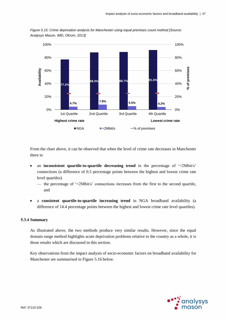
Impact analysis of socio-economic factors and broadband availability | 47
Ref: 37110-226 .
Figure 5.15: Crime deprivation analysis for Manchester using equal premises count method [Source:
Analysys Mason, IMD, Ofcom, 2013]
From the chart above, it can be observed that when the level of crime rate decreases in Manchester
there is:
an inconsistent quartile-to-quartile decreasing trend in the percentage of ‗<2Mbit/s‘
connections (a difference of 0.5 percentage points between the highest and lowest crime rate
level quartiles)
— the percentage of ‗<2Mbit/s‘ connections increases from the first to the second quartile,
and
a consistent quartile-to-quartile increasing trend in NGA broadband availability (a
difference of 14.4 percentage points between the highest and lowest crime rate level quartiles).
5.3.4 Summary
As illustrated above, the two methods produce very similar results. However, since the equal
domain range method highlights acute deprivation problems relative to the country as a whole, it is
those results which are discussed in this section.
Key observations from the impact analysis of socio-economic factors on broadband availability for
Manchester are summarised in Figure 5.16 below.
77.2%88.0% 88.7% 91.6%
4.7%7.8%
5.5% 4.2%
0%
20%
40%
60%
80%
100%
0%
20%
40%
60%
80%
100%
1st Quartile 2nd Quartile 3rd Quartile 4th Quartile
% o
f p
rem
ise
s
Ava
ila
bil
ity
Highest crime rate Lowest crime rate
NGA <2Mbit/s % of premises

Impact analysis of socio-economic factors and broadband availability | 48
Ref: 37110-226 .
Figure 5.16: Key observations on impact analysis for Manchester using equal domain range method [Source:
Analysys Mason, 2013]
Socio-economic
factor
Key observations
Income
There is an inconsistent quartile-to-quartile decreasing trend in the
percentage of ‘<2Mbit/s’ connections when the level of income deprivation
decreases
There is an inconsistent quartile-to-quartile increasing trend in NGA
broadband availability when the level of income deprivation decreases
Education
There is an inconsistent quartile-to-quartile decreasing trend in the
percentage of ‘<2Mbit/s’ connections when the level of education deprivation
decreases
There is an inconsistent quartile-to-quartile increasing trend in NGA
broadband availability when the level of education deprivation decreases
Crime
There is a consistent quartile-to-quartile decreasing trend in the percentage
of ‘<2Mbit/s’ connections when the level of crime rate decreases
There is an inconsistent quartile-to-quartile increasing trend in NGA
broadband availability when the level of crime rate decreases
The analysis shows that there is a potential relationship between the investigated socio-economic
factors and the percentage of ‗<2Mbit/s‘ connections, because there is generally a decreasing
trend in ‘<2Mbit/s’ connections when the level of deprivation decreases.
Moreover, the analysis shows that there is a potential relationship between the investigated socio-
economic factors and NGA broadband availability, because there is generally an increasing trend
in NGA broadband availability when the level of deprivation decreases.
It should be noted that attempts to investigate potential relationships between socio-economic
factors and NGA broadband availability may be limited by the fact that Manchester already has
high NGA broadband availability (86.3%). Also, it should be recognised that there are other
factors that influence broadband roll-out; for example, it is well established that issues related to
cost (e.g. premises density and line length) and take-up are significant considerations.

Impact analysis of socio-economic factors and broadband availability | 49
Ref: 37110-226 .
6 Impact analysis: Glasgow
6.1 City overview
The city boundary of Glasgow is defined as the Glasgow City Council geographical boundary as
shown in Figure 6.1 below.
Figure 6.1: Glasgow
geographical area
[Source: Analysys
Mason, 2013]
According to the 2011 census, Glasgow has a population of around 0.6 million and around
315 000 premises, of which 300 000 are residential premises.
6.2 Broadband availability
Using the Ofcom 2013 dataset, the percentage of ‗<2Mbit/s‘ connections is estimated as 5.5% of
all broadband connections across Glasgow and NGA broadband availability is estimated as 66.6%
of all premises across Glasgow. Maps showing the broadband availability in Glasgow are provided
in Figure 6.2 (‗<2Mbit/s‘ connections) and Figure 6.3 (NGA broadband availability).

Impact analysis of socio-economic factors and broadband availability | 50
Ref: 37110-226 .
Figure 6.2: ‘<2Mbit/s’
connections in Glasgow
[Source: Analysys
Mason, Ofcom, 2013]
Areas with the highest percentage of ‗<2Mbit/s‘ connections (worst areas), shown using red in
Figure 6.2, are mostly in the north-east and south-west of the city; most of the city has a low
percentage of ‗<2Mbit/s‘ connections (between 0% and 5%).
Figure 6.3: NGA
broadband availability
in Glasgow [Source:
Analysys Mason,
Ofcom, 2013]
Low levels of NGA broadband availability, shown using red in Figure 6.3, are scattered
throughout the city, but the north and south-west regions are generally well served with NGA
broadband.

Impact analysis of socio-economic factors and broadband availability | 51
Ref: 37110-226 .
Generally, the areas with a high percentage of ‗<2Mbit/s‘ connections do not correspond to areas
with low NGA broadband availability, so there does not seem to be a relationship between the two
that has affected NGA broadband availability in Glasgow.
It should be noted that broadband availability provides a snapshot in time, because it is expected
that broadband roll-out will continue to evolve, provided that, for example:
investment conditions remain attractive for broadband operators
intervention projects progress (such as the Future Cities Demonstrator programme and the
Digital Glasgow initiative).
6.3 Impact analysis findings
There are 694 Data Zones within the Glasgow boundary, and the broadband availability for each
Data Zone is derived using the Ofcom 2013 dataset. The impact analysis findings for the three
measures of deprivation (income, education and crime) are provided in this section, using both
methods (equal domain range and premises count).
6.3.1 Income
Equal domain range method
Figure 6.4 below shows the distribution of income deprivation across Glasgow using the equal
domain range method.
Figure 6.4: Distribution
of income deprivation
across Glasgow using
equal domain range
method [Source:
Analysys Mason, IMD,
2013]
Decre
asin
g le
vel
of d
ep
rivatio
n

Impact analysis of socio-economic factors and broadband availability | 52
Ref: 37110-226 .
It can be seen that a much lower proportion of Data Zones are in the most ‗income deprived‘
quartile (coloured in red, denoting the ‗0%–25%‘ range on the map) than in the other quartiles.
Geographically, the other three quartiles appear to be more evenly distributed.
Figure 6.5 below provides quartile analysis of the percentage of ‗<2Mbit/s‘ connections and NGA
broadband availability (left-hand vertical axis) by income deprivation. The right-hand vertical axis
represents the percentage of premises considered in each quartile, to highlight the difference
between the equal domain range and equal premises count methods of analysis.
Figure 6.5: Income deprivation analysis for Glasgow using equal domain range method [Source: Analysys
Mason, IMD, Ofcom, 2013]
From the chart above, it can be observed that when the level of income deprivation decreases
(representing areas with higher income) in Glasgow there is:
no obvious quartile-to-quartile trend in the percentage of ‗<2Mbit/s‘ connections, and
a consistent quartile-to-quartile increasing trend in NGA broadband availability (a
difference of 47.4 percentage points between the most and least ‗income deprived‘ quartiles).
Equal premises count method
Figure 6.6 below shows the distribution of income deprivation across Glasgow using the equal
premises count method.
23.9%
55.9%
68.8% 71.3%
5.4% 5.4% 5.9% 5.1%
0%
20%
40%
60%
80%
100%
0%
20%
40%
60%
80%
100%
1st Quartile 2nd Quartile 3rd Quartile 4th Quartile
% o
f p
rem
ise
s
Ava
ila
bil
ity
Most 'income deprived' Least 'income deprived'
NGA <2Mbit/s % of premises

Impact analysis of socio-economic factors and broadband availability | 53
Ref: 37110-226 .
Figure 6.6: Distribution
of income deprivation
across Glasgow using
equal premises count
method [Source:
Analysys Mason, IMD,
2013]
It can be observed that the Data Zones are more evenly distributed across the quartiles than when
using the equal domain range method. In addition, it can be seen that the most ‗income deprived‘
areas of Glasgow are scattered across the whole city.
Figure 6.7 below provides quartile analysis by income deprivation using the equal premises count
method. The right-hand vertical axis represents the percentage of premises considered in each
quartile (which is the same for each quartile using the equal premises count method).
Figure 6.7: Income deprivation analysis for Glasgow using equal premises count method [Source: Analysys
Mason, IMD, Ofcom, 2013]
Decre
asin
g le
vel
of d
ep
rivatio
n
57.8%
69.7% 65.5%73.3%
6.5% 5.2% 4.6% 5.8%
0%
20%
40%
60%
80%
100%
0%
20%
40%
60%
80%
100%
1st Quartile 2nd Quartile 3rd Quartile 4th Quartile
% o
f p
rem
ise
s
Ava
ila
bil
ity
Most 'income deprived' Least 'income deprived'
NGA <2Mbit/s % of premises

Impact analysis of socio-economic factors and broadband availability | 54
Ref: 37110-226 .
From the chart above, it can be observed that when the level of income deprivation decreases
(representing areas with higher income) in Glasgow there is:
an inconsistent quartile-to-quartile decreasing trend in the percentage of ‗<2Mbit/s‘
connections (a difference of 0.7 percentage points between the most and least ‗income
deprived‘ quartiles)
— the percentage of ‗<2Mbit/s‘ connections increases from the third to the fourth quartile,
and
an inconsistent quartile-to-quartile increasing trend in NGA broadband availability (a
difference of 15.5 percentage points between the most and least ‗income deprived‘ quartiles)
— however, there is a reduction of 4.2 percentage points in NGA broadband availability
between the second and third quartile.
6.3.2 Education
Equal domain range method
Figure 6.8 shows the distribution of education deprivation across Glasgow using the equal domain
range method.
Figure 6.8: Distribution
of education deprivation
across Glasgow using
equal domain range
method [Source:
Analysys Mason, IMD,
2013]
It can be seen that a much lower proportion of Data Zones are in the least ‗education deprived‘ quartile
(shown in the darker green colour, denoting the ‗75%–100%‘ range on the map) than in the other
quartiles. The two most ‗education deprived‘ quartiles encompass the majority of the city.
Decre
asin
g le
vel
of d
ep
rivatio
n
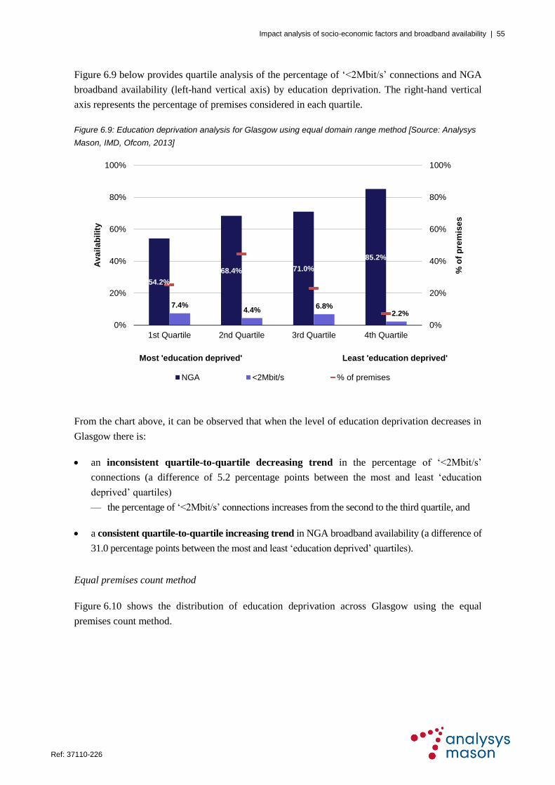
Impact analysis of socio-economic factors and broadband availability | 55
Ref: 37110-226 .
Figure 6.9 below provides quartile analysis of the percentage of ‗<2Mbit/s‘ connections and NGA
broadband availability (left-hand vertical axis) by education deprivation. The right-hand vertical
axis represents the percentage of premises considered in each quartile.
Figure 6.9: Education deprivation analysis for Glasgow using equal domain range method [Source: Analysys
Mason, IMD, Ofcom, 2013]
From the chart above, it can be observed that when the level of education deprivation decreases in
Glasgow there is:
an inconsistent quartile-to-quartile decreasing trend in the percentage of ‗<2Mbit/s‘
connections (a difference of 5.2 percentage points between the most and least ‗education
deprived‘ quartiles)
— the percentage of ‗<2Mbit/s‘ connections increases from the second to the third quartile, and
a consistent quartile-to-quartile increasing trend in NGA broadband availability (a difference of
31.0 percentage points between the most and least ‗education deprived‘ quartiles).
Equal premises count method
Figure 6.10 shows the distribution of education deprivation across Glasgow using the equal
premises count method.
54.2%
68.4% 71.0%
85.2%
7.4%4.4%
6.8%2.2%
0%
20%
40%
60%
80%
100%
0%
20%
40%
60%
80%
100%
1st Quartile 2nd Quartile 3rd Quartile 4th Quartile
% o
f p
rem
ise
s
Ava
ila
bil
ity
Most 'education deprived' Least 'education deprived'
NGA <2Mbit/s % of premises

Impact analysis of socio-economic factors and broadband availability | 56
Ref: 37110-226 .
Figure 6.10: Distribution
of education deprivation
across Glasgow using
equal premises count
method [Source:
Analysys Mason, IMD,
2013]
It can be observed that the Data Zones are more evenly distributed across the quartiles than when
using the equal domain range method. In addition, it can be seen that the most ‗education
deprived‘ areas in Glasgow (shown in red) are distributed across the whole city.
Figure 6.11 below provides quartile analysis for education deprivation using the equal premises
count method.
Figure 6.11: Education deprivation analysis for Glasgow using equal premises count method [Source:
Analysys Mason, IMD, Ofcom, 2013]
Decre
asin
g le
vel
of d
ep
rivatio
n
54.7%
68.3% 68.8%74.6%
7.2% 5.1% 3.3%6.2%
0%
20%
40%
60%
80%
100%
0%
20%
40%
60%
80%
100%
1st Quartile 2nd Quartile 3rd Quartile 4th Quartile
% o
f p
rem
ise
s
Ava
ila
bil
ity
Most 'education deprived' Least 'education deprived'
NGA <2Mbit/s % of premises

Impact analysis of socio-economic factors and broadband availability | 57
Ref: 37110-226 .
From the chart above, it can be observed that when the level of education deprivation decreases
(representing areas with higher levels of education) in Glasgow there is:
an inconsistent quartile-to-quartile decreasing trend in the percentage of ‗<2Mbit/s‘
connections (a difference of 1.0 percentage points between the most and least ‗education
deprived‘ quartiles)
— the percentage of ‗<2Mbit/s‘ connections increases from third to fourth quartile, and
a consistent quartile-to-quartile increasing trend in NGA broadband availability (a difference of
19.9 percentage points between the most and least ‗education deprived‘ quartiles).
6.3.3 Crime
Equal domain range method
Figure 6.12 below shows the distribution of crime rate levels across Glasgow using the equal
domain range method.
Figure 6.12: Distribution
of crime rate levels
across Glasgow using
equal domain range
method [Source:
Analysys Mason, IMD,
2013]
It can be seen that the proportion of Data Zones lying in the two highest crime rate level quartiles
(coloured in red and yellow, denoting the ‗0%–25%‘ and ‗25%–50%‘ ranges on the map) are
much lower than in the other two quartiles.
Figure 6.13 below provides quartile analysis of the percentage of ‗<2Mbit/s‘ connections and
NGA broadband availability (left-hand vertical axis). The right-hand vertical axis represents the
percentage of premises considered in each quartile.
Decre
asin
g le
vel
of d
ep
rivatio
n

Impact analysis of socio-economic factors and broadband availability | 58
Ref: 37110-226 .
Figure 6.13: Crime deprivation analysis for Glasgow using equal domain range method [Source: Analysys
Mason, IMD, Ofcom, 2013]
From the chart above, it can be observed that when the level of crime rate decreases in Glasgow
there is:
an inconsistent quartile-to-quartile increasing trend in the percentage of ‗<2Mbit/s‘
connections (a difference of 0.8 percentage points between the highest and lowest crime rate
level quartiles)
— the percentage of ‗<2Mbit/s‘ connections decreases from the first to the second quartile, and
a consistent quartile-to-quartile increasing trend in NGA broadband availability (a
difference of 40.0 percentage points between the highest and lowest crime rate level quartiles).
Equal premises count method
Figure 6.14 below shows the distribution of crime rate levels using the equal premises count method.
36.2%
58.9% 62.1%
76.2%
5.0% 4.6% 5.2% 5.8%
0%
20%
40%
60%
80%
100%
0%
20%
40%
60%
80%
100%
1st Quartile 2nd Quartile 3rd Quartile 4th Quartile
% o
f p
rem
ise
s
Ava
ila
bil
ity
Highest crime rate Lowest crime rate
NGA <2Mbit/s % of premises

Impact analysis of socio-economic factors and broadband availability | 59
Ref: 37110-226 .
Figure 6.14: Distribution
of crime rate levels
across Glasgow using
equal premises count
method [Source:
Analysys Mason, IMD,
2013]
It can be observed that the Data Zones are more evenly distributed across the quartiles than when
using the equal domain range method. In addition, it is noticeable that the areas of Glasgow with
the highest crime rate levels are predominantly in the central areas of the city.
Figure 6.15 below provides quartile analysis for the crime rate using the equal premises count method.
Figure 6.15: Crime deprivation analysis for Glasgow using equal premises count method [Source: Analysys
Mason, IMD, Ofcom, 2013]
Decre
asin
g le
vel
of d
ep
rivatio
n
53.5%60.9%
71.8%80.2%
6.0% 4.2% 5.4% 6.3%
0%
20%
40%
60%
80%
100%
0%
20%
40%
60%
80%
100%
1st Quartile 2nd Quartile 3rd Quartile 4th Quartile
% o
f p
rem
ise
s
Ava
ila
bil
ity
Highest crime rate Lowest crime rate
NGA <2Mbit/s % of premises

Impact analysis of socio-economic factors and broadband availability | 60
Ref: 37110-226 .
From the chart above, it can be observed that when the level of crime rate decreases in Glasgow
there is:
an inconsistent quartile-to-quartile increasing trend in the percentage of ‗<2Mbit/s‘
connections (a difference of 0.3 percentage points between the highest and lowest crime rate
level quartiles)
— the percentage of ‗<2Mbit/s‘ connections decreases from the first to the second quartile, and
a consistent quartile-to-quartile increasing trend in NGA broadband availability (a
difference of 26.7 percentage points between the highest and lowest crime rate level quartiles).
6.3.4 Summary
As illustrated above, the two methods produce very similar results. However, since the equal
domain range method highlights acute deprivation problems relative to the country as a whole, it is
those results which are discussed in this section.
Key observations from the impact analysis of socio-economic factors on broadband availability for
Glasgow are summarised in Figure 6.16 below.
Figure 6.16: Key observations on impact analysis for Glasgow using equal domain range method [Source:
Analysys Mason, 2013]
Socio-economic
factor
Key observations
Income
There is no obvious quartile-to-quartile trend in the percentage of ‘<2Mbit/s’
connections when the level of income deprivation decreases
There is a consistent quartile-to-quartile increasing trend in NGA
broadband availability when the level of income deprivation decreases
Education
There is an inconsistent quartile-to-quartile decreasing trend in the
percentage of ‘<2Mbit/s’ connections when the level of education deprivation
decreases
There is a consistent quartile-to-quartile increasing trend in NGA
broadband availability when the level of education deprivation decreases
Crime
There is an inconsistent quartile-to-quartile increasing trend in the
percentage of ‘<2Mbit/s’ connections when the level of crime rate decreases
There is a consistent quartile-to-quartile increasing trend in NGA
broadband availability when the level of crime rate decreases
The analysis shows that there are differing relationships between the investigated education and
crime domains and the percentage of ‗<2Mbit/s‘ connections; while the percentage of ‗<2Mbit/s‘
connections generally declines when the level of education deprivation decreases, it generally
increases when the level of crime rate decreases. However, there is no obvious trend between
income and the percentage of ‗<2Mbit/s‘ connections.

Impact analysis of socio-economic factors and broadband availability | 61
Ref: 37110-226 .
In contrast, the analysis shows that the investigated socio-economic factors may possibly have
influenced the roll-out of NGA broadband by fixed operators, because all domains show an
increasing trend in NGA broadband availability when the level of deprivation decreases.
However, it should be recognised that there are other factors that influence broadband roll-out; in
particular, it is well established that issues related to cost (e.g. premises density and line length)
and take-up are significant considerations.
Out of the six cities investigated, Glasgow has the lowest NGA broadband availability (at 66.6%),
significantly lower than for the other cities. This characteristic means that the findings for Glasgow
are of particular importance for this study.

Impact analysis of socio-economic factors and broadband availability | 62
Ref: 37110-226 .
7 Impact analysis: Cardiff
7.1 City overview
The city boundary of Cardiff is defined as the Cardiff City Council geographical boundary, as
shown in Figure 7.1 below.
Figure 7.1: Cardiff
geographical area
[Source: Analysys
Mason, 2013]
According to the 2011 census, Cardiff has a population of around 341 000 and around 152 000
premises, of which 144 000 are residential premises.
7.2 Broadband availability
Using the Ofcom 2013 dataset, the percentage of ‗<2Mbit/s‘ connections is estimated as 7.7% of
all broadband connections across Cardiff, and NGA broadband availability is estimated as 90.9%
of all premises across Cardiff. Maps showing broadband availability in Cardiff are provided in
Figure 7.2 (‗<2Mbit/s‘ connections) and Figure 7.3 (NGA broadband availability) below.

Impact analysis of socio-economic factors and broadband availability | 63
Ref: 37110-226 .
Figure 7.2: ‘<2Mbit/s’
connections in Cardiff
[Source: Analysys
Mason, Ofcom, 2013]
Areas with the highest percentage of ‗<2Mbit/s‘ connections (worst areas), shown using red in
Figure 7.2, are mostly in the east of Cardiff; most of the city has a low percentage of ‗<2Mbit/s‘
connections (between 0% and 10%).
Figure 7.3: NGA
broadband availability
in Cardiff [Source:
Analysys Mason,
Ofcom, 2013]
Areas with low availability of NGA broadband, shown in red in Figure 7.3, are concentrated in the
west of Cardiff; the rest of the city is well served with NGA broadband.
In general, the areas with high levels of ‗<2Mbit/s‘ connections do not correspond to areas with
low NGA broadband availability, so there does not seem to be a relationship between the two
measures that has affected NGA broadband availability in Cardiff.
It should be noted that this analysis of broadband availability provides a snapshot in time, because
it is expected that broadband roll-out will continue to evolve, provided that, for example:
investment conditions remain attractive for broadband operators, and
the demand stimulation intervention project in Cardiff‘s Super-Connected Cities programme
progresses.

Impact analysis of socio-economic factors and broadband availability | 64
Ref: 37110-226 .
7.3 Impact analysis findings
There are 203 LSOAs in Cardiff, and the broadband availability for each LSOA is derived using
the Ofcom 2013 dataset. The impact analysis findings for the three measures of deprivation
(income, education and crime) are provided in this section, using both methods (equal domain
range and premises count).
7.3.1 Income
Equal domain range method
Figure 7.4 below shows the distribution of income deprivation across Cardiff using the equal
domain range method.
Figure 7.4: Distribution
of income deprivation
across Cardiff using
equal domain range
method [Source:
Analysys Mason, IMD,
2013]
It can be seen that a much lower proportion of LSOAs are in the two most ‗income deprived‘
quartiles (coloured in red and yellow, denoting the ‗0%–25%‘ and ‗25%–50%‘ ranges on the map)
than in the other two quartiles. In contrast, the majority of LSOAs across the city belong to the
least ‗income deprived‘ quartile (shown in the darker green colour, denoting the ‗75%–100%‘
range).
Figure 7.5 below provides quartile analysis of the percentage of ‗<2Mbit/s‘ connections and NGA
broadband availability (left-hand vertical axis) by income deprivation. The right-hand vertical axis
represents the percentage of premises considered in each quartile, to highlight the difference
between the equal domain range and equal premises count methods of analysis.
Decre
asin
g le
vel
of d
ep
rivatio
n

Impact analysis of socio-economic factors and broadband availability | 65
Ref: 37110-226 .
Figure 7.5: Income deprivation analysis for Cardiff using equal domain range method [Source: Analysys
Mason, IMD, Ofcom, 2013]
From the chart above, it can be observed that when the level of income deprivation decreases
(representing areas with higher income) in Cardiff there is:
a consistent quartile-to-quartile increasing trend in the percentage of ‗<2Mbit/s‘
connections (a difference of 4.5 percentage points between the most and least ‗income
deprived‘ quartiles), and
an inconsistent quartile-to-quartile decreasing trend in NGA broadband availability (a
difference of 9.5 percentage points between the most and least ‗income deprived‘ quartiles)
— from Figure 7.3 earlier it can be seen that the west of Cardiff has very low NGA
broadband availability, while Figure 7.4 shows that the west of the city contains some of
the least ‗income deprived‘ areas, which contributes to the surprisingly low NGA
availability in the fourth quartile
— in addition, NGA broadband availability increases from the second to the third quartile,
despite the general trend.
Equal premises count method
Figure 7.6 below shows the distribution of income deprivation across Cardiff using the equal
premises count method.
98.2%93.1% 93.9%
88.7%
3.8%6.0% 8.1% 8.3%
0%
20%
40%
60%
80%
100%
0%
20%
40%
60%
80%
100%
1st Quartile 2nd Quartile 3rd Quartile 4th Quartile
% o
f p
rem
ise
s
Ava
ila
bil
ity
Most 'income deprived' Least 'income deprived'
NGA <2Mbit/s % of premises

Impact analysis of socio-economic factors and broadband availability | 66
Ref: 37110-226 .
Figure 7.6: Distribution
of income deprivation
across Cardiff using
equal premises count
method [Source:
Analysys Mason, IMD,
2013]
It can be observed that the LSOAs are more evenly distributed across the quartiles than when
using the equal domain range method.
Figure 7.7 below provides quartile analysis by income deprivation using the equal premises count
method. The right-hand vertical axis represents the percentage of premises considered in each
quartile (which is the same for each quartile using the equal premises count method).
Figure 7.7: Income deprivation analysis for Cardiff using equal premises count method [Source: Analysys
Mason, IMD, Ofcom, 2013]
From the chart above, it can be observed that when the level of income deprivation decreases
(representing areas with higher income) in Cardiff there is:
Decre
asin
g le
vel
of d
ep
rivatio
n
95.0% 91.2% 92.0%85.0%
5.3%8.5% 7.6% 9.0%
0%
20%
40%
60%
80%
100%
0%
20%
40%
60%
80%
100%
1st Quartile 2nd Quartile 3rd Quartile 4th Quartile
% o
f p
rem
ise
s
Ava
ila
bil
ity
Most 'income deprived' Least 'income deprived'
NGA <2Mbit/s % of premises

Impact analysis of socio-economic factors and broadband availability | 67
Ref: 37110-226 .
an inconsistent quartile-to-quartile increasing trend in the percentage of ‗<2Mbit/s‘
connections (a difference of 3.7 percentage points between the most and least ‗income
deprived‘ quartiles)
— the percentage of ‗<2Mbit/s‘ connections decreases from the second to the third quartile, and
an inconsistent quartile-to-quartile decreasing trend in NGA broadband availability (a
difference of 10.0 percentage points between the most and least ‗income deprived‘ quartiles)
— from Figure 7.3 earlier, it can be seen that the west of Cardiff has very low NGA
broadband availability, while Figure 7.6 shows that the west of the city contains some of
the least ‗income deprived‘ areas in Cardiff, which contributes to the surprisingly low
NGA availability in the fourth quartile
— in addition, NGA broadband availability increases from the second to the third quartile
despite the general trend.
7.3.2 Education
Equal domain range method
Figure 7.8 shows the distribution of education deprivation across Cardiff using the equal domain
range method.
Figure 7.8: Distribution
of education deprivation
across Cardiff using
equal domain range
method [Source:
Analysys Mason, IMD,
2013]
It can be seen that the proportion of LSOAs in the most ‗education deprived‘ quartile (coloured in
red, denoting the ‗0%–25%‘ range on the map) is much lower than in the other quartiles. In
contrast, the majority of Cardiff falls into the least ‗education deprived‘ quartile (shown in the
darker green colour, denoting the ‗75%–100%‘ range on the map).
Decre
asin
g le
vel
of d
ep
rivatio
n

Impact analysis of socio-economic factors and broadband availability | 68
Ref: 37110-226 .
Figure 7.9 below provides quartile analysis of the percentage of ‗<2Mbit/s‘ connections and NGA
broadband availability (left-hand vertical axis) for education deprivation. The right-hand vertical
axis represents the percentage of premises considered in each quartile, to highlight the difference
between the equal domain range and premises count methods of analysis.
Figure 7.9: Education deprivation analysis for Cardiff using equal domain range method [Source: Analysys
Mason, IMD, Ofcom, 2013]
From the chart above, it can be observed that when the level of education deprivation decreases in
Cardiff there is:
a consistent quartile-to-quartile increasing trend in the percentage of ‗<2Mbit/s‘
connections (a difference of 6.2 percentage points between the most and least ‗education
deprived‘ quartiles), and
an inconsistent quartile-to-quartile decreasing trend in NGA broadband availability (a
difference of 8.6 percentage points between the most and least ‗education deprived‘ quartiles)
— NGA broadband availability increases from the third to the fourth quartile, despite the
general trend.
100%
93.3%86.3%
91.4%
2.1%6.4% 7.8% 8.3%
0%
20%
40%
60%
80%
100%
0%
20%
40%
60%
80%
100%
1st Quartile 2nd Quartile 3rd Quartile 4th Quartile
% o
f p
rem
ise
s
Ava
ila
bil
ity
Most 'education deprived' Least 'education deprived'
NGA <2Mbit/s % of premises

Impact analysis of socio-economic factors and broadband availability | 69
Ref: 37110-226 .
Equal premises count method
Figure 7.10 shows the distribution of education deprivation across Cardiff using the equal
premises count method.
Figure 7.10: Distribution
of education deprivation
across Cardiff using
equal premises count
method [Source:
Analysys Mason, IMD,
2013]
It can be observed that the LSOAs are more evenly distributed across the quartiles than when
using the equal domain range method. In addition, it can be seen that the most ‗education
deprived‘ areas of Cardiff are primarily in the eastern part of the city.
Figure 7.11 below provides quartile analysis for education deprivation using the equal premises
count method.
Figure 7.11: Education deprivation analysis for Cardiff using equal premises count method [Source: Analysys
Mason, IMD, Ofcom, 2013]
Decre
asin
g le
vel
of d
ep
rivatio
n
93.7%87.6%
96.5%85.8%
7.9% 6.0% 7.0%9.7%
0%
20%
40%
60%
80%
100%
0%
20%
40%
60%
80%
100%
1st Quartile 2nd Quartile 3rd Quartile 4th Quartile
% o
f p
rem
ise
s
Ava
ila
bil
ity
Most 'education deprived' Least 'education deprived'
NGA <2Mbit/s % of premises

Impact analysis of socio-economic factors and broadband availability | 70
Ref: 37110-226 .
From the chart above, it can be observed that when the level of education deprivation decreases in
Cardiff there is:
an inconsistent quartile-to-quartile increasing trend in the percentage of ‗<2Mbit/s‘
connections (a difference of 1.8 percentage points between the most and least ‗education
deprived‘ quartiles)
— the percentage of ‗<2Mbit/s‘ connections decreases from the first to the second quartile, and
no obvious quartile-to-quartile trend in NGA broadband availability.
7.3.3 Crime
Equal domain range method
Figure 7.12 below shows the distribution of crime rate levels across Cardiff using the equal
domain range method.
Figure 7.12: Distribution
of crime rate levels
across Cardiff using
equal domain range
method [Source:
Analysys Mason, IMD,
2013]
It can be seen that the proportion of LSOAs in the highest crime rate level quartile (coloured in
red, denoting the ‗0%–25%‘ range on the map) is much lower than the other quartiles. In contrast,
the majority of areas in Cardiff lie in the lowest crime rate level quartile (shown in the darker
green colour, denoting the ‗75%–100%‘ range on the map).
Figure 7.13 below provides quartile analysis of the percentage of ‗<2Mbit/s‘ connections and
NGA broadband availability (left-hand vertical axis) by crime rate level. The right-hand vertical
axis represents the percentage of premises considered in each quartile.
Decre
asin
g le
vel
of d
ep
rivatio
n

Impact analysis of socio-economic factors and broadband availability | 71
Ref: 37110-226 .
Figure 7.13: Crime deprivation analysis for Cardiff using equal domain range method [Source: Analysys
Mason, IMD, Ofcom, 2013]
From the chart above, it can be observed that when the level of crime rate decreases in Cardiff
there is:
a consistent quartile-to-quartile increasing trend in the percentage of ‗<2Mbit/s‘
connections (a difference of 4.0 percentage points between the highest and lowest crime rate
level quartiles), and
an inconsistent quartile-to-quartile decreasing trend in NGA broadband availability (a
difference of 9.7 percentage points between the highest and lowest crime rate level quartiles)
— NGA broadband availability increases from the first to the second quartile, despite the
general trend.
Equal premises count method
Figure 7.14 below shows the distribution of crime rate levels across Cardiff using the equal
premises count method.
98.0% 99.4%89.8% 88.3%
4.4% 5.3%8.2% 8.4%
0%
20%
40%
60%
80%
100%
0%
20%
40%
60%
80%
100%
1st Quartile 2nd Quartile 3rd Quartile 4th Quartile
% o
f p
rem
ise
s
Ava
ila
bil
ity
Highest crime rate Lowest crime rate
NGA <2Mbit/s % of premises

Impact analysis of socio-economic factors and broadband availability | 72
Ref: 37110-226 .
Figure 7.14: Distribution
of crime rate levels
across Cardiff using
equal premises count
method [Source:
Analysys Mason, IMD,
2013]
It can be observed that the LSOAs are more evenly distributed across the quartiles than when
using the equal domain range method. In addition, it can be seen that the areas with the highest
crime rate levels are in the east and south of the city.
Figure 7.15 below provides quartile analysis for the crime rate using the equal premises count method.
Figure 7.15: Crime deprivation analysis for Cardiff using equal premises count method [Source: Analysys
Mason, IMD, Ofcom, 2013]
Decre
asin
g le
vel
of d
ep
rivatio
n
96.6%90.8% 91.2%
84.6%
5.3%8.2% 7.2%
9.6%
0%
20%
40%
60%
80%
100%
0%
20%
40%
60%
80%
100%
1st Quartile 2nd Quartile 3rd Quartile 4th Quartile
% o
f p
rem
ise
s
Ava
ila
bil
ity
Highest crime rate Lowest crime rate
NGA <2Mbit/s % of premises

Impact analysis of socio-economic factors and broadband availability | 73
Ref: 37110-226 .
From the chart above, it can be observed that when the level of crime rate decreases in Cardiff there is:
an inconsistent quartile-to-quartile increasing trend in the percentage of ‗<2Mbit/s‘
connections (a difference of 4.3 percentage points between the highest and lowest crime rate
level quartiles)
— the percentage of ‗<2Mbit/s‘ connections decreases from the second to the third quartile,
and
an inconsistent quartile-to-quartile decreasing trend in NGA broadband availability (a
difference of 12.0 percentage points between the highest and lowest crime rate level quartiles)
— NGA broadband availability increases from the second to the third quartile, despite the
general trend.
7.3.4 Summary
As illustrated above, the two methods produce very similar results. However, since the equal
domain range method highlights acute deprivation problems relative to the country as a whole, it is
those results which are discussed in this section.
Key observations from the impact analysis of socio-economic factors on broadband availability for
Cardiff are summarised in Figure 7.16 below.
Figure 7.16: Key observations on impact analysis for Cardiff using equal domain range method [Source:
Analysys Mason, 2013]
Socio-economic
factor
Key observations
Income
There is a consistent quartile-to-quartile increasing trend in the
percentage of ‘<2Mbit/s’ connections when the level of income deprivation
decreases
There is an inconsistent quartile-to-quartile decreasing trend in NGA
broadband availability when the level of income deprivation decreases, which
is surprising
Education
There is a consistent quartile-to-quartile increasing trend in the
percentage of ‘<2Mbit/s’ connections when the level of education
deprivation decreases
There is an inconsistent quartile-to-quartile decreasing trend in NGA
broadband availability when the level of education deprivation decreases
Crime
There is a consistent quartile-to-quartile increasing trend in the
percentage of ‘<2Mbit/s’ connections when the level of crime rate decreases
There is an inconsistent quartile-to-quartile decreasing trend in NGA
broadband availability when the level of crime rate decreases, which is
surprising
The analysis shows that there is a potential relationship between the investigated socio-economic
factors and the percentage of ‗<2Mbit/s‘ connections, because there is generally an increasing
trend in ‘<2Mbit/s’ connections when the level of deprivation decreases.

Impact analysis of socio-economic factors and broadband availability | 74
Ref: 37110-226 .
Moreover, the analysis shows that there is a potential relationship between the investigated socio-
economic factors and NGA broadband availability, because there is a decreasing trend in NGA
broadband availability when the level of deprivation decreases. This is surprising, as it
contradicts the trends observed for the other cities that have been investigated.
Because the western parts of Cardiff are rural areas, this could explain the low level of NGA
broadband availability. In addition, these parts of Cardiff have some of the highest income and
education levels in the whole of Wales, which helps to explain the surprising trends observed from
the quartile analyses. This finding is further supported by the fact that other factors influence
broadband roll-out; for example, it is well established that issues related to cost (e.g. premises
density and line length) and take-up are significant considerations.
It should be noted that attempts to investigate potential relationships between socio-economic
factors and NGA broadband availability may be limited by the fact that Cardiff already has a high
level of NGA broadband availability (90.9%).

Impact analysis of socio-economic factors and broadband availability | 75
Ref: 37110-226 .
8 Impact analysis: Belfast
8.1 City overview
The city boundary of Belfast is defined as the Belfast City Council geographical boundary, as
shown in Figure 8.1 below.
Figure 8.1: Belfast
geographical area
[Source: Analysys
Mason, 2013]
According to the 2011 census, Belfast has a population of around 269 000 and around 132 000
premises, of which 124 000 are residential premises.
8.2 Broadband availability
Using the Ofcom 2013 dataset, the percentage of ‗<2Mbit/s‘ connections is estimated as 3.8% of
all broadband connections across Belfast and NGA broadband availability is estimated as 98.1%
of all premises across Belfast. Maps showing broadband availability in Belfast are provided in
Figure 8.2 (‗<2Mbit/s‘ connections) and Figure 8.3 (NGA broadband availability) below.
Figure 8.2: ‘<2Mbit/s’
connections in Belfast
[Source: Analysys
Mason, Ofcom, 2013]

Impact analysis of socio-economic factors and broadband availability | 76
Ref: 37110-226 .
Areas with the highest percentage of ‗<2Mbit/s‘ connections (worst areas), shown using red in
Figure 8.2, are in the west of the city; there is a relatively low proportion of ‗<2Mbit/s‘
connections in the remaining parts of the city.
As shown in Figure 8.3 below, Belfast is generally well served with NGA broadband. This is
mainly due to the NGA broadband intervention project that was initiated in 2009 to upgrade
around 1300 cabinets in approximately 170 exchange areas across Northern Ireland (including
some located in Belfast).
Figure 8.3: NGA
broadband availability
in Belfast [Source:
Analysys Mason,
Ofcom, 2013]
Generally, the areas with a high level of ‗<2Mbit/s‘ connections do not correspond to areas with
low NGA broadband availability, so there does not seem to be a relationship between the two that
has affected NGA broadband availability in Belfast.
It should be noted that broadband availability provides a snapshot in time, because it is expected
that broadband roll-out will continue to evolve, provided that, for example:
investment conditions remain attractive for broadband operators, and
the demand stimulation intervention project in Belfast‘s Super-Connected Cities programme
progresses.
8.3 Impact analysis findings
There are 150 SOAs within the Belfast boundary, and the broadband availability for each SOA is
derived using the Ofcom 2013 dataset. The impact analysis findings for the three measures of
deprivation (income, education and crime) are provided in this section, using both methods (equal
domain range and equal premises count).

Impact analysis of socio-economic factors and broadband availability | 77
Ref: 37110-226 .
8.3.1 Income
Equal domain range method
Figure 8.4 below shows the distribution of income deprivation across Belfast using the equal
domain range method.
Figure 8.4: Distribution
of income deprivation
across Belfast using
equal domain range
method [Source:
Analysys Mason, IMD,
2013]
It can be seen that a much lower proportion of SOAs are in the most ‗income deprived‘ quartile
(coloured in red, denoting the ‗0%–25%‘ range on the map) than in the other quartiles, and these
are concentrated in the centre of the city. Geographically, the other SOAs are more evenly
distributed across the remaining quartiles.
Figure 8.5 below provides quartile analysis of the percentage of ‗<2Mbit/s‘ connections and NGA
broadband availability (left-hand vertical axis) by income deprivation. The right-hand vertical axis
represents the percentage of premises considered in each quartile, to highlight the difference
between the equal domain range and equal premises count methods of analysis.
Decre
asin
g le
vel
of d
ep
rivatio
n

Impact analysis of socio-economic factors and broadband availability | 78
Ref: 37110-226 .
Figure 8.5: Income deprivation analysis for Belfast using equal domain range method [Source: Analysys
Mason, IMD, Ofcom, 2013]
From the chart above, it can be observed that when the level of income deprivation decreases
(representing areas with higher income) in Belfast there is:
a consistent quartile-to-quartile decreasing trend in the percentage of ‗<2Mbit/s‘
connections (a difference of 4.6 percentage points between the most and least ‗income
deprived‘ quartiles), and
an inconsistent quartile-to-quartile increasing trend in NGA broadband availability (a
difference of 3.4 percentage points between the most and least ‗income deprived‘ quartiles)
— NGA broadband availability decreases between the first and second quartile, despite the
general trend.
Equal premises count method
Figure 8.6 below shows the distribution of income deprivation across Belfast using the equal
premises count method. It can be observed that the SOAs are more evenly distributed across the
quartiles than when using the equal domain range method.
96.3% 95.7% 99.2% 99.7%
7.0% 5.1% 4.0% 2.4%
0%
20%
40%
60%
80%
100%
0%
20%
40%
60%
80%
100%
1st Quartile 2nd Quartile 3rd Quartile 4th Quartile
% o
f p
rem
ise
s
Ava
ila
bil
ity
Most 'income deprived' Least 'income deprived'
NGA <2Mbit/s % of premises

Impact analysis of socio-economic factors and broadband availability | 79
Ref: 37110-226 .
Figure 8.6: Distribution
of income deprivation
across Belfast using
equal premises count
method [Source:
Analysys Mason, IMD,
2013]
Figure 8.7 below provides quartile analysis by income deprivation using the equal premises count
method. The right-hand vertical axis represents the percentage of premises considered in each
quartile, which is the same for each quartile using the equal premises count method.
Figure 8.7: Income deprivation analysis for Belfast using equal premises count method [Source: Analysys
Mason, IMD, Ofcom, 2013]
Decre
asin
g le
vel
of d
ep
rivatio
n
95.9% 97.3% 99.6% 99.7%
5.9% 4.6% 3.1% 2.2%
0%
20%
40%
60%
80%
100%
0%
20%
40%
60%
80%
100%
1st Quartile 2nd Quartile 3rd Quartile 4th Quartile
% o
f p
rem
ise
s
Ava
ila
bil
ity
Most 'income deprived' Least 'income deprived'
NGA <2Mbit/s % of premises
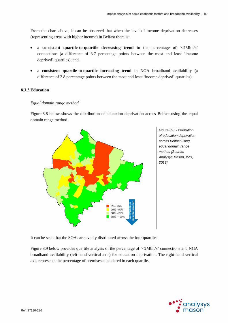
Impact analysis of socio-economic factors and broadband availability | 80
Ref: 37110-226 .
From the chart above, it can be observed that when the level of income deprivation decreases
(representing areas with higher income) in Belfast there is:
a consistent quartile-to-quartile decreasing trend in the percentage of ‗<2Mbit/s‘
connections (a difference of 3.7 percentage points between the most and least ‗income
deprived‘ quartiles), and
a consistent quartile-to-quartile increasing trend in NGA broadband availability (a
difference of 3.8 percentage points between the most and least ‗income deprived‘ quartiles).
8.3.2 Education
Equal domain range method
Figure 8.8 below shows the distribution of education deprivation across Belfast using the equal
domain range method.
Figure 8.8: Distribution
of education deprivation
across Belfast using
equal domain range
method [Source:
Analysys Mason, IMD,
2013]
It can be seen that the SOAs are evenly distributed across the four quartiles.
Figure 8.9 below provides quartile analysis of the percentage of ‗<2Mbit/s‘ connections and NGA
broadband availability (left-hand vertical axis) for education deprivation. The right-hand vertical
axis represents the percentage of premises considered in each quartile.
Decre
asin
g le
vel
of d
ep
rivatio
n

Impact analysis of socio-economic factors and broadband availability | 81
Ref: 37110-226 .
Figure 8.9: Education deprivation analysis for Belfast using equal domain range method [Source: Analysys
Mason, IMD, Ofcom, 2013]
From the chart above, it can be observed that when the level of education deprivation decreases in
Belfast there is:
an inconsistent quartile-to-quartile decreasing trend in the percentage of ‗<2Mbit/s‘
connections (a difference of 2.9 percentage points between the most and least ‗education
deprived‘ quartiles)
— the percentage of ‗<2Mbit/s‘ connections remains unchanged from the second to the third
quartile, and
a consistent quartile-to-quartile increasing trend in NGA broadband availability (a
difference of 8.1 percentage points between the most and least ‗education deprived‘ quartiles).
Equal premises count method
Figure 8.10 shows the distribution of education deprivation across Belfast using the equal premises
count method.
91.7%99.2% 99.7% 99.8%
5.3% 4.6% 4.6%2.4%
0%
20%
40%
60%
80%
100%
0%
20%
40%
60%
80%
100%
1st Quartile 2nd Quartile 3rd Quartile 4th Quartile
% o
f p
rem
ise
s
Ava
ila
bil
ity
Most 'education deprived' Least 'education deprived'
NGA <2Mbit/s % of premises

Impact analysis of socio-economic factors and broadband availability | 82
Ref: 37110-226 .
Figure 8.10: Distribution
of education deprivation
across Belfast using
equal premises count
method [Source:
Analysys Mason, IMD,
2013]
It can be observed that the SOAs are fairly evenly distributed across the four quartiles. In addition,
it can be seen that the most ‗education deprived‘ areas in Belfast are mostly in the north-east and
central parts of the city.
Figure 8.11 below provides quartile analysis for education deprivation using the equal premises
count method.
Figure 8.11: Education deprivation analysis for Belfast using equal premises count method [Source: Analysys
Mason, IMD, Ofcom, 2013]
Decre
asin
g le
vel
of d
ep
rivatio
n
93.4%99.5% 99.8% 99.7%
5.4% 4.4% 3.7% 2.4%
0%
20%
40%
60%
80%
100%
0%
20%
40%
60%
80%
100%
1st Quartile 2nd Quartile 3rd Quartile 4th Quartile
% o
f p
rem
ise
s
Ava
ila
bil
ity
Most 'education deprived' Least 'education deprived'
NGA <2Mbit/s % of premises

Impact analysis of socio-economic factors and broadband availability | 83
Ref: 37110-226 .
From the chart above, it can be observed that when the level of education deprivation decreases
(representing areas with higher levels of education) in Belfast there is:
a consistent quartile-to-quartile decreasing trend in the percentage of ‗<2Mbit/s‘
connections (a difference of 3.0 percentage points between the most and least ‗education
deprived‘ quartiles), and
an inconsistent quartile-to-quartile increasing trend in NGA broadband availability (a
difference of 6.3 percentage points between the most and least ‗education deprived‘ quartiles)
— NGA broadband availability decreases slightly between the third and fourth quartile,
despite the general trend.
8.3.3 Crime
Equal domain range method
Figure 8.12 below shows the distribution of crime rate levels across Belfast using the equal
domain range method.
Figure 8.12: Distribution
of crime rate levels
across Belfast using
equal domain range
method [Source:
Analysys Mason, IMD,
2013]
It can be seen that a much lower proportion of SOAs are in the highest crime rate level quartile
(coloured in red, denoting the ‗0%–25%‘ range on the map) than in the other quartiles. SOAs are
distributed more evenly across the other quartiles, and a slight majority lie in the lowest crime rate
level quartile (shown in the darker green colour).
Decre
asin
g le
vel
of d
ep
rivatio
n

Impact analysis of socio-economic factors and broadband availability | 84
Ref: 37110-226 .
Figure 8.13 below provides quartile analysis of the percentage of ‗<2Mbit/s‘ connections and
NGA broadband availability (left-hand vertical axis). The right-hand vertical axis represents the
percentage of premises considered in each quartile.
Figure 8.13: Crime deprivation analysis for Belfast using equal domain range method [Source: Analysys
Mason, IMD, Ofcom, 2013]
From the chart above, it can be observed that when the level of crime rate decreases in Belfast
there is:
an inconsistent quartile-to-quartile increasing trend in the percentage of ‗<2Mbit/s‘
connections (a difference of 2.4 percentage points between the highest and lowest crime rate
level quartiles)
— ‗<2Mbit/s‘ connections decrease by 1.0 percentage points between the third and fourth
quartile, despite the general trend
an inconsistent quartile-to-quartile increasing trend in NGA broadband availability (a
difference of 2.2 percentage points between the highest and lowest crime rate level quartiles)
— NGA broadband availability decreases by 2.9 percentage points between the first and
second quartile, despite the general trend.
Equal premises count method
Figure 8.14 below shows the distribution of crime rate levels across Belfast using the equal
premises count method.
97.6% 94.7%99.2% 99.8%
1.3%3.2% 4.7% 3.7%
0%
20%
40%
60%
80%
100%
0%
20%
40%
60%
80%
100%
1st Quartile 2nd Quartile 3rd Quartile 4th Quartile
% o
f p
rem
ise
s
Ava
ila
bil
ity
Highest crime rate Lowest crime rate
NGA <2Mbit/s % of premises

Impact analysis of socio-economic factors and broadband availability | 85
Ref: 37110-226 .
Figure 8.14: Distribution
of crime rate levels
across Belfast using
equal premises count
method [Source:
Analysys Mason, IMD,
2013]
It can be observed that the SOAs are more evenly distributed across the quartiles than when using
the equal domain range method. In addition, it is noticeable that the areas with the highest crime
rate levels are predominantly in the city centre.
Figure 8.15 below provides quartile analysis for the crime rate using the equal premises count
method.
Figure 8.15: Crime deprivation analysis for Belfast using equal premises count method [Source: Analysys
Mason, IMD, Ofcom, 2013]
Decre
asin
g le
vel
of d
ep
rivatio
n
98.1% 95.3% 99.3% 99.9%
2.6% 3.4%5.3% 3.8%
0%
20%
40%
60%
80%
100%
0%
20%
40%
60%
80%
100%
1st Quartile 2nd Quartile 3rd Quartile 4th Quartile
% o
f p
rem
ise
s
Ava
ila
bil
ity
Highest crime rate Lowest crime rate
NGA <2Mbit/s % of premises
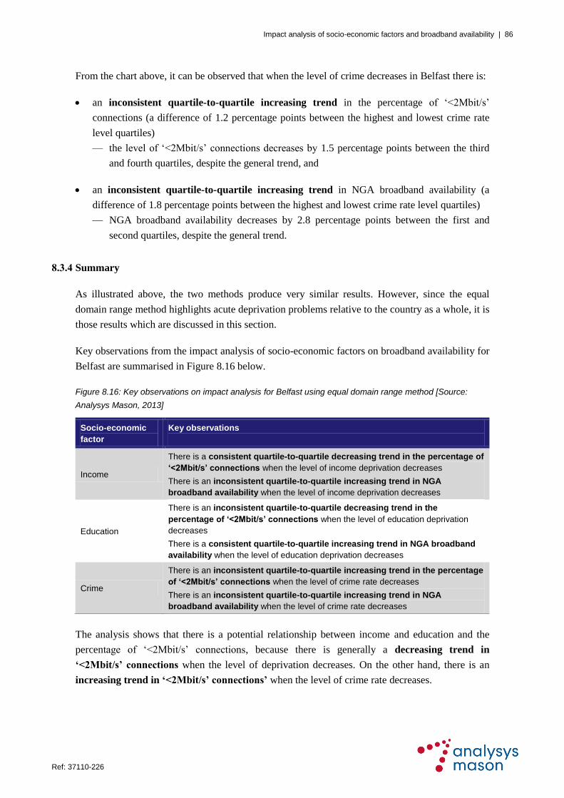
Impact analysis of socio-economic factors and broadband availability | 86
Ref: 37110-226 .
From the chart above, it can be observed that when the level of crime decreases in Belfast there is:
an inconsistent quartile-to-quartile increasing trend in the percentage of ‗<2Mbit/s‘
connections (a difference of 1.2 percentage points between the highest and lowest crime rate
level quartiles)
— the level of ‗<2Mbit/s‘ connections decreases by 1.5 percentage points between the third
and fourth quartiles, despite the general trend, and
an inconsistent quartile-to-quartile increasing trend in NGA broadband availability (a
difference of 1.8 percentage points between the highest and lowest crime rate level quartiles)
— NGA broadband availability decreases by 2.8 percentage points between the first and
second quartiles, despite the general trend.
8.3.4 Summary
As illustrated above, the two methods produce very similar results. However, since the equal
domain range method highlights acute deprivation problems relative to the country as a whole, it is
those results which are discussed in this section.
Key observations from the impact analysis of socio-economic factors on broadband availability for
Belfast are summarised in Figure 8.16 below.
Figure 8.16: Key observations on impact analysis for Belfast using equal domain range method [Source:
Analysys Mason, 2013]
Socio-economic
factor
Key observations
Income
There is a consistent quartile-to-quartile decreasing trend in the percentage of
‘<2Mbit/s’ connections when the level of income deprivation decreases
There is an inconsistent quartile-to-quartile increasing trend in NGA
broadband availability when the level of income deprivation decreases
Education
There is an inconsistent quartile-to-quartile decreasing trend in the
percentage of ‘<2Mbit/s’ connections when the level of education deprivation
decreases
There is a consistent quartile-to-quartile increasing trend in NGA broadband
availability when the level of education deprivation decreases
Crime
There is an inconsistent quartile-to-quartile increasing trend in the percentage
of ‘<2Mbit/s’ connections when the level of crime rate decreases
There is an inconsistent quartile-to-quartile increasing trend in NGA
broadband availability when the level of crime rate decreases
The analysis shows that there is a potential relationship between income and education and the
percentage of ‗<2Mbit/s‘ connections, because there is generally a decreasing trend in
‘<2Mbit/s’ connections when the level of deprivation decreases. On the other hand, there is an
increasing trend in ‘<2Mbit/s’ connections’ when the level of crime rate decreases.

Impact analysis of socio-economic factors and broadband availability | 87
Ref: 37110-226 .
Moreover, the analysis shows that there is a potential relationship between the investigated socio-
economic factors and NGA broadband availability, because there is generally an increasing trend
in NGA broadband availability when the level of deprivation decreases.
It should be noted that attempts to investigate potential relationships between socio-economic
factors and NGA broadband availability may be limited by the fact that Belfast already has high
NGA broadband availability (98.1%). Also, it should be recognised that there are other factors
which influence broadband roll-out; for example, it is well established that issues related to cost
(e.g. premises density and line length) and take-up are significant considerations.

Impact analysis of socio-economic factors and broadband availability | 88
Ref: 37110-226 .
9 Comparison of key city data
This section compares key data from each of the six cities investigated for this study, and makes
observations on key trends, differences and links between the various quartile analysis findings. The
focus is on observing trends, rather than comparing the exact percentage figures across cities, because
different nations use slightly different approaches when producing their deprivation parameters.
For the purposes of these comparisons and observing trends, findings based on the equal domain
range method have been used; the resulting trends from both analysis methods are similar but the
equal domain range method highlights better those areas with low broadband availability and acute
deprivation.
9.1 Overview of broadband availability
Using Ofcom‘s 2013 broadband availability dataset, the percentage of ‗<2Mbit/s‘ connections and
NGA broadband availability have been derived for each city studied, as summarised in Figure 9.1.
City
‘<2Mbit/s’
connections
NGA broadband
availability
Figure 9.1:
Broadband
availability for UK
cities in 2013
[Source: Analysys
Mason / Ofcom,
2013]
London 3.7% 88.4%
Birmingham 4.2% 91.3%
Manchester 5.5% 86.3%
Glasgow 5.5% 66.6%
Cardiff 7.7% 90.9%
Belfast 3.8% 98.1%
London has the lowest percentage of ‗<2Mbit/s‘ broadband connections, whilst Manchester, Glasgow
and Cardiff have the highest percentage of ‗<2Mbit/s‘ broadband connections (greater than 5%).
With the exception of Glasgow, all cities have NGA broadband availability of more than 86%.
Belfast has exceptionally high availability of NGA broadband (98.1%), which most likely reflects
the effect of the broadband intervention project initiated by the Department of Enterprise, Trade
and Investment in 2009. The relatively low level of NGA broadband availability in Glasgow
makes the city particularly suitable for investigating the potential relationships between socio-
economic factors and broadband availability.
It should be noted that broadband availability is continually evolving, based on a range of factors
(such as network operator plans, demand registration and public sector intervention projects), and
so the results presented here represent a ‗snapshot‘ in time.
More detailed comparisons of the percentage of ‗<2Mbit/s‘ broadband connections and NGA
broadband availability across the six cities are provided in Sections 9.2 and 9.3 respectively.

Impact analysis of socio-economic factors and broadband availability | 89
Ref: 37110-226 .
9.2 ‘<2Mbit/s’ broadband connections
9.2.1 Income deprivation
Figure 9.2 compares outputs from the income deprivation quartile analysis, indicating the
percentage of ‗<2Mbit/s‘ broadband connections for each city.
Figure 9.2: Comparison of income deprivation quartile analysis of ‘<2Mbit/s’ connections [Source: Analysys
Mason, IMD, Ofcom, 2013]
In general, all cities except Cardiff and Glasgow show a decreasing trend in the percentage of
‗<2Mbit/s‘ broadband connections when the level of income deprivation decreases. However,
Manchester exhibits an inconsistent decreasing trend (with an increase between the second and
third quartile), which may be because other factors (such as existing take-up and premises density)
have an overriding effect in some areas.
Cardiff could be considered as an exception, in that although the western parts of the city have a
very low level of income deprivation they do have a relatively high percentage of ‗<2Mbit/s‘
broadband connections. This may be explained by particular factors associated with the high
rurality of these parts of the city (e.g. long line length and potential geographical challenges).
Glasgow does not show any obvious trend in the percentage of ‗<2Mbit/s‘ broadband connections
when the level of income deprivation decreases.
0%
5%
10%
15%
1st Quartile 2nd Quartile 3rd Quartile 4th Quartile
'<2
Mb
it/s
' bro
ad
ba
nd
co
nn
ectio
ns
Most 'income deprived' Least 'income deprived'
Glasgow Birmingham London
Belfast Manchester Cardiff

Impact analysis of socio-economic factors and broadband availability | 90
Ref: 37110-226 .
9.2.2 Education deprivation
Figure 9.3 compares the outputs from the education deprivation quartile analysis, indicating the
percentage of ‗<2Mbit/s‘ broadband connections for each city.
Figure 9.3: Comparison of education deprivation quartile analysis of ‘<2Mbit/s’ connections [Source: Analysys
Mason, IMD, Ofcom, 2013]
In general, all cities except Cardiff show a decreasing trend in the percentage of ‗<2Mbit/s‘
broadband connections when the level of education deprivation decreases. However, the trends for
Glasgow, London and Manchester are inconsistent, which may be explained by the fact that other
factors (such as existing take-up and premises density) have an overriding effect in some areas.
Again, Cardiff could be considered as an exception, in that although the western parts of Cardiff have a
very low level of education deprivation they do have a relatively high percentage of ‗<2Mbit/s‘
broadband connections. This may be due to the reasons discussed in Section 9.2.1 above.
0%
5%
10%
15%
1st Quartile 2nd Quartile 3rd Quartile 4th Quartile
'<2
Mb
it/s
' bro
ad
ba
nd
co
nn
ectio
ns
Most 'education deprived' Least 'education deprived'
Glasgow Birmingham London
Belfast Manchester Cardiff

Impact analysis of socio-economic factors and broadband availability | 91
Ref: 37110-226 .
9.2.3 Crime deprivation
Figure 9.4 compares the outputs from the crime deprivation quartile analysis, indicating the
percentage of ‗<2Mbit/s‘ broadband connections for each city.
Figure 9.4: Comparison of crime deprivation quartile analysis of ‘<2Mbit/s’ connections [Source: Analysys
Mason, IMD, Ofcom, 2013]
Four of the cities show an increasing trend in the percentage of ‗<2Mbit/s‘ broadband connections
when the crime rate decreases. Birmingham and Manchester generally show a decreasing trend in the
percentage of ‗<2Mbit/s‘ broadband connections when the crime rate decreases.
9.2.4 Summary
Figure 9.5 below summarises the trends that have been identified, to help highlight the impact that the
investigated socio-economic factors have on the percentage of ‗<2Mbit/s‘ broadband connections. In
this table, declining trends are shown in green (on the basis that the ‗best‘ areas have the lowest
percentage of ‗<2Mbit/s‘ broadband connections), while increasing trends are shown in red (on the
basis that the ‗worst‘ areas have the highest percentage of ‗<2Mbit/s‘ broadband connections).
0%
5%
10%
15%
1st Quartile 2nd Quartile 3rd Quartile 4th Quartile
'<2
Mb
it/s
' bro
ad
ba
nd
co
nn
ectio
ns
Highest crime level Lowest crime level
Glasgow Birmingham London
Belfast Manchester Cardiff
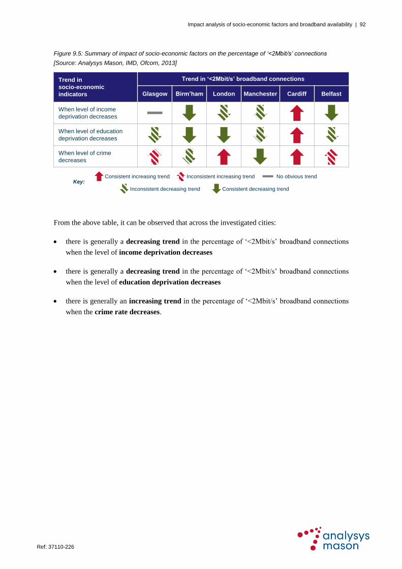
Impact analysis of socio-economic factors and broadband availability | 92
Ref: 37110-226 .
Figure 9.5: Summary of impact of socio-economic factors on the percentage of ‘<2Mbit/s’ connections
[Source: Analysys Mason, IMD, Ofcom, 2013]
From the above table, it can be observed that across the investigated cities:
there is generally a decreasing trend in the percentage of ‗<2Mbit/s‘ broadband connections
when the level of income deprivation decreases
there is generally a decreasing trend in the percentage of ‗<2Mbit/s‘ broadband connections
when the level of education deprivation decreases
there is generally an increasing trend in the percentage of ‗<2Mbit/s‘ broadband connections
when the crime rate decreases.
Trend in
socio-economic
indicators
Trend in ‘<2Mbit/s’ broadband connections
Glasgow Birm’ham London Manchester Cardiff Belfast
When level of income
deprivation decreases
When level of education
deprivation decreases
When level of crime
decreases
Consistent increasing trend Inconsistent increasing trend
Consistent decreasing trendInconsistent decreasing trend
No obvious trendKey:

Impact analysis of socio-economic factors and broadband availability | 93
Ref: 37110-226 .
9.3 NGA broadband availability
9.3.1 Income deprivation
Figure 9.6 below compares the outputs from the income deprivation quartile analysis of NGA
broadband availability for each city.
Figure 9.6: Comparison of income deprivation quartile analysis of NGA broadband availability [Source:
Analysys Mason, IMD, Ofcom, 2013]
In general, all cities except Cardiff and Birmingham show an increasing trend in NGA broadband
availability when the level of income deprivation decreases. However, the London, Manchester
and Belfast trends are inconsistent, which may be explained by the fact that other issues (such as
existing take-up and premises density) have an overriding effect in some areas. Birmingham shows
no obvious trend, while Cardiff exhibits a decreasing trend in NGA broadband availability when
the level of income deprivation decreases.
Again, Cardiff could be treated as an exception, in that although the western parts of Cardiff have
very low levels of income deprivation, the availability of NGA broadband is limited. This may be
due to the reasons discussed in Section 9.2.1 above. It is noted that the Welsh Government‘s
Superfast Cymru rural broadband project will address the NGA broadband availability issues faced
by the western parts of Cardiff.
0%
20%
40%
60%
80%
100%
1st Quartile 2nd Quartile 3rd Quartile 4th Quartile
NG
A a
va
ilab
ility
Most 'income deprived' Least 'income deprived'
Glasgow Birmingham London
Belfast Manchester Cardiff

Impact analysis of socio-economic factors and broadband availability | 94
Ref: 37110-226 .
9.3.2 Education deprivation
Figure 9.7 compares the outputs from the education deprivation quartile analysis of NGA
broadband availability for each city.
Figure 9.7: Comparison of education deprivation quartile analysis of NGA broadband availability [Source:
Analysys Mason, IMD, Ofcom, 2013]
In general, there is no obvious trend in NGA broadband availability when the level of education
deprivation decreases. This could mean that other factors have an overriding effect in some areas
(such as existing take-up and premises density).
The city centres of Birmingham and London have very low levels of NGA broadband availability,
but their levels of education deprivation are relatively high. It should be noted that the city centres
and their neighbouring areas have a high number of non-residential premises, which mostly
require business-class connectivity (e.g. leased lines) rather than broadband, and have relatively
low population densities. These factors could have discouraged network operators from rolling out
NGA broadband in these city centres.
The level of education deprivation is very low in the western parts of Cardiff, but NGA broadband
availability is also low. This may be due to the reasons discussed in Section 9.2.1 above.
0%
20%
40%
60%
80%
100%
1st Quartile 2nd Quartile 3rd Quartile 4th Quartile
NG
A a
va
ilab
ility
Most 'education deprived' Least 'education deprived'
Glasgow Birmingham London
Belfast Manchester Cardiff

Impact analysis of socio-economic factors and broadband availability | 95
Ref: 37110-226 .
9.3.3 Crime deprivation
Figure 9.8 compares outputs from the crime deprivation quartile analysis of NGA broadband
availability for each city.
Figure 9.8: Comparison of crime deprivation quartile analysis of NGA broadband availability [Source:
Analysys Mason, IMD, Ofcom, 2013]
In general, all cities except Cardiff and London show an increasing trend in NGA broadband
availability when the level of crime rate decreases. Some of the trends are inconsistent, which may
be due to other factors (such as existing take-up and premises density) having an overriding effect
in some areas.
The city centre of London has very low NGA broadband availability, most likely due to the large
number of non-residential premises and the low population density. This possibly explains the
sharp drop in NGA broadband availability between the third and fourth quartiles in the chart
above.
9.3.4 Summary
Figure 9.9 below summarises the trends that have been identified, to help highlight the impact that
the investigated socio-economic factors have on NGA broadband availability. In this table,
increasing trends are shown in green (on the basis that the ‗best‘ areas have higher NGA
broadband availability), while declining trends are shown in red (on the basis that the ‗worst‘ areas
have lower NGA broadband availability).
0%
20%
40%
60%
80%
100%
1st Quartile 2nd Quartile 3rd Quartile 4th Quartile
NG
A a
va
ilab
ility
Highest crime level Lowest crime level
Glasgow Birmingham London
Belfast Manchester Cardiff

Impact analysis of socio-economic factors and broadband availability | 96
Ref: 37110-226 .
Figure 9.9: Impact of socio-economic factors on NGA broadband availability [Source: Analysys Mason, IMD,
Ofcom, 2013]
From the above table, it can be observed that across the investigated cities (particularly if Cardiff
is considered as an exception, for the reasons outlined in Section 9.2.1):
there is generally an increasing trend in NGA broadband availability when the level of
income deprivation decreases
there is no overall obvious trend in NGA broadband availability when the level of education
deprivation decreases
there is generally an increasing trend in NGA broadband availability when the crime rate
decreases.
9.4 Conclusions and recommendations
9.4.1 Conclusions
The analysis has demonstrated marked relationships between socio-economic deprivation
factors and broadband availability.
It has also highlighted that individual cities have localities where there are acute deprivation
issues combined with low NGA broadband availability.
It is also seen that not all cities follow the general trends, but this reflects the fact that particular
districts of each city should be considered as having unique and sometimes highly localised
characteristics that have an impact on broadband availability.
Trend in
socio-economic
indicators
Trend in NGA broadband availability
Glasgow Birm’ham London Manchester Cardiff Belfast
When level of income
deprivation decreases
When level of education
deprivation decreases
When level of crime
decreases
Consistent increasing trend Inconsistent increasing trend
Consistent decreasing trendInconsistent decreasing trend
No obvious trendKey:

Impact analysis of socio-economic factors and broadband availability | 97
Ref: 37110-226 .
9.4.2 Recommendations
Therefore, policy makers seeking to identify ways to stimulate economic growth and investment
should investigate broadband-related issues, such as lack of NGA availability and problems with
‗<2Mbits‘ connections, using data analysis comparable to that undertaken in this report. An
assessment of the links between broadband and socio-economic factors such as income, education
and crime can improve understanding of the problems faced by individual UK cities, which are
sometimes complex.
The data analysis in this report has only been completed for six cities. Any policy development at the
national level would ideally be based on analysis of a wider sample of cities, conducted at a suitably
granular level; analysis at postcode level would be necessary as a minimum, but analysis at street level
should also be considered. Alternatively, any cities that wish to develop local broadband policies and
delivery plans should consider the implications of this analysis as part of the policy development
process. In addition, the data analysis could include other factors which may influence broadband
availability, such as unemployment, house prices and existing broadband take-up.

Impact analysis of socio-economic factors and broadband availability | A–1
Ref: 37110-226 .
Annex A Methodology
The full methodology used for the impact analysis of socio-economic factors on broadband roll-
out strategies involves eight steps, as explained below.
1. Gather Index of Multiple Deprivation (IMD) domain data (income, education and crime) from
each nation government‘s website. It should be noted that IMD and its deprivation scores are
calculated differently by each nation, and so it is not possible for this study to make a
quantitative comparison between cities in different nations.
2. Derive the percentage of ‗<2Mbit/s‘ connections and NGA broadband availability, based on
Ofcom‘s 2013 broadband availability dataset for each LSOA in England and Wales, Data
Zone in Scotland and SOA in Northern Ireland.
City
‘<2Mbit/s’
connections
NGA broadband
availability
Figure A.1: Broadband
availability for UK cities in
2013 [Source: Analysys
Mason / Ofcom, 2013]
London 3.7% 88.4%
Birmingham 4.2% 91.3%
Manchester 5.5% 86.3%
Glasgow 5.5% 66.6%
Cardiff 7.7% 90.9%
Belfast 3.8% 98.1%
3. Produce ‗<2Mbit/s‘ connections and NGA broadband availability maps for each city under
study using a geographical information system (GIS) tool.
— Five equal ranges have been used on all maps showing NGA broadband availability in the
cities studied:
a. 0%–20%
b. 20%–40%
c. 40%–60%
d. 60%–80%
e. 80%–100%
An example of an NGA broadband availability map is provided below.

Impact analysis of socio-economic factors and broadband availability | A–2
Ref: 37110-226 .
Figure A.2: NGA broadband availability in Glasgow [Source: Analysys Mason, Ofcom, 2013]
— Five ranges have also been used for ‗<2Mbit/s‘ connections, but these ranges are unequal
because the distribution of ‗<2Mbit/s‘ connections per region (LSOA / SOA / Data Zone)
generally lies between 0% and 10%, and majority of the remaining regions have between
10% and 30% ‗<2Mbit/s‘ connections. Accordingly, the following unequal ranges have
been used for all cities:
a. 0%–5%
b. 5%–10%
c. 10%–20%
d. 20%–30%
e. 30%–100%
An example of a ‗<2Mbit/s‘ broadband connections map is provided below.
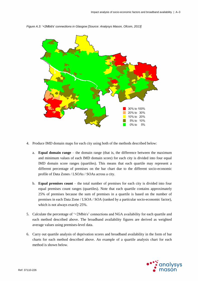
Impact analysis of socio-economic factors and broadband availability | A–3
Ref: 37110-226 .
Figure A.3: ‘<2Mbit/s’ connections in Glasgow [Source: Analysys Mason, Ofcom, 2013]
4. Produce IMD domain maps for each city using both of the methods described below:
a. Equal domain range – the domain range (that is, the difference between the maximum
and minimum values of each IMD domain score) for each city is divided into four equal
IMD domain score ranges (quartiles). This means that each quartile may represent a
different percentage of premises on the bar chart due to the different socio-economic
profile of Data Zones / LSOAs / SOAs across a city.
b. Equal premises count – the total number of premises for each city is divided into four
equal premises count ranges (quartiles). Note that each quartile contains approximately
25% of premises because the sum of premises in a quartile is based on the number of
premises in each Data Zone / LSOA / SOA (ranked by a particular socio-economic factor),
which is not always exactly 25%.
5. Calculate the percentage of ‗<2Mbit/s‘ connections and NGA availability for each quartile and
each method described above. The broadband availability figures are derived as weighted
average values using premises-level data.
6. Carry out quartile analysis of deprivation scores and broadband availability in the form of bar
charts for each method described above. An example of a quartile analysis chart for each
method is shown below.

Impact analysis of socio-economic factors and broadband availability | A–4
Ref: 37110-226 .
Figure A.4: Income deprivation results for Glasgow using equal domain range method [Source: Analysys
Mason, IMD, Ofcom, 2013]
Figure A.5: Income deprivation results for Glasgow using equal premises count method [Source: Analysys
Mason, IMD, Ofcom, 2013]
7. Produce geographical maps based on quartile ranges using both methods. This allows, for
example, the most deprived and least deprived areas to be quickly identified geographically
using the map colour range. Examples of geographical maps produced using the two methods
are shown below.
23.9%
55.9%
68.8% 71.3%
5.4% 5.4% 5.9% 5.1%
0%
20%
40%
60%
80%
100%
0%
20%
40%
60%
80%
100%
1st Quartile 2nd Quartile 3rd Quartile 4th Quartile
% o
f p
rem
ise
s
Ava
ila
bil
ity
Most 'income deprived' Least 'income deprived'
NGA <2Mbit/s % of premises
57.8%
69.7% 65.5%73.3%
6.5% 5.2% 4.6% 5.8%
0%
20%
40%
60%
80%
100%
0%
20%
40%
60%
80%
100%
1st Quartile 2nd Quartile 3rd Quartile 4th Quartile
% o
f p
rem
ise
s
Ava
ila
bil
ity
Most 'income deprived' Least 'income deprived'
NGA <2Mbit/s % of premises

Impact analysis of socio-economic factors and broadband availability | A–5
Ref: 37110-226 .
Figure A.6: Distribution of income across different quartiles for Glasgow using equal domain range method
[Source: Analysys Mason, IMD, 2013]
Figure A.7: Distribution of income across different quartiles for Glasgow using equal premises count method
[Source: Analysys Mason, IMD, 2013]
8. Draw key observations from each quartile analysis chart and geographical map for each city.
In some cases, known local factors such as public intervention are used to suggest potential
explanations for the analysis shown in the quartile analysis charts and/or geographical maps.
Decre
asin
g le
vel
of d
ep
rivatio
n
Decre
asin
g le
vel
of d
ep
rivatio
n


