Interactive Exploration of Flow
Fields Using Commodity
HardwareA thesis submitted in partial fulfillment for the
degree of Master of Science
by
Clara ThoneICA-3766349
UNIVERSITY OF UTRECHT
Faculty of Science
Department of Information and Computing Sciences
Supervisors:
dr. ir. A. Frank van der Stappen, Faculty of Science, University of Utrecht
Dr. Paul Benolken, Regional Computing Centre, University of Cologne
February 2014

Abstract
Flow visualization is a widely-used technique to explore flow fields, which occur in many
different research areas. Until now these visualizations are usually performed in tradi-
tional desktop settings. But the emergence of tablet PCs offers new possibilities in terms
of user interaction. Additionally it facilitate new ways to incorporate flow visualizations
into the work process.
The aim of this project is to examine the potential and limitations of tablet PCs for flow
field visualization. Therefore two flow field visualization apps for iPads are created, one
standalone and one client-server system. These applications are equipped with common
visualization techniques and utilize the tablet PC’s specific user interaction methods.
Furthermore the apps are tested with technical performance tests and a user study.
The results show that the applications in general received very positive responses from
the test-users. Some interaction methods need to be improved, but overall they were
perceived as intuitive and easy to understand. Moreover the standalone version per-
formed surprisingly well in the technical tests. The client-server app proved to be a
good extension in terms of reducing the processing time.
Contents
Abstract i
List of Figures iii
List of Tables iv
1 Introduction 1
1.1 Related Research . . . . . . . . . . . . . . . . . . . . . . . . . . . . . . . . 2
1.2 Structure of the Thesis . . . . . . . . . . . . . . . . . . . . . . . . . . . . . 3
2 Fundamentals 5
2.1 Flow Field Datasets . . . . . . . . . . . . . . . . . . . . . . . . . . . . . . 5
2.2 Visualization Techniques . . . . . . . . . . . . . . . . . . . . . . . . . . . . 7
2.2.1 Grid Surface . . . . . . . . . . . . . . . . . . . . . . . . . . . . . . 7
2.2.2 Colour Mapping . . . . . . . . . . . . . . . . . . . . . . . . . . . . 7
2.2.3 Cross Section . . . . . . . . . . . . . . . . . . . . . . . . . . . . . . 8
2.2.4 Iso-Surfaces . . . . . . . . . . . . . . . . . . . . . . . . . . . . . . . 9
2.2.5 Volume Rendering . . . . . . . . . . . . . . . . . . . . . . . . . . . 9
2.3 Vector Field Visualization . . . . . . . . . . . . . . . . . . . . . . . . . . . 10
2.3.1 Direct Flow Visualization . . . . . . . . . . . . . . . . . . . . . . . 11
2.3.2 Dense, Texture-based Flow Visualization . . . . . . . . . . . . . . . 11
2.3.3 Geometric Flow Visualization . . . . . . . . . . . . . . . . . . . . . 12
2.3.4 Feature-based Flow Visualization . . . . . . . . . . . . . . . . . . . 13
3 Implementation 14
3.1 Requirements . . . . . . . . . . . . . . . . . . . . . . . . . . . . . . . . . . 14
3.1.1 Visualization of Flow Fields . . . . . . . . . . . . . . . . . . . . . . 14
3.1.2 Examining the Potential of Tablet PCs . . . . . . . . . . . . . . . 15
3.1.3 Design Decisions . . . . . . . . . . . . . . . . . . . . . . . . . . . . 15
3.1.4 User Interaction Techniques . . . . . . . . . . . . . . . . . . . . . . 15
3.2 Visualization Libraries . . . . . . . . . . . . . . . . . . . . . . . . . . . . . 16
3.2.1 VTK . . . . . . . . . . . . . . . . . . . . . . . . . . . . . . . . . . . 17
3.2.2 VES . . . . . . . . . . . . . . . . . . . . . . . . . . . . . . . . . . . 18
3.2.3 Kiwi . . . . . . . . . . . . . . . . . . . . . . . . . . . . . . . . . . . 18
3.3 General Design . . . . . . . . . . . . . . . . . . . . . . . . . . . . . . . . . 19
3.3.1 Delegation . . . . . . . . . . . . . . . . . . . . . . . . . . . . . . . . 19
3.3.2 Model-View-Controller . . . . . . . . . . . . . . . . . . . . . . . . . 20
ii
Contents iii
3.3.3 Visualization Pipeline . . . . . . . . . . . . . . . . . . . . . . . . . 23
3.4 The Standalone Version . . . . . . . . . . . . . . . . . . . . . . . . . . . . 25
3.5 The Server-Client System . . . . . . . . . . . . . . . . . . . . . . . . . . . 26
3.5.1 Client-Side . . . . . . . . . . . . . . . . . . . . . . . . . . . . . . . 26
3.5.2 Server-Side . . . . . . . . . . . . . . . . . . . . . . . . . . . . . . . 27
3.5.3 The Communication . . . . . . . . . . . . . . . . . . . . . . . . . . 28
3.6 User Interface . . . . . . . . . . . . . . . . . . . . . . . . . . . . . . . . . . 31
4 Performance Testing 34
4.1 Datasets . . . . . . . . . . . . . . . . . . . . . . . . . . . . . . . . . . . . . 34
4.2 General Time Measurements . . . . . . . . . . . . . . . . . . . . . . . . . 35
4.2.1 Experiment Setting . . . . . . . . . . . . . . . . . . . . . . . . . . . 35
4.2.2 Results . . . . . . . . . . . . . . . . . . . . . . . . . . . . . . . . . 36
4.3 The Client-Server Application . . . . . . . . . . . . . . . . . . . . . . . . . 39
4.3.1 Experiment Setting . . . . . . . . . . . . . . . . . . . . . . . . . . . 39
4.3.2 Results . . . . . . . . . . . . . . . . . . . . . . . . . . . . . . . . . 40
4.4 Frame-Rate . . . . . . . . . . . . . . . . . . . . . . . . . . . . . . . . . . . 43
4.4.1 Experiment Settings . . . . . . . . . . . . . . . . . . . . . . . . . . 43
4.4.2 Results . . . . . . . . . . . . . . . . . . . . . . . . . . . . . . . . . 43
5 Usability Evaluation 45
5.1 What is Usability . . . . . . . . . . . . . . . . . . . . . . . . . . . . . . . . 45
5.2 Evaluating Usability . . . . . . . . . . . . . . . . . . . . . . . . . . . . . . 46
5.2.1 SUS - the System Usability Scale . . . . . . . . . . . . . . . . . . . 48
5.3 The Questionnaire . . . . . . . . . . . . . . . . . . . . . . . . . . . . . . . 48
5.4 Experiment Settings . . . . . . . . . . . . . . . . . . . . . . . . . . . . . . 49
5.5 Results . . . . . . . . . . . . . . . . . . . . . . . . . . . . . . . . . . . . . . 50
5.5.1 Answers to Open Questions . . . . . . . . . . . . . . . . . . . . . . 51
6 Conclusion and Future Work 53
6.1 Summary . . . . . . . . . . . . . . . . . . . . . . . . . . . . . . . . . . . . 53
6.2 Conclusion . . . . . . . . . . . . . . . . . . . . . . . . . . . . . . . . . . . 54
6.3 Future Work . . . . . . . . . . . . . . . . . . . . . . . . . . . . . . . . . . 54
A Results of the Performance Tests 56
B The Questionnaire 59
C The Results of the Questionnaire 66
Bibliography 69
List of Figures
1.1 Flow Visualization of the Car Dataset . . . . . . . . . . . . . . . . . . . . 1
2.1 Point and Cell Data . . . . . . . . . . . . . . . . . . . . . . . . . . . . . . 5
2.2 Structured Grids . . . . . . . . . . . . . . . . . . . . . . . . . . . . . . . . 6
2.3 Unstructured Grid . . . . . . . . . . . . . . . . . . . . . . . . . . . . . . . 7
2.4 Two Cross Section Options . . . . . . . . . . . . . . . . . . . . . . . . . . 8
2.5 Inside/Outside Test for Points against a Plane . . . . . . . . . . . . . . . 9
2.6 Iso-Surface of the Carotid Dataset . . . . . . . . . . . . . . . . . . . . . . 10
2.7 Flow Visualization Techniques . . . . . . . . . . . . . . . . . . . . . . . . . 11
2.8 LIC Visualizations of the Car and the Turbine Dataset . . . . . . . . . . 12
2.9 Different Types of Field Lines . . . . . . . . . . . . . . . . . . . . . . . . . 13
3.1 Relation of VTK, VES and Kiwi . . . . . . . . . . . . . . . . . . . . . . . 17
3.2 The VTK Pipeline . . . . . . . . . . . . . . . . . . . . . . . . . . . . . . . 17
3.3 Main Run Loop of iOS . . . . . . . . . . . . . . . . . . . . . . . . . . . . . 20
3.4 Model-View-Controller Scheme . . . . . . . . . . . . . . . . . . . . . . . . 21
3.5 The VTK-Pipeline . . . . . . . . . . . . . . . . . . . . . . . . . . . . . . . 23
3.6 TabletVis Standalone App . . . . . . . . . . . . . . . . . . . . . . . . . . . 25
3.7 Standalone Communication . . . . . . . . . . . . . . . . . . . . . . . . . . 25
3.8 TabletVis Client-Server App . . . . . . . . . . . . . . . . . . . . . . . . . . 26
3.9 Client Server Communication . . . . . . . . . . . . . . . . . . . . . . . . . 29
3.10 The Touch Gestures . . . . . . . . . . . . . . . . . . . . . . . . . . . . . . 31
3.11 Clipping of the Turbine Dataset . . . . . . . . . . . . . . . . . . . . . . . . 32
3.12 Streamlines of the Car Dataset . . . . . . . . . . . . . . . . . . . . . . . . 33
4.1 General Timing Test: Turbine Model . . . . . . . . . . . . . . . . . . . . . 36
4.2 General Timing Test: Component Model . . . . . . . . . . . . . . . . . . . 36
4.3 General Timing Test: Noise Model . . . . . . . . . . . . . . . . . . . . . . 38
4.4 General Timing Test: Carotid Model . . . . . . . . . . . . . . . . . . . . . 38
4.5 General Timing Test: Car Model . . . . . . . . . . . . . . . . . . . . . . . 38
4.6 Experiment Setting Client-Server Tests . . . . . . . . . . . . . . . . . . . . 39
4.7 Results of Client-Server Tests . . . . . . . . . . . . . . . . . . . . . . . . . 41
4.8 Transmitted Bytes . . . . . . . . . . . . . . . . . . . . . . . . . . . . . . . 42
4.9 Results of the Frame-Rate Tests . . . . . . . . . . . . . . . . . . . . . . . 43
4.10 Scenes for the Frame-Rate Tests . . . . . . . . . . . . . . . . . . . . . . . 44
5.1 Results of the Questionnaire . . . . . . . . . . . . . . . . . . . . . . . . . . 51
iv
List of Tables
4.1 Properties of the Utilized Datasets . . . . . . . . . . . . . . . . . . . . . . 34
A.1 Results of the General Timing Tests . . . . . . . . . . . . . . . . . . . . . 56
A.2 Results of the Client-Server Tests on the Turbine Dataset in ASCII Mode 57
A.3 Results of the Client-Server Tests on the Turbine Dataset in Binary Mode 57
A.4 Results of the Client-Server Tests on the Component Dataset in ASCIIMode . . . . . . . . . . . . . . . . . . . . . . . . . . . . . . . . . . . . . . 57
A.5 Results of the Client-Server Tests on the Component Dataset in BinaryMode . . . . . . . . . . . . . . . . . . . . . . . . . . . . . . . . . . . . . . 57
A.6 Results of the Client-Server Tests on the Noise Dataset in ASCII Mode . 57
A.7 Results of the Client-Server Tests on the Noise Dataset in Binary Mode . 58
A.8 Results of the Client-Server Tests on the Carotid Dataset in ASCII Mode 58
A.9 Results of the Client-Server Tests on the Carotid Dataset in Binary Mode 58
A.10 Results of the Client-Server Tests on the Car Dataset in ASCII Mode . . 58
A.11 Results of the Client-Server Tests on the Car Dataset in Binary Mode . . 58
C.1 Numerical Results of the Questionnaire . . . . . . . . . . . . . . . . . . . 67
C.2 Answers to Open Questions of the Questionnaire . . . . . . . . . . . . . . 68
v
Chapter 1
Introduction
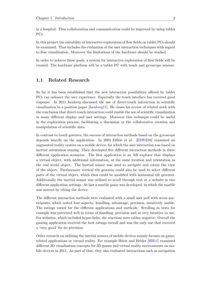
The exploration and analysis of flow fields is part of many research areas. That includes
for example the examination of the circulation around vehicles, aircraft or vessels, the
observation of atmospheric flow for the weather forecast or the analysis of the character-
istics of fluids in technical facilities. The flow data can result from measurements as well
as from simulations. For a long time researchers use the techniques of flow visualization
for the interactive exploration of these flow fields. The visualization plays an important
role in the efficient analysis and communication of the characteristics of flow datasets.
Figure 1.1: A visualization of a flow field resulting from numerical simulations witha car model.
So far these visualizations are usually performed in traditional desktop settings. But the
emergence of tablet PCs and their availability in typical office environments, provides
some interesting new possibilities. First of all tablet PCs offer new ways of user interac-
tion such as touch gestures or the use of the gyroscope. Additionally the mobility and
wireless use open up new ways of incorporating visualizations into the work process. The
tablet PC can easily be brought along to meetings, factory workshops or ward rounds
1
Chapter 1. Introduction 2
in a hospital. Thus collaboration and communication could be improved by using tablet
PCs.
In this project the suitability of interactive exploration of flow fields on tablet PCs should
be examined. That includes the evaluation of the user interaction techniques with regard
to flow visualization. Moreover the limitations of the hardware should be studied.
In order to achieve these goals, a system for interactive exploration of flow fields will be
created. The hardware platform will be a tablet PC with touch and gyroscope sensors.
1.1 Related Research
So far it has been established that the new interaction possibilities offered by tablet
PCs can enhance the user experience. Especially the touch interface has received good
response. In 2011 Isenberg discussed the use of direct-touch interaction in scientific
visualization in a position paper [Isenberg11]. He closes his review of related work with
the conclusion that direct-touch interaction could enable the use of scientific visualization
in many different display and user settings. Moreover this technique could be useful
in the exploration process, facilitating a discussion or the collaborative creation and
manipulation of scientific data.
In contrast to touch gestures, the success of interaction methods based on the gyroscope
depends heavily on the application. In 2004 Eißele et al. [ESWE04] examined an
augmented reality system on a mobile device, for which the user interaction was based on
inertial orientation sensing. They developed five different interaction methods in three
different application scenarios. The first application is an AR explorer that displays
a virtual object, with additional information, at the same location and orientation as
the real world object. The inertial sensor was used to navigate and rotate the view
of the object. Furthermore vertical tilt gestures could also be used to select different
parts of the virtual object, which then could be modified with horizontal tilt gestures.
Additionally the inertial sensor was utilized to scroll through text or a website in two
different application settings. At last a marble game was developed, in which the marble
was steered by tilting the device.
The different interaction methods were evaluated with a small user poll with seven par-
ticipants, which tested four aspects: handling, advantage, precision, intuitively usable.
The ratings varied for the different applications and methods. Scrolling in texts for
example was perceived well in terms of handling, precision and as very intuitive to use.
For websites, which included hyper-links, the reactions were rather negative. Overall the
gaming application received the best ratings overall and was the only one that received
a ’very good’ for its precision.
Other research on utilizing the inertial sensors of mobile devices mainly focuses on game-
related applications or virtual reality. For example Hurst and Helder [HH11] examined
different 3D visualization concepts for 3D games and virtual reality environments on mo-
bile devices in 2011. As part of that, they also evaluated interactions such as navigation

Chapter 1. Introduction 3
and selection of objects. The main difference to applications for scientific visualization,
or more specifically flow visualization, is, that in a game the user usually wants to ex-
plore a virtual world, not an object. So the task is to navigate through a scene and not
to examine an object from different views and angles. Therefore results on game-related
applications or virtual reality can not simply be transferred to scientific visualization.
Thus further examinations have to be done.
The LiverExplorer [MEVIS] for mobile devices developed by the Fraunhofer MEVIS
institute demonstrates that tablet PCs can be of great use in the medical field. Moreover
it is a good example for the use of mobile devices in augmented reality applications.
The app supports surgeons by providing interactive access to patient data during liver
surgery. It offers augmented reality features, such as the overlay of planning data over
the actual liver on the operation table. Moreover the app enables the surgeon to adapt
to new intra-operative situations. One can for example measure the length of vessel
branch sections with touch gestures or compute the volume drained or supported by any
branch. The app was first tested in August 2013.
Other research shows that tablet PCs could also be useful for applications concerned
with flow fields. Mouton et al. for example studied current systems and future trends in
collaborative visualization in 2011 [MSG11]. In their review they included a transatlantic
collaborative visualization with [ParaViewWeb], for which they utilized an iPad amongst
others.
As mentioned before, one research focus is utilization of mobile devices in augmented
reality applications. One example, that is concerned with flow fields, was presented by
Eißele et al. in 2008 [EKE08]. They presented a visualization system that used a tablet
PC as AR window and rendered visualizations of a flow simulation directly onto a flow
channel in the real world. The rendering was remote.
In general the existing systems for flow visualization on tablet PCs are usually based on
rendering clusters that can be accessed through a browser, such as [ParaViewWeb], or
use remote rendering. That restricts the mobility aspects of mobile devices significantly.
Therefore this project explores the possibilities of a standalone system and a client-server
approach.
1.2 Structure of the Thesis
In Chapter 2 the fundamentals of flow visualization are introduced. That includes a
description of flow datasets as well as an overview over common visualization techniques.
Within that the aspects of flow visualization are emphasized.
Next the implementation process is described in Chapter 3. First the requirements for
this project are stated. Then the utilized visualization libraries are introduced. After a
description of the general design ideas, the implementation of the two applications, that
were created for this project, are explained in more detail. The chapter concludes with
an introduction to the user interface.
Chapter 1. Introduction 4
Then the next two chapters are concerned with the testing and evaluation of the ap-
plications. Chapter 4 treats the performance tests that were conducted. After shortly
introducing the utilized datasets, the three experiments are explained and the results are
given. In Chapter 5 the usability evaluation is described. First the notion of usability
is introduced, followed by an overview over evaluation techniques. Then the evaluation
setting, chosen for this project, is explained, including the utilized questionnaire. At
last the results are given.
This thesis concludes with a short summary and a discussion of this work in Chapter 6.
Additionally a proposal for future work is given.
Chapter 2
Fundamentals
In this chapter an overview over the fundamentals of flow visualization is given. First
the typical structure of flow datasets is introduced in Section 2.1. Then some common
visualization techniques for grids and scalar fields are described in Section 2.2. Finally
in Section 2.3 flow visualization techniques are presented.
2.1 Flow Field Datasets
The aim of scientific flow visualization is to display scalar, vector and/or tensor fields
such that the user gains more insight on their structure. The data is usually generated
by a numerical simulation, but it can also result from experiments. A dataset can consist
of several different attributed data fields. These data attributes can be time-variant.
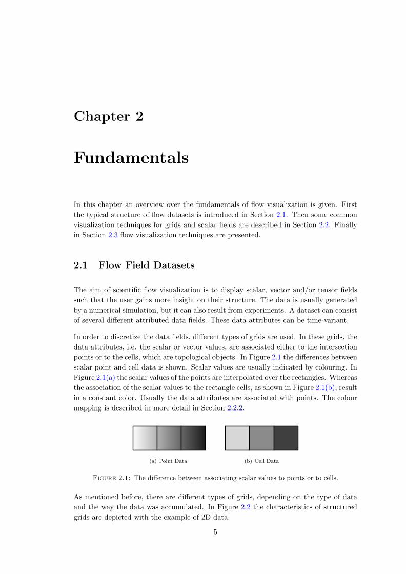
In order to discretize the data fields, different types of grids are used. In these grids, the
data attributes, i.e. the scalar or vector values, are associated either to the intersection
points or to the cells, which are topological objects. In Figure 2.1 the differences between
scalar point and cell data is shown. Scalar values are usually indicated by colouring. In
Figure 2.1(a) the scalar values of the points are interpolated over the rectangles. Whereas
the association of the scalar values to the rectangle cells, as shown in Figure 2.1(b), result
in a constant color. Usually the data attributes are associated with points. The colour
mapping is described in more detail in Section 2.2.2.
(a) Point Data (b) Cell Data
Figure 2.1: The difference between associating scalar values to points or to cells.
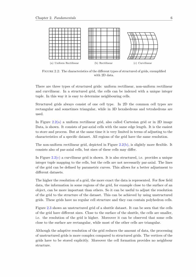
As mentioned before, there are different types of grids, depending on the type of data
and the way the data was accumulated. In Figure 2.2 the characteristics of structured
grids are depicted with the example of 2D data.
5
Chapter 2. Fundamentals 6
(a) Uniform Rectilinear (b) Rectilinear (c) Curvilinear
Figure 2.2: The characteristics of the different types of structured of grids, exemplifiedwith 2D data.
There are three types of structured grids: uniform rectilinear, non-uniform rectilinear
and curvilinear. In a structured grid, the cells can be indexed with a unique integer
tuple. In this way it is easy to determine neighbouring cells.
Structured grids always consist of one cell type. In 2D the common cell types are
rectangular and sometimes triangular, while in 3D hexahedrons and tetrahedrons are
used.
In Figure 2.2(a) a uniform rectilinear grid, also called Cartesian grid or in 2D image
Data, is shown. It consists of par-axial cells with the same edge length. It is the easiest
to store and process. But at the same time it is very limited in terms of adjusting to the
characteristics of a specific dataset. All regions of the grid have the same resolution.
The non-uniform rectilinear grid, depicted in Figure 2.2(b), is slightly more flexible. It
consists also of par-axial cells, but sizes of these cells may differ.
In Figure 2.2(c) a curvilinear grid is shown. It is also structured, i.e. provides a unique
integer tuple mapping to the cells, but the cells are not necessarily par-axial. The lines
of the grid can be defined by parametric curves. This allows for a better adjustment to
different datasets.
The higher the resolution of a grid, the more exact the data is represented. For flow field
data, the information in some regions of the grid, for example close to the surface of an
object, can be more important than others. So it can be useful to adjust the resolution
of the grid to the structure of the dataset. This can be achieved by using unstructured
grids. These grids have no regular cell structure and they can contain polyhedron cells.
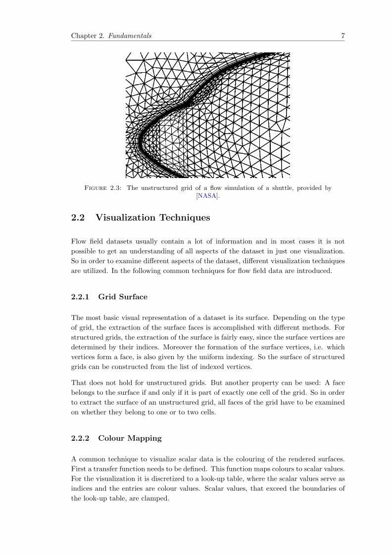
Figure 2.3 shows an unstructured grid of a shuttle dataset. It can be seen that the cells
of the grid have different sizes. Close to the surface of the shuttle, the cells are smaller,
i.e. the resolution of the grid is higher. Moreover it can be observed that some cells
close to the surface are rectangular, while most of the other cells are triangular.
Although the adaptive resolution of the grid reduces the amount of data, the processing
of unstructured grids is more complex compared to structured grids. The vertices of the
grids have to be stored explicitly. Moreover the cell formation provides no neighbour
structure.
Chapter 2. Fundamentals 7
Figure 2.3: The unstructured grid of a flow simulation of a shuttle, provided by[NASA].
2.2 Visualization Techniques
Flow field datasets usually contain a lot of information and in most cases it is not
possible to get an understanding of all aspects of the dataset in just one visualization.
So in order to examine different aspects of the dataset, different visualization techniques
are utilized. In the following common techniques for flow field data are introduced.
2.2.1 Grid Surface
The most basic visual representation of a dataset is its surface. Depending on the type
of grid, the extraction of the surface faces is accomplished with different methods. For
structured grids, the extraction of the surface is fairly easy, since the surface vertices are
determined by their indices. Moreover the formation of the surface vertices, i.e. which
vertices form a face, is also given by the uniform indexing. So the surface of structured
grids can be constructed from the list of indexed vertices.
That does not hold for unstructured grids. But another property can be used: A face
belongs to the surface if and only if it is part of exactly one cell of the grid. So in order
to extract the surface of an unstructured grid, all faces of the grid have to be examined
on whether they belong to one or to two cells.
2.2.2 Colour Mapping
A common technique to visualize scalar data is the colouring of the rendered surfaces.
First a transfer function needs to be defined. This function maps colours to scalar values.
For the visualization it is discretized to a look-up table, where the scalar values serve as
indices and the entries are colour values. Scalar values, that exceed the boundaries of
the look-up table, are clamped.
Chapter 2. Fundamentals 8
The design of the transfer function is crucial for the comprehensibility of the visualiza-
tion. For example scalar data representing temperatures are usually displayed such that
low values are blue and high values are red. But when the scalar data refers to landscape
heights, color maps normally range from blue for the sea level, i.e. the smallest scalar
values, over green for fields, brown for mountains up to white for the highest scalar
values, the mountain tops. In medical images on the other hand, the luminance color
map, ranging from black over grey to white, has come to be accepted.
2.2.3 Cross Section
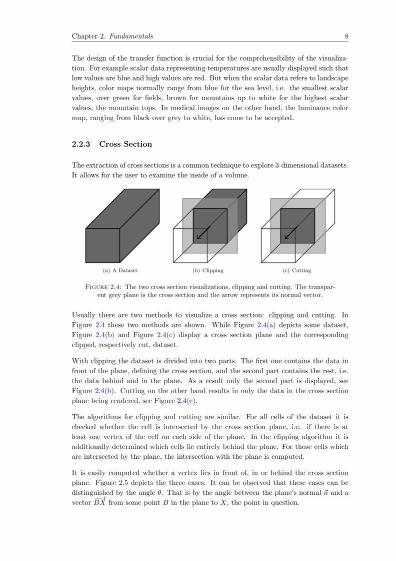
The extraction of cross sections is a common technique to explore 3-dimensional datasets.
It allows for the user to examine the inside of a volume.
(a) A Dataset (b) Clipping (c) Cutting
Figure 2.4: The two cross section visualizations, clipping and cutting. The transpar-ent grey plane is the cross section and the arrow represents its normal vector.
Usually there are two methods to visualize a cross section: clipping and cutting. In
Figure 2.4 these two methods are shown. While Figure 2.4(a) depicts some dataset,
Figure 2.4(b) and Figure 2.4(c) display a cross section plane and the corresponding
clipped, respectively cut, dataset.
With clipping the dataset is divided into two parts. The first one contains the data in
front of the plane, defining the cross section, and the second part contains the rest, i.e.
the data behind and in the plane. As a result only the second part is displayed, see
Figure 2.4(b). Cutting on the other hand results in only the data in the cross section
plane being rendered, see Figure 2.4(c).
The algorithms for clipping and cutting are similar. For all cells of the dataset it is
checked whether the cell is intersected by the cross section plane, i.e. if there is at
least one vertex of the cell on each side of the plane. In the clipping algorithm it is
additionally determined which cells lie entirely behind the plane. For those cells which
are intersected by the plane, the intersection with the plane is computed.
It is easily computed whether a vertex lies in front of, in or behind the cross section
plane. Figure 2.5 depicts the three cases. It can be observed that these cases can be
distinguished by the angle θ. That is by the angle between the plane’s normal ~n and a
vector−−→BX from some point B in the plane to X, the point in question.

Chapter 2. Fundamentals 9
~n
B
X
θ
(a) In Front of the Plane
~n
BX θ
(b) In the Plane
~n
B
X
θ
(c) Behind the Plane
Figure 2.5: A point X is either in front of, in or behind a plane. These three differentcases can be distinguished by the angle θ, that lies between the plane’s normal ~n and
the vector−−→BX, from some point B on the plane to the point X.
A point X lies in the plane for θ = π2 and for θ = 3π
2 . Moreover it lies in front of the
plane for θ ∈ [0, π2 [ and θ ∈]3π2 , 2π]. For θ ∈]π2 ,3π2 [ the point lies behind the plane.
With the dot product of two vectors given by ~v · ~w = ‖~v‖‖~w‖ cos(θ), it follows that:
• X lies in front of the plane if−−→BX · ~n > 0
• X lies on the plane if−−→BX · ~n = 0
• X lies behind the plane if−−→BX · ~n < 0
As a consequence the runtime of both cutting and clipping depends on the overall amount
of cells and also on the number of cells that intersect with the cross section plane.
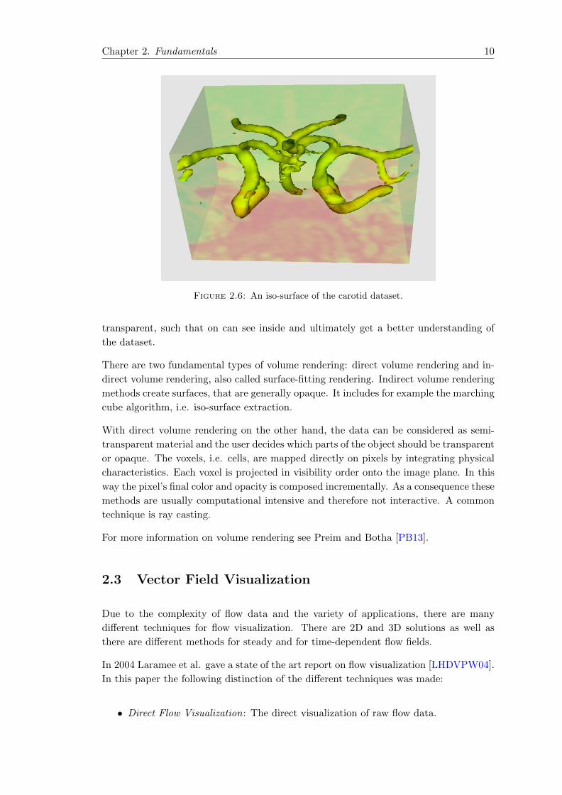
2.2.4 Iso-Surfaces
To examine scalar data, the visualization of iso-surfaces is a widely-used technique. An
iso-surface is similar to a contour line. It is a surface that represents the set of points
with the same constant scalar value. In Figure 2.6 an example of an iso-surface of the
carotid dataset is given.
For the computation of an iso-surface the marching cubes algorithm is used. The algo-
rithm examines the scalar values of the vertices of each cell in order to detect whether
the cell is intersecting the iso-surface or not. That is if at least one value is equal, or
at least one value is greater and one is smaller than the iso-value. By case distinction
depending on the geometry of the cells, the resulting iso-surface can be computed. If
necessary the intersection points are interpolated on the edges and connected to a sur-
face. The time complexity of the algorithm is O(n+k), where n is the number of vertices
and k is the number of cells that intersect the iso-surface. For more details see Preim
and Botha [PB13].
2.2.5 Volume Rendering
Volume rendering is used to create 2-dimensional graphic representations of scalar data
defined on 3-dimensional grids. The basic idea is to make some boundaries of an object
Chapter 2. Fundamentals 10
Figure 2.6: An iso-surface of the carotid dataset.
transparent, such that on can see inside and ultimately get a better understanding of
the dataset.
There are two fundamental types of volume rendering: direct volume rendering and in-
direct volume rendering, also called surface-fitting rendering. Indirect volume rendering
methods create surfaces, that are generally opaque. It includes for example the marching
cube algorithm, i.e. iso-surface extraction.
With direct volume rendering on the other hand, the data can be considered as semi-
transparent material and the user decides which parts of the object should be transparent
or opaque. The voxels, i.e. cells, are mapped directly on pixels by integrating physical
characteristics. Each voxel is projected in visibility order onto the image plane. In this
way the pixel’s final color and opacity is composed incrementally. As a consequence these
methods are usually computational intensive and therefore not interactive. A common
technique is ray casting.
For more information on volume rendering see Preim and Botha [PB13].
2.3 Vector Field Visualization
Due to the complexity of flow data and the variety of applications, there are many
different techniques for flow visualization. There are 2D and 3D solutions as well as
there are different methods for steady and for time-dependent flow fields.
In 2004 Laramee et al. gave a state of the art report on flow visualization [LHDVPW04].
In this paper the following distinction of the different techniques was made:
• Direct Flow Visualization: The direct visualization of raw flow data.

Chapter 2. Fundamentals 11
• Dense, Texture-based Flow Visualization: In order to generate a dense flow repre-
sentation, similar to the direct flow visualization, a texture is computed from the
flow data.
• Geometric Flow Visualization: Integration-based techniques are used to create
geometric objects, such as lines, to represent flow properties.
• Feature-based Flow Visualization: First specific features of the flow data are ex-
tracted, such as important phenomena or topological information of the flow. Then
this derived data is visualized.
Figure 2.7 depicts a schematic overview over the different flow visualization techniques.
Direct FlowVisualization:
arrows,color coding,
etc.
Texture-based FlowVisualization:
spot noise,line integral
convolution, etc.
Geometric FlowVisualization:
computation offieldlines,
flow volume, etc.
Visualization
Feature-based FlowVisualization:
extraction offeatures, i.e.vortices, etc.
Visualization
Data Acquisition
User Perception
Figure 2.7: The different flow visualization techniques.
2.3.1 Direct Flow Visualization
This category of techniques makes direct use of the flow data. Unlike techniques from
other categories, in direct flow visualization no preprocessing of the data is performed.
That results in fast visualizations that allow for immediate examination of the data.
Especially in 2D the resulting images can be very intuitive.
Common techniques are the drawing of arrows on the rendered surfaces, or color coding
of the velocity of the flow.
2.3.2 Dense, Texture-based Flow Visualization
Texture-based flow visualization techniques apply the directional structure of a flow field
on random textures. They are mainly used for visualizing flow in two dimensions or on
surfaces.
A common techniques is called Line-Integral-Convolution (LIC). It was first proposed
by Cabral and Leedom in 1993 [CL93] and has been picked up and developed further
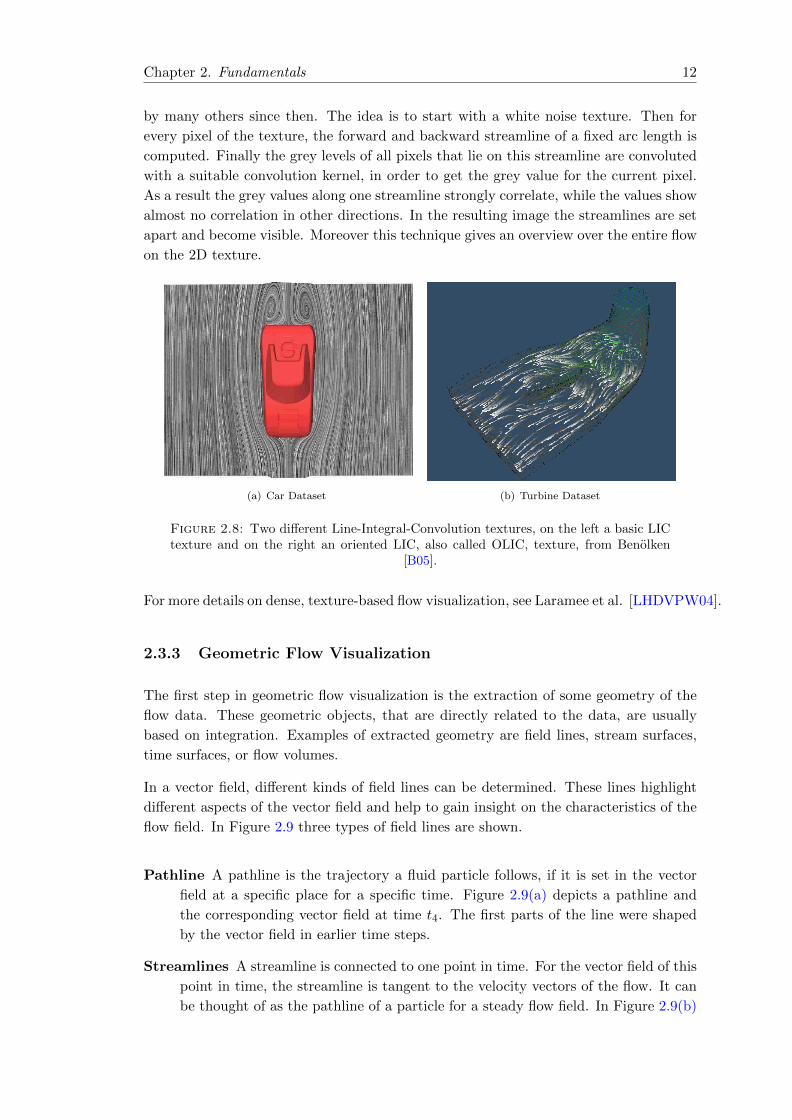
Chapter 2. Fundamentals 12
by many others since then. The idea is to start with a white noise texture. Then for
every pixel of the texture, the forward and backward streamline of a fixed arc length is
computed. Finally the grey levels of all pixels that lie on this streamline are convoluted
with a suitable convolution kernel, in order to get the grey value for the current pixel.
As a result the grey values along one streamline strongly correlate, while the values show
almost no correlation in other directions. In the resulting image the streamlines are set
apart and become visible. Moreover this technique gives an overview over the entire flow
on the 2D texture.
(a) Car Dataset (b) Turbine Dataset
Figure 2.8: Two different Line-Integral-Convolution textures, on the left a basic LICtexture and on the right an oriented LIC, also called OLIC, texture, from Benolken
[B05].
For more details on dense, texture-based flow visualization, see Laramee et al. [LHDVPW04].
2.3.3 Geometric Flow Visualization
The first step in geometric flow visualization is the extraction of some geometry of the
flow data. These geometric objects, that are directly related to the data, are usually
based on integration. Examples of extracted geometry are field lines, stream surfaces,
time surfaces, or flow volumes.
In a vector field, different kinds of field lines can be determined. These lines highlight
different aspects of the vector field and help to gain insight on the characteristics of the
flow field. In Figure 2.9 three types of field lines are shown.
Pathline A pathline is the trajectory a fluid particle follows, if it is set in the vector
field at a specific place for a specific time. Figure 2.9(a) depicts a pathline and
the corresponding vector field at time t4. The first parts of the line were shaped
by the vector field in earlier time steps.
Streamlines A streamline is connected to one point in time. For the vector field of this
point in time, the streamline is tangent to the velocity vectors of the flow. It can
be thought of as the pathline of a particle for a steady flow field. In Figure 2.9(b)
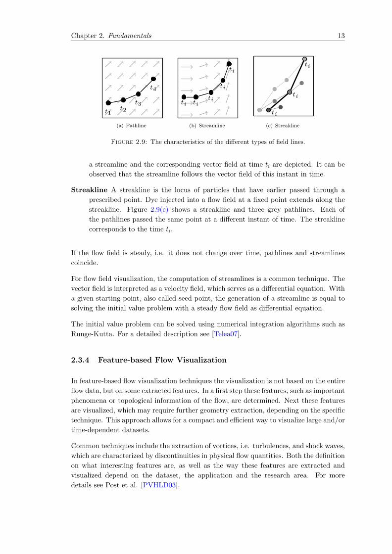
Chapter 2. Fundamentals 13
t1t2
t3
t4
(a) Pathline
ti titi
ti
ti
(b) Streamline
ti
ti
ti
(c) Streakline
Figure 2.9: The characteristics of the different types of field lines.
a streamline and the corresponding vector field at time ti are depicted. It can be
observed that the streamline follows the vector field of this instant in time.
Streakline A streakline is the locus of particles that have earlier passed through a
prescribed point. Dye injected into a flow field at a fixed point extends along the
streakline. Figure 2.9(c) shows a streakline and three grey pathlines. Each of
the pathlines passed the same point at a different instant of time. The streakline
corresponds to the time ti.
If the flow field is steady, i.e. it does not change over time, pathlines and streamlines
coincide.
For flow field visualization, the computation of streamlines is a common technique. The
vector field is interpreted as a velocity field, which serves as a differential equation. With
a given starting point, also called seed-point, the generation of a streamline is equal to
solving the initial value problem with a steady flow field as differential equation.
The initial value problem can be solved using numerical integration algorithms such as
Runge-Kutta. For a detailed description see [Telea07].
2.3.4 Feature-based Flow Visualization
In feature-based flow visualization techniques the visualization is not based on the entire
flow data, but on some extracted features. In a first step these features, such as important
phenomena or topological information of the flow, are determined. Next these features
are visualized, which may require further geometry extraction, depending on the specific
technique. This approach allows for a compact and efficient way to visualize large and/or
time-dependent datasets.
Common techniques include the extraction of vortices, i.e. turbulences, and shock waves,
which are characterized by discontinuities in physical flow quantities. Both the definition
on what interesting features are, as well as the way these features are extracted and
visualized depend on the dataset, the application and the research area. For more
details see Post et al. [PVHLD03].
Chapter 3
Implementation
In this chapter the design process and the final applications, that were implemented
for this project, are described. First the main requirements are deducted from the task
description in Section 3.1. Then the utilized visualization libraries are introduced in
Section 3.2. In Section 3.3 the three main design ideas are explained with regard to
the implementation, which gives a first overview over the structure of the applications.
It follows a more detailed description of the standalone app in Section 3.4 and of the
client-server app in Section 3.5. The chapter is concluded with an introduction to the
user interface in Section 3.6.
3.1 Requirements
The objective of this project is to create a system for the interactive exploration of flow
fields on a tablet PC. Furthermore this system shall be used to examine the possibilities
and the limits of scientific visualization on tablet PCs with regard to flow fields.
From this task description two sets of requirements arise.
3.1.1 Visualization of Flow Fields
Firstly, the application should be able to process flow field datasets. Such a dataset
usually includes a 3-dimensional grid with optional scalar, vector or tensor values. In
order to give an overview over the suitability of a tablet for flow visualization, it suffices
to restrict the datasets to scalar and vector fields. The use of advanced techniques for
time-variant datasets is not addressed.
In order to explore a flow field dataset, different visual representations are used. That in-
cludes cut-planes, iso-surfaces and streamlines. It follows that the application is required
to offer these common visualization techniques.
Additionally the rendering should be fluent, so that the application is interactive. The
user needs to be able to rotate, translate and zoom the visualized content, in order to get
14

Chapter 3. Implementation 15
a good understanding of the dataset. So the application is required to provide real-time
rendering, i.e. the rendering has to be fast enough for the user not to notice any delay.
The user should experience dynamic movements and not separated images.
3.1.2 Examining the Potential of Tablet PCs
To examine the potential and the constraints of a tablet PC for flow field visualization,
the application should be rendered on a tablet PC. Furthermore the use of additional
hardware should not limit the mobility of the tablet PC. The mobility is the main
advantage and difference of the tablet PC compared to desktop or laptop PCs. A tablet
PC functions wireless and can easily be carried around without spatial limitations. So
the application should be constructed in a way that this advantage can still be used.
Otherwise there is not much difference to a desktop or laptop PC.
Additionally the user interaction possibilities of the tablet PC should be utilized. The
biggest difference to traditional desktop or laptop PCs is the touch screen. But other
options, such as the gyroscope, should also be explored.
3.1.3 Design Decisions
Due to the aforementioned requirements and external circumstances three general deci-
sions were made for this project.
Firstly, it was decided to use the iPad 4 as basis of this project. At the time when this
project started, in the beginning of 2013, only iOS- or Android-based tablet PCs were
available. And since the University of Cologne has a master agreement with Apple and
the iPad provides powerful hardware, it was the best choice.
Secondly, VTK was chosen as auxiliary library for the scientific visualization. It is a
widely-used, open-source library that provides a wide range of visualization techniques
for flow fields. Additionally there exists a viewer app for iOS based on VTK, which was
used as starting point for this project. A detailed description is given in Section 3.2.
Thirdly, it was decided to create two versions of the same application, one standalone
and one based on a client-server system. Since the processing of flow field datasets
is computationally intensive, it is expected that the tablet PC reaches its limits with
larger datasets. So in order to examine these limits and explore a possible solution, a
client-server system will be created. This system should be wireless. Moreover it should
be realized on a private network for safety reasons.
3.1.4 User Interaction Techniques
A requirement for this project is the design of user interaction methods that use the
advantages of a tablet PC and enhance applications for flow visualization. The main
differences in terms of use interaction between a desktop PC and a tablet PC are the

Chapter 3. Implementation 16
touch screen, the accelerometer and the gyroscope. So the interaction methods imple-
mented for this project should use these possibilities.
The touch screen is used to navigate the scene. As described in Section 3.6, there are
five different touch gestures to rotate, translate and zoom the scene.
Additionally an auxiliary plane widget is implemented. It is used to place cut-planes
and seed-points. The widget is navigated with touch gestures.
Utilizing the Gyroscope
There were also attempts to utilize the gyroscope. The idea was to implement a rotation
of the scene linked to the gyroscope, such that tilting the tablet PC into one direction,
for example left, would result in the scene being rotated in the opposite direction, i.e.
right. The desired effect would have been to create the illusion of navigation to the left
in the virtual world. A similar approach is described by Hurst and Helder [HH11]. The
rotation was implemented as an optional feature, that could be turned on and off with
a button.
But it became clear early in the project, that this technique is not suitable. The biggest
issue was the imprecision. It was very difficult to tilt the tablet PC accurately to achieve
the desired rotation, even with different sensor sensitivities. Mainly because it was not
easy to control the device such that it tilted exactly in one direction.
Moreover the range, in which the screen can be tilted with the user still being able to
view the scene, is limited. The maximum tilt angle is about 30◦ in each direction from
the starting orientation. So the maximum range is about 60◦ in each direction. So either
one maps these 60◦ to 60◦ of rotation range, which seems intuitive, or to 360◦ in order
to enable a full turn of the scene with one gesture. The first option works only if the
tilting can be activated with a button. Then exploring the scene becomes very complex,
with activating the rotation, performing the tilting, deactivating the rotation, tilting
back to the starting point, activating the rotation, etc. . That does not only impede the
exploration of the scene, but it is also very difficult to maintain a precise rotation. But
mapping the 60◦ of tilting range to 360◦ of rotation also does not result in a satisfying
interaction method. The rotation gets so sensitive, that the movements are even harder
to control.
So after testing and tweaking different options, it became clear that the gyroscope-based
rotation has no advantages to touch-based rotation. It was bulky and inaccurate. As a
consequence this interaction method was withdrawn from the applications.
3.2 Visualization Libraries
The visualization for this project is based on three libraries, VTK, VES and Kiwi. These
libraries are built up on each other, which is depicted in Figure 3.1. Whereas VTK is
Chapter 3. Implementation 17
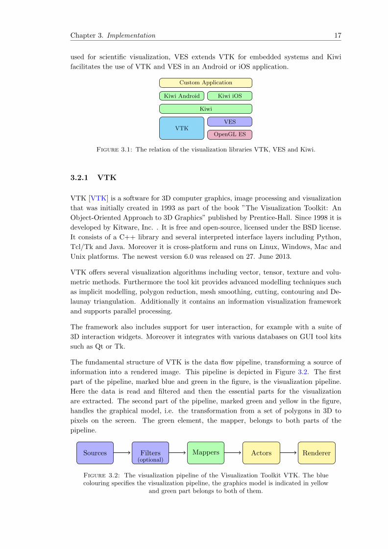
used for scientific visualization, VES extends VTK for embedded systems and Kiwi
facilitates the use of VTK and VES in an Android or iOS application.
VTKOpenGL ES
VES
Kiwi Android Kiwi iOS
Kiwi
Custom Application
Figure 3.1: The relation of the visualization libraries VTK, VES and Kiwi.
3.2.1 VTK
VTK [VTK] is a software for 3D computer graphics, image processing and visualization
that was initially created in 1993 as part of the book ”The Visualization Toolkit: An
Object-Oriented Approach to 3D Graphics” published by Prentice-Hall. Since 1998 it is
developed by Kitware, Inc. . It is free and open-source, licensed under the BSD license.
It consists of a C++ library and several interpreted interface layers including Python,
Tcl/Tk and Java. Moreover it is cross-platform and runs on Linux, Windows, Mac and
Unix platforms. The newest version 6.0 was released on 27. June 2013.
VTK offers several visualization algorithms including vector, tensor, texture and volu-
metric methods. Furthermore the tool kit provides advanced modelling techniques such
as implicit modelling, polygon reduction, mesh smoothing, cutting, contouring and De-
launay triangulation. Additionally it contains an information visualization framework
and supports parallel processing.
The framework also includes support for user interaction, for example with a suite of
3D interaction widgets. Moreover it integrates with various databases on GUI tool kits
such as Qt or Tk.
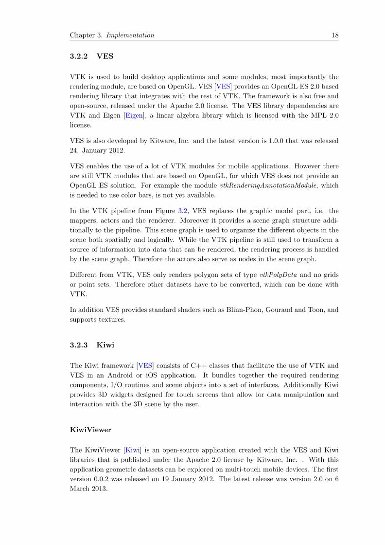
The fundamental structure of VTK is the data flow pipeline, transforming a source of
information into a rendered image. This pipeline is depicted in Figure 3.2. The first
part of the pipeline, marked blue and green in the figure, is the visualization pipeline.
Here the data is read and filtered and then the essential parts for the visualization
are extracted. The second part of the pipeline, marked green and yellow in the figure,
handles the graphical model, i.e. the transformation from a set of polygons in 3D to
pixels on the screen. The green element, the mapper, belongs to both parts of the
pipeline.
Sources Filters(optional)
Mappers Actors Renderer
Figure 3.2: The visualization pipeline of the Visualization Toolkit VTK. The bluecolouring specifies the visualization pipeline, the graphics model is indicated in yellow
and green part belongs to both of them.
Chapter 3. Implementation 18
3.2.2 VES
VTK is used to build desktop applications and some modules, most importantly the
rendering module, are based on OpenGL. VES [VES] provides an OpenGL ES 2.0 based
rendering library that integrates with the rest of VTK. The framework is also free and
open-source, released under the Apache 2.0 license. The VES library dependencies are
VTK and Eigen [Eigen], a linear algebra library which is licensed with the MPL 2.0
license.
VES is also developed by Kitware, Inc. and the latest version is 1.0.0 that was released
24. January 2012.
VES enables the use of a lot of VTK modules for mobile applications. However there
are still VTK modules that are based on OpenGL, for which VES does not provide an
OpenGL ES solution. For example the module vtkRenderingAnnotationModule, which
is needed to use color bars, is not yet available.
In the VTK pipeline from Figure 3.2, VES replaces the graphic model part, i.e. the
mappers, actors and the renderer. Moreover it provides a scene graph structure addi-
tionally to the pipeline. This scene graph is used to organize the different objects in the
scene both spatially and logically. While the VTK pipeline is still used to transform a
source of information into data that can be rendered, the rendering process is handled
by the scene graph. Therefore the actors also serve as nodes in the scene graph.
Different from VTK, VES only renders polygon sets of type vtkPolyData and no grids
or point sets. Therefore other datasets have to be converted, which can be done with
VTK.
In addition VES provides standard shaders such as Blinn-Phon, Gouraud and Toon, and
supports textures.
3.2.3 Kiwi
The Kiwi framework [VES] consists of C++ classes that facilitate the use of VTK and
VES in an Android or iOS application. It bundles together the required rendering
components, I/O routines and scene objects into a set of interfaces. Additionally Kiwi
provides 3D widgets designed for touch screens that allow for data manipulation and
interaction with the 3D scene by the user.
KiwiViewer
The KiwiViewer [Kiwi] is an open-source application created with the VES and Kiwi
libraries that is published under the Apache 2.0 license by Kitware, Inc. . With this
application geometric datasets can be explored on multi-touch mobile devices. The first
version 0.0.2 was released on 19 January 2012. The latest release was version 2.0 on 6
March 2013.
Chapter 3. Implementation 19
The early versions support the rendering of geometric 2D or 3D datasets with scalar
attributes as colour. The model can be navigated, i.e. rotated or zoomed, with touch
gestures. In the latest app various ways for sharing data were added. Moreover the
visualization engine was improved and more file formats are supported. The viewer now
allows for textured meshes, time-series data and animations. Furthermore there is the
possibility to connect to a ParaView desktop application for remote rendering, although
this technology is not yet fully developed.
In contrast to the applications developed for this project, the KiwiViewer is a solely a
viewer. It reads datasets or animations from files and displays the content. There is
no interactive visualization, with for example cut-planes or streamlines, applicable for
all datasets. Although there is one interactive example scene utilizing cut-planes, the
SPL-PNL Brain Atlas, that functionality is customized for this one demo dataset only.
3.3 General Design
There are three basic design principles underlying the TabletVis app. The delegation
pattern is used as basis for the main run loop of the app. The interaction of user input,
layout and logical components is organized following the Model-View-Controller pattern.
Furthermore the VTK related logic is based on a pipeline-design.
3.3.1 Delegation
The delegation pattern describes a relationship between two objects, the delegator and
the delegate, see [Gamma94]. In iOS-based apps, the delegator is always the UIAppli-
cation object, whereas the delegate is an app-specific custom object.
The delegator, i.e. the UIApplication object, keeps a reference to the delegate. When-
ever necessary the delegator notifies its delegate of events it is about to handle or has
just handled. Then the delegate may react to this message by updating its state, its
appearance or other objects in the application. In this way the control over the app’s
behaviour is centralized in one object, the application delegate.
The use of this pattern also influenced the design of the main run-loop.
The Main Run-Loop
When the application is launched, the UIMainApplication is called. Amongst other
things, this function creates the UIApplication singleton for the application. This object
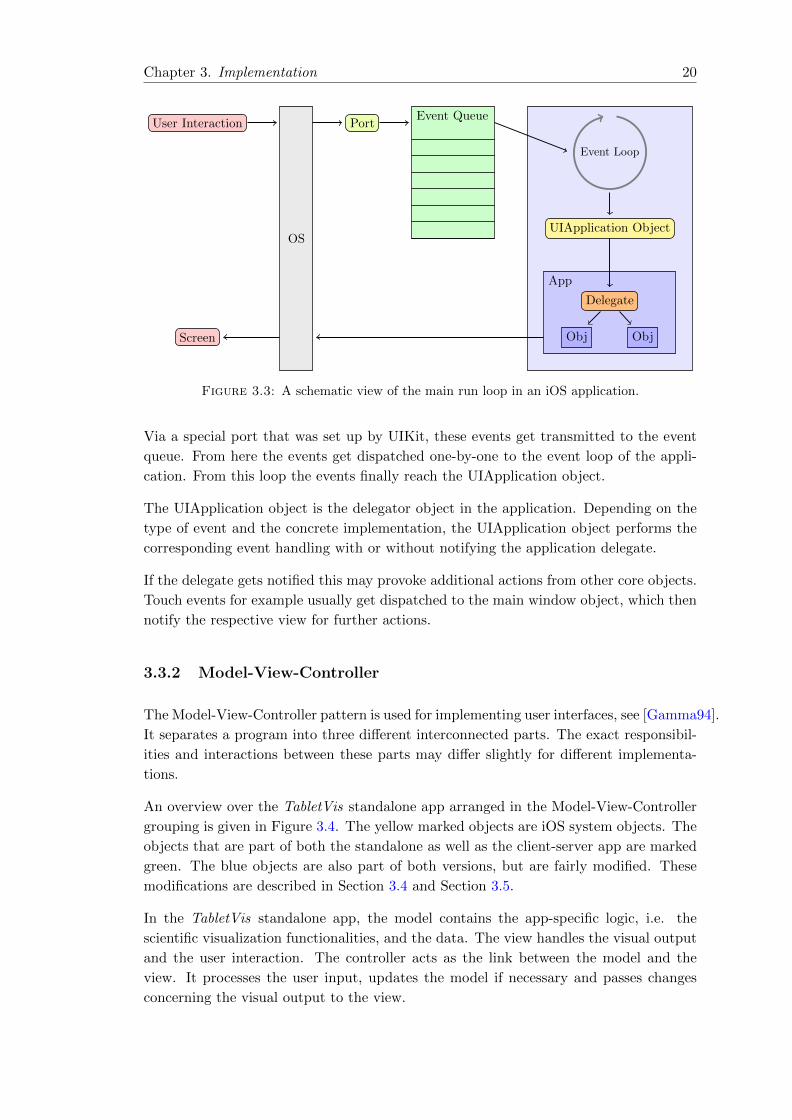
then initiates the main run loop that is depicted in Figure 3.3.
The main run loop is responsible for processing all user-related events in the application.
It starts with some kind of user interaction, for example a touch on the screen. When
this touch is detected, the operating system translates it into the corresponding system
events.
Chapter 3. Implementation 20
UIApplication Object
App
Delegate
ObjObj
Event Loop
Event QueuePort
OS
User Interaction
Screen
Figure 3.3: A schematic view of the main run loop in an iOS application.
Via a special port that was set up by UIKit, these events get transmitted to the event
queue. From here the events get dispatched one-by-one to the event loop of the appli-
cation. From this loop the events finally reach the UIApplication object.
The UIApplication object is the delegator object in the application. Depending on the
type of event and the concrete implementation, the UIApplication object performs the
corresponding event handling with or without notifying the application delegate.
If the delegate gets notified this may provoke additional actions from other core objects.
Touch events for example usually get dispatched to the main window object, which then
notify the respective view for further actions.
3.3.2 Model-View-Controller
The Model-View-Controller pattern is used for implementing user interfaces, see [Gamma94].
It separates a program into three different interconnected parts. The exact responsibil-
ities and interactions between these parts may differ slightly for different implementa-
tions.
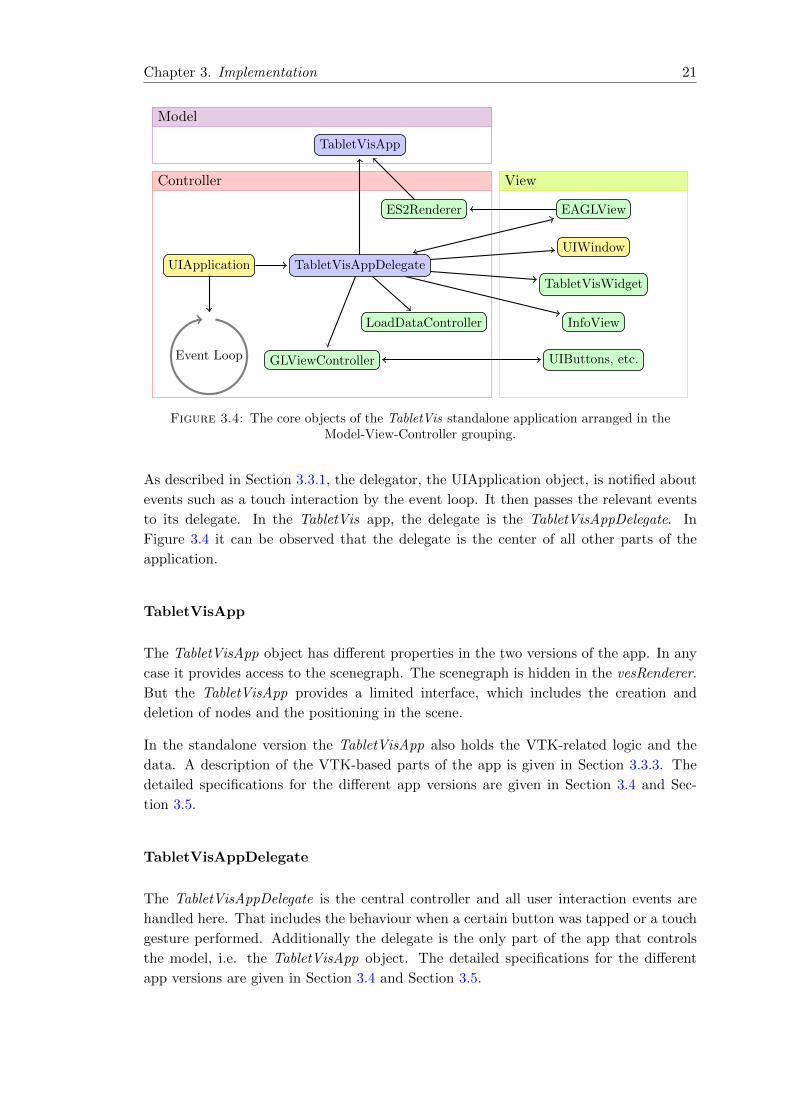
An overview over the TabletVis standalone app arranged in the Model-View-Controller
grouping is given in Figure 3.4. The yellow marked objects are iOS system objects. The
objects that are part of both the standalone as well as the client-server app are marked
green. The blue objects are also part of both versions, but are fairly modified. These
modifications are described in Section 3.4 and Section 3.5.
In the TabletVis standalone app, the model contains the app-specific logic, i.e. the
scientific visualization functionalities, and the data. The view handles the visual output
and the user interaction. The controller acts as the link between the model and the
view. It processes the user input, updates the model if necessary and passes changes
concerning the visual output to the view.
Chapter 3. Implementation 21
Controller
Model
View
UIApplication TabletVisAppDelegate
GLViewController
ES2Renderer
LoadDataController
TabletVisApp
UIWindow
EAGLView
InfoView
TabletVisWidget
UIButtons, etc.Event Loop
Figure 3.4: The core objects of the TabletVis standalone application arranged in theModel-View-Controller grouping.
As described in Section 3.3.1, the delegator, the UIApplication object, is notified about
events such as a touch interaction by the event loop. It then passes the relevant events
to its delegate. In the TabletVis app, the delegate is the TabletVisAppDelegate. In
Figure 3.4 it can be observed that the delegate is the center of all other parts of the
application.
TabletVisApp
The TabletVisApp object has different properties in the two versions of the app. In any
case it provides access to the scenegraph. The scenegraph is hidden in the vesRenderer.
But the TabletVisApp provides a limited interface, which includes the creation and
deletion of nodes and the positioning in the scene.
In the standalone version the TabletVisApp also holds the VTK-related logic and the
data. A description of the VTK-based parts of the app is given in Section 3.3.3. The
detailed specifications for the different app versions are given in Section 3.4 and Sec-
tion 3.5.
TabletVisAppDelegate
The TabletVisAppDelegate is the central controller and all user interaction events are
handled here. That includes the behaviour when a certain button was tapped or a touch
gesture performed. Additionally the delegate is the only part of the app that controls
the model, i.e. the TabletVisApp object. The detailed specifications for the different
app versions are given in Section 3.4 and Section 3.5.

Chapter 3. Implementation 22
GLViewController
The GLViewController represents an interface to the app’s main window layout. In this
class all sub-views of the main view are declared. So although the TabletVisAppDelegate
controls for example the behaviour triggered by a button, this view-controller is the only
object with access to the location and the appearance of the buttons.
The GLViewController serves as the root view-controller of the UIWindow of the dele-
gate. That means that whenever the screen of the tablet is touched, the UIApplication
object notifies the delegate, which refers the event to the window. The window then
informs its root view-controller, in order to find out if a sub-view, i.e. a button, was
tapped.
Moreover additional characteristics of the main view are controlled here, for example
whether the view rotates correspondingly when the device is rotated or if it does not.
ES2Renderer
The ES2Renderer controls the rendering of the model-related content, i.e. the output
of the VTK computations. It serves as an interface to the rendering functionality given
by the TabletVisApp.
EAGLView
The EAGLView is the view which presents the visual output of the model. It wraps iOS
classes such as CAEAGLLayer and provides a view into which an OpenGL ES scene can
be rendered. The EAGLView uses the ES2Renderer in order to get the visual output of
the TabletVisApp.
LoadDataController
The LoadDataController organizes a drop-down menu, which offers the available datasets.
The TabletVisAppDelegate controls when this menu is displayed. When an item in the
menu is tapped, the delegate is notified.
InfoView
The InfoView is a small view, which displays some basic information about the current
dataset. That includes the number of triangles, vertices and the current frame-rate. The
TabletVisAppDelegate controls when this view is displayed.
Chapter 3. Implementation 23
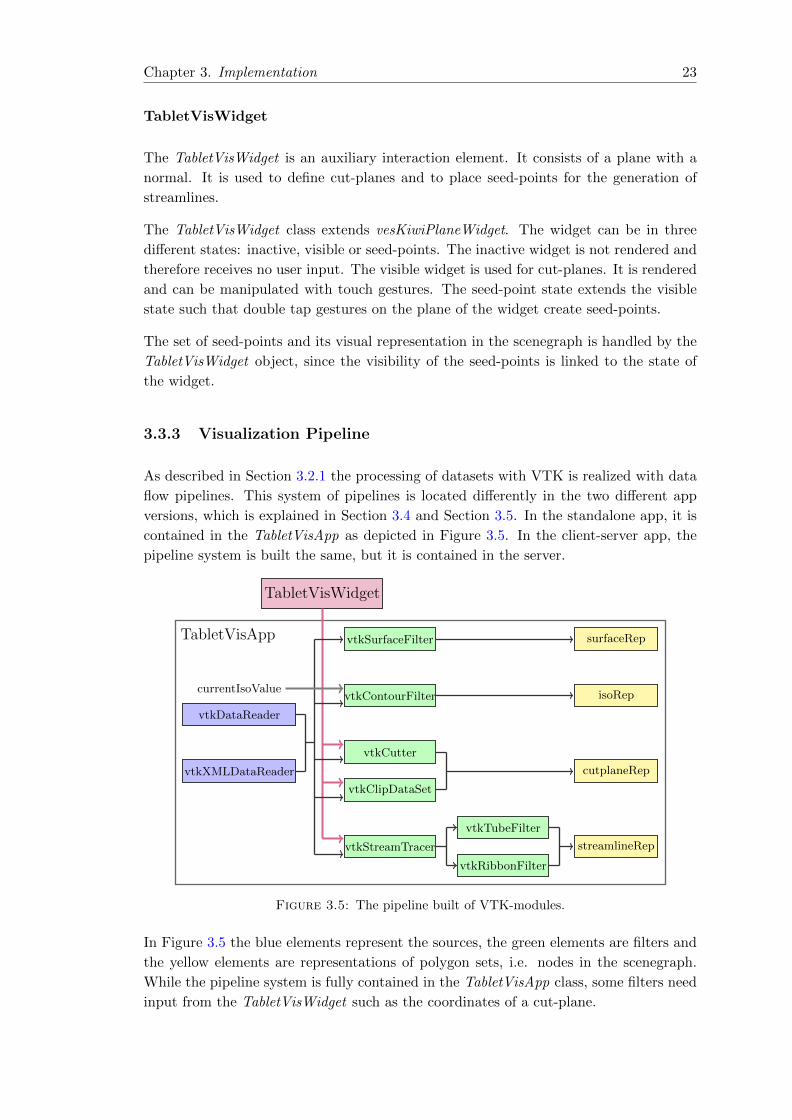
TabletVisWidget
The TabletVisWidget is an auxiliary interaction element. It consists of a plane with a
normal. It is used to define cut-planes and to place seed-points for the generation of
streamlines.
The TabletVisWidget class extends vesKiwiPlaneWidget. The widget can be in three
different states: inactive, visible or seed-points. The inactive widget is not rendered and
therefore receives no user input. The visible widget is used for cut-planes. It is rendered
and can be manipulated with touch gestures. The seed-point state extends the visible
state such that double tap gestures on the plane of the widget create seed-points.
The set of seed-points and its visual representation in the scenegraph is handled by the
TabletVisWidget object, since the visibility of the seed-points is linked to the state of
the widget.
3.3.3 Visualization Pipeline
As described in Section 3.2.1 the processing of datasets with VTK is realized with data
flow pipelines. This system of pipelines is located differently in the two different app
versions, which is explained in Section 3.4 and Section 3.5. In the standalone app, it is
contained in the TabletVisApp as depicted in Figure 3.5. In the client-server app, the
pipeline system is built the same, but it is contained in the server.
TabletVisApp
vtkXMLDataReader
vtkDataReader
TabletVisWidget
currentIsoValue
vtkSurfaceFilter
vtkContourFilter
vtkCutter
vtkClipDataSet
vtkStreamTracer
vtkRibbonFilter
vtkTubeFilter
surfaceRep
isoRep
cutplaneRep
streamlineRep
Figure 3.5: The pipeline built of VTK-modules.
In Figure 3.5 the blue elements represent the sources, the green elements are filters and
the yellow elements are representations of polygon sets, i.e. nodes in the scenegraph.
While the pipeline system is fully contained in the TabletVisApp class, some filters need
input from the TabletVisWidget such as the coordinates of a cut-plane.
Chapter 3. Implementation 24
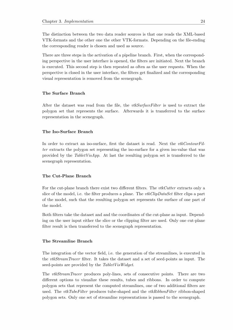
The distinction between the two data reader sources is that one reads the XML-based
VTK-formats and the other one the other VTK-formats. Depending on the file-ending
the corresponding reader is chosen and used as source.
There are three steps in the activation of a pipeline branch. First, when the correspond-
ing perspective in the user interface is opened, the filters are initiated. Next the branch
is executed. This second step is then repeated as often as the user requests. When the
perspective is closed in the user interface, the filters get finalized and the corresponding
visual representation is removed from the scenegraph.
The Surface Branch
After the dataset was read from the file, the vtkSurfaceFilter is used to extract the
polygon set that represents the surface. Afterwards it is transferred to the surface
representation in the scenegraph.
The Iso-Surface Branch
In order to extract an iso-surface, first the dataset is read. Next the vtkContourFil-
ter extracts the polygon set representing the iso-surface for a given iso-value that was
provided by the TabletVisApp. At last the resulting polygon set is transferred to the
scenegraph representation.
The Cut-Plane Branch
For the cut-plane branch there exist two different filters. The vtkCutter extracts only a
slice of the model, i.e. the filter produces a plane. The vtkClipDataSet filter clips a part
of the model, such that the resulting polygon set represents the surface of one part of
the model.
Both filters take the dataset and and the coordinates of the cut-plane as input. Depend-
ing on the user input either the slice or the clipping filter are used. Only one cut-plane
filter result is then transferred to the scenegraph representation.
The Streamline Branch
The integration of the vector field, i.e. the generation of the streamlines, is executed in
the vtkStreamTracer filter. It takes the dataset and a set of seed-points as input. The
seed-points are provided by the TabletVisWidget.
The vtkStreamTracer produces poly-lines, sets of consecutive points. There are two
different options to visualize these results, tubes and ribbons. In order to compute
polygon sets that represent the computed streamlines, one of two additional filters are
used. The vtkTubeFilter produces tube-shaped and the vtkRibbonFilter ribbon-shaped
polygon sets. Only one set of streamline representations is passed to the scenegraph.
Chapter 3. Implementation 25
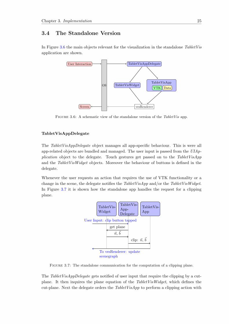
3.4 The Standalone Version
In Figure 3.6 the main objects relevant for the visualization in the standalone TabletVis
application are shown.
TabletVisAppDelegate
TabletVisApp
VTK DataTabletVisWidget
vesRenderer
OS
User Interaction
Screen
Figure 3.6: A schematic view of the standalone version of the TabletVis app.
TabletVisAppDelegate
The TabletVisAppDelegate object manages all app-specific behaviour. This is were all
app-related objects are bundled and managed. The user input is passed from the UIAp-
plication object to the delegate. Touch gestures get passed on to the TabletVisApp
and the TabletVisWidget objects. Moreover the behaviour of buttons is defined in the
delegate.
Whenever the user requests an action that requires the use of VTK functionality or a
change in the scene, the delegate notifies the TabletVisApp and/or the TabletVisWidget.
In Figure 3.7 it is shown how the standalone app handles the request for a clipping
plane.
TabletVis-Widget
TabletVis-App-Delegate
TabletVis-App
User Input: clip button tapped
To vesRenderer: updatescenegraph
get plane
~n, ~b
clip: ~n, ~b
Figure 3.7: The standalone communication for the computation of a clipping plane.
The TabletVisAppDelegate gets notified of user input that require the clipping by a cut-
plane. It then inquires the plane equation of the TabletVisWidget, which defines the
cut-plane. Next the delegate orders the TabletVisApp to perform a clipping action with
Chapter 3. Implementation 26
the given plane equation. The TabletVisApp performs the clipping, and updates the
scenegraph.
TabletVisApp
The VTK logic, i.e. the pipeline system presented in Section 3.3.3, is contained in
the TablteVisApp class which extends vesKiwiViewerApp. Additionally the TabletVis-
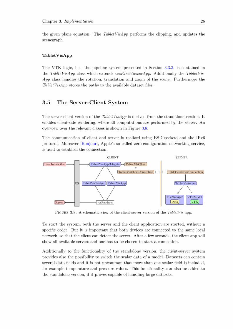
App class handles the rotation, translation and zoom of the scene. Furthermore the
TabletVisApp stores the paths to the available dataset files.
3.5 The Server-Client System
The server-client version of the TabletVisApp is derived from the standalone version. It
enables client-side rendering, where all computations are performed by the server. An
overview over the relevant classes is shown in Figure 3.8.
The communication of client and server is realized using BSD sockets and the IPv6
protocol. Moreover [Bonjour], Apple’s so called zero-configuration networking service,
is used to establish the connection.
CLIENT SERVER
TabletVisAppDelegate
TabletVisAppTabletVisWidget
vesRenderer
OS
User Interaction
Screen
TabletVisClient
TabletVisClientConnection TabletVisServerConnection
TabletVisServer
FileManager
Data
VTKModel
VTK
Figure 3.8: A schematic view of the client-server version of the TabletVis app.
To start the system, both the server and the client application are started, without a
specific order. But it is important that both devices are connected to the same local
network, so that the client can detect the server. After a few seconds, the client app will
show all available servers and one has to be chosen to start a connection.
Additionally to the functionality of the standalone version, the client-server system
provides also the possibility to switch the scalar data of a model. Datasets can contain
several data fields and it is not uncommon that more than one scalar field is included,
for example temperature and pressure values. This functionality can also be added to
the standalone version, if it proves capable of handling large datasets.

Chapter 3. Implementation 27
3.5.1 Client-Side
After establishing a connection the client asks the server for the list of names of the
available datasets, in order to build the dropdown menu. Then the app waits for user
input.
TabletVisAppDelegate
Similar to the standalone app, the user input is handled and transferred by the TabletVis-
AppDelegate. Whenever a computation from the server is needed, the delegate provides
the TabletVisClient with the necessary information, such as the coordinates of the plane
widget or an iso-value, to request the computation from the server. The delegate is
also responsible for handling the messages from the server that are translated by the
TabletVisClient. The detailed communication process is described in Section 3.5.3.
TabletVisApp
In contrast to the standalone version of the application, the TabletVisApp in the client
does not contain any VTK logic. But it still provides an interface to the scenegraph.
Moreover it also still holds the list of available datasets that was sent by the server.
TabletVisClient
The TabletVisClient is used as an interface to the server for the TabletVisAppDelegate.
It translates the requests of the delegate into a message, that can be read by the server.
Additionally it also translates messages from the server into actions for the delegate.
That may include decompressing the server’s answer.
For the communication with the sever the TabletVisClient uses a TabletVisClientCon-
nection object.
TabletVisClientConnection
The TabletVisClientConnection bundles the low level connection details on the client-
side. That includes controlling the socket and its input- and output-streams. The
TabletVisClient passes the message for the server to the TabletVisClientConnection
which is then responsible for transferring it to the server. When the server answers,
the TabletVisClientConnection gathers all incoming bytes until it reaches the coding
for the end of the message. Only then does it transfer the complete message to the
TabletVisClient.

Chapter 3. Implementation 28
3.5.2 Server-Side
TabletVisServerConnection
The TabletVisServerConnection is the counterpart to the TabletVisClientConnection.
Since the server is designed such that it could be extended to handle several clients, the
sockets are controlled by the TabletVisServer. The TabletVisServerConnection controls
the input- and output-streams. Additionally it is responsible for the compression of the
answers sent to the client.
Whenever the TabletVisServerConnection receives information from the client it passes
the complete message to the TabletVisServer.
TabletVisServer
The TabletVisServer is the main controller on the server-side, which includes the han-
dling of the sockets. Moreover it is responsible for performing the client’s request with
the use of the VTKModel and the FileManager. First it receives a message form the
TabletVisServerConnection, which it translates into an action request. Then it executes
this action and answers the result to the client.
VTKModel
The VTKModel contains the VTK functionality. It stores a synchronized version of the
TabletVisApp from the client-side. That means, if the iso-surface perspective is opened
on the client, the VTKModel has the necessary filters prepared. It therefore also needs
to get notified is a perspective is closed.
FileManager
The FileManager handles the available files. When the server is started, the path to
the data directory has to be passed. From this directory all files in a VTK format are
detected and proposed to the client. In contrast to the standalone version of the app,
the client-server system does not support the loading of files from Dropbox.
3.5.3 The Communication
The general process of communication between server and client starts with the client.
And the server always answers, even if there is no data that needs to be transmitted. In
this way the client knows that the server received its message.
In order to reduce the amount of transmitted data, the compression of messages from
the server-side can be activated. That is explained in more detail at the end of this
section.
Chapter 3. Implementation 29
TabletVis-Widget
TabletVis-App
TabletVis-App-Delegate
TabletVis-Client
TabletVis-Client-Connection
TabletVis-Server-Connection
TabletVis-Server
VTKModel
User Input: clip button tapped
To vesRenderer:update scene-graph
get plane
~n, ~b Request:clip, ~n, ~b
string
bytes
string
Clip: ~n, ~b
polygonsetstring
(compressed)bytes(compressed)
bytespolygonsetpolygon
set
Figure 3.9: The client-server communication for the computation of a clipping plane.
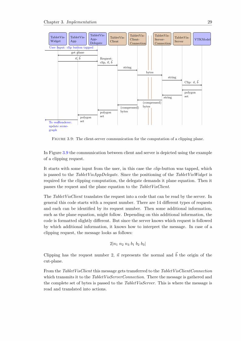
In Figure 3.9 the communication between client and server is depicted using the example
of a clipping request.
It starts with some input from the user, in this case the clip-button was tapped, which
is passed to the TabletVisAppDelegate. Since the positioning of the TabletVisWidget is
required for the clipping computation, the delegate demands it plane equation. Then it
passes the request and the plane equation to the TabletVisClient.
The TabletVisClient translates the request into a code that can be read by the server. In
general this code starts with a request number. There are 14 different types of requests
and each can be identified by its request number. Then some additional information,
such as the plane equation, might follow. Depending on this additional information, the
code is formatted slightly different. But since the server knows which request is followed
by which additional information, it knows how to interpret the message. In case of a
clipping request, the message looks as follows:
2|n1 n2 n3 b1 b2 b3|
Clipping has the request number 2, ~n represents the normal and ~b the origin of the
cut-plane.
From the TabletVisClient this message gets transferred to the TabletVisClientConnection
which transmits it to the TabletVisServerConnection. There the message is gathered and
the complete set of bytes is passed to the TabletVisServer. This is where the message is
read and translated into actions.
Chapter 3. Implementation 30
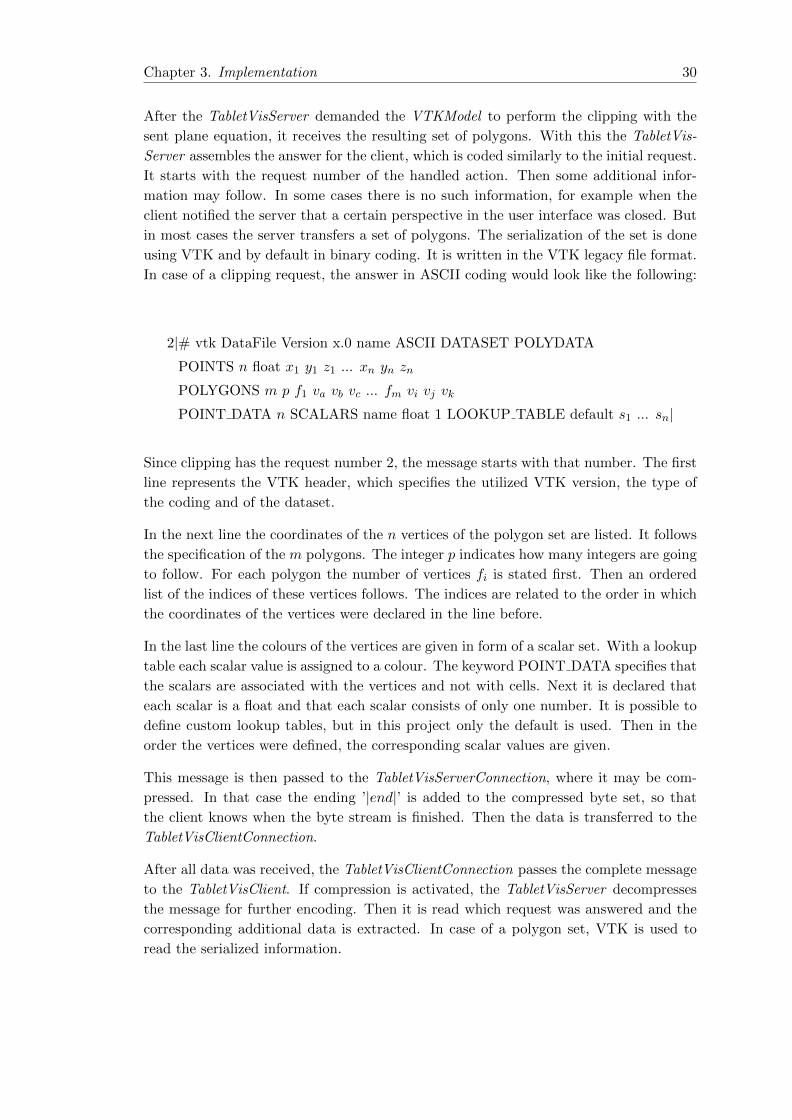
After the TabletVisServer demanded the VTKModel to perform the clipping with the
sent plane equation, it receives the resulting set of polygons. With this the TabletVis-
Server assembles the answer for the client, which is coded similarly to the initial request.
It starts with the request number of the handled action. Then some additional infor-
mation may follow. In some cases there is no such information, for example when the
client notified the server that a certain perspective in the user interface was closed. But
in most cases the server transfers a set of polygons. The serialization of the set is done
using VTK and by default in binary coding. It is written in the VTK legacy file format.
In case of a clipping request, the answer in ASCII coding would look like the following:
2|# vtk DataFile Version x.0 name ASCII DATASET POLYDATA
POINTS n float x1 y1 z1 ... xn yn zn
POLYGONS m p f1 va vb vc ... fm vi vj vk
POINT DATA n SCALARS name float 1 LOOKUP TABLE default s1 ... sn|
Since clipping has the request number 2, the message starts with that number. The first
line represents the VTK header, which specifies the utilized VTK version, the type of
the coding and of the dataset.
In the next line the coordinates of the n vertices of the polygon set are listed. It follows
the specification of the m polygons. The integer p indicates how many integers are going
to follow. For each polygon the number of vertices fi is stated first. Then an ordered
list of the indices of these vertices follows. The indices are related to the order in which
the coordinates of the vertices were declared in the line before.
In the last line the colours of the vertices are given in form of a scalar set. With a lookup
table each scalar value is assigned to a colour. The keyword POINT DATA specifies that
the scalars are associated with the vertices and not with cells. Next it is declared that
each scalar is a float and that each scalar consists of only one number. It is possible to
define custom lookup tables, but in this project only the default is used. Then in the
order the vertices were defined, the corresponding scalar values are given.
This message is then passed to the TabletVisServerConnection, where it may be com-
pressed. In that case the ending ’|end|’ is added to the compressed byte set, so that
the client knows when the byte stream is finished. Then the data is transferred to the
TabletVisClientConnection.
After all data was received, the TabletVisClientConnection passes the complete message
to the TabletVisClient. If compression is activated, the TabletVisServer decompresses
the message for further encoding. Then it is read which request was answered and the
corresponding additional data is extracted. In case of a polygon set, VTK is used to
read the serialized information.

Chapter 3. Implementation 31
The extracted data is then passed to the TabletVisAppDelegate. In case of a clipping
request, the polygon set is transferred to the TabletVisApp, which updates the visual
representation cut-plane node in the scenegraph.
Optional Compression
In order to reduce the amount of data that is transmitted from server to client, especially
when large polygon sets are sent, the app can be set to compress these messages. Due to
the fact that the amount of data sent from the client is usually small, the compression
is only used in the direction server to client. The compressions is optional, i.e. the user
can disable it at any time.
For this purpose [ZLIB] is used. An open-source, cross-platform library that enables
lossless compression. It uses an LZ77 method called deflate, which is a type of dictionary
coder combined with Huffman coding. This method is also used for the ZIP archive file
format. It gives good compression results on different types of data while using few
resources.
The compression can be set to levels from 0 to 9, while 0 means no compression and 9
is the highest level.
3.6 User Interface
The user can choose from a set of datasets to load. The standalone app provides the
possibility to download files from Dropbox or via email, while the client-server app
restricts the set of datasets to the ones stored on the server. For each dataset the surface
of the dataset is shown. Furthermore there are three additional representations of the
dataset which can be displayed simultaneously. In order to examine these additional
representations with respect to the whole dataset, the surface of the dataset can be
set to opaque, transparent or not to be rendered. In Figure 3.11 and Figure 3.12 the
combination of different dataset representations with a transparent surface can be seen.
(a) Rotation (b) Rotation (c) Translation (d) Zoom in (e) Zoom out
Figure 3.10: The different touch gestures for rotation, translation and zoom.
The displayed content can be navigated with common touch gestures as depicted in
Figure 3.10. There are two gestures for the rotation. With wiping gestures with one
finger, as shown in Figure 3.10(a), the scene is rotated along an axis parallel to the
screen. The direction of the finger movement is orthogonal to that rotation axis. In
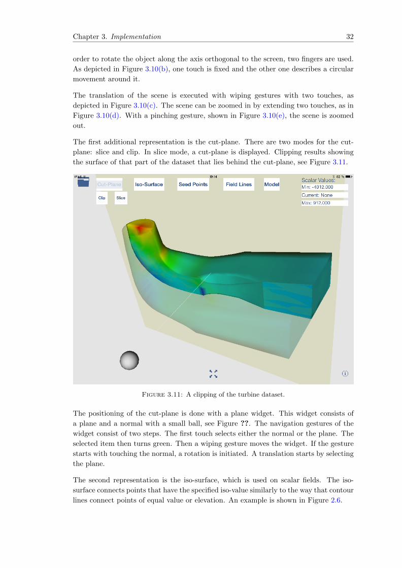
Chapter 3. Implementation 32
order to rotate the object along the axis orthogonal to the screen, two fingers are used.
As depicted in Figure 3.10(b), one touch is fixed and the other one describes a circular
movement around it.
The translation of the scene is executed with wiping gestures with two touches, as
depicted in Figure 3.10(c). The scene can be zoomed in by extending two touches, as in
Figure 3.10(d). With a pinching gesture, shown in Figure 3.10(e), the scene is zoomed
out.
The first additional representation is the cut-plane. There are two modes for the cut-
plane: slice and clip. In slice mode, a cut-plane is displayed. Clipping results showing
the surface of that part of the dataset that lies behind the cut-plane, see Figure 3.11.
Figure 3.11: A clipping of the turbine dataset.
The positioning of the cut-plane is done with a plane widget. This widget consists of
a plane and a normal with a small ball, see Figure ??. The navigation gestures of the
widget consist of two steps. The first touch selects either the normal or the plane. The
selected item then turns green. Then a wiping gesture moves the widget. If the gesture
starts with touching the normal, a rotation is initiated. A translation starts by selecting
the plane.
The second representation is the iso-surface, which is used on scalar fields. The iso-
surface connects points that have the specified iso-value similarly to the way that contour
lines connect points of equal value or elevation. An example is shown in Figure 2.6.
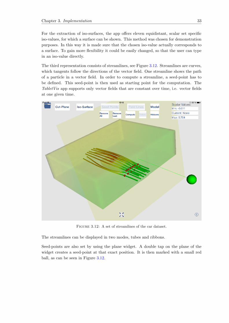
Chapter 3. Implementation 33
For the extraction of iso-surfaces, the app offers eleven equidistant, scalar set specific
iso-values, for which a surface can be shown. This method was chosen for demonstration
purposes. In this way it is made sure that the chosen iso-value actually corresponds to
a surface. To gain more flexibility it could be easily changed, so that the user can type
in an iso-value directly.
The third representation consists of streamlines, see Figure 3.12. Streamlines are curves,
which tangents follow the directions of the vector field. One streamline shows the path
of a particle in a vector field. In order to compute a streamline, a seed-point has to
be defined. This seed-point is then used as starting point for the computation. The
TabletVis app supports only vector fields that are constant over time, i.e. vector fields
at one given time.
Figure 3.12: A set of streamlines of the car dataset.
The streamlines can be displayed in two modes, tubes and ribbons.
Seed-points are also set by using the plane widget. A double tap on the plane of the
widget creates a seed-point at that exact position. It is then marked with a small red
ball, as can be seen in Figure 3.12.
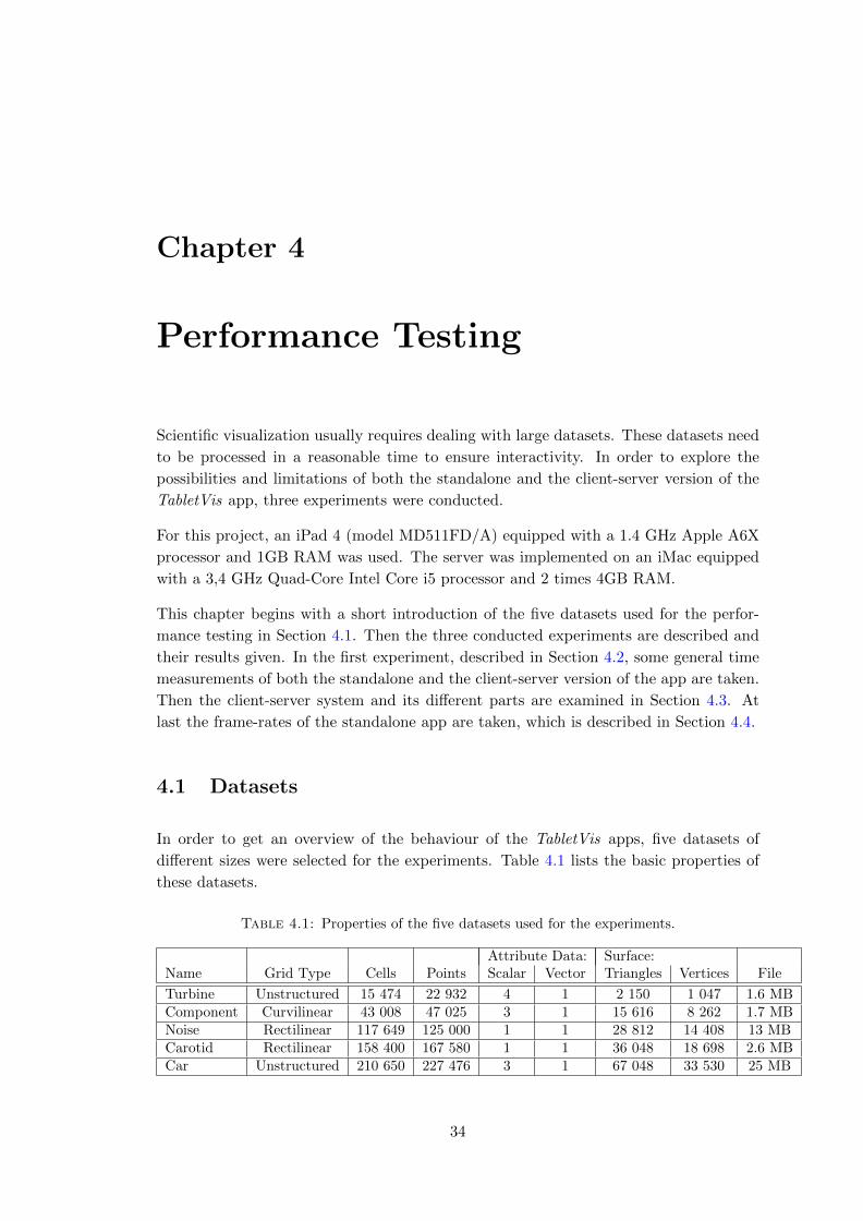
Chapter 4
Performance Testing
Scientific visualization usually requires dealing with large datasets. These datasets need
to be processed in a reasonable time to ensure interactivity. In order to explore the
possibilities and limitations of both the standalone and the client-server version of the
TabletVis app, three experiments were conducted.
For this project, an iPad 4 (model MD511FD/A) equipped with a 1.4 GHz Apple A6X
processor and 1GB RAM was used. The server was implemented on an iMac equipped
with a 3,4 GHz Quad-Core Intel Core i5 processor and 2 times 4GB RAM.
This chapter begins with a short introduction of the five datasets used for the perfor-
mance testing in Section 4.1. Then the three conducted experiments are described and
their results given. In the first experiment, described in Section 4.2, some general time
measurements of both the standalone and the client-server version of the app are taken.
Then the client-server system and its different parts are examined in Section 4.3. At
last the frame-rates of the standalone app are taken, which is described in Section 4.4.
4.1 Datasets
In order to get an overview of the behaviour of the TabletVis apps, five datasets of
different sizes were selected for the experiments. Table 4.1 lists the basic properties of
these datasets.
Table 4.1: Properties of the five datasets used for the experiments.
Attribute Data: Surface:Name Grid Type Cells Points Scalar Vector Triangles Vertices File
Turbine Unstructured 15 474 22 932 4 1 2 150 1 047 1.6 MBComponent Curvilinear 43 008 47 025 3 1 15 616 8 262 1.7 MBNoise Rectilinear 117 649 125 000 1 1 28 812 14 408 13 MBCarotid Rectilinear 158 400 167 580 1 1 36 048 18 698 2.6 MBCar Unstructured 210 650 227 476 3 1 67 048 33 530 25 MB
34
Chapter 4. Performance Testing 35
The component, noise and carotid dataset were provided by VTK. The other two
datasets were part of the [VISICADE] project. Visualizations of different represen-
tations of the datasets are given in Appendix A.
4.2 General Time Measurements
With this experiment a general overview is given over the timing of both the standalone
and the client-server version of the TabletVis app. From the beginning of this project
it was expected that the standalone version would reach its limits with larger datasets.
That was the reason for implementing a client-server app. So this experiment should
test that hypothesis.
There are several aspects that are examined with this experiments. First of all it should
be determined whether any of the two applications can handle the processing of large
scientific datasets. Moreover which version performs better for different dataset sizes or
different visualization techniques. It is expected that the computation on the server is
faster than on the tablet PC. But it is not clear how the transmission of data between
server and client impacts the overall processing time, compared to the standalone version.
4.2.1 Experiment Setting
For each app version the following set of actions was executed alternately and its time
measured:
• 5 times a cut-plane in slice-mode
• 5 times a cut-plane in clip-mode
• 5 times an iso-surface for 3 different iso-values
From all measurements of each action the average was taken in order to eliminate the
influence of internal scheduling.
To ensure reproducibility, the cut-planes were all conducted with the widget in default
position. Moreover the three iso-values were chosen from the pre-selected equidistant
values. The computation of streamlines is difficult to reproduce with the same parame-
ters. Therefore this part of the applications was left out for these tests.
It is obvious that comparing the results of different datasets for actions such as cut-plane
or iso-surface extraction is difficult. For iso-surfaces the run time of the marching cube
algorithm depends on the size and location of the iso-surface and the complexity of the
underlying grid. Nevertheless the timing of these actions can still give an impression of
the processing times.
All server client tests were conducted with a network band width of 54 Mbps and a
compression rate of 2.

Chapter 4. Performance Testing 36
4.2.2 Results
Out of all tests, the clipping took the longest for all models. Besides that the results of
the datasets differ a lot.
Turbine Dataset
For the turbine dataset the standalone version of the app was faster in all cases but the
clipping test, see Figure 4.1. Although the server was faster in computing, processing
and transmitting the data took longer in most cases. At the same time, the differences
are very small and barely noticeable for the user.
load slice clip iso 1 iso 2 iso 3
time in [sec]
1Computation TabletOverall TabletComputation Client-ServerOverall Client-Server
Figure 4.1: The results of the general timing tests with the turbine model.
Component Dataset
In Figure 4.2 it is shown that the client-server system was more than three times faster
in the tests with the component dataset than the standalone version. That is due to
the fact that the computations on the tablet took so much longer. In comparison to the
noise dataset in Figure 4.3, which has more than 2.5 times more points and cells, the
component dataset performs worse. The iso-surface times of different datasets are not
comparable. But the component dataset takes almost twice as much time for the load
and slice test with the client-server system. For the tablet version it takes about ten
times as long as the noise dataset.
load slice clip iso 1 iso 2 iso 3
time in [sec]
1
2
3
4Computation TabletOverall TabletComputation Client-ServerOverall Client-Server
Figure 4.2: The results of the general timing tests with the component model.

Chapter 4. Performance Testing 37
Noise Dataset
For the noise dataset the server-client system is slightly slower than the standalone
version in all tests but the clipping, see Figure 4.3.
Carotid Dataset
The longest computation times were measured for the carotid dataset, see Figure 4.4.
The client-server system’s computation times are more than five times faster than the
tablet’s. That results in overall processing times that are between four and five times
faster.
Car Dataset
For the car dataset the client-server system performed slightly better for all tests, but the
loading, see Figure 4.5. The clipping shows again a more significant difference between
the two versions of the app.
It stands out how fast the standalone version can process this dataset. It is more than
twice as fast as the processing on the component dataset. The differences are less
noticeable for the client-server system.
Overall
In summary it can be observed that the client-server system is faster handling compu-
tationally intensive operations. That includes the processing of complex datasets, such
as the carotid dataset, or methods such as clipping. That was expected. But it is also
shown that the client-server communication does not impact the overall performance too
much. Only for the turbine dataset and the faster computations of the noise dataset did
the server perform a faster computation but the standalone version had a better overall
processing. And in these cases the time difference was very small.
Moreover the impact of expensive operations is much higher in the standalone version
of the TabletVis app. It did result in processing times of over 6 seconds for a clipping
operation on the carotid dataset. The client-server version on the other hand did not
take longer than 2 seconds in any test.
Furthermore it can be observed that the client-server system is not always faster than the
standalone version, not even just for the larger datasets. For example for the turbine and
the car dataset, the standalone version was faster loading the surface. The carotid and
component dataset on the other hand, were loaded faster by the client-server application.
A look into Table 4.1 shows, that neither the amount of cells, points, triangles and
vertices of the surface nor the file size gives an indication on why the standalone version
is sometimes faster and sometimes slower than the client-server version.

Chapter 4. Performance Testing 38
load slice clip iso 1 iso 2 iso 3
time in [sec]
1
2Computation TabletOverall TabletComputation Client-ServerOverall Client-Server
Figure 4.3: The results of the general timing tests with the noise model.
load slice clip iso 1 iso 2 iso 3
time in [sec]
1
2
3
4
5
6Computation TabletOverall TabletComputation Client-ServerOverall Client-Server
Figure 4.4: The results of the general timing tests with the carotid model.
load slice clip iso 1 iso 2 iso 3
time in [sec]
1
2
3Computation TabletOverall TabletComputation Client-ServerOverall Client-Server
Figure 4.5: The results of the general timing tests with the car model.
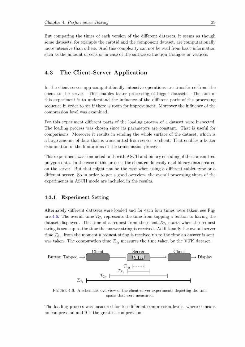
Chapter 4. Performance Testing 39
But comparing the times of each version of the different datasets, it seems as though
some datasets, for example the carotid and the component dataset, are computationally
more intensive than others. And this complexity can not be read from basic information
such as the amount of cells or in case of the surface extraction triangles or vertices.
4.3 The Client-Server Application
In the client-server app computationally intensive operations are transferred from the
client to the server. This enables faster processing of bigger datasets. The aim of
this experiment is to understand the influence of the different parts of the processing
sequence in order to see if there is room for improvement. Moreover the influence of the
compression level was examined.
For this experiment different parts of the loading process of a dataset were inspected.
The loading process was chosen since its parameters are constant. That is useful for
comparisons. Moreover it results in sending the whole surface of the dataset, which is
a large amount of data that is transmitted from server to client. That enables a better
examination of the limitations of the transmission process.
This experiment was conducted both with ASCII and binary encoding of the transmitted
polygon data. In the case of this project, the client could easily read binary data created
on the server. But that might not be the case when using a different tablet type or a
different server. So in order to get a good overview, the overall processing times of the
experiments in ASCII mode are included in the results.
4.3.1 Experiment Setting
Alternately different datasets were loaded and for each four times were taken, see Fig-
ure 4.6. The overall time TC1 represents the time from tapping a button to having the
dataset displayed. The time of a request from the client TC2 starts when the request
string is sent up to the time the answer string is received. Additionally the overall server
time TS1 , from the moment a request string is received up to the time an answer is sent,
was taken. The computation time TS2 measures the time taken by the VTK dataset.
Button TappedClient Server
VTK
ClientDisplay
TS2
TS1
TC2
TC1
Figure 4.6: A schematic overview of the client-server experiments depicting the timespans that were measured.
The loading process was measured for ten different compression levels, where 0 means
no compression and 9 is the greatest compression.

Chapter 4. Performance Testing 40
Since the processing time can vary due to side effects such as internal scheduling, each
experiment was repeated five times. Moreover all experiments were conducted with a
constant network band width of 54 Mbps.
4.3.2 Results
The detailed results are given in Appendix A. The graphs in Figure 4.7 are based on
the averaged results.
In Figure 4.7 it can be seen that for the turbine dataset all time measurements from the
binary experiments are between 0.01 and 0.1 seconds. So it is difficult to argue with this
data, since conclusions from these small values are more error prone and less significant.
Client- and Server-Side Processing
The results for all datasets have several similarities. First the computing time is constant
for all different compression levels. That was expected, since the parameters for the
computation did not change. But the processing time of the client, which is depicted
with the dashed red line, is also constant for all experiments, from level 1 on. That
means that the time needed for the decompression is independent from the level of
compression. Moreover the client-side processing time is similar for all datasets. The
increase for larger datasets is only marginal.
Furthermore the overall server-side processing time shows a slight increase for all datasets
beginning at level 0. Towards the higher levels, starting at level 5 or 6, the graph
increases more and more. The larger the dataset have a steeper increase in the higher
levels. This could be traced back to the fact that the compression becomes more time
consuming for higher levels. And since the larger datasets tend to have larger data to
compress, this factor weighs in more.
Transmission Time and Compression Rate
Another similarity is that the transmission time is also very stable for all datasets. After
a subtle decline from no compression to compression level 1, the time for transmitting
the data is almost constant. The larger the dataset, the larger the decrease is. Only the
transmission time graph of the noise dataset and the car dataset show a slight increase
in the higher compression levels. That can be explained by looking at Figure 4.8. First
of all it can be observed that the amount of transmitted data drops significantly from
level 0 to 1 for all datasets in both modes. The greater the starting amount is, the
steeper the fall. And although the starting amounts differ for ASCII and binary mode
of each dataset, from level 1 on the amount of bytes for the two modes are similar.
After compression level 1, the ASCII graphs and most binary graphs are slightly decreas-
ing. Again the larger datasets such as the car dataset show a more noticeable decrease
than the smaller datasets such as the turbine dataset. But it can also be observed that
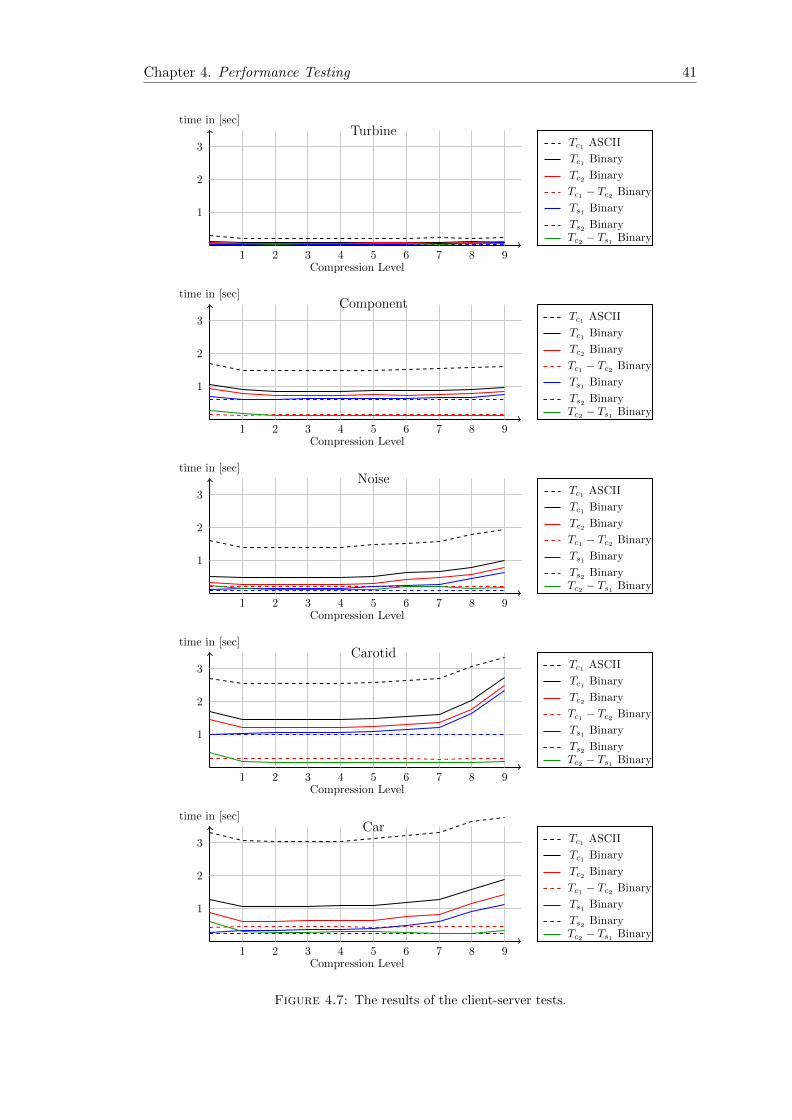
Chapter 4. Performance Testing 41
Compression Level1 2 3 4 5 6 7 8 9
time in [sec]
1
2
3 Tc1 ASCII
Tc1 Binary
Tc2 Binary
Tc1 − Tc2 Binary
Ts1 Binary
Ts2 BinaryTc2 − Ts1 Binary
Turbine
Compression Level1 2 3 4 5 6 7 8 9
time in [sec]
1
2
3 Tc1 ASCII
Tc1 Binary
Tc2 Binary
Tc1 − Tc2 Binary
Ts1 Binary
Ts2 BinaryTc2 − Ts1 Binary
Component
Compression Level1 2 3 4 5 6 7 8 9
time in [sec]
1
2
3 Tc1 ASCII
Tc1 Binary
Tc2 Binary
Tc1 − Tc2 Binary
Ts1 Binary
Ts2 BinaryTc2 − Ts1 Binary
Noise
Compression Level1 2 3 4 5 6 7 8 9
time in [sec]
1
2
3 Tc1 ASCII
Tc1 Binary
Tc2 Binary
Tc1 − Tc2 Binary
Ts1 Binary
Ts2 BinaryTc2 − Ts1 Binary
Carotid
Compression Level1 2 3 4 5 6 7 8 9
time in [sec]
1
2
3 Tc1 ASCII
Tc1 Binary
Tc2 Binary
Tc1 − Tc2 Binary
Ts1 Binary
Ts2 BinaryTc2 − Ts1 Binary
Car
Figure 4.7: The results of the client-server tests.
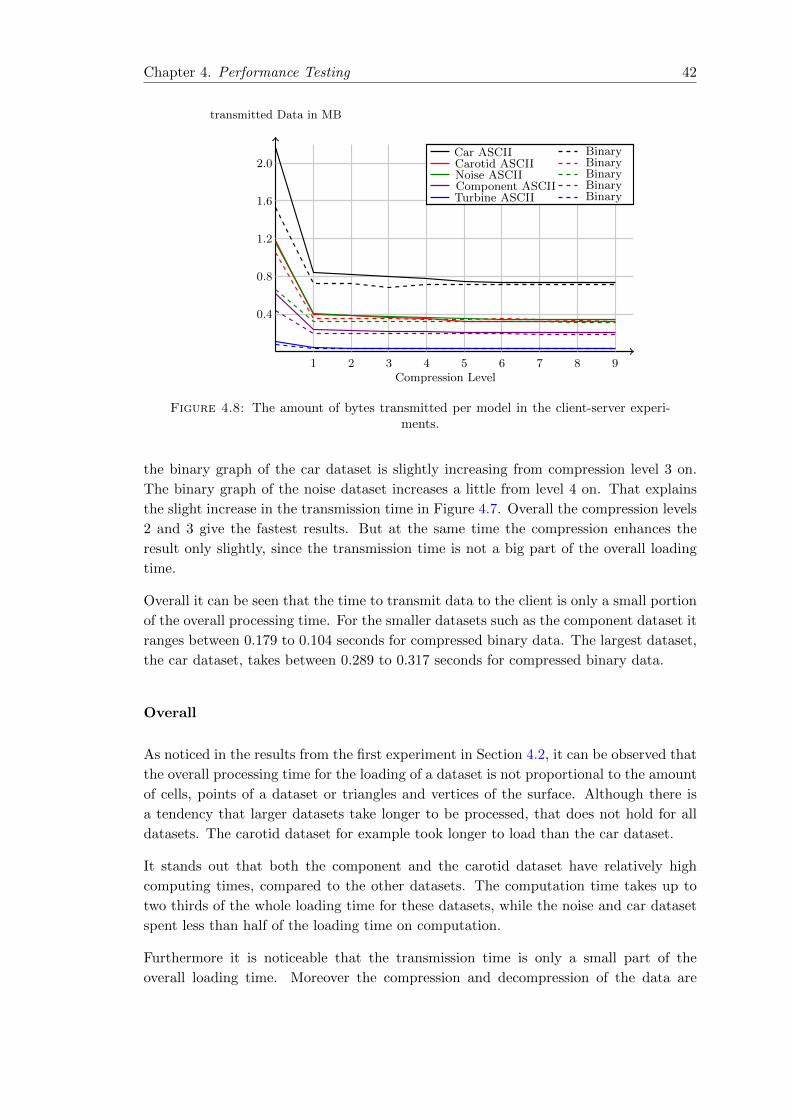
Chapter 4. Performance Testing 42
Compression Level1 2 3 4 5 6 7 8 9
transmitted Data in MB
0.4
0.8
1.2
1.6
2.0Car ASCII BinaryCarotid ASCII BinaryNoise ASCII BinaryComponent ASCII BinaryTurbine ASCII Binary
Figure 4.8: The amount of bytes transmitted per model in the client-server experi-ments.
the binary graph of the car dataset is slightly increasing from compression level 3 on.
The binary graph of the noise dataset increases a little from level 4 on. That explains
the slight increase in the transmission time in Figure 4.7. Overall the compression levels
2 and 3 give the fastest results. But at the same time the compression enhances the
result only slightly, since the transmission time is not a big part of the overall loading
time.
Overall it can be seen that the time to transmit data to the client is only a small portion
of the overall processing time. For the smaller datasets such as the component dataset it
ranges between 0.179 to 0.104 seconds for compressed binary data. The largest dataset,
the car dataset, takes between 0.289 to 0.317 seconds for compressed binary data.
Overall
As noticed in the results from the first experiment in Section 4.2, it can be observed that
the overall processing time for the loading of a dataset is not proportional to the amount
of cells, points of a dataset or triangles and vertices of the surface. Although there is
a tendency that larger datasets take longer to be processed, that does not hold for all
datasets. The carotid dataset for example took longer to load than the car dataset.
It stands out that both the component and the carotid dataset have relatively high
computing times, compared to the other datasets. The computation time takes up to
two thirds of the whole loading time for these datasets, while the noise and car dataset
spent less than half of the loading time on computation.
Furthermore it is noticeable that the transmission time is only a small part of the
overall loading time. Moreover the compression and decompression of the data are

Chapter 4. Performance Testing 43
also negligible for lower compression levels. The time spent on computation is the
determining factor for the processing time of the client-server application.
4.4 Frame-Rate
As described in Section 3.1 was that the scene should be rendered in real-time. In order
to examine the rendering limits of the TabletVis app, the frame-rates of standalone app
were measured. Since the client-server app is based on client-side rendering, there is no
difference in the rendering capabilities of both app versions.
4.4.1 Experiment Settings
For this experiments the two largest datasets were used, the carotid and the car dataset.
With each dataset a complex scene was created as depicted in Figure 4.10(a) and Fig-
ure 4.10(b). Then the scenes were rotated and the frame-rate was sampled.
4.4.2 Results
The results of the frame-rate experiment are shown in Figure 4.9.
1 2 3 4 5 6 7 8 9 10time in [sec]
frames per sec
10
20
30
40
50
60
(a) Carotid
1 2 3 4 5 6 7 8 9 10time in [sec]
frames per sec
10
20
30
40
50
60
(b) Car
Figure 4.9: The results of the frame-rate experiment.
For the carotid dataset the average frame-rate during the test was 56.1 frames per second.
It ranged between 50 and 60 frames per second.
For the car dataset the average frame-rate during the test was 57.9 frames per second.
It ranged between 55 and 60 frames per second.
An application is said to be rendering in real-time if it displays more than 15 frames per
second [AHH11]. From about 72 fps up, differences in the display rate are effectively
not detectable. So a frame-rate of 55-60 fps is not only real-time, but also pretty good.
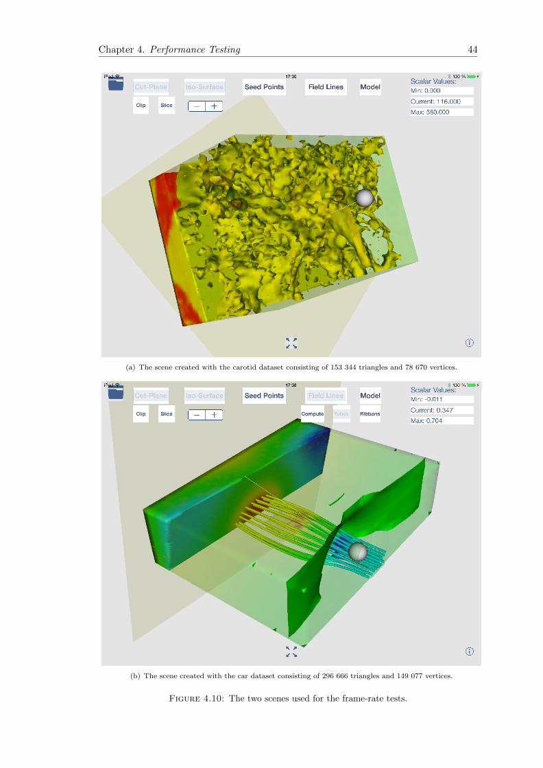
Chapter 4. Performance Testing 44
(a) The scene created with the carotid dataset consisting of 153 344 triangles and 78 670 vertices.
(b) The scene created with the car dataset consisting of 296 666 triangles and 149 077 vertices.
Figure 4.10: The two scenes used for the frame-rate tests.

Chapter 5
Usability Evaluation
Next to the technical suitability of tablets for scientific visualization, which was discussed
in Chapter 4, the usability in terms of user interaction is equally important.
Compared to desktop applications for scientific visualization, the TabletVis app provides
three new concepts for user interaction: the manipulation of the 3D model by touch, the
touch manipulation of the plane widget and the tapping gesture for setting seed points.
Hence the main focus of this chapter is the usability of these concepts.
Due to the time constraints of this project, most design aspects of the user interface,
such as the layout, remained basic and did not become a priority. Therefore I abstained
from extensive usability inspection, usability testing or comparisons to other established
visualization systems.
Nevertheless a user study can give some insight on the app’s usability and on existing
problems. The aim of the conducted study is to examine the earlier mentioned new
interaction concepts and to fathom the appeal of a scientific visualization application
for tablets, irrespective of the appearance or design of the TabletVis app.
This chapter begins with an introduction of the term usability in Section 5.1. Next
in Section 5.2 a short overview over evaluation methods for usability is given and it is
explained which method was chosen for this project and why. Then the design and the
design process of the utilized questionnaire is presented Section 5.3. Additionally the
experiment setting is described in Section 5.4. This chapter finishes with a presentation
of the results in Section 5.5.
5.1 What is Usability
Usability comes from usable and describes the ”ability or fit to be used” [OD]. That
is a very general description and it is not sufficient to cover all aspects of this quality
with regard to user interfaces. Over the years there have been many attempts to find
an adequate definition.
45
Chapter 5. Usability Evaluation 46
The International Organization of Standardization (ISO) defines usability as the ”ex-
tent to which a product can be used by specified users to achieve specified goals with
effectiveness, efficiency and satisfaction in a specified context of use” [ISO9241].
The usability expert Nielsen gave the much-quoted definition, that usability is a ”quality
attribute that assesses how easy user interfaces are to use” [N12]. He extends the ISO
definition to a list of five quality components:
Learnability How easy is it for users to accomplish basic tasks the first time they
encounter the design?
Efficiency Once users have learned the design, how quickly can they perform tasks?
Memorability When users return to the design after a period of not using it, how
easily can they re-establish proficiency?
Errors How many errors do users make, how severe are these errors, and how easily
can they recover from the errors?
Satisfaction How pleasant is it to use the design?
5.2 Evaluating Usability
There are many different methods that are used to evaluate the usability of an interface.
They vary in cost, complexity and at which time in the design process they are used.
In general one distinguishes between two types of usability evaluation methods, usability
inspection and usability testing methods. Usability inspection methods are executed by
usability experts who examine the user interface. In usability testing methods real,
potential users test the interface and their behaviour and/or opinion is recorded.
Usability Inspection Methods
One of the most used inspection method is the heuristic evaluation. A usability specialist
examines the interface with regard to a set of guidelines, the heuristics. The most popular
heuristics are Nielsen’s heuristics [N94].
Other widely exploited methods are cognitive or pluralistic walkthroughs [LW97]. In a
cognitive walkthrough a usability expert reviews the interface by performing a specific
task or use case step-by-step. In the pluralistic version not only a usability expert, but
also a real user and a product developer perform the walkthrough.
The main advantage of expert-based usability evaluation methods is that less partici-
pants are needed to find more usability problems [N92]. Therefore these test are faster
and potentially more thorough.
Chapter 5. Usability Evaluation 47
On the other hand real users may have different needs or problems than the expert
imagines. So testing with experts only does not ensure to find all problems. Additionally
it can be difficult to find usability specialists and they may be more expensive than a
group of real users.
Usability Testing Methods
A widely used usability testing method is called thinking aloud [L82]. The user performs
a specific task with the interface while saying out loud all of his thoughts. These thoughts
and the steps taken in the interface are recorded and analysed later.
Usability testing also includes performance measurements that produce quantitative
data. Popular measurements are for example the time to complete a specific task,
number of user errors, time spent to recover from errors or the frequency of the use of
the manual. The collected data can be used to compare different systems.
Another way of conducting a usability test is through interviews or questionnaires. After
the user has performed a specific task with the interface, he answers several questions
that are later analysed. The questions are often based on standardized test. In that way
the results can be compared and a certain amount of reliability and validity is provided.
While interviews allow for direct and individual questions, questionnaires are rigid but
therefore enable structure an comparability.
The main advantage of user-based usability evaluation methods is that the opinions
and problems of real users are detected. That increases the probability that the most
important usability issues are found.
On the other hand the findings of each user are subjective and the validity of the overall
result depends on the number of participants. A thorough test might need a lot of users
which can be very time-consuming. Additionally some usability testing methods such
as thinking aloud produce data that is difficult to analyse.
For this study a usability testing method was chosen. Since the main focus of the test
are interaction concepts, such as touch gestures, the feedback of real users seems more
valuable than an expert’s opinion.
Using a questionnaire is the best choice for this project. It gives a good overview over
the usability of the TabletVis app within a reasonable amount of cost and complexity.
Moreover this method fits the time restrictions of this project.
The questionnaire, that is described in more detail in Section 5.3, is based on a stan-
dardized test, the System Usability Scale.

Chapter 5. Usability Evaluation 48
5.2.1 SUS - the System Usability Scale
The System Usability Scale (SUS) was developed in 1986 by John Brooke in order to give
a global view of subjective assessments of usability [Brooke86]. It is kept very general
so that it can be used for a variety of interfaces and systems. Moreover it also enables
the test to be used for the comparison of different systems.
The SUS questionnaire consists of ten statements for which the agreement of the user
is measured on a Likert Scale from 1 (strongly disagree) to 5 (strongly agree). In the
original version, which was used for this project, the statements are phrased alternately
in a positive and negative manner. The statements cover usability aspects such as the
need for support, training, and complexity.
For the analysis of the collected data the answers to the questions are scaled to the
interval [0,4]. That is done by subtracting 1 from the positive statements’ scores and by
subtracting the negative statements’ scores from 5. Then the sum of all scaled scores is
multiplied by 2.5 to get the SUS score that ranges between 0 and 100.
The SUS has been examined in several studies such as [TS04] or [BKM08]. The results
imply that this scale is both valid and reliable and serves as a good measure for user
satisfaction.
5.3 The Questionnaire
The questionnaire, given in Appendix B, starts with three questions that aim to assess
the respondent’s experience with mobile devices and scientific visualization software.
Next nine questions are posed that are specifically about the TabletVis app. Then the
ten SUS statements are given. At last the participants are asked to name aspects the
liked or disliked.
The app-specific questions target those interaction features in which the TabletVis app
differs the most from a system developed for a desktop PC. That includes the manip-
ulation by touch of the 3D model, the touch manipulation of the plane widget and the
tapping gesture for setting seed points.
The questions 4-12 are based on Nielsen’s five quality components of usability, Sec-
tion 5.1. Due to the experiment setting, memorability was not examined. Moreover
the error handling was not explicitly tested. It was assumed that the most important
aspects for these interaction features are covered by learnability (questions 4, 7, 10),
efficiency (questions 5, 8, 11) and satisfaction (questions 6, 9, 12).
Since these questions are specific to this application, there were no standard surveys to
derive them from. Therefore this part of the study has not been tested for reliability,
validity, objectivity or sensitivity. Nevertheless the questions were designed following
several guidelines which are supported by statistical evidence.
Chapter 5. Usability Evaluation 49
Alternating Positive and Negative Statements
Besides the SUS, many often used Usability questionnaires use both positive and neg-
ative phrasing. It is believed that this reduces the acquiescent bias, the tendency of a
respondent to agree to everything, and the extreme response bias, the tendency to give
extreme ratings. On the other hand one could argue that the alternation of positive and
negative statements can lead to misunderstandings or mistakes by the respondent and
to misinterpretation by the researcher.
In 2011 Sauro and Lewis published a study [SL11] comparing SUS scores conducted with
only positive and with alternating positive and negative statements in an unmoderated
setting. They concluded that there was no significant difference between the results
obtained with the positive or with the original SUS questionnaire.
Given this result and the assumption that a small moderated study reduces the risk of
misinterpretation by the respondents, the questioning is kept alternating. In this way
the original SUS test can be used and the additional questions are in the same style.
The Number of Scale Points
An article by Finstad [F10] implies that 7-point Likert Scales provide a more accurate
measure of the user’s opinion than 5-point Likert Scales. However the benefits were
considered small. At the same time the SUS, which is also part of the questionnaire for
this project, uses a 5-point scale.
Since the results of Finstad’s study give no indication on how the potential inaccuracy
of the scale impacts the results of a study, the additional questions are supplied with
5-point Likert Scales.That ensures consistency with the SUS part.
Extreme Phrasing
In 2008 Karn et al. conducted a user study [KLNSKAN08] examining the influence of
extreme phrasing in a user evaluation questionnaire. They found that extreme phrasings
such as ’I think that this is one of my all-time favourite web sites.’ or ’I thought
the web site was very difficult to use.’ lead to more extreme answers than moderate
phrasings. Overall users tended to disagree more with extreme statements, both positive
or negative.
With this result in mind, extreme phrases using words such as ’very’, ’never’, ’especially’
or ’immediately’ were avoided in the additional questions.
Chapter 5. Usability Evaluation 50
5.4 Experiment Settings
The model carotid.vtk used in the user study was provided by Kitware, Inc. via VTK.
It contains a 3D scan of carotid arteries. Additionally it includes a vector field of flow
data and a scalar field with speed values.
The experiment begins with a short introduction of the TabletVis app. Its features and
the navigation are explained briefly using a manual.
Then the following task description is handed out and talked through.
Task Description
1. Open the TabletVis app
2. Choose model carotid to be displayed
3. Examine the model from all angles
4. Cut the model both with the Clip and the Slice method
5. Load iso-surfaces for a few different values
6. Place a few seed points and display the resulting streamlines both as tubes and
ribbons
Afterwards the participant fills out the questionnaire that is given in Appendix B.
5.5 Results
The detailed answers to the questionnaire are given in the Appendix C, Table C.1. In
Figure 5.1 the scaled and averaged answer scores a depicted.
Ten users participated in this user study. Out of these ten participants, six declared to
have worked with scientific visualization software before. The list of software included
ParaView, COVISE, VisIt, AutoCAD, OpenCover and genomic viewer. These six par-
ticipants estimated their experience in visualization software on average with a score of
3 out of 4, i.e. experienced.
All ten participants declared to have used a smartphone or tablet PC before. The
average estimated experience level was a score of 3 out of 4, i.e. experienced.
The scaled and averaged refers to the method with which the SUS is calculated. The
scores of the negative statements are reversed by first subtracting 5 and then taking the
absolute value. Then all scores are scaled to the range [0,4] by subtracting 1 from each.
As a result the average scaled score for each question can be interpreted with 4 being
the best and 0 being the worst value.
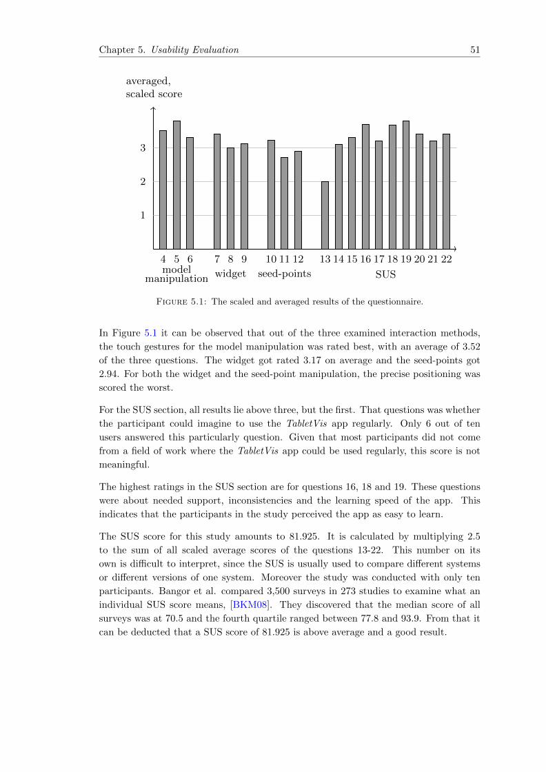
Chapter 5. Usability Evaluation 51
modelmanipulation
4 5 6
widget
7 8 9
seed-points
10 11 12
SUS
13 14 15 16 17 18 19 20 21 22
averaged,scaled score
1
2
3
Figure 5.1: The scaled and averaged results of the questionnaire.
In Figure 5.1 it can be observed that out of the three examined interaction methods,
the touch gestures for the model manipulation was rated best, with an average of 3.52
of the three questions. The widget got rated 3.17 on average and the seed-points got
2.94. For both the widget and the seed-point manipulation, the precise positioning was
scored the worst.
For the SUS section, all results lie above three, but the first. That questions was whether
the participant could imagine to use the TabletVis app regularly. Only 6 out of ten
users answered this particularly question. Given that most participants did not come
from a field of work where the TabletVis app could be used regularly, this score is not
meaningful.
The highest ratings in the SUS section are for questions 16, 18 and 19. These questions
were about needed support, inconsistencies and the learning speed of the app. This
indicates that the participants in the study perceived the app as easy to learn.
The SUS score for this study amounts to 81.925. It is calculated by multiplying 2.5
to the sum of all scaled average scores of the questions 13-22. This number on its
own is difficult to interpret, since the SUS is usually used to compare different systems
or different versions of one system. Moreover the study was conducted with only ten
participants. Bangor et al. compared 3,500 surveys in 273 studies to examine what an
individual SUS score means, [BKM08]. They discovered that the median score of all
surveys was at 70.5 and the fourth quartile ranged between 77.8 and 93.9. From that it
can be deducted that a SUS score of 81.925 is above average and a good result.
Chapter 5. Usability Evaluation 52
5.5.1 Answers to Open Questions
The translated answers to the last two questions are given in Table C.2. The critique
can be distinguished in four different parts.
Interaction Issues
The main interaction issue was the widget. It was said to be difficult to precisely
navigate. For another user the widget lacked visual cues, that would indicate the options
of navigation. Additionally it was mentioned that moving the model while displaying
the widget was also difficult.
The second interaction issue was the loading time. The user tests were conducted with
the standalone version of the app with a rather large model. Therefore the processing
times of different operations were not interactive.
Additionally the simultaneous display of the model and some additional functionality
lead to confusion. In one answer it was mentioned that when the participant first
tapped the iso-surface button, the app did not behave as expected. Since the model was
in opaque mode, the iso-surface was not displayed. The user did not know that setting
the model to transparent or not displayed would have resolved the issue.
Requested Features
Some participants listed features they thought were missing or could be helpful. These
requests included the following:
• the possibility to enter an exact iso-value
• an online help menu
• an undo-button
• a way of saving results, for example with a built-in screenshot functionality
• a button that resets everything, extending the Home-button such that all addi-
tional visualizations (iso-surfaces, streamlines,...) are deleted as well
Layout Issues
The positioning of the data menu button was found faulty. Moreover the overall UI-
Design was listed as negative by one participant.
Chapter 5. Usability Evaluation 53
Positive Aspects of the Interface and the Interaction Possibilities
Overall the manipulation of the model via touch was received positively. It was described
with terms such as ’familiar’, ’intuitive’, pleasant’ and ’easy to understand’. Addition-
ally several participants approved of the clearly arranged menu and the simplicity of
the app. One user mentioned that the ’visualization algorithms are relevant’ and that
’slicing, clipping, iso-surfaces and streamlines cover the whole spectrum’. Furthermore
it remarked that it was positive that the app runs on a tablet and that the different
functions could be used simultaneously.
Chapter 6
Conclusion and Future Work
6.1 Summary
This work discusses the use of tablet PCs for flow visualization. At first the fundamentals
in scientific visualization, with the focus on flow fields, are introduced briefly. Then it
is stated which requirements a system must fulfil so that it can be used to examine the
potential and limitations of tablet PCs with regard to flow visualization. There are three
requirements concerning the visualization: the ability to process flow field datasets, the
availability of common visualization techniques and real-time rendering. Additionally
it is required that the system should preserve the mobility of the device. Moreover the
system should make use of the user interaction possibilities offered by the tablet PC,
namely touch gestures and the gyroscope.
From these requirements the major design decisions are deducted. It is stated why the
iPad was chosen as hardware and that the visualization is based on VTK. Furthermore it
is explained that within the scope of this project two applications should be developed,
one standalone version and one with local rendering and a client-server system. Next the
design decisions concerning the user interaction are given. That includes a description
of the failed attempt to utilize the gyroscope for navigation in the scene.
In the next sections the visualization libraries VTK, VES and Kiwi are introduced. Then
the general design ideas, that both versions of the application are based on, are briefly
explained with regard to the concrete implementation. The first pattern is the delegation
pattern which is used in the iOS main run loop. Secondly the model-view-controller
pattern is used to structure the entire application. And thirdly there is the visualization
pipeline, which is the main concept of all VTK-based libraries. These general ideas
are then followed by detailed descriptions of the implementations of the two versions
of the application, i.e. the standalone and the client-server version. That includes an
explanation of the client-server communication and the optional compression. Last but
not least the user interface is presented and explained in detail.
Then follows a description of the performance testing and its results. Three experiments
are conducted. First some general time measurements of both versions of the application
54
Chapter 6. Conclusion and Future Work 55
are taken. Then the client-server system is examined in detail. At last the frame-rates
of the standalone version are measured.
Additionally the usability of the application is evaluated. After shortly introducing
the notion of usability and a brief review of usability evaluation methods, the method
chosen for this project, a SUS-based questionnaire, is presented. After describing the
experiment settings, the results of the test are discussed.
6.2 Conclusion
Overall the results of this project show that tablet PCs offer great opportunities for flow
visualization. We developed a standalone system, i.e. wireless and independent from
network connections, for tablet PCs that allows for the exploration of flow data sets
with common visualization techniques. The system is capable of processing datasets
with over 200.000 cells and over 220.000 points. Although the computation times are
capable of improvement, even larger scenes are rendered in real-time.
In general the proposed user interaction methods were received well by the participants
of the user study. It turned out that the plane widget needs more work in order to
be more predictable and accurate. But overall the touch interaction was said to be
’familiar’, ’intuitive’ and ’easy to understand’.
The client-server version was developed in case the tablet PC was not able to handle
larger datasets. And it has proven itself has a reliable and efficient extension. The local
rendering seems to be a good balance for tablet PCs to improve processing time, while
keeping the data traffic low. The client-server system performed evenly well for different
datasets and decreased the processing time for computationally intensive operations
significantly, compared to the standalone version.
6.3 Future Work
The applications created in this project can be used as a basis for further studies on
flow visualization on tablet PCs. Due to the time restrictions of this project, there was
not enough time to thoroughly optimize the interaction methods. Especially the plane
widget has the potential to be a useful interaction tool. Additionally the client-server
application could be extended for the use of several clients.
Moreover the use of a desktop PC as server, enables the use of more advanced visual-
ization techniques, such as Line Integral Convolution (LIC), see Section 2.3. So far the
LIC algorithms are not implemented to run with OpenGL ES. But the computations
could be performed on the server and the output could be processed such that the tablet
PC was able to render it. With that said, the use of LIC combined with touch gestures
offers interesting interaction possibilities. For example the selection of regions, for which
the resolution of the LIC texture should be increased.

Chapter 6. Conclusion and Future Work 56
Furthermore the application could be extended for other research fields such as medicine
or biology. That would entail the implementation of other visualization techniques. And
with other visualization techniques there might come new ways to utilize the touch and
gyroscope interaction.
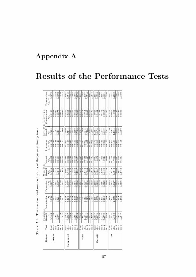
Appendix A
Results of the Performance Tests
Table
A.1
:T
he
aver
aged
and
rou
nd
edre
sult
sof
the
gen
eral
tim
ing
test
s.
Sta
ndalone:
ClientSid
e:
Serv
erSid
e(C
.-Level2):
Data
set
Task
Overa
llComputa
tion
Pro
cessin
gOvera
llRequest
Pro
cessin
gOvera
llComputa
tion
Tra
nsm
ission
T1
T2
T1−
T2
TC1
TC2
TC1
−TC2
TS1
TS2
TC2
−TS1
load
0.0463
0.0326
0.0137
0.0695
0.0501
0.0194
0.0229
0.0168
0.0272
Turbin
eslice
0.0356
0.0273
0.0083
0.0604
0.0362
0.0242
0.0111
0.0088
0.0251
clip
0.0851
0.0737
0.0114
0.0754
0.0606
0.0148
0.0254
0.0209
0.0352
iso
10.0371
0.0284
0.0087
0.0610
0.0483
0.0128
0.0111
0.0077
0.0372
iso
20.0378
0.0290
0.0088
0.0681
0.0539
0.0142
0.0112
0.0075
0.0426
iso
30.0635
0.0521
0.0114
0.0664
0.0504
0.0160
0.0160
0.0096
0.0344
load
3.3264
3.2259
0.1005
0.8506
0.7224
0.1282
0.6129
0.5886
0.1095
Com
ponent
slice
3.2337
3.2240
0.0097
0.6420
0.6262
0.0158
0.5714
0.5655
0.0548
clip
3.8003
3.7618
0.0385
1.0076
0.9234
0.0842
0.8252
0.7963
0.0982
iso
13.2354
3.2250
0.0104
0.6424
0.6247
0.0177
0.5644
0.5565
0.0603
iso
23.2521
3.2376
0.0145
0.7164
0.6655
0.0509
0.5780
0.5656
0.0875
iso
33.2593
3.2427
0.0166
0.7397
0.7073
0.0324
0.5803
0.5639
0.1270
load
0.3834
0.2072
0.1762
0.4658
0.2548
0.2110
0.1357
0.0912
0.1191
Noise
slice
0.1673
0.1551
0.0122
0.2824
0.1004
0.1820
0.0609
0.0513
0.0395
clip
1.6931
1.6114
0.0817
1.1434
0.9434
0.2000
0.7646
0.7054
0.1787
iso
10.2299
0.2109
0.0190
0.3305
0.1448
0.1857
0.0738
0.0543
0.0710
iso
20.3417
0.3119
0.0298
0.5002
0.2991
0.2010
0.1384
0.0821
0.1607
iso
30.1969
0.1817
0.0152
0.3633
0.1730
0.1903
0.0856
0.0595
0.0874
load
5.4657
5.2554
0.2103
1.4666
1.2090
0.2576
1.0555
1.0047
0.1535
Carotid
slice
5.2674
5.2558
0.0116
1.0287
1.0074
0.0213
0.9478
0.9484
0.0596
clip
6.7296
6.6757
0.0539
1.7758
1.6770
0.0988
1.5203
1.4708
0.1566
iso
15.2716
5.2531
0.0184
1.1790
1.1265
0.0525
0.9678
0.772
0.1587
iso
25.2570
5.2448
0.0123
1.0486
1.0220
0.0266
0.9419
0.9257
0.0801
iso
35.2546
5.2446
0.0100
1.0199
1.0031
0.0168
0.9301
0.9242
0.0730
load
0.9087
0.5118
0.3969
1.0511
0.5952
0.4559
0.3310
0.2422
0.2641
Car
slice
0.3036
0.2901
0.0135
0.1732
0.1514
0.0217
0.1067
0.0955
0.0447
clip
3.0496
2.9470
0.1027
1.8514
1.7006
0.1508
1.4818
1.4005
0.2188
iso
10.3877
0.3648
0.0229
0.2968
0.2465
0.0503
0.1498
0.1197
0.0967
iso
20.2854
0.2720
0.0134
0.1957
0.1644
0.0312
0.1046
0.0896
0.0598
iso
30.2647
0.2532
0.0116
0.1464
0.1300
0.0164
0.0900
0.0835
0.0400
57
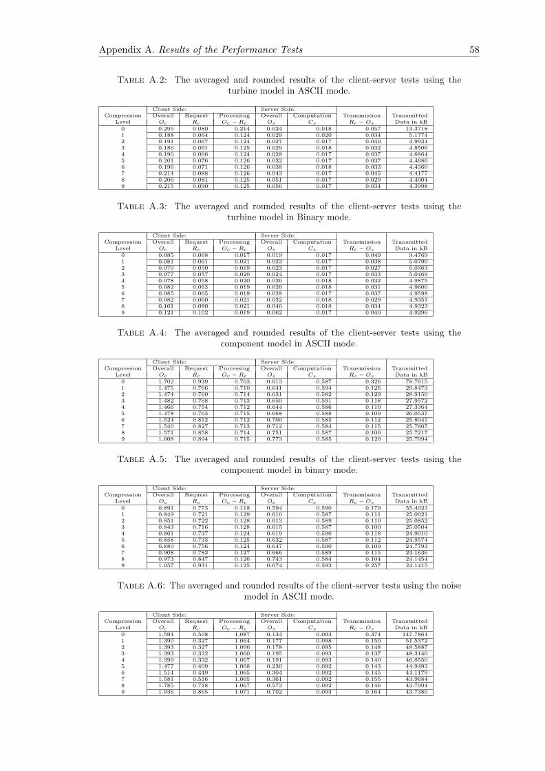
Appendix A. Results of the Performance Tests 58
Table A.2: The averaged and rounded results of the client-server tests using theturbine model in ASCII mode.
Client Side: Server Side:Compression Overall Request Processing Overall Computation Transmission Transmitted
Level Oc Rc Oc − Rc Os Cs Rc − Os Data in kB0 0.295 0.080 0.214 0.024 0.018 0.057 13.37181 0.188 0.064 0.124 0.029 0.020 0.034 5.17742 0.191 0.067 0.124 0.027 0.017 0.040 4.99343 0.186 0.061 0.125 0.029 0.018 0.032 4.85064 0.190 0.066 0.124 0.028 0.017 0.037 4.68645 0.201 0.076 0.126 0.032 0.017 0.037 4.46866 0.196 0.071 0.126 0.038 0.018 0.033 4.43607 0.214 0.088 0.126 0.043 0.017 0.045 4.41778 0.206 0.081 0.125 0.051 0.017 0.029 4.40049 0.215 0.090 0.125 0.056 0.017 0.034 4.3998
Table A.3: The averaged and rounded results of the client-server tests using theturbine model in Binary mode.
Client Side: Server Side:Compression Overall Request Processing Overall Computation Transmission Transmitted
Level Oc Rc Oc − Rc Os Cs Rc − Os Data in kB0 0.085 0.068 0.017 0.019 0.017 0.049 9.47691 0.081 0.061 0.021 0.023 0.017 0.038 5.07902 0.070 0.050 0.019 0.023 0.017 0.027 5.03633 0.077 0.057 0.020 0.024 0.017 0.033 5.04694 0.078 0.058 0.020 0.026 0.018 0.032 4.98755 0.082 0.063 0.019 0.026 0.018 0.031 4.96006 0.085 0.065 0.019 0.028 0.017 0.037 4.95987 0.082 0.060 0.021 0.032 0.018 0.029 4.93518 0.101 0.080 0.021 0.046 0.018 0.034 4.93239 0.121 0.102 0.019 0.062 0.017 0.040 4.9296
Table A.4: The averaged and rounded results of the client-server tests using thecomponent model in ASCII mode.
Client Side: Server Side:Compression Overall Request Processing Overall Computation Transmission Transmitted
Level Oc Rc Oc − Rc Os Cs Rc − Os Data in kB0 1.702 0.939 0.763 0.613 0.587 0.326 78.76151 1.475 0.766 0.710 0.641 0.594 0.125 29.84732 1.474 0.760 0.714 0.631 0.582 0.129 28.91503 1.482 0.768 0.713 0.650 0.591 0.118 27.95724 1.466 0.754 0.712 0.644 0.586 0.110 27.33645 1.478 0.763 0.715 0.668 0.588 0.109 26.05376 1.524 0.812 0.712 0.700 0.585 0.112 25.80417 1.540 0.827 0.713 0.712 0.584 0.115 25.76678 1.571 0.858 0.714 0.751 0.587 0.106 25.72179 1.608 0.894 0.715 0.773 0.585 0.120 25.7094
Table A.5: The averaged and rounded results of the client-server tests using thecomponent model in binary mode.
Client Side: Server Side:Compression Overall Request Processing Overall Computation Transmission Transmitted
Level Oc Rc Oc − Rc Os Cs Rc − Os Data in kB0 0.891 0.773 0.118 0.594 0.590 0.179 55.40231 0.849 0.721 0.129 0.610 0.587 0.111 25.00212 0.851 0.722 0.128 0.613 0.589 0.110 25.08523 0.843 0.716 0.128 0.615 0.587 0.100 25.05044 0.861 0.737 0.124 0.619 0.590 0.118 24.90105 0.858 0.733 0.125 0.632 0.587 0.112 24.95746 0.880 0.756 0.124 0.647 0.590 0.109 24.77937 0.908 0.782 0.127 0.666 0.589 0.115 24.16368 0.973 0.847 0.126 0.743 0.584 0.104 24.14549 1.057 0.931 0.125 0.674 0.592 0.257 24.1415
Table A.6: The averaged and rounded results of the client-server tests using the noisemodel in ASCII mode.
Client Side: Server Side:Compression Overall Request Processing Overall Computation Transmission Transmitted
Level Oc Rc Oc − Rc Os Cs Rc − Os Data in kB0 1.594 0.508 1.087 0.134 0.093 0.374 147.78641 1.390 0.327 1.064 0.177 0.098 0.150 51.53722 1.393 0.327 1.066 0.178 0.095 0.148 49.58873 1.393 0.332 1.060 0.195 0.093 0.137 48.31404 1.399 0.332 1.067 0.191 0.093 0.140 46.85505 1.477 0.409 1.068 0.230 0.092 0.143 44.94936 1.514 0.449 1.065 0.304 0.092 0.145 44.11797 1.581 0.516 1.065 0.361 0.092 0.155 43.96848 1.785 0.718 1.067 0.573 0.092 0.146 43.79949 1.936 0.865 1.071 0.702 0.093 0.164 43.7380
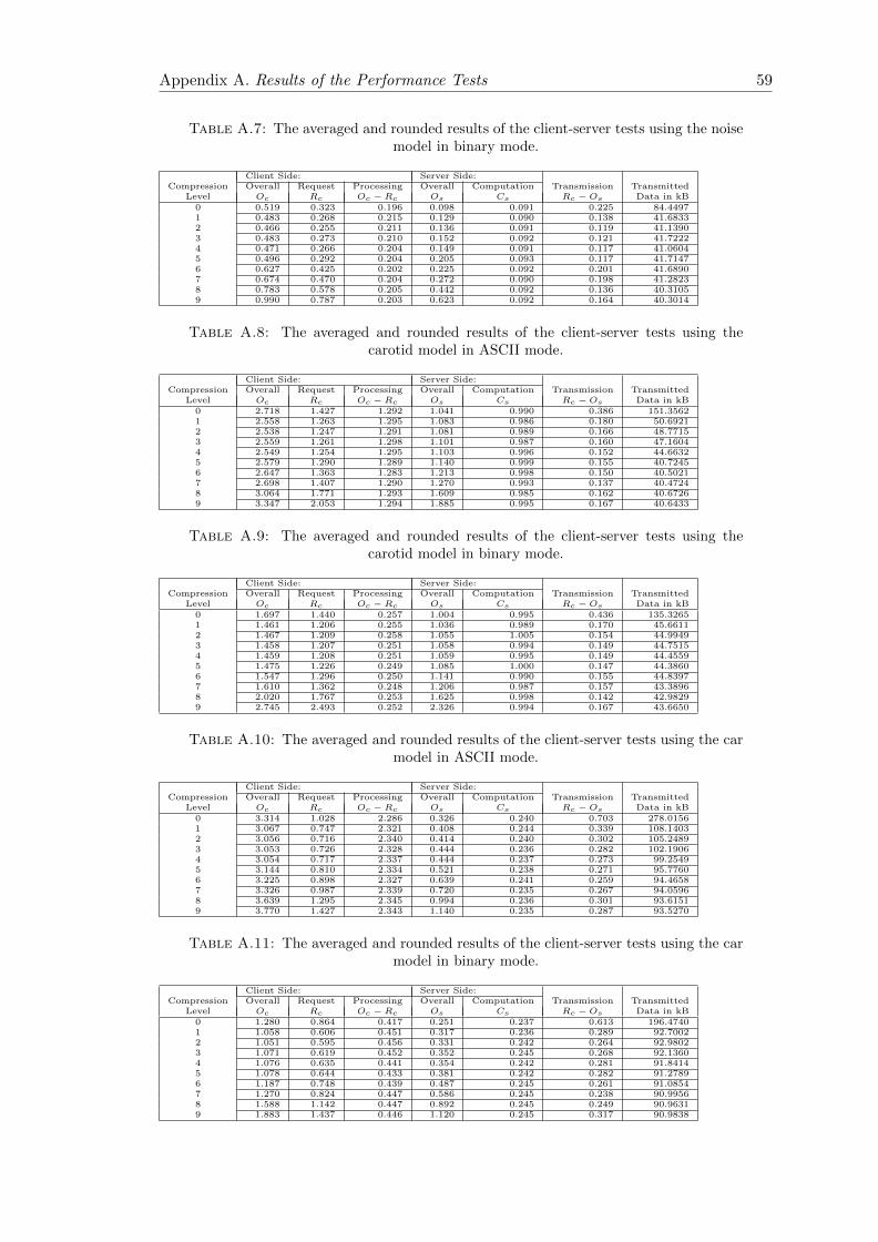
Appendix A. Results of the Performance Tests 59
Table A.7: The averaged and rounded results of the client-server tests using the noisemodel in binary mode.
Client Side: Server Side:Compression Overall Request Processing Overall Computation Transmission Transmitted
Level Oc Rc Oc − Rc Os Cs Rc − Os Data in kB0 0.519 0.323 0.196 0.098 0.091 0.225 84.44971 0.483 0.268 0.215 0.129 0.090 0.138 41.68332 0.466 0.255 0.211 0.136 0.091 0.119 41.13903 0.483 0.273 0.210 0.152 0.092 0.121 41.72224 0.471 0.266 0.204 0.149 0.091 0.117 41.06045 0.496 0.292 0.204 0.205 0.093 0.117 41.71476 0.627 0.425 0.202 0.225 0.092 0.201 41.68907 0.674 0.470 0.204 0.272 0.090 0.198 41.28238 0.783 0.578 0.205 0.442 0.092 0.136 40.31059 0.990 0.787 0.203 0.623 0.092 0.164 40.3014
Table A.8: The averaged and rounded results of the client-server tests using thecarotid model in ASCII mode.
Client Side: Server Side:Compression Overall Request Processing Overall Computation Transmission Transmitted
Level Oc Rc Oc − Rc Os Cs Rc − Os Data in kB0 2.718 1.427 1.292 1.041 0.990 0.386 151.35621 2.558 1.263 1.295 1.083 0.986 0.180 50.69212 2.538 1.247 1.291 1.081 0.989 0.166 48.77153 2.559 1.261 1.298 1.101 0.987 0.160 47.16044 2.549 1.254 1.295 1.103 0.996 0.152 44.66325 2.579 1.290 1.289 1.140 0.999 0.155 40.72456 2.647 1.363 1.283 1.213 0.998 0.150 40.50217 2.698 1.407 1.290 1.270 0.993 0.137 40.47248 3.064 1.771 1.293 1.609 0.985 0.162 40.67269 3.347 2.053 1.294 1.885 0.995 0.167 40.6433
Table A.9: The averaged and rounded results of the client-server tests using thecarotid model in binary mode.
Client Side: Server Side:Compression Overall Request Processing Overall Computation Transmission Transmitted
Level Oc Rc Oc − Rc Os Cs Rc − Os Data in kB0 1.697 1.440 0.257 1.004 0.995 0.436 135.32651 1.461 1.206 0.255 1.036 0.989 0.170 45.66112 1.467 1.209 0.258 1.055 1.005 0.154 44.99493 1.458 1.207 0.251 1.058 0.994 0.149 44.75154 1.459 1.208 0.251 1.059 0.995 0.149 44.45595 1.475 1.226 0.249 1.085 1.000 0.147 44.38606 1.547 1.296 0.250 1.141 0.990 0.155 44.83977 1.610 1.362 0.248 1.206 0.987 0.157 43.38968 2.020 1.767 0.253 1.625 0.998 0.142 42.98299 2.745 2.493 0.252 2.326 0.994 0.167 43.6650
Table A.10: The averaged and rounded results of the client-server tests using the carmodel in ASCII mode.
Client Side: Server Side:Compression Overall Request Processing Overall Computation Transmission Transmitted
Level Oc Rc Oc − Rc Os Cs Rc − Os Data in kB0 3.314 1.028 2.286 0.326 0.240 0.703 278.01561 3.067 0.747 2.321 0.408 0.244 0.339 108.14032 3.056 0.716 2.340 0.414 0.240 0.302 105.24893 3.053 0.726 2.328 0.444 0.236 0.282 102.19064 3.054 0.717 2.337 0.444 0.237 0.273 99.25495 3.144 0.810 2.334 0.521 0.238 0.271 95.77606 3.225 0.898 2.327 0.639 0.241 0.259 94.46587 3.326 0.987 2.339 0.720 0.235 0.267 94.05968 3.639 1.295 2.345 0.994 0.236 0.301 93.61519 3.770 1.427 2.343 1.140 0.235 0.287 93.5270
Table A.11: The averaged and rounded results of the client-server tests using the carmodel in binary mode.
Client Side: Server Side:Compression Overall Request Processing Overall Computation Transmission Transmitted
Level Oc Rc Oc − Rc Os Cs Rc − Os Data in kB0 1.280 0.864 0.417 0.251 0.237 0.613 196.47401 1.058 0.606 0.451 0.317 0.236 0.289 92.70022 1.051 0.595 0.456 0.331 0.242 0.264 92.98023 1.071 0.619 0.452 0.352 0.245 0.268 92.13604 1.076 0.635 0.441 0.354 0.242 0.281 91.84145 1.078 0.644 0.433 0.381 0.242 0.282 91.27896 1.187 0.748 0.439 0.487 0.245 0.261 91.08547 1.270 0.824 0.447 0.586 0.245 0.238 90.99568 1.588 1.142 0.447 0.892 0.245 0.249 90.96319 1.883 1.437 0.446 1.120 0.245 0.317 90.9838

60
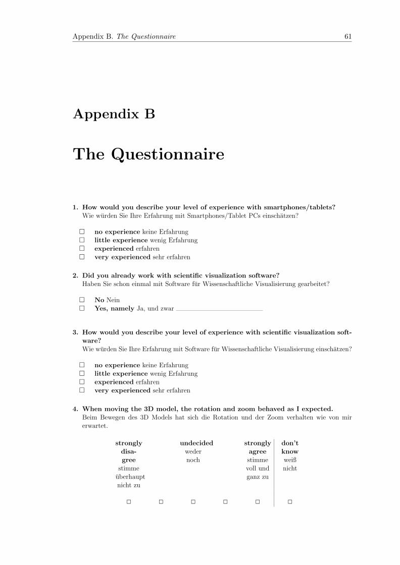
Appendix B. The Questionnaire 61
Appendix B
The Questionnaire
1. How would you describe your level of experience with smartphones/tablets?Wie wurden Sie Ihre Erfahrung mit Smartphones/Tablet PCs einschatzen?
� no experience keine Erfahrung� little experience wenig Erfahrung� experienced erfahren� very experienced sehr erfahren
2. Did you already work with scientific visualization software?Haben Sie schon einmal mit Software fur Wissenschaftliche Visualisierung gearbeitet?
� No Nein� Yes, namely Ja, und zwar
3. How would you describe your level of experience with scientific visualization soft-ware?Wie wurden Sie Ihre Erfahrung mit Software fur Wissenschaftliche Visualisierung einschatzen?
� no experience keine Erfahrung� little experience wenig Erfahrung� experienced erfahren� very experienced sehr erfahren
4. When moving the 3D model, the rotation and zoom behaved as I expected.Beim Bewegen des 3D Models hat sich die Rotation und der Zoom verhalten wie von mirerwartet.
stronglydisa-gree
stimmeuberhauptnicht zu
undecidedwedernoch
stronglyagreestimmevoll undganz zu
don’tknowweißnicht
2 2 2 2 2 2
5. It was difficult to manipulate the 3D model into the position I wanted.Es war schwierig das 3D Modell in die von mir gewunschte Position zu bringen.
stronglydisagreestimme
uberhauptnicht zu
undecidedweder noch
stronglyagree
stimme vollund ganz
zu
don’tknow
weiß nicht
2 2 2 2 2 2
6. The manipulation of the 3D model was straightforward.Es war unkompliziert das 3D Modell zu rotieren/verschieben/zoomen.
stronglydisagreestimme
uberhauptnicht zu
undecidedweder noch
stronglyagree
stimme vollund ganz
zu
don’tknow
weiß nicht
2 2 2 2 2 2
7. It was difficult to understand how I could control the plane widget.Es war schwierig zu verstehen wie ich das Ebenen Widget kontrollieren kann.
stronglydisagreestimme
uberhauptnicht zu
undecidedweder noch
stronglyagree
stimme vollund ganz
zu
don’tknow
weiß nicht
2 2 2 2 2 2
8. It was easy to manipulate the plane widget into the position I wanted it in.Es war einfach das Ebenen Widget in die gewunschte Position zu bringen.
stronglydisagreestimme
uberhauptnicht zu
undecidedweder noch
stronglyagree
stimme vollund ganz
zu
don’tknow
weiß nicht
2 2 2 2 2 2
Appendix B. The Questionnaire 62
9. It was unsatisfying to work with the plane widget.Es war unbefriedigend mit dem Ebenen Widget zu arbeiten.
stronglydisagreestimme
uberhauptnicht zu
undecidedweder noch
stronglyagree
stimme vollund ganz
zu
don’tknow
weiß nicht
2 2 2 2 2 2
10. It was easy to understand how I could set a seed point.Es war einfach zu verstehen wie ich einen Startpunkt setzen kann.
stronglydisagreestimme
uberhauptnicht zu
undecidedweder noch
stronglyagree
stimme vollund ganz
zu
don’tknow
weiß nicht
2 2 2 2 2 2
11. It was difficult to set the seed points exactly were I wanted them.Es war schwierig die Startpunkte an genau den Stellen zu platzieren, wo ich sie habenwollte.
stronglydisagreestimme
uberhauptnicht zu
undecidedweder noch
stronglyagree
stimme vollund ganz
zu
don’tknow
weiß nicht
2 2 2 2 2 2
12. Setting the seed points was straightforward.Das Setzen der Startpunkte war unkompliziert.
stronglydisagreestimme
uberhauptnicht zu
undecidedweder noch
stronglyagree
stimme vollund ganz
zu
don’tknow
weiß nicht
2 2 2 2 2 2
Appendix B. The Questionnaire 63
13. I think that I would like to use the tabletVis app frequently.Ich kann mir sehr gut vorstellen, die tabletVis App regelmaßig zu benutzen.
stronglydisagreestimme
uberhauptnicht zu
undecidedweder noch
stronglyagree
stimme vollund ganz
zu
don’tknow
weiß nicht
2 2 2 2 2 2
14. I found the tabletVis app unnecessarily complex.Ich empfinde die tabletVis App als unnotig komplex.
stronglydisagreestimme
uberhauptnicht zu
undecidedweder noch
stronglyagree
stimme vollund ganz
zu
don’tknow
weiß nicht
2 2 2 2 2 2
15. I thought the tabletVis app was easy to use.Ich empfinde die tabletVis App als einfach zu benutzen.
stronglydisagreestimme
uberhauptnicht zu
undecidedweder noch
stronglyagree
stimme vollund ganz
zu
don’tknow
weiß nicht
2 2 2 2 2 2
16. I think that I would need the support of a technical person to be able to usethe tabletVis app.Ich denke, dass ich technischen Support brauchen wurde, um die tabletVis App zu nutzen.
stronglydisagreestimme
uberhauptnicht zu
undecidedweder noch
stronglyagree
stimme vollund ganz
zu
don’tknow
weiß nicht
2 2 2 2 2 2
Appendix B. The Questionnaire 64
17. I found the various functions in the tabletVis app were well integrated.Ich finde, dass die verschiedenen Funktionen der tabletVis App gut integriert sind.
stronglydisagreestimme
uberhauptnicht zu
undecidedweder noch
stronglyagree
stimme vollund ganz
zu
don’tknow
weiß nicht
2 2 2 2 2 2
18. I thought there was too much inconsistency in the tabletVis app.Ich finde, dass es in der tabletVis App zu viele Inkosistenzen gibt.
stronglydisagreestimme
uberhauptnicht zu
undecidedweder noch
stronglyagree
stimme vollund ganz
zu
don’tknow
weiß nicht
2 2 2 2 2 2
19. I would imagine that most people would learn to use the tabletVis app veryquickly.Ich kann mir vorstellen, dass die meisten Leute die tabletVis App schnell zu beherrschenlernen.
stronglydisagreestimme
uberhauptnicht zu
undecidedweder noch
stronglyagree
stimme vollund ganz
zu
don’tknow
weiß nicht
2 2 2 2 2 2
20. I found the tabletVis app very cumbersome to use.Ich empfinde die Bedinung der tabletVis App asl sehr umstandlich.
stronglydisagreestimme
uberhauptnicht zu
undecidedweder noch
stronglyagree
stimme vollund ganz
zu
don’tknow
weiß nicht
2 2 2 2 2 2
Appendix B. The Questionnaire 65
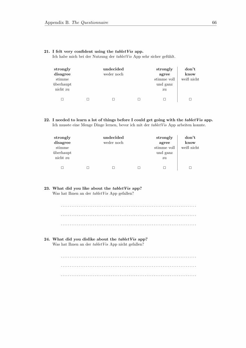
21. I felt very confident using the tabletVis app.Ich habe mich bei der Nutzung der tabletVis App sehr sicher gefuhlt.
stronglydisagreestimme
uberhauptnicht zu
undecidedweder noch
stronglyagree
stimme vollund ganz
zu
don’tknow
weiß nicht
2 2 2 2 2 2
22. I needed to learn a lot of things before I could get going with the tabletVis app.Ich musste eine Menge Dinge lernen, bevor ich mit der tabletVis App arbeiten konnte.
stronglydisagreestimme
uberhauptnicht zu
undecidedweder noch
stronglyagree
stimme vollund ganz
zu
don’tknow
weiß nicht
2 2 2 2 2 2
23. What did you like about the tabletVis app?Was hat Ihnen an der tabletVis App gefallen?
. . . . . . . . . . . . . . . . . . . . . . . . . . . . . . . . . . . . . . . . . . . . . . . . . . . . . . . . . . . . . . . . . . . . . . . . . . . .
. . . . . . . . . . . . . . . . . . . . . . . . . . . . . . . . . . . . . . . . . . . . . . . . . . . . . . . . . . . . . . . . . . . . . . . . . . . .
. . . . . . . . . . . . . . . . . . . . . . . . . . . . . . . . . . . . . . . . . . . . . . . . . . . . . . . . . . . . . . . . . . . . . . . . . . . .
24. What did you dislike about the tabletVis app?Was hat Ihnen an der tabletVis App nicht gefallen?
. . . . . . . . . . . . . . . . . . . . . . . . . . . . . . . . . . . . . . . . . . . . . . . . . . . . . . . . . . . . . . . . . . . . . . . . . . . .
. . . . . . . . . . . . . . . . . . . . . . . . . . . . . . . . . . . . . . . . . . . . . . . . . . . . . . . . . . . . . . . . . . . . . . . . . . . .
. . . . . . . . . . . . . . . . . . . . . . . . . . . . . . . . . . . . . . . . . . . . . . . . . . . . . . . . . . . . . . . . . . . . . . . . . . . .
Appendix B. The Questionnaire 66
Appendix C
The Results of the Questionnaire
The results are given for each participant.
Additionally the table contains the average and the scaled average for each question.
For the questions 1 and 3 no experience translates to a value of 1 and very experienced
to a value of 4. For the questions 4-22, strongly disagree relates to a value of 1 and
strongly agree to a value of 5.
The scaled average refers to the method with which the SUS is calculated. The scores of
the negative statements are reversed by first subtracting 5 and then taking the absolute
value. Then all scores are scaled to the range [0,4] by subtracting 1 from each. As a
result the average scaled score for each question can be interpreted with 4 being the best
and 0 being the worst value.
67
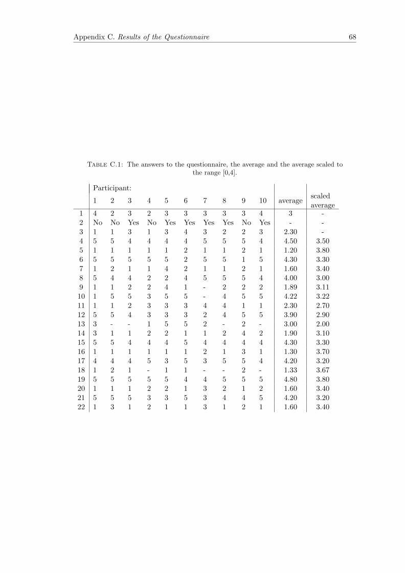
Appendix C. Results of the Questionnaire 68
Table C.1: The answers to the questionnaire, the average and the average scaled tothe range [0,4].
Participant:
1 2 3 4 5 6 7 8 9 10 averagescaledaverage
1 4 2 3 2 3 3 3 3 3 4 3 -2 No No Yes No Yes Yes Yes Yes No Yes - -3 1 1 3 1 3 4 3 2 2 3 2.30 -4 5 5 4 4 4 4 5 5 5 4 4.50 3.505 1 1 1 1 1 2 1 1 2 1 1.20 3.806 5 5 5 5 5 2 5 5 1 5 4.30 3.307 1 2 1 1 4 2 1 1 2 1 1.60 3.408 5 4 4 2 2 4 5 5 5 4 4.00 3.009 1 1 2 2 4 1 - 2 2 2 1.89 3.1110 1 5 5 3 5 5 - 4 5 5 4.22 3.2211 1 1 2 3 3 3 4 4 1 1 2.30 2.7012 5 5 4 3 3 3 2 4 5 5 3.90 2.9013 3 - - 1 5 5 2 - 2 - 3.00 2.0014 3 1 1 2 2 1 1 2 4 2 1.90 3.1015 5 5 4 4 4 5 4 4 4 4 4.30 3.3016 1 1 1 1 1 1 2 1 3 1 1.30 3.7017 4 4 4 5 3 5 3 5 5 4 4.20 3.2018 1 2 1 - 1 1 - - 2 - 1.33 3.6719 5 5 5 5 5 4 4 5 5 5 4.80 3.8020 1 1 1 2 2 1 3 2 1 2 1.60 3.4021 5 5 5 3 3 5 3 4 4 5 4.20 3.2022 1 3 1 2 1 1 3 1 2 1 1.60 3.40

Appendix C. Results of the Questionnaire 69
Table C.2: The answers to the open questions of the questionnaire, paired by partic-ipant.
What did you like about the TabletVis app? What did you dislike about the TabletVis app?
clearly arranged, functional UI-Design, loading- and waiting-times
precise view due to zoom, etc. very complex
the possibilities of visualization, the iso-surfaces
• using rotation, translation and zoom was intu-itive
• the visualization algorithms are relevant, slic-ing, clipping, iso-surfaces and streamlines coverthe whole spectrum
• it is positive that the app runs on a tablet
• the calculations are not interactive, it wouldhave been nicer to have remote rendering
• it should be possible to for example to enter theexact iso-value
navigation familiar from Touch-UI widget gives only few visual cues
• manipulation of the model met expectations
• simultaneous use of the functions
• simplicity/clarity
• precise manipulation of the widget is difficult
• display of the iso-surface unclear (trans-parency) [when choosing the iso-surface whiledisplaying the solid model, the iso-surface is notvisible]
• waiting time: if I want to look at iso-value 0, Ihave to start at 5 and tap the stepper 5 timesand wait
• error correction [for example an ’undo’-button]
no sub-menus with sub-items, simple layout a simple online-help would be good
clearly arranged menu , handling is easy to under-stand
the handling of the widget, it should be easier torotate/translate the model including the widget
very pleasant and intuitive to use, it is easy to achievethe goal • the folder-symbol could have been placed left
or right at the bottom, the upper row is verycrowded, there is plenty of space at the bottom
• the functionality of the ’Home’-button is incon-sistent: the widget is reset, but cut-planes andfield-lines remain. How can you reset every-thing?
very intuitively operable it should be possible to save the results
Bibliography
[AHH11] T. Akenine-Mller, E. Haines, N. Hoffman (2011): Real-time Rendering,
Third Edition, CRC Press
[B05] Paul Benolken (2005): Effiziente Visualisierungs- und Interaktionsmethoden
zur Analyse numerischer Simulationen in virtuellen und erweiterten Realitaten, Darm-
stadt University of Technology 2005, p. 1-129
[BKM08] Aaron Bangor, Philip T. Kortum, James T. Miller (2008): An Em-
pirical Evaluation of the System Usability Scale, International Journal of Human-
Computer Interaction, Volume 24, Issue 6, p. 574 594
[Bonjour] http://www.apple.com/support/bonjour/
[Brooke86] John Brooke (1986): SUS: A quick and dirty usability scale, In: Jordan,
P. W., Thomas, B., Weerdmeester, B. A., McClelland (eds.) Usability Evaluation in
Industry, Taylor & Francis, London, UK, p. 189-194
[CL93] Brian Cabral, Leith Leedom (1993): Imaging Vector Fields Using Line In-
tegral Convolution, Proceedings of the 20th Annual Conference on Computer Graphics
and Interactive Techniques, p. 263-270
[Eigen] Eigen Library http://www.eigen.tuxfamily.org/
[ESWE04] M. Eißele, S. Stegmaier, D. Weiskopf, T. Ertl (2004): Orienta-
tion as an additional User Interface in Mixed-Reality Environments, Proceedings of
Workshop Virtuelle und Erweiterte Realitat of the GI-Fachgruppe AR/VR, p. 79-90
[EKE08] M. Eißele, M. Kreiser, T. Ertl (2008): Context-Controlled Flow Visual-
ization in Augmented Reality, GI 08: Proceedings of Graphics Interface, p. 8996
[F10] Kraig Finstad (2010): Response Interpolation and Scale Sensitivity: Evidence
Against 5-Point Scales, Journal of Usability Studies, Volume 5, Issue 3, p. 104 - 110
[Gamma94] E. Gamma, R. Helm, R. Johnson,J. M. Vlissides (1994): Design Pat-
terns: Elements of Reusable Object-Oriented Software, Addison-Wesley Professional
[HH11] Wolfgang Hurst and Matthias Helder (2011): Mobile 3D Graphics and
Virtual Reality Interaction, Proceedings of the 8th International Conference on Ad-
vances in Computer Entertainment Technology
70
Appendix C. Results of the Questionnaire 71
[Isenberg11] Tobias Isenberg (2011): Position Paper: Touch Interaction in Scien-
tific Visualization, Proceedings of the Workshop on Data Exploration on Interactive
Surfaces, p. 24-27
[ISO9241] ISO 9241-11 (1998): Ergonomic requirements for office work with visual
display terminals (VDTs) - Part 11: Guidance on usability, Technical report, Inter-
national Organization for Standardization
[Kiwi] Visualization App http://www.kiwiviewer.org/
[KLNSKAN08] K. Karn, A. Little, G. Nelson, J. Sauro, J. Kirakowski, W.
Albert, K.Norman (2008): Subjective Ratings of Usability: Reliable or Ridiculous?,
Panel Presentation at the Usability Professionals Association Conference Baltimore,
MD
[L82] Clayton Lewis (1982): Using the thinking-aloud method in cognitive interface
design, IBM Research Report RC 9265, Yorktown Heights, NY
[LHDVPW04] R. Laramee, H. Hauser, H. Doleisch, B. Vrolijk, F. H. Post, D.
Weiskopf (2004): The State of the Art in Flow Visualization: Dense and Texture-
Based Techniques, Computer Graphics Forum, Volume 23(2), p. 203221
[LW97] Clayton Lewis, Cathleen Wharton (1997): Cognitive Walkthroughs, In:
Martin G. Helander, Thomas K. Landauer, Prasad V. Prabhu (Eds.): Handbook of
Human-Computer Interactions, Elsevier Press, Amsterdam, p. 717732
[MEVIS] Fraunhofer MEVIS (2013): Mobile Liver Explorer,
http://www.mevis.fraunhofer.de/en/solutions/mobile-liver-explorer.html (accessed
January 16, 2014)
[MSG11] C. Mouton, K. Sons, I. Grimstead (2011): Collaborative Visualization:
Current Systems and Future Trends, Proceedings of the 16th International Conference
on 3D Web Technology, New York, NY, p. 101-110
[NASA] An unstructured grid http://fun3d.larc.nasa.gov/merged grid.jpg
[N92] Jakob Nielsen (1992): Finding usability problems through heuristic evaluation.,
Proceedings of the SIGCHI conference on Human factors in computing systems, New
York, NY, p. 373380
[N94] Jakob Nielsen (1994): Heuristic Evaluation, In Nielsen, J., and Mack, R.L.
(Eds.), Usability Inspection Methods, John Wiley & Sons, New York, NY
[N12] Jakob Nielsen (2012): Usability 101: Introduction to Usability,
http://www.nngroup.com/articles/usability-101-introduction-to-usability/ (accessed
October 2, 2013)
[ParaViewWeb] ParaViewWeb framework http://www.paraview.org/Wiki/ParaViewWeb
[PB13] Bernhard Preim, Charl Botha (2013): Visual Computing for Medicine:
Theory, Algorithms, and Applications, 2nd edition, Morgan Kaufmann, Waltham,
MA
Appendix C. Results of the Questionnaire 72
[PVHLD03] F. H. Post, B. Vrolijk, H. Hauser, R. S. Laramee, H. Doleisch
(2003): The State of the Art in Flow Visualisation:Feature Extraction and Tracking,
Computer Graphics Forum, Volume 22(4), p. 1-17
[SL11] Jeff Sauro, James R. Lewis (2011): When Designing Usability Question-
naires, Does It Hurt to Be Positive?, Proceedings of the SIGCHI Conference on Hu-
man Factors in Computing Systems, New York, NY, p. 2215-2224
[Telea07] Alexandru C. Telea (2007): Data Visualization: Principles and Practice,
A K Peters Ltd
[TS04] Thomas S. Tullis, Jacqueline N. Stetson (2004): A Comparison of Ques-
tionnaires for Assessing Website Usability, Usability Professionals Association Con-
ference, Minneapolis, MN
[OD] Oxford Dictionaries Oxford University Press.
http://oxforddictionaries.com/definition/english/usable (accessed September 30,
2013)
[VES] VTK OpenGL ES Rendering Toolkit http://www.vtk.org/Wiki/VES
[VISICADE] P. Benlken; U. Bossong; H. Graf (2002): VISICADE - interaktive
Simulationen in integrierten Prozessen, ProduktDaten Journal 9, p. 38-41
[VTK] Visualization Toolkit http://www.vtk.org/
[ZLIB] Compression Libraryhttp://www.zlib.net/


