Lesson 1: Gouache 101
OUTLINE The first video in this course is going to be an overview of the medium, and the basic supplies that will be needed to work with it. We will cover the main characteristics of gouache, and we will briefly compare it to the mediums it is most associated with, watercolor and acrylic. We will also cover what supplies work best with it, and we will look into what colors would make a good starting kit.
• The medium • Gouache vs Watercolor • Gouache vs Acrylic • Basic supplies (brushes, paper...) • Basic paints and colors
SUPPLIES MENTIONED
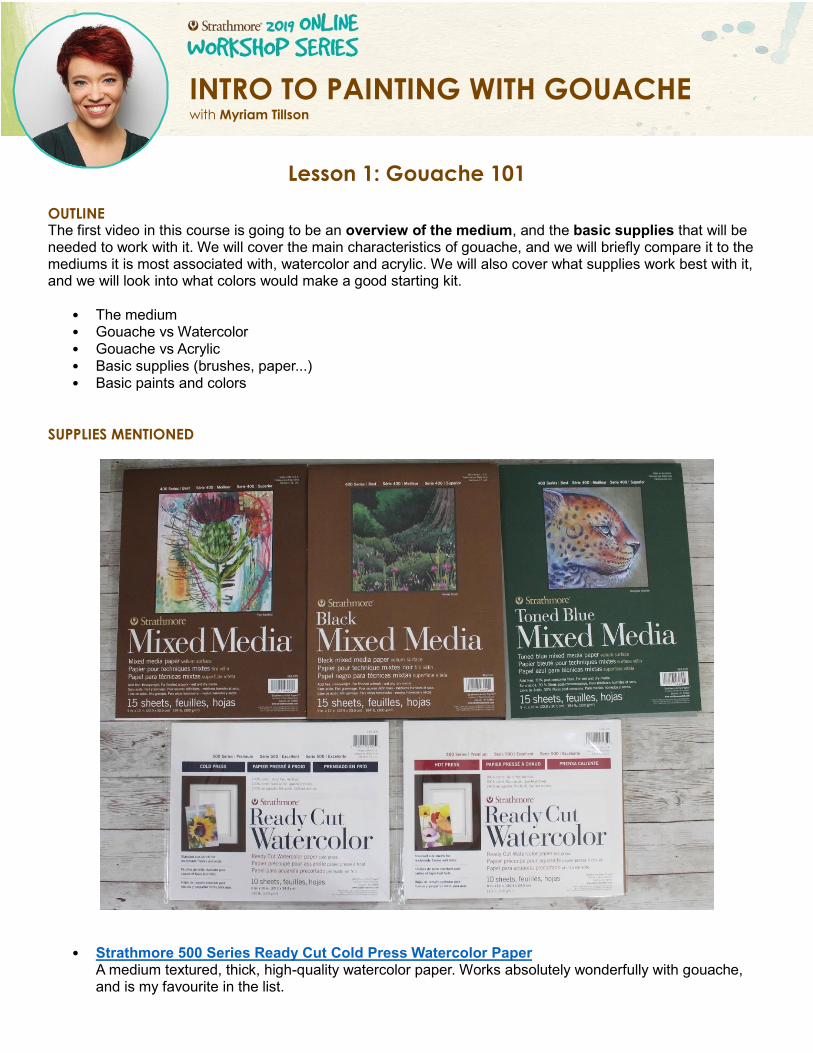
• Strathmore 500 Series Ready Cut Cold Press Watercolor Paper A medium textured, thick, high-quality watercolor paper. Works absolutely wonderfully with gouache, and is my favourite in the list.
INTRO TO PAINTING WITH GOUACHE with Myriam Tillson
• Strathmore 500 Series Ready Cut Hot Press Watercolor Paper A softer textured, thick, high-qaulity watercolor paper, that works really well with gouache also, but is smoother than cold-press paper.
• Strathmore 400 Series Mixed Media Paper (White, Toned Blue and Black) Smooth, thick, high-quality mixed media papers, all fantastic to use with a range of media.
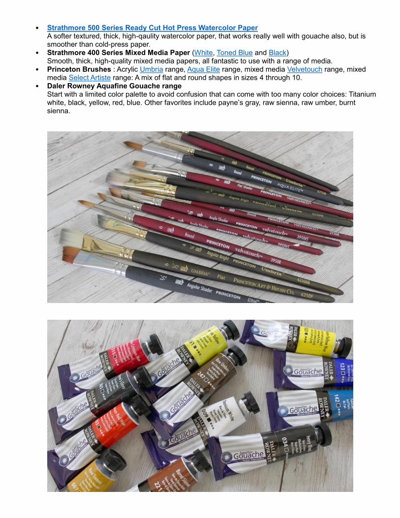
• Princeton Brushes : Acrylic Umbria range, Aqua Elite range, mixed media Velvetouch range, mixed media Select Artiste range: A mix of flat and round shapes in sizes 4 through 10.
• Daler Rowney Aquafine Gouache range Start with a limited color palette to avoid confusion that can come with too many color choices: Titanium white, black, yellow, red, blue. Other favorites include payne’s gray, raw sienna, raw umber, burnt sienna.
1. WHAT IS GOUACHE The main characteristics of gouache are:
– Waterbased medium (needs to be mixed with water) – Watersoluble (can be reactivated with water once dry) – Quick drying time – Dries matte
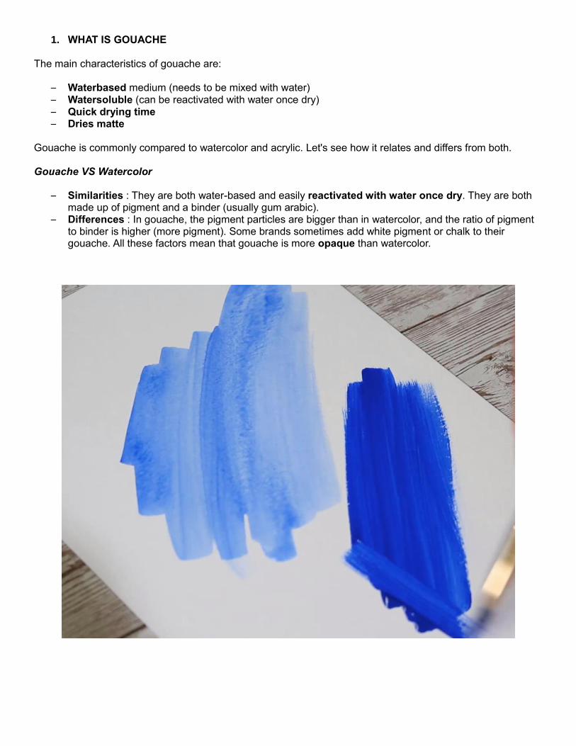
Gouache is commonly compared to watercolor and acrylic. Let's see how it relates and differs from both. Gouache VS Watercolor
– Similarities : They are both water-based and easily reactivated with water once dry. They are both made up of pigment and a binder (usually gum arabic).
– Differences : In gouache, the pigment particles are bigger than in watercolor, and the ratio of pigment to binder is higher (more pigment). Some brands sometimes add white pigment or chalk to their gouache. All these factors mean that gouache is more opaque than watercolor.
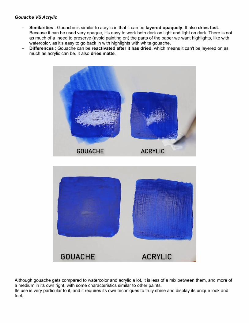
Gouache VS Acrylic
– Similarities : Gouache is similar to acrylic in that it can be layered opaquely. It also dries fast. Because it can be used very opaque, it's easy to work both dark on light and light on dark. There is not as much of a need to preserve (avoid painting on) the parts of the paper we want highlights, like with watercolor, as it's easy to go back in with highlights with white gouache.
– Differences : Gouache can be reactivated after it has dried, which means it can't be layered on as much as acrylic can be. It also dries matte.
Although gouache gets compared to watercolor and acrylic a lot, it is less of a mix between them, and more of a medium in its own right, with some characteristics similar to other paints. Its use is very particular to it, and it requires its own techniques to truly shine and display its unique look and feel.
2. HOW TO USE GOUACHE Gouache can be used fresh from the tube, which is the best way to achieve the highest opacity, but it is also water-soluble, and can easily be reactivated after it has dried. Reactivating gouache makes it a little more difficult to achieve as high a coverage as when it is used fresh, although it is possible. It mainly means it is easily portable and does not need to be washed off or thrown away at the end of a painting session.
3. THE IDEAL GOUACHE SUPPLIES
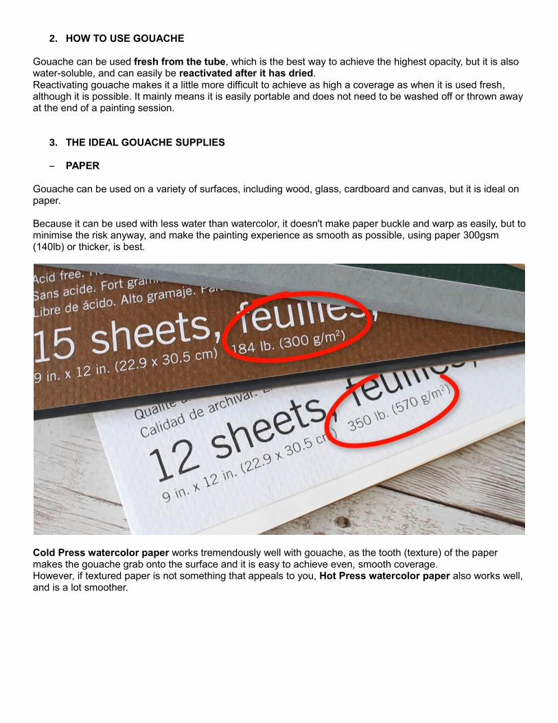
– PAPER Gouache can be used on a variety of surfaces, including wood, glass, cardboard and canvas, but it is ideal on paper. Because it can be used with less water than watercolor, it doesn't make paper buckle and warp as easily, but to minimise the risk anyway, and make the painting experience as smooth as possible, using paper 300gsm (140lb) or thicker, is best.
Cold Press watercolor paper works tremendously well with gouache, as the tooth (texture) of the paper makes the gouache grab onto the surface and it is easy to achieve even, smooth coverage. However, if textured paper is not something that appeals to you, Hot Press watercolor paper also works well, and is a lot smoother.
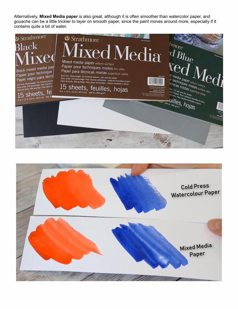
Alternatively, Mixed Media paper is also great, although it is often smoother than watercolor paper, and gouache can be a little trickier to layer on smooth paper, since the paint moves around more, especially if it contains quite a bit of water.
– BRUSHES
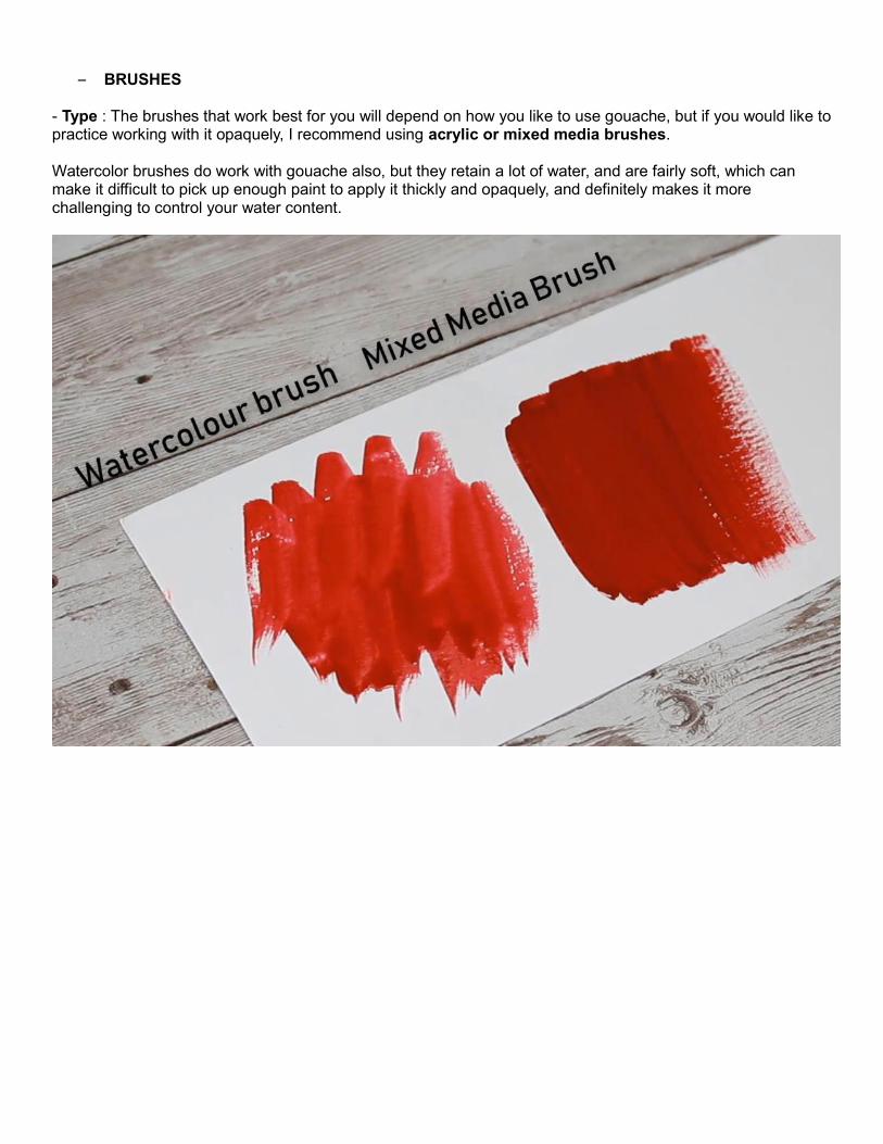
- Type : The brushes that work best for you will depend on how you like to use gouache, but if you would like to practice working with it opaquely, I recommend using acrylic or mixed media brushes. Watercolor brushes do work with gouache also, but they retain a lot of water, and are fairly soft, which can make it difficult to pick up enough paint to apply it thickly and opaquely, and definitely makes it more challenging to control your water content.
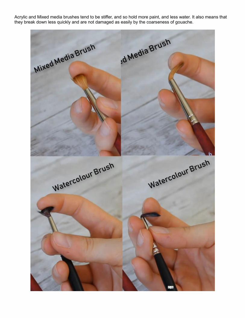
Acrylic and Mixed media brushes tend to be stiffer, and so hold more paint, and less water. It also means that they break down less quickly and are not damaged as easily by the coarseness of gouache.
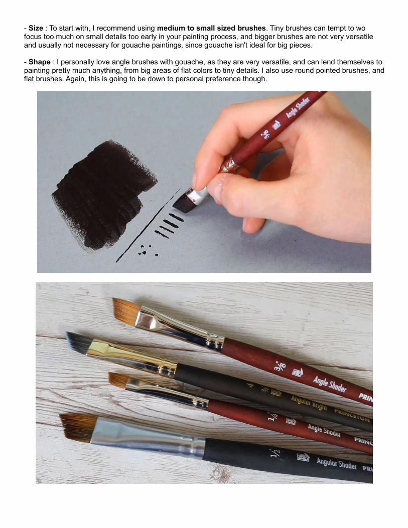
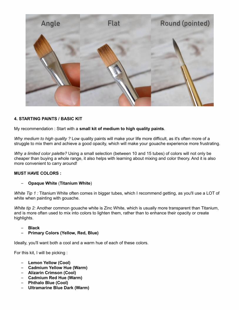
- Size : To start with, I recommend using medium to small sized brushes. Tiny brushes can tempt to wo focus too much on small details too early in your painting process, and bigger brushes are not very versatile and usually not necessary for gouache paintings, since gouache isn't ideal for big pieces. - Shape : I personally love angle brushes with gouache, as they are very versatile, and can lend themselves to painting pretty much anything, from big areas of flat colors to tiny details. I also use round pointed brushes, and flat brushes. Again, this is going to be down to personal preference though.
4. STARTING PAINTS / BASIC KIT My recommendation : Start with a small kit of medium to high quality paints. Why medium to high quality ? Low quality paints will make your life more difficult, as it's often more of a struggle to mix them and achieve a good opacity, which will make your gouache experience more frustrating. Why a limited color palette? Using a small selection (between 10 and 15 tubes) of colors will not only be cheaper than buying a whole range, it also helps with learning about mixing and color theory. And it is also more convenient to carry around! MUST HAVE COLORS :
– Opaque White (Titanium White) White Tip 1 : Titanium White often comes in bigger tubes, which I recommend getting, as you'll use a LOT of white when painting with gouache. White tip 2: Another common gouache white is Zinc White, which is usually more transparent than Titanium, and is more often used to mix into colors to lighten them, rather than to enhance their opacity or create highlights.
– Black – Primary Colors (Yellow, Red, Blue)
Ideally, you'll want both a cool and a warm hue of each of these colors. For this kit, I will be picking :
– Lemon Yellow (Cool) – Cadmium Yellow Hue (Warm) – Alizarin Crimson (Cool) – Cadmium Red Hue (Warm) – Phthalo Blue (Cool) – Ultramarine Blue Dark (Warm)

Color Terminology Tip : When talking about colors, the term “Hue” refers to the pure color, such as, for example, Red, Yellow or Blue. There are different color tones within a hue. If you see the term “hue” on a tube however, such as Cadmium Yellow Hue, or Alizarin Crimson Hue for example, it means that the paint manufacturer replaced what used to be a fairly toxic ingredient (in our examples, cadmium and alizarin), with a safer compound. Warm/Cool Hue Tip : If you don't know how to differentiate between warm and cool colors within a hue yet, here are some tips to get your started. For our primary colors, Yellow, Red and Blue: - Cool yellows have more green in them, and Warm yellows have more red (so orange undertones). - Cool reds have more blue in them (so purple undertones), and Warm reds have more yellow (so orange undertones). - Cool blues have more purple in them, and Warm blues have more green. [Dark blues are trickier to categorise, and some say Phthalo Blue is warmer than Ultramarine Blue, which are the colors I chose, but it matters little in the context of our course]

– Neutrals and Browns
And finally, it is useful to add a few neutral colors to any kit. For this, I chose 1 Ochre : Raw Sienna, and 2 browns, 1 cool : Raw Umber, and one warm : Burnt Sienna. Lastly, I also added Payne's Grey to our kit, since it is a great Black alternative. Payne's Grey is a dark grey-blue color, that is great to mix and darken other colors, and has less of a greying, flattening effect, than Black. I like to keep black for the darkest parts of a painting, and use Payne's Grey for anything lighter, as it is warmer, and richer.


