Making it Comprehesnible
Depicting Data
Depicting Data (adapted in part from Mandeville)
Graphical displays help make sense of raw data.
Can be an aid in analysisShould enhance overall communicationInvolves choices about what/how to display
What do you want to say? Are you trying to inform? Persuade?
Who do you want to say it to?Does data help to tell the story?
Depicting DataShould tell a story (i.e. trends over time,
patterns)Relate back to the wholeOffers possibility of projections and
comparisons
Common Types of VisualsGraphs/histograms
Bar chartsPie chartsLine charts
http://www.statcan.ca/english/edu/power/ch9/piecharts/pie.htm
Pictures/Concept mapsData mappingTables
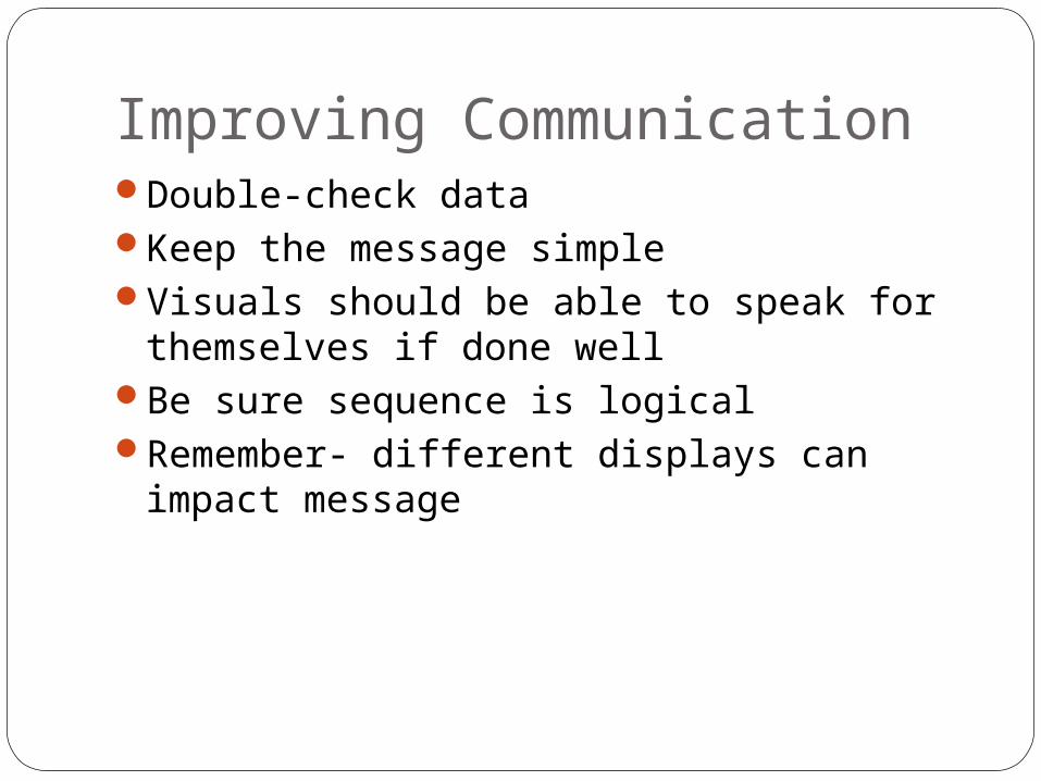
Improving CommunicationDouble-check dataKeep the message simpleVisuals should be able to speak for
themselves if done wellBe sure sequence is logicalRemember- different displays can impact
message

Choosing DisplaysIf data is mostly qualitative/textual tables
are often preferableQuantitative data can often be best
displayed in histograms and graphsIn particular, quantitative data with 5 or
more data points are usually best displayed in graphs
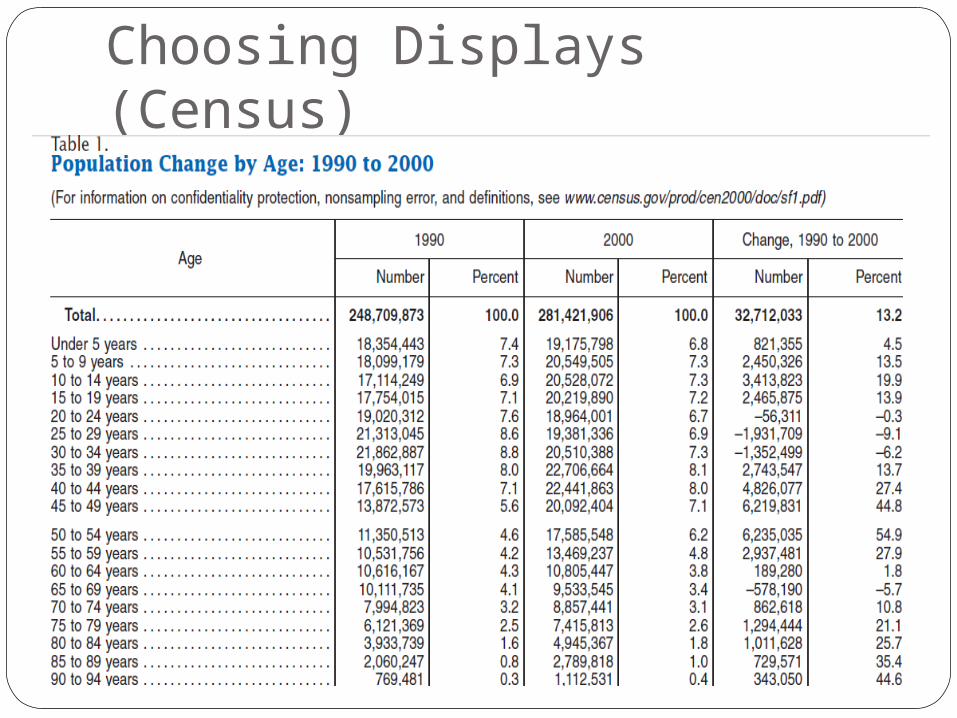
Choosing Displays (Census)
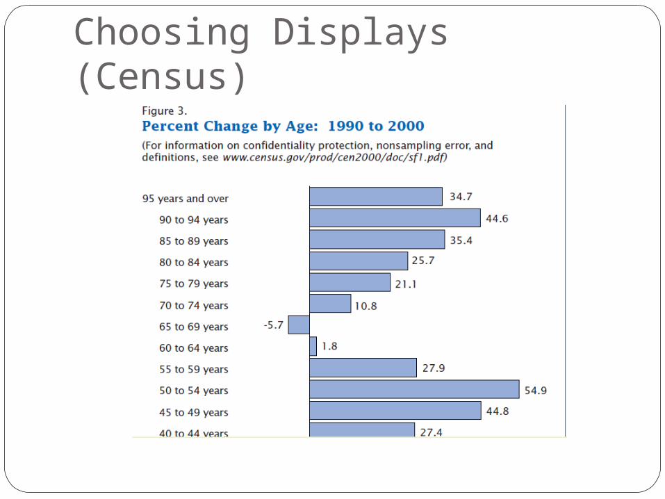
Choosing Displays (Census)
Effect of Choices on DisplaysOld Faithful
http://www.stat.sc.edu/~west/javahtml/Histogram.html
Depicting data
Wicked Awesome Examples
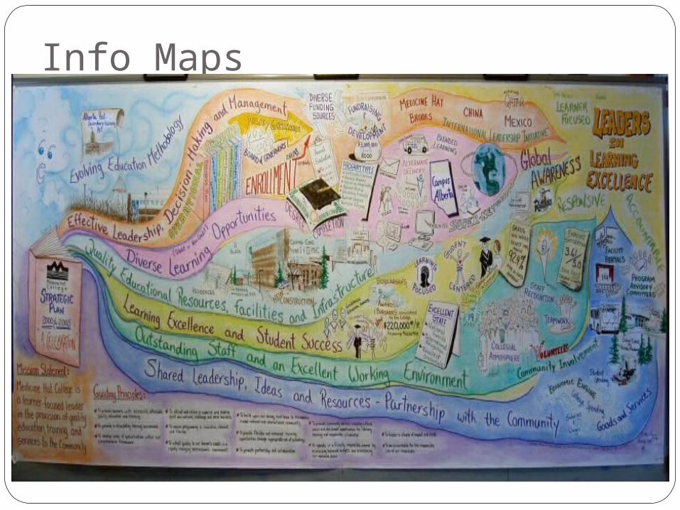
Info Maps
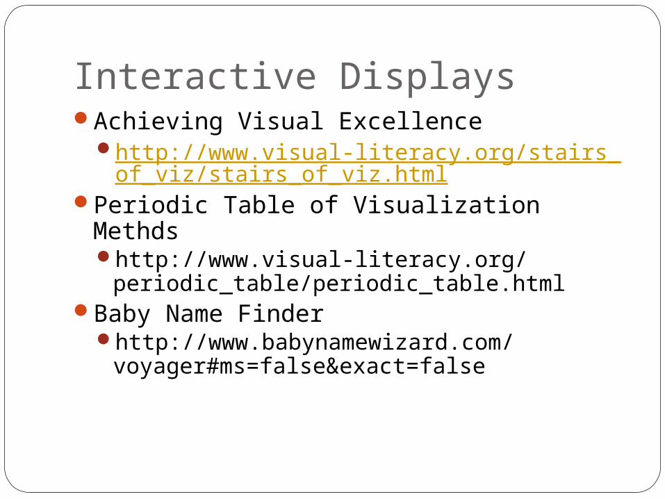
Interactive DisplaysAchieving Visual Excellence
http://www.visual-literacy.org/stairs_of_viz/stairs_of_viz.html
Periodic Table of Visualization Methdshttp://www.visual-literacy.org/
periodic_table/periodic_table.htmlBaby Name Finder
http://www.babynamewizard.com/voyager#ms=false&exact=false

ReferencesVisual Literacy
http://www.visual-literacy.org/pages/documents.htm
Tables vs. graphshttp://www.ncsu.edu/labwrite/res/
tablevsgraph/res-tablevsgraph.htmlVisual displays of data
www.nhhealthpolicyinstitute.unh.edu/ec/ppt/03_visual.ppt


