Download - MO Insights Q1 2012
Page 1 of 10
A N E C O N O M I C A N D M A R K E T C O M M E N T A R Y B Y M I C H A E L O B U C H O W S K I , P H . D .
After the incredible volatility of 2011, the first quarter of
2012 brought back the nearly forgotten sense of
direction to the global markets. Investors’ focus shifted
towards the future and the continually improving US
economy. After being written off by many pundits, the US
is once again the driving force among developed
countries and is likely to drive the global economic
growth in the near future.
As a result, the US equity markets ended the quarter with
the best result since 2009. The Russell 1000 Growth
ended the quarter with a 14.69% return, the S&P 500 with
a 12.59% return and the Russell Top 200 growth with a
14.76% return for the quarter. The quarterly returns were
led by Financials (21.5%) and Information Technology
(21.1%), followed by Consumer Discretionary (15.5%),
Industrials (10.7%), Materials (10.6%), Health Care (8.4%),
Introduction
Global Risks and Global Response
Under another Mario taking over its reins, the European
Central Bank (ECB) finally became much more attuned to
the economic growth risks. Many have argued that ECB’s
prior obsession with real or imaginary inflation under
Jean-Paul Trichet contributed to the European economic
woes with repeated increases in interest rates enacted
with what proved to be the worst timing possible (July
2008 and July of 2011 are just two of the best
examples). In contrast to his predecessor, Mario Draghi’s
first order of business was to reverse the misguided
interest rate increases and to provide support and
increased liquidity to the European banking system that
was hanging on a thread on the edge of the abyss
threatened with significant exposure to the rapidly
deteriorating in value sovereign European debt.
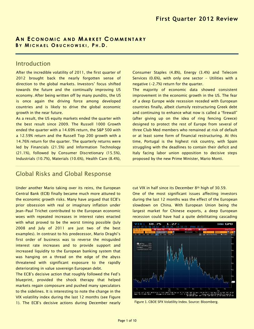
The ECB’s decisive action that roughly followed the Fed’s
blueprint, provided the shock therapy that helped
markets regain composure and pushed many speculators
to the sidelines. It is interesting to note the change in the
VIX volatility index during the last 12 months (see Figure
1). The ECB’s decisive actions during December nearly
Consumer Staples (4.8%), Energy (3.4%) and Telecom
Services (0.6%), with only one sector - Utilities with a
negative (-2.7%) return for the quarter.
The majority of economic data showed consistent
improvement in the economic growth in the US. The fear
of a deep Europe wide recession receded with European
countries finally, albeit clumsily restructuring Greek debt
and continuing to enhance what now is called a “firewall”
(after giving up on the idea of ring fencing Greece)
designed to protect the rest of Europe from several of
three Club Med members who remained at risk of default
or at least some form of financial restructuring. At this
time, Portugal is the highest risk country, with Spain
struggling with the deadlines to contain their deficit and
Italy facing labor union opposition to decisive steps
proposed by the new Prime Minister, Mario Monti.
cut VIX in half since its December 8th high of 30.59.
One of the most significant issues affecting investors
during the last 12 months was the effect of the European
slowdown on China. With European Union being the
largest market for Chinese exports, a deep European
recession could have had a quite debilitating cascading
First Quarter 2012 Review
Figure 1. CBOE SPX Volatility Index. Source: Bloomberg.
Page 2 of 10
Page 2
First Quarter 2012 Review
effect around the world. If the Chinese economy slowed
down significantly, that would have affected global
demand for industrial commodities, seriously hurting the
economies of rapidly growing materials exporting
countries. A slowdown in the Chinese economy would
have also had a negative effect on the US economy.
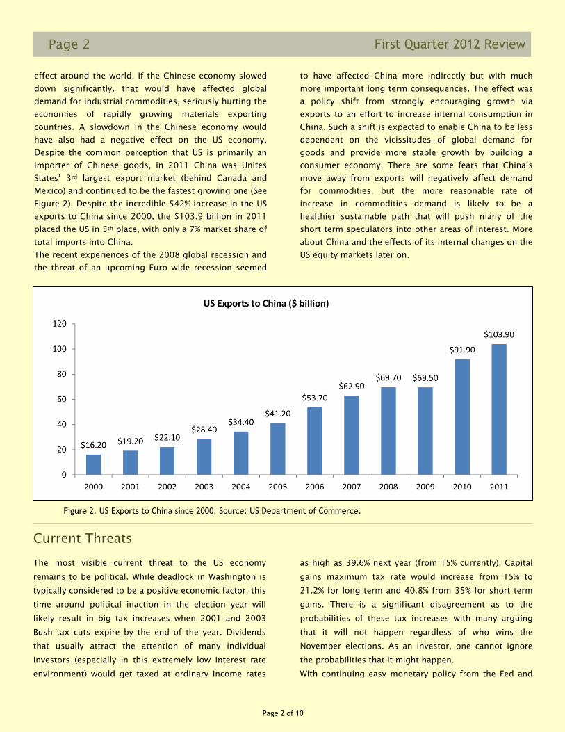
Despite the common perception that US is primarily an
importer of Chinese goods, in 2011 China was Unites
States’ 3rd largest export market (behind Canada and
Mexico) and continued to be the fastest growing one (See
Figure 2). Despite the incredible 542% increase in the US
exports to China since 2000, the $103.9 billion in 2011
placed the US in 5th place, with only a 7% market share of
total imports into China.
The recent experiences of the 2008 global recession and
the threat of an upcoming Euro wide recession seemed
as high as 39.6% next year (from 15% currently). Capital
gains maximum tax rate would increase from 15% to
21.2% for long term and 40.8% from 35% for short term
gains. There is a significant disagreement as to the
probabilities of these tax increases with many arguing
that it will not happen regardless of who wins the
November elections. As an investor, one cannot ignore
the probabilities that it might happen.
With continuing easy monetary policy from the Fed and
to have affected China more indirectly but with much
more important long term consequences. The effect was
a policy shift from strongly encouraging growth via
exports to an effort to increase internal consumption in
China. Such a shift is expected to enable China to be less
dependent on the vicissitudes of global demand for
goods and provide more stable growth by building a
consumer economy. There are some fears that China’s
move away from exports will negatively affect demand
for commodities, but the more reasonable rate of
increase in commodities demand is likely to be a
healthier sustainable path that will push many of the
short term speculators into other areas of interest. More
about China and the effects of its internal changes on the
US equity markets later on.
Current Threats
The most visible current threat to the US economy
remains to be political. While deadlock in Washington is
typically considered to be a positive economic factor, this
time around political inaction in the election year will
likely result in big tax increases when 2001 and 2003
Bush tax cuts expire by the end of the year. Dividends
that usually attract the attention of many individual
investors (especially in this extremely low interest rate
environment) would get taxed at ordinary income rates
Figure 2. US Exports to China since 2000. Source: US Department of Commerce.
Page 3 of 10
Page 3 First Quarter 2012 Review
the future. One of the early measures indicating increase
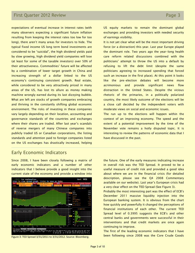
in overall risk was the TED Spread. It proved to be a
useful measure of credit risk and provided a good idea
about where we are in the financial crisis (for detailed
description, please see the Q4 2008 Commentary
available on our website). Last year’s European crisis had
a very clear effect on the TED Spread (See Figure 3).
Probably the most interesting part was the effect of ECB’s
December 2011 massive liquidity injection into the
European banking system. It is obvious from the chart
how quickly and powerfully it changed the perceptions of
financial institutions of each other. The current TED
Spread level of 0.3995 suggests the ECB’s and other
central banks and governments were successful in their
interventions and that credit markets are once again
continuing to improve.
The first of the leading economic indicators that I have
been following since 2008 was the Core Crude Goods
Since 2008, I have been closely following a matrix of
early economic indicators and a number of other
indicators that I believe provide a good insight into the
current state of the economy and provide a window into
expectations of eventual increase in interest rates (with
many observers expecting a significant future inflation
resulting from keeping the interest rates too low for too
long), there aren’t many areas for investors to hide. The
typical fixed income US long term bond investments are
considered to be “suicidal”, the high dividend yields paid
by slow growing, high dividend yield companies will lose
(at least for some of the taxable investors) over 50% of
their attractiveness. Commodities’ future will be affected
by a combination of lower target growth in China and
increasing strength of a dollar linked to the US
economy’s continuing consistent growth. Real estate,
while considered to be very attractively priced in many
areas of the US, has lost its allure as money making
machine wrongly earned during its last dizzying bubble.
What are left are stocks of growth companies embracing
and thriving in the constantly shifting global economic
environment. The risks of investing in these companies
vary largely depending on their location, accounting and
governance standards of the countries and exchanges
where their shares are traded. After last year’s scandals
of reverse mergers of many Chinese companies into
publicly traded US or Canadian corporations, the listing
standards and attention paid to foreign companies listed
on the US exchanges has drastically increased, helping
US equity markets to remain the dominant global
exchanges and providing investors with needed security
of earnings visibility.
It is not yet clear what will be the most important driving
force (or a distraction) this year. Last year Europe played
the dominant role. Two years ago the year-long health
care reform related discussions combined with the
politicians’ attempt to throw the US into a default by
refusing to lift the debt limit (despite the same
politicians agreeing to increased spending that forced
such an increase in the first place). At this point it looks
like the pre-election debates will become more
acrimonious and provide significant news flow
distraction in the United States. Despite the vicious
rhetoric of the primaries, in a politically polarized
country, the most likely outcome of the elections will be
a close call decided by the independent voters with
moderate views on social and economic issues.
The run up to the elections will happen within the
context of an improving economy. The speed and the
extent of a potential improvement by the time of the
November vote remains a hotly disputed topic. It is
interesting to review the patterns of economic data that I
have discussed in the past.
Early Economic Indicators
Figure 3: TED Spread 3/31/2011 to 3/31/2012. Source: Bloomberg.
Page 4 of 10
Page 4
First Quarter 2012 Review
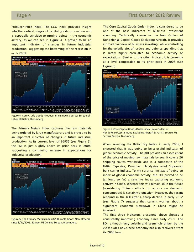
Producer Price Index. The CCG Index provides insight
into the earliest stages of capital goods production and
is especially sensitive to turning points in the economic
activity, as we can see in Figure 4. It proved to be an
important indicator of changes in future industrial
production, suggesting the bottoming of the recession in
early 2009.
Figure 5. The Primary Metals Index (US Durable Goods New Orders) since 3/31/2006. Source: US Census Bureau, Bloomberg.
The Core Capital Goods Order Index is considered to be
one of the best indicators of business investment
spending. Technically known as the New Orders of
Nondefense Capital Goods Excluding Aircraft, it provides
a broad overview of business investing, while controlling
for the volatile aircraft orders and defense spending that
is rarely highly correlated to economic activity or
expectations. Similar to the other indices, it is currently
at a level comparable to its prior peak in 2008 (See
Figure 6).
The Primary Metals Index captures the raw materials
being ordered by large manufacturers and it proved to be
an important indicator of changes in future industrial
production. At its current level of 26955 (see Figure 5),
the PMI is just slightly above its prior peak in 2008,
suggesting a continuing increase in expectations for
industrial production.
Figure 4. Core Crude Goods Producer Price Index. Source: Bureau of Labor Statistics, Bloomberg.
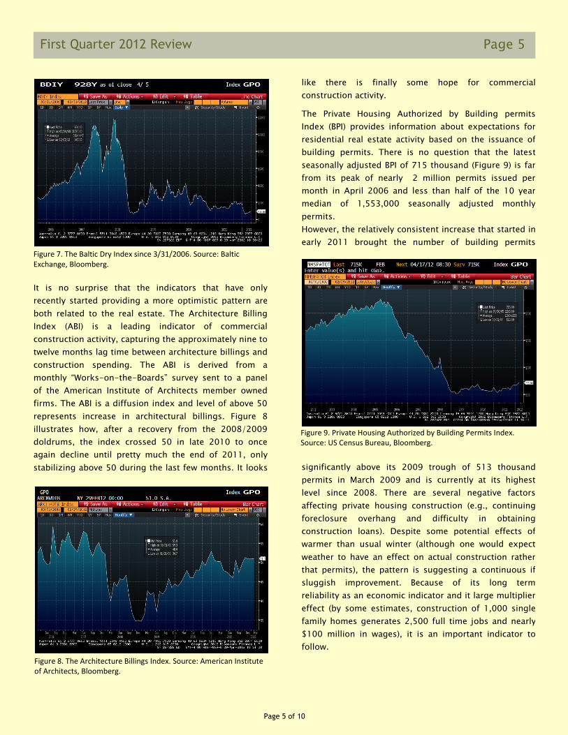
When selecting the Baltic Dry Index in early 2008, I
expected that it was going to be a useful indicator of
global economic activity. The BDI provides an assessment
of the price of moving raw materials by sea. It covers 26
shipping routes worldwide and is a composite of the
Baltic Capesize, Panamax, Handysize ansd Supramax
bulk carrier indices. To my surprise, instead of being an
index of global economic activity, the BDI proved to be
(at least so far) a sensitive index capturing economic
activity in China. Whether this will remain so in the future
(considering China’s efforts to refocus on domestic
consumption) is certainly a question. However, the recent
rebound in the BDI after a sharp decline in early 2012
(see Figure 7) suggests that current worries about a
significant economic slowdown in China might be
incorrect.
The first three indicators presented above showed a
consistently improving economy since early 2009. The
BDI, although very volatile and seemingly driven by the
vicissitudes of Chinese economy has also recovered from
its 2008 lows.
Figure 6. Core Capital Goods Order Index (New Orders of Nondefense Capital Good Excluding Aircraft & Parts). Source: US Census Bureau, Bloomberg.
Page 5 of 10
Page 5 First Quarter 2012 Review
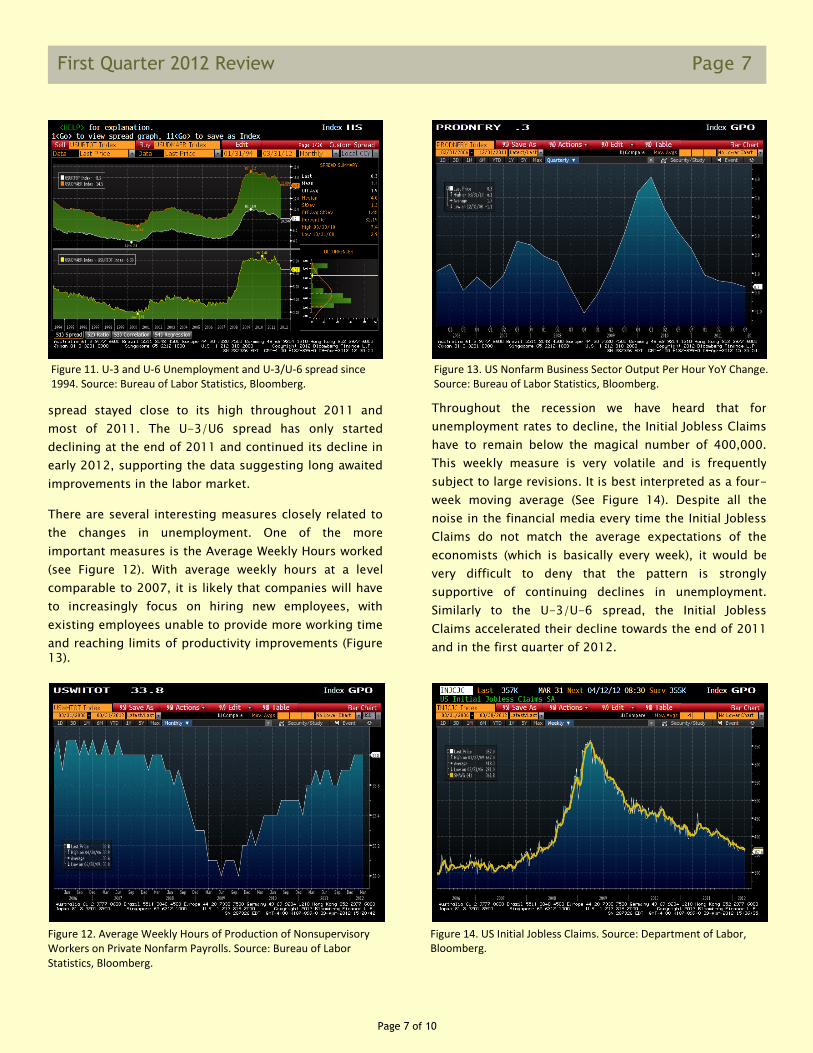
It is no surprise that the indicators that have only
recently started providing a more optimistic pattern are
both related to the real estate. The Architecture Billing
Index (ABI) is a leading indicator of commercial
construction activity, capturing the approximately nine to
twelve months lag time between architecture billings and
construction spending. The ABI is derived from a
monthly “Works-on-the-Boards” survey sent to a panel
of the American Institute of Architects member owned
firms. The ABI is a diffusion index and level of above 50
represents increase in architectural billings. Figure 8
illustrates how, after a recovery from the 2008/2009
doldrums, the index crossed 50 in late 2010 to once
again decline until pretty much the end of 2011, only
stabilizing above 50 during the last few months. It looks
like there is finally some hope for commercial
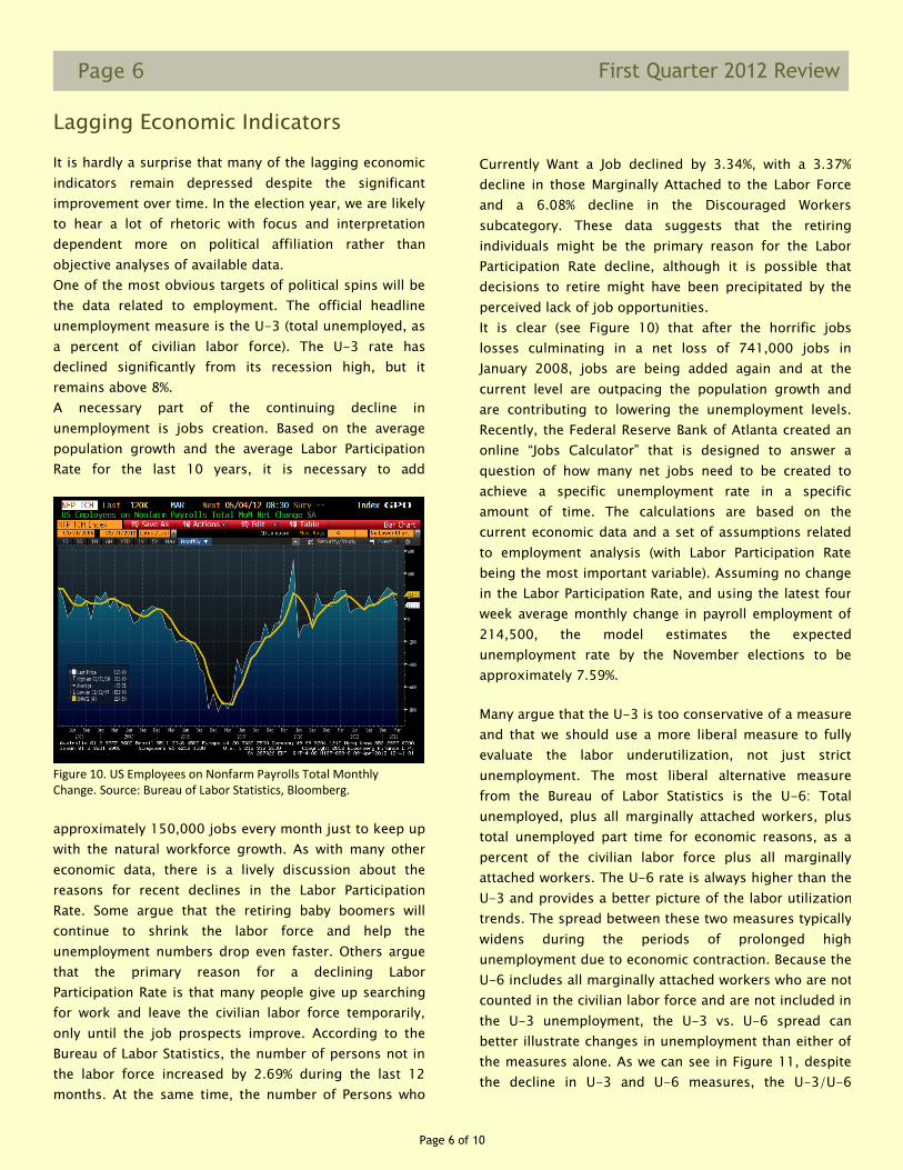
construction activity. The Private Housing Authorized by Building permits
Index (BPI) provides information about expectations for
residential real estate activity based on the issuance of
building permits. There is no question that the latest
seasonally adjusted BPI of 715 thousand (Figure 9) is far
from its peak of nearly 2 million permits issued per
month in April 2006 and less than half of the 10 year
median of 1,553,000 seasonally adjusted monthly
permits.
However, the relatively consistent increase that started in
early 2011 brought the number of building permits
significantly above its 2009 trough of 513 thousand
permits in March 2009 and is currently at its highest
level since 2008. There are several negative factors
affecting private housing construction (e.g., continuing
foreclosure overhang and difficulty in obtaining
construction loans). Despite some potential effects of
warmer than usual winter (although one would expect
weather to have an effect on actual construction rather
that permits), the pattern is suggesting a continuous if
sluggish improvement. Because of its long term
reliability as an economic indicator and it large multiplier
effect (by some estimates, construction of 1,000 single
family homes generates 2,500 full time jobs and nearly
$100 million in wages), it is an important indicator to
follow.
Figure 7. The Baltic Dry Index since 3/31/2006. Source: Baltic Exchange, Bloomberg.
Figure 8. The Architecture Billings Index. Source: American Institute of Architects, Bloomberg.
Figure 9. Private Housing Authorized by Building Permits Index. Source: US Census Bureau, Bloomberg.
Page 6 of 10
Page 6
First Quarter 2012 Review
It is hardly a surprise that many of the lagging economic
indicators remain depressed despite the significant
improvement over time. In the election year, we are likely
to hear a lot of rhetoric with focus and interpretation
dependent more on political affiliation rather than
objective analyses of available data.
One of the most obvious targets of political spins will be
the data related to employment. The official headline
unemployment measure is the U-3 (total unemployed, as
a percent of civilian labor force). The U-3 rate has
declined significantly from its recession high, but it
remains above 8%.
A necessary part of the continuing decline in
unemployment is jobs creation. Based on the average
population growth and the average Labor Participation
Rate for the last 10 years, it is necessary to add
approximately 150,000 jobs every month just to keep up
with the natural workforce growth. As with many other
economic data, there is a lively discussion about the
reasons for recent declines in the Labor Participation
Rate. Some argue that the retiring baby boomers will
continue to shrink the labor force and help the
unemployment numbers drop even faster. Others argue
that the primary reason for a declining Labor
Participation Rate is that many people give up searching
for work and leave the civilian labor force temporarily,
only until the job prospects improve. According to the
Bureau of Labor Statistics, the number of persons not in
the labor force increased by 2.69% during the last 12
months. At the same time, the number of Persons who
Many argue that the U-3 is too conservative of a measure
and that we should use a more liberal measure to fully
evaluate the labor underutilization, not just strict
unemployment. The most liberal alternative measure
from the Bureau of Labor Statistics is the U-6: Total
unemployed, plus all marginally attached workers, plus
total unemployed part time for economic reasons, as a
percent of the civilian labor force plus all marginally
attached workers. The U-6 rate is always higher than the
U-3 and provides a better picture of the labor utilization
trends. The spread between these two measures typically
widens during the periods of prolonged high
unemployment due to economic contraction. Because the
U-6 includes all marginally attached workers who are not
counted in the civilian labor force and are not included in
the U-3 unemployment, the U-3 vs. U-6 spread can
better illustrate changes in unemployment than either of
the measures alone. As we can see in Figure 11, despite
the decline in U-3 and U-6 measures, the U-3/U-6
Lagging Economic Indicators
Currently Want a Job declined by 3.34%, with a 3.37%
decline in those Marginally Attached to the Labor Force
and a 6.08% decline in the Discouraged Workers
subcategory. These data suggests that the retiring
individuals might be the primary reason for the Labor
Participation Rate decline, although it is possible that
decisions to retire might have been precipitated by the
perceived lack of job opportunities.
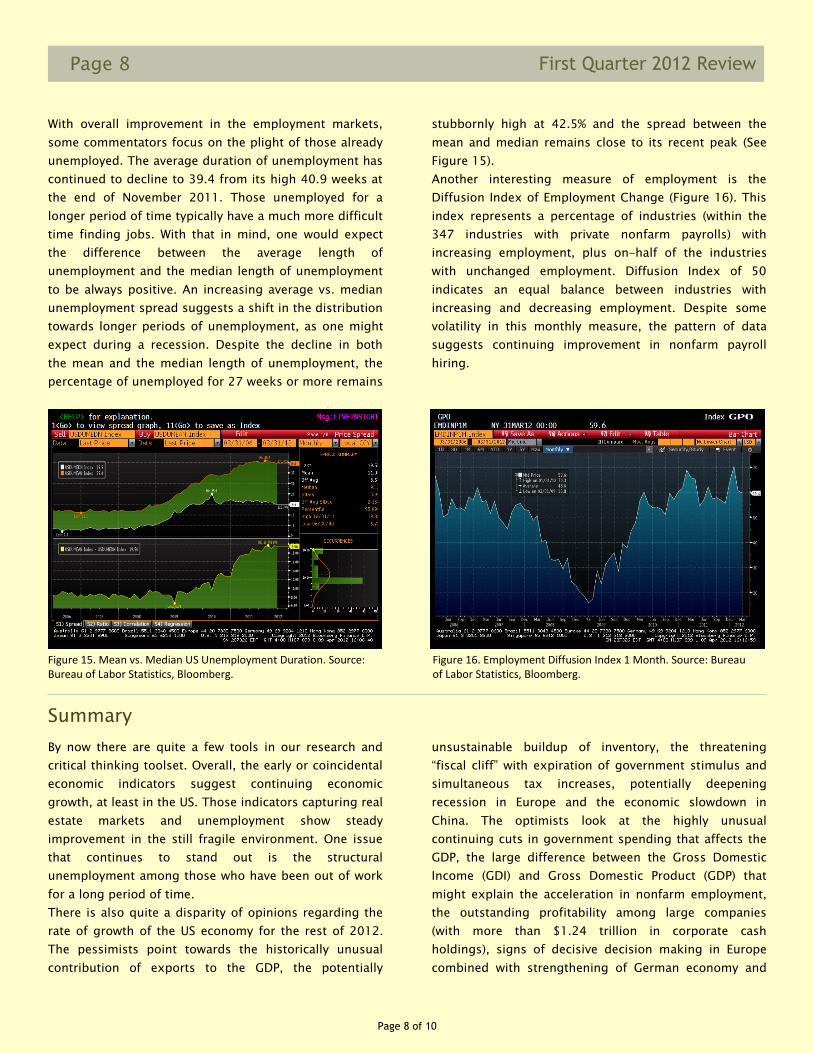
It is clear (see Figure 10) that after the horrific jobs
losses culminating in a net loss of 741,000 jobs in
January 2008, jobs are being added again and at the
current level are outpacing the population growth and
are contributing to lowering the unemployment levels.
Recently, the Federal Reserve Bank of Atlanta created an
online “Jobs Calculator” that is designed to answer a
question of how many net jobs need to be created to
achieve a specific unemployment rate in a specific
amount of time. The calculations are based on the
current economic data and a set of assumptions related
to employment analysis (with Labor Participation Rate
being the most important variable). Assuming no change
in the Labor Participation Rate, and using the latest four
week average monthly change in payroll employment of
214,500, the model estimates the expected
unemployment rate by the November elections to be
approximately 7.59%.
Figure 10. US Employees on Nonfarm Payrolls Total Monthly Change. Source: Bureau of Labor Statistics, Bloomberg.
Page 7 of 10
Page 7 First Quarter 2012 Review
spread stayed close to its high throughout 2011 and
most of 2011. The U-3/U6 spread has only started
declining at the end of 2011 and continued its decline in
early 2012, supporting the data suggesting long awaited
improvements in the labor market.
There are several interesting measures closely related to
the changes in unemployment. One of the more
important measures is the Average Weekly Hours worked
(see Figure 12). With average weekly hours at a level
comparable to 2007, it is likely that companies will have
to increasingly focus on hiring new employees, with
existing employees unable to provide more working time
and reaching limits of productivity improvements (Figure 13).
Throughout the recession we have heard that for
unemployment rates to decline, the Initial Jobless Claims
have to remain below the magical number of 400,000.
This weekly measure is very volatile and is frequently
subject to large revisions. It is best interpreted as a four-
week moving average (See Figure 14). Despite all the
noise in the financial media every time the Initial Jobless
Claims do not match the average expectations of the
economists (which is basically every week), it would be
very difficult to deny that the pattern is strongly
supportive of continuing declines in unemployment.
Similarly to the U-3/U-6 spread, the Initial Jobless
Claims accelerated their decline towards the end of 2011
and in the first quarter of 2012.
Figure 11. U-3 and U-6 Unemployment and U-3/U-6 spread since 1994. Source: Bureau of Labor Statistics, Bloomberg.
Figure 12. Average Weekly Hours of Production of Nonsupervisory Workers on Private Nonfarm Payrolls. Source: Bureau of Labor Statistics, Bloomberg.
Figure 13. US Nonfarm Business Sector Output Per Hour YoY Change. Source: Bureau of Labor Statistics, Bloomberg.
Figure 14. US Initial Jobless Claims. Source: Department of Labor, Bloomberg.
Page 8 of 10
Page 8
First Quarter 2012 Review
With overall improvement in the employment markets,
some commentators focus on the plight of those already
unemployed. The average duration of unemployment has
continued to decline to 39.4 from its high 40.9 weeks at
the end of November 2011. Those unemployed for a
longer period of time typically have a much more difficult
time finding jobs. With that in mind, one would expect
the difference between the average length of
unemployment and the median length of unemployment
to be always positive. An increasing average vs. median
unemployment spread suggests a shift in the distribution
towards longer periods of unemployment, as one might
expect during a recession. Despite the decline in both
the mean and the median length of unemployment, the
percentage of unemployed for 27 weeks or more remains
stubbornly high at 42.5% and the spread between the
mean and median remains close to its recent peak (See
Figure 15).
Another interesting measure of employment is the
Diffusion Index of Employment Change (Figure 16). This
index represents a percentage of industries (within the
347 industries with private nonfarm payrolls) with
increasing employment, plus on-half of the industries
with unchanged employment. Diffusion Index of 50
indicates an equal balance between industries with
increasing and decreasing employment. Despite some
volatility in this monthly measure, the pattern of data
suggests continuing improvement in nonfarm payroll
hiring.
By now there are quite a few tools in our research and
critical thinking toolset. Overall, the early or coincidental
economic indicators suggest continuing economic
growth, at least in the US. Those indicators capturing real
estate markets and unemployment show steady
improvement in the still fragile environment. One issue
that continues to stand out is the structural
unemployment among those who have been out of work
for a long period of time.
There is also quite a disparity of opinions regarding the
rate of growth of the US economy for the rest of 2012.
The pessimists point towards the historically unusual
contribution of exports to the GDP, the potentially
Summary
unsustainable buildup of inventory, the threatening
“fiscal cliff” with expiration of government stimulus and
simultaneous tax increases, potentially deepening
recession in Europe and the economic slowdown in
China. The optimists look at the highly unusual
continuing cuts in government spending that affects the
GDP, the large difference between the Gross Domestic
Income (GDI) and Gross Domestic Product (GDP) that
might explain the acceleration in nonfarm employment,
the outstanding profitability among large companies
(with more than $1.24 trillion in corporate cash
holdings), signs of decisive decision making in Europe
combined with strengthening of German economy and
Figure 15. Mean vs. Median US Unemployment Duration. Source: Bureau of Labor Statistics, Bloomberg.
Figure 16. Employment Diffusion Index 1 Month. Source: Bureau of Labor Statistics, Bloomberg.

Page 9 of 10
Page 9 First Quarter 2012 Review
China’s determination to maintain at least 7.5% GDP
growth rate of their increasingly opening economy.
The emerging markets are rapidly becoming a significant
part of the global economy. Jim O’Neill who in 2001
coined the term BRIC (Brazil, Russia, India and China) to
identify the countries that would significantly growth
their share of the world economy (from combined 8% in
2001), has added the Next Eleven (N-11) group of
countries in 2005 and in early 2011 decided that many
of those countries are no longer “emerging markets” but
rather “Growth Markets” that will increasingly influence
the global economic growth. Adding such framework to
our focus on the G7 will certainly help in the
understanding and analysis of future economic changes.
With China surpassing Japan as the world’s second
largest economy in the second quarter of 2010, the
effects of changes in China’s economic policies are
increasingly felt around the world. One of the interesting
developments that I have been closely following for some
time is the increasing openness to allowing Chinese
citizens to invest outside of mainland China. Until now,
the primary vehicle for individuals who wanted to invest
globally was the Qualified Domestic Institutional Investor
(QDII) program, originally extended to investment fund
firms in 2006. There are many limitations to the QDII
funds, including size quotas, maximum exposure to
stocks and countries where funds can be invested. After
a few aborted attempts, China’s State Council announced
that they are studying allowing residents of Wenzhou
(one of the earliest cities in China to open to the world in
1978 and considered to be the birthplace of China’s
private economy) to invest directly overseas. Although
the details of such a potential approval are not yet clear,
it might become a precursor to expanding it nationwide
after testing it in Wenzhou. With China’s central bank
encouraging Chinese businesses to invest overseas to
diversify its $3.2 trillion of foreign exchange reserves, I
believe that approval for individual investors to invest
overseas is just a question of time. China has the world’s
highest savings rate at more than 50 percent of the
economic activity. Of the more than $12.5 trillion in
deposits, 46% (or $5.75 trillion) comes from households.
With the expected opening of global markets to Chinese
citizens, at least some of those deposits will find their
way overseas and will likely have a significant effect on
the demand for all types of investable assets, providing a
likely boost to the equity markets.
Regardless of the level of optimism and the timing of
potential large inflows into securities markets from the
growth economies, it is clear that the global economy is
still fragile. With ECB joining other central banks, the
monetary policies from every major central bank are
already aggressively easy (Bank of England and Bank of
Japan, ECB and The Fed) or are in the process of easing
(e.g., Bank of China). Those aggressive policies combined
with excess liquidity are likely to continue for the time
being, continuing to boost prices of risky asset classes.
Many of the investors who remain on the sidelines
sooner or later will have to decide on coming back to the
markets and investing more than $7 trillion of assets
invested in money market mutual funds, saving accounts
and CDs. In addition, the lending capacity of depository
institutions is at an all time high and can provide a
significant boost to the economic growth as the
perception of the economy continues to improve. Since
the housing crisis, many depository institutions
continued to build excess cash liquidity. With continuing
slow business and consumer lending combined with fear
of rising interest rates, they have been investing their
rising cash primary into short term instruments that
quickly mature, adding to their cash liquidity. In fact,
$1.5 trillion is currently held by depository institutions in
their accounts at Federal Reserve Banks in excess of their
required reserve and contractual clearing balance.
Until we all agree to adopt a new economic paradigm
focused on Gross National Happiness (as recommended
last year by the UN Resolution 65/309), the differences
of expectations and opinions will remain. After the
prolonged global recession, a rising number of
economists and politicians point out to the lack of
increases in self reported happiness and life satisfaction
in developed countries during several decades of rising
wealth. Hopefully, focus on happiness and satisfaction
will become more important in the future as the global
economy continues its slow and bumpy recovery.
Michael Obuchowski, Ph.D.
Page 10 of 10
Page 10
First Quarter 2012 Review
Disclosures
The foregoing letter is qualified by the following notes:
1. The S&P 500 Index consists of 500 stocks
chosen for market size, liquidity and industry
group representation. It is a market-value
weighted index with each stock’s weight in the
Index proportionate to its market value. The
Index is one of the most widely-used
benchmarks of U.S. equity performance.
2. The Russell Top 200 Growth Index measures the
performance of the especially large cap segment
of the U.S. equity universe represented by stocks
in the largest 200 by market cap that exhibit
growth characteristics. It includes Russell Top
200 Index companies with higher price-to-book
ratios and higher forecast growth values. The
companies also are members of the Russell 1000
Growth Index. The Russell Top 200 Growth Index
is constructed to provide a comprehensive and
unbiased barometer of this larger cap growth
market. The Index is completely reconstituted
annually to ensure new and growing equities are
included and that the represented companies
continue to reflect growth characteristics.
3. The Russell 1000 Growth Index measures the
performance of the large-cap growth segment of
the U.S. equity universe. It includes those Russell
1000 companies with higher price-to-book
ratios and higher forecasted growth values. The
Russell 1000 Growth Index is constructed to
provide a comprehensive and unbiased
barometer for the large-cap growth segment.
The Index is completely reconstituted annually to
ensure new and growing equities are included
and that the represented companies continue to
reflect growth characteristics.
4. The indices referred to herein are unmanaged
and therefore do not have any transaction costs,
advisory fees or similar expenses to which a
client account would be subject. It is not
possible to invest in these indices. The indices
are for comparison purposes only. It should not
be assumed that a composite will invest in any
specific securities that comprise the indices.
Performance for all indices includes the
reinvestment of dividends.
5. There is no guarantee that the matrix of
economic indicators (or each indicator
individually) can accurately predict profits or
losses in the markets or the composite. The
matrix of indicators discussed herein is not
intended to determine investment decisions.
Other indices or economic indicators may reflect
differing or contrary results. There is always the
potential for gains as well as the possibility of
losses.
6. This letter is not an offer or solicitation.


