
Step 1: Set up the variables AB Design
Use the top cells to label the variables that will be displayed on the X and Y axes of the graph

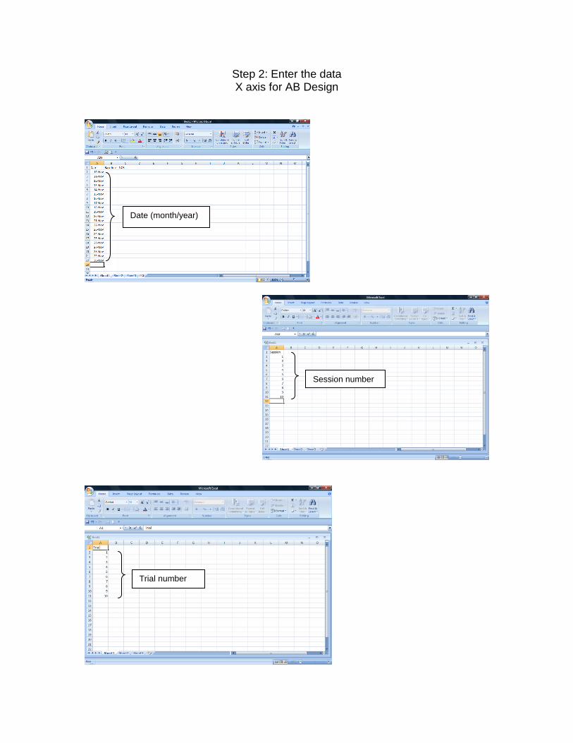
Step 1: Set up the variables X axis for AB Design
Enter X axis label in this cell For example:
If you are graphing data for each day, enter “Date” in this cell
If you are graphing data for each trial, enter “Trial in this cell
If you are graphing data for each session, enter “Session” in this cell

Step 1: Set up the variables X axis
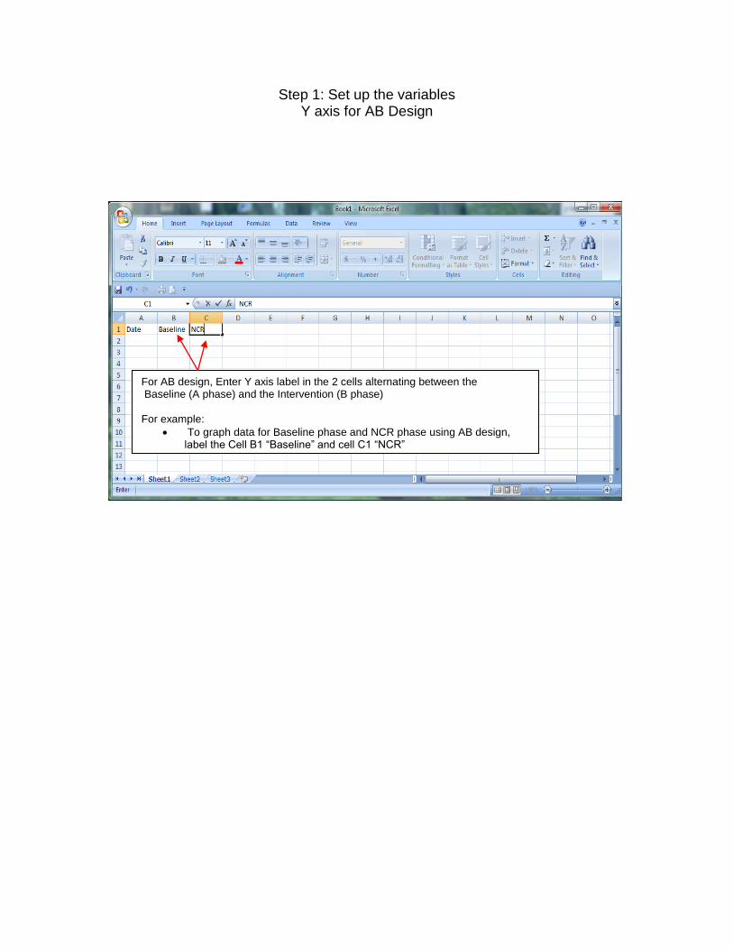
Step 1: Set up the variables Y axis for AB Design
For AB design, Enter Y axis label in the 2 cells alternating between the Baseline (A phase) and the Intervention (B phase) For example:
To graph data for Baseline phase and NCR phase using AB design, label the Cell B1 “Baseline” and cell C1 “NCR”

Step 1: Set up the variables Y axis for AB Design
Step 2: Enter the data X axis for AB Design
Date (month/year)
Session number
Trial number

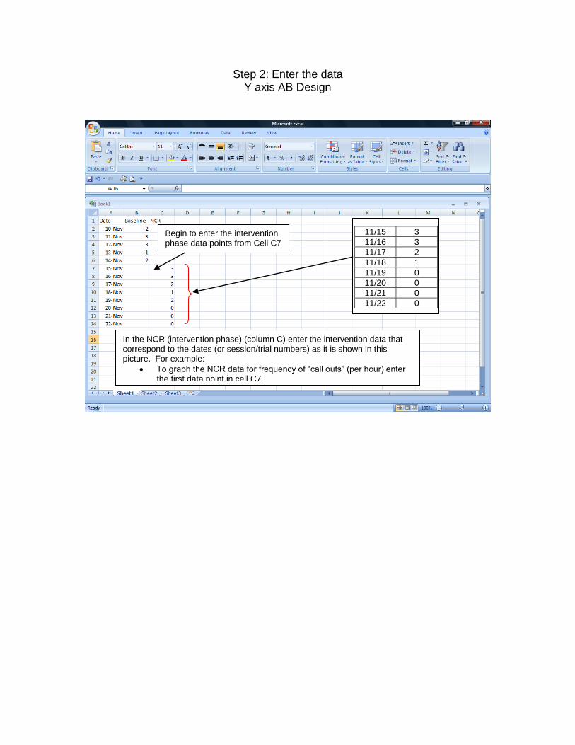
Step 2: Enter the data Y axis AB Design
Underneath the “Baseline” phase (Cell B1) enter the data that correspond to the dates (or session/trial numbers). For example:
The following baseline data for frequency of “call outs” (per hour) before the NCR was implemented.
11/10 2
11/11 3
11/12 3
11/13 1
11/14 2
Step 2: Enter the data Y axis AB Design
Begin to enter the intervention phase data points from Cell C7
In the NCR (intervention phase) (column C) enter the intervention data that correspond to the dates (or session/trial numbers) as it is shown in this picture. For example:
To graph the NCR data for frequency of “call outs” (per hour) enter the first data point in cell C7.
11/15 3
11/16 3
11/17 2
11/18 1
11/19 0
11/20 0
11/21 0
11/22 0
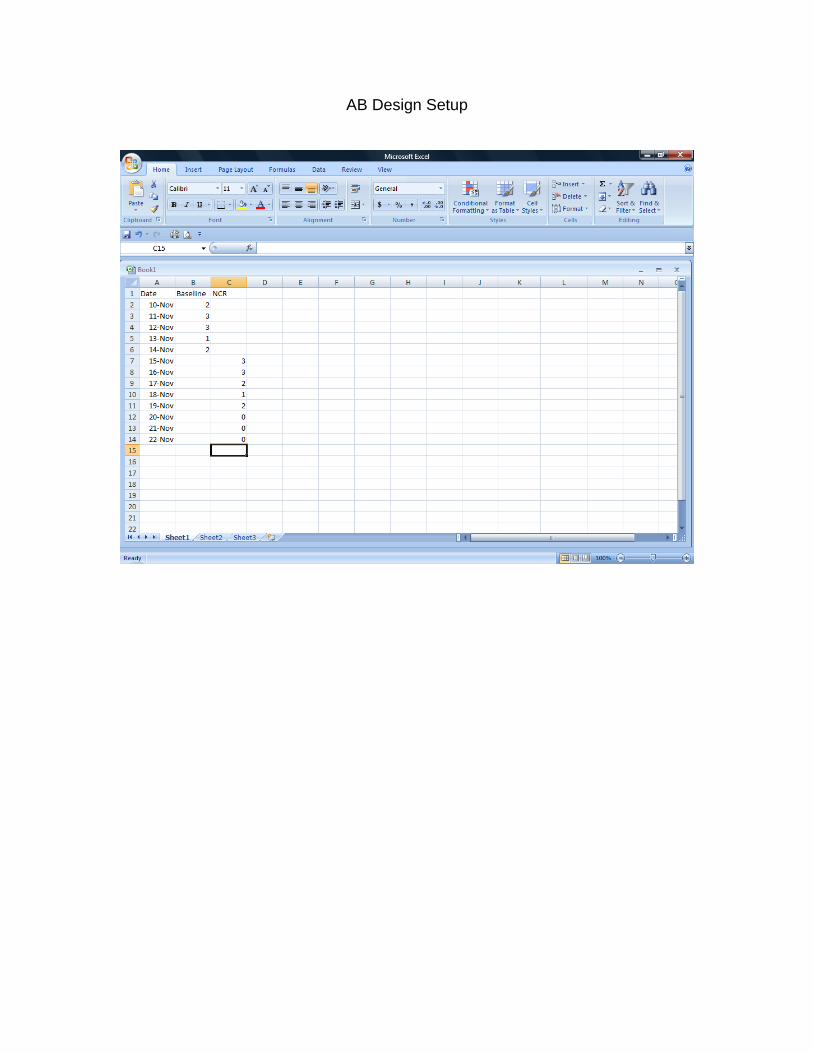
AB Design Setup
Creating the Line Graph
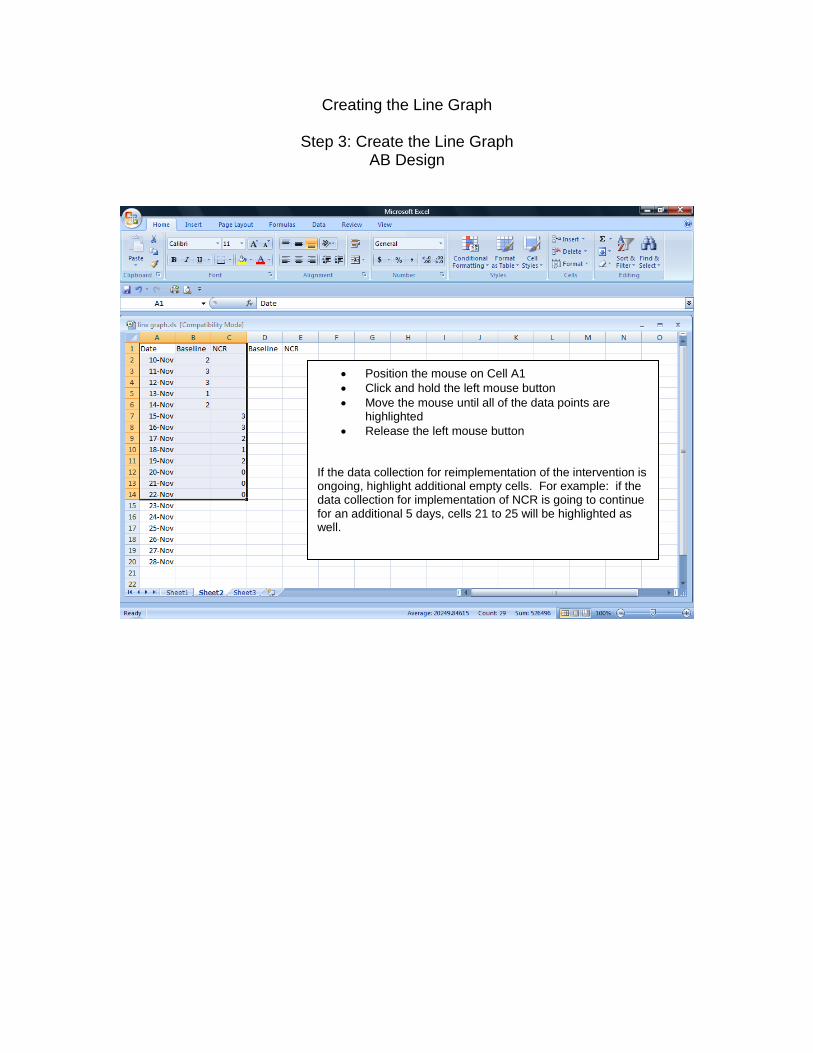
Step 3: Create the Line Graph AB Design
Position the mouse on Cell A1
Click and hold the left mouse button
Move the mouse until all of the data points are highlighted
Release the left mouse button If the data collection for reimplementation of the intervention is ongoing, highlight additional empty cells. For example: if the data collection for implementation of NCR is going to continue for an additional 5 days, cells 21 to 25 will be highlighted as well.
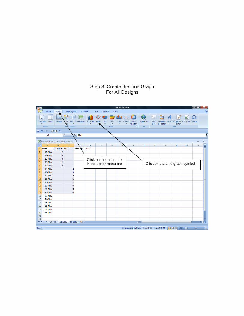
Step 3: Create the Line Graph For All Designs
Click on the Insert tab in the upper menu bar
Click on the Line graph symbol
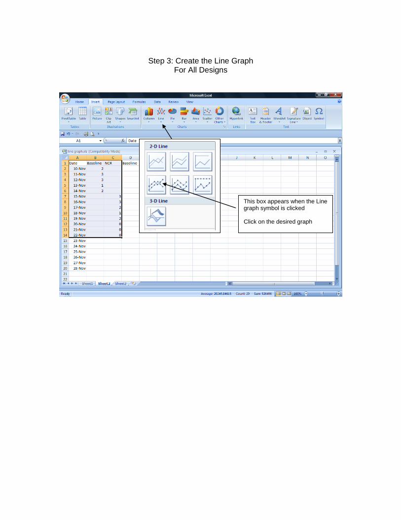
Step 3: Create the Line Graph
For All Designs
This box appears when the Line graph symbol is clicked Click on the desired graph
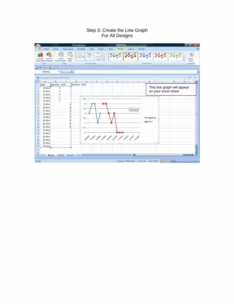
Step 3: Create the Line Graph For All Designs
This line graph will appear on your excel sheet

Step 3: Create the Line Graph Add axes labels
Click on line graph area and graph and data become outlined

Step 3: Create the Line Graph Add axes labels
Click on the Layout tab in the upper menu bar
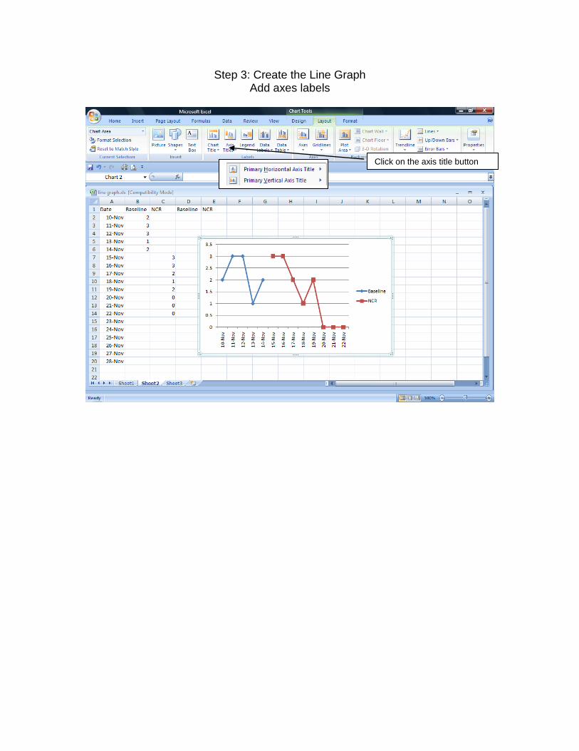
Step 3: Create the Line Graph Add axes labels
Click on the axis title button

Step 3: Create the Line Graph Add X axis label
Choose placement of title
Choose x (horizontal) axis
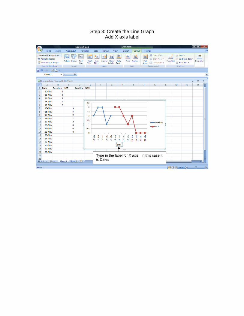
Step 3: Create the Line Graph Add X axis label
Type in the label for X axis. In this case it is Dates
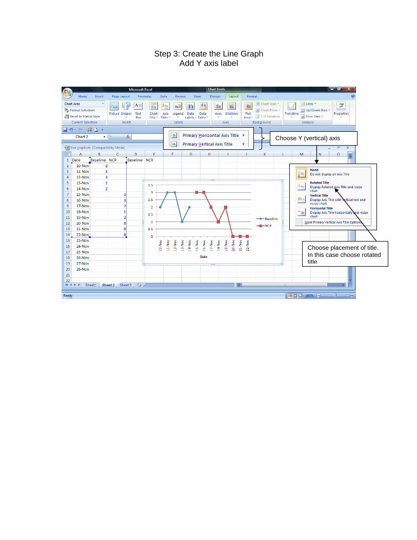
Step 3: Create the Line Graph Add Y axis label
Choose Y (vertical) axis
Choose placement of title. In this case choose rotated title
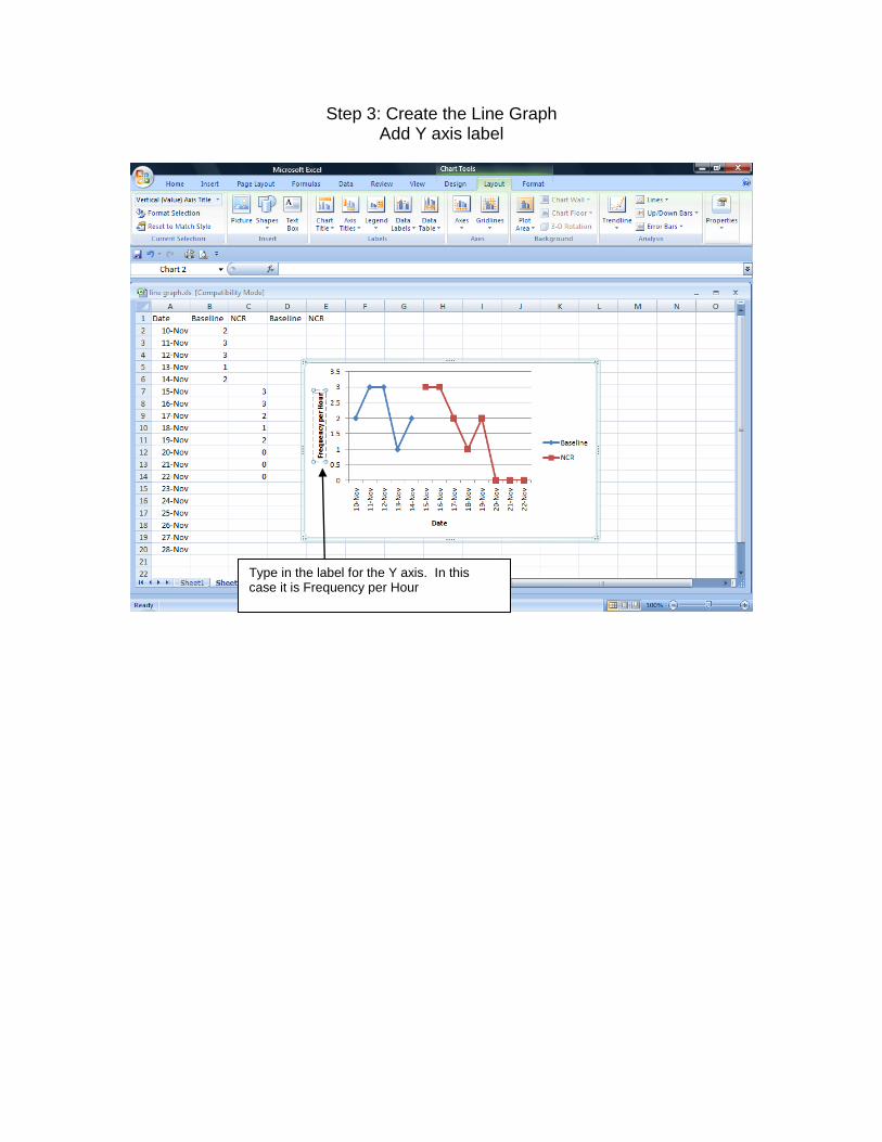
Step 3: Create the Line Graph Add Y axis label
Type in the label for the Y axis. In this case it is Frequency per Hour
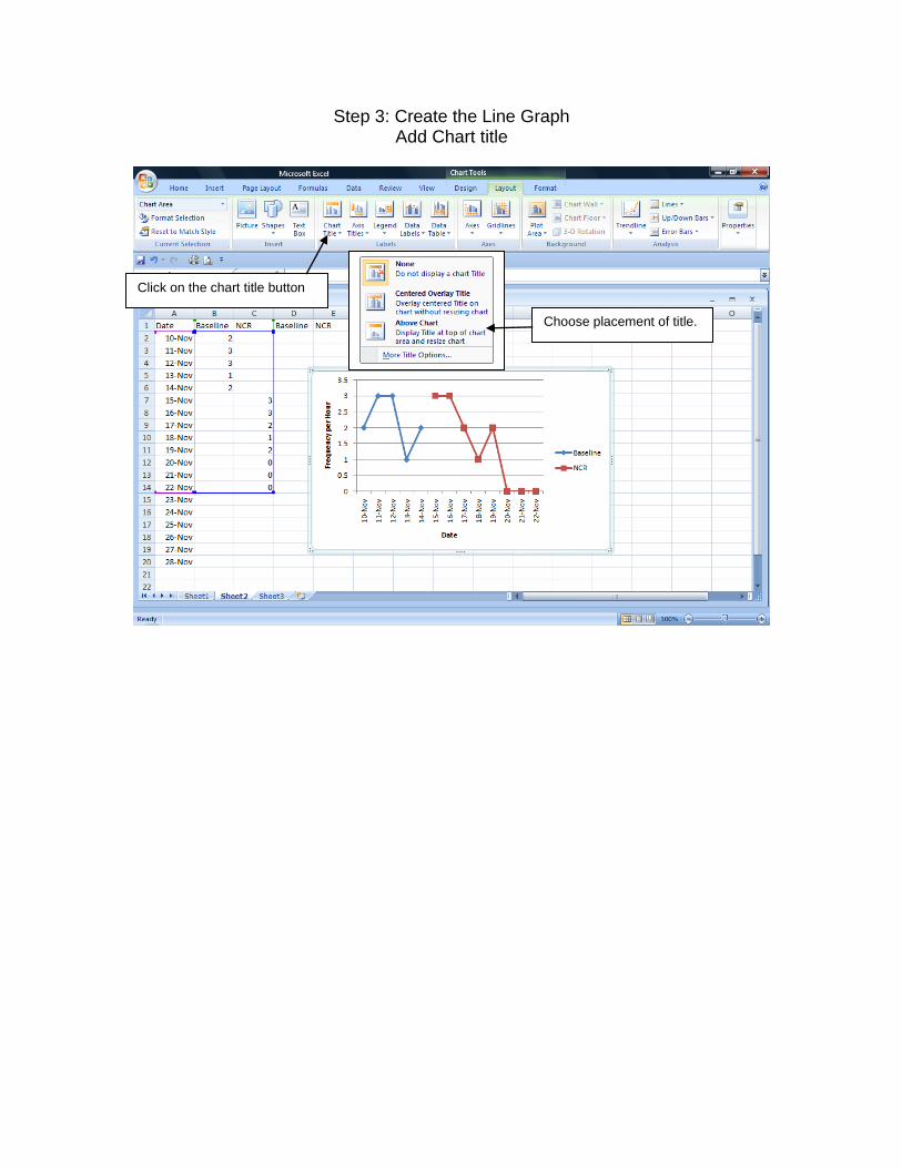
Step 3: Create the Line Graph Add Chart title
Click on the chart title button
Choose placement of title.
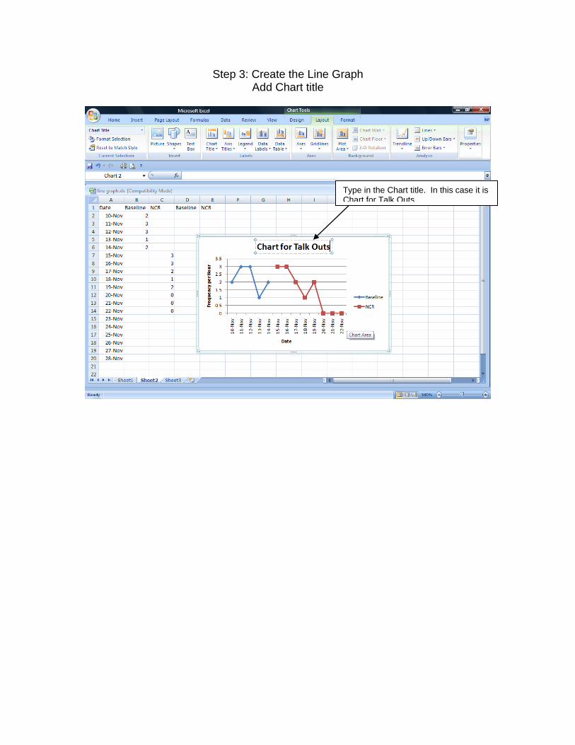
Step 3: Create the Line Graph Add Chart title
Type in the Chart title. In this case it is Chart for Talk Outs
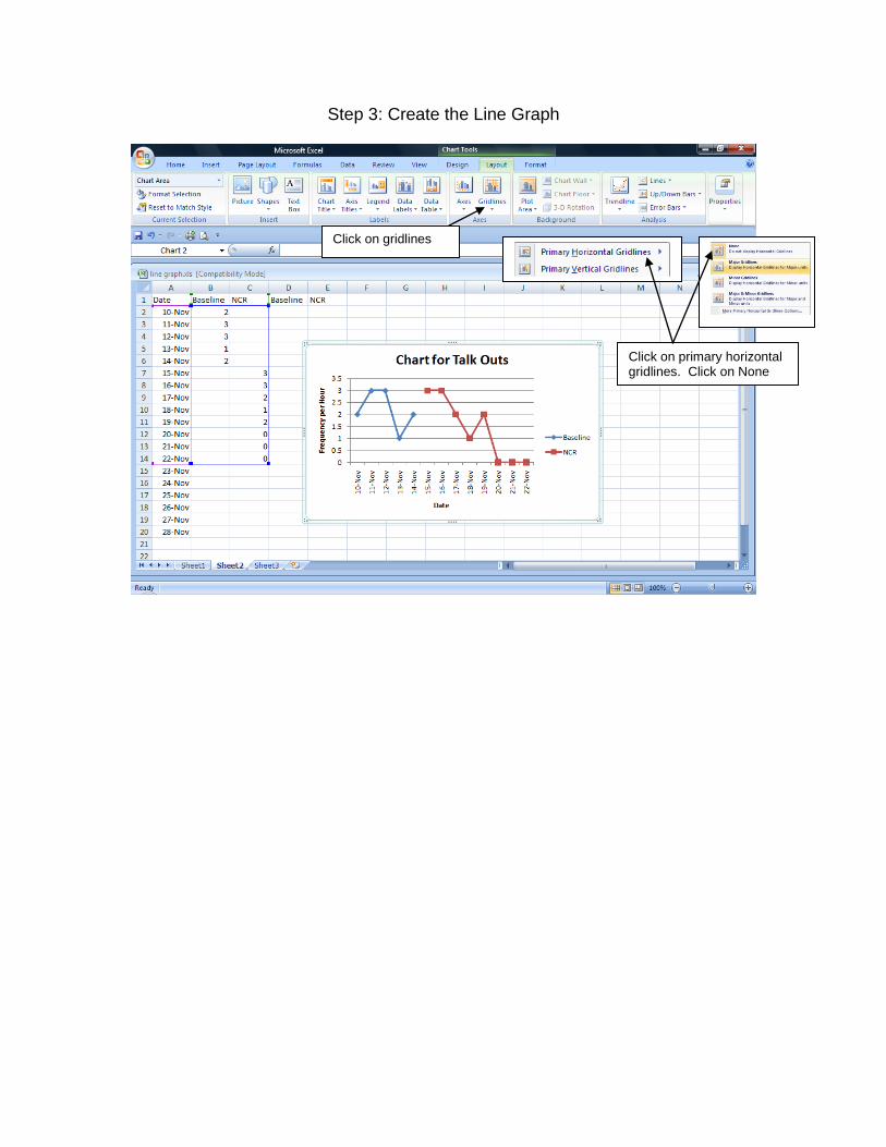
Step 3: Create the Line Graph
Click on gridlines
Click on primary horizontal gridlines. Click on None

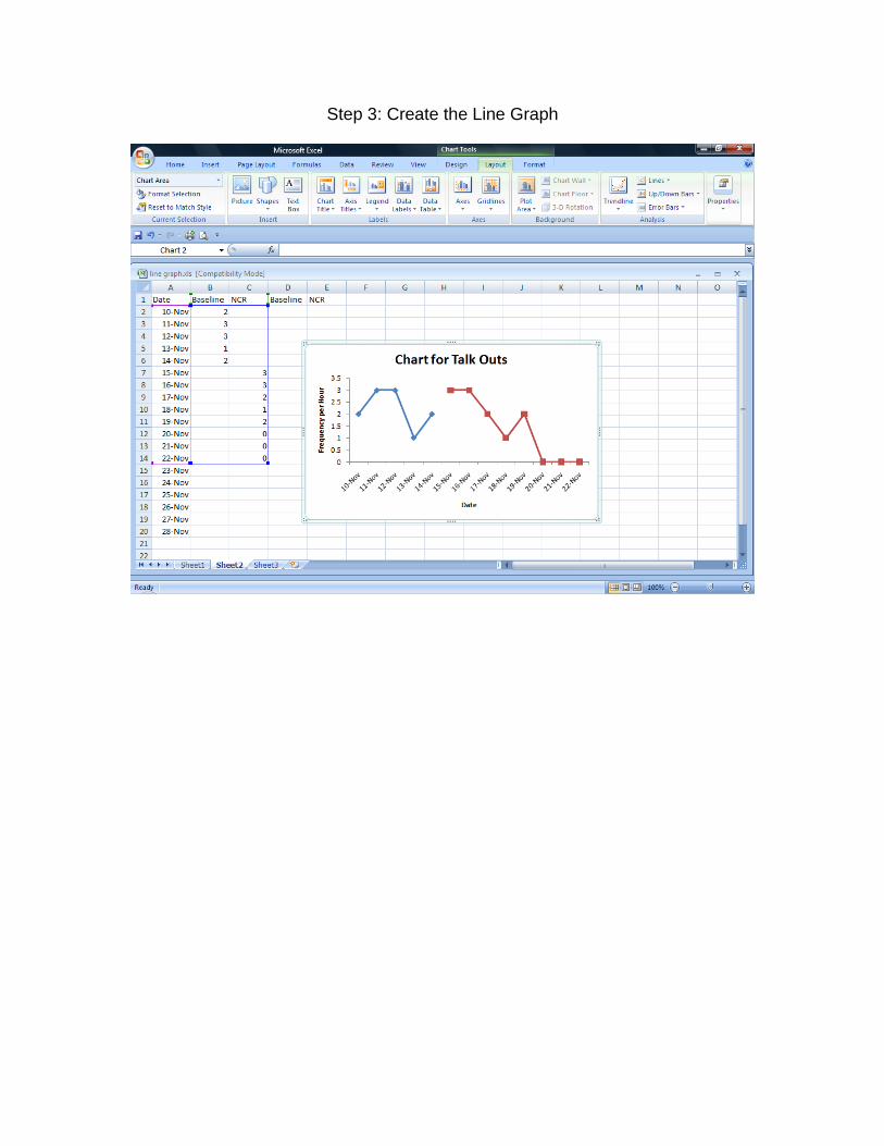
Step 3: Create the Line Graph
Click on legend button
Click on None
Step 3: Create the Line Graph
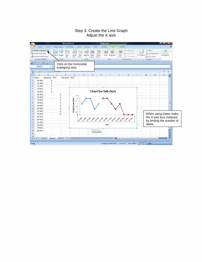
Step 3: Create the Line Graph
Adjust the X axis
When using Dates make the X axis less cluttered by limiting the number of dates.
Click on the Horizontal (category) axis.

Step 3: Create the Line Graph Adjust the X axis
Click on Format selection. Change Major unit to fixed 5 Change Minor unit to fixed 1 Click close

Step 3: Create the Line Graph
Adjust the Y axis
Click on the Vertical (value) axis

Step 3: Create the Line Graph
Adjust the Y axis
Change the Maximum to at least 2 times the highest number in data set – in this case fixed10. When the Y axis is a percentage, then set the Maximum at 100.
Change the Major unit to a whole number – in this case fixed 2
Change the Minor unit to a whole number – in this case fixed 1 Click close

Step 3: Create the Line Graph Adjust the Plot Area of the Graph
Click on Plot area Click on Format selection
Click on Border color – no line Click close

Step 4: Create the Line Graph
Adjust the Points
Click on a single data point in the baseline condition
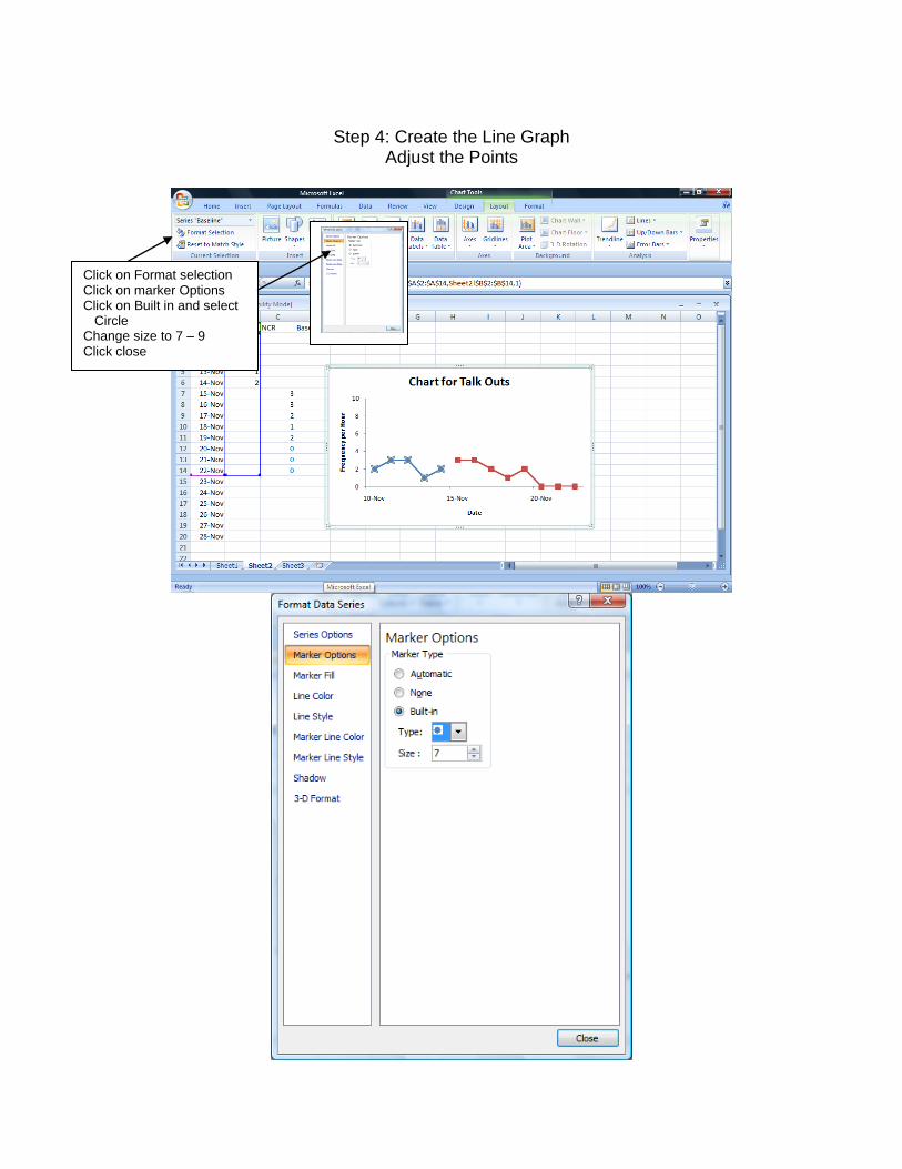
Step 4: Create the Line Graph
Adjust the Points
Click on Format selection Click on marker Options Click on Built in and select Circle Change size to 7 – 9 Click close

Step 4: Create the Line Graph Adjust the points
Change Line color to solid line black Click close Change Marker fill to solid fill black Click close

Step 4: Create the Line Graph Adjust the Points
Follow the same procedure for the other data points

Step 4: Create the Line Graph Draw the Phase Change Lines
Click Inset tab in the upper menu bar
Click Shapes; click on symbol of straight line
Draw line from the bottom to the top between the conditions

Step 4: Create the Line Graph Adjust the Phase Change Line
Click on the Phase line; click on the Format tab in the upper menu bar Click on shape outline; click on dashes and select dash size Click on the black color square to change the color of the line to black
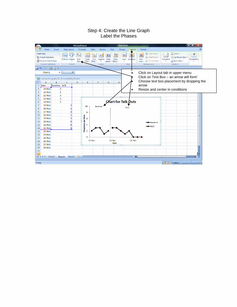
Step 4: Create the Line Graph Label the Phases
Click on Layout tab in upper menu
Click on Text Box – an arrow will form’
Choose text box placement by dropping the arrow
Resize and center in conditions

Step 5: Create the Line Graph Place the Graph within a document
Highlight graph area
Left click on the mouse and hold
Click on copy
Open document
Left click on the mouse and hold
Click on paste


