Download - Tips Professional Photography
8/14/2019 Tips Professional Photography
http://slidepdf.com/reader/full/tips-professional-photography 1/11
Taking Professional Looking Photos Without a Professional
By Lindsay Landis, Lindsay Designs
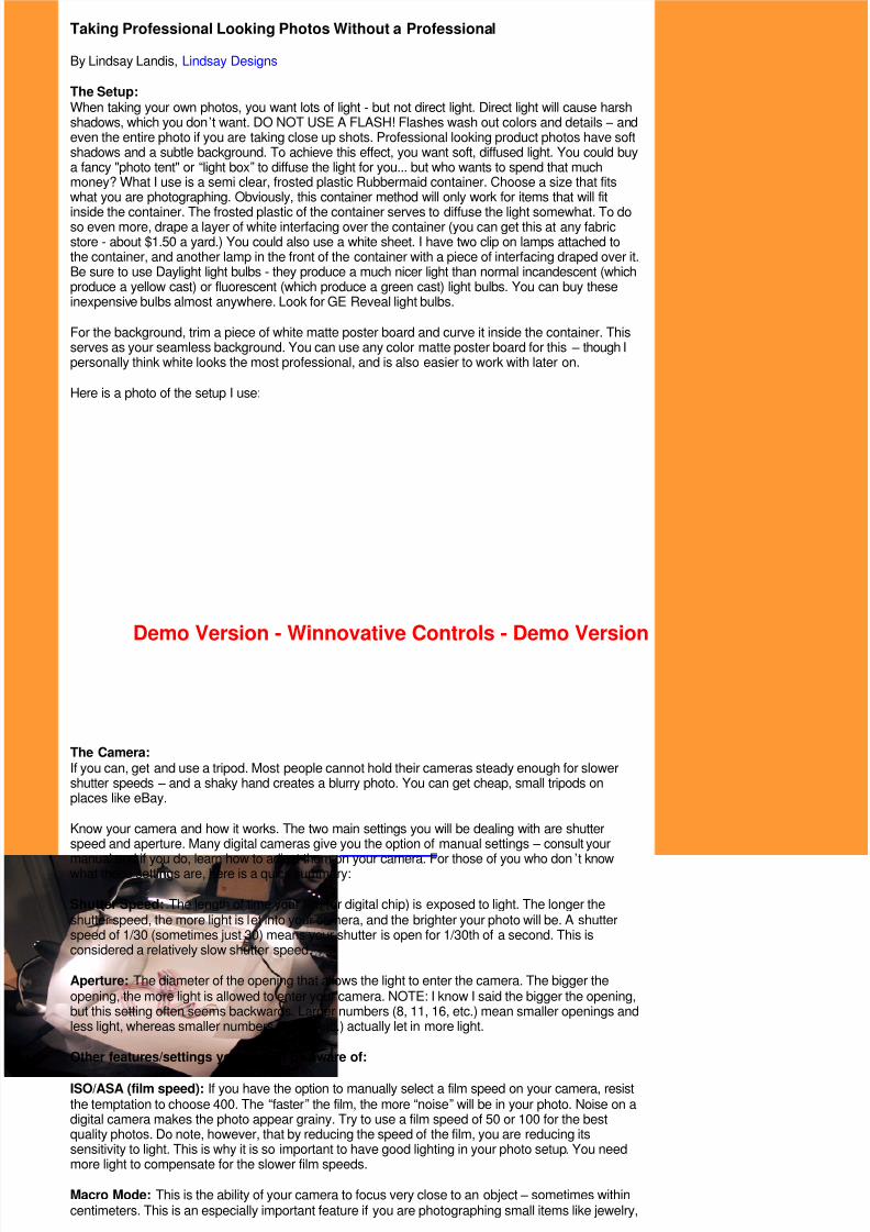
The Setup:When taking your own photos, you want lots of light - but not direct light. Direct light will cause harshshadows, which you don ’t want. DO NOT USE A FLASH! Flashes wash out colors and details – andeven the entire photo if you are taking close up shots. Professional looking product photos have softshadows and a subtle background. To achieve this effect, you want soft, diffused light. You could buya fancy "photo tent" or “light box” to diffuse the light for you... but who wants to spend that muchmoney? What I use is a semi clear, frosted plastic Rubbermaid container. Choose a size that fitswhat you are photographing. Obviously, this container method will only work for items that will fit
inside the container. The frosted plastic of the container serves to diffuse the light somewhat. To doso even more, drape a layer of white interfacing over the container (you can get this at any fabricstore - about $1.50 a yard.) You could also use a white sheet. I have two clip on lamps attached tothe container, and another lamp in the front of the container with a piece of interfacing draped over it.Be sure to use Daylight light bulbs - they produce a much nicer light than normal incandescent (whichproduce a yellow cast) or fluorescent (which produce a green cast) light bulbs. You can buy theseinexpensive bulbs almost anywhere. Look for GE Reveal light bulbs.
For the background, trim a piece of white matte poster board and curve it inside the container. Thisserves as your seamless background. You can use any color matte poster board for this – though Ipersonally think white looks the most professional, and is also easier to work with later on.
Here is a photo of the setup I use:
The Camera:If you can, get and use a tripod. Most people cannot hold their cameras steady enough for slowershutter speeds – and a shaky hand creates a blurry photo. You can get cheap, small tripods onplaces like eBay.
Know your camera and how it works. The two main settings you will be dealing with are shutterspeed and aperture. Many digital cameras give you the option of manual settings – consult your
manual and if you do, learn how to adjust them on your camera. For those of you who don’t knowwhat these settings are, here is a quick summary:
Shutter Speed: The length of time your film (or digital chip) is exposed to light. The longer theshutter speed, the more light is let into your camera, and the brighter your photo will be. A shutterspeed of 1/30 (sometimes just 30) means your shutter is open for 1/30th of a second. This isconsidered a relatively slow shutter speed.
Aperture: The diameter of the opening that allows the light to enter the camera. The bigger theopening, the more light is allowed to enter your camera. NOTE: I know I said the bigger the opening,but this setting often seems backwards. Larger numbers (8, 11, 16, etc.) mean smaller openings andless light, whereas smaller numbers (2.8, 4, etc.) actually let in more light.
Other features/settings you should be aware of:
ISO/ASA (film speed): If you have the option to manually select a film speed on your camera, resistthe temptation to choose 400. The “faster” the film, the more “noise” will be in your photo. Noise on adigital camera makes the photo appear grainy. Try to use a film speed of 50 or 100 for the bestquality photos. Do note, however, that by reducing the speed of the film, you are reducing itssensitivity to light. This is why it is so important to have good lighting in your photo setup. You needmore light to compensate for the slower film speeds.
Macro Mode: This is the ability of your camera to focus very close to an object – sometimes withincentimeters. This is an especially important feature if you are photographing small items like jewelry,
Demo Version - Winnovative Controls - Demo Version
8/14/2019 Tips Professional Photography
http://slidepdf.com/reader/full/tips-professional-photography 2/11
or just want a close up detail shot of an item. This mode is usually indicated by a tulip icon. Learnhow to turn it on, and the how close you can get before you need to use it. (For example, my camerafocuses in macro mode when the distance between the lens and the subject is between 5 and26cm).
Light Meter: This is the feature on your camera that tells you how much light enters the camera. Alight meter’s sole purpose in life is to create photos where the average is middle gray – an 18%shade of gray to be exact. That is, the average of all the tones in the photo – from pure black to purewhite – will average out to middle gray. This is exactly what the “auto” feature on a camera creates – an “average” photo. Sometimes this works, sometimes it doesn ’t. That is why it is nice to be able tocontrol your own settings. For example, if you were photographing a white purse on a whitebackground, you would want the end result lighter than average (more white tones than black). Forthis photo you may want your light meter to read +2/3 or +1.
A light meter comes in many different forms. Mine is a + or – number in the corner of my screen whenI push the shutter button down half way. Other light meters may be more similar to an odometer. Azero or center reading will produce an average photo. Start out by trying to get your meter to readzero. You do this by changing the amount of light entering the camera – in other words by changingyour aperture and shutter speeds. Experiment with different settings and see what combinations ofapertures and shutter speeds will produce a zero reading in certain lighting conditions. Once you getto know your light meter you can begin to adjust the light as necessary for the particular photo.
White Balance: Most digital cameras have a white balance feature that will adjust the colorsdepending on the lighting conditions. The names of the settings are not often accurate. I recommendsetting up your photo container with lights and an item, and take one photo with each of the whit ebalance settings (usually auto, tungsten, fluorescent, halogen, daylight, etc.)… and see which onelooks best. If you are using a white background, see which background looks whitest (as opposed toorange or green, for example). Remember this setting and use it. For example, under my lighting
conditions and with my camera, the fluorescent setting produces the best photos… go figure.
Taking Your Pictures
When taking your photos, don’t rush. Take multiple photos of each item. Reposition the item, getcloser, farther away, choose a different perspective - take photos with a light meter reading ofaverage, a little below average, and a little above average (this is known as bracketing).Photography is often a game of odds - the more photos you take, the better your chances are ofgetting a good one. And that’s what’s nice about digital – you can delete the bad ones later on.
Making Your Photos Beautiful with PhotoshopPhotoshop will soon be your new best friend. If you don’t have it, I highly recommend you buy it. Don’twant to spend that much? Buy Photoshop Elements – you get pretty much all of the same features asthe normal version for about $80.
When editing photos for your website – consistency is key. Have all your photos with the samebackground, and the same size/proportions. Once you download your photos from your camera, gothrough and decide which ones are best (you did take multiple photos of each object… right?) Lookfor the best color and focus. When editing photos, compare the backgrounds from one photo to thenext. Try to get them all the same. I am guilty of this – making some backgrounds more gray andsome more white – the brighter photos will always stand out. The more similar your photos, thebetter.
Editing the Photo: Step By StepNote: This tutorial was done on PhotoshopCS with Mac OS X. Other platforms/versions should befairly similar – though not identical.
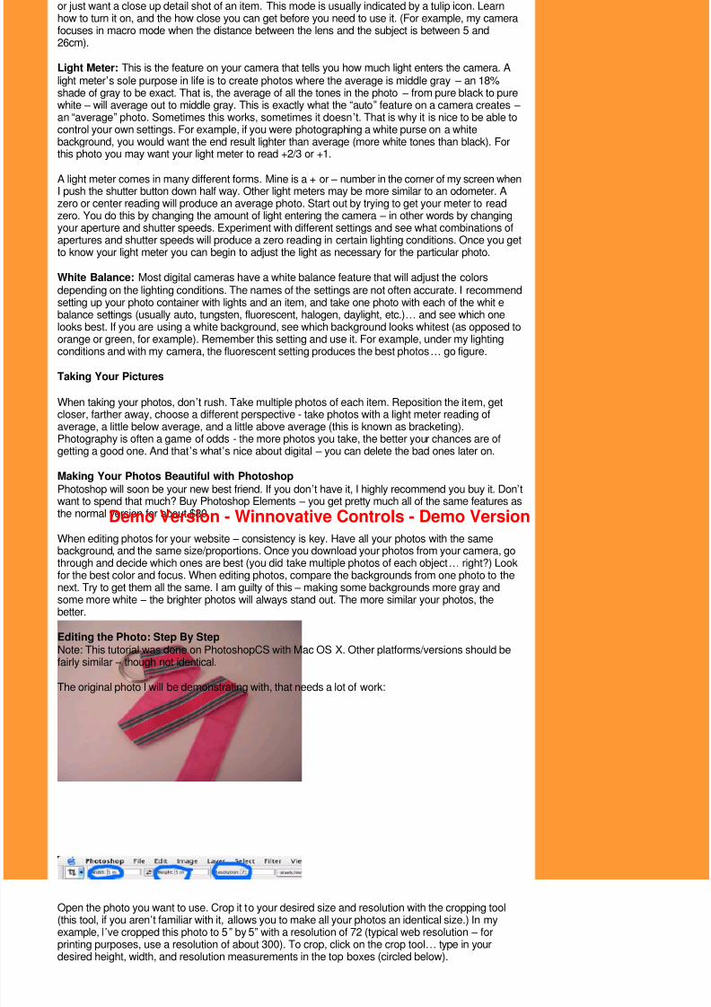
The original photo I will be demonstrating with, that needs a lot of work:
Open the photo you want to use. Crop it to your desired size and resolution with the cropping tool(this tool, if you aren’t familiar with it, allows you to make all your photos an identical size.) In myexample, I’ve cropped this photo to 5 ” by 5” with a resolution of 72 (typical web resolution – forprinting purposes, use a resolution of about 300). To crop, click on the crop tool… type in yourdesired height, width, and resolution measurements in the top boxes (circled below).
Demo Version - Winnovative Controls - Demo Version
8/14/2019 Tips Professional Photography
http://slidepdf.com/reader/full/tips-professional-photography 3/11
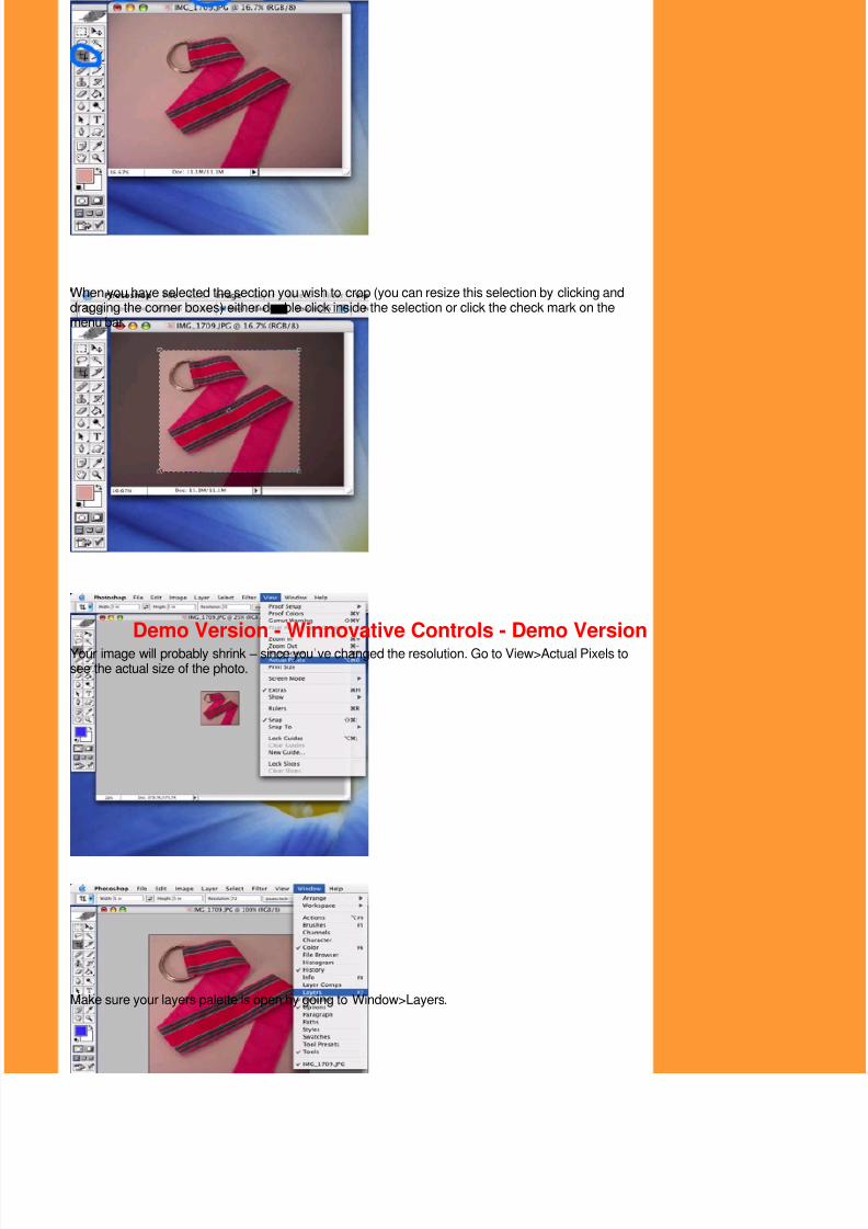
When you have selected the section you wish to crop (you can resize this selection by clicking anddragging the corner boxes) either double click inside the selection or click the check mark on themenu bar.
Your image will probably shrink – since you’ve changed the resolution. Go to View>Actual Pixels tosee the actual size of the photo.
Make sure your layers palette is open by going to Window>Layers.
Demo Version - Winnovative Controls - Demo Version

8/14/2019 Tips Professional Photography
http://slidepdf.com/reader/full/tips-professional-photography 4/11
The palette should look like this:
On the bottom of the layers palette, click on the icon that looks like a two toned black and whitecircle. Select “curves” from that menu.
You should have a window open that looks like this. To see the effects of the curve on your photo, besure the “preview” box is checked.
So What Exactly is a Curves Layer?Curves is one of the most versatile features in photoshop – you can improve the quality of (almost)any photo. It can do much more than brightness/contrast and levels adjustments. It can brighten,increase contrast, decrease contrast, improve color, change color, increase or decrease saturation,and more. The diagonal line you see is your RGB curve. There are three other curves for a colorphoto – one each for Red, Green, and Blue (you can view these by clicking “channel” and selecting
Demo Version - Winnovative Controls - Demo Version

8/14/2019 Tips Professional Photography
http://slidepdf.com/reader/full/tips-professional-photography 5/11
your desired curve).
A combination of adjustments to these menus can do wonders to a mediocre photo. Basically, eachpoint on the curve represents a pixel value – 0 (pure black in the lower left corner) to 255 (pure whitein the upper right corner). Put your mouse anywhere on the curve plot – underneath, you’ll see aninput and output value. The input is the value of the pixel – the output is what the value of the pixelwould be if you dragged the curve to that point. Now, click and hold anywhere on your photo – you’llsee a small bubble on your curves graph. This is the value of the pixel you’ve clicked on. Drag your
mouse around the photo – and see the values change.
Why Use Layers?Granted you can access the same curves window through Image>Adjustments>Curves. So why gothrough the layers palette? Using layers will give you more flexibility. Think of layers as a stack ofpaper. If you were to drag another picture on to the one you have open now, it would obscure it – it islying “on top” of your current photo. But adjustments layers are like clear paper. They adjust yourphoto in various ways – by adjusting color, contrast, effects, etc, but they are not attached to yourphoto. You can delete them at any time and go back to your original photo. Another benefit, you canalso drag an adjustment (curves) layer onto another photo. If you took more than one photo of thesame item – open both photos, and drag the curves layer from one onto the other. It should have thesame effect on both pictures. This is much easier than manually trying to reproduce the samecorrections for multiple photos.
Anyways -
Click the “Auto” button and see what happens to your photo.
Now, sometimes that doesn ’t look very nice…. Sometimes it may look downright weird. What theauto function actually does is take your lightest pixel and makes it pure white, and your darkest pixeland makes it pure black. The reason this function can often look funny is you don ’t have a pure whiteor pure black in your photo. Want this function to work better? Make sure you have a pure black andpure white in your photo… easy as that. If your background is white, you ’re set on that part. If you
need something black, try placing a black object (I use a piece of black nylon webbing) somewherein the edge of the frame (where you know you will end up cropping it out). If you are doing this, just dothe above steps in a different order (curves first, then crop… as the black piece will be no good if itsout of the picture).
Anyways, if the auto function looks decent, keep the window open. If the auto curve is way off, cancelthe curves layer and open a new one to start from scratch. Sometimes the auto curve is so far off itseasier to start over than try to fix it. When working with curves, focus on the object itself. We ’ll work onthe background later. And remember, since you are using layers, you can come back and adjust thecurve any time (just double click on the curve layer in the layers palette to do so.)
Demo Version - Winnovative Controls - Demo Version

8/14/2019 Tips Professional Photography
http://slidepdf.com/reader/full/tips-professional-photography 6/11
Now it’s time to adjust your curves. You do this by clicking anywhere on the curve line and dragging apoint to another position. Experiment and see what happens to your photo when you drag the curvearound. For example, notice the shape of the curve and the effect on the photo. Generally, if you draga point up, it will get lighter. Down and it will get darker.
Try dragging just the white point left along the top – this will lighten just your highlights and increasecontrast. Drag the black point right along the bottom – this will darken just the shadow values andincrease contrast. Experiment with various shaped curves in each of the 4 colored curves – and notethe effect on your photo. If you are fairly familiar with what effect a certain action on a curve willproduce, then you will be able to make your photos just as you ’d like them.
A Few General Rules When Working With Curves:- The STEEPER the curve, the GREATER the contrast. Remember this, because sometimes highercontrast will make a picture look nicer. If you have a smooth curve, like say the 2nd one above, youmay have more contrast in some areas and less in another. In that curve, the highlights (upper half ofcurve) are less steep – so have less contrast. The lowlights (lower half of curve) are steeper – andwill have more contrast.- You want a smooth curve. Nothing that looks even remotely like a rollercoaster.- Utilize all 4 curves on a color photo. Just want a little more blue in a photo? Drag the blue curve up
Demo Version - Winnovative Controls - Demo Version

8/14/2019 Tips Professional Photography
http://slidepdf.com/reader/full/tips-professional-photography 7/11
(make it lighter). Less red? Drag the red curve down (make it darker). And so on…
Ok – so adjust your photo. Since your photo will be different than mine, I can ’t tell you exactly whatadjustments to make. If you’ve used the auto curve, I sometimes find it a bit too contrasty. Go intoeach of the colored curves and drag the white point back to the right to reduce contrast. This willmake the photo darker. If you want it lighter, drag a point in the middle up a bit. Vice versa if you wantit darker.
Here are the current adjustments on my photo:
Results in:
Like I said above, just worry about the object itself in this layer. I tinkered with the curves until I thoughtthe pinks were the right shade, and the belt was the right brightness and contrast.
Now, the background needs to be “whitened.” To do this, select the magic wand tool, and click toselect the background. If you don ’t get the whole thing on the first click, hold down the shift key, andclick again in the area(s) of the background that were not selected. Repeat until all of your
background is surrounded by ants. Don ’t worry if you also select parts of your item (this will happen ifparts of your item are of a similar color/tone as your background. You can fix that later. Whenselected, there should be a little trail of ants marching around your image.
Demo Version - Winnovative Controls - Demo Version

8/14/2019 Tips Professional Photography
http://slidepdf.com/reader/full/tips-professional-photography 8/11
Now go to the select menu and choose feather.
Set the feather to 1 or 2 pixels. This softens the edge around your selection.
At the bottom of the layers palette, click the black and white circle icon and select curves, like you didbefore. However this time, by having part of your picture selected, you are creating a mask – that is,only the selected portions of your picture will be affected by the new curve.
The curves window should open, and you should see a new layer added to your layers palette, with ablack blob in the shape of your object.
Demo Version - Winnovative Controls - Demo Version

8/14/2019 Tips Professional Photography
http://slidepdf.com/reader/full/tips-professional-photography 9/11
Now, fiddle with the curve. This one is easier than the first curve, because it is only a whitebackground (this is why I recommended a white background for your photos – it would be harder toachieve uniformity in your photos if you were always trying to match a particular shade of blue, forexample). I usually just lighten a point in the middle of the RGB curve, and pull the white point a bit to
the left. If your white is not completely “white,” you can edit the other color curves as well.
Now, if your selection was messy, you will see that some of your object is affected by the curve orthat some of your background is not affected by it. You can fix this by using the paintbrush. Be surethe background curves layer is selected. Then with a paintbrush (choose an appropriate size for whatyou’re trying to fix)… paint on the curve layer with either black or white. Instead of showing up asopaque black or white, the paint will either add to or subtract from your mask. If you are painting withBLACK, you will be adding to the mask (any area under a mast will NOT be affected by curves.) Forexample, if I painted over my background with black:
The opposite is true if you painted with white. Think of white as clear or as an eraser – if you paintover a masked portion, it will erase the mask and the curve WILL affect the image in the area youpainted. For example, I painted with white over some of my object:
Demo Version - Winnovative Controls - Demo Version

8/14/2019 Tips Professional Photography
http://slidepdf.com/reader/full/tips-professional-photography 10/11
What you want to do is either add or subtract to the mask. If, when you selected your background,you also selected part of your object (some of my stripes on the belt were selected, for example),then the curve is affecting a part of the image that you don ’t want it to. So in this case, I would paintover the affected stripes with black. If you missed a part of your background when selecting, paintover it with white so it will be affected by the whitening curve.
Sometimes your mask can be hard to see. You can’t quite tell what parts of the image are affected
by the mask and what parts are not. To see your mask better, on the layers palette, click the“channel” tab. You should see 5 layers: RGB, Red, Green, Blue, and Curves. Poke the little eyeball inthe square next to the curves layer. Your object should turn red.
The red is the curves mask – the portion of your photo that is NOT affected by the curve. You canpaint with black to ADD to the red mask, or with white to REMOVE the red mask. When you’refinished, the red mask should cover just the item and none of the background. Poke the eyeballagain to turn the red off.
You should now have your final image:
Now, I recommend you save your image twice. Once as a .psd file. This will leave all your curveslayers intact in case you need to change something… and you don’t have to start from scratch. Theother way you should save it is for the web (if you will be using the image on a website). To do this,go to file>save for web.
Demo Version - Winnovative Controls - Demo Version

8/14/2019 Tips Professional Photography
http://slidepdf.com/reader/full/tips-professional-photography 11/11
When the save for web window is open – choose the format and quality of your image. The lower thequality, the smaller the image. I usually save mine as a JPEG image, quality Very High or around 80.I use a lower number for less important images.
And TADA! You’re done! You’ve just created a professional product photo without a professional!Congratulations! I hope this was helpful. Please let me know if anything in this tutorial is confusing orunclear – and I will try and expand a little more (as if this wasn ’t long enough already!) Hope thishelped! Good luck!
Visit Lindsay Landis and all her fantastically photographed products at Lindsay Designs
Demo Version - Winnovative Controls - Demo Version


