Download - UI - Entelect

UICookbookA guide to user interface design
IntroductionIntroduction
Hello and welcome to Entelectrsquos UI Cookbook
Have you ever been told to create a screen but you have no idea where to begin in creating an effective and delightful interface Well this Cookbook is for you
Itrsquos designed to be a handbook or go-to guide when facing design choices whether simplex or complex We have made design suggestions to help guide you to meet your userrsquos needs across a wide variety of scenarios Once you have completed this Cookbook refer to the resources section to increase your learning and methods around creating user interfaces (UI)
This guide is broken down into two sections Ingredients and Recipes Ingredients are the UI components such as buttons or input fields that UI recipes are made of Recipes are the different methods and tips for putting together UI components in different ways This book is based on the principles of Atomic Design
UI Rules10 rules to follow when designing UIrsquos
IngredientsButtonsInput fieldsIconsTypographyCardsListsImagesFooterModalsAlert and notification messagesTablesStepper or wizardRadio buttons and switchesCheckboxesSliders
RecipesSplash screenFormsHome screenDesktop navigationLogin screenMobile navigationData screenStatistics dashboardE-commerce landing screenE-commerce products screenProfile screenSocial screenContact screenResources
12
78910111314151617181920212223
252729313335363739414345474951
ContentsContents
UI COOKBOOK | A GUIDE TO USER INTERFACE DESIGN
1 2
1 Visibility of system status
Itrsquos important to ensure that a user knows that there is an action in progress This is done by providing the user with the right feedback at the right time
Questions to askbull Does every display begin with a title
or header that describes the screenrsquos contents
bull Is there some form of system feedback for every user action
bull Is the user kept informed of the systemrsquos progress
10 rules to follow when designing UIrsquos to ensure good usability
UI RulesUI Rules2 Match between the system and the real world
Users expect to see information in a logical order and the system should relate back to real world experiences eg an interface shouldnrsquot feel foreign or confusing
Questions to askbull Are icons concrete and familiar bull Do the selected colours correspond to
common expectations of colour codes eg orange for warning and green for success
bull Is information described in terminology that is familiar to the user
UI RULES | UI RULES 10 RULES TO FOLLOW | UI RULES
UI COOKBOOK | A GUIDE TO USER INTERFACE DESIGN
3 4
3User control and freedom
Users need to be able to control what actions they perform and have enough freedom to do any task provided it wonrsquot cause errors
Questions to askbull When a userrsquos task is complete does the
system wait for a signal or action from the user before processing
bull Are users prompted to confirm commands that have drastic or destructive consequences eg permanently deleting a file
bull Can the user lsquoundorsquo a functionbull Can users cancel out of operations in
progress
4 Consistency and standards
Good user interface design should ensure that both the graphic elements and terminology are consistent across a platform or related platforms
Questions to askbull Have your clientrsquos or companyrsquos design
and styling standards been followed consistently in all screens within the system
bull Are colours used correctly - four primary colours maximum with secondary colours only used when needed
bull Is soft conversational wording used for regular positive feedback and is stronger wording only used for rare critical conditions like errors
5 Error prevention
Errors can be prevented if you guide users through the actions they need to perform
Questions to askbull Does the system warn users if they are
about to make a potentially serious error bull Are the buttons that can cause the most
serious consequences located far away from low-consequence and high-use buttons eg is the delete button separated from save or edit buttons
bull Are required input validations stated to the user upfront
6 Recognition over recall
Reduce the need for users to think by displaying only relevant information on a specific page or section
Questions to askbull Is all data a user needs displayed at each
step bull Are elements prompts cues and messages
placed where a user expects thembull Is it obvious to the user what actions can
be performed
UI RULES | 10 RULES TO FOLLOW 10 RULES TO FOLLOW | UI RULES
UNDOSTOP
UI COOKBOOK | A GUIDE TO USER INTERFACE DESIGN
5 6
7 Flexibility and efficiency
The interface should be flexible enough to allow various types of users to perform frequent actions with ease and efficiency
Questions to askbull Does the system support both novice and
expert users bull Do users have the option of using a
keyboard shortcut bull Does the system allow the user to tailor
frequent functions
8 Aesthetics and minimalism
The interface should be aesthetically pleasing and only display relevant information while removing all unnecessary content
Questions to askbull Is all the information displayed on screen
essential to a userbull Is white space utilised to create meaningful
groupings of contentbull Does each screen have a short clear and
distinctive title
9 Error recognition
Help users recognize diagnose and recover from errors
Questions to askbull Are prompts constructive without overt or
implied criticism of the user bull Do prompts imply that the user is in
control bull Do error messages suggest the cause of
the problem bull Do error messages indicate what action the
user needs to take to correct the error
10 Help and documentationAssist novice users but donrsquot frustrate expert users
Questions to askbull Is a Help menu visible and easy to find bull Is there context-sensitive help bull If choices are ambiguous does the system
provide additional explanatory information when an item is selected
UI RULES | 10 RULES TO FOLLOW 10 RULES TO FOLLOW | UI RULES
ctrl Cctrl V
These UI rules are cited from Nielsen Normanrsquos 10 Usability Heuristic for User Interface Design
UI COOKBOOK | A GUIDE TO USER INTERFACE DESIGN
7 8
Buttons are easy to use even for inexperienced users and should be used to execute important actions Avoid using too many buttons as the more choice you add the more complex a page can become The time it takes to make decision increases with the number and complexity of choices this is known as Hickrsquos Law
Tips for using buttonsbull Use the primary button for the default actionbull Group related buttonsbull Position unrelated buttons away from related ones bull Keep button labels short
Buttons
IngredientsIngredients
INGREDIENTS | INGREDIENTS BUTTONS | INGREDIENTS
DISABLED
Default Primary button for high emphasis
Secondary button for medium emphasis
Tertiary button for low emphasis
NORMAL PRESSED
NORMAL PRESSED
NORMAL PRESSED DISABLED
DISABLED
10
UI COOKBOOK | A GUIDE TO USER INTERFACE DESIGN
9
Input fields
Commonly used for username password search messages and other inputs from users
Tips for using text iputsbull Label text shouldnrsquot be multiple linesbull Placeholder or hint text must disappear
when the user starts typing bull It should be clear that the text field is
either enabled disabled required filled etc
bull If the input text required is long rather use a multi-line text box control than a regular input
bull Fields should always be aligned to each other to make them easier to read
Icons
Icons should be used carefully should be clear and allow users to understand their meaning instantaneously They are a powerful way to enhance user interaction and reinforce the brand
Tips for using iconsbull An icon should have a single meaning across an
application bull Use colour consistently and appropriately eg red
for a warning icon bull Ensure detail is clear even on small iconsbull Maintain the same size for all icons eg 20px icon
4px padding all around bull Ensure all strokes are the same thickness
Use icon packs for consistencybull Font awesome bull Material Design icons
Use icons that have the same detail and style
INGREDIENTS | TEXT INPUT ICONS | INGREDIENTS
Before adding input
After adding input
Disabled input
Input error
John Doe
Name
Enter name
Name
personmailcom
myemailcom
Please provide a valid email address
Maintain the same aspect ratio
10
12
UI COOKBOOK | A GUIDE TO USER INTERFACE DESIGN
11
Typography
The way text looks in terms of its size width colour and structure contributes to the effectiveness of a design and the message that needs to be conveyed
Misuse of typography can negatively impact the user experience of your site if not done correctly
Tips for using typographybull Make sure itrsquos readable in large and small
sizes bull Use different sizes to show hierarchybull The chosen fonts should match your
brand and image bull Use system fonts where possible eg
Roboto for Android San Francisco for iOS Segoe UI for Windows
bull Ensure there is enough whitespace around the text otherwise itrsquos hard to read
bull The smallest size for body text should be 16px or 12pt so that users can read it comfortably however labels can be smaller at 13px or 10pt
INGREDIENTS | TYPOGRAPHY TYPOGRAPHY | INGREDIENTS 12
DisplayH1 tag - Modal titles light 42pt
HeaderH2 tag - Page titles bold 34pt
Title 1H3 tag - Tabs titles forms semi-bold 28pt
Title 2H4 tag - Buttons tabstitles forms
semi-bold 22pt
Subtitle 1H5 tag - Info paragraphs regular 20pt
BodyP tag - Info descriptions regular 14pt
CaptionSmall tag - Time stampsfooters figure or photodescription
regular 12pt
Subtitle 2H6 tag - Info paragraphs semi-bold 16pt
UI COOKBOOK | A GUIDE TO USER INTERFACE DESIGN
13 14
Cards
Cards group images text and other elements together They show a summary of information and can be the entry point for more information Cards help use space effectively and balance the user interface by grouping and structuring content
Tips for using cardsbull All content within a card should relate to a
single idea bull Use the same layout and styling for all cards
with a similar use bull A drop-shadow rounded corners and a
hover effect can be used to show a card is clickable
bull A card should have minimal content
REFERENCE
$ 4000 month
230 additional notes
1890 additional notes
ORDER
Lists
A lists is continuous group of text or images
Tips for using listsbull Lists should be sorted in logical ways
that make content easy to scan such as alphabetical numerical chronological or by user preference through filtering
bull Lists present content in a way that makes it easy to identify a specific item in a collection of items and act on it
bull Lists should present icons text and actions in a consistent format
DOCUMENTS
Adobe XD
Adobe PS
Adobe New Photo
TOP HITS
Adobe XD
Adobe Illustrator
Adobe Photoshop
INGREDIENTS | CARDS CARDS | INGREDIENTS
UI COOKBOOK | A GUIDE TO USER INTERFACE DESIGN
15 16
Images
Images are an important part of a design as they can help tell a story communicate a brand clarify complex messages or even show users how to perform an action
Tips for using imagesbull Ensure all your images are optimised for web 72ppi (pixels per inch) is generally the
web standard bull High-resolution screens are more popular these days therefore 150ppi is also
acceptable and sometimes necessary bull Images should have a purpose on the page and not be used to simply make up space bull They should relate to each other and the content on a page by sharing the same style
function and intent bull Images should always have alt-text so that a screen reader can pick up visual details for
users with visual impairments
Footer
A footer helps visitors find additional information about an organisation and other links such as social media contact information etc
Tips for using footersbull You can add main navigation links or a sitemap to footers bull Social media links are usually found in the footer bull Include the companyrsquos main contact details bull Links to other relevant websites such as a business website (if your website is consumer
facing) bull Include copyright information bull If you use a narrow footer design you can make it fixed to the bottom of the screen so
that it stays visible to the user at all times bull Exclude the footer if your page has infinite scrolling eg a news blog that loads article
after article as you scroll
INGREDIENTS | IMAGES FOOTER | INGREDIENTS
CONTACT US
+44 345 678 903
contactmailcom
Find a Store
SERVICES
Contact Us
Ordering amp Payment
Shipping
Returns
FAQ
Sizing Guide
INFORMATION
About
Work With US
Privacy Policy
Terms amp Conditions
Press Enquiries
copy Copyright mark
UI COOKBOOK | A GUIDE TO USER INTERFACE DESIGN
17 18
Modals
Modals are content overlaid on top of the sitersquos main content They usually disable the background content but are still visible behind a transparent full-screen overlay Modals stop a user from interacting with the main content drawing attention to an important task or piece of information
Tips for using modalsbull Modals are best used when users need to make an important decision to get their full
attention or when the user needs to confirm a risky action bull Donrsquot include a close button on your modal if a user must complete an action before
returning to the main content instead close the modal once an action has been completed by a user clicking a login save or continue button for example
bull Modals are useful when you want to show the user extra information without changing the context or main content
Alert and notification messages
Alert and notification messages appear temporarily or can be dismissed they either appear in context or the top or bottom of the screen They donrsquot require user input but sometimes they have an action that the user needs to perform
Tips for using alert messagesbull Informational alerts provide updates on processes and actions eg loading saving
or errorsbull Contextual alerts should be placed in the most suitable area of the screen eg alert
messages and system messages are usually displayed at the top or bottom of the screen
bull Create a standardised set of alerts eg information warning success error and use them consistently throughout the UI
bull Keep the messages short and to the pointbull Donrsquot use technical terms or error codes bull Use clear and simple language that the user can easily understand
INGREDIENTS | MODALS ALERTS amp NOTIFICATIONS | INGREDIENTS
UI COOKBOOK | A GUIDE TO USER INTERFACE DESIGN
19 20
Tables
Tables help to organisation data in an orderly manner so that users can scan compare and analyse it
Tips for using tablesbull Make sure the table-header text stands out and has enough padding it mustnrsquot be too
bold or squashedbull If you are showing more than thirty rows per page put pagination at the top and
bottom of the table so that the user can move between pages without too much scrolling
bull Add filters to reduce the amount of data displayed based on the userrsquos needsbull Sorting can be added when data can be sorted alphabetically or numerically Add solid
triangle arrow icons next to the header icons as sorting controls (chevrons are harder to click or tap)
bull Use clean minimal styling and icons for tables so that the data is the focusbull When including text links in a table use proper link styling to provide a visual cue to the
users that these are clickable
Stepper or wizard
Steppers are useful for signup pages or forms where the user has to complete multiple sections of data They simplify the userrsquos experience because it breaks up long forms into small chunks and provides feedback of the userrsquos progress
Tips for using a stepperbull Use clear concise and short labels for each step bull You can add numbers and custom icons to each step as they help the user see where
they are in the process at a glancebull Explain each step along the way with a short sentence below the headingbull Ensure that the stepper and layout of each page in the series remains consistentbull Highlight the completed steps and the current step as the user progressesbull Ensure that the user can get back to a previous step in case they want to make a
correctionbull Never add more steps when the user is already busy with a form If you need a varying
number of steps rather allow the user to set up the form before completing it eg if you ask a user lsquoAre you an individual or businessrsquo then load the appropriate amount of form steps
INGREDIENTS | TABLES STEPPER OR WIZARD | INGREDIENTS
1 2 3
UI COOKBOOK | A GUIDE TO USER INTERFACE DESIGN
21 22
Radio buttons and switches
Radio buttons and switches allow the user to select exactly one choice from at least two options
Tips for using radio buttons and switchesbull Use radio buttons to choose an option from a group not as action buttons to perform
commandsbull You should list the options in a logical order such as the most likely to be selected to least or
simplest operation to most complexbull Labels should be clear and simple if they are vague it might mislead usersbull If the user might not want to choose from the list give them the option of selecting lsquononersquobull Lay radio buttons out vertically one item with its label per line If you need them to be
horizontal ensure the space between the buttons and labels are even to provide enough space between each so that you know which label goes with which radio button
bull Ensure radio buttons are large enough for a user to click or tap on when using smaller devices bull If there are only two options you could use a single checkbox or a switch eg lsquoon-offrsquo or lsquoyes-norsquo
Checkboxes
Checkboxes allow the user to select any number of choices from no choice through to several Each checkbox is independent in a list and checking one box doesnrsquot uncheck the others
Tips for using checkboxesbull Checkboxes should have a tick mark or an lsquoXrsquo and a solid background colour when
selectedbull Checkboxes are small components by default ensure the user can click or tap on it on
smaller device sizesbull Lay your checkboxes out vertically with one item and its label on a single line If you
need your checkboxes to run horizontally then ensure the space between the buttons and labels are even and provide enough space between each so that you know which label goes with which checkbox
bull Use positive wording so that its clear what will happen if the user selects the checkbox
INGREDIENTS | RADIO BUTTONS amp SWITCHES CHECKBOXES | INGREDIENTS
UI COOKBOOK | A GUIDE TO USER INTERFACE DESIGN
23 24
Sliders
A slider is a control element that uses a lever that moves horizontally to control a variable such as speaker volume or brightness on a screen In practice sliders can be difficult for the user to manipulate because the user must be able to tap or click and drag their finger or mouse over the screen which requires multiple movements at once
Tips for using slidersbull Ensure the sliderrsquos labels remain visible above the userrsquos cursor or thumb while the user
moves the lever so they can always see the selected valuebull Ensure the sliderrsquos range isnrsquot too large and that itrsquos easy for the user to select a precise
valuebull Sliders are effective on mobile devices as they replicate the natural action of a thumb
however you need to ensure that the lever is large enough to tap and drag across a devicersquos screen
INGREDIENTS | SLIDERS SLIDERS | INGREDIENTS
UI COOKBOOK | A GUIDE TO USER INTERFACE DESIGN
25 26
RecipesRecipes
RECIPES | RECIPES RECIPES | RECIPES
2827
UI COOKBOOK | A GUIDE TO USER INTERFACE DESIGN
SHOP ONLINE
Splash screen
Time to design 10 minutes
What yoursquoll needbull App icon or company logobull Title or catchy phrase (optional)
When to use itbull When you need a few seconds to load
background data from a serverbull When the user needs to be
authenticated
5 Fade out the splash screen after two to three seconds If data is still loading use a loading indicator to keep the userrsquos informed that the app is doing something
Finishing touchesbull Sometimes the app version number is
displayed on the splash screen and the user can be prompted to update their app version if required
RECIPES | SPLASH SCREEN SPLASH SCREEN | RECIPES
Directions1 Choose an appropriate solid background
colour or gradient that fits in with the apprsquos branding
2 Ensure the app icon is in a vector format3 Use a simple animation to fade the app
icon or company logo into the view4 If you have a title or catch phrase position
it below the icon and animate it into the view
27
UI COOKBOOK | A GUIDE TO USER INTERFACE DESIGN
UI COOKBOOK | A GUIDE TO USER INTERFACE DESIGN
29 30
c For selecting an option from a list of more than three items use a dropdown
d For selecting multiple options use checkboxes
e For selecting a single option use radio buttons or a button toggle
f If the user needs to perform an action use a button
2 Can components be grouped into logical groups or steps eg personal details and banking detailsa Use a stepper and slot the correct
components in accordingly Note Use this to improve the form experience only if there are many fields in which case grouping them will reduce cognitive load (the load placed on a userrsquos brain)
3 If your form has a stepper make sure that there are lsquonextrsquo and lsquobackrsquo buttons to allow the user to navigate easily through the form
NEXT
Credit Card Info
CARD NUMBER
1234 5678 3456 2456
CARDHOLDER NAME
John Doe
CVV
123
EXPIRE DATE
05 21
Forms
Time to design 30 minutes
What yoursquoll needbull Input fieldsbull Buttonsbull Feedbackbull Switches and sliders (optional)bull Stepper (optional)
When to use itbull Anytime a user needs to input data into
a systembull For sign up or onboardingbull For user loginbull Data entry of any kind
Billing Info
FULL NAME
John Doe
ADDRESS
497 Evergreen Rd
CITY
Roseville
ZIP CODE
95673
COUNTRY
United States
NEXT
RECIPES | FORMS FORMS | RECIPES
Directions1 Think of all the fields that are needed for
the task and select the appropriate input component
a For simple input use an input fieldb For selecting an option from a list
of more than three items use a dropdown
4 The primary action for the form is to lsquosubmit or lsquoaddrsquo depending on its purpose
Finishing touchesbull Forms should be in one column with one
component per row as this improves speed of entry
UI COOKBOOK | A GUIDE TO USER INTERFACE DESIGN
31 32
Home screen
Time to design 1-2 hours
What yoursquoll needbull Navigationbull Bannerbull Imagesbull Image carouselbull Cards
When to use itAs the first impression users get of the company what the products or services are and what makes them unique The home page is therefore an important part of a website andor app
bull Use cards for key services offerings
Directions1 Place main navigation at the top of page
(see next recipe on desktop navigation)2 Place image carousel (if you want or need
to use one) below the navigation This will be the first thing that catches your userrsquos eye but isnrsquot always necessary for home page design
3 Place cards below the image carousel lined up side by side These should stack equally on a responsive page
4 Below the card content can be other essential information you want to communicate to the user but donrsquot clutter it
5 You will place the footer below this content
Finishing touchesbull Trends in home page design vary so
you will need to think about how your homepage is communicated as there can be many ways to do it Look for inspiration from your favourite websites or look at competitors of your client through a simple competitor review
Preparationbull Get your headlines ready ndash h1 through to
h6 but remember to use only one h1 per page as that is what Google indexes as the most important when crawling
bull Use an image carousel to promote specials or exciting information about your client
FEED AUTHORS EXPLORE BLOG CONTACT
This is where we share our travel adventures across Africa with you
Welcome
Mountain Gorilla Trekking in the Impenetrable Forest of Uganda
Uganda
READ MORE
RECIPES | HOME SCREEN HOME SCREEN | RECIPES
UI COOKBOOK | A GUIDE TO USER INTERFACE DESIGN
33 34
Navigation with search field hidden
Navigation with search field open
Desktop navigation
Time to design 1 hour
What yoursquoll need for desktopbull Logobull Hyperlinksbull Search iconbull Input fieldbull Labels x 2bull Profile iconbull Drop downbull Primary and secondary buttons
When to use itWhen your site or app has more than one page
Directions1 Align the logo to the left this web
convention and itrsquos also a great place to hyperlink to lsquohomersquo
2 The rest of your nav items can be aligned centre and should be spaced evenly apart as well as given enough space to lsquobreathersquo with padding top and bottom
3 The search and profile icons (if login is required) should be aligned to the right - this is web convention When you follow conventions like this the consistency helps with the learnability of the system
4 Your search icon will hide and show the search field so place it to the left of the profile icon so it has space to stretch out into an input field (refer to example)
5 On click of search icon the search should be exposed with the ability to search and close
6 The profile icon on click will expose the drop-down Inside that drop-down you will have prepared two input fields with labels along with a primary and secondary button so now we will label thema The first label will be rsquousernamersquob The second label will be lsquopasswordrsquoc Donrsquot forgot the hint text for your fields ndash hint texts help users know what data to input
7 Label your primary button lsquosign inrsquo and your secondary button lsquoregisterrsquo (refer to login screen recipe on the next page)
RECIPES | DESKTOP NAVIGATION DESKTOP NAVIGATION | RECIPES
FEED AUTHORS EXPLORE BLOG CONTACT
FEED AUTHORS EXPLORE BLOG CONTACT
Preparationbull Create a rectangular container at the top of
the page to fill the full width of the screenbull Place the logo navigational hyperlinks
search icon search input field and profile icon into the container
UI COOKBOOK | A GUIDE TO USER INTERFACE DESIGN
35 36
Login screen
Time to design 30 minutes
What yoursquoll needbull Input fields x 2bull Cardbull Background imagebull Buttonsbull Field validationbull Show hide password icon
When to use itWhen you need a user to login or authenticate themselves
3 Place two buttons next to each other on the bottom of the carda Left align the register button (secondary button) or use a tertiary button or link below the login buttonb Right align the sign in or login button (primary button)
4 Ensure that you show an error message if the login fails eg username or password entered is incorrect
Finishing touchesbull Add a showhide icon to the right-hand
side of the password field so the user can toggle visibility of their password to check if itrsquos typed correctly This is an important pattern for mobile login screens
Mobile navigation
Time to design 1 hour
What yoursquoll need for mobilebull Hamburger nav iconbull Drawer panelbull Hyperlinksbull Profile iconbull Primary and secondary buttons
When to use itWhen your site or app has more than one page and when your site is viewed on a mobile device Try keep the primary menu visible and use the hamburger for secondary options
TITLE
Mobile header with hamburger nav
Drawer panel slides out when user taps the hamburger nav
Log In
USERNAME
jdoe2340
PASSWORD
NOT REGISTERED LOG IN
RECIPES | LOGIN SCREEN LOGIN SCREEN | RECIPES
John DoeSan Francisco CA
FEED
EXPLORE
MESSAGES
NOTIFICATIONS
PHOTOS
VIDEOS
PLACES
SETTINGS
SEARCH
Directions1 Place a background image on the page ndash
the background should cover the whole page
2 Place the card in the centre of the page add the two fields one below the othera Label the first field lsquousernamersquob Label the second field lsquopasswordrsquo
Directions1 When the hamburger is clicked it should
open a container for navigation This contains the user profile navigation links and sign out button
2 Place the profile icon at the top of the drawer panel with the profile or sign out buttons below
3 Add the navigation hyperlinks one below the other in the same order as the desktop menu (refer to previous recipe) Ensure that the padding around each item is the same
UI COOKBOOK | A GUIDE TO USER INTERFACE DESIGN
37 38
Data screen
Time to design 30 minutes to a few hours this depends on the amount of data that needs to be represented
What yoursquoll needbull Cardsbull Listsbull Tablesbull Labels
When to use itTo display a group of data in one place eg all employees of a company (admin) or all items on sale (e-commerce)
b If the user needs to compare sort or filter the data display the data in a table
Directions1 Place a label at the top left corner of the
screen This label defines everything that will be displayed on the page in one or two words
2 Add sub-headings to explain what the data is about in one or two sentences (optional)
3 Place a search bar in the top right corner to indicate that the user can search to filter data
4 Decide whether you will use cards or lists (refer to figure on the left)
5 Fill the rest of the page with the data you would like to display
6 Add pagination to show there is more data to find in this category if all data canrsquot be displayed on a single page
Finishing touchesbull Ensure that the data is displayed in a way
that makes it easy for a user to understand and is useful
bull Use headings and sub-headings to break up the data into sections and categories so that the user can easily scan the page
PreparationEach item within the data will have many related fields Decide on the top four or five fields that are most important to identify the item
a If the best way to distinguish different data items is visually use a wall of cardstiles
Search for items brand and inspirationhellip
Items
Sam ShopaholicCart
FilterSort
Red Espadrille
Striped Wool Hat
Premium Sneaker
R 50000
R 10000
R 150000
Yellow Jersey
Purple Jacket
Pattern Wool Hat
R 30000
R 100000
R 15000
Skinny Jeans
Blue Lace Up Snhellip
Yellow Shorts
R 40000
R 110000
R 35000
Button Up T-shirt
Multi-colour Jacket
Maroon Sneaker
R 25000
R 80000
R 75000
Striped T-shirt
Striped Pants
Green Cap
R 25000
R 40000
R 10000
Flash Vest
Blue Sneaker
Green Jacket
R 10000
R 80000
R 95000
SHOP
WOMEN
MEN
SPORT
ACCESSORIES
Search for items brand and inspirationhellip
Items
Cart
Description
Red Espadrille
Yellow Jersey
Skinny Jeans
Button Up T-shirt
Stripped T-shirt
Flash Vest
Striped Wool Hat
Purple Jersey
Blue Lace Up Sneaker
Multi-colour Jacket
Price
R 50000
R 30000
R 40000
R 25000
R 25000
R 10000
R 10000
R 100000
R 110000
R 80000
Sam Shopaholic
FilterSortSHOP
WOMEN
MEN
SPORT
ACCESSORIES
Add to cartView
Add to cartView
Add to cartView
Add to cartView
Add to cartView
Add to cartView
Add to cartView
Add to cartView
Add to cartView
Add to cartView
RECIPES | DATA SCREEN DATA SCREEN | RECIPES
bull Input Fields bull Buttonsbull Search Barbull Pagination
UI COOKBOOK | A GUIDE TO USER INTERFACE DESIGN
39 40
Statistics dashboard
Time to design 30 minutes
What yoursquoll needbull Cardsbull Graphs bull Labelsbull Tablesbull Buttons bull Togglesbull Input Fields
When to use itAnytime a user needs to see reporting infor-mation
bull A card sorting exercise where you place all navigation items on physical cards and sort them can help you design or evaluate the information architecture of your site
Directions1 Sketch out the basic layout you would like
for your dashboard 2 Decide on the correct graphs to display the
data you want eg a bar graph to display categories of data
3 Label each section with a main heading to group the data logically
4 Use cards per data item5 Make sure to add a toggle or date picker
so that the user can alter the dashboard to display the data that they are looking for
Finishing touchesbull Remember a dashboard is like a meal - it
needs a bit everything to be satisfying but too many ingredients can throw out its visual balance out completely
Nov 10 2017 Dec 10 2017
$5k
$10k
$15k
$20k
$25k
$5k
$10k
$15k
$20k
$25k
Last 30 Days
Total viewsProducts sold
Trends
Total Revenue$50000
Revenue$1250
Growth+20
$190500 of $1MUnited States
$98321 of $1MChina
$128602 of $1MAlgeria
$293792 of $1MAustralia
$829910 of $1MRussia
View Full ReportSales by Country
4 hours agoJohn Doe added you to his team
8 hours agoInvoice for 30 hours of calls has paid
2 days agoYoursquove logged in on a new device
3 days agoYoursquove got a new message on Facebook
Timeline
Preparationbull List the type of information you want
to display in order of what is the most valuable and important to the user to the least creating a hierarchy of information
RECIPES | STATISTIC DASHBOARD STATISTIC DASHBOARD | RECIPES
UI COOKBOOK | A GUIDE TO USER INTERFACE DESIGN
41 42
E-commerce landing screen
Time to design A few hours
What yoursquoll needbull Navigationbull Image carouselbull Promotional imagesbull Product imagebull Cardsbull Primary button and potentially two
or three secondary buttons
When to use itTo display different products promotions and services that the company offers
Directions1 Place your promotional images in a full
width image carousel to be able to move through the various promotions or offers
2 Place image carousel below navigation and remember this should be 100 width to allow it to constrain to different screen sizes
3 Your cards come next you can organise these in different ways Some options in how you could organise these are promoted products latest or those on sale Be sure to clearly categorise or label your card sections
4 You will then to place your footer at the bottom of your page
Finishing touchesbull If you do need additional buttons on your
product cards like wish list or comparison ensure that you have icons that relate to their function
SHOP ONLINE
SPA
BLOG
CONTACT
Search for products brand and treatmentshellip
Our specials
Name SurnameCart
Jasmine oilR 16000
VIEW
Aloe vera gelR 32000
VIEW
Rosemary oilR 16000
VIEW
Lotus flower lotionR 30000
VIEW
Get a free facial with any full body massageLimited time offer
Introducing our new Garra Rufa fish pedicure
Book now
Book now
Preparationbull When preparing your cards ensure there is
space for a product image an add to cart button
bull You might want to include buttons such as wish list and product comparison
RECIPES | E-COMMERCE LANDING SCREEN E-COMMERCE LANDING SCREEN | RECIPES
UI COOKBOOK | A GUIDE TO USER INTERFACE DESIGN
43 44
E-commerce product screen
Time to design A few hours
What yoursquoll needbull Navigationbull Product imagebull Product gallerybull Cards (other similar products or promoted
products)bull Footer
When to use itWhen you need to display
a Detailed information about a product with imagesb Add product to a cartc Compare that product to another productd Add the chosen product to a wish list
2 Ensure your primary product image comes first and secondary product images are nested below A user should be able to see a physical product from different angles to engender trust and aid in decision making
3 Product details should be included in a simple table that displays key information about the product to allow the user to make an informed decision
4 Call to action buttons may sit below the image gallery or next to a productrsquos details Once the user has viewed necessary product information they are able to make a purchase or engage in a product comparison
5 Promoted or related products can be included either on the side or below the product detail but shouldnrsquot distract from the key purchase
Finishing touchesbull You can add additional buttons such as
wish list like share or compare
ABOUT VISIT US SHOP WHOLESALE CONTACT US
Single Origin UgandaBugisu AA Organic
250gR 10000
Add to CartAdd to Wishlist
Story
Related Products
In Stock 9 Reviews
Processing Tasting Notes Reviews
Terbodorersquos SELECT range showcases some of the best single origin beans in the world This Uganda Bugisu AA bean is grown according to the principles of sustainable farming conditions and often left to grow naturally It features a full body notes of red apple and dark chocolate in the finish
2
RECIPES | E-COMMERCE PRODUCT SCREEN E-COMMERCE PRODUCT SCREEN | RECIPES
Directions1 Place product gallery above the fold
(before the point of scrolling) This is what the user has come to see
UI COOKBOOK | A GUIDE TO USER INTERFACE DESIGN
45 46
Profile screen
Time to design 30 minutes to an hour
What yoursquoll needbull Tabsbull Expansion panel accordion bull Imagebull Labels bull Buttons
When to use itbull When you want to display information
about a user either to the user themselves or an admin user This should include the ability to edit the userrsquos details or delete the userrsquos profile
5 Itrsquos always handy to have a picture or picture placeholder as it elevates the design The picture should be grouped with the most important data
6 Depending on the profile and the information it contains the rest of the data about the user should be grouped into tabs or expansion panels (this should take up the rest of the page)a The primary actions available for the user eg edit delete should be easy to find and therefore should be a primary button at the top right hand of the screen3 The items that are of most importance
should be displayed at the top or left of the screen as you want the user to read this first
4 Make sure that the items you pick for this are available for all users You donrsquot want gaps in your designs eg name surname role are great examples of things that are of the highest priority Things like lsquohair colourrsquo are not as important (unless you are a hair modelling agency) and it might not be available data for everyone
Finishing touchesbull Add icons to your tabs or expansion
panels as this will aid findability as well as improve the overall look and feel of the profile page
bull Always have a back button that allows a user to return to their previous screen if they so wish
Directions1 Discover what information you have
to display for any given user You could use a card sorting exercise to order the information based on importance
2 Know which fields are mandatory
NameJames
SurnameJackson
Phone number
Address
123 456 7890
jjacksonemailcom
1 Sesame StreetCA
Password
Address
Card details
System key
Username
Phone
RECIPES | PROFILE SCREEN PROFILE SCREEN | RECIPES
UI COOKBOOK | A GUIDE TO USER INTERFACE DESIGN
47 48
Social screen
Time to design 10 minutes
What yoursquoll needbull Cover or banner imagebull Profile picturebull Background (optional)
When to use itWhen your organisation needs a platform such as Facebook Twitter or LinkedIn to communicate their brand and products This also allows your organisation to grow their network by drawing in followers and gaining social media presence
do change from time to time so check guidelines regularly)
3 Use more images than text on your social screen as the human brain processes images much faster than text
4 Create a visual relationship between your profile picture and cover image
5 The profile picture shouldnrsquot hide any valuable content in the cover image
6 Ensure your designs follow the guidelines set by each social platform
Finishing touchesbull Update imagery on the social media page
every few months to keep your target audience interested
bull Make sure the overall design is consistent with the companyrsquos branding and demonstrates the products and services they offer
bull Use a consistent look and feel across all your social media pages
bull If the content and visuals are appealing they are more likely to be shared and increase engagement
Directions1 Choose a cover or banner image
and background that promotes the organisation or a marketing campaign
2 Create the correct size images for each social platform (these sizes are defined in a social platforms documentation but
RECIPES | SOCIAL SCREEN SOCIAL SCREEN | RECIPES
PostDelete
Create a post
Say something
With the technological advancement in the 21st century everybody wants to experience the best technology with the least amount of effort By now user experience (UX) design is recognised as a crucial part of customer satisfactionhellip
12 January 2020Entelect
12 Interactions 3 Comments
THE DATA SCIENCEBEHIND UX
ENTELECT INSIGHTSINNOVATE TRANSFORM AUTOMATE BY ENTELECT
ShareCommentLike
UI COOKBOOK | A GUIDE TO USER INTERFACE DESIGN
49 50
Contact screen
Time to design 30 minutes
What yoursquoll needbull Navigationbull Contact formbull Location (use google maps)bull Phone numbersbull Email addressesbull Chat bot (if possibleapplicable)bull Product logobrand imagebull Footer
When to use itA contact page allows those visiting your site to contact you This page should be easy for users to navigate to and page links should be in the footer section of your website as well as your menu
2 Always give the user clear direction to the purpose of a page ndash in this case lsquoContact Usrsquo
3 Organise the information in a symmetrical fashion eg the contact form on the left and the numbers and location on the right
4 Give the user feedback once the form is submitted or if itrsquos been incorrectly filled out using success or error messages
5 Give the user a notification that you will respond to them within a certain time frame if successful or explain the errors in what they have input and how to correct them
6 Keep the colours text and sizing of the contact page consistent with the design on all other pages of your website
Finishing touchesbull The contact page should be kept brief and
simple bull Your contact page should have multiple
methods by which a user can contact you if possible besides the contact form itself
FEED AUTHORS EXPLORE BLOG CONTACT
Contact UsContact Us Get in touch to find out about our available positions or just to chat about your future Let Us Get back to you Fill out our form
Full Name
Message
Send
+27 87 1234
contactusemailcom
RECIPES | CONTACT SCREEN CONTACT SCREEN | RECIPES
Directions1 Place the contact form above the fold
(before the point of scrolling) This is what the user has come to see
UI COOKBOOK | A GUIDE TO USER INTERFACE DESIGN
51 52
Resourcesbull 10 rules of good UI to follow bull 5 tips for creating a social media page designbull Matrial Design - Design guidance and codebull Building the perfect splash screenbull Balsamiqbull Typography in UI Guide for beginnersbull 15 examples of popular card UI design bull 8 rules for perfect typography in UIbull User interface elementsbull 10 usability heuristics for UI designbull Laws of UXbull Card Sorting
This book was brought to you by the UX Guild
RESOURCES | RESOURCES 52
If you have any suggestions or comments for improvement please emailguild-uxentelectcoza
cultureentelectcoza

UI COOKBOOK | A GUIDE TO USER INTERFACE DESIGN
3 4
3User control and freedom
Users need to be able to control what actions they perform and have enough freedom to do any task provided it wonrsquot cause errors
Questions to askbull When a userrsquos task is complete does the
system wait for a signal or action from the user before processing
bull Are users prompted to confirm commands that have drastic or destructive consequences eg permanently deleting a file
bull Can the user lsquoundorsquo a functionbull Can users cancel out of operations in
progress
4 Consistency and standards
Good user interface design should ensure that both the graphic elements and terminology are consistent across a platform or related platforms
Questions to askbull Have your clientrsquos or companyrsquos design
and styling standards been followed consistently in all screens within the system
bull Are colours used correctly - four primary colours maximum with secondary colours only used when needed
bull Is soft conversational wording used for regular positive feedback and is stronger wording only used for rare critical conditions like errors
5 Error prevention
Errors can be prevented if you guide users through the actions they need to perform
Questions to askbull Does the system warn users if they are
about to make a potentially serious error bull Are the buttons that can cause the most
serious consequences located far away from low-consequence and high-use buttons eg is the delete button separated from save or edit buttons
bull Are required input validations stated to the user upfront
6 Recognition over recall
Reduce the need for users to think by displaying only relevant information on a specific page or section
Questions to askbull Is all data a user needs displayed at each
step bull Are elements prompts cues and messages
placed where a user expects thembull Is it obvious to the user what actions can
be performed
UI RULES | 10 RULES TO FOLLOW 10 RULES TO FOLLOW | UI RULES
UNDOSTOP
UI COOKBOOK | A GUIDE TO USER INTERFACE DESIGN
5 6
7 Flexibility and efficiency
The interface should be flexible enough to allow various types of users to perform frequent actions with ease and efficiency
Questions to askbull Does the system support both novice and
expert users bull Do users have the option of using a
keyboard shortcut bull Does the system allow the user to tailor
frequent functions
8 Aesthetics and minimalism
The interface should be aesthetically pleasing and only display relevant information while removing all unnecessary content
Questions to askbull Is all the information displayed on screen
essential to a userbull Is white space utilised to create meaningful
groupings of contentbull Does each screen have a short clear and
distinctive title
9 Error recognition
Help users recognize diagnose and recover from errors
Questions to askbull Are prompts constructive without overt or
implied criticism of the user bull Do prompts imply that the user is in
control bull Do error messages suggest the cause of
the problem bull Do error messages indicate what action the
user needs to take to correct the error
10 Help and documentationAssist novice users but donrsquot frustrate expert users
Questions to askbull Is a Help menu visible and easy to find bull Is there context-sensitive help bull If choices are ambiguous does the system
provide additional explanatory information when an item is selected
UI RULES | 10 RULES TO FOLLOW 10 RULES TO FOLLOW | UI RULES
ctrl Cctrl V
These UI rules are cited from Nielsen Normanrsquos 10 Usability Heuristic for User Interface Design
UI COOKBOOK | A GUIDE TO USER INTERFACE DESIGN
7 8
Buttons are easy to use even for inexperienced users and should be used to execute important actions Avoid using too many buttons as the more choice you add the more complex a page can become The time it takes to make decision increases with the number and complexity of choices this is known as Hickrsquos Law
Tips for using buttonsbull Use the primary button for the default actionbull Group related buttonsbull Position unrelated buttons away from related ones bull Keep button labels short
Buttons
IngredientsIngredients
INGREDIENTS | INGREDIENTS BUTTONS | INGREDIENTS
DISABLED
Default Primary button for high emphasis
Secondary button for medium emphasis
Tertiary button for low emphasis
NORMAL PRESSED
NORMAL PRESSED
NORMAL PRESSED DISABLED
DISABLED
10
UI COOKBOOK | A GUIDE TO USER INTERFACE DESIGN
9
Input fields
Commonly used for username password search messages and other inputs from users
Tips for using text iputsbull Label text shouldnrsquot be multiple linesbull Placeholder or hint text must disappear
when the user starts typing bull It should be clear that the text field is
either enabled disabled required filled etc
bull If the input text required is long rather use a multi-line text box control than a regular input
bull Fields should always be aligned to each other to make them easier to read
Icons
Icons should be used carefully should be clear and allow users to understand their meaning instantaneously They are a powerful way to enhance user interaction and reinforce the brand
Tips for using iconsbull An icon should have a single meaning across an
application bull Use colour consistently and appropriately eg red
for a warning icon bull Ensure detail is clear even on small iconsbull Maintain the same size for all icons eg 20px icon
4px padding all around bull Ensure all strokes are the same thickness
Use icon packs for consistencybull Font awesome bull Material Design icons
Use icons that have the same detail and style
INGREDIENTS | TEXT INPUT ICONS | INGREDIENTS
Before adding input
After adding input
Disabled input
Input error
John Doe
Name
Enter name
Name
personmailcom
myemailcom
Please provide a valid email address
Maintain the same aspect ratio
10
12
UI COOKBOOK | A GUIDE TO USER INTERFACE DESIGN
11
Typography
The way text looks in terms of its size width colour and structure contributes to the effectiveness of a design and the message that needs to be conveyed
Misuse of typography can negatively impact the user experience of your site if not done correctly
Tips for using typographybull Make sure itrsquos readable in large and small
sizes bull Use different sizes to show hierarchybull The chosen fonts should match your
brand and image bull Use system fonts where possible eg
Roboto for Android San Francisco for iOS Segoe UI for Windows
bull Ensure there is enough whitespace around the text otherwise itrsquos hard to read
bull The smallest size for body text should be 16px or 12pt so that users can read it comfortably however labels can be smaller at 13px or 10pt
INGREDIENTS | TYPOGRAPHY TYPOGRAPHY | INGREDIENTS 12
DisplayH1 tag - Modal titles light 42pt
HeaderH2 tag - Page titles bold 34pt
Title 1H3 tag - Tabs titles forms semi-bold 28pt
Title 2H4 tag - Buttons tabstitles forms
semi-bold 22pt
Subtitle 1H5 tag - Info paragraphs regular 20pt
BodyP tag - Info descriptions regular 14pt
CaptionSmall tag - Time stampsfooters figure or photodescription
regular 12pt
Subtitle 2H6 tag - Info paragraphs semi-bold 16pt
UI COOKBOOK | A GUIDE TO USER INTERFACE DESIGN
13 14
Cards
Cards group images text and other elements together They show a summary of information and can be the entry point for more information Cards help use space effectively and balance the user interface by grouping and structuring content
Tips for using cardsbull All content within a card should relate to a
single idea bull Use the same layout and styling for all cards
with a similar use bull A drop-shadow rounded corners and a
hover effect can be used to show a card is clickable
bull A card should have minimal content
REFERENCE
$ 4000 month
230 additional notes
1890 additional notes
ORDER
Lists
A lists is continuous group of text or images
Tips for using listsbull Lists should be sorted in logical ways
that make content easy to scan such as alphabetical numerical chronological or by user preference through filtering
bull Lists present content in a way that makes it easy to identify a specific item in a collection of items and act on it
bull Lists should present icons text and actions in a consistent format
DOCUMENTS
Adobe XD
Adobe PS
Adobe New Photo
TOP HITS
Adobe XD
Adobe Illustrator
Adobe Photoshop
INGREDIENTS | CARDS CARDS | INGREDIENTS
UI COOKBOOK | A GUIDE TO USER INTERFACE DESIGN
15 16
Images
Images are an important part of a design as they can help tell a story communicate a brand clarify complex messages or even show users how to perform an action
Tips for using imagesbull Ensure all your images are optimised for web 72ppi (pixels per inch) is generally the
web standard bull High-resolution screens are more popular these days therefore 150ppi is also
acceptable and sometimes necessary bull Images should have a purpose on the page and not be used to simply make up space bull They should relate to each other and the content on a page by sharing the same style
function and intent bull Images should always have alt-text so that a screen reader can pick up visual details for
users with visual impairments
Footer
A footer helps visitors find additional information about an organisation and other links such as social media contact information etc
Tips for using footersbull You can add main navigation links or a sitemap to footers bull Social media links are usually found in the footer bull Include the companyrsquos main contact details bull Links to other relevant websites such as a business website (if your website is consumer
facing) bull Include copyright information bull If you use a narrow footer design you can make it fixed to the bottom of the screen so
that it stays visible to the user at all times bull Exclude the footer if your page has infinite scrolling eg a news blog that loads article
after article as you scroll
INGREDIENTS | IMAGES FOOTER | INGREDIENTS
CONTACT US
+44 345 678 903
contactmailcom
Find a Store
SERVICES
Contact Us
Ordering amp Payment
Shipping
Returns
FAQ
Sizing Guide
INFORMATION
About
Work With US
Privacy Policy
Terms amp Conditions
Press Enquiries
copy Copyright mark
UI COOKBOOK | A GUIDE TO USER INTERFACE DESIGN
17 18
Modals
Modals are content overlaid on top of the sitersquos main content They usually disable the background content but are still visible behind a transparent full-screen overlay Modals stop a user from interacting with the main content drawing attention to an important task or piece of information
Tips for using modalsbull Modals are best used when users need to make an important decision to get their full
attention or when the user needs to confirm a risky action bull Donrsquot include a close button on your modal if a user must complete an action before
returning to the main content instead close the modal once an action has been completed by a user clicking a login save or continue button for example
bull Modals are useful when you want to show the user extra information without changing the context or main content
Alert and notification messages
Alert and notification messages appear temporarily or can be dismissed they either appear in context or the top or bottom of the screen They donrsquot require user input but sometimes they have an action that the user needs to perform
Tips for using alert messagesbull Informational alerts provide updates on processes and actions eg loading saving
or errorsbull Contextual alerts should be placed in the most suitable area of the screen eg alert
messages and system messages are usually displayed at the top or bottom of the screen
bull Create a standardised set of alerts eg information warning success error and use them consistently throughout the UI
bull Keep the messages short and to the pointbull Donrsquot use technical terms or error codes bull Use clear and simple language that the user can easily understand
INGREDIENTS | MODALS ALERTS amp NOTIFICATIONS | INGREDIENTS
UI COOKBOOK | A GUIDE TO USER INTERFACE DESIGN
19 20
Tables
Tables help to organisation data in an orderly manner so that users can scan compare and analyse it
Tips for using tablesbull Make sure the table-header text stands out and has enough padding it mustnrsquot be too
bold or squashedbull If you are showing more than thirty rows per page put pagination at the top and
bottom of the table so that the user can move between pages without too much scrolling
bull Add filters to reduce the amount of data displayed based on the userrsquos needsbull Sorting can be added when data can be sorted alphabetically or numerically Add solid
triangle arrow icons next to the header icons as sorting controls (chevrons are harder to click or tap)
bull Use clean minimal styling and icons for tables so that the data is the focusbull When including text links in a table use proper link styling to provide a visual cue to the
users that these are clickable
Stepper or wizard
Steppers are useful for signup pages or forms where the user has to complete multiple sections of data They simplify the userrsquos experience because it breaks up long forms into small chunks and provides feedback of the userrsquos progress
Tips for using a stepperbull Use clear concise and short labels for each step bull You can add numbers and custom icons to each step as they help the user see where
they are in the process at a glancebull Explain each step along the way with a short sentence below the headingbull Ensure that the stepper and layout of each page in the series remains consistentbull Highlight the completed steps and the current step as the user progressesbull Ensure that the user can get back to a previous step in case they want to make a
correctionbull Never add more steps when the user is already busy with a form If you need a varying
number of steps rather allow the user to set up the form before completing it eg if you ask a user lsquoAre you an individual or businessrsquo then load the appropriate amount of form steps
INGREDIENTS | TABLES STEPPER OR WIZARD | INGREDIENTS
1 2 3
UI COOKBOOK | A GUIDE TO USER INTERFACE DESIGN
21 22
Radio buttons and switches
Radio buttons and switches allow the user to select exactly one choice from at least two options
Tips for using radio buttons and switchesbull Use radio buttons to choose an option from a group not as action buttons to perform
commandsbull You should list the options in a logical order such as the most likely to be selected to least or
simplest operation to most complexbull Labels should be clear and simple if they are vague it might mislead usersbull If the user might not want to choose from the list give them the option of selecting lsquononersquobull Lay radio buttons out vertically one item with its label per line If you need them to be
horizontal ensure the space between the buttons and labels are even to provide enough space between each so that you know which label goes with which radio button
bull Ensure radio buttons are large enough for a user to click or tap on when using smaller devices bull If there are only two options you could use a single checkbox or a switch eg lsquoon-offrsquo or lsquoyes-norsquo
Checkboxes
Checkboxes allow the user to select any number of choices from no choice through to several Each checkbox is independent in a list and checking one box doesnrsquot uncheck the others
Tips for using checkboxesbull Checkboxes should have a tick mark or an lsquoXrsquo and a solid background colour when
selectedbull Checkboxes are small components by default ensure the user can click or tap on it on
smaller device sizesbull Lay your checkboxes out vertically with one item and its label on a single line If you
need your checkboxes to run horizontally then ensure the space between the buttons and labels are even and provide enough space between each so that you know which label goes with which checkbox
bull Use positive wording so that its clear what will happen if the user selects the checkbox
INGREDIENTS | RADIO BUTTONS amp SWITCHES CHECKBOXES | INGREDIENTS
UI COOKBOOK | A GUIDE TO USER INTERFACE DESIGN
23 24
Sliders
A slider is a control element that uses a lever that moves horizontally to control a variable such as speaker volume or brightness on a screen In practice sliders can be difficult for the user to manipulate because the user must be able to tap or click and drag their finger or mouse over the screen which requires multiple movements at once
Tips for using slidersbull Ensure the sliderrsquos labels remain visible above the userrsquos cursor or thumb while the user
moves the lever so they can always see the selected valuebull Ensure the sliderrsquos range isnrsquot too large and that itrsquos easy for the user to select a precise
valuebull Sliders are effective on mobile devices as they replicate the natural action of a thumb
however you need to ensure that the lever is large enough to tap and drag across a devicersquos screen
INGREDIENTS | SLIDERS SLIDERS | INGREDIENTS
UI COOKBOOK | A GUIDE TO USER INTERFACE DESIGN
25 26
RecipesRecipes
RECIPES | RECIPES RECIPES | RECIPES
2827
UI COOKBOOK | A GUIDE TO USER INTERFACE DESIGN
SHOP ONLINE
Splash screen
Time to design 10 minutes
What yoursquoll needbull App icon or company logobull Title or catchy phrase (optional)
When to use itbull When you need a few seconds to load
background data from a serverbull When the user needs to be
authenticated
5 Fade out the splash screen after two to three seconds If data is still loading use a loading indicator to keep the userrsquos informed that the app is doing something
Finishing touchesbull Sometimes the app version number is
displayed on the splash screen and the user can be prompted to update their app version if required
RECIPES | SPLASH SCREEN SPLASH SCREEN | RECIPES
Directions1 Choose an appropriate solid background
colour or gradient that fits in with the apprsquos branding
2 Ensure the app icon is in a vector format3 Use a simple animation to fade the app
icon or company logo into the view4 If you have a title or catch phrase position
it below the icon and animate it into the view
27
UI COOKBOOK | A GUIDE TO USER INTERFACE DESIGN
UI COOKBOOK | A GUIDE TO USER INTERFACE DESIGN
29 30
c For selecting an option from a list of more than three items use a dropdown
d For selecting multiple options use checkboxes
e For selecting a single option use radio buttons or a button toggle
f If the user needs to perform an action use a button
2 Can components be grouped into logical groups or steps eg personal details and banking detailsa Use a stepper and slot the correct
components in accordingly Note Use this to improve the form experience only if there are many fields in which case grouping them will reduce cognitive load (the load placed on a userrsquos brain)
3 If your form has a stepper make sure that there are lsquonextrsquo and lsquobackrsquo buttons to allow the user to navigate easily through the form
NEXT
Credit Card Info
CARD NUMBER
1234 5678 3456 2456
CARDHOLDER NAME
John Doe
CVV
123
EXPIRE DATE
05 21
Forms
Time to design 30 minutes
What yoursquoll needbull Input fieldsbull Buttonsbull Feedbackbull Switches and sliders (optional)bull Stepper (optional)
When to use itbull Anytime a user needs to input data into
a systembull For sign up or onboardingbull For user loginbull Data entry of any kind
Billing Info
FULL NAME
John Doe
ADDRESS
497 Evergreen Rd
CITY
Roseville
ZIP CODE
95673
COUNTRY
United States
NEXT
RECIPES | FORMS FORMS | RECIPES
Directions1 Think of all the fields that are needed for
the task and select the appropriate input component
a For simple input use an input fieldb For selecting an option from a list
of more than three items use a dropdown
4 The primary action for the form is to lsquosubmit or lsquoaddrsquo depending on its purpose
Finishing touchesbull Forms should be in one column with one
component per row as this improves speed of entry
UI COOKBOOK | A GUIDE TO USER INTERFACE DESIGN
31 32
Home screen
Time to design 1-2 hours
What yoursquoll needbull Navigationbull Bannerbull Imagesbull Image carouselbull Cards
When to use itAs the first impression users get of the company what the products or services are and what makes them unique The home page is therefore an important part of a website andor app
bull Use cards for key services offerings
Directions1 Place main navigation at the top of page
(see next recipe on desktop navigation)2 Place image carousel (if you want or need
to use one) below the navigation This will be the first thing that catches your userrsquos eye but isnrsquot always necessary for home page design
3 Place cards below the image carousel lined up side by side These should stack equally on a responsive page
4 Below the card content can be other essential information you want to communicate to the user but donrsquot clutter it
5 You will place the footer below this content
Finishing touchesbull Trends in home page design vary so
you will need to think about how your homepage is communicated as there can be many ways to do it Look for inspiration from your favourite websites or look at competitors of your client through a simple competitor review
Preparationbull Get your headlines ready ndash h1 through to
h6 but remember to use only one h1 per page as that is what Google indexes as the most important when crawling
bull Use an image carousel to promote specials or exciting information about your client
FEED AUTHORS EXPLORE BLOG CONTACT
This is where we share our travel adventures across Africa with you
Welcome
Mountain Gorilla Trekking in the Impenetrable Forest of Uganda
Uganda
READ MORE
RECIPES | HOME SCREEN HOME SCREEN | RECIPES
UI COOKBOOK | A GUIDE TO USER INTERFACE DESIGN
33 34
Navigation with search field hidden
Navigation with search field open
Desktop navigation
Time to design 1 hour
What yoursquoll need for desktopbull Logobull Hyperlinksbull Search iconbull Input fieldbull Labels x 2bull Profile iconbull Drop downbull Primary and secondary buttons
When to use itWhen your site or app has more than one page
Directions1 Align the logo to the left this web
convention and itrsquos also a great place to hyperlink to lsquohomersquo
2 The rest of your nav items can be aligned centre and should be spaced evenly apart as well as given enough space to lsquobreathersquo with padding top and bottom
3 The search and profile icons (if login is required) should be aligned to the right - this is web convention When you follow conventions like this the consistency helps with the learnability of the system
4 Your search icon will hide and show the search field so place it to the left of the profile icon so it has space to stretch out into an input field (refer to example)
5 On click of search icon the search should be exposed with the ability to search and close
6 The profile icon on click will expose the drop-down Inside that drop-down you will have prepared two input fields with labels along with a primary and secondary button so now we will label thema The first label will be rsquousernamersquob The second label will be lsquopasswordrsquoc Donrsquot forgot the hint text for your fields ndash hint texts help users know what data to input
7 Label your primary button lsquosign inrsquo and your secondary button lsquoregisterrsquo (refer to login screen recipe on the next page)
RECIPES | DESKTOP NAVIGATION DESKTOP NAVIGATION | RECIPES
FEED AUTHORS EXPLORE BLOG CONTACT
FEED AUTHORS EXPLORE BLOG CONTACT
Preparationbull Create a rectangular container at the top of
the page to fill the full width of the screenbull Place the logo navigational hyperlinks
search icon search input field and profile icon into the container
UI COOKBOOK | A GUIDE TO USER INTERFACE DESIGN
35 36
Login screen
Time to design 30 minutes
What yoursquoll needbull Input fields x 2bull Cardbull Background imagebull Buttonsbull Field validationbull Show hide password icon
When to use itWhen you need a user to login or authenticate themselves
3 Place two buttons next to each other on the bottom of the carda Left align the register button (secondary button) or use a tertiary button or link below the login buttonb Right align the sign in or login button (primary button)
4 Ensure that you show an error message if the login fails eg username or password entered is incorrect
Finishing touchesbull Add a showhide icon to the right-hand
side of the password field so the user can toggle visibility of their password to check if itrsquos typed correctly This is an important pattern for mobile login screens
Mobile navigation
Time to design 1 hour
What yoursquoll need for mobilebull Hamburger nav iconbull Drawer panelbull Hyperlinksbull Profile iconbull Primary and secondary buttons
When to use itWhen your site or app has more than one page and when your site is viewed on a mobile device Try keep the primary menu visible and use the hamburger for secondary options
TITLE
Mobile header with hamburger nav
Drawer panel slides out when user taps the hamburger nav
Log In
USERNAME
jdoe2340
PASSWORD
NOT REGISTERED LOG IN
RECIPES | LOGIN SCREEN LOGIN SCREEN | RECIPES
John DoeSan Francisco CA
FEED
EXPLORE
MESSAGES
NOTIFICATIONS
PHOTOS
VIDEOS
PLACES
SETTINGS
SEARCH
Directions1 Place a background image on the page ndash
the background should cover the whole page
2 Place the card in the centre of the page add the two fields one below the othera Label the first field lsquousernamersquob Label the second field lsquopasswordrsquo
Directions1 When the hamburger is clicked it should
open a container for navigation This contains the user profile navigation links and sign out button
2 Place the profile icon at the top of the drawer panel with the profile or sign out buttons below
3 Add the navigation hyperlinks one below the other in the same order as the desktop menu (refer to previous recipe) Ensure that the padding around each item is the same
UI COOKBOOK | A GUIDE TO USER INTERFACE DESIGN
37 38
Data screen
Time to design 30 minutes to a few hours this depends on the amount of data that needs to be represented
What yoursquoll needbull Cardsbull Listsbull Tablesbull Labels
When to use itTo display a group of data in one place eg all employees of a company (admin) or all items on sale (e-commerce)
b If the user needs to compare sort or filter the data display the data in a table
Directions1 Place a label at the top left corner of the
screen This label defines everything that will be displayed on the page in one or two words
2 Add sub-headings to explain what the data is about in one or two sentences (optional)
3 Place a search bar in the top right corner to indicate that the user can search to filter data
4 Decide whether you will use cards or lists (refer to figure on the left)
5 Fill the rest of the page with the data you would like to display
6 Add pagination to show there is more data to find in this category if all data canrsquot be displayed on a single page
Finishing touchesbull Ensure that the data is displayed in a way
that makes it easy for a user to understand and is useful
bull Use headings and sub-headings to break up the data into sections and categories so that the user can easily scan the page
PreparationEach item within the data will have many related fields Decide on the top four or five fields that are most important to identify the item
a If the best way to distinguish different data items is visually use a wall of cardstiles
Search for items brand and inspirationhellip
Items
Sam ShopaholicCart
FilterSort
Red Espadrille
Striped Wool Hat
Premium Sneaker
R 50000
R 10000
R 150000
Yellow Jersey
Purple Jacket
Pattern Wool Hat
R 30000
R 100000
R 15000
Skinny Jeans
Blue Lace Up Snhellip
Yellow Shorts
R 40000
R 110000
R 35000
Button Up T-shirt
Multi-colour Jacket
Maroon Sneaker
R 25000
R 80000
R 75000
Striped T-shirt
Striped Pants
Green Cap
R 25000
R 40000
R 10000
Flash Vest
Blue Sneaker
Green Jacket
R 10000
R 80000
R 95000
SHOP
WOMEN
MEN
SPORT
ACCESSORIES
Search for items brand and inspirationhellip
Items
Cart
Description
Red Espadrille
Yellow Jersey
Skinny Jeans
Button Up T-shirt
Stripped T-shirt
Flash Vest
Striped Wool Hat
Purple Jersey
Blue Lace Up Sneaker
Multi-colour Jacket
Price
R 50000
R 30000
R 40000
R 25000
R 25000
R 10000
R 10000
R 100000
R 110000
R 80000
Sam Shopaholic
FilterSortSHOP
WOMEN
MEN
SPORT
ACCESSORIES
Add to cartView
Add to cartView
Add to cartView
Add to cartView
Add to cartView
Add to cartView
Add to cartView
Add to cartView
Add to cartView
Add to cartView
RECIPES | DATA SCREEN DATA SCREEN | RECIPES
bull Input Fields bull Buttonsbull Search Barbull Pagination
UI COOKBOOK | A GUIDE TO USER INTERFACE DESIGN
39 40
Statistics dashboard
Time to design 30 minutes
What yoursquoll needbull Cardsbull Graphs bull Labelsbull Tablesbull Buttons bull Togglesbull Input Fields
When to use itAnytime a user needs to see reporting infor-mation
bull A card sorting exercise where you place all navigation items on physical cards and sort them can help you design or evaluate the information architecture of your site
Directions1 Sketch out the basic layout you would like
for your dashboard 2 Decide on the correct graphs to display the
data you want eg a bar graph to display categories of data
3 Label each section with a main heading to group the data logically
4 Use cards per data item5 Make sure to add a toggle or date picker
so that the user can alter the dashboard to display the data that they are looking for
Finishing touchesbull Remember a dashboard is like a meal - it
needs a bit everything to be satisfying but too many ingredients can throw out its visual balance out completely
Nov 10 2017 Dec 10 2017
$5k
$10k
$15k
$20k
$25k
$5k
$10k
$15k
$20k
$25k
Last 30 Days
Total viewsProducts sold
Trends
Total Revenue$50000
Revenue$1250
Growth+20
$190500 of $1MUnited States
$98321 of $1MChina
$128602 of $1MAlgeria
$293792 of $1MAustralia
$829910 of $1MRussia
View Full ReportSales by Country
4 hours agoJohn Doe added you to his team
8 hours agoInvoice for 30 hours of calls has paid
2 days agoYoursquove logged in on a new device
3 days agoYoursquove got a new message on Facebook
Timeline
Preparationbull List the type of information you want
to display in order of what is the most valuable and important to the user to the least creating a hierarchy of information
RECIPES | STATISTIC DASHBOARD STATISTIC DASHBOARD | RECIPES
UI COOKBOOK | A GUIDE TO USER INTERFACE DESIGN
41 42
E-commerce landing screen
Time to design A few hours
What yoursquoll needbull Navigationbull Image carouselbull Promotional imagesbull Product imagebull Cardsbull Primary button and potentially two
or three secondary buttons
When to use itTo display different products promotions and services that the company offers
Directions1 Place your promotional images in a full
width image carousel to be able to move through the various promotions or offers
2 Place image carousel below navigation and remember this should be 100 width to allow it to constrain to different screen sizes
3 Your cards come next you can organise these in different ways Some options in how you could organise these are promoted products latest or those on sale Be sure to clearly categorise or label your card sections
4 You will then to place your footer at the bottom of your page
Finishing touchesbull If you do need additional buttons on your
product cards like wish list or comparison ensure that you have icons that relate to their function
SHOP ONLINE
SPA
BLOG
CONTACT
Search for products brand and treatmentshellip
Our specials
Name SurnameCart
Jasmine oilR 16000
VIEW
Aloe vera gelR 32000
VIEW
Rosemary oilR 16000
VIEW
Lotus flower lotionR 30000
VIEW
Get a free facial with any full body massageLimited time offer
Introducing our new Garra Rufa fish pedicure
Book now
Book now
Preparationbull When preparing your cards ensure there is
space for a product image an add to cart button
bull You might want to include buttons such as wish list and product comparison
RECIPES | E-COMMERCE LANDING SCREEN E-COMMERCE LANDING SCREEN | RECIPES
UI COOKBOOK | A GUIDE TO USER INTERFACE DESIGN
43 44
E-commerce product screen
Time to design A few hours
What yoursquoll needbull Navigationbull Product imagebull Product gallerybull Cards (other similar products or promoted
products)bull Footer
When to use itWhen you need to display
a Detailed information about a product with imagesb Add product to a cartc Compare that product to another productd Add the chosen product to a wish list
2 Ensure your primary product image comes first and secondary product images are nested below A user should be able to see a physical product from different angles to engender trust and aid in decision making
3 Product details should be included in a simple table that displays key information about the product to allow the user to make an informed decision
4 Call to action buttons may sit below the image gallery or next to a productrsquos details Once the user has viewed necessary product information they are able to make a purchase or engage in a product comparison
5 Promoted or related products can be included either on the side or below the product detail but shouldnrsquot distract from the key purchase
Finishing touchesbull You can add additional buttons such as
wish list like share or compare
ABOUT VISIT US SHOP WHOLESALE CONTACT US
Single Origin UgandaBugisu AA Organic
250gR 10000
Add to CartAdd to Wishlist
Story
Related Products
In Stock 9 Reviews
Processing Tasting Notes Reviews
Terbodorersquos SELECT range showcases some of the best single origin beans in the world This Uganda Bugisu AA bean is grown according to the principles of sustainable farming conditions and often left to grow naturally It features a full body notes of red apple and dark chocolate in the finish
2
RECIPES | E-COMMERCE PRODUCT SCREEN E-COMMERCE PRODUCT SCREEN | RECIPES
Directions1 Place product gallery above the fold
(before the point of scrolling) This is what the user has come to see
UI COOKBOOK | A GUIDE TO USER INTERFACE DESIGN
45 46
Profile screen
Time to design 30 minutes to an hour
What yoursquoll needbull Tabsbull Expansion panel accordion bull Imagebull Labels bull Buttons
When to use itbull When you want to display information
about a user either to the user themselves or an admin user This should include the ability to edit the userrsquos details or delete the userrsquos profile
5 Itrsquos always handy to have a picture or picture placeholder as it elevates the design The picture should be grouped with the most important data
6 Depending on the profile and the information it contains the rest of the data about the user should be grouped into tabs or expansion panels (this should take up the rest of the page)a The primary actions available for the user eg edit delete should be easy to find and therefore should be a primary button at the top right hand of the screen3 The items that are of most importance
should be displayed at the top or left of the screen as you want the user to read this first
4 Make sure that the items you pick for this are available for all users You donrsquot want gaps in your designs eg name surname role are great examples of things that are of the highest priority Things like lsquohair colourrsquo are not as important (unless you are a hair modelling agency) and it might not be available data for everyone
Finishing touchesbull Add icons to your tabs or expansion
panels as this will aid findability as well as improve the overall look and feel of the profile page
bull Always have a back button that allows a user to return to their previous screen if they so wish
Directions1 Discover what information you have
to display for any given user You could use a card sorting exercise to order the information based on importance
2 Know which fields are mandatory
NameJames
SurnameJackson
Phone number
Address
123 456 7890
jjacksonemailcom
1 Sesame StreetCA
Password
Address
Card details
System key
Username
Phone
RECIPES | PROFILE SCREEN PROFILE SCREEN | RECIPES
UI COOKBOOK | A GUIDE TO USER INTERFACE DESIGN
47 48
Social screen
Time to design 10 minutes
What yoursquoll needbull Cover or banner imagebull Profile picturebull Background (optional)
When to use itWhen your organisation needs a platform such as Facebook Twitter or LinkedIn to communicate their brand and products This also allows your organisation to grow their network by drawing in followers and gaining social media presence
do change from time to time so check guidelines regularly)
3 Use more images than text on your social screen as the human brain processes images much faster than text
4 Create a visual relationship between your profile picture and cover image
5 The profile picture shouldnrsquot hide any valuable content in the cover image
6 Ensure your designs follow the guidelines set by each social platform
Finishing touchesbull Update imagery on the social media page
every few months to keep your target audience interested
bull Make sure the overall design is consistent with the companyrsquos branding and demonstrates the products and services they offer
bull Use a consistent look and feel across all your social media pages
bull If the content and visuals are appealing they are more likely to be shared and increase engagement
Directions1 Choose a cover or banner image
and background that promotes the organisation or a marketing campaign
2 Create the correct size images for each social platform (these sizes are defined in a social platforms documentation but
RECIPES | SOCIAL SCREEN SOCIAL SCREEN | RECIPES
PostDelete
Create a post
Say something
With the technological advancement in the 21st century everybody wants to experience the best technology with the least amount of effort By now user experience (UX) design is recognised as a crucial part of customer satisfactionhellip
12 January 2020Entelect
12 Interactions 3 Comments
THE DATA SCIENCEBEHIND UX
ENTELECT INSIGHTSINNOVATE TRANSFORM AUTOMATE BY ENTELECT
ShareCommentLike
UI COOKBOOK | A GUIDE TO USER INTERFACE DESIGN
49 50
Contact screen
Time to design 30 minutes
What yoursquoll needbull Navigationbull Contact formbull Location (use google maps)bull Phone numbersbull Email addressesbull Chat bot (if possibleapplicable)bull Product logobrand imagebull Footer
When to use itA contact page allows those visiting your site to contact you This page should be easy for users to navigate to and page links should be in the footer section of your website as well as your menu
2 Always give the user clear direction to the purpose of a page ndash in this case lsquoContact Usrsquo
3 Organise the information in a symmetrical fashion eg the contact form on the left and the numbers and location on the right
4 Give the user feedback once the form is submitted or if itrsquos been incorrectly filled out using success or error messages
5 Give the user a notification that you will respond to them within a certain time frame if successful or explain the errors in what they have input and how to correct them
6 Keep the colours text and sizing of the contact page consistent with the design on all other pages of your website
Finishing touchesbull The contact page should be kept brief and
simple bull Your contact page should have multiple
methods by which a user can contact you if possible besides the contact form itself
FEED AUTHORS EXPLORE BLOG CONTACT
Contact UsContact Us Get in touch to find out about our available positions or just to chat about your future Let Us Get back to you Fill out our form
Full Name
Message
Send
+27 87 1234
contactusemailcom
RECIPES | CONTACT SCREEN CONTACT SCREEN | RECIPES
Directions1 Place the contact form above the fold
(before the point of scrolling) This is what the user has come to see
UI COOKBOOK | A GUIDE TO USER INTERFACE DESIGN
51 52
Resourcesbull 10 rules of good UI to follow bull 5 tips for creating a social media page designbull Matrial Design - Design guidance and codebull Building the perfect splash screenbull Balsamiqbull Typography in UI Guide for beginnersbull 15 examples of popular card UI design bull 8 rules for perfect typography in UIbull User interface elementsbull 10 usability heuristics for UI designbull Laws of UXbull Card Sorting
This book was brought to you by the UX Guild
RESOURCES | RESOURCES 52
If you have any suggestions or comments for improvement please emailguild-uxentelectcoza
cultureentelectcoza
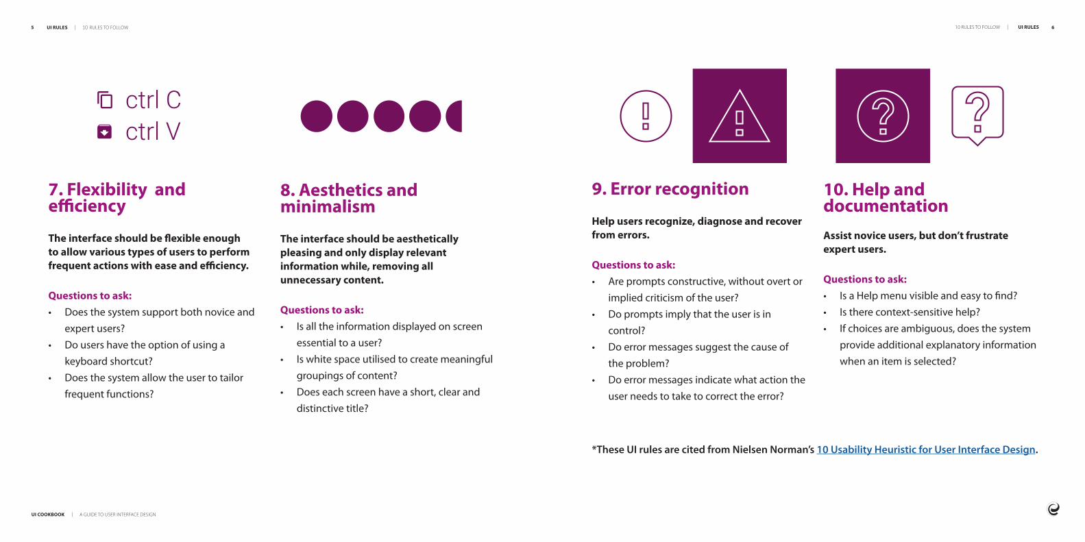
UI COOKBOOK | A GUIDE TO USER INTERFACE DESIGN
7 8
Buttons are easy to use even for inexperienced users and should be used to execute important actions Avoid using too many buttons as the more choice you add the more complex a page can become The time it takes to make decision increases with the number and complexity of choices this is known as Hickrsquos Law
Tips for using buttonsbull Use the primary button for the default actionbull Group related buttonsbull Position unrelated buttons away from related ones bull Keep button labels short
Buttons
IngredientsIngredients
INGREDIENTS | INGREDIENTS BUTTONS | INGREDIENTS
DISABLED
Default Primary button for high emphasis
Secondary button for medium emphasis
Tertiary button for low emphasis
NORMAL PRESSED
NORMAL PRESSED
NORMAL PRESSED DISABLED
DISABLED
10
UI COOKBOOK | A GUIDE TO USER INTERFACE DESIGN
9
Input fields
Commonly used for username password search messages and other inputs from users
Tips for using text iputsbull Label text shouldnrsquot be multiple linesbull Placeholder or hint text must disappear
when the user starts typing bull It should be clear that the text field is
either enabled disabled required filled etc
bull If the input text required is long rather use a multi-line text box control than a regular input
bull Fields should always be aligned to each other to make them easier to read
Icons
Icons should be used carefully should be clear and allow users to understand their meaning instantaneously They are a powerful way to enhance user interaction and reinforce the brand
Tips for using iconsbull An icon should have a single meaning across an
application bull Use colour consistently and appropriately eg red
for a warning icon bull Ensure detail is clear even on small iconsbull Maintain the same size for all icons eg 20px icon
4px padding all around bull Ensure all strokes are the same thickness
Use icon packs for consistencybull Font awesome bull Material Design icons
Use icons that have the same detail and style
INGREDIENTS | TEXT INPUT ICONS | INGREDIENTS
Before adding input
After adding input
Disabled input
Input error
John Doe
Name
Enter name
Name
personmailcom
myemailcom
Please provide a valid email address
Maintain the same aspect ratio
10
12
UI COOKBOOK | A GUIDE TO USER INTERFACE DESIGN
11
Typography
The way text looks in terms of its size width colour and structure contributes to the effectiveness of a design and the message that needs to be conveyed
Misuse of typography can negatively impact the user experience of your site if not done correctly
Tips for using typographybull Make sure itrsquos readable in large and small
sizes bull Use different sizes to show hierarchybull The chosen fonts should match your
brand and image bull Use system fonts where possible eg
Roboto for Android San Francisco for iOS Segoe UI for Windows
bull Ensure there is enough whitespace around the text otherwise itrsquos hard to read
bull The smallest size for body text should be 16px or 12pt so that users can read it comfortably however labels can be smaller at 13px or 10pt
INGREDIENTS | TYPOGRAPHY TYPOGRAPHY | INGREDIENTS 12
DisplayH1 tag - Modal titles light 42pt
HeaderH2 tag - Page titles bold 34pt
Title 1H3 tag - Tabs titles forms semi-bold 28pt
Title 2H4 tag - Buttons tabstitles forms
semi-bold 22pt
Subtitle 1H5 tag - Info paragraphs regular 20pt
BodyP tag - Info descriptions regular 14pt
CaptionSmall tag - Time stampsfooters figure or photodescription
regular 12pt
Subtitle 2H6 tag - Info paragraphs semi-bold 16pt
UI COOKBOOK | A GUIDE TO USER INTERFACE DESIGN
13 14
Cards
Cards group images text and other elements together They show a summary of information and can be the entry point for more information Cards help use space effectively and balance the user interface by grouping and structuring content
Tips for using cardsbull All content within a card should relate to a
single idea bull Use the same layout and styling for all cards
with a similar use bull A drop-shadow rounded corners and a
hover effect can be used to show a card is clickable
bull A card should have minimal content
REFERENCE
$ 4000 month
230 additional notes
1890 additional notes
ORDER
Lists
A lists is continuous group of text or images
Tips for using listsbull Lists should be sorted in logical ways
that make content easy to scan such as alphabetical numerical chronological or by user preference through filtering
bull Lists present content in a way that makes it easy to identify a specific item in a collection of items and act on it
bull Lists should present icons text and actions in a consistent format
DOCUMENTS
Adobe XD
Adobe PS
Adobe New Photo
TOP HITS
Adobe XD
Adobe Illustrator
Adobe Photoshop
INGREDIENTS | CARDS CARDS | INGREDIENTS
UI COOKBOOK | A GUIDE TO USER INTERFACE DESIGN
15 16
Images
Images are an important part of a design as they can help tell a story communicate a brand clarify complex messages or even show users how to perform an action
Tips for using imagesbull Ensure all your images are optimised for web 72ppi (pixels per inch) is generally the
web standard bull High-resolution screens are more popular these days therefore 150ppi is also
acceptable and sometimes necessary bull Images should have a purpose on the page and not be used to simply make up space bull They should relate to each other and the content on a page by sharing the same style
function and intent bull Images should always have alt-text so that a screen reader can pick up visual details for
users with visual impairments
Footer
A footer helps visitors find additional information about an organisation and other links such as social media contact information etc
Tips for using footersbull You can add main navigation links or a sitemap to footers bull Social media links are usually found in the footer bull Include the companyrsquos main contact details bull Links to other relevant websites such as a business website (if your website is consumer
facing) bull Include copyright information bull If you use a narrow footer design you can make it fixed to the bottom of the screen so
that it stays visible to the user at all times bull Exclude the footer if your page has infinite scrolling eg a news blog that loads article
after article as you scroll
INGREDIENTS | IMAGES FOOTER | INGREDIENTS
CONTACT US
+44 345 678 903
contactmailcom
Find a Store
SERVICES
Contact Us
Ordering amp Payment
Shipping
Returns
FAQ
Sizing Guide
INFORMATION
About
Work With US
Privacy Policy
Terms amp Conditions
Press Enquiries
copy Copyright mark
UI COOKBOOK | A GUIDE TO USER INTERFACE DESIGN
17 18
Modals
Modals are content overlaid on top of the sitersquos main content They usually disable the background content but are still visible behind a transparent full-screen overlay Modals stop a user from interacting with the main content drawing attention to an important task or piece of information
Tips for using modalsbull Modals are best used when users need to make an important decision to get their full
attention or when the user needs to confirm a risky action bull Donrsquot include a close button on your modal if a user must complete an action before
returning to the main content instead close the modal once an action has been completed by a user clicking a login save or continue button for example
bull Modals are useful when you want to show the user extra information without changing the context or main content
Alert and notification messages
Alert and notification messages appear temporarily or can be dismissed they either appear in context or the top or bottom of the screen They donrsquot require user input but sometimes they have an action that the user needs to perform
Tips for using alert messagesbull Informational alerts provide updates on processes and actions eg loading saving
or errorsbull Contextual alerts should be placed in the most suitable area of the screen eg alert
messages and system messages are usually displayed at the top or bottom of the screen
bull Create a standardised set of alerts eg information warning success error and use them consistently throughout the UI
bull Keep the messages short and to the pointbull Donrsquot use technical terms or error codes bull Use clear and simple language that the user can easily understand
INGREDIENTS | MODALS ALERTS amp NOTIFICATIONS | INGREDIENTS
UI COOKBOOK | A GUIDE TO USER INTERFACE DESIGN
19 20
Tables
Tables help to organisation data in an orderly manner so that users can scan compare and analyse it
Tips for using tablesbull Make sure the table-header text stands out and has enough padding it mustnrsquot be too
bold or squashedbull If you are showing more than thirty rows per page put pagination at the top and
bottom of the table so that the user can move between pages without too much scrolling
bull Add filters to reduce the amount of data displayed based on the userrsquos needsbull Sorting can be added when data can be sorted alphabetically or numerically Add solid
triangle arrow icons next to the header icons as sorting controls (chevrons are harder to click or tap)
bull Use clean minimal styling and icons for tables so that the data is the focusbull When including text links in a table use proper link styling to provide a visual cue to the
users that these are clickable
Stepper or wizard
Steppers are useful for signup pages or forms where the user has to complete multiple sections of data They simplify the userrsquos experience because it breaks up long forms into small chunks and provides feedback of the userrsquos progress
Tips for using a stepperbull Use clear concise and short labels for each step bull You can add numbers and custom icons to each step as they help the user see where
they are in the process at a glancebull Explain each step along the way with a short sentence below the headingbull Ensure that the stepper and layout of each page in the series remains consistentbull Highlight the completed steps and the current step as the user progressesbull Ensure that the user can get back to a previous step in case they want to make a
correctionbull Never add more steps when the user is already busy with a form If you need a varying
number of steps rather allow the user to set up the form before completing it eg if you ask a user lsquoAre you an individual or businessrsquo then load the appropriate amount of form steps
INGREDIENTS | TABLES STEPPER OR WIZARD | INGREDIENTS
1 2 3
UI COOKBOOK | A GUIDE TO USER INTERFACE DESIGN
21 22
Radio buttons and switches
Radio buttons and switches allow the user to select exactly one choice from at least two options
Tips for using radio buttons and switchesbull Use radio buttons to choose an option from a group not as action buttons to perform
commandsbull You should list the options in a logical order such as the most likely to be selected to least or
simplest operation to most complexbull Labels should be clear and simple if they are vague it might mislead usersbull If the user might not want to choose from the list give them the option of selecting lsquononersquobull Lay radio buttons out vertically one item with its label per line If you need them to be
horizontal ensure the space between the buttons and labels are even to provide enough space between each so that you know which label goes with which radio button
bull Ensure radio buttons are large enough for a user to click or tap on when using smaller devices bull If there are only two options you could use a single checkbox or a switch eg lsquoon-offrsquo or lsquoyes-norsquo
Checkboxes
Checkboxes allow the user to select any number of choices from no choice through to several Each checkbox is independent in a list and checking one box doesnrsquot uncheck the others
Tips for using checkboxesbull Checkboxes should have a tick mark or an lsquoXrsquo and a solid background colour when
selectedbull Checkboxes are small components by default ensure the user can click or tap on it on
smaller device sizesbull Lay your checkboxes out vertically with one item and its label on a single line If you
need your checkboxes to run horizontally then ensure the space between the buttons and labels are even and provide enough space between each so that you know which label goes with which checkbox
bull Use positive wording so that its clear what will happen if the user selects the checkbox
INGREDIENTS | RADIO BUTTONS amp SWITCHES CHECKBOXES | INGREDIENTS
UI COOKBOOK | A GUIDE TO USER INTERFACE DESIGN
23 24
Sliders
A slider is a control element that uses a lever that moves horizontally to control a variable such as speaker volume or brightness on a screen In practice sliders can be difficult for the user to manipulate because the user must be able to tap or click and drag their finger or mouse over the screen which requires multiple movements at once
Tips for using slidersbull Ensure the sliderrsquos labels remain visible above the userrsquos cursor or thumb while the user
moves the lever so they can always see the selected valuebull Ensure the sliderrsquos range isnrsquot too large and that itrsquos easy for the user to select a precise
valuebull Sliders are effective on mobile devices as they replicate the natural action of a thumb
however you need to ensure that the lever is large enough to tap and drag across a devicersquos screen
INGREDIENTS | SLIDERS SLIDERS | INGREDIENTS
UI COOKBOOK | A GUIDE TO USER INTERFACE DESIGN
25 26
RecipesRecipes
RECIPES | RECIPES RECIPES | RECIPES
2827
UI COOKBOOK | A GUIDE TO USER INTERFACE DESIGN
SHOP ONLINE
Splash screen
Time to design 10 minutes
What yoursquoll needbull App icon or company logobull Title or catchy phrase (optional)
When to use itbull When you need a few seconds to load
background data from a serverbull When the user needs to be
authenticated
5 Fade out the splash screen after two to three seconds If data is still loading use a loading indicator to keep the userrsquos informed that the app is doing something
Finishing touchesbull Sometimes the app version number is
displayed on the splash screen and the user can be prompted to update their app version if required
RECIPES | SPLASH SCREEN SPLASH SCREEN | RECIPES
Directions1 Choose an appropriate solid background
colour or gradient that fits in with the apprsquos branding
2 Ensure the app icon is in a vector format3 Use a simple animation to fade the app
icon or company logo into the view4 If you have a title or catch phrase position
it below the icon and animate it into the view
27
UI COOKBOOK | A GUIDE TO USER INTERFACE DESIGN
UI COOKBOOK | A GUIDE TO USER INTERFACE DESIGN
29 30
c For selecting an option from a list of more than three items use a dropdown
d For selecting multiple options use checkboxes
e For selecting a single option use radio buttons or a button toggle
f If the user needs to perform an action use a button
2 Can components be grouped into logical groups or steps eg personal details and banking detailsa Use a stepper and slot the correct
components in accordingly Note Use this to improve the form experience only if there are many fields in which case grouping them will reduce cognitive load (the load placed on a userrsquos brain)
3 If your form has a stepper make sure that there are lsquonextrsquo and lsquobackrsquo buttons to allow the user to navigate easily through the form
NEXT
Credit Card Info
CARD NUMBER
1234 5678 3456 2456
CARDHOLDER NAME
John Doe
CVV
123
EXPIRE DATE
05 21
Forms
Time to design 30 minutes
What yoursquoll needbull Input fieldsbull Buttonsbull Feedbackbull Switches and sliders (optional)bull Stepper (optional)
When to use itbull Anytime a user needs to input data into
a systembull For sign up or onboardingbull For user loginbull Data entry of any kind
Billing Info
FULL NAME
John Doe
ADDRESS
497 Evergreen Rd
CITY
Roseville
ZIP CODE
95673
COUNTRY
United States
NEXT
RECIPES | FORMS FORMS | RECIPES
Directions1 Think of all the fields that are needed for
the task and select the appropriate input component
a For simple input use an input fieldb For selecting an option from a list
of more than three items use a dropdown
4 The primary action for the form is to lsquosubmit or lsquoaddrsquo depending on its purpose
Finishing touchesbull Forms should be in one column with one
component per row as this improves speed of entry
UI COOKBOOK | A GUIDE TO USER INTERFACE DESIGN
31 32
Home screen
Time to design 1-2 hours
What yoursquoll needbull Navigationbull Bannerbull Imagesbull Image carouselbull Cards
When to use itAs the first impression users get of the company what the products or services are and what makes them unique The home page is therefore an important part of a website andor app
bull Use cards for key services offerings
Directions1 Place main navigation at the top of page
(see next recipe on desktop navigation)2 Place image carousel (if you want or need
to use one) below the navigation This will be the first thing that catches your userrsquos eye but isnrsquot always necessary for home page design
3 Place cards below the image carousel lined up side by side These should stack equally on a responsive page
4 Below the card content can be other essential information you want to communicate to the user but donrsquot clutter it
5 You will place the footer below this content
Finishing touchesbull Trends in home page design vary so
you will need to think about how your homepage is communicated as there can be many ways to do it Look for inspiration from your favourite websites or look at competitors of your client through a simple competitor review
Preparationbull Get your headlines ready ndash h1 through to
h6 but remember to use only one h1 per page as that is what Google indexes as the most important when crawling
bull Use an image carousel to promote specials or exciting information about your client
FEED AUTHORS EXPLORE BLOG CONTACT
This is where we share our travel adventures across Africa with you
Welcome
Mountain Gorilla Trekking in the Impenetrable Forest of Uganda
Uganda
READ MORE
RECIPES | HOME SCREEN HOME SCREEN | RECIPES
UI COOKBOOK | A GUIDE TO USER INTERFACE DESIGN
33 34
Navigation with search field hidden
Navigation with search field open
Desktop navigation
Time to design 1 hour
What yoursquoll need for desktopbull Logobull Hyperlinksbull Search iconbull Input fieldbull Labels x 2bull Profile iconbull Drop downbull Primary and secondary buttons
When to use itWhen your site or app has more than one page
Directions1 Align the logo to the left this web
convention and itrsquos also a great place to hyperlink to lsquohomersquo
2 The rest of your nav items can be aligned centre and should be spaced evenly apart as well as given enough space to lsquobreathersquo with padding top and bottom
3 The search and profile icons (if login is required) should be aligned to the right - this is web convention When you follow conventions like this the consistency helps with the learnability of the system
4 Your search icon will hide and show the search field so place it to the left of the profile icon so it has space to stretch out into an input field (refer to example)
5 On click of search icon the search should be exposed with the ability to search and close
6 The profile icon on click will expose the drop-down Inside that drop-down you will have prepared two input fields with labels along with a primary and secondary button so now we will label thema The first label will be rsquousernamersquob The second label will be lsquopasswordrsquoc Donrsquot forgot the hint text for your fields ndash hint texts help users know what data to input
7 Label your primary button lsquosign inrsquo and your secondary button lsquoregisterrsquo (refer to login screen recipe on the next page)
RECIPES | DESKTOP NAVIGATION DESKTOP NAVIGATION | RECIPES
FEED AUTHORS EXPLORE BLOG CONTACT
FEED AUTHORS EXPLORE BLOG CONTACT
Preparationbull Create a rectangular container at the top of
the page to fill the full width of the screenbull Place the logo navigational hyperlinks
search icon search input field and profile icon into the container
UI COOKBOOK | A GUIDE TO USER INTERFACE DESIGN
35 36
Login screen
Time to design 30 minutes
What yoursquoll needbull Input fields x 2bull Cardbull Background imagebull Buttonsbull Field validationbull Show hide password icon
When to use itWhen you need a user to login or authenticate themselves
3 Place two buttons next to each other on the bottom of the carda Left align the register button (secondary button) or use a tertiary button or link below the login buttonb Right align the sign in or login button (primary button)
4 Ensure that you show an error message if the login fails eg username or password entered is incorrect
Finishing touchesbull Add a showhide icon to the right-hand
side of the password field so the user can toggle visibility of their password to check if itrsquos typed correctly This is an important pattern for mobile login screens
Mobile navigation
Time to design 1 hour
What yoursquoll need for mobilebull Hamburger nav iconbull Drawer panelbull Hyperlinksbull Profile iconbull Primary and secondary buttons
When to use itWhen your site or app has more than one page and when your site is viewed on a mobile device Try keep the primary menu visible and use the hamburger for secondary options
TITLE
Mobile header with hamburger nav
Drawer panel slides out when user taps the hamburger nav
Log In
USERNAME
jdoe2340
PASSWORD
NOT REGISTERED LOG IN
RECIPES | LOGIN SCREEN LOGIN SCREEN | RECIPES
John DoeSan Francisco CA
FEED
EXPLORE
MESSAGES
NOTIFICATIONS
PHOTOS
VIDEOS
PLACES
SETTINGS
SEARCH
Directions1 Place a background image on the page ndash
the background should cover the whole page
2 Place the card in the centre of the page add the two fields one below the othera Label the first field lsquousernamersquob Label the second field lsquopasswordrsquo
Directions1 When the hamburger is clicked it should
open a container for navigation This contains the user profile navigation links and sign out button
2 Place the profile icon at the top of the drawer panel with the profile or sign out buttons below
3 Add the navigation hyperlinks one below the other in the same order as the desktop menu (refer to previous recipe) Ensure that the padding around each item is the same
UI COOKBOOK | A GUIDE TO USER INTERFACE DESIGN
37 38
Data screen
Time to design 30 minutes to a few hours this depends on the amount of data that needs to be represented
What yoursquoll needbull Cardsbull Listsbull Tablesbull Labels
When to use itTo display a group of data in one place eg all employees of a company (admin) or all items on sale (e-commerce)
b If the user needs to compare sort or filter the data display the data in a table
Directions1 Place a label at the top left corner of the
screen This label defines everything that will be displayed on the page in one or two words
2 Add sub-headings to explain what the data is about in one or two sentences (optional)
3 Place a search bar in the top right corner to indicate that the user can search to filter data
4 Decide whether you will use cards or lists (refer to figure on the left)
5 Fill the rest of the page with the data you would like to display
6 Add pagination to show there is more data to find in this category if all data canrsquot be displayed on a single page
Finishing touchesbull Ensure that the data is displayed in a way
that makes it easy for a user to understand and is useful
bull Use headings and sub-headings to break up the data into sections and categories so that the user can easily scan the page
PreparationEach item within the data will have many related fields Decide on the top four or five fields that are most important to identify the item
a If the best way to distinguish different data items is visually use a wall of cardstiles
Search for items brand and inspirationhellip
Items
Sam ShopaholicCart
FilterSort
Red Espadrille
Striped Wool Hat
Premium Sneaker
R 50000
R 10000
R 150000
Yellow Jersey
Purple Jacket
Pattern Wool Hat
R 30000
R 100000
R 15000
Skinny Jeans
Blue Lace Up Snhellip
Yellow Shorts
R 40000
R 110000
R 35000
Button Up T-shirt
Multi-colour Jacket
Maroon Sneaker
R 25000
R 80000
R 75000
Striped T-shirt
Striped Pants
Green Cap
R 25000
R 40000
R 10000
Flash Vest
Blue Sneaker
Green Jacket
R 10000
R 80000
R 95000
SHOP
WOMEN
MEN
SPORT
ACCESSORIES
Search for items brand and inspirationhellip
Items
Cart
Description
Red Espadrille
Yellow Jersey
Skinny Jeans
Button Up T-shirt
Stripped T-shirt
Flash Vest
Striped Wool Hat
Purple Jersey
Blue Lace Up Sneaker
Multi-colour Jacket
Price
R 50000
R 30000
R 40000
R 25000
R 25000
R 10000
R 10000
R 100000
R 110000
R 80000
Sam Shopaholic
FilterSortSHOP
WOMEN
MEN
SPORT
ACCESSORIES
Add to cartView
Add to cartView
Add to cartView
Add to cartView
Add to cartView
Add to cartView
Add to cartView
Add to cartView
Add to cartView
Add to cartView
RECIPES | DATA SCREEN DATA SCREEN | RECIPES
bull Input Fields bull Buttonsbull Search Barbull Pagination
UI COOKBOOK | A GUIDE TO USER INTERFACE DESIGN
39 40
Statistics dashboard
Time to design 30 minutes
What yoursquoll needbull Cardsbull Graphs bull Labelsbull Tablesbull Buttons bull Togglesbull Input Fields
When to use itAnytime a user needs to see reporting infor-mation
bull A card sorting exercise where you place all navigation items on physical cards and sort them can help you design or evaluate the information architecture of your site
Directions1 Sketch out the basic layout you would like
for your dashboard 2 Decide on the correct graphs to display the
data you want eg a bar graph to display categories of data
3 Label each section with a main heading to group the data logically
4 Use cards per data item5 Make sure to add a toggle or date picker
so that the user can alter the dashboard to display the data that they are looking for
Finishing touchesbull Remember a dashboard is like a meal - it
needs a bit everything to be satisfying but too many ingredients can throw out its visual balance out completely
Nov 10 2017 Dec 10 2017
$5k
$10k
$15k
$20k
$25k
$5k
$10k
$15k
$20k
$25k
Last 30 Days
Total viewsProducts sold
Trends
Total Revenue$50000
Revenue$1250
Growth+20
$190500 of $1MUnited States
$98321 of $1MChina
$128602 of $1MAlgeria
$293792 of $1MAustralia
$829910 of $1MRussia
View Full ReportSales by Country
4 hours agoJohn Doe added you to his team
8 hours agoInvoice for 30 hours of calls has paid
2 days agoYoursquove logged in on a new device
3 days agoYoursquove got a new message on Facebook
Timeline
Preparationbull List the type of information you want
to display in order of what is the most valuable and important to the user to the least creating a hierarchy of information
RECIPES | STATISTIC DASHBOARD STATISTIC DASHBOARD | RECIPES
UI COOKBOOK | A GUIDE TO USER INTERFACE DESIGN
41 42
E-commerce landing screen
Time to design A few hours
What yoursquoll needbull Navigationbull Image carouselbull Promotional imagesbull Product imagebull Cardsbull Primary button and potentially two
or three secondary buttons
When to use itTo display different products promotions and services that the company offers
Directions1 Place your promotional images in a full
width image carousel to be able to move through the various promotions or offers
2 Place image carousel below navigation and remember this should be 100 width to allow it to constrain to different screen sizes
3 Your cards come next you can organise these in different ways Some options in how you could organise these are promoted products latest or those on sale Be sure to clearly categorise or label your card sections
4 You will then to place your footer at the bottom of your page
Finishing touchesbull If you do need additional buttons on your
product cards like wish list or comparison ensure that you have icons that relate to their function
SHOP ONLINE
SPA
BLOG
CONTACT
Search for products brand and treatmentshellip
Our specials
Name SurnameCart
Jasmine oilR 16000
VIEW
Aloe vera gelR 32000
VIEW
Rosemary oilR 16000
VIEW
Lotus flower lotionR 30000
VIEW
Get a free facial with any full body massageLimited time offer
Introducing our new Garra Rufa fish pedicure
Book now
Book now
Preparationbull When preparing your cards ensure there is
space for a product image an add to cart button
bull You might want to include buttons such as wish list and product comparison
RECIPES | E-COMMERCE LANDING SCREEN E-COMMERCE LANDING SCREEN | RECIPES
UI COOKBOOK | A GUIDE TO USER INTERFACE DESIGN
43 44
E-commerce product screen
Time to design A few hours
What yoursquoll needbull Navigationbull Product imagebull Product gallerybull Cards (other similar products or promoted
products)bull Footer
When to use itWhen you need to display
a Detailed information about a product with imagesb Add product to a cartc Compare that product to another productd Add the chosen product to a wish list
2 Ensure your primary product image comes first and secondary product images are nested below A user should be able to see a physical product from different angles to engender trust and aid in decision making
3 Product details should be included in a simple table that displays key information about the product to allow the user to make an informed decision
4 Call to action buttons may sit below the image gallery or next to a productrsquos details Once the user has viewed necessary product information they are able to make a purchase or engage in a product comparison
5 Promoted or related products can be included either on the side or below the product detail but shouldnrsquot distract from the key purchase
Finishing touchesbull You can add additional buttons such as
wish list like share or compare
ABOUT VISIT US SHOP WHOLESALE CONTACT US
Single Origin UgandaBugisu AA Organic
250gR 10000
Add to CartAdd to Wishlist
Story
Related Products
In Stock 9 Reviews
Processing Tasting Notes Reviews
Terbodorersquos SELECT range showcases some of the best single origin beans in the world This Uganda Bugisu AA bean is grown according to the principles of sustainable farming conditions and often left to grow naturally It features a full body notes of red apple and dark chocolate in the finish
2
RECIPES | E-COMMERCE PRODUCT SCREEN E-COMMERCE PRODUCT SCREEN | RECIPES
Directions1 Place product gallery above the fold
(before the point of scrolling) This is what the user has come to see
UI COOKBOOK | A GUIDE TO USER INTERFACE DESIGN
45 46
Profile screen
Time to design 30 minutes to an hour
What yoursquoll needbull Tabsbull Expansion panel accordion bull Imagebull Labels bull Buttons
When to use itbull When you want to display information
about a user either to the user themselves or an admin user This should include the ability to edit the userrsquos details or delete the userrsquos profile
5 Itrsquos always handy to have a picture or picture placeholder as it elevates the design The picture should be grouped with the most important data
6 Depending on the profile and the information it contains the rest of the data about the user should be grouped into tabs or expansion panels (this should take up the rest of the page)a The primary actions available for the user eg edit delete should be easy to find and therefore should be a primary button at the top right hand of the screen3 The items that are of most importance
should be displayed at the top or left of the screen as you want the user to read this first
4 Make sure that the items you pick for this are available for all users You donrsquot want gaps in your designs eg name surname role are great examples of things that are of the highest priority Things like lsquohair colourrsquo are not as important (unless you are a hair modelling agency) and it might not be available data for everyone
Finishing touchesbull Add icons to your tabs or expansion
panels as this will aid findability as well as improve the overall look and feel of the profile page
bull Always have a back button that allows a user to return to their previous screen if they so wish
Directions1 Discover what information you have
to display for any given user You could use a card sorting exercise to order the information based on importance
2 Know which fields are mandatory
NameJames
SurnameJackson
Phone number
Address
123 456 7890
jjacksonemailcom
1 Sesame StreetCA
Password
Address
Card details
System key
Username
Phone
RECIPES | PROFILE SCREEN PROFILE SCREEN | RECIPES
UI COOKBOOK | A GUIDE TO USER INTERFACE DESIGN
47 48
Social screen
Time to design 10 minutes
What yoursquoll needbull Cover or banner imagebull Profile picturebull Background (optional)
When to use itWhen your organisation needs a platform such as Facebook Twitter or LinkedIn to communicate their brand and products This also allows your organisation to grow their network by drawing in followers and gaining social media presence
do change from time to time so check guidelines regularly)
3 Use more images than text on your social screen as the human brain processes images much faster than text
4 Create a visual relationship between your profile picture and cover image
5 The profile picture shouldnrsquot hide any valuable content in the cover image
6 Ensure your designs follow the guidelines set by each social platform
Finishing touchesbull Update imagery on the social media page
every few months to keep your target audience interested
bull Make sure the overall design is consistent with the companyrsquos branding and demonstrates the products and services they offer
bull Use a consistent look and feel across all your social media pages
bull If the content and visuals are appealing they are more likely to be shared and increase engagement
Directions1 Choose a cover or banner image
and background that promotes the organisation or a marketing campaign
2 Create the correct size images for each social platform (these sizes are defined in a social platforms documentation but
RECIPES | SOCIAL SCREEN SOCIAL SCREEN | RECIPES
PostDelete
Create a post
Say something
With the technological advancement in the 21st century everybody wants to experience the best technology with the least amount of effort By now user experience (UX) design is recognised as a crucial part of customer satisfactionhellip
12 January 2020Entelect
12 Interactions 3 Comments
THE DATA SCIENCEBEHIND UX
ENTELECT INSIGHTSINNOVATE TRANSFORM AUTOMATE BY ENTELECT
ShareCommentLike
UI COOKBOOK | A GUIDE TO USER INTERFACE DESIGN
49 50
Contact screen
Time to design 30 minutes
What yoursquoll needbull Navigationbull Contact formbull Location (use google maps)bull Phone numbersbull Email addressesbull Chat bot (if possibleapplicable)bull Product logobrand imagebull Footer
When to use itA contact page allows those visiting your site to contact you This page should be easy for users to navigate to and page links should be in the footer section of your website as well as your menu
2 Always give the user clear direction to the purpose of a page ndash in this case lsquoContact Usrsquo
3 Organise the information in a symmetrical fashion eg the contact form on the left and the numbers and location on the right
4 Give the user feedback once the form is submitted or if itrsquos been incorrectly filled out using success or error messages
5 Give the user a notification that you will respond to them within a certain time frame if successful or explain the errors in what they have input and how to correct them
6 Keep the colours text and sizing of the contact page consistent with the design on all other pages of your website
Finishing touchesbull The contact page should be kept brief and
simple bull Your contact page should have multiple
methods by which a user can contact you if possible besides the contact form itself
FEED AUTHORS EXPLORE BLOG CONTACT
Contact UsContact Us Get in touch to find out about our available positions or just to chat about your future Let Us Get back to you Fill out our form
Full Name
Message
Send
+27 87 1234
contactusemailcom
RECIPES | CONTACT SCREEN CONTACT SCREEN | RECIPES
Directions1 Place the contact form above the fold
(before the point of scrolling) This is what the user has come to see
UI COOKBOOK | A GUIDE TO USER INTERFACE DESIGN
51 52
Resourcesbull 10 rules of good UI to follow bull 5 tips for creating a social media page designbull Matrial Design - Design guidance and codebull Building the perfect splash screenbull Balsamiqbull Typography in UI Guide for beginnersbull 15 examples of popular card UI design bull 8 rules for perfect typography in UIbull User interface elementsbull 10 usability heuristics for UI designbull Laws of UXbull Card Sorting
This book was brought to you by the UX Guild
RESOURCES | RESOURCES 52
If you have any suggestions or comments for improvement please emailguild-uxentelectcoza
cultureentelectcoza

10
UI COOKBOOK | A GUIDE TO USER INTERFACE DESIGN
9
Input fields
Commonly used for username password search messages and other inputs from users
Tips for using text iputsbull Label text shouldnrsquot be multiple linesbull Placeholder or hint text must disappear
when the user starts typing bull It should be clear that the text field is
either enabled disabled required filled etc
bull If the input text required is long rather use a multi-line text box control than a regular input
bull Fields should always be aligned to each other to make them easier to read
Icons
Icons should be used carefully should be clear and allow users to understand their meaning instantaneously They are a powerful way to enhance user interaction and reinforce the brand
Tips for using iconsbull An icon should have a single meaning across an
application bull Use colour consistently and appropriately eg red
for a warning icon bull Ensure detail is clear even on small iconsbull Maintain the same size for all icons eg 20px icon
4px padding all around bull Ensure all strokes are the same thickness
Use icon packs for consistencybull Font awesome bull Material Design icons
Use icons that have the same detail and style
INGREDIENTS | TEXT INPUT ICONS | INGREDIENTS
Before adding input
After adding input
Disabled input
Input error
John Doe
Name
Enter name
Name
personmailcom
myemailcom
Please provide a valid email address
Maintain the same aspect ratio
10
12
UI COOKBOOK | A GUIDE TO USER INTERFACE DESIGN
11
Typography
The way text looks in terms of its size width colour and structure contributes to the effectiveness of a design and the message that needs to be conveyed
Misuse of typography can negatively impact the user experience of your site if not done correctly
Tips for using typographybull Make sure itrsquos readable in large and small
sizes bull Use different sizes to show hierarchybull The chosen fonts should match your
brand and image bull Use system fonts where possible eg
Roboto for Android San Francisco for iOS Segoe UI for Windows
bull Ensure there is enough whitespace around the text otherwise itrsquos hard to read
bull The smallest size for body text should be 16px or 12pt so that users can read it comfortably however labels can be smaller at 13px or 10pt
INGREDIENTS | TYPOGRAPHY TYPOGRAPHY | INGREDIENTS 12
DisplayH1 tag - Modal titles light 42pt
HeaderH2 tag - Page titles bold 34pt
Title 1H3 tag - Tabs titles forms semi-bold 28pt
Title 2H4 tag - Buttons tabstitles forms
semi-bold 22pt
Subtitle 1H5 tag - Info paragraphs regular 20pt
BodyP tag - Info descriptions regular 14pt
CaptionSmall tag - Time stampsfooters figure or photodescription
regular 12pt
Subtitle 2H6 tag - Info paragraphs semi-bold 16pt
UI COOKBOOK | A GUIDE TO USER INTERFACE DESIGN
13 14
Cards
Cards group images text and other elements together They show a summary of information and can be the entry point for more information Cards help use space effectively and balance the user interface by grouping and structuring content
Tips for using cardsbull All content within a card should relate to a
single idea bull Use the same layout and styling for all cards
with a similar use bull A drop-shadow rounded corners and a
hover effect can be used to show a card is clickable
bull A card should have minimal content
REFERENCE
$ 4000 month
230 additional notes
1890 additional notes
ORDER
Lists
A lists is continuous group of text or images
Tips for using listsbull Lists should be sorted in logical ways
that make content easy to scan such as alphabetical numerical chronological or by user preference through filtering
bull Lists present content in a way that makes it easy to identify a specific item in a collection of items and act on it
bull Lists should present icons text and actions in a consistent format
DOCUMENTS
Adobe XD
Adobe PS
Adobe New Photo
TOP HITS
Adobe XD
Adobe Illustrator
Adobe Photoshop
INGREDIENTS | CARDS CARDS | INGREDIENTS
UI COOKBOOK | A GUIDE TO USER INTERFACE DESIGN
15 16
Images
Images are an important part of a design as they can help tell a story communicate a brand clarify complex messages or even show users how to perform an action
Tips for using imagesbull Ensure all your images are optimised for web 72ppi (pixels per inch) is generally the
web standard bull High-resolution screens are more popular these days therefore 150ppi is also
acceptable and sometimes necessary bull Images should have a purpose on the page and not be used to simply make up space bull They should relate to each other and the content on a page by sharing the same style
function and intent bull Images should always have alt-text so that a screen reader can pick up visual details for
users with visual impairments
Footer
A footer helps visitors find additional information about an organisation and other links such as social media contact information etc
Tips for using footersbull You can add main navigation links or a sitemap to footers bull Social media links are usually found in the footer bull Include the companyrsquos main contact details bull Links to other relevant websites such as a business website (if your website is consumer
facing) bull Include copyright information bull If you use a narrow footer design you can make it fixed to the bottom of the screen so
that it stays visible to the user at all times bull Exclude the footer if your page has infinite scrolling eg a news blog that loads article
after article as you scroll
INGREDIENTS | IMAGES FOOTER | INGREDIENTS
CONTACT US
+44 345 678 903
contactmailcom
Find a Store
SERVICES
Contact Us
Ordering amp Payment
Shipping
Returns
FAQ
Sizing Guide
INFORMATION
About
Work With US
Privacy Policy
Terms amp Conditions
Press Enquiries
copy Copyright mark
UI COOKBOOK | A GUIDE TO USER INTERFACE DESIGN
17 18
Modals
Modals are content overlaid on top of the sitersquos main content They usually disable the background content but are still visible behind a transparent full-screen overlay Modals stop a user from interacting with the main content drawing attention to an important task or piece of information
Tips for using modalsbull Modals are best used when users need to make an important decision to get their full
attention or when the user needs to confirm a risky action bull Donrsquot include a close button on your modal if a user must complete an action before
returning to the main content instead close the modal once an action has been completed by a user clicking a login save or continue button for example
bull Modals are useful when you want to show the user extra information without changing the context or main content
Alert and notification messages
Alert and notification messages appear temporarily or can be dismissed they either appear in context or the top or bottom of the screen They donrsquot require user input but sometimes they have an action that the user needs to perform
Tips for using alert messagesbull Informational alerts provide updates on processes and actions eg loading saving
or errorsbull Contextual alerts should be placed in the most suitable area of the screen eg alert
messages and system messages are usually displayed at the top or bottom of the screen
bull Create a standardised set of alerts eg information warning success error and use them consistently throughout the UI
bull Keep the messages short and to the pointbull Donrsquot use technical terms or error codes bull Use clear and simple language that the user can easily understand
INGREDIENTS | MODALS ALERTS amp NOTIFICATIONS | INGREDIENTS
UI COOKBOOK | A GUIDE TO USER INTERFACE DESIGN
19 20
Tables
Tables help to organisation data in an orderly manner so that users can scan compare and analyse it
Tips for using tablesbull Make sure the table-header text stands out and has enough padding it mustnrsquot be too
bold or squashedbull If you are showing more than thirty rows per page put pagination at the top and
bottom of the table so that the user can move between pages without too much scrolling
bull Add filters to reduce the amount of data displayed based on the userrsquos needsbull Sorting can be added when data can be sorted alphabetically or numerically Add solid
triangle arrow icons next to the header icons as sorting controls (chevrons are harder to click or tap)
bull Use clean minimal styling and icons for tables so that the data is the focusbull When including text links in a table use proper link styling to provide a visual cue to the
users that these are clickable
Stepper or wizard
Steppers are useful for signup pages or forms where the user has to complete multiple sections of data They simplify the userrsquos experience because it breaks up long forms into small chunks and provides feedback of the userrsquos progress
Tips for using a stepperbull Use clear concise and short labels for each step bull You can add numbers and custom icons to each step as they help the user see where
they are in the process at a glancebull Explain each step along the way with a short sentence below the headingbull Ensure that the stepper and layout of each page in the series remains consistentbull Highlight the completed steps and the current step as the user progressesbull Ensure that the user can get back to a previous step in case they want to make a
correctionbull Never add more steps when the user is already busy with a form If you need a varying
number of steps rather allow the user to set up the form before completing it eg if you ask a user lsquoAre you an individual or businessrsquo then load the appropriate amount of form steps
INGREDIENTS | TABLES STEPPER OR WIZARD | INGREDIENTS
1 2 3
UI COOKBOOK | A GUIDE TO USER INTERFACE DESIGN
21 22
Radio buttons and switches
Radio buttons and switches allow the user to select exactly one choice from at least two options
Tips for using radio buttons and switchesbull Use radio buttons to choose an option from a group not as action buttons to perform
commandsbull You should list the options in a logical order such as the most likely to be selected to least or
simplest operation to most complexbull Labels should be clear and simple if they are vague it might mislead usersbull If the user might not want to choose from the list give them the option of selecting lsquononersquobull Lay radio buttons out vertically one item with its label per line If you need them to be
horizontal ensure the space between the buttons and labels are even to provide enough space between each so that you know which label goes with which radio button
bull Ensure radio buttons are large enough for a user to click or tap on when using smaller devices bull If there are only two options you could use a single checkbox or a switch eg lsquoon-offrsquo or lsquoyes-norsquo
Checkboxes
Checkboxes allow the user to select any number of choices from no choice through to several Each checkbox is independent in a list and checking one box doesnrsquot uncheck the others
Tips for using checkboxesbull Checkboxes should have a tick mark or an lsquoXrsquo and a solid background colour when
selectedbull Checkboxes are small components by default ensure the user can click or tap on it on
smaller device sizesbull Lay your checkboxes out vertically with one item and its label on a single line If you
need your checkboxes to run horizontally then ensure the space between the buttons and labels are even and provide enough space between each so that you know which label goes with which checkbox
bull Use positive wording so that its clear what will happen if the user selects the checkbox
INGREDIENTS | RADIO BUTTONS amp SWITCHES CHECKBOXES | INGREDIENTS
UI COOKBOOK | A GUIDE TO USER INTERFACE DESIGN
23 24
Sliders
A slider is a control element that uses a lever that moves horizontally to control a variable such as speaker volume or brightness on a screen In practice sliders can be difficult for the user to manipulate because the user must be able to tap or click and drag their finger or mouse over the screen which requires multiple movements at once
Tips for using slidersbull Ensure the sliderrsquos labels remain visible above the userrsquos cursor or thumb while the user
moves the lever so they can always see the selected valuebull Ensure the sliderrsquos range isnrsquot too large and that itrsquos easy for the user to select a precise
valuebull Sliders are effective on mobile devices as they replicate the natural action of a thumb
however you need to ensure that the lever is large enough to tap and drag across a devicersquos screen
INGREDIENTS | SLIDERS SLIDERS | INGREDIENTS
UI COOKBOOK | A GUIDE TO USER INTERFACE DESIGN
25 26
RecipesRecipes
RECIPES | RECIPES RECIPES | RECIPES
2827
UI COOKBOOK | A GUIDE TO USER INTERFACE DESIGN
SHOP ONLINE
Splash screen
Time to design 10 minutes
What yoursquoll needbull App icon or company logobull Title or catchy phrase (optional)
When to use itbull When you need a few seconds to load
background data from a serverbull When the user needs to be
authenticated
5 Fade out the splash screen after two to three seconds If data is still loading use a loading indicator to keep the userrsquos informed that the app is doing something
Finishing touchesbull Sometimes the app version number is
displayed on the splash screen and the user can be prompted to update their app version if required
RECIPES | SPLASH SCREEN SPLASH SCREEN | RECIPES
Directions1 Choose an appropriate solid background
colour or gradient that fits in with the apprsquos branding
2 Ensure the app icon is in a vector format3 Use a simple animation to fade the app
icon or company logo into the view4 If you have a title or catch phrase position
it below the icon and animate it into the view
27
UI COOKBOOK | A GUIDE TO USER INTERFACE DESIGN
UI COOKBOOK | A GUIDE TO USER INTERFACE DESIGN
29 30
c For selecting an option from a list of more than three items use a dropdown
d For selecting multiple options use checkboxes
e For selecting a single option use radio buttons or a button toggle
f If the user needs to perform an action use a button
2 Can components be grouped into logical groups or steps eg personal details and banking detailsa Use a stepper and slot the correct
components in accordingly Note Use this to improve the form experience only if there are many fields in which case grouping them will reduce cognitive load (the load placed on a userrsquos brain)
3 If your form has a stepper make sure that there are lsquonextrsquo and lsquobackrsquo buttons to allow the user to navigate easily through the form
NEXT
Credit Card Info
CARD NUMBER
1234 5678 3456 2456
CARDHOLDER NAME
John Doe
CVV
123
EXPIRE DATE
05 21
Forms
Time to design 30 minutes
What yoursquoll needbull Input fieldsbull Buttonsbull Feedbackbull Switches and sliders (optional)bull Stepper (optional)
When to use itbull Anytime a user needs to input data into
a systembull For sign up or onboardingbull For user loginbull Data entry of any kind
Billing Info
FULL NAME
John Doe
ADDRESS
497 Evergreen Rd
CITY
Roseville
ZIP CODE
95673
COUNTRY
United States
NEXT
RECIPES | FORMS FORMS | RECIPES
Directions1 Think of all the fields that are needed for
the task and select the appropriate input component
a For simple input use an input fieldb For selecting an option from a list
of more than three items use a dropdown
4 The primary action for the form is to lsquosubmit or lsquoaddrsquo depending on its purpose
Finishing touchesbull Forms should be in one column with one
component per row as this improves speed of entry
UI COOKBOOK | A GUIDE TO USER INTERFACE DESIGN
31 32
Home screen
Time to design 1-2 hours
What yoursquoll needbull Navigationbull Bannerbull Imagesbull Image carouselbull Cards
When to use itAs the first impression users get of the company what the products or services are and what makes them unique The home page is therefore an important part of a website andor app
bull Use cards for key services offerings
Directions1 Place main navigation at the top of page
(see next recipe on desktop navigation)2 Place image carousel (if you want or need
to use one) below the navigation This will be the first thing that catches your userrsquos eye but isnrsquot always necessary for home page design
3 Place cards below the image carousel lined up side by side These should stack equally on a responsive page
4 Below the card content can be other essential information you want to communicate to the user but donrsquot clutter it
5 You will place the footer below this content
Finishing touchesbull Trends in home page design vary so
you will need to think about how your homepage is communicated as there can be many ways to do it Look for inspiration from your favourite websites or look at competitors of your client through a simple competitor review
Preparationbull Get your headlines ready ndash h1 through to
h6 but remember to use only one h1 per page as that is what Google indexes as the most important when crawling
bull Use an image carousel to promote specials or exciting information about your client
FEED AUTHORS EXPLORE BLOG CONTACT
This is where we share our travel adventures across Africa with you
Welcome
Mountain Gorilla Trekking in the Impenetrable Forest of Uganda
Uganda
READ MORE
RECIPES | HOME SCREEN HOME SCREEN | RECIPES
UI COOKBOOK | A GUIDE TO USER INTERFACE DESIGN
33 34
Navigation with search field hidden
Navigation with search field open
Desktop navigation
Time to design 1 hour
What yoursquoll need for desktopbull Logobull Hyperlinksbull Search iconbull Input fieldbull Labels x 2bull Profile iconbull Drop downbull Primary and secondary buttons
When to use itWhen your site or app has more than one page
Directions1 Align the logo to the left this web
convention and itrsquos also a great place to hyperlink to lsquohomersquo
2 The rest of your nav items can be aligned centre and should be spaced evenly apart as well as given enough space to lsquobreathersquo with padding top and bottom
3 The search and profile icons (if login is required) should be aligned to the right - this is web convention When you follow conventions like this the consistency helps with the learnability of the system
4 Your search icon will hide and show the search field so place it to the left of the profile icon so it has space to stretch out into an input field (refer to example)
5 On click of search icon the search should be exposed with the ability to search and close
6 The profile icon on click will expose the drop-down Inside that drop-down you will have prepared two input fields with labels along with a primary and secondary button so now we will label thema The first label will be rsquousernamersquob The second label will be lsquopasswordrsquoc Donrsquot forgot the hint text for your fields ndash hint texts help users know what data to input
7 Label your primary button lsquosign inrsquo and your secondary button lsquoregisterrsquo (refer to login screen recipe on the next page)
RECIPES | DESKTOP NAVIGATION DESKTOP NAVIGATION | RECIPES
FEED AUTHORS EXPLORE BLOG CONTACT
FEED AUTHORS EXPLORE BLOG CONTACT
Preparationbull Create a rectangular container at the top of
the page to fill the full width of the screenbull Place the logo navigational hyperlinks
search icon search input field and profile icon into the container
UI COOKBOOK | A GUIDE TO USER INTERFACE DESIGN
35 36
Login screen
Time to design 30 minutes
What yoursquoll needbull Input fields x 2bull Cardbull Background imagebull Buttonsbull Field validationbull Show hide password icon
When to use itWhen you need a user to login or authenticate themselves
3 Place two buttons next to each other on the bottom of the carda Left align the register button (secondary button) or use a tertiary button or link below the login buttonb Right align the sign in or login button (primary button)
4 Ensure that you show an error message if the login fails eg username or password entered is incorrect
Finishing touchesbull Add a showhide icon to the right-hand
side of the password field so the user can toggle visibility of their password to check if itrsquos typed correctly This is an important pattern for mobile login screens
Mobile navigation
Time to design 1 hour
What yoursquoll need for mobilebull Hamburger nav iconbull Drawer panelbull Hyperlinksbull Profile iconbull Primary and secondary buttons
When to use itWhen your site or app has more than one page and when your site is viewed on a mobile device Try keep the primary menu visible and use the hamburger for secondary options
TITLE
Mobile header with hamburger nav
Drawer panel slides out when user taps the hamburger nav
Log In
USERNAME
jdoe2340
PASSWORD
NOT REGISTERED LOG IN
RECIPES | LOGIN SCREEN LOGIN SCREEN | RECIPES
John DoeSan Francisco CA
FEED
EXPLORE
MESSAGES
NOTIFICATIONS
PHOTOS
VIDEOS
PLACES
SETTINGS
SEARCH
Directions1 Place a background image on the page ndash
the background should cover the whole page
2 Place the card in the centre of the page add the two fields one below the othera Label the first field lsquousernamersquob Label the second field lsquopasswordrsquo
Directions1 When the hamburger is clicked it should
open a container for navigation This contains the user profile navigation links and sign out button
2 Place the profile icon at the top of the drawer panel with the profile or sign out buttons below
3 Add the navigation hyperlinks one below the other in the same order as the desktop menu (refer to previous recipe) Ensure that the padding around each item is the same
UI COOKBOOK | A GUIDE TO USER INTERFACE DESIGN
37 38
Data screen
Time to design 30 minutes to a few hours this depends on the amount of data that needs to be represented
What yoursquoll needbull Cardsbull Listsbull Tablesbull Labels
When to use itTo display a group of data in one place eg all employees of a company (admin) or all items on sale (e-commerce)
b If the user needs to compare sort or filter the data display the data in a table
Directions1 Place a label at the top left corner of the
screen This label defines everything that will be displayed on the page in one or two words
2 Add sub-headings to explain what the data is about in one or two sentences (optional)
3 Place a search bar in the top right corner to indicate that the user can search to filter data
4 Decide whether you will use cards or lists (refer to figure on the left)
5 Fill the rest of the page with the data you would like to display
6 Add pagination to show there is more data to find in this category if all data canrsquot be displayed on a single page
Finishing touchesbull Ensure that the data is displayed in a way
that makes it easy for a user to understand and is useful
bull Use headings and sub-headings to break up the data into sections and categories so that the user can easily scan the page
PreparationEach item within the data will have many related fields Decide on the top four or five fields that are most important to identify the item
a If the best way to distinguish different data items is visually use a wall of cardstiles
Search for items brand and inspirationhellip
Items
Sam ShopaholicCart
FilterSort
Red Espadrille
Striped Wool Hat
Premium Sneaker
R 50000
R 10000
R 150000
Yellow Jersey
Purple Jacket
Pattern Wool Hat
R 30000
R 100000
R 15000
Skinny Jeans
Blue Lace Up Snhellip
Yellow Shorts
R 40000
R 110000
R 35000
Button Up T-shirt
Multi-colour Jacket
Maroon Sneaker
R 25000
R 80000
R 75000
Striped T-shirt
Striped Pants
Green Cap
R 25000
R 40000
R 10000
Flash Vest
Blue Sneaker
Green Jacket
R 10000
R 80000
R 95000
SHOP
WOMEN
MEN
SPORT
ACCESSORIES
Search for items brand and inspirationhellip
Items
Cart
Description
Red Espadrille
Yellow Jersey
Skinny Jeans
Button Up T-shirt
Stripped T-shirt
Flash Vest
Striped Wool Hat
Purple Jersey
Blue Lace Up Sneaker
Multi-colour Jacket
Price
R 50000
R 30000
R 40000
R 25000
R 25000
R 10000
R 10000
R 100000
R 110000
R 80000
Sam Shopaholic
FilterSortSHOP
WOMEN
MEN
SPORT
ACCESSORIES
Add to cartView
Add to cartView
Add to cartView
Add to cartView
Add to cartView
Add to cartView
Add to cartView
Add to cartView
Add to cartView
Add to cartView
RECIPES | DATA SCREEN DATA SCREEN | RECIPES
bull Input Fields bull Buttonsbull Search Barbull Pagination
UI COOKBOOK | A GUIDE TO USER INTERFACE DESIGN
39 40
Statistics dashboard
Time to design 30 minutes
What yoursquoll needbull Cardsbull Graphs bull Labelsbull Tablesbull Buttons bull Togglesbull Input Fields
When to use itAnytime a user needs to see reporting infor-mation
bull A card sorting exercise where you place all navigation items on physical cards and sort them can help you design or evaluate the information architecture of your site
Directions1 Sketch out the basic layout you would like
for your dashboard 2 Decide on the correct graphs to display the
data you want eg a bar graph to display categories of data
3 Label each section with a main heading to group the data logically
4 Use cards per data item5 Make sure to add a toggle or date picker
so that the user can alter the dashboard to display the data that they are looking for
Finishing touchesbull Remember a dashboard is like a meal - it
needs a bit everything to be satisfying but too many ingredients can throw out its visual balance out completely
Nov 10 2017 Dec 10 2017
$5k
$10k
$15k
$20k
$25k
$5k
$10k
$15k
$20k
$25k
Last 30 Days
Total viewsProducts sold
Trends
Total Revenue$50000
Revenue$1250
Growth+20
$190500 of $1MUnited States
$98321 of $1MChina
$128602 of $1MAlgeria
$293792 of $1MAustralia
$829910 of $1MRussia
View Full ReportSales by Country
4 hours agoJohn Doe added you to his team
8 hours agoInvoice for 30 hours of calls has paid
2 days agoYoursquove logged in on a new device
3 days agoYoursquove got a new message on Facebook
Timeline
Preparationbull List the type of information you want
to display in order of what is the most valuable and important to the user to the least creating a hierarchy of information
RECIPES | STATISTIC DASHBOARD STATISTIC DASHBOARD | RECIPES
UI COOKBOOK | A GUIDE TO USER INTERFACE DESIGN
41 42
E-commerce landing screen
Time to design A few hours
What yoursquoll needbull Navigationbull Image carouselbull Promotional imagesbull Product imagebull Cardsbull Primary button and potentially two
or three secondary buttons
When to use itTo display different products promotions and services that the company offers
Directions1 Place your promotional images in a full
width image carousel to be able to move through the various promotions or offers
2 Place image carousel below navigation and remember this should be 100 width to allow it to constrain to different screen sizes
3 Your cards come next you can organise these in different ways Some options in how you could organise these are promoted products latest or those on sale Be sure to clearly categorise or label your card sections
4 You will then to place your footer at the bottom of your page
Finishing touchesbull If you do need additional buttons on your
product cards like wish list or comparison ensure that you have icons that relate to their function
SHOP ONLINE
SPA
BLOG
CONTACT
Search for products brand and treatmentshellip
Our specials
Name SurnameCart
Jasmine oilR 16000
VIEW
Aloe vera gelR 32000
VIEW
Rosemary oilR 16000
VIEW
Lotus flower lotionR 30000
VIEW
Get a free facial with any full body massageLimited time offer
Introducing our new Garra Rufa fish pedicure
Book now
Book now
Preparationbull When preparing your cards ensure there is
space for a product image an add to cart button
bull You might want to include buttons such as wish list and product comparison
RECIPES | E-COMMERCE LANDING SCREEN E-COMMERCE LANDING SCREEN | RECIPES
UI COOKBOOK | A GUIDE TO USER INTERFACE DESIGN
43 44
E-commerce product screen
Time to design A few hours
What yoursquoll needbull Navigationbull Product imagebull Product gallerybull Cards (other similar products or promoted
products)bull Footer
When to use itWhen you need to display
a Detailed information about a product with imagesb Add product to a cartc Compare that product to another productd Add the chosen product to a wish list
2 Ensure your primary product image comes first and secondary product images are nested below A user should be able to see a physical product from different angles to engender trust and aid in decision making
3 Product details should be included in a simple table that displays key information about the product to allow the user to make an informed decision
4 Call to action buttons may sit below the image gallery or next to a productrsquos details Once the user has viewed necessary product information they are able to make a purchase or engage in a product comparison
5 Promoted or related products can be included either on the side or below the product detail but shouldnrsquot distract from the key purchase
Finishing touchesbull You can add additional buttons such as
wish list like share or compare
ABOUT VISIT US SHOP WHOLESALE CONTACT US
Single Origin UgandaBugisu AA Organic
250gR 10000
Add to CartAdd to Wishlist
Story
Related Products
In Stock 9 Reviews
Processing Tasting Notes Reviews
Terbodorersquos SELECT range showcases some of the best single origin beans in the world This Uganda Bugisu AA bean is grown according to the principles of sustainable farming conditions and often left to grow naturally It features a full body notes of red apple and dark chocolate in the finish
2
RECIPES | E-COMMERCE PRODUCT SCREEN E-COMMERCE PRODUCT SCREEN | RECIPES
Directions1 Place product gallery above the fold
(before the point of scrolling) This is what the user has come to see
UI COOKBOOK | A GUIDE TO USER INTERFACE DESIGN
45 46
Profile screen
Time to design 30 minutes to an hour
What yoursquoll needbull Tabsbull Expansion panel accordion bull Imagebull Labels bull Buttons
When to use itbull When you want to display information
about a user either to the user themselves or an admin user This should include the ability to edit the userrsquos details or delete the userrsquos profile
5 Itrsquos always handy to have a picture or picture placeholder as it elevates the design The picture should be grouped with the most important data
6 Depending on the profile and the information it contains the rest of the data about the user should be grouped into tabs or expansion panels (this should take up the rest of the page)a The primary actions available for the user eg edit delete should be easy to find and therefore should be a primary button at the top right hand of the screen3 The items that are of most importance
should be displayed at the top or left of the screen as you want the user to read this first
4 Make sure that the items you pick for this are available for all users You donrsquot want gaps in your designs eg name surname role are great examples of things that are of the highest priority Things like lsquohair colourrsquo are not as important (unless you are a hair modelling agency) and it might not be available data for everyone
Finishing touchesbull Add icons to your tabs or expansion
panels as this will aid findability as well as improve the overall look and feel of the profile page
bull Always have a back button that allows a user to return to their previous screen if they so wish
Directions1 Discover what information you have
to display for any given user You could use a card sorting exercise to order the information based on importance
2 Know which fields are mandatory
NameJames
SurnameJackson
Phone number
Address
123 456 7890
jjacksonemailcom
1 Sesame StreetCA
Password
Address
Card details
System key
Username
Phone
RECIPES | PROFILE SCREEN PROFILE SCREEN | RECIPES
UI COOKBOOK | A GUIDE TO USER INTERFACE DESIGN
47 48
Social screen
Time to design 10 minutes
What yoursquoll needbull Cover or banner imagebull Profile picturebull Background (optional)
When to use itWhen your organisation needs a platform such as Facebook Twitter or LinkedIn to communicate their brand and products This also allows your organisation to grow their network by drawing in followers and gaining social media presence
do change from time to time so check guidelines regularly)
3 Use more images than text on your social screen as the human brain processes images much faster than text
4 Create a visual relationship between your profile picture and cover image
5 The profile picture shouldnrsquot hide any valuable content in the cover image
6 Ensure your designs follow the guidelines set by each social platform
Finishing touchesbull Update imagery on the social media page
every few months to keep your target audience interested
bull Make sure the overall design is consistent with the companyrsquos branding and demonstrates the products and services they offer
bull Use a consistent look and feel across all your social media pages
bull If the content and visuals are appealing they are more likely to be shared and increase engagement
Directions1 Choose a cover or banner image
and background that promotes the organisation or a marketing campaign
2 Create the correct size images for each social platform (these sizes are defined in a social platforms documentation but
RECIPES | SOCIAL SCREEN SOCIAL SCREEN | RECIPES
PostDelete
Create a post
Say something
With the technological advancement in the 21st century everybody wants to experience the best technology with the least amount of effort By now user experience (UX) design is recognised as a crucial part of customer satisfactionhellip
12 January 2020Entelect
12 Interactions 3 Comments
THE DATA SCIENCEBEHIND UX
ENTELECT INSIGHTSINNOVATE TRANSFORM AUTOMATE BY ENTELECT
ShareCommentLike
UI COOKBOOK | A GUIDE TO USER INTERFACE DESIGN
49 50
Contact screen
Time to design 30 minutes
What yoursquoll needbull Navigationbull Contact formbull Location (use google maps)bull Phone numbersbull Email addressesbull Chat bot (if possibleapplicable)bull Product logobrand imagebull Footer
When to use itA contact page allows those visiting your site to contact you This page should be easy for users to navigate to and page links should be in the footer section of your website as well as your menu
2 Always give the user clear direction to the purpose of a page ndash in this case lsquoContact Usrsquo
3 Organise the information in a symmetrical fashion eg the contact form on the left and the numbers and location on the right
4 Give the user feedback once the form is submitted or if itrsquos been incorrectly filled out using success or error messages
5 Give the user a notification that you will respond to them within a certain time frame if successful or explain the errors in what they have input and how to correct them
6 Keep the colours text and sizing of the contact page consistent with the design on all other pages of your website
Finishing touchesbull The contact page should be kept brief and
simple bull Your contact page should have multiple
methods by which a user can contact you if possible besides the contact form itself
FEED AUTHORS EXPLORE BLOG CONTACT
Contact UsContact Us Get in touch to find out about our available positions or just to chat about your future Let Us Get back to you Fill out our form
Full Name
Message
Send
+27 87 1234
contactusemailcom
RECIPES | CONTACT SCREEN CONTACT SCREEN | RECIPES
Directions1 Place the contact form above the fold
(before the point of scrolling) This is what the user has come to see
UI COOKBOOK | A GUIDE TO USER INTERFACE DESIGN
51 52
Resourcesbull 10 rules of good UI to follow bull 5 tips for creating a social media page designbull Matrial Design - Design guidance and codebull Building the perfect splash screenbull Balsamiqbull Typography in UI Guide for beginnersbull 15 examples of popular card UI design bull 8 rules for perfect typography in UIbull User interface elementsbull 10 usability heuristics for UI designbull Laws of UXbull Card Sorting
This book was brought to you by the UX Guild
RESOURCES | RESOURCES 52
If you have any suggestions or comments for improvement please emailguild-uxentelectcoza
cultureentelectcoza

UI COOKBOOK | A GUIDE TO USER INTERFACE DESIGN
25 26
RecipesRecipes
RECIPES | RECIPES RECIPES | RECIPES
2827
UI COOKBOOK | A GUIDE TO USER INTERFACE DESIGN
SHOP ONLINE
Splash screen
Time to design 10 minutes
What yoursquoll needbull App icon or company logobull Title or catchy phrase (optional)
When to use itbull When you need a few seconds to load
background data from a serverbull When the user needs to be
authenticated
5 Fade out the splash screen after two to three seconds If data is still loading use a loading indicator to keep the userrsquos informed that the app is doing something
Finishing touchesbull Sometimes the app version number is
displayed on the splash screen and the user can be prompted to update their app version if required
RECIPES | SPLASH SCREEN SPLASH SCREEN | RECIPES
Directions1 Choose an appropriate solid background
colour or gradient that fits in with the apprsquos branding
2 Ensure the app icon is in a vector format3 Use a simple animation to fade the app
icon or company logo into the view4 If you have a title or catch phrase position
it below the icon and animate it into the view
27
UI COOKBOOK | A GUIDE TO USER INTERFACE DESIGN
UI COOKBOOK | A GUIDE TO USER INTERFACE DESIGN
29 30
c For selecting an option from a list of more than three items use a dropdown
d For selecting multiple options use checkboxes
e For selecting a single option use radio buttons or a button toggle
f If the user needs to perform an action use a button
2 Can components be grouped into logical groups or steps eg personal details and banking detailsa Use a stepper and slot the correct
components in accordingly Note Use this to improve the form experience only if there are many fields in which case grouping them will reduce cognitive load (the load placed on a userrsquos brain)
3 If your form has a stepper make sure that there are lsquonextrsquo and lsquobackrsquo buttons to allow the user to navigate easily through the form
NEXT
Credit Card Info
CARD NUMBER
1234 5678 3456 2456
CARDHOLDER NAME
John Doe
CVV
123
EXPIRE DATE
05 21
Forms
Time to design 30 minutes
What yoursquoll needbull Input fieldsbull Buttonsbull Feedbackbull Switches and sliders (optional)bull Stepper (optional)
When to use itbull Anytime a user needs to input data into
a systembull For sign up or onboardingbull For user loginbull Data entry of any kind
Billing Info
FULL NAME
John Doe
ADDRESS
497 Evergreen Rd
CITY
Roseville
ZIP CODE
95673
COUNTRY
United States
NEXT
RECIPES | FORMS FORMS | RECIPES
Directions1 Think of all the fields that are needed for
the task and select the appropriate input component
a For simple input use an input fieldb For selecting an option from a list
of more than three items use a dropdown
4 The primary action for the form is to lsquosubmit or lsquoaddrsquo depending on its purpose
Finishing touchesbull Forms should be in one column with one
component per row as this improves speed of entry
UI COOKBOOK | A GUIDE TO USER INTERFACE DESIGN
31 32
Home screen
Time to design 1-2 hours
What yoursquoll needbull Navigationbull Bannerbull Imagesbull Image carouselbull Cards
When to use itAs the first impression users get of the company what the products or services are and what makes them unique The home page is therefore an important part of a website andor app
bull Use cards for key services offerings
Directions1 Place main navigation at the top of page
(see next recipe on desktop navigation)2 Place image carousel (if you want or need
to use one) below the navigation This will be the first thing that catches your userrsquos eye but isnrsquot always necessary for home page design
3 Place cards below the image carousel lined up side by side These should stack equally on a responsive page
4 Below the card content can be other essential information you want to communicate to the user but donrsquot clutter it
5 You will place the footer below this content
Finishing touchesbull Trends in home page design vary so
you will need to think about how your homepage is communicated as there can be many ways to do it Look for inspiration from your favourite websites or look at competitors of your client through a simple competitor review
Preparationbull Get your headlines ready ndash h1 through to
h6 but remember to use only one h1 per page as that is what Google indexes as the most important when crawling
bull Use an image carousel to promote specials or exciting information about your client
FEED AUTHORS EXPLORE BLOG CONTACT
This is where we share our travel adventures across Africa with you
Welcome
Mountain Gorilla Trekking in the Impenetrable Forest of Uganda
Uganda
READ MORE
RECIPES | HOME SCREEN HOME SCREEN | RECIPES
UI COOKBOOK | A GUIDE TO USER INTERFACE DESIGN
33 34
Navigation with search field hidden
Navigation with search field open
Desktop navigation
Time to design 1 hour
What yoursquoll need for desktopbull Logobull Hyperlinksbull Search iconbull Input fieldbull Labels x 2bull Profile iconbull Drop downbull Primary and secondary buttons
When to use itWhen your site or app has more than one page
Directions1 Align the logo to the left this web
convention and itrsquos also a great place to hyperlink to lsquohomersquo
2 The rest of your nav items can be aligned centre and should be spaced evenly apart as well as given enough space to lsquobreathersquo with padding top and bottom
3 The search and profile icons (if login is required) should be aligned to the right - this is web convention When you follow conventions like this the consistency helps with the learnability of the system
4 Your search icon will hide and show the search field so place it to the left of the profile icon so it has space to stretch out into an input field (refer to example)
5 On click of search icon the search should be exposed with the ability to search and close
6 The profile icon on click will expose the drop-down Inside that drop-down you will have prepared two input fields with labels along with a primary and secondary button so now we will label thema The first label will be rsquousernamersquob The second label will be lsquopasswordrsquoc Donrsquot forgot the hint text for your fields ndash hint texts help users know what data to input
7 Label your primary button lsquosign inrsquo and your secondary button lsquoregisterrsquo (refer to login screen recipe on the next page)
RECIPES | DESKTOP NAVIGATION DESKTOP NAVIGATION | RECIPES
FEED AUTHORS EXPLORE BLOG CONTACT
FEED AUTHORS EXPLORE BLOG CONTACT
Preparationbull Create a rectangular container at the top of
the page to fill the full width of the screenbull Place the logo navigational hyperlinks
search icon search input field and profile icon into the container
UI COOKBOOK | A GUIDE TO USER INTERFACE DESIGN
35 36
Login screen
Time to design 30 minutes
What yoursquoll needbull Input fields x 2bull Cardbull Background imagebull Buttonsbull Field validationbull Show hide password icon
When to use itWhen you need a user to login or authenticate themselves
3 Place two buttons next to each other on the bottom of the carda Left align the register button (secondary button) or use a tertiary button or link below the login buttonb Right align the sign in or login button (primary button)
4 Ensure that you show an error message if the login fails eg username or password entered is incorrect
Finishing touchesbull Add a showhide icon to the right-hand
side of the password field so the user can toggle visibility of their password to check if itrsquos typed correctly This is an important pattern for mobile login screens
Mobile navigation
Time to design 1 hour
What yoursquoll need for mobilebull Hamburger nav iconbull Drawer panelbull Hyperlinksbull Profile iconbull Primary and secondary buttons
When to use itWhen your site or app has more than one page and when your site is viewed on a mobile device Try keep the primary menu visible and use the hamburger for secondary options
TITLE
Mobile header with hamburger nav
Drawer panel slides out when user taps the hamburger nav
Log In
USERNAME
jdoe2340
PASSWORD
NOT REGISTERED LOG IN
RECIPES | LOGIN SCREEN LOGIN SCREEN | RECIPES
John DoeSan Francisco CA
FEED
EXPLORE
MESSAGES
NOTIFICATIONS
PHOTOS
VIDEOS
PLACES
SETTINGS
SEARCH
Directions1 Place a background image on the page ndash
the background should cover the whole page
2 Place the card in the centre of the page add the two fields one below the othera Label the first field lsquousernamersquob Label the second field lsquopasswordrsquo
Directions1 When the hamburger is clicked it should
open a container for navigation This contains the user profile navigation links and sign out button
2 Place the profile icon at the top of the drawer panel with the profile or sign out buttons below
3 Add the navigation hyperlinks one below the other in the same order as the desktop menu (refer to previous recipe) Ensure that the padding around each item is the same
UI COOKBOOK | A GUIDE TO USER INTERFACE DESIGN
37 38
Data screen
Time to design 30 minutes to a few hours this depends on the amount of data that needs to be represented
What yoursquoll needbull Cardsbull Listsbull Tablesbull Labels
When to use itTo display a group of data in one place eg all employees of a company (admin) or all items on sale (e-commerce)
b If the user needs to compare sort or filter the data display the data in a table
Directions1 Place a label at the top left corner of the
screen This label defines everything that will be displayed on the page in one or two words
2 Add sub-headings to explain what the data is about in one or two sentences (optional)
3 Place a search bar in the top right corner to indicate that the user can search to filter data
4 Decide whether you will use cards or lists (refer to figure on the left)
5 Fill the rest of the page with the data you would like to display
6 Add pagination to show there is more data to find in this category if all data canrsquot be displayed on a single page
Finishing touchesbull Ensure that the data is displayed in a way
that makes it easy for a user to understand and is useful
bull Use headings and sub-headings to break up the data into sections and categories so that the user can easily scan the page
PreparationEach item within the data will have many related fields Decide on the top four or five fields that are most important to identify the item
a If the best way to distinguish different data items is visually use a wall of cardstiles
Search for items brand and inspirationhellip
Items
Sam ShopaholicCart
FilterSort
Red Espadrille
Striped Wool Hat
Premium Sneaker
R 50000
R 10000
R 150000
Yellow Jersey
Purple Jacket
Pattern Wool Hat
R 30000
R 100000
R 15000
Skinny Jeans
Blue Lace Up Snhellip
Yellow Shorts
R 40000
R 110000
R 35000
Button Up T-shirt
Multi-colour Jacket
Maroon Sneaker
R 25000
R 80000
R 75000
Striped T-shirt
Striped Pants
Green Cap
R 25000
R 40000
R 10000
Flash Vest
Blue Sneaker
Green Jacket
R 10000
R 80000
R 95000
SHOP
WOMEN
MEN
SPORT
ACCESSORIES
Search for items brand and inspirationhellip
Items
Cart
Description
Red Espadrille
Yellow Jersey
Skinny Jeans
Button Up T-shirt
Stripped T-shirt
Flash Vest
Striped Wool Hat
Purple Jersey
Blue Lace Up Sneaker
Multi-colour Jacket
Price
R 50000
R 30000
R 40000
R 25000
R 25000
R 10000
R 10000
R 100000
R 110000
R 80000
Sam Shopaholic
FilterSortSHOP
WOMEN
MEN
SPORT
ACCESSORIES
Add to cartView
Add to cartView
Add to cartView
Add to cartView
Add to cartView
Add to cartView
Add to cartView
Add to cartView
Add to cartView
Add to cartView
RECIPES | DATA SCREEN DATA SCREEN | RECIPES
bull Input Fields bull Buttonsbull Search Barbull Pagination
UI COOKBOOK | A GUIDE TO USER INTERFACE DESIGN
39 40
Statistics dashboard
Time to design 30 minutes
What yoursquoll needbull Cardsbull Graphs bull Labelsbull Tablesbull Buttons bull Togglesbull Input Fields
When to use itAnytime a user needs to see reporting infor-mation
bull A card sorting exercise where you place all navigation items on physical cards and sort them can help you design or evaluate the information architecture of your site
Directions1 Sketch out the basic layout you would like
for your dashboard 2 Decide on the correct graphs to display the
data you want eg a bar graph to display categories of data
3 Label each section with a main heading to group the data logically
4 Use cards per data item5 Make sure to add a toggle or date picker
so that the user can alter the dashboard to display the data that they are looking for
Finishing touchesbull Remember a dashboard is like a meal - it
needs a bit everything to be satisfying but too many ingredients can throw out its visual balance out completely
Nov 10 2017 Dec 10 2017
$5k
$10k
$15k
$20k
$25k
$5k
$10k
$15k
$20k
$25k
Last 30 Days
Total viewsProducts sold
Trends
Total Revenue$50000
Revenue$1250
Growth+20
$190500 of $1MUnited States
$98321 of $1MChina
$128602 of $1MAlgeria
$293792 of $1MAustralia
$829910 of $1MRussia
View Full ReportSales by Country
4 hours agoJohn Doe added you to his team
8 hours agoInvoice for 30 hours of calls has paid
2 days agoYoursquove logged in on a new device
3 days agoYoursquove got a new message on Facebook
Timeline
Preparationbull List the type of information you want
to display in order of what is the most valuable and important to the user to the least creating a hierarchy of information
RECIPES | STATISTIC DASHBOARD STATISTIC DASHBOARD | RECIPES
UI COOKBOOK | A GUIDE TO USER INTERFACE DESIGN
41 42
E-commerce landing screen
Time to design A few hours
What yoursquoll needbull Navigationbull Image carouselbull Promotional imagesbull Product imagebull Cardsbull Primary button and potentially two
or three secondary buttons
When to use itTo display different products promotions and services that the company offers
Directions1 Place your promotional images in a full
width image carousel to be able to move through the various promotions or offers
2 Place image carousel below navigation and remember this should be 100 width to allow it to constrain to different screen sizes
3 Your cards come next you can organise these in different ways Some options in how you could organise these are promoted products latest or those on sale Be sure to clearly categorise or label your card sections
4 You will then to place your footer at the bottom of your page
Finishing touchesbull If you do need additional buttons on your
product cards like wish list or comparison ensure that you have icons that relate to their function
SHOP ONLINE
SPA
BLOG
CONTACT
Search for products brand and treatmentshellip
Our specials
Name SurnameCart
Jasmine oilR 16000
VIEW
Aloe vera gelR 32000
VIEW
Rosemary oilR 16000
VIEW
Lotus flower lotionR 30000
VIEW
Get a free facial with any full body massageLimited time offer
Introducing our new Garra Rufa fish pedicure
Book now
Book now
Preparationbull When preparing your cards ensure there is
space for a product image an add to cart button
bull You might want to include buttons such as wish list and product comparison
RECIPES | E-COMMERCE LANDING SCREEN E-COMMERCE LANDING SCREEN | RECIPES
UI COOKBOOK | A GUIDE TO USER INTERFACE DESIGN
43 44
E-commerce product screen
Time to design A few hours
What yoursquoll needbull Navigationbull Product imagebull Product gallerybull Cards (other similar products or promoted
products)bull Footer
When to use itWhen you need to display
a Detailed information about a product with imagesb Add product to a cartc Compare that product to another productd Add the chosen product to a wish list
2 Ensure your primary product image comes first and secondary product images are nested below A user should be able to see a physical product from different angles to engender trust and aid in decision making
3 Product details should be included in a simple table that displays key information about the product to allow the user to make an informed decision
4 Call to action buttons may sit below the image gallery or next to a productrsquos details Once the user has viewed necessary product information they are able to make a purchase or engage in a product comparison
5 Promoted or related products can be included either on the side or below the product detail but shouldnrsquot distract from the key purchase
Finishing touchesbull You can add additional buttons such as
wish list like share or compare
ABOUT VISIT US SHOP WHOLESALE CONTACT US
Single Origin UgandaBugisu AA Organic
250gR 10000
Add to CartAdd to Wishlist
Story
Related Products
In Stock 9 Reviews
Processing Tasting Notes Reviews
Terbodorersquos SELECT range showcases some of the best single origin beans in the world This Uganda Bugisu AA bean is grown according to the principles of sustainable farming conditions and often left to grow naturally It features a full body notes of red apple and dark chocolate in the finish
2
RECIPES | E-COMMERCE PRODUCT SCREEN E-COMMERCE PRODUCT SCREEN | RECIPES
Directions1 Place product gallery above the fold
(before the point of scrolling) This is what the user has come to see
UI COOKBOOK | A GUIDE TO USER INTERFACE DESIGN
45 46
Profile screen
Time to design 30 minutes to an hour
What yoursquoll needbull Tabsbull Expansion panel accordion bull Imagebull Labels bull Buttons
When to use itbull When you want to display information
about a user either to the user themselves or an admin user This should include the ability to edit the userrsquos details or delete the userrsquos profile
5 Itrsquos always handy to have a picture or picture placeholder as it elevates the design The picture should be grouped with the most important data
6 Depending on the profile and the information it contains the rest of the data about the user should be grouped into tabs or expansion panels (this should take up the rest of the page)a The primary actions available for the user eg edit delete should be easy to find and therefore should be a primary button at the top right hand of the screen3 The items that are of most importance
should be displayed at the top or left of the screen as you want the user to read this first
4 Make sure that the items you pick for this are available for all users You donrsquot want gaps in your designs eg name surname role are great examples of things that are of the highest priority Things like lsquohair colourrsquo are not as important (unless you are a hair modelling agency) and it might not be available data for everyone
Finishing touchesbull Add icons to your tabs or expansion
panels as this will aid findability as well as improve the overall look and feel of the profile page
bull Always have a back button that allows a user to return to their previous screen if they so wish
Directions1 Discover what information you have
to display for any given user You could use a card sorting exercise to order the information based on importance
2 Know which fields are mandatory
NameJames
SurnameJackson
Phone number
Address
123 456 7890
jjacksonemailcom
1 Sesame StreetCA
Password
Address
Card details
System key
Username
Phone
RECIPES | PROFILE SCREEN PROFILE SCREEN | RECIPES
UI COOKBOOK | A GUIDE TO USER INTERFACE DESIGN
47 48
Social screen
Time to design 10 minutes
What yoursquoll needbull Cover or banner imagebull Profile picturebull Background (optional)
When to use itWhen your organisation needs a platform such as Facebook Twitter or LinkedIn to communicate their brand and products This also allows your organisation to grow their network by drawing in followers and gaining social media presence
do change from time to time so check guidelines regularly)
3 Use more images than text on your social screen as the human brain processes images much faster than text
4 Create a visual relationship between your profile picture and cover image
5 The profile picture shouldnrsquot hide any valuable content in the cover image
6 Ensure your designs follow the guidelines set by each social platform
Finishing touchesbull Update imagery on the social media page
every few months to keep your target audience interested
bull Make sure the overall design is consistent with the companyrsquos branding and demonstrates the products and services they offer
bull Use a consistent look and feel across all your social media pages
bull If the content and visuals are appealing they are more likely to be shared and increase engagement
Directions1 Choose a cover or banner image
and background that promotes the organisation or a marketing campaign
2 Create the correct size images for each social platform (these sizes are defined in a social platforms documentation but
RECIPES | SOCIAL SCREEN SOCIAL SCREEN | RECIPES
PostDelete
Create a post
Say something
With the technological advancement in the 21st century everybody wants to experience the best technology with the least amount of effort By now user experience (UX) design is recognised as a crucial part of customer satisfactionhellip
12 January 2020Entelect
12 Interactions 3 Comments
THE DATA SCIENCEBEHIND UX
ENTELECT INSIGHTSINNOVATE TRANSFORM AUTOMATE BY ENTELECT
ShareCommentLike
UI COOKBOOK | A GUIDE TO USER INTERFACE DESIGN
49 50
Contact screen
Time to design 30 minutes
What yoursquoll needbull Navigationbull Contact formbull Location (use google maps)bull Phone numbersbull Email addressesbull Chat bot (if possibleapplicable)bull Product logobrand imagebull Footer
When to use itA contact page allows those visiting your site to contact you This page should be easy for users to navigate to and page links should be in the footer section of your website as well as your menu
2 Always give the user clear direction to the purpose of a page ndash in this case lsquoContact Usrsquo
3 Organise the information in a symmetrical fashion eg the contact form on the left and the numbers and location on the right
4 Give the user feedback once the form is submitted or if itrsquos been incorrectly filled out using success or error messages
5 Give the user a notification that you will respond to them within a certain time frame if successful or explain the errors in what they have input and how to correct them
6 Keep the colours text and sizing of the contact page consistent with the design on all other pages of your website
Finishing touchesbull The contact page should be kept brief and
simple bull Your contact page should have multiple
methods by which a user can contact you if possible besides the contact form itself
FEED AUTHORS EXPLORE BLOG CONTACT
Contact UsContact Us Get in touch to find out about our available positions or just to chat about your future Let Us Get back to you Fill out our form
Full Name
Message
Send
+27 87 1234
contactusemailcom
RECIPES | CONTACT SCREEN CONTACT SCREEN | RECIPES
Directions1 Place the contact form above the fold
(before the point of scrolling) This is what the user has come to see
UI COOKBOOK | A GUIDE TO USER INTERFACE DESIGN
51 52
Resourcesbull 10 rules of good UI to follow bull 5 tips for creating a social media page designbull Matrial Design - Design guidance and codebull Building the perfect splash screenbull Balsamiqbull Typography in UI Guide for beginnersbull 15 examples of popular card UI design bull 8 rules for perfect typography in UIbull User interface elementsbull 10 usability heuristics for UI designbull Laws of UXbull Card Sorting
This book was brought to you by the UX Guild
RESOURCES | RESOURCES 52
If you have any suggestions or comments for improvement please emailguild-uxentelectcoza
cultureentelectcoza

UI COOKBOOK | A GUIDE TO USER INTERFACE DESIGN
31 32
Home screen
Time to design 1-2 hours
What yoursquoll needbull Navigationbull Bannerbull Imagesbull Image carouselbull Cards
When to use itAs the first impression users get of the company what the products or services are and what makes them unique The home page is therefore an important part of a website andor app
bull Use cards for key services offerings
Directions1 Place main navigation at the top of page
(see next recipe on desktop navigation)2 Place image carousel (if you want or need
to use one) below the navigation This will be the first thing that catches your userrsquos eye but isnrsquot always necessary for home page design
3 Place cards below the image carousel lined up side by side These should stack equally on a responsive page
4 Below the card content can be other essential information you want to communicate to the user but donrsquot clutter it
5 You will place the footer below this content
Finishing touchesbull Trends in home page design vary so
you will need to think about how your homepage is communicated as there can be many ways to do it Look for inspiration from your favourite websites or look at competitors of your client through a simple competitor review
Preparationbull Get your headlines ready ndash h1 through to
h6 but remember to use only one h1 per page as that is what Google indexes as the most important when crawling
bull Use an image carousel to promote specials or exciting information about your client
FEED AUTHORS EXPLORE BLOG CONTACT
This is where we share our travel adventures across Africa with you
Welcome
Mountain Gorilla Trekking in the Impenetrable Forest of Uganda
Uganda
READ MORE
RECIPES | HOME SCREEN HOME SCREEN | RECIPES
UI COOKBOOK | A GUIDE TO USER INTERFACE DESIGN
33 34
Navigation with search field hidden
Navigation with search field open
Desktop navigation
Time to design 1 hour
What yoursquoll need for desktopbull Logobull Hyperlinksbull Search iconbull Input fieldbull Labels x 2bull Profile iconbull Drop downbull Primary and secondary buttons
When to use itWhen your site or app has more than one page
Directions1 Align the logo to the left this web
convention and itrsquos also a great place to hyperlink to lsquohomersquo
2 The rest of your nav items can be aligned centre and should be spaced evenly apart as well as given enough space to lsquobreathersquo with padding top and bottom
3 The search and profile icons (if login is required) should be aligned to the right - this is web convention When you follow conventions like this the consistency helps with the learnability of the system
4 Your search icon will hide and show the search field so place it to the left of the profile icon so it has space to stretch out into an input field (refer to example)
5 On click of search icon the search should be exposed with the ability to search and close
6 The profile icon on click will expose the drop-down Inside that drop-down you will have prepared two input fields with labels along with a primary and secondary button so now we will label thema The first label will be rsquousernamersquob The second label will be lsquopasswordrsquoc Donrsquot forgot the hint text for your fields ndash hint texts help users know what data to input
7 Label your primary button lsquosign inrsquo and your secondary button lsquoregisterrsquo (refer to login screen recipe on the next page)
RECIPES | DESKTOP NAVIGATION DESKTOP NAVIGATION | RECIPES
FEED AUTHORS EXPLORE BLOG CONTACT
FEED AUTHORS EXPLORE BLOG CONTACT
Preparationbull Create a rectangular container at the top of
the page to fill the full width of the screenbull Place the logo navigational hyperlinks
search icon search input field and profile icon into the container
UI COOKBOOK | A GUIDE TO USER INTERFACE DESIGN
35 36
Login screen
Time to design 30 minutes
What yoursquoll needbull Input fields x 2bull Cardbull Background imagebull Buttonsbull Field validationbull Show hide password icon
When to use itWhen you need a user to login or authenticate themselves
3 Place two buttons next to each other on the bottom of the carda Left align the register button (secondary button) or use a tertiary button or link below the login buttonb Right align the sign in or login button (primary button)
4 Ensure that you show an error message if the login fails eg username or password entered is incorrect
Finishing touchesbull Add a showhide icon to the right-hand
side of the password field so the user can toggle visibility of their password to check if itrsquos typed correctly This is an important pattern for mobile login screens
Mobile navigation
Time to design 1 hour
What yoursquoll need for mobilebull Hamburger nav iconbull Drawer panelbull Hyperlinksbull Profile iconbull Primary and secondary buttons
When to use itWhen your site or app has more than one page and when your site is viewed on a mobile device Try keep the primary menu visible and use the hamburger for secondary options
TITLE
Mobile header with hamburger nav
Drawer panel slides out when user taps the hamburger nav
Log In
USERNAME
jdoe2340
PASSWORD
NOT REGISTERED LOG IN
RECIPES | LOGIN SCREEN LOGIN SCREEN | RECIPES
John DoeSan Francisco CA
FEED
EXPLORE
MESSAGES
NOTIFICATIONS
PHOTOS
VIDEOS
PLACES
SETTINGS
SEARCH
Directions1 Place a background image on the page ndash
the background should cover the whole page
2 Place the card in the centre of the page add the two fields one below the othera Label the first field lsquousernamersquob Label the second field lsquopasswordrsquo
Directions1 When the hamburger is clicked it should
open a container for navigation This contains the user profile navigation links and sign out button
2 Place the profile icon at the top of the drawer panel with the profile or sign out buttons below
3 Add the navigation hyperlinks one below the other in the same order as the desktop menu (refer to previous recipe) Ensure that the padding around each item is the same
UI COOKBOOK | A GUIDE TO USER INTERFACE DESIGN
37 38
Data screen
Time to design 30 minutes to a few hours this depends on the amount of data that needs to be represented
What yoursquoll needbull Cardsbull Listsbull Tablesbull Labels
When to use itTo display a group of data in one place eg all employees of a company (admin) or all items on sale (e-commerce)
b If the user needs to compare sort or filter the data display the data in a table
Directions1 Place a label at the top left corner of the
screen This label defines everything that will be displayed on the page in one or two words
2 Add sub-headings to explain what the data is about in one or two sentences (optional)
3 Place a search bar in the top right corner to indicate that the user can search to filter data
4 Decide whether you will use cards or lists (refer to figure on the left)
5 Fill the rest of the page with the data you would like to display
6 Add pagination to show there is more data to find in this category if all data canrsquot be displayed on a single page
Finishing touchesbull Ensure that the data is displayed in a way
that makes it easy for a user to understand and is useful
bull Use headings and sub-headings to break up the data into sections and categories so that the user can easily scan the page
PreparationEach item within the data will have many related fields Decide on the top four or five fields that are most important to identify the item
a If the best way to distinguish different data items is visually use a wall of cardstiles
Search for items brand and inspirationhellip
Items
Sam ShopaholicCart
FilterSort
Red Espadrille
Striped Wool Hat
Premium Sneaker
R 50000
R 10000
R 150000
Yellow Jersey
Purple Jacket
Pattern Wool Hat
R 30000
R 100000
R 15000
Skinny Jeans
Blue Lace Up Snhellip
Yellow Shorts
R 40000
R 110000
R 35000
Button Up T-shirt
Multi-colour Jacket
Maroon Sneaker
R 25000
R 80000
R 75000
Striped T-shirt
Striped Pants
Green Cap
R 25000
R 40000
R 10000
Flash Vest
Blue Sneaker
Green Jacket
R 10000
R 80000
R 95000
SHOP
WOMEN
MEN
SPORT
ACCESSORIES
Search for items brand and inspirationhellip
Items
Cart
Description
Red Espadrille
Yellow Jersey
Skinny Jeans
Button Up T-shirt
Stripped T-shirt
Flash Vest
Striped Wool Hat
Purple Jersey
Blue Lace Up Sneaker
Multi-colour Jacket
Price
R 50000
R 30000
R 40000
R 25000
R 25000
R 10000
R 10000
R 100000
R 110000
R 80000
Sam Shopaholic
FilterSortSHOP
WOMEN
MEN
SPORT
ACCESSORIES
Add to cartView
Add to cartView
Add to cartView
Add to cartView
Add to cartView
Add to cartView
Add to cartView
Add to cartView
Add to cartView
Add to cartView
RECIPES | DATA SCREEN DATA SCREEN | RECIPES
bull Input Fields bull Buttonsbull Search Barbull Pagination
UI COOKBOOK | A GUIDE TO USER INTERFACE DESIGN
39 40
Statistics dashboard
Time to design 30 minutes
What yoursquoll needbull Cardsbull Graphs bull Labelsbull Tablesbull Buttons bull Togglesbull Input Fields
When to use itAnytime a user needs to see reporting infor-mation
bull A card sorting exercise where you place all navigation items on physical cards and sort them can help you design or evaluate the information architecture of your site
Directions1 Sketch out the basic layout you would like
for your dashboard 2 Decide on the correct graphs to display the
data you want eg a bar graph to display categories of data
3 Label each section with a main heading to group the data logically
4 Use cards per data item5 Make sure to add a toggle or date picker
so that the user can alter the dashboard to display the data that they are looking for
Finishing touchesbull Remember a dashboard is like a meal - it
needs a bit everything to be satisfying but too many ingredients can throw out its visual balance out completely
Nov 10 2017 Dec 10 2017
$5k
$10k
$15k
$20k
$25k
$5k
$10k
$15k
$20k
$25k
Last 30 Days
Total viewsProducts sold
Trends
Total Revenue$50000
Revenue$1250
Growth+20
$190500 of $1MUnited States
$98321 of $1MChina
$128602 of $1MAlgeria
$293792 of $1MAustralia
$829910 of $1MRussia
View Full ReportSales by Country
4 hours agoJohn Doe added you to his team
8 hours agoInvoice for 30 hours of calls has paid
2 days agoYoursquove logged in on a new device
3 days agoYoursquove got a new message on Facebook
Timeline
Preparationbull List the type of information you want
to display in order of what is the most valuable and important to the user to the least creating a hierarchy of information
RECIPES | STATISTIC DASHBOARD STATISTIC DASHBOARD | RECIPES
UI COOKBOOK | A GUIDE TO USER INTERFACE DESIGN
41 42
E-commerce landing screen
Time to design A few hours
What yoursquoll needbull Navigationbull Image carouselbull Promotional imagesbull Product imagebull Cardsbull Primary button and potentially two
or three secondary buttons
When to use itTo display different products promotions and services that the company offers
Directions1 Place your promotional images in a full
width image carousel to be able to move through the various promotions or offers
2 Place image carousel below navigation and remember this should be 100 width to allow it to constrain to different screen sizes
3 Your cards come next you can organise these in different ways Some options in how you could organise these are promoted products latest or those on sale Be sure to clearly categorise or label your card sections
4 You will then to place your footer at the bottom of your page
Finishing touchesbull If you do need additional buttons on your
product cards like wish list or comparison ensure that you have icons that relate to their function
SHOP ONLINE
SPA
BLOG
CONTACT
Search for products brand and treatmentshellip
Our specials
Name SurnameCart
Jasmine oilR 16000
VIEW
Aloe vera gelR 32000
VIEW
Rosemary oilR 16000
VIEW
Lotus flower lotionR 30000
VIEW
Get a free facial with any full body massageLimited time offer
Introducing our new Garra Rufa fish pedicure
Book now
Book now
Preparationbull When preparing your cards ensure there is
space for a product image an add to cart button
bull You might want to include buttons such as wish list and product comparison
RECIPES | E-COMMERCE LANDING SCREEN E-COMMERCE LANDING SCREEN | RECIPES
UI COOKBOOK | A GUIDE TO USER INTERFACE DESIGN
43 44
E-commerce product screen
Time to design A few hours
What yoursquoll needbull Navigationbull Product imagebull Product gallerybull Cards (other similar products or promoted
products)bull Footer
When to use itWhen you need to display
a Detailed information about a product with imagesb Add product to a cartc Compare that product to another productd Add the chosen product to a wish list
2 Ensure your primary product image comes first and secondary product images are nested below A user should be able to see a physical product from different angles to engender trust and aid in decision making
3 Product details should be included in a simple table that displays key information about the product to allow the user to make an informed decision
4 Call to action buttons may sit below the image gallery or next to a productrsquos details Once the user has viewed necessary product information they are able to make a purchase or engage in a product comparison
5 Promoted or related products can be included either on the side or below the product detail but shouldnrsquot distract from the key purchase
Finishing touchesbull You can add additional buttons such as
wish list like share or compare
ABOUT VISIT US SHOP WHOLESALE CONTACT US
Single Origin UgandaBugisu AA Organic
250gR 10000
Add to CartAdd to Wishlist
Story
Related Products
In Stock 9 Reviews
Processing Tasting Notes Reviews
Terbodorersquos SELECT range showcases some of the best single origin beans in the world This Uganda Bugisu AA bean is grown according to the principles of sustainable farming conditions and often left to grow naturally It features a full body notes of red apple and dark chocolate in the finish
2
RECIPES | E-COMMERCE PRODUCT SCREEN E-COMMERCE PRODUCT SCREEN | RECIPES
Directions1 Place product gallery above the fold
(before the point of scrolling) This is what the user has come to see
UI COOKBOOK | A GUIDE TO USER INTERFACE DESIGN
45 46
Profile screen
Time to design 30 minutes to an hour
What yoursquoll needbull Tabsbull Expansion panel accordion bull Imagebull Labels bull Buttons
When to use itbull When you want to display information
about a user either to the user themselves or an admin user This should include the ability to edit the userrsquos details or delete the userrsquos profile
5 Itrsquos always handy to have a picture or picture placeholder as it elevates the design The picture should be grouped with the most important data
6 Depending on the profile and the information it contains the rest of the data about the user should be grouped into tabs or expansion panels (this should take up the rest of the page)a The primary actions available for the user eg edit delete should be easy to find and therefore should be a primary button at the top right hand of the screen3 The items that are of most importance
should be displayed at the top or left of the screen as you want the user to read this first
4 Make sure that the items you pick for this are available for all users You donrsquot want gaps in your designs eg name surname role are great examples of things that are of the highest priority Things like lsquohair colourrsquo are not as important (unless you are a hair modelling agency) and it might not be available data for everyone
Finishing touchesbull Add icons to your tabs or expansion
panels as this will aid findability as well as improve the overall look and feel of the profile page
bull Always have a back button that allows a user to return to their previous screen if they so wish
Directions1 Discover what information you have
to display for any given user You could use a card sorting exercise to order the information based on importance
2 Know which fields are mandatory
NameJames
SurnameJackson
Phone number
Address
123 456 7890
jjacksonemailcom
1 Sesame StreetCA
Password
Address
Card details
System key
Username
Phone
RECIPES | PROFILE SCREEN PROFILE SCREEN | RECIPES
UI COOKBOOK | A GUIDE TO USER INTERFACE DESIGN
47 48
Social screen
Time to design 10 minutes
What yoursquoll needbull Cover or banner imagebull Profile picturebull Background (optional)
When to use itWhen your organisation needs a platform such as Facebook Twitter or LinkedIn to communicate their brand and products This also allows your organisation to grow their network by drawing in followers and gaining social media presence
do change from time to time so check guidelines regularly)
3 Use more images than text on your social screen as the human brain processes images much faster than text
4 Create a visual relationship between your profile picture and cover image
5 The profile picture shouldnrsquot hide any valuable content in the cover image
6 Ensure your designs follow the guidelines set by each social platform
Finishing touchesbull Update imagery on the social media page
every few months to keep your target audience interested
bull Make sure the overall design is consistent with the companyrsquos branding and demonstrates the products and services they offer
bull Use a consistent look and feel across all your social media pages
bull If the content and visuals are appealing they are more likely to be shared and increase engagement
Directions1 Choose a cover or banner image
and background that promotes the organisation or a marketing campaign
2 Create the correct size images for each social platform (these sizes are defined in a social platforms documentation but
RECIPES | SOCIAL SCREEN SOCIAL SCREEN | RECIPES
PostDelete
Create a post
Say something
With the technological advancement in the 21st century everybody wants to experience the best technology with the least amount of effort By now user experience (UX) design is recognised as a crucial part of customer satisfactionhellip
12 January 2020Entelect
12 Interactions 3 Comments
THE DATA SCIENCEBEHIND UX
ENTELECT INSIGHTSINNOVATE TRANSFORM AUTOMATE BY ENTELECT
ShareCommentLike
UI COOKBOOK | A GUIDE TO USER INTERFACE DESIGN
49 50
Contact screen
Time to design 30 minutes
What yoursquoll needbull Navigationbull Contact formbull Location (use google maps)bull Phone numbersbull Email addressesbull Chat bot (if possibleapplicable)bull Product logobrand imagebull Footer
When to use itA contact page allows those visiting your site to contact you This page should be easy for users to navigate to and page links should be in the footer section of your website as well as your menu
2 Always give the user clear direction to the purpose of a page ndash in this case lsquoContact Usrsquo
3 Organise the information in a symmetrical fashion eg the contact form on the left and the numbers and location on the right
4 Give the user feedback once the form is submitted or if itrsquos been incorrectly filled out using success or error messages
5 Give the user a notification that you will respond to them within a certain time frame if successful or explain the errors in what they have input and how to correct them
6 Keep the colours text and sizing of the contact page consistent with the design on all other pages of your website
Finishing touchesbull The contact page should be kept brief and
simple bull Your contact page should have multiple
methods by which a user can contact you if possible besides the contact form itself
FEED AUTHORS EXPLORE BLOG CONTACT
Contact UsContact Us Get in touch to find out about our available positions or just to chat about your future Let Us Get back to you Fill out our form
Full Name
Message
Send
+27 87 1234
contactusemailcom
RECIPES | CONTACT SCREEN CONTACT SCREEN | RECIPES
Directions1 Place the contact form above the fold
(before the point of scrolling) This is what the user has come to see
UI COOKBOOK | A GUIDE TO USER INTERFACE DESIGN
51 52
Resourcesbull 10 rules of good UI to follow bull 5 tips for creating a social media page designbull Matrial Design - Design guidance and codebull Building the perfect splash screenbull Balsamiqbull Typography in UI Guide for beginnersbull 15 examples of popular card UI design bull 8 rules for perfect typography in UIbull User interface elementsbull 10 usability heuristics for UI designbull Laws of UXbull Card Sorting
This book was brought to you by the UX Guild
RESOURCES | RESOURCES 52
If you have any suggestions or comments for improvement please emailguild-uxentelectcoza
cultureentelectcoza
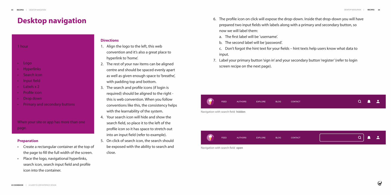
UI COOKBOOK | A GUIDE TO USER INTERFACE DESIGN
33 34
Navigation with search field hidden
Navigation with search field open
Desktop navigation
Time to design 1 hour
What yoursquoll need for desktopbull Logobull Hyperlinksbull Search iconbull Input fieldbull Labels x 2bull Profile iconbull Drop downbull Primary and secondary buttons
When to use itWhen your site or app has more than one page
Directions1 Align the logo to the left this web
convention and itrsquos also a great place to hyperlink to lsquohomersquo
2 The rest of your nav items can be aligned centre and should be spaced evenly apart as well as given enough space to lsquobreathersquo with padding top and bottom
3 The search and profile icons (if login is required) should be aligned to the right - this is web convention When you follow conventions like this the consistency helps with the learnability of the system
4 Your search icon will hide and show the search field so place it to the left of the profile icon so it has space to stretch out into an input field (refer to example)
5 On click of search icon the search should be exposed with the ability to search and close
6 The profile icon on click will expose the drop-down Inside that drop-down you will have prepared two input fields with labels along with a primary and secondary button so now we will label thema The first label will be rsquousernamersquob The second label will be lsquopasswordrsquoc Donrsquot forgot the hint text for your fields ndash hint texts help users know what data to input
7 Label your primary button lsquosign inrsquo and your secondary button lsquoregisterrsquo (refer to login screen recipe on the next page)
RECIPES | DESKTOP NAVIGATION DESKTOP NAVIGATION | RECIPES
FEED AUTHORS EXPLORE BLOG CONTACT
FEED AUTHORS EXPLORE BLOG CONTACT
Preparationbull Create a rectangular container at the top of
the page to fill the full width of the screenbull Place the logo navigational hyperlinks
search icon search input field and profile icon into the container
UI COOKBOOK | A GUIDE TO USER INTERFACE DESIGN
35 36
Login screen
Time to design 30 minutes
What yoursquoll needbull Input fields x 2bull Cardbull Background imagebull Buttonsbull Field validationbull Show hide password icon
When to use itWhen you need a user to login or authenticate themselves
3 Place two buttons next to each other on the bottom of the carda Left align the register button (secondary button) or use a tertiary button or link below the login buttonb Right align the sign in or login button (primary button)
4 Ensure that you show an error message if the login fails eg username or password entered is incorrect
Finishing touchesbull Add a showhide icon to the right-hand
side of the password field so the user can toggle visibility of their password to check if itrsquos typed correctly This is an important pattern for mobile login screens
Mobile navigation
Time to design 1 hour
What yoursquoll need for mobilebull Hamburger nav iconbull Drawer panelbull Hyperlinksbull Profile iconbull Primary and secondary buttons
When to use itWhen your site or app has more than one page and when your site is viewed on a mobile device Try keep the primary menu visible and use the hamburger for secondary options
TITLE
Mobile header with hamburger nav
Drawer panel slides out when user taps the hamburger nav
Log In
USERNAME
jdoe2340
PASSWORD
NOT REGISTERED LOG IN
RECIPES | LOGIN SCREEN LOGIN SCREEN | RECIPES
John DoeSan Francisco CA
FEED
EXPLORE
MESSAGES
NOTIFICATIONS
PHOTOS
VIDEOS
PLACES
SETTINGS
SEARCH
Directions1 Place a background image on the page ndash
the background should cover the whole page
2 Place the card in the centre of the page add the two fields one below the othera Label the first field lsquousernamersquob Label the second field lsquopasswordrsquo
Directions1 When the hamburger is clicked it should
open a container for navigation This contains the user profile navigation links and sign out button
2 Place the profile icon at the top of the drawer panel with the profile or sign out buttons below
3 Add the navigation hyperlinks one below the other in the same order as the desktop menu (refer to previous recipe) Ensure that the padding around each item is the same
UI COOKBOOK | A GUIDE TO USER INTERFACE DESIGN
37 38
Data screen
Time to design 30 minutes to a few hours this depends on the amount of data that needs to be represented
What yoursquoll needbull Cardsbull Listsbull Tablesbull Labels
When to use itTo display a group of data in one place eg all employees of a company (admin) or all items on sale (e-commerce)
b If the user needs to compare sort or filter the data display the data in a table
Directions1 Place a label at the top left corner of the
screen This label defines everything that will be displayed on the page in one or two words
2 Add sub-headings to explain what the data is about in one or two sentences (optional)
3 Place a search bar in the top right corner to indicate that the user can search to filter data
4 Decide whether you will use cards or lists (refer to figure on the left)
5 Fill the rest of the page with the data you would like to display
6 Add pagination to show there is more data to find in this category if all data canrsquot be displayed on a single page
Finishing touchesbull Ensure that the data is displayed in a way
that makes it easy for a user to understand and is useful
bull Use headings and sub-headings to break up the data into sections and categories so that the user can easily scan the page
PreparationEach item within the data will have many related fields Decide on the top four or five fields that are most important to identify the item
a If the best way to distinguish different data items is visually use a wall of cardstiles
Search for items brand and inspirationhellip
Items
Sam ShopaholicCart
FilterSort
Red Espadrille
Striped Wool Hat
Premium Sneaker
R 50000
R 10000
R 150000
Yellow Jersey
Purple Jacket
Pattern Wool Hat
R 30000
R 100000
R 15000
Skinny Jeans
Blue Lace Up Snhellip
Yellow Shorts
R 40000
R 110000
R 35000
Button Up T-shirt
Multi-colour Jacket
Maroon Sneaker
R 25000
R 80000
R 75000
Striped T-shirt
Striped Pants
Green Cap
R 25000
R 40000
R 10000
Flash Vest
Blue Sneaker
Green Jacket
R 10000
R 80000
R 95000
SHOP
WOMEN
MEN
SPORT
ACCESSORIES
Search for items brand and inspirationhellip
Items
Cart
Description
Red Espadrille
Yellow Jersey
Skinny Jeans
Button Up T-shirt
Stripped T-shirt
Flash Vest
Striped Wool Hat
Purple Jersey
Blue Lace Up Sneaker
Multi-colour Jacket
Price
R 50000
R 30000
R 40000
R 25000
R 25000
R 10000
R 10000
R 100000
R 110000
R 80000
Sam Shopaholic
FilterSortSHOP
WOMEN
MEN
SPORT
ACCESSORIES
Add to cartView
Add to cartView
Add to cartView
Add to cartView
Add to cartView
Add to cartView
Add to cartView
Add to cartView
Add to cartView
Add to cartView
RECIPES | DATA SCREEN DATA SCREEN | RECIPES
bull Input Fields bull Buttonsbull Search Barbull Pagination
UI COOKBOOK | A GUIDE TO USER INTERFACE DESIGN
39 40
Statistics dashboard
Time to design 30 minutes
What yoursquoll needbull Cardsbull Graphs bull Labelsbull Tablesbull Buttons bull Togglesbull Input Fields
When to use itAnytime a user needs to see reporting infor-mation
bull A card sorting exercise where you place all navigation items on physical cards and sort them can help you design or evaluate the information architecture of your site
Directions1 Sketch out the basic layout you would like
for your dashboard 2 Decide on the correct graphs to display the
data you want eg a bar graph to display categories of data
3 Label each section with a main heading to group the data logically
4 Use cards per data item5 Make sure to add a toggle or date picker
so that the user can alter the dashboard to display the data that they are looking for
Finishing touchesbull Remember a dashboard is like a meal - it
needs a bit everything to be satisfying but too many ingredients can throw out its visual balance out completely
Nov 10 2017 Dec 10 2017
$5k
$10k
$15k
$20k
$25k
$5k
$10k
$15k
$20k
$25k
Last 30 Days
Total viewsProducts sold
Trends
Total Revenue$50000
Revenue$1250
Growth+20
$190500 of $1MUnited States
$98321 of $1MChina
$128602 of $1MAlgeria
$293792 of $1MAustralia
$829910 of $1MRussia
View Full ReportSales by Country
4 hours agoJohn Doe added you to his team
8 hours agoInvoice for 30 hours of calls has paid
2 days agoYoursquove logged in on a new device
3 days agoYoursquove got a new message on Facebook
Timeline
Preparationbull List the type of information you want
to display in order of what is the most valuable and important to the user to the least creating a hierarchy of information
RECIPES | STATISTIC DASHBOARD STATISTIC DASHBOARD | RECIPES
UI COOKBOOK | A GUIDE TO USER INTERFACE DESIGN
41 42
E-commerce landing screen
Time to design A few hours
What yoursquoll needbull Navigationbull Image carouselbull Promotional imagesbull Product imagebull Cardsbull Primary button and potentially two
or three secondary buttons
When to use itTo display different products promotions and services that the company offers
Directions1 Place your promotional images in a full
width image carousel to be able to move through the various promotions or offers
2 Place image carousel below navigation and remember this should be 100 width to allow it to constrain to different screen sizes
3 Your cards come next you can organise these in different ways Some options in how you could organise these are promoted products latest or those on sale Be sure to clearly categorise or label your card sections
4 You will then to place your footer at the bottom of your page
Finishing touchesbull If you do need additional buttons on your
product cards like wish list or comparison ensure that you have icons that relate to their function
SHOP ONLINE
SPA
BLOG
CONTACT
Search for products brand and treatmentshellip
Our specials
Name SurnameCart
Jasmine oilR 16000
VIEW
Aloe vera gelR 32000
VIEW
Rosemary oilR 16000
VIEW
Lotus flower lotionR 30000
VIEW
Get a free facial with any full body massageLimited time offer
Introducing our new Garra Rufa fish pedicure
Book now
Book now
Preparationbull When preparing your cards ensure there is
space for a product image an add to cart button
bull You might want to include buttons such as wish list and product comparison
RECIPES | E-COMMERCE LANDING SCREEN E-COMMERCE LANDING SCREEN | RECIPES
UI COOKBOOK | A GUIDE TO USER INTERFACE DESIGN
43 44
E-commerce product screen
Time to design A few hours
What yoursquoll needbull Navigationbull Product imagebull Product gallerybull Cards (other similar products or promoted
products)bull Footer
When to use itWhen you need to display
a Detailed information about a product with imagesb Add product to a cartc Compare that product to another productd Add the chosen product to a wish list
2 Ensure your primary product image comes first and secondary product images are nested below A user should be able to see a physical product from different angles to engender trust and aid in decision making
3 Product details should be included in a simple table that displays key information about the product to allow the user to make an informed decision
4 Call to action buttons may sit below the image gallery or next to a productrsquos details Once the user has viewed necessary product information they are able to make a purchase or engage in a product comparison
5 Promoted or related products can be included either on the side or below the product detail but shouldnrsquot distract from the key purchase
Finishing touchesbull You can add additional buttons such as
wish list like share or compare
ABOUT VISIT US SHOP WHOLESALE CONTACT US
Single Origin UgandaBugisu AA Organic
250gR 10000
Add to CartAdd to Wishlist
Story
Related Products
In Stock 9 Reviews
Processing Tasting Notes Reviews
Terbodorersquos SELECT range showcases some of the best single origin beans in the world This Uganda Bugisu AA bean is grown according to the principles of sustainable farming conditions and often left to grow naturally It features a full body notes of red apple and dark chocolate in the finish
2
RECIPES | E-COMMERCE PRODUCT SCREEN E-COMMERCE PRODUCT SCREEN | RECIPES
Directions1 Place product gallery above the fold
(before the point of scrolling) This is what the user has come to see
UI COOKBOOK | A GUIDE TO USER INTERFACE DESIGN
45 46
Profile screen
Time to design 30 minutes to an hour
What yoursquoll needbull Tabsbull Expansion panel accordion bull Imagebull Labels bull Buttons
When to use itbull When you want to display information
about a user either to the user themselves or an admin user This should include the ability to edit the userrsquos details or delete the userrsquos profile
5 Itrsquos always handy to have a picture or picture placeholder as it elevates the design The picture should be grouped with the most important data
6 Depending on the profile and the information it contains the rest of the data about the user should be grouped into tabs or expansion panels (this should take up the rest of the page)a The primary actions available for the user eg edit delete should be easy to find and therefore should be a primary button at the top right hand of the screen3 The items that are of most importance
should be displayed at the top or left of the screen as you want the user to read this first
4 Make sure that the items you pick for this are available for all users You donrsquot want gaps in your designs eg name surname role are great examples of things that are of the highest priority Things like lsquohair colourrsquo are not as important (unless you are a hair modelling agency) and it might not be available data for everyone
Finishing touchesbull Add icons to your tabs or expansion
panels as this will aid findability as well as improve the overall look and feel of the profile page
bull Always have a back button that allows a user to return to their previous screen if they so wish
Directions1 Discover what information you have
to display for any given user You could use a card sorting exercise to order the information based on importance
2 Know which fields are mandatory
NameJames
SurnameJackson
Phone number
Address
123 456 7890
jjacksonemailcom
1 Sesame StreetCA
Password
Address
Card details
System key
Username
Phone
RECIPES | PROFILE SCREEN PROFILE SCREEN | RECIPES
UI COOKBOOK | A GUIDE TO USER INTERFACE DESIGN
47 48
Social screen
Time to design 10 minutes
What yoursquoll needbull Cover or banner imagebull Profile picturebull Background (optional)
When to use itWhen your organisation needs a platform such as Facebook Twitter or LinkedIn to communicate their brand and products This also allows your organisation to grow their network by drawing in followers and gaining social media presence
do change from time to time so check guidelines regularly)
3 Use more images than text on your social screen as the human brain processes images much faster than text
4 Create a visual relationship between your profile picture and cover image
5 The profile picture shouldnrsquot hide any valuable content in the cover image
6 Ensure your designs follow the guidelines set by each social platform
Finishing touchesbull Update imagery on the social media page
every few months to keep your target audience interested
bull Make sure the overall design is consistent with the companyrsquos branding and demonstrates the products and services they offer
bull Use a consistent look and feel across all your social media pages
bull If the content and visuals are appealing they are more likely to be shared and increase engagement
Directions1 Choose a cover or banner image
and background that promotes the organisation or a marketing campaign
2 Create the correct size images for each social platform (these sizes are defined in a social platforms documentation but
RECIPES | SOCIAL SCREEN SOCIAL SCREEN | RECIPES
PostDelete
Create a post
Say something
With the technological advancement in the 21st century everybody wants to experience the best technology with the least amount of effort By now user experience (UX) design is recognised as a crucial part of customer satisfactionhellip
12 January 2020Entelect
12 Interactions 3 Comments
THE DATA SCIENCEBEHIND UX
ENTELECT INSIGHTSINNOVATE TRANSFORM AUTOMATE BY ENTELECT
ShareCommentLike
UI COOKBOOK | A GUIDE TO USER INTERFACE DESIGN
49 50
Contact screen
Time to design 30 minutes
What yoursquoll needbull Navigationbull Contact formbull Location (use google maps)bull Phone numbersbull Email addressesbull Chat bot (if possibleapplicable)bull Product logobrand imagebull Footer
When to use itA contact page allows those visiting your site to contact you This page should be easy for users to navigate to and page links should be in the footer section of your website as well as your menu
2 Always give the user clear direction to the purpose of a page ndash in this case lsquoContact Usrsquo
3 Organise the information in a symmetrical fashion eg the contact form on the left and the numbers and location on the right
4 Give the user feedback once the form is submitted or if itrsquos been incorrectly filled out using success or error messages
5 Give the user a notification that you will respond to them within a certain time frame if successful or explain the errors in what they have input and how to correct them
6 Keep the colours text and sizing of the contact page consistent with the design on all other pages of your website
Finishing touchesbull The contact page should be kept brief and
simple bull Your contact page should have multiple
methods by which a user can contact you if possible besides the contact form itself
FEED AUTHORS EXPLORE BLOG CONTACT
Contact UsContact Us Get in touch to find out about our available positions or just to chat about your future Let Us Get back to you Fill out our form
Full Name
Message
Send
+27 87 1234
contactusemailcom
RECIPES | CONTACT SCREEN CONTACT SCREEN | RECIPES
Directions1 Place the contact form above the fold
(before the point of scrolling) This is what the user has come to see
UI COOKBOOK | A GUIDE TO USER INTERFACE DESIGN
51 52
Resourcesbull 10 rules of good UI to follow bull 5 tips for creating a social media page designbull Matrial Design - Design guidance and codebull Building the perfect splash screenbull Balsamiqbull Typography in UI Guide for beginnersbull 15 examples of popular card UI design bull 8 rules for perfect typography in UIbull User interface elementsbull 10 usability heuristics for UI designbull Laws of UXbull Card Sorting
This book was brought to you by the UX Guild
RESOURCES | RESOURCES 52
If you have any suggestions or comments for improvement please emailguild-uxentelectcoza
cultureentelectcoza
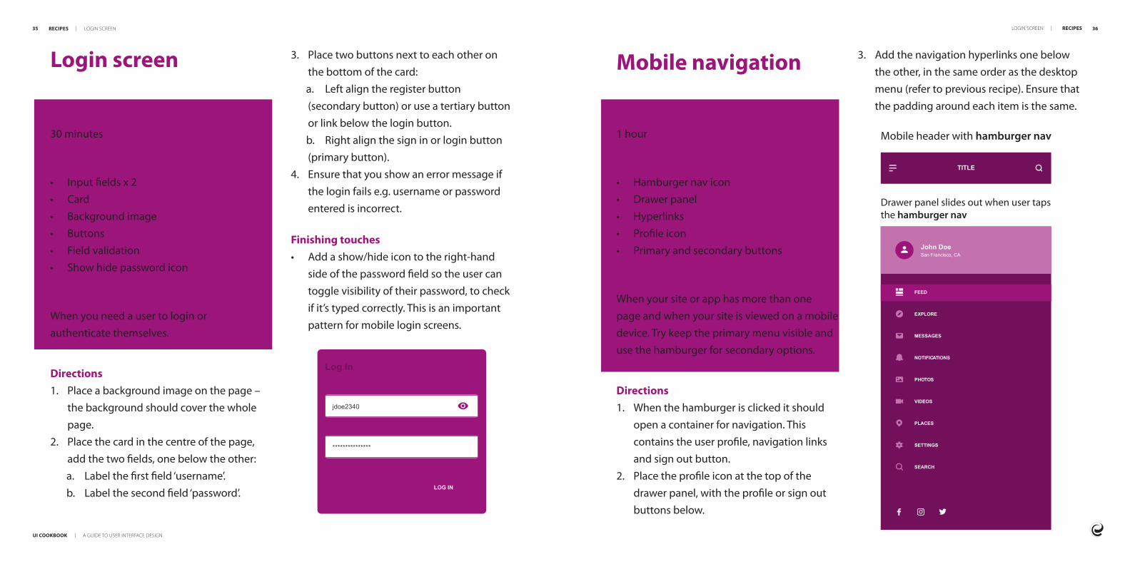
UI COOKBOOK | A GUIDE TO USER INTERFACE DESIGN
51 52
Resourcesbull 10 rules of good UI to follow bull 5 tips for creating a social media page designbull Matrial Design - Design guidance and codebull Building the perfect splash screenbull Balsamiqbull Typography in UI Guide for beginnersbull 15 examples of popular card UI design bull 8 rules for perfect typography in UIbull User interface elementsbull 10 usability heuristics for UI designbull Laws of UXbull Card Sorting
This book was brought to you by the UX Guild
RESOURCES | RESOURCES 52
If you have any suggestions or comments for improvement please emailguild-uxentelectcoza
cultureentelectcoza

cultureentelectcoza


