
Paper 158-2009
1
Using PROC SGPLOT for Quick High-Quality Graphs Lora D. Delwiche, University of California, Davis, CA
Susan J. Slaughter, Avocet Solutions, Davis, CA
ABSTRACT New with SAS® 9.2, ODS Graphics introduces a whole new way of generating high quality graphs using SAS. With just a few lines of code, you can add sophisticated graphs to the output of existing statistical procedures, or create stand-alone graphs. The SGPLOT procedure produces a variety of graphs including bar charts, scatter plots, and line graphs. Because ODS Graphics uses the Output Delivery System, graphs can be sent to ODS destinations, and use ODS styles. This paper shows how to produce different types of graphs using PROC SGPLOT, how to send your graph to different ODS destinations, and how to apply ODS styles to your graph. We will also show how to use the ODS Graphics Editor to make changes to graphs produced using ODS Graphics.
INTRODUCTION When ODS Graphics was originally conceived, the goal was to enable statistical procedures to produce sophisticated graphs tailored to each specific statistical analysis, and to integrate those graphs with the destinations and styles of the Output Delivery System. In SAS 9.2, over 60 statistical procedures have the ability to produce graphs using ODS Graphics. A fortuitous side effect of all this graphical power has been the creation of a set of procedures for creating stand-alone graphs (graphs that are not embedded in the output of a statistical procedure). These procedures all have names that start with the letters SG (SGPLOT, SGSCATTER, SGPANEL, and SGRENDER). This paper focuses on one of those new procedures, the SGPLOT procedure. PROC SGPLOT produces many types of graphs. In fact, this one procedure produces 15 types of graphs. PROC SGPLOT creates one or more graphs and overlays them on a single set of axes. (There are four axes in a set: left, right, top, and bottom.) Other SG procedures create panels with multiple sets of axes, or render graphs using custom ODS graph templates. Because the syntax for SGPLOT and SGPANEL are so similar, we also show an example of SGPANEL which produces a panel of graphs all using the same axis specifications.
ODS GRAPHICS VS. TRADITIONAL SAS/GRAPH To use ODS Graphics you must have SAS/GRAPH software which is licensed separately from Base SAS. Some people may wonder whether ODS Graphics replaces traditional SAS/Graph procedures. No doubt, for some people and some applications, it will. But ODS Graphics is not designed to do everything that traditional SAS/Graph does, and does not replace it. For example, ODS Graphics does not create contour plots; for contour plots you need to use traditional SAS/GRAPH.
Here are some of the major differences between ODS Graphics and traditional SAS/GRAPH procedures.
Traditional SAS/GRAPH ODS Graphics
• Graphs are saved in SAS graphics catalogs
• Produces graphs in standard image file formats such as PNG and JPEG
• Graphs are viewed in the Graph window
• Graphs are viewed in standard viewers such as a web browser for HTML output
• Uses GOPTIONS statements to control appearance of graphs
• Uses ODS styles to control appearance of graphs.
Hands-on WorkshopsSAS Global Forum 2009

2
VIEWING ODS GRAPHICS When you produce ODS Graphics in the SAS windowing environment, for most destinations the Results Viewer window opens displaying your results. However, when you use the LISTING destination, graphs are not automatically displayed. You can always view your graphs by double-clicking their graph icons in the Results window.
EXAMPLES
HISTOGRAMS Histograms show the distribution of a continuous variable. The following PROC SGPLOT uses data from the preliminary heats of the 2008 Olympics Men’s Swimming Freestyle 100 m event. The histogram shows a variable, TIME, which is the time in seconds for each swimmer.
* Histograms; PROC SGPLOT DATA = Freestyle; HISTOGRAM Time; TITLE "Olympic Men's Swimming Freestyle 100"; RUN;
Hands-on WorkshopsSAS Global Forum 2009
3
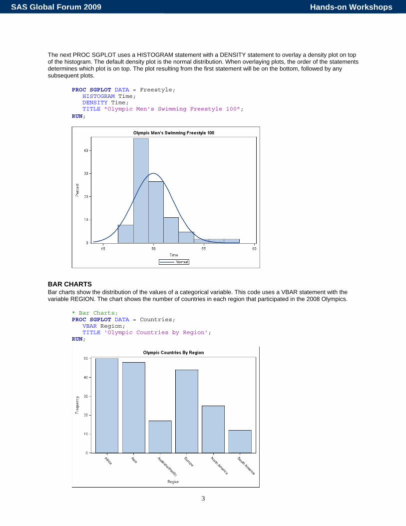
The next PROC SGPLOT uses a HISTOGRAM statement with a DENSITY statement to overlay a density plot on top of the histogram. The default density plot is the normal distribution. When overlaying plots, the order of the statements determines which plot is on top. The plot resulting from the first statement will be on the bottom, followed by any subsequent plots.
PROC SGPLOT DATA = Freestyle; HISTOGRAM Time; DENSITY Time; TITLE "Olympic Men's Swimming Freestyle 100"; RUN;
BAR CHARTS Bar charts show the distribution of the values of a categorical variable. This code uses a VBAR statement with the variable REGION. The chart shows the number of countries in each region that participated in the 2008 Olympics.
* Bar Charts; PROC SGPLOT DATA = Countries; VBAR Region; TITLE 'Olympic Countries by Region'; RUN;
Hands-on WorkshopsSAS Global Forum 2009
4
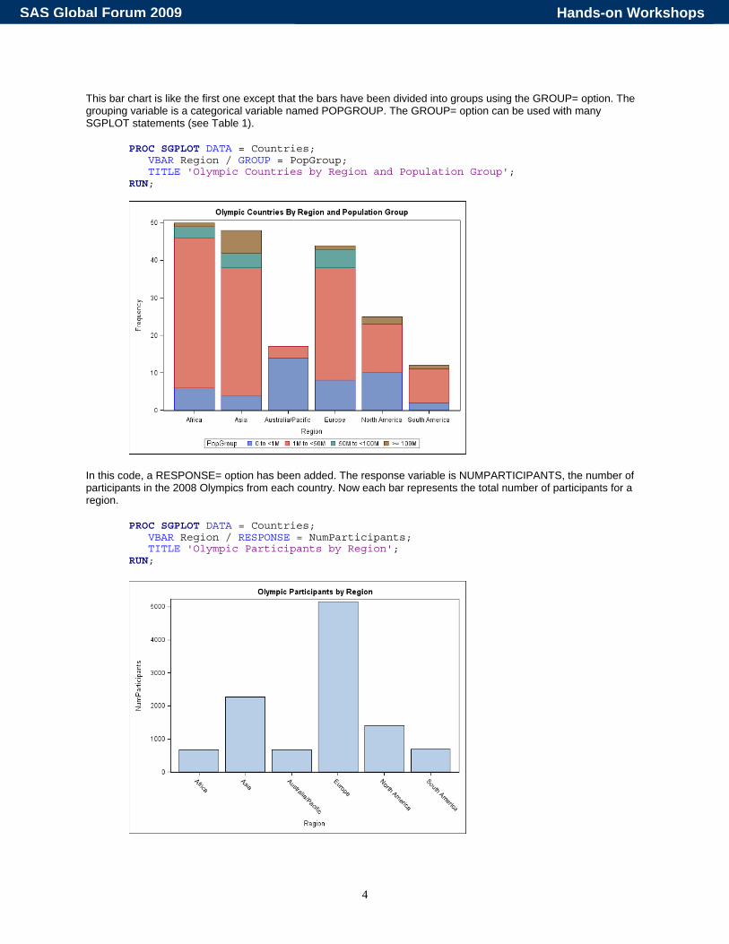
This bar chart is like the first one except that the bars have been divided into groups using the GROUP= option. The grouping variable is a categorical variable named POPGROUP. The GROUP= option can be used with many SGPLOT statements (see Table 1).
PROC SGPLOT DATA = Countries; VBAR Region / GROUP = PopGroup; TITLE 'Olympic Countries by Region and Population Group'; RUN;
In this code, a RESPONSE= option has been added. The response variable is NUMPARTICIPANTS, the number of participants in the 2008 Olympics from each country. Now each bar represents the total number of participants for a region.
PROC SGPLOT DATA = Countries; VBAR Region / RESPONSE = NumParticipants; TITLE 'Olympic Participants by Region'; RUN;
Hands-on WorkshopsSAS Global Forum 2009

5
SERIES PLOTS In a series plot, the data points are connected by a line. This example uses the average monthly rainfall for three cities, Beijing, Vancouver and London. Three SERIES statements overlay the three lines. Data for series plots must be sorted by the X variable. If your data are not already in the correct order, then use PROC SORT to sort the data before running the SGPLOT procedure.
* Series plot; PROC SGPLOT DATA = Weather; SERIES X = Month Y = BRain; SERIES X = Month Y = VRain; SERIES X = Month Y = LRain; TITLE 'Average Monthly Rainfall in Olympic Cities'; RUN;
EMBELLISHING GRAPHS So far the examples have all shown how to create basic plots. The remaining examples show statements and options you can use to polish graphs.
XAXIS AND YAXIS STATEMENTS In the preceding series plot, the variable on the X axis is Month. The values of Month are integers from 1 to 12, but the default labels on the X axis have values like 2.5. The option TYPE = DISCRETE tells SAS to use the actual data values. Other options change the axis label and set values for the Y axis, and add grid lines.
* Plot with XAXIS and YAXIS; PROC SGPLOT DATA = Weather; SERIES X = Month Y = BRain; SERIES X = Month Y = VRain; SERIES X = Month Y = LRain; XAXIS TYPE = DISCRETE GRID; YAXIS LABEL = 'Rain in Inches' GRID VALUES = (0 TO 10 BY 1); TITLE 'Average Monthly Rainfall in Olympic Cities'; RUN;
Hands-on WorkshopsSAS Global Forum 2009

6
PLOT STATEMENT OPTIONS Many options can be added to plot statements. For these SERIES statements, the options LEGENDLABEL=, MARKERS, AND LINEATTRS= have been added. The LEGENDLABEL= option can be used with any of the plot statements, while the MARKERS and LINEATTRS= options can only be used with some plot statements (see Table 1).
* Plot with options on plot statements; PROC SGPLOT DATA = Weather; SERIES X = Month Y = BRain / LEGENDLABEL = 'Beijing' MARKERS LINEATTRS = (THICKNESS = 2); SERIES X = Month Y = VRain / LEGENDLABEL = 'Vancouver' MARKERS LINEATTRS = (THICKNESS = 2); SERIES X = Month Y = LRain / LEGENDLABEL = 'London' MARKERS LINEATTRS = (THICKNESS = 2); XAXIS TYPE = DISCRETE; TITLE 'Average Monthly Rainfall in Olympic Cities'; RUN;
Hands-on WorkshopsSAS Global Forum 2009
7
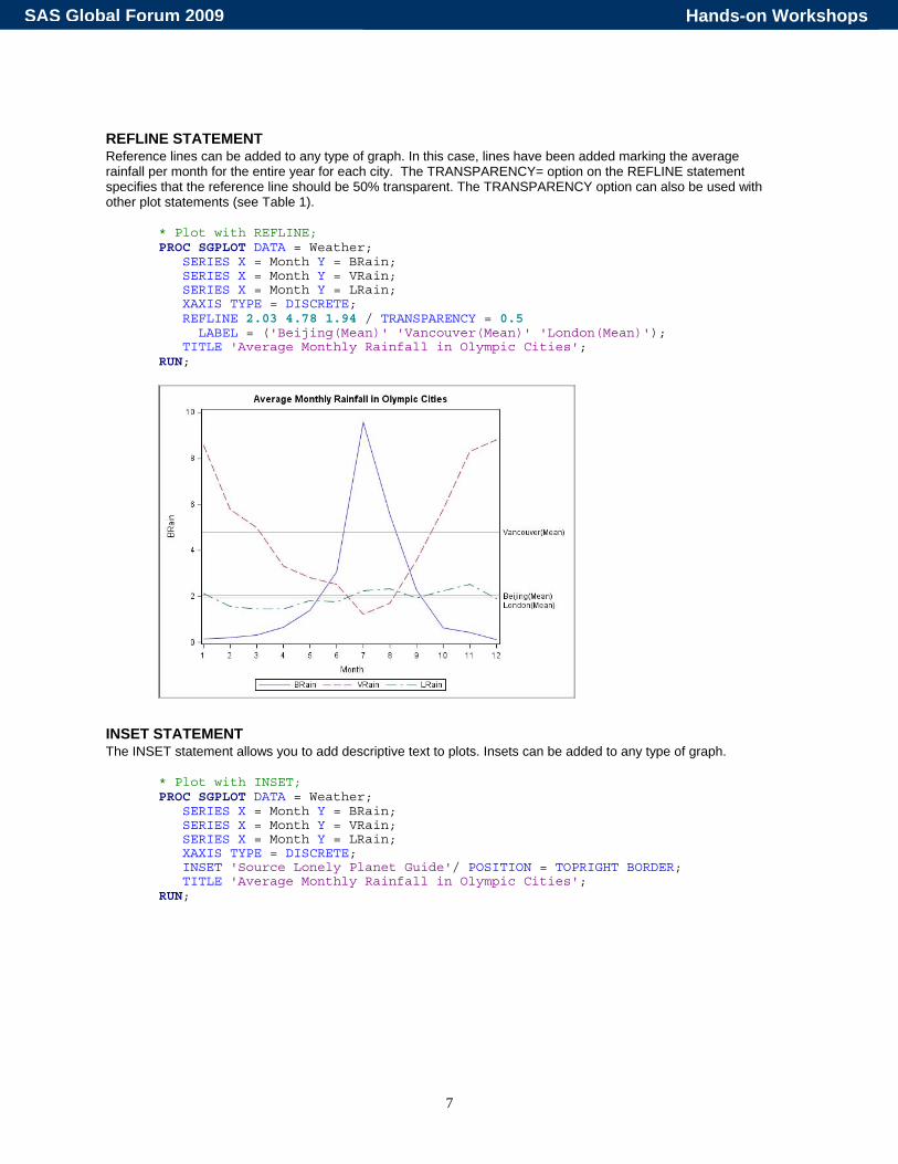
REFLINE STATEMENT Reference lines can be added to any type of graph. In this case, lines have been added marking the average rainfall per month for the entire year for each city. The TRANSPARENCY= option on the REFLINE statement specifies that the reference line should be 50% transparent. The TRANSPARENCY option can also be used with other plot statements (see Table 1).
* Plot with REFLINE; PROC SGPLOT DATA = Weather; SERIES X = Month Y = BRain; SERIES X = Month Y = VRain; SERIES X = Month Y = LRain; XAXIS TYPE = DISCRETE; REFLINE 2.03 4.78 1.94 / TRANSPARENCY = 0.5 LABEL = ('Beijing(Mean)' 'Vancouver(Mean)' 'London(Mean)'); TITLE 'Average Monthly Rainfall in Olympic Cities'; RUN;
INSET STATEMENT The INSET statement allows you to add descriptive text to plots. Insets can be added to any type of graph.
* Plot with INSET; PROC SGPLOT DATA = Weather; SERIES X = Month Y = BRain; SERIES X = Month Y = VRain; SERIES X = Month Y = LRain; XAXIS TYPE = DISCRETE; INSET 'Source Lonely Planet Guide'/ POSITION = TOPRIGHT BORDER; TITLE 'Average Monthly Rainfall in Olympic Cities'; RUN;
Hands-on WorkshopsSAS Global Forum 2009

8
SYNTAX The SGPLOT procedure can produce 15 different types of plots that can be grouped into five general areas: basic X Y plots, band plots, fit and confidence plots, distributions graphs for continuous DATA, and distribution graphs for categorical DATA. Many of these plot types can be used together in the same graph. In the examples, we used the HISTOGRAM and DENSITY statements together to produce a histogram overlaid with a normal density curve. We also used three SERIES statements together to produce one graph with three different series lines. However not all plot statements can be used with all other plot statements. Table 1 shows which statements can be used with which other statements. Table 1 also includes several options that can be used with many different plot statements as well as selected optional statements.
Hands-on WorkshopsSAS Global Forum 2009

9
Table 1. Compatibility of SGPLOT procedure statements and selected options. If a check mark appears in the box then the two statements or options can be used together.
SC
ATT
ER
SE
RIE
S
STE
P
NE
ED
LE
BA
ND
RE
G
LOE
SS
PB
SP
LIN
E
ELL
IPS
E
HB
OX
/VB
OX
HIS
TOG
RA
M
DE
NS
ITY
HB
AR
/VB
AR
HLI
NE
/VLI
NE
DO
T
Basic X Y PLots PLOTNAME X=var Y=var / options;
SCATTER SERIES
STEP NEEDLE
Band Plots BAND X=var UPPER=var LOWER=var / options; (You can also specify numeric values for upper and lower.)
BAND Fit and Confidence Plots PLOTNAME X=var Y=var / options;
REG LOESS
PBSPLINE ELLIPSE
Distribution Graphs – Continuous DATA PLOTNAME response-var / options;
HBOX or VBOX HISTOGRAM
DENSITY Distribution Graphs – Categorical DATA PLOTNAME category-var / options;
HBAR or VBAR HLINE or VLINE
DOT Selected Options to Plot Statements
GROUP /GROUP=var;
TRANSPARENCY /TRANSPARENCY=value;
MARKERS /MARKERS;
NOMARKERS /NOMARKERS;
LEGENDLABEL /LEGENDLABEL=’text-string’;
FILLATTRS /FILLATTRS=(attribute=val);
LINEATTRS /LINEATTRS=(attribute=val);
MARKERATTRS /MARKERATTRS=(attribute=val);
Selected Optional Statements INSET
INSET ’text-string’/options;
REFLINE REFLINE value-list /options;
XAXIS or YAXIS XAXIS options;
Hands-on WorkshopsSAS Global Forum 2009
10
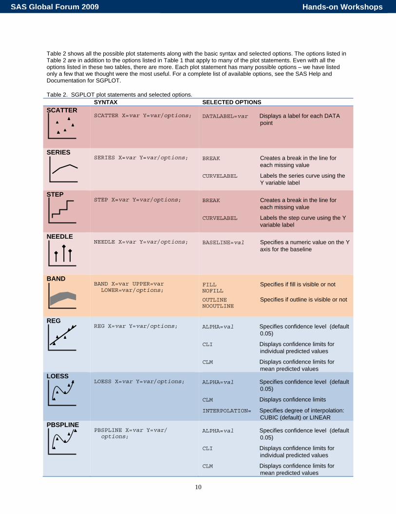
Table 2 shows all the possible plot statements along with the basic syntax and selected options. The options listed in Table 2 are in addition to the options listed in Table 1 that apply to many of the plot statements. Even with all the options listed in these two tables, there are more. Each plot statement has many possible options – we have listed only a few that we thought were the most useful. For a complete list of available options, see the SAS Help and Documentation for SGPLOT. Table 2. SGPLOT plot statements and selected options. SYNTAX SELECTED OPTIONS SCATTER
SCATTER X=var Y=var/options;
DATALABEL=var Displays a label for each DATA
point
SERIES
SERIES X=var Y=var/options;
BREAK Creates a break in the line for
each missing value
CURVELABEL Labels the series curve using the Y variable label
STEP
STEP X=var Y=var/options;
BREAK Creates a break in the line for
each missing value
CURVELABEL Labels the step curve using the Y variable label
NEEDLE
NEEDLE X=var Y=var/options;
BASELINE=val Specifies a numeric value on the Y
axis for the baseline
BAND
BAND X=var UPPER=var LOWER=var/options;
FILL Specifies if fill is visible or not NOFILL OUTLINE Specifies if outline is visible or not NOOUTLINE
REG
REG X=var Y=var/options;
ALPHA=val Specifies confidence level (default
0.05)
CLI Displays confidence limits for individual predicted values
CLM Displays confidence limits for mean predicted values
LOESS
LOESS X=var Y=var/options;
ALPHA=val Specifies confidence level (default
0.05)
CLM Displays confidence limits
INTERPOLATION= Specifies degree of interpolation: CUBIC (default) or LINEAR
PBSPLINE
PBSPLINE X=var Y=var/ options;
ALPHA=val Specifies confidence level (default
0.05)
CLI Displays confidence limits for individual predicted values
CLM Displays confidence limits for mean predicted values
Hands-on WorkshopsSAS Global Forum 2009

11
SYNTAX SELECTED OPTIONS ELLIPSE
ELLIPSE X=var Y=var/options;
ALPHA=val Specifies confidence level for the
ellipse
TYPE= Specifies type of ellipse: MEAN or PREDICTED (default)
HBOX/VBOX
VBOX response-var/options; HBOX response-var/options;
CATEGORY=var A box plot is created for each
value of the category variable
MISSING Creates box plot for missing values of category variable
HISTOGRAM
HISTOGRAM response-var/ options;
SHOWBINS Places tic mark at midpoint of bin
SCALE= Specifies scale for vertical axis: PERCENT (default), COUNT or PROPORTION
DENSITY
DENSITY response-var/ options;
SCALE= Specifies scale for vertical axis:
DENSITY (default), PERCENT COUNT or PROPORTION
TYPE= Specifies type of density function: NORMAL (default) or KERNEL
HBAR/VBAR
VBAR category-var/options; HBAR category-var/options;
RESPONSE=var Specifies a numeric response
variable for plot
STAT= Specifies statistic for axis of response variable (if specified): MEAN, or SUM (default)
BARWIDTH=num Specifies numeric value for width of bars (default 0.8)
HLINE/VLINE
VLINE category-var/options; HLINE category-var/options;
RESPONSE=var Specifies numeric response
variable for plot
STAT= Specifies statistic for axis of response variable (if specified): MEAN, or SUM (default)
DOT
DOT category-var/options;
RESPONSE=var Specifies numeric response
variable for plot
STAT= Specifies statistic for axis of response variable (if specified): MEAN, or SUM (default)
LIMITSTAT= Specifies statistic for limit lines (must use STAT=MEAN): CLM (default), STDDEV, or STDERR
Hands-on WorkshopsSAS Global Forum 2009

12
In addition to the 15 plot statements, there are some optional statements that you might want to use. Table 3 shows some of these statements with selected options for the statements. Table 3. Selected optional statements with selected options. SYNTAX SELECTED OPTIONS REFLINE
REFLINE value1 value2 .../ options;
AXIS= Specifies axis for reference line: X,
Y (default), X2, or Y2
LABEL=( ) Creates labels for reference lines: (’text1’ ’text2’ ...)
LABELLOC= Specifies placement of label with respect to plot area: INSIDE (default) or OUTSIDE
LINEATTRS=( ) Specifies attributes for reference line: (attribute=value)
XAXIS/YAXIS
XAXIS options; YAXIS options;
GRID Creates grid line at each tick on
the axis
LABEL=’text’ Specifies a label for the axis
TYPE= Specifies type of axis: DISCRETE, LINEAR, LOG, or TIME
VALUES=( ) Specifies values for tics on the axis: (num1,num2,…) or (num1 TO num2 BY increment)
INSET
INSET ’text1’ ’text2’ ... / options;
BORDER Creates a border around text box
POSITION= Specifies position of text box within plot area: BOTTOM, BOTTOMLEFT, BOTTOMRIGHT, LEFT, RIGHT, TOP, TOPLEFT, or TOPRIGHT
Hands-on WorkshopsSAS Global Forum 2009

13
Several statements can use the LINEATTR, MARKERATTR, or FILLATTR options to chance the appearance of lines, markers, or fill (see Table 1). These options allow you choose values for the color of fill; the color, pattern and thickness of lines; and color, symbol, and size of markers. Table 4 gives the syntax for hard coding the values for these options. (Note that it is also possible to use styles to control these attributes, or to change them using the ODS Graphics Editor—see the SAS Help and Documentation for more information.) Table 4. The attribute options for plot statements. SYNTAX ATTRIBUTES FILLATTRS
/FILLATTRS=(attribute=value);
COLOR= Specifies color for fill
including: AQUA, BLACK, BLUE, FUCHSIA, GREEN, GRAY, LIME, MAROON, NAVY, OLIVE, PURPLE, RED, SILVER, TEAL, WHITE, and YELLOW
LINEATTRS
/LINEATTRS=(attribute=value);
COLOR= Specifies color for fill
including: AQUA, BLACK, BLUE, FUCHSIA, GREEN, GRAY, LIME, MAROON, NAVY, OLIVE, PURPLE, RED, SILVER, TEAL, WHITE, and YELLOW
PATTERN= Specifies pattern for line including: SOLID, DASH, SHORTDASH, LONGDASH, DOT, DASHDASHDOT, and DASHDOTDOT
THICKNESS=val Specifies thickness of line. Value can include units: CM, IN, MM, PCT, PT, or PX (default)
MARKERATTRS
/MARKEREATTRS= (attribute=value);
COLOR= Specifies color for fill
including: AQUA, BLACK, BLUE, FUCHSIA, GREEN, GRAY, LIME, MAROON, NAVY, OLIVE, PURPLE, RED, SILVER, TEAL, WHITE, and YELLOW
SIZE=val Specifies size of marker. Value can include units: CM, IN, MM, PCT, PT, or PX (default)
SYMBOL= Specifies symbol for marker including: CIRCLE, CIRCLEFILLED, DIAMOND, DIAMONDFILLED, PLUS, SQUARE, SQUAREFILLED, STAR, STARFILLED, TRIANGLE, and TRIANGLEFILLED
Hands-on WorkshopsSAS Global Forum 2009
14
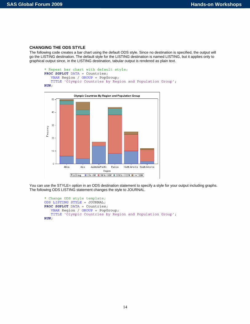
CHANGING THE ODS STYLE The following code creates a bar chart using the default ODS style. Since no destination is specified, the output will go the LISTING destination. The default style for the LISTING destination is named LISTING, but it applies only to graphical output since, in the LISTING destination, tabular output is rendered as plain text.
* Repeat bar chart with default style; PROC SGPLOT DATA = Countries; VBAR Region / GROUP = PopGroup; TITLE 'Olympic Countries by Region and Population Group'; RUN;
You can use the STYLE= option in an ODS destination statement to specify a style for your output including graphs. The following ODS LISTING statement changes the style to JOURNAL.
* Change ODS style template; ODS LISTING STYLE = JOURNAL; PROC SGPLOT DATA = Countries; VBAR Region / GROUP = PopGroup; TITLE 'Olympic Countries by Region and Population Group'; RUN;
Hands-on WorkshopsSAS Global Forum 2009

15
CHANGING THE ODS DESTINATION You can send ODS Graphics output to any ODS destination, and you do it in the same way that you would for ODS tabular output, using ODS statements for that destination. These statements send a bar chart to the PDF destination.
* Send graph to PDF destination; ODS PDF FILE = 'c:\MyPDFFiles\BarChart.pdf'; PROC SGPLOT DATA = Countries; VBAR Region / GROUP = PopGroup; TITLE 'Olympic Countries by Region and Population Group'; RUN; ODS PDF CLOSE;
Hands-on WorkshopsSAS Global Forum 2009
16
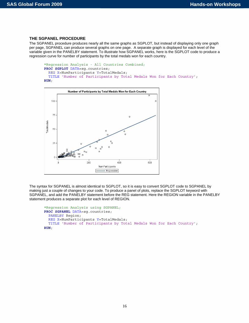
THE SGPANEL PROCEDURE The SGPANEL procedure produces nearly all the same graphs as SGPLOT, but instead of displaying only one graph per page, SGPANEL can produce several graphs on one page. A separate graph is displayed for each level of the variable given in the PANELBY statement. To illustrate how SGPANEL works, here is the SGPLOT code to produce a regression curve for number of participants by the total medals won for each country.
*Regression Analysis - All Countries Combined; PROC SGPLOT DATA=sg.countries; REG X=NumParticipants Y=TotalMedals; TITLE 'Number of Participants by Total Medals Won for Each Country'; RUN;
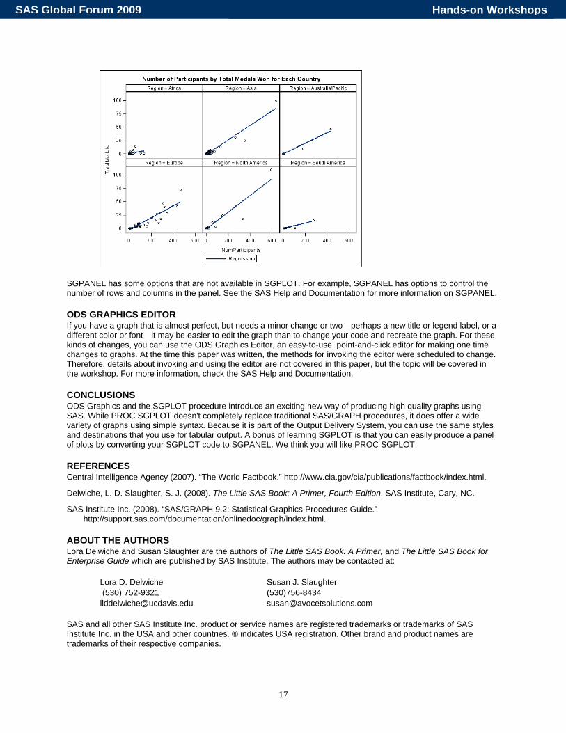
The syntax for SGPANEL is almost identical to SGPLOT, so it is easy to convert SGPLOT code to SGPANEL by making just a couple of changes to your code. To produce a panel of plots, replace the SGPLOT keyword with SGPANEL, and add the PANELBY statement before the REG statement. Here the REGION variable in the PANELBY statement produces a separate plot for each level of REGION.
*Regression Analysis using SGPANEL; PROC SGPANEL DATA=sg.countries; PANELBY Region; REG X=NumParticipants Y=TotalMedals; TITLE 'Number of Participants by Total Medals Won for Each Country'; RUN;
Hands-on WorkshopsSAS Global Forum 2009
17
SGPANEL has some options that are not available in SGPLOT. For example, SGPANEL has options to control the number of rows and columns in the panel. See the SAS Help and Documentation for more information on SGPANEL.
ODS GRAPHICS EDITOR If you have a graph that is almost perfect, but needs a minor change or two—perhaps a new title or legend label, or a different color or font—it may be easier to edit the graph than to change your code and recreate the graph. For these kinds of changes, you can use the ODS Graphics Editor, an easy-to-use, point-and-click editor for making one time changes to graphs. At the time this paper was written, the methods for invoking the editor were scheduled to change. Therefore, details about invoking and using the editor are not covered in this paper, but the topic will be covered in the workshop. For more information, check the SAS Help and Documentation.
CONCLUSIONS ODS Graphics and the SGPLOT procedure introduce an exciting new way of producing high quality graphs using SAS. While PROC SGPLOT doesn't completely replace traditional SAS/GRAPH procedures, it does offer a wide variety of graphs using simple syntax. Because it is part of the Output Delivery System, you can use the same styles and destinations that you use for tabular output. A bonus of learning SGPLOT is that you can easily produce a panel of plots by converting your SGPLOT code to SGPANEL. We think you will like PROC SGPLOT.
REFERENCES Central Intelligence Agency (2007). “The World Factbook.” http://www.cia.gov/cia/publications/factbook/index.html.
Delwiche, L. D. Slaughter, S. J. (2008). The Little SAS Book: A Primer, Fourth Edition. SAS Institute, Cary, NC.
SAS Institute Inc. (2008). “SAS/GRAPH 9.2: Statistical Graphics Procedures Guide.” http://support.sas.com/documentation/onlinedoc/graph/index.html.
ABOUT THE AUTHORS Lora Delwiche and Susan Slaughter are the authors of The Little SAS Book: A Primer, and The Little SAS Book for Enterprise Guide which are published by SAS Institute. The authors may be contacted at:
Lora D. Delwiche Susan J. Slaughter (530) 752-9321 (530)756-8434 [email protected] [email protected]
SAS and all other SAS Institute Inc. product or service names are registered trademarks or trademarks of SAS Institute Inc. in the USA and other countries. ® indicates USA registration. Other brand and product names are trademarks of their respective companies.
Hands-on WorkshopsSAS Global Forum 2009


