drawn design of my contents page
DESCRIPTION
ÂTRANSCRIPT
Drawn Design Of My Contents Page
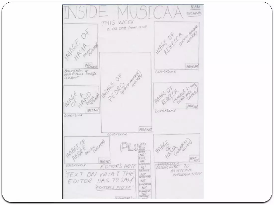
For my contents page I gained inspiration from NME which helped me plan my drawn design. While producing the contents page I didn’t have enough space to add the image of Haya thus meaning i didn’t had it in. In contrast I made the subscribe box bigger adding more contact details in it instead of adding an image.
For my contents page having a variety of images that link well with the page the image is representing is a key convention for a content page. It allows the audience to decide whether they would be interested in the article just from looking at the images and reading the cover lines presented at the bottom of the image.
Another key convention for a contents page is the cover lines used to summaries the article or the piece of information. This allows the audience to gain a representative image and summary of the article or page. A cover line is key in any contents page as it gives the audience an idea as to whether purchasing the magazine is suitable and whether the information presented in the magazine is what the individual is looking and interested in reading. It basically gives the audience an idea as to what kind of information can be found in the magazine.
Another key convention to a contents page is the editor’s note. I gained inspiration from the magazine Kerrange. I specifically liked the fact that an editors talks directly to the individual as this is not a usual convention found in music magazines however it is a key convention for Kerrange. It allows the individuals to feel wanted as its not in every music magazine that the editor leaves a note for his target market. It makes MUSICAA differentiate itself in a positive way from the other rival music magazines.