dreamdraper® quick reference guide - window treatment software
TRANSCRIPT

DreamDraper®Quick Reference Guide

Disclaimer of Liability
The information in this Guide is distributed on an “As Is” basis, without warranty. While every precaution has been taken in the preparation of this Guide, Evan Marsh Designs, Inc. shall have no liability to any person or entity with respect to any loss or damage caused or alleged to be caused directly or indirectly by the instructions contained in this Guide or by the computer software and hardware products described in it.
Responsibility for fabrication of any design ultimately rests with the designer and/or workroom involved and fabrication results are not guaranteed by the Licensor or by any vendor. In any case, vendor catalogs should be consulted for exact guidelines and specifications.
The DreamDraper® Quick Reference Guide
Copyright © 2010 by Evan Marsh Designs, Inc. All rights reserved. Printed in the United States of America. Except as permitted under the Copyright Act of 1976, no part of this publication may be reproduced or distributed in any form or by any means, or stored in a database or retrieval system, without the prior written permission of publisher.
Book Design by Kristen Morgan DowneyCover DreamDraper® rendering by Patricia Hewins
DreamDraper® is a registered trademark of Evan Marsh Designs, Inc.
P.O. Box 664Bethlehem, PA 18016USA

Preface
Chapter 1 INTRODUCTION Using Your Mouse—Left Click / Right Click . . . . . . . . . . . . . . . . . . . . . . 2 Using Your Mouse to Select or Deselect Objects . . . . . . . . . . . . . . . . . . . 2 Using Your Keyboard to Nudge Objects . . . . . . . . . . . . . . . . . . . . . . . . . . 3 Invoking Commands . . . . . . . . . . . . . . . . . . . . . . . . . . . . . . . . . . . . . . . . . . 3 Organizing Your Computer Files . . . . . . . . . . . . . . . . . . . . . . . . . . . . . . . . 4 Saving Your Work . . . . . . . . . . . . . . . . . . . . . . . . . . . . . . . . . . . . . . . . . . . . . 7 SavingDreamDraperPortfolios . . . . . . . . . . . . . . . . . . . . . . . . . . . . . . . . 7 SavingItemsfromtheWeb . . . . . . . . . . . . . . . . . . . . . . . . . . . . . . . . . . . . 7 SavingDesignstobeEmailed—JPG . . . . . . . . . . . . . . . . . . . . . . . . . . . . 8 Additional Learning Options . . . . . . . . . . . . . . . . . . . . . . . . . . . . . . . . . . . 9
Chapter 2 BASIC COMMANDS The DreamDraper® Screen . . . . . . . . . . . . . . . . . . . . . . . . . . . . . . . . . . . . 12 UpdateWindow . . . . . . . . . . . . . . . . . . . . . . . . . . . . . . . . . . . . . . . . . . . . . 12 CommandLineandToolbars . . . . . . . . . . . . . . . . . . . . . . . . . . . . . . . . . 13 Canvas . . . . . . . . . . . . . . . . . . . . . . . . . . . . . . . . . . . . . . . . . . . . . . . . . . . . . 13 DesignandSwatchLibraries . . . . . . . . . . . . . . . . . . . . . . . . . . . . . . . . . 14 PropertiesandLayersWindows . . . . . . . . . . . . . . . . . . . . . . . . . . . . . . .15 Toolbar Icons . . . . . . . . . . . . . . . . . . . . . . . . . . . . . . . . . . . . . . . . . . . . . . . . 16 Standard Toolbar . . . . . . . . . . . . . . . . . . . . . . . . . . . . . . . . . . . . . . . . . . . . . 18 New Canvas . . . . . . . . . . . . . . . . . . . . . . . . . . . . . . . . . . . . . . . . . 18 Open Portfolio . . . . . . . . . . . . . . . . . . . . . . . . . . . . . . . . . . . . . . . 18 Save Portfolio . . . . . . . . . . . . . . . . . . . . . . . . . . . . . . . . . . . . . . . . 18 Save Portfolio As . . . . . . . . . . . . . . . . . . . . . . . . . . . . . . . . . . . . . 19 Print . . . . . . . . . . . . . . . . . . . . . . . . . . . . . . . . . . . . . . . . . . . . . . 19 Undo/Redo Toolbar . . . . . . . . . . . . . . . . . . . . . . . . . . . . . . . . . . . . . . . . . . 19 Undo . . . . . . . . . . . . . . . . . . . . . . . . . . . . . . . . . . . . . . . . . . . . . . 19 Redo . . . . . . . . . . . . . . . . . . . . . . . . . . . . . . . . . . . . . . . . . . . . . . 19
iii
Table of Contents

Select Mode Toolbar . . . . . . . . . . . . . . . . . . . . . . . . . . . . . . . . . . . . . . . . . . 19 Default Design Mode . . . . . . . . . . . . . . . . . . . . . . . . . . . . . . . . . . 19 Custom Fill Mode . . . . . . . . . . . . . . . . . . . . . . . . . . . . . . . . . . . . . 19 Custom Fill Group Mode . . . . . . . . . . . . . . . . . . . . . . . . . . . . . . . 19 Clipboard Toolbar . . . . . . . . . . . . . . . . . . . . . . . . . . . . . . . . . . . . . . . . . . . .20 Copy . . . . . . . . . . . . . . . . . . . . . . . . . . . . . . . . . . . . . . . . . . . . . 20 Paste . . . . . . . . . . . . . . . . . . . . . . . . . . . . . . . . . . . . . . . . . . . . . 20 Copy Style Eyedropper . . . . . . . . . . . . . . . . . . . . . . . . . . . . . . . . 20 Paste Style Eyedropper . . . . . . . . . . . . . . . . . . . . . . . . . . . . . . . . . 21 Cut . . . . . . . . . . . . . . . . . . . . . . . . . . . . . . . . . . . . . . . . . . . . . . . 21 Delete . . . . . . . . . . . . . . . . . . . . . . . . . . . . . . . . . . . . . . . . . . . . .22 Edit Mode Toolbar . . . . . . . . . . . . . . . . . . . . . . . . . . . . . . . . . . . . . . . . . . . .22 Default Design Mode . . . . . . . . . . . . . . . . . . . . . . . . . . . . . . . . . .22 Rotate/Skew . . . . . . . . . . . . . . . . . . . . . . . . . . . . . . . . . . . . . . . .22 Edit Points . . . . . . . . . . . . . . . . . . . . . . . . . . . . . . . . . . . . . . . . . .22 Perspective . . . . . . . . . . . . . . . . . . . . . . . . . . . . . . . . . . . . . . . . .24 Free Distort . . . . . . . . . . . . . . . . . . . . . . . . . . . . . . . . . . . . . . . . .24 Zoom Toolbar . . . . . . . . . . . . . . . . . . . . . . . . . . . . . . . . . . . . . . . . . . . . . . . .25 Zoom In . . . . . . . . . . . . . . . . . . . . . . . . . . . . . . . . . . . . . . . . . . .25 Zoom Out . . . . . . . . . . . . . . . . . . . . . . . . . . . . . . . . . . . . . . . . . .25 Edit Toolbar . . . . . . . . . . . . . . . . . . . . . . . . . . . . . . . . . . . . . . . . . . . . . . . . .25 Group . . . . . . . . . . . . . . . . . . . . . . . . . . . . . . . . . . . . . . . . . . . . .25 Ungroup . . . . . . . . . . . . . . . . . . . . . . . . . . . . . . . . . . . . . . . . . . .25 Lock . . . . . . . . . . . . . . . . . . . . . . . . . . . . . . . . . . . . . . . . . . . . . .25 UnLock . . . . . . . . . . . . . . . . . . . . . . . . . . . . . . . . . . . . . . . . . . . .26 Bring to Front . . . . . . . . . . . . . . . . . . . . . . . . . . . . . . . . . . . . . . .26 Bring Forward . . . . . . . . . . . . . . . . . . . . . . . . . . . . . . . . . . . . . . .26 Send to Back . . . . . . . . . . . . . . . . . . . . . . . . . . . . . . . . . . . . . . . .26 Send Backward . . . . . . . . . . . . . . . . . . . . . . . . . . . . . . . . . . . . . .26 Rotate CW 90* . . . . . . . . . . . . . . . . . . . . . . . . . . . . . . . . . . . . . .27 Flip Vertical . . . . . . . . . . . . . . . . . . . . . . . . . . . . . . . . . . . . . . . . .27 Flip Horizontal . . . . . . . . . . . . . . . . . . . . . . . . . . . . . . . . . . . . . .27 Crop Image . . . . . . . . . . . . . . . . . . . . . . . . . . . . . . . . . . . . . . . . .27 Reset Image . . . . . . . . . . . . . . . . . . . . . . . . . . . . . . . . . . . . . . . . .28 Align Toolbar . . . . . . . . . . . . . . . . . . . . . . . . . . . . . . . . . . . . . . . . . . . . . . . .28 Align Left . . . . . . . . . . . . . . . . . . . . . . . . . . . . . . . . . . . . . . . . . .28 Align Right . . . . . . . . . . . . . . . . . . . . . . . . . . . . . . . . . . . . . . . . .28 Align Top . . . . . . . . . . . . . . . . . . . . . . . . . . . . . . . . . . . . . . . . . . .28 Align Bottom . . . . . . . . . . . . . . . . . . . . . . . . . . . . . . . . . . . . . . . .28
iv
Chapter2continued

Align Vertical Center . . . . . . . . . . . . . . . . . . . . . . . . . . . . . . . . . .28 Align Horizontal Center . . . . . . . . . . . . . . . . . . . . . . . . . . . . . . . .28
Drawing Toolbar . . . . . . . . . . . . . . . . . . . . . . . . . . . . . . . . . . . . . . . . . . . . .29 Insert Image . . . . . . . . . . . . . . . . . . . . . . . . . . . . . . . . . . . . . . . .29 Cubic Bezier Curve . . . . . . . . . . . . . . . . . . . . . . . . . . . . . . . . . . . .29 Pencil . . . . . . . . . . . . . . . . . . . . . . . . . . . . . . . . . . . . . . . . . . . . .29 Dimension Tool—Freeform . . . . . . . . . . . . . . . . . . . . . . . . . . . . 30 Dimension Tool—Discrete . . . . . . . . . . . . . . . . . . . . . . . . . . . . . 30 Polygon . . . . . . . . . . . . . . . . . . . . . . . . . . . . . . . . . . . . . . . . . . . 30 Polyline . . . . . . . . . . . . . . . . . . . . . . . . . . . . . . . . . . . . . . . . . . . . 31 Date and Time . . . . . . . . . . . . . . . . . . . . . . . . . . . . . . . . . . . . . . . 31 Circle . . . . . . . . . . . . . . . . . . . . . . . . . . . . . . . . . . . . . . . . . . . . . . 31 Square . . . . . . . . . . . . . . . . . . . . . . . . . . . . . . . . . . . . . . . . . . . . . 31 Rectangle . . . . . . . . . . . . . . . . . . . . . . . . . . . . . . . . . . . . . . . . . . 31 Rounded Rectangle . . . . . . . . . . . . . . . . . . . . . . . . . . . . . . . . . . . 31 Right Triangle . . . . . . . . . . . . . . . . . . . . . . . . . . . . . . . . . . . . . . . 31 Isosceles Triangle . . . . . . . . . . . . . . . . . . . . . . . . . . . . . . . . . . . . . 31 Diamond . . . . . . . . . . . . . . . . . . . . . . . . . . . . . . . . . . . . . . . . . . . 31 Line . . . . . . . . . . . . . . . . . . . . . . . . . . . . . . . . . . . . . . . . . . . . . . .32 Brace . . . . . . . . . . . . . . . . . . . . . . . . . . . . . . . . . . . . . . . . . . . . . .32 Bracket . . . . . . . . . . . . . . . . . . . . . . . . . . . . . . . . . . . . . . . . . . . .32 Text Box . . . . . . . . . . . . . . . . . . . . . . . . . . . . . . . . . . . . . . . . . . . .32
Command Line—Other Useful Functions . . . . . . . . . . . . . . . . . . . . . . .34 File . . . . . . . . . . . . . . . . . . . . . . . . . . . . . . . . . . . . . . . . . . . . . . . . . . .34 File—Export . . . . . . . . . . . . . . . . . . . . . . . . . . . . . . . . . . . . . . . . . . . . . . . . . 34 File—Open Recent File . . . . . . . . . . . . . . . . . . . . . . . . . . . . . . . . . . . . . . .35 File—Exit . . . . . . . . . . . . . . . . . . . . . . . . . . . . . . . . . . . . . . . . . . . . . . . . . . .35
Edit . . . . . . . . . . . . . . . . . . . . . . . . . . . . . . . . . . . . . . . . . . . . . . . . . . 35 Edit–Select All . . . . . . . . . . . . . . . . . . . . . . . . . . . . . . . . . . . . . . . . . . . . . . .35 Edit–Canvas Resize . . . . . . . . . . . . . . . . . . . . . . . . . . . . . . . . . . . . . . . . . . 35 Edit–Preferences . . . . . . . . . . . . . . . . . . . . . . . . . . . . . . . . . . . . . . . . . . . . 35
View . . . . . . . . . . . . . . . . . . . . . . . . . . . . . . . . . . . . . . . . . . . . . . . . . . .36 View–Grid . . . . . . . . . . . . . . . . . . . . . . . . . . . . . . . . . . . . . . . . . . . . . . . . . .36 View–Low / High Quality . . . . . . . . . . . . . . . . . . . . . . . . . . . . . . . . . . . . 36 View–Toolbars . . . . . . . . . . . . . . . . . . . . . . . . . . . . . . . . . . . . . . . . . . . . . . .36
Object . . . . . . . . . . . . . . . . . . . . . . . . . . . . . . . . . . . . . . . . . . . . . . . . .36 Object–Rotate . . . . . . . . . . . . . . . . . . . . . . . . . . . . . . . . . . . . . . . . . . . . . . .36 Object–Scale . . . . . . . . . . . . . . . . . . . . . . . . . . . . . . . . . . . . . . . . . . . . . . . . .36
v

Windows . . . . . . . . . . . . . . . . . . . . . . . . . . . . . . . . . . . . . . . . . . . . . . . . . . . . 36 Windows—Show / Hide Windows . . . . . . . . . . . . . . . . . . . . . . . . . . . . .36 Help . . . . . . . . . . . . . . . . . . . . . . . . . . . . . . . . . . . . . . . . . . . . . . . . . . . . . . . 37 Help–About DreamDraper . . . . . . . . . . . . . . . . . . . . . . . . . . . . . . . . . . . .37 Help–Update . . . . . . . . . . . . . . . . . . . . . . . . . . . . . . . . . . . . . . . . . . . . . . . .37 Help–Reinstall Packages . . . . . . . . . . . . . . . . . . . . . . . . . . . . . . . . . . . . . 37
Keyboard Shortcuts . . . . . . . . . . . . . . . . . . . . . . . . . . . . . . . . . . . . . . . . . . 37
Chapter 3 FEATURES Design Library . . . . . . . . . . . . . . . . . . . . . . . . . . . . . . . . . . . . . . . . . . . . . . 40 Break-Apart®Designs . . . . . . . . . . . . . . . . . . . . . . . . . . . . . . . . . . . . . . . . 40 Categories . . . . . . . . . . . . . . . . . . . . . . . . . . . . . . . . . . . . . . . . . . . . . . . . . . 40 Designs with Components . . . . . . . . . . . . . . . . . . . . . . . . . . . . . . . . . . . . 40 Component Categories . . . . . . . . . . . . . . . . . . . . . . . . . . . . . . . . . . . . . . . 41 Embellishments . . . . . . . . . . . . . . . . . . . . . . . . . . . . . . . . . . . . . . . . . . . . . 41 Decorative Hardware . . . . . . . . . . . . . . . . . . . . . . . . . . . . . . . . . . . . . . . . 41 Hard Treatments . . . . . . . . . . . . . . . . . . . . . . . . . . . . . . . . . . . . . . . . . . . . 42 Windows and Doors . . . . . . . . . . . . . . . . . . . . . . . . . . . . . . . . . . . . . . . . . 42 Elevation Templates . . . . . . . . . . . . . . . . . . . . . . . . . . . . . . . . . . . . . . . . . .42 Furniture and Room Accessories . . . . . . . . . . . . . . . . . . . . . . . . . . . . . . 42 Space Planning. . . . . . . . . . . . . . . . . . . . . . . . . . . . . . . . . . . . . . . . . . . . . . 42 UsingtheDesignLibrary . . . . . . . . . . . . . . . . . . . . . . . . . . . . . . . . . . . . . 42 PreviewWindow . . . . . . . . . . . . . . . . . . . . . . . . . . . . . . . . . . . . . . . . . . . . . 44 Design Description . . . . . . . . . . . . . . . . . . . . . . . . . . . . . . . . . . . . . . . . . . 44 Additional Description . . . . . . . . . . . . . . . . . . . . . . . . . . . . . . . . . . . . . . . 44 Code . . . . . . . . . . . . . . . . . . . . . . . . . . . . . . . . . . . . . . . . . . . . . . . . . . . . . . . 44 GoldButtons . . . . . . . . . . . . . . . . . . . . . . . . . . . . . . . . . . . . . . . . . . . . . . . . 44 GoBacktoDesignLibrary . . . . . . . . . . . . . . . . . . . . . . . . . . . . . . . . . . . 46 Search . . . . . . . . . . . . . . . . . . . . . . . . . . . . . . . . . . . . . . . . . . . . . . . . . . . . . . 46 Favorites . . . . . . . . . . . . . . . . . . . . . . . . . . . . . . . . . . . . . . . . . . . . . . . . . . . 48 Rename . . . . . . . . . . . . . . . . . . . . . . . . . . . . . . . . . . . . . . . . . . . . . . . . . . . . 48 Concepts of Scale . . . . . . . . . . . . . . . . . . . . . . . . . . . . . . . . . . . . . . . . . . . . 49 CanvasSize . . . . . . . . . . . . . . . . . . . . . . . . . . . . . . . . . . . . . . . . . . . . . . . . . 49 ResizingImagesandDesigns . . . . . . . . . . . . . . . . . . . . . . . . . . . . . . . . . .49 Changing the Width . . . . . . . . . . . . . . . . . . . . . . . . . . . . . . . . . . . . . . . . . 50 Changing the Height . . . . . . . . . . . . . . . . . . . . . . . . . . . . . . . . . . . . . . . . 50 Simultaneously Changing the Width and Height . . . . . . . . . . . . . . . . . 51
vi
Chapter2continued

Simultaneously Changing the Width and Height While Maintaining Aspect Ratio . . . . . . . . . . . . . . . . . . . . . . . . . . . . . . . . 51 Sizing to an Exact Measurement . . . . . . . . . . . . . . . . . . . . . . . . . . . . . . 51 ChangingScale . . . . . . . . . . . . . . . . . . . . . . . . . . . . . . . . . . . . . . . . . . . . . . 52 UsingaGrid . . . . . . . . . . . . . . . . . . . . . . . . . . . . . . . . . . . . . . . . . . . . . . . . 53 DimensionTools . . . . . . . . . . . . . . . . . . . . . . . . . . . . . . . . . . . . . . . . . . . . . 53 ScalingaPhoto . . . . . . . . . . . . . . . . . . . . . . . . . . . . . . . . . . . . . . . . . . . . . . 54 Working with Colors and Fabrics . . . . . . . . . . . . . . . . . . . . . . . . . . . . . . . 55 QuickFill:AddColororFabric . . . . . . . . . . . . . . . . . . . . . . . . . . . . . . . 55 Using the Color Properties Eyedropper . . . . . . . . . . . . . . . . . . . . . . . . .55 Using the Color Palette . . . . . . . . . . . . . . . . . . . . . . . . . . . . . . . . . . . . . . .56 The Swatch Library . . . . . . . . . . . . . . . . . . . . . . . . . . . . . . . . . . . . . . . . . . 58 The Style Eyedroppers . . . . . . . . . . . . . . . . . . . . . . . . . . . . . . . . . . . . . . . 59 AddingDetailColor . . . . . . . . . . . . . . . . . . . . . . . . . . . . . . . . . . . . . . . . . 60 AddingYourOwnFabric . . . . . . . . . . . . . . . . . . . . . . . . . . . . . . . . . . . . . 62 Scale Your Fabric Swatch . . . . . . . . . . . . . . . . . . . . . . . . . . . . . . . . . . . . . 62 Crop Your Fabric Swatch . . . . . . . . . . . . . . . . . . . . . . . . . . . . . . . . . . . . . 62 Name Your Swatch . . . . . . . . . . . . . . . . . . . . . . . . . . . . . . . . . . . . . . . . . . 62 Quality of Swatch Image . . . . . . . . . . . . . . . . . . . . . . . . . . . . . . . . . . . . . 63 AddingTransparency . . . . . . . . . . . . . . . . . . . . . . . . . . . . . . . . . . . . . . . . 65 Working with Photos and Furniture Images . . . . . . . . . . . . . . . . . . . . .65 InsertImage . . . . . . . . . . . . . . . . . . . . . . . . . . . . . . . . . . . . . . . . . . . . . . . . 65 CropImage . . . . . . . . . . . . . . . . . . . . . . . . . . . . . . . . . . . . . . . . . . . . . . . . . 65 EliminateBackground:TKO(TotalKnockout) . . . . . . . . . . . . . . . . . . 66 MaskingandChangingWallColor . . . . . . . . . . . . . . . . . . . . . . . . . . . . 67 Layers . . . . . . . . . . . . . . . . . . . . . . . . . . . . . . . . . . . . . . . . . . . . . . . . . . . . . .68 LayerCommands . . . . . . . . . . . . . . . . . . . . . . . . . . . . . . . . . . . . . . . . . . . . 68 MaskingwithLayers . . . . . . . . . . . . . . . . . . . . . . . . . . . . . . . . . . . . . . . . . .71 ChangingWallColor . . . . . . . . . . . . . . . . . . . . . . . . . . . . . . . . . . . . . . . . . 72 GeneralTipsWhenUsingLayers . . . . . . . . . . . . . . . . . . . . . . . . . . . . . . 72 Drawing Your Own Designs . . . . . . . . . . . . . . . . . . . . . . . . . . . . . . . . . . 73 Creating Your Own Templates . . . . . . . . . . . . . . . . . . . . . . . . . . . . . . . . . 73
Chapter 4 CREATING DESIGNS Creating Room Elevations and Designing on a Photo . . . . . . . . . . . . . 76 Step 1: Creating the Base . . . . . . . . . . . . . . . . . . . . . . . . . . . . . . . . . . . . . . 76 CreatingtheWallforRoomElevations . . . . . . . . . . . . . . . . . . . . . . . . . 76 ImportingthePhototoDesignUpon . . . . . . . . . . . . . . . . . . . . . . . . . . . 79
vii

Step 2: Select Design Style from the Design Library . . . . . . . . . . . . . .80 Step 3: Resize Design to Fit the Window . . . . . . . . . . . . . . . . . . . . . . . .80 Step 4: Fill with Colors and Fabric Patterns . . . . . . . . . . . . . . . . . . . . . . 81 Step 5: Position Treatment Behind Furniture or Other Obstructions . . . . . . . . . . . . . . . . . . . . . . . . . . . . . . . . . .82 Step 6: Add Furniture and Accessories (Optional) . . . . . . . . . . . . . . . .83
Chapter 5 SPACE PLANNING Creating Floor Plans . . . . . . . . . . . . . . . . . . . . . . . . . . . . . . . . . . . . . . . . . .86 Scale . . . . . . . . . . . . . . . . . . . . . . . . . . . . . . . . . . . . . . . . . . . . . . . . . . . . . . . .86 Using the Grid . . . . . . . . . . . . . . . . . . . . . . . . . . . . . . . . . . . . . . . . . . . . . . . 87 Creating Perimeters Using the Rectangle Tool . . . . . . . . . . . . . . . . . . . 87 Creating Perimeters Using Wall Templates . . . . . . . . . . . . . . . . . . . . . .89 Creating Perimeters for Odd-Shaped Rooms . . . . . . . . . . . . . . . . . . . . 91 Adding Windows, Doors and Other Fixtures . . . . . . . . . . . . . . . . . . . . .92 AddingFurnitureandAccessories . . . . . . . . . . . . . . . . . . . . . . . . . . . . . 94 Designing on Blueprints . . . . . . . . . . . . . . . . . . . . . . . . . . . . . . . . . . . . . .94 AddingFurnitureandAccessoriestoBlueprints . . . . . . . . . . . . . . . . . 97
Chapter 6 TUTORIALS Viewing the Tutorials . . . . . . . . . . . . . . . . . . . . . . . . . . . . . . . . . . . . . . . .100 Introduction to DreamDraper . . . . . . . . . . . . . . . . . . . . . . . . . . . . . . . .100 Basic Features . . . . . . . . . . . . . . . . . . . . . . . . . . . . . . . . . . . . . . . . . . . . . .100 Time-Saving Features . . . . . . . . . . . . . . . . . . . . . . . . . . . . . . . . . . . . . . . . 101 Design-On-A-Photo . . . . . . . . . . . . . . . . . . . . . . . . . . . . . . . . . . . . . . . . . .102 Working With Color . . . . . . . . . . . . . . . . . . . . . . . . . . . . . . . . . . . . . . . . .102 Working With Fabric . . . . . . . . . . . . . . . . . . . . . . . . . . . . . . . . . . . . . . . .102 Drawing Tools . . . . . . . . . . . . . . . . . . . . . . . . . . . . . . . . . . . . . . . . . . . . . .103 Space Planning . . . . . . . . . . . . . . . . . . . . . . . . . . . . . . . . . . . . . . . . . . . . . .103
Chapter4continued

Program Overview
Welcome to the world of DreamDraper®! This revolutionary software program was developed to provide designers with a fast, easy-to-use, and affordable tool to help convey their design ideas to potential customers. The phrase “A picture is worth a thousand words” was never more true than in the realm of interior design, whether it be custom window treatments, space planning or room layouts. With DreamDraper®, you can show your clients detailed renderings, complete with colors and fabric patterns. Elimination of client uncertainty speeds up the sales process and dramatically increases sales closure rates.
Window treatments, space planning, or furniture arrangements can be designed to scale and any color or fabric pattern can be applied to the design pieces. Renderings can be developed entirely in DreamDraper® using the program’s extensive inventory of windows, doors, window treatment designs and components, furniture, and accessories.
A popular approach is designing on a photo (or on top of a blueprint if creating a floor plan). The result is a very realistic
portrayal of how the completed design will look—in the client’s own room setting.
In addition to the vast inventory of window treatment designs, accessories and furniture, the DreamDraper® program also includs a comprehensive space planning module for creating floorplans, to scale, complete with colors, fabrics, and textures.
Using This Quick Reference Guide
The purpose of this Guide is to briefly describe the key features and functions of the program and to assist new users of the software. Basic functions, including creating room elevations, designing on a photo, and space planning are covered. However, we strongly recommend that users supplement this Quick Reference Guide by referring to the education and support features located on our website, www .dreamdraper .com. Look for the Support link. There you will find frequently asked questions (FAQ), narrated tutorials on a variety of topics, and information about the availability of live and recorded webinars. Note: This guide is applicable to both the installed desktop DreamDraper program and DreamDraper Online.
Preface
ix


IntroductionWe realize that many of our users like to jump in feet first, without reading any of the information or watching our tutorials. Therefore we will try to lead you through the various sections in this guide that we think are most important, depending on your skill and comfort level.
Regardless of your skill level, make sure to read these topics included in this chapter:
• Using Your Mouse to Select or Deselect Objects
• Invoking Commands
• Saving Your Work
1

Introduction
�
Using Your Mouse— Left Click / Right Click
DreamDraper is a graphics program and requires the use of a mouse. Throughout this Guide, you will be instructed to “click” on an object, or “click” on a command, or “click” on an option, etc. All references to clicking imply a LEFT click of the mouse, unless otherwise mentioned. (This is ap-plicable to a right-handed person.)
You will also see instructions to “select” or “highlight” an object with your mouse. These two terms are used interchangeably and mean the same thing. When a design object (such as a window) is selected or highlighted with the mouse, it will be very evident as the object will be surrounded (highlighted) by a blue box.
Using your Mouse to Select or Deselect Objects
Select an object. Once you start design-ing in DreamDraper, most of the functions require that one or more objects (such as a design, a component, window or photo) be selected or highlighted. This is done sim-ply by placing the cursor of your mouse on the object, then clicking the mouse. Once selected, the object will become highlight-ed—a blue boundary box will outline the object and “handles” (little blue squares) will appear on the corners and midpoints of the four sides of the boundary box. See figure C1-F1.
CI-F1: Example of a highlighted image, showing boundary box and handles (circled).
CI-F2: Example of multiple objects where both the window and shade are highlighted.

Introduction
�
Handles are used to resize an object, and they are covered in detail in Chapter 3, page 49. If you click on a second object, then that second object will become high-lighted and the first object will no longer be highlighted.
Select multiple objectS. You can high-light multiple objects by clicking on each object while keeping your finger depressed on the Shift key of your keyboard. See figure C1-F2. Select all objectS. You can highlight every object on your design workspace (called the canvas) by clicking on Edit- Select All in the top Command Line.
laSSo. The lasso technique can be used to select one or more objects, and is a very effective selection method. To lasso an object, use your mouse and position the cursor on the canvas outside the object (i.e., not within the boundary box if the object were highlighted), then depress the mouse and drag the cursor over the object until the entire object has been lassoed by the mouse. Then release your finger on the mouse. The object will now be highlighted. If you lassoed more than one object, then all objects within the lasso are highlighted. DeSelect. To eliminate the highlighting of an object, move the cursor of your mouse to any blank space on the workspace (can-vas) and click. This is known as deselecting an object, and we also refer to this as the “click-away.”
DeSelect multiple objectS. If you have highlighted multiple objects, you can deselect one or more of them. Make sure the Shift key is depressed, and click on the object(s) you wish to deselect. (If you wish to deselect all highlighted objects, then click on a blank portion of the canvas (click-away).
Delete an object. You can delete any object that is selected by simply hitting the Delete key on your keyboard (or click on the trash can icon located in the top toolbar).
Using Your Keyboard to Nudge Objects
As you start designing, you will be moving your design pieces around on the work-space (canvas) and you will be using your mouse to position those pieces (the object must be highlighted). Sometimes you will only need to gently nudge an object into position. If you use your mouse to do so, you can sometimes overshoot your mark and move the object a tad too much (or perhaps a tad too little). No problem! Your keyboard contains 4 arrow keys—up, down, left, right—and you can depress one of the arrow keys to gently nudge your object into position.
Invoking Commands
Please note that there are several ways to invoke a command within DreamDraper.

Introduction
�
toolbar iconS. Click on one of the many icons located in the top toolbars. For ex-ample, to copy an object, click on the Copy icon (it looks like two pieces of paper). Refer to Chapter 2, page 16 for a descrip-tion and illustration of all the toolbars and icons. Using the toolbar icons to invoke commands is the most commonly used ap-proach, it is the easiest to learn, and will be the method used throughout this Guide.
commanD line. These are the standard commands located along the top of the program, such as File, Edit, View, etc. For example, to copy an object using this approach, click on Edit-Copy. When you click on Edit, a menu of options will ap-pear, then click on the Copy option. Refer to Chapter 2, Basic Commands, page 34 for a description of the commands. right click. Most of the commands are available through right clicking with your mouse, either with the cursor positioned on the workspace (canvas) or on an object that has been selected (highlighted). When you right click, a menu of commands will appear and you will be able to select one of those commands by clicking on the desired option.
keyboarD ShortcutS. Chapter 2, pages 37 and 38 contains a list of the available keyboard shortcuts (sometimes referred to as hot keys). For example, the keyboard shortcut for the COPY command is Ctrl + C (depress both the Control key and the C key simultaneously).
Whether you choose to invoke commands by clicking on toolbar icons, clicking on the command line, right clicking, or using keyboard shortcuts, is strictly up to indi-vidual user preferences and experiences. Please note that the toolbar icon method is used throughout this Guide, but you are not restricted to that approach.
Organizing Your Computer Files
Before you start designing with Dream-Draper, you should establish a simple file organization system to enable you to quickly file and retrieve the various computer files and records associated with your business. Setting this up at the begin-ning will pay big dividends in the future as your business grows. Key information will include such items as digital photos, fabric swatches, furniture and accessories from vendor websites. This section describes a suggested approach that has worked well for many design and workroom busi-nesses. The folder icons shown are from the Windows 7 operating system, but the same organizational concept applies to any operating system on a PC or Mac.
To begin, open the program on your computer where you can view or explore your documents. On a PC, right click on the Start button located in the lower left corner, and click on Explore. (On a Mac, click on the Finder icon located on the bottom left side of your dock and your folders will appear on your screen; click on Documents.)

Introduction
�
The following steps show you how you might organize your files, such as creating a folder for your own company, client fold-ers within your business folder, room fold-ers within the client folder, etc. The terms “folder” and “directory” are synonymous.
1. Within Documents, create a new company folder just for your business, such as: Dempseys Designs. To create a folder, click on File-New Folder and type in your company name. Hint: We recommend that file or folder names not include special characters such as the apostrophe, comma, or period, etc., with the exception of the dash (-) or under-score (_). See figure C1-F3.
2. Open up your own company folder by double clicking on the folder icon. Within this folder, you should also create other folders that pertain just to your company—Art Work, Clients, Fabrics, Furniture, Logo, Quick-Books, etc., including one labeled Clients. See figure C3-F4.
3. Within the Clients folder, create individual folders for each client. Type the last name first, for example Smith-Jane. See figure C1-F5.
4. Within each individual client folder, create separate folders for each room in their house that you will be work-ing on, for example Dining Room, Family Room, etc. See figure C1-F6.
CI-F3: Creating a folder for your business.
CI-F4: Typical subfolders under your company folder.
CI-F5: Example of your client folders.
CI-F6: Example of room folders for client Smith-Jane.

Introduction
�
5. Within each client room folder, create subfolders for specific items that are needed to design the room, such as Fabrics, Furniture and DreamDraper Designs. Save your fabrics, furniture, etc. from the internet or other sources in these item folders. See figure C1-F7.
You will now have established a file organi-zational system as shown in figure C1-F8.
CI-F7: Typical subfolders for content related to each room.
CI-F8: Example of folder organization.

Introduction
�
Saving Your Work
The instructions on how to save designs that you create in the DreamDraper pro-gram are covered in Chapter 2, page 18.
Saving DreamDraper Portfolios
Your DreamDraper design file is called a “Portfolio.” It will have a file extension of “ddf ” and can only be opened using the DreamDraper program. Please remember to organize your folders as recommended above so you can save your new Dream-Draper Portfolio file in the appropriate client and room folder that you created.
Saving Items from the Web
If you are browsing vendor websites and see images (such as a piece of furniture or a fabric swatch) that you may want to in-corporate into your DreamDraper render-ing, then follow these instructions.
1. Hover your mouse over the image that you wish to save and right click. A menu of options will appear. Click on Save Picture As. See figure C1-F9.
2. Save the image to your client folder by clicking on Documents. Follow the path to the appropriate folder (e.g., your business folder, to the Clients folder, to the specific client folder, etc.) and click on Save. Follow the same path as figure C1-F8. Be sure you save the item as a JPG.
CI-F9: PC: Menu of options after right-clicking on a website image, such as a fabric swatch or furniture item, so that you can save it to your computer.

Introduction
�
MAC users Follow the same previous steps. Hover your mouse over the image and right click. A menu of options should ap-pear, click on Save Image As. See figure C1-F10 Save the image to your client folder—click on Documents, follow the same path as mentioned above and click on Save. Be sure you save the image as a JPG.
Saving Designs to be Emailed—JPG
The instructions on how to save your DreamDraper design as a JPG, so that it can be emailed, are covered in Chapter 2, page 34 (the File-Export command). We recommend that you organize your fold-ers so that you can save your JPG in the appropriate client folder that you created,
CI-F10: MAC: Menu of options after right-clicking on a website fabric image, so that you can save it to your computer.
CI-F11: When you create a JPG for emailing to your client, save it in the proper folder.

Introduction
�
in Documents. When you save your JPG (via File-Export), make sure to navigate to a location such as: Documents, Your Company Name, Clients, Client Name, Room, and JPGs to email or print. Be sure to add a descriptive filename such as Smith-Family Room-Email. See figure C1-F11 You can now attach the JPG of your design to an email, or use it to print your rendering.
Whether you are saving your Portfolio file, saving items from the web, or saving your design as a JPG so that it can be emailed, the important things to remember are:
• Save the files to a location on your computer that you can easily find. Typically that location will be in your Documents folder, and in appropriate client subfolders.
• When creating filenames, do not include special characters other than a dash or underscore.
Additional Learning Options
Looking for additional instruction? DreamDraper comes with a compre-hensive set of step-by-step video tutori-als available for viewing on our website. Please refer to Chapter 6, for more infor-mation.We also offer a number of getting started and advanced webinars, private tutoring, group training and seminars! Our webi-nars are recorded too, so if you can’t attend one of the sessions, you can view the we-binar online. View the support options on our website, www.dreamdraper.com, and click on the Support link located at the top of the webpage.


Basic CommandsChapter 2 covers all the basic commands, in detail. You can browse the information and jump to the next Chapters where we talk about starting a design, however we strongly encourage you to refer to the information in this Chapter to learn about the specific commands, as you begin to use them.
Regardless of your skill level, make sure to read these topics included in this Chapter 2:
• The DreamDraper Screen
• Select Mode Toolbar— Default Design Mode
• Edit Mode Toolbar— Default Design Mode
2

Basic Commands
12
The DreamDraper Screen
Upon opening the DreamDraper program, the basic screen will appear. See figure C2-F1
Update Window
When you first open the program, you may see an Update pop-up window. This will notify you if you have any updates or
design collections to download into the DreamDraper program. We recommend that you check the box that is located in the lower left corner, “Do Not Show Again on Startup”. By keeping the box checked, it will help to open the program faster. If you ever need to check for updates, simply click on Help–Update in the top Command Line and the Update pop-up window will appear.
C2-F1: The DreamDraper screen. For detailed description of the individual components of the screen, see text. The Command Line, canvas names, and Properties and Layers windows are circled.

Basic Commands
13
Command Line and Toolbars
Along the top of the program you will see the Command Line (e.g., File, Edit, View, etc.) and underneath it are the Toolbars and Icons. These are both discussed at length later in this Chapter.
Canvas
The DreamDraper program is based on the drag and drop concept. Designs and/or components are selected from the Design Library (which is described in detail in Chapter 3, pages 40-48) and dragged onto the workspace where they can be modified as desired. The large white area (previ-ously described as the workspace) within the program is known as the Canvas. You will note a rectangle on the canvas. All de-signs and components within this bound-ary will show on a printout (or on a JPG if you want to email your design). The area outside the boundary box is known as the gutter and can be used to temporarily store components, fabric swatches, color chips, etc., but anything in this outer gutter area will not show on a printout or a JPG. Along the top and left side of the canvas you will see rulers that are graduated in inches. The starting point, zero, is located at the upper left corner of the canvas.
Default canvas size. When you open the program, the default canvas in Dream-Draper will accommodate a design that is up to 333” by 250” (approximately 28’ by 21’), whether you are creating a wall eleva-tion or a floor plan (top-down view). Your
Portfolio file can consist of one or several canvases (or pages), and each canvas can be named (such as Bedroom-option-1 or Bedroom-option-2). Instructions for changing the size of the canvas, or add-ing a new canvas, or naming a canvas are all covered later in this Chapter (see New Canvas, page 18). text area below the canvas. Just below the canvas you will see areas of text that describe the following, from left to right:
• Canvas name. Each canvas within your file is identified by a unique name which is displayed not only on the tab at the top of the canvas, but also along the bottom.
• Zoom level. The current zoom level
will also be displayed. A higher value signifies that you are looking at your design in a close-up view. You can zoom anywhere from 20% to 3000% (extreme close-up). The zoom com-mands are also covered in detail later in this Chapter. It should be noted that the zoom level has nothing to do with changing the scale of your design, it only acts as a magnifying glass and allows you to see close-up views.
• X and Y coordinates. This information is only visible when you move your mouse on the canvas and it displays the current X and Y coordinates of your mouse. You might use this

Basic Commands
14
information if you wanted to place an object in the exact same spot on differ-ent canvases.
• Dimensions. If you have an object selected on the canvas, its width and height dimensions will be displayed.
• Layer designation. The default layer in DreamDraper is Layer 1, but this field will display whatever layer you are presently working on. The Layers feature is covered in detail in Chapter 3, page 68.
• Design code. Each design or compo-nent within the Design Library has been assigned a unique code, which is very useful for searching or identify-ing designs. This code is discussed in detail in Chapter 3, page 44.
symbols below the text area. Just below the canvas and underneath the text area, you will see additional symbols:
• Trash can. Click on this icon to delete a canvas.
• Arrows. Click on the arrows to easily
move forward or backward through the canvases within the Portfolio (or you can click on the tabs at the top of the canvas).
resize or change scale. Click on Edit-Canvas-Resize to either resize the canvas or to change scale. This is extensively covered later in this chapter and also in Chapter 3 (Concepts of Scale—Changing Scale) so please refer to those sections for more information.
When you first open the program, you may want to zoom in on the canvas, so that the boundary box area (and any design that will be placed in it) appears larger on your computer screen. To do so, click on the Zoom In icon located in the top toolbar.
Design and Swatch Libraries
Along the left side of the program screen are the Design and Swatch Libraries.
DreamDraper includes a comprehensive collection of beautifully illustrated designs and components for creating window treatments, room elevations, or floor plans. The Design Library has many time-saving features to make finding your designs fast and easy.
Underneath it you will find the Swatch Library, which contains fabric samples that you can play with, plus common textures (such as wood grains or marble) that you may want to apply to furniture or architectural features, as well as a Custom

Basic Commands
15
Swatch Library, where you can add your own fabric samples that can be applied to designs.
Both the Design Library and the Swatch Library will be covered extensively throughout Chapter 3.
Properties and Layers Windows
To the right of the canvas are two win-dows—Properties and Layers. These two windows are actually hidden and to reveal either (or both), just click on the appropriate tab. The Properties window controls the application of colors and other appearance features such as opacity (for making sheers), stroke (line) color and width, and text editing including font and color. Within the Properties window, you can also control the grid and the TKO, which is used to knock out any unwanted background color from JPG images that have been imported. These commands and features are covered later in this Chapter.
For most commands in the Properties window to be active (i.e., available or enabled), there must first be a design or component on the canvas that has been selected or highlighted with your mouse, otherwise the window may appear blank or you may see a message such as “No item selected”.
The Layers window enables the user to develop designs in layers, whereby you can easily hide or reveal design options, fabrication or installation instructions, and pricing information. Layers make design-ing on a photo or floor plan easy, as you can totally isolate sections of your design so that they are immovable and totally un-detected by your mouse. The use of layers is covered in detail in Chapter 3, page 68.
Hint: When you use either the Properties or Layers window, it will automatically close after use. It is sometimes convenient to keep either window open and you can do so just by clicking on the push pin symbol that is located in the upper right corner of the window (the middle icon). You can also keep both windows open at the same time. To close either window, click again on the push pin.
If the Properties or Layers window or other parts of the Design Library are inadvertently closed, they may be restored just by clicking on Windows-Show/Hide Windows in the top Command Line, and clicking on the appropriate window to be displayed.
Recommended tutorials:IntroductionBasic Features: Getting Started

Basic Commands
16
Toolbar Icons
You can invoke commands using various methods, including clicking on the toolbar icons, clicking on the Command Line lo-cated at the top of the program (e.g., File,
Edit, View, Insert, etc.), right clicking, or using keyboard shortcuts. See figures C2-F2 through C2-F12. The following sections de-scribe the 9 toolbars that appear along the top of the program, and the icons within each toolbar.
C2-F2: The DreamDraper Toolbars.
C2-F3: Description of Toolbar Icons..

Basic Commands
17
C2-F4: The Standard Toolbar: New Canvas, Open Portfolio, Save Portfolio, Save Portfolio As, Print.
C2-F5: The Undo/Redo Toolbar: Undo, Redo.
C2-F6: The Select Mode Toolbar: Default Design Mode, Custom Fill Mode, Custom Fill Group Mode.
C2-F7: The Clipboard Toolbar: Copy, Paste, Copy Style Eyedropper, Paste Style Eyedropper, Cut, Delete.
C2-F8: The Edit Mode Toolbar: Default Design Mode, Rotate/Skew, Edit Points, Perspective, Free Distort.
C2-F9: The Zoom Toolbar: Zoom In, Zoom Out.
C2-F10: The Edit Toolbar: Group, Ungroup, Lock, Unlock, Bring to Front, Bring Forward, Send to Back, Send Backward, Rotate CW 90^, Flip Vertical, Flip Horizontal, Crop Image, Reset Image.
C2-F11: The Align Toolbar: Align Left, Align Right, Align Top, Align Bottom, Align Vertical Center, Align Horizontal Center.
C2-F12: The Drawing Toolbar: Insert Image, Cubic Bezier Curve, Pencil, Dimension Tool-Freeform, Dimension Tool-Discrete, Polygon, Polyline, Date and Time, Circle, Square, Rectangle, Rounded Rectangle, Right Triangle, Isosceles Triangle, Diamond, Line, Brace, Bracket, Text Box.

Basic Commands
18
Standard Toolbar
new canvas. Creates a new canvas within the DreamDraper Portfolio file. Your Portfolio may
contain several canvases (each canvas can be thought of as a page in a written document). For maximum efficiency we recommend that each Portfolio contain no more than about three or four canvases, especially if they are filled with photos and fabric swatches.
• Name a canvas: Double click on the tab at the top of the canvas (it will be called “Untitled”), type in a unique new name and hit the Enter key on your keyboard.
• Delete a canvas: Click on the trash can located at the bottom of the canvas.
• Change the size of a canvas: See Edit- Canvas Resize, which is described later in this Chapter, page 35, and also in Chapter 3, page 52 (Changing Scale).
open portfolio. Opens an existing Portfolio file (DreamDrap-er files have an extension of “ddf ”).
The open command will not work on other documents, such as JPGs.
save portfolio. Saves your design as a DreamDraper file, with an extension of “ddf ”. For example,
if you named your Portfolio file “Jones-Kitchen”, then the filename will be listed as
“Jones-Kitchen.ddf ”. Only DreamDraper can open ddf files. Chapter 1 of this Guide gave you tips on file organization and creating directories (folders) for your various clients. When you do go to save your design using either the Save Portfolio or Save Portfolio As commands, a pop-up window will appear and you will be able to navigate to your client’s folder. On the bottom of the pop-up window, be sure to add a file name such as Smith-Family Room and click on Save. Your Portfolio is now saved in your client folder. (Similar to figure C1-F11.)
If you have been working on your design for a length of time, remember to periodi-cally save your rendering. Click on the icon Save Portfolio. In addition, if you are working on a design for an extended time, we suggest that you Save Portfolio As and rename the file so that you have a back-up version, e.g., Smith-Family Room-a, or Smith-Family Room-b, etc.
Note: When you save your design, the program will create the ddf file (the file that you open and edit in DreamDraper), plus it will create a small thumbnail JPG of each canvas within the Portfolio. Those small thumbnail JPGs are used by the program, and not intended for your use.
Recommended tutorials:Basic Features: Save a Portfolio

Basic Commands
19
save portfolio as. Allows you to save the Portfolio file with a different name (such as when
creating a backup file).
print. Prints the active canvas. When you click on the Print command, a Print Preview window
will appear, where you will be able to change margins and orientation of paper, if necessary, by going into Page Setup.
As a habit, make sure that your file is saved before you print your design.
Undo/Redo Toolbar
unDo. Negates the last action performed, and returns to the previous state.
reDo. Redoes the last undone action performed.
Select Mode Toolbar
Default Design moDe. In this mode, you can perform most tasks such as dragging objects onto the
canvas, scaling (sizing) your designs, adding color and fabric to the designs, grouping, rotating, etc. This is the default mode, where you can select an object on your canvas with your mouse. Also known as Select mode.
Example: If you fill a double-hung win-dow with color such as blue, the entire window will be colored blue (including all the panes and frame). To avoid having the entire window (panes and frame) the same color, switch to the Custom Fill Mode described below.
custom fill moDe. Click on this icon if you want to do detail work on a design (fill different portions
of the design with color, fabric, or tex-tures), without having to take it apart. With your mouse you will be able to select an area within a grouped item (such as lining on a top treatment) and apply fabric or color to just that portion, without having to ungroup the design. Also known as Select Direct mode. Example: Continuing with the example of the double-hung window, you can click on this icon to custom-fill the window with multiple colors or textures. Click on the frame to make it wood-colored, click on the individual panes to fill with color or to make the panes sheer so that you can see through them. Each pane could be filled with a dif-ferent color, if desired. (Another example might be tassel trim on a swag, where you could fill each tassel with a different col-or—all on the second arrow—and you never have to ungroup or take apart the swag.)
custom fill group moDe. Click on this icon to do detail fill work to a group of objects within a

Basic Commands
20
design, without having to take it apart. For example, this allows you to apply color to all the panes in a window, with a single click (and leaving the frame untouched). With your mouse you will be able to select a grouped area (such as panes in a win-dow, or flowers in a vase) within a grouped item. Also known as Select Direct Group mode.
Example: Continuing with the example of the double-hung window, you can also click on this icon to custom-color all the panes of the window, with a single click.
Hint: Whenever you change arrows, do the click-away before continuing. Just remem-ber: change arrows, do the click-away so that nothing is highlighted, then you can click on your object. When finished with doing the detail fill work, then switch back to the first arrow (Default Design Mode), do the click-away, and you are ready to resume designing.
Please refer to Chapter 3, page 60, for an in-formative discussion about working with color and fabric, and staying in the Default Design Mode ( first arrow) for the “Quick Fill”, or using the Custom Fill Mode (second arrow) for detail or contrast coloring.
Recommended tutorials:Basic Features: Click-away
Clipboard Toolbar
copy. You can copy a single object or multiple objects on the canvas (with your mouse use one of the
selection techniques discussed in Chapter 1, page 2). Make sure to select the object(s), then click on the Copy icon. The object(s) are temporarily stored on the clipboard, in preparation for the Paste command.
paste. Paste an object(s) onto the canvas that was previously selected using the Copy or Cut commands.
You can copy an object from one canvas and paste it onto another canvas. In addition you can copy an object from one Portfolio file and paste it into another new or existing Portfolio file.
copy style eyeDropper. Copy the complete style of an object— including its fill (color or com-
plete fabric print), stroke (line color and thickness), and transparency. If copying just a portion of a full design (such as an area of contrast trim), then switch to the second arrow (Custom Fill Mode). This will enable you to select just that portion of the design that you wish to copy (the contrast trim) without having to take apart the design. After you have selected the area (contrast trim) with your mouse, then click on the Copy Style Eyedropper. Its icon has the arrow that points upward, indicat-ing that the style has been placed on the

Basic Commands
21
clipboard and you will be able to paste that style to another object using the Paste Style Eyedropper. This is a convenient time-saver, as this feature copies the fill, the stroke, and the transparency of an object, all at the same time.
If you try to use the Copy Style Eyedrop-per and it is not active or enabled (i.e., the icon is gray), then make sure you are on the second arrow (Custom Fill Mode) which is used for detail fill work on grouped objects, before you select the area to be copied. Remember that after you have changed arrows, always first do the click-away, and then you can select an object or area within an object with your mouse.
paste style eyeDropper. Paste the complete style of an object— including its fill (color or com-
plete fabric print), stroke (line color and thickness), and transparency to a new object on the canvas. If applying the fill to a portion of a full design (such as an area of contrast trim), then switch to the second arrow (Custom Fill Mode). This will enable you to select just that portion of the design where you wish to paste (the contrast trim) without having to take apart the design. You must first use the Copy Style Eyedropper before using the Paste Style Eyedropper. Its icon has the arrow that points downward, indicating that the style is being pasted from the clipboard into your selected object. This is a conve-
nient time-saver, as this feature pastes the fill, the stroke, and the transparency of an object, all at the same time. If you try to use the Paste Style Eyedrop-per and it is not active or enabled (i.e., it is gray), then make sure you first executed the Copy Style Eyedropper command, and you were on the second arrow (Cus-tom Fill Mode) which is used for detail fill work on grouped objects. Remember that after you have changed arrows, always first do the click-away, and then you can select an object with your mouse. When finished with doing the detail fill work, then switch back to the first arrow (Default Design Mode), do the click-away, and you are ready to resume designing.
Note: The Style Eyedroppers differ from the eyedroppers that are found in the Properties window in that they are more powerful. The Properties eyedropper will only capture a col-or, whereas the Style Eyedroppers will copy the complete fill (color or fabric print), the stroke color and thickness, as well as the transpar-ency of the object. The Properties window will be explored in more detail in Chapter 3, page 55—Working with Colors and Fabrics.
In most cases, you will need to be in the Custom Fill Mode (second arrow) when using the Style Eyedroppers.
cut. The Cut command, when performed on an object, will delete that object from the

Basic Commands
22
canvas. It is stored temporarily on the clipboard and available for the Paste command.
Delete. This command removes a selected object from the canvas. You can delete multiple objects at a
time, if multiple objects are selected (as described in Chapter 1, page 2).
Edit Mode Toolbar
Default Design moDe. Normal default design mode, where you can perform most tasks such as
scaling (sizing) your designs, adding color and fabric to the designs, grouping, rotating, etc.
rotate/skew. Rotates or skews a design to any angle. If creating a floor plan, you can rotate space
planning templates (such as a chair) to show it positioned in the corner of a room and facing out into the center of the room.
• To rotate. Click on the Rotate/Skew icon and select your object on the canvas. Place your mouse over any one of the arrows located at each corner and with your finger depressed on the mouse, you can rotate the object clockwise or counterclockwise, just by moving your mouse from side to side.
• To skew. Click on the Rotate/Skew icon and select your object on the canvas. Place your mouse over any
one of the arrows located along each of the four sides and with your finger depressed on the mouse, you can skew the object left or right (if using one of the horizontal arrows), or up or down (if using one of the vertical arrows), just by moving your mouse back and forth (side to side, or up and down).
When finished, return to the Default De-sign Mode by clicking on the icon.
Hint: To rotate an object by a specific amount, you can do so while in the Default Design Mode (and you don’t have to click on the Rotate/Skew icon). With your object highlighted, click on Object–Rotate–Arbitrary in the top Com-mand Line and then enter a positive number (representing degrees) to rotate clockwise, or enter a negative number (degrees) to rotate counter-clockwise. This is discussed later in this Chapter 2, page 36.
eDit points. This feature allows you to alter the shape of a design using its edit points, i.e., you can
turn a straight line segment into a curved segment, or vice versa. A design in Dream-Draper is comprised of its outline (for example, the outline of a drapery swag), plus all the detail lines within the swag, representing fabric folds. Using the Edit Points feature, you can modify the angle of the curves and corners by moving an edit point or by pulling on an edit point handle. For example, the swag might have straight sides, and you may wish to make the side edges more curved. See figure C2-F13.

Basic Commands
23
Select an object (such as a swag) with your mouse and click on the Edit Points icon. The normal blue boundary box disappears and in its place you will see all the edit points—these are the small blue squares. You will note that the normal blue bound-ary box surrounds an object, whereas edit points are part of the object itself. If you are working with a swag, then you will see edit points along the outline of the swag, and also along all of the detail lines (representing how the fabric is pleated or gathered). You can move any of those blue squares (the edit points) with your mouse and change the shape and place-ment of any line segment, and you can do so without having to take apart or ungroup the design.
C2-F13: The swag on the left is shown in the Default Design Mode. The swag on the right is shown in Edit Points Mode.
• To move a point. Place your mouse over a point, depress and move the point. Release your finger when done.
• To add a point. Keep the Ctrl key (Control key) depressed and position your mouse over a line segment. When you see that the cursor changes to a plus sign, then click and a new edit point will have been created.
• To delete a point. Keep the Ctrl key depressed and position your mouse over an edit point. When the cursor changes to a minus sign, click and the edit point will have been deleted.
• To modify the curvature of a line. Most edit points have handles, which are small circles that emanate from the point. Those small circles are con-

Basic Commands
24
perspective. Turn a design into a perfect perspective to fit a bay or corner window. Highlight your
object and click on the Perspective icon and move your mouse over one of the side arrows (with your finger depressed)—you can simultaneously move your mouse up/down and left/right to control the degree of turn or angle. This is a symmetric tool, as all four sides of the object are affected. When finished, return to the Default Design Mode by clicking on the icon.
free Distort. Turn a design into a perspective view to fit a bay or corner window. Click on the Free
Distort icon and you can asymmetrically distort your design, by changing only a single corner of the design. When your object has been selected and you are in Free Distort mode, just place your mouse over any one of the corner arrows, depress your finger, and you can pull that corner out or in, up or down, to distort the image.When finished, return to the Default De-sign Mode by clicking on the icon.
While both the Perspective and the Free Distort tools can be used for bay and cor-ner windows, they operate differently. The Perspective tool affects the entire design whereas the Free Distort tool can be used to modify just one corner of the design.
Recommended tutorials:Basic Features: Design on a Perspective
nected to the point via stems. Use your mouse and pull on a circle—place your mouse on a circle, depress, and move the mouse. That pulling action can change the curvature of a line segment. It can straighten a curved line, or turn a straight line into a curved segment.
Using these techniques, you can totally reshape any design or portions of a design. You can make a balloon shade more billowy, or reduce the number of gathers in a swag. When finished, return to the Default Design Mode by clicking on the icon.
Hint: If you are working with a design that has been grouped, you can still modify a line segment without having to ungroup the design. Click on the second arrow (Custom Fill Mode), do the click-away so that nothing is highlighted, then use your mouse and select just that line segment that you want to alter. The benefit of working on the second arrow is that you will only see the edit points related to that portion of the design, versus seeing every edit point contained in the full design. When done, go back to the first arrow (Default Design Mode), do the click-away, and you are ready to resume designing.
Recommended tutorials:Drawing Tools: Edit Points I Edit Points II Edit Points III

Basic Commands
25
Zoom Toolbar
zoom in. Click on this icon to enlarge the canvas. It works like a magnifying glass. The design scale
doesn’t change, and you see a close-up view.
zoom out. Click on this icon to reduce the canvas and get a bird’s eye view (the design appears
smaller on the canvas). The actual design scale doesn’t change, but you can zoom out to see more of the design or canvas.
More information on the Zoom commands can be found earlier in this Chapter 2, page 13.
Edit Toolbar
group. This command is conve-nient when you have many objects on the canvas (such as a finished
room elevation or floor plan) and you want to move the entire room, or copy the entire room, or even resize the entire room. With the objects grouped as a single item, you can perform your action once on the entire group, rather than having to perform multiple actions on individual items. To group, select the desired objects on the canvas. Hold down the Shift key on your keyboard to select multiple objects with your mouse, or lasso them by clicking and dragging on the canvas, enveloping all the objects with the action of your mouse.
When the objects are selected, then click on the Group icon. Grouping multiple objects allows you to treat them as a single object.
ungroup. Select the desired object and then click on this icon. The Ungroup command will only
work on an object that has already been grouped. Please note that after an Un-group command is executed, then two or more objects will be highlighted on the canvas. If you only want to manipulate one of those objects, you must do the click-away so that nothing is highlighted. Then you can select your object.
Recommended tutorials:Basic Features: Group and Order
lock. Lock an object on the canvas to prevent it from being acciden-tally moved, especially when
working with multiple objects (such as designing on a photo). Select the object and click on the Lock icon. The locked object will be bounded by a red border instead of the usual blue border, and locks will appear at the corners of the object instead of the usual blue squares. Your mouse will still be able to detect an object that is locked, and if selected, you can still manipulate the object (such as changing its color, or even copying it), however you cannot move a locked object.

Basic Commands
26
When you design and have multiple ob-jects on your canvas, the very last object that is added to the canvas is considered to be the object that is “in front” or “on top of the stack” with regard to the “order” com-mand.
bring forwarD. Move selected object up (forward) one level. As each element is added to your
canvas, the computer assigns to it a sequence number, with the last item added having the highest number. The computer considers your design elements to be a stack of objects. If you use the Bring Forward command on a particular design element, that element will move up through the stack of objects, one object at a time. If you are designing a complete room, your canvas may contain many objects (maybe 30 or more). So when you select an object and click on the Bring Forward command, you may think that the object that you are trying to move into position should do so, with a single click. However, you may have to click on the Bring Forward icon mul-tiple times as your selected object moves through the stack of objects.
senD to back. Move selected object to the bottom level behind all other objects on the canvas.
senD backwarD. Move selected object back one level. Like the Bring Forward command, you may
For more advanced locking techniques, view the section on Layers and using Layer Locks in Chapter 3, page 68. With Layer Locks, you will be able to lock objects on your canvas and your mouse will not be able to detect those objects.
unlock. Unlock an object on the canvas that was previously locked. Select your object, click on the
Unlock icon, and the object will revert from its locked state with the red border to the normal unlocked state with the blue border.
bring to front. There are four commands to position objects in front of or behind one another.
This one moves the selected object to the top level, i.e., in front of all other objects on the canvas. For example, when designing a window treatment, you might draw the wall, then the window is applied, then you might add a cornice. However, you do not have to design in a specific order or sequence. You can always add an object and then “order” it into the proper position. Continuing with this example, you might want to add panels to your rendering, in which case once you add panels, they will be sitting on top of the cornice instead of underneath it. To correct this situation, simply highlight the cornice, click on the Bring to Front icon, and your cornice will be positioned on top, and properly in front of the panels (and all other objects on the canvas).

Basic Commands
27
have to click on the icon multiple times to move your selected object through the stack of objects, into its proper position.
Recommended tutorials:Basic Features: Group and Order
rotate cw 90°. Rotates selected object 90 degrees clockwise. For more rotation options:
• Click on Object-Rotate in the top Command Line, where you can rotate the object by a specific amount. This command is covered later in this Chapter 2, page 36.
• Or use the Rotate/Skew tool (part of the Edit Mode Toolbar, described ear-lier in this Chapter 2, page 22).
flip vertical. Flip selected object vertically (180 degrees), creating a mirror image of the original object.
flip horizontal. Flip selected object horizontally (180 degrees). This is often used to create a
mirror object, for example taking a left cascade and turning it into a right cascade.
Recommended tutorials:Basic Features: Flip and Align
crop image. This tool allows you to crop a photo, for example you can crop furniture out of a JPG
image. The most common use of this command is if you are designing on a photo, where you might be applying a design such as panels to a window in the photo. In front of the window might be some furniture (like a sofa), and there-fore your panels will lie on top of the sofa, instead of appearing behind the sofa like in a normal situation. You can quickly remedy this problem by cropping the sofa out of the photo, and once cropped, you can place that sofa on top of the panels so that the finished render-ing looks normal.
1. In the situation just described where you have a photo and you placed your design (panels) on top of the photo, first make a copy of the photo and ensure that it is not grouped to any other object.
2. Use one of the Drawing Tools to trace around the object to be cropped (in this example, you will be tracing the sofa). Make sure to review the Draw-ing Tools (e.g., Cubic Bezier, Polyline, etc., which are described further below in this Chapter 2, page 29). The Cubic Bezier is the most versatile for tracing, but you can use any of the Drawing Tools. Once you have drawn around the object (i.e., you traced the sofa), to stop tracing, double-click with your mouse.

Basic Commands
28
align top. All selected objects will have their tops aligned, according to the topmost object.
align bottom. All selected objects will have their bottoms aligned, ac-cording to the bottommost object.
align vertical center. All se-lected objects will be aligned verti-cally along their center midpoints.
align horizontal center. All selected objects will be aligned horizontally along their midpoints.
You may want to use the Align command if placing sconces along a wall and you want to ensure that they are at the same height. Select all the sconces and use the Align Top command.
Or, if positioning a window on a wall, and you know that the window is 24” from the floor, then do the following:
1. First draw a Dimension Tool—the discrete version—and specify its dimension to be 24”. Draw it on the canvas, vertically, on top of the wall.
2. With both the wall selected and the Dimension Tool selected (by keeping the Shift key depressed while select-ing the components), click on Align Bottom. This ensures that the bottom
3. Select both the photo and your trace (keep your finger depressed on the Shift key as you select both objects).
4. Then click on the Crop Image icon, and your sofa will be cut out of the photo. Please note that the Crop Image icon is only enabled or active when both the photo and a drawn ob-ject are highlighted simultaneously.
5. The last step is to move the cropped object (sofa) into position on top of the original photograph so that it cov-ers the panels.
Recommended tutorials:Design-On-a-Photo: Photo Crop IPhoto Crop II
reset image. Resets your photo back to its original state, before it was cropped (similar to Edit Undo).
Align Toolbar
align left. All selected objects will have their left sides aligned, according to the leftmost object.
align right. All selected objects will have their right sides aligned, according to the rightmost object.

Basic Commands
29
of the Dimension Tool is precisely placed at the bottom of the wall at the floorline, so that you can position the window to be 24” above the floor.
3. The final step is to position the win-dow so that its bottom is located at the top of the Dimension Tool.
Recommended tutorials:Basic Features: Flip and Align
Drawing Toolbar
insert image. Enables you to insert an image (such as a photo, logo, or a picture of furniture)
onto the canvas. Click on the Insert Image icon in the top toolbar and a pop-up window will appear. Click on the Load Image button and navigate to the appro-priate folder where your image is stored, and select your image. The pop-up window contains a large preview window which will display the image that you selected. Then click on the Insert Image button located at the bottom of the pop-up window and your image will be placed on your canvas.
Recommended tutorials:Design-On-a-Photo: Insert Image I Insert Image II
cubic bezier curve. This is the only drawing tool (aside from the Circle and the Rounded
Rectangle) that allows you to create freeform shapes that, once drawn, can be completely modified via edit points to transform straight line segments into curved line segments and vice versa. Click on the Cubic Bezier Curve icon and then click on the canvas with your mouse to start drawing. Click your mouse wherever you want to create a bend or turn in the line. You can con-tinue to move your mouse, click to demarcate a bend/turn, draw, click, draw, click, etc. To finish drawing, double-click your mouse. Each bend in the line can be transformed into a smooth curve by going into Edit Points mode (described earlier in this Chapter, page 22). This tool is one of the most used Drawing Tools because of its versatility where you can transform the line segments using edit points, and transform a straight line segment into a curved line segment and vice versa, by pulling on the edit point handles. Your drawn object will not be automatically filled with any default fill color, but it can be filled if you wish.
pencil. Drawing tool to create freeform shapes. Click on the Pencil icon and then click on the
canvas with your mouse to start draw-ing. Similar to the Cubic Bezier Curve,

Basic Commands
30
Dimension tool–Discrete. Use this tool to draw a Dimension Tool that is specified to an exact
measurement. Click on the icon, then click on the canvas and a pop-up window will appear that will let you input the exact dimension that you require. After you enter the dimension and hit the OK button, then drag your mouse across the canvas while keeping your finger de-pressed to draw the tool, and release your finger to stop drawing. The Dimension Tool will be the exact length that you specified.
• Draw left to right and the dimension will appear on the bottom of the line.
• Draw right to left and the dimension will appear on the top of the line.
• Draw top to bottom and the dimension will appear to the left of the line.
• Draw bottom to top and the dimension will appear to the right of the line.
• Keep the Shift key depressed to draw a completely horizontal, vertical, or 45 degree angle line.
• To hide the dimension numbers, click on the Properties tab and move the Fill Opacity slider bar to the left (to-wards zero).
polygon. Select the icon, then click and drag your mouse across the canvas to draw a shape, where
each click of the mouse creates a corner on the shape. To end drawing, double-click. This tool differs from the Cubic Bezier Curve in two respects:
you can click your mouse wherever you want to create a bend in the line. In addition, you can keep the mouse depressed and draw freeform, like a pencil, creating many continuous curves without clicking the mouse. You can continue to draw like a pencil without clicking, or resume the draw and click method, and go back and draw like a pencil, etc., until you are finished. Double click on the mouse to end drawing. Your drawn object will auto-matically fill with the default fill color.
Dimension tool–freeform. Use this tool to measure the dimension of an object that is on the canvas.
Click on the icon, then click on the canvas where you want to start measuring, and drag your mouse while keeping your finger depressed. Release your finger to stop measuring.
• Draw left to right and the dimension will appear on the bottom of the line.
• Draw right to left and the dimension will appear on the top of the line.
• Draw top to bottom and the dimension will appear to the left of the line.
• Draw bottom to top and the dimension will appear to the right of the line.
• Keep the Shift key depressed to draw a completely horizontal, vertical, or 45 degree angle line.
• To hide the dimension numbers, click on the Properties tab and move the Fill Opacity slider bar to the left (to-wards zero).

Basic Commands
31
• The Polygon object, when in Edit Points mode, does not include edit point handles. Therefore you cannot transform a straight line segment into a curved line segment.
• The Polygon shape, when drawn, will automatically become a “closed path” object and fill with the default color, whereas the Cubic Bezier Curve does not fill with color.
polyline. Select the icon, then click and drag your mouse across the canvas to draw a shape, where
each click of the mouse creates a bend in the shape. To end drawing, double-click. The Polyline does not automatically fill with color, nor does it contain edit point handles when in Edit Points mode.
Date anD time. Inserts a Date and Time stamp onto the canvas.
circle. Select the icon, then click and drag your mouse across the canvas to draw a circle (or an
elliptical shape), and release your finger when done. The circle can be completely reshaped asymmetrically in Edit Points mode using edit points or the edit point handles. The drawn object will automati-cally fill with the default fill color.
square. Select the icon, then click and drag your mouse across the canvas to draw a square, and
release your finger when done. Your drawn
object will automatically fill with the default fill color.
rectangle. Select the icon, then click and drag your mouse across the canvas to draw a rectangle,
and release your finger when done. Your drawn object will automatically fill with the default fill color.
rounDeD rectangle. Select the icon, then click and drag your mouse across the canvas to draw
a rounded rectangle, and release your finger when done. The rounded corners can be further modified and made more round by going into Edit Points mode and moving the edit points or pulling the edit points handles. Your drawn object will automatically fill with the default fill color.
right triangle. Select the icon, then click and drag your mouse across the canvas to draw a right
triangle, and release your finger when done. Your drawn object will automatically fill with the default fill color.
isosceles triangle. Select the icon, then click and drag your mouse across the canvas to draw
an isosceles triangle, and release your finger when done. Your drawn object will automatically fill with the default fill color.
DiamonD. Select the icon, then click and drag your mouse across the canvas to draw a diamond, and

Basic Commands
32
bracket. Select the icon, then click and drag your mouse across the canvas to draw a bracket, and
release your finger when done. Keep the Shift key depressed while drawing to draw a completely horizontal, vertical, or 45 degree angle brace. The bracket can face in any of four directions, depending on how you move your mouse when drawing:
• Draw up to down and the bracket will have its open side facing to the right
• Draw down to up and the bracket will have its open side facing to the left
• Draw left to right and the bracket will have its open side facing up
• Draw right to left and the bracket will have its open side facing down
text box. Select the icon and click on the canvas in a location where you want to place the text. Write
your text in the dialog box. To finish, simply click anywhere on the canvas (outside the text dialog box). The default text font is Arial, size 36. If you prefer a different default font, you can change your settings by clicking on Edit–Preferences in the top Command Line (Edit–Prefer-ences is covered in detail later in this Chapter, page 35).
release your finger when done. Your drawn object will automatically fill with the default fill color.
line. Select the icon, then click and drag your mouse across the canvas to draw a line, and release your
finger when done. Keep the Shift key depressed while drawing to draw a com-pletely horizontal, vertical, or 45 degree angle line.
brace. Select the icon, then click and drag your mouse across the canvas to draw a brace, and release
your finger when done. Keep the Shift key depressed while drawing to draw a com-pletely horizontal, vertical, or 45 degree angle brace. The brace can face in any of four directions, depending upon the direction that you move your mouse when drawing:
• Draw up to down and the brace will have its open side facing to the right
• Draw down to up and the brace will have its open side facing to the left
• Draw left to right and the brace will have its open side facing up
• Draw right to left and the brace will have its open side facing down

Basic Commands
33
To edit the text or to modify font style, font size, font color, or font opacity, first make sure that your text is highlighted and then open the Properties window.
• Text. Located at the top of the window is an area where you can edit the text. Click on the Apply button when edit-ing is complete, and the text on the canvas will be modified.
• Font. Default is Arial, but you choose from many other fonts by choosing from the drop-down menu.
• Font Size. Default is 36. Choose from other sizes in the drop-down menu, or type in your own size. If you type a value, make sure to hit Enter.
• Font Style. You can choose from stan-dard styles such as bold, italic, or bold italic.
• Color. Note that the text is comprised of two parts—its outline (stroke) and its fill. The default color for both is black, but you can change either. For example, your text could have a black outline with a red fill.
• Opacity. Both the fill and stroke can have their opacity modified, making the text more transparent. It is a con-venient feature if you want to apply a faint watermark to your renderings.
You can even copy text from other documents outside of DreamDraper and paste them onto the canvas. Sim-ply paste the text either directly into the Text Box on the canvas when you are first creating the text, or paste the text into the edit area in the Properties window. When you paste the text, it is necessary to use the Ctrl + V keyboard shortcut (the Paste icon cannot be used with this function). Depress the Ctrl (Control) key and the V key simultane-ously.
Most of the shapes created with the Draw-ing Tools can be further manipulated in Edit Points Mode.
Tip: The default font style is Arial. If you wish to change to another font style, for example to Times New Roman, just type the letter “T” in the font drop-down box, and all the fonts that start with the letter “T” will be displayed. This speeds up the search process. Then you can scroll down through the “T” section, until you see Times New Roman and select this font.
Recommended tutorials:Basic Features: Text

Basic Commands
34
Command Line— Other Useful Functions
Another method for invoking commands is using the Command Line located at the top of the program. The following are some other useful functions that are not necessarily available via the Toolbar Icons.
File
file–export. Exports the contents of the canvas as a large JPG image, suitable for presentation purposes (emailing or print-ing). If you would like to email your client the DreamDraper rendering, you need to first save the canvas containing the DreamDraper design as a JPG. Click on File–Export. See figure C2-F13.
C2-F14: Create a large JPG suitable for emailing to your client.
C2-F15: When creating a JPG, this window will allow you to change the size of the JPG, however we recommend that you use the default settings and hit OK.

Basic Commands
35
A window will appear similar to the one when you saved your Portfolio, where you can navigate to the appropriate folder to save the JPG. Click on Documents, Company Name, Clients, Client Name, Room, and JPGs to email or print. On the bottom of the window, be sure to add a filename such as Smith-Family Room-Email, then click Save. (See Organizing Your Computer Files in Chapter 1, refer to illustration C1-F11, page 8.) Another small window will appear on the top left of your screen, where you can change the size of the JPG. It is set at a default size that will easily email. We rec-ommend that you use the default size and click OK. See figure C2-F15.
The JPG should now be in your client folder, and you can attach it to send in an email (or use it to print your design). file–open recent file. Provides quick ac-cess to the previous recently saved Dream-Draper files. file–exit. Closes the DreamDraper program.
Edit
eDit–select all. Selects (highlights) all objects on the canvas. This is commonly used if you want to group all objects, or to delete all objects on the canvas, or to copy and paste all objects onto another canvas.
eDit–canvas resize. The default canvas size will accommodate a design (elevation or floor plan) that is up to 333” wide by 250” (approximately 28’ by 21’). The can-vas is in landscape mode, but if you want to create a design in portrait mode, simply reverse the settings so that the width is 250” and the height is 333”.
You will use this command if you desire to print your design to an exact half or quar-ter inch scale. Changing scales is covered in the next Chapter 3, page 52. eDit–preferences. This area allows you to define some of the program default settings for items such as text font, size, or color; dimension settings (e.g., metric or English); drawing tool fill colors, stroke colors, stroke width, etc., so that every time you open the program, DreamDraper will remember your pref-erences. For example, the default font for text is Arial, size 36. If you prefer to use a different font, you can change it so that the default font is Times New Roman, size 24, or Verdana 18, etc. The program will remember all your preferences every time it is opened, and you can always choose to revert back to the original default settings.
Recommended tutorials:Basic Features: Preferences

Basic Commands
36
View
view–griD. Turn the grid on or off. The default is that the grid is turned off when you open the program, and when turned on, the lines are spaced every six inches and the grid color is gray. These grid set-tings are also conveniently located in the Properties window, or you can turn on/off the grid via the right click feature. You can change the color of the grid lines, and also the spacing of the grid lines. To change the spacing, type in the new value (for example 12) and hit the Enter key, and the grid lines will be spaced every twelve inches.
The grid can be turned on or off at any time. If it is turned on at the time that you print your design or create a JPG (using the File–Export command), then the grid will also appear on the printout or JPG. view–low/high quality. The images on the canvas will normally be displayed in a high quality mode. If you have an old computer with a low amount of RAM (less than 2 GB) and a slow processor (less than 2.0 GHz), then click on the View–Low Quality option and the program uses fewer system resources. This does not affect the quality of any printouts or JPG images of your design, both of which will be created in high quality. At any time, you can click on View–High Quality and go back to the normal default mode where the designs on your canvas will once again appear normal (high quality).
view–toolbars. Turn on or off (show or hide) any of the nine toolbars that appear along the top of the program.
Object
object–rotate. To rotate an object by a specific amount, simply select your object and then click on Object–Rotate–Ar-bitrary in the top Command Line and then enter a positive number (represent-ing degrees) to rotate clockwise, or enter a negative number (degrees) to rotate counter-clockwise. As mentioned earlier in this Chapter, you can also rotate an object using either Rotate/Skew or Rotate CW 90°, both of which are located in the Tool-bar Icons.
object–scale. Size your objects to exact measurements, by entering the width and height dimensions (in inches, or in centi-meters if using metric measurements). To maintain an object’s proportions, check the Maintain Aspect Ratio box and you will only need to enter the dimensions for one side (width or height) and the computer will automatically calculate the other side.
Windows
winDows–show/hiDe winDows. If you accidentally close one of the control win-dows, such as Properties, Layers, Design Library, Swatch Library, etc., you can easily open them up again. Simply click on Win-

Basic Commands
37
dows-Show/Hide Windows and you can select the appropriate window.
Help
help–about DreamDraper. Your unique 24-character key that you used to activate the DreamDraper program will be dis-played at the bottom of the About window. The About window will also display the version of DreamDraper that is installed on your computer in the lower right cor-ner. The key is not applicable to Dream-Draper Online users. help–upDate. If you click on this com-mand, the Update window will notify you if an update is available (either a program update, or an upgrade, or a design pack-age). In order to detect if an update is
available, you must be online and con-nected to the internet.
help–reinstall packages. If you ordered one of our optional design packages and you need to reinstall the designs into the Design Library, just click on this com-mand. You must be online and connected to the internet.
Keyboard Shortcuts
DreamDraper includes keyboard shortcuts for the most commonly used functions to save you time while designing. Please note that PC computers use the Ctrl key in many of the shortcuts, while Mac comput-ers generally use the Command key. Some use both keys. Please see the table on pages 37 and 38 for keyboard shortcuts.
PC: Installed Version or DreamDraper Online
Mac: Installed Version
Mac: DreamDraper Online
function shortcut shortcut shortcut
NEw POrTFOlIO CTrl + N COmmAND + N COmmAND + N
OPEN POrTFOlIO CTrl + O COmmAND + O COmmAND + O
ClOSE POrTFOlIO CTrl + Q N/A N/A
SAvE POrTFOlIO CTrl + S COmmAND + S COmmAND + S
SAvE POrTFOlIO AS CTrl +AlT + S COmmAND + AlT + S N/A
ExPOrT CANvAS CTrl + E COmmAND + E COmmAND + E
PrINT CANvAS CTrl + P COmmAND + P COmmAND + P
ExIT DrEAmDrAPEr ESCAPE KEy ESCAPE KEy ESCAPE KEy
Keyboard Shortcuts
Continued on page 38

Basic Commands
38
PC: Installed Version or Dream-Draper Online
Mac: Installed Version
Mac: DreamDraper Online
function shortcut shortcut shortcut
UNDO CTrl + Z COmmAND + Z COmmAND + Z
rEDO CTrl + y COmmAND + y COmmAND + y
CUT CTrl + x COmmAND + x COmmAND + x
COPy CTrl + C COmmAND + C COmmAND + C
PASTE CTrl + v COmmAND + v COmmAND + v
DElETE OBjECT DElETE FN + DElETE or
CTrl + x
FN + DElETE or
CTrl + x
SElECT All CTrl + A COmmAND + A COmmAND + A
DESElECT All CTrl + D COmmAND + D COmmAND + D
GrOUP CTrl + G COmmAND + G COmmAND + G
UNGrOUP CTrl + U COmmAND + U COmmAND + U
AlIGN lEFT ShIFT + lEFT ArrOw ShIFT + lEFT ArrOw ShIFT + lEFT ArrOw
AlIGN rIGhT ShIFT + rIGhT ArrOw ShIFT + rIGhT ArrOw ShIFT + rIGhT ArrOw
AlIGN TOP ShIFT + UP ArrOw ShIFT + UP ArrOw ShIFT + UP ArrOw
AlIGN BOTTOm ShIFT + DOwN ArrOw ShIFT + DOwN ArrOw ShIFT + DOwN ArrOw
AlIGN CENTEr ShIFT + C ShIFT + C ShIFT + C or
N/A (SNOw lEOPArD)
BrING TO FrONT ShIFT + CTrl + UP ShIFT + COmmAND +
UP ArrOw
ShIFT + COmmAND +
UP ArrOw
BrING FOrwArD ShIFT + CTrl + DOwN COmmAND +
UP ArrOw
N/A
SEND TO BACK CTrl + UP ShIFT + COmmAND +
DOwN ArrOw
ShIFT + COmmAND +
DOwN ArrOw
SEND BACKwArD CTrl + DOwN COmmAND +
DOwN ArrOw
COmmAND +
DOwN ArrOw
OPEN FIlE mENU AlT + F N/A N/A
OPEN EDIT mENU AlT + E N/A N/A
ZOOm IN + DEPrESS ShIFT AND + DEPrESS ShIFT AND +
ZOOm OUT _ _ _
Keyboard Shortcuts Continued

FeaturesChapter 3 covers many of the popular features within the program that you will use when designing. These include:
• Working with color and adding your own fabric
• Cropping photos
• Changing Scale
• Using Layers
• Drawing your own designs
• Plus much more
Understanding all of these features is essential to successfully using the DreamDraper program, so we highly recommend that you take the time to review this entire Chapter.
3

Features
40
Design Library
DreamDraper comes with a Design Library filled with beautifully illustrated completed designs and components, which have been conveniently categorized so that you can quickly find just what you are looking for. The library contains many of the stan-dard and basic designs and components that you might expect (window treatment designs, windows and doors, plus furni-ture and accessories). In addition to the basics, we also have beautifully illustrated full designs that you can use as points of inspiration, plus popular styles from pat-tern makers.
Break-Apart® Designs
DreamDraper introduced the concept of Break-Apart® Designs and a sophisticated Design Library organization, which are real time-savers and make the designing process a breeze. A Break-Apart® Design is a fully assembled or finished design that you can take apart with just a click of the mouse (highlight the design and click on Ungroup). Sample Break-Apart® Designs include:
• Completed window treatment (with panels, sheers, swags, hardware)
• Furniture (such as a sectional sofa with throw pillows)
• Bed ensemble (headboard, coverlet, pillows, bedskirt)
• Room vignette (window treatment, furniture and accessories).
The advantages of the Break-Apart® De-sign are many. You have finished designs that can be a source of inspiration or reference point, and you don’t have to start from scratch looking through components (although you have that option). Also, if you do see a fully completed design that you would like to use, such as an empire top treatment for a window (comprised of 2 swag sections, 1 horn/pelmet, and 2 cascades), and you want to modify it for a wider window (you need an additional swag section and another horn/pelmet), you have all the components available to you in a single design. You don’t have to search through different categories to find all the pieces. Otherwise, you would have to search through swag components, cas-cade components, and pelmet components to build your top treatment from scratch.
Note: If you are viewing a Break-Apart® Design in the library, you can immediately display all the components that make up the design with a single click on the Gold Buttons. This is a real time-saver!
Categories
The Design Library is located on the left side of the screen and has been broken into nine main categories, all with subcat-egories based on style. See figure C3-F1.
Designs with Components. Full, fin-ished Break-Apart® window treatment designs such as draperies with tiebacks on a decorative rod, or swags and cascades

Features
41
with stationary panels. The designs have been categorized by style, such as Drapery Designs, Swag Designs, Top Treatment Designs, etc., and these categories can also contain subcategories, such as header style (e.g., French Pleat, Goblet Pleat, Euro Pleat, etc.). The individual components that make up a Break-Apart® Design can also listed in one of the Component Categories within the library (see directly below), including the Decorative Hard-ware or Embellishments categories.
Component Categories. Standard window treatment components, plus the component pieces that make up the full Break-Apart® window treatment designs. The components have been broken down into categories by style, such as Panel Components, Tieback Components, Swag Components, etc. Similar to the first main category (Designs with Components), these style categories may also contain subcategories, such as header style (e.g., French Pleat, Goblet Pleat, Gathered, etc.).
embellishments. Contains standard embellishments (such as tassels, tiebacks, beading, fringe, etc.), plus applicable pieces that come from one of the full Break-Apart® designs.
DeCorative harDware. Contains both commonly used hardware and decorative pieces (such as rods and finials, holdbacks, medallions, etc.) plus applicable pieces that came from one of the full Break-Apart® designs.
C3-F1: The main categories of the Design Library. More detailed descriptions of each category are in the accompanying text on pages 40-42.

Features
42
harD treatments. Contains various shut-ters, blinds and shades.
winDows anD Doors. Contains hundreds of door, window, and handle components so that you can construct realistic room settings. The collection includes basic styles, arch styles (including Palladian), double-hung, transom, sidelight, specialty shapes, etc. The window and door com-ponents can be used together to form any required combination, for example, adding a horizontal transom to a picture window.
elevation templates. Provided for your convenience to quickly sketch a room set-ting, including walls, floors, and molding.
Furniture anD aCCessories. Contains an eclectic mix of staples such as fireplac-es, chairs, sofas, wall hangings, lighting, bedding, etc.
spaCe planning. Contains components for creating floor plans.
Using the Design Library
To open the Design Library, click on any of the 9 main categories, and its subcat-egories will open up. For example, click on Designs with Components, and you will see 8 subcategories (Drapery De-signs, Swag Designs, etc., through Cornice Designs). Click on Swag Designs, and the Browser window will open, show-ing thumbnails of the available designs in that category. You can further refine your
viewing by clicking on the subcategory Pole Swag, and you will see all the Break-Apart® designs in the Swag Designs category, with a header style of Pole Swag.
To navigate through the Design Library, you can also use the Arrow keys on your keyboard. To traverse through a category, use the Up/Down keys. To open or close a catagory use the Left/Right keys.
Click on a thumbnail in the Browser and the Preview window will open and display a larger version of the selected design, including a summary description of the design. See figure C3-F2.
The number of designs within a particu-lar category or subcategory of the Design Library is displayed at the bottom of the Brower window. Please note that addition-al designs are available within the catego-ry, and these will be displayed by clicking on the Gold Buttons, which are described on page 44.
To drag a design onto your canvas, you can click on the full design or any com-ponent that is displayed either in the Preview or Browser windows. Keep your finger depressed on your mouse and drag the design onto your canvas area. Release your finger off the mouse, and the design will appear on the canvas. Each full design can be quickly ungrouped into individual components which allows you to mix and match the pieces. This gives you endless design possibilities. See figure C3-F3.

Features
43
C3-F2: Select a thumbnail in the Browser window to display a larger version in the Preview window
C3-F3: Example of a grouped and un-grouped design.

Features
44
• Middle: comprised of numbers (3 or more numbers)
• Suffix: comprised of letters (1 or more letters), if present
Designs or components that are related will all have their prefix and middle sections be the same. Only the suffix will be different. For example, Pole Swag Design PO2039 (it has no suffix) is a full Break-Apart® Design and it has 3 component files associated with it: PO-2039SW—swags, PO2039CS—cascades, and PO2039EM—tassel. Notice that all 4 files associated with this design have the same prefix and middle, but different suffixes. This will become important when you start using the Search feature, described below.
Hint: When you drag a component onto the canvas and it is highlighted, its code will be displayed at the bottom right of the screen. This is a convenient feature, as sometimes you may forget exactly where in the library the compo-nent was located. You can find that component again by inputting it’s unique code into the Search function, which is described in more detail on page 46.
Gold Buttons
For many designs throughout the Design Library, you will also see four Gold But-tons displayed in the Preview window. See figure C3-F4. The presence of these buttons indicates that, with a single click, you will be able to display additional information about that design, such as all of the com-ponents that make up a full design, related
Preview Window
The Preview window contains important information. As mentioned previously, the image displayed in the Preview window is a larger version of the selection that was made in the Browser. This enables you to see more detail before you decide to drag the design onto your canvas. Design DesCription. Beneath the image in the window, you will see a short descrip-tion of the design, such as “Board Swag Design” or “Wood Blinds”.
aDDitional DesCription. Some designs in the library may be associated with a particular pattern company, designer, or fabrication system, and if so, that addition-al information will be displayed beneath the Design Description. CoDe. Every design has been assigned a unique code. This is useful in case you have a question about a particular design and that code will help to identify it. For example, a designer may have a question about how a particular design is fabri-cated, and they can ask a question on the DreamDraper xChange forum and inquire specifically about that design by specifying its code. An example of a code for a design that is in the library—a wood blind—is: HTWB001A. The format of each code is as follows:
• Prefix: comprised of letters (2 or more letters)

Features
45
designs, or alternative views of the same design. Specifically:
• Individual components. All the indi-vidual component pieces that make up a full Break-Apart® design will be displayed.
• Related designs. For example, if a de-sign in the library represents a pattern from a vendor, the pattern may have several style options. Those style op-tions will also be displayed when you click on the Gold Buttons. Another example is in the Hard Treatments category, where you might find a shut-ter style. Click on the buttons and you will see additional related shutters.
• Perspective views. Most of the furni-ture and many window treatments
C3-F4: The presence of Gold Buttons indicates that more op-tions are available by clicking on the buttons.
(with noticeable returns) have been drawn in both straight-on and per-spective views. The perspective views will be revealed when you click on the Gold Buttons.
• Trim options. If you browse through the Components Categories, you will see individual components such as panels or swags that have been embel-lished with trim and they display Gold Buttons in the Preview window. If you click on the buttons, you will see ver-sions of the components without trim. This organization saves you time and allows you to quickly browse through the design choices, and then choose the component with or without trim.
• Furniture sectional pieces. Some sec-tional pieces are only visible after you click on the Gold Buttons.
• Space planning sets. Within the Space Planning category, you will find a category called Sets—Sofa and Chairs. When you search for a sofa within this category, make sure to click on the buttons and you will see the matching loveseats and chairs.
Make sure to keep an eye on the Gold But-tons within the Preview window, as you will find many more designs available to you!
Recommended tutorials:Basic Features: Find a DesignTime-Saving Features: View Selected Designs

Features
46
Search
To quickly find a design or component, click on the Search tab, which is located right next to the Design Library tab, to open its window. Type in a keyword such as “goblet” (or “pole”) and click on the Go button or hit the Enter key on your keyboard. All designs that have the word “goblet” (or “pole”) in its description will be displayed in the Browser. Similarly, typing in the keyword “mfay” or “m’fay” will enable you to display all patterns and components from that pattern maker.
If the keyword is found in different catego-ries within the Design Library, the catego-ries will be displayed within the Search window. You can narrow the search by
Go Back to Design Library
Oftentimes when looking for a particular design, you will be browsing through the categories and then you may want to look at the details or options of a particular de-sign (i.e., by clicking on the Gold Buttons), after which you will want to resume your browsing through the categories at the point where you left off.
To go back to the point where you were browsing in the Design Library prior to clicking on the Gold Buttons, simply click on the Go Back to Design Library button that is in the Preview window to the right of the Gold Buttons, and you will return to the same spot where you left off before. See figure C3-F5.
C3-F5: Click on the Go Back button to return to your previous position in the Design Library.

Features
47
clicking on a specific category within that window. The Browser will open showing thumbnails associated with the keyword. See figure C3-F6.
To aid in finding a design or its related components, remember that every design has a unique code assigned to it, which is displayed in the Preview window. If you type the prefix and middle parts of a code into the Search field, then all components related to
that particular design will be displayed in the Browser.
Hint: The results of your last search will always be available under the Search tab in the Browser window (located at the top of the Browser), until you perform another search.
Recommended tutorials:Time-Saving Features: Search for Designs
C3-F6: Results of a search will display the different categories containing the selected components.

Features
48
Favorites
To save browsing time, you can save your favorite designs in a separate window within the Browser. Click on the design’s thumbnail in the Browser, and click on Add Favorites found at the bottom of the window. See figure C3-F7. Your design is now in the Favorites window and will remain there (even after you close the program) until you decide to remove it. To view your favorite designs, click on the Favorites tab located at the top of the Browser. See figure
C3-F8.
Recommended tutorials:Time-Saving Features: Add to Favorites
Rename
Every design either has already been assigned a description that is displayed underneath its image in the Browser, or it can be assigned a description if one does not already exist. (These are in addition to the descriptions contained in the Preview window.) Browser descriptions, when used, usually reference a particular pattern maker (if applicable), or possibly a par-ticular designer or fabrication system. You have the ability to add or modify that de-scription. This is a convenient feature, as it allows you to customize the Design Library and use your own nomenclature. Plus you can quickly find your own renamed designs using the Search tool.
C3-F7: Select the thumbnail that you want to save in the Favorites category, and click on Add Favorites.
C3-F8: Click on the Favorites tab in the Browser to view your favorite designs.

Features
49
To rename a design (or add a name, if one does not already exist), click on the design’s thumbnail and then click on Rename Item found at the bottom of the Browser window. See figure C3-F9.
Please note that the design’s descriptions in the Preview window will remain un-changed. The Rename feature only affects the design’s description within the Brows-er. The basic code in the DreamDraper program will remain unchanged.
Recommended tutorials:Time-Saving Features: Rename a Design
C3-F9: Click on Rename Item to customize the component names.
Concepts of Scale
Designing in DreamDraper is a breeze, because you are designing in real world measurements and you don’t have to do any math conversions. For your conve-nience, designs and components that are dragged onto the canvas from the Design Library have already been scaled to ap-proximate real-life dimensions. However, the sizes can be easily changed to any dimensions using the techniques described in this section.
Canvas Size
When you open up the program, the default canvas will accommodate a design that is up to 333” by 250” (approximately 28’ by 21’), whether you are creating a wall elevation or a floor plan (top-down view). The default canvas size has been designed to give you enough space to design for most rooms and provide a nice-sized print-out of your design (or JPG using the File-Export command, see Chapter 2, page 34). If you need to have your printout to an exact quarter-inch or half-inch scale, you can easily do so by changing the canvas size in the program. This is also covered further below.
Resizing Images and Designs
Any object on the DreamDraper canvas, whether a design from the Design Library, or an image imported from the internet, or an object that you drew using one of the Drawing tools, can be easily resized.

Features
50
When an object on the canvas is high-lighted, the width and height dimensions are displayed on the bottom of the screen. See figure C3-F10.
When resizing with the mouse, you will be resizing the object visually. If you want to specify exact dimensions, then use the Object-Scale technique, which is described starting at the bottom of page 51. The first step for any resizing is to highlight the object with your mouse. See figure C3-F11.
Changing the wiDth. Move the cursor of your mouse to a midpoint handle on either of the vertical edges (left or right sides) of the boundary box. As your mouse hovers over one of the vertical midpoint handles, you will see it change to a left-right arrow. Depress your finger on the mouse and keep your finger depressed while dragging the midpoint handle left or right until the desired width is attained, then release the mouse. The height of the object remains unchanged.
Changing the height. Move the cursor of your mouse to a midpoint handle on either of the horizontal edges (top or bot-tom sides) of the boundary box. As your mouse hovers over one of the horizontal midpoint handles, you will see it change to an up-down arrow. Depress your finger on the mouse and keep your finger depressed while dragging the midpoint handle up or down until the desired height is attained,
C3-F10: When an object on the canvas is highlighted, its dimensions are displayed along the bottom of the canvas.

Features
51
then release the mouse. The width of the object remains unchanged.
simultaneously Changing the wiDth
anD height. Move the cursor of your mouse over any one of the four corner han-dles of the boundary box. As your mouse hovers over one of the corner handles, you will see it change to a diagonal arrow (MAC users may see an “L” shape). De-press your finger on the mouse and keep your finger depressed while dragging the corner handle in or out until the desired size is attained, then release. Both the width and height of the object is changed, and the proportion between the width and height will most likely have been changed.
simultaneously Change the wiDth anD
height, while maintaining the objeCt’s
aspeCt ratio. To resize proportionately, depress the Shift key on your keyboard. Keeping it depressed, move the cursor to one of the corner handles until you see it change to a diagonal arrow (MAC users will see an “L” shape). Drag the corner handle in or out until the proper size is attained. Do not release the Shift key until the design is the desired size. Keeping your finger on the Shift key maintains aspect ra-tio. An example of where this is important is in resizing a photo of a room to prevent the image from being distorted.
sizing to an exaCt measurement. Click on Object-Scale located in the Command Line. To maintain an object’s proportions,
C3-F11: To resize using the mouse, pull on one of the handles.

Features
52
check the Maintain Aspect Ratio box and you will only need to enter the dimensions for one side (width or height) and the com-puter will automatically calculate the other side. See figure C3-F12.
When done resizing (and with the object still highlighted), the object’s new dimen-sions will be displayed at the bottom of the canvas.
Recommended tutorials:Basic Features – Size a Window
Changing Scale
Click on Edit-Canvas Resize in the Com-mand Line. You will see the default value of 333” by 250” (approximately 28’ by 21’). See figure C3-F13.
To change scale, do the following:• Half inch scale: Change the canvas
size to 240” by 180” (this will accom-modate a design of 20’ by 15’ and your design will print larger than if using the default canvas).
• Quarter inch scale: Change the canvas size to 480” by 360” (this will ac-commodate a design up to 40’ by 30’ and you can fit a larger room on the printed page).
When you go to PRINT, make sure to click on PAGE SETUP and set all four margins to a half inch (.5). No further conversion or math is necessary! Simply
C3-F12: Use Object-Scale to resize to exact dimensions.
C3-F13: Use Edit-Canvas/Resize if necessary to change the default canvas size.

Features
53
design as you would normally, and enter in the real world dimensions for your components.
Using a Grid
Chapter 2 covered how to turn the Grid on and off, and how to change the settings (grid line color and grid spacing). The de-fault setting when you open the program is that the grid is turned off. If turned on, the default settings are gray grid lines spaced every 6 inches. You can turn on the Grid either through the Command Line (View–Grid), or by opening the Properties window, or by right clicking on the canvas. See figure C3-F14.
Grids can be very useful if creating a floor plan, and we recommend turning on the grid and building the floor perimeter on top of it. This will be covered in more de-tail in Chapter 5.
Dimension Tools
The DreamDraper program contains two convenient Dimension Tools for measuring or specifying dimensions. The Freeform tool allows you to measure something that has already been placed on the canvas, and the Discrete tool allows you to specify an exact measurement before the tool is drawn. Make sure to review the descrip-tions of these tools in Chapter 2, page 30, to learn how to draw perfectly straight tools, or how to position the numbers, or even how to hide the numbers.
C3-F14: Open the Properties window to turn on the grid. (Click on Show Grid button.)

Features
54
Scaling a Photo
Some of our clients like to size the pho-tos of their client’s room to scale. Please keep in mind that photos of rooms, even when well shot, can distort the size or proportions of the wall. We recommend using photos for presentation purposes. You must be very careful if depending on photos for taking measurements, espe-cially when it concerns detail fabrication or installation instructions.
To scale a photo, pick out a feature that has a known measurement, such as the width of the window, from outside frame to outside frame. Using the second (Dis-crete) Dimension Tool, create a line to the exact measurement of the window. Next, click on the photo, keep your finger depressed on the Shift key and resize the photo by dragging any one of the corner handles until the window in the photo is the same width as your Dimension Tool. Remember to release your finger from the Shift key only after you have finished resiz-ing the photo. This will ensure that the photo stays in proportion (maintains its aspect ratio) and doesn’t distort. See figures C3-F15 and C3-F16.
Note: If the photo is not exactly a front-on view but rather is taken at an angle, or even if the photo appears to be straight-on, the measure-ments may not be accurate. We suggest that you still manually take measurements of the room and sketch the wall to scale, and not depend on the photo for your specifications.
C3-F15: To scale a photo, first draw a Dimension tool to rep-resent the measurement of a feature in the photo. In this example, the window measures 75 inches.
C3-F16: Then resize the photo proportionately so the feature matches the Dimension tool.
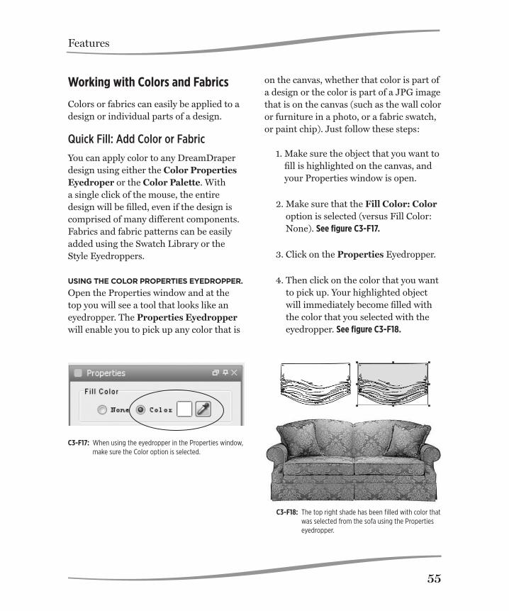
Features
55
Working with Colors and Fabrics
Colors or fabrics can easily be applied to a design or individual parts of a design.
Quick Fill: Add Color or Fabric
You can apply color to any DreamDraper design using either the Color Properties Eyedroper or the Color Palette. With a single click of the mouse, the entire design will be filled, even if the design is comprised of many different components. Fabrics and fabric patterns can be easily added using the Swatch Library or the Style Eyedroppers.
using the Color properties eyeDropper. Open the Properties window and at the top you will see a tool that looks like an eyedropper. The Properties Eyedropper will enable you to pick up any color that is
on the canvas, whether that color is part of a design or the color is part of a JPG image that is on the canvas (such as the wall color or furniture in a photo, or a fabric swatch, or paint chip). Just follow these steps:
1. Make sure the object that you want to fill is highlighted on the canvas, and your Properties window is open.
2. Make sure that the Fill Color: Color option is selected (versus Fill Color: None). See figure C3-F17.
3. Click on the Properties Eyedropper.
4. Then click on the color that you want to pick up. Your highlighted object will immediately become filled with the color that you selected with the eyedropper. See figure C3-F18.
C3-F17: When using the eyedropper in the Properties window, make sure the Color option is selected.
C3-F18: The top right shade has been filled with color that was selected from the sofa using the Properties eyedropper.

Features
56
using the Color palette. To fill a design with a custom color, follow these steps:
1. Make sure the object that you want to fill is highlighted on the canvas, and your Properties window is open.
2. Make sure that the Fill Color: Color option is selected (versus Fill Color: None). See figure C3-F17.
3. Click on the Fill Color box that is located to the left of the eyedropper.
4. A color palette will open and you can choose from over 200 popular colors. Just click on one of the colors, then click on OK, and that color will be applied to your object. See figure C3-F19.
Please note that you are not restricted to the standard colors that appear when you open the color palette. At the top of the palette window you will see 3 tabs labeled Swatches, HSB, and RGB. You can click on any of the tabs for more color options.
• Swatches. This tab contains the stan-dard colors, shown in figure C3-F19.
• HSB. (Hue, Saturation, Brightness) See figure C3-F20. You can completely customize your color and make it any shade of the rainbow, from pastel to a dark tone, using 2 main controls.
C3-F19: Click on a color of your choice in the color palette.
C3-F20: Move the circle using your mouse to select the desired color.

Features
57
The large box displays the color that you have initially selected and you can use your mouse and transition between pastels to darker tones, just by moving the cursor (shaped like a white circle) through the large box. If the color that you started with is a shade of red, then the box will display pastel and dark tone versions of that particular shade of red.
To the right of the large box is a verti-cal color bar representing the colors of the rainbow, starting with red at the top, transitioning through orange and yellow, into the greens, blues, vio-lets, etc. Use the vertical slider bar to change color, and the large color box will reflect your selection.
• RGB. (Red, Green, Blue) If you know the exact RGB code of the color that you desire, then click on this tab and you can enter the appropriate RGB numbers. See figure C3-F21.
Whether using the Swatches, HSB, or RGB tab to define your color, on the very bottom right corner of the color palette window you will see a preview of your color selection.
Recommended tutorials:Working with Color/Fabric: Color Palette
C3-F21: Type in the RGB color codes, if known.

Features
58
the swatCh library. This feature is located along the left side of your screen, just below the Design Library. From there you can choose to fill your design with your own fabric (from the Custom catego-ry, which is discussed below), or use one of the pre-installed sample fabric swatch-es that are provided for your convenience, or use images from the Textures category (e.g., wood, marble, brick, leather, etc.). Just follow these steps:
1. Make sure the object that you want to fill is highlighted on the canvas, and your Swatch window is open.
2. Go into one of the Swatch categories and select the swatch or texture that you want to use.
3. Double-click on your selection (or click on the Apply button). Your highlighted object will immediately become filled with the swatch or texture that you selected. See figure C3-F22.
Hint: If you attempt to fill a design with fabric (or a texture) and you find that it won’t fill, then first fill the design with color. Then you should be able to fill it with fabric with no problem.
C3-F22: To apply fabric, double-click on the fabric or click on the Apply button.

Features
59
the style eyeDroppers. Exclusive to DreamDraper, these tools are located in the top toolbar. These have significant differences from the Properties Eyedrop-per. The Properties Eyedropper can apply only single colors. The Style Eyedroppers can copy/paste the complete style of an object, and be used to fill colors, complete fabric prints, or textures. They may also be used to adjust fill opacity, stroke properties (color, thickness, or opacity).
The Copy Style and Paste Style Eyedrop-pers are covered extensively in Chapter 2, pages 20-21, in addition to the Select Mode Toolbar (page 19). An example of using the Style Eyedroppers follows.
1. In this example, pretend that you have 2 designs on your canvas: a win-dow treatment and an accent pillow.
2. Fill the window treatment with fabric. Imagine that you have filled a complete design with the fabric, including swags and panels.
3. Change to the second arrow (Custom Fill Mode), and do the click-away.
4. With your mouse, select an area of the treatment where you want to pick up the fabric (such as the panel). Re-member, you are now on the second arrow and you can select any com-ponent within the design, without having to take it apart.
5. Click on the Copy Style Eyedropper. This copies the complete style of the panel (its fill, stroke, and transpar-ency) to the clipboard.
6. Click on the accent pillow, and then click on the Paste Style Eyedropper. You have now transferred the com-plete style (fill, stroke, and transpar-ency) of the panel over to the accent pillow.
7. When done, click on the first arrow (Default Design Mode), and do the click-away.
Recommended tutorials:Working with Color: Quick FillWorking with Fabric: Style Eyedropper

Features
60
Adding Detail Color
As mentioned earlier, the Quick Fill meth-od will apply color or fabric to an entire design. In the example immediately above in step 2, the entire window treatment (including swags and panels) was filled with fabric. However you may want to add contrast color or textures to a design, and you can easily do so. There are 2 methods described below.
The fastest method is to use your second arrow (Custom Fill Mode). As mentioned earlier, we strongly encourage you to review the Select Mode Toolbar topic, which was discussed in Chapter 2, page 19. Continuing with the example from above, the accent pillow was filled with fabric using the Paste Style Eyedropper. Imagine that the pillow has a corded edge, and you now want to apply an accent color to the cording. Follow these steps:
1. Change to the second arrow (Custom Fill Mode), and do the click-away.
2. With your mouse, select the corded edge and then fill with your desired color, fabric, or texture.
3. When done, click on the first arrow
(Default Design Mode), and do the click-away.
The advantages of using this method are multiple, and significant:
• You don’t have to ungroup the design in order to fill any of its components.
• You can select multiple components within the design to fill at a single time (by depressing the Shift key as you select the different components).
• You can actually group an entire room filled with furniture, window treat-ments, and accessories, and using the second arrow, you can fill a component within the room, without ever having to take the room apart. This is a real time-saver.
• You always have the design right in front of you, with an unobstructed view. No dialog window needs to be opened. You have direct control. It is truly WYSIWYG (What You See Is What You Get).
• You don’t have to guess as to the name of any of the components within a design, because you are visu-ally selecting the areas to fill, and you don’t have to read and select from a list of names.
The other method for applying contrast color or fabric to a design is to simply ungroup the design. Remember that when you ungroup, all objects within the design

Features
61
are highlighted. So first do the click-away so that nothing is highlighted, and then se-lect the specific component or components that you want to contrast fill. For example, you might be working with a swag that contains both trim and cording. When you ungroup the swag, three objects will be highlighted: the fabric portion, the trim, and the cording. Do the click-away, which deselects the three objects, then click on whichever component you want to fill. When done, remember to regroup the swag.
Using the second arrow to custom fill a design is generally the quickest method. An exception might be if you are working with trim that has been drawn as single
strands (such as beading or tassel trim, where each strand or tassel is actually a separate object). In this case, you have the flexibility of coloring each strand dif-ferently. If you want to color the entire trim as one color, the ungroup method is preferred.
The key steps for both approaches are summerized in the table below.
Recommended tutorials:Working with Color: Add ColorAdd Detail Color I Add Detail Color II Add Detail Color III Working with Fabric: Fill With Fabric
using 2nD arrow using 1st arrow
1. Select 2nd arrow, click-away. 1. Start on 1st arrow (default design mode).
2. Select and fill object(s). 2. Ungroup design, click away.
3. Click on the 1st arrow to return to the default design mode, then click-away.
3. Select object(s) to be filled.
4. Fill.
5. Regroup all components.
Two Ways to Apply Contrast Color or Fabric

Features
62
Adding your Own Fabric
To add your own fabric to the Swatch Li-brary, click on the Custom category. Click on Import located at the bottom of the browser that opens up. See figure C3-F23.
Click on Load Image in the window that appears on your screen and locate the fab-ric swatch that you saved to your computer (from the vendor’s website, from a digital photo, or a scan of the fabric), then click OK. The fabric will appear in the preview window.
sCale your FabriC swatCh. When you load your swatch, you will need to specify how to scale it. You only need to specify either the width or the height, and the program will automatically calculate the other side.
If your fabric image is from a website, then sometimes the vendor will display the size of the image. For example, a particular vendor will show a swatch and tell you that you are looking at 35” of fabric (width), and that the horizontal repeat is 27”. In this case, enter a value of 35 in the width field. Please take note that you are not concerned about the repeat. You are more interested in the amount of fabric that is represented by the swatch.
Sometimes a fabric has a small repeat of 2”, but you are viewing perhaps 14” of fab-
ric. In this case, you enter 14 into the pro-gram. Again, you are more interested in the amount of fabric that is represented by the swatch, and not the size of the repeat. Crop your FabriC swatCh. The large preview window shows your swatch, and the small preview window shows how it will be applied (tiled) in a design. Some-times your swatch will have an uneven edge (especially if it was scanned) and you have the ability to crop the swatch before it is imported into the Swatch Library. Use your mouse to select the good area of the fabric in the large preview window (with the mouse, make a rectangular motion), and the program will crop off the rest.
name your swatCh. When adding your own swatches, you may want to use a meaningful name that might include in-formation about the vendor, color, or even how you scaled the swatch. For example, you might call it XYZ-Enzo-blk-35, where XYZ represents the company, Enzo is the pattern, blk is the color, and 35 was your scale. As previously mentioned with regard to filenames, we recommend that you do not use special characters in names (with the exception of dashes or underscores).
When done scaling, cropping, or naming your swatch, then you are ready to import it into the Custom library. Now click Im-port at the bottom of the message box. See figure C3-F24.

Features
63
C3-F23: Open the custom category in the Swatch Library, then click on the Import button to import your own swatch.
Quality oF swatCh image. Generally, the best images come from vendor websites, where the images are likely to be well-lit and larger areas of fabric have been pho-tographed. If you cannot find the image online, the next best solution is to take a digital photo of the fabric if you have a sample. This can be problematic because you will want the fabric to be evenly lit, and straight, and hopefully wrinkle free. The least favored method is if you scan a swatch. The problem with scans is that your scan bed is generally small and you will not be able to capture the repeat for many prints. In addition, the scan cre-ates shadows on the fabric which can be
distorting, as well as the scan is often crooked. As a general rule:
• Images from websites are the best.• The larger the print, the better. If your
fabric repeat is large, for example 27”, your design will look quite beautiful and realistic. Very small prints, espe-cially when the repeat is only about 2”, lose their clarity and vibrancy because they are so small.
• Stripes can be problematic, as they need to be perfectly vertical. If the stripe is even slightly crooked, the result is a checkerboard appearance as the computer tiles the fabric into a design.

Features
64
• If you are working with fabric that has a small repeat and the print comes across muddled, try to change the scale. For example, if you scanned a fabric that was only 8” wide (with a repeat of 2”), and you scaled the fabric at 8”, try to import it again and scale it
larger, say 16”. That may improve how the fabric appears in the program.
Recommended tutorials:Working with Fabric: Add Your Own FabricCrop Your Fabric
C3-F24: 1. Click on Load Image. 2. Find your swatch. 3. Scale your swatch. 4. Rename if desired. 5. Click on import.

Features
65
Adding Transparency
Whether your design is filled with color, fabric, or a texture, you can change the opacity of the object so that it is “see-through”, just like a sheer. To change an object’s opacity, do the following:
1. Make sure the object is highlighted, then open the Properties window (click on the Properties tab to the right of the canvas.).
2. At the top of the Properties window
you will see a slider bar labeled Fill Opacity. Use your mouse and move the slider bar to the left to make the object more translucent. The more you move it to the left, the more of the fill is removed. To restore complete opacity to the ob-ject, move the slider bar all the way to the right.
3. Below the Fill Color controls, you will see the Stroke Color controls (for the outline). You will also see a slider bar labeled Stroke Opacity and you will be able to remove color from the stroke as well.
Recommended tutorials:Basic Features: Create Translucent SheersCreate Translucent WindowsChange Line Thickness (Stroke)
Working with Photos and Furniture Images
Another very useful function is the ability to import photos and furniture images.
Insert Image
Whether you are planning on designing on a photo, or you want to incorporate an image of a piece of furniture or an acces-sory item into your rendering, or you want to incorporate a fabric swatch or a paint chip onto the canvas, you follow the same procedure and use the Insert Image com-mand, which was described in Chapter 2, page 29. If you are designing on a photo, we recommend that you lock the photo in place so that it doesn’t move accidentally as you are placing components on top of it.
• The object lock feature is located in the top toolbar. Even though locked, your mouse will still be able to detect the photo.
• The preferred method for locking your photo is to use the Layers feature, which is described further below and is more advanced. Using Layers, your photo can be locked in place and your mouse will never detect it.
Crop Image
This feature is extremely popular and is sometimes referred to as the “photo crop”, and was described in detail in Chapter 2, page 27. You will find this command used in two popular ways:

Features
66
• If designing on a photo, where typi-cally a sofa might be in front of the window, your window treatment design will lay on top of the sofa and you will want to “tuck” your treatment behind the sofa. Use the Crop Image command to crop out the sofa and you will be able to place the cropped sofa on top of the window treatment. Make sure to refer to Chapter 2, page 27 for a full description of this command.
• You may see an image on a website that contains a furniture or accessory item that you want to incorporate into your rendering, but the image con-tains other items that you want to re-move. The Crop Image command will conveniently crop out whatever item you want to use. If the image contains more than one item that you want to use, you will have to insert the image again onto the canvas to crop out the second item.
The Crop Image command requires the use of one of the Drawing tools (typically the Cubic Bezier Curve) where you trace the object that is to be cropped.
Eliminate Background: TKO (Total KnockOut)
The TKO is a convenient tool that is located in the Properties window, and can “knock out” or eliminate the background of an image. For example, many images
of furniture (such as a chair or sofa) on websites will have a white background. If you insert the chair onto the canvas, it will be surrounded by white and it won’t look right in your rendering (plus the white will cover other parts of your design.)
You have two ways of eliminating the white background:
• You can use the Crop Image com-mand, whereby you trace the chair using one of the Drawing tools, and then you crop out the chair. However, in this instance, there is an easier method.
• Use the TKO tool. You will be able to remove that white background with a single click of the mouse.
To use the TKO tool:1. Insert the image onto the canvas, and
open the Properties window. Make sure the image is highlighted
2. Click on the Properties Eyedrop-per. (Note that since a JPG image is highlighted, the eyedropper that you will be using for the TKO is not the same eyedropper that you use when working with a design.)
3. Then click on the white background, and it will be eliminated!
With the TKO, it doesn’t matter what the color of the background is. Simply click on

Features
67
the eyedropper and then click on the color that you want to remove. See figure C3-F25.
The TKO is actually a very sophisticated tool, as you can do the following:
• Remove multiple colors. You are not limited to a single color removal. You can repeatedly click on the eyedropper and then click on the color that you want to remove from the image. All
colors that you remove will be dis-played in the Colors Removed grid in the Properties window.
• Control the amount of color re-moved. For each color removed, you can control the amount that is removed simply by moving the Transparency Level slider bar. For example, sometimes if you remove the white from the background of a chair, you might see some fragments of white along the border of the chair. You can remove those white fragments by moving the slider bar to the right.
• Reset. Use this button if you want to restore the JPG image to its original state.
Recommended tutorials:Design-On-a-Photo: Eliminate Back-ground TKO
Masking and Changing Wall Color
Oftentimes you may be designing on a photo and you may want to cover up ob-jects (i.e., “remove” furniture or wall hang-ings, etc., from the photo). This is covered below, under the topic of Layers.
You can change the color of walls (or furniture) in photos by using the mask-ing technique. This too is covered below, under the topic of Layers.
C3-F25: In the top sofa, the background is present. The bottom sofa is shown after the removal of the background using TKO.

Features
68
Layers
Layers is an advanced feature and once you learn it, you will always want to use it! Using this feature you will be able to create elements of your rendering on separate layers. For example, you can create your “base” (whether it is a photo, an elevation wall, or a floor plan) on Layer 1, and then you can place your design components on Layer 2, and on Layer 3 you might want to show another design option, and then possibly add fabrication or installation instructions on Layer 4.
Benefits include the following:• The ability to isolate and lock a por-
tion of your design so your mouse won’t even detect it. This differs significantly from the locks that are located in the top toolbar (described in Chapter 2, page 25), where you can lock an object so that it doesn’t move, but your mouse still detects it. When designing on top of a base (such as a photo) and even though the base is locked, it can be frustrating to try and select small components (such as finials) that are on top of it, when you keep accidentally selecting the photo. This problem can be totally eliminated by using Layers.
• The ability to hide a portion of your design, and control when you want to reveal it. If designing on a photo as in the example above, the photo is on layer 1 and you can create your
design on the second layer. However you might want to show the client an alternative option. Using Layers, you can create design options on the same canvas (in this case you can hide your second layer, and put the alternative option on the third layer), otherwise you would have to build the same room on multiple canvases to display your options.
• The ability to add additional layers on the same canvas, for different audiences. This is a real time saver. For example, a layer might be created specifically for the fabricator, includ-ing information about fabric, lining, trim, etc. This layer can be hidden or revealed. Another layer might be created specifically for the installer, including specifications about place-ment and hardware. This layer can be hidden or revealed. Another layer might be created specifically for the client, and include cost information. This layer can be hidden or revealed.
Layer Commands
When you open the DreamDraper pro-gram, the Layers tab is located along the right side of your screen.
Open the Layers window. Click on the Lay-ers tab to open the window. You can keep the Layers window open by clicking on the push pin symbol that is located in the upper right corner of the window. See figure C3-F26.

Features
69
C3-F26: Click on the push pin symbol (middle icon in top corner) to keep the windown open.
C3-F27: To rename the layer, click on the middle icon at the bottom of the window.
The default layer is Layer 1. If you previ-ously saved a file that had layers, make sure to open up the Layers window and select the appropriate layer to resume your designing. Otherwise, any new object that you drag onto the canvas will, by default, go onto the first layer.
rename the layer. For your conve-nience, you can choose to rename a layer. For example, if you inserted a photo onto the canvas, you might want to identify it as being a photo. First make sure that the layer is highlighted in the Layers window, and then click on the middle icon (it has a pencil in the center) that is located at the bottom of the Layers window. A pop-up will appear in the upper left corner of the screen. Simply type in a name for the layer, such as “L-1 Photo” (L-1, signifying the first layer) and click on OK. See figure C3-F27.
loCk a layer. Make sure that the layer is highlighted in the Layers window, and then click on the lock icon that is on the right side of the window. By default, the icon is in the unlocked open position. See figure C3-F29 on page 70.
Once your layer is locked (closed position), your mouse will not detect anything on that layer. This is perfect for designing on top of a photo, a wall elevation, or a floor plan, as you can see the base, but you never have to worry about accidentally selecting it with your mouse.

Features
70
Delete a layer. Use your mouse and highlight the layer that you want to delete, then click on the trash can icon that is lo-cated at the bottom of the Layers window. The layer will then be deleted. See figure C3-F29.
restore the layers winDow. If you ac-cidentally close the entire Layers window so it no longer appears at the right of the canvas, click on Windows–Show/Hide Windows in the Command Line and you will be able to restore it.
unloCk a layer. Use your mouse and highlight the layer that you want to un-lock, then click on the lock icon. The icon will change from the closed to the open position, and you will be able to design on that layer again.
aDD a new layer. To add a new layer, click on the first icon (it contains a plus sign) located at the bottom of the Layers window. Layer 2 will appear under Layer 1 in the window. You should also rename this layer to reflect it’s content. Typically if designing on a photo, or a wall elevation, or a floor plan, you build the base on the first layer, lock it, and then you can start designing on the second layer. See figure C3-F28.
hiDe a layer. To hide a layer, simply click on the eye icon that is on the left side of the Layers window. By default, the eye is in the open position. When you click on the eye, it will close and thereby hide your layer. See figure C3-F29.
This is a convenient feature which allows you to create several design options and simply hide them when not in use. It is a good idea to lock your layer if you are done with it.
reveal a layer. To reveal a layer, simply click on the eye icon that is on the left side of the window. If hidden, the eye is in the closed position, and after clicking it will be in the open position and reveal your layer.
C3-F28: To add another layer, click on the left icon located at the bottom of the window. Multiple layers can be used for different audiences or to show alternative styles to your client.

Features
71
Masking with Layers
mask a portion oF a photo. Oftentimes you may be designing on a photo and you may want to cover up objects (i.e., “remove” furniture or wall hangings, etc., from the photo). This can be effectively accomplished by placing the photo on the first layer and masking over the unwanted portions on the second layer, using the Drawing tools (see Chapter 2, page 29). You can then lock both layers and start your design on the third layer.
When masking objects:
1. Trace the object that you want to cover, typically using the Cubic Bezier Curve (see Chapter 2, page 29).
2. If necessary, modify the trace line
segments (move them or change a straight segment into a curved seg-ment) by going into Edit Points Mode (discussed in Chapter 2, page 22).
3. Fill the object (your trace) with a color that matches its surroundings. For example, if you are trying to cover up a wall covering, then trace the wall covering and fill it with the surround-ing wall color. Use the Properties Eyedropper (Chapter 3, page 55) to pick up the wall color.
4. Change the stroke color from its default black color to the same wall color.
C3-F29: 1. To delete a layer, make sure that it is highlighted and then click on the trash can icon located at the bottom of the window.
2. Click on the eyeball to show or hide the layer. 3. Click on the lock icon to lock (or unlock) the layer.

Features
72
Changing Wall Color
Sometimes you will want to actually change the wall color in a photo. The same masking technique can be applied. It is important to make sure that the photo is locked on Layer 1. You will then be able to start your masking on Layer 2 without moving the photo.
1. Trace the walls, ceilings, floor, windows, molding, using one of the Drawing tools (see Chapter 2, page 29). Typically you would use the Cubic Bezier Curve, but if no curves are involved, you can use the Polygon. Remember that the Cubic Bezier Curve, once drawn, does not automatically fill with color. So make sure to open the Properties window and select the Fill Color—Color option.
2. As you trace an object ( for example,
the wall), open the Properties win-dow and change the opacity of your trace, so that you can see the photo underneath. Move the Fill Opacity slider bar to the left to make the wall translucent.
3. Once you have traced the architectur-
al features (e.g., walls, ceiling, etc.), then you can restore their opacity (move Fill Opacity slider bar to the right) and change their colors.
In this manner, you have a render-ing that architecturally resembles the client’s room, but you have modified it to reflect your new design, com-plete with wall colors (including textures or patterns), floor, ceiling, and customized molding.
General Tips When Using Layers
veriFy the layer. To assure that your components are on the correct layer, make sure that the layer you are working on is highlighted in the Layers window. Click on any component on the canvas and at the bottom of the screen you will see its layer designation. To move a component between layers:
1. Highlight the component to be moved.
2. Click on the Cut icon in the top tool-bar (see Chapter 2, page 21).
3. Highlight the destination layer (and make sure it is unlocked).
4. Click on Paste.
Recommended tutorials:Drawing Tools – Layers

Features
73
Drawing Your Own Designs
Sometimes you may have a design that you sketched by hand, or you found a picture in a book or magazine, and you would like to use that design in DreamDraper (including the ability to fill it with color or fabric). To do so, first scan the design into your computer and create a JPG. The program automatically defaults to the first layer, so complete these steps:
1. Insert the JPG onto the canvas, using the Insert Image command (Chapter 2, page 29).
2. Lock Layer 1.
3. Create Layer 2. You will be tracing the design on the second layer. On Layer 2, use the Cubic Bezier Curve tool (Chapter 2, page 29) and trace the JPG, including the outline and the inner detail lines that represent folds of the fabric. Use Edit Points to refine your trace and to convert straight line segments into curved segments (described in Chapter 2, page 22).
4. Hide Layer 1. When done drawing, you can hide the JPG (or delete Layer 1 by clicking on the trash can icon located at the bottom of the Layers window).
Creating Your Own Templates
DreamDraper is a comprehensive graphics design program that also enables you to add notes, text and logos to your de-signs. You can create professional looking renderings that not only showcase your designs, but also includes your logo and business information.
Create a master template with your logo and company information so that you will be able to incorporate this on each design that you create, using these suggested, simple steps.
1. Select File/New Portfolio from the Command line.
2. Click on the Text icon and type your
company name, address, phone num-ber and any other information that you want to appear in your template.
3. Position the text in a location where you would like to consistently place your information. Typically it is in the bottom right portion of the canvas (within the rectangle boundary box).
4. Open the Properties window and
modify the font to create a unique color or style for your company. Re-member that your text is comprised of both a stroke (outline) and a fill

Features
74
(refer to Chapter 2, page 32), so that you can be very creative. Also, you can change the opacity of the text so that you can see through it, which can create a watermark effect.
5. Click on the Insert Image icon lo-cated in the toolbar and import your company logo. In Chapter 1, we dis-cussed how you should organize your files, so your logo should be saved as a JPG in your company folder. (Please note that your logo can also be in the form of a GIF or PNG file.)
6. Resize your logo so that it appears in proportion to your text. Remem-ber to depress the Shift key on your keyboard when resizing, so that your logo maintains its proportions and that you do not distort it.
7. If your logo has a white background
(or other color), and you would prefer
to take out that color, you can use the TKO tool (described earlier in this Chapter) to remove the unwanted background color.
8. When you are finished, click on
File–Save Portfolio. Save the Port-folio in your company folder and give it a unique name such as “Template-Company Information”.
When you are ready to create a Dream-Draper design for a new client, click on Open Portfolio and open the template that you saved in your company file. Your company information and logo will appear at the bottom of the canvas. Click on Save Portfolio As and give it another name that references your client such as Smith- Family Room. You have now created a brand new Portfolio for your client with your company information, and your original template has been preserved for future use.

Creating DesignsChapter 4 is a “quick start” guide to beginning the design process, and the simple example given involves designing a window treatment. It will refer you to specific areas within this Guide for a more in-depth explanation of how certain commands work.
We strongly urge you to review the recommended reading in Chapters 1, 2, and 3, as those topics contain the foundational material regarding the Design Library and some of the fundamental commands and controls. A basic understanding will make the learning experience go much faster for you.
4

Creating Designs
76
Creating Room Elevations and Designing on a Photo
With the DreamDraper software you can create beautiful room elevations and window treatments entirely within the program. For your convenience, elevation templates for basic flat walls and bay win-dows are available to facilitate the process. However, the most popular and realistic feature is a rendering that is created when the design is shown on a digital photo of the client’s room. With this technique the photo serves as the backdrop (base or foundation) on the canvas and the proposed design (or design alternatives) can be viewed in the ac-tual room setting complete with the client’s furniture, wall coverings, fireplaces, room accessories, and exterior views.
This Chapter describes the general proce-dures for both methods. Most of the steps are the same for either approach, as shown in the table below. The steps are discussed in more detail throughout this chapter.
Step 1: Creating the Base
Whether you are creating room elevations or designing on a photo, the first step is to create the base.
Creating the Wall for Room Elevations
When developing a room elevation, you have 2 methods for creating the wall—you can use one of the templates that are located within the Design Library, or you can draw the wall using the Drawing tools.
Creating room elevations Designing on a Photo
1. Create your wall. 1. Import a photo.
2. Select design style from the Design Library.
2. Select design style from the Design Library.
3. Resize design to fit the window.
3. Resize design to fit the window.
4. Fill with colors and fabric patterns.
4. Fill with colors and fabric patterns.
5. Add furniture and accesso-ries (optional).
5. Position treatment behind furniture or other obstruc-tions in original photo (if necessary).
6. Add furniture and accesso-ries (optional).
Step by Step Procedures for Creating Designs

Creating Designs
77
if you wish to use temPlates, the Design Library contains a category of Elevation Templates that has components featuring molding, flooring, walls, plus a finished sample. The walls come in 2 stan-dard heights (8’ and 10’) both for straight and bay or corner walls. See figure C4-F1.
If designing purely for presentation pur-poses, you can drag the wall components onto the canvas and use your mouse to quickly resize the walls to fill the canvas area. This will quickly create the backdrop wall for your design.
Or, if you wish to resize to true scale, select the wall and then click on Object–Scale and type in the exact width and height measurements (in inches or centimeters if
C4-F1: Wall templates within the Design Library.
choosing metric dimensions). This com-mand is reviewed in Chapter 3, page 51, See figure C4-F2.
The default canvas in DreamDraper will accommodate a design that is up to 333” by 250” (approximately 28’ by 21’). If you are designing to scale and you need to establish a wall that exceeds the default canvas size, then you should change to quarter-inch scale.
If you choose to add other architectural details such as molding, do the following:
• Drag on your desired component, and position in place (i.e., at the top or bottom of the wall, or partially up the wall if chair molding).

Creating Designs
78
that best fits your client’s room and drag onto the canvas (click on the object either in the Browser or Preview window), keep your finger depressed, and drag the mouse over onto the canvas, then you can release. Resize the window to fit the wall space or resize to true scale (same directions as above). If you do not see exactly the win-dow type you are looking for, you should be able to create it by resizing and/or combining several window types, such as adding a transom or arch to a basic picture window. See figure C4-F3.
If your wall has been drawn to scale, you can position your windows or doors into place by using the Dimension Tool and measuring distances from the floor, ceil-ing, or the side walls. Simply follow the previous example (placing chair molding, and refer to the Align-Bottom command).
Recommended tutorials:Drawing Tools: DrawingDrawing Bays
• If your wall is drawn to scale, you can position the chair molding in place simply by drawing a Dimension Tool vertically (See Chapter 2, page 30. For example, if you know that the chair molding is 36” from the floor, then draw a vertical Dimension Tool and position the bottom end so that it is flush with the bottom of the wall.
if you wish to use Drawing tools, you can also quickly sketch a wall (discussed in Chapter 2). Click on the Rectangle icon and draw a shape. To size to scale, click on Object-Scale and you will be able to enter your exact measurements.
Once your foundation wall is in place (ei-ther using the templates or drawing your own wall), you can add on your windows or doors. Click on the Windows and Doors category in the Design Library. There are close to 500 windows and doors to choose from—basic, double hung, transom and more, in addition to specialty windows and door handles. Find the window or door
C4-F2: Resizing the wall using Object-Scale.

Creating Designs
79
Importing the Photo to Design Upon
To import a digital photo, click on the In-sert Image icon in the toolbar. For presen-tation purposes, you can resize the digital photo to fit the entire canvas area, which gives your client a large image to view, either as a printout or on a JPG. Resize the photo by pulling on a corner handle while keeping the Shift key depressed. This ensures that the photo maintains its aspect ratio and that you do not distort it out of shape.
If you want to scale the photo, then please refer to Chapter 3, page 54 (Scaling a Photo) which describes in detail how to scale your photo.
Whether you are designing on top of an elevation wall or a photo, we encourage you to lock down your base before design-ing on top of it. You can use either of the following methods:
• Lock your photo or wall in place by clicking on the Lock icon in the top toolbar. The lock commands were dis-cussed in Chapter 2, page 26, and will prevent your object (in this case your wall or photo) from moving. However your mouse will still be able to detect the object. See figure C4-F4.
• A more advanced, but preferred meth-
od, is the Layers feature. Use Layers and lock your base (on Layer 1). Create your design on Layer 2. Please refer to Chapter 3, page 68, for a detailed explanation of Layers.
C4-F3: Example of a combination window built by combin-ing arch and picture windows from the library. The windows can be positioned using the Dimension tool as shown.
C4-F4: Using the Lock icon in the top toolbar, the photo has been locked in place on the canvas.

Creating Designs
80
key on your keyboard is depressed. Then place the mouse over one of the corner handles and drag the mouse out or in to make it larger or smaller. Chapter 3 con-tains a comprehensive write-up on resizing (pages 49-52). to Change either the wiDth anD/or
height of the entire Design, but not
maintaining the asPeCt ratio, highlight the design, hover your mouse over any one of the blue squares on the edges of the box surrounding the design (but do not depress the Shift key), keep your finger de-pressed and drag until the width or height of the design fits the window. it may be neCessary to ungrouP your
Design. For example, if you are working with an empire top treatment that has 2 swag sections and your window requires 3 swag sections. In this case, you will need to Ungroup the design and add another swag section. You can Copy the existing swag and Paste it to create the 3rd swag. Please refer to Chapter 2 for a further explana-tion of the Ungroup command (page 25), the concept of the “click-away”, and refer to Chapter 3 to understand Break-Apart® Designs (page 40).
to resize only Certain ComPonents
within a Design, you must Ungroup the design. Then you will be able to resize just the components that you desire. C4-F5
Hint: If working with identical components ( for example the 3 swags mentioned previ-
Step 2: Select Design Style from the Design Library
Click on a Category and its Sub-Catego-ries in the Design Library. The Browser window will open with thumbnails of the designs in that specific category. (Example: Designs with Components-Swag Designs-Pole Swags, See C3-F2, page 43.)
In the Preview window you will see a brief description of the design as well as the Gold Buttons. (See C3-F4, page 45.) Click on the buttons and all the individual com-ponent pieces that make up the full design are displayed in the browser. Important: Please review Chapter 3, which contains an extensive description of all the features and capabilities of the Design Library and the Gold Buttons.
You can drag a design onto the canvas from either the Preview or Browser win-dow. (See C3-F5, page 46.)
Step 3: Resize Design to Fit the Window
At this point the canvas will have either a wall elevation and window or a photo of the client’s window, and a design from the Design Library. There are a number of ways to resize a design to fit the window, depending on your needs.
to resize ProPortionately, make sure the design is highlighted and that the Shift

Creating Designs
81
ously), it can be faster to group them and then resize as a single object to fit the window, versus resizing the swags individually. This may not always be possible.
Step 4: Fill with Colors and Fabric Patterns
Now that you have created your design as a line drawing, you can add the colors or fabric patterns of your choice. Please refer to Chap-ter 3, which has a comprehensive write-up on this subject (page 55). You will be able to:
• Add any color from the color palette, located in the Properties window.
• Customize the color, choosing any
shade from pastel to a deep hue.
• Pick up a color from a photo, a fabric swatch, or a paint chip, using the Properties Eyedropper.
• Pick up an entire fabric print using the Style Eyedroppers (which picks up the entire fill (color or fabric print), the stroke (outline) color and weight (thickness), and the transparency level.
• Add your own fabric. (You should have the specific fabric patterns that you wish to use stored in a fabric folder on your computer, as described in Chapter 1.)
• Easily apply contrast color to areas of detail (lining, cording, etc.).
C4-F5: The design on top was ungrouped, so that the cascades could be made longer. All other components remain the same.

Creating Designs
82
Step 5: Position Treatment Behind Furniture or Other Obstructions
This step applies only when designing on a photo and only when the photo that you are using as your base contains furniture or other obstructions in front of the win-dow, which may be covered by a design. In this case, your initial DreamDraper design will appear to be on top of the furniture rather than behind it. See figure C4-F6. To achieve the desired end result you need to “tuck” the treatment behind the furniture.
1. First make a copy of the photo and ensure that it is not grouped to any other object.
2. Use one of the Drawing Tools to trace around the object (e.g., a sofa in front of the window in the photo). The Cubic Bezier Curve is the most versatile for tracing, but you can use any of the Drawing Tools. Click on Cubic Bezier Curve icon and then click on the canvas with your mouse to start drawing. Click your mouse wherever you want to create a bend or turn in the line as you trace the furniture that you want to crop, and then double-click to stop drawing. Make sure to review Chapter 2, page 29, for a detailed explanation of the Cubic Bezier Curve. See figure C4-F7.
3. Select both the photo and your trace (keep your finger depressed
C4-F6: The panel appears on top of the chair in the photo.
C4-F7: To crop out the chair, first make a copy of the photo, then use a Drawing tool (such as the Cubic Bezier Curve) to draw around the chair. Highlight the photo and the trace, then click on Crop Image.

Creating Designs
83
on the Shift key as you select both objects).
4. Then click on the Crop Image icon, and your sofa will be cut out of the photo. Please note that the Crop Image icon is only enabled or active when both the photo and a drawn ob-ject are highlighted simultaneously. See figure C4-F8.
5. Now, using your mouse, move the sofa to the proper location on top of the design! See figure C4-F9.
Step 6: Add Furniture and Accessories (Optional)
The Design Library includes Furniture and Room Accessories that you can add to your rendering. As with all DreamDraper designs, these can also be filled with color and fabrics to match or complement the design. When viewed in the Preview window, many of the furniture pieces will have Gold Buttons displayed, so you can view the additional related pieces (such as perspective view, or matching components like as sectional pieces).
If you wish to import items from the web, click on the Insert Image icon in your toolbar and you will be able to incorpo-rate furniture or other accessories into the rendering. You can remove any unwanted background by using either the TKO tool or the Crop Image tool. Both are described in detail, in Chapter 3, pages 65-66.
C4-F8: The chair is now cropped.
C4-F9: Position the chair on top of the panel.


Space PlanningChapter 5 is a “quick start” guide to beginning the design process for creating a floor plan using the Space Planning templates. It will refer you to specific areas within this Guide for a more in-depth explanation of how certain commands work. The program features and commands are identical to those used for window treatments—only the templates are different.
We strongly urge you to review the recommended reading in Chapters 1, 2, and 3, as those topics contain the foundational material regarding the Design Library and some of the fundamental commands and controls. A basic understanding will make the learning experience go much faster for you.
5

Space Planning
86
Creating Floor Plans
The Design Library within DreamDraper contains not only beautifully illustrated window treatments, plus furniture and accessories, but it also contains a com-prehensive collection of Space Planning templates for creating floor plans. As with all DreamDraper designs and components, the templates can be sized to scale and filled with color, fabric, textures and pat-terns.
The floor plan base (perimeter) can be built from scratch within the program, or you can input a blueprint of a room and start designing directly on top of it, much the same way as you can design on a photo. The DreamDraper program provides two ways to create the room perimeters: using the Rectangle tool or using the wall tem-plates from the design library.
If you have already used the program to design window treatments or room layouts, then you are already familiar with the commands required to build a floor plan. The exact same program features are used. The only thing that differs is that you will be using the Space Planning templates within the Design Library.
Scale
The default canvas in DreamDraper will accommodate a design that is up to 333” by 250” (approximately 28’ by 21’). If your
room fits within this boundary, then you can start designing. Please note that when you print out your design, your design will be completely proportional, and to scale. However your printout will be somewhere between a quarter-inch and half-inch scale. The reason why the scale is somewhere between the 2 standard scales is because it allows your design to be of a nice size on the printout (or JPG if you used the File-Export command to create a nice-sized jpg for presentation purpose).
If you design to a quarter-inch scale, your design will appear smaller on the printout (versus the default scale). If you design to a half-inch scale, your design will appear larger on the printout (versus the default scale), but it may not fit on the printed page. So for presentation purposes, the default canvas will print your floor plan at a nice size, and still be absolutely propor-tional and to scale.
If you need to establish a wall that ex-ceeds the default canvas size, then you should change to quarter-inch scale. Please refer to Chapter 3, page 52 (Changing Scale) for a complete descrip-tion. Please note that even if your design will fit on the default canvas, you may want to change to a quarter-inch scale anyhow, especially if you will be using the printout in a showroom and you need to do some on-the-spot calculations when shopping for furniture.

Space Planning
87
Using the Grid
When constructing your floor plan, it is often helpful to show the grid during development not only of the perimeter, but it will also aid in the placement of the furniture pieces. Please refer to Chapter 3, page 53 for more information on activat-ing the grid and changing its settings.
The grid can be turned on or off at any time. If it is turned on at the time that you print your design or create a JPG (using the File–Export command), then the grid will also appear on the printout or JPG.
Hint: Once you start placing your design pieces onto the canvas and if you have placed a floor on top of the grid, the grid will not be visible unless you change the floor’s opacity so that you can see through the floor to the grid. To do so, make sure the floor is highlighted and then open the Properties window and move the Fill Opac-ity slider bar to the left, until you can see the grid. When done designing, you can restore the opacity of the floor by simply moving the Fill Opacity slider bar to the right. (Refer to Chapter 3, page 65, Adding Transparency.)
Creating Perimeters Using the Rectangle Tool
The Rectangle tool is located in the top toolbar, and is probably the fastest method for creating perimeters. (Refer to Chapter 2, page 31 for a description of all the Draw-ing tools.)
1. Draw the rectangle. Click on this icon, move the cursor to the upper left area of the canvas. Click and keep your finger depressed on the mouse while dragging the mouse down and across to create a rect-angle on the canvas.
2. Scale the rectangle. With the rect-
angle highlighted, click on Object–Scale and you will be able to enter in the exact measurements. For more information on this command, please refer to Chapter 2, page 36.
3. Adjusting opacity of the base. When the rectangle is drawn, it will auto-matically fill with the default gray color. If using the Grid, you will want to see the grid through the base that you just drew. So turn the base translucent by opening the Properties window and moving the Fill Opac-ity slider bar to the left. Make sure that the floor is highlighted. (Refer to Chapter 3, page 65.)
4. Changing the base color. Some designers prefer to work on top of a white base instead of the default gray, and you can change the fill color by using the Properties window. With the rectangle highlighted, make sure that the Fill Color: Color option in the Properties Window is selected (versus Fill Color: None). Then, Click on the Properties Eyedropper and

Space Planning
88
then click on the white portion of the canvas, and your rectangle will turn white.
5. Adding dimension to your walls. If you wish to provide dimensions to the walls, e.g., 6” wall thickness (instead of just showing the thin outline), then follow these simple steps: First, draw a second rectangle using the same steps as above. Click on Ob-ject–Scale in the Command Line and add 12” to the room dimensions for both width and length, and click OK. This additional 12” will represent the 6” wall thickness on all four sides. Next, order this second rectangle into place. (Notice that the new rectangle is sitting on top of the original one.) To place it into proper position, keep the new rectangle highlighted, and in the toolbar icon click on Send to Back (refer to Chapter 2, page 26). You can keep the default fill color of this second, outer rectangle, but you may want to also turn it into a sheer so that you can view the grid underneath. Finally, you must position the two rectangles so that the walls are even on all four sides. Highlight both rect-angles (keep your finger depressed on the Shift key on your keyboard while you select both components), then click on the Align Vertical Center icon in the top toolbar, then click on
C5-F1: The top illustration shows two rectangles drawn, the larger one being 12” wider in both width and height to acommodate wall widths of 6”. The bottom illustration shows the inner rectangle changed to a white fill.
the Align Horizontal Center icon to perfectly superimpose the one rectangle on top of the other. Refer to Chapter 2, page 28 for more infor-mation on the Align commands. See figure C5-F1
6. Lock the perimeter in place. Once the perimeter has been established, it is important to lock it in place so it is not accidentally moved as furniture and accessories are dragged onto the canvas to form the room layout.

Space Planning
89
This may be done by highlighting the finished perimeter and floor, and clicking on the Lock icon (top toolbar), but it is better to use the Layers feature, where the perimeter is on Layer 1 and locked, and the design pieces are dragged on to Layer 2. The advantage of using Layers is that you can design freely on top of the perimeter or room layout, and your mouse will never detect it, which makes it much easier to design. The Layers feature is extensively covered in Chapter 3, page 68.
Creating Perimeters Using Wall Templates
The second way to create perimeters is to use the wall templates from the Design Library. They are located in the Space Planning category, in the Walls/Windows/Doors subcategory. The following section uses several commands that are located in the top toolbar, and are described in Chapter 2.
1. Select Wall Templates. Drag onto your canvas two wall templates that are closest to the length and width of your room. The wall templates will drag onto the canvas as horizontal walls. Keep the two walls horizontal, until after they have been sized and you are ready to construct the perimeter. If you want to change the default 6” wall thickness, you can do so by click-
ing on Object–Scale and entering in your desired wall thickness measure-ment, which will be displayed as the height value. You will notice that each wall template has a 6” segment on both ends, representing the thickness of the walls when they intersect to create a corner. (The only wall tem-plate that has a segment on just one end is the 4’ room divider.)
2. Size the two walls. Use the Object-
Scale function to input the desired di-mensions before assembling the walls into a perimeter. If the wall that you desire is 10’, then drag on the 10’ wall template. Notice that it is actually 11’ wide. This is because 6” on the left of the template represents the width of the wall on the left, and the 6” on the right represents the width of the wall on the right. However the main por-tion of the wall is 10’. Add or subtract to resize the wall to the desired width.
3. Highlight the template that repre-sents the width of your room. (The width should be the shorter side of the room because you will want to transform that wall from its current horizontal position to a vertical posi-tion.) Then click on the Rotate CW 90° icon located in the toolbar. The template will rotate 90 degrees so it now appears vertical on your canvas.
4. Join the two walls (horizontal and vertical). Keep your finger depressed

Space Planning
90
on the Shift key and select both tem-plates. Click on Align Left, then click on Align Top. The 6” segments on both templates should now perfectly intersect, forming the upper left corner of the room. Group both tem-plates by clicking on the Group icon.
5. Create the opposite side. Copy and Paste the wall segments that you just grouped to create the opposite side of the room. Keep the copied tem-plate highlighted. Then, click on the Rotate CW 90° icon twice so that the grouped templates will rotate 180 degrees to form the opposite sides. (Or you can click on Flip Vertical and Flip Horizontal to achieve the same effect.)
6. Join the four sides and complete the perimeter. Select both objects (rep-resenting the 4 walls. Click on Align Left, and then click on Align Top, which will perfectly align the walls to form the perimeter.
7. Group the walls to insure that the perimeter remains intact.
8. Create the floor. Using the Rectangle tool in the top toolbar, draw a rect-angle. Click on Object–Scale and type in the exact measurements of the floor. Position the floor in place and you will notice that the floor will fit perfectly within the perimeter (inside the walls). Click on Properties and
the Fill Color box to open the color palette and change the floor to a white fill, if desired. See figure C5-F2. If using the Grid, you will want to see it through the floor that you just drew. So turn the base translucent, by opening the Properties window and moving the Fill Opacity slider bar to the left. (Refer to Chapter 3, page 65.)
9. Lock the perimeter in place. Once the perimeter has been established, it is important to lock it in place so it is
C5-F2: The top illustration shows the room perimeter constructed using wall templates. Using the Align command, the walls join perfectly at the corners. The bottom illustration shows the floor drawn using one of the drawing tools. You can fill with white, or fill with a texture such as wood grain or a carpet.

Space Planning
91
C5-F3: Example of an odd-shaped room, created by drawing two separate “rooms.” The dimension tool can be used to properly position the alcove relative to the main room.
not accidentally moved as furniture and accessories are dragged onto the canvas to form the room layout. This may be done by highlighting the finished perimeter and floor, and clicking on the Lock icon (top toolbar), but it is better to use the Layers feature, where the perimeter is on Layer 1 and locked, and the design pieces are dragged on to Layer 2. The advantage of using Layers is that you can design freely on top of the perimeter or room layout, and your mouse will never detect it, which makes it much easier to design. The Layers feature is extensively covered in Chapter 3, page 68.
Creating Perimeters for Odd-Shaped Rooms
Irregular shaped rooms that include alcoves, bays, breakfast nooks, etc., can also be created using either the Drawing Tools with Edit Points or the wall section templates. Refer to Chapter 2, page 22.
The space planning tutorials Perimeters II and Perimeters III describe approaches to create irregular rooms in detail, and you are encouraged to view the advanced techniques of Edit Points in action.
If using the wall templates located in the Design Library to create an irregular shaped room, use this technique:
1. Create two separate “rooms” following the same steps as outlined above. One area will represent the larger main portion of the room, and the second area will represent the odd shaped portion of the room. See figure C5-F3
2. Create the floor to join the two areas
into a single room. Use the Cubic Bezier Curve drawing tool located in the top toolbar (refer to Chapter 2, page 29.) First trace the floor area. Click on the top left inside corner of the room to begin, and continue to draw inside both rooms, clicking at the corners. When you have com-pleted tracing the floor area, double click to finish.

Space Planning
92
3. Fill the trace with color, which will join the two areas into a single room. With your trace highlighted, open the Properties window located at the right side of your screen, and make sure that the Fill Color–Color but-ton is checked. (The default position when using the Cubic Bezier Curve tool is for the Fill Color button to be set to None.) Then, click on the Fill Color box that is located to the left of the eyedropper, and you will be able to fill your trace with color. You can later replace the color with a flooring of your choice and adjust the opacity to view the grid. The flooring should now cover both rooms. See figure C5-F4.
4. Lock the perimeter onto the canvas as previously described.
Adding Windows, Doors and Other Fixtures
Various window and door templates, plus architectural details such as staircases and fireplaces, are included in the Space Plan-ning category within the Design Library. You may want to add these fixtures onto their own layer. For example, your perim-eter could be on Layer 1, fixtures on Layer 2, and your furniture on Layer 3. (Refer to Chapter 3, page 68 for a complete discus-sion on Layers.) Once the perimeter is established, the following are the usual steps to complete the space plan.
C5-F4: Use a drawing tool (Cubic Bezier Curve or Polygon) to create one floor, thereby joining the two rooms. If appropriate the bay window area could also be filled with the floor color in the same way.
1. Create a second layer for the fixtures and drag the fixture templates onto the canvas. Make sure that you are on the correct layer (2).
2. Resize the fixtures using Object–Scale. Remember that certain templates may be comprised of areas that are completely transparent. For example, the door template shows the door and also the arc representing the area that the door covers when moved from a closed to a fully opened position. In order to select components such as this, make sure that you position the cursor on a line within the object, and not on a transparent section of the

Space Planning
93
object. Otherwise your mouse will not detect the component if it is posi-tioned over a transparent area.
3. Position the fixtures. You may have to rotate the components so that they are facing the proper direction. As mentioned in Chapter 2, there are a number of commands available for your use. • Object–Rotate. Located in the top
command line• Rotate/Skew. Located in the top
toolbar• Rotate CW 90°. Located in the top
toolbar
4. Place the fixtures. To place the fixtures within the wall perimeter, use the Dimension Tool to measure distances between fixtures and walls. Chapter
C5-F5: Use a dimension tool (discrete) to accurately measure and position fixtures such as doors, windows, and a fireplace in the room.
2 contains a complete description of the Dimension Tools and how to use them to properly place them in a room setting (see page 30). Click on the second Dimension Tool (discrete) and type in the distance in inches from the inner wall to the first fixture and click OK. Keeping your finger depressed on the Shift key, click on the canvas and draw a line either horizontally or vertically. The line will stop at the exact measure-ment that you specified. Use this line as a “measuring tape”. Place it on the inner corner or wall of the room and drag your fixture to its correct loca-tion in the room. Continue to create measuring lines in this way to place the rest of the fixtures to their correc-tion location. See figure C5-F5.

Space Planning
94
Adding Furniture and Accessories
We recommend using the Layers feature, where you can add furniture and accesso-ries to its own layer. In this example, Layer 1 contains the perimeter, Layer 2 contains the fixtures, and Layer 3 will contain your design templates. Make sure that Layer 3 is highlighted before you start adding the design components, and that the other lay-ers are locked.
Add furniture and accessories located in the Design Library. Chapter 3 contains a comprehensive discussion of the Design Library and the Gold Buttons. Make sure to click on the Gold Buttons if available in the Preview window, especially when view-ing the Sets – Sofas and Chairs category, because you will be able to see the sofa with its matching loveseat and chairs, or sofas with their matching sectional pieces. You will also see variations on tables and cabinets.
Resize, rotate, or position the furniture the same way as you did the fixtures. Remem-ber that all of the DreamDraper design templates can be filled with color, fabric, or textures.
The Design Library also contains pieces representing cabinets, tables, area rugs, etc., all of which can be resized and re-shaped. Also, you can easily draw your own templates using the Drawing tools such as the Rectangle or Circle.
When done with your basic design, and if you used the grid, don’t forget that you can hide the grid by returning your floor to full opacity.
Designing on Blueprints
If you are creating room layouts using an architect’s floor plan, the process of constructing perimeters has been done for you. Such plans are frequently available as JPGs which can be imported into Dream-Draper and used as your base (similar to designing on a photo, which was discussed in Chapter 4).
1. Crop the blueprint, if necessary. If the floor plan is for a large house with many rooms, it may be necessary to break the plan up into several living areas to facilitate the preparation of furniture layouts. Use the Crop Im-age tool to cut out just the portion of the blueprint you want to work on. (See Chapter 2, page 27.) When de-signing on a photo and cropping out furniture, we usually recommend that you use the Cubic Bezier Curve tool, which will allow you to trace an object and then by going into Edit Points Mode, you will be able to convert straight line segments into curved line segments, and vice versa. Howev-er if you are cropping out a particular area of a blueprint, you might be able to use the simple Rectangle tool for creating your trace instead.

Space Planning
95
ment as the width of the room. Refer to Chapter 2, page 30 for a complete description of the tool. Then size the blueprint. With your mouse, move the drawn Dimension Tool onto the room in the proper location (i.e., to measure the width of the room). Then highlight the blue-print and resize it so that the room is the same width as the Dimension Tool. Make sure to keep your finger on the Shift key when resizing so that the blueprint maintains its propor-tions. See figure C5-F6.
3. Draw the floor of the room. Using the Cubic Bezier Curve, draw inside the room perimeter to create the floor,
2. Scale the blueprint. Before proceed-ing, you should size the floor plan to scale using the Dimension Tool. This is done by choosing any known room dimension such as the width of a room. Make sure that the room will fit on the canvas. If not, you may have to change to a quarter inch scale, which is described in Chapter 3, page 49. Remember, regardless of which scale you are in, the measure-ments that are use are real world. No conversion is necessary. First, measure the room. Click on the second Dimension Tool (discrete version, with the number 14 on the icon) located in the toolbar, and cre-ate a line that is the same measure-
C5-F6: Portrays designing on top of a blueprint, which indicates a room width of 18’. The Dimension tool was used to measure a distance of 216”, then the blueprint was sized to scale. The blueprint is on Layer 1.

Space Planning
96
C5-F7: Shows a floor was drawn on top of the blueprint, and made sheer so you can see through it. (Layer 2)
just as was described previously in this Chapter. Be sure to click on Prop-erties located on the right side screen. Click on the Fill Color - Color button, click on the color palette and fill with white (or a color of your choice) until you decide on the flooring. Remem-ber that the flooring may be visible and subsequently hidden by adjust-ing the Fill Opacity in the Properties window. See figure C5-F7.
4. Use the Layers feature. As with de-signing on a photo, we recommend that you take advantage of the Layers feature.• Layer 1 contains the blueprint and
should be locked.• Layer 2 contains the floor that you
drew, and should be locked.
• Layer 3 contains additional archi-tectural fixtures, and should be locked.
• Layer 4 contains your design com-ponents (furniture and accessories).
5. Use the Grid. Because you are design-ing on a JPG image, if you turn on the grid, you will not see the grid. It will be hidden by the blueprint JPG. Unlike DreamDraper design com-ponents or objects drawn in Dream-Draper (such as the floor of a room which you created using the Drawing tools), JPG images cannot be made sheer.
However, you can view the grid if you first hide Layer 1, which contains the JPG, by clicking on the eye icon in the
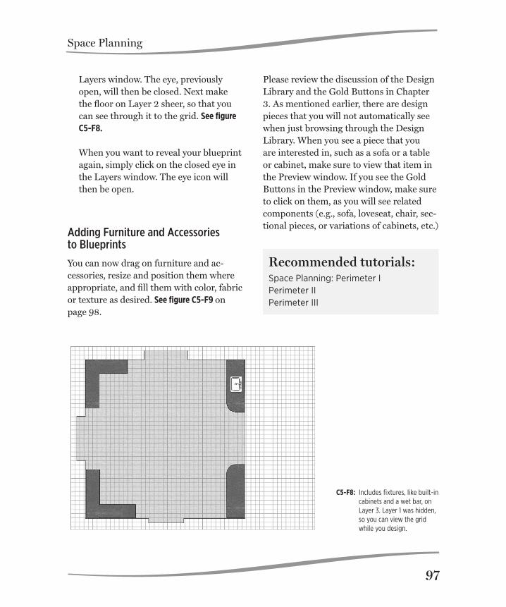
Space Planning
97
C5-F8: Includes fixtures, like built-in cabinets and a wet bar, on Layer 3. Layer 1 was hidden, so you can view the grid while you design.
Layers window. The eye, previously open, will then be closed. Next make the floor on Layer 2 sheer, so that you can see through it to the grid. See figure C5-F8. When you want to reveal your blueprint again, simply click on the closed eye in the Layers window. The eye icon will then be open.
Adding Furniture and Accessories to Blueprints
You can now drag on furniture and ac-cessories, resize and position them where appropriate, and fill them with color, fabric or texture as desired. See figure C5-F9 on page 98.
Please review the discussion of the Design Library and the Gold Buttons in Chapter 3. As mentioned earlier, there are design pieces that you will not automatically see when just browsing through the Design Library. When you see a piece that you are interested in, such as a sofa or a table or cabinet, make sure to view that item in the Preview window. If you see the Gold Buttons in the Preview window, make sure to click on them, as you will see related components (e.g., sofa, loveseat, chair, sec-tional pieces, or variations of cabinets, etc.)
Recommended tutorials:Space Planning: Perimeter IPerimeter IIPerimeter III

Space Planning
98
C5-F9: Shows the designed room, with the furniture on Layer 4. Layer 1 (blueprint) was revealed so you can see the walls. Layer 2 shows the transparency was removed from the floor.

TutorialsDreamDraper has a comprehensive set of tutorials that cover various features and functions of the program. All are accessible on our website, www.dreamdraper.com which will always contain the latest tutorials and information. Click on the Support link located at the top of the home page. The tutorials are organized into the following categories:
1. Introduction to DreamDraper
2. Basic Features
3. Time-Saving Features
4. Design-On-A-Photo
5. Working with Color
6. Working with Fabric
7. Drawing Tools
8. Space Planning
6

Tutorials
100
Viewing the Tutorials
Whether you are just getting started with the program or need to review, these videos will supplement this Guide and help you along. When you click on one of the tuto-rial links on the website, the lesson will start playing. Each lesson is only about 3-to-5 minutes in length, and you can pause or rewind them. Many of the examples used in the lessons show the DreamDraper commands with respect to designing window treatments. However, the same concepts can be applied to any design ele-ment, whether you are creating a floor plan using space planning templates or creating a room elevation and including furniture and accessories. A description of each of the lessons contained in the categories follows.
Note: The lessons on the website have been re-corded using the G5 Gold release of the Dream-Draper program, and require a high speed internet connection. If you are using a slow speed connection, each lesson may take several minutes to download to your computer before it starts to play. Depending on the settings of your monitor, you may have to scroll to the right or to the bottom in your browser, to view the entirety of what is depicted in the lesson, or to see the play/pause/rewind controls.
Introduction to DreamDraper
Overview of the DreamDraper design pro-gram. This tutorial is a summary of what you can accomplish with DreamDraper!
Basic Features
GettinG Started. Familiarize yourself with the design workspace (called a can-vas).
Save a Portfolio. Save your design (Portfolio file). Each Portfolio file can contain multiple canvases. PreferenceS. You can customize the pro-gram so that it will automatically default to your preferences, such as font style for creating text, or fill color when draw-ing objects, and you can even set up your dimensions in metric measurements. SizinG objectS. Size a window, or any ob-ject, to scale by inputting exact measure-ments, or you can dynamically size objects by dragging the mouse.
deSiGn library. Learn how to navigate through the Design Library and find your favorite designs, faster than ever. The Design Library includes Break-Apart® designs and their components, plus standard compo-nents, furniture and accessories, decorative hardware, and space planning templates.
click-away. This command allows you to deselect an object after it was selected. For example, when a design is ungrouped (taken apart), then all objects within the group are highlighted on the canvas. You will need to deselect all the objects (via the click-away) before you can work on just one of the objects. The click-away is also

Tutorials
101
performed every time you change arrows (for example, going from the Default De-sign Mode to the Custom Fill Mode).
GrouP and order. Learn how to group multiple objects into one object, and take them apart again – Group and Ungroup. This allows you to build a complete design made of many components and group them into one object so that the entire de-sign can be moved together without com-ing apart, or sized at one time, or copied to another canvas at one time. Learn how to select and deselect objects on the canvas. Learn how to move objects in front of or behind other objects. fliP and aliGn. Learn how to create a mirror-image of an object. For example, create a drapery panel for the left side of a window (to scale, filled with color or fab-ric) and easily create the panel for the right side of the window. Learn to align the tops of the panels or other objects so that they are perfectly lined up.
PerSPective/free diStort. Use these tools to angle a design to fit a bay or corner window, or to design on top of a photo where the walls are at an angle. The Perspective tool will symmetrically skew a design on all sides. The Free Distort will allow you to skew a design asymmetrically, one side at a time.
chanGe the line (Stroke) thickneSS of
your deSiGn. You may want to increase the stroke if working with a busy or dark
fabric, or decrease the stroke if working with a sheer.
create tranSlucent SheerS. Create a translucent sheer out of any design ele-ment. This works on plain drawings as well as those filled with color and fabric.
create tranSlucent windowS. Add color or wood grain to a window frame and create translucent panes so that you can view a landscape photo through the window.
text. Add text to your rendering. Edit the text, change font style, size, and color.
create a jPG. Create a large JPG of your design, suitable for printing or presenta-tion purposes.
Time-Saving Features
Search for deSiGnS. Quickly find a design by entering a keyword, description, or pattern name or number. Then all the designs or components that match those criteria will be displayed.
rename a deSiGn. Rename a design and customize the description to fit your own business.
add to favoriteS. To quickly find a design, add it to your Favorites collection. This eliminates having to browse through categories to find your favorite styles.

Tutorials
102
view Selected deSiGnS. While brows-ing through the Design Library, you can select designs for further review, thus narrowing down your choices to your top candidates.
Design-On-A-Photo
inSert imaGe i. Insert a photo of a room onto the canvas and design on top of it.
inSert imaGe ii. If you are using an older computer, this lesson covers advanced fea-tures of file compression to help improve performance. Otherwise you can skip this lesson.
Photo croP i. Cut out furniture in your photo and place on top of your window treatment designs, in just a few seconds.
Photo croP ii. More examples of crop-ping with the Drawing Tools.
total knockout (tko). Insert images of furniture or accessories into your render-ing, and remove the background color with a click of your mouse. The TKO can remove one or multiple colors from backgrounds of photos taken from vendor websites or other sources.
Working With Color
Quick fill. Fill designs with color, fab-ric, or textures, with a single click of the mouse!
add color. More examples of adding color to a design. With complete design freedom, you can add color (or fabric) to any part of the design—and all without having to ungroup the design. add detail color i. More examples of adding color (or fabric) to the detail trim and areas of contrast of your design.
add detail color ii. More examples of adding color (or fabric) to the detail trim and areas of contrast of your design.
add detail color iii. More examples of adding color (or fabric) to the detail trim and areas of contrast of your design.
color Palette. You can fill a design with any color of the rainbow, from vibrant hues to soft pastels, using the features of our color palette.
Working With Fabric
Quick fill. Fill designs with color, fab-ric, or textures, with a single click of the mouse! (This lesson is the same as the Quick Fill lesson under Working with Color, above.)
fill with fabric. This lesson shows how to custom fill a design using the more advanced technique with the second arrow (Custom Fill Mode) to add different fabrics to a completed design, without having to ungroup the design.

Tutorials
103
add your own fabric. Add your own fabric to the Custom Swatch Library and size the fabric to scale.
croP your fabric. Crop your fabric to show a perfect repeat or remove rough edges of a swatch.Style eyedroPPer. Using our exclusive Style Eyedropper, you can quickly transfer a fabric print, texture, pattern, color, or even transparency from one design ele-ment to another.
Drawing Tools
layerS. Create options for your client using layers. Hide or reveal options, fabrication or installation instructions, and pricing information. Layers make designing on a photo, wall elevation, or floor plan a breeze, as you can totally iso-late sections of your design so that they are immovable and totally undetected by your mouse!
drawinG. Draw walls and molding to cre-ate a background setting.
drawinG bayS. Use the Drawing Tools to create walls and background settings for bay and corner windows.
edit PointS i. Alter the shape of your designs using Edit Points. Pull on the Edit Points handles to change a straight line segment into a curved line segment, and vice versa.
edit PointS ii. Learn to draw your own designs or trace an object. Design on a photo, and cut around furniture. Also great for use when cropping an object out of a photo.
edit PointS iii. Reshape the curves of your design without having to take it apart.
Space Planning
Perimeter i. Build your wall perimeter when creating a floor plan. It is helpful to review the basic lessons first, as those techniques of grouping, ordering, aligning, etc., are all used to create the perimeter.
Perimeter ii. Creating irregular perim-eters, and understanding the basics. Make sure to also view the shortcuts lesson below.
Perimeter iii. Shortcuts when creating an irregular perimeter.