dressing up your sas/graph and sg procedural output with
TRANSCRIPT

1
PharmaSUG 2021 - Paper DV-187
Dressing Up your SAS/GRAPH and SG Procedural Output
with Templates, Attributes and Annotation
Louise S. Hadden, Abt Associates Inc.
ABSTRACT
Enhancing output from SAS/GRAPH® has been the subject of many a SAS® paper over the years, including my own and those written with co-authors. The more recent graphic output from PROC SGPLOT and the recently released PROC SGMAP is often "camera-ready" without any user intervention, but occasionally there is a need for additional customization. SAS/GRAPH is a separate SAS product for which a specific license is required, and newer SAS maps (GfK Geomarketing) are available with a SAS/GRAPH license. In the past, along with SAS/GRAPH maps, all mapping procedures associated with SAS/GRAPH were only available to those with a SAS/GRAPH license. As of SAS 9.4 M6, all relevant mapping procedures have been made available in BASE SAS, which is a rich resource for SAS users, and in SAS 9.4 M7, further enhancements were provided. This paper and presentation will explore new opportunities within BASE SAS for creating remarkable graphic output, and compare and contrast techniques in both SAS/GRAPH such as PROC TEMPLATE, PROC GREPLAY, PROC SGRENDER, and GTL, SAS-provided annotation macros and the concept of "ATTRS" in SG procedures. Discussion of the evolution of SG procedures and the myriad possibilities offered by PROC GEOCODE's availability in BASE SAS will be included.
INTRODUCTION
The focus of this paper is procedures, tools and techniques that create data visualizations in SAS, emphasizing opportunities for customization using SAS/Graph and ODS graphics procedural and template based outputs as a base. Enhancing output from SAS/GRAPH has been the subject of many a SAS paper over the years, including my own, and many excellent techniques have been explored and developed, and continue to be. The more recent graphic outputs from statistical graphs (ODS graphics) are often "camera-ready" without any user intervention, but frequently there is a need for additional customization. The specific topic of customization of SAS created graphics using SAS provided annotation macros and attribute maps, and specialized templates in the two different SAS graphics suites is explored below.
HISTORY OF SAS/GRAPH
SAS released a number of new components to complement version 5 Base SAS in the 1980s and 1990s, prior to the development of the Output Delivery System (ODS) and thus, before the shift to template based output. ODS was introduced in SAS version 7, along with an enhanced text editor. ODS was constantly improved through subsequent releases and continues to add more destinations and tagsets today. SAS/Graph has been licensed as a separate product from BASE SAS for many years. There is a huge body of literature regarding SAS/GRAPH throughout its 40+ years, and many users as well as SAS developers have contributed to the product. When SAS/GRAPH was released, SAS allowed and encouraged users to create custom graphs with a structured programming language. You can still find some code samples from these users today on SAS MapsOnline. Accordingly, there are a multitude of ways to present SAS data with SAS/Graph, as the programming language lets you draw and annotate your own images. There are myriad ways to change the look, size and presentation of data using SAS/GRAPH, and as many output formats (destinations) with hundreds of colors and transparency options. SAS/GRAPH has come a long way from when DEV= referred to an actual printer model (often black and white). With so many options for destinations, styles, devices and procedures, it is no wonder many SAS users are intimidated by SAS/GRAPH.
In the beginning, SAS/GRAPH included the GCHART procedure (including bar, pie, block, donut and star charts), GPLOT (including scatter, bubble, line, area, box, and regression plots), G3D (3-D scatter and surface plots), GCONTOUR (contour plots), and GMAP (maps using user-defined data). These

2
procedures are dependent on a number of specialized procedures which don’t create graphic objects, but display graphic options or manage elements involved in creating graphic output. These procedures include GANNO (displays annotate data sets), GSLIDE (produces graphic output on a slide), and GREPLAY (replays graphs existing in graphics catalogs into templates or overlays, the crazy favorite uncle and precursor of GTL), GANNO and GSLIDE also have hidden talents (GANNO can rescale graphics, and GSLIDE can produce presentation slides out of titles and annotate data). GDEVICE, GFONT and GOPTIONS manage device catalogs, fonts and graphic options respectively. Custom SAS/GRAPH procedures have emerged over the years, including GAREABAR (produces area bar charts in which width of a bar represents one statistic and height of the bar reflects another), GBARLINE (produces a bar chart which is overlaid by one or more line graphs), GKPI (produces KPI charts [generally used for dashboards] and includes graphics such as sliders, bullet graphs, dials, speedometers, and traffic lights), GRADAR (produces radar, windrose, and calendar plots, sometimes known as star charts), and GTILE (produces charts with “tiles” that reflect data element size, sometimes referred to as rectangular tree maps). These specialized charts are customized outgrowths of the earlier SAS/GRAPH procedures. It would be fair to characterize these SAS/GRAPH procedures as catalog and device based as opposed to template based.
There were a number of specialized SAS/GRAPH procedures for producing and enhancing maps; any of these procedures that are currently relevant have been moved to ODS GRAPHICS as of version 9.4 M6. These include PROC MAPIMPORT, PROC GINSIDE and PROC GEOCODE, among others.
HISTORY OF ODS GRAPHICS
SAS introduced a pre-production version of ODS GRAPHICS, a new graphics system which was template based, following in the Output Delivery System’s footsteps. This new system was originally part of SAS/GRAPH, but in order to reach more users, it was moved to BASE SAS and remains there today. In ODS GRAPHICS, many statistical procedures could produce one or more graphic, depending on options within the procedure, etc., simply by turning on the ODS GRAPHICS option. In SAS 9.2, ODS GRAPHICS moved toward production, with the introduction of the SG family of procedures. These procedures assist users in the creation of effective graphics displaying information from statistical procedures, by using statements which actually invoke statistical procedures. Like ODS, SAS developed templates for each procedure and option based on research into what users commonly wished to display, and how they wished to display it. These templates work more or less seamlessly with the ODS style templates and destinations, and other SAS standards. Attractive and meaningful graphics can be created quickly and efficiently “out of the box”, with little effort by the programmer. The full-fledged version of the template language is referred to as GTL (Graphics Template Language), and it is GTL that allows for customization of graphics by interested users. The default appearance attributes include but are not limited to: colors, fonts, patterns and lines; and are set by the ODS style in effect. Importantly, reliance on a graphics template language allows for consistency in production.
Initially, the SG procedures included PROC SGPLOT (single-celled graph, with many options), PROC SGSCATTER (paneled graphs with scatter plots), and PROC SGPANEL (classification panels). All these procedures support by processing and paneling when applicable. As noted above, the syntax of these procedures enables users to create many different statistical plots and graph features, so while many procedures can create a histogram, the SG procedures have a histogram statement that is agnostic as to statistical procedure. Unlike SAS/GRAPH, in which overlays need to be replayed or annotated using PROC GREPLAY and/or annotation, the SG procedures produce overlays automatically. Like SAS/GRAPH, SG procedures have a procedure which allow users to use custom templates they have developed: SGRENDER. PROC SGRENDER is a utility procedure that produces graphs from templates written in GTL, often using custom layouts, similar to PROC GREPLAY. Additionally, the SG procedures have a far less well known procedure, PROC SGDESIGN, which creates ODS graphics based on files that have been created using the interactive SAS/Graph ODS Graphics Designer application (SGE). The newest SG procedures on the block are SGMAP (a powerful tool which became available in SAS version 9.4 M5 to bring mapping to BASE SAS) and the SGPIE procedure (preproduction as of version 9.4 M6, which creates pie and donut charts in BASE SAS). PROC SGMAP users the same template based functionality as ODS Graphics to render maps and then overlap plots such as text, scatter, or bubble plots. Many statisticians sneer at lowly pie and donut charts, but they remain popular in the general
3
population. These charts are useful for looking at how different values of a variable contribute to the whole and for quick comparisons.
DIFFERENCES BETWEEN SAS/GRAPH AND ODS GRAPHICS
As you might guess, there are both similarities (born of SAS’s history of mining older programming constructs) and distinct differences. SG procedures are completely layout based, while SAS/GRAPH is device driven, which makes sense, since graphics were literally sent to devices. My very first SAS paper created SAS/GRAPH maps that were sent to a very expensive color printer. There are more subtle differences such as titles and footnotes, inheritance of ODS styles, use of graphic catalogs (or not), etc. There are also differences and similarities in the way that SAS/GRAPH and ODS GRAPHICS handle attributes and annotation, the primary topic of this paper and presentation.
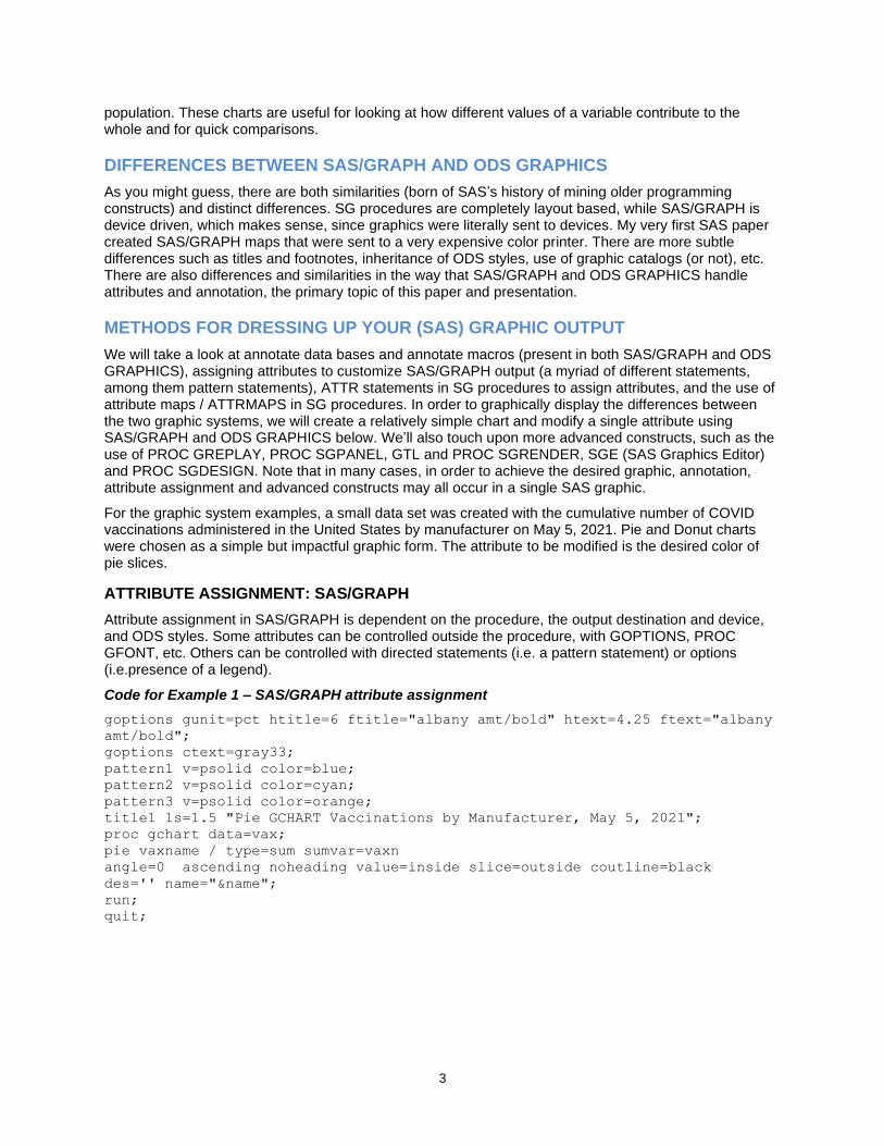
METHODS FOR DRESSING UP YOUR (SAS) GRAPHIC OUTPUT
We will take a look at annotate data bases and annotate macros (present in both SAS/GRAPH and ODS GRAPHICS), assigning attributes to customize SAS/GRAPH output (a myriad of different statements, among them pattern statements), ATTR statements in SG procedures to assign attributes, and the use of attribute maps / ATTRMAPS in SG procedures. In order to graphically display the differences between the two graphic systems, we will create a relatively simple chart and modify a single attribute using SAS/GRAPH and ODS GRAPHICS below. We’ll also touch upon more advanced constructs, such as the use of PROC GREPLAY, PROC SGPANEL, GTL and PROC SGRENDER, SGE (SAS Graphics Editor) and PROC SGDESIGN. Note that in many cases, in order to achieve the desired graphic, annotation, attribute assignment and advanced constructs may all occur in a single SAS graphic.
For the graphic system examples, a small data set was created with the cumulative number of COVID vaccinations administered in the United States by manufacturer on May 5, 2021. Pie and Donut charts were chosen as a simple but impactful graphic form. The attribute to be modified is the desired color of pie slices.
ATTRIBUTE ASSIGNMENT: SAS/GRAPH
Attribute assignment in SAS/GRAPH is dependent on the procedure, the output destination and device, and ODS styles. Some attributes can be controlled outside the procedure, with GOPTIONS, PROC GFONT, etc. Others can be controlled with directed statements (i.e. a pattern statement) or options (i.e.presence of a legend).
Code for Example 1 – SAS/GRAPH attribute assignment
goptions gunit=pct htitle=6 ftitle="albany amt/bold" htext=4.25 ftext="albany
amt/bold";
goptions ctext=gray33;
pattern1 v=psolid color=blue;
pattern2 v=psolid color=cyan;
pattern3 v=psolid color=orange;
title1 ls=1.5 "Pie GCHART Vaccinations by Manufacturer, May 5, 2021";
proc gchart data=vax;
pie vaxname / type=sum sumvar=vaxn
angle=0 ascending noheading value=inside slice=outside coutline=black
des='' name="&name";
run;
quit;

4
Figure 1. SAS/GRAPH PROC CHART - PIE
The goptions statements set a number of environment variables for the chart. The pattern statements are what determines both the pattern (in this case p for pie solid) and the color. If you don’t use a pattern statement SAS decides for you and that may or may not be what you want. Most people want set colors. The GCHART procedure is called, and we choose pie as the type of chart. There are a number of formatting commands after the forward slash, one specifying the outline color of the pie and slices.
Code for Example 2 – SAS/GRAPH attribute assignment
goptions gunit=pct htitle=6 ftitle="albany amt/bold" htext=4.25 ftext="albany
amt/bold";
goptions ctext=gray33;
pattern1 v=psolid color=blue;
pattern2 v=psolid color=cyan;
pattern3 v=psolid color=orange;
title1 ls=1.5 "Doughnut GCHART Vaccinations by Manufacturer, May 5, 2021";
proc gchart data=vax;
donut vaxname / type=sum sumvar=vaxn
angle=0 ascending noheading value=inside
slice=outside coutline=black des='' name="&name";
run;
quit;
Figure 2. SAS/GRAPH PROC CHART - DONUT

5
This is our second example, using the same data as the first example. The only difference in the code here is the selection of a donut chart instead of a pie chart, and we see that the color assignment is identical in the code and in the chart.
ATTRIBUTE ASSIGNMENT VIA ATTR STATEMENTS: ODS GRAPHICS
Attribute assignment in SAS/GRAPH is dependent on the procedure, options, output destinations, and ODS styles. Attributes are assigned via ATTR statements. Different procedures and options may have many different ATTR statements. Syntax is consistent in the different ATTR statements to an extent – for example, a color for a graphic element is defined with xxxxattrs=(color=yyyyy) no matter what the attr statement applies to.
There are too many types of ATTR statements to cover in this paper, so I encourage you to check the SAS documentation. Below follows a table of sample attributes.
datalabelattrs=(size=12pt color=blue)
fillattrs=(color=cornsilk)
markerattrs=(symbol=circlefilled color= violet size=12px)
lineattrs=(color=red thickness=3px)
curvelabelattrs=(size=11pt style=italic)
valueattrs=(size=10pt color=navy);
labelattrs=(size=12pt weight=bold)
titleattrs=(color=blue size=14pt)
Shown below are examples modifying attributes of the same pie and donut graphs using ODS GRAPHICS instead of SAS/GRAPH.
Code for Example 3 – ODS GRAPHICS PROC SGPIE
title2 'Vaccinations in Millions - May 5, 2021';
title3 'Vanilla Pie';
proc sgpie data=vax where=(vaxdate='05may2021'd));
pie vaxname /
response=vaxn
datalabelloc=outside;
run;
Figure 3. SG PROC SGPIE - Vanilla

6
Out of the box, this is much better looking pie chart, using the same data as the SAS/GRAPH examples. There are no style commands here – SAS is just using the default ODS style in effect and default color map. You will also immediately notice that there is a lot less code used. That is because behind the scenes the style template and GTL is handling a lot of the formatting commands.
Code for Example 4 – ODS GRAPHICS PROC SGPIE
title2 'Vaccinations in Millions - May 5, 2021';
title3 'Vanilla Donut';
proc sgpie data=vax where=(vaxdate='05may2021'd));
donut vaxname /
response=vaxn
datalabelloc=outside;
run;
Figure 4. SG PROC SGPIE - Vanilla Donut
Again, this out of the box graphic is more attractive than the SAS/GRAPH vanilla pie and donut charts, and the only difference in the code is the use of the donut chart type rather than pie chart.
Code for Example 5 – ODS GRAPHICS PROC SGPIE
title2 'Vaccinations in Millions - May 5, 2021';
title3 'Styleattrs Pie';
proc sgpie data=vax (where=(vaxdate='05may2021'd));
styleattrs backcolor=lightgreen
datacolors=(blue cyan orange);
pie vaxname / response=vaxn ;
run;
Figure 5. SG PROC SGPIE – ATTR PIE

7
Again, we use the exact same data and code with one important addition, ATTR statements. The STYLEATTRS statement with the BACKCOLOR and DATACOLORS commands make a vibrant difference. The BACKCOLOR (background color) is obvious. The DATACOLORS statement colors each of the 3 vaccine names in alphabetic order. If you want a different order, you need to use an ATTRMAPS statement.
ATTRIBUTE ASSIGNMENT VIA ATTRMAPS: ODS GRAPHICS
An ATTRMAP (attribute map) defines attributes such as line, fill or marker values to values of a group variable. There are two types of ATTRMAPS: discrete and range. Both types will be discussed below. All SG procedures accept ATTRMAPS to control attributes. The required columns in an ATTRMAP are ID (variable name) and VALUE (specific value of the named variable in the ID column). Other column(s) specify the attribute(s) you want to modify. In the example below, we modify FILLCOLOR. Note that the ATTRMAP is reusable, much like a format.
Again, this out of the box graphic is more attractive than the SAS/GRAPH vanilla pie and donut charts, and the only difference in the code is the use of the donut chart type rather than pie chart.
Code for Example 6 – ODS GRAPHICS PROC SGPIE
data attrmap;
length id $ 9 fillcolor $ 20;
input id $ value $ fillcolor $
datalines;
myvax Moderna pink
myvax Other blue;
run;
title2 'Vaccine in Millions - May 5, 2021';
title3 'Attrmap Pie';
run;
proc sgpie data=vax (where=(vaxdate='05may2021’d))
dattrmap=attrmap;
pie vaxname / response=vaxn
datalabelloc=outside startangle=90 attrid=myvax;
run;
Figure 6. SG PROC SGPIE – PIE with ATTRMAP
Figure 6 shows the effect of using an ATTRMAP on the sample file. The ATTRMAP is created with a simple data step, but it could be stored in a spreadsheet, csv file, or SAS data set, then associated with our small data set and linked. The ATTRMAP is specified with the DATTRMAP statement, and the linkage is specified with the ATTRID statement. Note that we only have two pie slices, and we know that the data has three different values of myvax. That is because, much like a format, Other in the Value column indicates that all other values be associated with the value in the FILLCOLOR column. This makes combining values as easy as – pie.

8
ANNOTATION MACROS
There are SAS provided annotation macros for both SAS/GRAPH and SG procedures. %ANNOMAC is the SAS/GRAPH version, while %SGANNO is the SG procedure version. Both macros are documented on the SAS website: like the ATTR statements, there is so much detail that covering them is out of scope for this paper. Annotation is a paper topic in its own right. %SGANNO is pre-production as of SAS 9.4 M6. One macro that I am very keen to use is the %SGIMAGE macro, which annotates images onto ODS GRAPHICS. Interestingly, while the %SGANNO annotation macro is specific to SG procedures, the SG procedures take advantage of the %ANNOMAC macros, particularly for the SGMAP procedure. There are quite a number of mapping related macros that have been created over the years. %CENTROID, which we will demonstrate below, is one of these geographic macros. Other newer macros include GEOCODE related macros.
TIME TO GET DRESSED
We have discussed the basics of the SAS/GRAPH and ODS GRAPHICS systems, and delved into some of the details of both annotation and the assignment of graphic attributes, using a small sample data set and simple coding to illustrate concepts. Below, we will review a number of examples from both SAS/GRAPH and ODS GRAPHICS that use at least one annotation and attribute assignment technique to create custom outputs.
Code for Example 7 – PROC SGPLOT, POLYGON STATEMENT, RANGE ATTRMAP, and %CENTROID
/* Define a range attribute map for the response data */
data attrmap;
id = 'maparea';
textcolor='black';
input value $20. @22 fillcolor $;
datalines;
No Data beige
100 and under cx74c476
Between 100 and 200 cx006d2c
Between 200 and 300 cx756bb1
Between 300 and 400 cx41b6c4
Over 400 cx253494;
run;
%ANNOMAC;
/* Calculate the center of each polygon to be used to place a label */
%centroid(us,centers,id);
/* Define a label to be placed at the center of each polygon */
data all;
set all centers(rename=(x=xcen y=ycen) in=a);
/* Define the variable to contain the label for each polygon */
if a then label=fipstate(substr(id,4,2));
run;
/* The IMAGEMAP option enables you to view the data tips for the graph */
ods graphics / reset width=600px height=400px imagefmt=png imagename='Map'
imagemap=on tipmax=4000;
title 'Counts by State';
proc sgplot data=all dattrmap=attrmap ;
format count mapfmt.;
/* Draw each polygon */
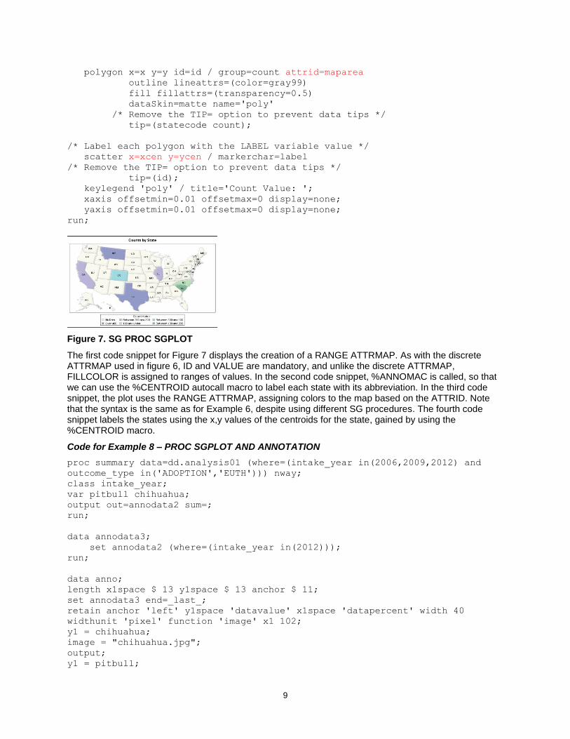
9
polygon x=x y=y id=id / group=count attrid=maparea
outline lineattrs=(color=gray99)
fill fillattrs=(transparency=0.5)
dataSkin=matte name='poly'
/* Remove the TIP= option to prevent data tips */
tip=(statecode count);
/* Label each polygon with the LABEL variable value */
scatter x=xcen y=ycen / markerchar=label
/* Remove the TIP= option to prevent data tips */
tip=(id);
keylegend 'poly' / title='Count Value: ';
xaxis offsetmin=0.01 offsetmax=0 display=none;
yaxis offsetmin=0.01 offsetmax=0 display=none;
run;
Figure 7. SG PROC SGPLOT
The first code snippet for Figure 7 displays the creation of a RANGE ATTRMAP. As with the discrete ATTRMAP used in figure 6, ID and VALUE are mandatory, and unlike the discrete ATTRMAP, FILLCOLOR is assigned to ranges of values. In the second code snippet, %ANNOMAC is called, so that we can use the %CENTROID autocall macro to label each state with its abbreviation. In the third code snippet, the plot uses the RANGE ATTRMAP, assigning colors to the map based on the ATTRID. Note that the syntax is the same as for Example 6, despite using different SG procedures. The fourth code snippet labels the states using the x,y values of the centroids for the state, gained by using the %CENTROID macro.
Code for Example 8 – PROC SGPLOT AND ANNOTATION
proc summary data=dd.analysis01 (where=(intake_year in(2006,2009,2012) and
outcome_type in('ADOPTION','EUTH'))) nway;
class intake_year;
var pitbull chihuahua;
output out=annodata2 sum=;
run;
data annodata3;
set annodata2 (where=(intake_year in(2012)));
run;
data anno;
length x1space $ 13 y1space $ 13 anchor $ 11;
set annodata3 end=_last_;
retain anchor 'left' y1space 'datavalue' x1space 'datapercent' width 40
widthunit 'pixel' function 'image' x1 102;
y1 = chihuahua;
image = "chihuahua.jpg";
output;
y1 = pitbull;

10
image = "pitbull.jpg";
output;
if (_last_) then do;
x1space = "graphpercent";
y1space = "graphpercent";
anchor = "bottomright";
x1 = 99; y1 = 1; width=90; image = "ts_logo.png";
output;
function = "text";
anchor = "bottomleft";
x1 = 1; width=150; textsize = 6;
label = "MSPCA/Angell";
output;
end;
run;
proc sgplot data=annodata2 (where=(intake_year in(2006,2009,2012)))
noautolegend sganno=anno pad=(bottom=5%);
xaxis display=(nolabel) offsetmax=0.1 type=discrete VALUES=
('2006' '2009' '2012' );
yaxis label="# of Dogs";
series x=intake_year y=chihuahua / markers
markerattrs=(symbol=circlefilled size=12px color=CXa5aace)
lineattrs=(thickness=10 color=CXa5aace) transparency=0;
scatter x=intake_year y=chihuahua / markerattrs=(symbol=circlefilled
size=10px color=white);
series x=intake_year y=pitbull / markers
markerattrs=(symbol=circlefilled size=12px color=CXd69e94)
lineattrs=(thickness=10 color=CXd69e94) transparency=0;
scatter x=intake_year y=pitbull / markerattrs=(symbol=circlefilled size=10px
color=white);
run;
Figure 8. SG PROC SGPLOT ANNOTATION
I volunteer at a local animal shelter walking and photographing dogs. A behaviorist at the shelter started a program called Safewalk that modified both human and canine behavior with the hope of improving adoptability and reducing euthanasia, particularly in a harder to adopt population (pit bulls). The shelter collected data on every animal in their care, sometimes for multiple stays if the animal was returned. During the study period, two confounding events occurred. The first was that breed specific legislation was reversed in 2010 and the second was that the shelter started a targeted free spay and neuter program covering zip codes that tended to surrender more animals. This chart shows the number of dogs taken in by year. Lines and markers are modified using ATTR statements and images are added in three places using annotation. For Figure 8, the first code snippet summarizes data to be used to annotate our

11
images of a pit bull and chihuahua, the two most frequently surrendered breeds at the shelter. While SG procedures produce statistics and group automatically – ANNOTATE data sets do not. You need to summarize any data to be used for annotation to match your automatically grouped data. The second code snippet adds the dog images in the last record for each group and starts to build the annotate data set. The third code snippet annotates the shelter logo on the bottom right of the image and the shelter name on the bottom left. The fourth code snippet creates the PROC SGPLOT call and identifies the annotate data base as “ANNO”. The fifth code snippet uses MARKERATTRS and LINEATTRS to add attribute information to the plot.
Code for Example 9 – PROC SGPLOT BUBBLE PLOT and ATTR statements
ODS HTML path=odsout body="&name..htm"
(title="MA Nursing Home Facilities: Overall Ratings") style=htmlblue;
ods graphics / noscale imagefmt=png imagename="&name"
width=1200px height=900px noborder;
title1 color=gray33 height=24pt "Providers by Overall Rating Status (1-5
Stars) August 2019";
title2 color=gray33 height=18pt "Red: 1 Star Orange: 2 Stars Yellow: 3 Stars
Green: 4 Stars Blue: 5 Stars";
proc sgmap mapdata=my_map (drop = lat long)
maprespdata=my_counties
plotdata=my_data noautolegend;
choromap counter /
mapid=id
lineattrs=(color=black);
bubble x=x1 y=y1 size=or1 / fillattrs=(color=red) group=or1 transparency=.8
bradiusmin=3px bradiusmax=11px ;
bubble x=x2 y=y2 size=or2 / fillattrs=(color=lightorange) group=or2
transparency=.8 bradiusmin=4px bradiusmax=12px ;
bubble x=x3 y=y3 size=or3 / fillattrs=(color=lightyellow) group=or3
transparency=.8 bradiusmin=5px bradiusmax=13px ;
bubble x=x4 y=y4 size=or4 / fillattrs=(color=lightgreen) group=or4
transparency=.8 bradiusmin=6px bradiusmax=14px ;
bubble x=x5 y=y5 size=or5 / fillattrs=(color=lightblue) group=or5
transparency=.8 bradiusmin=7px bradiusmax=15px ;
run;
Figure 9. PROC SGPLOT, BUBBLE PLOT and ATTR statements
Figure 9 demonstrates the use of annotate, including the construction of a custom legend and the use of data driven boxes for small states, with SAS/GRAPH. This is part of a macro that generates hundreds of these maps every year and is based on a sample from Robert Allison. The second code snippet creates a chloropleth map similar to what PROC GMAP would. Note the LINEATTRS statement assigning a color.

12
The third code snippet overlays 5 bubble plots, one for each rating level, over the county map. The FILLATTR statement determines the color of the dots, while the number of facilities with a given overall rating in a geographic area determines the size of the dot. The dots are “dithered” slightly by group and transparency is set.
Code for Example 10 – SAS/GRAPH, ANNOTATE, ATTRIBUTES and PROC GREPLAY
DATA mymap;
SET maps.us (where=(state ne 72));
RUN;
DATA extra_squares;
INPUT statecode $ 1-2;
state=stfips(statecode);
DATALINES;
NH
VT . . .
DATA extra_squares;
SET extra_squares;
RETAIN y;
segment=999;
IF _n_=1 THEN y=.15;
ELSE y=y-.010;
x=.345; OUTPUT;
x=x+.040; OUTPUT;
y=y-.020; OUTPUT;
x=x-.040; OUTPUT;
RUN;
PROC SQL;
CREATE table extra_label AS
SELECT UNIQUE avg(y) AS y, avg(x)+.03 AS x,
statecode AS text
FROM extra_squares
GROUP BY statecode;
QUIT;
RUN;
goptions device=png noborder;
goptions cback=white;
goptions gunit=pct ftitle="albany amt/bold“;
goptions ftext="albany amt/bold";
goptions ctitle=black ctext=gray55;
legend1 label=("&leglab." height=8pt position=top justify=center) across=5
cframe=gold cborder=navy
position=(bottom center outside) shape=bar(.15in,.15in) mode=reserve
offset=(0,0)
value=(j=l "&t1" "&t2" "&t3" "&t4" "&t5");
pattern1 value=msolid color=white;
pattern2 value=msolid color=lightblue ;
. . .
title1 a=-90 h=5pct " ";
title2 a=90 h=1pct " ";
title3 h=18pt bold "&year";

13
proc gmap data=my_data map=mymap all anno=extra_label gout=library.excat;
id state_name;
choro msr_bin / discrete coutline=gold woutline=1
cdefault=yellow legend=legend1 html=my_html des='' name="&y2.";
run;
quit;
proc greplay tc=tempcat
nofs;
tdef V2S des= "1 BOX UP, 1 BOX DOWN (WITH SPACE)"
1/llx=0 lly=52
ulx=0 uly=100
urx=100 ury=100
lrx=100 lry=52
2/llx=00 lly=00
ulx=00 uly=48
urx=100 ury=48
lrx=100 lry=0
;
quit;
/* Replay the graphs with a template to create one graph. The graphs stored
in
LIBRARY.EXCAT are replayed to create one graph. */
proc greplay igout=ee.excat nofs
tc=tempcat template=v2s;
treplay 1:&y2._13 2:&y2._14 name="&y2._c";
quit;
Figure 10. PROC GMAP with ANNOTATE
Figure 10 is part of a series of chloropleth maps representing nursing homes’ performance on a number of different metrics. The very complex process is wrapped in a macro (thankfully) and has a multitude of steps. The first code snippet is to set in the map data base except for Puerto Rico, as the map is distorted by including it and to create a data set of abbreviations for states to be “boxed”. The second code snippet is to literally draw the boxes. Code snippet three creates an annotate data base with labels for the boxes. Graphics options are set, legend and pattern options are created, and titles are set. The map with a legend is generated, using the annotate data set with the boxes. Additionally, it is stored in a graphics catalog to be replayed later into a graphics template that stacks two maps on the same page using PROC GREPLAY. Maps stored in the graphics catalog (IGOUT) are replayed into an entry (V2S) in the template catalog (TEMPCAT). This allows the viewer to evaluate change from one year to the next.

14
Code for Example 11 – PROC SGRENDER and GTL
proc format;
value lp 0='Other Breed’
1='Pit Bull Type';
value ls 0='Pre-Safewalk’
1='Post-Safewalk';
value sp 1='Safewalk, Pit Bull Type Dog'
2='Safewalk, Non Pit Bull Type Dog'
3='Pre Safewalk, Pit Bull Type Dog'
4='Pre Safewalk, Non Pit Bull Type Dog';
value yearf 2005,2014,2015=' ' ;
run;
title1 'Histograms by Breed Group and Safewalk Status';
proc sgpanel data=analysis01a ;
panelby safewalk_pitbull / layout=rowlattice onepanel novarname;
histogram lengthofstay;
density lengthofstay;
colaxis display=(nolabel);
format safewalk_pitbull sp.;
run;
PROC TEMPLATE;
DEFINE STATGRAPH scatterhist;
DYNAMIC xvar yvar title;
BEGINGRAPH / DESIGNWIDTH=600px DESIGNHEIGHT=400px BORDERATTRS =
(thickness=3px);
ENTRYTITLE title;
LAYOUT LATTICE / ROWS=2 COLUMNS=2 ROWWEIGHTS = (.2 .8) COLUMNWEIGHTS = (.8
.2)
ROWDATARANGE=union COLUMNDATARANGE=union
ROWGUTTER=0 COLUMNGUTTER=0;

15
/*Row#1, Column#1) HISTOGRAM at X2 axis position */
LAYOUT OVERLAY / WALLDISPLAY = (fill) XAXISOPTS = (DISPLAY=none)
YAXISOPTS = (DISPLAY=none OFFSETMIN=0);
HISTOGRAM xvar / binaxis=false;
ENDLAYOUT; /*OVERLAY*/
/* Row#1, Column#2) TEXT ENTRY*/
LAYOUT OVERLAY;
ENTRY '# Obs = ' EVAL( N( xvar ) );
ENDLAYOUT; /*OVERLAY*/
/* Row#2, Column#1) SCATTER PLOT */
LAYOUT OVERLAY;
SCATTERPLOT Y=yvar X=xvar / DATATRANSPARENCY=.95
MARKERATTRS = (SYMBOL=circlefilled SIZE=11px);
ENDLAYOUT; /*OVERLAY*/
/* Row#2, Column#2) HISTOGRAM at Y2 axis position */
LAYOUT OVERLAY / WALLDISPLAY = (fill)
XAXISOPTS = (display=none offsetmin=0)
YAXISOPTS = (display=none);
ENDLAYOUT; /*OVERLAY*/
ENDLAYOUT; /*LATTICE*/
ENDGRAPH; /*END GRAPH BLOCK*/
END; /*END DEFINE BLOCK*/
RUN;
PROC SGRENDER DATA=analysis01a (where=(pitbull =1 and 2006 le
year(outcome_date) le 2013)) TEMPLATE=scatterhist;
DYNAMIC yvar="LengthofStay" xvar="Outcome_Date" title="Length of Stay for
Pit Bull Type Dogs";
RUN;
PROC SGRENDER DATA=analysis01a (where=(pitbull =0 and 2006 le
year(outcome_date) le 2013)) TEMPLATE=scatterhist;
DYNAMIC yvar="LengthofStay" xvar="Outcome_Date" title="Length of Stay for
Non Pit Bull Type Dogs";
RUN;
Figure 11. PROC SGRENDER and GTL
This is another graphic from my shelter volunteering, this time tracking length of stay for pit bull type dogs and non pit bull type dogs by number of observations across years. As noted earlier, PROC SGRENDER takes advantage of a prebuilt, specialized template with information to create a graph, and renders a graph using the layout and style information in the template. The first step is to set up formats. Next, we use SGPANEL to create the histograms, using a rowlattice onepanel layout. The third step is to define a template for the graph. Note the BORDERATTRS. We continue filling the layout with our graphics,

16
including the production of SCATTERPLOTs. Once the layout and template are complete, we use PROC SGRENDER to put all the pieces together. Looking at the two graphics side by side, it is clear that pit bull type dogs’ LOS splits after 2009 and the start of the Safewalk program – there’s more density in the lower length of stay AND there’s more long stay dogs. The shape of the scatterplot for non pit bull type dogs is much more stable. I adopted one of the long stay dogs in 2011 – she’s living proof of the success of the program.
Code for Example 12 – SAS GRAPHIC EDITOR (SGE)
ODS HTML SGE=ON / ODS LISTING SGE=ON
Figure 12. SAS GRAPHIC EDITOR (SGE)
ODS Graphics hosts an interactive graphics editor called SGE. This can be invoked in a program with a simple command: ods html sge=on or ods listing sge=on. A file with the extension .sge will be created. This can be edited manually, and the results saved to a template which can be reused with PROC SGEDITOR. It is a bit of a novelty but it definitely fits into the annotation category for ODS GRAPHICS. I edited in a star, a comment, and a graphic thumbnail and saved it as a PNG.
CONCLUSION
SAS has always been at the forefront of data visualization, from the days of SAS/GRAPH to the SG procedures, SAS Visual Analytics, and SAS Viya. The use of annotation and attributes can greatly enhance both SAS/GRAPH and ODS GRAPHICS output and allow a high degree of customization. I hope some of the examples in this paper inspire you to explore some fantastic custom visualizations.
ACKNOWLEDGMENTS
Many thanks to Robert Allison, Cynthia Zender, Dan Heath, Ed Odom, Sanjay Matange, Nat Wooding, Barbara Okerson, Troy Hughes, and Mike Zdeb, for their unfailing patience, inspiration and technical assistance!
Full code samples provided upon request.
CONTACT INFORMATION
Your comments and questions are valued and encouraged. Contact the author at:
Louise Hadden Abt Associates Inc. [email protected]
SAS and all other SAS Institute Inc. product or service names are registered trademarks or trademarks of SAS Institute Inc. in the USA and other countries. ® indicates USA registration.
Other brand and product names are trademarks of their respective companies.