ease brand guidelines
TRANSCRIPT

These are the brand guidelines for Ease Entertainment Services.

If you would kindly follow them, our work will all match and look more professional.

You may have noticed this typeface. It’s called Museo Slab.

It can be bold.
It can also be italicized.

That’s about it.

You should use it when you are writing in complete sentences.
You could also use it for bullet points in the body text of a document.

You should also make sure that it’s left-aligned and has a space after each paragraph that’s the same height as the text.
Like that.TEXT

Headings
Headings are the other thing you might type.

Myriad Pro
The font we use for headings is Myriad Pro.
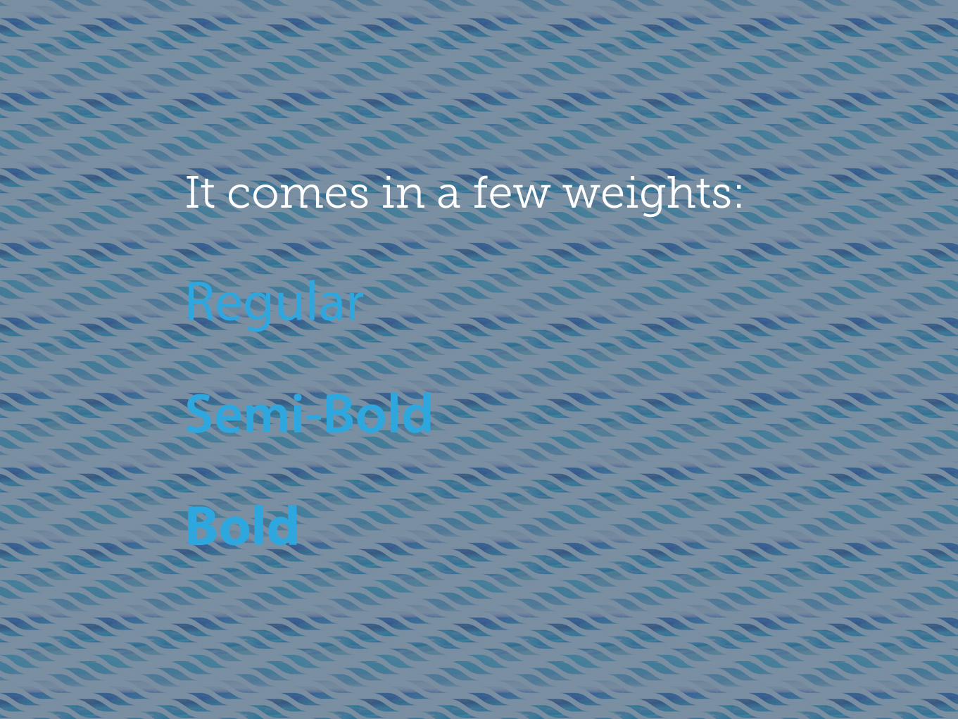
It comes in a few weights:
Regular
Semi-Bold
Bold
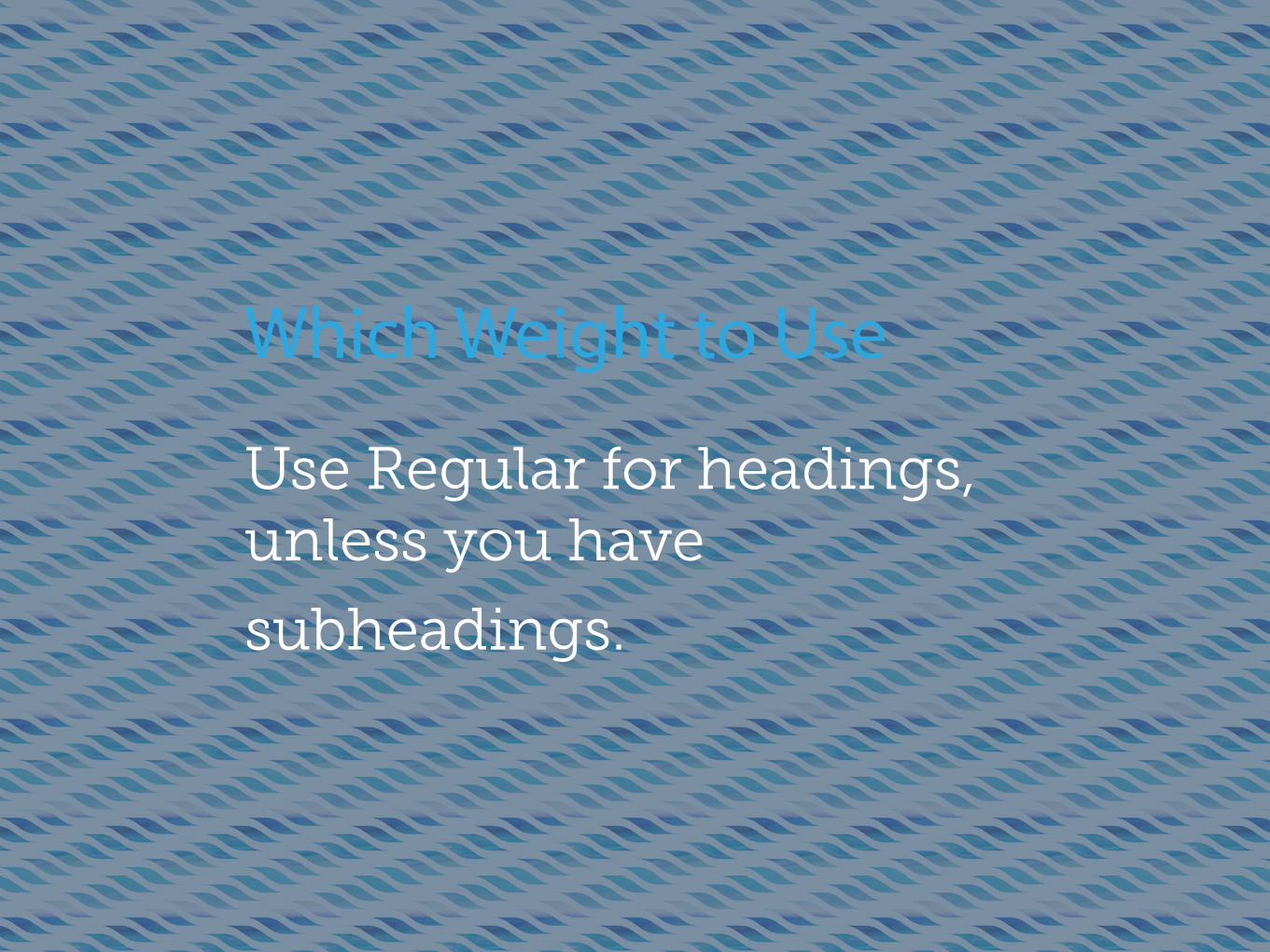
Which Weight to Use
Use Regular for headings, unless you have
subheadings.

Headings
with Subheadings
If you have both, use Semi-Bold for headings and Regular for subheadings.

Display Text
Only use Bold for display text. If you aren’t sure what that is, then don’t use Bold.
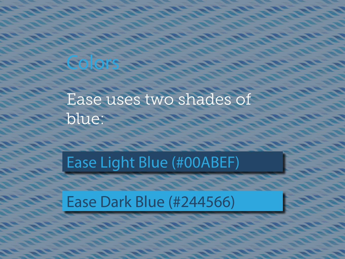
Colors
Ease uses two shades of blue:
Ease Dark Blue (#244566)
Ease Light Blue (#00ABEF)

If you are using color, make the headings Ease Light Blue. If you are doing a presentation, sentences should be white.
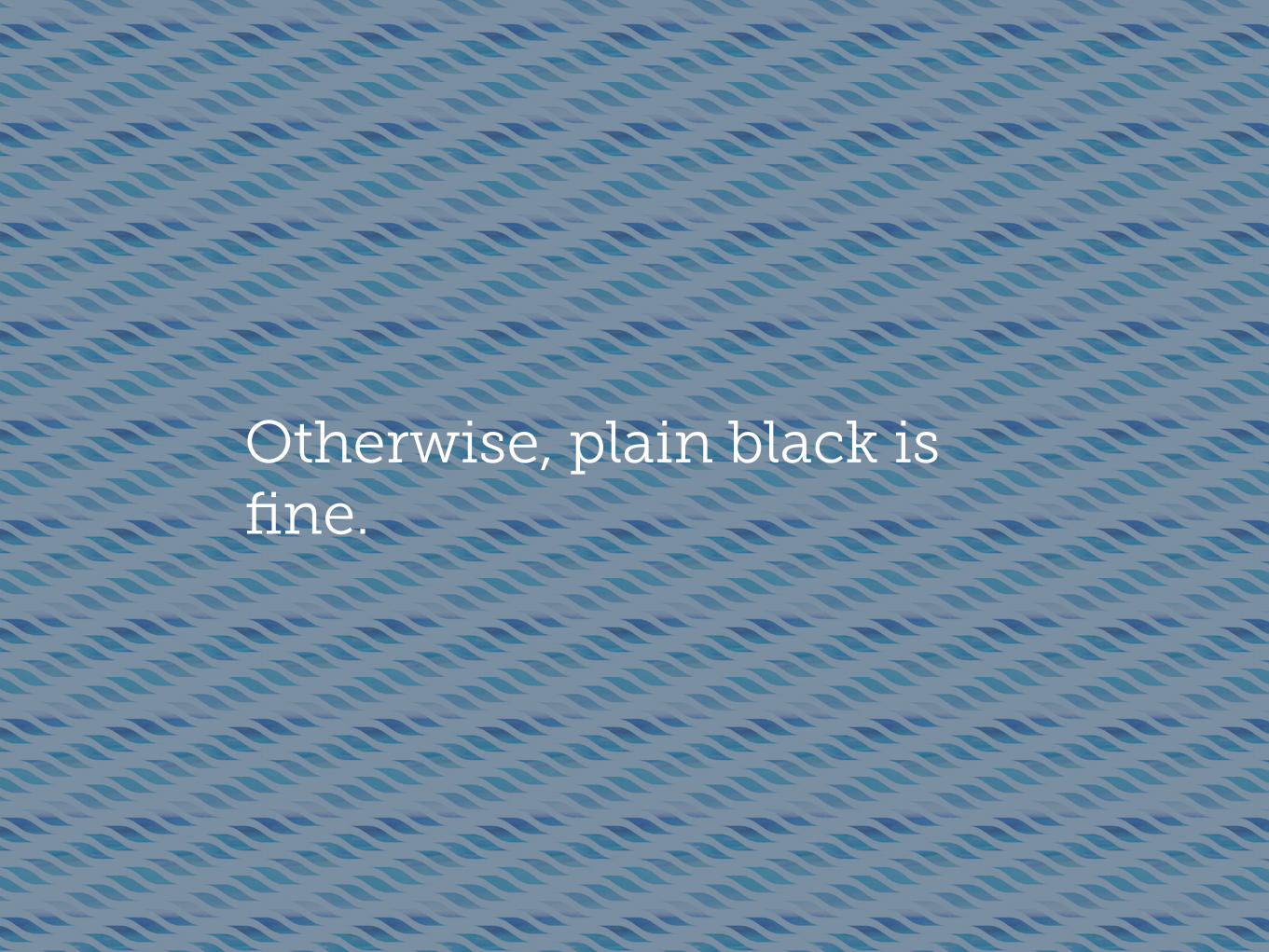
Otherwise, plain black is fine.

Backgrounds
This background pattern can be used for title pages and presentations.

For printed documents and correspondence (like email), just use a plain white background.

For presentations and documents that will be viewed on a screen, you can use Pale Blue (#C0E2EF).

This is the Ease logo:
production made modern
™

It has three parts.

The Icon

The Wordmark

The Tagline

We also include a trademark symbol.

When the whole logo appears together, it should be spaced according to a particular ratio called the lock-up.

production made modern
™
25
25
23

It should also have a minimum amount of space around it.

Aborioribus explacepro earcia cus etur sequatem es et assin net aut quiam dis endiam eos quo quo est, unt aspellam, comni descimo discipitio odiandendis re et lictia ne eos enist omnimus veria quas eium as in conem sitae min niam hit re apis dolorum doles animi, tem es qui qui serero mo ommolupti quo inulpar cipissitae dolestibus, con ressum dolore rae odit fugitatias delit, omnissin-citi blaborrum senim es con consequi sit
production made modern
™

You can use the wordmark by itself.
™

And you can use the logo by itself.

But please don’t use any of the other parts in any other configurations.
PRODUCTION MADE MODERN
No

The Ease logo should only be Ease Light Blue with a white E in the icon.

Only use the color logo on backgrounds that are:
• White
• Blue
• 40% gray or lighter

For color backgrounds, use a monochromatic white logo.

For printing in black and white on paper, use a monochromatic black logo.

If the logo is surrounded by a lot of busy graphics, add a subtle drop shadow so it stands out.

production made modern
™
production made modern
™
Like that

If you are picking imagery, use natural, documentary style photography and eschew stock photography and vector graphics.

Yes!

No!

That way, people think we know what we’re talking about.

Those are all the things you need to know.
If you have any questions, please ask Marketing.
Thanks!