ecs user interface style guide - deep, slow, easy resources/hughes eos chi guidebook.pdf ·...
TRANSCRIPT

410-TD-001-003
ECS User Interface Style Guide
Technical Data - Not intended for formal review or Government approval.
January 1996
Prepared Under Contract NAS5-60000
RESPONSIBLE ENGINEER
John C Lowry /s/ 4/11/96
John C. Lowry, Human Factors Engineer Date EOSDIS Core System Project
SUBMITTED BY
Paul W. Fingerman /s/ 4/11/96
Paul Fingerman DateDevelopment EngineeringEOSDIS Core System Project
Hughes Information Technology Systems Upper Marlboro, Maryland

This page intentionally left blank.
ECS User Interface Style Guide ii 410-TD-001-003

Abstract•
The user interface style guide for the Earth Observing System Data Information System (EOSDIS) Core System (ECS) provides standards for designing and implementing ECS user interfaces to guide ECS developers in the creation of effective, user-friendly interfaces. Consistent application of these standards will help ensure a common "look and feel" across ECS user interfaces.
The style guide has been tailored to the unique requirements of the Unix Operating System (OS), OSF/Motif Release 1.2, and the ICS Builder Xcessory software toolkit. It provides general guidance regarding the design of the ECS desktop and describes high-level user interface design guidelines that should be followed when developing ECS user interfaces, or any Motif user interface, as well as specific characteristics of the ECS user interface, including windows, color schemes, data manipulation, tailoring, and keyboard shortcuts.
Keywords: Builder Xcessory, ECS Workbench, Graphical User Interface, OSF/Motif, User Interface Style Guide
ECS User Interface Style Guide iii 410-TD-001-003

This page intentionally left blank.
ECS User Interface Style Guide iv 410-TD-001-003

Contents•
Section Page
Abstract.......................................................................................................................................iii
Contents .......................................................................................................................................v
1. Introduction..............................................................................................................................1
1.1 Applicable Documents..........................................................................................................2
2. ECS User Interface Guidelines ................................................................................................3
2.1 Desktop ..................................................................................................................................3
2.1.1 Iconic Object-Process Paradigm ............................................................................4
2.1.2 Multiple Desktop Workspaces...............................................................................5
2.1.3 Window Activation..............................................................................................6
2.1.4 Definition of Desktop Icons and Icon Textual Labels ...........................................6
2.1.5 Guidelines for ECS Login, Logout, and Passwords...............................................6
2.2 Workbench.............................................................................................................................9
2.2.1 The MOTIF Object Selection Model....................................................................10
2.2.2 Navigation and Window Management Design for Integrating ECS Software .....11
2.2.3 Measures of Effectiveness (MOE) for CRT and GUI Screen Density .................15
2.2.4 Window, Menu, Control Button, and Dialog Selection and Design.....................18
2.2.5 Location of Screen Elements on the Screen and in Primary Windows.................27
2.2.6 Graphical Interaction Techniques for Interaction Tasks.......................................28
2.2.7 Other HMI Considerations and Standards ............................................................29
3. ECS User Interface Specifications/Characteristics ................................................................35
3.1 Widgets ................................................................................................................................36
3.1.1 Windows .............................................................................................................36
3.1.2 Menus..................................................................................................................41
3.1.3 Controls...............................................................................................................44
3.1.4 Dialogs ................................................................................................................48
3.2 Widget Set Attributes...........................................................................................................53
3.2.1 ECS Widget Attributes .........................................................................................54
3.2.2 ECS PushButton Attributes...................................................................................54
3.2.3 Dialog Box Border Colors ....................................................................................55
ECS User Interface Style Guide v 410-TD-001-003

3.2.4 ECS Widget Highlighting .....................................................................................56
3.2.5 ECS Specific Widgets/Objects..............................................................................57
3.2.6 ECS Use of Color...................................................................................................57
3.3 Composing the Interface .......................................................................................................59
3.3.1 Window Characteristics .........................................................................................59
3.3.2 Window Organization............................................................................................59
3.3.3 Using Dialog Boxes ...............................................................................................61
3.3.4 Data Manipulation..................................................................................................66
3.3.5 Data Entry/Editing and Form Filling .....................................................................68
3.3.6 Graphics presentation............................................................................................73
3.3.7 ECS Icons...............................................................................................................88
3.3.8 Display and Printout of Tabular Data ...................................................................89
3.3.9 Tailoring the System ..............................................................................................95
3.3.10 International Considerations ................................................................................96
3.3.11 General Principles................................................................................................98
3.4 GUI Builder Templates for Basic ECS Interface Structure ................................................111
3.4.1 Primary Window..................................................................................................111
3.4.2 Main Window ......................................................................................................111
3.4.3 Menu Bar..............................................................................................................111
3.4.4 Common Menu Structure for ECS.......................................................................112
3.4.5 Form, Toolbar, TabStack, and Button Bar............................................................114
3.5 On-Line Help ......................................................................................................................114
3.5.1 OSF/Motif Guidelines for Types of Help ............................................................115
3.5.2 Characteristics of and Guidelines for On-line Help...........................................121
4. HTML-Based Applications....................................................................................................123
4.1 Endorsement of the Yale C/AIM WWW Style Manual......................................................123
4.1.1 Tailoring Guide to the Yale Style Manual.........................................................123
4.2 Detailed Human Factors Guidelines for HTML Documents..............................................123
4.2.1 HTML document title lengths..............................................................................123
4.2.2 Hypertext/hypermedia links.................................................................................124
4.2.3 Lists......................................................................................................................125
4.2.4 Text Highlighting.................................................................................................126
5. COTS Integration...................................................................................................................127
ECS User Interface Style Guide vi 410-TD-001-003

References..................................................................................................................................129
Appendix A: Glossary..............................................................................................................A - 1
Appendix B: ECS GUI Screen Templates ...............................................................................B - 1
Appendix C: Selection of Graphic Forms................................................................................C - 1
Appendix D: Character Size and Fonts.....................................................................................D - 1
Index ....................................................................................................................................... I - 1
ECS User Interface Style Guide vii 410-TD-001-003

This page intentionally left blank.
ECS User Interface Style Guide viii 410-TD-001-003

List of Figures
Figure Page
2.1.5.1-1 A generic model of an acceptable "login" dialog....................................................7
2.1.5.1-2 Example of a poorly designed login error dialog....................................................8
2.1.5.1-3 Example of an effective error dialog for incorrect password entry.........................9
2.2.2.5-1 Illustration of Hypothetical GUI Screen Layout Concept UsingTabbed Form Navigation Technique .....................................................................15
2.2.4.14-1 Decision Aid for Selecting Menu and Dialog Structures.......................................24
2.2.4.14-2 Decision Aid for Selecting Controls and Control Groupings ................................26
Major Elements of Builder Xcessory Tool ............................................................35
3.1.1-1 Sample Screen Illustrating Use of MainWindow ..................................................38
3.1.1-2 ScrolledWindow.....................................................................................................38
3.1.1-3 DrawingArea..........................................................................................................39
3.1.1-4 PanedWindow ........................................................................................................39
3.1.1-5 Illustration of the Use of a Frame ..........................................................................40
3.1.1-6 Pop-up Label..........................................................................................................40
3.1.1-7 TabStack.................................................................................................................41
3.1.2-1 Mnemonics and Accelerators.................................................................................41
3.1.2-2 PullDown Menu .....................................................................................................43
3.1.2-3 PopUp Menu ..........................................................................................................43
3.1.2-4 OptionMenu ...........................................................................................................44
3.1.3-1 PushButton.............................................................................................................46
3.1.3-2 ArrowButton ..........................................................................................................46
3.1.3-3 DrawnButton..........................................................................................................46
3.1.3-4 CascadeButton .......................................................................................................47
3.1.3-5 OptionButton..........................................................................................................47
3.1.3-6 Separator (using the default option: single line) ....................................................47
3.1.3-7 Labels.....................................................................................................................48
3.1.3-8 Left Justification of Labels in a Vertical List ........................................................48
ECS User Interface Style Guide ix 410-TD-001-003
3-1

3.1.4-1 Selection Dialog.....................................................................................................50
3.1.4-2 File Selection Dialog..............................................................................................50
3.1.4-4 ScrollBar ................................................................................................................51
3.1.4-5 Scale.......................................................................................................................52
3.1.4-6 Text Field Widget ..................................................................................................52
3.1.4-7 Scrolled Text Widget .............................................................................................52
3.1.4-8 Sash ........................................................................................................................52
3.2.1-1 Widget Attributes...................................................................................................54
3.2.2-1 PushButton Attributes............................................................................................54
3.2.3-1 Error Border Color.................................................................................................55
3.2.3-2 Warning Border Color ...........................................................................................55
3.2.3-3 Border Color for Information, Prompt, Question, and Working Dialogs..............56
3.2.4-1 Widget Highlighting ..............................................................................................56
3.3.2-1 Window Organization............................................................................................60
3.3.2-2 Right Justification of Labels When Referencing Other Objects............................61
3.3.3-1 Prompt Dialog........................................................................................................62
3.3.3-2 Error Dialog ...........................................................................................................62
3.3.3-3 Information Dialog.................................................................................................63
3.3.3-4 Question Dialog .....................................................................................................63
3.3.3-5 Working Dialog......................................................................................................64
3.3.3-6 Warning Dialog......................................................................................................64
3.3.3-7 Default PushButton................................................................................................65
3.3.3-8 CheckButtons.........................................................................................................65
3.3.3-9 RadioButtons..........................................................................................................66
3.3.4-1 Find Function .........................................................................................................67
3.3.4-2 List with Visible Item Count of Four.....................................................................68
3.3.5-1 Examples of acceptable data input forms...............................................................70
ECS User Interface Style Guide x 410-TD-001-003

3.3.6-1 Illustration of the effects of scale alteration on the perception andinterpretation of information..................................................................................76
3.3.6-2 Shaded statistical map............................................................................................84
3.3.10-1 Example Diacritics for International Users............................................................97
3.3.11.3-1 PushButton Highlighting ......................................................................................101
3.3.11.3-2 Progress Indicator .................................................................................................102
3.3.11.3-3 Incorrect Error Dialog...........................................................................................103
3.3.11.3-4 Correct Error Dialog .............................................................................................104
3.3.11.8-1 Calendar Metaphor................................................................................................109
3.4.1-1 ECS Interface Basic Window Structure................................................................112
3.4.4-1 Common menu structure for ECS custom applications........................................113
3.5.1.1-1 Example of Help on Context.................................................................................116
3.5.1.2-1 Example of Help on Window................................................................................117
3.5.1.3-1 Example of Help on Keys. ....................................................................................118
3.5.1.4-1 Layout of Help Index Option Box. .......................................................................119
3.5.1.5-1 Example of Help on Help......................................................................................120
3.5.1.7-1 Example of Help on Version.................................................................................121
C.1.1.1.6-1 Breaking a bar graph...............................................................................................4
C.1.1.1.9-1 Blowup insert graph................................................................................................6
C.1.1.1.10-1 Total insert graph. ...................................................................................................7
C.1.1.4-1 Subdivided 100% bar graph....................................................................................8
C.1.1.7.3-1 Deviation-bar graph. ..............................................................................................10
C.1.1.8-1 Range-bar graph.....................................................................................................11
C.1.2.9-1 Range-column graph..............................................................................................16
C.2.2.1-1 Multiple slope-curve graph. ...................................................................................19
C.2.3.2-1 Cumulative curve-graph.........................................................................................21
C..2.6.1.4-1 Supplementary amount scale. ................................................................................23
C.2.6.5-1 Multiple graphic format for user interpretation of multiple slope curve graphs....26
C.3.5-1 Net-difference surface graph..................................................................................28
C.3.7-1 Subdivided or multiple-strata surface graph. .........................................................30
ECS User Interface Style Guide xi 410-TD-001-003

This page intentionally left blank.
ECS User Interface Style Guide xii 410-TD-001-003

List of Tables
Table Page
2.2.1-1 The OSF/Motif 1.2 Object-Action Selection Model..............................................11
2.2.3.2-1 Look-Up Table for Number of Text Characters per inch.......................................17
2.2.4.9-1 Motif Function Key Reservations..........................................................................20
2.2.4.10-1 Suggested Keyboard Accelerators for ECS ...........................................................21
2.2.5-1 Screen Element Locations for Applications...........................................................28
2.2.7.2-1 Acceptable and Unacceptable Foreground Color ChoicesBased on Given Background Colors......................................................................30
2.2.7.3-1 List of Unacceptable Words Used as Commands and Suitable Alternatives.........31
2.2.7.4-1 Maximum Tolerable and Optimum Response Times for GenericOperations Performed by Computers in Response to Operator Tasks...................32
3.1.1-1 Workbench Windows, Their Use and Associations...............................................37
3.1.2-1 Menus, Their Use and Associations.......................................................................42
3.1.3-1 Controls, Their Use and Associations....................................................................45
3.1.4-1 Dialogs, Their Use and Associations .....................................................................49
3.2-1 ECS Operator/user Interface Style Standards ........................................................53
3.2.6-1 Acceptable Background/Foreground Combinations Colors ..................................57
3.2.6-2 Recommended Background Colors for Widgets Used in the Construction ofWindows, Help Screens, and Dialogs....................................................................58
3.3.8.17-1 Tabular Display (Good Example)..........................................................................94
3.3.8.17-2 Tabular Display (Bad Example) ............................................................................95
3.3.11.5-1 Background and Text Color Combinations ..........................................................107
3.3.11.5-2 Recommended Colors for Thin Lines on White and Black Backgrounds............107
4.1.1-1 Tailoring Guidance for the Use of Stylistic Guidelines Contained inthe Yale Style Manual...........................................................................................124
B-1 ECS GUI Screen Templates.................................................................................B - 1
B-2 Color Usage Conventions ....................................................................................B - 2
C-1 Major graphic forms and their principal variants.................................................C - 1
D-1 Required Pixels for Stroke Width ........................................................................D - 1
D-2 Required Pixels for Width Design .......................................................................D - 1
ECS User Interface Style Guide xiii 410-TD-001-003

This page intentionally left blank.
ECS User Interface Style Guide xiv 410-TD-001-003
1. Introduction
This Style Guide provides standards for designing and implementing Earth Observing System Data Information System (EOSDIS) Core System (ECS) operator/user interfaces. The standards contained in this document are intended to guide ECS developers in the creation of effective, user-friendly interfaces, primarily for ECS maintenance and operations (M&O) personnel, although the principles can also serve as guidance for refinement of the applications interfaces for science users. Consistent application of these standards will help ensure a common look and feel across ECS user interfaces.
This Style Guide is inclusive of Graphical User Interfaces (GUIs) built using the Unix Operating System (OS), OSF/Motif Release 1.2, and the ICS Builder Xcessory software toolkit. As such, the guidelines have been tailored to the unique requirements of these products. Further, some ECS subsystems will be developing applications using the HyperText Markup Language (HTML) to operate in conjunction with the World Wide Web (WWW). For these applications, the ECS subsystem developer shall comply with the Yale C/AIM WWW Style Manual. The Yale WWW Style Manual is located at the following address:
http://info.med.yale.edu/caim/StyleManual_Top.HTML
This style manual is an excellent source of information for GUI design using HTML.
Finally, the current version of the ECS User Interface Style Guide provides general guidance regarding the design of the ECS desktop. In particular, the desktop guidelines prescribe the use and behavior of icons and iconic 'drag and drop' processes on the ECS desktop.
The standards described in this document are not intended to address every operator/user interface design challenge which will arise during ECS development. Rather, these standards should be used to develop a general ECS "look and feel" . When the standards do not provide guidance for a specific design problem, it is the operator/user interface designer's responsibilit y to weigh the options and determine the best solution. These specific solutions should be documented to ensure consistency in the event that a similar situation occurs in the future.
Interface design has progressed through two discernible generations. The first generation is Character-based User Interfaces (ChUIs), explicitl y not considered in this Style Guide. Rather, the guide is directed towards the design of GUIs. This document also explicitl y does not address the applications of the next generation of more advanced operator/user interface concepts, such as virtual reality or voice interaction.
The Style Guide is divided into two major sections. Section 2.0 describes high-level user interface design guidelines that should be followed when developing ECS operator/user interfaces, or any Motif user interface. Section 3.0 contains specific characteristics of the ECS user interface, including windows, color schemes, data manipulation, tailoring, and keyboard shortcuts. Appendix A provides a glossary of terms, Appendix B provides
ECS User Interface Style Guide 1 410-TD-001-003

ill ustrations of templates prepared using Builder Xcessory to assist GUI developers/programmers in preparing ECS GUI screens, and Appendix C provides detailed guidance on selection of graphic forms that supplements Section 3.3.6, Graphics Presentation.
1.1 Applicable Documents
The following documents are referenced herein and are directly applicable to the guidelines provided for ECS Graphical User Interface development, to the extent cited. In the event of confli ct between any of the documents cited and this document, this document shall take precedence.
Human-Computer lnterface Guidelines (National Aeronautics and Space Administration, 1992). Goddard Space Flight Center, Greenbelt, MD.
OSF/Motif Style Guide Release 1.1 (Open Software Foundation, 1991). Prentice Hall , Englewood Cliffs, NJ.
Motif 1.2 Style Guide (Sun Microsystems, Inc., 1993) Sunsoft, Mountain View, CA.
ECS User Interface Style Guide 2 410-TD-001-003

2. ECS User Interface Guidelines
This section contains a description of the operator/user interface guidelines for ECS. The purpose of this description is to provide high-level guidance for developers of ECS operator/user interfaces. It is organized into two subsections, one describing the desktop, or core set of 'root' objects, and one describing the workbench, or the remainder of the software, including applications.
2.1 Desktop
The ECS desktop provides the capabilit y to organize and present various applications objects (data and programs) with which an operator/user interacts. The desktop provides the following basic classes of desktop objects:
• General desktop objects - root class for all desktop objects.
• Desktop container objects - a subclass that provides for "containment" actions in general.
• Desktop document objects - a subclass that provides for the handling of objects that possess the characteristics of documents.
• Desktop application objects - a subclass that provides default behavior for objects that represent executable programs.
The ECS desktop also accomplishes the following:
• Supports the definition of new types of objects as subtypes of the basic desktop object classes.
• Provides for the installation of the software implementing the new object types into the desktop.
• Executes the software associated with an object in response to operator/user input actions.
• Provides a framework for installing object format translators.
• Provides additional predefined desktop object classes (e.g., folders) as subtypes of the basic classes to facilitate the organization of the desktop.
Three discrete stages are evident in the evolution of the ECS desktop. The first stage of the evolution, which began prior to Release A, was a custom-coded desktop that provides essentially file manager functionality, with some aspects of the desirable desktop, such as multiple desktop workspaces. It provides icons that open new windows on which ECS subsystems run, and allows operators/users to select an icon that loads an application. True iconic 'drag and drop' processes, however, are not actively supported. As such, then, the ECS desktop represented a useful interim solution.
ECS User Interface Style Guide 3 410-TD-001-003

The second evolutionary stage of the ECS desktop is transitional between the current ECS desktop and a new desktop standard. This stage occurs concurrently with Release A development. Release A supports two desktops, depending upon the capabiliti es of the operators'/users' workstations. The first desktop implements the new Common Desktop Environment (CDE) standard. The CDE provides important capabiliti es to operators/users, including the use of multiple workspaces and the application of the iconic object-process paradigm (discussed in a subsequent section).
Unfortunately, full support of CDE in Release A is problematic, due to the fact that implementation of CDE as the desktop requires Sun OS Version 2.5 and HP UX10. The emergent status of these operating systems precludes full reliance on them for Release A. The CDE standard itself only became available in mid-1995. Consequently, the backup desktop solution remains the current ECS desktop, to be installed on workstations for those operators/users who do not run CDE. For workstations that run CDE, it is assumed that CDE will become the only desktop. (This will only be universal at Release B.) For DAAC workstations not running CDE, the ECS desktop runs on top of the native workstation desktop environment, using ECS as an added service.
The third evolutionary stage of the ECS desktop will conclude with Release B. At this time, the ECS CDE-compliant desktop will run exclusively on ECS workstations.
The following paragraphs describe the iconic object-process paradigm and other desktop characteristics that define the ECS desktop.
2.1.1 Iconic Object-Process Paradigm
The iconic object-process paradigm describes the basis of iconic representations on the ECS CDE-compliant desktop and the relationship between objects (entities which operators/users manipulate, such as documents) and processes (entities which manipulate objects). Objects (i.e., documents, data files, graphic files), represented by icons on the desktop, can be employed by operators/users using one of three roughly equivalent techniques:
(a) Objects are selected by a single click on the object/icon. After an object is selected, a pop-up menu can be used to select a process to be performed. These menus should only have generic object functions, since pop-up menus on the desktop are typically limited to one single pop-up menu and one directory menu across the desktop. The object types include, for example, jobs, roles, document_classes, document - metadata, and document - graphics, among numerous others.
(b) Object processes can be activated by double clicking the object's icon. Separate activations occur for each mouse button, also different processes can be activated by the combination of shift, control, or mode keys with the mouse buttons. Process types include, but are not limited to, the following:
• calendar
• clock
• mailbox
ECS User Interface Style Guide 4 410-TD-001-003

• printer
• workbench application loader (installs applications from a server to the workstation)
• data format converter
• calculator
• ECS processes (e.g., sendmail, telnet, file transfer, web browsers)
(c) Processes can be activated by double clicking the process icon (this would normally start a status request of the process) or by dragging and dropping an object icon on top of a process icon (or into an open process).
In any of these cases, options and parameters (assigned to these objects and processes) will be accessible through modifiable properties contained in a CDE action file associated with each specific process icon.
The use of the iconic object process paradigm simplifies the user interface over that of the traditional menu-driven process paradigm. However, this capabilit y, while it shields the operator/user from the complexities of a highly complex and interactive process, also shields the operator/user from understanding processing errors when they occur. The availabilit y of property menus/dialogs and meaningful error/warning windows can help compensate for this limitation.
Example: The Object-Conversion Paradigm.
The object-conversion paradigm is a special instance of the iconic object-process paradigm. This paradigm provides the means by which one type of object (e.g., a raw data stream) is converted to another type (e.g., specially formatted, compressed data). The paradigm supports single-object conversions as well as many-object conversions at once, so long as all objects converted are of the identical type and the target type is the same as well . The operator/user selects, drags, and drops an object icon on a data format converter (process) icon. This results in the appearance of a data format conversion dialog that allows the operator/user to select the object filters that are required to perform the conversion. Multiple object icons of the same type may be selected in sequence by an operator/user and then dragged and dropped on the converter process icon.
2.1.2 Multiple Desktop Workspaces
Operators/users should be provided with the abilit y to have multiple desktop workspaces, so they can organize their work based on the different roles they play (meaning their work assignments and job responsibiliti es). In CDE, desktop workspaces, each with a unique name, can be accessed with a simple selection from a bar at the bottom of the screen. Operators/users should be able to move to a different workspace by selecting the designated workspace representation and double-clicking on mouse button #1. Operators/users should be able to move objects from one workspace to another by dragging and dropping an object's icon on top of the representation of the workspace to which that object is to be moved.
ECS User Interface Style Guide 5 410-TD-001-003

2.1.3 Window Activation
Operators/users should be provided the means to cycle through windows which overlap one another (thus obscuring part or all of 'lower' windows). This is normally a function of the window manager. The following means should be used to provide operators/users the ability to select among available windows open on their desktop.
• Operators/users should be able to 'make active' each window, one at a time, in sequence by (a) holding down the 'Shift' key, (b) positioning the cursor at the location of overlapping windows by means of the mouse, and (c) pressing mouse button #1 in progression and stop when they have 'made active' the window they wish to use. Operators/users should be able to cycle through the sequence of overlapping windows continuously by these combinations of key and mouse button actuations.
• Operators/users should be able to 'make active' a window by (a) positioning the cursor anywhere inside an inactive window and (b) pressing mouse button #1. Here again, operators/users should be provided the option of performing this operation repeatedly.
• It is also possible to use function keys in conjunction with a ctrl or alt key to provide operators/users with the abilit y to select windows (e.g., alt <F1> to select the first window, alt <F2> to select the second window . . . ). The assignment of windows to function keys is simply determined by the order of window activation (i.e., sequence of window opening on the desktop).
2.1.4 Definition of Desktop Icons and Icon Textual Labels
For consistency in look and feel, ECS user interface developers should avoid proliferation of widely varying iconic representations of objects and processes. There should be a standard set of icons for all appropriate situations.
An icon label will consist of: (a) a unique object name and (b) an object name extension. The object name will be unique to the object or process. The object name extension will designate the object or process type. Operators/users should be able to change object names, but will not be permitted to alter object or process type classifications.
Restrict the absolute number of icon types available on a 'single' workspace to no more than 20. Operators/users will almost certainly not remember the functionality of any more than that. Ideally, avoid the availabilit y of any more than 20 icons regardless of workspace. If that is not possible, try to ensure that any operator/user who sees more than one desktop (e.g., manager, scientist, and ECS M&O operators) does not see any more than a total of 20 icons.
2.1.5 Guidelines for ECS Login , Logout , and Passwords
Use the following guidelines for login, logout, and passwords.
ECS User Interface Style Guide 6 410-TD-001-003

2.1.5.1 Login
"Logins" are an authentication tool used to ensure that only authorized operators and users gain access to systems, applications, and data. A well-designed system requires login only once at the system level (after login at a workstation), allowing any authorized operator/user access to those applications and data elements to which that operator/user has been granted permission. The following guidelines should be considered when designing a login system:
1) Login should be a simple, prompted process.
2) Login should be the first action that the operator/user can perform at a workstation.
3) Operators/users and operators should be prompted once at the ECS application level. No additional logins should be required for those applications for which the appropriate accesses and permissions have been granted.
4) The login procedure must appear to the operator/user to be separate and distinct from application procedures. Login must be completed before access is granted to applications, operations, or data.
5) Login, at a minimum, should include the combination of a user ID and a password. Operators/users must enter these elements correctly before accessing system resources.
6) The text entry field for each required piece of information, (i.e., user name, password) should be clearly labeled and presented on separate lines, as shown in Figure 2.1.5.1-1. The figure depicts a generic model of an acceptable "login" dialog. Although "login" does not have to be performed through a dialog, it should be the first and only operation available to potential operators/users after login at the workstation. No other information should appear on the screen until an operator/user has successfully completed the login process.
OK
User ID:
Login
Cancel
Password:
jdoe
*******
Figure 2.1.5.1-1. A generic model of an acceptable "login " dialog .
ECS User Interface Style Guide 7 410-TD-001-003

7) Establish user authorization for applications and data display at initial ECS application login. Do not require additional authorization when data display, entry, or change attempts are made.
8) Do not allow entered passwords to be displayed on the screen. Typically, asterisks are substituted for alphanumeric characters of the password in the password entry field (see Figure 2.1.5.1-1).
9) Operators/users should receive relevant feedback regarding the status of the login process.
10) In the event of a system delay, operators/users should be advised as to when the system will be ready (see Table 2.2.5.4-1 entitled "Maximum Tolerable and Optimum Response Times for Generic Operations Performed by Computers in Response to Operator Tasks" ).
11) If an operator/user cannot login to the system, a dialog should appear to explain the reason for this inability.
12) If an operator/user makes an error during the login procedure, an error dialog or message should be used to notify the operator/user of the nature of the error and guidance correcting the error. The message should not generate information that could assist someone in breaking into the system. Figure 2.1.5.1-2 ill ustrates a poorly designed login error dialog. Not only does this dialog fail to guide the user towards a solution (it does not clearly state the nature of the error, and does not advise the operator/user how to correct the error), but it also displays information that represents a potential security risk (an incorrect password entry is echoed, providing cues to the correct password that would be obvious to an onlooker).
Error!
You have entered:
"passwork"
Figure 2.1.5.1-2. Example of a poorly designed login error dialog .
ECS User Interface Style Guide 8 410-TD-001-003

Figure 2.1.5.1-3 illustrates an error dialog that is better. The nature of the error is stated, an opportunity to correct the error is presented with guidance, and no information is displayed that is a potential threat to system security.
OK
User ID:
Error!
Cancel
Password:
jdoe
*******
Invalid userid. Please try again.
Figure 2.1.5.1-3. Example of an effective error dialog for incorrect password entry.
2.1.5.2 Changing Passwords
Passwords are a required element in the login procedure. Since user IDs are generally based upon the name of the operator/user, they are not hard to guess, if one is inclined to do so. By requiring use of a password, unauthorized access to a given operator's/user's system accounts and permissions is not possible based on the knowledge of the user ID alone. For further information on the use of passwords and changing passwords for the ECS application, please consult NASA and ECS security guidelines.
2.1.5.3 Logouts
"Logout" ends the operator/user ECS session. It should close all ECS application windows and return the computer display to the initial workstation login screen. If ECS applications are open, logout should initiate an exit from active applications.
2.2 Workbench
The ECS workbench provides tools for helping operators/users to access, analyze, and disseminate data to colleagues throughout the scientific community. The workbench provides software objects that are subtypes of the basic object classes provided by the desktop. The workbench objects offer an environment for accessing and managing an operator's/user's view into the EOSDIS data and services and consist of the following:
ECS User Interface Style Guide 9 410-TD-001-003

• A collection of GUI-based tools for viewing, creating, and editing ECS data objects.
• APIs or libraries to build science applications or prepare and manipulate data.
• A collection of software objects providing the GUI to the ECS services, ECS data objects, and ChUI interface functions (if any).
• ECS client support software objects that assist in the interaction between the Client Subsystem and the ECS services.
This subsection describes the OSF/Motif object selection model and its characteristics that define the characteristics and behavior of the workbench.
2.2.1 The MOTIF Object Selection Model
OSF/Motif employs an object-action selection model for navigating around the workspace. The OSF/Motif Style Guide Release 1.1 describes this model succinctly in the following manner:
"In object ... selection, users first select an object, and then select an action to perform on that object. The OSF/Motif selection model employs the following kinds of selection:
• The selection of a single object
• The selection of a range of objects
• The selection of additional (non-contiguous) objects, including multiple ranges.
To make selections in OSF/Motif applications, users always use the same basic steps. First, they place the pointer (mouse) or location cursor (keyboard) on the object they wish to select. Second, they perform a specific selection action. Thus the kinds of selection... are not separate types of selection. Rather, they are variations of the one selection model theme. Which variation they use depends on whether they wish to select a single object, a range of objects, or several additional (non-contiguous) objects."
Table 2.2.1-1 li sts the mouse button and keyboard operations of the OSF/Motif 1.2 selection model.
ECS User Interface Style Guide 10 410-TD-001-003

Table 2.2.1-1. The OSF/Motif 1.2 Object-Action Selection Model
SELECTION TASK MOUSE BUTTON
OPERATION
KEYBOARD SELECTION OPERATION
Select a single object (set the anchor point) and deselect all other objects.
Click BSelect (left mouse button)
Press <Select>
Select a single object from a collection of browsed singly selectable objects and deselect all other objects.
Release BSelect in a selectable element
Press <Select> while element is highlighted
Select a range of objects (set the anchor point at range beginning) and deselect all other objects.
Drag BSelect Press <Shift> + navigation keys
Toggle the selection of all objects between current location and the anchor pointer.
<Shift> + click BSelect
Press <Shift> + <Select>
Toggle the selection of an additional object.
<Ctrl> + click selection operation
Press <Ctrl> + selection operation
Refer to the Motif 1.2 Style Guide (Chapter 4: Selection) for a detailed description of selection models and operator interaction techniques.
2.2.2 Navigation and Windo w Management Design for Integrating ECS Software
This section presents design standards for the navigation and window management of ECS software that employs a graphical user interface (GUI). It is intended to support the development of a consistent look and feel for all ECS subsystem software applications, to the extent practicable. The successful GUI design will produce a consistent look and feel across ECS interfaces, regardless of the underlying type of software application that is integrated into ECS, including Motif developmental and Commercial-Off- the-Shelf/Offthe-Shelf (COTS/OTS) and HyperText Markup Language-based (HTML-based) software applications. ECS Release A will support two desktops, namely the existing ECS desktop and a desktop based on the new industry standard, Common Desktop Environment (CDE). This represents a transitional phase from the existing ECS desktop to CDE. The transition to CDE will be complete at Release B. The impact of this transitional period on the GUI design for ECS subsystem applications will be that the applications cannot depend on the availabilit y of a single set of desktop services to support the workbench.
ECS User Interface Style Guide 11 410-TD-001-003

2.2.2.1 Problem Statement
The effective integration of ECS software that encompasses the full range of Motif custom, COTS/OTS, and HTML-based applications is dependent upon addressing at least four GUI design issues. These issues are:
1. Operator focus - Simply stated, operator focus is the abilit y of an operator/user to orient to, navigate through, and interact effectively with the GUI to accomplish specified tasks.
2. Screen Density - The amount of information presented on a CRT display has a direct effect on its readabilit y by operators/users. The goal for screen density is set to 25%, with a maximum upper limit of 50% of the overall screen workspace.
3. Real estate management - Effective management of the CRT real estate involves (a) the eff icient allocation of CRT workspace among the screen elements that support ongoing tasks, (b) ease of reconfiguration and restoration of screen elements (without destructive loss of data), (c) effective presentation of technical information and options without excessively taxing human memory limitations, among other factors.
4. Use of overlapping windows and iconification - Effective focus and real estate management involves minimizing dependence on multiple overlapping windows and iconification as CRT display 'real estate management tools.'
2.2.2.2 Navigation and Window Management Design Standards
The design standards discussed in this section are intended to provide adequate operator/user focus to the tasks being performed and techniques to manage the density of screen information and the overall screen real estate. The following operator/user interactions with the computer are assumed in this section.
1. At the desktop (whether the existing ECS desktop or the upcoming CDE desktop environments), the operator/user initiates an ECS session by activating an ECS icon.
2. The application displays a Motif primary window to the operator/user. (The primary window consists of a pull-down menu on top, a collection of tabbed forms, or "tab stack," below the pull-down menu, and application workspace area on each tabbed form, among other screen elements.)
3. At this point, the usage of CRT display space is dependent upon the information presentation requirements of the ECS application. The typical operations are:
a. Operator/user toggles through tabs to select tabbed processes that are associated with an 'active' ECS subsystem.
b. The functionality associated with the selected process is displayed in the application workspace area contained in the application's primary window.
c. Circumstances may dictate, however, that Motif secondary windows be created to display the functionality associated with specific processes. (This may occur, for example, in the situation where the process uses the functionality of a COTS/OTS product to accomplish tasks.)
ECS User Interface Style Guide 12 410-TD-001-003

d. In this case, the icon activates the COTS/OTS product inside its own discrete window. A similar situation may occur for HTML-based applications, which are by definition not Motif-compliant. (This design places control of the activation and dismissal of all secondary windows, including COTS/OTS products and HTML-based applications, into the "stack" of tabbed forms located on the application's primary window. In this case, there should be a clear distinction between custom and COTS/OTS or HTML applications, such as by a feature of the icon that indicates it is for a COTS/OTS or HTML item.)
e. The requirement for a secondary window may also occur when dialogs or message boxes are needed to support the immediate accomplishment of a given task or when immediate feedback on the outcome of a given operation is required.
The following sections define the key components of this design.
2.2.2.3 Tabbed Form
A single tabbed form will be associated with each ECS subsystem application. The tabs on each tabbed form will contain icons capable of generating default screen layouts, as described in the preceding section. The icons will control the mapping of associated ECS subsystem functions or processes to tabbed workspace areas contained on primary and secondary windows. Each icon will use standard icon bitmaps representing common ECS processes (e.g. control, monitor, history) to the maximum extent feasible. The tabbed form provides one of the main tools for managing CRT display real estate and for achieving operator focus on the task to be performed. In general, for a single application, it i s desirable to keep the number of processes, and therefore tabbed forms, small enough that there will be a single row of tabs below the menu bar at the top of the screen; two rows of tabs should be considered the maximum permissible.
This design also permits the use of a toolbar or rulerbar to provide icon-based access to services (e.g., print, file save) as used in typical PC windows applications.
2.2.2.4 Multiple Window Containers Inside the Primary Window of an Application
The preferred mode of operation in this design is to assign each ECS subsystem process to one Motif 'container' widget located (as a child) on the application's tabbed workspace area for the primary window (the 'parent' container). This minimizes dependence on multiple overlapping windows and the iconification of application windows as the primary method of real estate management on the CRT display.
The following application 'behaviors' are used to manage the activation and dismissal of these child containers.
a. Activation of an icon (on the tabbed form) displays a child container window on the application workspace for the primary window, and 'hides' all other child containers in the same application workspace.
b. Activation of each different process, within a given ECS subsystem application, provides for the protection of criti cal data against loss or destruction by the
ECS User Interface Style Guide 13 410-TD-001-003

application. That is, within an application, when an operator/user has entered but not saved data on one tabbed form and then activates a second tabbed form, the unsaved data is protected and accessible by simply activating the first tabbed form again. This behavior is obtained for all data associated with the tabbed form window container, in which unselected processes are not visible to the operator.
c. The tabbed form supports a rapid toggle between processes, permitting operators/user to observe data entered on prior screens (for the active application).
d. Extensibilit y of the workspace area inside the primary window is achieved through the use of scrollable containers (e.g., paned window). This permits operators/users to scroll across portions of a widget to interact with the functionality required to accomplish a specified task. While it is preferred that all functionality associated with a given process be visible on a single window, this is not always feasible. Therefore, this design supports the goal of locating most process-specific commands, operations, and text on the same 'process' window.
2.2.2.5 Consistent Placement of Secondary Windows on CRT Displays, with Reference to the Primary Window
The consistent placement of primary and secondary windows on the CRT display is a principal aid to achieving a consistent look to the ECS GUI. This means that window screen elements will implement the following screen display guidelines.
a. Primary windows will default to the upper middle area of the CRT display upon activation of an ECS application.
b. Secondary windows (e.g., those that contain COTS/OTS products or HTMLbased applications or that are otherwise necessitated by operator/user work flow) will be displayed in non-overlapping secondary windows adjacent to the primary window. These windows shall be activated and dismissed in accordance with their required use for each process selected by the operator/user toggling among icons on the collection of tabbed forms. A secondary window will appear to the left of the primary window on the CRT display. If two secondary windows must be displayed simultaneously, an additional secondary window will be displayed to the right of the primary window. In the unlikely event that three or more secondary windows are required for a given process, they shall be arranged in a manner that permits the operator to rapidly select an active window from among those available on the display.
c. Secondary windows that contain subordinate dialogs or message boxes will be displayed prominently in conjunction with the primary window (or secondary window) to which the dialog or message box contained in the secondary window is attached. This means that the dialog or message box will overlap with and display on a portion of the window to which it is associated, such that criti cal data are not obscured by the dialog or message box. Such dialogs or message boxes will be dismissed when their use has been completed.
Figure 2.2.2.5-1 ill ustrates a typical sequence of events and associated window placement defined by this design. To start, an operator/user activates an ECS application by selecting its matching icon on the ECS desktop (see Panel 1 of Figure 2.2.2.5-1). The
ECS User Interface Style Guide 14 410-TD-001-003

application responds by placing the primary window for the application on the upper central region of the CRT display (see Panel 2). The ensuing sequence of events depends on the process that is selected by the operator/user. For instance, to select Process A, the operator/user activates the process icon for A and the CRT display is updated with the 'Process A screens' (see left side of Panel 3). On the other hand, to select Process B, the operator/user activates the process icon for B and the CRT display is updated with the 'Process B screens' (see the right side of Panel 3). The balance of an operator/user session with the ECS subsystem proceeds in a similar fashion.
Primary
Window
Secondary
Windows
(if justified)
Additional
Dialogs/
Message
Boxes
ECS DESKTOP or CDE
Initial Application Display
Process A Display Layout Process B Display Layout
Tabs on Tabbed Form
Pull-Down MenuActivate Icon for Process A Activate Icon
for Process B
Activate desktop icon for ECS
subsystem
PANEL 1
PANEL 2
PANEL 3
Primary
Window
Primary
Window
1 to 2 Rows of
Secondary Window (COTS or HTML apps, or otherwise justified)
Secondary Window (COTS or HTML apps, or otherwise justified)
Secondary
Windows
(if justified)
Additional
Dialogs/
Message
Boxes
Figure 2.2.2.5-1. Illustration of Hypothetical GUI Screen Layout Concept Using Tabbed Form Navigation Technique
2.2.3 Measures of Effectiveness (MOE) for CRT and GUI Screen Density
Screen density is a calculation of the proportion of display character positions in the screen or an area of the screen (i.e., a window) containing something. When screen density exceeds certain limits, then the resulting displays become increasingly more cluttered and complex for users to use. Screens whose screen density is within the limits
ECS User Interface Style Guide 15 410-TD-001-003

are acceptable. Screens whose screen density exceed (is greater than) the limits require redesign to reduce apparent screen complexity. Acceptable screen density is defined below.
2.2.3.1 General Principles
• Provide only information that is essential to making a decision or performing an action. Do not flood a user with information.
• Provide all data related to one task on a single screen. The user should not have to remember data from one screen to the next.
• Maintain overall density levels of less than 25% to 30%, with a maximum tolerable upper limit of 50%.
2.2.3.2 MOE for overall screen density
Overall screen density is a measure of the percentage of alphanumeric character positions on the entire screen containing data. There are two methods available for calculating this MOE.
Method A for computing the overall CRT density. In the first method, four steps calculate overall CRT display density.
1. 'Rubber band' the portion of the CRT display that contains data. Calculate its area in square inches. The result is used as the denominator in the ratio equation for overall CRT density.
2. Estimate the number of text characters contained in the display using one of the following two procedures. (a) Count the actual number of text characters displayed on the screen. Or, (b) calculate the number and length of all rows of text of a given standard text size, and multiply the result by the appropriate estimated number of text characters per square inch of a given Font Point (see Table 2.2.3.2-1). The result of (a) or (b) is used as the numerator in the ratio equation for overall CRT density.
3. Calculate overall CRT density by dividing the result of step 2 by the result of step 1.1
4. If the ratio is > 50%, then the window screens on the display must be modified. If the ratio is <50% but greater than 25%, then consideration should be given to modifying the window screens on the display. If the ratio is ≤ 25%, then stop. The density is well within tolerances.
1If the overlap between two or more open windows is greater than 10%, then Method B, described on the
next page, should be used to calculate overall window screen layout density first for all windows displayed
on the CRT. The sum of all window screen densities is then used as the measure of overall CRT density.
ECS User Interface Style Guide 16 410-TD-001-003

Method B for computing the overall window screen density. In the second method, four steps compute the overall screen density of a window area on the display.
1. 'Rubber band' the portion of the window display area that contains data. Calculate its area in square inches. This value represents the total available window display area and is used as the denominator in the ratio equation for overall window screen density.
2. Measure the length of each row of text (including text fields inside text entry/selection boxes) in inches. Sum all row lengths of the same font type (fixed or proportional) and font size. Determine row height by looking up the row height value in Table 2.2.3.2-1 for each specified font type and size. Multiply row height by total row length for each font type and size. Do this for every font type and size of each type used in the window display area. Sum all results to create the total number of square inches used in the window display area.
3. Calculate the overall window screen density by dividing the result of step 2 by the result of step 1.
4. If the ratio is >50%, then the window screens on the display must be modified. If the ratio is <50% but greater than 25%, then consideration should be given to modifying the window screens on the display. If the ratio is ≤ 25%, then stop. The density is well within tolerances.
Table 2.2.3.2-1. Look-Up Table for Number of Text Characters per inch, given a specified Font point size. 2
Font Size (in Points)
Font Height in Inches; proportional
fonts (helvetica)
Font Height in Inches; fixed fonts
(lucida sans typewriter)
8 0.1250 0.1250
9 0.1250 0.1250
10 0.1250 0.1250
11 0.1250 0.1875
12 0.1875 0.1875
14 0.1875 0.1875
18 0.2500 0.2500
20 0.2500 0.2500
2These measurements were recorded from a SunSPARC 10 workstation, running Open View 3.3, Motif
Version 1.2. Standard fonts were displayed using Builder Xcessory 3.5.1.
ECS User Interface Style Guide 17 410-TD-001-003

2.2.4 Window, Menu, Control Button , and Dialog Selection and Design
Beyond the iconic representation of objects, OSF/Motif identifies standardized sets of tools (including: windowing, menu, control, and interactive dialog options) for use by GUI developers and programmers in the rapid development of 'friendly' methods of user interaction with the computer. These methods of interaction include (1) selection of items from menus and submenus that pull down, pop up, and/or cascade from other menus; (2) activation of functions by mouse-click on a variety of types of buttons and other controls; (3) reading/selection/entry of text in a wide range of types of windows/dialog areas; and (4) combinations of these screen-based controls and displays. Section 2.2.4.14 provides decision aids, in the form of logic diagrams, to assist GUI developers/programmers in selecting among windows/dialogs, controls, and control grouping widgets. The use of the term widget or widget sets in this Style Guide refers to screen elements and collections of elements in windows, menus, controls, and dialogs, developed using the selected GUI builder tool.
Windows. The following specific guidelines are associated with windows:
2.2.4.1 Primary Window
The primary window (the window from which all other windows are generated in an application) should possess the following characteristics and behaviors:
• Operators/users should observe that all ECS workbench applications open with a primary window.
• The primary window should be the first window displayed.
• One primary window per application is recommended.
• An application can only be closed from the primary window.
• A primary window may contain dialogs, li sts, boxes, controls, and other elements, as subsets.
2.2.4.2 Secondary Windows
The secondary window(s), (context-specific dialogs that usually occur inside windows), should possess the following characteristics and behaviors:
• Secondary windows should always be associated with a parent window, usually the primary window.
• Secondary windows may have secondary windows, however, it is poor form to have more than 3 hierarchical levels of windows (i.e., one primary window with two secondary windows, with one subordinate to the other).
• Secondary windows may contain a variety of widget types (e.g., boxes, dialogs, menus)
ECS User Interface Style Guide 18 410-TD-001-003

Menus. The following specific guidelines are associated with menus:
2.2.4.3 Pop-up Menus
Pop-up menus should be restricted to the following types:
• option (parameter) selection for both object and process icons
• root desktop window management
• special purpose dialog boxes (as defined within the Motif 1.2 Style Guide) which are either data or text intensive [e.g., (1) selection of a phrase from a li st of common phrases; (2) entry of a scalar value; (3) use of a slide bar as in color selection by operators/users; (4) tailoring of an analysis in which data from one object is 'dropped' into another object - by means of icons - and the operator/user must configure the analysis parameters or enter additional data].
Pop-up menus should be arranged vertically only (i.e., avoid the use of horizontal pop-up menus).
2.2.4.4 Pull-down Menus
Pull-down menus, which appear vertically when menubar pushbuttons (cascadebuttons) are actuated, should be used generally for application management and organizing access to the most common features of an application (e.g., help, font selection for text processing operations).
2.2.4.5 Application Menus
Application specific operations should generally be restricted to actuation through the application window - and not actuated through the root window. Note however, that application window management (opening/closing of windows) can occur through root desktop pop-up menus, since these operations are not application specific.
2.2.4.6 Multilevel Menus
Multilevel menus involving pull -down or pop-up menus should employ cascading menus for all submenus. Multilevel menus should in general employ no more than two levels (i.e., one main and a single cascading menu). However, the main menu may have more than one cascading menu.
2.2.4.7 Lotus-style Menus
Lotus-style menus involve the application of submenu bars, the content of which changes as main menu items are selected. This menu style should be reserved only for common applications (e.g., Lotus 1-2-3) that already employ them. They should be avoided in all other circumstances.
2.2.4.8 Full-screen Menus
Full-screen menus (e.g., full-page text menu from a character-based user interface) are unnecessary for all uses, unless the nature of an application calls for their use or operators/users have expectations that they should be available. However,
ECS User Interface Style Guide 19 410-TD-001-003

operators/users should be permitted to resize windows to encompass the entire screen on demand.
2.2.4.9 Function Keys
Function key operations (as substitutions for menus) are generally unnecessary due to the use of keyboard accelerators permitted under Motif. Therefore, all ECS applications should avoid the use of special function keys. Function keys (particularly in combination with simultaneous key presses of other keys) may be used, however, as a means to establish keyboard accelerators in addition to menu selections by means of mouse operations as permitted in the Style Guide.
Motif does reserve the use of some function keys as shown in Table 2.2.4.9-1. These function key reservations should be respected in all applications. Keystroke combinations consisting of a function key and either <Control> or <Shift> keys, have not been assigned. Additionally, workstation keyboards produced by different manufacturers include numerous special function keys not standard on all keyboards. Avoiding the use of such special function keys will help ensure that ECS applications are fully operable on all workstations regardless of manufacture.
Table 2.2.4.9-1. Motif Function Key Reservations. Function
Key OSF/Motif
Assignment (no modifier)
OSF/Motif Assignment (<alt> mode)
Function Key
OSF/Motif Assignment (no modifier)
OSF/Motif Assignment (<alt> mode)
<F1> Help - <F7> - -
<F2> - - <F8> - -
<F3> - Lower <F9> - Minimize Window
<F4> Prompt/Pop-up Menu
Close Window <F10> Switch to menu bar
Maximize Window
<F5> - Restore Window
<F11> - -
<F6> Switch window panes
Switch Window <F12> - -
2.2.4.10 Mnemonics
Mnemonics should be employed to identify keyboard accelerator keys which act as 'hot keys' for experienced users to activate menu options without having to traverse menus by means of mouse operations. The mnemonic should be alphabetic characters only and should be identifiable as the underlined character in each command name contained in menus. Preferably, the mnemonic should be the first letter (case insensiti ve) of the command name. However, it is understood that multiple occurrences of the same alphabetic character will occur in the same menu. In this event, a consonant character later in the command name should be selected as the mnemonic and therefore be underlined. Function keys should be selected in accordance with the Style Guide in order to actuate the command. For example, the <Ctrl> key and the letter 'N' could be pressed
ECS User Interface Style Guide 20 410-TD-001-003

simultaneously to activate the command 'NEW' on the 'FILES' menu in order to clear memory of all data presently located therein. Table 2.2.4.10-1 li sts suggested keyboard accelerators for ECS. Three of the suggested accelerators result in actions different from those suggested in prior versions of this Style Guide; they are <Ctrl>d, <Ctrl>h, and <Ctrl>r. These changes, shown in the table, reflect compatibility with CDE.
Table 2.2.4.10-1. Suggested Keyboard Accelerators for ECS Recommended Accelerator Action
<Alt>F4 Close active window, does not exit the application unless it is the only window
<Delete> Delete selected text, graphic, or object without copy to clipboard
<Ctrl>/ Select all
<Ctrl>\ Deselect all
<Ctrl><BackSpace> Change permissions
<Ctrl>a Save as
<Ctrl>c Copy selected text or graphic to clipboard
<Ctrl>d Go down in folder hierarchy
<Ctrl>f Find file
<Ctrl>h Go to home folder
<Ctrl>n Start a new document
<Ctrl>o Open a document/file
<Ctrl>p Print data entry values or active file contents (not a graphical dump of the display)
<Ctrl>q Quit the current application
<Ctrl>r Replicate (duplicate) selected text or graphic
<Ctrl>s Save current document/file
<Ctrl>t Open a terminal in the desk top
<Ctrl>u Go up in the folder hierarchy
<Ctrl>v Paste copied/cut text or graphic from clipboard
<Ctrl>w Close a file without closing the application
<Ctrl>x Cut selected text or graphic to clipboard
<Ctrl>z Undo last operation
Controls. The following specific guidelines are associated with controls:
2.2.4.11 Radio Buttons
A radio button is a symbol placed to the left of a menu choice (option) in a singleselection field. It is either 'on' (true - pushed in/detented) or 'off' (false - extended). Its function is similar to that of a button on a car radio: only one radio button may be active at a time in a menu containing radio buttons. Menu operations may be used by themselves to provide this type of control option.
ECS User Interface Style Guide 21 410-TD-001-003

2.2.4.12 Push Buttons
A push button is used for actions that occur immediately when the push button is selected. Use push buttons in pull-down menus.
2.2.4.13 Check Boxes
A check box is a symbol used for multiple-choice selections. When users select a choice (option), the check box appearance changes (usually an 'x' appears in the check box). More than one check box may be active at a time in a single menu or dialog box.
2.2.4.14 Control Groupings
Similar or related controls should be grouped depending upon their frequency of use and the extent to which controls must remain readily available to operators/users. If controls are frequently used and must remain readily available, then the controls should be grouped and located on the application main window. Otherwise, the controls should be made operator/user accessible through pull-down or pop-up menus and grouped together in group boxes or control panels.
Decision aids for selecting menus, dialogs, and controls. Two decisions aids are available for GUI developers/programmers to choose among the types of tools to develop ECS operator/user interfaces. The first decision aid presents a series of heuristics in question and answer form within the structure of a top-down flow diagram. The purpose of this decision aid is to provide programmers the appropriate rules for selecting among the available menu and dialog structure options. The programmer should familiarize himself/herself with the decision aid and have a good understanding of the operations users will perform in order to accomplish assigned tasks. It is on this basis that the selection of tools will be best accomplished. Figure 2.2.4.14-1 presents this decision aid. Once selected, these decisions should be revisited by the programmer. As the humanmachine interface for a specific application evolves, its structure may become increasingly complex and would therefore become a candidate for a restructuring of the interface permitting more optimal menu and dialog layouts.
This decision aid is based on the following assumptions:
• Pull-down menus are the backbone of the menu structure of each application.
• Pop-up menus are restricted as described in guideline 2.2.4.3.
• Some menu and dialog structures are considered independent of this decision logic. These include:
- Icons on the desktop
- Message box (computer-generated alert automatically presented to users during interactive session with the workbench).
The second decision aid is structured similarly to the first. The purpose of the second decision aid is to provide programmers the rules for selecting among the available controls for use in menus and dialogs that allow users to manage their activities within applications. The approach applied to the use of the first decision aid should be used by
ECS User Interface Style Guide 22 410-TD-001-003

programmers in applying the second decision aid. Figure 2.2.4.14-2 presents this decision aid. Again, programmers are reminded that improved selections and arrangement of controls, menus and dialogs will be evident as the design evolves, and programmers are therefore encouraged to revisit earlier selections for the most optimal presentation.
ECS User Interface Style Guide 23 410-TD-001-003

Consider the nature of the user task (operation) being performed when answering the questions below.
Are Users Required to Remain Focused
on Their Work?
Are Users Required to Enter a Value from a Range of
Values by Adjusting a Scale?
Use: Use:
Use:
OR
Use:
Use:
Are Users Required to Make Selections:
a) Frequently, or
b) Several at Once, or
c) Currently Using Mouse in Control Panel which Modify Relationships Within an Application?
Is a Menu Required for
Temporary Use in a Specific
Context?
Pop-Up Menus
Does the Menu Contain a Series of Complex
Selections?
Cascading Menus
Dialog Box Containing
a Scale
Control Panel
Option
A
1.0 1.1 1.1.1 1.2 1.2.1
2.0 2.0.1
3.0
4.0
Are Users Required to Select from a List of Six But
Not More than 12 Items?
3.0.1
4.0.1
Yes Yes Yes
Yes
Yes
Yes
NoNoNo
No
No
No
No
Menu
Figure 2.2.4.14-1. Decision Aid for Selecting Menu and Dialog Structures (Sheet 1 of 2).
ECS User Interface Style Guide 24 410-TD-001-003

Is Incremental Search or Automatic
Entry Required?
Use:
Use:
Combined List & Entry
Boxes
Entry Box
A
6.0
Are Users Required to Enter Text (extrinsic to a
document) 6.1
6.1.1
6.1.2
Yes Yes
No
No No
7.0
Are Users Required to Perform an
Immediate Action?
No
8.1
Does the Menu Contain a Series of
Complex Selections?
Use:
Message Box
7.0.1
Use:
Pull-Down Menu
8.0.1
Use:
Cascading Menu
8.1.1
Yes
Yes Yes
Is Incremental Search or Automatic
Entry Required?
Use:
Use:
Combined List & Entry
Boxes
List Box
Are Users Required to Select from an Existing List of
Items that is Long or Variable in
Length? 5.1
5.1.1
5.1.2
Yes
Yes
No
No5.0
Figure 2.2.4.14-1. Decision Aid for Selecting Menu and Dialog Structures (Sheet 2 of 2)
ECS User Interface Style Guide 25 410-TD-001-003

Consider the nature of the user task (operation) being performed when answering the questions below.
Are Users Required to Select One
Mutually Exclusive Option from a List
of Mutually Exclusive Options?
Are Users Required to Select at Least
One Option from a List of Options?
Are Users Required to Select Several
Options from a List of Options
(Especially When Space is Limited)?
Are Users Required to Select Many
Options from a List of Options?
Are Users Required to
Activate/de-activate Each Option
Through Toggling?
Use:
Push Buttons
1.0
2.1
5.0.1
4.0
3.0
2.0
Use:
Radio Button
1.0.1
Use:
Group Box with Push Buttons
3.0.1
Use:
List Box with Check Buttons
4.0.1
Use:
Push Buttons
2.1.2
Use:
Check Buttons
2.1.1
Yes
Yes
Yes
Yes
Yes
No
No
No
No
No
Figure 2.2.4.14-2. Decision Aid for Selecting Controls and Control Groupings
ECS User Interface Style Guide 26 410-TD-001-003

2.2.5 Location of Screen Elements on the Screen and in Primary Windows
The location of screen elements for applications should be standard to the extent feasible. The common elements of a ChUI/GUI screen are:
• screen title
• screen identifier or ID (e.g., title or identifying data at upper right corner of client area)
• client area or screen body, including:
- captions
- data
- section headings
- completion aids
- prompting
• status line or instructional messages (optional)
• help (located on Help pull-down menu)
• error messages (located on status line or appearing in separate message boxes)
• command area (if applicable; normally used only in ChUIs)
Table 2.2.5-1 presents the preferred location for each of the elements li sted above. Column 2 presents the preferred locations for elements in a window environment, while column 3 presents the preferred locations for elements in a ChUI (e.g., full screen display) or full-screen window environment (or nearly so). These location conventions for a full-screen environment presume a nominal 24-line CRT display. Other screen sizes should be expanded (or reduced) proportionally. See section 3.4.1 for further information and representation of layout for elements on the screen in a GUI primary window.
ECS User Interface Style Guide 27 410-TD-001-003

--
Table 2.2.5-1. Screen Element Locations for Applications
SCREEN ELEMENT
LOCATION IN WINDOW ENVIRONMENT
LOCATION IN FULL SCREEN ENVIRONMENT
Screen title title bar of window upper center
Screen identifier or ID upper right hand corner of client area upper right hand corner
Status or error messages status or message line (optional) at the bottom of the window; or separate message box as needed
line above the command field or function key description line (on a 24 line screen this is line 23)
Help extreme right hand corner of window menu bar
bottom line of the screen
Command area bottom of the client area, if used bottom line of the screen
Screen body (or Client Area in the Motif environment)
operator/user work area inside the primary window
lines between title and message line (lines 3 to 22 on a 24 line screen)
2.2.6 Graphical Interaction Techniques for Interaction Tasks
Graphical interaction tasks describe operations performed by operators/users to enter symbols using a variety of possible input devices which cause: (a) the actuation of computer commands1 and (b) the manipulation of graphical objects. For the purposes of these guidelines, graphical interaction tasks apply generically to the broadest class of ECS users. This includes the following task types:
• selection highlighting by dragging the cursor over the material to be selected, either by using the mouse with the left button depressed or by using the arrow keys with the shift key held depressed (this is the OSF/Motif object-selection model)
• quantification -- selection or keyboard entry of numerical data in data entry fields
• text entry -- selection or keyboard entry of alphanumeric data in data entry fields.
These tasks primarily support the use of text-based applications. For implementation of interaction techniques and input media, Builder Xcessory provides widgets with default interaction processes.
_________________________________________
1 It should be noted that the lexicon of graphical interaction tasks does not include data entry operations
such as wordprocessing, spreadsheet development, and computer programming (among others) per se.
Rather, the focus is on computer commands (which may and are anticipated to occur in data entry) that
result in user-computer interactions.
ECS User Interface Style Guide 28 410-TD-001-003

The programmer is encouraged to become familiar with these tasks and techniques. The optimum selection of a specific technique has been determined empirically by human factors research. These guidelines have been extrapolated from that research for use by programmers in making input device selections.
2.2.7 Other Human-Machine Interface (HMI) Considerations and Standards
The HMI considerations discussed in this subsection are intended as conventions to be applied to the development of ECS user interfaces. These conventions are drawn from applicable human factors engineering standards affecting the appearance and control of the HMI. These conventions are currently in no particular order, and will be extended as the need arises.
2.2.7.1 Character size and fonts
Fonts should be selected to facilit ate menu and label legibilit y and improve text search and sorting task performance. In general, ECS applications shall use fixed width fonts, specifically lucida sans typewriter, with at least 18-point character size for menus and labels, and at least 12-point character size for li sts. If a compelli ng reason precludes meeting these standards, Appendix D provides additional guidance for required pixel matrix, character stroke width, and character height to width ratios.
2.2.7.2 Use of Color
Two cautions should be observed in the use of color coding. First, a relatively large percentage of operators/users (particularly men) will be color weak. Second, the color associations among operators/users should be recognized and reinforced (not violated). In general, it is recommended that all software be programmed for use on monochromatic CRTs (even though it is understood that color CRTs are prevalent). This ensures that color is not the dominant or sole coding technique used on CRTs. Color coding should be used as an additional coding technique in combination with other traditional forms of coding (i.e., size, line, pattern/location, geometric shape, flash, auditory, brightness intensity, symbol, number, letter, and word coding). Therefore, the use of color as a coding technique is authorized as long as the following criteria are met.
• The meanings shown below are reserved for each of the following colors:
- RED - should be used to indicate conditions such as "no-go", "error", "failure", and malfunction".
- FLASHING RED - should be used only to denote emergency conditions requiring immediate operator action, or to avert personnel injury, equipment damage, or both. (In general, it should be obvious that this will rarely - if ever- be used in ECS.)
- YELLOW - should be used to indicate marginal conditions or to alert situations where caution, recheck, or unexpected delay is necessary.
ECS User Interface Style Guide 29 410-TD-001-003

- GREEN - should be used to indicate that monitored equipment/processes are within tolerance or a condition is satisfactory and that it is all right to proceed with an operation or transaction.
- WHITE - should be used to indicate system conditions that do not have operabilit y or safety implications, but indicate alternative functions (e.g., "Printer #2 on-line").
- BLUE - may be used as an advisory color, preferential use of blue should be avoided.
• The color combinations shown in Table 2.2.7.2-1 should be considered when assembling foreground-background pairings of colors. 'Good' foreground colors (meaning: acceptable pairing) as well as 'Poor' foreground colors (meaning: unacceptable pairings) are listed for each background color shown.
Table 2.2.7.2-1. Acceptable and Unacceptable Foreground Color Choices Based on Given Background Colors
BACKGROUND COLOR GOOD FOREGROUND CHOICES
POOR FOREGROUND CHOICES
Black bright cyan; bright white; cyan; green; white; yellow
blue; brown; magenta
Blue bright white; white; yellow black; bright red; brown; magenta; red
Brown black; white; yellow bright blue; bright magenta; magenta; red
Cyan black; blue; bright white; brown; yellow
bright green; bright red; bright magenta; green; red; white
Green black; bright white; white; yellow bright red; cyan; magenta
Magenta bright magenta; bright white; white; yellow
blue; bright blue; green; red
Red black; bright cyan; bright magenta; bright red; bright white; green; white; yellow
blue; bright blue; brown; magenta
White black; blue; bright blue; brown; magenta; red
cyan; bright cyan; bright magenta; bright red; green; yellow
2.2.7.3 Words to avoid as commands
In some situations, a command line mode of operator/user interaction will be used in place of mouse interactions (e.g., a COTS/OTS product that cannot be modified that employs a command line). In these situations, the following guidance should be employed regarding command word choice. The li st of unacceptable words contained in Table 2.2.7.3-1 should be avoided when creating commands, such as are used in command languages. These words convey either negative, vague, or ambiguous meanings to operators/users that should be avoided. For each unacceptable word, the table identifies one or more suitable alternatives.
ECS User Interface Style Guide 30 410-TD-001-003

Table 2.2.7.3-1. List of Unacceptable Words Used as Commands and Suitable Alternatives
UNACCEPTABLE WORD ACCEPTABLE WORD(S)
Abend End, Cancel, Stop
Abort End, Cancel, Stop
Access Get, Ready, Display
Available Ready
Boot Start, Run
Execute Complete
Hit Press, Depress
Implement Do, Use, Put Into
Invalid Not Correct, Not Good, Not Valid
Key Type, Enter
Kill End, Cancel
Output Report, List, Display
Return Key Enter, Transmit
Terminate End, Exit
2.2.7.4 System Response Time
System responsiveness should match the speed and flow of human thought processes (particularly human short term memory). Constant delays (for the same operations) are preferable to variable delays. The schedule shown in Table 2.2.7.4-1 is a compilation of the maximum tolerable response times (Max. RT) as well as optimum (read: preferred) response times (Opt. RT). These criteria should be used as guidance, but their violations should not be an accident of design.
ECS User Interface Style Guide 31 410-TD-001-003

Table 2.2.7.4-1. Maximum Tolerable and Optimum Response Times for Generic Operations Performed by Computers in Response to Operator
Tasks (Sheet 1 of 2) OPERATION RESPONSE TIME COMMENTS
Browsing/scrolling Max RT: 1.0 sec NOTE: See also Page Turn & Page Scan
Command Language: Dialog Type Max RT: 2.0 sec
Opt RT: 0.5 sec
Control Response Time: Variability
a. 0 to 2 sec
Max Tolerable: < 5%
b. 2 to 5 sec
Max Tolerable: <10%
c. >5 sec
Max Tolerable: <15%
Cursor: Full Screen Traversal Max RT: 0.5 sec
Data Entry
a. Within a transaction
Max RT: 6.0 sec
Opt RT: 4.0 sec
b. After transaction completion
Max RT: 15.0 sec
Data Field Entry Max RT: 0.2 sec
Drawing/Sketching Max RT: 0.2 sec
Error feedback Max RT: 2.0 sec
Opt RT: 0.25 sec
Feedback
a. that ID# is correct length/format
Max RT: 0.5 sec
Opt RT: 0.25 sec
b. That ID is accepted
Max RT: 2.0 sec
Opt RT: 0.25 sec
File Update Max RT: 10.0 sec
Form Filing: Dialog Type Max RT: 2.0 sec
Function Keys: Dialog Type Max RT: 0.2 sec
Function Selection Max RT: 2.0 sec See also: Request for Service
Graphic Interaction: Dialog Type Max RT: 0.2 sec
Host Update Max RT: 2.0 sec
Inquiry (Complex) Max RT: 10.0 sec NOTE: See also Request for Service (b.) for conflict
Inquiry (Simple) Max RT: See Request for Service a.)
Opt RT: Ibid
ECS User Interface Style Guide 32 410-TD-001-003

Table 2.2.7.4-1. Maximum Tolerable and Optimum Response Times for Generic Operations Performed by Computers in response to Operator
Tasks (Sheet 2 of 2) OPERATION RESPONSE TIME COMMENTS
Key Print (echo) Max RT: 0.2 sec
Key Response Max RT: See Response to control activation
Lightpen Positioning a. Menu Selection Max RT: 1.0 sec b. Cursor Positioning Max RT: 0.1 sec
Local Update Max RT: 0.5 sec
Logon/initialization Max RT: 30.0 sec See also: System Activation
Menu Selection: Dialog Type Max RT: 0.2 sec
Natural/Query Language: Dialog Type Max RT: 0.5 sec Opt RT: 0.2 sec
Page Scan Max RT: 0.5 sec
Page Turn Max RT: 1.0 sec
Pointing Max RT: 0.2 sec
Question and Answer: Dialog Type Max RT: 2.0 sec Opt RT: 0.5 sec
Request for service
a. Simple (frame already exists) Max RT: 2.0 sec Opt RT: 0.25 sec b. Complex command Max RT: 5.0 sec Opt RT: 2.0 sec
Response to control activation Max RT: 0.1 sec
Response to Simple Display Request Max RT: 1.0 sec Opt RT: 0.5 sec
System activation
a. Engage ON button Max RT: 5.0 sec Opt RT: 0.25 sec b. Request to contact the system Max RT: 5.0 sec Opt RT: 2.0 sec
User intervention in an automatic process
a. Acknowledgment of command Max RT: 2.0 sec Opt RT: 0.25 sec b. Able to excuse command Max RT: 5.0 sec Opt RT: 2.0 sec
XY Entry Max RT: 0.2 sec
ECS User Interface Style Guide 33 410-TD-001-003

This page intentionally left blank.
ECS User Interface Style Guide 34 410-TD-001-003

3. ECS User Interface Specifications/Characteristics
This section provides detailed specific guidance concerning ECS operator/user interface components, including windows, color schemes, data manipulation, tailoring, and keyboard shortcuts. It first introduces the widgets selected from the ICS GUI Builder, Builder Xcessory, Version 3.5, for use in development of the ECS GUI (see Figure 3-1 for ill ustration of the main elements of the Builder Xcessory tool). This is followed by detailed discussion of the application of these widgets to create interface components.
Figure 3-1. Major Elements of Builder Xcessory Tool
ECS User Interface Style Guide 35 410-TD-001-003

3.1 Widgets
This guide groups the widgets to be used in developing ECS operator/user interfaces into four categories:
• windows
• menus
• controls, and
• dialogs.
It is important to use widgets for their intended functions. For example, a RadioButton should not be used to activate a Pull-Down Menu. Switching the behavior of widgets will only confuse the operator/user and defeat the purpose of using the interface standards. The information in the following section has been abstracted from the Open Software Foundation OSF/Motif Style Guide.
3.1.1 Windows
A window is a rectangular subset of the display screen that contains information and widgets that are responsive to user keyboard and mouse input. Table 3.1.1-1 summarizes the Motif windows tools, their functions, the GUI builder and window manager widget equivalents and associations for each Motif tool, and the location of the tool in the OSF/Motif Style Guide. Each of the ICS Builder Xcessory widgets that are equivalent to or are associated with the Motif windows tools are defined in the following subparagraphs, with the following exceptions:
• Radio Box - defined in section 3.1.2, Controls.
• Scrolled Text - defined in section 3.1.4, Dialogs.
• Scrolled List - defined in section 3.1.4, Dialogs.
• Scale - defined in section 3.1.4, Dialogs.
ECS User Interface Style Guide 36 410-TD-001-003

Table 3.1.1-1. Workbench Windows, Their Use and Associations•
TOOL NAME FUNCTION
BUILDER XCESSORY / WINDOW MANAGER EQUIVALENTS AND
ASSOCIATIONS MOTIF PAGE #
Primary Window The window from which all other windows are generated in an application. The primary window is the first window displayed. One primary window per application is recommended. An application can only be closed from the primary window. (A primary window opens automatically upon beginning application development, and may contain dialogs, lists, boxes, etc..., as subsets).
TOP LEVEL SHELL - Main Window - Bulletin Board - Scrolled Window - Paned Window - Form - Row/Column Form - Frame
3-3 & 3-4
Secondary Window
Context-specific dialogs usually occur inside secondary windows, called dialog boxes. Secondary windows are always associated with a parent window, usually the primary window. Secondary windows may have secondary windows, however, it is poor form to have more than 3-levels of windows (i.e., one primary window with two hierarchical secondary windows is permitted.)
MAIN WINDOW BULLETIN BOARD SCROLLED WINDOW PANED WINDOW FORM ROW/COLUMN FORM FRAME
3-4
Container Window
Holds controls. Generally, container windows may occur in primary or secondary windows; a TabStack, however, is associated with a primary window.
DRAWING AREA RADIO BOX SCROLLED TEXT SCROLLED LIST SCALE TABSTACK
5-2 to 5-9
MainWindow. A MainWindow provides a format and organization (size and extent) for the contents of the application (see Figure 3.1.1-1). The options available for a MainWindow include numerous other windows, menus, controls, and other elements for creation of screen layouts. The MainWindow is typically the first widget selected and applied in an application. For example, the MainWindow may contain controls for accessing the primary ECS functions and for viewing the most frequently accessed data, such as geographic areas.
ECS User Interface Style Guide 37 410-TD-001-003

File Edit Help
Command Area:
Message Area:
MainWindow
Top Level Shell
Figure 3.1.1-1. Sample Screen Illustrating Use of MainWindow
ScrolledWindow. A ScrolledWindow is also used to frame components. When the area defined in the ScrolledWindow is too small to display the entire component set, ScrollBars are used to scroll to the unseen components as shown in Figure 3.1.1-2. ScrolledWindows should be used to display large sets of non-criti cal data and controls in a limited space.
Figure 3.1.1-2. ScrolledWindow
Form, Bulletin Board, and Row/Column Form. This group of window widgets are used for organizing components into groups. Forms should be used for window backgrounds because widgets can be attached so that they can resize with the form. Bulletin Boards are primarily used for Dialog Boxes and as a general container widget. Row/Column Forms are used to organize subordinate widgets into either rows or columns.
ECS User Interface Style Guide 38 410-TD-001-003

DrawingArea. DrawingAreas are used to give operators/users a means to provide graphical input and to display backdrop graphics. The graphics may or may not be editable. A DrawingArea may be used as a background for graphical images. For example, Figure 3.1.1-3 shows an image depicting a map displayed on a DrawingArea.
Los Angeles
New York
Figure 3.1.1-3. DrawingArea
PanedWindow. The Paned Window is an organization of components using sashes as separators. The operator/user can move the sashes to resize paned areas while the window size remains constant (see Figure 3.1.1-4). PanedWindows should be used to organize components into distinct sections which can be selectively shown and hidden.
1 2 3 4 5 6 7 8 9 10 1 2 3 4 5 6 7 8 9 10
Paned Window Paned Window
Figure 3.1.1-4.
ECS User Interface Style Guide 39 410-TD-001-003
PanedWindow

Frame. Frame objects provide borders to frame components to provide a sense of grouping (see Figure 3.1.1-5). To frame a group of components, they must first be placed on a manager (e.g. form) and then the manager is placed on the frame. A frame can only have one subordinate widget.
1 2 3 4 Frame
Figure 3.1.1-5. Illustration of the Use of a Frame
Button Box, Icon Box, Toolbar, and TabStack. A Button Box provides a container for a row of buttons along the bottom or side of a dialog box. It enables resizing and relocating the buttons as necessary. An Icon Box provides a similar container, but the objects in it are laid out on a grid, and new cells are added automatically when its window is resized. It also has constraints that force each contained object to be the same size. A Toolbar also provides a container for buttons, and it enables the use of pop-up labels (see Figure 3.1.1-6) that appear when the cursor is placed over the contained objects. A TabStack provides a means of simulating a stack of tabbed folders or dividers with tabs along the top, bottom, or side of a window (see Figure 3.1.1-7). It enables the use of an icon and label on the "tabs" to represent what is to be selected.
Toolbar
Print Pop-up Label
Figure 3.1.1-6. Pop-up Label
ECS User Interface Style Guide 40 410-TD-001-003

Tabs for Stacked Forms
Label
Tabbed Form
Figure 3.1.1-7. TabStack
3.1.2 Menus
"Menus are the primary means of organizing...[an]...application's features. Because of screen size limitation and visual simplicity, Menus organize both components used frequently by users and components used in most application sessions;" (Open Software Foundation, 1991).
The mouse cursor should be placed either on the assigned default value for the Menu, or on the first entry of the Menu whenever a Menu is activated. Mnemonics and accelerators should be included to provide expert shortcuts to Menu elements (see Figure 3.1.2-1). Mnemonics are keyboard keys associated primarily with Menus. Mnemonics are shown as a single underlined character. An accelerator is a key, or key combination, which activates a function from the keyboard. Using letters from the Menu items for mnemonics and accelerators make them easier for the user to remember (Open Software Foundation, 1991).
Mnemonic
Accelerators
Edit
Cu opy . . .
aste . . .
C t
P Ctrl + X . . . Ctrl + C
Ctrl + V
Figure 3.1.2-1. Mnemonics and Accelerators
41 410-TD-001-003ECS User Interface Style Guide

Open Software Foundation (1991) recommends the following when designing Menus for an interface:
• Keep Menu structures simple.
• Group like Menu elements together.
• List Menu selections by frequency of use.
• List Menu selections by importance or order of use.
• Separate destructive actions.
• Provide mnemonics and accelerators.
• Menu structures should be limited to two or fewer levels deep.
As shown in Table 3.1.2-1, there are four types of Menus. Three of the menus have an equivalent in the Builder Xcessory tool. The fourth menu is a capabilit y of the Motif window manager, and therefore, not a part of this description of workbench widgets. The table describes the Motif menu tool, its function(s), equivalents and associations of the Builder Xcessory tool and the window manager, and the location of the menu tool in the OSF/MOTIF Style Guide. Each of the Builder Xcessory widgets that are the equivalent of or associated with each Motif menu tool are defined in the following subparagraphs.
Table 3.1.2-1. Menus, Their Use and Associations
TOOL NAME FUNCTION
BUILDER XCESSORY /WINDOW MANAGER EQUIVALENTS AND
ASSOCIATIONS MOTIF PAGE #
Cascading menu Submenu (child) PULL-DOWN MENU
- pull-down menu POP-UP MENU
- pull-down menu OPTION MENU:
- pull-down menu - pop-up menu
4-10 4-13 6-2 6-5..
Pop-up menu List of selections associated with application
POP-UP MENU - pull-down menu
4-10 4-13
Pull-down Menu Menu PULL-DOWN MENU - pull-down menu - client application
6-2..
Workspace menu Pop-up menu for managing workspace function
WINDOW MANAGER: - workspace
6-4..
PullDown Menus. PullDown Menus are opened by selecting a CascadeButton (see Figure 3.1.2-2). The label on the CascadeButton provides the title for its associated PullDown Menu. Other CascadeButtons may be included within the PullDown Menu to create
ECS User Interface Style Guide 42 410-TD-001-003

nested Menus. However, no more than three levels of nesting should be used in constructing PullDown menus. The elements li sted in a PullDown Menu can be represented with graphics or text labels. The PullDown Menu must be wide enough to accommodate its widest element.
All menu options should be visible without scrolling. Use PullDown Menus when space is limited, when users need to see menu items only when selecting them, and when required information on the screen would not be obscured by the menu (NASA, 1992).
EditFile Tools Help
Cu opy . . .
aste . . .
C t
P Ctrl + X . . . Ctrl + C
Ctrl + V
Figure 3.1.2-2. PullDown Menu
Popup Menus. Popup Menus are context sensiti ve, and provide no cue to their existence. They are activated when the operator/user selects a component with an associated Popup Menu. Popup Menus (see Figure 3.1.2-3) are displayed at the location of the cursor when the operator/user presses mouse button #3. This type of Menu should be used only to provide expert shortcuts as novice operators/users will be unaware of their existence. The title for a Popup Menu is placed at the top of the Menu with a Separator between it and the Menu selections (Open Software Foundation, 1991). The elements li sted in a Popup Menu can be represented with graphics or text labels. The Popup Menu must be wide enough to accommodate its widest element.
opy . . . Ctrl + CC Cu . . . Ctrl + X aste . . . Ctrl + V
t P
Figure 3.1.2-3. PopUp Menu
Option Menus. Option Menus are accessed through OptionButtons. Option Menus should be used when the number of available options is between 6 and 12. This Menu allows the operator/user to select from a li st of items while consuming a small amount of space. The title of an Option Menu is the label on the OptionButton. This title changes to reflect the
ECS User Interface Style Guide 43 410-TD-001-003

most recent selection from the Menu. The elements li sted in an Option Menu can be represented with graphics or text labels. The Option Menu must be wide enough to accommodate its widest element. Figure 3.1.2-4 presents an example of an Option Menu.
Sunday
Monday
Tuesday
Wednesday
Thursday
Friday
Saturday
Figure 3.1.2-4. OptionMenu
3.1.2.1 Variants in Menu Behavior
Spring-Loaded Menu. This type of Menu stays displayed as long as the cursor remains within the Menu, but must be removed whenever the mouse button is released or the cursor moves out of the Menu area. As the cursor moves through the Menu its movement is reflected by highlighting items in the li st; however, an item is not selected or activated until the mouse is released. If a CascadeButton is selected in a Menu that has an associated nested Menu, the first Menu is deactivated and the nested Menu is displayed.
Posted Menu. This Menu remains displayed until it is explicitl y removed. The events below are those that would unpost a posted Menu (Open Software Foundation, 1991).
• A mouse button is pressed
• A keyboard operation moves the cursor to a parent of the posted menu.
• A Menu item, other than a CascadeButton, is activated.
3.1.3 Controls
Controls are graphical representations of real li fe controls, as shown in Table 3.1.3-1. As shown in the table, there are four types of Controls. Three of the controls have an equivalent in the Builder Xcessory tool. The third control in the table, RadioButtons are created using the Builder Xcessory only by means of a RadioBox. In this case, a regular pushbutton may be used to create the actual RadioButtons inside the RadioBox. RadioBox widgets are defined in section 3.1.4, and will not be repeated here. The fourth control, the Window Menu Button, is a capabilit y of the Motif window manager, and therefore, not a part of this description of workbench widgets. The table describes the Motif control or tool, its function(s), equivalents and associations of the Builder Xcessory
ECS User Interface Style Guide 44 410-TD-001-003

tool and the window manager, and the location of the control in the OSF/Motif Style Guide. The controls defined in this section take only simple input and have no internal navigation. Each of the Builder Xcessory widgets that are the equivalent of or associated with each Motif control are defined in the following subparagraphs. Additionally, tools that enhance the appearance or functionality of controls located in menu or dialog widgets, are discussed at the end of this section.
ToggleButton. ToggleButtons are used to select one or more operations from a set of grouped ToggleButtons (grouped inside an appropriate dialog or window). When the operator/user places the mouse cursor onto a ToggleButton and presses the mouse button, the ToggleButton displays a detent mode, signaling that the selected operation is active. When the operator/user presses the mouse button a second time, the ToggleButton returns to its original non-detent mode, signaling that the selected operation is inactive.
Table 3.1.3-1. Controls, Their Use and Associations
TOOL NAME FUNCTION
BUILDER XCESSORY /WINDOW MANAGER EQUIVALENTS
AND ASSOCIATIONS
MOTIF 1.2 PAGE #
Check Button Graphical control to select settings that are not mutually exclusively
TOGGLE BUTTON: - button 9-12..
Push Button Graphical control PUSH BUTTON: - button
ARROWBUTTON CASCADEBUTTON DRAWNBUTTON ICONBUTTON OPTIONBUTTON
9-82..
Radio Button Graphical control for mutually exclusively (setting states or modes)
RADIO BOX: - button 9-86..
Window menu button
Graphical control button WINDOW MANAGER - window frame
9-111..
PushButton. PushButtons are used to execute an operation (see Figure 3.1.3-1). A PushButton contains a Label, with either text or an image that identifies the operation it will perform when selected. A descriptive text label should also be included below a button if an image is used on the button. PushButtons should be used to execute an action, not for setting modes or selecting values. For example, a PushButton should be used to close a window or cancel an operation.
ECS User Interface Style Guide 45 410-TD-001-003

Save
Figure 3.1.3-1. PushButton
IconButton. An IconButton is a pushbutton or toggle button that displays either a label, a pixel-mapped image, or both a label and a pixel-mapped image.
ArrowButton. An ArrowButton is a version of a PushButton with a directional arrow as the label (see Figure 3.1.3-2). The direction of the arrow can be set to up, down, left or right. Arrow Buttons should be used to increment and decrement numerical values in text fields, or to move between pages in a document.
Figure 3.1.3-2. ArrowButton
DrawnButton. A DrawnButton is a graphics area that can be assigned PushButton behaviors (see Figure 3.1.3-3). The button graphics can contain anything other than text or pixmaps and can be redrawn by the application interactively. DrawnButtons should be used for graphics which will change interactively based on operator/user input.
Figure 3.1.3-3. DrawnButton
CascadeButton. A CascadeButton is used to access a PullDown Menu. A CascadeButton contains a label that is the title for the associated PullDown Menu. CascadeButtons can also contain an arrow after the label to indicate a CascadeMenu (see Figure 3.1.3-4). CascadeButtons should be used to provide access to PullDown Menus on a MenuBar and to nested menus within a menu structure.
ECS User Interface Style Guide 46 410-TD-001-003

Animal Types
Figure 3.1.3-4. CascadeButton
OptionButton. An OptionButton is used to access an Option Menu. The Label on an OptionButton indicates the last selection made from the Option Menu (see Figure 3.1.35). An OptionButton contains a rectangular graphic to the right side of the label which helps to distinguish it from PushButtons. Option Menus should be used to select from a list of 12 or fewer items. See Section 3.1.2 for a description of Option Menus.
Friday
Figure 3.1.3-5. OptionButton
The following tools enhance the appearance or functionality of controls:
Separator. A Separator provides a visual separation between groups of functions within windows, or between menu items (see Figure 3.1.3-6). The seven different appearance options are: single line, double line, single dashed line, double dashed line, no line, shadow etched-in line, and shadow etched-out line. The shadow etched-in line should be used for separation of menu headers from menu items and to separate functional groups of items on a window.
Options
Error Check . . .
Graphics . . .
Range/Azimuth . . .
Tidy Windows
Ctrl + E
Separator
Figure 3.1.3-6. Separator (using the default option: single line)
ECS User Interface Style Guide 47 410-TD-001-003

Label. Labels are used for either text or images (see Figure 3.1.3-7). Images and text characters cannot be contained within a single Label. A Label presents information to operators/users. For example, a Label may be used as a title for a group of functions, or as a graphic on a PushButton or a tool bar. The text or the image of an active Label should be solid, not grayed out, to indicate the function's availability.
Text or
Text
Figure 3.1.3-7. Labels
When labels are used in a vertical li st, they should be left justified, leaving a ragged right margin as illustrated in Figure 3.1.3-8.
DAACs:
JPL
NSIDC
GSFC
EDC
LaRC
ASF
Figure 3.1.3-8. Left Justification of Labels in a Vertical List
3.1.4 Dialogs
Operator/user transactions with computers are called dialogs. Dialogs can be configured within the operator/user interface in a number of ways. A dialog box is the typical method of operator/user interaction for such transactions. As stated earlier, dialog boxes are secondary windows that contain application controls. Builder Xcessory consists of four types of dialogs, Selection, File Selection, Command, and Message Windows. This GUI Builder may be used to construct a number of other Motif dialog tools by combining other widgets from the palette. As such, these widgets will not be discussed at length in this section. Other dialog tools are associated with the desktop. For instance, Property Sheets are capabiliti es of the desktop window manager (if implemented). Property Sheets
ECS User Interface Style Guide 48 410-TD-001-003

are used to define and permit the operator/user to modify the object characteristics of icons. A second example are Icon Boxes. Icon boxes are a means of 'iconizing' objects inside workbench window applications. The types of dialogs, their function(s), the Builder Xcessory or window manager widget equivalents or associations, and the location of the tool in the OSF/Motif Style Guide, are li sted in Table 3.1.4-1 and discussed in the following subparagraphs.
Table 3.1.4-1. Dialogs, Their Use and Associations
TOOL NAME FUNCTION
BUILDER XCESSORY /WINDOW MANAGER EQUIVALENTS
AND ASSOCIATIONS MOTIF PAGE #
Control panel Holds graphical controls SELECTION (DIALOG) FILE SELECTION
- dialog box containing push buttons (and other graphical controls) associated strictly with application windows
4-3
Entry box Text entry area COMMAND (DIALOG) - dialog box
5-6..
Group box Identifies logically grouped controls
COMBINATIONS - dialog box containing graphical controls (E.G., radio box, toggle button, scale, push button, scrolled list & text)
4-7..
List box Scrollable list of options LIST AND SCROLLED LIST (PRIMITIVE)
- dialog box 5-4..
Message box Provides information MESSAGE WINDOW (DIALOGS) - dialog box
7-7..
Property sheet Associated with icons, for use in modifying object characteristics
WINDOW MANAGER - dialog box associated with icon properties
N/A
Scales Entry of a range of values in analog fashion
SCALE (PRIMITIVES) - dialog box
5-9
Selection Dialog: A type of dialog box that lets the operator/user select from a li st of choices (see Figure 3.1.4-1). The Selection Dialog must contain: a li st, a text field, and a group of PushButtons labeled OK, Cancel, and Help. The text field may be fill ed in when a selection is made from the li st, or used as a text entry field for finding selections in the list.
ECS User Interface Style Guide 49 410-TD-001-003

Items
Selection
OK Cancel Help
Selection Box
Figure 3.1.4-1. Selection Dialog
File Selection Dialog: A type of dialog box that lets the operator/user search through directories and select a file (see Figure 3.1.4-2). The File Selection Dialog must contain: two li sts, one for files and the other for directories; and two text fields, one to specify file selection parameters to filter the directory and the other to display the filename selection. It also must have a group of PushButtons labeled OK, Filter, Cancel, and Help. The format of this dialog is strictly enforced as a Motif standard.
Filter
Selection
HelpOK Filter Cancel
File Selection Box
Figure 3.1.4-2. File Selection Dialog
50 410-TD-001-003ECS User Interface Style Guide

Command Dialog. A type of dialog that is used to enter text string commands or information. Command Dialogs consist of two parts, an upper text string viewing window, and a lower text entry window. The text entry window is always one line. Text can be entered and stored that is longer than the display length of the command line. The other characteristics of a text entry widget are described in a subsequent paragraph of this section. The upper text string viewing window is scrollable to display text strings that cannot be viewed in their entirety on the display. This type of dialog can be resized to accommodate different operator/user viewing requirements.
Message Window. A type of dialog box that is used to give information. Message Window Dialogs should contain a symbol, a message, and pertinent PushButtons. Use the guidelines below when writing prompts and messages contained in Message Window Dialogs:
• Use active rather than passive voice.
• Use positive phrasing. Tell the user what to do, not what to avoid.
• Make messages brief and informative.
• Order words chronologically, e.g., "Complete address and page forward" rather than "Page forward after completing address".
There a number of different types of Message Window Dialogs, as discussed in section 3.3.3.
The following dialog components are used to create dialogs using windowing widgets contained on the Palette of Builder Xcessory. They use internal navigation controls.
Lists. A List is used for displaying items, numbering greater than twelve, in a li st format. Items in a List are to be selected by the operator/user; they cannot be edited by the operator/user. Lists are usually aligned in a vertical fashion and can have both vertical and horizontal scroll bars. It is recommended that lists be placed on a form and the constraints set such that if the form is resized, the list will size accordingly.
ScrollBar. A ScrollBar is used to scroll the visible area of another component (see Figure 3.1.4-4). For example, a List that contains too many items to display simultaneously would use a ScrollBar to navigate through the complete li st of items. A ScrollBar consists of a slider, moving within an element that indicates the full size of the scrolled component, and two buttons with arrow graphics for moving the slider. The position and size of the slider is relative to the full size of the component.
Figure 3.1.4-4. ScrollBar•
ECS User Interface Style Guide 51 410-TD-001-003

Scale. A Scale is used to display or set a value within a range. A Scale is composed of a slider that moves within a fixed area and a label that reflects the current value of the Scale. The position of the slider is relative to the current value within the range. The slider can be manipulated directly with the mouse or with the keyboard arrow keys. A Scale can also include arrow graphics for moving the slider. A Scale should be used to enter values from a continuous range. If the minimum and maximum values for the range are known, they should be displayed at the scale ends so that all available values are apparent to the operator/user as illustrated in Figure 3.1.4-5.
100
47
0
Figure 3.1.4-5. Scale
Text Field/Text. The Text Field widget allows for only one line of text entry (see Figure 3.1.4-6) while the Text widget (see Figure 3.1.4-7) allows for more than one line of text entry. The Scrolled Text widget can have both vertical and horizontal scroll bars to display text that is hidden. For the Text Field widget, it is advisable to set the number of columns equal to the maximum length. This prevents the operator/user from typing extra characters in that field.
Figure 3.1.4-6. Text Field Widget Figure 3.1.4-7. Scrolled Text Widget
Sash. A sash is used to resize groups of widgets in a PanedWindow (see Figure 3.1.1-4 and Figure 3.1.4-8). When the sash is moved, one pane gets larger and the other gets smaller. This is used to hide information, to make more room on the screen, or to make more room within a Pane.
Figure 3.1.4-8. Sash•
ECS User Interface Style Guide 52 410-TD-001-003

3.2 Widget Set Attributes
This subsection provides recommended standards for widget sets used in the design of ECS operator/user interfaces. The summary Table 3.2-1 indicates the specific standards which should be followed for design of ECS fonts, cursors, and other widget attributes. The figures contained in this subsection ill ustrate widget attributes and settings for design of ECS applications as delivered. To encourage consistency across ECS, changes to the basic style shall not be encouraged (e.g., do not provide broad capabilit y to set preferences, such as by placing 'Preferences' on a pull-down menu named 'Options'). It is recognized, however, that a knowledgeable operator/user may elect to alter some of these settings through reference to a settings file different from the application defaults file.
Table 3.2-1. ECS Operator/user Interface Style Standards Attribute Value/Setting
Fonts
Font for Lists and Text Fields Lucida Sans Typewriter 12 point
Font for other components Lucida Sans Typewriter 18 point
PushButtons
Pixmap Button Labels Placed below the button
TextFields
TextField Width As long as longest input or readout string
Containers
Container Type Use MainWindow as the primary window; do not use MainWindow as a secondary window
Form resizing standards If form contains a list or map that can be resized, attach that object to the form so that when the operator/user interactively changes the size of the form, the list or map will increase or decrease in size as well
Lists
List Selection Types Multiple Select Exception: of items
Cursors
Use the general purpose pointer for normal inputs.
Change the cursor style to the watch pointer when an action taking more than 2 seconds is initiated.
Change the cursor style to the sighting pointer when making geographic coordinate selections.
Extended Select for choosing ranges
ECS User Interface Style Guide 53 410-TD-001-003

3.2.1 ECS Widget Attributes
Figure 3.2.1-1 ill ustrates some recommended size, color, and placement attributes for ECS widgets.
Items
Item Number 1 Item Number 2
OK Cancel Help
Daylight
Font = Lucida Sans
List Font = Lucida Sans
Background color = Beige
Pixmap label is under button
Foreground color = white
Background color = sea
Typewriter 18
Typewriter 12
All three PushButton widths are equal; label strings are within 10 characters.
Figure 3.2.1-1. Widget Attributes
3.2.2 ECS PushButton Attributes
Figure 3.2.2-1 illustrates specific recommended attributes for pushbuttons.
Top Shadow Color = WhiteSmoke
Cancel PushButton Height = 30
Bottom Shadow Color = DimGray
Figure 3.2.2-1. PushButton Attributes
ECS User Interface Style Guide 54 410-TD-001-003

3.2.3 Dialog Box Border Colors
Figures 3.2.3-1 through 3.2.3-3 ill ustrate recommended border color attributes for dialog boxes. Specifically, Error Dialog boxes should have a yellow border, Warning Dialog boxes should have a red border, and other dialog boxes should use the border color assigned by the Window Manager.
OK
Error Dialog
Border Color = Yellow
Figure 3.2.3-1. Error Border Color
OK
!
Warning Dialog
Border Color = Red
Figure 3.2.3-2. Warning Border Color
ECS User Interface Style Guide 55 410-TD-001-003

... Dialog
OK
Border Color = Color assigned by Window Manager
Figure 3.2.3-3. Border Color for Information , Prompt , Question , and Working Dialogs
3.2.4 ECS Widget Highlighting
Figure 3.2.4-1 ill ustrates highlighting for widgets. To highlight fields or buttons, place a bold frame around the area to be highlighted.
TextField Highlighting
Blue
Green
Red ToggleButton Highlighting
Stop
Run RadioButton Highlighting
Figure 3.2.4-1. Widget Highlighting
ECS User Interface Style Guide 56 410-TD-001-003

3.2.5 ECS Specific Widgets/Objects
All widgets and objects created specifically to support ECS requirements and functions will be placed in the on-line ECS common objects library.
3.2.6 ECS Use of Color
Table 3.2.6-1 presents a li st of acceptable colors for ECS custom software GUIs. These color combinations have been selected on the basis of contrast and ease of visibilit y to operators/users. These colors should be used for all ECS custom software GUIs and also in COTS/OTS GUIs to the extent that a given COTS/OTS product is customizable. By following these recommendations, GUI developers help ensure a similar look & feel for all ECS software.
Table 3.2.6-1. Acceptable Background/Foreground Combinations Colors
Acceptable Background Color
RGB Value Corresponding Foreground (Font )
Color
RGB Value
Beige #cec0ae Black #000000
Gray #788487 White #ffffff
Light Gray #9e9e9e Black #000000
PaleBlue #9ebfe8 Black #000000
Papaya Whip #ffefd5 Black #000000
Sea #2a6581 White #ffffff
Tan #d1ac7f Black #000000
In most instances, three types of GUI displays will be used: Main Windows or Screens, Help Screens, and Dialogs. Though color is not the primary coding convention to create distinction between these three types of displays, color can be used to further promote and accentuate visual distinction among them. Table 3.2.6-2 li sts recommended background colors for Motif widgets commonly used in the three different types of screens.
Note: Colors are not to be specified in C++ or C code files. Instead, they should be specified in an application defaults file (see the "ECS Motif Developers' Guide").
ECS User Interface Style Guide 57 410-TD-001-003

Table 3.2.6-2. Recommended Background Colors for Widgets Used in the•Construction of Windows, Help Screens, and Dialogs•
GUI Component Primary Window Help Screens Dialogs
Main Window Beige Light Gray N/A
Form Beige Light Gray *
Container Widgets placed on Form
Sea Gray Tan
Menubar Sea Sea N/A
CascadeButtons (on menubar)
Sea Sea N/A
Pull-down Menu Papaya Whip Papaya Whip N/A
Pull-down Menu PushButtons
Papaya Whip Papaya Whip N/A
Tabbed Widget (TabStack)
Beige N/A N/A
ToolBar Beige N/A N/A
Icons Pale Blue N/A N/A
Text Fields (& Scrolled Text)
Sea Gray White
Lists (& Scrolled Lists) Sea Gray White
Separator Beige Light Gray Tan
Button Box Beige Light Gray N/A
PushButtons Sea Sea Sea
Dialogs (Message, Information, Warning, Error, Question, Prompt, File Selection, etc.)
N/A N/A Tan
Border: Error Dialog N/A N/A Yellow*
Border: Warning Dialog N/A N/A Red*
* Generally, the only time a screen developer will need to use a Form with a Dialog is if there is to be a
border around the Dialog. In this case, BX will not allow the developer to add a border on a Dialog until it
resides on a container widget of some type (a "Form," for instance). The color of the Form should
correspond to the color of the border. In the ECS User Interface Style Guide, there are only two types of
Dialogs requiring borders; Warning Dialogs and Error Dialogs. The colors for their borders (and the
container widget upon which each resides) should be red or yellow, respectively. No other colors should
be used for borders.
To see sample screens using the recommended color scheme, please refer to Appendix B of the ECS User
Interface Style Guide, which is available as Document 410-TD-001-003 on the EDHS page of the World
Wide Web (http://edhs1.gsfc.nasa.gov/).
ECS User Interface Style Guide 58 410-TD-001-003

3.3 Composing the Interface
This subsection contains the description of ECS-specific components to be used when developing the operator/user interface.
3.3.1 Window Characteristics
An effectively designed multiple window application provides a considerable amount of operator/user flexibilit y. Windows may be used to temporarily add data to a display or as a means to control or display divergent information, or to segregate and control separate operations (NASA, 1992). The advantages offered by a multiple window environment include:
• The operator/user may perform multiple data sets simultaneously.
• The operator/user may view multiple data sets simultaneously.
• Operators/users may perform tasks while concurrently viewing results in separate window(s).
• Flexible placement and selection of windows allows a more natural interaction/task flow than rigid single-screen systems which enforce a prescribed hierarchy of inputs.
Window placement is typically handled by the Motif window manager, sometimes within constraints imposed by resource settings by the operator/user. Usually, default window placement is in a stacked configuration, with new windows offset slightly lower and to the right on the screen (unless that offset would place part of the new window off the screen). An alternative is a tiled placement, with windows lined up in rows and columns so that they do not overlap.
3.3.2 Window Organization
Consistent window organization enhances the operator's/user's sense of confidence and satisfaction with the system. This consistency lessens the amount of time it takes to become accustomed to the layout of functions and reduces search time for specific data or controls. Guidelines for organizing the layout of windows are provided below and illustrated in Figure 3.3.2-1.
ECS User Interface Style Guide 59 410-TD-001-003

Window Title
OK Cancel Help
Menu Bar
Main Window Area
Function Buttons
Figure 3.3.2-1. Window Organization
• Place the most frequently used functions in the top left portion of the display. Then arrange components in progression from left to right and top to bottom.
• Group functions by sequence of use to indicate a particular order of operations.
• Group related functions together.
• Include a unique title for each window that describes the contents or purpose of the window. Window titles should contain three words or less.
• Function buttons should be evenly spaced across the lower portion of the window. Separate buttons by at least 4 pixels to prevent overlapping of traversal highlighting.
- The "OK" button should always be located in the lower left corner of the window.
- The "Help" button should always be located in the lower right corner of the window.
- The "Cancel" button should be located to the left of the "Help" button.
• Do not use contractions, short forms, or punctuation in window titles unless absolutely necessary for meaning, to accommodate space restrictions, or unless the title itself is an accepted standard (NASA, 1992).
• Make titles consistent in wording, differentiation, and location throughout the design (NASA, 1992).
• The main subject of the title should be included as the title of the associated icon title. For example, the "Inventory Results" window icon should be labeled "Results".
• Indicate any required entries with a highlighted border.
ECS User Interface Style Guide 60 410-TD-001-003

Labels should be right justified when they accompany a set of other objects, leaving a ragged left margin as ill ustrated in Figure 3.3.2-2. Use XmAlignment_beginning for left justification and XmAlignment_end for right justification.
Granules
JPL 10
NSIDC 122
GSFC 96
LARC 0
EDC 47
Figure 3.3.2-2. Right Justification of Labels When Referencing Other Objects
3.3.3 Using Dialog Boxes
A Dialog Box may be as simple as a Label and PushButtons, or as complex as a large set of components used to establish settings for a printer. The PushButtons contained in a Dialog Box should be arranged according to order and frequency of use. Positi ve responses to the Dialog Box should be presented first, followed by negative and canceling responses. The action should close the window once a response has been selected.
Dialogs that just present information should contain only the informational prompt and an "OK" button. The "OK" button should be centered in the lower portion of the dialog. When selected it removes the window from the display. Dialogs that allow user input or perform a specific or implied action require three buttons: "OK", "Cancel" , and "Help". When default push buttons are used, highlight the default button (NASA, 1992).
Some different types of Message Dialogs are shown below:
Prompt Dialog: This dialog box is used to ask for an input(s) from the operator/user (see Figure 3.3.3-1). It should include a message, a text field, and "OK", "Cancel", and "Help" buttons.
ECS User Interface Style Guide 61 410-TD-001-003

Prompt Dialog
OK Cancel Help
Enter a number
Figure 3.3.3-1. Prompt Dialog
Error: Dialog used to convey a message about an operator/user error (see Figure 3.3.3-2). Be sure to provide information on how to correct the error in this dialog. An error dialog should be activated as close as possible to the location of the error without covering it. If the operator/user corrects the error prior to selecting the "OK" button, the dialog should automatically deactivate.
OK
Select an item to delete
Error Dialog
Figure 3.3.3-2. Error Dialog
Information: Dialog used to convey information to the operator/user (see Figure 3.3.3-3). This dialog should contain only an informational prompt and an "OK" button.
ECS User Interface Style Guide 62 410-TD-001-003

OK
You have new maili
Information Dialog
Figure 3.3.3-3. Information Dialog
Question: Dialog used to get a specific response to a question (see Figure 3.3.3-4). Be sure to word the question so that the operator's/user's response is "Yes" or "No".
Question Dialog
Yes
Do you want to save? this search?
No
Figure 3.3.3-4. Question Dialog
Working: Dialog used to show work in progress and to give the operator/user an opportunity to cancel the operation (see Figure 3.3.3-5).
ECS User Interface Style Guide 63 410-TD-001-003

Working Dialog
OK Cancel Help
Search in progress . . .
Estimated time to complete:
0% 25% 50% 75% 100%
4.0 min
Figure 3.3.3-5. Working Dialog
Warning: Dialog used to alert the user to a possible danger (see Figure 3.3.3-6).
Warning Dialog
OK Cancel Help
This action will delete your files.!
Figure 3.3.3-6. Warning Dialog
Typical PushButtons contained in a Dialog Box, in their approximate sequence, are:
Yes. Provides an aff irmative answer to the question posed in the Dialog Box. For example, a dialog may ask, "The printer was busy. Would you like to try again?" Only use "Yes" if it is a clear answer to the question.
No. Provides a negative response to the question posed in the Dialog Box. Only use "No" if it is a clear answer to the question.
OK. Indicates a positi ve confirmation that operator/user inputs should be saved and any corresponding action performed.
ECS User Interface Style Guide 64 410-TD-001-003

Cancel. Closes the window and discards any user inputs, without performing any of the actions not yet applied to the application.
Help. Activates the help information for the Dialog Box. This action should always be the last option on the right.
Default PushButton. Default PushButtons (see Figure 3.3.3-7) are used only in Dialog Boxes and usually confirm an action or accept selections made within the Dialog. Default PushButtons are used to indicate the most likely selection on a Dialog Box or the least destructive action. For example, when prompted with a dialog for deleting files the Default PushButton should be "No" rather than "Yes". Default PushButtons can be activated using the Enter or Return keys or the spacebar on the keyboard or the mouse. Be careful when using Default PushButtons as the operators/users are unable to change their minds when they use the keyboard keys.
OK
Figure 3.3.3-7. Default PushButton
CheckButton. A CheckButton is used when any number of items, from a group of items, may be selected simultaneously (see Figure 3.3.3-8). A CheckButton is composed of a small square button with two distinct states, "on" and "off," and a label. A distinct color for the "on" state can be included to provide an additional cue as to the state of the CheckButton. CheckButtons should be used to select from a number of items or settings that are not mutually exclusive.
Red
Blue
Green
Figure 3.3.3-8. CheckButtons
RadioButton. A RadioButton is used to select one item from a group of items (see Figure 3.3.3-9). The graphic usually associated with a RadioButton is a diamond, representing a toggle button with two distinct states, "on" and "off," shown in a Radio
ECS User Interface Style Guide 65 410-TD-001-003

Box. The "on" state is generally represented as the diamond pushed in; the "off" state displays the diamond pushed out. Only one RadioButton in a group can be selected at a time; therefore, RadioButtons should be used for selecting items or settings that are mutually exclusive. There must be a minimum of two items in a group of RadioButtons, and there should be no more than 5 or 6.
Run
Stop
Figure 3.3.3-9. RadioButtons
3.3.4 Data Manipulation
Use the guidelines li sted below when designing functions where the operator/user is required to discern complex or large amounts of data.
• Provide zooming or scaling functions in areas where the operator/user may need to view data, maps, or diagrams in greater detail.
• Include a scale of some type to indicate the expansion/reduction factor.
• A Panning function to move the center point of an image is also a desirable means of viewing map displays.
• Allow the operator/user to sort lists of data according to various parameters contained within the data. For example, when viewing the results of a search, the operator/user should be able to sort based on date/time, data set ID, browse availability, etc.
• Use filters to compress data and make it more manageable. For example, allow the operator/user to selectively view data from one DAAC instead of all of the DAACs.
• Provide a type ahead or a "Find" function in long li sts of parameters or information. (Note: The find function should be labeled "Find" vs. "Search" due to the connotations associated with "Search" in the operator/user community.) Figure 3.3.4-l provides an example of a Find function.
ECS User Interface Style Guide 66 410-TD-001-003

Item List
OK Cancel
Items
Find
Item Number 1 Item Number 2 Item Number 3 Item Number 4 Item Number 5
Help
Figure 3.3.4-1. Find Function
A list can be designed to allow multiple items to be selected simultaneously or it can be restricted to only one selection at a time. This is accomplished through the type of selection policy that is chosen. The selection policies are as follows:
Single: Single select toggles state of one item and deselects any other item. Single select allows the operator/user to deselect a selected item by either toggling off that item or choosing another.
Browse: Browse selects one item and deselects any other item. Once the operator/user selects an item from the li st, it can only be deselected by choosing another item. This selection policy ensures one item is always selected after the initial input. Selections may be cleared by the application or through operator/user input to a separate user interface component.
Multiple: Multiple select toggles the state of one item, but does not deselect any other items. This policy allows an operator/user to select more than one item from the li st. It also allows the operator/user to deselect a selected item directly.
Extended: Extended select allows the operator/user to select any number of items. It can also be used to select multiple discontiguous ranges of elements in a collection.
Other list attributes that can be set are:
List size policy: set to "constant" so the li st will not grow if the items within the li st increase in size.
Scroll bar display policy: set to "as needed" so the scroll bar will only appear when needed.
Visible item count: determines the height of the li st by fixing the number of visible items. For example, the list shown in Figure 3.3.4-2 has a visible item count of four.
ECS User Interface Style Guide 67 410-TD-001-003

Students
Sandy Jones
Bob Price
Nick Lindsey
Maria Schinder
ClearCase
Illustra
AutoSys
HP OpenView
Figure 3.3.4-2. List with Visible Item Count of Four
3.3.5 Data Entry /Editing and Form Filling
Where a task requires the operator/user to enter data for related information, use onscreen data entry forms consisting of specially formatted displays of labeled data entry fields. Consider form filli ng as an aid for composing complex control entries, such as a print request, where a displayed form can help the operator/user invoke the various format controls that are available.
3.3.5.1 Form Layout
The construction of forms on the screen should be considered in conjunction with the screen layout guidance in sections 2.2.5 and 3.4.1. Whether designed for Motif or HTML (see Section 4.0) applications, form construction should be consistent with principles for good data arrangement and grouping on the screen, such as the following guidance:
• Make different elements of a form distinctive from each other.
• Place recurring data fields in consistent relative positions within forms.
• Put a title or header near the top center of each form.
• Try to achieve a layout that appears "uncluttered." (See Section 2.2.3 concerning screen density considerations.)
• Make formats consistent within a system.
• Use grouping to make the form appear as a collection of smaller identifiable elements.
• Demarcate groups of information by spacing, lines, color coding, or some other means.
• Group data to support task completion.
• When data are entered/used in some spatial or temporal order, group by sequence of entry/use.
ECS User Interface Style Guide 68 410-TD-001-003

• Group data items that are particularly important and/or are used more frequently than others at the top of the form.
• If there is no other appropriate logic for grouping data, group alphabetically or chronologically.
• When forms are used for reviewing displayed data as well as for data entry, use the same item labels and sequence for both the form for data entry and that for display output.
• If no source document or external information is involved, then design forms so that data items are ordered in the sequence in which an operator/user will t hink of them.
• When sets of data items must be entered sequentially, in a repetiti ve series, provide a tabular display format where data sets can be keyed row by row. If the items in each data set are too lengthy for display on a single row on the screen, it is desirable to provide a simple means for horizontal scrolling. If that is not possible, re-design the format; do not wrap rows of a table onto successive lines.
• For long tables (i.e., those with many rows), provide an extra visual cue to help an operator/user scan a row accurately across columns (e.g., add a blank line after every fifth row, or provide a displayed ruler which the operator/user can move from one row to another).
Figure 3.3.5-1 ill ustrates several principles of good form layout. It shows use of a form title, grouping of items, automatic display of default item content, pull-down list capabilit y for selection of content where possible, and provision for easy clearing of entered data at the discretion of the operator/user.
ECS User Interface Style Guide 69 410-TD-001-003

Labels above and left-aligned with fields (Most useful for HTML forms)
User Profile Last Name:
First Name:
Middle Initial:
Organization Name:
Street Address:
City:
State/Province:
Country:
USA
ZIP/Postal Code:
Telephone:
Telefax:
Internet Email Address:
SUBMIT Press this button to submit profile
Press this button to clear formCLEAR
Labels left of and vertically aligned with fields (preferred)
User Profile
Last Name:
First Name:
Middle Initial:
Organization Name:
Street Address:
City: State/Province:
Country:
ZIP/Postal Code:
Telephone:
Telefax:
Internet Email Address:
Press this button SUBMIT Press this button to submit profile: to clear form:
USA
CLEAR
Figure 3.3.5-1. Examples of acceptable data input forms
ECS User Interface Style Guide 70 410-TD-001-003

3.3.5.2 Data Entry Fields
Forms are created by the on-screen arrangement of data entry fields and their labels against the background space. Guidance for data entry fields includes:
• Use special characters such as underlining or data field "boxing" to delineate data entry fields and data entry field lengths.
• Visually distinguish required entry fields from optional entry fields.
• If the fields are variable in length, indicate the maximum acceptable length on each field.
• Reserve character spaces for fixed entry length data fields, e.g., the field for entry of a phone number would appear as (nnn) nnn-nnnn.
3.3.5.3 Labels
Effective labels for data entry fields should adhere to the following guidance:
• Label every data entry field adjacent to (i.e., to the left of or above) the data input area only.
• Make labels distinctive from data entry fields, prompts, and other information displays, by the use of color, size, font, and other coding techniques.
• Terminate the label for a data entry field with a colon to signify a data entry point.
• Use whole words in data entry labels in preference to predefined terms, codes, or abbreviations.
• Make field labels consistent; always use the same label to indicate the same kind of data entry.
• Ensure that labels are sufficiently close to be associated with their proper data fields, but are separated by at least one space.
• Include in a field label additional cueing of data format when that seems helpful [e.g., a date field with the entries delineated by slashes can be labeled as follows: "Date (mm/dd/yy):"].
• When a measurement unit is consistently associated with a particular data field, include the unit as part of the field label rather than requiring the operator/user to enter it (e.g., if the field is for cost entry, the label can be "Cost: $").
3.3.5.4 Text Entry/Editing
For entry of data in forms, the following guidelines are based primarily on Motif capabiliti es and characteristics, but reflect generally desirable features for data entry. Some of these guidelines may be problematic in HTML-based applications; those that are particularly likely to be problematic are noted in the list.
• Place the cursor at the first data entry field into which the operator/user must enter data. (May be problematic for HTML.)
ECS User Interface Style Guide 71 410-TD-001-003

• Advance the cursor to the next data field when the operator/user has completed entry of the current field. (May be problematic for HTML.)
• Display default values automatically in their appropriate data fields whenever possible.
• Give the operator/user the abilit y to modify default values and save the new defaults. (May be problematic for HTML.)
• Permit the operator/user to use the mouse cursor, arrow keys, or the TAB key to move through fields. (May be problematic for HTML.)
• When long data items must be entered, partition them into shorter groups (e.g. addresses).
• Keep data entries for coded data (alphanumeric data) short, in the range of 5-7 characters maximum.
• Treat upper and lower case text entry as equivalent.
• Prevent entry of inappropriate characters into a field (e.g., entry of an alphabetic character into a field reserved for entry of numeric characters). (May be problematic for HTML.)
• Prompt the operator/user for required formats and acceptable entry values.
• In general, for data entry, do not routinely require the operator/user to overwrite a set of characters in a field (such as a default).
• In entry of items that may vary in length, the operator/user shall not be required to remove unused underscores or other character placeholders.
• Require the operator/user to enter any particular data only once; the system should automatically store and access that data if needed at a later point in time. (May be problematic for HTML.)
• Highlight any text selected for editing.
• Use Insert mode as the text editor default.
• Make it possible for operators/users to perform simple editing (e.g., backspace to correct keystroke errors) during data entry, without entering a special editing mode.
• Do not make it possible to select non-contiguous blocks of text.
• When a field delimiter must be used for data entry, adopt a standard character to be used consistently for that purpose [e.g., a slash (/)].
• When an item length is variable, provide automatic justification in computer processing; an operator/user should not have to right- or left-justify an entry.
• Allow operators/users to make numeric entries in tables without concern for justification; the computer should right-justify integers, or, as appropriate, justify with respect to a decimal point. (May be problematic for HTML.)
ECS User Interface Style Guide 72 410-TD-001-003

• Require explicit operator/user action (e.g., pressing a tab key or moving the cursor with a mouse) to move from one data entry field to the next.
• When designing displays for form-filli ng data entry, minimize user actions required for cursor movement from one field to the next.
• When an operator/user must enter numeric values that will l ater be displayed, maintain all significant zeros; zeros after a decimal point should not be arbitraril y removed if they affect the meaning of the number in terms of significant digits. (May be problematic for HTML.)
• For entry of tabular data, when entries are frequently repeated, provide operators/users with an easy way to copy duplicated data.
• Allow placement of the cursor only in allowable data-entry areas so that non-entry areas are clearly designated and made inaccessible for data entry.
3.3.6 Graphics presentation
Graphics show spatial, temporal, or other relations among data by special formatting of graphic elements. This section provides information and guidelines on when and how to present data in a graphics format. The guidelines are designed to answer questions about the use, selection, construction, and coding of numerous graphic forms. The application context for these guidelines is primarily computer generated graphic displays, i.e., displays automatically created by the computer to represent data in the computer data base.
3.3.6.1 Use
Consider graphics rather than text description or tables in the situations described.
Relations. A graphics format is appropriate to show relations in space or time.
Scan and compare. When operators/users must quickly scan and compare related sets of data, a graphics format is appropriate.
Monitor. When operators/users must monitor changing data, a graphics format can be used effectively.
3.3.6.2 Selection of graphics forms
The graphic form that best supports the information requirements of the operator/user should be employed. Consider the nature of the data (e.g., range and scale of measurement), purpose and emphasis of the message to be conveyed, and operator/user characteristics when selecting a graphic form.
Graphical-perception tasks. Quantitative data should be encoded on a graph so that the visual decoding involves tasks as high in the ordering of elementary graphical-perception tasks li sted below. The elementary graphical-perception tasks ranked in descending order by accuracy of human performance are:
1. Position along a common scale
2. Position along identical, nonaligned scales
ECS User Interface Style Guide 73 410-TD-001-003

3. Length
4. Angle-slope
5. Area
6. Volume
7. Color hue-color saturation-density.
Distance and detection. Consider distance and detection when selecting a graphic form based upon the ordering of the elementary graphical perception tasks.
a. A decrease in the accuracy of perceptual judgments may be associated with an increase in the distance between the data values on the graphics display. Specifically, an increase in the distance between the graphical elements that encode the data values can increase the number of errors in judgment.
b. Detection is the abilit y of the operator/user to see the graphic elements on the data display either simultaneously or by nearly effortless scanning. For example, legibilit y and the abilit y to discriminate visually between graphic elements must be considered when selecting and constructing a data display based upon the ordering of the elementary graphical perception tasks.
User selection. Allow the user to select the graphic format that best satisfies the informational needs.
Multiple formats. As necessary, provide more than a single format to assist the user in identifying patterns, trends or idiosyncrasies in the data and to satisfy user differences in information requirements.
3.3.6.3 Construction
Graphic displays should be designed in a consistent format. Consistency in design is important because it permits the user to focus on changes in data without being distracted by changes in display format. This section reviews basic principles of construction that are generally applicable to most graphic forms. Use these guidelines to achieve consistency in the design of graphic displays. Appendix C, Selection of Graphic Forms, provides additional principles of construction that are idiosyncratic to specific graphic forms.
Scales. Choose scales that give a true picture of the data. Altering the scales of a graph may expand or contract the image or representation of the data and may change the way the information is perceived and interpreted. For example, Figure 3.3.6-1 ill ustrates three versions of the same graphic display, varied only by an expansion or contraction of the horizontal (x) or vertical (y) scales. Figure 3.3.6-1(a), Neutral, presents the preferred arithmetic line graph in which neither scale is exaggerated. The vertical and horizontal scales are equal, creating a square grid. The curve shows changes that are neutral to moderate. Figure 3.3.6-1(b), Dramatic, presents a graph in which the vertical (or y) scale
ECS User Interface Style Guide 74 410-TD-001-003

is exaggerated. The curve shows changes that are dramatic, rapid, and sudden. Finally, Figure 3.3.6-1(c), Flat, presents a graph in which the horizontal scale is exaggerated. The curve shows changes that are sluggish, slow, and flat.
Consistent scaling. When graphics data are to be compared across a series of graphs, use the same scales for each graph. It may be diff icult for operators/users to compare data that are scaled differently. Operators/users may overlook that the scales are different and interpret the data erroneously. As an alternative to displaying separate graphs, consider combining the graphics into a single graphic format, as possible to do so.
Linear scales. Except where system requirements clearly dictate nonlinearity to satisfy operator/user information requirements, linear scales should be used in preference to nonlinear scales.
Logarithmic scales. For operators/users who are familiar with logarithmic scales, consider using a logarithmic scale:
a. when it is important that the operator/user understand rates of change, percent change, or multiplicative factors.
b. to improve resolution and to help the operator/user do a better job of grasping and analyzing data.
Multiple scales. Generally, the use of multiple amount scales on the same graph should be avoided and used for specialized purposes only. (See special scales section in Appendix C.)
Three-dimensional scales. The use of three-dimensional (3-D) scales (i.e., the plotting of multivariate data using x, y, and z-axes) should be restricted to special applications for users who are familiar with them. As an alternative to 3-D scales, consider showing a third dimension with auxiliary coding (e.g., shape or color coding) or use pictographic symbols or multiple displays to present multivariate data.
When 3-D scales are used, adopt a consistent method of representation (e.g., isometric or orthographic projection, perspective drawing, or triangular coordinate grid.)
Scale axes. The axes of graphs shall have major scale divisions (tick marks) which shall be numbered or labeled. The axes of graphs shall be labeled with their description and unit of measurement.
ECS User Interface Style Guide 75 410-TD-001-003

(a) Neutral
(b) Dramatic
c. Flat
Figure 3.3.6-1. Illustration of the effects of scale alteration on the perception and interpretation of information
Scale divisions. Major scale divisions shall be easy to read (e.g., shall progress by 1, 2, or 5 units or decimal multiples) and should cover the entire range of the data. Awkward divisions (e.g., odd intervals of 7, 11, 13) shall be avoided and used only where it is appropriate for the data plotted (e.g., the seven days of the week, or 12 months of the year).
Minimize the number of major and intermediate scale divisions. If possible, use less than 10 or 12 major scale divisions; and use no more than nine intermediate scale divisions.
ECS User Interface Style Guide 76 410-TD-001-003

Scale numerics. The following applies to the appearance of scale numerics:
a. The display scale should start at zero, except where this would be inappropriate for the function involved. For example, do not include zero when its inclusion would severely compromise the resolution of the data.
b. Except for measurements that are normally expressed in decimals, whole numbers should be used for major graduation marks.
Scale break. Avoid breaking the scale, as possible to do so. If a scale break is necessary, use a full scale break; and do not connect numerical values on the two sides of a break.
Grid. A grid, rectangular in shape, consists of two vertical scale lines, two horizontal scale lines, and horizontal or vertical scale rulings drawn inside the grid (grid lines). The grid bounds the data region, the area for plotting data.
Grid lines. Horizontal and vertical grid lines guide the eye in locating and reading points on a graph. Use grid lines when presenting data in a graphics format; however, grid lines should not obscure data and should be clearly distinguishable from the data. Consider these general principles when constructing a grid:
a. Minimize the number of grid lines; however, use enough grid lines so the user can obtain an approximate reading of the data values. Too many grid lines may clutter the display, obscure data and make the display harder instead of easier to read.
b. Grid lines may be omitted or suppressed when data values can be read using tick marks. However, grid lines and tick marks are usually necessary to obtain approximate readings of data values, except for very small graphs.
c. Most graphs will not need more than 8 or 10 vertical or horizontal grid lines.
d. Graphs that are to be read precisely need more grid lines than those meant to give a general picture.
e. Use more grid lines with wide graphs than with narrow graphs and more with tall graphs than with short graphs.
f. Grid lines should be thinner than data lines or curves, and should not be visible through bars, columns or other graphic or pictorial data elements (i.e., they should not cross them). The zero line or other base line is made broader than other grid lines.
Graphic aids. Both to minimize the number of grid lines and to satisfy the operator's/user's individual preference or information requirements (i.e., differences among operators/users in the degree of accuracy or amount of detail needed from the graphics display):
ECS User Interface Style Guide 77 410-TD-001-003

a. consider placing the suppression and presentation of grid lines under user control
b. consider providing a capabilit y where the value of any data point selected by an operator/user is displayed automatically
c. consider providing a capabilit y where all the data values in the graph can be displayed in a table, when requested by the operator/user.
Typeface. Type should be upper and lower case with simple sans-serif type fonts and with few exceptions, should be positioned from left to right, the normal orientation for reading.
Labels. When it is necessary to label graphic data elements (e.g., bars, columns, and curves), use adjacent labels in preference to keys or legends, as possible. Because contiguous labels require less movement of the eye and less remembering, they permit the operator/user to assimilate information more efficiently than do keys or legends.
a. Labels should be concise, easily read, reasonably close to the graphic data elements, arranged to achieve a balanced composition of the graph, and in a horizontal position. With the exception of surface graphs and pie charts, labels should not be placed directly on graphic elements.
b. To connect the graphic data elements and labels, use arrows, lines, or slightly tapered wedges, as necessary.
c. Generally, abbreviations should not be used as labels for graphic data elements. Abbreviations are permissible if they are standard annotations that are well known by a majority of operators/users. Computer abbreviations are not acceptable.
Key or legend. When it is necessary to use a key or legend to label graphic data elements, locate the key or legend inside the grid. Locate the key or legend outside the grid when it may obscure data elements, clutter the data region or interfere with the interpretation of the data. The style and proportion of lettering in the key or legend should be the same as that in the graph.
Graphic design elements. Eliminate or suppress graphical design elements (symbolic or pictorial features, decorative forms, three-dimensional formats, grid lines, and other design elements) that are superfluous, redundant, or that compete with the data. The overall graphic design should make the data visually prominent and should communicate quantitative and qualitative information rather than graphical style.
Realistic graphics. Consider using realistic graphics to focus operator/user attention. Due to their greater meaningfulness, realistic graphics may also be used to enhance information processing and recall . However, the number of graphical design elements should be minimized.
Form. Graphics should tend toward the horizontal, greater in length than height. As a rule of thumb, use a height-to-width ratio of 4 to 5. However, use the data as a guide in determining the shape of the graphic when possible to do so.
ECS User Interface Style Guide 78 410-TD-001-003

Reproduction. It is desirable to preserve a graph's visual clarity when the graph is reduced or printed.
3.3.6.4 Bar and column graphs
The bar graph and the column graph are the two most common one-dimensional graphic forms. They show a comparative measure for different items, for parts of a total, or for a variable sampled at discrete intervals. Bar and column graphs differ primarily in the orientation of the bars. The bars are arranged horizontally in bar graphs and vertically in column graphs. Comparisons are based upon length judgments.
Bar graph. This graph and its variations (see Appendix C for detailed guidance on construction) are generally used to show a comparative measure of different items. Bar graphs can be used to show how several items differ from each other in one or two characteristics, or to show how several items differ from each other in the distribution of their components.
Bar graphs differ from column graphs in that they typically have only one scale (an amount scale) and are not generally used to plot time series data. However, a bar graph may be used to portray temporal data when its use is more appropriate for the specific situation.
Column graphs. This graphic form and its variations (see Appendix C for detailed guidance on construction) are generally used to show time series data when the number of values plotted is not very large (e.g., to compare data for a single item or several items measured at discrete intervals). In column graphs, the bars are arranged vertically and there are generally two scales. The vertical scale shows amount and the horizontal scale shows time. Column graphs are also used to show component relations (e.g., the component parts of a total or a series of totals).
Period data. Use column graphs to portray period data rather than point data. For example, a column graph can be used effectively to show data of activities or events that occur during a period of time, but is less effective in showing data that indicate status on a given date.
a. Point data may be shown as column graphs. However, point data can usually be represented better by curve and arithmetic line graphs or surface graphs, because these graphic forms better facilit ate the analysis of point data. For example, curve graphs effectively can show trends, projections, forecasts and other estimates that are important for analyzing point data. Trend lines or other projections superimposed on a column chart usually clutter the graphic and make it more difficult to read.
Emphasize amounts or contrasts. Column graphs make a stronger presentation of the same data than curve graphs when few data points are plotted. For example, the discreteness, vertical extension and width of the columns provide greater emphasis in showing amount of growth or development than do curves. Also, consider using the column graph rather than the curve graph when it is important to provide greater contrasts in portraying amounts in two or three short time series.
ECS User Interface Style Guide 79 410-TD-001-003

Fluctuation in time series. Use the column graph rather than the curve graph to show time series data that fluctuate sharply and are few in number (e.g., expenditures that vary monthly from high to low for the first quarter of a fiscal year).
Alternative formats. Use alternative graphic formats to present a long series of data with a great many plotting points, to show numerous components of totals and when several series of data must be compared.
3.3.6.5 Curve and arithmetic line graphs
This general type of graphic form, called curve or arithmetic line graph, is a type of "Cartesian" coordinate graph that is derived by plotting one or more sets of data on a coordinate surface (see Appendix C for detailed guidance on construction). The curve and arithmetic line graph shows relations among sets of data defined by two continuous variables. In the curve graph, data relations are summarized by a smoothed line (curve); and in the arithmetic line graph, straight line segments are used to connect successive plotting points. These graphic forms have their greatest and most significant application in the representation of time series data but are appropriate to represent any entity measured on a continuum (e.g., height, weight, temperature, area). The term "curve graph" will primarily be used herein; however, the guidelines apply to both curve and arithmetic line graphs.
a. Consider the curve graph to portray a time series when many points are plotted, several time series are compared, and when emphasis is on movement or trends rather than on actual amounts.
b. The curve graph can be used effectively to show projections or forecasts.
3.3.6.6 Surface graphs
Surface graphs are essentially types of curve and arithmetic line graphs that are shaded or textured to provide greater emphasis (see Appendix C for detailed guidance on construction). Specifically, a surface graph is a plot of one or more lines, curves or steps where the distances between the plotted graphic elements are fill ed with crosshatching, shading or color to create strata or layers. Surface graphs can be used to portray component relations (e.g., to portray a total and its component or to show how the component parts of a total change in importance over a span of time). However, unlike arithmetic line graphs, surface graphs cannot directly show forecasts, estimates or other projections and multi-strata surface graphs are difficult to read.
3.3.6.7 Pie charts
This chart, also known as a sector graph or sectogram, is a circular graphic used to display component relations, the proportion of the components to the whole. The various sectors of the circle represent component parts of an aggregate or total and show the relative distribution of quantitative data among the components or categories.
Use. In the use of pie charts, there are specific guidelines for the indicated areas.
Number of components. Use a pie chart to portray a total that consists of no more than five components or categories.
ECS User Interface Style Guide 80 410-TD-001-003

Focus attention on single component. Use pie charts when it is important to focus attention on one important component or category of a total.
Subtotals. A pie chart can be used effectively when its components provide useful subtotals.
Restrictions on use. There are three areas of restrictions on the use of pie charts.
Comparison of components. Generally, the use of pie charts to compare the components of a total should be avoided. Alternative graphic forms that require linear measurement should be used, when possible to do so (e.g., bar graphs, column graphs and curve and arithmetic line graphs).
a. Pie charts require estimation of angle or area. Because the eye can compare linear distances more easily and accurately than angles or areas, the component parts of a total can usually be shown more effectively in a graph using linear measurement.
Multiple pies. A pie chart should not be used when a comparison calls for more than one divided total. Do not use pie charts of different sizes to compare totals of different sizes.
Display area. When the amount of space is an important factor, consider alternative graphic forms. Pie charts require several times more space than linear comparisons and in addition, are more limited in their range of useful variations.
Construction. The following guidance addresses construction of pie charts.
Sectors. Concerning sectors:
a. Arrange the sectors of a pie chart from largest to smallest, beginning with the largest sector at 12 o'clock.
b. To differentiate the sectors, highlight the sectors using shading coding, color coding or cross-hatching. When printing a pie chart, black and white without cross hatching is usually preferred.
c. To emphasize a particular sector of a pie chart; consider highlighting the sector by special hatching or shading, or by displacing the sector from the remainder of the pie chart
d. When a sector has subcomponents, consider displacing that sector and dividing the sector into its component parts outside the pie to provide added emphasis and detail.
Labeling. Concerning labels:
a. Place the labels inside the sectors if there is sufficient space; otherwise the labels should be placed in contiguous positions outside the circle usually with an arrow pointing to the appropriate sector.
b. Place the percentages or other absolute values represented by each sector directly below the identifying label.
ECS User Interface Style Guide 81 410-TD-001-003

3.3.6.8 Flow chart
A flow chart is a diagram of facts and relations (e.g., positional, hierarchical, functional, conceptual structural, or sequential relations). It depicts nonquantifiable relationships among persons, events, operations, processes, components, data or other entities. Process charts, organizational charts, spider charts, progress charts, time line charts, and timeand-activity charts are considered types of flow charts.
Use. Flow charts can be used effectively to present a large number of facts and relationships simply, clearly, and accurately. To avoid an extensive or somewhat involved verbal description of facts and relationships use a flow chart other than text.
a. Use flow charts to portray sequences in processes, events and organized operations (e.g., a flow chart that shows the specific sequences of events in the design, development, production, and installation and test of an information system).
b. Use flow charts to portray lines of authority in organizations, functional relationships, time stages and other subjects (e.g., a flow of income and expenditures, an organizational chart of a DAAC, and a time line (Gantt) chart of projected production time for the steps in developing jobs for document and data production).
Construction. The following guidance addresses construction of flow charts.
a. As available, use a standard symbology, conventions, and procedures (e.g., display content using the left-to-right and top-to-bottom reading convention) to construct flow charts, especially when constructing organizational charts.
b. The flow chart title and each element should be labeled clearly.
Process chart. This graphic form provides a systematic description of a process or work cycle involving activities of humans, agents or objects and provides other information for analysis (e.g., time required, distance moved, costs). A process chart, which is conveyed in a tabular schematic format, uses symbols to portray the sequence of all relevant actions or evens occurring during a process. Process charts have a variety of uses, but they are used most often for analysis, for job instruction and training, and to show ways of improvement.
Flow charts as graphic aids. Flow charts can provide useful graphic aids.
a. Consider using flow charts that depict relationships among system components, processes, or data as graphic aids to help users learn about a computer system and its operational procedures. To construct these flow charts use the principles and practices for constructing flow charts endorsed by the American National Standards Institute (ANSI), as applicable (e.g., ANSI X33-1970).
b. Consider providing computer generated displays of process charts to assist users in managing or analyzing operational activities.
ECS User Interface Style Guide 82 410-TD-001-003

--
--
3.3.6.9 Map displays
Map displays show geographic relations among operations, activities, resources, objects, or other subjects of interest. Situation maps, topographic maps, and statistical maps are types of map displays.
Construction. The following guidance addresses construction of map displays.
Map symbols. Concerning symbols in map display construction:
a. Standard symbols Use standard symbology on digital maps, whenever available.
b. Exact locations -- Place symbols on the map at exact locations. When it i s not possible to place symbols at exact locations, place the symbol near the location and use an arrow to indicate its exact location. However, always consider alternative ways of presenting the map display to reduce its density and circumvent the need for using arrows to connect symbols and locations since the arrows add clutter.
c. Overlap Map symbols should not overlap, unless the symbols can be clearly and unambiguously identified.
1. When graphics data are in the process of being changed or automatically updated by the system (i.e., when data are moving on the display), symbols temporarily may overlap and obscure other symbols or permanent background features.
2. Prioriti ze graphic elements or data categories, identifying which elements may be obscured by others. Restore the obscured or overlaid elements when the update is completed; and ensure that no elements are erased from the display during the process of obscuration and restoration.
d. Labels. Map symbols and features require identifying information so they can be clearly understood. Provide labels of symbols and other map features directly on map displays.
1. If the density of the display precludes the use of contiguous labels, consider displaying labels and additional information about the display items in a legend or key or supplementary display. Also, consider allowing the user to obtain the information by selecting or pointing at the item of interest.
2. The labels should be positioned consistently in relation to their referent symbol or feature. Unnecessary variabilit y in the arrangement and organization of the display adds to the time it takes the user to perceive and then process the information on the display.
ECS User Interface Style Guide 83 410-TD-001-003

Background features. To assist operators/users in their design of effective topographic displays, familiarize them with the optimum combinations of background features (e.g., topography, vegetation, contour lines, grid lines).
Contour lines. Concerning contour lines:
a. Avoid the use of contour lines representing graduations finer than 20 meters because they produce visual clutter and potentially can cause eye fatigue.
b. Do not rely solely on contour lines to separate the areas of a map display. So that unambiguous figure ground relationships will emerge, consider differentiating the display surface by using texture, shading, color or shape of objects.
Framed rectangle graphs. As an alternative to shading, consider using framed rectangle graphs to encode data on statistical maps. Shading requires judgments of density, and framed rectangle graphs require judgments of position along nonaligned, identical scales. The latter judgments are performed more accurately. In addition shading patterns can create adverse visual effects. (See Figure 3.3.6-2.)
0 - 10 10 - 20 20 - 30 30 - 40
Granules
Average Granules Requested Per Day by State in the Continental United States
Figure 3.3.6-2. Shaded statistical map
ECS User Interface Style Guide 84 410-TD-001-003

Graphic aids for map displays. Design of graphic aids for map displays requires attention to several areas of concern.
Presentation techniques. To draw attention to specific areas of interest or importance on a map display and to facilit ate user integration of the information, consider using two-dimensional and three- dimensional presentation techniques.
a. Two-dimensional: Consider displaying the areas of the map by separating them.
1. To highlight the areas of interest, use color coding, shading, symbology or segregate the areas of interest from the rest of the areas on the map.
2. Display the areas of interest and leave the rest of the map blank.
b. Three-dimensional: Consider displaying the areas of interest as blocks rising above or sinking below the surface of the map.
1. Consider displaying the map's entire surface area at a lower angle to show its levels. Highlight the areas of interest by depicting them as peaks (above surface) or valleys (below surface).
2. Do not use level on three-dimensional map displays to encode statistical data, unless only gross, large-scale comparisons are required. In such displays, it is too diff icult for an operator/user to make judgments of position along non-aligned scales.
Coding and sequencing techniques. Consider using a coding or sequencing technique to segregate and highlight symbolic information on high-density map displays, particularly for displays where the pictographs and other symbology may overlap temporarily and are repeatedly updated.
a. Coding techniques: To make selected pictographs and other symbology on a complex map display more distinguishable, consider using doublecue coding and color coding techniques.
1. Double-cue coding. This coding technique is advantageous because it does not add new symbology to the display, but rather augments a measurable dimension of existing symbology (size, length, width). For example, to denote an update or change in status of a feature on a digital map display, the specific unit pictograph can be emphasized by blinking the symbol on and off.
2. Color coding. Color is a dominant coding dimension, and it may obviate the perception of features coded in other visual dimensions. Therefore, in complex map displays, consider color coding those symbols that provide information that is of primary or first-level interest to the operator/user. When primary information requirements are not known or if the display will be used for multiple tasks,
ECS User Interface Style Guide 85 410-TD-001-003

consider placing the color coding under operator/user control (such as by means of function keys).
b. Sequencing techniques: Provide sequencing techniques as standard functions in the interface. Sequencing techniques can reduce the number of symbols on map displays at any one time by displaying segments of the entire display over time. Also, sequencing techniques permit the operator/user to view areas of interest when the map exceeds the capacity of a single display frame.
1. Consider faciliti es that will permit the operator/user to display segments sequentially in discrete state views, or faciliti es that will permit the user to scan the display segments.
2. For digital map displays, consider providing faciliti es to display topographic information sequentially with an overlap between views to facilitate operator/user integration of the information.
Panning technique. Consider providing a panning capabilit y to permit the operator/user to examine an area of interest in greater detail when the display area exceeds the capabilit y of a single frame in terms of extent and level of detail . The panning capabilit y will permit operators/users to move continuously over a map display in any direction without encountering any internal boundaries imposed by the predefined display framing.
Zooming technique. Consider providing a zooming capabilit y, that will permit operators/users to expand the map display for viewing at various levels of detail . A zooming capabilit y will allow operators/users to control and personalize map displays, so that the displays can more effectively satisfy individual information requirements.
a. Consider designing the map displays with hierarchical levels of portrayed detail and labeling so that the operator/user can zoom in to examine an area in greater detail and zoom out for an aggregated display. However, when graphic data are layered hierarchically at different levels of detail , complex data files and data management techniques may be required.
b. Also, consider implementing zooming as a continuous function, by which a display can be expanded to any degree.
Inset. To assist the operator/user in maintaining orientation when using a sequencing, zooming, panning or other technique to examine a segment of the entire display, provide some type of graphic indicator of the current position in the overall map display. Consider using an inset that gives a dynamic scale-model representation of the displayed area mapped onto a block representing the entire display surface.
Normal display coverage. If panning, zooming, or other techniques are available to the operator/user that cause a change in the normal display coverage, provide an easy means for the user to return to the normal display coverage (e.g., the use of function
ECS User Interface Style Guide 86 410-TD-001-003

keys labeled "Return" or "Reset"). Normal coverage may be operator/user defined or predefined by default system parameters.
Dynamic capabilities. Consider providing dynamic display capabiliti es that will permit operators/users to simulate activities on a dynamic display (e.g., software or hardware architecture mimic displays). Such a capabilit y is particularly important in troubleshooting applications to support the decision-making process.
Analytic aids. Use the following guidance when designing analytic aids for map displays.
a. Distance judgments. When operators/users must judge distances accurately on a map, consider providing computer aids for that purpose. For example, consider permitting operators/users to select any two points, and have the system provide the separation distance.
b. Topographic analysis. Consider providing computer aids to help operators/users perform analysis of topographic displays.
3.3.6.10 Three- or more-dimensional forms
Generally, the use of three- or more-dimensional presentation formats should be restricted to operators/users who are familiar with advanced statistical presentation formats, techniques and methodologies.
Pictographic scales. Consider using pictographic or character scales to present multidimensional data (e.g., Cernoff's faces, sunflowers, weathervane, stars or polygons).
a. Select and design pictographic scales so that the scales are separable. The scales should allow the operator/user to easily shift attention from one coded aspect to another.
b. Select and design pictographic scales so that the individual values coded can be integrated to form an overall impression of trends in the data.
Multiple displays. Consider using a series of small multiple displays to present multidimensional data (e.g., multiple bivariate displays to present multidimensional data of four variables).
3.3.6.11 Dynamic displays
Use the following guidance for dynamic displays.
Changing values. Update alphanumeric values that an operator/user must reliably read no more than once per second. When the display is to be considered as real time, update alphanumeric values that a viewer uses to identify rate of change or to read gross values no faster than five times per second, and no slower than two times per second.
Update rate. The rate of update on a dynamic display should be controllable by the operator/user and shall be determined by the operator's/user's informational requirements.
Display freeze. Provide a display freeze mode to allow the operator/user to scrutinize closely any selected frame that is updated or advanced automatically by the system. For
ECS User Interface Style Guide 87 410-TD-001-003

frozen display frames, provide an option to allow the operator/user to resume the display at the point of stoppage or at the current real-time point.
Freeze feedback. Provide an appropriate label or graphic indicator to remind the operator/user when the display is in the freeze mode.
3.3.7 ECS Icons
Icons are often used in a user interface to provide an additional means of accessing common functions. One of the primary benefits of icons is their abilit y to help a novice operator/user learn the system. This is because familiar objects allow the operator/user to make inferences about the system. Icons are also easier to learn and process than unfamiliar text-based commands. Another advantage is the amount of information icons can present in a limited display space. Icons promote faster processing and recall of images with less interference with cognitive processing. They ease learning, recall and recognition and also provide visual appeal.
Representational icons consist of simple pictures or symbols which have properties or characteristics which are similar to the operation to be performed, e.g., a picture of a scissors for performing the "cut" portion of a cut and paste task. Abstract icons are composed of one or more geometric symbols which depict a computer object or operation that cannot be represented by familiar symbols or pictures. An abstraction which captures the meaning of a picture rather than the specific details or spatial relations in the picture will be more easily remembered by the operator/user. Application/problem domain, menu depth and breadth, operator/user experience, task and symbol construction are some of the factors which must be controlled when developing and evaluating icons (Kacmar and Carey, 1991).
The following guidelines on the use of icons were drawn from NASA, 1992:
• Give each icon a text label which corresponds to the object or action. Do not let the label obscure the icon.
• Highlight icons selected by the user.
• Use the same icons for the same objects/actions across applications.
• Do not use abstract or humorous designs for icons.
• Make each icon a simple, closed figure.
• Make the icon big enough to be seen, recognized and selected easily, generally
• 5mm on a side separated by at least 3mm.
• Make each icon represent a single object or action.
ECS User Interface Style Guide 88 410-TD-001-003

---------- ---------- ---------- ----------
3.3.8 Display and Printout of Tabular Data
Data can be displayed in tabular (row-column) format to aid detailed comparison of ordered sets of items. Displays/reports that require the operator/user to transpose, compute, interpolate, or mentally translate into other units or numerical basis should be avoided.
3.3.8.1 Tables for Data Comparison
When information handling requires detailed comparison of ordered sets of data, adopt a tabular format for data display.
3.3.8.2 Logical Organization
Organize tabular data in some recognizable order to facilit ate scanning and assimilation. For example, organize dates chronologically and names alphabetically.
3.3.8.3 Table Access by Row and Column
Construct a table so that row and column labels represent the information a user has prior to consulting the table, i.e., the information that can be used to access table entries for a particular task.
Example: If a user’s task were to determine characteristics of various raw materials, then a table might be organized as:
Raw Transport Processing Material Costs Time
A High Slow
B High Fast
C Low Slow
D High Slow
E High Fast
F Low Fast
ECS User Interface Style Guide 89
Consumer Acceptance
Good
Good
Good
Poor
Poor
Poor
410-TD-001-003

whereas if the user’s task were to identify what raw material meets certain criteria, then the table might be organized as:
High Fast Processing TransportCosts Slow Processing
Low Fast ProcessingTransportCosts Slow Processing
3.3.8.4 Tables Referenced by First Column
Consumer Acceptance
Good Poor
B E
A D
- F
C -
When tables are used for reference, display/printout the reference items, i.e., those by which the table will be accessed, in the left column; display/printout the material most relevant for user response in the next adjacent column; and display/printout associated but less significant material in columns further to the right.
3.3.8.5 Items Paired for Direct Comparison
If data items must be compared on a character-by-character basis, display/printout one item directly above the other.
3.3.8.6 Row and Column Labels
Label the rows and columns of tabular displays/reports in accordance with the following guidelines:
a. Identify each data field with a label.
b. Choose a word or phrase to label each field that describes the data content of that field.
c. Ensure that labels are worded consistently, so that the same data item is given the same label if it appears in different tables.
d. Ensure that labels are worded distinctively from one another.
e. Place each label in a consistent location above or to the left of its associated data field(s).
f. Ensure that labels are distinctive in format/positioning to help users distinguish them from data and other display features.
g. Ensure that each label is sufficiently close to be associated with its data field, but is separated from its data field by at least one space.
ECS User Interface Style Guide 90 410-TD-001-003

h. Include the units of measurement for displayed data either in the label or as part of each data item (e.g., Distance (km): _ _ _ _ _ or Distance: _ _ _ _ _ km).
i. Adopt a consistent format for labeling the rows and columns of displayed tables.
j. When rows or columns are labeled by number, start the numbering with “1" rather than “0".
3.3.8.7 Repeated Elements in Hierarchic Numbering
For hierarchic li sts with compound numbers, display the complete numbers; do not omit repeated elements.
Example (Good)
2.1 Position Designation
2.1.1 arbitrary positions
2.1.1.1 discrete
2.1.1.2 continuous
2.1.2 predefined positions
2.1.2.1 HOME
2.1.2.2 other
Example (Bad)
2.1. Position Designation
1. arbitrary positions
1 discrete
2 continuous
2. predefined positions
1 HOME
2 other
3.3.8.8 Labeling Units of Measurement
In tabular displays/reports, either consistently include the units of measure in the columnlabels, or else place them after the first row entry.
Examples:
Time Velocity Temp.
Or:
(s) (m/s) (oC) Time Velocity Temp.
5 8 25 5s 8m/s 25 oC
21 49 29 21 49 29
43 87 35 43 87 35
3.3.8.9 Consistent Column Spacing
Maintain consistent column spacing within a table, and from one table to another.
3.3.8.10 Column Scanning Cues
Separate the columns in a table by enough blank spaces, or by some other distinctive feature, to ensure separation of entries within a row. For most tables, a column separation of at least three spaces should be maintained. The spacing between columns should be greater than any internal spaces that might be displayed within a tabular data item.
ECS User Interface Style Guide 91 410-TD-001-003

3.3.8.11 Row Scanning Cues
In dense tables with many rows, insert a blank line (or some other distinctive feature) after a group of rows at regular intervals. For many displays/reports, it will suffice to insert a line after every five rows.
3.3.8.12 Justification of Alphabetic Data
Show columns of alphabetic data with left justification to permit rapid scanning.
Example (Good):
APL
COBOL
FORTRAN
PL1
Example (Bad):
APL
COBOL
FORTRAN
PL1
3.3.8.13 Meaningful character strings in Alphanumeric Data
When grouping alphanumeric characters, acronyms or short, meaningful character strings should be used rather than randomly selected characters that have littl e relevance to the system. In the case of a small classification system, it may be advantageous to have vowels between consonants to make pronunciation easier.
Example (Good): Example (Bad):
Jeep 2631 L2XW 2631
Van 2573 VNK 2573
3.3.8.14 Justification of Alphanumeric Data
Alphanumeric data should be left justified. When five or more alphanumerics are displayed and no natural, i.e., population stereotype exists, characters should be grouped in blocks of three to four characters. If a series is to be 10 units, then its structure should have distinct groups of 3, 4, 3 instead of no form of grouping.
Example (Good): Example (Bad):
A62 4156 317 A624156317
Groups should be separated by one blank character, in general.
ECS User Interface Style Guide 92 410-TD-001-003

3.3.8.15 Justification of Numeric and Decimal Data
Justify columns of numeric data with respect to a fixed decimal point; if there is no decimal point, then numbers should be right justified.
Numeric Decimal
8437 48.28
28 8.0
439 6.8
26 4.333
3.3.8.16 Maintaining Significant Zeros
When an operator/user must enter numeric values that will l ater be displayed/printed, maintain all significant zeros; zeros should not be arbitraril y removed after a decimal point if they affect the meaning of the number in terms of significant digits.
3.3.8.17 Illustrative Examples of Tables
In summary, effective displays/reports present data in a useful and meaningful manner that ensures the rapid assimilation of its content by operators/users. Effective tabular presentations include the elements of organization, labeling, and cues to aid operator/user scanning of tabular data. Two integrated examples of tables, one good example and one bad example, are presented in Tables 3.3.8.17-1 and 3.3.8.17-2.
ECS User Interface Style Guide 93 410-TD-001-003

Table 3.3.8.17-1. Tabular Display (Good Example)
AUTOMOBILE OWNERS Page 1 of 4
LICENSE EMPLOYEE EXT DEPT
MA 127 395 Michaels, Allison 7715 91 MA 135 449 Duvet, William 3898 81 MA 227 379 Smithson, Jill 2491 83 MA 227 GBH Zadrowski, Susan 2687 53 MA 253 198 Jenskin, Erik 3687 31
MA 286 PAM Hilsmith, Joseph 2443 100 MA 291 302 Leonard, John 7410 92 MA 297 210 Toth, Kelley 7538 45 MA 328 847 Cooksey, Roger 2144 84 MA 342 NCG Hesen, Christopher 7544 21
MA 387 923 Maddox, Patrick 7070 68 MA 375 NRC Ashley, Maria 3397 34 MA 378 388 Wheatley, Katherine 2638 58 MA 385 248 Malone, Frank 2144 64 MA 391 293 Lowman, Edward 8263 77
This sample printout represents a table for finding the owner of a car with a particular li cense plate. (The function of the display/printout is to identify an employee who has parked in the wrong place, or who has left headlights burning.) In the good example, data are ordered by license number to aid the search.
The bad printout is ordered alphabetically by employees’ last name, which will not prove helpful for this task. The bad printout is annotated to indicate several other violations of the HFE design guidelines related to tabular displays of data.
ECS User Interface Style Guide 94 410-TD-001-003

Tables 3.3.8.17-2. Tabular Display (Bad Example)
Automobile Owners
Maria Ashley 3397 MA 375 NRC 34 Roger Cooksey 2144 MA 328 847 84 William Duvet 3898 MA 135 449 81 Christopher Hesen 7544 MA 342 NCG 21 Joseph Hilsmith 2443 MA 286 PAM 100 Erik Jenskin 3687 MA 253 198 31 John Leonard 7410 MA 291 302 92 Edward Lowman 8263 MA 391 293 100 Patrick Maddox 7070 MA 387 923 68 Frank Malone 2144 MA 385 248 64 Allison Michaels 7715 MA 127 395 103 Jill Smithson 2491 MA 227 379 83 Kelley Toth 7538 MA 297 210 45 Katherine Wheatley 2638 MA 378 388 103 Susan Zadrowski 2687 MA 227 GBH 53
This bad tabular data display/report violates in some degree several HFE design guidelines:
• logical organization
• table references by first column
• row and column labels
• consistent column spacing
• column scanning cues
• row scanning cues
• justification of numeric data
Various other guidelines are also violated in this bad example, including those pertaining to identification of multipage displays/reports and display of control options.
3.3.9 Tailoring the System
A tailoring function allows the operator/user to modify parts of the system according to individual preferences. Operator/user-selected preferences are stored in the system and are remembered from session to session. Preferences only need to be entered once. This type of customization provides a greater sense of flexibilit y and user satisfaction. Below is the li st of recommended operator/user preference settings. For further discussion regarding the use of operator/user preferences, see Section 3.3.10.5 of this document.
ECS User Interface Style Guide 95 410-TD-001-003

• Date/Time formats: settings include, e.g., 12- or 24-hour clocks, dd/mm/yy, M/D/Y, hh:mm, Western calendar, European calendar
• Coordinate formats: e.g., Latitude/Longitude, Universal Transverse Mercator (UTM)
• Window placement schemes: fixed position or user-selected position
As mentioned, operator/user tailoring provides flexibilit y and increases operator/user satisfaction; however, the level of tailoring features available should be weighed carefully and kept to a reasonable number for several reasons. First, tailoring adds an additional layer of functionality to the system which also adds to the operator's/user's learning load. Second, this is a feature used primarily by the expert operators/users. Novice operators/users still need a good interface with which to work. Do not put all hope for operator/user satisfaction in the tailoring function. Tailoring the interface can also increase the diff iculty of helping other operator/users. If an operator's/user's interface is radically different from the baseline interface, providing operator/user assistance will be especially difficult.
Items which should not be made readily available for operator/user preference settings:
• Color schemes (color will be set in an application default function at ECS implementation)
• Font style (e.g., typeface, size, bold, itali c, underline) (font style will be set in an application default function at ECS implementation)
• Modification of function labels
• Layout of widgets in a window
3.3.10 International Considerations
Several points of interest are li sted below to highlight the fact that the operator/user interface has to consider the special needs of other countries and cultures since ECS is ultimately intended to be used internationally. Several of these options should be included as operator/user preferences.
• An X-mark in Japan is used to indicate an unwanted option. For example, in this case background printing would be turned off.
Background Printing
• Many countries use character sets beyond the A-Z alphabet. As Figure 3.3.10-1 ill ustrates, it is important to allow at least two extra pixels for diacriti cs above and below the normal line of characters.
ECS User Interface Style Guide 96 410-TD-001-003

Upper two pixels for above line diacritics
A y Normal range of characters
Lower two pixels for below line diacritics
Figure 3.3.10-1. Example Diacritics for International Users
• There are differences in the way currency values are written. The comma, period, and colon are examples of valid separators for currency. The currency symbol may be up to 4 characters. Valid currency values include:
Sch3.50
SFr.5.
760 Ptas
kr. 3,50
25c
10,000.00
10.000,00
• Dates can be written in different formats based on locale. Hyphens, commas, periods, spaces, and slashes are all valid separators for date notations. They can be used in different places in the notation or left out completely. The location of the month, day and year can all be reversed. Many European countries use the week number as a reference to a date (e.g., Data request will be received during Week 30). With no consistent operator/user convention for dates, it is best to use the month name or abbreviation to eliminate potential ambiguity about which number is the month and which is the day (Brown, 1988). Date notations include:
Jan 5, 1994
5/1/94
5/1-94
1994.1.5
940105
• Telephone numbers also include a large number of valid separators. Blanks, commas, periods, and square brackets are all valid in a phone number. They can
97 410-TD-001-003ECS User Interface Style Guide

be displayed in local, national, and international formats. National formats may include the area code in parenthesis, where the international format may have a + sign in front of the number to indicate the country code. The following are all valid phone number formats:
(079) 473589
+55 (079) 555555
612,437,9247
(1) 612-699-0023
3.3.11 General Principles
The purpose of this subsection is to provide some general, overarching principles that facilit ate consistency in ECS operator/user interface design and guide operator/user interface designers in the creation of products which increase operator/user effectiveness and satisfaction. There are ten general principles that are particularly important in the development of ECS operator/user interfaces. Each is presented here with specific guidelines for its application in design of ECS user interfaces.
3.3.11.1 Be Consistent
People perceive a system as a single entity and expect the system to look, act, and feel the same throughout (Galitz, 1985). Consistency in presentation and operation gives the system a single look and feel, promotes a positi ve transfer of operator/user skill s, lessens the time it takes to learn a system and makes the system easier to use. It also improves an operator's/user's productivity by leading to a higher throughput and fewer errors (Nielsen, 1993). The following guidelines recommended by Shneiderman (1987) and Open Software Foundation, Inc. (1991) are applicable.
• Use consistent and familiar terminology including abbreviations, acronyms, and mnemonics.
• Be consistent in the placement of functions. This lessens the processing time it takes for the operator/user to identify and access desired functions.
• Use color consistently.
• Use a consistent format in all displays:
- Icon design and meaning
- Menu bar location
- Cursor shape and function
- Field delimiters
- Data entry prompts
- Title field location
- Message location
- Cursor home position
- Color meanings
- Alarms and warnings
ECS User Interface Style Guide 98 410-TD-001-003

• Require consistent sequences of actions in similar situations:
- Command terminology - Command meanings
- Editing procedures - Function and Command keys
• Ensure that the same action always has an identical result.
3.3.11.2 Keep It Simple
Simplify interface complexity by applying the following guidelines:
• Use familiar, consistent, and concise terms.
• One word labels on interface components are preferred over phrases. The longer the label, the longer it takes for the operator/user to read it and perform the task.
• Use abbreviations and acronyms only if the display does not have sufficient space for the unabbreviated word or if the abbreviation or acronym is more commonly used than the full word or phrase (NASA, 1992).
• Keep control sequences short.
• Make criti cal information evident. Make the most frequently used functions accessible from the top level framework. Functions that are criti cal to performing the operator's/user's task should be displayed at the top level as well.
• Minimize menu depth (2 levels) and keep menu breadth moderate (8 to 16 items) (Kiger, 1984).
• Tell the operators/users only what they need to know. Apple Computer (1992) encourages the use of "progressive disclosure", i.e., presenting the most commonly used choices to operators/users while initiall y hiding the more complex choices or supplementary information.
• Present only information relevant to the operator's/user's job. Do not present information on the screen relevant to the system software or its workings (NASA, 1992).
• Screen clutter should be minimal. Keep the number of controls, colors, and data sets to a minimum. See sections 3.2.6 and 3.3.11.5 for more detail regarding color use.
3.3.11.3 Operator/User Control and Feedback of ECS Software
ECS software will be developed to provide operator/user control over ongoing computer operations and feedback on the status and outcome of operator/user commands entered into the computer. Control and feedback are provided to support operator/user productivity, prevent design-induced human error that leads to unproductive outcomes and system failure, and to ensure the resili ence of the user interface to a range of operator/user responses. According to the NASA HCI Guidelines (1992), "resili ent software can handle minor deviations, anticipates what the user needs or wants, and tries to figure out what the user is doing. The system then prompts the user prior to command
ECS User Interface Style Guide 99 410-TD-001-003

execution." The sections that follow identify human factors guidelines that support the provision of control and feedback to ECS operators/users.
Give the Operator/User Control. Let the operator/user, not the computer, set the pace. Follow these guidelines to design an ECS interface which functions according to the operator's/user's command:
• Prevent errors whenever possible.
- Use scale bars to input values from a continuous range. These can be oriented vertically or horizontally. In cases where very specific values are possible, e.g., 1.3421, provide an associated field where the operator/user can type the value.
- Show valid ranges for input values.
- Use formatted text fields where the operator/user is required to enter text in a specific format.
- Show all necessary selection options. For example, provide two toggle buttons if options are "On" and "Off",
♦ On
◊ Off
instead of one push button which toggles between "On" and "Off" when selected.
On
The single label does not present all available options and it is not clear what the resultant action will be when the button is selected.
- Use shading to indicate options that are not available in a specific system state. Context sensiti ve help may be used to describe why the function is not available if shaded objects are selected by the operator/user.
• Provide clear exits from system states and functions. The system should allow the operator/user to cancel an action or return to a previous state in as many situations as possible.
• Permit easy reversal of actions, such as an "undo" command.
• Make "undo" itself reversible. A second "undo" action should do again whatever was just undone (NASA, 1992).
• Require users to confirm that they want to perform a criti cal, potentially hazardous, or destructive command before execution (NASA, 1992).
• Use dialog boxes to confirm actions that will delete criti cal information. Describe specifically the events that will occur as a result of the action. For example, "All selected files will be deleted".
ECS User Interface Style Guide 100 410-TD-001-003
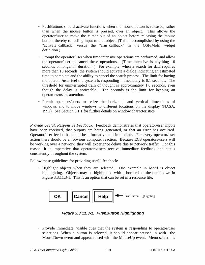
• PushButtons should activate functions when the mouse button is released, rather than when the mouse button is pressed, over an object. This allows the operator/user to move the cursor out of an object before releasing the mouse button, thereby canceling input to that object. (This is accomplished by using the "activate_callback" versus the "arm_callback" in the OSF/Motif widget definition.)
• Prompt the operator/user when time intensive operations are performed, and allow the operator/user to cancel these operations. (Time intensive is anything 10 seconds or longer in duration. ) For example, when a search for data requires more than 10 seconds, the system should activate a dialog indicating an estimated time to complete and the abilit y to cancel the search process. The limit for having the operator/user feel the system is responding immediately is 0.1 seconds. The threshold for uninterrupted train of thought is approximately 1.0 seconds, even though the delay is noticeable. Ten seconds is the limit for keeping an operator's/user's attention.
• Permit operators/users to resize the horizontal and vertical dimensions of windows and to move windows to different locations on the display (NASA, 1992). See Section 3.1.1 for further details on window characteristics.
Provide Useful, Responsive Feedback. Feedback demonstrates that operator/user inputs have been received, that outputs are being generated, or that an error has occurred. Operator/user feedback should be informative and immediate. For every operator/user action there should be an obvious computer reaction. Because ECS operators/users will be working over a network, they will experience delays due to network traff ic. For this reason, it is imperative that operators/users receive immediate feedback and status consistently throughout the system.
Follow these guidelines for providing useful feedback:
• Highlight objects when they are selected. One example in Motif is object highlighting. Objects may be highlighted with a border li ke the one shown in Figure 3.3.11.3-1. This is an option that can be set in a resource file.
OK Help PushButton HighlightingCancel
Figure 3.3.11.3-1. PushButton Highlighting
• Provide immediate, visible cues that the system is responding to operator/user selections. When a button is selected, it should appear pressed in with the MouseDown event and appear raised with the MouseUp event. Menu selections
ECS User Interface Style Guide 101 410-TD-001-003

should appear raised, and windows should be displayed within one second of the selection.
• Change the cursor to the Watch Pointer when an action is initiated that suspends operator/user input and takes more than two seconds to complete. When the action has been completed, return the cursor to the previous style. In the ECS environment, when a process is initiated its duration may vary based on the current level of network traff ic. When this occurs, the Watch Pointer should be used up to the 10-second limit and then a progress indicator should be displayed.
• Use progress indicators to graphically depict time intensive processing (anything that is 10 seconds or longer in duration). As mentioned, the operator/user should also have the abilit y to cancel time intensive operations. Figure 3.3.11.3-2 provides an example of a progress indicator.
OK Cancel Help
Transferring file . . .
Estimated time to complete:
0% 25% 50% 75% 100%
Working Dialog
3.0 min
Figure 3.3.11.3-2. Progress Indicator
• Inform the operator/user of system/status conditions by displaying messages, for example, processing delays, log-on failures, save operations, and mail/data transmissions.
NASA (1992) recommends these additional guidelines when providing operator/user feedback:
• Do not provide additional feedback when the completion of a command results in a consequence that is easily perceptible to the operator/user. Closing a file is an example of a command that does not require additional feedback.
• Use prompts to explain required inputs, commands, error messages, system capabilities, display formats, procedures, and steps in a sequence.
• Locate prompts at the location of the desired input whenever possible or place them in a standard message area. Use positive wording and active voice.
ECS User Interface Style Guide 102 410-TD-001-003

• Use warnings for actions that may not be reversible, confli ct with the operations of others, or require excessive processing time.
• Use warnings for actions that will result in permanent data loss, cannot be interrupted, may invoke ancill ary system actions, or which might compromise information, e.g., proprietary data.
• Use specific, rather than generic, error messages for all errors.
• Use words to describe the error. Codes and symbols in error messages are diff icult to understand. They are also inconvenient, since the user must look up their definitions. Figure 3.3.11.3-3 provides an example of an incorrect error dialog.
OK
Error #401@S occurred.
Error Dialog
Figure 3.3.11.3-3. Incorrect Error Dialog
• Provide error messages which describe the specific error and the actions required to correct the error. For example, the system should respond with a dialog li ke the one in Figure 3.3.11.3-4 if the user types an invalid month value into a date field. If the operator/user corrects the error prior to acknowledging the error dialog, the dialog should automatically deactivate once the error is corrected. (See Figures 3.3.3-3 and 3.3.3-6 for illustrations of Error and Warning Dialog styles.)
ECS User Interface Style Guide 103 410-TD-001-003

Error Dialog
OK
between 1 and 12. Please reenter.
Month must be
Figure 3.3.11.3-4. Correct Error Dialog
• Make error messages descriptive, but concise. Try to limit the message to two simple sentences. Use simple, direct, positive language (NASA, 1992).
• Include a description of the system state, directives for user action, and the consequences, if any, of failure to follow the directives (NASA, 1992).
3.3.11.4 Allow for Varying Work Styles and Expertise
ECS operator/user interfaces should be designed to accommodate differing work styles and levels of expertise (e.g., to accommodate operators/users who prefer to enter commands by typing and those who prefer to select the commands from a menu or a li st). Varying work styles and expertise levels can be accommodated by following these guidelines:
• Provide multiple paths to criti cal functions. Providing access to a single function through a menu, a keyboard sequence, or an icon on the tool bar allows the operators/users to develop their own style of interacting with the system. An example for ECS is to allow the operator/user to access "Results" from the main menu, from a button on the search window, or using a keyboard shortcut.
• Allow operators/users to set user preferences. Operator/user preferences are settings that affect the behavior or attributes within an application. They are stored in the system and remembered from session to session. A system should provide preferences that are useful and change infrequently. If a setting needs to be modified numerous times in a session, it should be placed in a menu or other interface element to which the operator/user has easy access (Apple Computer, Inc., 1992). Operators/users should not be required to enter preferences. These settings should be options for frequent operators/users who want to tailor the interface to their personal work style.
• Use progressive disclosure (as discussed in Section 3.3.11.2) to prevent a novice operator/user from being overwhelmed or intimidated by system functions (Apple Computer, Inc., 1992).
ECS User Interface Style Guide 104 410-TD-001-003

• Present a limited set of options and a small number of consistently used terms to assist the novice operator/user in gaining confidence with the system (Shneiderman, 1987).
• Provide a function that allows users to set the level of desired feedback. Novice operators/users will require more informative feedback, while experts will expect brief and less distracting feedback. The function for setting level of feedback should be categorized as a operator/user preference. The default level of feedback should be novice.
• Provide on-line Help and permit the operator/user to enter Help at any point using a simple, standard action for the user to request Help. Provide an easy means of returning to the task after accessing Help (NASA, 1992).
• Provide expert shortcuts, special keys, hidden commands, and other accelerators to accommodate frequent operators/users (Shneiderman, 1987). These features should provide additional pathways to functions; they should not replace the more simplistic interaction required for novices.
3.3.11.5 Minimize Use of Color to Maximize Effectiveness
Use the colors identified for use in ECS operator/user interfaces (see section 3.2.6 and Appendix B), unless there is a compelli ng reason to do otherwise. If it becomes necessary to use other colors, the general principles identified in this subsection can provide additional guidance.
Initial operator/user interface designs should be created in gray scale. Design for monochrome first. Use color to enhance an otherwise logical design (NASA, 1992). Color should be added conservatively. Use color primarily for drawing attention to important messages or features; indicating status, failures, or warnings; increasing realism; and grouping related elements.
Color should be a redundant cue, rather than the only thing that distinguishes an object or function. Text, location, shapes, and patterns can be used to help differentiate objects.
Be sure that colors are used consistently throughout the system. If warnings are indicated in red, all warnings should be red. Inconsistent use defeats the purpose of color coding. The operator/user will not be able to associate meanings with colors in the interface if colors are used inconsistently.
Be aware of the color expectations of the operator/user community. For example, cartographers consider blue as water, green as trees or forests, and black as roads. When appropriate, place a color legend on the display or in a help function (Shneiderman, 1987).
Marcus (1986) and NASA (1992) offer these guidelines for use of color:
• Use a maximum of 5, plus or minus 2 colors. For novice operators/users, use four distinct colors. For aesthetic reasons, or for added realism, use of more colors may be necessary.
ECS User Interface Style Guide 105 410-TD-001-003

• Use foveal (center) and peripheral colors appropriately.
- Use blue for large areas such as backgrounds; not for thin lines, small objects, symbols, or text. There are relatively few blue sensiti ve cones in the retina. Thus, blue objects appear dimmer and are more difficult to focus.
- When using red or green, place in the center of the visual field, not in the periphery. (The edges of the retina are relatively insensitive to these colors.)
- Do not use red as a background color.
• Use dark text, thin lines, and small shapes on light backgrounds for viewing situations where ambient lighting is bright.
• Do not use high-chroma, spectrally extreme colors simultaneously. Avoid contrasts of red/green, blue/yellow, green/blue, and red/blue because they create visual vibrations, illusions of shadows, and afterimages.
• Consider the needs of color deficient individuals attempting to use the screen. Eight percent of males are red-green color deficient.
• Use familiar, consistent color codings. It is particularly important to provide colors which are consistent with varying cultural color codings since ECS is an international system. Examples of some common Western coding schemes are:
- Red for stop, warning, danger, hot, fire
- Yellow for caution, slow, test
- Green for go, OK, clear
- Blue for cold, water
- Grays, white, and blue for neutrality
• Use the same color for grouping related elements.
• Use the same color code for training, testing, application, and publication.
• When portraying a relative value for a single variable, use gradual color changes to indicate the relative values.
Sutcliffe, 1989 provides these additional guidelines:
• To draw attention use high value, high saturation colors such as white, yellow, or red.
• To group or show similarity use colors which are close neighbors in the spectrum such as orange/yellow or blue/indigo.
• To separate data choose colors from different parts of the spectrum such as red/green, blue/yellow, or any color and white.
• To order data follow the spectrum - red, orange, yellow, green, blue, indigo, violet.
ECS User Interface Style Guide 106 410-TD-001-003

Table 3.3.11.5-1 provides recommended two-color combinations for background and text as well as a listing of two-color combinations which should be avoided.
Table 3.3.11.5-1. Background and Text Color Combinations (US Space Command, 1993 and NASA, 1992)
TWO-COLOR COMBINATIONS (Text and background)
GOOD POOR
Black on Light Blue White on Dark Blue Yellow on Dark Blue Green on Black Amber on Black White on Black Yellow on Black Black on White Red on White Blue on White Black on Light Gray Yellow on Medium Gray Blue on Medium Gray Red on Medium Gray
Red and Blue Black on Dark Blue Blue and Yellow Magenta on Black Green and Blue Green on White Red and Green Red on Black Yellow and Purple Any Color on Red Magenta and Green Blue for Text Yellow and White Brown and Black Yellow and Green
To make thin lines easily perceivable, consider the combinations in Table 3.3.11.5-2 (NASA, 1992):
Table 3.3.11.5-2. Recommended Colors for Thin Lines on White and Black Backgrounds
# of Colors White Background Black Background
1 Red or Green Yellow or Cyan or Green
2 Red and Green Magenta and Cyan Red and Blue
Green and Magenta Yellow and Magenta Cyan and Magenta
3 Red, Blue and Green Cyan, Magenta and Yellow
3.3.11.6 Make it Legible
Font types, weights, slants, sizes, and colors affect legibilit y and usabilit y of the user interface. Follow these guidelines to maximize legibility:
ECS User Interface Style Guide 107 410-TD-001-003

• Use no more than two font types, two slants, two weights, and four sizes in a single user interface (Marcus, 1984).
• Use font styles and sizes consistently across the interface.
• Do not use varying sizes or styles of fonts for any reason other than coding, for example, text as labels, text as data, text as command input (NASA, 1992).
• Where appropriate, allow the user to control font size (US Space Command, 1993).
• Where appropriate, allow the user to control justification, line length, space between lines, margins, and size (NASA, 1992).
• Do not use ALL CAPS. Use combinations of upper and lower case characters.
• Use 150% of character height as default line spacing (NASA, 1992).
• Use 52-80 characters as default line length (NASA, 1992).
• Use colors that provide high contrast between text and background. Effective combinations of background and text colors are shown in Tables 3.3.11.5-1 and 3.3.11.5-2.
3.3.11.7 Consider Standard Interface Conventions
When designing a system it is important to consider the interface conventions of the system baseline. The standard convention defined for the development of the ECS is OSF/Motif. Following standard OSF/Motif conventions in the ECS graphical user interface design will reduce user training time, increase familiarity and system exploration, and reduce errors. Using a defined standard also makes it easier for the developers of the system. Most of the interface objects and their behaviors are already defined in the OSF/Motif toolkits. The current standard Motif widgets are discussed earlier in this document (see Sections 3.1 and 3.2).
Although standard conventions provide the advantages cited above, they also have disadvantages. Interface standards also imply reduced flexibilit y in designing a system that needs application specific tailoring in order to meet the requirements. Standards may also limit enhancements and change to a system to the point where it becomes obsolete. Standards need to evolve as new needs and new technologies emerge. There are cases where the design will have to deviate from the standard to meet the application requirements.
In instances where the standards do not apply, an ECS specific solution must be defined. In some cases, the creation of a new widget may be required. To ensure commonality, any deviation from the standards, or creation of new widgets, should be recorded and added to this document.
3.3.11.8 Use Real World Metaphors
As a designer, you can take advantage of people's knowledge of the world around them by using metaphors to convey concepts and features of your application (Apple
ECS User Interface Style Guide 108 410-TD-001-003

1
2
3
4
5
6
7
Computer, Inc., 1992). Functions modeled using real world metaphors allow the user to apply established skill s or expectations to computer interactions. The Open Software Foundation (1991) states that effective metaphors make it easier for users to infer how to use an application. An example of a metaphor is the folders used by the Macintosh system. Users place files in folders, which is similar to how hard copy documents are organized. The trash can is another example of a metaphor that is familiar to most users. Users throw files that are no longer needed into the trash.
Knowledge of the user community, their experience and expectations, will be important in selecting metaphors for the ECS system. Using metaphors is an effective means of communicating features of an interface; however, a designer must be sure there is a balance between what is suggested by the metaphor and the computer's abilit y to support the metaphor (Apple Computer, Inc., 1992).
The following guidelines will aid in the design of metaphors:
• Use concrete representations of an item to express the metaphor.
• Ensure the metaphor clearly represents the intended meaning of the designer and is understood by the operator/user.
• Use everyday, conventional metaphors instead of computer specific metaphors.
• Design with the understanding that the detail presented in the metaphor will depend on the resolution of the operator's/user's display.
Metaphors must provide the same meaning to all operators/users. ECS designers must pay particular attention to the meanings behind metaphors selected for the international ECS operator/user community. Metaphors and icons used throughout the system will have to be well designed and tested with a variety of operator/user groups in order to prevent confusion. For example, if a wall calendar metaphor is used to identify temporal ranges for data searches, provide calendar formats which are familiar to the various ECS operator/user communities (see Figure 3.3.11.8-1).
European Calendar
American Calendar
S M T W T F S
1 2 3 4 5 6 7
8 9 10 11 12 13 14
15 16 17 18 19 20 21
22 23 24 25 26 27 28
29 30 31
S 8 15 22 29
M 9 16 23 30
T 10 17 24 31
W 11 18 25
T 12 19 26
F 13 20 27
S 14 21 28
Figure 3.3.11.8-1. Calendar Metaphor
ECS User Interface Style Guide 109 410-TD-001-003

3.3.11.9 Know the Operator/User
Knowing the operators/users will enable designers to develop an operator/user interface which employs an intuitive data organization structure and familiar terminology. A natural data structure and lexicon allows the operators/users to focus on their task, instead of on the tool they use to perform that task. Studying operator/user knowledge, skill s, abiliti es, and expectations will help designers gain an understanding of the operator/user cognitive model of the task. The operator/user lexicon should also be studied when determining the set of terms that will be used to label controls and objects. Make the software transparent and concentrate the design around the operator's/user's job (NASA, 1992).
Four elements instrumental in creating an effective operator/user interface are:
• Know the operators/users and their tasks.
• Empower operators/users. Enable them to do their tasks effectively and efficiently.
• Organize the system from the operators'/users' perspective versus the software development perspective.
• Incorporate the operators'/users' lexicon.
Several operator/user characteristics which should be examined before designing the operator/user interface include (Sutcliffe, 1989):
• Frequency of use - How much interaction will t he operator/user have with the system?
• Level of discretionary usage - Will t he user's interaction with the system be compulsory or optional?
• Computer familiarity - How much knowledge of computer programming and operation does the operator/user have?
• Mental abiliti es - What is the general knowledge and intelli gence level of operators/users?
• Operator/user physical abiliti es and skill s - What is the range of physical capabilities and limitations in the operator/user community?
Ideally, operators/users are involved in all phases of the design process, from requirements definition to final testing before delivery or publication. User representatives should act as resources for the user interface design team, answering questions and providing suggestions as needed.
A method for collecting operator/user feedback for ECS, which is beyond the requirements definition stage, is to involve user representatives in the operator/user interface (UI) design review process. Involving operator/user representatives during this process allows their expertise to be incorporated in the prototype prior to implementation, when design changes are easier to make. Providing a means for the operator/user to
ECS User Interface Style Guide 110 410-TD-001-003

comment on-line while using the system is also a way of obtaining feedback. Concerns, errors, suggestions, and comments can be provided while they are fresh in the operators'/users' minds. An immediate response to these inputs is also an important part of this process. If the operators/users feel they are not being heard or taken seriously, they will stop providing feedback and their subject matter expertise will be lost.
3.4 GUI Builder Templates for Basic ECS Interface Structure
ECS interface window templates have been created and are available in Builder Xcessory to facilit ate the design of interface screens using Builder Xcessory (see Appendix B). The basic ECS interface structure is developed using a series of windows and buttons required in all ECS interface screens. The following subparagraphs are a hierarchical description of the widgets involved in the basic ECS interface.
3.4.1 Primary Window
The primary window is the top level of each ECS interface screen, and is created automatically by Builder Xcessory when the first main element is selected and displayed in building an application. This primary window, or top-level shell , is the outermost layer of the application, as indicated in Figure 3.4.1-1. Its main function is to provide a shell on which to create the other widgets. It is also the widget on which the developer locates the title and the x and y coordinates of the window.
3.4.2 Main Window
The main window (see Figure 3.4.1-1) is the first main element displayed in building an application, and serves as a housing for the menu bar and form (see Section 3.4.5). It can be sized as desired, and upon exit from it, the application closes.
3.4.3 Menu Bar
The menu bar (see Figure 3.4.1-1) is a widget that stretches across the top of the main window. It houses pull-down menus, which create cascade buttons when they are placed.
ECS User Interface Style Guide 111 410-TD-001-003

Title
File Edit P rocess Help
Top-Level Shell
Main Window
Cascade Button (Pull-Down Menu) Menu Bar
1 to 2 Rows
Button Box Push Button
Form (on which TabStack and Button
TabStack (provides labels and pixmaps for processes)
Box are
of Tabs
Anchored)
Selected V iew Options
Figure 3.4.1-1. ECS Interface Basic Window Structure
3.4.4 Common Menu Structure for ECS
Figure 3.4.4-1 presents a standard menu system for all ECS custom applications. Modifications (e.g., adding new menubar items and cascading menu pushbutton items) are allowed, so long as the common menu structure is used.
Additional clarifications to the common menu structure:
1) This figure shows three pulldown menus which are open simultaneously for the purpose of displaying the menu choices only. ECS screens, of course, should not be developed with the capability of opening multiple pulldown menus simultaneously.
ECS User Interface Style Guide 112 410-TD-001-003

View Process
Undo Ctrl+Z Cut Ctrl+X Copy Ctrl+C Paste Ctrl+V
Delete Del
On Context On Help On Window On Keys Index Tutorial On Version
New Open Ctrl+O
Save Ctrl+S
Save As Print Ctrl+P
Close File Ctrl+W
Exit Alt+F4
Selected Options topLevelShell
Cl e
Edit HelpFile
Ctrl+N
Ctrl+A
xxxx ar
Figure 3.4.4-1. Common menu structure for ECS custom applications.
2) The choices displayed here serve as a generic model. If a particular application has no need for some of the functions shown or described on a basic Motif-compliant menu, then the unnecessary widgets should be removed. The choices can and should be tailored to the requirements of the specific application (e.g., on the Edit menu, if the Clear xxxx choice is used it should be to clear something meaningful to the user, such as Clear Form). However, if any or all of these functions are needed than this is the order in which they are to be listed.
3) See pages 9-58 and 9-59 of OSF/Motif 1.2 Style Guide for definitions and descriptions of Selected, View, and Options.
4) Clear and Delete (found under Edit on the menubar) have two separate and distinct functions. The definitions for Clear and Delete as found in the Motif 1.2 Style Guide are as follows:
"'Clear' -- must remove a selected portion of data from the client area without copying it to the clipboard. The remaining data is not compressed to fill the space that was occupied by the cleared data."
"'Delete' -- must remove a selected portion of data from the client area without copying it to the clipboard. The remaining data fills the space that was occupied by the deleted data."
5) Process is used to activate a process/function that is part of the specified ECS subsystem. There are as many cascadeButtons/menu items as there are subsystem processes/functions. For each "Process" with an icon on the stack of tabbed forms, there should also be an item on the "Process" menu to provide an alternate means of navigation. The label for the process item should denote the process/function that it activates.
The use of the term "process" replaces what had been formerly called "mode." This change is made to increase clarity as to the intended use of this selection and to prevent the
ECS User Interface Style Guide 113 410-TD-001-003

purpose of this menu selection from being confused with "mode management" functions and operations.
6) Close File (located under the pulldown menu File) is used for applications with multiple, independent primary windows. "Close File" should delete the window which contains the choice, but should not terminate the application.
7) Software developers should attempt to make any user action immediately reversible. Both the Motif 1.2 Style Guide and the NASA HMI Guidelines recommend that an "Undo" button be provided for this purpose. "Undo" should be placed immediately under the "Edit" selection on the menu bar. "Undo" should have the capabilit y of reversing any function found under the "Edit" menu. "Undo" should, to the extent that it is possible, reverse the last action performed by the user. As a visual cue, the title of the "Undo" button should be dynamically modified to name the action that is being undone. For example, if the user's last action is "Delete," than the "Undo" button should be dynamically updated to read "Undo Delete."
"Undo" should be itself reversible. In other words, by selecting "Undo" immediately following an "Undo" action, this should reinstate the action that had been initiall y undone. In the event that an "Undo" action is executed, the "Undo" button should be dynamically updated to read "Undo Undo."
3.4.5 Form , Toolbar , TabStack , and Button Bar
A Form widget is used below the menu bar to anchor other elements of the application screen. Other elements, used as needed and appropriate, are in the Form. A Toolbar, which may be placed at the top of the Form window, houses Icon Buttons to provide single-press mouse access to frequently used and/or significant operations. An important property of the Toolbar is to enable use of pop-up labels for the Icon Buttons, so that screen clutter with labels can be minimized. A TabStack placed on the Form Window provides a simple and rapid means of switching between screen contexts, enabling eff iciency in effective management of screen real estate and facilit ating operator focus on the task to be performed. It houses tabbed forms, with pixmaps and labels on the tabs, allowing ECS developers to provide labeled icons for operator/user selections. ECS applications should use labeled icons on the tabs to represent different application processes.
A Button Box is anchored at the bottom of the Form window, as ill ustrated in Figure 3.4.1-1. The Button Box contains PushButtons to provide single-press mouse access to significant but less frequently used operations generic to several application processes; buttons unique to a process should be placed on the tabbed form for that process.
3.5 On-Line Help
On-line Help provides answers to operator/user questions about valid input codes, available options, or methods for accomplishing work. To be effective, help must be easy
ECS User Interface Style Guide 114 410-TD-001-003

--
to understand (well organized, straightforward text) and unobtrusive. In general, technical writers are best suited to prepare the text which is used in Help.
3.5.1 OSF/Motif Guidelines for Types of Help
OSF/Motif is endorsed as the primary HMI standard for ECS. Accordingly, on-line help should be consistent with Motif (refer to Chapter 6 of the OSF/Motif 1.2 Style Guide for the guidelines on Help). Motif identifies several forms of Help (each accessible through the Help Menu located on the extreme right-hand side of the main pull-down menu bar (see Section 3.4.4.4). These include:
• Help on Context -- also identified as context-sensiti ve Help, describes the nature of a specific control and how to use that control
• Help on Help -- provides information on how to use Help, and
• Help on Window -- gives information on the current window
• Help on Keys -- shows special uses of keys, especially function keys
• Help Index -- lists alphabetically a series of topics on which Help is available
• Help Tutorial -- not a form of Help, but provides users access to a menu listing of all on-line Computer-Based Training (CBT) available (see CBT discussion below)
• Help on Version provides information about the specific version of the application (e.g., version number, date).
The subparagraphs that follow describe each of these types of Help.
3.5.1.1 Description of context sensitive Help (Help on Context)
The most important type of Help is context sensiti ve Help because it requires the programmer to anticipate operator/user problems in understanding the system's functionality and software operations and not to require users to frame a specific question. It bypasses indexes or li sts of topics, and presents the user with the information most likely to solve an immediate and narrowly defined problem.
The specific layout of context-sensiti ve Help has yet to be determined, however, it is expected to have the following characteristics:
• Help subject determination will be by software identification of the active window and the active data entry field in which the cursor is located.
• a separate Help window will be activated which displays the Help text/message.
• the Help window will contain the following buttons available to users to manipulate the Help windows:
- cancel - search - history - back - browse (forward and back).
ECS User Interface Style Guide 115 410-TD-001-003

• the Help window will size in accordance with the amount of text to be presented, this means that the Help topic should be narrow enough and the Help text concise enough so that it can be displayed on a single window page which requires no, or only few, scrolling or page-turning operations.
• extended topics should reference the user to more detailed material contained in either:
- technical, operator, and/or user manuals
- on-line CBT
- other job aids.
If hypertext media is employed some amount of research and development will be required to implement context-sensiti ve Help. The level of effort required to develop the hyperlinks is greater, however, the potential rewards for success are also greater.
An example of a context-sensiti ve Help box from a sample window titled "Printer Options" is shown in Figure 3.5.1.1-1.
File Edit B
Browse > <Browse History Contents
Baud Rate
14400, and 28800. accept data. Baud rate is the speed at which your printer can
ookmark Help
Acceptable speeds are 2400, 9600,
BackSearch
Context-Sensitive Help
Enter the speed in bits per second.
Figure 3.5.1.1-1. Example of Help on Context.
ECS User Interface Style Guide 116 410-TD-001-003

3.5.1.2 Description of Help On Window
The purpose of the Help on Window function is to: (a) provide descriptive information on the use of the currently active window and (b) to explain the functions contained in the window menu button located in the upper left-hand corner of the active window. These functions typically include:
• Restore
• Move
• Size
• Minimize
• Maximize
• Lower
• Close
See Figure 3.5.1.2-1 for an example of Help On Window box.
File Edit Help
Help on Window Functions
Search Cancel
The following functions may be performed on the Printer Options window via the menu window button located . . . . .
xxxx
xxxx
estore
ove
Printer Options
R
M
(description of function)
(description of function)
Figure 3.5.1.2-1. Example of Help on Window .
ECS User Interface Style Guide 117 410-TD-001-003

3.5.1.3 Description of Help On Keys
The purpose of this Help function is to identify the use and operational effects or outcomes of specific function (and/or 'hot') key operations on the functionality contained in the active window (if it varies from the standard or default window functionality. (The documentation of these variations may become particularly important in the instance where COTS/OTS product function keys operate differently than those programmed for other ECS workbench functions.) As seen in Figure 3.5.1.3-1, the expected layout of this Help is a li st (scrollable if necessary) of function keys, their definitions, consequences of their use, and references to more detailed discussion (if required).
File Edit Help
Help on Function Keys
Search Cancel
The following specific function key operations are available with the Printer Options window.
xx xxx xxx
xxxxx
xxx
Function Keys
[list standard keys or "hot" keys in a list format]
(description of meaning)
(description of meaning)
Figure 3.5.1.3-1. Example of Help on Keys.
3.5.1.4 Description of Help Index
The layout of Help Index should consist of two side-by-side scrolling boxes, including one box (on the left) which contains the li st of index terms against which users conduct a search of topics/terms and another box (on the right) which contains the specifics help text/message for each selected topics (see Figure 3.5.1.4-1). Help contained in these indices should be short, clear, and concise. External reference to more detailed information/discussion may be provided.
ECS User Interface Style Guide 118 410-TD-001-003

File Edit Help
Help Index
Cancel
xxx xxx
Selected Topic
xxx xxxx
xxx xx xxxx
Scrolled
ApplyOK
xxxx xxx xxx xxx xxxxxx
xxxxx xxxxxx List
Scrolled Text
Figure 3.5.1.4-1. Layout of Help Index Option Box.
3.5.1.5 Description of Help On Help
This Help function provides a more detailed description on how to use each Help function. Each of the Help function options is described in a separate Help entry (see Figure 3.5.1.5.1).
ECS User Interface Style Guide 119 410-TD-001-003

File Edit Help
Help on Help
Search Cancel
There are seven types of Help available from the Printer Options window:
How to Use Help
Help on C
Help on W Help on K
. . .
(description of option, how to use, etc.)ontext
. . . .indow . . . .eys
Figure 3.5.1.5-1. Example of Help on Help.
3.5.1.6 Departure from Motif Guidelines for Computer-Based Training (Help Tutorial)
For the purpose of this project, Help Tutorial, described on page 8-3 of the OSF/Motif Style Guide is not considered a form of Help. Rather, it is considered training. The manner in which computer-based training (CBT) is accessed by users through the system will be consistent with the Motif guidelines on Help and the Help Tutorial. CBT will be accessed through the Tutorial command located on the Help menu. Once selected, the operator/user will observe a CBT menu on the CRT that will replace all other menus (CBT will cause all other ongoing applications, except for the root desktop, to be stored). At this point, the operator/user will be presented with a CBT menu which directs them to select the CBT they wish to initiate. Upon termination of the CBT, the system will provide a prompt (preferably a message box) which requires selection of one of the following options: (a) return to prior application/object being processed and location in that application/object, (b) select the basic desktop, or (c) cancel the operation and return to the CBT selection menu.
3.5.1.7 Description of Help On Version
This Help function identifies the version, any serial numbers, corporate and copyright ownership, and date of version regarding the application in use (see Figure 3.5.1.7-1).
ECS User Interface Style Guide 120 410-TD-001-003

File Edit Help
Help on Version
OK
Information about the specific version is given here (e.g., name, version, date, contract number)
Version
Figure 3.5.1.7-1. Example of Help on Version.
3.5.2 Characteristics of and Guidelines for On-line Help
Deciding what to include in the Help system is one of the most diff icult operator/user interface decisions you make. It should be understood that on-line Help is one of a class of techniques collectively known as Job Aids (which provide information to operators/users in support of their work activities) including:
• computer-based training (including on-line tutorials)
• traditional paper-based training (e.g., workbooks)
• technical documentation (e.g., technical manuals, proceduralized job aids).
On-line Help has the following characteristics which distinguish it from other aiding techniques:
• contains short, clear, and concise descriptions of (a) codes, (b) methods of operations, (c) clarifications for lost operators/users on correct methods of operation, and (d) provide reference to on-line tutorials and/or technical documentation which provide more detailed descriptions of operations.
• does not remove the user from the application they are currently using, and
• does not permanently destroy any window views shown on the screen prior to the selection of Help.
ECS User Interface Style Guide 121 410-TD-001-003

The effective design and use of on-line Help is important because it can reduce the need for off-line training and increase operator/user proficiency. Therefore, the following guidelines are presented for the design of on-line Help facilities.
3.5.2.1 Consistency
The key element in designing Help is to be consistent, such as using the same terms to represent actions (e.g., always use delete to delete, don't refer to the action as erase). The same menu choice should be used to represent Help, and should always be placed in the same position. The same function key should also be used consistently to indicate Help (e.g., F1).
3.5.2.2 Integration with Written Documentation
Where on-line Help is supplemented by supporting material in written manuals, the online Help should refer the operator/user to the written documentation.
3.5.2.3 Flexibility
Help should be flexible such as accepting synonyms for standard system terminology ("clear" for delete).
3.5.2.4 Provision of Needed Support
Help effort should be focused in areas where it is predicted that users will need it the most. Help should also be provided when the program works differently from what users are accustomed to and when functions look alike but function differently.
3.5.2.5 Matching Operator/User Expertise
Help should be written to the level of expertise of most operators/users.
3.5.2.6 Navigation
Users should be allowed to browse through Help screens (i.e., navigate forwards and backwards) and easily exit Help.
3.5.2.8 Readability of On-Line Help
Specific recommendations for writing Help text include:
• Avoid excessive use of jargon. Terminology should reflect the functional operator/user, not the designer.
• Use affirmative statements with a positive tone.
• Write directly to the operator/user (e.g., "Press Enter to continue.").
• Use active rather than passive voice (e.g.," Enter 01 for inclusive" not "Inclusion is indicated by entering 01").
• Use familiar combinations of words and commonly-used words.
• Be concise.
• Describe sequences of steps in the same order as they occur.
• Give Help instructions in a logical order.
• Use plenty of white space.
ECS User Interface Style Guide 122 410-TD-001-003

4. HTML-Based Applications
This section provides human factors guidelines for the preparation of HyperText Markup Language (HTML)-based applications. This section does not address HTML issues that are not directly related to human factors. For example, the topic of compliance with existing and evolving HTML standards (i.e., HTML 2.0, HTML 3.0, and HTML with Netscape extensions) is not addressed in this section. However, there are specific human factors concerns associated with the implementation of specific HTML commands or procedures (e.g., Netscape Tables functions) should they be used in ECS. Many of the prescriptions and recommendations in the preceding sections of this Style Guide can provide useful guidance in development of HTML applications. For example, Section 3.3.5 on Data Entry/Editing and Form Filli ng identifies many principles that are applicable to HTML as well as Motif applications.
4.1 Endorsement of the Yale C/AIM WWW Style Manual
In general, the style of HTML documents should conform to the stylistic guidelines contained in the Yale C/AIM WWW Style Manual (hereafter, the Yale Style Manual). See the following subparagraph for the tailoring of the manual for its applicable content. The Yale Style Manual can be located at the following World Wide Web (WWW) address:
http://info.med.yale.edu/caim/StyleManual_Top.HTML
4.1.1 Tailoring Guide to the Yale Style Manual
The Yale Style Manual has been tailored to identify those important sections which are recommended for strict adherence in the development of HTML documents. This tailoring of the Yale Style Manual i s shown in Table 4.1.1-1. It is recommended that the sections flagged in the table be adhered to in preparing such documents.
4.2 Detailed Human Factors Guidelines for HTML Documents
Compliance with the Yale Style Manual, as tailored in section 4.1.1 above, by itself, does not automatically guarantee compliance with all human factors considerations that affect good design and layout of HTML documents. The following detailed human factors guidelines supplement the stylistic guidelines contained in the Yale Style Manual.
4.2.1 HTML document title lengths
Titles for HTML documents should be no more than sixty (60) characters, including spaces. This will ensure ease of display and readabilit y on a variety of browsers because of the large font size used.
ECS User Interface Style Guide 123 410-TD-001-003

Table 4.1.1-1. Tailoring Guidance for the Use of Stylistic Guidelines Contained in the Yale Style Manual
YALE STYLE GUIDE PAGE TITLE HFE RECOMMENDATION
INTRODUCTION Information only
I. INTERFACE DESIGN IN WWW SYSTEMS Information only
Hypermedia and Conventional Document Design Information only
Navigation in Hyperspace Recommended
WWW Site Structure Recommended
WWW Page Design Information only
Efficient Use of the World Wide Web Information only
System Responsiveness Recommended
Well-balanced Page and Menu Designs Recommended
II. WWW PAGE DESIGN
Design Integrity in WWW Systems Recommended
Essential Elements of WWW Pages Recommended
Page Length Recommended
Design Grids for HTML Information only
Sample Templates for a WWW Pages Information only
Local Links and Navigation Aids Recommended
Page Headers Recommended
Typography Recommended
Page Footers: Verifying Origin and Authorship Recommended
Official Seals or Marks of the Institution Recommended
Contact Information Recommended
Copyright Information only
Page Date Recommended
Page URL Recommended
III. OPTIMIZING PERFORMANCE IN WWW PAGES Information only
Sizing Inlined Graphics Information only
Interlacing GIF Graphics Information only
Using Width and Height in Graphic Anchors Information only
Loading Low Rez/High Rez Graphics Information only
Trimming graphics by Limiting Bit Depth Information only
JPEG Graphics Information only
4.2.2 Hypertext/hypermedia links
4.2.2.1 Lost in hyperspace
To avoid user disorientation, hypertext/hypermedia documents should employ (1) maps or browsers that indicate position in the network or (2) tags, markers, or milestones which represent locations.
ECS User Interface Style Guide 124 410-TD-001-003
4.2.2.2 Availability of links
Hypertext/hypermedia links should be clearly indicated and continually available.
4.2.2.3 Multiple methods for accessing information
Information should be accessible in a hypertext/hypermedia document in numerous ways, for example by: (1) following links, (2) searching, and (3) using contextual cues.
4.2.2.4 Acceptable methods for identifying hypertext/hypermedia links
Hypertext/hypermedia documents should clearly indicate the presence of links, by use of a link marker (such as an icon) or by use of highlighting (preferably underlining and color coding together).
4.2.2.5 Links with objects besides text
To the extent possible, links should exist across media, and should not be limited to text linking only.
4.2.2.6 Links based on user’s information requirements
Links between related information should be based on the user’s need for information in some particular context. Large numbers of such links should be generated by means of a formal associative model that relates information elements to one another on a systematic basis. Context-sensitive help is one situation that merits such an effort.
4.2.3 Lists
4.2.3.1 When to use bulletized lists
If the writing includes more than two or three items, or a sentence or paragraph has become long and unwieldy because it contains a number of items, break it into a bulletized list.
4.2.3.2 When to use numbered lists
In a procedure with more than one step, use numbers to record the steps. Whenever a specified number of items are referenced by the prior text, present the items in a numbered list.
4.2.3.3 Ordering items in bulletized lists
Use alphabetical organization if a user is going to use the li st to look up a word or abbreviation. Use numerical order if the user is going to look up a number in the li st. Use an appropriate logical ordering of items in a li st when the li st consists of a collection of thoughts.
4.2.3.4 Continuous numbering in multipage lists
Number the items in a li st continuously in relation to the first item on the first page when the list exceeds one display page.
ECS User Interface Style Guide 125 410-TD-001-003

4.2.4 Text Highlighting
4.2.4.1 Emphasizing Text
When a criti cal passage merits emphasis to set it apart from other text, highlight that passage by bolding/italicizing, brightening, or color coding or by some auxiliary annotation, rather than by capitalization. Do not overuse these highlighting conventions, as they lose their ability to attract the reader's eye when they are used to excess.
4.2.4.2 Text with graphics
Linked graphic materials should appear with appended text defining the graphic material and its text links.
ECS User Interface Style Guide 126 410-TD-001-003

5. COTS Integration
The use of Commercial Off- the-Shelf (COTS(COTS/OTS)) software applications to provide ECS functionality is a major program and cost-saving goal of this project. The nature of COTS product developments is such that there are large differences in the implementation of the GUI across COTS products, even for Motif-compliant products. These differences in the design and layout of COTS GUIs create concern that operator performance errors may occur as a direct consequence of the GUI differences across applications. Specifically, negative transfer can occur when the operator/user who has been working with one COTS product shifts to another if the metaphor changes, especially if it changes in subtle ways. One method of offsetting these differences is the 'wrapping' of COTS products inside a custom-coded GUI. The labor required to wrap COTS with a custom GUI can negate the cost savings of using COTS applications over developmental software applications. Additionally, the maintenance and support effort and costs associated with wrapped COTS are significant. Consequently, wrapping is not feasible for all or many COTS applications. However, when the wrapping of COTS applications is required, the resulting custom-coded GUI shall comply with the human factors requirements contained in this Style Guide.
Other than wrapping each COTS(COTS/OTS) product within a custom-coded GUI that is compliant with the ECS User Interface Style Guide, the use of coding conventions that differentiate one COTS product from other COTS products is the only alternative available. Possibly relevant coding conventions include:
• Window border color coding
• Window border thickness coding
• Workbench application area color coding
• Workbench widget shape coding
• Workbench widget blink coding
Only the first three coding techniques appear to be useful as COTS(COTS/OTS) cuing conventions. The others have li kely negative impact on the operator/user ease of learning and/or acceptance of the products.
Practical L imitations. An analysis of the feasibilit y of implementing these coding techniques in ECS has determined that highly salient distinctions between the COTS(COTS/OTS) environments are prevented by the limitations imposed by the window manager, which controls the frames and other display elements that might otherwise be used to emphasize metaphor boundaries. The limitations include the following:
• Color of the desktop workspace background and window borders is under the control of the Motif Window Manager (MWM). Motif does not support the capabilit y to choose individual window border colors because: (1) the MWM highlights the active window and fades the inactive windows on the desktop (this
ECS User Interface Style Guide 127 410-TD-001-003

convention always informs the use as to which window is currently active) and (2) MWM provides operators/users the abilit y to select color preferences (without preempting the differences between active and inactive windows).
• The MWM controls window border thickness. Currently, there appears to be no way to modify that screen element.
• Most COTS(COTS/OTS) applications provide operators/users with the capabilit y to select color preferences inside the workbench application area. So far as is known, the source code for each COTS(COTS/OTS) product would be required to modify this setup. Setting color preferences would have to be preempted in order to enforce color coding on the workbench application area.
Severity of the Problem. None of the three potential coding techniques appears feasible. It is impossible to quantify the risk of performance errors due to COTS(COTS/OTS) GUI differences. However, initial examination of major COTS(COTS/OTS) tools for ECS indicated that the potential negative transfer is unlikely to be criti cal. No evidence of 'mission criti cal' tasks has been identified that would make such errors intolerable. Errors resulting from such negative transfer are li kely to be limited to reduced productivity and/or operator/user frustration with the system. Furthermore, the COTS(COTS/OTS) products that were examined appear to be tailorable, using their capabiliti es and features for setting user preferences, to many of the human factors requirements contained in this ECS User Interface Style Guide. This can help ameliorate the problem.
Recommendations. The development teams should tailor the COTS(COTS/OTS) products to the requirements of the Style Guide to the extent feasible. The use of COTS applications does not obviate the need to comply with the applicable human factors requirements contained in the Style Guide, but realistically, it does complicate the process and place boundaries upon the realistic achievement of compliance with these human factors requirements. A number of the COTS(COTS/OTS) products (e.g., HP OpenView, Trouble Ticket) as complete Motif implementations possess the capabilit y, through setting of user preferences, to modify many (but not all ) of the GUI attributes that affect the "look and feel" of the COTS GUI. In these cases, it is recommended that the ECS subsystem development team consult with the ECS human factors team to determine which human factors requirements apply to each COTS product that possesses a modifiable GUI. Default GUI configurations can then be developed for each COTS(COTS/OTS) application and suggestions for procedures and policies guiding their modification by operators can be prepared for the Government. Each COTS GUI should be reviewed by the ECS human factors team prior to its full implementation to assure the adherence to a single "look and feel" and seamless integration of COTS(COTS/OTS) applications to the extent feasible.
ECS User Interface Style Guide 128 410-TD-001-003

References
American National Standards Institute, Inc. (1970). Flowchart Symbols and their Usage in Information Processing. (ANSI X3.5-1970). New York, NY.
Apple Computer, Inc. (1992). Macintosh Human lnterface Guidelines. Addison-Wesley Publishing Company, Reading, MA.
Brown, C.M. (1988) Human-Computer lnterface Design Guidelines. Ablex Publishing Corporation. Norwood, NJ.
Department of Defense (1985). Human Engineering Guidelines for Management Information Systems. (DOD-HDBK-761). Washington, D.C.
Fowler, S.L. and Stanwick, V.R. (1995). The GUI Style Guide. Boston, MA: AP Professional.
Galitz, W. (1989). Handbook of Screen Format Design. QED Information Sciences, Inc. Wellesley, MA.
Human Factors Society, Inc. (1988). American National Standard for Human Factors Engineering of Visual Display Terminal Workstations. Santa Monica, CA.
Kacmar, C. and Carey, J. (1991). Assessing the Usabilit y of Icons in User Interfaces. Behaviour and Information Technology, 10. 6.443457.
Kiger, J. (1984). The Depth/Breadth Trade-off in the Design of Menu Driven User Interfaces. International Journal of Man-Machine Studies, 20, 201-213.
Kobara, S. (1991). Visual Design with OSF/Motif. Addison-Wesley Publishing Company, Reading, MA.
Lockheed Missiles & Space Company, Inc. (1982). Human Factors Engineering Standards For Information Processing Systems. Sunnyvale, CA.
Marcus, A. (1986). The Ten Commandments of Color. Computer Graphics Today 3, 10, (November), 7ff.
Marcus, A. (1984). Display Users Now Making Type Decisions. Computer Graphics Today 1, 3, (September), 18ff.
Mitre Corporation (1986). Guidelines for Designing User Interface Software. Bedford, MA.
NASA (1992). Human-Computer lnterface Guidelines. Goddard Space Flight Center, Greenbelt, MD.
Nielsen, J. (1993). Usability Engineering. Academic Press, Inc., San Diego, CA.
ECS User Interface Style Guide 129 410-TD-001-003

Open Software Foundation (1991). OSF/Motif Style Guide Release 1.1. Prentice Hall , Englewood Cliffs, NJ.
Rivlin, C., Lewis, R., and Davies Cooper, R. (1990). Guidelines for Screen Design. The University Press, Cambridge, Great Britain.
Shneiderman, B. (1987). Designing the User Interface - Strategies for Effective Human-Computer Interaction. Addison-Wesley Publishing Company, Reading, MA.
Software Productivity Consortium (1988). User Interface Style Guide. Reston, VA.
Sun Microsystems, Inc., (1993). Motif 1.2 Style Guide. MountainView, CA: SunSoft.
Sutcli ffe, A. (1989). Human -Computer Interface Design. Springer-Verlag New York Inc., New York, NY.
US Space Command, ISC HCI Working Group (August, 1993). Integrated Satellit e Control (ISC) Human Computer Interface (HCI) Standard (Draft Version 1.0).
ECS User Interface Style Guide 130 410-TD-001-003

Appendix A: Glossary
Accelerator - A key or key combination that invokes an action regardless of where the cursor is currently located. Accelerators are most commonly used to access frequently used menu items.
Arr owButton - An ArrowButton is a version of a PushButton with a directional arrow as the label. The direction of the arrow can be set to up, down, left or right.
Browse select - A selection model that allows browsing through single selection collections.
Bulletin Board - A container widget that provides simple geometry management of its children. It does not force positioning and it can be set to prevent overlapping.
Button - A graphical component on a window frame or in a DialogBox that works by pressing it.
Cancel - A capabilit y that regenerates or re-initiali zes the current display without processing or retaining any changes made by the user.
Canvas -A graphical component used for displaying, entering, and modifying graphics.
Cascading Menu - A submenu that provides selections that amplify the parent selection on a PullDown or Popup Menu.
Character based User Interface (ChUI) - An interface that consists solely of text. All options, menu items, commands, etc. are displayed and bordered with text characters. There are generally no graphics included in a ChUI.
CheckButton - A component used to select settings that are not mutually exclusive. The visual cue to the selection is frequently that the button is filled in or checked.
Click - An input device button-down event, distinct from cursor positioning, for the actual entry of a designated position.
Composition - A type of Layout Group which organizes a collection of components in an arbitrary layout.
Consistency - Similarity of patterns which may be perceived in tasks, in presentation of information and other facets of an interface design.
Control sequences - Keyboard key sequences used to activate system functions. Control sequences are generally considered expert shortcuts.
Cursor - A display structure that is used to indicate the position of the user's operation on the display. Cursors serve two different functions: place holding and pointing.
DAAC - Acronym for Distributed Active Archive Center.
ECS User Interface Style Guide A - 1 410-TD-001-003

Default - A predetermined, frequently used value for a data or control entry, intended to reduce required user entry actions.
Default PushButton - A default action of a component group which is distinguished from the other selections by an extra border.
Desktop - The system that provides user access to the services of the computer operating system (including execution of workbench applications) and processes such as calendar, clock, and mailboxes. The window manager/navigator functionality is part of the desktop.
Diacritic - A mark, pointer, or symbol added to a letter or character to distinguish it from another of similar form to give it a particular phonetic value, indicate stress, etc.
Dialog box - A box used to initiate a structured series of interchanges between a user and the system.
Discrete -Consisting of distinct or unconnected elements.
DrawnButton - A graphics area that can be assigned PushButton behaviors.
ECS - Acronym for EOSDIS Core System.
EOSDIS - Acronym for Earth Observing System Data and Information System.
Expert Shortcuts - Command sequences designed into the system to allow "quick" access to actions and functions in the system. These actions and functions must also be available elsewhere in the system to support novice users.
Extended select - A list selection policy which allows the user to select any number of items, even multiple discontiguous ranges of elements.
Feedback - A cue to the user indicating system processing, a system state, or a system response.
FileSelection Dialog - A type of dialog box that lets the user search through directories and select a file.
Form - 1. A widget used to anchor other elements of a screen. 2. A formatted output to the user with blank spaces for insertion of required or requested information.
Frame - A type of framing group which draws framing decorations around a component.
Framing Groups - Used to frame groups of components.
Graphical User Interface (GUI) - A form of communication between the user and the computer that includes graphics such a buttons, windows, and icons, to simplify the interaction.
ECS User Interface Style Guide A - 2 410-TD-001-003

Highlighting - A means of providing a visual cue to the current selection or to the current location of the input focus. Highlighting is frequently accomplished by reversing the video of the selection.
Icon - Pictorial, pictographic, or other nonverbal representation of objects or actions.
IconButton - An object with the characteristics of a PushButton and the capabilit y to display both simple text and a pixel map graphic.
Label - Descriptor that is distinguishable from and helps to identify displayed screen structures. A title or descriptor that helps a user identify displayed data.
Layout Groups - Used for organizing components into groups.
Legibili ty - The characteristics of text which allow groups of characters to be easily discriminated, recognized, and interpreted.
List - An ordered set of items.
List size policy - Determines whether or not the li st will grow if the items within the li st increase in size.
Main Window -A type of Framing Group which organizes the contents of a primary window. A MainWindow frames the client area and can optionally include ScrollBars, a MenuBar, a command area, and a message area.
Menus - A type of dialog in which a user selects one item out of a li st of displayed alternatives. Selection may be made by pointing and clicking, associated option code, or by an adjacent function key.
Message Dialog - A type of dialog box that is used to give information.
Mnemonic - A single character (usually the first character) of a Menu selection, that when the Menu is displayed and the character is pressed on the keyboard, initiates the selection.
Multiple select -A selection model that allows multiple single selections.
OptionButton - A button used to display an Option Menu. An OptionButton contains a label that indicates the current state of the Option Menu, and a bar graphic to distinguish it from a PushButton.
Option Menus - An Option Menu allows for a one of many selection.
Overlapping Windows - A means of manipulating multiple windows which allows windows to overlap and obscure the contents of the covered windows.
Pan - A style of data or image manipulation that allows you to change your viewpoint in a horizontal, vertical, or diagonal fashion, by clicking and holding the mouse button down as you to move the cursor in the desired direction.
ECS User Interface Style Guide A - 3 410-TD-001-003

PanedWindow - A linear grouping of components, Separators, and Sashes. Sashes are used to set the boundary between two components. The separated components are called Panes and can contain any components.
Pixel -The smallest addressable element of a display. In a multicolor display, the smallest addressable element capable of producing the full color range.
Popup Menu - A Menu that provides no visual cue to its presence, but simply pops up when users perform a particular action. Pop-up menus remain visible until another user action takes place to hide the menu or make a selection.
Posted Menu - A menu which remains visible until explicitly unposted.
Progress Indicator - A user prompt that indicates the status of a system action or process. Progress indicators should be used for events that require longer than 10 seconds to complete.
Progressive Disclosure - Presentation of the most commonly used choices while initiall y hiding more complex choices or supplementary information.
Prompt Dialog - A type of dialog box that is used to ask for an input from the user.
PullDown Menu - A menu whose items are normally hidden from the user's view until the user holds the selection button down over the desired menu bar label.
PushButton - A graphic component that simulates a real-li fe PushButton. Use the cursor and mouse to select the button and initiate the function.
RadioButton - A graphic component that simulates the buttons on a real-li fe car radio. Each button represents a mutually exclusive selection. RadioButtons are typically used for setting states or modes.
Resource Files - A file used to define default appearances and behaviors of the components in the system. This file is read as the program starts up.
Row columns - A widget manager that controls the layout of the widgets in either a Row or a Column arrangement.
Sash - Sashes are used to set the boundary between two components in a PanedWindow.
Scale - A widget that contains a slider that is moved within a range of values and a label that indicates the current value of the scale. Arrow graphics can also be used to manipulate the current scale value.
Scale bars -A graphical component used to set or display a value in a range of values.
ScrollBar - A graphical device used to change a user's viewpoint of a li st or data file. The user causes the view to scroll up or down in the window adjacent to the scroll bar by sliding a slider in the scroll area or by pressing one of the scroll arrows.
ECS User Interface Style Guide A - 4 410-TD-001-003

Scroll bar display policy - A policy within Motif that controls the automatic placement of the Scroll bars. If the policy is set to "as_needed," the scrollbars are displayed when the items within the workspace exceed its bounds. If the policy is defined as static, the scrollbars are displayed immediately regardless of the number of items contained in the workspace.
ScrolledWindow - A type of window in which data can be moved for viewing in a lineby-line manner by rolling upward or downward. A scrolled window frames a component and adds ScrollBars for scrolling the visible area of the component.
Selection Dialog - A type of dialog box that lets the user select from a list of choices.
Separator - Provides a visual separation between groups of functions within windows or between menu items.
Single Select -A selection model that allows selection of a single element.
Spr ing Loaded Menu - A menu which is removed when a button is released, except on a CascadeButton. If the release is on a CascadeButton, the associated Cascade Menu must be posted.
Stroke Width - The width of a line comprising a character.
System Response Time - The elapsed time between the initiation of a command and the notification to the user that the command has been completed.
TabStack - A container window that represents a paradigm of using tabbed folders for context switching. It provides this paradigm by managing a group of forms to permit mouse-selection of labels and/or pixmap images on the "tabs" for rapid switching between the contexts generated by the child widgets on the forms.
Text field - A specified area for the initial entry and subsequent editing of textual data.
Tiled windows - A means of manipulating windows by which multiple windows on the same display abut, but do not overlap. As the number of windows increases in the tiled window environment, the size of each window decreases.
ToggleButton - A button with two states: on and off. A ToggleButton contains a label that indicates the active state.
Toolbar - A container window to manage a group of controls (typically IconButtons) in a single row or column.
Traversal highlighting - A Motif style of highlighting components in the interface. A border is drawn around the currently highlighted object. The location of the border can be modified by using the arrow keys, tab key, or the space bar. Selecting the Return key will activate the currently highlighted object.
Undo - A capability that reverses the effect of the previous operation.
ECS User Interface Style Guide A - 5 410-TD-001-003

User - Any person who interacts with the system in an on-line fashion. Anyone who requires the services of the system.
User Interface - All aspects of information system design that affect a user's participation in information handling transactions.
User preference sett ings - Settings that affect the behavior or attributes within an application which are stored and remembered from session to session.
Visible item count - An OSF/Motif setting, determines the height of a li st by fixing the number of visible items.
Watch Pointer - A cursor style used to indicate that an action is in progress. While the watch pointer is displayed, all mouse button and keyboard events are ignored on the display.
Widget - A graphical object capable of receiving input from the mouse or the keyboard and then communicating with the application.
Window - A rectangular, visually distinguished portion of a display screen showing a particular type of information or function.
Window Manager - A program that controls the size, placement, and operation of windows on the workspace. The window manager includes the functional window frames that surround each window object.
Workbench - The collection of software applications (both commercial off-the-shelf and ECS developmental) that provides the functionality of the system.
ECS User Interface Style Guide A - 6 410-TD-001-003

Appendix B: ECS GUI Screen Templates
Screen templates were created using Builder Xcessory and are available for use by ECS GUI developers/programmers in creating ECS GUI screens. The templates make it easy to apply the prescriptions of this Style Guide to achieve a common "look and feel" i n ECS operator/user interfaces. The templates are in two categories: (1) collections, or widgets that may be extensively edited by the developer/programmer for broad flexibilit y in creating GUI screens, and (2) classes, or widgets that provide the developer/programmer standard dialog box shells with fields that may be edited (e.g., a standard ECS message dialog box in which the message may be specified by the developer/programmer). Table B-1 identifies the templates that are available and indicates a Figure and its page number in the Style Guide ill ustrating the interface component(s) provided by each template. Print-outs of screens using the templates with application defaults for ECS are provided under separate cover as part of this appendix. Table B-2 identifies colors to be applied through use of application defaults for ECS custom GUIs.
Table B-1. ECS GUI Screen Templates Template Figure Number Page
Collections (all elements of instances may be edited) Screen 1 (Basic Structure Screen) 3.4.1-1 112
General Help 3.5.1.2-1 3.5.1.3-1 3.5.1.5-1 3.5.1.7-1
117 118 120 121
Context-Sensitive Help 3.5.1.1-1 116
Help Index 3.5.1.4-1 119
Classes (selected elements of instances may be edited)
Error Dialog 3.3.3-2 3.3.11.3-4
62 104
Warning Dialog 3.3.3-6 64
ECS User Interface Style Guide B - 1 410-TD-001-003

Table B-2. Color Usage Conventions GUI Component Screen 1, All Dialogs (except
Message Dialogs) Help Window Message Dialogs
Main Window Beige Light Gray N/A
Form Beige Light Gray Tan
Windows placed on top of form
Sea Gray Tan
Menu Bar Sea Sea N/A
Menu Bar Cascade Buttons
Sea Sea N/A
Pull-down menu Papaya Whip Papaya Whip N/A
Pull-down menu pushbuttons
Papaya Whip Papaya Whip N/A
Pull-down menu cascade buttons
Papaya Whip Papaya Whip N/A
Tabbed Widget (TabStack)
Beige N/A N/A
Separator Beige Light Gray Tan
Button Box Beige Light Gray N/A
Push Buttons Sea Sea Sea
Border Color: Error N/A N/A Yellow
Border Color: Warning N/A N/A Red
ECS User Interface Style Guide B - 2 410-TD-001-003

Template B-1. The Basic Screen Structure
The Basic Screen Structure is derived from the placement of a menu bar and its associated children upon a Main Window. A ‘Form’ is also placed upon the Main Window. Upon the Form, a Tabbed Widget and a ButtonBox are placed and attached. Four forms placed on the Tabbed Widget create a TabStack; forms can be added or deleted as required for a particular application. Icons (pixmaps) and PushButtons can be placed upon the TabStack and ButtonBox, respectively, by the screen developer. The screen developer can also add and attach other widgets to the Form. Attaching widgets to the Form gives the developer control of widget location during screen resizing.
The Basic Screen Structure serves a template for all screens except ‘Help’ Screens and Message Dialogs.
ECS User Interface Style Guide B-3 410-TD-001-003

Template B-2. General Help
The General Help screen should be considered the template for most Help Screens. The screen shown above is constructed using a Main Window that serves as a container with a Menu Bar attached. The Menu Bar has three Pulldown menus on it. A Scrolled Text Window is provided to display relevant help text. A Button Box is placed on the Main Window below the Scrolled Text Window. Between the Scrolled Text Window and the Button Box is a Separator.
The General Help Screen shown here should serve as a template for all help screens except for Context-Sensitive Help and Help Index. Examples of help screens to which this template is applicable include: Help on Window Functions, Help on Function Keys, Help on Help, or Help on Version.
ECS User Interface Style Guide B-4 410-TD-001-003

Template B-3. Context-Sensitive Help
The Context-Sensitive Help Screen differs from the General Help Screen (Template B-2). The screen shown above is constructed using a Main Window that serves as a container with a Menu Bar attached. The Menu Bar has four Pull-down Menus on it. A Button Box is placed on the Main Window immediately below the Menu Bar. A Scrolled Text Window is placed below the Button Box and is used to display relevant help text. Nothing appears below the Scrolled Text Window.
Context-Sensitive Help differs from other help screens in that the user does not select the topic area. Text is selected by the software based upon the active window and the active data field in which the cursor is located.
ECS User Interface Style Guide B-5 410-TD-001-003

Template B-4. Help Index
The Help Index Screen differs slightly from the General Help Screen (template B-2). The screen shown above is constructed using a Main Window that serves as a container with a Menu Bar attached. The Menu Bar has three Pulldown Menus on it. A Scrolled List Window and a Scrolled Text Window are placed below the Menu Bar, adjacent to one another, and are identical in height and width. A Separator is placed below the Scrolled Windows and a Button Box is placed below the Separator.
The Scrolled List Window (located to the left of the Scrolled Text Window) contains a list of index terms against which a user can conduct a search. The Scrolled Text Window displays text related to a user’s list selection.
ECS User Interface Style Guide B-6 410-TD-001-003

Template B-5. Error Dialog
The Error Dialog is constructed upon a Form. The Form is colored Yellow and has a Tan-colored Bulletin Board upon it. The Bulletin Board is sized slightly smaller than the Form, then attached to the Form. This creates a Yellow border around the Bulletin Board and prevents the Bulletin Board from moving during resizing operations relative to the Form.
Two Labels are placed upon the Bulletin Board. The first is a labelPixmap; the second, a labelString. The labelPixmap should be used to create an icon appropriate to the error message. The fill color around the icon should be Tan like the Bulletin Board upon which the icon will be placed. The labelString should be edited to convey relevant information about the error to the user and should be placed to the right of the icon.
A PushButton is placed near the bottom of the Bulletin Board and a Separator is placed between the Labels and the PushButton. A Button Box is not required.
An Error Dialog is used to provide information to the user. It should appear in the middle of the user’s screen when required. Its presence should suspend all other screen interaction until the user responds to the Dialog.
ECS User Interface Style Guide B-7 410-TD-001-003

Template B-6. Warning Dialog
The Warning Dialog is constructed upon a Form. The Form is colored Red and has a Tan-colored Bulletin Board upon it. The Bulletin Board is sized slightly smaller than the Form, then attached to the Form. This creates a Red border around the Bulletin Board and prevents the Bulletin Board from moving during resizing operations relative to the Form.
Two Labels are placed upon the Bulletin Board. The first is a labelPixmap; the second, a labelString. The labelPixmap should be used to create an icon appropriate to the warning message. The fill color around the icon should be Tan like the Bulletin Board upon which the icon will be placed. The labelString should be edited to convey relevant information to the user regarding the nature of the warning and should be placed to the right of the icon.
A PushButton is placed near the bottom of the bulletin board and a separator is placed between the Labels and the PushButton. A Button Box is not required.
A Warning Dialog is used to provide information to the user. It should appear in the middle of the user’s screen when required. Its presence should suspend all other screen interaction until the user responds to the Dialog.
ECS User Interface Style Guide B-8 410-TD-001-003

Appendix C: Selection of Graphic Forms
Table C-1 presents a summary of the major graphic forms and many of their principal variants. Developers should be familiar with each of the major graphic forms and use this guide to select among the principal variants when developing software that is intended to make use of the graphic forms identified in this appendix.
Table C-1. Major graphic forms and their principal variants. Graphic Form Variant Text location
Bar graph Simple bar graph Subdivided-bar graph Subdivided 100% bar graph Area-bar chart Grouped-bar chart Bilateral-bar graph Paired-bar graph Sliding-bar graph Deviation-bar graph Range-bar graph Change-bar graph
p. C-6 p. C-7 pp. C-7 to C-8 p. C-8 pp. C-8 to C-9 p. C-9 p. C-9 p. C-9 p. C-10 pp. C-10 to C-11 p. C-11
Column graph Simple-column graph Grouped-column graph Subdivided-column graph Deviation-column graph Gross and net deviation column graph Floating-column graph Range-column graph
pp. C-13 to C-14 p. C-14 p. C-14 pp. C-14 to C-15 p. C-15 p. C-15 pp. C-15 to C-16
Curve and arithmetic line graph
Slope-curve graph Multiple slope-curve graph Step-curve graph Multiple step-curve graph Cumulative-curve graph Cumulative-deviation graph Vertical-line graph
p. C-18 pp. C-18 to C-19 p. C-19 p. C-19 p. C-20 to C-21 p. C-20 p. C-20
Surface graph Simple-surface or silhouette graph Simple-step or staircase surface graph Band-surface graph Net-difference surface graph Subdivided or multiple-strata surface graph Subdivided or multiple-step surface graph
p. C-26 p. C-27 p. C-27 pp.C-27 to C-28 pp. C-28 to C-29
pp. C-29 to C-30
ECS User Interface Style Guide C - 1 410-TD-001-003

C.1 Bar and column graphs
The bar graph and the column graph are the two most common one-dimensional graphic forms. They show a comparative measure for different items, for parts of a total, or for a variable sampled at discrete intervals. Bar and column graphs differ primarily in the orientation of the bars. The bars are arranged horizontally in bar graphs and vertically in column graphs. Comparisons are based upon length judgments.
C.1.1 Bar graph
This graph and its variations are generally used to show a comparative measure of different items. Bar graphs can be used to show how several items differ from each other in one or two characteristics, or to show how several items differ from each other in the distribution of their components.
Bar graphs differ from column graphs in that they typically have only one scale (an amount scale) and are not generally used to plot time series data. However, a bar graph may be used to portray temporal data when its use would be more appropriate for the specific situation.
C.1.1.1 Construction
Bar graphs typically have one scale, an amount scale that measures across the graph. The items measured are li sted on the vertical dimension. A bar graph has both an amount scale and a time scale when it is used to portray temporal data. All bar graphs, except the range-bar graph, have a zero or other base line.
C.1.1.1.1 Location of scales
The amount scale should be placed at the top of the graph directly below the title. To facilit ate reading, repeat the amount scale at the bottom of the graph when the graph is extremely tall and there are more than 3 or 4 scale divisions.
C.1.1.1.2 Scale numerals
Center the numerals above the scale divisions. Shorten the numerals, as necessary, to prevent them from running together.
C.1.1.1.3 Scale labels
Use a scale label for all bar graphs (e.g., percent completed, thousand). Center the label above the scale numerals. Do not provide a label for a scale that is repeated at the bottom of a graph.
C.1.1.1.4 Spacing and width
Use the number of bars and the size and proportions of the graph to determine the width of the bars and the spacing between them. However, the space between adjacent bars
ECS User Interface Style Guide C - 2 410-TD-001-003

should be close enough so that a direct visual comparison can be made without eye movement. The following additional guidelines apply.
a. The bars should be the same width and evenly spaced.
b. As a general rule, the spacing between the bars should be less than the bar width, preferably, one half the width of the bars.
c. The bars should be neither disproportionately long and narrow nor short and wide. As a general strategy, the shorter or closer the bars, the thinner they should be; the longer or farther apart the bars, the thicker they should be.
C.1.1.1.5 Ordering of bars
Order the bars so they are appropriate to the users informational requirements. For example, an alphabetical, geographical, or another systematic ordering of the bars may be appropriate for the operators/users needs. The bars are usually arranged in order of size, starting with the largest.
C.1.1.1.6 Breaking a bar (or column)
A bar may be broken when it represents an extreme data value that far exceeds the range of the amount scale ("freak bar"). As ill ustrated in Figure C.1.1.1.6-1, when the end of a bar must be broken:
a. break the bar beyond the last grid line
b. use a bold, simple break
c. do not show the square end of the bar
d. show the value of the bar in small numerals, just above or below the break.
ECS User Interface Style Guide C - 3 410-TD-001-003

0
An unusually long "freak" bar compresses the rest
of the graph.
a
b
c
d
e
f
0
The same graph has been redrawn with a break
and added numeral for the long bar.
a
b
c
d
e
f
24
25 20 15 10 5
5 4 3 2 1
Figure C.1.1.1.6-1. Breaking a bar graph.
C.1.1.1.7 Labeling a bar
Use contiguous labels in preference to keys or legends to label the bars of a bar graph, as possible to do so. Place basic data indicated by numerals at the left of the zero line outside the grid of the bar graph. Avoid placing numerals and other alphanumerics inside
ECS User Interface Style Guide C - 4 410-TD-001-003

the bars and at the right end of bars (e.g., number of observations or persons, value of each bar, or value of a "freak bar").
When making judgments of comparative lengths, the eye tends to add numerals placed at the end of the bars to its length. When the placement of numerals at the right end of bars cannot be avoided, the numerals should be relatively small i n size and separated from the bar.
When numerals are placed inside the bars, there is a tendency to compare only the parts of the bars in which there are no numbers. Leave a strip of shading on all sides of the numerals when the placement of numerals and other alphanumerics inside the bars cannot be avoided.
C.1.1.1.8 Shading
Use shading or cross-hatching patterns in bar graphs (or column graphs) to differentiate the various categories of data plotted. Select patterns that do not produce adverse visual effects.
a. Use color to add emphasis or for specialized purposes (e.g., to draw the users attention to a total, a broken bar, or other important data element).
b. Black and white should be used with caution. They are not recommended for general use.
(1) Do not use white for large areas of bar graphs and column graphs, because white will not provide adequate contrast with the background of the display surface. White is sometimes effective for very small segments if the lines of the bars or columns are heavy enough to set the bars or columns off from the background and define figure and ground relationships.
(2) Use black in small areas and for certain special purposes (e.g., to show unfavorable conditions). Because black is so visually prominent (strong), it will dominate the graph when used in large areas (e.g., suppress the perception of data shaded in other ways). However, when used in small areas it can help solve shading problems and can make the graph easier to understand.
c. Do not use outline bars or columns. Outline bars or columns generally will not provide adequate contrast with the background of the display surface and figure and ground relationships will not emerge. See b. (black and white) above.
C.1.1.1.9 Blowup Insert graph
When there is a wide range in the data, the smaller items may be barely visible on a bar graph. To support comparative judgments using the smaller items, consider using a "Blowup Insert graph" where the smaller items are presented on an expanded scale (see Figure C.1.1.1.9-1).
a. Generally, insert bars should be the same thickness as the bars in the bar graph. Bars may be made slightly narrower if there is not sufficient space on the graph.
ECS User Interface Style Guide C - 5 410-TD-001-003

b. Do not use an additional scale label if the insert can be placed directly opposite the item it describes. If an alternative placement is necessary the scale label should be repeated in an abbreviated format.
0
a
b
c
d
e
f
0
Lost units Units received
500 400 300 200 100
30 15
Figure C.1.1.1.9-1. Blowup insert graph.
C.1.1.1.10 Total Insert graph
When it is necessary to show the total and the size of the total precludes its direct placement on the graph, consider using a "total insert graph". This insert is shown at a reduced scale (see Figure C.1.1.1.10-1).
C.1.1.2 Simple bar graph
This graph is used to compare two or more coordinate items. It is a series of horizontal bars drawn to the right of a common base line.
a. Items may be plotted according to absolute value, or may be expressed as a percentage of an appropriate total, goal, average, or other standard.
b. A single shading for all bars should be used. However, a bar used to show a different category, such as a total or average, may be set off from the other bars by a different shading or by additional space between bars.
ECS User Interface Style Guide C - 6 410-TD-001-003

0
'A' Transmitted
'A' Received
'B' Transmitted
'B' Received
'C' Transmitted
'C' Received
Transmitted
Received
0 Total
Units (thousands) 25 20 15 10 5
60 40 20
Figure C.1.1.1.10-1 Total insert graph.
C.1.1.3 Subdivided-bar graph
In this type of bar graph, each bar is divided into its component parts. The subdivided-bar graph should be used to show the effects of each component on the size of the total. It is also called a segmented-bar or component bar graph.
a. The subdivided-bar graph has the disadvantage that only the component that starts from the base can be measured directly from the arithmetic scale, which is calibrated in absolute numbers.
b. By convention, the largest or most important component of each bar should be placed next to the zero line.
c. Consider using this graph in preference to multiple pie charts to show a comparative measure of totals of different sizes.
C.1.1.4 Subdivided 100 percent bar graph
In this graph each bar is segmented into components that total 100 percent, regardless of the absolute size of the total value of the bar. The subdivided 100 percent bar graph should be used when it i s important to show the proportional part of the total contributed by each component, i.e. the percentage distribution of the components (see Figure C.1.1.4-1).
ECS User Interface Style Guide C - 7 410-TD-001-003

a. The graph has the advantage of providing two base lines, zero and 100 percent. These base lines support direct comparisons of components at either end of the graph.
b. To prevent the inappropriate use of percentage comparisons, use this graph with caution when there is a wide difference in the absolute amounts or totals on which the graph is based. Such comparisons can be ambiguous or misleading when absolute amounts differ by wide margins.
c. Consider using this graph in preference to multiple pie charts to show the percentage distribution of a series of totals.
0
DAAC A
DAAC B
DAAC C
DAAC D
DAAC E
DAAC F
Percentage distribution
Push
100 80 60 40 20
Push + Pull Pull
Figure C.1.1.4-1. Subdivided 100% bar graph.
C.1.1.5 Area-bar chart
A variation of the 100% subdivided bar chart, the area-bar chart is useful for conveying proportionate amounts of a total and the relative importance of coordinate items. In this type of bar graph, the areas (width) of bars and their subdivisions are drawn in proportion to the values of the categories and subcategories that they represent.
C.1.1.6 Grouped-bar graph
This type of bar graph can be used effectively when it is important to convey comparisons of magnitudes for each of two or three periods of time or for two or three categories of coordinate items. Each item in a grouped-bar graph is described by a set of bars. The paired or grouped bars are arranged in a series that spans the height of the graph.
ECS User Interface Style Guide C - 8 410-TD-001-003

a. The scales of a grouped-bar graph can be calibrated in absolute numbers or percentages.
b. While it is permissible to connect the bars of an item, common practice is to separate the bars for each category of an item by a small space.
c. The space between groups of bars should be no less than the thickness of a single bar.
d. When time period data are plotted, the most important category should be placed first and given a darker shading.
e. To avoid the need for overlapping, increase the height of the graph. However, when a series of paired bars takes up more space than warranted, the bars may be overlapped to reduce the height of the graph, if one set of bars stays consistently shorter than the other.
C.1.1.7 Bilateral-bar graphs
This category of graphs consists of three types of bar graphs: paired-bar graph, slidingbar graph and deviation-bar graph. In bilateral-bar graphs, the bars extend to the left and right of a common referent line or base line. These graphs are used for making comparisons of two contrasting variables or attributes, or for presenting positi ve and negative deviations, increases and decreases, or gains and losses. Bilateral-bar graphs are also called two-way bar graphs.
C.1.1.7.1 Paired-bar graph
This graph shows comparisons of coordinate items or groups on two distinct variables or attributes. The bars for each attribute are placed opposite each other, one to the left and one to the right of the base line. The paired-bar graph is appropriate when different units or scales must be used for each variable or attribute. As appropriate, use the convention that bars that extend to the left denote unfavorable results or considerations.
C.1.1.7.2 Sliding-bar graph
In this graph the length of each bar represents the total of two main components or attributes. One component of each bar extends to the left and the other component to the right of a common referent line or base line. Sliding-bar graphs may be used when it is important to compare the magnitude of the components from a common base line.
a. The scale of a sliding-bar graph can be calibrated in either percentages or absolute numbers.
b. The two main components of the sliding-bar graph may be further subdivided. To avoid an overly complicated presentation, do not subdivide the components of a sliding-bar graph into more than three to four segments.
c. Shading may be used to differentiate the components and subdivisions.
ECS User Interface Style Guide C - 9 410-TD-001-003

C.1.1.7.3 Deviation-bar graph
This graph is useful for comparing differences between actual results and a standard (e.g., positi ve and negative deviations, increases and decreases, and net gains and net losses). Unlike the other bilateral graphs, each coordinate item on a deviation-bar graph has a single bar that extends either to the left or to the right of the reference line (Figure C.1.1.7.3-1).
Datapak 1
Datapak 2
Datapak 3
Datapak 4
Datapak 5
Datapak 6
Processing time variance from the mean
-20
Shorter Longer
20 15 10 5 0 -5 -10 -15
Figure C.1.1.7.3-1. Deviation-bar graph.
C.1.1.8 Range-bar graph
The use of the range-bar graph is recommended when it is important that the user know something about the distribution of the data values reported for each coordinate item In this graph, a range bar plots the minimum and maximum value amount and permits a comparison of the difference between the high and low values plotted. Range bars are not plotted from a common base line and comparisons of ranges for different items cannot be made directly (see Figure C.1.1.8-1).
a. A cross-bar or some other appropriate symbol may be added to this graph to permit a comparison of data values (e.g. averages) and their underlying distributions.
b. Goals or tolerance limits may also be portrayed using an appropriate symbol such as a dashed line that extends the height of the graph.
ECS User Interface Style Guide C - 10 410-TD-001-003

0 Units (thousands)
Highest expected
Datapak 6
Datapak 5
Datapak 4
Datapak 3
Datapak 2
Datapak 1
Low
Average
High
Lowest expected
60 50 40 30 20 10
Figure C.1.1.8-1. Range-bar graph.
C.1.1.9 Change-bar graph
This graph is a variation of the range-bar graph; and it has a direction indicator (such as an arrowhead) to show change from one time to another, instead of simple range. This graph may be used effectively to show performance, the direction of the performance, and the predicted future performance of coordinate items. Also, this bar graph may be used to show performance before and after adoption of new methods or performance of an original and revised program.
a. To show data such as an objective or other bench mark, best previous performance, or predicted future performance, appropriate graphical symbology that does not clutter the display may be used.
b. By convention, unfavorable changes are shown with black bars; however, "red" may also be appropriate for the data.
C.1.2 Column graphs
This graphic form and its variations are generally used to show time series data when the number of values plotted is not very large (e.g., to compare data for a single item or several items measured at discrete intervals). In column graphs, the bars are arranged vertically and there are generally two scales. The vertical scale shows amount and the horizontal scale shows time. Column graphs are also used to show component relations (e.g., the component parts of a total or a series of totals).
ECS User Interface Style Guide C - 11 410-TD-001-003

C.1.2.1 Period data
Use column graphs to portray period data rather than point data. For example, a column graph can be used effectively to show data of activities or events that occur during a period of time, but is less effective in showing data that indicate status on a given date.
a. Point data may be shown as column graphs. However, point data can usually be represented better by curve and arithmetic line graphs or surface graphs; because these graphic forms better facilit ate the analysis of point data. For example, curve graphs can effectively show trends, projections, forecasts and other estimates that are important for analyzing point data. Trend lines or other projections superimposed on a column chart usually clutter the graphic and make it more difficult to read.
C.1.2.2 Emphasize amounts or contrasts
Column graphs make a stronger presentation of the same data than curve graphs when a few data points are plotted. For example, the discreteness, vertical extension and width of the columns provide greater emphasis in showing amount of growth or development than do curves. Also, consider using the column graph rather than the curve graph when it is important to provide greater contrasts in portraying amounts in two or three short time series.
C.1.2.3 Fluctuation In time series
Use the column graph rather than de curve graph to show time series data that fluctuate very sharply and are few in number (e.g., expenditures that vary monthly from high to low for the first quarter of a fiscal year).
C.1.2.4 Alternative formats
Use alternative graphic formats to present a long series of data with a great many plotting points, to show numerous components of totals and when several series of data must be compared.
C.1.2.5 Construction
Column graphs can be diff icult to design effectively. Use these guidelines to design column graphs.
C.1.2.5.1 Grid
Use a grid with horizontal grid lines to present a column graph.
C.1.2.5.2 Scale
The vertical scale of a column graph should always begin with zero and cover the range of the data to be plotted.
ECS User Interface Style Guide C - 12 410-TD-001-003

C.1.2.5.3 Spacing and width
The columns should be of uniform width and evenly spaced. Spacing between columns may vary from one half to the same width as the columns.
C.1.2.5.4 Connected columns
When many columns must be plotted, use connected columns to save space and to avoid using very narrow columns. However, do not use connected columns to plot a very long time series (e g., when data for 3 or more years are plotted by months); use an alternative format (e.g., step curve surface graph).
C.1.2.5.5 Overlapping columns (or bars)
Avoid using overlapping columns or bars as possible to do so. The major purpose of overlapping columns or bars is to save space or to facilit ate comparisons. Because the height of a bar graph is more flexible than the width of a column chart, overlapping in bar graphs can usually be circumvented by increasing the height of the graph. Use overlapping in column graphs only when each of the front set of columns is shorter than the back set.
a. Overlap the columns by one half the column width, and separate pairs by no less than one half the column width. However, with a larger number of columns it may be necessary to overlap by two thirds the column width.
b. Avoid overlapping columns that are subdivided into three or more parts, because the selection of matching shadings will be diff icult. However, color can be used effectively as a part of the shading scheme when more complex subdivided columns must be overlapped, (e.g. background columns of blue could be shaded with same series of patterns as the overlapping columns, portrayed in an achromatic hue).
C.1.2.5.6 Breaking a column
Columns should not be broken, except for extreme values.
C.1.2.5.7 Shading
Use shading or cross-hatching patterns to differentiate the categories of data plotted. Select patterns that do not produce adverse visual effects. Color may be used to provide emphasis or it may be used for specialized purposes. Do not use outline columns. because outline columns will not provide adequate contrast with the background of the display surface. Black and white should not be used for standard purposes and their use generally should be restricted to small areas.
C.1.2.6 Simple column graph
This column graph is effective for showing a single time series (e.g., procurements for January through December). The simple column graph consists of a series of vertical bars each of which extend from the horizontal scale to a plotted point.
ECS User Interface Style Guide C - 13 410-TD-001-003

a. Under no circumstances should the horizontal scale of a single column graph be omitted.
b. The vertical scale should always begin with zero, should cover the range of the data to be plotted, and should have horizontal grid lines that continue across the width of the graph.
c. It is common practice to use a single shading for all the columns; however, other shading or cross-hatching patterns may also be appropriate in some instances (e.g., to distinguish a column of a different category or to achieve consistency with another display that plots the same data).
C.1.2.7 Grouped-column graph
This graph is similar to the grouped bar graph and can be used to compare two to three series of data or different categories of data in the same series. The grouped-column graph is most effective for a series of data that differ in level, in trend or by condition or classification.
a. The spacing between sets of columns should be at least as wide as a column.
b. The columns in a single group may be connected, overlapped or separated by a small space.
c. The size of columns should have shadings that provide adequate contrast with one another and with the background of the display surface.
C.1.2.8 Subdivided-column graph
The graph is used to show the size of the component parts of a series of totals. It is similar to the subdivided-bar graph and serves similar purposes as the subdivided surface graph. The scale may be calibrated in either absolute numbers or percentages.
a. It is diff icult to compare and identify individual segments when vertical columns are partitioned into a large number of segments. The subdivided-column graph is best used to show a series of totals that have three or four component parts. When a large number of component parts must be presented, use the subdivided surface graph.
b. Use the subdivided column graph rather than the subdivided surface graph when the plotted values fluctuate sharply from one period to the next. The subdivided column graph can be used to show distributions that may fluctuate sharply.
c. Use appropriate shading and cross-hatching patterns to differentiate the segments of the columns. When the patterns cannot be labeled within the grid, use a key or legend.
C.1.2.9 Deviation column graph
This type of column graph and its variant, the gross and net deviation column graph, are similar to bilateral bar graphs. The deviation column graph shows the differences
ECS User Interface Style Guide C - 14 410-TD-001-003

between two series. It can be used effectively to present net gains and losses, to show increases and decreases, to show how results varied from an estimate or requirement, and to show other plus-or-minus differences.
a. Columns extend either above or below a referent line, but not in both directions.
b. By convention, positi ve values are plotted above the referent line and negative values below the referent line.
c. The use of diagonal li nes to connect segments in adjoining columns should be avoided. Diagonal li nes used in this way generally do not help to interpret the graph but rather distract from its clarity.
C.1.2.10 Gross and net deviation column graph
This graph is used to portray gross and net changes. The "net", the difference between each pair of columns, is shown as an overlapping deviation column that appears either above or below the zero referent line.
C.1.2.11 Floating column graph
This type of column graph is a variation of the subdivided column graph. The total length of each column is the total of two main components, and the dividing line between the two components is used as the base line. The components usually show favorable and unfavorable attributes or conditions.
a. The floating column graph differs from the deviation column graph in that each column extends both above and below the base line.
b. The unfavorable condition is usually plotted below the base line.
C.1.2.12 Range column graph
This graphic facilit ates comparisons of minimal and maximal values plotted for different time periods. The high and low values for each time period are plotted and connected by a column to show the range of the data (see Figure C.1.2.12-1). The range graph can be used to show monthly, weekly, or daily fluctuations in data such as personnel strength, inventories, or prices.
a. Average values can be included on range graphs by using cross lines or other appropriate indicators.
b. Supplementary range information such as high and low tolerance limits, upper and lower levels of eff iciency, or other top and bottom "bench" mark data may be placed on a range graph. A light dash or dot line across the entire graph is generally used.
ECS User Interface Style Guide C - 15 410-TD-001-003

Oct
0
10
20
30
40
50
60
Granules (thousands)
Monthly summary of granules processed
Sep Aug Jul Jun May Apr Mar Feb Jan Dec Nov
Figure C.1.2.12-1. Range-column graph.
C.2 Curve and arithmetic line graphs
This general type of graphic form, called curve or arithmetic line graph, is a type of "Cartesian" coordinate graph that is derived by plotting one or more sets of data on a coordinate surface. The Curve and arithmetic line graph shows relations among sets of data defined by two continuous variables. In the curve graph, data relations are summarized by a smoothed line (curve), and in the arithmetic line graph straight line segments are used to connect successive plotting points. These graphic forms have their greatest and most significant application in the representation of time series data but are appropriate to represent any entity measured on a continuum (e.g., height, weight, temperature, area). The term "curve graph" will primarily be used herein; however, the guidelines apply to both curve and arithmetic line graphs.
a. Consider the curve graph to portray a time series when many points are plotted, several time series are compared, and when emphasis is on movement or trends rather than on actual amounts.
b. The curve graph can be used effectively to show projections or forecasts.
ECS User Interface Style Guide C - 16 410-TD-001-003

C.2.1 Construction
C.2.1.1 Scale
Plot time or other entity (e.g., temperature, area, mission segment) considered the independent variable on the horizontal scale (X-axis); and plot amount, the dependent variable, on the vertical scale (Y-axis).
a. The number of major and intermediate scale divisions should be minimized. The scale divisions on the vertical axis should cover the entire range of the data and should be easy to read.
C.2.1 2 Grid
a. Present curve and arithmetic line graphs in a fully enclosed grid that consists of both horizontal and vertical grid lines.
b. To prevent distorting the data or erroneous interpretations of the data, break the grid when a large part of the grid is not needed. The break can be shown by a wavy line that extends horizontally across the width of the grid. The zero base line may be omitted if appropriate for the range of the relevant data.
C.2.1.3 Multiple curves
When it is important that the user compare related curves, place multiple curves on the same graph.
a. No more than four curves or lines should be presented on the same graph.
b. When the presentation of several curves on the graph will not provide an unambiguous interpretation of the data, consider using multiple graphs, enlarging the overcrowded portion of the grid, using some other form of graphic presentation or presenting the data in a non-graphic format.
C.2.1.3.1 Coding
Use line coding or color coding to differentiate the curves. When curves portraying the same data are presented in a series of related displays, use line or color codes consistently.
C.2.1.3.2 Color
Consider using color to differentiate the curves when the graph will not be reproduced. When colored lines are reproduced, they may show only slight differences in shading tones and may not be clearly distinguishable.
ECS User Interface Style Guide C - 17 410-TD-001-003

C.2.1.4 Curve labels
When several curves are plotted on the same graph, label each curve. Labels either can be located contiguous to the curves or li sted along with the curve patterns in a special key or legend. Use contiguous curve labels whenever possible to do so.
C.2.2 Slope curve graph
In this graphic form plotted points are connected by a smoothed line that extends from one point to the next. The slope curve graph is commonly used to display ''as of" or point data, status as of specific points in time (e.g., month-end inventories, strength, unliquidated obligations). Slope curves suggest that changes from point to point are continuous and are therefore usually the best way to show data that have a "carry over"' from one time to the next.
a. When fewer than four or five points are plotted, use a column graph.
C.2.2.1 Multiple slope-curve graph
When it is important that the user compare related curves, use a multiple slope-curve graph, where two or more curves are presented on the same graph (see Figure C.2.2.1-1). A multiple slope-curve graph can be used to show interdependent curves, such as a total and its components; independent curves, such as two or more totals, or nondependent curves, such as an actual result compared with a forecast or estimate.
a. When curves cannot be unambiguously interpreted due to crisscrossing, overlapping or other interactions, consider using two or more graphs with the same scales.
ECS User Interface Style Guide C - 18 410-TD-001-003

0
1000
2000
3000
4000
5000
D-2
Push and pull data processing usage rate
Day
Megabytes
D+6 D+4 D+2 D-0
Push
Pull
Figure C.2.2.1-1. Multiple slope-curve graph.
C.2.3 Step curve graph
A step curve graph is an arithmetic line graph where vertical li nes are used to connect the ends of horizontal lines that are drawn through each point.
a. Use the step curve to show averages, or other measures that apply over periods of time.
b. A step curve graph may be used effectively to present data that change abruptly at irregular intervals.
c. Use the step curve graph rather than the slope curve graph to show "period" data, especially when the time series is a long one.
C.2.3.1 Multiple step-curve graph
This graphic form presents two or more step curves on the same graph but should be used only in limited cases. Step curves are diff icult to track if they cross. Present two or more step curves on the same graph if they to not overlap or if crossing is minimal, i.e. to not cross back and forth several times.
ECS User Interface Style Guide C - 19 410-TD-001-003

C.2.3.2 Cumulative curve graph
This graphic format uses either a slope or step curve to show a running total. Each point on the curve is a cumulative total, the total for the current period plus all earlier periods (see Figure C.2.3.2-1).
a. Use a cumulative curve graph when the cumulative total at each period can stay the same or increase but can never decrease.
b. Consider using a cumulative curve graph to compare present performance with an objective or goal.
c. Consider using multiple curves when it i s important to compare cumulative totals for the same intervals for different periods.
C.2.4 Cumulative deviation graph
This graph shows the cumulative differences or deviations at each period plotted (e.g., net gain or loss in strength, or cumulative deviation from budget or allowance). Unlike the cumulative curve graph, its curve can go down as well as up to show net changes, increases or decreases.
C.2.5 Vertical line graph
This graphic form portrays the data values of a single time series using vertical li nes. The vertical li nes may originate from the horizontal axis, but the graph is usually more effective when the vertical li nes begin from a horizontal li ne through the center of the data. Consider using the vertical li ne graph when the user needs a display of the individual values, when the user needs to examine short-term fluctuations, or when the time series has a large number of values.
ECS User Interface Style Guide C - 20 410-TD-001-003

0
10,000
20,000
30,000
40,000
50,000
D-2
Push data processing cumulative usage
Day
Megabytes
D+6 D+4 D+2 D-0
Figure C.2.3.2-1. Cumulative curve-graph.
C.2.6 Graphic aids
C.2.6.1 Special scales
C.2.6.1.1 Repeated time scale
An arithmetic line graph with a repeated time scale superimposes on the same grid two or more temporal series covering different periods of time. The presentation of monthly data on a 12-month time scale for different years is the most common application. Consider using a repeated time scale when it is important to bring different time series into close juxtaposition for ready comparison.
C.2.6.1.2 Multiple time scale
This type of scale is similar to a repeated time scale; however, arithmetic line graphs with multiple time scales compare two or more temporal series that cover nonrepeating time periods.
ECS User Interface Style Guide C - 21 410-TD-001-003

a. A multiple time scale can be used effectively to compare results or conditions during two historical periods.
b. Multiple time scales are disadvantaged because they are diff icult to design. The matching of time periods is the main design problem.
C.2.6.1.3 Multiple amount scale
For purposes of comparison, a multiple amount scale brings into close juxtaposition two or more curves measured in different units or curves measured in the same unit, where the spread in the range of their values makes it diff icult to compare them. Users must exercise extreme caution in examining and interpreting graphs that have more than one amount scale. Users can misread them easily. Consequently, the use of multiple amount scales shall be avoided. Consider converting the differing variables to a common scale of measurement (e.g., index numbers or percent of average for period) or using a semilogarithmic scale.
C.2.6.1.4 Supplementary amount scale
This type of scale provides two kinds of measurement on a single graph (see Figure C.2.6.1.4-1. In addition to measuring variations in a series of data (common to all curve graphs), a graph with a supplementary amount scale also measures the size of the series in relation to another series (e.g., a curve measuring cumulative production processing plotted against a series of supplementary curves that measure 40, 50, 75 and 95 percent of system production capacity).
a. Supplementary amount scales can be used effectively to portray data for any item in terms of actual levels and tolerance ranges.
ECS User Interface Style Guide C - 22 410-TD-001-003

0
100
200
300
400
500
0
Estimate of cumulative granules processed (bold line)
with standard percentage production rates (dashed lines)
Day
Granules
10 8 6 4 2
95%
75%
50%
40%
Figure C..2.6.1.4-1. Supplementary amount scale.
C.2.6.1.6 Index-scale
An index scale shows data that have been converted into percentages of a base value. While index scales are used primarily to show composite data, they can be used for comparing two or more series of data that are measured in different units (e.g., workload and strength) or in different size units (e.g., a total and one of its components).
a. Generally, the comparisons shown on a graph that uses an index scale can be shown clearer if presented as simple percentage differences. An exception is standard economic indexes such as price and wage indexes.
C.2.6.1.6 Logarithmic amount scales
On a logarithmic scale equal distances represent equal ratios and on an arithmetic scale equal distances represent equal amounts. When a scale is ruled logarithmically, relative changes can be represented accurately, and the rate of change is emphasized. Arithmetic scales emphasize the absolute amounts of change.
a. Because the characteristics of logarithmic scales are not understood widely, they are recommended only for users who are familiar with them.
b. Logarithmic scales cannot be used to show zero or minus (negative) figures.
ECS User Interface Style Guide C - 23 410-TD-001-003

C.2.6.1.7 Semilogarithmic graph
Line graphs that use semilogarithmic scaling have both a logarithmic scale (the vertical axis) and an arithmetic scale (the horizontal axis). This type of graph is also called a ratio graph.
a. Consider using a semilogarithmic graph when it is important to represent relative changes accurately, especially when there is a wide range in the values or sizes of the time series compared.
b. Arithmetic scales may portray changes accurately if the quantities compared are approximately the same value or size. However, the wider the range of the arithmetic scale (e.g., 0 to 9,000,000) the greater the division between actual and relative changes.
c. A logarithmic amount scale can be used to compare relatively small numbers with large ones without giving the user misleading or inaccurate impressions of the data.
d. Consider using a semilogarithmic scale to show the mathematical projection of trends for special kinds of data and time series analysis, only.
e. Consider using a semilogarithmic scale to compare relative changes of a single series of data at different times, or of two or more series at the same time.
C.2.6.1.8 Logarithmic graphs
Line graphs that have logarithmic scales for both the vertical and horizontal scales are called logarithmic graphs, learning curves or progress curves. These graphs are useful for studying certain production quantity-cost relations, such as those for computers and other equipment.
C.2.6.1.9 Multiple-log graph
A line graph that consists of a multiple-log amount scale has two vertical scales that are ruled logarithmically and a horizontal scale that is ruled arithmetically. A multiple-log amount scale permits a comparison of data that are measured in different units or that are measured in the same unit but differ considerably in size. As with multiple amount graphs, users can easily misread multiple-log amount graphs and must use extreme caution in examining and interpreting them. Consequently, these type graphs should be used only when absolutely necessary. Consider using a multiple-log amount graph only when it is important to show how the relative (percentage) changes in one series compares with relative changes in another.
C.2.6.2 Differences of curves
When the user must compare the values of two superimposed curves with widely varying slopes, a graph of the curve differences may be provided to help the user make more accurate judgments.
ECS User Interface Style Guide C - 24 410-TD-001-003

C.2.6.3 Trend lines
Consider superimposing a trend line (a fitted curve) on an arithmetic line graph when it is important for the user to measure the deviations from a trend (e.g., cyclical, seasonal and irregular movements) or when it is important for the user to study the trend in the data (e.g., note effect of factors bearing on the trend; compare one trend with another; discover what effect trend movements have on cyclical fluctuations; attempt to forecast the future behavior of the trend). Trend lines may be developed using an appropriate mathematical technique (e.g., simple moving average, weighted moving average, least-squares method, asymptotic growth curve).
C.2.6.4 Residuals
When the user must judge the vertical distances of points from a fitted curve or trend line, a graph of the residuals may be provided to help the user make more accurate judgments.
C.2.6.5 Multiple graphs
To support user interpretation of a graph that has multiple lines or curves, consider using multiple presentations. In addition to the single graph that presents the juxtaposed curves, display pairs of curves separately. Use the same scale in all graphs; and consider allowing the user to select pairs of curves for display. See Figure 2.6.5-1 for an ill ustration of these points.
C.3 Surface graphs
Surface graphs are essentially types of curve and arithmetic line graphs that are shaded or textured to provide greater emphasis. Specifically, a surface graph is a plot of one or more lines, curves or steps where the distances between the plotted graphic elements are fill ed with crosshatching, shading or color to create strata or layers. Surface graphs can be used effectively to portray component relations (e.g., to portray a total and its component or to show how the component parts of a total change in importance over a span of time). However, unlike arithmetic line graphs, surface graphs cannot directly show forecasts, estimates or other projections and multi-strata surface graphs are difficult to read.
C.3.1 Construction
C.3.1.1 No broken scale
The scales of surface graphs should never be broken. Broken scales will distort the data.
C.3.1.2 Coding
To avoid adverse visual effects and to achieve clarity, simplicity, and ease of interpretation, the method used to differentiate the strata or stratum (e.g., cross-hatching, shading or color) should be selected judiciously.
ECS User Interface Style Guide C - 25 410-TD-001-003

a. The four curves presented together in this multiple slope curve graph are difficult to interpret.
b. c.
Different pairs of curves are presented in separate graphs (b. and c.) to assist the user in interpreting the multiple slope-curve graph.
Figure C.2.6.5-1. Multiple graphic format for user interpretation of multiple slope curve graphs.
C.3.1.3 Strata labels
Each stratum label or designation should be located directly within the textured or shaded stratum it identifies. When there is insufficient space, a label may be placed outside the stratum and connected to the stratum using an arrow. However, when an arrow must cross a stratum to reach one that is unlabeled, use a key or legend to identify the strata of the surface graph.
C.3.2 Simple surface or silhouette graph
This graph is a slope curve graph in which the area between the curve and the base line or other reference line is textured or shaded. It is primarily used to provide added emphasis (e.g., to make a simple growth curve look more impressive).
ECS User Interface Style Guide C - 26 410-TD-001-003

C.3.3 Simple step or staircase surface graph
This graph is a step curve graph in which the area between the steps or staircases has been textured or shaded. Its uses parallel those of the step curve graph. Also, the step surface graph is similar to a connected column graph and can be used instead of connected columns to plot a long time series (e.g., when data for 3 or more years are plotted by months).
C.3.4 Band surface graph
In a band surface graph the space between two curves is shaded or textured to emphasize the differences between the two curves, as well as their absolute magnitudes (e.g., to show profit margin, an increase, a decrease, a difference between cumulative expenditures and obligations). To use the band surface graph, one series of data must always be greater than the other and the two series cannot cross. This graph is also a type of range graph and serves similar purposes as the range-column graph.
C.3.5 Net-difference surface graph
The net difference surface graph is used to show differential changes between two series of data. Unlike the band surface chart, the two curves shown can cross so the difference between them can have two meanings (e.g., net loss or net gain or other plus-or-minus differences, income and expenses, personnel accessions and separations). Contrasting shadings or textures are used to differentiate the plus-or-minus differences. The netdifference surface graph has similar uses as the deviation column graph and the gross and net-deviation column graph (see Figure C.3.5-1).
ECS User Interface Style Guide C - 27 410-TD-001-003

0
3
6
9
12
15
0
Hour (in a 10 hour shift)
Net difference in Granules Processing per DAAC As a Function of Time of Day.
Granules
10 8 6 4 2
DAAC 'B'
DAAC 'A'
Figure C.3.5-1. Net-difference surface graph.
C.3.6 Subdivided or multiple-strata surface graph
The subdivided surface graph has similar uses as the multiple slope curve graph from which it i s derived. However, this graph is used widely in statistical presentation to show how the component parts of a total change in importance over a span of time (i.e., to show trends in the distribution of the component parts over time). The data values may be expressed either in absolute numbers or percentages. Restrictions on the use and construction of the multiple-strata surface graph are described below.
C.3.6.1 Precise comparisons
It is diff icult to read the data on a surface graph and to make accurate comparisons when more than one strata is shown. Only the bottom layer and a total on a multiple-strata surface graph can be read directly from the base line. The values of the other strata are read using the distance between the plotted lines. Therefore, when a user must make precise, measurable comparisons, consider using a column graph or break up the series of layers into individual graphs keyed to the master surface graph.
ECS User Interface Style Guide C - 28 410-TD-001-003

C.3.6.2 Data that rise sharply
Do not use the multi-strata surface graph to plot data that rise sharply; use an alternative graphic format, such as a column graph. If a series of strata in a multi-strata surface graph display a sharp upward trend, an ill usion may be created in the top stratum which may indicate a decrease in its width toward the end of the series. This ill usion results from a tendency of the eye to interpret the width of the stratum horizontally rather than vertically.
C.3.6.3 Positioning of strata
To avoid distortions in the strata of a multiple-strata surface graph, place the least variable strata at the bottom and the most variable strata at the top. An irregular component when placed at the bottom of a surface graph may distort the strata placed on top of it; and these strata may also be perceived as irregular. In cases where arranging the strata to fit the behavior of the data would be ill ogical given the subject of the data plotted, consider an alternative format (e.g., multiple-step surface graph, multiple slopecurve graph, or column graph).
C.3.7 Subdivided or multiple-step surface graph
This graph presents two or more shaded or textured step curves on the same graph (see Figure C.3.7-1). It can be used effectively to show "period data" as opposed to "point data" and to show averages or other composite measures that apply over periods of time. However, it is especially effective for presenting data that change abruptly at irregular intervals or move up or down at irregular intervals. The least variable strata should be placed at the bottom and the most variable strata at the top, as possible to do so.
ECS User Interface Style Guide C - 29 410-TD-001-003

Granules Granules per hours by DAAC.
15
12
9
6
3
0
H+0 H+2 H+4 H+6 H+8 H+10 H+12
Hours
Large DAAC
Medium DAAC
Small DAAC
Figure C.3.7-1. Subdivided or multiple-strata surface graph.
ECS User Interface Style Guide C - 30 410-TD-001-003

Appendix D: Character Size and Fonts
No specific criteria have been established for the selection of fonts. However, adherence to the following character size criteria are more easily ascertained and verified if fixed as opposed to proportional fonts are selected for display on CRTs.
• To improve text search and sorting task performance, use a 9 x 13-pixel matrix or larger.
• When displaying dot matrix symbols in non-vertical orientations, use at least an 8 x 11-pixel matrix and preferably a 15 x 21 matrix size.
• Character stroke width (SW) should be in the range defined by:
(character height ÷ 12) + 0.5 ≤ SW ≤ (character height + 6)
See Table D-1 for guidance.
Table D-1. Required Pixels for Stroke Width Pixels in Upper Case
Character Height Minimum Stroke
Pixel Count Maximum Stroke
Pixel Count
7 to 8 1 1
9 to 12 1 2
13 to 14 2 2
15 to 20 2 3
21 to 23 2 4
• Character height to width should be in the range defined by:
(character height x 0.5) ≤ character width ≤ (character height x 0.9)
See Table D-2 for guidance.
Table D-2. Required Pixels for Width Design Pixels in Upper Case
Character Height Minimum Width
Pixel Count Suggested Minimum
Width Pixel Count Maximum Width
Pixel Count
7 4 5 5
8 4 6 7
9 5 6 8
10 5 7 9
11 6 8 10
12 6 9 11
13 6 9 12
14 7 10 13
15 or 16 8 11 14
ECS User Interface Style Guide D - 1 410-TD-001-003

This page intentionally left blank.
ECS User Interface Style Guide D - 2 410-TD-001-003

Index
A
accelerator, 20-21, 41, 42, A-1
attribute, 9
authorization, 8
B
basic screen structure, 112
border, 55, 56, 58, 60, 101, 127, 128, A-2, A-5
Builder Xcessory, 1, 2, 28, 35, 36, 37, 42, 44, 45, 48,
49, 51, 111, B-1
button
arrow, 45, 46, A-1
cancel, 49, 50, 60, 61, 115
cascade, 18, 42, 45, 46-47, 111, A-5, B-2
check, 45, 65, A-1
control, 18
drawn, 45, 46, A-2
help, 49, 50, 60, 61, 65
icon, 45, 46, 114, A-3, A-5
mouse, 4, 5, 6, 10-11, 28, 43, 44, 45, 101, A-3,
A-6
OK, 49, 50, 60, 61, 64
option, 43, 45, 47, A-3
push, 22, 45-46, 49, 53, 64, 65, 100, 101, 114,
A-2, A-4
radio, 21, 36, 45, 65-66, A-4
toggle, 45, 49, A-5
undo, 100, 114
Window Menu, 44, 45, 117
C
cancel, 31, 45, 63, 65, 100, 101, 102, 120, A-1
CDE, 4, 5, 11, 12, 21
character size, 29, 108, A-5, D-1
check box, 22
ChUI, 1, 10, 27
class
Builder Xcessory, B-1
object, 3, 6, 9
coding, 71, 73, 75, 81, 84, 85-86, 108, 125, 126, 127,
128, C-17
color, 29-30, 57, 68, 75, 81, 85, 105, 106, 125,
126, 127, 128, C-17
double-cue, 85
collection, 18
Builder Xcessory, B-1
color coding, See coding
common menu structure, 112-14
consistency, 1, 6, 11, 14, 53, 59, 60, 68, 71, 72, 74,
75, 83, 90, 91, 95, 98-99, 101, 105, 106, 108, 122,
A-1, C-14, C-17
container, 3, 13-14, 37, 38, 40, 53, 58, A-1, A-5
control, 18, 21-26, 32, 33, 36, 37, 38, 45, 44-48, 49,
59, 95, 99, 100, 110, 115, A-5
grouping, 18, 22, 26, 49
COTS/OTS, 11, 12, 13, 14, 30, 57, 118, 127-28
cursor, 6, 10, 28, 32, 33, 40, 41, 43, 44, 45, 53, 71,
72, 73, 98, 101, 102, 115, A-1, A-3, A-4, A-6
ECS User Interface Style Guide I - 1 410-TD-001-003
D
data entry, 28, 32, 68-73, 98, 115, 123
data manipulation, 1, 35, 66
decision aid, 22-26
default, 3, 13, 14, 28, 41, 47, 59, 61, 65, 69, 72, 87,
96, 105, 108, 118, 128, A-2, A-4
delay, 8, 29, 32-33, 101
density, See screen density
desktop, 1, 3-9, 11, 12, 14, 19, 22, 48, 120, 127, A-2
dialog, 5, 8, 14, 18, 19, 22, 24, 25, 32, 33, 36, 37, 38,
40, 45, 48-52, 55, 57, 58, 61, 100, A-2, B-1, B-2
command, 48, 51
error, 8, 9, 55, 58, 62, 103, 104, B-1, B-7
file selection, 50, A-2
information, 56, 61, 62-63
login, 7
menu, 3
message, 14, 49, 51, 61-64, A-3
prompt, 56, 61-62, A-4
question, 56, 63
selection, 49-50, A-5
warning, 55, 58, 64, B-1, B-8
working, 56, 63-64, 101
drag and drop, 1, 3, 5
F
feedback, 8, 13, 32, 88, 99-105, 110, 111, A-2
find, 21, 66-67
font, 16, 17, 19, 53, 57, 71, 96, 107-108, 123
form, 38, 40, 51, 53, 58, 111-114, A-2
form filling, 32, 68-73, 123, A-2
ECS User Interface Style Guide
format
coordinates, 96
data entry, 68, 69-70, 71
date/time, 96, 97
dialog, 50
display, 98
graphics, 2, 73-88, 82
label, 78, 90, 91
list, 51
screen, 37
tabular, 69, 82, 89-95
telephone numbers, 98
text field, 100
function keys, 20
G
graphics, 73-88, C-1 - C-30
GUI screen templates -- See screen templates
H
help, 19, 20, 27, 28, 49, 50, 57, 58, 65, 100, 105,
114-22, 125, B-1, B-4 - B-6
highlighting, 11, 28, 44, 56, 60, 61, 72, 81, 85, 88,
101, 125, 126, 127, A-3, A-5
HTML, 1, 11, 12, 13, 14, 68, 123-26
I
icon, 1, 3, 4, 5, 6, 12, 13, 14, 15, 19, 22, 40, 45, 46, 49, 58, 60, 88, 98, 104, 109, 113, 114, 125, 129, A-2, A-3, A-5
interaction, 1, 10-17, 18, 28, 30, 32, 48, 59, 105, 109, 110, 130, A-2, C-18
international considerations, 96-98
I - 2 410-TD-001-003

L
label, 6, 29, 40, 42, 43, 44, 45, 46, 47, 48, 52, 53, 61,
65, 69, 71, 78, 81, 83, 88, 89, 90-91, 95, 96, 99, 100,
108, 110, 114, A-1, A-3, A-4, A-5, C-4, C-6, C-18, C
26
pop-up, 40, 114
li st, 18, 29, 31, 37, 49, 50, 51, 53, 58, 66, 67, 68, 91,
104, 118, 125, 3, 4, 1
scrollable, 118
scrolled, 36, 37, 49, 51, 58
login, 6-9
logout, 6, 9
M
map, 39, 53, 66, 83-87, 124, A-3
menu, 4, 18, 19-21, 22, 24, 25, 28, 29, 33, 36, 37, 41
44, 45, 46, 47, 58, 88, 98, 99, 101, 104, 111, 120,
122, 124, A-3
application, 19
cascading, 19, 42-43, A-1
full-screen, 19
help, 27, 115, 120
Lotus-style, 19
multilevel, 19
option, 43-44, 47, A-3
pop-up, 4, 19, 22, 42, 43, A-4
posted, 44, A-4
property, 5
pull -down, 12, 19, 22, 27, 36, 42-43, 46, 53, 58,
A-4, B-2
spring-loaded, 44, A-5
workspace, 42
menu bar, 13, 111-14, 115, A-3, B-2
ECS User Interface Style Guide
menu structure, 112-14
mnemonics, 20-21, 41, 42, 98, A-3
Motif, 1, 2, 10-12, 13, 18, 19, 20, 28, 36, 37, 42, 44,
45, 48, 49, 50, 57, 59, 68, 101, 108, 113, 114, 115,
120, 123, 127, 128, 129, 130, A-5, A-6
N
navigation, 11-15, 45, 51, 114, 122, 124
O
object, 3, 9, 10, 18, 19, 40, 49, 57, 88, 108, 120, 125
application, 3
classes, 3, 9
container, 3
desktop, 3
document, 3
selection, 10-11, 28
object-process, 4-5
OTS, 11, 12, 13, 14, 30, 57, 118, 127-28
P
password, 7-9
R
Release A, 3, 4, 11
Release B, 4, 11
response time, 31-33, A-5
S
sash, 52, A-4
scale, 36, 37, 49, 52, A-4
scales, 74-77
pictographic, 87
I - 3 410-TD-001-003

screen density, 12, 15-17, 68, 83, 85
screen elements, 12, 14, 18-22
location, 27-28
screen templates, B-1 - B-8
basic screen structure, B-3
help, B-4 - B-6
error dialog, B-7
warning dialog, B-8
scroll bar, 51, 67, A-4, A-5
security, 8-9
selection, See object -- selection
separator, 43, 47, 58, A-5, B-2
status line, 27-28
T
tabbed form, 12, 13-15, 40, 41, 113-14, A-5
tables, 69
tabstack, 12, 37, 40-41, 58, 114, A-5
tabular data, 68-69, 73
display and printout, 89-95
tailoring, 1, 35, 95-96
templates, See screen templates
text entry, 7, 17, 28, 32, 49, 51, 52, 71-73
text field, 7, 17, 46, 49, 50, 52, 53, 56, 58, 61, 100,
toolbar, 13, 40, 48, 58, 104, 114, A-5
U
undo, 21, 100, 114, A-5
user authorization, 8
ECS User Interface Style Guide
W
watch pointer, 53, 102, A-6
window, 1, 18, A-6
activation, 6
application, 13, 19, 22
bulletin board, 37, 38
clutter, 16
command, 48
container, 13-14, 37
COTS/OTS, 14
dialog, 14
drawing area, 39
file selection, 48
form, 37, 38
frame, 37, 40, 45
full-screen, 27
help, 115, 116, B-2, B-4 - B-6
Help on, 115, 117
main, 37-38, 53, 57, 111-12, A-3, B-2
management, 11-13, 19
menu, 44-45
message, 5, 48, 51
multiple, 13, 114
overlapping, 13, A-3
paned, 37, 39, 52, A-4
placement, 14, 96
primary, 12-14, 18, 27, 28, 37, 53, 58
root, 19
row/column, 37, 38
scrolled, 37, 38, A-5
secondary, 12-14, 18, 37, 48
I - 4 410-TD-001-003
A-5

selection, 48
sizing, 20, 53, 101
templates, 111-12, B-1 - B-8
text entry, 51
tiled, 59, A-5
viewing, 51
window characteristics, 59
ECS User Interface Style Guide
window manager, 42, 45, 49, 55, 56, 127, A-2, A-6
window organization, 59-61
workspace, 5, 14
Y
Yale Style Manual, 1, 123-124
I - 5 410-TD-001-003

This page intentionally left blank.
ECS User Interface Style Guide I - 6 410-TD-001-003