editing the chosen image
TRANSCRIPT
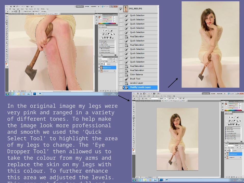
In the original image my legs were very pink and ranged in a variety of different tones. To help make the image look more professional and smooth we used the ‘Quick Select Tool’ to highlight the area of my legs to change. The ‘Eye Dropper Tool’ then allowed us to take the colour from my arms and replace the skin on my legs with this colour. To further enhance this area we adjusted the levels. This came out far too dull and pasty so we reverted back to the second original which was smooth and perfectly toned.
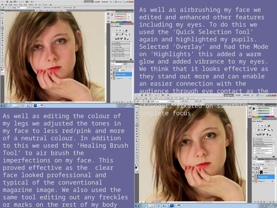
As well as editing the colour of my legs we adjusted the tones in my face to less red/pink and more of a neutral colour. In addition to this we used the ‘Healing Brush Tool’ to air brush the imperfections on my face. This proved effective as the clear face looked professional and typical of the conventional magazine image. We also used the same tool editing out any freckles or marks on the rest of my body shown. This was to ensure it looked ‘pure’ and stereotypical of the ‘perfect’ airbrushed skin.
As well as airbrushing my face we edited and enhanced other features including my eyes. To do this we used the ‘Quick Selection Tool’ again and highlighted my pupils. Selected ‘Overlay’ and had the Mode on ‘Highlights’ this added a warm glow and added vibrance to my eyes. We think that it looks effective as they stand out more and can enable an easier connection with the audience through eye contact as the vibrance helps to make them look stronger, fixated on something and complete focus.
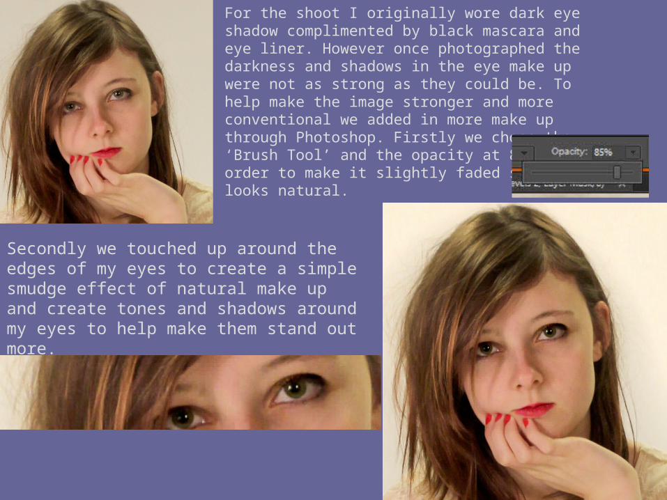
For the shoot I originally wore dark eye shadow complimented by black mascara and eye liner. However once photographed the darkness and shadows in the eye make up were not as strong as they could be. To help make the image stronger and more conventional we added in more make up through Photoshop. Firstly we chose the ‘Brush Tool’ and the opacity at 85% in order to make it slightly faded so as it looks natural.
Secondly we touched up around the edges of my eyes to create a simple smudge effect of natural make up and create tones and shadows around my eyes to help make them stand out more.
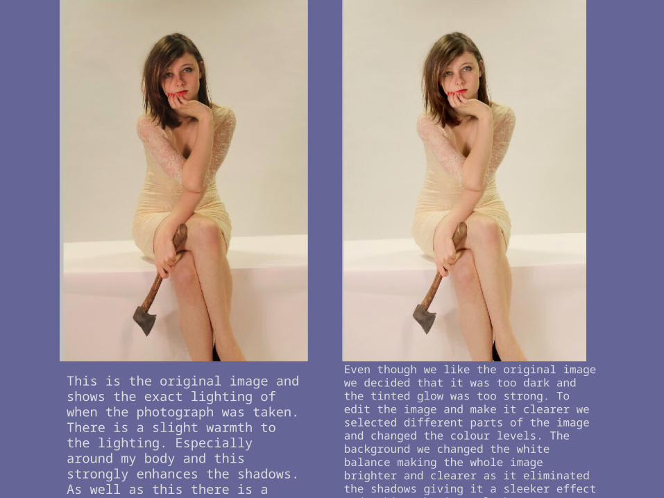
This is the original image and shows the exact lighting of when the photograph was taken. There is a slight warmth to the lighting. Especially around my body and this strongly enhances the shadows. As well as this there is a warm tint on my face making it darker and less clear.
Even though we like the original image we decided that it was too dark and the tinted glow was too strong. To edit the image and make it clearer we selected different parts of the image and changed the colour levels. The background we changed the white balance making the whole image brighter and clearer as it eliminated the shadows giving it a sleeker effect and making the image look more professional and typical of a magazine front cover image.