elements · indesign cs4, adobe photoshop cs4, ... creative direction farnsworth design ... now...
TRANSCRIPT

ElementsI P H O T O G R A P H I C I
I T E C H N I Q U E S IElementsElementsIElementsElementsP H O T O G R A P H I CElementsElementsIElements
I T E C H N I Q U E S IT E C H N I Q U E ST E C H N I Q U E S
CAMERARAW IN
ELEMENTSLEARN THE INS AND OUTS OF THE NEW CAMERA RAW
FEATURES IN ELEMENTS 11
RETOUCHINGWITH LIQUIFY
MATT KLOSKOWSKI
KEEP YOUR CAMERA
DUST FREEBEN LONG
GET ORGANIZED WITH LIGHTROOM
WHY LIGHTROOM IS THE BEST CHOICE TO ORGANIZE
YOUR IMAGES
JANUARY I FEBRUARY 2013
FC-JanFeb13.indd 1 12/13/12 8:42 PM
2 | Photographic Elements Techniques
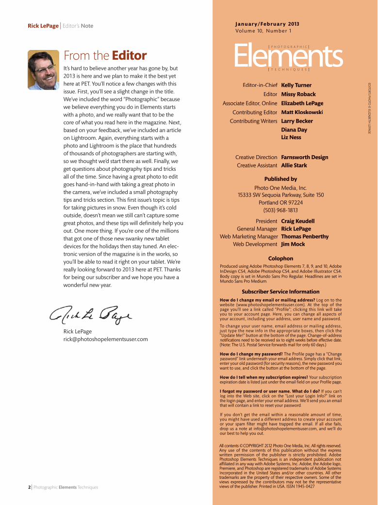
Rick LePage | Editor’s Note
EDITO
R’S PHO
TO ©
ELIZABETH LEPAG
E
J a n u a r y / Fe b r u a r y 2013Vol um e 10, Numbe r 1
ColophonProduced using Adobe Photoshop Elements 7, 8, 9, and 10, Adobe InDesign CS4, Adobe Photoshop CS4, and Adobe Illustrator CS4. Body copy is set in Mundo Sans Pro Regular. Headlines are set in Body copy is set in Mundo Sans Pro Regular. Headlines are set in Body copy is set in Mundo Sans Pro Regular. Headlines are setMundo Sans Pro Medium.
Subscriber Service InformationHow do I change my email or mailing address? Log on to the website (www.photoshopelementsuser.com). At the top of the page you’ll see a link called “Profile”; clicking this link will take you to your account page. Here, you can change all aspects of your account, including your address, user name and password.
To change your user name, email address or mailing address, just type the new info in the appropriate boxes, then click the “Update Me!” button at the bottom of the page. Change-of-address notifi cations need to be received six to eight weeks before e� ective date. (Note: The U.S. Postal Service forwards mail for only 60 days.)
How do I change my password? The Profile page has a “Change password” link underneath your email address. Simply click that link, enter your old password (for security reasons), the new password you want to use, and click the button at the bottom of the page.
How do I tell when my subscription expires? Your subscription expiration date is listed just under the email fi eld on your Profi le page.
I forgot my password or user name. What do I do? If you can’t log into the Web site, click on the “Lost your Login Info?” link on the login page, and enter your email address. We’ll send you an email that will contain a link to reset your password.
If you don’t get the email within a reasonable amount of time, you might have used a different address to create your account or your spam fi lter might have trapped the email. If all else fails, drop us a note at [email protected], and we’ll do our best to help you out.
From the Editor
All contents ©COPYRIGHT 2012 Photo One Media, Inc. All rights reserved. Any use of the contents of this publication without the express written permission of the publisher is strictly prohibited. Adobe Photoshop Elements Techniques is an independent publication not a� liated in any way with Adobe Systems, Inc. Adobe, the Adobe logo, Premiere, and Photoshop are registered trademarks of Adobe Systems Incorporated in the United States and/or other countries. All other trademarks are the property of their respective owners. Some of the views expressed by the contributors may not be the representative views of the publisher. Printed in USA. ISSN 1945-0427
Editor-in-Chief Kelly Turner
Editor Missy Roback
Associate Editor, Online Elizabeth LePage
Contributing Editor Matt Kloskowski
Contributing Writers Larry Becker
Diana Day Liz Ness Creative Direction Farnsworth Design
Creative Assistant Allie Stark Creative Assistant Allie Stark Creative Assistant
Published by
Photo One Media, Inc.15333 SW Sequoia Parkway, Suite 150
Portland OR 97224 (503) 968-1813
President Craig Keudell General Manager Rick LePageWeb Marketing Manager Thomas PenberthyWeb Marketing Manager Thomas PenberthyWeb Marketing Manager
Web Development Jim MockWeb Development Jim MockWeb Development
It’s hard to believe another year has gone by, but 2013 is here and we plan to make it the best yet here at PET. You’ll notice a few changes with this issue. First, you’ll see a slight change in the title. We’ve included the word “Photographic” because we believe everything you do in Elements starts with a photo, and we really want that to be the core of what you read here in the magazine. Next, based on your feedback, we’ve included an article on Lightroom. Again, everything starts with a photo and Lightroom is the place that hundreds of thousands of photographers are starting with, so we thought we’d start there as well. Finally, we get questions about photography tips and tricks all of the time. Since having a great photo to edit goes hand-in-hand with taking a great photo in the camera, we’ve included a small photography tips and tricks section. This fi rst issue’s topic is tips for taking pictures in snow. Even though it’s cold outside, doesn’t mean we still can’t capture some great photos, and these tips will defi nitely help you out. One more thing. If you’re one of the millions that got one of those new swanky new tablet devices for the holidays then stay tuned. An elec-tronic version of the magazine is in the works, so you’ll be able to read it right on your tablet. We’re really looking forward to 2013 here at PET. Thanks for being our subscriber and we hope you have a wonderful new year.
Rick [email protected]
02_TOC.indd 2 12/6/12 6:41 PM
January | February | 2013 Volume 10 | Number 1
January/February 2013 | 3
Contents
04 Put your own stamp on it Turn a photo into a type portrait with some creative brush-ing and custom text. By Diana Day
09 Create photos with an edge A border on a photograph is a bit like icing on a cake: It adds extra flavor, en-hancing the overall experience. By Liz Ness
23 Retouching photos with the Liquify tool The Liquify filter is one of the hidden gems in Elements. This article will show you a few different ways to take advan-tage of it for retouch-ing your photos. By Matt Kloskowski
26 Combining 3D text with a photo Take your 2-dimen-sional photo into the 3D world, with some creative text, shadows, and perspective adjustments. By Larry Becker
31 Keep your camera dust free How to prevent and remove sensor dust. By Ben Long
34 Photography tips and tricks Just because it’s cold out doesn’t mean there’s no picture opportuni-ties out there. Here’s 5 tips to help you make the most of the cold weather, and take some great photos during the winter months. By Matt Kloskowski
EXTRAS: DoubLE TAkE
Want to test how good your eye is? See if you can spot the differences in the two photos on page 36
Can You Spot The Differences?
Getting organized in LightroomThe organizer and Elements is a great place to start organizing your photos. but when you’re ready to jump to that next level, Lightroom is the place to beBy Matt Kloskowski
The new Camera Raw in Elements 11Learn the ins and outs of the lastest Adobe Camera Raw features in Photoshop Elements 11By Scott KelbyMatt Kloskowski
15
19
Lightroom & Elements TogetherLearn how to start out in Lightroom for your basic photo editing, and jump into Elements to finish things off.
EDITo
R’S PHo
To ©
ELIzAbETH LEPAg
E
ONLINE VIDEO
02_TOC.indd 3 12/7/12 7:30 AM
4 | Photographic Elements Techniques
Diana Day | Typographic Portraits
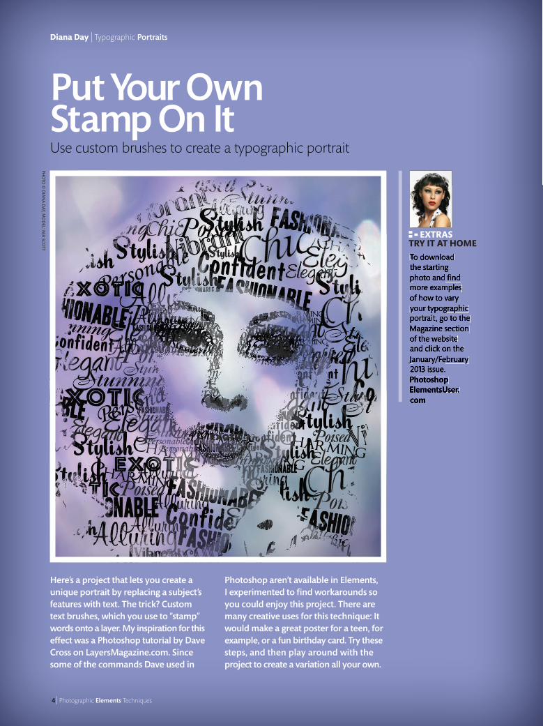
Here’s a project that lets you create a unique portrait by replacing a subject’s features with text. The trick? Custom text brushes, which you use to “stamp” words onto a layer. My inspiration for this e� ect was a Photoshop tutorial by Dave Cross on LayersMagazine.com. Since some of the commands Dave used in
Photoshop aren’t available in Elements, I experimented to fi nd workarounds so you could enjoy this project. There are many creative uses for this technique: It would make a great poster for a teen, for example, or a fun birthday card. Try these steps, and then play around with the project to create a variation all your own.
Put Your Own Stamp On It Use custom brushes to create a typographic portrait
To download the starting photo and fi nd more examples of how to vary your typographic portrait, go to the Magazine section of the website and click on the January/February 2013 issue. PhotoshopElementsUser.com
EXTRAS TRY IT AT HOME
PHO
TO ©
DIAN
A DAY, M
OD
EL: NIA SCO
TT
04_TypePortrait.indd 4 12/6/12 6:44 PM
Put your own stamp on it | Diana Day
January/February 2013 | 5
Techniques
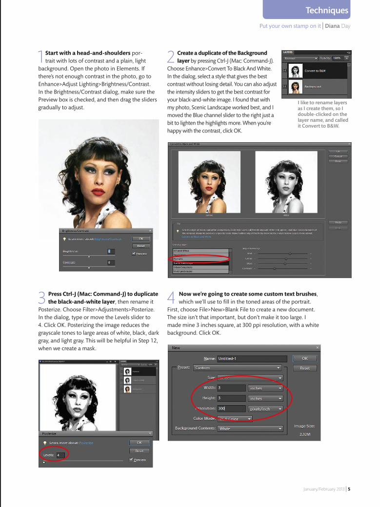
1 Start with a head-and-shoulders por-trait with lots of contrast and a plain, light
background. Open the photo in Elements. If there’s not enough contrast in the photo, go to Enhance>Adjust Lighting>Brightness/Contrast. In the Brightness/Contrast dialog, make sure the Preview box is checked, and then drag the sliders gradually to adjust.
2 Create a duplicate of the Background layer by pressing Ctrl-J (Mac: Command-J).
Choose Enhance>Convert To Black And White. In the dialog, select a style that gives the best contrast without losing detail. You can also adjust the intensity sliders to get the best contrast for your black-and-white image. I found that with my photo, Scenic Landscape worked best, and I moved the Blue channel slider to the right just a bit to lighten the highlights more. When you’re happy with the contrast, click OK.
3 Press Ctrl-J (Mac: Command-J) to duplicate the black-and-white layer, then rename it
Posterize. Choose Filter>Adjustments>Posterize. In the dialog, type or move the Levels slider to 4. Click OK. Posterizing the image reduces the grayscale tones to large areas of white, black, dark gray, and light gray. This will be helpful in Step 12, when we create a mask.
4 Now we’re going to create some custom text brushes, which we’ll use to fill in the toned areas of the portrait.
First, choose File>New>Blank File to create a new document. The size isn’t that important, but don’t make it too large. I made mine 3 inches square, at 300 ppi resolution, with a white background. Click OK.
I like to rename layers as I create them, so I double-clicked on the layer name, and called it Convert to B&W.
04_TypePortrait.indd 5 12/6/12 6:44 PM
6 | Photographic Elements Techniques
Diana Day | Typoraphic Portraits
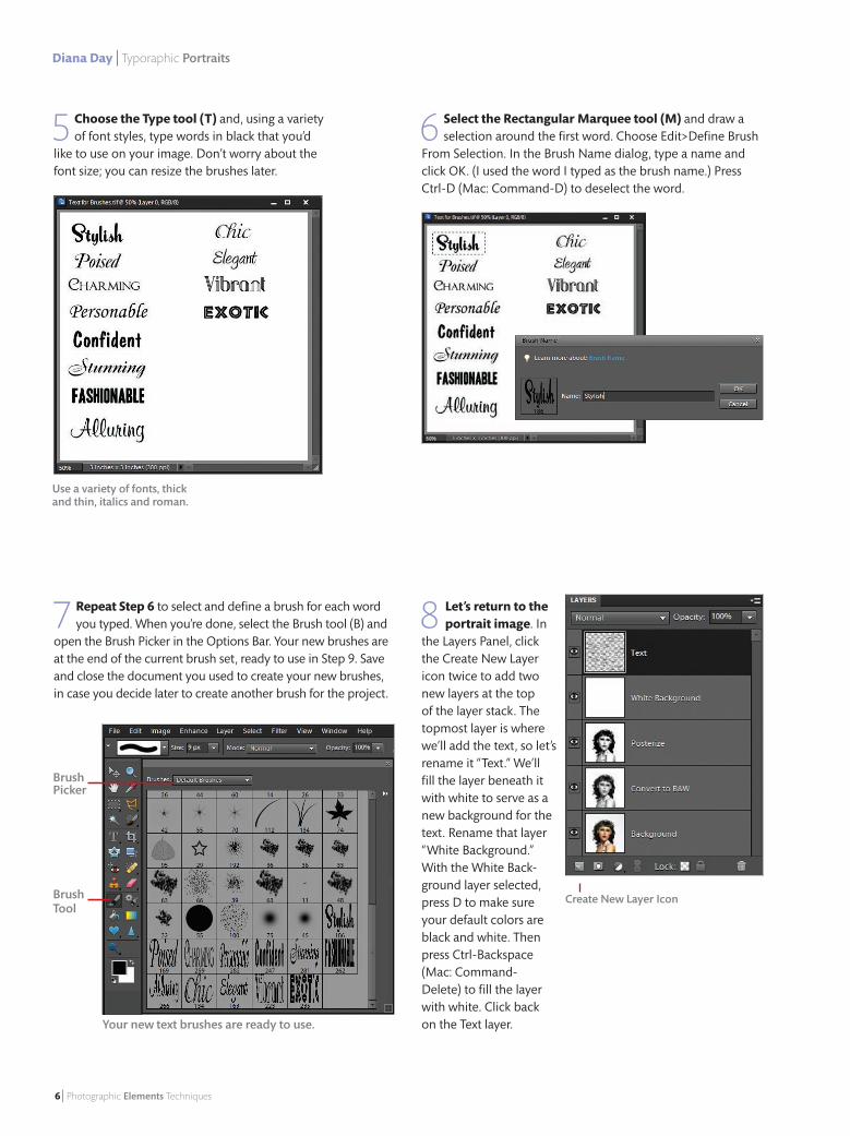
5 Choose the Type tool (T) and, using a variety of font styles, type words in black that you’d
like to use on your image. Don’t worry about the font size; you can resize the brushes later.
6 Select the Rectangular Marquee tool (M) and draw a selection around the first word. Choose Edit>Define Brush
From Selection. In the Brush Name dialog, type a name and click OK. (I used the word I typed as the brush name.) Press Ctrl-D (Mac: Command-D) to deselect the word.
7 Repeat Step 6 to select and define a brush for each word you typed. When you’re done, select the Brush tool (B) and
open the Brush Picker in the Options Bar. Your new brushes are at the end of the current brush set, ready to use in Step 9. Save and close the document you used to create your new brushes, in case you decide later to create another brush for the project.
8 Let’s return to the portrait image. In
the Layers Panel, click the Create New Layer icon twice to add two new layers at the top of the layer stack. The topmost layer is where we’ll add the text, so let’s rename it “Text.” We’ll fill the layer beneath it with white to serve as a new background for the text. Rename that layer “White Background.” With the White Back-ground layer selected, press D to make sure your default colors are black and white. Then press Ctrl-Backspace (Mac: Command-Delete) to fill the layer with white. Click back on the Text layer.
Use a variety of fonts, thick and thin, italics and roman.
Your new text brushes are ready to use.
Brush Picker
Brush Tool
Create New Layer Icon
04_TypePortrait.indd 6 12/6/12 6:44 PM
Put your own stamp on it | Diana Day
January/February 2013 | 7
Techniques
9 Now, let’s put our words to good use. From the Brush Picker in the Options Bar, choose a cus-
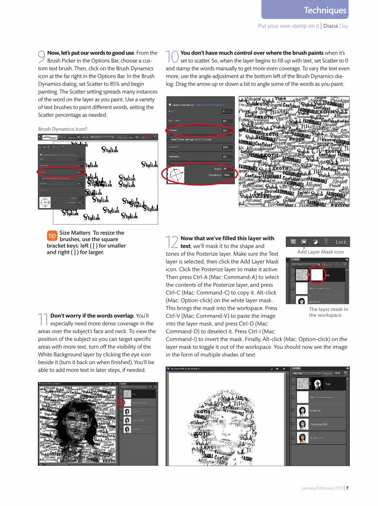
tom text brush. Then, click on the Brush Dynamics icon at the far right in the Options Bar. In the Brush Dynamics dialog, set Scatter to 85% and begin painting. The Scatter setting spreads many instances of the word on the layer as you paint. Use a variety of text brushes to paint different words, setting the Scatter percentage as needed.
10 You don’t have much control over where the brush paints when it’s set to scatter. So, when the layer begins to fill up with text, set Scatter to 0
and stamp the words manually to get more even coverage. To vary the text even more, use the angle adjustment at the bottom left of the Brush Dynamics dia-log. Drag the arrow up or down a bit to angle some of the words as you paint.
11 Don’t worry if the words overlap. You’ll especially need more dense coverage in the
areas over the subject’s face and neck. To view the position of the subject so you can target specific areas with more text, turn off the visibility of the White Background layer by clicking the eye icon beside it (turn it back on when finished). You’ll be able to add more text in later steps, if needed.
12 Now that we’ve filled this layer with text, we’ll mask it to the shape and
tones of the Posterize layer. Make sure the Text layer is selected, then click the Add Layer Mask icon. Click the Posterize layer to make it active. Then press Ctrl-A (Mac: Command-A) to select the contents of the Posterize layer, and press Ctrl-C (Mac: Command-C) to copy it. Alt-click (Mac: Option-click) on the white layer mask. This brings the mask into the workspace. Press Ctrl-V (Mac: Command-V) to paste the image into the layer mask, and press Ctrl-D (Mac: Command-D) to deselect it. Press Ctrl-I (Mac: Command-I) to invert the mask. Finally, Alt-click (Mac: Option-click) on the layer mask to toggle it out of the workspace. You should now see the image in the form of multiple shades of text.
Add Layer Mask icon
Size Matters To resize the brushes, use the square
bracket keys: left ( [ ) for smaller and right ( ] ) for larger.
Brush Dynamics Icon?
The layer mask in the workspace.
04_TypePortrait.indd 7 12/6/12 6:45 PM
8 | Photographic Elements Techniques
Diana Day | Typoraphic Portraits
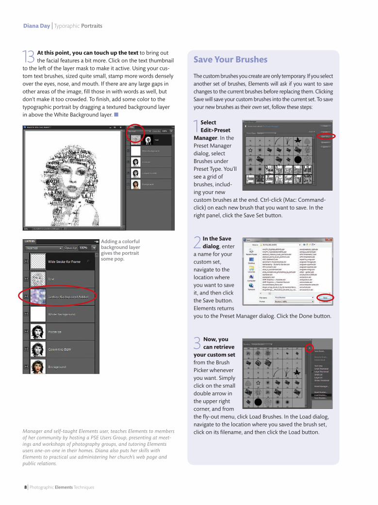
13 At this point, you can touch up the text to bring out the facial features a bit more. Click on the text thumbnail
to the left of the layer mask to make it active. Using your cus-tom text brushes, sized quite small, stamp more words densely over the eyes, nose, and mouth. If there are any large gaps in other areas of the image, fi ll those in with words as well, but don’t make it too crowded. To fi nish, add some color to the typographic portrait by dragging a textured background layer in above the White Background layer. ■
Adding a colorful background layer gives the portrait some pop.
Manager and self-taught Elements user, teaches Elements to members of her community by hosting a PSE Users Group, presenting at meet-ings and workshops of photography groups, and tutoring Elements users one-on-one in their homes. Diana also puts her skills with Elements to practical use administering her church’s web page and public relations.
Save Your Brushes
The custom brushes you create are only temporary. If you select another set of brushes, Elements will ask if you want to save changes to the current brushes before replacing them. Clicking Save will save your custom brushes into the current set. To save your new brushes as their own set, follow these steps:
1Select Edit>Preset
Manager. In the Preset Manager dialog, select Brushes under Preset Type. You’ll see a grid of brushes, includ-ing your new custom brushes at the end. Ctrl-click (Mac: Command-click) on each new brush that you want to save. In the right panel, click the Save Set button.
2 In the Save dialog, enter
a name for your custom set, navigate to the location where you want to save it, and then click the Save button. Elements returns you to the Preset Manager dialog. Click the Done button.
3 Now, you can retrieve
your custom setfrom the Brush Picker whenever you want. Simply click on the small double arrow in the upper right corner, and from the fl y-out menu, click Load Brushes. In the Load dialog, navigate to the location where you saved the brush set, click on its fi lename, and then click the Load button.
04_TypePortrait.indd 8 12/6/12 6:45 PM
January/February 2013 | 9
Liz Ness | Colorful Borders
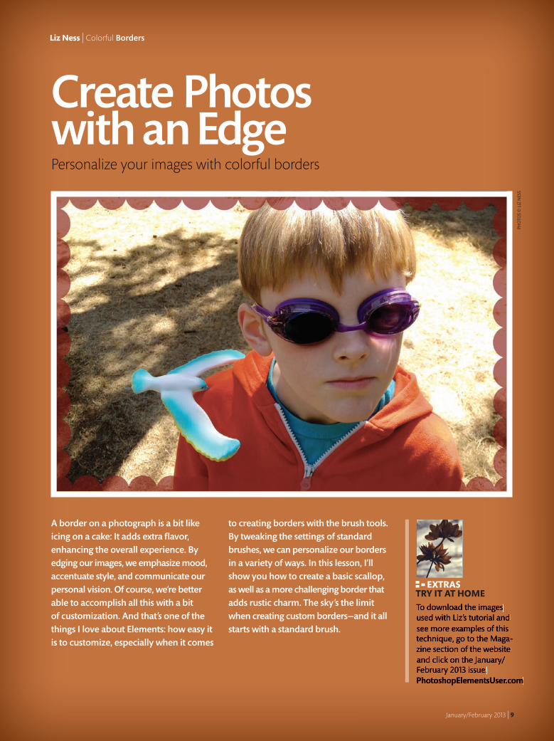
Create Photos with an Edge
A border on a photograph is a bit like icing on a cake: It adds extra fl avor, enhancing the overall experience. By edging our images, we emphasize mood, accentuate style, and communicate our personal vision. Of course, we’re better able to accomplish all this with a bit of customization. And that’s one of the things I love about Elements: how easy it is to customize, especially when it comes
to creating borders with the brush tools. By tweaking the settings of standard brushes, we can personalize our borders in a variety of ways. In this lesson, I’ll show you how to create a basic scallop, as well as a more challenging border that adds rustic charm. The sky’s the limit when creating custom borders—and it all starts with a standard brush.
Personalize your images with colorful borders
To download the images used with Liz’s tutorial and see more examples of this technique, go to the Maga-zine section of the website and click on the January/February 2013 issue.PhotoshopElementsUser.com
EXTRAS TRY IT AT HOME
PHO
TOS
© L
IZ N
ESS
09_Decorative-Edges.indd 9 12/6/12 6:46 PM

10 | Photographic Elements Techniques
Liz Ness | Colorful Borders
1 Open your image in Elements and create a new layer by pressing Shift-Ctrl-N (Mac: Shift-Command-N). With the
Eyedropper tool (I), select a color from your image. This will be the color of the scallops.
2 Choose the Brush tool (B) and in the Options Bar, click on the Brush Picker and select the
Hard Round 19-pixel brush.
3 Hover the brush over the image and use the Bracket keys ( [ or ] ) to adjust the brush size as desired. For the example, I increased the brush
to 110 pixels. Depending on the size of your image (or how large you’d like your scallop) you may need to set the size larger or smaller. Then, click on the Brush Dynamics icon at the far right in the Options Bar. In the Brush Dynamics dialog, set Spacing to 95% so the dots in the Brush Preset view are just barely touching each other.
4 Position your brush just inside the top left edge of the image and click the mouse.
Now, hold down the Shift key and reposition the brush just inside the top right edge of the image. Click the mouse again to lay down a horizontal line of dots. While still pressing the Shift key, reposition the brush just inside the right bottom edge of the image to lay down a vertical line of dots. Finally, release the Shift key.
I chose an orange shade from the boy’s jacket.
Caption about creating a new layer.
Click the Brush Dynamics icon to bring up the Brush Dynam-ics dialog.
The Brush Preset view displays the new spacing.
Brush Dynamics icon
Don’t worry if the dots don’t reach the very edge of a corner; we’ll resize the border later.
Scalloped BorderThe scallop, made with a standard brush, is both a classic border and a quick and playful way to edge an image.
09_Decorative-Edges.indd 10 12/6/12 6:46 PM
Create photos with an edge | Liz Ness
January/February 2013 | 11
Techniques
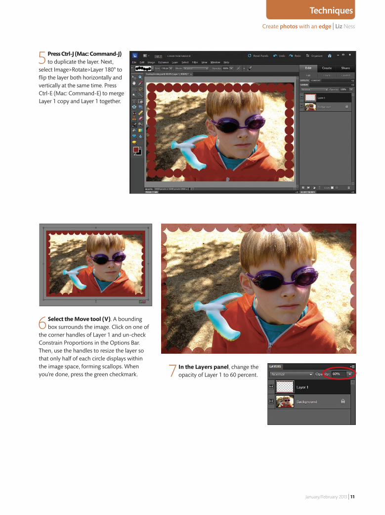
5 Press Ctrl-J (Mac: Command-J) to duplicate the layer. Next,
select Image>Rotate>Layer 180° to flip the layer both horizontally and vertically at the same time. Press Ctrl-E (Mac: Command-E) to merge Layer 1 copy and Layer 1 together.
6 Select the Move tool (V). A bounding box surrounds the image. Click on one of
the corner handles of Layer 1 and un-check Constrain Proportions in the Options Bar. Then, use the handles to resize the layer so that only half of each circle displays within the image space, forming scallops. When you’re done, press the green checkmark. 7 In the Layers panel, change the
opacity of Layer 1 to 60 percent.
09_Decorative-Edges.indd 11 12/6/12 6:46 PM

12 | Photographic Elements Techniques
Liz Ness | Colorful Borders
1 Open your image in Elements and create a new layer by pressing Shift-Ctrl-N (Mac: Shift-Command-N). Press D to
set the foreground and background colors to their defaults, and select the Paint Bucket tool (K). Fill the new layer (Layer 1) with black. Then, select the Rectangle Marque tool (M) and draw a rectangle just inside the image, forming a frame. Press Ctrl-X (Mac: Command-X) to cut the center from the frame.
2 Choose the Brush tool (B). In the Options Bar, click on the Brush Picker and select the Hard Round 19-pixel
brush. Click on the Brush Dynamics icon to bring up the Brush Dynamics dialog. There, set Fade, Hue, and Angle to zero, Scatter and Roundness to 5% and Spacing to 250%. Then, use the right bracket key ( ] ) to make the brush size slightly wider than the frame. For my example, I adjusted the brush size to 50 pixels.
3 Now we’re going to paint a pattern on
the foundation frame. First, create a new layer, then press X so that white is the foreground color. Position the brush over the top left corner of the frame and click the mouse. Hold down the Shift key, place the brush over the lower left corner of the frame, and click again to lay down a column of scattered lines. Release the Shift key. Repeat this process on the right side of the frame, clicking the mouse and holding down the Shift key to add another column of lines.
Rustic FrameNow that we’ve learned how to alter the spacing of a standard brush, let’s take our brush modifications to the next level. We’ll add a foundation frame, change our brush shape, and edge our image in rustic charm.
09_Decorative-Edges.indd 12 12/6/12 6:47 PM
January/February 2013 | 13
Techniques
Create photos with an edge | Liz Ness
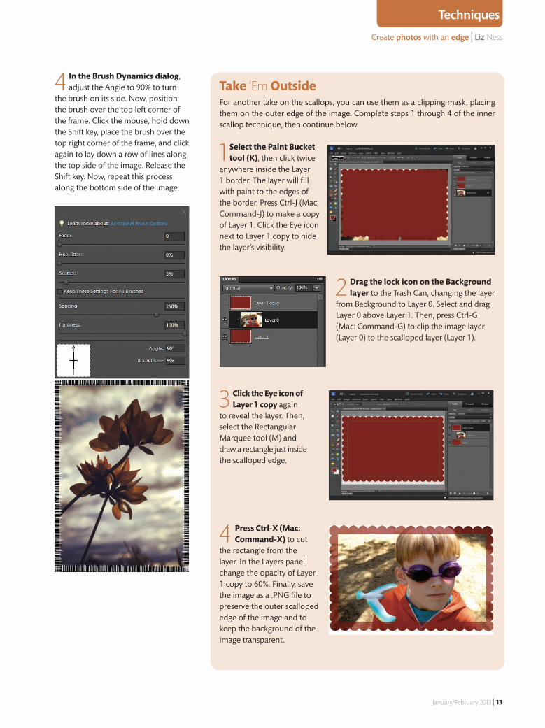
Take ‘Em OutsideFor another take on the scallops, you can use them as a clipping mask, placing them on the outer edge of the image. Complete steps 1 through 4 of the inner scallop technique, then continue below.
1 Select the Paint Bucket tool (K), then click twice
anywhere inside the Layer 1 border. The layer will fi ll with paint to the edges of the border. Press Ctrl-J (Mac: Command-J) to make a copy of Layer 1. Click the Eye icon next to Layer 1 copy to hide the layer’s visibility.
2 Drag the lock icon on the Background layer to the Trash Can, changing the layer
from Background to Layer 0. Select and drag Layer 0 above Layer 1. Then, press Ctrl-G (Mac: Command-G) to clip the image layer (Layer 0) to the scalloped layer (Layer 1).
3 Click the Eye icon of Layer 1 copy again
to reveal the layer. Then, select the Rectangular Marquee tool (M) and draw a rectangle just inside the scalloped edge.
4 Press Ctrl-X (Mac: Command-X) to cut
the rectangle from the layer. In the Layers panel, change the opacity of Layer 1 copy to 60%. Finally, save the image as a .PNG fi le to preserve the outer scalloped edge of the image and to keep the background of the image transparent.
4 In the Brush Dynamics dialog, adjust the Angle to 90% to turn
the brush on its side. Now, position the brush over the top left corner of the frame. Click the mouse, hold down the Shift key, place the brush over the top right corner of the frame, and click again to lay down a row of lines along the top side of the image. Release the Shift key. Now, repeat this process along the bottom side of the image.
09_Decorative-Edges.indd 13 12/6/12 6:47 PM
14 | Photographic Elements Techniques
Liz Ness | Colorful Borders
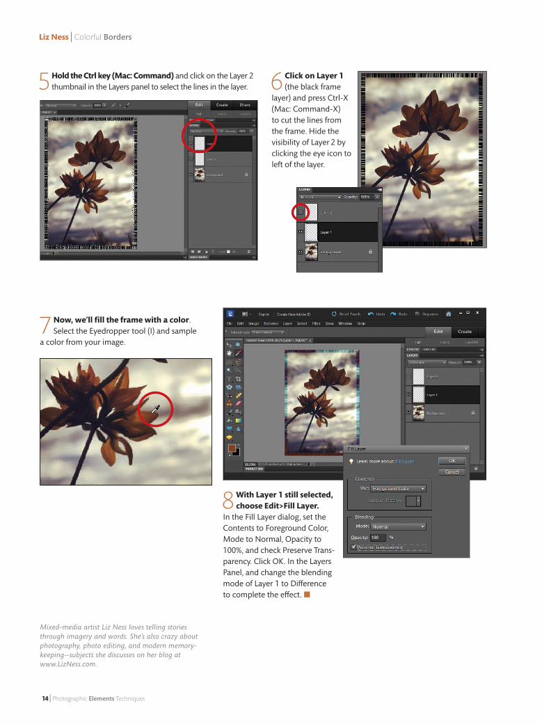
7 Now, we’ll fill the frame with a color. Select the Eyedropper tool (I) and sample
a color from your image.
8 With Layer 1 still selected, choose Edit>Fill Layer.
In the Fill Layer dialog, set the Contents to Foreground Color, Mode to Normal, Opacity to 100%, and check Preserve Trans-parency. Click OK. In the Layers Panel, and change the blending mode of Layer 1 to Difference to complete the effect. ■
Mixed-media artist Liz Ness loves telling stories through imagery and words. She’s also crazy about photography, photo editing, and modern memory-keeping—subjects she discusses on her blog at www.LizNess.com.
6 Click on Layer 1 (the black frame
layer) and press Ctrl-X (Mac: Command-X) to cut the lines from the frame. Hide the visibility of Layer 2 by clicking the eye icon to left of the layer.
5 Hold the Ctrl key (Mac: Command) and click on the Layer 2 thumbnail in the Layers panel to select the lines in the layer.
09_Decorative-Edges.indd 14 12/6/12 6:47 PM
Getting organized | Lightroom
January/February 2013 | 15
Feature
Liz Ness | Colorful Borders
steps to getting organized
in LightroomThe Organizer in Elements is a great place to start organizing your photos. But when you’re ready to jump to that next level, Lightroom is the place to be. Don’t worry, you can still use Elements for all of the layers, selections and adjustments you’re used to. But Lightroom has become the place where photographers start their workflow, as well as do their basic raw photo edits. One of the keys to success in Lightroom is organization. By planning ahead and keeping things simple, you’ll spend less time sorting through your catalog trying to locate photos.
This article is courtesy of our friends at the National
Association of Photoshop Professionals, and their premier
issue of Lightroom Magazine. Available in the iTunes App store
71 Choose A Good Folder Structure
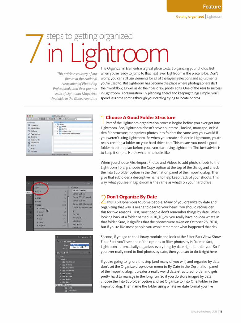
Part of the Lightroom organization process begins before you ever get into Lightroom. See, Lightroom doesn’t have an internal, locked, managed, or hid-den file structure; it organizes photos into folders the same way you would if you weren’t using Lightroom. So when you create a folder in Lightroom, you’re really creating a folder on your hard drive, too. This means you need a good folder structure plan before you even start using Lightroom. The best advice is to keep it simple. Here’s what mine looks like.
When you choose File>Import Photos and Videos to add photo shoots to the Lightroom library, choose the Copy option at the top of the dialog and check the Into Subfolder option in the Destination panel of the Import dialog. Then, give that subfolder a descriptive name to help keep track of your shoots. This way, what you see in Lightroom is the same as what’s on your hard drive
2 Don’t Organize By Date This is blasphemous to some people. Many of you organize by date and
organizing that way is near and dear to your heart. You should reconsider this for two reasons. First, most people don’t remember things by date. When looking back at a folder named 2010_10_28, you really have no idea what’s in that folder. Sure, it signifies that the photos were taken on October 28, 2010, but if you’re like most people you won’t remember what happened that day.
Second, if you go to the Library module and look at the Filter Bar (View>Show Filter Bar), you’ll see one of the options to filter photos by is Date. In fact, Lightroom automatically organizes everything by date right here for you. So if you ever really need to find photos by date, then you can to do it right here
If you’re going to ignore this step (and many of you will) and organize by date, don’t set the Organize drop-down menu to By Date in the Destination panel of the Import dialog. It creates a really weird date-structured folder and gets pretty hard to manage in the long run. So if you do store images by date, choose the Into Subfolder option and set Organize to Into One Folder in the Import dialog. Then name the folder using whatever date format you like
15_GettingOrganized_Feature.indd 15 12/7/12 7:50 AM
Getting organized | Lightroom
16 | Photographic Elements Techniques
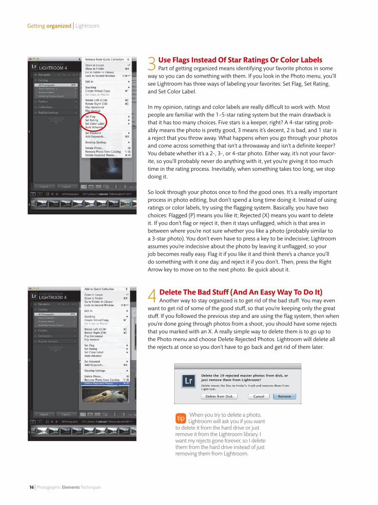
3 Use Flags Instead Of Star Ratings Or Color Labels Part of getting organized means identifying your favorite photos in some
way so you can do something with them. If you look in the Photo menu, you’ll see Lightroom has three ways of labeling your favorites: Set Flag, Set Rating, and Set Color Label.
In my opinion, ratings and color labels are really difficult to work with. Most people are familiar with the 1–5-star rating system but the main drawback is that it has too many choices. Five stars is a keeper, right? A 4-star rating prob-ably means the photo is pretty good, 3 means it’s decent, 2 is bad, and 1 star is a reject that you throw away. What happens when you go through your photos and come across something that isn’t a throwaway and isn’t a definite keeper? You debate whether it’s a 2-, 3-, or 4-star photo. Either way, it’s not your favor-ite, so you’ll probably never do anything with it, yet you’re giving it too much time in the rating process. Inevitably, when something takes too long, we stop doing it.
So look through your photos once to find the good ones. It’s a really important process in photo editing, but don’t spend a long time doing it. Instead of using ratings or color labels, try using the flagging system. Basically, you have two choices: Flagged (P) means you like it; Rejected (X) means you want to delete it. If you don’t flag or reject it, then it stays unflagged, which is that area in between where you’re not sure whether you like a photo (probably similar to a 3-star photo). You don’t even have to press a key to be indecisive; Lightroom assumes you’re indecisive about the photo by leaving it unflagged, so your job becomes really easy. Flag it if you like it and think there’s a chance you’ll do something with it one day, and reject it if you don’t. Then, press the Right Arrow key to move on to the next photo. Be quick about it.
4 Delete The Bad Stuff (And An Easy Way To Do It) Another way to stay organized is to get rid of the bad stuff. You may even
want to get rid of some of the good stuff, so that you’re keeping only the great stuff. If you followed the previous step and are using the flag system, then when you’re done going through photos from a shoot, you should have some rejects that you marked with an X. A really simple way to delete them is to go up to the Photo menu and choose Delete Rejected Photos. Lightroom will delete all the rejects at once so you don’t have to go back and get rid of them later.
When you try to delete a photo, Lightroom will ask you if you want
to delete it from the hard drive or just remove it from the Lightroom library. I want my rejects gone forever, so I delete them from the hard drive instead of just removing them from Lightroom.
15_GettingOrganized_Feature.indd 16 12/6/12 6:49 PM
Getting organized | Lightroom
January/February 2013 | 17
Feature
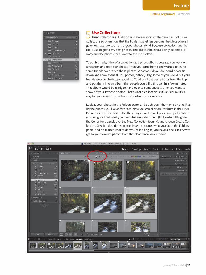
5 Use CollectionsUsing collections in Lightroom is more important than ever; in fact, I use
collections so often now that the Folders panel has become the place where I go when I want to see not-so-good photos. Why? Because collections are the tool I use to get to my best photos. The photos that should only be one click away and the photos that I want to see most often.
To put it simply, think of a collection as a photo album. Let’s say you went on a vacation and took 850 photos. Then you came home and wanted to invite some friends over to see those photos. What would you do? You’d never sit down and show them all 850 photos, right? (Okay, some of you would but your friends wouldn’t be happy about it.) You’d print the best photos from the trip and put them into an album that people could fl ip through in a few minutes. That album would be ready to hand over to someone any time you want to show o� your favorite photos. That’s what a collection is; it’s an album. It’s a way for you to get to your favorite photos in just one click.
Look at your photos in the Folders panel and go through them one by one. Flag (P) the photos you like as favorites. Now you can click on Attribute in the Filter Bar and click on the fi rst of the three fl ag icons to quickly see your picks. When you’ve fi gured out what your favorites are, select them (Edit>Select All), go to the Collections panel, click the New Collection icon (+), and choose Create Col-lection. Give it a descriptive name. Now, no matter what you do in the Folders panel, and no matter what folder you’re looking at, you have a one-click way to get to your favorite photos from that shoot from any module
15_GettingOrganized_Feature.indd 17 12/7/12 7:50 AM
Getting organized | Lightroom
18 | Photographic Elements Techniques
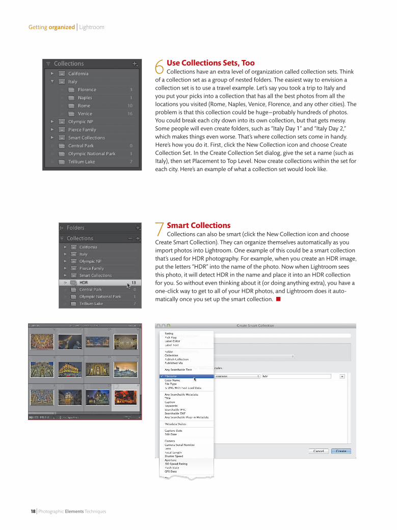
6 Use Collections Sets, TooCollections have an extra level of organization called collection sets. Think
of a collection set as a group of nested folders. The easiest way to envision a collection set is to use a travel example. Let’s say you took a trip to Italy and you put your picks into a collection that has all the best photos from all the locations you visited (Rome, Naples, Venice, Florence, and any other cities). The problem is that this collection could be huge—probably hundreds of photos. You could break each city down into its own collection, but that gets messy. Some people will even create folders, such as “Italy Day 1” and “Italy Day 2,” which makes things even worse. That’s where collection sets come in handy. Here’s how you do it. First, click the New Collection icon and choose Create Collection Set. In the Create Collection Set dialog, give the set a name (such as Italy), then set Placement to Top Level. Now create collections within the set for each city. Here’s an example of what a collection set would look like.
7 Smart Collections Collections can also be smart (click the New Collection icon and choose
Create Smart Collection). They can organize themselves automatically as you import photos into Lightroom. One example of this could be a smart collection that’s used for HDR photography. For example, when you create an HDR image, put the letters “HDR” into the name of the photo. Now when Lightroom sees this photo, it will detect HDR in the name and place it into an HDR collection for you. So without even thinking about it (or doing anything extra), you have a one-click way to get to all of your HDR photos, and Lightroom does it auto-matically once you set up the smart collection. ■
15_GettingOrganized_Feature.indd 18 12/6/12 6:49 PM
New Camera Raw Essentials | Elements 11
January/February 2013 | 19
Feature
Liz Ness | Colorful Borders
The New Camera Raw Essentials In Elements 11:
Setting the exposureIn Elements 11, Adobe not only changed the way some sliders work in Camera Raw, but they actually changed the sliders (and names) themselves. We’ll usually use these sliders to set the overall exposure and tone of the
photo. But exposure in Camera Raw isn’t just the Exposure slider. It’s actually five sliders: Exposure (midtones), Blacks (deep shadows), Shadows (regular shadows), Highlights (well-named), and Whites (extreme highlights).
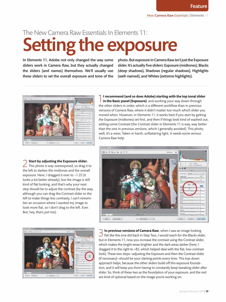
1 I recommend (and so does Adobe) starting with the top tonal slider in the Basic panel (Exposure) and working your way down through
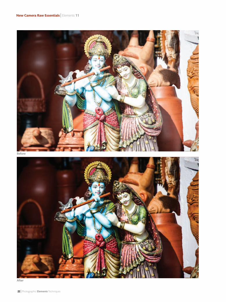
the other sliders in order, which is a different workflow than in previous versions of Camera Raw, where it didn’t matter too much which slider you moved when. However, in Elements 11, it works best if you start by getting the Exposure (midtones) set first, and then if things look kind of washed out, adding some Contrast (the Contrast slider in Elements 11 is way, way better than the one in previous versions, which I generally avoided). This photo, well, it’s a mess. Taken in harsh, unflattering light, it needs some serious Camera Raw help.
2 Start by adjusting the Exposure slider. This photo is way overexposed, so drag it to
the left to darken the midtones and the overall exposure. Here, I dragged it over to –1.25 (it looks a lot better already), but the image is still kind of flat looking, and that’s why your next step should be to adjust the contrast (by the way, although you can drag the Contrast slider to the left to make things less contrasty, I can’t remem-ber an occasion where I wanted my image to look more flat, so I don’t drag to the left. Ever. But, hey, that’s just me).
3 In previous versions of Camera Raw, when I saw an image looking flat like this one did back in Step Two, I would reach for the Blacks slider,
but in Elements 11, now you increase the contrast using the Contrast slider, which makes the bright areas brighter and the dark areas darker (here, I dragged it to the right to +82, which helped deal with the flat, low-contrast look). These two steps—adjusting the Exposure and then the Contrast slider (if necessary)—should be your starting points every time. This top-down approach helps, because the other sliders build off this exposure founda-tion, and it will keep you from having to constantly keep tweaking slider after slider. So, think of these two as the foundation of your exposure, and the rest are kind of optional based on the image you’re working on.
19_CameraRaw_Feature.indd 19 12/7/12 6:46 AM

New Camera Raw Essentials | Elements 11
20 | Photographic Elements Techniques
4 Before we go any further, increasing our contrast to where we wanted it created a clipping problem, meaning
we are clipping off our highlights (part of our photo got so bright that it won’t have any detail in that area at all. It’s blown out. If all that sounds bad, well, that’s ’cause it is). Luckily, Camera Raw will give you a warning if you’re clipping, in the upper-right corner of the histogram. See that triangle? That’s the highlight clipping warning (although I just call it “the white triangle of death”). Now, if you do see a white triangle, don’t freak out. First, go up and click directly on that white triangle and the areas that are clipping will appear in red (look on her arm). We do this to find out if what’s clipping is an area of important detail, or if it’s like a tiny highlight on a chrome bumper or something meaningless in the background of your image.
5 If that red highlight shows over an area you feel has important detail (her arm and other
areas here certainly seem important to me), go to the Highlights slider and drag it to the left until the red areas disappear (here, I dragged the Highlights slider to the left to –18). For those of you upgrad-ing from an earlier version of Camera Raw, I kind of hesitate to say this replaces the Recovery slider, because there’s more going on than just that, due to the way Adobe reworked the Exposure slider. Now when you adjust the Exposure slider, there’s less chance of clipping than ever before, so it’s kind of like the Exposure slider has some built-in Recovery power, too! That being said, I still look to the Highlights slider to recover clipped highlights first, and then if that doesn’t do the trick, I try lowering the Exposure amount, but I rarely have to do that.
6 The next slider down, Shadows, is another one you only use if there’s a problem ( just
like the Highlights slider), and in this case, the problem is we can’t see any detail in the upper-left corner of the photo. We can see that something’s there, but we can’t see exactly what. That’s when you reach for the Shadows slider—drag it to the right to brighten the shad-ows (like I did here, where I dragged it over to +87) and look how you can now see the pottery in the background.
The Color Warning Triangles If you see a red, yellow, magenta,
etc., color warning triangle (rather than white), it’s not great, but it’s not nearly as bad as white. It means you’re clipping just that one color channel (and there’s still detail in the other channels).
19_CameraRaw_Feature.indd 20 12/7/12 6:46 AM
New Camera Raw Essentials | Elements 11
January/February 2013 | 21
Feature
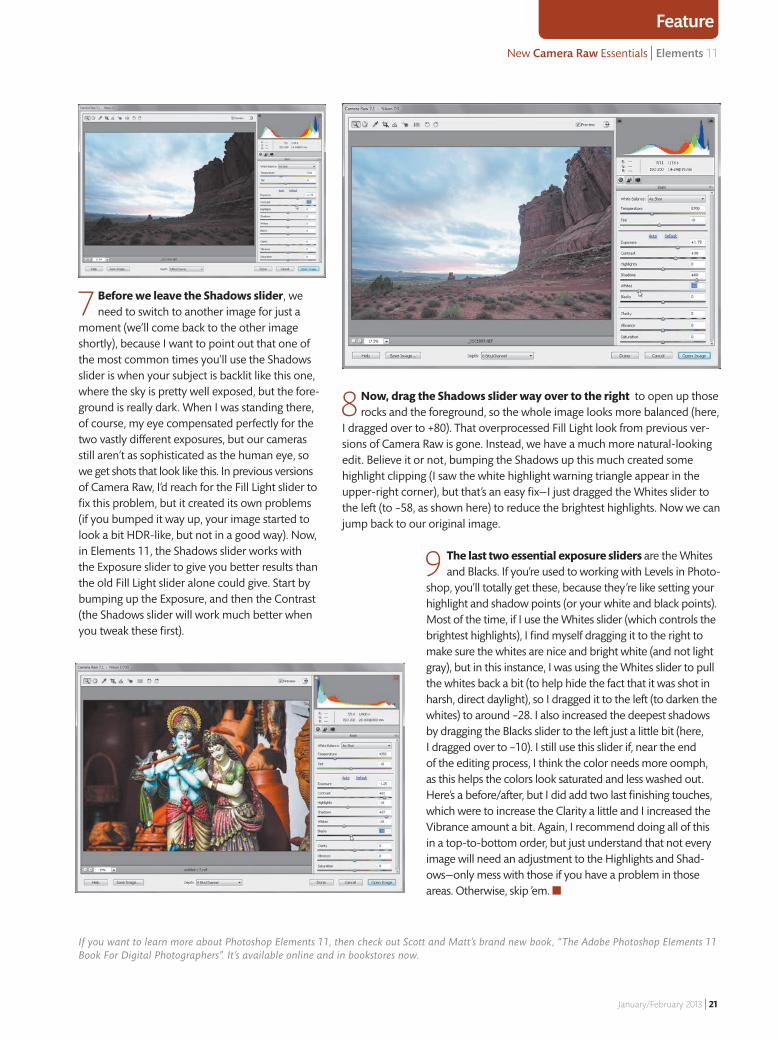
9 The last two essential exposure sliders are the Whites and Blacks. If you’re used to working with Levels in Photo-
shop, you’ll totally get these, because they’re like setting your highlight and shadow points (or your white and black points). Most of the time, if I use the Whites slider (which controls the brightest highlights), I find myself dragging it to the right to make sure the whites are nice and bright white (and not light gray), but in this instance, I was using the Whites slider to pull the whites back a bit (to help hide the fact that it was shot in harsh, direct daylight), so I dragged it to the left (to darken the whites) to around –28. I also increased the deepest shadows by dragging the Blacks slider to the left just a little bit (here, I dragged over to –10). I still use this slider if, near the end of the editing process, I think the color needs more oomph, as this helps the colors look saturated and less washed out. Here’s a before/after, but I did add two last finishing touches, which were to increase the Clarity a little and I increased the Vibrance amount a bit. Again, I recommend doing all of this in a top-to-bottom order, but just understand that not every image will need an adjustment to the Highlights and Shad-ows—only mess with those if you have a problem in those areas. Otherwise, skip ’em. ■
7 Before we leave the Shadows slider, we need to switch to another image for just a
moment (we’ll come back to the other image shortly), because I want to point out that one of the most common times you’ll use the Shadows slider is when your subject is backlit like this one, where the sky is pretty well exposed, but the fore-ground is really dark. When I was standing there, of course, my eye compensated perfectly for the two vastly different exposures, but our cameras still aren’t as sophisticated as the human eye, so we get shots that look like this. In previous versions of Camera Raw, I’d reach for the Fill Light slider to fix this problem, but it created its own problems (if you bumped it way up, your image started to look a bit HDR-like, but not in a good way). Now, in Elements 11, the Shadows slider works with the Exposure slider to give you better results than the old Fill Light slider alone could give. Start by bumping up the Exposure, and then the Contrast (the Shadows slider will work much better when you tweak these first).
8 Now, drag the Shadows slider way over to the right to open up those rocks and the foreground, so the whole image looks more balanced (here,
I dragged over to +80). That overprocessed Fill Light look from previous ver-sions of Camera Raw is gone. Instead, we have a much more natural-looking edit. Believe it or not, bumping the Shadows up this much created some highlight clipping (I saw the white highlight warning triangle appear in the upper-right corner), but that’s an easy fix—I just dragged the Whites slider to the left (to –58, as shown here) to reduce the brightest highlights. Now we can jump back to our original image.
If you want to learn more about Photoshop Elements 11, then check out Scott and Matt’s brand new book, “The Adobe Photoshop Elements 11 Book For Digital Photographers”. It’s available online and in bookstores now.
19_CameraRaw_Feature.indd 21 12/7/12 6:47 AM
New Camera Raw Essentials | Elements 11
22 | Photographic Elements Techniques
Before
After
19_CameraRaw_Feature.indd 22 12/7/12 6:47 AM
Matt Kloskowski | Liquify Filter
January/February 2013 | 23
With a Nip aNd atuck
Make subtle corrections to your images with the Liquify filter
The Liquify filter is one of the hidden gems of Photo-shop Elements. It lets you twist, twirl, and otherwise distort parts of an image in a variety of ways, producing effects ranging from subtle to extreme. It’s the extreme
side of the spectrum, however, that has given Liquify a bad rap: The filter is often used as a nip/tuck tool—and like plastic surgery, the results can be all too obvious. But when the filter is used correctly—and, more importantly, sparingly—it can be a great retouching tool, especially for fixing nagging little details in portraits. Best of all, your subjects will never know they had a little work done.
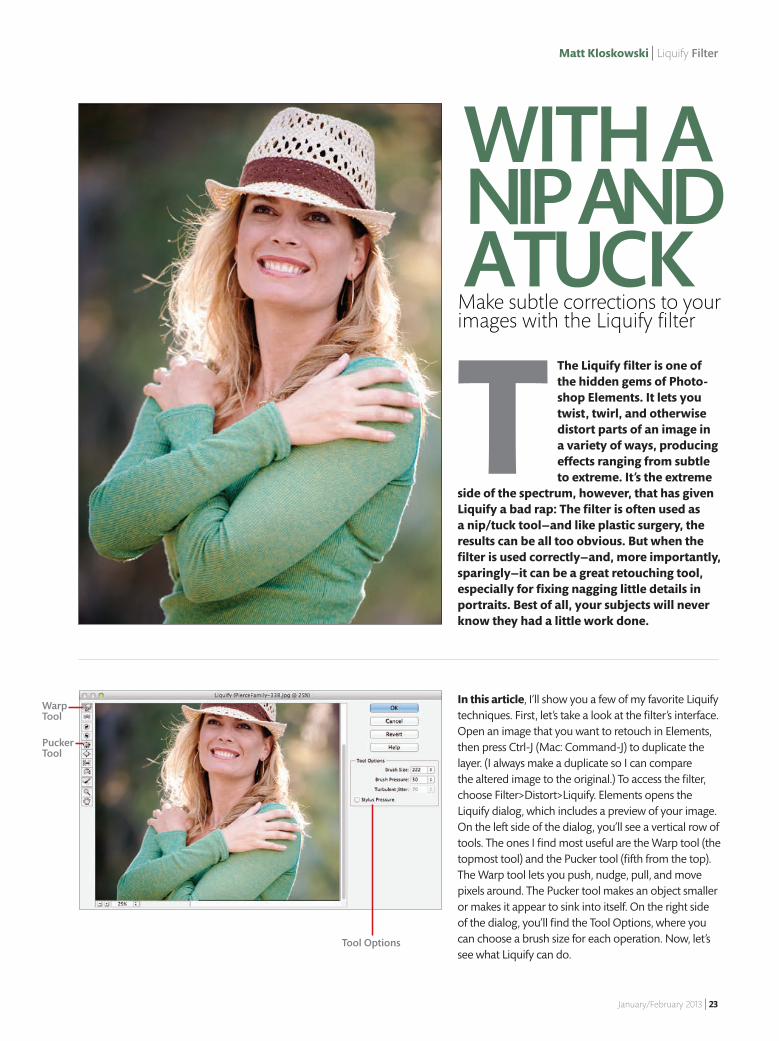
In this article, I’ll show you a few of my favorite Liquify techniques. First, let’s take a look at the filter’s interface. Open an image that you want to retouch in Elements, then press Ctrl-J (Mac: Command-J) to duplicate the layer. (I always make a duplicate so I can compare the altered image to the original.) To access the filter, choose Filter>Distort>Liquify. Elements opens the Liquify dialog, which includes a preview of your image. On the left side of the dialog, you’ll see a vertical row of tools. The ones I find most useful are the Warp tool (the topmost tool) and the Pucker tool (fifth from the top). The Warp tool lets you push, nudge, pull, and move pixels around. The Pucker tool makes an object smaller or makes it appear to sink into itself. On the right side of the dialog, you’ll find the Tool Options, where you can choose a brush size for each operation. Now, let’s see what Liquify can do.
tool Options
Warp tool
pucker tool
T
23_Liquify.indd 23 12/7/12 7:53 AM
24 | Photographic Elements Techniques
Matt Kloskowski | Liquify Filter
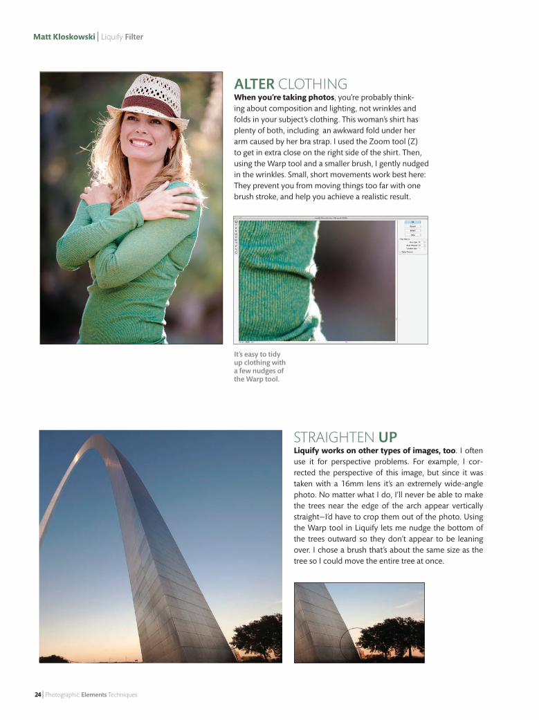
STraighTen Up Liquify works on other types of images, too. I often use it for perspective problems. For example, I cor-rected the perspective of this image, but since it was taken with a 16mm lens it’s an extremely wide-angle photo. No matter what I do, I’ll never be able to make the trees near the edge of the arch appear vertically straight—I’d have to crop them out of the photo. Using the Warp tool in Liquify lets me nudge the bottom of the trees outward so they don’t appear to be leaning over. I chose a brush that’s about the same size as the tree so I could move the entire tree at once.
AltEr CloThing When you’re taking photos, you’re probably think-ing about composition and lighting, not wrinkles and folds in your subject’s clothing. This woman’s shirt has plenty of both, including an awkward fold under her arm caused by her bra strap. I used the Zoom tool (Z) to get in extra close on the right side of the shirt. Then, using the Warp tool and a smaller brush, I gently nudged in the wrinkles. Small, short movements work best here: They prevent you from moving things too far with one brush stroke, and help you achieve a realistic result.
It’s easy to tidy up clothing with a few nudges of the Warp tool.
23_Liquify.indd 24 12/7/12 7:53 AM
With a nip and a tuck | Matt Kloskowski
January/February 2013 | 25
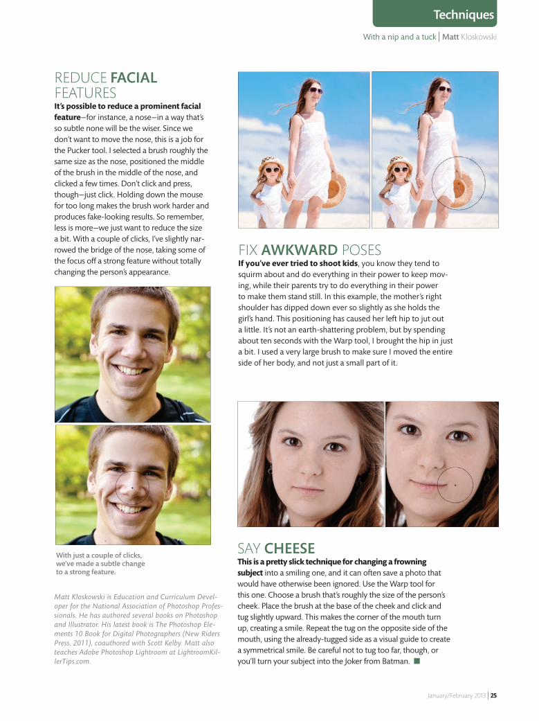
Techniques
Fix AwkwArd PosesIf you’ve ever tried to shoot kids, you know they tend to squirm about and do everything in their power to keep mov-ing, while their parents try to do everything in their power to make them stand still. In this example, the mother’s right shoulder has dipped down ever so slightly as she holds the girl’s hand. This positioning has caused her left hip to jut out a little. It’s not an earth-shattering problem, but by spending about ten seconds with the Warp tool, I brought the hip in just a bit. I used a very large brush to make sure I moved the entire side of her body, and not just a small part of it.
say CheeseThis is a pretty slick technique for changing a frowning subject into a smiling one, and it can often save a photo that would have otherwise been ignored. Use the Warp tool for this one. Choose a brush that’s roughly the size of the person’s cheek. Place the brush at the base of the cheek and click and tug slightly upward. This makes the corner of the mouth turn up, creating a smile. Repeat the tug on the opposite side of the mouth, using the already-tugged side as a visual guide to create a symmetrical smile. Be careful not to tug too far, though, or you’ll turn your subject into the Joker from Batman. ■
Matt Kloskowski is Education and Curriculum Devel-oper for the National Association of Photoshop Profes-sionals. He has authored several books on Photoshop and Illustrator. His latest book is The Photoshop Ele-ments 10 Book for Digital Photographers (New Riders Press, 2011), coauthored with Scott Kelby. Matt also teaches Adobe Photoshop Lightroom at LightroomKil-lerTips.com.
with just a couple of clicks, we’ve made a subtle change to a strong feature.
ReDUCe FACIALFeaTURes It’s possible to reduce a prominent facial feature—for instance, a nose—in a way that’s so subtle none will be the wiser. Since we don’t want to move the nose, this is a job for the Pucker tool. I selected a brush roughly the same size as the nose, positioned the middle of the brush in the middle of the nose, and clicked a few times. Don’t click and press, though—just click. Holding down the mouse for too long makes the brush work harder and produces fake-looking results. So remember, less is more—we just want to reduce the size a bit. With a couple of clicks, I’ve slightly nar-rowed the bridge of the nose, taking some of the focus off a strong feature without totally changing the person’s appearance.
23_Liquify.indd 25 12/7/12 7:53 AM

26 | Photographic Elements Techniques
Larry Day | Add Dimension
Adding 3D text to an image in Ele-ments isn’t an automatic process, but it can be done. Unfortunately, I’ve seen many instances of text placed on a fl at, horizontal surface, which looks pretty unconvincing. However, it’s quite possible to create a believable looking scene with 3D text. Over the next few pages, I’ll show you how to scale text properly to simulate perspective, create realistic shadows, and make
elements of your photograph overlap with the text. A couple things will help when creating this e� ect. Start with an image that has shadows and an identifi -able light source so that when you add simulated shadows, you’ll have an idea where to place them. As for the text, a sans serif typeface with a thick stroke works best. And use all caps—you don’t want any descenders dipping below the baseline.
Make a Scene with 3D TextAdd new dimensions to your images with shadows and perspective
To download the image used with Larry’s tutorial and see further examples of this technique, go to the Magazine section of the website and click on the January/February 2013 issue. PhotoshopElementsUser.com
EXTRAS TRY IT AT HOME
IMAG
E © ???
26_3D.indd 26 12/6/12 6:53 PM
Make a scene with 3D text | Larry Becker
January/February 2013 | 27
Techniques
imag
e © ???
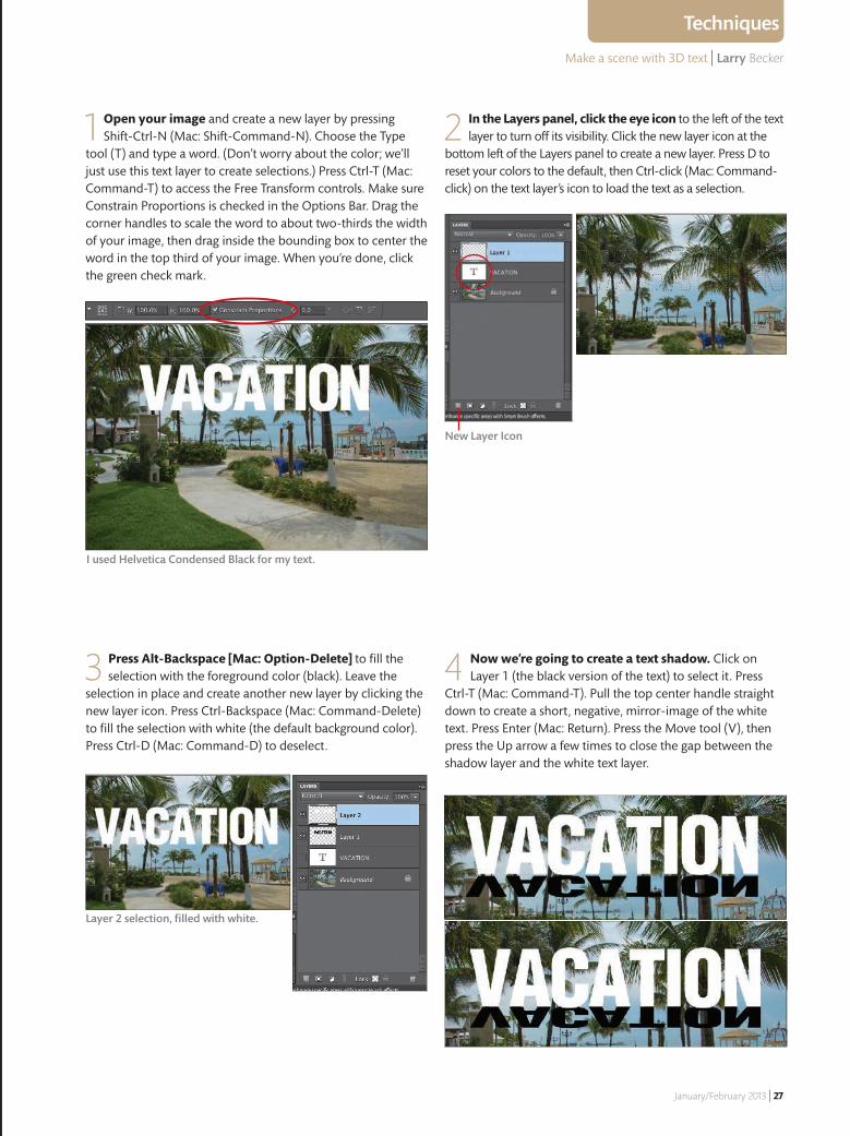
1 Open your image and create a new layer by pressing Shift-Ctrl-N (mac: Shift-Command-N). Choose the Type
tool (T) and type a word. (Don’t worry about the color; we’ll just use this text layer to create selections.) Press Ctrl-T (mac: Command-T) to access the Free Transform controls. make sure Constrain Proportions is checked in the Options Bar. Drag the corner handles to scale the word to about two-thirds the width of your image, then drag inside the bounding box to center the word in the top third of your image. When you’re done, click the green check mark.
I used Helvetica Condensed Black for my text.
2 In the Layers panel, click the eye icon to the left of the text layer to turn off its visibility. Click the new layer icon at the
bottom left of the Layers panel to create a new layer. Press D to reset your colors to the default, then Ctrl-click (mac: Command-click) on the text layer’s icon to load the text as a selection.
3 Press Alt-Backspace [Mac: Option-Delete] to fill the selection with the foreground color (black). Leave the
selection in place and create another new layer by clicking the new layer icon. Press Ctrl-Backspace (mac: Command-Delete) to fill the selection with white (the default background color). Press Ctrl-D (mac: Command-D) to deselect.
4 Now we’re going to create a text shadow. Click on Layer 1 (the black version of the text) to select it. Press
Ctrl-T (mac: Command-T). Pull the top center handle straight down to create a short, negative, mirror-image of the white text. Press enter (mac: Return). Press the move tool (V), then press the Up arrow a few times to close the gap between the shadow layer and the white text layer.
New Layer Icon
Layer 2 selection, filled with white.
26_3D.indd 27 12/6/12 6:53 PM
28 | Photographic Elements Techniques
Larry Becker | Add Dimension
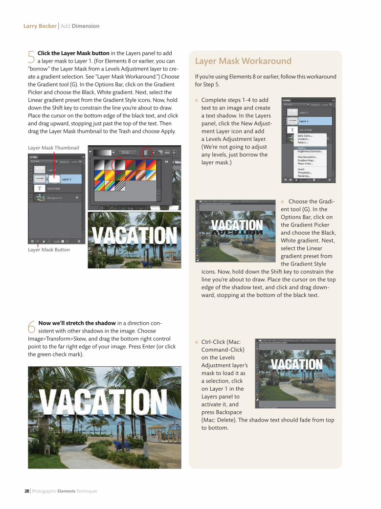
5 Click the Layer Mask button in the Layers panel to add a layer mask to Layer 1. (For Elements 8 or earlier, you can
“borrow” the Layer Mask from a Levels Adjustment layer to cre-ate a gradient selection. See “Layer Mask Workaround.”) Choose the Gradient tool (G). In the Options Bar, click on the Gradient Picker and choose the Black, White gradient. Next, select the Linear gradient preset from the Gradient Style icons. Now, hold down the Shift key to constrain the line you’re about to draw. Place the cursor on the bottom edge of the black text, and click and drag upward, stopping just past the top of the text. Then drag the Layer Mask thumbnail to the Trash and choose Apply.
6 Now we’ll stretch the shadow in a direction con-sistent with other shadows in the image. Choose
Image>Transform>Skew, and drag the bottom right control point to the far right edge of your image. Press Enter (or click the green check mark).
Layer Mask Button
Layer Mask Thumbnail
Layer Mask Workaround
If you’re using Elements 8 or earlier, follow this workaround for Step 5.
■ Complete steps 1-4 to add text to an image and create a text shadow. In the Layers panel, click the New Adjust-ment Layer icon and add a Levels Adjustment layer. (We’re not going to adjust any levels, just borrow the layer mask.)
■ Choose the Gradi-ent tool (G). In the Options Bar, click on the Gradient Picker and choose the Black, White gradient. Next, select the Linear gradient preset from the Gradient Style
icons. Now, hold down the Shift key to constrain the line you’re about to draw. Place the cursor on the top edge of the shadow text, and click and drag down-ward, stopping at the bottom of the black text.
■ Ctrl-Click (Mac: Command-Click) on the Levels Adjustment layer’s mask to load it as a selection, click on Layer 1 in the Layers panel to activate it, and press Backspace (Mac: Delete). The shadow text should fade from top to bottom.
26_3D.indd 28 12/6/12 6:53 PM
Make a scene with 3D text | Larry Becker
January/February 2013 | 29
Techniques
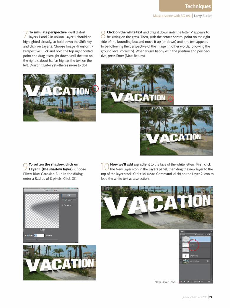
9 To soften the shadow, click on Layer 1 (the shadow layer). Choose
Filter>Blur>Gaussian Blur. In the dialog, enter a Radius of 8 pixels. Click OK.
10 Now we’ll add a gradient to the face of the white letters. First, click the New Layer icon in the Layers panel, then drag the new layer to the
top of the layer stack. Ctrl-click (Mac: Command-click) on the Layer 2 icon to load the white text as a selection.
7 To simulate perspective, we’ll distort layers 1 and 2 in unison. Layer 1 should be
highlighted already, so hold down the Shift key and click on Layer 2. Choose Image>Transform> Perspective. Click and hold the top right control point and drag it straight down until the text on the right is about half as high as the text on the left. Don’t hit Enter yet—there’s more to do!
8 Click on the white text and drag it down until the letter V appears to be sitting on the grass. Then, grab the center control point on the right
side of the bounding box and move it up (or down) until the text appears to be following the perspective of the image (in other words, following the ground level correctly). When you’re happy with the position and perspec-tive, press Enter (Mac: Return).
New Layer Icon
26_3D.indd 29 12/6/12 6:53 PM
30 | Photographic Elements Techniques
Larry Becker | Add Dimension
Slant It Your Gradient drag
may not be <<exactly>> straight down because of the way the letters are distorted for perspec-tive. Try dragging almost straight down and slightly to the right. If you don’t like how it looks, press Ctrl-Z (Mac: Com-mand-Z) and try again at a slightly different angle.
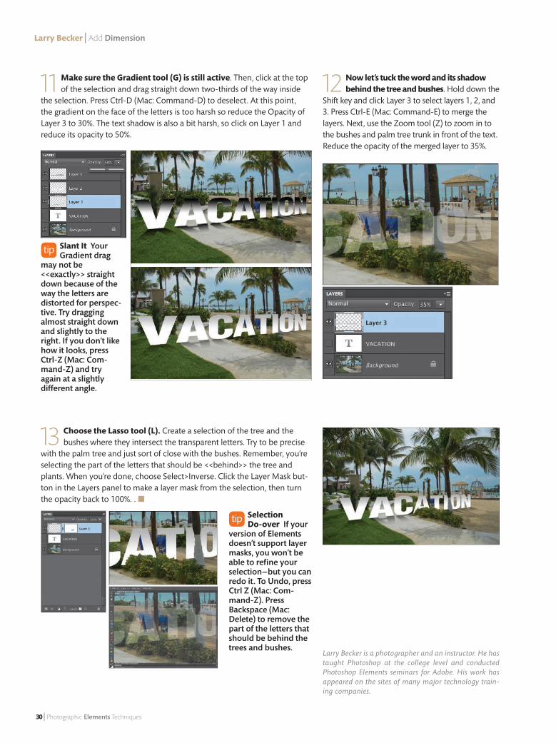
11 Make sure the Gradient tool (G) is still active. Then, click at the top of the selection and drag straight down two-thirds of the way inside
the selection. Press Ctrl-D (Mac: Command-D) to deselect. At this point, the gradient on the face of the letters is too harsh so reduce the Opacity of Layer 3 to 30%. The text shadow is also a bit harsh, so click on Layer 1 and reduce its opacity to 50%.
12 Now let’s tuck the word and its shadow behind the tree and bushes. Hold down the
Shift key and click Layer 3 to select layers 1, 2, and 3. Press Ctrl-E (Mac: Command-E) to merge the layers. Next, use the Zoom tool (Z) to zoom in to the bushes and palm tree trunk in front of the text. Reduce the opacity of the merged layer to 35%.
13 Choose the Lasso tool (L). Create a selection of the tree and the bushes where they intersect the transparent letters. Try to be precise
with the palm tree and just sort of close with the bushes. Remember, you’re selecting the part of the letters that should be <<behind>> the tree and plants. When you’re done, choose Select>Inverse. Click the Layer Mask but-ton in the Layers panel to make a layer mask from the selection, then turn the opacity back to 100%. . ■
Larry Becker is a photographer and an instructor. He has taught Photoshop at the college level and conducted Photoshop Elements seminars for Adobe. His work has appeared on the sites of many major technology train-ing companies.
Selection Do-over If your
version of Elements doesn’t support layer masks, you won’t be able to refine your selection—but you can redo it. To Undo, press Ctrl Z (Mac: Com-mand-Z). Press Backspace (Mac: Delete) to remove the part of the letters that should be behind the trees and bushes.
26_3D.indd 30 12/6/12 6:55 PM

January/February 2013 | 31
Keep your camera dust free | Ben Long
There’s no question the single-lens refl ex (SLR) camera is a favorite among photographers. Because it accepts a variety of lenses, it o� ers a greater deal of fl exibility than a point-and-shoot does. But SLRs do have a downside: They’re much more vulnerable to dust. Whenever you remove the lens from your camera, dust can get inside the camera’s mirror chamber, the hollow cavity that sits just behind the lens. From there, the dust can land on the image sensor, the silicon chip located at the very back of the camera. When this happens, you’ll see small spots, smudges, or dark blotches on your images, like those near the top of the photo, above.
How to prevent and remove sensor dust
WATER PH
OTO
© RICK LEPAG
E, ALL OTH
ER PHO
TOS ©
BEN LO
NG
Mirror
Mirror Chamber
If your SLR doesn’t have a mirror, you’ll see only the sensor—it looks like a colorful hologram—when you remove the lens.
Keep your camera
dust-free
30_DUST.indd 31 12/6/12 7:22 PM
32 | Photographic Elements Techniques
Ben Long | Prevent and remove sensor dust
KEEP THE SENSOR CLEANING SYSTEM ON
Most SLRs have a built-in sensor cleaning mechanism that vibrates the sensor every time you turn the camera on. This vibration shakes o� most dust particles, which are then trapped by a small adhesive on the bottom of the mirror chamber. By default, this system is turned on, and it’s best to leave it that way. It shouldn’t interfere with your camera’s boot-up time: Most cameras automatically stop cleaning if you press the shutter button halfway. (If you think the cleaning cycle is keeping you from shooting as quickly as you’d like, you can probably set the camera to clean the sensor only when the power is turned o� . See your camera’s manual for details.)
Preventing Sensor DustWhile you can clean the sensor, the best way to deal with sensor dust is to avoid it in the fi rst place. Here are a few tips.
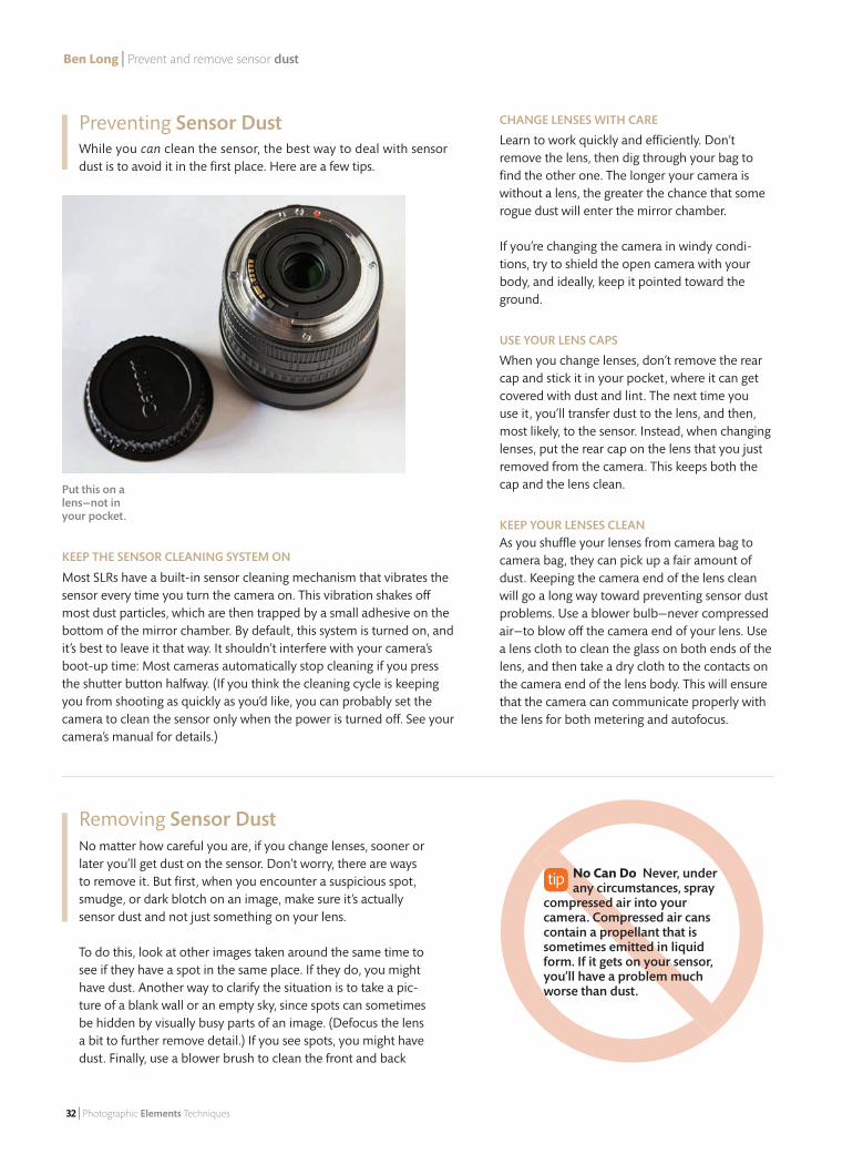
Put this on a lens—not in your pocket.
No Can Do Never, under any circumstances, spray
compressed air into your camera. Compressed air cans contain a propellant that is sometimes emitted in liquid form. If it gets on your sensor, you’ll have a problem much worse than dust.
Removing Sensor DustNo matter how careful you are, if you change lenses, sooner or later you’ll get dust on the sensor. Don’t worry, there are ways to remove it. But fi rst, when you encounter a suspicious spot, smudge, or dark blotch on an image, make sure it’s actually sensor dust and not just something on your lens.
To do this, look at other images taken around the same time to see if they have a spot in the same place. If they do, you might have dust. Another way to clarify the situation is to take a pic-ture of a blank wall or an empty sky, since spots can sometimes be hidden by visually busy parts of an image. (Defocus the lens a bit to further remove detail.) If you see spots, you might have dust. Finally, use a blower brush to clean the front and back
CHANGE LENSES WITH CARE
Learn to work quickly and e� ciently. Don’t remove the lens, then dig through your bag to fi nd the other one. The longer your camera is without a lens, the greater the chance that some rogue dust will enter the mirror chamber.
If you’re changing the camera in windy condi-tions, try to shield the open camera with your body, and ideally, keep it pointed toward the ground.
USE YOUR LENS CAPS
When you change lenses, don’t remove the rear cap and stick it in your pocket, where it can get covered with dust and lint. The next time you use it, you’ll transfer dust to the lens, and then, most likely, to the sensor. Instead, when changing lenses, put the rear cap on the lens that you just removed from the camera. This keeps both the cap and the lens clean.
KEEP YOUR LENSES CLEANAs you shu� e your lenses from camera bag to camera bag, they can pick up a fair amount of dust. Keeping the camera end of the lens clean will go a long way toward preventing sensor dust problems. Use a blower bulb—never compressed air—to blow o� the camera end of your lens. Use a lens cloth to clean the glass on both ends of the lens, and then take a dry cloth to the contacts on the camera end of the lens body. This will ensure that the camera can communicate properly with the lens for both metering and autofocus.
30_DUST.indd 32 12/6/12 7:22 PM
Keep your camera dust free | Ben Long
January/February 2013 | 33
Photo Tip
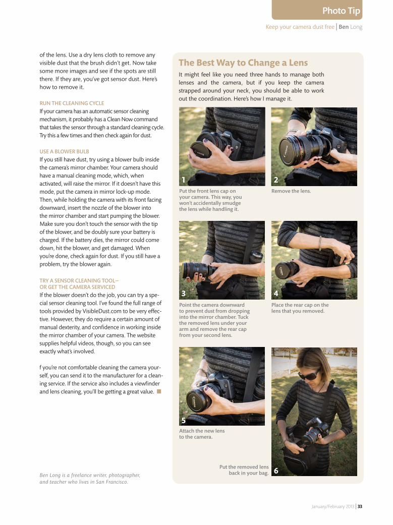
The Best Way to Change a LensIt might feel like you need three hands to manage both lenses and the camera, but if you keep the camera strapped around your neck, you should be able to work out the coordination. Here’s how I manage it.
Put the front lens cap on your camera. This way, you won’t accidentally smudge the lens while handling it.
Remove the lens.
1 2
Point the camera downward to prevent dust from dropping into the mirror chamber. Tuck the removed lens under your arm and remove the rear cap from your second lens.
Place the rear cap on the lens that you removed.
Attach the new lens to the camera.
Put the removed lens back in your bag.
3
5
4
6
RUN THE CLEANING CYCLEIf your camera has an automatic sensor cleaning mechanism, it probably has a Clean Now command that takes the sensor through a standard cleaning cycle. Try this a few times and then check again for dust.
USE A BLOWER BULB If you still have dust, try using a blower bulb inside the camera’s mirror chamber. Your camera should have a manual cleaning mode, which, when activated, will raise the mirror. If it doesn’t have this mode, put the camera in mirror lock-up mode. Then, while holding the camera with its front facing downward, insert the nozzle of the blower into the mirror chamber and start pumping the blower. Make sure you don’t touch the sensor with the tip of the blower, and be doubly sure your battery is charged. If the battery dies, the mirror could come down, hit the blower, and get damaged. When you’re done, check again for dust. If you still have a problem, try the blower again.
TRY A SENSOR CLEANING TOOL—OR GET THE CAMERA SERVICEDIf the blower doesn’t do the job, you can try a spe-cial sensor cleaning tool. I’ve found the full range of tools provided by VisibleDust.com to be very e� ec-tive. However, they do require a certain amount of manual dexterity, and confi dence in working inside the mirror chamber of your camera. The website supplies helpful videos, though, so you can see exactly what’s involved.
f you’re not comfortable cleaning the camera your-self, you can send it to the manufacturer for a clean-ing service. If the service also includes a viewfi nder and lens cleaning, you’ll be getting a great value. ■
of the lens. Use a dry lens cloth to remove any visible dust that the brush didn’t get. Now take some more images and see if the spots are still there. If they are, you’ve got sensor dust. Here’s how to remove it.
Ben Long is a freelance writer, photographer, and teacher who lives in San Francisco.
30_DUST.indd 33 12/6/12 7:23 PM
Matt Kloskowski | Photography Tips & Tricks
34 | Photographic Elements Techniques
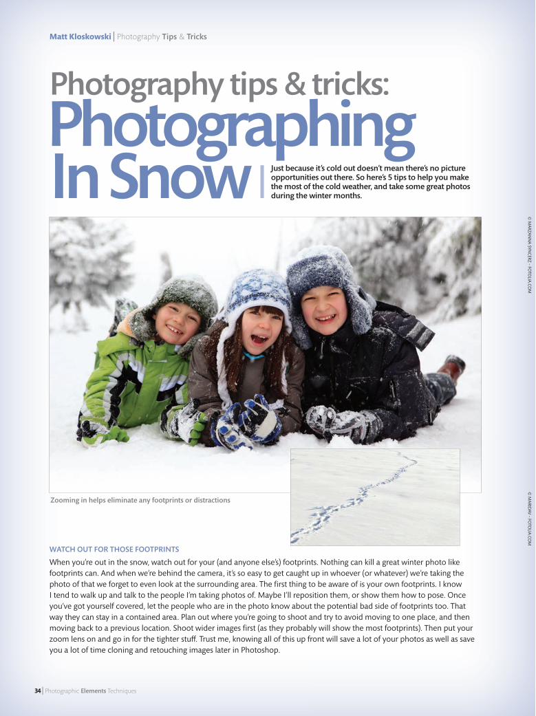
WATCH OUT FOR THOSE FOOTPRINTS
When you’re out in the snow, watch out for your (and anyone else’s) footprints. Nothing can kill a great winter photo like footprints can. And when we’re behind the camera, it’s so easy to get caught up in whoever (or whatever) we’re taking the photo of that we forget to even look at the surrounding area. The fi rst thing to be aware of is your own footprints. I know I tend to walk up and talk to the people I’m taking photos of. Maybe I’ll reposition them, or show them how to pose. Once you’ve got yourself covered, let the people who are in the photo know about the potential bad side of footprints too. That way they can stay in a contained area. Plan out where you’re going to shoot and try to avoid moving to one place, and then moving back to a previous location. Shoot wider images fi rst (as they probably will show the most footprints). Then put your zoom lens on and go in for the tighter stu� . Trust me, knowing all of this up front will save a lot of your photos as well as save you a lot of time cloning and retouching images later in Photoshop.
© M
ARZANN
A SYNCERZ - FO
TOLIA
.COM
Zooming in helps eliminate any footprints or distractions
Photography tips & tricks:
Photographing In Snow Just because it’s cold out doesn’t mean there’s no picture
opportunities out there. So here’s 5 tips to help you make the most of the cold weather, and take some great photos during the winter months.
© M
ARIDAV - FO
TOLIA
.COM
34_Photo_Tips_Tricks.indd 34 12/6/12 7:06 PM
Photographing In Snow | Matt Kloskowski
January/February 2013 | 35
Photo Tip
© M
ARZANN
A SYNCERZ - FO
TOLIA
.COM
Okay, while I mentioned earlier that nothing can kill a beautiful winter photo like footprints can, there’s nothing that can stop your photo shoot before it happens, like your lens/camera fogging up. Whenever you move from the cold into the heat (whether it’s indoors or a heated car), you risk fog and condensation on your lens and inner elements of the camera. But it’s not the foggy stu� we see on our eyeglasses that you can just wipe o� . It actually fogs up inside where you can’t wipe it o� . When that happens, the only thing to do is wait for 20-30 minutes until it goes away. Depending on what you’re photographing, you can totally miss out on the shoot because of it. One way around it is to put your camera in the environment it’s going to be in about 30 minutes before you’re ready to use it. Another little trick we use, if you want to go that extra step, is to try putting your camera in a plastic bag and sucking all the air out while you’re still out in the cold. Then move it into the heat and wait about 10 minutes before you take it out.
DON’T WEAR
WHITE!ASK THE
PEOPLE IN YOUR PHOTOS
TO WEAR BRIGHT COLORS
© JÖ
RG H
ACKEMAN
N - FO
TOLIA
.COM
© M
ARIDAV - FO
TOLIA
.COM
TAKE EXTRA BATTERIESIf you’re going to be out in the cold for a while, then you’ll want to take some extra batteries. Whether it’s with your point-and-shoot or your DSLR, the cold eats up batteries faster than if it were warm out. I generally assume that if it’s around freezing temperatures my batteries will drain twice as fast as they normally would. If it’s even colder, then I’ll assume even faster than that. So if you plan to be out for a few hours bring an extra battery (or three) with you. Oh… and here’s a tip within a tip. Try putting the extra battery in a warm place. If you have someone staying in a warm car, leave it with them. Keep it in your pocket or any place that’ll keep it warmer than it would be in an exterior pocket on your camera bag. See… two tips in one!
MAKE SURE YOUR PHOTO IS BRIGHT ENOUGHYou probably know that your camera makes a lot of decisions for you. One of the biggest decisions it makes is the right exposure for your scene. Most of the time it does a great job at it. But when you’re shooting outside in the snow, you’ll fi nd your photos tend to be too dark. That’s because your camera sees this mass of white as it looks at the scene and decides that, in order to make a correct exposure, it should underexpose a little. Because of that, you’ll fi nd your outdoor snow photos tend to look dark, especially any people in the photos. One way to help out is to use the exposure compen-sation feature on your camera to override the camera’s choice, and tell it you’d like to overexpose the photo a little. How much really depends on the scene you’re looking at. So try overexposing at the camera’s smallest adjust-ment and then increase from there until the people (or whatever subject you’re shooting) is bright enough.
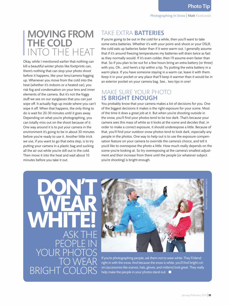
If you’re photographing people, ask them not to wear white. They’ll blend right in with the snow. And because the snow is white, you’ll fi nd bright col-ors (accessories like scarves, hats, gloves, and mittens) look great. They really help make the people in your photos stand out. ■
MOVING FROM THE COLD INTO THE HEAT
34_Photo_Tips_Tricks.indd 35 12/6/12 7:06 PM
36 | Photographic Elements Techniques
Double Double Take
Double | Take
Photo Tip
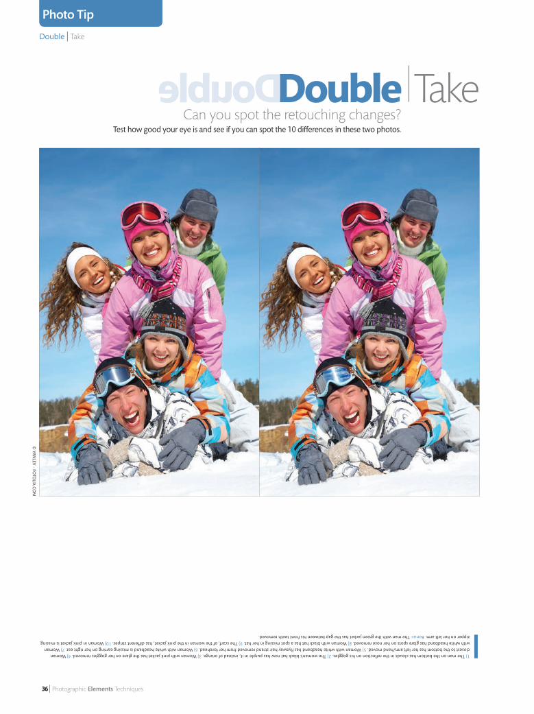
Can you spot the retouching changes?Test how good your eye is and see if you can spot the 10 differences in these two photos.
1) The man on the bottom has clouds in the reflection on his goggles. 2) The woman’s black hat now has purple in it, instead of orange. 3) Woman with pink jacket has the glare on her goggles removed. 4) Woman closest to the bottom has her left arm/hand moved. 5) Woman with white headband has flyaway hair strand removed from her forehead. 6) Woman with white headband is missing earring on her right ear. 7) Woman with white headband has glare spots on her nose removed. 8) Woman with black hat has a spot missing in her hat. 9) The scarf, of the woman in the pink jacket, has different stripes. 10) Woman in pink jacket is missing zipper on her left arm. Bonus: The man with the green jacket has the gap between his front teeth removed.
© Yan
lev - FoTo
lia.co
m
33_DoubleTake.indd 36 12/6/12 7:34 PM