enhancing peoplesoft with custom look and feel...enhancing peoplesoft with custom look and feel todd...
TRANSCRIPT

Enhancing PeopleSoft with Custom Look and Feel
Todd Kummer

2
Objective
Share what we’ve learned about how to design highly usable PeopleSoft applications.

3
Agenda
• Why is usability important?
• Thinking differently about PeopleTools
• What’s possible?
• Knowing the problem before designing the solution
• The perils of data model driven design
• How to avoid common PeopleTools pitfalls

4
Good Usability
• Infrequently used functionality is out of the way (minimal clutter)
• Minimal number of clicks required for most users (minimal “clickiness”)
• User doesn’t need instructions, but help is readily available
• "No matter how beautiful, no matter how cool your interface, it would be better if there were less of it." -Alan Cooper

5
Good Usability
• Benefits
– Reduced training
– Reduced support call volume
– Higher productivity
– Fewer mistakes
– High utilization / less enforcement
– Happy, loyal users
6
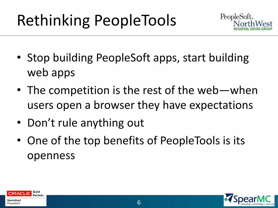
Rethinking PeopleTools
• Stop building PeopleSoft apps, start building web apps
• The competition is the rest of the web—when users open a browser they have expectations
• Don’t rule anything out
• One of the top benefits of PeopleTools is its openness
7
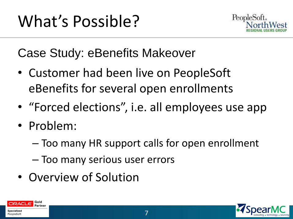
What’s Possible?
• Customer had been live on PeopleSoft eBenefits for several open enrollments
• “Forced elections”, i.e. all employees use app
• Problem:
– Too many HR support calls for open enrollment
– Too many serious user errors
• Overview of Solution
Case Study: eBenefits Makeover

8
What’s Possible?
• Results:
– 95% reduction in support calls
– Zero serious errors to date
– CEO – “I actually did it myself … now that is simple.”
– Relations Specialist – “I was done in less than 5 minutes, even after comparing 3-4 different enrollment options”
– IT Engineer – “Holy crap that was awesome!”

What’s the Problem?
• Be careful when handed a solution without requirements
• If you are designing the solution, make sure the requirements correctly identify the problem
• Example: Rating Distribution Charts

10
What’s the Problem?
• Mockups
– Non-functional, “sketches” of user interface
– Powerful tool for correctly identifying the problem
– Increases likelihood design will make sense to the users
– Example: Cerner eBenefits makeover

Initial
White
Board

Wireframe mockup in Balsamiq

Final mockup
in Excel

14
What’s the Problem?
Mockups (cont.)
– Iterative: Create mockup based on known requirements, get user feedback, repeat
– Progressive: Increasing levels of detail; focus evolves from functionality to visual design
– Low tech: Excel, Balsamiq, white board, pen and paper!

15
Data Model Driven Design
• Traditionally pages look a lot like tables
• PeopleTools is a very good rapid application development tool, not a design tool

16
Data Model Driven Design
• Solution 1: Folders
– Start with the main information
– Provide the ability to see additional information in context
– Example: ePerformance Documents

17
Data Model Driven Design

18
Data Model Driven Design
• Solution 2: Multipane Pages
– Divide the page into multiple, independent panes
– Each pane displays a component/page or other content
– Example: Staffing Workbench

Data Model Driven Design

20
Avoiding PeopleTools Pitfalls
• Effective Dating
– Traditional method of exposing effective date to user can result in unnecessary clutter
– Effective dating should only be as prominent as it is important to the user
– Example: ePerformance Goal Manager


24
Avoiding PeopleTools Pitfalls
• Switching Modes: Fields available to specify dependent on mode or initial criteria
– Traditional method of hiding and unhiding fields based on user selection can be confusing
– Distinguish the mode selection from other criteria
– Provide a consistent page
– Example: Allocation Workbench Search

25
Avoiding PeopleTools Pitfalls

26
Avoiding PeopleTools Pitfalls
• The standard color palette
– Don’t be afraid to use color
– But…use it mostly to guide the user, not to decorate
– Example: Cerner eBenefits

27
Avoiding PeopleTools Pitfalls
• The standard search dialog
– Powerful, but limited ability to customize look & feel
– What navigation mechanism would get most users to exactly what they are interested in with the fewest clicks?
– Example: Employee Relations Case Management


Questions?
Enhancing PeopleSoft with
Custom Look and Feel