ethompson - unit 13: lo4
TRANSCRIPT
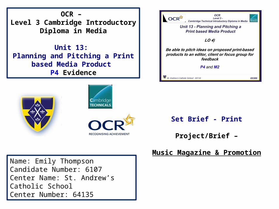
OCR – Level 3 Cambridge Introductory Diploma in
Media
Unit 13: Planning and Pitching a Print based Media
Product P4 Evidence
Name: Emily ThompsonCandidate Number: 6107Center Name: St. Andrew’s Catholic SchoolCenter Number: 64135
Set Brief - Print
Project/Brief –
Music Magazine & Promotion
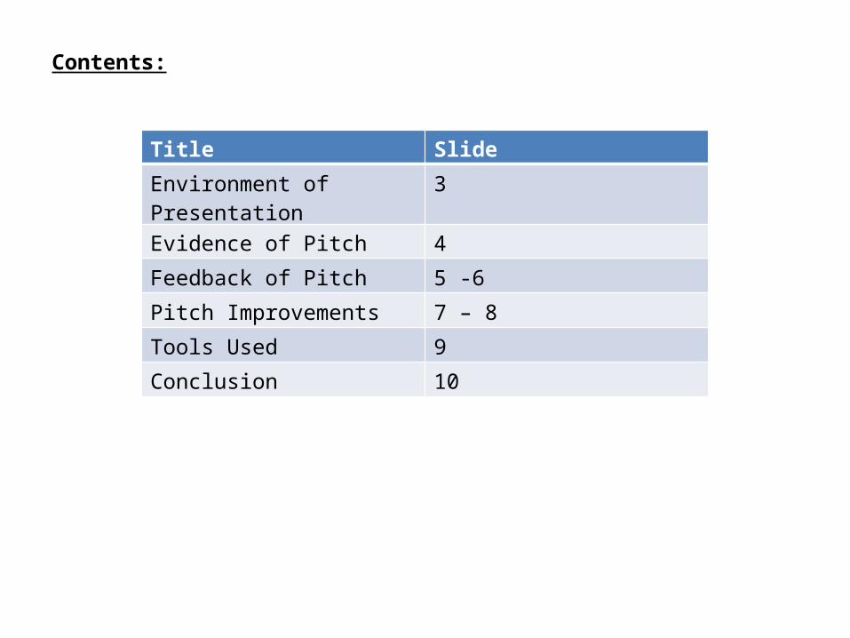
Contents:
Title Slide
Environment of Presentation 3
Evidence of Pitch 4
Feedback of Pitch 5 -6
Pitch Improvements 7 – 8
Tools Used 9
Conclusion 10
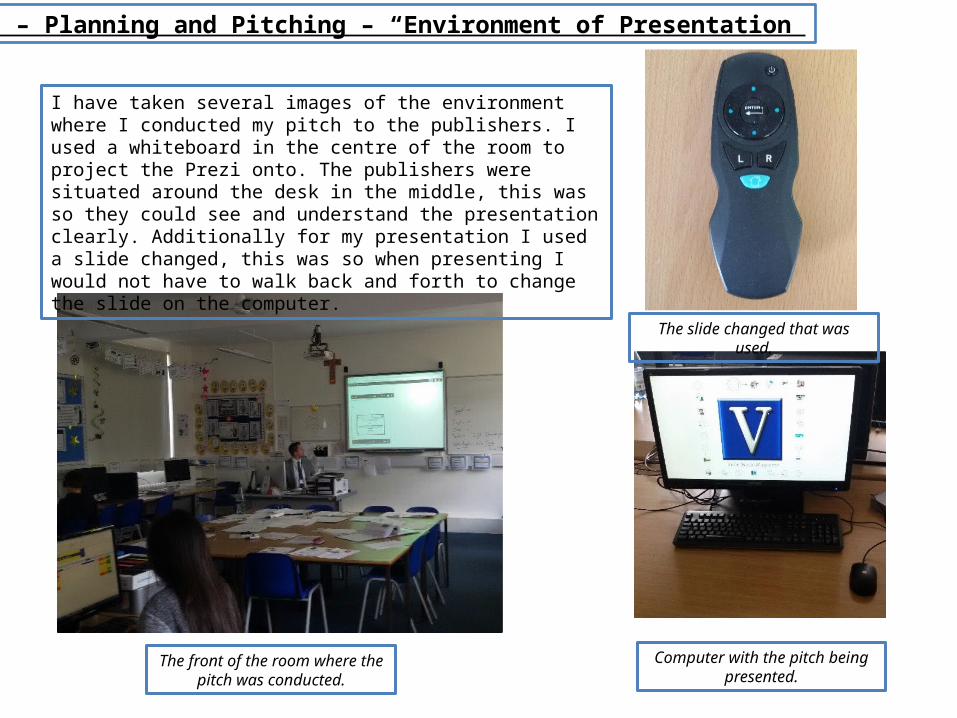
Unit 13 – Planning and Pitching – “Environment of Presentation”
I have taken several images of the environment where I conducted my pitch to the publishers. I used a whiteboard in the centre of the room to project the Prezi onto. The publishers were situated around the desk in the middle, this was so they could see and understand the presentation clearly. Additionally for my presentation I used a slide changed, this was so when presenting I would not have to walk back and forth to change the slide on the computer.
The front of the room where the pitch was conducted.
Computer with the pitch being presented.
The slide changed that was used.

Unit 13 – Planning and Pitching – “Evidence of Pitch”
When conducting my pitch it was recorded on a camera. This meant that I was able to look back on the presentation and view the strengths and weaknesses based on the feedback I gained.Based on verbal feedback from the group of people that were watching the pitch the positives were that I was well presented with my dress, this meant I came across as confident. This illustrated that I knew what I was talking about and demonstrated good enthusiasm for the magazine.A negative of the presentation, based on feedback was that more eye contact was needed with the publisher. I agree with this as in the video I can see that more body language is needed which will help establish my ideas in a higher standard.
Once I had completed my pitch I was given a witness statement form from the head publisher. On this form it outlined areas that were needed to improve the pitch. By having this written information it means that it is more clear on what the publisher wants to know about the magazine and the information that they feel is essential. I have used this feedback to make corrections on my pitch.
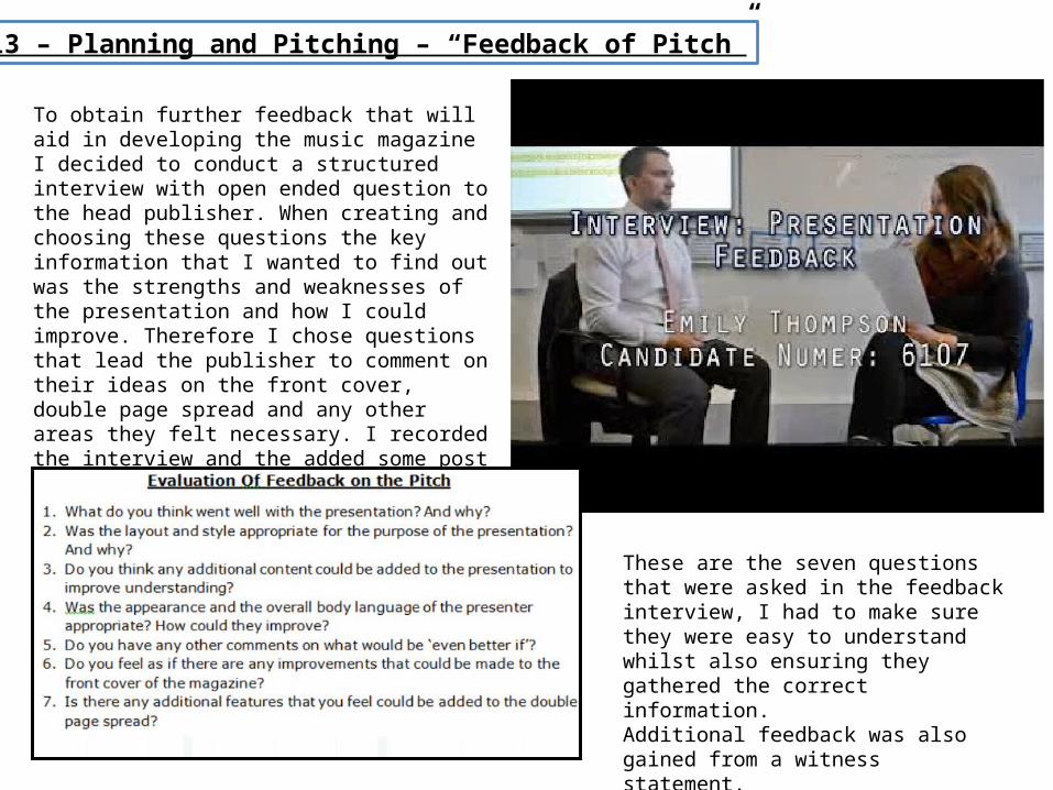
Unit 13 – Planning and Pitching – “Feedback of Pitch”
To obtain further feedback that will aid in developing the music magazine I decided to conduct a structured interview with open ended question to the head publisher. When creating and choosing these questions the key information that I wanted to find out was the strengths and weaknesses of the presentation and how I could improve. Therefore I chose questions that lead the publisher to comment on their ideas on the front cover, double page spread and any other areas they felt necessary. I recorded the interview and the added some post production editing such as sound enhancing to make the question and response clearer.
These are the seven questions that were asked in the feedback interview, I had to make sure they were easy to understand whilst also ensuring they gathered the correct information.Additional feedback was also gained from a witness statement.
Unit 13 – Planning and Pitching – “Feedback of Pitch”
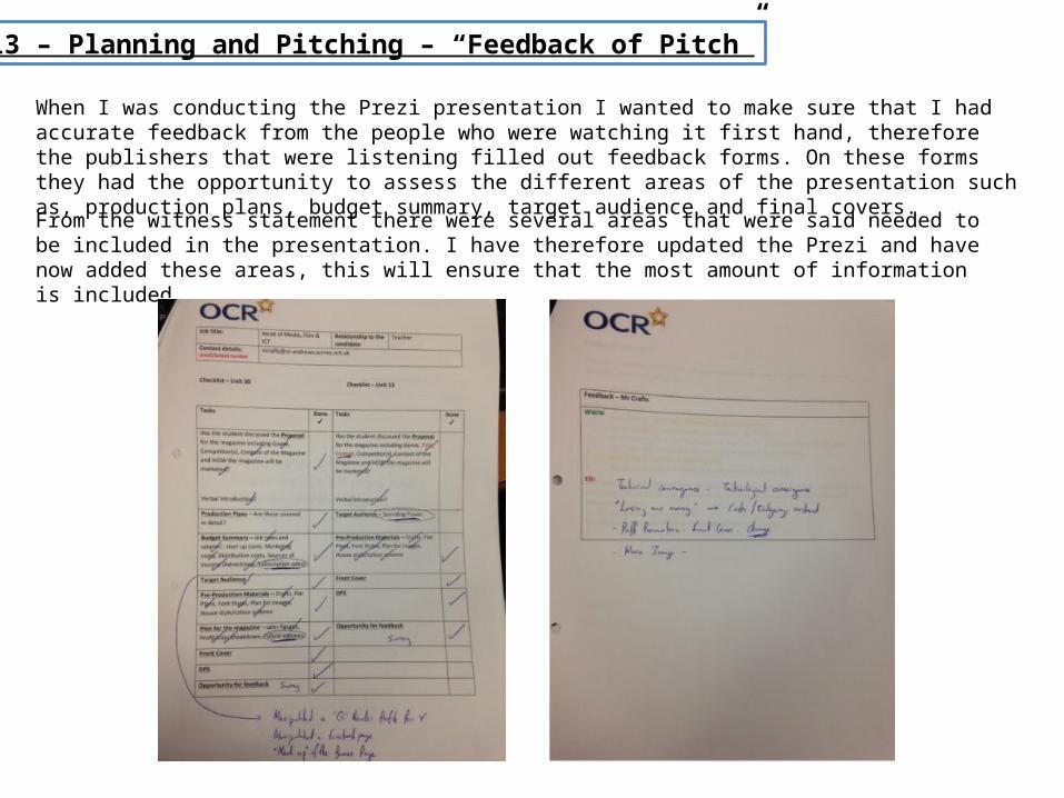
When I was conducting the Prezi presentation I wanted to make sure that I had accurate feedback from the people who were watching it first hand, therefore the publishers that were listening filled out feedback forms. On these forms they had the opportunity to assess the different areas of the presentation such as, production plans, budget summary, target audience and final covers.
From the witness statement there were several areas that were said needed to be included in the presentation. I have therefore updated the Prezi and have now added these areas, this will ensure that the most amount of information is included.
Unit 13 – Planning and Pitching – “Pitch Improvements”
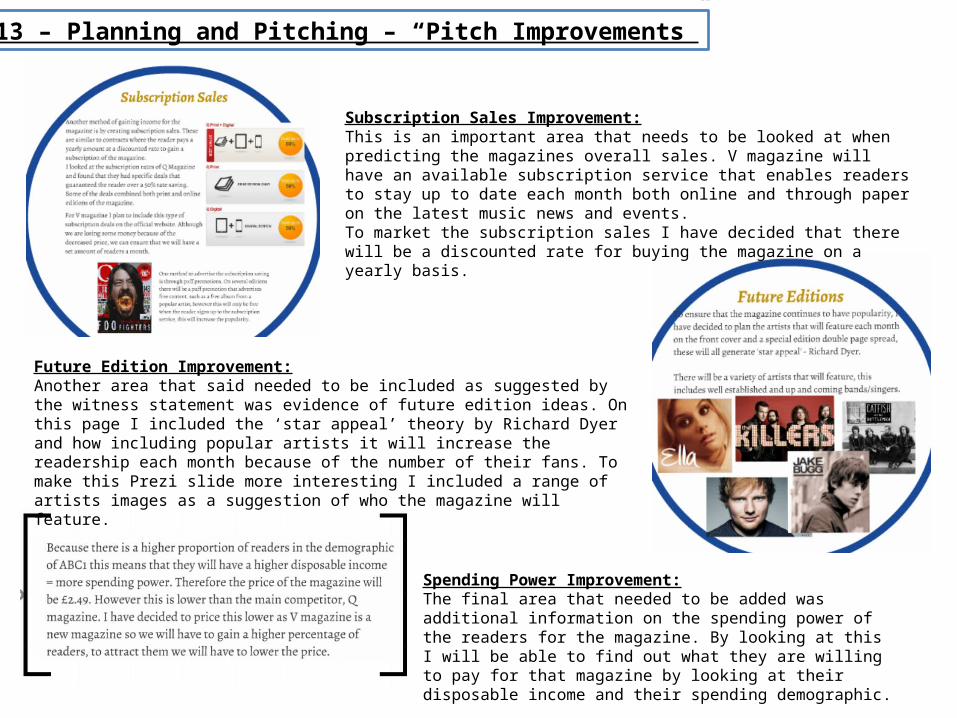
Spending Power Improvement:The final area that needed to be added was additional information on the spending power of the readers for the magazine. By looking at this I will be able to find out what they are willing to pay for that magazine by looking at their disposable income and their spending demographic.
Future Edition Improvement:Another area that said needed to be included as suggested by the witness statement was evidence of future edition ideas. On this page I included the ‘star appeal’ theory by Richard Dyer and how including popular artists it will increase the readership each month because of the number of their fans. To make this Prezi slide more interesting I included a range of artists images as a suggestion of who the magazine will feature.
Subscription Sales Improvement:This is an important area that needs to be looked at when predicting the magazines overall sales. V magazine will have an available subscription service that enables readers to stay up to date each month both online and through paper on the latest music news and events.To market the subscription sales I have decided that there will be a discounted rate for buying the magazine on a yearly basis.
Unit 13 – Planning and Pitching – “Pitch Improvements”
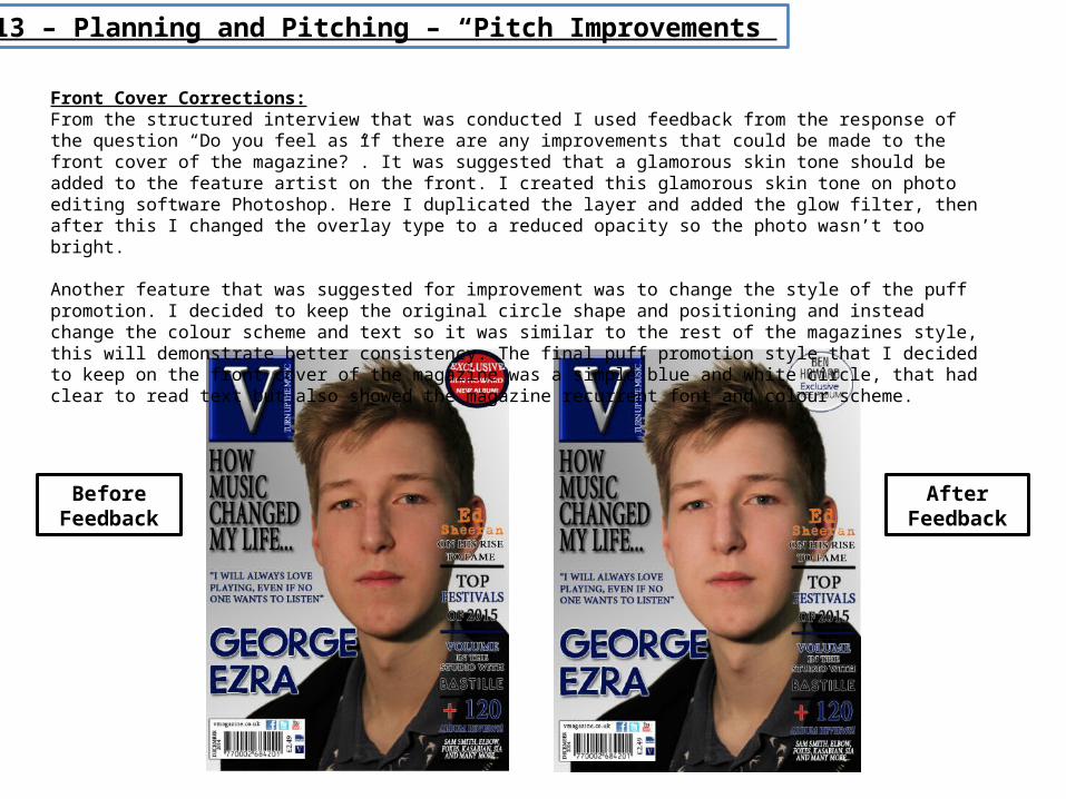
Front Cover Corrections:From the structured interview that was conducted I used feedback from the response of the question “Do you feel as if there are any improvements that could be made to the front cover of the magazine?”. It was suggested that a glamorous skin tone should be added to the feature artist on the front. I created this glamorous skin tone on photo editing software Photoshop. Here I duplicated the layer and added the glow filter, then after this I changed the overlay type to a reduced opacity so the photo wasn’t too bright.
Another feature that was suggested for improvement was to change the style of the puff promotion. I decided to keep the original circle shape and positioning and instead change the colour scheme and text so it was similar to the rest of the magazines style, this will demonstrate better consistency. The final puff promotion style that I decided to keep on the front cover of the magazine was a simple blue and white circle, that had clear to read text but also showed the magazine recurrent font and colour scheme.
Before Feedback
After Feedback
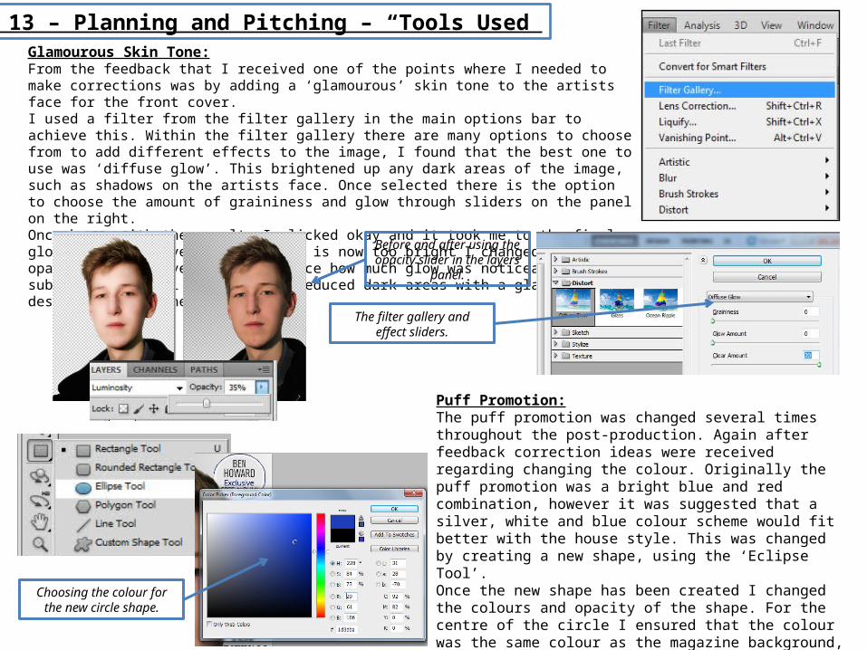
Unit 13 – Planning and Pitching – “Tools Used”Glamourous Skin Tone:From the feedback that I received one of the points where I needed to make corrections was by adding a ‘glamourous’ skin tone to the artists face for the front cover.I used a filter from the filter gallery in the main options bar to achieve this. Within the filter gallery there are many options to choose from to add different effects to the image, I found that the best one to use was ‘diffuse glow’. This brightened up any dark areas of the image, such as shadows on the artists face. Once selected there is the option to choose the amount of graininess and glow through sliders on the panel on the right.Once happy with the results I clicked okay and it took me to the final glow result. However, as the glow is now too bright I changed the opacity on the layers bar to reduce how much glow was noticeable on the subject. The final result shows reduced dark areas with a glamourous desirable skin tone.
Before and after using the opacity slider in the layers
panel.
The filter gallery and effect sliders.
Puff Promotion:The puff promotion was changed several times throughout the post-production. Again after feedback correction ideas were received regarding changing the colour. Originally the puff promotion was a bright blue and red combination, however it was suggested that a silver, white and blue colour scheme would fit better with the house style. This was changed by creating a new shape, using the ‘Eclipse Tool’.Once the new shape has been created I changed the colours and opacity of the shape. For the centre of the circle I ensured that the colour was the same colour as the magazine background, this gives the effect that the circle is see through. This makes the text that has been inserted stand out even further without using the bright colours that were used previously.
Choosing the colour for the new circle shape.
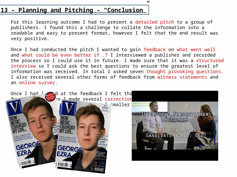
Unit 13 – Planning and Pitching – “Conclusion”
For this learning outcome I had to present a detailed pitch to a group of publishers. I found this a challenge to collate the information into a readable and easy to present format, however I felt that the end result was very positive.
Once I had conducted the pitch I wanted to gain feedback on what went well and what could be even better if..? I interviewed a publisher and recorded the process so I could use it in future. I made sure that it was a structured interview so I could ask the best questions to ensure the greatest level of information was received. In total I asked seven thought provoking questions. I also received several other forms of feedback from witness statements and an online survey.
Once I had looked at the feedback I felt that I could improve the pitch further. Therefore I made several corrections that included changing the final front cover image and several smaller areas within the Prezi presentation.