ethompson - unit 14: lo4 powerpoint
TRANSCRIPT
OCR –Level 3 Cambridge Introductory Diploma in
Media
Unit 14: Producing a Print based Media Product
P5 Evidence
Name: Emily ThompsonCandidate Number: 6107Center Name: St. Andrew’s Catholic SchoolCenter Number: 64135
Set Brief - Print
Project/Brief –
Music Magazine & Promotion
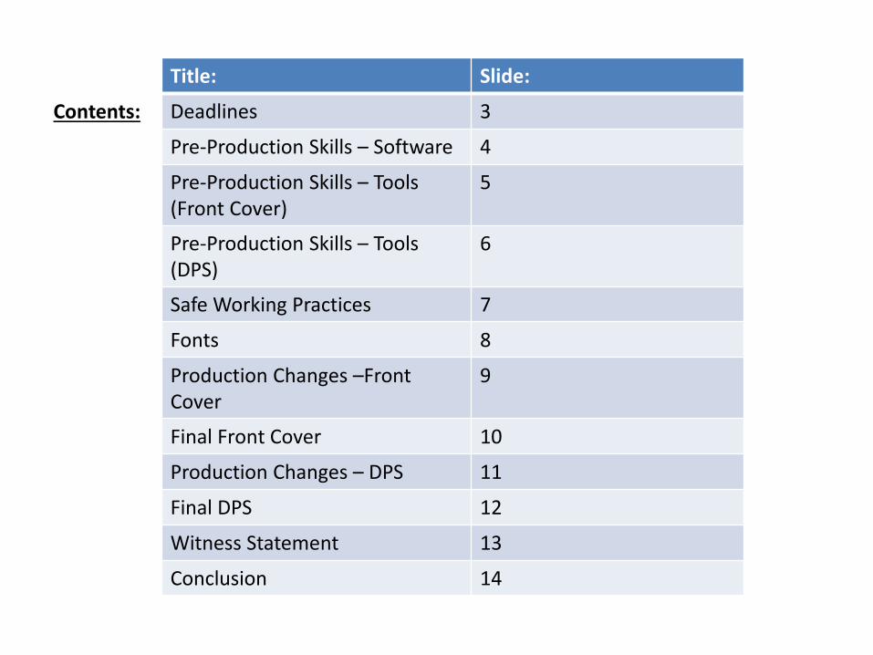
Contents:
Title: Slide:
Deadlines 3
Pre-Production Skills – Software 4
Pre-Production Skills – Tools (Front Cover)
5
Pre-Production Skills – Tools (DPS)
6
Safe Working Practices 7
Fonts 8
Production Changes –Front Cover
9
Final Front Cover 10
Production Changes – DPS 11
Final DPS 12
Witness Statement 13
Conclusion 14
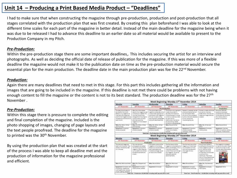
Unit 14 – Producing a Print Based Media Product – “Deadlines”
I had to make sure that when constructing the magazine through pre-production, production and post-production that all stages correlated with the production plan that was first created. By creating this plan beforehand I was able to look at the different time scales for each part of the magazine in better detail. Instead of the main deadline for the magazine being when it was due to be released I had to advance this deadline to an earlier date so all material would be available to present to theProduction Company in my Pitch.
Pre-Production:Within the pre-production stage there are some important deadlines,. This includes securing the artist for an interview and photographs. As well as deciding the official date of release of publication for the magazine. If this was more of a flexibledeadline the magazine would not make it to the publication date on time as the pre-production material would secure the essential plan for the main production. The deadline date in the main production plan was foe the 22nd November.
Production:Again there are many deadlines that need to met in this stage. For this part this includes gathering all the information and images that are going to be included in the magazine. If this deadline is not met there could be problems with not having enough content to fill the magazine or the content is not to its best standard. The production deadline was for the 27th
November .
Pre-Production:Within this stage there is pressure to complete the editing and final completion of the magazine. Included is the photo shopping of images, changing of page layouts and the text people proofread. The deadline for the magazine to printed was the 30th November.
By using the production plan that was created at the start of the process I was able to keep all deadline met and the production of information for the magazine professional and efficient.
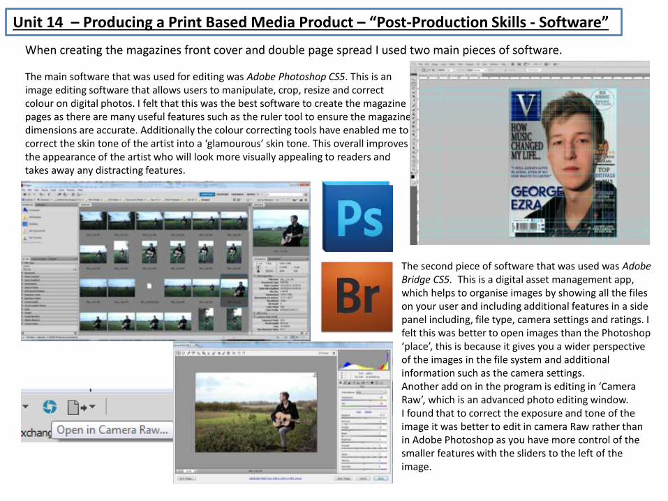
Unit 14 – Producing a Print Based Media Product – “Post-Production Skills - Software”
The main software that was used for editing was Adobe Photoshop CS5. This is an image editing software that allows users to manipulate, crop, resize and correct colour on digital photos. I felt that this was the best software to create the magazine pages as there are many useful features such as the ruler tool to ensure the magazine dimensions are accurate. Additionally the colour correcting tools have enabled me to correct the skin tone of the artist into a ‘glamourous’ skin tone. This overall improves the appearance of the artist who will look more visually appealing to readers and takes away any distracting features.
The second piece of software that was used was Adobe Bridge CS5. This is a digital asset management app, which helps to organise images by showing all the files on your user and including additional features in a side panel including, file type, camera settings and ratings. I felt this was better to open images than the Photoshop ‘place’, this is because it gives you a wider perspective of the images in the file system and additional information such as the camera settings.Another add on in the program is editing in ‘Camera Raw’, which is an advanced photo editing window. I found that to correct the exposure and tone of the image it was better to edit in camera Raw rather than in Adobe Photoshop as you have more control of the smaller features with the sliders to the left of the image.
When creating the magazines front cover and double page spread I used two main pieces of software.
Unit 14 – Producing a Print Based Media Product – “Post-Production Skills – Tools”
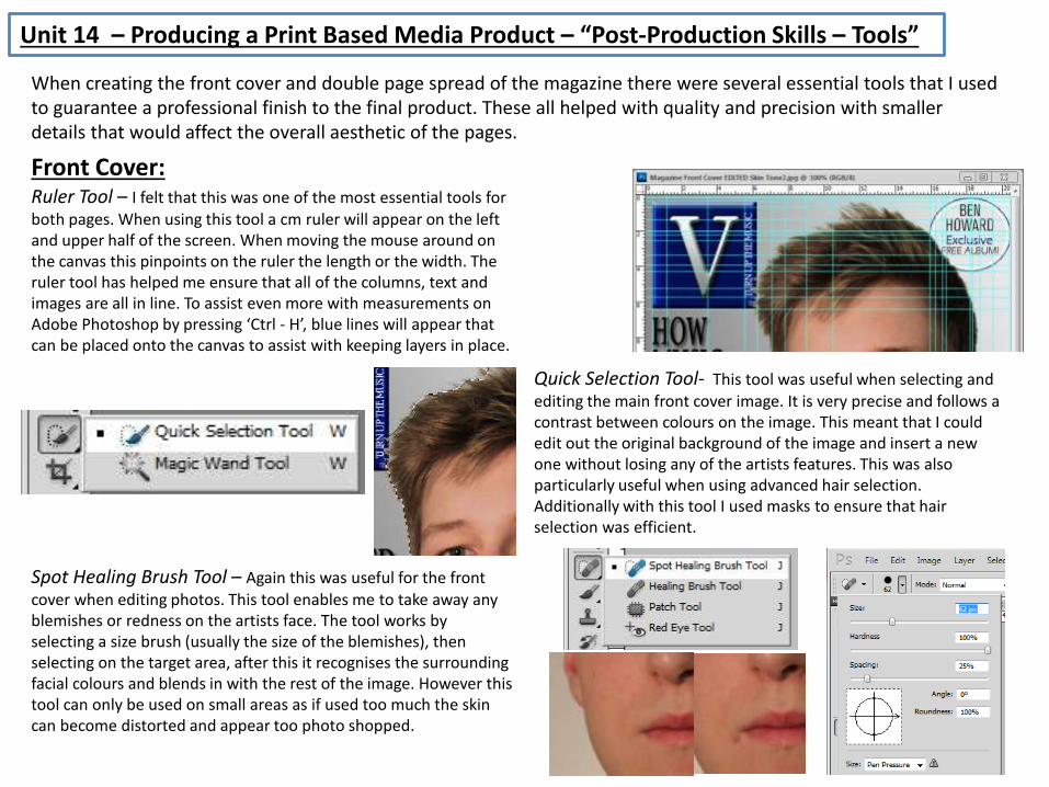
When creating the front cover and double page spread of the magazine there were several essential tools that I used to guarantee a professional finish to the final product. These all helped with quality and precision with smaller details that would affect the overall aesthetic of the pages.
Ruler Tool – I felt that this was one of the most essential tools for both pages. When using this tool a cm ruler will appear on the left and upper half of the screen. When moving the mouse around on the canvas this pinpoints on the ruler the length or the width. The ruler tool has helped me ensure that all of the columns, text and images are all in line. To assist even more with measurements on Adobe Photoshop by pressing ‘Ctrl - H’, blue lines will appear that can be placed onto the canvas to assist with keeping layers in place.
Front Cover:
Quick Selection Tool- This tool was useful when selecting and editing the main front cover image. It is very precise and follows a contrast between colours on the image. This meant that I could edit out the original background of the image and insert a new one without losing any of the artists features. This was also particularly useful when using advanced hair selection.Additionally with this tool I used masks to ensure that hair selection was efficient.
Spot Healing Brush Tool – Again this was useful for the front cover when editing photos. This tool enables me to take away any blemishes or redness on the artists face. The tool works by selecting a size brush (usually the size of the blemishes), then selecting on the target area, after this it recognises the surrounding facial colours and blends in with the rest of the image. However this tool can only be used on small areas as if used too much the skin can become distorted and appear too photo shopped.
Unit 14 – Producing a Print Based Media Product – “Post-Production Skills – Tools”
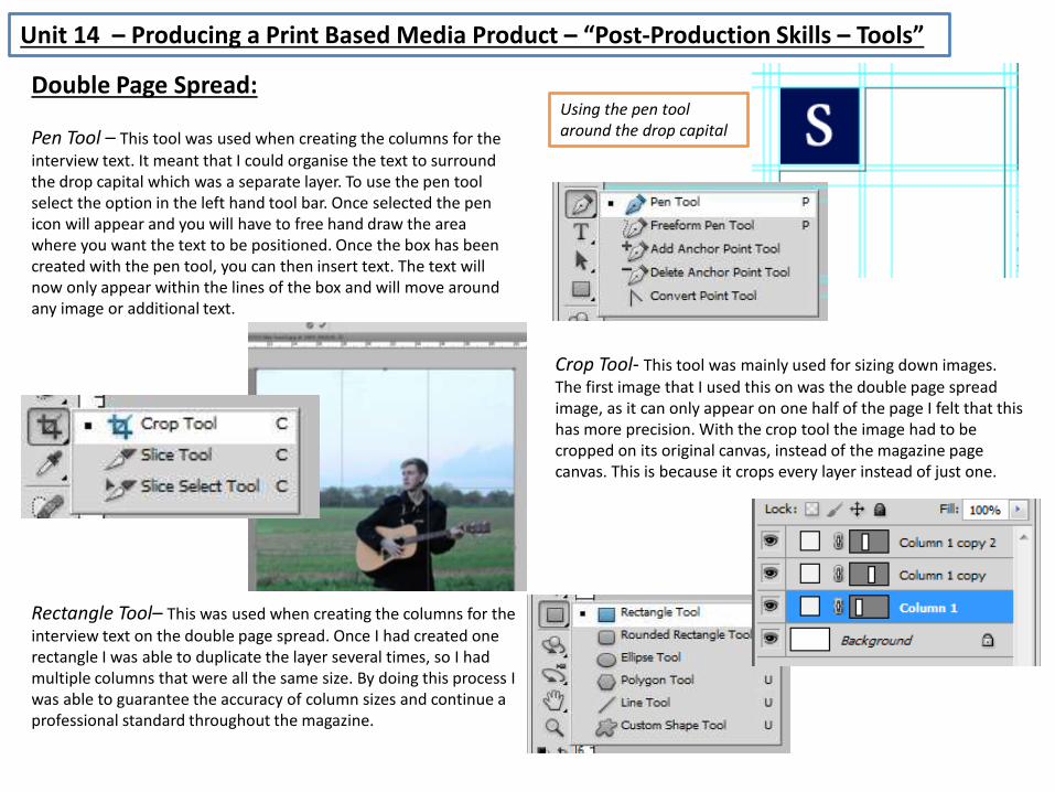
Pen Tool – This tool was used when creating the columns for the interview text. It meant that I could organise the text to surround the drop capital which was a separate layer. To use the pen tool select the option in the left hand tool bar. Once selected the pen icon will appear and you will have to free hand draw the area where you want the text to be positioned. Once the box has been created with the pen tool, you can then insert text. The text will now only appear within the lines of the box and will move around any image or additional text.
Double Page Spread:
Crop Tool- This tool was mainly used for sizing down images. The first image that I used this on was the double page spread image, as it can only appear on one half of the page I felt that this has more precision. With the crop tool the image had to be cropped on its original canvas, instead of the magazine page canvas. This is because it crops every layer instead of just one.
Rectangle Tool– This was used when creating the columns for the interview text on the double page spread. Once I had created one rectangle I was able to duplicate the layer several times, so I had multiple columns that were all the same size. By doing this process I was able to guarantee the accuracy of column sizes and continue a professional standard throughout the magazine.
Using the pen tool around the drop capital
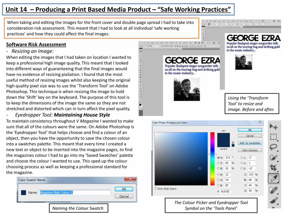
Unit 14 – Producing a Print Based Media Product – “Safe Working Practices”
Software Risk Assessment- Resizing an Image:When editing the images that I had taken on location I wanted to keep a professional high image quality. This meant that I looked into different ways of guaranteeing that the final images would have no evidence of resizing pixilation. I found that the most useful method of resizing images whilst also keeping the original high quality pixel size was to use the ‘Transform Tool’ on Adobe Photoshop. This technique is when resizing the image to hold down the ‘Shift’ key on the keyboard. The purpose of this tool is to keep the dimensions of the image the same so they are not stretched and distorted which can in turn affect the pixel quality.
- Eyedropper Tool: Maintaining House StyleTo maintain consistency throughout V Magazine I wanted to make sure that all of the colours were the same. On Adobe Photoshop is the ‘Eyedropper Tool’ that helps choose and find a colour of an object, then you have the opportunity to save the chosen colour into a swatches palette. This meant that every time I created a new text or object to be inserted into the magazine pages, to find the magazines colour I had to go into my ‘Saved Swatches’ palette and choose the colour I wanted to use. This sped up the colour choosing process as well as keeping a professional standard for the magazine.
Naming the Colour SwatchThe Colour Picker and Eyedropper Tool
Symbol on the ‘Tools Panel’
Using the ‘Transform Tool’ to resize and image. Before and after.
When taking and editing the images for the front cover and double page spread I had to take into consideration risk assessment. This meant that I had to look at all individual ‘safe working practices’ and how they could affect the final images.
Unit 14 – Producing a Print Based Media Product – “Fonts”
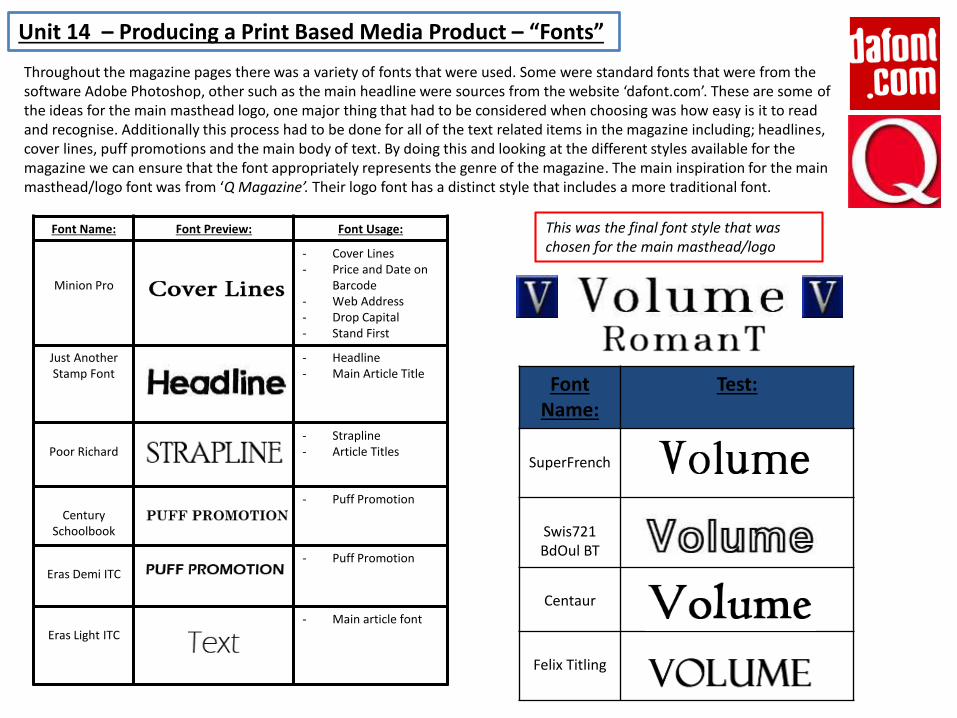
Throughout the magazine pages there was a variety of fonts that were used. Some were standard fonts that were from the software Adobe Photoshop, other such as the main headline were sources from the website ‘dafont.com’. These are some of the ideas for the main masthead logo, one major thing that had to be considered when choosing was how easy is it to read and recognise. Additionally this process had to be done for all of the text related items in the magazine including; headlines, cover lines, puff promotions and the main body of text. By doing this and looking at the different styles available for the magazine we can ensure that the font appropriately represents the genre of the magazine. The main inspiration for the main masthead/logo font was from ‘Q Magazine’. Their logo font has a distinct style that includes a more traditional font.
Font Name:
Test:
SuperFrench
Swis721 BdOul BT
Centaur
Felix Titling
Font Name: Font Preview: Font Usage:
Minion Pro
- Cover Lines- Price and Date on
Barcode- Web Address- Drop Capital- Stand First
Just Another Stamp Font
- Headline- Main Article Title
Poor Richard- Strapline- Article Titles
CenturySchoolbook
- Puff Promotion
Eras Demi ITC- Puff Promotion
Eras Light ITC- Main article font
This was the final font style that was chosen for the main masthead/logo
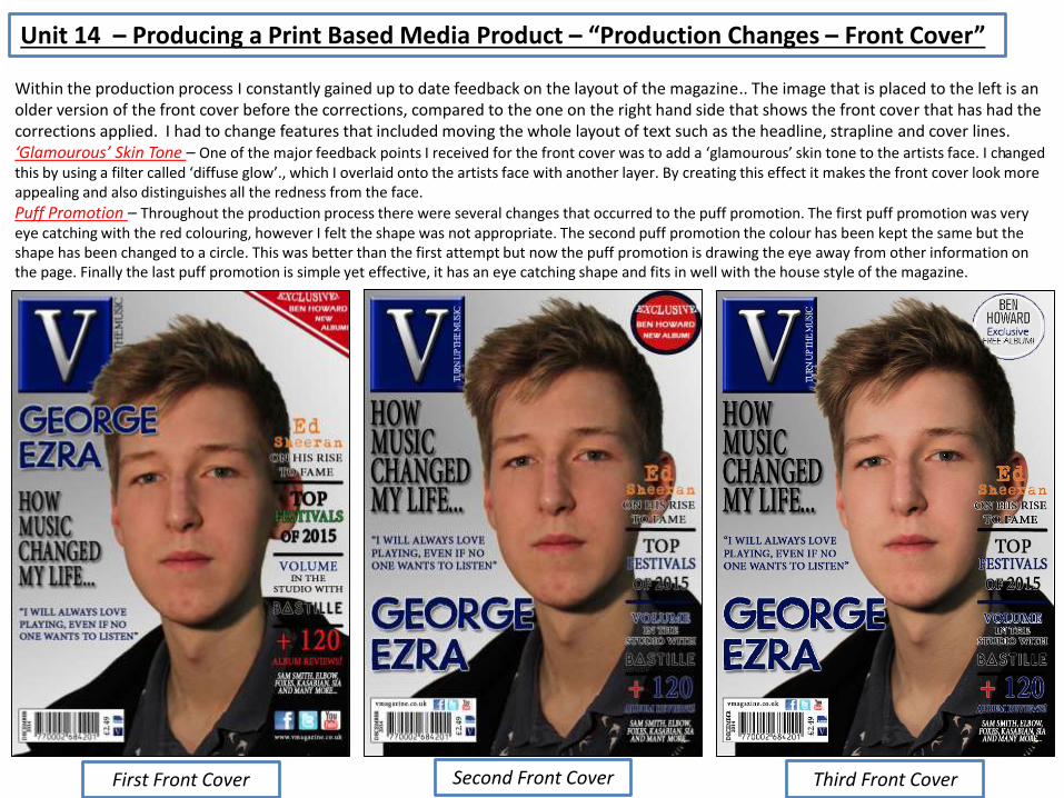
Within the production process I constantly gained up to date feedback on the layout of the magazine.. The image that is placed to the left is an older version of the front cover before the corrections, compared to the one on the right hand side that shows the front cover that has had the corrections applied. I had to change features that included moving the whole layout of text such as the headline, strapline and cover lines.‘Glamourous’ Skin Tone – One of the major feedback points I received for the front cover was to add a ‘glamourous’ skin tone to the artists face. I changed this by using a filter called ‘diffuse glow’., which I overlaid onto the artists face with another layer. By creating this effect it makes the front cover look more appealing and also distinguishes all the redness from the face.
Puff Promotion – Throughout the production process there were several changes that occurred to the puff promotion. The first puff promotion was very eye catching with the red colouring, however I felt the shape was not appropriate. The second puff promotion the colour has been kept the same but the shape has been changed to a circle. This was better than the first attempt but now the puff promotion is drawing the eye away from other information on the page. Finally the last puff promotion is simple yet effective, it has an eye catching shape and fits in well with the house style of the magazine.
Unit 14 – Producing a Print Based Media Product – “Production Changes – Front Cover”
First Front Cover Second Front Cover Third Front Cover
Final Front Cover
Unit 14 – Producing a Print Based Media Product – “Final Front Cover”
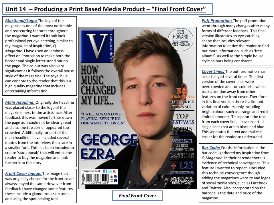
Masthead/Logo: The logo of the magazine is one of the most noticeable and reoccurring features throughout the magazine. I wanted it took look professional yet eye-catching, similar to my magazine of inspiration, Q Magazine. I have used an ‘emboss’ effect on Photoshop to make both the border and single letter stand out on the page. The colour was also very significant as it follows the overall house style of the magazine. The royal blue can connote to the reader that this is a high quality magazine that includes entertaining information.
Puff Promotion: The puff promotion went through many changes after many forms of different feedback. This final version illustrates an eye-catching shape that includes relevant information to entice the reader to find out more information, such as ‘free album!’. As well as the simple house style colours being consistent.
Cover Lines: The puff promotion has also changed several times. The first version of the cover lines were overcrowded and too colourful which took attention away from other features on the front cover. Therefore in this final version there is a limited variation of colours, only including bright colours such as orange and red in limited amounts. To separate the text from each cover line, I have inserted single lines that are in black and blue. This separates the text and makes it easier for the reader to understand.
Bar Code: For the information in the bar code I gathered my inspiration from Q Magazine. In their barcode there is evidence of technical convergence. This feature I wanted to repeat. I included this technical convergence though adding the magazines website and logos of social media sites, such as Facebook and Twitter. Also incorporated on the barcode is the date and price of the magazine.
Main Headline: Originally the headline was placed closer to the logo of the magazine, next to the artists face. After feedback this was moved further down the page as it could not be clearly read and also the top corner appeared too crowded. Additionally for part of the main headline I have included several quotes from the interview, these are in a smaller font. This has been included to create ‘star appeal;’ that will entice the reader to buy the magazine and look further into the story.
Front Cover Image: The image that was originally chosen for the front cover always stayed the same However from feedback I have changed some features, these include a glamourous skin tone and using the spot healing tool.

Unit 14 – Producing a Print Based Media Product – “Production Changes –DPS”
This is the comparison of the before and after version for the double page spread. The one on the left shows the original version that was created, and the one on the right is the edited version after corrections. There were not too many corrections for this page, only simple changes such as formatting of words and changing some titles to italics. By using these corrections and feedback I can determine what needs to improve for future versions of the magazine, it has also helped me to self assess.
First DPS Second DPS
Text Formatting – One correction that had to be made in the production stage was the changing of some of the text format. Seen on the right hand side the introduction of the article has been changed. This meant that it was easier to understand for the reader and eliminated any information that was not needed.
Credits – An additional change to text was the credits for the article. Originally it read ‘Words and Photos’ but was then changed to ‘Words and Photography’. This was so the magazine does not sound too informal and gives appropriate recognition to the writer.
Final DPS
Unit 14 – Producing a Print Based Media Product – “Final DPS”
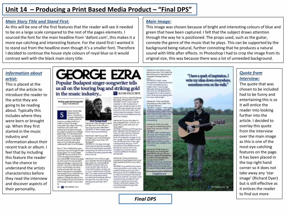
Main Story Title and Stand First:As this will be one of the first features that the reader will see it needed to be on a large scale compared to the rest of the pages elements. I sourced the font for the main headline from ‘dafont.com’, this makes it a more eye catching and interesting feature. For the stand first I wanted it to stand out from the headline even though it’s a smaller font. Therefore I decided to continue the house style colours of royal blue so it would contrast well with the black main story title.
Main Image:This image was chosen because of bright and interesting colours of blue and green that have been captured. I felt that the subject draws attention through the way he is positioned. The props used, such as the guitar, connote the genre of the music that he plays. This can be supported by the background being natural, further connoting that he produces a natural sound with little after effects. In Photoshop I had to crop the image from its original size, this was because there was a lot of unneeded background.
Information about artist:This is placed at the start of the article to introduce the reader to the artist they are going to be reading about. Typically this includes where they were born or brought up. When they first started in the music industry and information about their recent track or album. I feel that by including this feature the reader has the chance to understand the artists characteristics before they read the interview and discover aspects of their personality.
Quote from Interview:The quote that was chosen to be included had to be funny and entertaining this is so it will entice the reader into looking further into the article. I decided to overlay this quote from the interview over the main image as this is one of the most eye-catching features on the page. It has been placed in the top right hand corner so it does not take away any ‘star image’ (Richard Dyer) but is still effective as it entices the reader to find out more
Unit 14 – Producing a Print Based Media Product – “Conclusion”
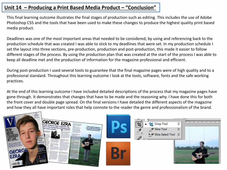
This final learning outcome illustrates the final stages of production such as editing. This includes the use of Adobe Photoshop CS5 and the tools that have been used to make these changes to produce the highest quality print based media product.
Deadlines was one of the most important areas that needed to be considered, by using and referencing back to the production schedule that was created I was able to stick to my deadlines that were set. In my production schedule I set the layout into three sections, pre-production, production and post-production, this made it easier to follow different stages of the process. By using the production plan that was created at the start of the process I was able to keep all deadline met and the production of information for the magazine professional and efficient.
During post-production I used several tools to guarantee that the final magazine pages were of high quality and to a professional standard. Throughout this learning outcome I look at the tools, software, fonts and the safe working practices.
At the end of this learning outcome I have included detailed descriptions of the process that my magazine pages have gone through. It demonstrates that changes that have to be made and the reasoning why. I have done this for both the front cover and double page spread. On the final versions I have detailed the different aspects of the magazine and how they all have important roles that help connote to the reader the genre and professionalism of the brand.