evaluation
TRANSCRIPT
Evaluation Clara Schjødt

In what ways does your media product use, develop or challenge forms and conventions of
real media products?
Front Cover

Masthead
When it came to the masthead for my magazine, I wanted to create something that would attract the audience. I therefore used a quite big font size and stretched the masthead across the whole upper page to make it impossible not to notice, like fig. 2. The name «Replay» is a very short and snappy word that is easily memorable and instantly associated with music, just like «Billboard» in fig. 2. The colour white is a very neutral and simple colour that attracts both the male and female gender. I also placed the masthead behind the person on the cover page, like magazines usually do (fig.2). This suggests that the readers already know my magazine quite well, especially because it is the 4. issue of the year (published in April). My masthead doesn’t have any colours inside the open spaces, which makes it stand out from the more colourful and popping magazines, and it also suggests that the magazine has a more mature audience.
Fig. 1 Fig. 2

Main Image
I have used a medium shot on the front cover (fig. 1) because it is similar to the magazines I have analysed earlier. It makes the model’s face the centre of focus, as well as not being too close up. I used a male on the front cover because it will attract the male readers who will aspire to be like him, as well as the female readers who will find him attracting or interesting. The two other magazines have used a studio photo as the main image, but I challenged this convention and used a location shot for my cover image as I think the details (such as the graffiti in the background) reflects the urban and playful style of my magazine. The image doesn’t contain any popping colours and has a quite neutral colour scheme like in the two other magazines (fig. 2 and 3). This draws the focus to the headlines and coverlines which will carry information that the readers will want to read about. I directed the model on the image to look straight into the camera, similar to the other magazines, creating a feeling of them making eye contact with the readers and persuading them to buy the magazine. The male on my front cover also looks pretty serious (like on fig. 2) which is suggesting that he is taking his career seriously and attracting a older and more mature audience than ‘We Love Pop’ (fig. 3).
Fig. 1Fig. 2
Fig. 3

Coverlines
I have chosen to let the coverlines overlap the main image on my cover page, like on fig. 2. On Billboard’s front cover (fig. 2) the coverlines follows the outline of the image, but I wanted the attention to be on the features in the magazine as well as the main image. This made the layout look a bit ‘messy’ and fun, and I therefore challenged the convention of everything being tidy and neat like on fig. 2. I have used a coloured text outline just like on fig. 2 to make the coverlines pop out more, and make them more noticeable by the readers. Some of the words are also highlighted in other colours – like “hots” and “nots” to draw the audience’s attention and persuade them to see what is cool and not. This is a common convention in magazines, as well as using capitalization to capture the eye. I challenged this convention, and went for a mix between lowercase and uppercase letters – a mix between fig. 2 and fig. 3 – because I found it more sophisticated and neat looking which would balance out the more messy layout.
Fig. 2
Fig. 1 Fig. 3
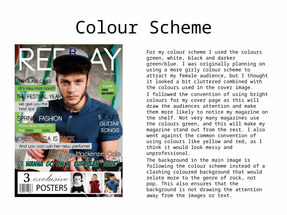
Colour SchemeFor my colour scheme I used the colours green, white, black and darker green/blue. I was originally planning on using a more girly colour scheme to attract my female audience, but I thought it looked a bit cluttered combined with the colours used in the cover image. I followed the convention of using bright colours for my cover page as this will draw the audiences attention and make them more likely to notice my magazine on the shelf. Not very many magazines use the colours green, and this will make my magazine stand out from the rest. I also went against the common convention of using colours like yellow and red, as I think it would look messy and unprofessional. The background in the main image is following the colour scheme instead of a clashing coloured background that would relate more to the genre of rock, not pop. This also ensures that the background is not drawing the attention away from the images or text.
Sticker
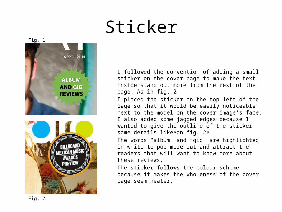
I followed the convention of adding a small sticker on the cover page to make the text inside stand out more from the rest of the page. As in fig. 2 I placed the sticker on the top left of the page so that it would be easily noticeable next to the model on the cover image’s face. I also added some jagged edges because I wanted to give the outline of the sticker some details like on fig. 2. The words “album” and “gig” are highlighted in white to pop more out and attract the readers that will want to know more about these reviews.The sticker follows the colour scheme because it makes the wholeness of the cover page seem neater.
Fig. 2
Fig. 1

Strapline
I chose to place a strapline in the centre of my cover page, like on ‘We Love Pop’ (fig. 2) to make it the most eye-catching cover line on the page. The pull quote will make the readers want to read more about “Mackenzie’s” tour plans, and therefore feel persuaded to buy the magazine.
I also followed the convention of using a bold font (like on fig. 2) in a strong colour to make the text pop out more on the page. By writing the name of the artist the article will be about, the audience will most definitely him from earlier and therefore be interested in reading more.
Fig. 2
Fig. 1
Banner
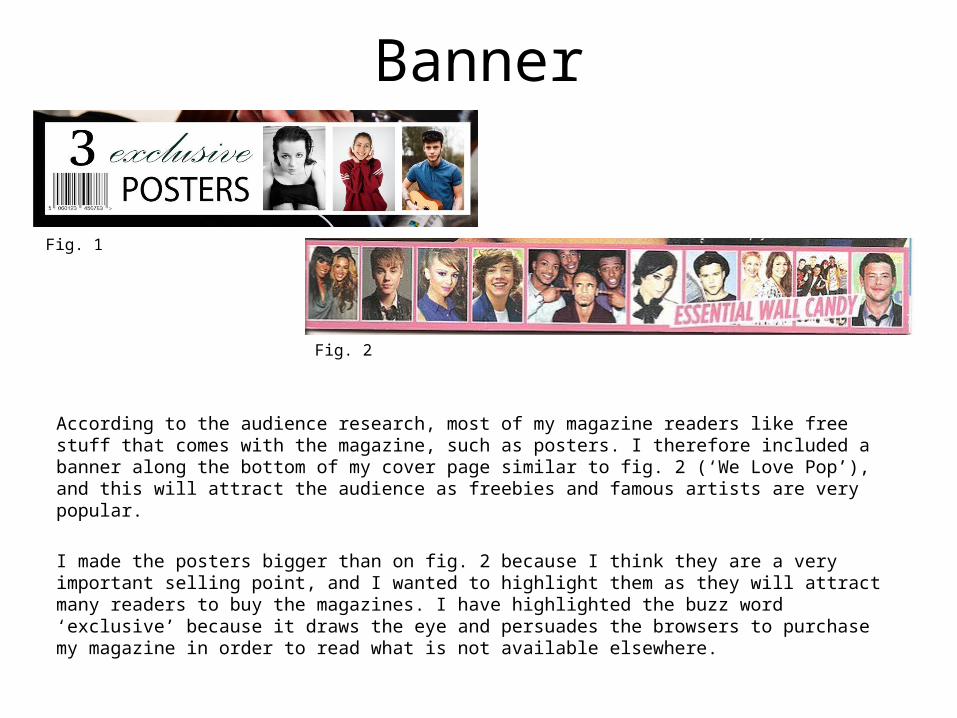
According to the audience research, most of my magazine readers like free stuff that comes with the magazine, such as posters. I therefore included a banner along the bottom of my cover page similar to fig. 2 (‘We Love Pop’), and this will attract the audience as freebies and famous artists are very popular.
I made the posters bigger than on fig. 2 because I think they are a very important selling point, and I wanted to highlight them as they will attract many readers to buy the magazines. I have highlighted the buzz word ‘exclusive’ because it draws the eye and persuades the browsers to purchase my magazine in order to read what is not available elsewhere.
Fig. 2
Fig. 1

Barcode
I followed the most common convention of placing the barcode on the bottom corner (here: left) of the cover page, like in Billboard’ (fig. 2). This will make sure the readers have already seen the rest of the features in the magazine and feel tempted to purchase it. ‘We Love Pop’ (fig. 3) has not done this though, as they have followed the theory of the Z-reading pattern. The barcode uses the conventions of the other magazines by including price, date and website. The price is written with a very small font to ensure it is the last thing that the browser will notice.
**NOTE: I forgot to add the price, date and website next to my barcode, and I therefore had to edit that in later. To avoid having to do a lot of work over again, some of the photos on this PowerPoint is therefore missing the price, date and website.
Fig. 2Fig. 1 Fig. 3

Contents Page

Headline
The headline was placed on the top of the page as in ‘Billboard’ (fig. 2) because this is the first thing that the reader will see. I used a black colour similar to fig. 2 as it will stand out against the white background and therefore be easy to notice. I also followed the convention of using bold, thick capital letters for the headline as well as some nice coloured lines underneath to give the headline a bit of colours and excitement.
Most magazines add the issue number and dates underneath the headline on the contents page (like fig. 2) but I challenged this convention and left it out because I didn’t find it very important when the readers can check the date and issue number on the cover page anyway.
Fig. 2Fig. 1

Images
My images for the contents page are quite large, because I want to show that these articles and artists are the most important ones and I also believe that my teenage audience will care more about the pictures than reading the text.
I have used a variety of images using different angles and distances (like fig. 2) because it makes the magazine look like it has a lot of exiting contents to offer. The use of various artists also appeals to a larger audience as the browsers are likely to find at least one artist they want to read about. Two of the photos are shot in a studio, following the professional convention of most magazines. The three other images are location photos, and they make the magazine seem exciting and fun – appealing to the younger audience.
The mise-en-scene is colourful and fun, like in fig. 2, appealing to teenagers who like action, and it is also relating to the upbeat music style of the magazine; rock pop.
Fig. 2
Fig. 1
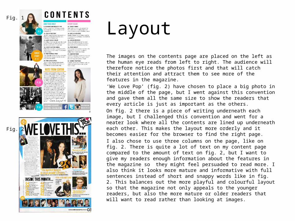
LayoutThe images on the contents page are placed on the left as the human eye reads from left to right. The audience will therefore notice the photos first and that will catch their attention and attract them to see more of the features in the magazine. ‘We Love Pop’ (fig. 2) have chosen to place a big photo in the middle of the page, but I went against this convention and gave them all the same size to show the readers that every article is just as important as the others. On fig. 2 there is a piece of writing underneath each image, but I challenged this convention and went for a neater look where all the contents are lined up underneath each other. This makes the layout more orderly and it becomes easier for the browser to find the right page. I also chose to use three columns on the page, like on fig. 2. There is quite a lot of text on my content page compared to the amount of text on fig. 2, but I want to give my readers enough information about the features in the magazine so they might feel persuaded to read more. I also think it looks more mature and informative with full sentences instead of short and snappy words like in fig. 2. This balances out the more playful and colourful layout so that the magazine not only appeals to the younger readers, but also the more mature or older readers that will want to read rather than looking at images.
Fig. 2
Fig. 1

Note from editor
I wanted to add a ‘note from the editor’ because it is a nice way to interact with the readers. They will feel like the magazine is targeted directly towards them as the editor of the magazine is talking to each reader as an individual.
I placed the note from the editor in a small column, similar to ‘We Love Pop’ (fig. 1) and added a photo of myself so that the readers would get an idea of what type of person was creating the magazine, like on fig. 1.
On the bottom of the note I followed the convention of adding my signature – like We Love Pop has done.
Fig. 2
Fig. 1

Page numbers and fontsI made the page number besides the photos quite big (fig. 1) so that it would be easier for the readers to see the numbers and flick to the right page straight away. This technique was also used by ‘We Love Pop’ (fig. 2), which also uses a coloured box behind the text to make the numbers stand out from the sometimes noisy background.
I chose to use circular shapes behind my page numbers because they added some fun and interest into the otherwise very neat and clean page. I also think the colours appeal to the younger audience as well as it draws attention towards the most important articles.
I have chosen to use two columns for my list of contents, unlike on fig. 2 where one columns is all that is needed. I followed the convention of writing the headline in a bolder font and then give a more detailed description of the articles underneath, like fig. 2 have done. I also categorized the articles under “One Time Only” and “Every Issue” to make it easier for the browsers to choose what to read.
I only used two fonts for the text, because I wanted to keep the neat and organized appearance. The fonts are a mix between sans serif and serif fonts, which will appeal to a both young teenagers and adults.
Fig. 2
Fig. 1

Social Medias
On the bottom of my contents page I placed a banner with links to the social medias that my magazine uses. This is a normal convention that allows the readers to interact with the magazine in different platforms, and make them pay more attention to the features in the magazine. Since the audience research showed that the majority of my readers use Facebook, Twitter and Instagram I added the links for those in. I used the symbols for the social medias instead of just text, as the browsers easily recognise the icons.
Double Page Spread

Headline
For my headline I wanted to draw the attention towards the article by using a bold font in a noticeable colour (fig. 3), like ‘We Love Pop’ on fig. 1 has done. This challenges fig. 2 (Q Magazine) who has chosen to use a simple, colourless font that I think looks uninteresting and not at all appealing. I placed the headline on the top of the page because that is the first thing the reader will see . I also chose to use a very special/different font than the one used in the interview because I wanted to hook the readers and make them interested in reading the rest. I also think the font style reflects the urban, youthful style that runs through the whole magazine.
Fig. 2
Fig. 1
Fig. 3
Layout
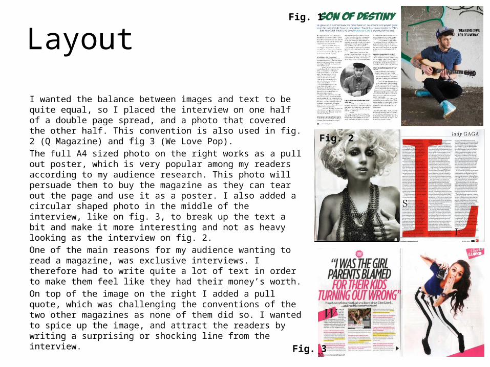
I wanted the balance between images and text to be quite equal, so I placed the interview on one half of a double page spread, and a photo that covered the other half. This convention is also used in fig. 2 (Q Magazine) and fig 3 (We Love Pop). The full A4 sized photo on the right works as a pull out poster, which is very popular among my readers according to my audience research. This photo will persuade them to buy the magazine as they can tear out the page and use it as a poster. I also added a circular shaped photo in the middle of the interview, like on fig. 3, to break up the text a bit and make it more interesting and not as heavy looking as the interview on fig. 2. One of the main reasons for my audience wanting to read a magazine, was exclusive interviews. I therefore had to write quite a lot of text in order to make them feel like they had their money’s worth. On top of the image on the right I added a pull quote, which was challenging the conventions of the two other magazines as none of them did so. I wanted to spice up the image, and attract the readers by writing a surprising or shocking line from the interview.
Fig. 2
Fig. 1
Fig. 3

Photos
For the main image in the article I used a long shot, similar to fig. 3 (We Love Pop) but challenging the convention of fig. 2 (Q Magazine). I chose to use a location shot because it is reflecting the urban music style of my magazine, and the graffiti wall in the background will appeal to my younger target audience. The two other magazines have used studio photos, so I challenged this convention because I found it more interesting looking with location shots. In the middle of the article I chose to place a small photo, following the convention of fig. 3, but challenging the convention of fig. 2. The circular shape of the image is making it stand out from the rest of the layout as well as it is relating to the contents page where I used colourful circles behind the page numbers. This creates a common thread throughout the magazine, and appeals to the young audience who likes to see pictures instead of text. In both fig. 2 and 3 the models are looking straight into the camera. I challenged this convention by directing my artist to look away, because it relates to albums where the bands/artists very often do not look in to the camera. On the smaller image the model looks straight into the camera, following the conventions of fig. 2 and 3. This is a medium close up that adds more variety and interest to the page.
Fig. 2
Fig. 1
Fig. 3
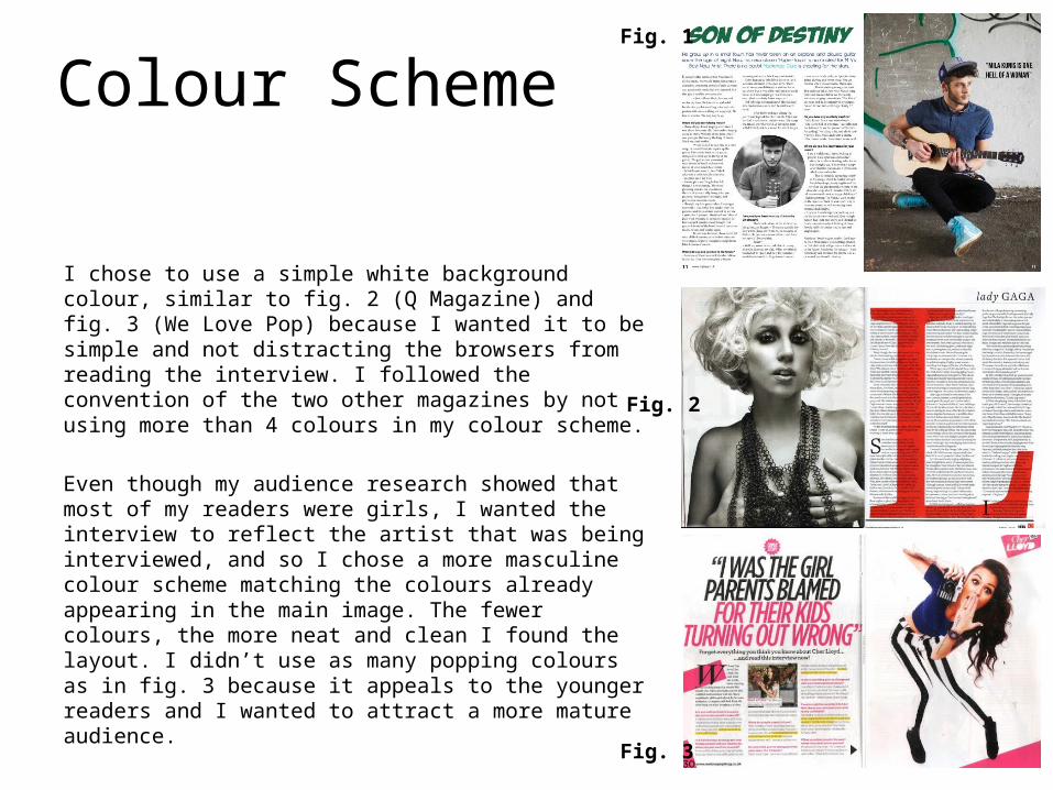
Colour Scheme
I chose to use a simple white background colour, similar to fig. 2 (Q Magazine) and fig. 3 (We Love Pop) because I wanted it to be simple and not distracting the browsers from reading the interview. I followed the convention of the two other magazines by not using more than 4 colours in my colour scheme.
Even though my audience research showed that most of my readers were girls, I wanted the interview to reflect the artist that was being interviewed, and so I chose a more masculine colour scheme matching the colours already appearing in the main image. The fewer colours, the more neat and clean I found the layout. I didn’t use as many popping colours as in fig. 3 because it appeals to the younger readers and I wanted to attract a more mature audience.
Fig. 1
Fig. 3
Fig. 2

Writing Style
I opted for a very casual writing style because my magazine is aimed at young people around 16-24 years old who communicate in a very non-formal way. I have chosen not to use so much slang, but the language is simple and informal, like on fig 2 (We Love Pop). On fig. 3 (Q Magazine) the language is slightly more formal, but since my target audience is somewhere between the two magazine’s readers, I followed some writing conventions of both magazines. The questions for my magazine is emphasized in a bold font that stands out from the rest of the page and makes it easier for the browser to get an overview of what the article will be about. I also added a sub Heading underneath the text like on fig. 2 because it hopefully attracts the audience to read more in order to reveal more of the interesting interview.
Fig. 2Fig. 1 Fig. 3