evaluation on book cover
TRANSCRIPT
EVALUATION ON BOOK COVER
Btec 90 credit - Graphic design
Thomas Cavanagh

The three book covers I designed
The front covers:

The three book covers I designed
The back designs:
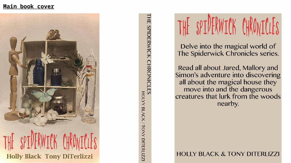
Main book cover

Themes:I focused on a few themes, but I mainly focused on a magical theme. This theme pretty much represents the book as a whole, as the book is based on a magical book. A lot of dark colours are used for my book covers, these dark colours represent the ‘dark’ woods and mystical creatures within the book’s story. The images used all represent nature, but also has that magical effect to it, for example the jars. As “spider” is represented in the book cover name, I used the theme of nature and magic to help choose my font. Joseph Cornell helped me display the themes in my book cover, as I took inspiration from his cardboard box artwork as he also worked with nature and magical type themes. For my main book cover, the dark like mysterious theme isn't presented as much as the other books, however the dark theme can be seen in the jars, or peacock feather depending on how the reader themselves views the book cover as it could probably be interpreted in different ways and there is a few themes within the book. For the second book cover (green and black) I focused mainly on the magical theme, as when I used part of a peacock feather and zoomed In, it produced a pixelated, spotty, magical effect. It also reminded me of a night sky with a green magical effect in it. For the third book cover, again I focused on the magical theme, with the different coloured specles that again, gave off a magical type effect. I also drew a spider and web, that combined well with the book title and its name. It also linked with a nature/creature theme.
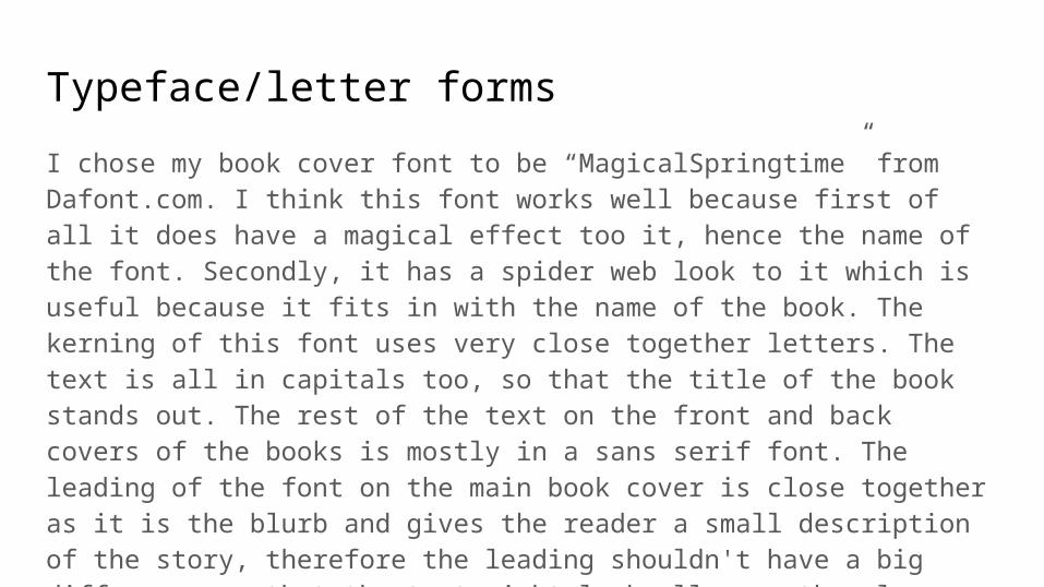
Typeface/letter forms
I chose my book cover font to be “MagicalSpringtime” from Dafont.com. I think this font works well because first of all it does have a magical effect too it, hence the name of the font. Secondly, it has a spider web look to it which is useful because it fits in with the name of the book. The kerning of this font uses very close together letters. The text is all in capitals too, so that the title of the book stands out. The rest of the text on the front and back covers of the books is mostly in a sans serif font. The leading of the font on the main book cover is close together as it is the blurb and gives the reader a small description of the story, therefore the leading shouldn't have a big difference so that the text might look all over the place and/or confuse the reader. I used the same font for the title of each book cover, and also the same font for each blurb of the back covers.
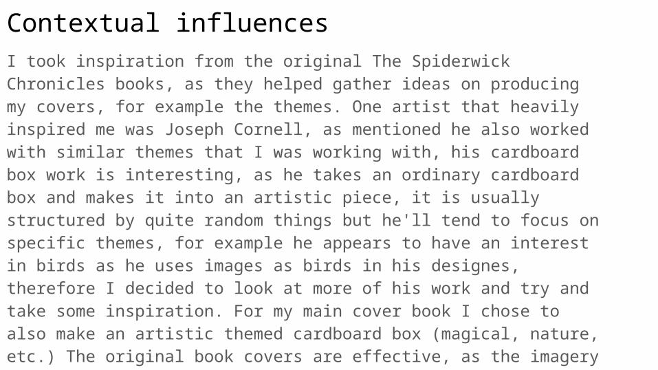
Contextual influences I took inspiration from the original The Spiderwick Chronicles books, as they helped gather ideas on producing my covers, for example the themes. One artist that heavily inspired me was Joseph Cornell, as mentioned he also worked with similar themes that I was working with, his cardboard box work is interesting, as he takes an ordinary cardboard box and makes it into an artistic piece, it is usually structured by quite random things but he'll tend to focus on specific themes, for example he appears to have an interest in birds as he uses images as birds in his designes, therefore I decided to look at more of his work and try and take some inspiration. For my main cover book I chose to also make an artistic themed cardboard box (magical, nature, etc.) The original book covers are effective, as the imagery used on the covers display the themes or story fairly well. The original book covers are also effective because the typography is creative and has a script type font for the title, giving the covers that extra bit of an eye-catching look.
The stages of designFirst of all I gathered my sources, information on the book, imagery, themes, etc. This helped me with the basics of designing my book cover, for example which specific themes would mostly link to a book like The Spiderwick Chronicles and which kind of design and imagery I'd be using to display the themes. Originally I was going to stick with having an illustrated main book cover, but after having a photo shoot with the Joseph Cornell style cardboard box, I decided to use that as my main cover as it definitely had more depth in creativity and the particular themes I was focusing on. After the photo shoot, I developed the three book covers, one being mostly illustrated using photoshop and illustrator. I created a front and back cover for each book design. And a spine for my main cover. Apart from researching about the book itself, I also researched on different fonts I could use for my book. The fact I have also previously done work on book covers also helped with the layout of the covers and etc.

The brief The brief of designing the covers was to produce one which was imaginative and explored typefaces and letter. My main book cover fits the brief, as I have used a creative font for the title of the book, and made it a red colour. The colour of the title is important so it grabs the readers attention, therefore I used quite a bright red so the title stands out and doesn't look too plain as I believe the cover image should stand out just as much as the title does. However, the image and background colour does also help make the type stand out as the red title with the beige like colour background. The images for the cover is imaginative as it includes the different themes portrayed in the original book/books. The fact I used torn book pages to fill the inside of the cardboard box also is an imaginative way to approach designing a “book” cover as it has a sense of irony, also the books story does include a magical type book featured in it.