evaluation question 1
TRANSCRIPT
In what ways does your magazine use, develop or challenge forms and conventions of real media products?
Magazine Cover: Use
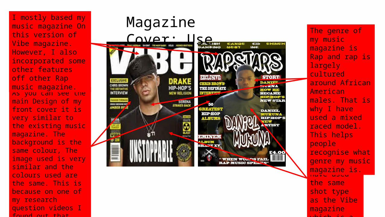
For my magazine I have used the same shot type as the Vibe magazine which is a mid-shot.
As you can see the main Design of my front cover it is very similar to the existing music magazine. The background is the same colour, The image used is very similar and the colours used are the same. This is because on one of my research question videos I found out that most people prefer this design, so I based my design off this one.
The genre of my music magazine is Rap and rap is largely cultured around African American males. That is why I have used a mixed raced model. This helps people recognise what genre my music magazine is.
I mostly based my music magazine On this version of Vibe magazine. However, I also incorporated some other features off other Rap music magazine.

Magazine Cover: DevelopEven though I based the majority of my front cover design on this specific magazine there are some things that I have developed.
An example of something that I have developed on my magazine is the Masthead. As you can see the style of text is different. I used a more graffiti style text to give my magazine more of a ‘street’ look. Also instead of having a sold coloured text, I have used a two toned style text.
Another thing that I have developed on my front cover is the lighting used on the pictures taken. The lighting used with my model it a lot more brighter. This symbolises the bright future that my model has ahead of him in the rap industry.
One final thing that I have developed on my front cover is the background. Even though the background is the same colour I have incorporated a smokey look onto the background. This is just to give my background a different look.

Magazine Cover: Challenge On my front cover I have inserted my strapline “ When words fail rap music speaks” at the bottom of my magazine. Where as Vibe magazine hasn’t got one anywhere on their magazine.
At the bottom of my magazine I have incorporated some advertisement for Eminem’s new album. Where as Vibe magazine doesn’t advertise products on their front cover.
At the bottom right of my front cover I have added the price and made it very visible. Where as the price isn’t visible or possibly not there on Vibe magazines front cover.
I do not have a logo on my magazine but there is a logo on Vibe’s magazine.
On my magazine I have added a storyline onto the front cover of my magazine where as Vibe magazine hasn’t.

Contents Page: UseEven though my contents page looks nothing like the one on the right, this is the contents page that I have analysed toughly. My Contents page looks nothing like this one because I used many different contents pages to create mine.
One thing that is the same on both contents pages is the fact that they both have page numbers on them.
Another thing that is the same on both magazines is the fact that the information that is on each page is listed and the page numbers are also displayed as well.
All of the images on my contents page are mid-shots as is the image on the contents page on the right.
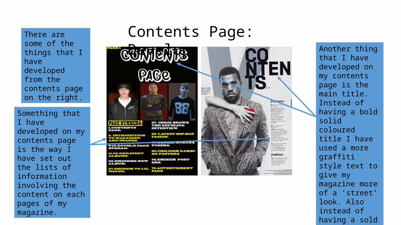
Contents Page: DevelopThere are some of the things that I have developed from the contents page on the right.
Something that I have developed on my contents page is the way I have set out the lists of information involving the content on each pages of my magazine.
Another thing that I have developed on my contents page is the main title. Instead of having a bold solid coloured title I have used a more graffiti style text to give my magazine more of a ‘street’ look. Also instead of having a sold coloured text, I have used a two toned style text.

Contents Page: ChallengeEven though I have talk about some points which are the same there are lots of features that are different
One massive difference between these two contents pages is the colour of the background. I have chosen to use the colour black because my magazine front cover is black so I want to keep the colour of the backgrounds consistent.
Another big difference between these two contents pages is the fact there is only one image on the contents page on the right, where as I have used three images on mine.
One final difference between my contents page and the contents page on the right is the different colour text. I have continued to use black and yellow text to keep consistency.
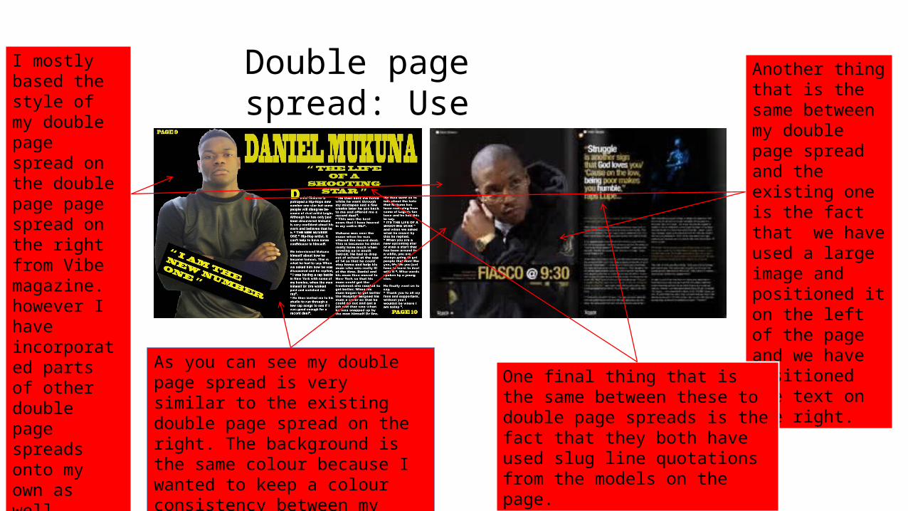
Double page spread: UseI mostly based the style of my double page spread on the double page page spread on the right from Vibe magazine. however I have incorporated parts of other double page spreads onto my own as well.
As you can see my double page spread is very similar to the existing double page spread on the right. The background is the same colour because I wanted to keep a colour consistency between my three products.
Another thing that is the same between my double page spread and the existing one is the fact that we have used a large image and positioned it on the left of the page and we have positioned the text on the right.
One final thing that is the same between these to double page spreads is the fact that they both have used slug line quotations from the models on the page.

Double Page spread: DevelopEven though these two double page spreads look very similar, there are some thing that I have developed on mine.
Some thing that I have developed on my double page spread is in stead of having his name in small writing over the top of the image. I have moved it to the top of the page and made it into a title
Something else that I have developed on my double page spread is the angle that I have taken my photo in. Even though they are both mid-shots my image is taken centrally where as the image on the existing double page spread is taken from a side point of view.
One final thing that I have developed on my double page spread is instead of using just one slug line I have used two. I have done this to try and make my page look like it has more on it.

Double page spread: ChallengeOn my double page spread I have incorporated page numbers, where as the double page spread on the right doesn’t have any on.
Another difference between these two double page spreads is the colour in text. On my double page I have used a lot brighter white and yellow to make the text stand out, where as the double page spread on the right uses a darker white and a bronze colour.
Another difference between these two double page spreads is the fact that I have only used one image on my double page spread, where as there is two on the double page spread on the right.
One final difference between these two double page spreads is, I have split my story into three columns, where as the other double page spread story is spilt into two columns.