evaluation question 1
TRANSCRIPT
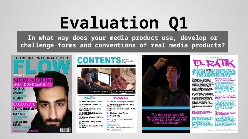
Evaluation Q1In what way does your media product use, develop or challenge
forms and conventions of real media products?

In creating my magazine cover I have used the conventions:
Masthead - The masthead is the name of the magazine displayed boldly along the top of the cover. In my real media the masthead was always largest text on the page, which I have also done here. It also follows the house theme of the magazine.
Left Third - All information for features of the magazine is contained within the left third of my magazine. When I originally planned my cover I had not intended to use the left third so heavily, but in practice and from looking at more forms of real media I found that it was the most effective way to have my main image and image both displayed clearly on the page. My left third follows the house theme and uses bold cover lines that stand out from the other text.
Main Image - A main image of a music artist relating to my most prominent coverline is used, as is very commonly seen in real media. The image is slightly overlapping the masthead to bring it forward which is a convention that I saw almost always used when looking at real media.
Header - Above the masthead I have implemented a header that, while not relating to the contents of this particular issue of the magazine, gives more information on what content will generally be in the magazine. Headers were something I saw in all of my real media for various purposes.
Fonts - The fonts in my cover were kept mainly quite simple for most of the cover lines and masthead so as to not make the information too difficult to read. More stylized fonts such as a dripping marker have been used sparingly for the issue number and contact details.
House theme - When creating my cover I chose to use a more unusual colour scheme of magenta/turquoise/black, taking inspiration from Complex magazine when looking at real media. This aims to give the magazine more of a stand-out look from the competition and would be considered challenging usual conventions.

In creating my magazine contents page I have used the conventions:
Heading - A large heading is used at the top of page to title the page in the same colours as the masthead previously. Alongside this is the header area the dates is also listed. In the large majority of real media ‘Contents’ is displayed on the page in a similar way.
Images - I have developed conventions when using images by using two smaller images relating to two different features of the magazine, rather than having one large main image similar to the style of the cover, which was often used in real media such as in the Vibe contents page.
Features - The lower half of the page is devoted to the features of the magazine, split into two separate columns for Music/Fashion. This is developing the convention as most often in my real media the contents was listed in one long column along the right/left side of the page.
House theme - I have continued to use the house theme established in the cover of turquoise/magenta/black. The basic information is kept black whereas the colour is used to distinguish the header and to distinguish each column from each other visually.
Contact Info/Social Media - I have included social media and website addresses at the bottom of the contents page as in the contents seemed the most effect place to include this information and was where I had seen social media linked in real media.

In creating my double page spread I have used the conventions:
Main Image - One page of the spread is mostly a large main image of the artist featured in the article on the other page of the spread. Use of an image in this way was commonly seen when looking at real media. The image is on a black background so as to make the subject more of the focus.
Quote - I have developed the convention of using a quote from the article by including that quote large and bold on the first page of the spread underneath my image. Often in real media a quote is blown up and inserted somewhere amidst the article rather than given it’s own space on the first page.
Header - The ‘D-Ratik’ header is stylized to fit the genre of the magazine and to have the header be visually different to the other text used in the article. The name of the artist is usually used for this as seen in my real media included, the ‘WK’ being the name of the artist Wiz Khalifa.
Summary - A small summarizing paragraph under the main header that introduces the artist and the purpose of the article, leading into the article with a question. This small paragraph was something utilized in real media also.
Article - For the article itself I have included information on the artist in plain black and then the interview is in the house theme of magenta/turquoise to visually seperate the two sections of article. This is developing what I saw in real media where often the text of the article is just all black, instead I have incorporated my house theme.