evaluation question 2
TRANSCRIPT

When constructing my digipack, I conformed to
the convention of having four panels, with the disk cradle on the third panel.
Panel 1 Panel 2 Panel 3 Panel 4
Poster
The medium
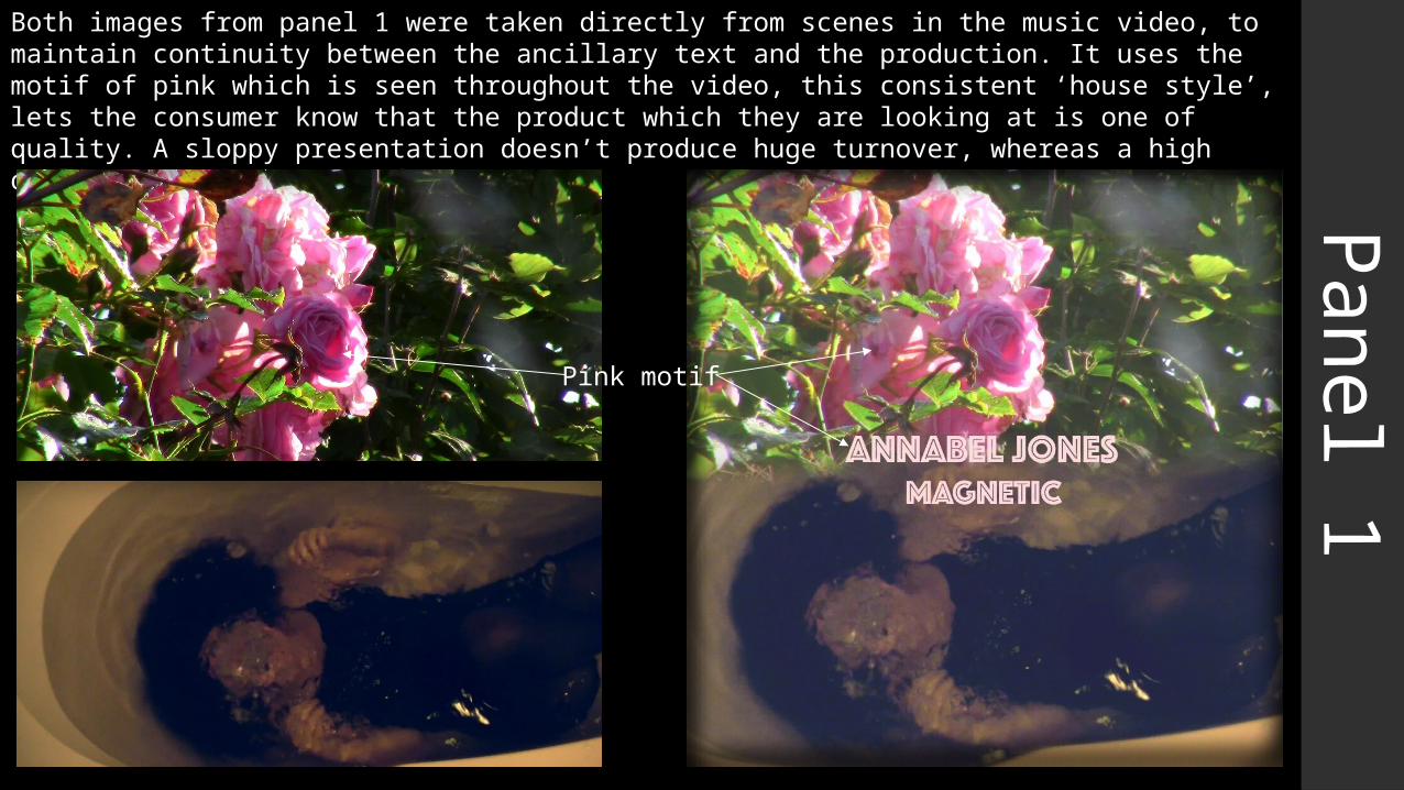
Panel 1Both images from panel 1 were taken directly from scenes in the music video, to maintain continuity between the ancillary text and the production. It uses the motif of pink which is seen throughout the video, this consistent ‘house style’, lets the consumer know that the product which they are looking at is one of quality. A sloppy presentation doesn’t produce huge turnover, whereas a high quality, consistent one does.
Pink motif

Panel 1The only person on panel 1 is the lead character in the music video – this also shows how she is the most important part of the production and the ancillary texts. This paints her as independent and strong, yet isolated and lonely; same as in the video. Having images of the artist throughout the music video and ancillary texts is also a generic convention, and relates to Goodwin’s theory of promoting the artist.The two images on panel 1 also relate to the concept / topics of the music video. The music video aims to explore the highs and lows of the character’s trip – comparing ecstasy with fear, and commenting on youth culture’s need for escapism. Panel one does the same: the top image is positive symbolism, whereas the bottom images is negative (this also is an intertextual reference to the bible, heaven and hell – Goodwin).
’Heavenly’ image – roses symbolise love and beauty. The word rose also means ‘pink’ in a variety of languages. Pink represents compassion, nurturing and love. It relates to unconditional love and understanding, and the giving and receiving of nurturing.
‘Hellish’ image – drowning in dreams depicts fear of being overwhelmed by difficult emotions or anxieties.
By depicting this on panel one it amplifies the themes and allows a consumer to create their first impressions based on something substantial, rather than just an image of the artist.

Panel 2+3Panels 2 + 3 were also taken from the film itself to establish continuity within the product.It features a sleeping lead character surrounded by rose petals; symbolising the blurred lines between her reality and her life in the dream / trip.Again, the motif of pink is shown in the pink rose petals and only the lead character is present, like in panel 1.I liked this image in particular for these panels since it is somewhat symmetrical. I feel that this makes it perfect for the inside of the CD case, since it covers the two panels, and the image of the woman is split across the two, she is half and half on each. By having the image across the inside I challenged the generic convention of having a blank/very minimal design for the 3rd panel, and just the design on the back of the insert as panel 2.
Pink + rose motif

Panel 4Panel 4 was the biggest thematic deviation, since it is the only image which isn’t taken directly from the music video. There isn’t really much reasoning behind this, other than that I wanted to change it up a little and add a higher sense of fantasy to the ‘tripping’ concept.The image shows the lead character floating into the air in the middle of the road. This also has links to Ophelia floating in the river and is a reference to the ‘out of body experience’ which some drugs allegedly provide.
The reference to the ‘pink’ motif is mostly seen in the text, and the very subtly digitally enhanced pinkness of her skin.
This image is also an intertextual reference (Goodwin) to the art of Imagine Dragons'‘Continued Silence EP’.

Panel 4The image also uses the rule of thirds, by not having the focus of the image in the direct centre; she is slightly below; this draws attention to her hand in the centre of the frame, which is in a very similar position to Adam’s in the Michelangelo’s ‘The Creation of Adam’.
This is another biblical intertextual reference (Goodwin), and also ties in to the image of the apple in my music video, which has links to the Garden of Eden.
The use of space around the subject of the image allows space for the track listing, institutional information and barcode.
The pink motif is present again, as is the singular character’s presence.

PosterMy poster uses the pink motif massively – the whole poster is just pink, white and black.This also is an image taken from the music video. I think this is the best way to represent my music video to those who haven’t already seen it, since it takes actual content from the video, and also incorporates both the lead character and the motif; therefore giving a sense of what is to come without fully experiencing it. The image links to the section of the trip where the paint is poured over the girl’s head.The image challenges the generic convention of promotion of the artist, considering the face is out of frame – but the text of the artist name is the largest of them all, which perpetuates the convention.