evaluation question 7
TRANSCRIPT

Evaluation Question 7 - Looking back at your preliminary task (the
school magazine task), what do you feel you have learnt in the
progression from it to your final production

Research and planning- Looking back at my prelim research and planning for my college magazine i researched into different professional magazines to see what content it had on it however i did not research in depth, i basically looked at things such as mast heads, sell lines and things such as them. However when doing my final piece i had more time to look over professional magazines and look into each aspect of each magazine closely so that i can apply them to my own magazine, as a result my magazine follows closely with those that are professional, my double page spread is similar to the professional top of the pops magazine as i liked the way it was designed, looking at all the professional magazines in detail i have identified different styles that they have used, i then took some of these styles and adapted them to my own cover. I still could have managed my time better as i left some things i,e the draft copy till the very last minute, i found myself updating my blog an an hour before deadline however after our draft i did try to keep on top of things from then on. Im not very good at planning things, i tend to do a rough draft and then start my product once i start my product i start to change things and it never ends up looking like my plan, i prefer to have a base to change rather then draft and then start the product. Therefore my planning could have been better for my product but I am still happy how things went.

Construction-
The left is my prelim design and the right is my final product, comparing the two my final product has a genre and a theme around it, it is based on something and has detail and other images whereas my prelim product is basic, it has one main photo with sell likes spread out quite messy around the page, things such as the mast head is boring on the prelim, its basic and a bland colour whereas on my final product I have chosen bold colours and I have added detail around the masthead, this is due to the fact I had more time with my open product to get to know how to work the software I have used, doing this enabled me to be able to use the full use of the piece of software I used which was an advantage and allowed me to doing different and more in your face things with my front cover than it did with my prelim meaning my product was able to fit a genre and had themes rather than bring plain and simple. In my prelim I took the photo on my phone, I used the photography studio at college and no one helped me with the angles of which I took the photo whereas with my product I had time to plan where I wanted to take my photos, who I wanted to model for them, I also had help off Phil, he showed me what angles to take the photos from, where to have the lighting which is something I didn’t take into account last time also looking at the professional magazines in detail I added things such as an issue number, barcode and things such as these to ensure my product was identical to an original, this is something that I didn’t do on my prelim as I hadn’t researched or thought into it as well as I did on my product. For my prelim I didn’t have a genre that I wanted to follow or match, therefore I had no sell line to picture ratio, I had more sell lines and only one photo, It also didn’t have any different fonts and nothing stood out, however on my product I had a genre that I wanted my magazine to be like and that meant I had to ensure that I used appropriate fonts and pictures and that I made things stand out in contrasting colours. Finally with my genre being Pop I needed to make sure my models looked pop like, whereas in the prelim I didn’t even think about the outfit that my model was wearing.

What I learnt
Creating my product I learnt how to use the camera to the extent that would allow me to produce good photos, I learnt how to position my models and the camera so that I got a good photo which didn’t have space between each model, I learnt where to position the lights so that it made my photos more light and wouldn’t create shadows on certain parts of the picture. I didn’t use a tripod so I had to learn how to position the tripod so that I got a good photo and the position I wanted it however make sure it wasn’t a poor quality, I had to ensure my models stood how I wanted them to and posed the way I wanted so that my magazine genre didn’t change because they weren’t positioned or posing right. I think this is shown in my final piece if we compare my final piece to my prelim.
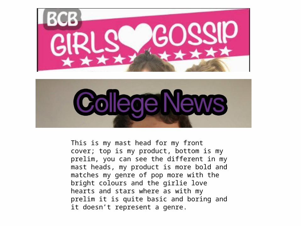
This is my mast head for my front cover; top is my product, bottom is my prelim, you can see the different in my mast heads, my product is more bold and matches my genre of pop more with the bright colours and the girlie love hearts and stars where as with my prelim it is quite basic and boring and it doesn’t represent a genre.

For my sell lines and the rest of my front cover, as you can see there is much more detail, I have a barcode, issue number, big bold sell lines and bold boarders around the photos, which is an improvement to my 5 basic sell lines on my prelim, I don’t have any extra photos on my prelim however I do on my product, also the photo on my product is of better quality to my prelim as the lighting is different and a lot better.

Contents Page Equally to my front cover my contents page for my prelim I didn’t have a genre to follow, I also didn’t research into what a professional contents page looked like, my prelim contents page is bland, it had colour however its dull and boring it also has no structure to it, whereas after research I structured my contents page on a professional top of the pops magazine, this helped me get my contents page to match the genre I had chosen. it also showed me how to structure my page out so that it looked a lot more professional and not just crammed together.

The top one is my prelim and the bottom is my final product, As you can see my product is completely different to my prelim, I haven’t stated that it’s the contents page in my main product I've used dark and light contrasting colours to ensure it stands out whereas my prelim is boring and dull colours, it also doesn’t have a specific genre whereas you can kind of make out what genre my product is portraying.
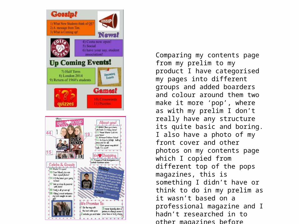
Comparing my contents page from my prelim to my product I have categorised my pages into different groups and added boarders and colour around them two make it more ‘pop’, where as with my prelim I don’t really have any structure its quite basic and boring. I also have a photo of my front cover and other photos on my contents page which I copied from different top of the pops magazines, this is something I didn’t have or think to do in my prelim as it wasn’t based on a professional magazine and I hadn’t researched in to other magazines before hand.
I have learnt…I learnt about layout and the importance of it throughout my prelim and my product. My prelim evidences this by the way it is so basic and doesn’t follow the forms and conventions of any professional product, however my main task uses the forms and conventions of professional texts more and looks more profession than the prelim I created. For instance I have used things such as barcodes and issue numbers, boarders around my photos, extra photos, outfits and lighting, more sell lines, bolder colours and more structure to my page in comparison to my prelim where I haven’t added a barcode or issue number and there is limited detail.