evaluation question 7
TRANSCRIPT
7. Looking back at your preliminary task, what do you feel you have learnt in the progression from it to the full product?
Since completing my preliminary task, of creating a college magazine and draft contents page, I have gained more knowledge and understanding regarding photography, editing and most importantly the construction of magazines. I have used everything I learnt these past few months to aid me while creating my final product, a music magazine.
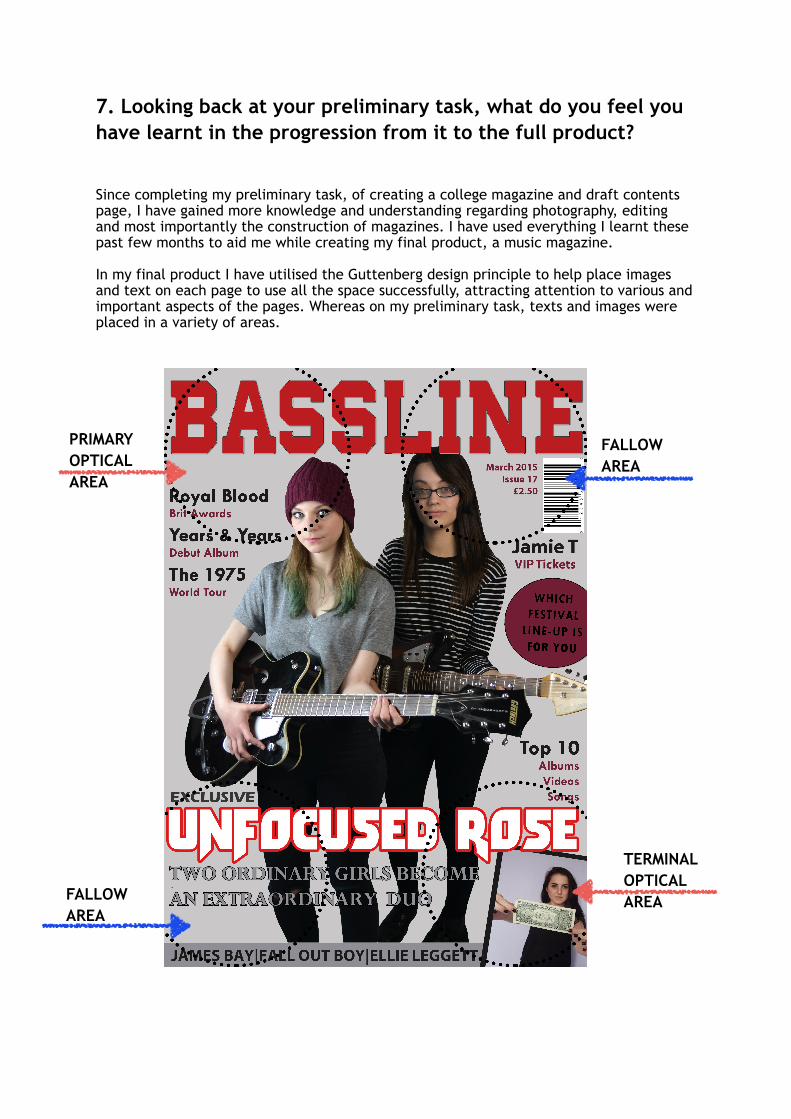
In my final product I have utilised the Guttenberg design principle to help place images and text on each page to use all the space successfully, attracting attention to various and important aspects of the pages. Whereas on my preliminary task, texts and images were placed in a variety of areas.
PRIMARY OPTICAL AREA
TERMINAL OPTICAL AREA
FALLOW AREA
FALLOW AREA

Copared to my initial college magazine, I have used the different sections within the guttenberg design principle to feature different things. For example in the terminal optical area, I have added my secondary image and the bottom fallow area, I has used white text for the modal credit, which contrast with the prominent dark colours on the front page, this therefore draws attention to this area, that otherwise may have been looked over by the audience. It also features a banner along the bottom that features extra cover lines, the banner helps draw attention to theses.
Since my preliminary task I have improved my photography skills, by using rule of thirds and different lighting techniques (I used softbox lights for my final product where as my preliminary task relied on natural light) I have been able to get better quality photos to use in my magazine. I have also used a much wider range of photos throughout my final piece. Also in my final piece all of my images were shot with a neutral background and with some of the images I cropped this out. This ensured that unlike in my preliminary task, text could be read easily.
Also, in my final product I have taken into account the whole image and used models and props that suit my genre. For the front cover of my preliminary task I used a simple profile photo of a student however in my final product I chose 2 people who would help represent the indie-rock genre and including props to further reflect the genre.
Guitars Dark Clothing

I have also used a stronger house style throughout my final piece which makes it more professional while creating familiarity for the audience to recognise the magazine. (my preliminary task used a range of colours) In my final piece I have fewer bright colours than in my preliminary task. This is so that the audience is not overwhelmed when seeing the front cover and keeps it more sophisticated.
In my final piece I have also used more common features of magazines, such as badges and banners where as my preliminary task did not include these features. This has helped improved my final piece; badges attract attention, so that consumers can identify special features when the magazine is on shop shelves. While the side bar in my double page spread gives extra detail. The timeline is effective as it is easy to read, and text is displayed in a visual manner.