everyday robots analysis
TRANSCRIPT

Everyday Robots (2014) is Damon Albarn’s first solo album, the digipak was designed by Aitor Throup. Albarn is most famously synonymous with the British bands Blur and Gorillaz. These two bands are illustrious for their style and star iconography; Gorillaz’s being anime style characters and a range of music influences; Blur’s being figureheads for Britpop and their energetic music style. However Damon Albarn's new solo album is a lot less eccentric and he has softened the tempo of the music in comparison to previous works. The digipak aesthetically parallels this gentle composition in the sense that it the design is minimal and colourless. The album is also an autobiographical fabrication, it is a chance for Albarn to create personal music free from the confines of reputation. This could explain the sparse artwork; there is no need for symbolic graphics or idiosyncratic qualities, a simple photograph of him will suffice.
digipak analysis

the outside
front
The cover of the digipak is as simple as an be. All that resides is name of the album and artist in the centre third and a lonesome photo of Albarn in the right hand third. Aitor Throup wrote on his website that the cover is intended to represent Albarn ‘going solo’. This message is conveyed with the low-key photograph of the artist sitting in an empty space. This image gives the connotations of isolation and loneliness but also contemplation and the space in from of the figure signifies ‘room to grow’. This possibly stems from the fact that Albarn has left his previous affiliations to focus on this album giving him his own creative reign coupled with an unfamiliar feeling of isolation.
The reverse of the album continues with the basic theme. The centre third consists of the track list and a bar code, the bottom horizontal third contains all the necessary information about the production. This element of the digipak is the least attention grabbing. It seems that the lack of colour and any imagery is telling the reader that the most important facet here is the music. Additionally the style of the music is sombre and mature, the layout is reflecting this. Which means, as most people will ‘judge a book by it’s cover’, any expectations of Albarn's usual styles will be halted. The font used in the track list (the same used for the name of the artist) resembles hand writing. This is a signifier that the music is personal and carefully made.
back
the inside fold
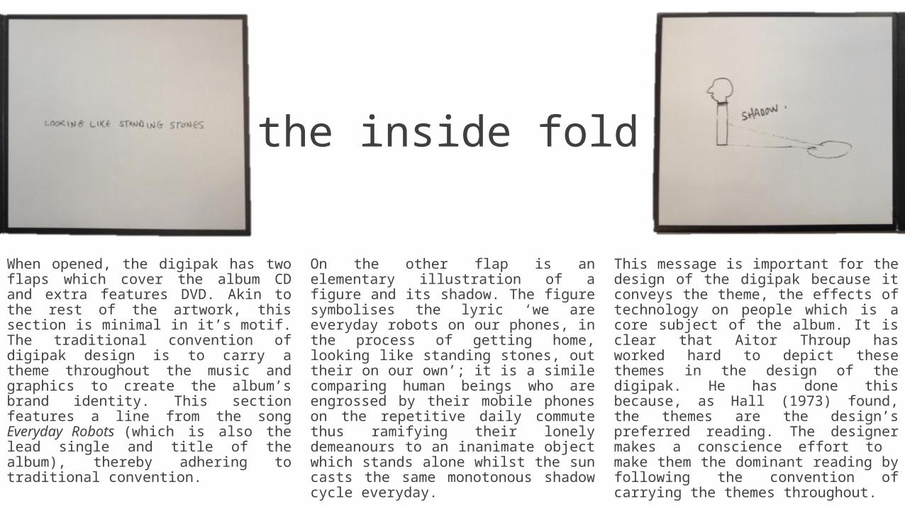
When opened, the digipak has two flaps which cover the album CD and extra features DVD. Akin to the rest of the artwork, this section is minimal in it’s motif. The traditional convention of digipak design is to carry a theme throughout the music and graphics to create the album’s brand identity. This section features a line from the song Everyday Robots (which is also the lead single and title of the album), thereby adhering to traditional convention.
On the other flap is an elementary illustration of a figure and its shadow. The figure symbolises the lyric ‘we are everyday robots on our phones, in the process of getting home, looking like standing stones, out their on our own’; it is a simile comparing human beings who are engrossed by their mobile phones on the repetitive daily commute thus ramifying their lonely demeanours to an inanimate object which stands alone whilst the sun casts the same monotonous shadow cycle everyday.
This message is important for the design of the digipak because it conveys the theme, the effects of technology on people which is a core subject of the album. It is clear that Aitor Throup has worked hard to depict these themes in the design of the digipak. He has done this because, as Hall (1973) found, the themes are the design’s preferred reading. The designer makes a conscience effort to make them the dominant reading by following the convention of carrying the themes throughout.

the inside spread
When opened completely, a four sectioned spread is revealed inside. Again, the design and layout is analogous with the recurring theme. This part of the digipak contains more illustrations and lyrics from songs on the album. The background to the drawings is crumpled paper and there is a lot of lyrics scribbled out and rewritten. This further gives the sense of the album being personal and autobiographical because it seems that Damon Albarn has inputted a lot of effort and more than just the music. Also the shape on the right flap resembles the pentangle symbol which Albarn wears on a necklace and is part of his star iconography.
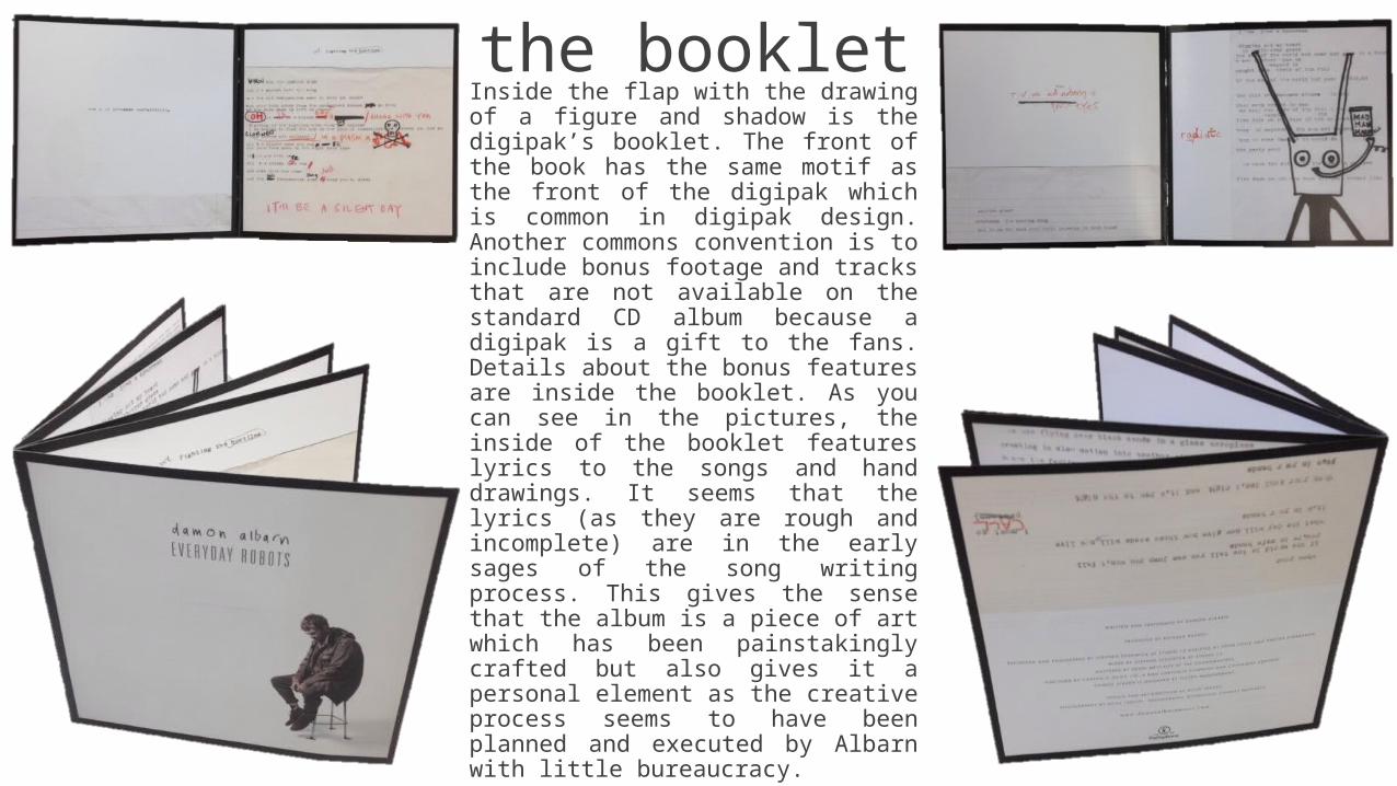
the bookletInside the flap with the drawing of a figure and shadow is the digipak’s booklet. The front of the book has the same motif as the front of the digipak which is common in digipak design. Another commons convention is to include bonus footage and tracks that are not available on the standard CD album because a digipak is a gift to the fans. Details about the bonus features are inside the booklet. As you can see in the pictures, the inside of the booklet features lyrics to the songs and hand drawings. It seems that the lyrics (as they are rough and incomplete) are in the early sages of the song writing process. This gives the sense that the album is a piece of art which has been painstakingly crafted but also gives it a personal element as the creative process seems to have been planned and executed by Albarn with little bureaucracy.