excel functions & charts - landscape management system
TRANSCRIPT

1
Excel Functions & Charts
Microsoft Excel® is a powerful companion program for use with LMS. To open Excel,click Start on the Task Bar then Programs/ Office/ Microsoft Excel.

2
Pivot tables are used in Excel to automate organization and calculation of spread sheet data.
In the following pages, the user will learn to create a Pivot table to summarize stand volumes by species.

3
Step 1: From LMS main window, click Analysis/Tables/Inventory , select the year 2000, select all stands, open and delimit Inventory table with macro control key (see Tables section).
Step 2: With a cell selected within the table area, click on the Data drop down menu in Excel. Then click on Pivot Table Report .
Pivot Table using Excel 2000

4
Step 4: The data area should be surrounded by a dashed line, click on Next.
Step 3: Select Microsoft Excel list or database. Click Next .
Pivot Table using Excel 2000

5
Step 3: Select New worksheet. Click Finish...
Pivot Table using Excel 2000

6
Step 4: Click and drag Stand to the Row area, click and drag Species to the column area, click and drag VolPer Tree to the data area.
Pivot Table using Excel 2000

7
A Pivot table that displays volume by species by stand is created.
Pivot Table using Excel 2000
8
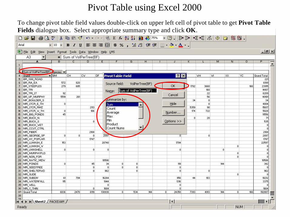
To change pivot table field values double-click on upper left cell of pivot table to get Pivot Table Fields dialogue box. Select appropriate summary type and click OK.
Pivot Table using Excel 2000

9
Step 4: The data area should be surrounded by a dashed line, click on Next.
Step 3: Select Microsoft Excel list or database. Click Next .
Pivot Table using Excel 97

10
Step 5: Click and drag Stand to the Row area, click and drag Species to the column area, click and drag VolPer Tree to the data area. Click Finish...
Pivot Table using Excel 97

11
and a Pivot table that displays volume by species by stand is created.
Pivot Table using Excel 97

12
Column charts are used in Excel to visually display data quantity distributions.
In the next few pages, the user will learn to create a column chart that summarizes timber volumes and grades for the
Pack Example landscape.

13
Step 1: In LMS main window click Analysis/Tables/Volume by Species and Size, open and delimit (use the macro created earlier) Volume by Species and Size table. Highlight the species and log size columns.
Step 2: From the Excel tool bar Graphical User Interface (GUI), click on the ChartWizard button. This can also be accomplished from the drop down menu by clicking Insert/Chart .
Step 3: Choose the Column chart in the top center. Click Next.

14
Step 5: Click on the Titles tab and add title , Volume by Tree Size and Species. Label Y axis by typing in Thousand Board Feet.
Step 6: Click on the Gridlines tab and uncheck Major gridlines.
Step 4: Click Series in Rows. Click Next.
15
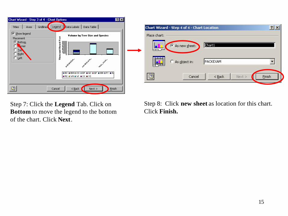
Step 7: Click the Legend Tab. Click on Bottom to move the legend to the bottom of the chart. Click Next .
Step 8: Click new sheet as location for this chart. Click Finish.

16
Volume by Tree Size and Species
0
1000
2000
3000
4000
5000
6000
7000
8000
9000
pole(mbf/stand) sawtimber(mbf/stand) large_sawtimber(mbf/stand)
Th
ou
san
d B
oar
d F
eet
BM CH CW DF GC GF MH PY RA RC WH WI XX YC

17
Step 10: Click on the Scale tab. Change the Maximum to 10000 and the Major unit to 5000. Click OK.
Step 11: Right click in the plot area. Then click Format Plot Area.
Step 9: Right click on the Y axis and then click Format Axis.

18
Step 12: Select None for Area. Click OK.
Step 13: To copy and paste the chart into a PowerPoint presentation, click on the chart border to select. The chart is selected when small squares appear on the border. Click on the Edit in the Excel drop down menu and click Copy. Go to PowerPoint
font size to 24, and click bold. Type in Title, Volume by Species and Tree Size Summaries made in Excel from the Volume by Species and Size table. Size the pasted chart to fit available space by dragging one of the small corner squares. Slide is finished.
Step 14: With a new slide open in PowerPoint (add title format), click the Edit drop down menu and then click Paste. Click in the add title space provided on slide, adjust

19
Volume by Species and Tree Size Summaries made in Excel from the Volume by Species and Size table
Volume by Tree Size and Species
0
5000
10000
pole (mbf/stand) sawtimber (mbf/stand) large_sawtimber (mbf/stand)
Th
ou
san
d B
oar
d F
eet
BM CH CW DF GC GF MH PY RA RC WH WI XX YC

20
AGE CLASS DISTRIBUTION, 2000
050
100150200250300350
0-10yrs
10-20yrs
20-30yrs
30-40yrs
40-50yrs
50-60yrs
60-70yrs
>70yrs
AGE CLASSES
AC
RE
S
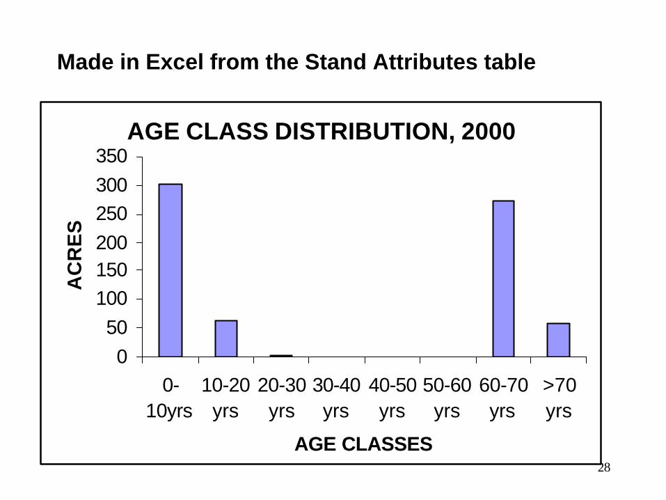
Excel column charts can also be used to display Age class distribution. For this exercise the user will learn to use IF statements to group data and then use grouped data to create a chart.

21
Step 1: From LMS main window click Analysis/Tables/Attributes open and delimit Strand Attributes Table.
Step 2: Enter age classes (0-10,11-20, 21-30, 31-40, 41-50, 51-60, 61-70, >70) as column titles in the columns next to the Stand Attributes data. Be sure to begin your entry with a single quote (‘) to avoid Excel thinking you are entering dates.

22
Step 3: To group the stands into the appropriate age classes, an IF statement is used. Click on cell L2, the first cell under the 0-10 age class heading. Type in IF formula as shown, =IF($F2<11,$K2,0). The first part of the IFstatement ($F2<11) evaluates the stand age. In this case if the stand is less than 11 years old. The second ($K2) part of the IF statement says what to put in that cell if the first part is true, in this case the stand acreage. The third part of the IFstatement (0) says what to put in the cell if the first part of the statement is false. For this example the first and last columns of age class cell formulas are created in a similar manner. For the last column cell (S2), type in the formula: =IF($F2>70,$K2,0).
Step 4: For the middle columns, the stand age class is a more discrete range (11-20, 21-30, etc.). Here the IF statement is varied a little by using an ANDcondition to pick up the range. Only the first part of the IF statement changes. Now a range is given using the AND condition, =IF(AND($F2>10,$F2<21),$K2,0). Now the first part of the IF statement must meet both conditions to be considered true, for example older than 10 and younger than 21. Repeat using appropriate ranges for the rest of the middle columns in this row.
23
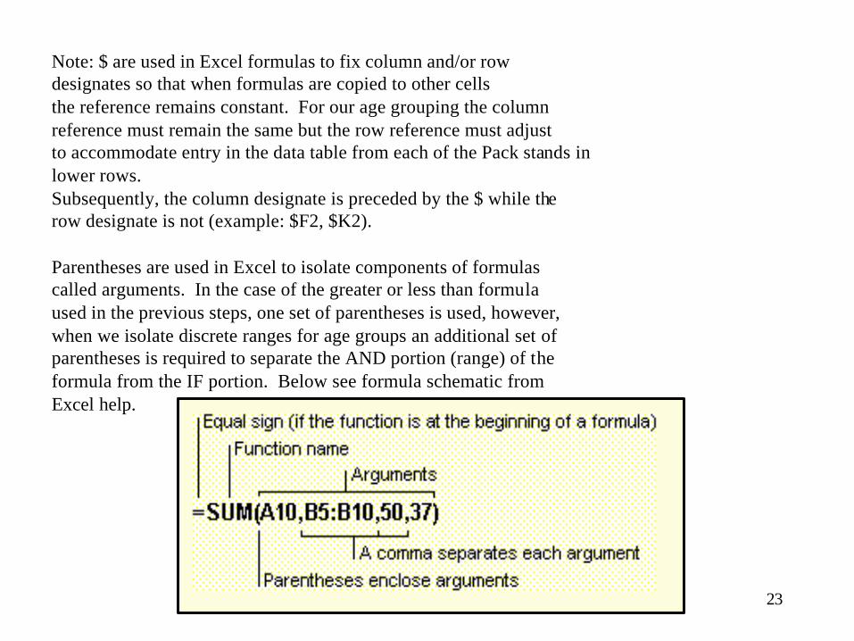
Note: $ are used in Excel formulas to fix column and/or row designates so that when formulas are copied to other cells the reference remains constant. For our age grouping the columnreference must remain the same but the row reference must adjustto accommodate entry in the data table from each of the Pack stands in lower rows.Subsequently, the column designate is preceded by the $ while the row designate is not (example: $F2, $K2).
Parentheses are used in Excel to isolate components of formulas called arguments. In the case of the greater or less than formula used in the previous steps, one set of parentheses is used, however,when we isolate discrete ranges for age groups an additional set of parentheses is required to separate the AND portion (range) of the formula from the IF portion. Below see formula schematic from Excel help.

24
Step 5: Once all of the IF statements are entered into the first row, the columns can be filled (copied) down. This will put the appropriate IF statement into each cell to segregate stand acreage by age class. To fill, select all the cells with the IFstatements entered. A little square will appear on the bottom right-hand corner of the selected cells. Click on this square and drag down. The IF statements will then copy to all cells to create the new table. This table will display acreage by age class.

25
Step 6: To sum up the acres in each age class, highlight the cells across the bottom of the age class columns. Next click the sum button (Σ) from the GUI (Graphical User Interface or speed bar).
Step 7: With the summed cells still highlighted, click on the Chart Wizard button from the GUI or click Insert/Chart from the drop down menu.
Step 8: Choose the column chart in the upper left corner and click Next .

26
Step 9: Click on the Series tab. To get the proper labels (diameter classes) on the x axis, click on the Category (X) axis labels box.
Step 10: Highlight the age classes and click on the box again. Age classes will appear on the x axis.
Step 11: Click on Next.

27
Step 13: Click on the Legend tab and uncheck Show legend. Click Next,then As new sheet, replace Chart1with Age_Classes, and then click Finish.
Step 14: Make other chart format changes as desired and then Copy and Paste the chart into PowerPoint (see previous chart paste).
Step 12: Click on the Titles tab and enter the appropriate titles as shown.
28
AGE CLASS DISTRIBUTION, 2000
050
100150200250300350
0-10yrs
10-20yrs
20-30yrs
30-40yrs
40-50yrs
50-60yrs
60-70yrs
>70yrs
AGE CLASSES
AC
RE
SMade in Excel from the Stand Attributes table

29
Volume by Tree Size for Landscape
pole(<12)
sawtimber
large_sawtimber(>24)-(mbf/stand)
A number of chart types are available for creation within Excel. Next, the user will learn to create a pie chart that
displays volume by tree size for the landscape.

30
Step 1: In LMS main window click Analysis/Tables/Volume by Size Class. Open and delimit (your macro) the Volume by Size Class table. Highlight the cells on the bottom of the size class columns. Click the Sum (Σ) button from the GUI. This will add up the volumes in each size class.
Step 2: With the Sums still selected, click the Chart Wizard button. Select Chart type: Pie and then chose the Pie chart in the upper left corner.

31
Step 4: Highlight the size classes in the table and click the Category Labels box again.
Step 5: Click Next.
Step 3: Click on the Series tab then click on the Category Labels box.

32
Step 6: Click on the Titles tab and add the title, Volume by Tree Size for Landscape.
Step 7: Click on the Legend tab and unselect Show Legend.
Step 8: Click on the Data Labels tab and select Show label. Click Next. Click As new sheet, name the sheet Vol_by_tree_size and click Finish.
Step 9: To adjust the size of the Pie chart, click near the Pie chart until a square appears around the chart. Click on one of the corners of the square and drag to adjust to desired size.

33
Step 11: Copy and Paste chart into PowerPoint.
Step 10: Data labels may be edited for spacing, content, and font size by clicking on the data label so that a box around text appears.

34
Volume by Tree Size for Landscape
pole(<12)
sawtimber
large_sawtimber(>24)-(mbf/stand)
Pie Chart made in Excel from Volume by Size Class table

35
Distribution of Oliver 5c Stand Structures, 2000
1_SI
2_SE
3_UR
4_SV
5_OG
Distribution of HCSSPT Stand Structures, 2000
1_SI
2_SE
3_UR
4_DEU
5_DIU
6_DEM7_DIM
Other Pie charts can easily be made from LMS Analysis data.
Shown below are pie charts displaying structural stages. The structural stage options in LMS reflect different approaches to categorize forest successional stages. To open these tables from the LMS main window click Analysis/Structural Stages (see tables section). When the Select Structure classes window opens, click by Structure and then choose desired structure classification. For this example, Oliver 5c was chosen for the first Pie chart creation and HCSSPT was chosen for the second Pie chart.

36
Step 2: Select the Pie Chart in the upper left corner. Click Next.
Step 3: Click on Next again.
Step 1: Open and delimit Oliver 5c from the Select Structure Classes window. Highlight the structures and proportions of structure and click on the Chart Wizard.

37
Step 4: Click on the Titles tab and enter the title.
Step 5: Click on the Legend tab and unselect Show legend.

38
Step 6: Click on the Data Labels tab and select Show label. Click Next.
Step 7: Copy and paste each chart into one PowerPoint slide for side by side comparison. Type in title.
Step 7: Click As new sheet, name the sheet Oliver_5C_Chart and click Finish. Repeat Steps 1 -6 with the HCSSPT structural instead of Oliver 5c.

39
Distribution of Oliver 5c Stand Structures, 2000
1_SI
2_SE
3_UR
4_SV
5_OG
Distribution of HCSSPT Stand Structures, 2000
1_SI
2_SE
3_UR
4_DEU
5_DIU
6_DEM7_DIM
Pie Chart comparisons of Stand Structure distributions made in Excel from Stand Structure Analyses tables

40
Any of the charts that have just been created may be saved as Templates in Excel. By saving tables and charts as
templates, in the future when the user wants to view the same chart only with different data, all the user must do is to paste the appropriate data into the template table. Then
the charts will change automatically to reflect the new data.
The following pages show the user how to save an Excel workbook and accompanying chart as a template.

41
Step 1: When a chart is completed, click on the File drop down menu then click on Save As.
42
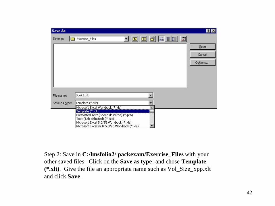
Step 2: Save in C:/lmsfolio2/ packexam/Exercise_Files with your other saved files. Click on the Save as type: and chose Template (*.xlt). Give the file an appropriate name such as Vol_Size_Spp.xlt and click Save.

43
Exercise
• Create each of the previous tables and graphs for other data sets available from LMS Analysis drop down.
• Save workbooks as templates *.xlt with appropriate names that you will remember in C:/lmsfolio2/packexam/Exercise_Files/.