exploring entities in text with descriptive non...
TRANSCRIPT
Exploring Entities in Text with Descriptive Non-photorealistic Rendering
Meng-Wei Chang and Christopher Collins
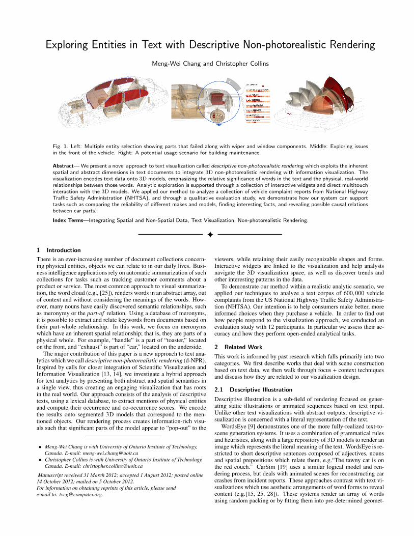
Fig. 1. Left: Multiple entity selection showing parts that failed along with wiper and window components. Middle: Exploring issuesin the front of the vehicle. Right: A potential usage scenario for building maintenance.
Abstract— We present a novel approach to text visualization called descriptive non-photorealistic rendering which exploits the inherentspatial and abstract dimensions in text documents to integrate 3D non-photorealistic rendering with information visualization. Thevisualization encodes text data onto 3D models, emphasizing the relative significance of words in the text and the physical, real-worldrelationships between those words. Analytic exploration is supported through a collection of interactive widgets and direct multitouchinteraction with the 3D models. We applied our method to analyze a collection of vehicle complaint reports from National HighwayTraffic Safety Administration (NHTSA), and through a qualitative evaluation study, we demonstrate how our system can supporttasks such as comparing the reliability of different makes and models, finding interesting facts, and revealing possible causal relationsbetween car parts.
Index Terms—Integrating Spatial and Non-Spatial Data, Text Visualization, Non-photorealistic Rendering.
1 Introduction
There is an ever-increasing number of document collections concern-ing physical entities, objects we can relate to in our daily lives. Busi-ness intelligence applications rely on automatic summarization of suchcollections for tasks such as tracking customer comments about aproduct or service. The most common approach to visual summariza-tion, the word cloud (e.g., [25]), renders words in an abstract array, outof context and without considering the meanings of the words. How-ever, many nouns have easily discovered semantic relationships, suchas meronymy or the part-of relation. Using a database of meronyms,it is possible to extract and relate keywords from documents based ontheir part-whole relationship. In this work, we focus on meronymswhich have an inherent spatial relationship; that is, they are parts of aphysical whole. For example, “handle” is a part of “toaster,” locatedon the front, and “exhaust” is part of “car,” located on the underside.
The major contribution of this paper is a new approach to text ana-lytics which we call descriptive non-photorealistic rendering (d-NPR).Inspired by calls for closer integration of Scientific Visualization andInformation Visualization [13, 14], we investigate a hybrid approachfor text analytics by presenting both abstract and spatial semantics ina single view, thus creating an engaging visualization that has rootsin the real world. Our approach consists of the analysis of descriptivetexts, using a lexical database, to extract mentions of physical entitiesand compute their occurrence and co-occurrence scores. We encodethe results onto segmented 3D models that correspond to the men-tioned objects. Our rendering process creates information-rich visu-als such that significant parts of the model appear to “pop-out” to the
• Meng-Wei Chang is with University of Ontario Institute of Technology,Canada. E-mail: [email protected]
• Christopher Collins is with University of Ontario Institute of Technology,Canada. E-mail: [email protected]
Manuscript received 31 March 2012; accepted 1 August 2012; posted online14 October 2012; mailed on 5 October 2012.For information on obtaining reprints of this article, please sende-mail to: [email protected].
viewers, while retaining their easily recognizable shapes and forms.Interactive widgets are linked to the visualization and help analystsnavigate the 3D visualization space, as well as discover trends andother interesting patterns in the data.
To demonstrate our method within a realistic analytic scenario, weapplied our techniques to analyze a text corpus of 600,000 vehiclecomplaints from the US National Highway Traffic Safety Administra-tion (NHTSA). Our intention is to help consumers make better, moreinformed choices when they purchase a vehicle. In order to find outhow people respond to the visualization approach, we conducted anevaluation study with 12 participants. In particular we assess their ac-curacy and how they perform open-ended analytical tasks.
2 Related Work
This work is informed by past research which falls primarily into twocategories. We first describe works that deal with scene constructionbased on text data, we then walk through focus + context techniquesand discuss how they are related to our visualization design.
2.1 Descriptive Illustration
Descriptive illustration is a sub-field of rendering focused on gener-ating static illustrations or animated sequences based on text input.Unlike other text visualizations with abstract outputs, descriptive vi-sualization is concerned with a literal representation of the text.
WordsEye [9] demonstrates one of the more fully-realized text-to-scene generation systems. It uses a combination of grammatical rulesand heuristics, along with a large repository of 3D models to render animage which represents the literal meaning of the text. WordsEye is re-stricted to short descriptive sentences composed of adjectives, nounsand spatial prepositions which relate them, e.g.“The tawny cat is onthe red couch.” CarSim [19] uses a similar logical model and ren-dering process, but deals with animated scenes for reconstructing carcrashes from incident reports. These approaches contrast with text vi-sualizations which use aesthetic arrangements of word forms to revealcontent (e.g.[15, 25, 28]). These systems render an array of wordsusing random packing or by fitting them into pre-determined geomet-

Fig. 2. A subset of the component keywords hierarchy. Words in squarebrackets are synonyms. The components in this hierarchy were isolatedin the 3D model of a car, and extracted from the text data and counted.
ric shapes designed to be semantically meaningful, such as renderingwords about flowers into the shape of a blossom.
Our application differs in that we aim for an interpretive view whichsummarizes common nouns in a collection of text, rather than deeplyprocessing short sentences to construct representable logical forms.The spatial positions in our system are not determined by the prepo-sitions in the text, but rather determined by their inherent positions aspart of the 3D model which serves as the substrate of our visualization.
Another related area of descriptive rendering is systems which al-ready have a defined scene geometry and use input data to modify howa scene is rendered. For example, IBIS is one of the first systems touse dynamic rendering based on user-specified input [22]. IBIS parsesa set of text-based rules to determine the optimal perspective and light-ing parameters that satisfy them. More recently, Sedlmair et al. aug-mented a system that visualizes communication among vehicle com-ponents with a 3D model of the vehicle itself, using the model to showthe communication paths [21]. Our work is related in that we augmenta non-photorealistic rendering of a car to emphasize important regions,however our visualization is driven by unstructured text data and weprovide for direct interaction on the 3D visualization itself.
2.2 Focus + Context
Focus + Context is a well-known technique used to draw attention toareas of interest while maintaining visibility of contextual informa-tion. There are various ways to discriminate these areas, for exampleHauser [13] reviews a general approach in which the use of colour,space, opacity and other resources are demonstrated.
A lens widget can be considered a focus + context technique thatmaps to a real-world metaphor of a magnifying glass. The area or ob-jects “under” the lens can take on additional properties or receive ad-ditional interactions, as seen in examples such as Magic Lens [5], 3DMagic Lens [24] and NPRLens [18]. Our lens system drew inspirationfrom these examples. In addition, our lens widget is location-awareas our scene is spatially segmented, which is somewhat similar to theBrainGazer visual query paths [6].
Lenses can also be used for dynamic labelling, in which the lens isused to reveal additional data that would have otherwise created toomuch visual clutter on the display [11, 12]. In addition, summariesand other abstract information can be displayed as part of the labellingscheme [4]. Our system uses a similar approach, but additional smallvisualizations are shown instead of textual labels.
3 Problem
Within documents which describe physical objects, the words mayhave two types of context. First, the context of the word in the sen-tences of the document (i.e., co-occurrence relationships). Second, thecontext of the word in terms of its location in the physical world andits spatial relationship with other words mentioned in the document.For example, the sentence “The brake lights would not turn on, butthe horn continued to sound.” indicates a co-occurrence relationshipbetween “brake lights” and “horn,” but the physical contexts of theseobjects in a real vehicle are quite different.
Traditional text visualization approaches such as word clouds couldbe used to summarize the reports about a particular subject matterover a given time period, but they present the common terms outof context—both co-occurrence context and physical space context.Some approaches to text visualization spatially organize words basedon semantic relationships such as the “is-a” relation [8], but we areunaware of any visualization which approaches text analysis by visu-alizing the real-world spatial contexts of the words in the text.
Revealing the spatial dimensions may have several benefits. Fore-most, the familiarity of the form makes the subject matter immediatelyrecognizable to experts and novices alike, combined with the message-carrying capability of NPR illustrations, we argue that our approachcreates a rich, engaging experience. Second, it is possible to conducta different type of data exploration: the spatial dimension allows us toexplore proximal relations and filtration by spatial volumes, possiblyallowing new insights to be formed.
Consider product quality reports for a musical instrument. Visu-alizing these report allows one to see exact location of the problemson the 3D model, for example: which valves are failing. Seeing theinstrument in physical form may promote conjectures that are less ap-parent with text or abstract visualization, for example: perhaps thevalves failed because they are encased in a faulty housing. There aremany applicable datasets which carry this sort of physically mappablevocabulary: hotel and consumer product reviews, technical manuals,and technical support logs are examples.
3.1 Use Case: Vehicle Complaint Reports
We choose to demonstrate our approach on a dataset of vehicle com-plaint reports. Each year thousands of reports are submitted to theNHTSA database, consisting of consumer complaints, defect reportsand manufacturer recalls. Each report has fixed fields describing thedetails of the incident (date, make, model, etc.), and a free-form textfield, typically containing several sentences which describe the inci-dent in detail, including what physical parts were damaged or bro-ken. Thus this data can be mined for frequency counts as well asco-occurrence counts of car parts. All together the meta data and freetext offer a wealth of information on safety and reliability issues ofvehicles. Consumers can access this data online to support car-buyingdecisions. The current interface uses a conventional search form, re-turning long lists of textual results; there are no mechanisms to supportconcise overviews or dynamic details-on-demand.
In order to derive concrete requirements for our design, we neededto determine the considerations which are most important to a con-sumer in a purchasing decision. To determine this, we surveyed car-experts’ columns, user forums, and review services such as ConsumerReports and Edmunds. Our findings revealed that aside from price,safety, trends and capability to relate problems to each other are ofhigh concern. Based on these findings, we have four design require-ments for our visualization:
1. Provide an intuitive representation and make important itemsclearly visible;
2. Facilitate finding of trends, interesting facts and causal relationsin the reports;
3. Allow multiple types of comparisons such as time, componentsand make/model of vehicles;
4. Provide for reading of the original complaint report in the contextof the visualization.
4 Data Processing
We applied several processing steps to each text record. First, weparsed the metadata fields. Then we parsed all nouns, and filtered thislist to create a hierarchical vocabulary of components mentioned invehicle defect reports. Each component reference was then counted inall documents to calculate a word score and co-occurrence scores forthat (component, document) pair. Finally, we segmented 3D modelsto match our keyword ontology. These steps are explained in greaterdetail below.
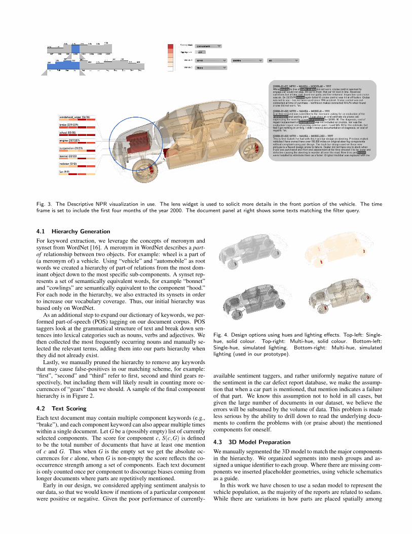
Fig. 3. The Descriptive NPR visualization in use. The lens widget is used to solicit more details in the front portion of the vehicle. The timeframe is set to include the first four months of the year 2000. The document panel at right shows some texts matching the filter query.
4.1 Hierarchy Generation
For keyword extraction, we leverage the concepts of meronym andsynset from WordNet [16]. A meronym in WordNet describes a part-of relationship between two objects. For example: wheel is a part of(a meronym of) a vehicle. Using “vehicle” and “automobile” as rootwords we created a hierarchy of part-of relations from the most dom-inant object down to the most specific sub-components. A synset rep-resents a set of semantically equivalent words, for example “bonnet”and “cowlings” are semantically equivalent to the component “hood.”For each node in the hierarchy, we also extracted its synsets in orderto increase our vocabulary coverage. Thus, our initial hierarchy wasbased only on WordNet.
As an additional step to expand our dictionary of keywords, we per-formed part-of-speech (POS) tagging on our document corpus. POStaggers look at the grammatical structure of text and break down sen-tences into lexical categories such as nouns, verbs and adjectives. Wethen collected the most frequently occurring nouns and manually se-lected the relevant terms, adding them into our parts hierarchy whenthey did not already exist.
Lastly, we manually pruned the hierarchy to remove any keywordsthat may cause false-positives in our matching scheme, for example:“first”, “second” and “third” refer to first, second and third gears re-spectively, but including them will likely result in counting more oc-currences of “gears” than we should. A sample of the final componenthierarchy is in Figure 2.
4.2 Text Scoring
Each text document may contain multiple component keywords (e.g.,“brake”), and each component keyword can also appear multiple timeswithin a single document. Let G be a (possibly empty) list of currentlyselected components. The score for component c, S(c,G) is definedto be the total number of documents that have at least one mentionof c and G. Thus when G is the empty set we get the absolute oc-currences for c alone, when G is non-empty the score reflects the co-occurrence strength among a set of components. Each text documentis only counted once per component to discourage biases coming fromlonger documents where parts are repetitively mentioned.
Early in our design, we considered applying sentiment analysis toour data, so that we would know if mentions of a particular componentwere positive or negative. Given the poor performance of currently-
Fig. 4. Design options using hues and lighting effects. Top-left: Single-hue, solid colour. Top-right: Multi-hue, solid colour. Bottom-left:Single-hue, simulated lighting. Bottom-right: Multi-hue, simulatedlighting (used in our prototype).
available sentiment taggers, and rather uniformly negative nature ofthe sentiment in the car defect report database, we make the assump-tion that when a car part is mentioned, that mention indicates a failureof that part. We know this assumption not to hold in all cases, butgiven the large number of documents in our dataset, we believe theerrors will be subsumed by the volume of data. This problem is madeless serious by the ability to drill down to read the underlying docu-ments to confirm the problems with (or praise about) the mentionedcomponents for oneself.
4.3 3D Model Preparation
We manually segmented the 3D model to match the major componentsin the hierarchy. We organized segments into mesh groups and as-signed a unique identifier to each group. Where there are missing com-ponents we inserted placeholder geometries, using vehicle schematicsas a guide.
In this work we have chosen to use a sedan model to represent thevehicle population, as the majority of the reports are related to sedans.While there are variations in how parts are placed spatially among
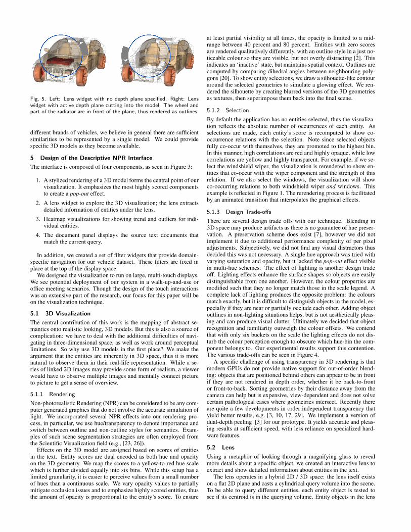
Fig. 5. Left: Lens widget with no depth plane specified. Right: Lenswidget with active depth plane cutting into the model. The wheel andpart of the radiator are in front of the plane, thus rendered as outlines.
different brands of vehicles, we believe in general there are sufficientsimilarities to be represented by a single model. We could providespecific 3D models as they become available.
5 Design of the Descriptive NPR Interface
The interface is composed of four components, as seen in Figure 3:
1. A stylized rendering of a 3D model forms the central point of ourvisualization. It emphasizes the most highly scored componentsto create a pop-out effect.
2. A lens widget to explore the 3D visualization; the lens extractsdetailed information of entities under the lens.
3. Heatmap visualizations for showing trend and outliers for indi-vidual entities.
4. The document panel displays the source text documents thatmatch the current query.
In addition, we created a set of filter widgets that provide domain-specific navigation for our vehicle dataset. These filters are fixed inplace at the top of the display space.
We designed the visualization to run on large, multi-touch displays.We see potential deployment of our system in a walk-up-and-use oroffice meeting scenarios. Though the design of the touch interactionswas an extensive part of the research, our focus for this paper will beon the visualization technique.
5.1 3D Visualization
The central contribution of this work is the mapping of abstract se-mantics onto realistic looking, 3D models. But this is also a source ofcomplication: we have to deal with the additional difficulties of navi-gating in three-dimensional space, as well as work around perceptuallimitations. So why use 3D models in the first place? We make theargument that the entities are inherently in 3D space, thus it is morenatural to observe them in their real-life representation. While a se-ries of linked 2D images may provide some form of realism, a viewerwould have to observe multiple images and mentally connect pictureto picture to get a sense of overview.
5.1.1 Rendering
Non-photorealistic Rendering (NPR) can be considered to be any com-puter generated graphics that do not involve the accurate simulation oflight. We incorporated several NPR effects into our rendering pro-cess, in particular, we use hue/transparency to denote importance andswitch between outline and non-outline styles for semantics. Exam-ples of such scene segmentation strategies are often employed fromthe Scientific Visualization field (e.g., [23, 26]).
Effects on the 3D model are assigned based on scores of entitiesin the text. Entity scores are dual encoded as both hue and opacityon the 3D geometry. We map the scores to a yellow-to-red hue scalewhich is further divided equally into six bins. While this setup has alimited granularity, it is easier to perceive values from a small numberof hues than a continuous scale. We vary opacity values to partiallymitigate occlusion issues and to emphasize highly scored entities, thusthe amount of opacity is proportional to the entity’s score. To ensure
at least partial visibility at all times, the opacity is limited to a mid-range between 40 percent and 80 percent. Entities with zero scoresare rendered qualitatively differently, with an outline style in a just no-ticeable colour so they are visible, but not overly distracting [2]. Thisindicates an ‘inactive’ state, but maintains spatial context. Outlines arecomputed by comparing dihedral angles between neighbouring poly-gons [20]. To show entity selections, we draw a silhouette-like contouraround the selected geometries to simulate a glowing effect. We ren-dered the silhouette by creating blurred versions of the 3D geometriesas textures, then superimpose them back into the final scene.
5.1.2 Selection
By default the application has no entities selected, thus the visualiza-tion reflects the absolute number of occurrences of each entity. Asselections are made, each entity’s score is recomputed to show co-occurrence relations with the selection. Note since selected objectsfully co-occur with themselves, they are promoted to the highest bin.In this manner, high correlations are red and highly opaque, while lowcorrelations are yellow and highly transparent. For example, if we se-lect the windshield wiper, the visualization is rerendered to show en-tities that co-occur with the wiper component and the strength of thisrelation. If we also select the windows, the visualization will showco-occurring relations to both windshield wiper and windows. Thisexample is reflected in Figure 1. The rerendering process is facilitatedby an animated transition that interpolates the graphical effects.
5.1.3 Design Trade-offs
There are several design trade offs with our technique. Blending in3D space may produce artifacts as there is no guarantee of hue preser-vation. A preservation scheme does exist [7], however we did notimplement it due to additional performance complexity of per pixeladjustments. Subjectively, we did not find any visual distractors thusdecided this was not necessary. A single hue approach was tried withvarying saturation and opacity, but it lacked the pop-out effect visiblein multi-hue schemes. The effect of lighting is another design tradeoff. Lighting effects enhance the surface shapes so objects are easilydistinguishable from one another. However, the colour properties aremodified such that they no longer match those in the scale legend. Acomplete lack of lighting produces the opposite problem: the coloursmatch exactly, but it is difficult to distinguish objects in the model, es-pecially if they are near or partially occlude each other. Adding objectoutlines in non-lighting situations helps, but is not aesthetically pleas-ing and can produce visual clutter. Ultimately we decided that objectrecognition and familiarity outweigh the colour offsets. We contendthat with only six buckets on the scale the lighting effects do not dis-turb the colour perception enough to obscure which hue-bin the com-ponent belongs to. Our experimental results support this contention.The various trade-offs can be seen in Figure 4.
A specific challenge of using transparency in 3D rendering is thatmodern GPUs do not provide native support for out-of-order blend-ing: objects that are positioned behind others can appear to be in frontif they are not rendered in depth order, whether it be back-to-frontor front-to-back. Sorting geometries by their distance away from thecamera can help but is expensive, view-dependent and does not solvecertain pathological cases where geometries intersect. Recently thereare quite a few developments in order-independent-transparency thatyield better results, e.g. [3, 10, 17, 29]. We implement a version ofdual-depth peeling [3] for our prototype. It yields accurate and pleas-ing results at sufficient speed, with less reliance on specialized hard-ware features.
5.2 Lens
Using a metaphor of looking through a magnifying glass to revealmore details about a specific object, we created an interactive lens toextract and show detailed information about entities in the text.
The lens operates in a hybrid 2D / 3D space: the lens itself existson a flat 2D plane and casts a cylindrical query volume into the scene.To be able to query different entities, each entity object is tested tosee if its centroid is in the querying volume. Entity objects in the lens
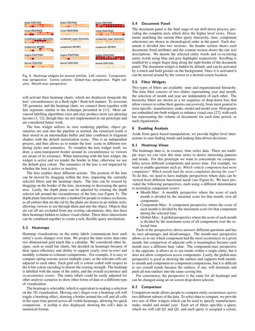
Fig. 6. Heatmap widgets for several entities. Left column: Component-max perspective. Centre column: Global-max perspective. Right col-umn: Month-max perspective.
will activate their heatmap charts, which are displayed alongside thelens’ circumferences in a flush right / flush-left manner. To associate3D geometry and the heatmap chart, we connect them together withline segments similar to the technique presented in [11]. More ad-vanced labelling algorithms exist and may produce more eye-pleasinglayouts [1, 12], though they are not implemented in our prototype andare considered future work.
The lens widget utilizes its own rendering pipeline, object ge-ometries are sent into the pipeline as normal, the rasterized result isthen stored in an intermediate buffer and later combined in fragmentshaders with the default rasterization scene. This is an independentprocess, and thus allows us to render the lens’ scene in different ren-dering styles and semantics. To visualize the lens widget itself, wedraw a semi-transparent border around its circumference so viewersare aware of its existence. When interacting with the lens widget, thewidget is active and we render the border in blue, otherwise we usethe default grey colour. The semantics of the lens is not impacted bywhether the lens is active or inactive.
The lens enables three different actions. The position of the lenscan be moved by dragging within the lens, impacting the currentlyselected filters and the heatmap charts. The lens can be resized bydragging on the border of the lens, increasing or decreasing the queryarea. Lastly, the depth plane can be adjusted by rotating the depthselector tab around the circumference of the lens (see Figure 5). Thedepth plane function provides a method for people to reduce occlusion,as all entities that are the cut by the plane are drawn in an outline style,allowing viewers to see through them and into the object. Objects thatare cut off are excluded from any scoring calculations, they also havetheir heatmaps hidden to reduce visual clutter. These three interactionscan be combined together to create a rich, flexible query mechanism.
5.3 Heatmaps
Heatmap visualizations on the entity labels communicate how eachentity’s score changes over time. We project the time-series data ontotwo dimensional grid much like a calendar. We considered other de-signs, such as small bar charts, but decided on heatmaps because oftheir space-efficiency and ability to support yearly (row-to-row) andmonthly (column-to-column) comparisons . For example, it is easy tocompare spring seasons across multiple years, as the relevant cells areadjacent to each other. Each grid cell is colour coded with respect tothe 6-bin colour encoding to denote the scoring strength. The heatmapis labelled with the name of the entity, and the overall occurrence andco-occurrence scores. The entity labels could be easily adjusted forother analysis scenarios to show other forms of data or a different typeof visualization.
The heatmap is selectable, which is equivalent to making a selectionon the 3D visualization. Moving one’s finger over a heatmap cell willtoggle a brushing effect, drawing a border around the cell and all cellsin the same time period across all visible heatmaps, allowing for quickcomparison. A tooltip is also displayed, showing the cell’s data innumerical format.
5.4 Document Panel
The document panel is the final stage of our drill-down process, pro-viding the complete texts which drive the higher level views. Docu-ments matching the current filter query (hierarchy, time, componentselections) are shown in chronological order in the panel. Each doc-ument is divided into two sections: the header section shows eachdocuments fixed attributes and the content section shows the raw textdescriptions. We denote the selected entity words and co-occurringentity words using blue and grey highlights respectively. Scrolling isenabled by a single finger drag along the right border of the documentpanel. The document widget is hidden by default, and can be activatedby a touch and hold gesture on the background. Once it is activated itcan be moved around by the viewer to a desired screen location.
5.5 Filter Widgets
Two types of filters are available: time and organizational hierarchy.The time filter consists of two sliders representing year and month,the selection of month and year are independent of each other. Thehierarchy filters are shown as a set sequence of drop-down lists thatallow viewers to refine their queries successively, from most general tomost specific: manufacturer, make, model and model year. Histogramsare embedded into both widgets to enhance visual cues [27], with eachbar representing the volume of documents for each time period, oreach organization.
6 Enabling Analysis
Aside from query-based manipulation, we provide higher level inter-actions to ease finding trends and making data-driven decisions.
6.1 Heatmap Views
The heatmaps data is, in essence, time series data. There are multi-ple ways we can view this time series to derive interesting patternsand trends. For this prototype we want to concentrate on compara-bility across different components and across time. For example, wewant to enable questions such as: Which vehicle component had morecomplaints? Which month had the most complaints during the year?To do this, we need to have multiple perspectives where data can beviewed from different functional needs (see Figure 6). We have pro-vided the following perspectives, each using a different denominatorto normalize component scores:
• Month-Max: A monthly perspective where the score of eachmonth is divided by the maximal score for that month, over allcomponents.
• Component-Max: A component perspective where the score ofeach month is divided by the maximum score for that componentduring the selected time.
• Global-Max: A global perspective where the score of each monthis divided by the maximum score of all components over the se-lected time.
Each of the perspectives above answers different questions and hasits own advantages and disadvantages. The month-max perspectiveallows us to see which component had the most occurrences in a givenmonth, but comparison of adjacent cells is meaningless because eachmonth uses a different base value. The component-max perspectiveis the opposite, it allows us to see trends within a single entity, but itdoes not allow comparison across components. Lastly, the global-maxperspective is good at showing the outliers and supports both month-to-month and component-to-component comparisons, but it is difficultto see overall trends because the outliers, if any, will dominate andpush all non-outliers into the same scoring bin.
For consistency, the perspective is the same for all heatmaps andcan be changed using an on screen drop-down selector.
6.2 Comparison
Comparison mode allows people to compare entity occurrences acrosstwo different subsets of the data. To select data to compare, we providetwo sets of filter widgets which can be used to specify manufacturer,make, model and model year. Each set of filters specifies a query,which we will call Q1 and Q2, and each query is assigned a colour,
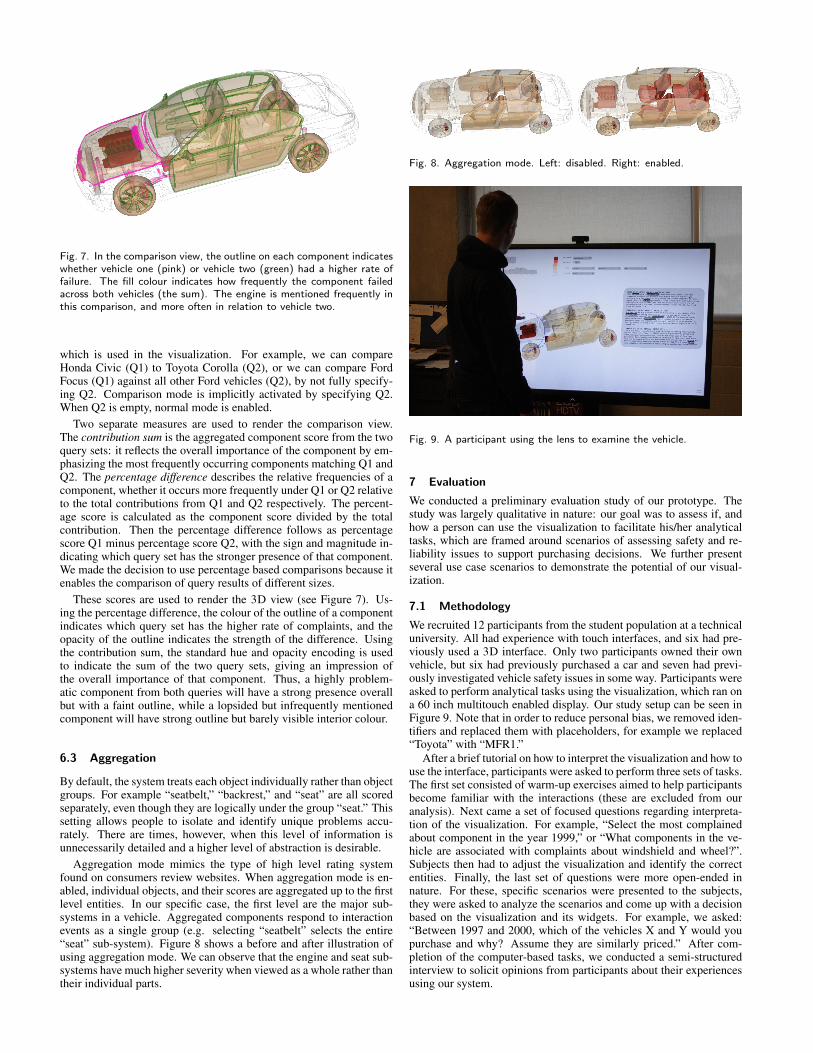
Fig. 7. In the comparison view, the outline on each component indicateswhether vehicle one (pink) or vehicle two (green) had a higher rate offailure. The fill colour indicates how frequently the component failedacross both vehicles (the sum). The engine is mentioned frequently inthis comparison, and more often in relation to vehicle two.
which is used in the visualization. For example, we can compareHonda Civic (Q1) to Toyota Corolla (Q2), or we can compare FordFocus (Q1) against all other Ford vehicles (Q2), by not fully specify-ing Q2. Comparison mode is implicitly activated by specifying Q2.When Q2 is empty, normal mode is enabled.
Two separate measures are used to render the comparison view.The contribution sum is the aggregated component score from the twoquery sets: it reflects the overall importance of the component by em-phasizing the most frequently occurring components matching Q1 andQ2. The percentage difference describes the relative frequencies of acomponent, whether it occurs more frequently under Q1 or Q2 relativeto the total contributions from Q1 and Q2 respectively. The percent-age score is calculated as the component score divided by the totalcontribution. Then the percentage difference follows as percentagescore Q1 minus percentage score Q2, with the sign and magnitude in-dicating which query set has the stronger presence of that component.We made the decision to use percentage based comparisons because itenables the comparison of query results of different sizes.
These scores are used to render the 3D view (see Figure 7). Us-ing the percentage difference, the colour of the outline of a componentindicates which query set has the higher rate of complaints, and theopacity of the outline indicates the strength of the difference. Usingthe contribution sum, the standard hue and opacity encoding is usedto indicate the sum of the two query sets, giving an impression ofthe overall importance of that component. Thus, a highly problem-atic component from both queries will have a strong presence overallbut with a faint outline, while a lopsided but infrequently mentionedcomponent will have strong outline but barely visible interior colour.
6.3 Aggregation
By default, the system treats each object individually rather than objectgroups. For example “seatbelt,” “backrest,” and “seat” are all scoredseparately, even though they are logically under the group “seat.” Thissetting allows people to isolate and identify unique problems accu-rately. There are times, however, when this level of information isunnecessarily detailed and a higher level of abstraction is desirable.
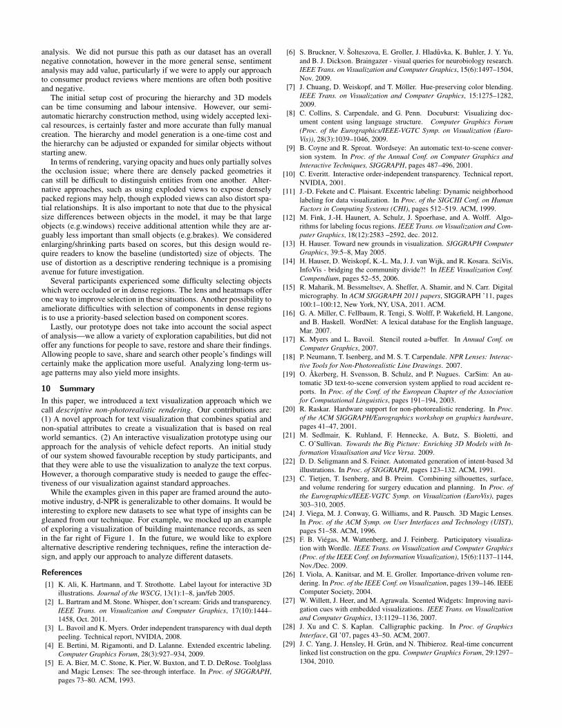
Aggregation mode mimics the type of high level rating systemfound on consumers review websites. When aggregation mode is en-abled, individual objects, and their scores are aggregated up to the firstlevel entities. In our specific case, the first level are the major sub-systems in a vehicle. Aggregated components respond to interactionevents as a single group (e.g. selecting “seatbelt” selects the entire“seat” sub-system). Figure 8 shows a before and after illustration ofusing aggregation mode. We can observe that the engine and seat sub-systems have much higher severity when viewed as a whole rather thantheir individual parts.
Fig. 8. Aggregation mode. Left: disabled. Right: enabled.
Fig. 9. A participant using the lens to examine the vehicle.
7 Evaluation
We conducted a preliminary evaluation study of our prototype. Thestudy was largely qualitative in nature: our goal was to assess if, andhow a person can use the visualization to facilitate his/her analyticaltasks, which are framed around scenarios of assessing safety and re-liability issues to support purchasing decisions. We further presentseveral use case scenarios to demonstrate the potential of our visual-ization.
7.1 Methodology
We recruited 12 participants from the student population at a technicaluniversity. All had experience with touch interfaces, and six had pre-viously used a 3D interface. Only two participants owned their ownvehicle, but six had previously purchased a car and seven had previ-ously investigated vehicle safety issues in some way. Participants wereasked to perform analytical tasks using the visualization, which ran ona 60 inch multitouch enabled display. Our study setup can be seen inFigure 9. Note that in order to reduce personal bias, we removed iden-tifiers and replaced them with placeholders, for example we replaced“Toyota” with “MFR1.”
After a brief tutorial on how to interpret the visualization and how touse the interface, participants were asked to perform three sets of tasks.The first set consisted of warm-up exercises aimed to help participantsbecome familiar with the interactions (these are excluded from ouranalysis). Next came a set of focused questions regarding interpreta-tion of the visualization. For example, “Select the most complainedabout component in the year 1999,” or “What components in the ve-hicle are associated with complaints about windshield and wheel?”.Subjects then had to adjust the visualization and identify the correctentities. Finally, the last set of questions were more open-ended innature. For these, specific scenarios were presented to the subjects,they were asked to analyze the scenarios and come up with a decisionbased on the visualization and its widgets. For example, we asked:“Between 1997 and 2000, which of the vehicles X and Y would youpurchase and why? Assume they are similarly priced.” After com-pletion of the computer-based tasks, we conducted a semi-structuredinterview to solicit opinions from participants about their experiencesusing our system.

Each study session took approximately one hour to complete,though participants were allowed to take as much time as they wantedon any task. Each session was recorded on video, and touch interac-tions were logged by the system.
7.2 Discussion
12 participants took part in the study, however one session was ex-cluded from our analysis; the participant exhibited a lack of Englishlanguage skills which lead to difficulty understanding the instructionsand contradictory statements during the interview portion.
In general, feedback was favourable and most tasks were completedreasonably well, in the sense that correct answers were derived basedon findings from using our system. There were a few exceptions: someparticipants did not correctly respond to the focus questions that askedthem to identify outliers (3/11 and 1/11). This may partly be attributedto initial unfamiliarity with what the visualization is trying to show,as one participant (P5) revealed later that at first the answers were notbased on the visualization, but rather on personal opinion about auto-motive vehicles. The other exception was a task that required a personto switch among multiple visualization views and compare them insequence. The added cognitive load of memorizing states likely con-tributed to the varied answers.
Participants enjoyed using the 3D visualization along with the lenswidget. Several participants made explicit comments with regards tothe usage of familiar form factor: “Nicer to look at a picture than abunch of numbers.”(P1), “everything is in detail, very interactive. [. . . ]The visual, is self-explanatory” (P8), “I can see clearly each part in thecar, so I can know what to choose”(P6) and “it is relatable, I’ve beenin cars and I’ve had the opportunity to see some of the components.”(P2). Using the lens widget for dynamic focusing of interesting datawas voiced by several participants: “kind of cool, being able to dissectwith it.’ (P1) and “You can zoom in to the parts that you cannot reallyunderstand, for example the transmission.” (P7).
The heatmap widget received the least favourable responses, withfour participants mentioning that it provided too much low-level de-tail, in particular P11 suggested using a pie-chart or bar-chart for eachcomponent in comparison view. The design implication here may beto provide different levels of granularity that can be dynamically ad-justed. We observed that three participants had difficulties understand-ing co-occurrence, however, we are not sure if this is due to insufficientexplanations at the start of the study, or the fact that the same colour-ing scheme that is used for both occurrence and co-occurrence causedthe confusions. Several interaction issues such as executing touch ges-tures were noted during the study, however participants seemed to en-joy using the visualization: “even though there are some interactionproblems, it just looks really good!’ (P10).
In Figure 10, we present a summary of the interactions logs for thetask of comparing two different types of vehicles. In this task partici-pants were free to use any widgets they want to investigate which of thetwo vehicles is more reliable. From the figure, we see that participantsfirst remove irrelevant data using the filters, then they either interactthrough the lens or directly with the 3D scene to explore the visual-ization. The navigation actions were mostly executed in short bursts,followed by an idle period. This behaviour appears to correspond tofinding interesting data and then spending time to assess his/her find-ings. We thought for most participants the lens widget would be usedonly after the 3D model is moved into a desired orientation, howeverthis is not supported by the logs. The participant strategies seem togroup into three types: use of both the 3D scene and the lens widget forexploration (P3,6,8,9,10), only the lens (P2,7), and only the 3D scene(P1,4,5,11). Surprisingly, participants did not make use of the docu-ment widget during this task. Further investigation of the role full-textdetails can play in decision-making using d-NPR is warranted.
7.3 Analysis Scenario: Toyota Recall
In addition to experimental testing, we can examine how our visual-ization system works by reviewing example scenarios. The Toyotavehicle recall happened between September 2009 to February 2010and had to do with faulty accelerators and brakes. We wondered if
Fig. 10. Widget usage for the task of comparing two vehicles.
there were any leading or lagging indicators in our data, which may beindicative of the problem. We set the visualization time frame to be be-tween 2008 and 2010 and selected Toyota as the vehicle manufacturer.The first thing we noticed is that the engine, usually one of the highestoccurring components in the complaint reports, no longer dominatedthe visualization. Instead, two components pop out: brakes and accel-erator. A closer examination with the lens widget raised more ques-tions. The heatmaps show that there are two outlier months where ahuge amount of complaints were registered: February 2010 and March2010, after the recall was announced. Perhaps the widely publicizedevent triggered a loss in consumer confidence, which in turn led to anover-reporting of problems. This is supported by the sharp drop-offafter March 2010.
7.4 Analysis Scenario: Using Spatial Dimension
This scenario describes how a regular consumer, Daniel, may use thevisualization to research a problem. Daniel has about three years ofdriving experience but does not know a lot about cars. Recently, whiledriving, he noticed a rattling sound coming from the front passengerside of his vehicle. He decides to conduct some research on his ownbefore taking the car back to the dealership.
Using the visualization, Daniel filters the dataset to focus on hisvehicle model. Since he is not sure exactly where the noise camefrom, he uses the lens widget to focus on components near the front-passenger region. Using the lens, he can see that the suspension com-ponent has a higher number of complaints registered against it than theother components in the focused area. Wondering if the suspension isnormally a problematic component, Daniel activates the comparisonmode to view his vehicle against all other models by this manufacturer.He finds that the suspension for his model is more frequently reportedthan for other cars. He then selects the suspension component usingthe heatmap, and toggles the document widget so he can read throughthe actual complaint reports. After a few minutes of reading, Danielnotes that there are at least eight or nine reports that seemed to docu-ment similar noise issues and point to defective suspension setup. Hedecides that he should contact his dealership to have them check it out.
8 Implementation
Our prototype is written in Java and Java OpenGL. The dataset isfreely available on NHTSA’s website and consists of data from 1995 topresent day. Our 3D model is taken from Google 3D Warehouse1 andhas approximately 160K vertices. Our application runs at 1680x1050resolution and was able to achieve between 15-30 FPS, depending onmodel complexity and size of the dataset. We use a 3.2GHz I5 QuadCore CPU.
9 Discussion and Future Work
The system described here is a working prototype that is capable ofallowing people to explore text entities through the use of 3D NPR-renderings and spatially-aware UI widgets. However, there are stillsome outstanding opportunities for improvement which can form thebasis for future work.
Our parsing uses a simplistic dictionary approach. Creating a parsercapable of deciphering more complex relations, such as dependencyrelations, would enrich the data. Another path to explore is sentiment
1http://sketchup.google.com
analysis. We did not pursue this path as our dataset has an overallnegative connotation, however in the more general sense, sentimentanalysis may add value, particularly if we were to apply our approachto consumer product reviews where mentions are often both positiveand negative.
The initial setup cost of procuring the hierarchy and 3D modelscan be time consuming and labour intensive. However, our semi-automatic hierarchy construction method, using widely accepted lexi-cal resources, is certainly faster and more accurate than fully manualcreation. The hierarchy and model generation is a one-time cost andthe hierarchy can be adjusted or expanded for similar objects withoutstarting anew.
In terms of rendering, varying opacity and hues only partially solvesthe occlusion issue; where there are densely packed geometries itcan still be difficult to distinguish entities from one another. Alter-native approaches, such as using exploded views to expose denselypacked regions may help, though exploded views can also distort spa-tial relationships. It is also important to note that due to the physicalsize differences between objects in the model, it may be that largeobjects (e.g.windows) receive additional attention while they are ar-guably less important than small objects (e.g.brakes). We consideredenlarging/shrinking parts based on scores, but this design would re-quire readers to know the baseline (undistorted) size of objects. Theuse of distortion as a descriptive rendering technique is a promisingavenue for future investigation.
Several participants experienced some difficulty selecting objectswhich were occluded or in dense regions. The lens and heatmaps offerone way to improve selection in these situations. Another possibility toameliorate difficulties with selection of components in dense regionsis to use a priority-based selection based on component scores.
Lastly, our prototype does not take into account the social aspectof analysis—we allow a variety of exploration capabilities, but did notoffer any functions for people to save, restore and share their findings.Allowing people to save, share and search other people’s findings willcertainly make the application more useful. Analyzing long-term us-age patterns may also yield more insights.
10 Summary
In this paper, we introduced a text visualization approach which wecall descriptive non-photorealistic rendering. Our contributions are:(1) A novel approach for text visualization that combines spatial andnon-spatial attributes to create a visualization that is based on realworld semantics. (2) An interactive visualization prototype using ourapproach for the analysis of vehicle defect reports. An initial studyof our system showed favourable reception by study participants, andthat they were able to use the visualization to analyze the text corpus.However, a thorough comparative study is needed to gauge the effec-tiveness of our visualization against standard approaches.
While the examples given in this paper are framed around the auto-motive industry, d-NPR is generalizable to other domains. It would beinteresting to explore new datasets to see what type of insights can begleaned from our technique. For example, we mocked up an exampleof exploring a visualization of building maintenance records, as seenin the far right of Figure 1. In the future, we would like to explorealternative descriptive rendering techniques, refine the interaction de-sign, and apply our approach to analyze different datasets.
References
[1] K. Ali, K. Hartmann, and T. Strothotte. Label layout for interactive 3Dillustrations. Journal of the WSCG, 13(1):1–8, jan/feb 2005.
[2] L. Bartram and M. Stone. Whisper, don’t scream: Grids and transparency.IEEE Trans. on Visualization and Computer Graphics, 17(10):1444–1458, Oct. 2011.
[3] L. Bavoil and K. Myers. Order independent transparency with dual depthpeeling. Technical report, NVIDIA, 2008.
[4] E. Bertini, M. Rigamonti, and D. Lalanne. Extended excentric labeling.Computer Graphics Forum, 28(3):927–934, 2009.
[5] E. A. Bier, M. C. Stone, K. Pier, W. Buxton, and T. D. DeRose. Toolglassand Magic Lenses: The see-through interface. In Proc. of SIGGRAPH,pages 73–80. ACM, 1993.
[6] S. Bruckner, V. Solteszova, E. Groller, J. Hladuvka, K. Buhler, J. Y. Yu,and B. J. Dickson. Braingazer - visual queries for neurobiology research.IEEE Trans. on Visualization and Computer Graphics, 15(6):1497–1504,Nov. 2009.
[7] J. Chuang, D. Weiskopf, and T. Moller. Hue-preserving color blending.IEEE Trans. on Visualization and Computer Graphics, 15:1275–1282,2009.
[8] C. Collins, S. Carpendale, and G. Penn. Docuburst: Visualizing doc-ument content using language structure. Computer Graphics Forum(Proc. of the Eurographics/IEEE-VGTC Symp. on Visualization (Euro-Vis)), 28(3):1039–1046, 2009.
[9] B. Coyne and R. Sproat. Wordseye: An automatic text-to-scene conver-sion system. In Proc. of the Annual Conf. on Computer Graphics andInteractive Techniques, SIGGRAPH, pages 487–496, 2001.
[10] C. Everitt. Interactive order-independent transparency. Technical report,NVIDIA, 2001.
[11] J.-D. Fekete and C. Plaisant. Excentric labeling: Dynamic neighborhoodlabeling for data visualization. In Proc. of the SIGCHI Conf. on HumanFactors in Computing Systems (CHI), pages 512–519. ACM, 1999.
[12] M. Fink, J.-H. Haunert, A. Schulz, J. Spoerhase, and A. Wolff. Algo-rithms for labeling focus regions. IEEE Trans. on Visualization and Com-puter Graphics, 18(12):2583 –2592, dec. 2012.
[13] H. Hauser. Toward new grounds in visualization. SIGGRAPH ComputerGraphics, 39:5–8, May 2005.
[14] H. Hauser, D. Weiskopf, K.-L. Ma, J. J. van Wijk, and R. Kosara. SciVis,InfoVis - bridging the community divide?! In IEEE Visualization Conf.Compendium, pages 52–55, 2006.
[15] R. Maharik, M. Bessmeltsev, A. Sheffer, A. Shamir, and N. Carr. Digitalmicrography. In ACM SIGGRAPH 2011 papers, SIGGRAPH ’11, pages100:1–100:12, New York, NY, USA, 2011. ACM.
[16] G. A. Miller, C. Fellbaum, R. Tengi, S. Wolff, P. Wakefield, H. Langone,and B. Haskell. WordNet: A lexical database for the English language,Mar. 2007.
[17] K. Myers and L. Bavoil. Stencil routed a-buffer. In Annual Conf. onComputer Graphics, 2007.
[18] P. Neumann, T. Isenberg, and M. S. T. Carpendale. NPR Lenses: Interac-tive Tools for Non-Photorealistic Line Drawings. 2007.
[19] O. Akerberg, H. Svensson, B. Schulz, and P. Nugues. CarSim: An au-tomatic 3D text-to-scene conversion system applied to road accident re-ports. In Proc. of the Conf. of the European Chapter of the Associationfor Computational Linguistics, pages 191–194, 2003.
[20] R. Raskar. Hardware support for non-photorealistic rendering. In Proc.of the ACM SIGGRAPH/Eurographics workshop on graphics hardware,pages 41–47, 2001.
[21] M. Sedlmair, K. Ruhland, F. Hennecke, A. Butz, S. Bioletti, andC. O’Sullivan. Towards the Big Picture: Enriching 3D Models with In-formation Visualisation and Vice Versa. 2009.
[22] D. D. Seligmann and S. Feiner. Automated generation of intent-based 3dillustrations. In Proc. of SIGGRAPH, pages 123–132. ACM, 1991.
[23] C. Tietjen, T. Isenberg, and B. Preim. Combining silhouettes, surface,and volume rendering for surgery education and planning. In Proc. ofthe Eurographics/IEEE-VGTC Symp. on Visualization (EuroVis), pages303–310, 2005.
[24] J. Viega, M. J. Conway, G. Williams, and R. Pausch. 3D Magic Lenses.In Proc. of the ACM Symp. on User Interfaces and Technology (UIST),pages 51–58. ACM, 1996.
[25] F. B. Viegas, M. Wattenberg, and J. Feinberg. Participatory visualiza-tion with Wordle. IEEE Trans. on Visualization and Computer Graphics(Proc. of the IEEE Conf. on Information Visualization), 15(6):1137–1144,Nov./Dec. 2009.
[26] I. Viola, A. Kanitsar, and M. E. Groller. Importance-driven volume ren-dering. In Proc. of the IEEE Conf. on Visualization, pages 139–146. IEEEComputer Society, 2004.
[27] W. Willett, J. Heer, and M. Agrawala. Scented Widgets: Improving navi-gation cues with embedded visualizations. IEEE Trans. on Visualizationand Computer Graphics, 13:1129–1136, 2007.
[28] J. Xu and C. S. Kaplan. Calligraphic packing. In Proc. of GraphicsInterface, GI ’07, pages 43–50. ACM, 2007.
[29] J. C. Yang, J. Hensley, H. Grun, and N. Thibieroz. Real-time concurrentlinked list construction on the gpu. Computer Graphics Forum, 29:1297–1304, 2010.