figure 1: counties and major cities in kp southern...
TRANSCRIPT

1
Paper 1374 -2017
Visualizing the Demographics of a Large Healthcare
Provider’s Membership using SAS
Donald McCarthy and Michael Santema, Kaiser Permanente Southern California
ABSTRACT
Visualization of complex data can be a valuable tool for researchers and policy makers, and Base SAS® has powerful capabilities for such data exploration. In particular, SAS/GRAPH® software is a flexible tool that enables the analyst to create a wide variety of data visualizations. This paper presents work done using SAS® to visualize complex demographic data related to the membership of a large American healthcare provider, Kaiser Permanente (KP). We use SAS to create a number of geographic visualizations of KP demographic data related to the provider’s membership.
INTRODUCTION
KP is a large exclusive provider organization (EPO) with a membership drawn from a number of geographic regions: Southern California, Northern California, the Pacific Northwest, Hawaii, and the Middle Atlantic States. This paper is concerned only with the Southern California. Of the set of active members in Southern California membership. 3.7 million members were geocoded in 2015 to specific 2010 census tracts spread across primarily Kern, Los Angeles, Orange, Riverside, San Bernardino, San Diego, and Ventura Counties (shown in Figure 1 along with selected cities in the region). Age data were available for all of these members, and self-reported (or imputed in a minority of cases) race data were available for 3.5 million of these members. We use SAS® PROC GMAP SAS to create a number of geographic visualizations of these data.
The purpose of this paper is both to explore demographic features of the KP population and to show how PROC GMAP is capable of doing so. It can be useful for a healthcare provider to know more about the race and age of its members. Research has suggested the existence of racial and ethnic disparities in health care access and utilization (Institute of Medicine, 2003) while certain age groups (the elderly for instance, or children) are more likely to utilize healthcare and may have unique health requirements .
DATA
Figure 1: Counties and Major Cities in KP Southern California Region

2
Data on membership are taken from a number of KP systems and are typically self-reported. The main exception to this is race data which are imputed in some cases where self-reported race is not available yet other sources of data are sufficiently rich to allow reasonable imputation. Members’ ages are split into the following groups: less than 18 years, 18 to 29, 30 to 49, 50 to 64, and 65 and older Race and age categories are mutually exclusive. Comparator demographic data are from the U.S. Census Bureau and are from the 2010 Census (available here). Census tract shape file data are from the U.S. Census Bureau (available here https://www.census.gov/geo/maps-data/data/cbf/cbf_tracts.html and
https://www.census.gov/geo/maps-data/data/tiger-data.html).
DATA PROCESSING
The census tract shape file for 2010 was downloaded from the Census Bureau website and converted into a SAS/Graph map data using the MAPIMPORT procedure:
proc mapimport
datafile="&inpath./tract/gz_2010_06_140_00_500k.shp"
out=shape_t_2010 ;
run;
This dataset was then limited using FIPS codes to tracts in the following California counties: Kern, Los Angeles, Orange, Riverside, San Bernardino, San Diego, and Ventura. Annotate datasets were then created of county boundaries using this data set and the GREMOVE procedure:
proc gremove
data=shape_t_2010
out=all_tract_map1;
id tract;
by county;
run;
data anno_tract_all;
length function color $8;
retain xsys ysys '2' hsys '3' size 1 color 'black' when 'a';
set all_tract_map1;
by county segment;
function = ifc(first.segment or
(lag(x)=. and lag(y)=.), 'poly', 'polycont');
if x and y then output;
run;
Active KP members were geocoded to 2010 Census tract boundaries using MapMarkerTM software and the address that they were reported to residing at in 2015. Members’ ages (as of January 1, 2015) were grouped into the following bins: less than 18 years, 18 to 29 years, 30 to 49 years, 50 to 64 years and over 65 years of age. Geocoded members’ races/ethnicities were mapped to the following exclusive categories: Asian, Black-African American, Hispanic, Multi-Race, Other Race, Pacific Islander, and White. People indicating Hispanic ethnicity (regardless of their race) were mapped to the Hispanic race/ethnicity group.
This treatment of Hispanic ethnicity allows for mutually exclusive race/ethnicity groups and is also in keeping with recent research from the Pew Research Center that “suggests that Hispanics have a unique view of race that doesn’t necessarily fit within the official U.S. definitions” (Gonzalez-Barrera and Lopez, 2015) and that “two thirds … of Hispanic adults describe their Hispanic background as a part of their racial background” (PewResearchCenter, 2015).
Counts of KP members as well as representations of racial makeup, age distribution, and medical insurance type per census tract were plotted using the GMAP procedure. For example, this code

3
produced a green choropleth map of KP member density for each tract over the entire Southern California region using tract and annotated county data created above:
GOPTIONS RESET=ALL DEVICE=jpeg GSFNAME=gout
YMAX=7.5in gunit=pct colors=(VPAG LIG MOG DAG );
PROC GMAP
DATA=kp_member_data
MAP=shape_t_2010
annotate= anno_tract_all;
ID GEOID10;
CHORO n_kp_member_sqmi /LEVELS=4 CDEFAULT=white coutline=same;
LABEL n_kp_member_sqmi=
"Kaiser members per square mi";
LEGEND1 ACROSS=3 DOWN=2; RUN;
MEMBERSHIP LOCATION OVERVIEW

4
Figure 2 uses the GMAP procedure with annotate datasets (for county boundaries and the location of KP medical centers that offer inpatient or emergency department) to visualize the density of KP membership in Southern California. To create this figure we did the following: for each tract, we calculated the ratio of the number of active KP members in 2015 to the area of the tract in square miles (the area of Census tracts is available in Topologically Integrated Geographic Encoding and Referencing (TIGER) shapefile data that can be downloaded from https://www.census.gov/geo/maps-data/data/tiger.html). We present these results using a green color scheme with darker shades indicating a higher density of KP members in a given tract. Black circles represent KP facilities. The figure shows the distribution for the region as a whole then presents more detail for the more populous counties.
Regions with the highest concentrations of KP members are mostly clustered around KP facilities, as expected. Also unsurprisingly, KP members are concentrated in urban and suburban tracts. The densest regions for members are urban Los Angeles County and urban San Diego County. Other notable areas of high density are northern Orange County, the extreme west of Riverside County and the extreme south west of San Bernardino.
In Los Angeles and Orange counties, the highest concentration of members is in the tracts of southern Los Angeles County and northern and central Orange County. Members tend to be located further inland
Figure 2: Density of Active KP Members in 2015.

5
from the coast and coastal (particularly coastal southern) Orange county has relatively few members. Distinct from this main distribution one can distinguish the suburban area of the San Fernando Valley and further north (separated from it by the natural barrier of mountainous terrain) Santa Clarita. In the extreme north of Los Angeles County one can note a cluster of KP members in the Antelope Valley around Palmdale. In San Bernardino and Riverside, the highest concentration of members is in the tracts in the extreme south western area, around the cities of San Bernardino and Riverside and including a less dense area of suburbs south of this more urbanized area. Members in San Diego County are grouped largely in urbanized tracts in the extreme south west of the county are located around the city of San Diego with El Cajon to its east and National City and Chula Vista to its south near the Mexican border. Further north on the coast, one can see another pocket of members in less dense tracts that comprise Encinitas and Carlsbad on the coast and Escondido, Poway, and Vista inland.
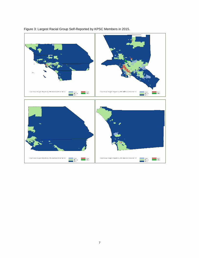
DISTRIBUTION OF THE MOST COMMON RACE OF MEMBERS Figure 3 uses the GMAP procedure with annotate datasets of county boundaries to visualize the race and ethnicity of KP members by mapping the most common race amongst KP members by census tract. We treat the largest races individually (Asian, Black/African-American, Hispanic, White) and combine the rest (Multi-Racial, Native American, Pacific Islander, and Other) as ‘Other’. We present these results for the counties served by KP in southern California and then for the subset of counties in this geographic region that are home to most members: Los Angeles/Orange County, Riverside/San Bernardino, and San Diego.
Tracts with White as the most common race (dark blue) comprise the majority of the region’s land mass and make up a nearly contiguous area broken by smaller areas where other races are the most common race. Tracts with Asian or Black/African-American as the most common race (pale blue and reddish brown, respectively) comprise quite small clusters in Los Angeles and Orange counties while tracts with Hispanic race as the single largest race amongst members make up scattered but geographically large areas in all counties.
In Figure 4, for Riverside/San Bernardino, and San Diego we consider two subsets of those areas: the tracts closest to KP facilities. To select these tracts we consider the distance of tract centroids from a KP inpatient or emergency department facility. Tracts with centroids 30 miles or less from such a KP facility were included. The coordinates for the centroids of census tracts were calculated using the %CENTROID macro and the distances from these coordinates to KP facilities were calculated using the GEODIST function:
proc sort data=shape_t_2010;
by geo_id;
run;
%annomac;
%centroid(shape_t_2010, centroid_t_2010, geo_id);
data _null_;
set kp_facility_location (where=(kp_facility='LOS ANGELES'));
call symputx('la_x',x); call symputx('la_y',y);
data centroid_t_2010 ;
set centroid_t_2010; dist_la=geodist(y_cent,x_cent,&la_y,&la_x,'M');
if area_la=1;
run;
Here one can see some additional features about the distribution of Asian and Black/African-American members that are not so apparent in Figure 3. Asian is the largest race in Riverside/San Bernardino for a small number of tracts as is Black/African-American in a single, densely populated, tract. In San Diego,

6
Black/African-American is the largest race in a few urbanized tracts in the city of San Diego while Asian is the most common race in several coastal tracts.
7
Figure 3: Largest Racial Group Self-Reported by KPSC Members in 2015.

8
DISTRIBUTION OF MEMBERS BY RACE
Figure 5 uses the GMAP procedure with annotate datasets of county boundaries to visualize the distribution of Asian KP members by census tract. We present these results for the same geographic areas as above using a green color scheme with lighter shades indicating a lower percentage of KP members in a given tract reporting that race.
Asian members are almost entirely absent from sparsely populated rural tracts and are concentrated largely in suburban tracts. Asian members are particularly concentrated in Orange County, south western San Diego County, and in an almost contiguous stretch of tracts running east-west across the center of Los Angeles County and continuing into Ventura County to the west and Riverside and San Bernardino counties to the east. Notable outlying concentrations exist in Kern County.
For Los Angeles and Orange Counties, Asian members are present in suburban and some coastal urban tracts yet are poorly represented in tracts in the north of Los Angeles as well as densely populated urban tracts in the south central part of the same county. In San Diego County. Asian members are concentrated in two clusters of tracts: suburban tracts north of the city of San Diego and those located to the south west of the downtown areas of the city.
Figure 6 shows the distribution of Black/African-American KP members by census tract. Black/African-American members tend to be concentrated in urban tracts in central south Los Angeles County in suburban tracts in the north of the same county around Palmdale and the rest of the Antelope Valley, in more populous parts of western Riverside and San Bernardino counties and in urban tracts in San Diego County Notable outlying concentrations exist in Kern County around the city of Bakersfield and in west -central San Bernardino County around the city of Victorville (see Figure 1 for the locations of relevant cities). Black members appear also in some concentration in sparsely populated rural tracts in the extreme west of Riverside and San Bernardino counties.
Figure 7 gives the distribution of Hispanic KP members by census tract. While Hispanic members are well-represented in a wide range of types of tracts (including rural, urban, and suburban) and in all counties served by KP in Southern California, it is possible to note certain areas of concentration of Hispanic members. There are at least seven notable areas of Hispanic members: Bakersfield and the Central Valley in the extreme north west of the region (central and north western Kern County), a near contiguous belt of Ventura County suburbs starting at the Pacific coast at Oxnard and stretching through Simi Valley to the Los Angeles County border, the extreme north of Los Angeles County around the city of Palmdale, an area of urban and suburban tracts in central Los Angeles County, the more populous areas of Riverside and San Bernardino in the extreme west of those counties, urban San Diego County
Figure 4: Largest Racial Group Self-Reported by KPSC Members in 2015: Detail.

9
stretching from the city of San Diego to the Mexican border and an area of the Coachella Valley in central Riverside County near Palm Springs (see Figure 1).
Figure 8 shows the distribution of White KP members by census tract. Notably, white members appear to make up a higher proportion of the population of members in tracts in rural areas and a lower proportion in more dense and racially diverse urban areas. The distribution of White members tends to show higher concentrations in rural tracts, tracts on the Pacific Coast and in suburban areas surrounding denser, more racially diverse urban tracts
Figure 5: Asian KPSC Members in 2015.

10
Figure 6: Black/African-American KPSC Members in 2015.

11
Figure 7: Hispanic KPSC Members in 2015.

12
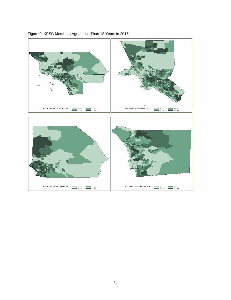
DISTRIBUTION OF MEMBERS BY AGE
Figure 9 uses age information available for geocoded KP members with GMAP procedure with annotate datasets of county boundaries to visualize the distribution of young members (members aged less than 18 years old in 2015). A number of rural tracts in western Kern County and northern San Bernardino County have high proportions of young members as do densely populated urban tracts in central Los Angeles County and northern Orange County. Young members are poorly represented along the Pacific Coast and in rural areas of eastern Riverside and San Bernardino counties. Many of these tracts are also areas where Hispanic members are concentrated as is apparent in Figures 3 and 8.
Figure 10 which presents the distribution of older members (members aged 65 years or older in 2015) shows a very different pattern. Older members are seen in desert tracts in central eastern Riverside (including the desert resort city of Palm Springs) and San Bernardino counties, in sparsely populated mountainous tracts in northern Los Angeles County and central San Diego County, and in tracts along the Pacific Coast. These are in many cases also the tracts that have the highest concentration of White members (see Figures 3 and 9).
Figure 8: White KPSC Members in 2015.
13
Figure 9: KPSC Members Aged Less Than 18 Years in 2015.

14
DISTRIBUTION OF MEMBERS WITH MEDICARE COVERAGE
Finally, one of the many resources available to researchers at KP is an abundance of medical insurance information. A number of KP members are enrolled in Medicare, the national social insurance program for people over the age of 65 administered by the US government. We present the percent of KP members enrolled in Medicare in Figure 11. As expected, this figure overlaps almost entirely with Figure 10, the maps of percent of KP members over the age of 65. There are some differences in the most remote tracts, especially in the Northwestern part of San Bernardino County. This may be an artifact of how few members are in that tract to begin with (Figure 2). A method similar to this could be useful for further describing distributions of people on different types of insurance plans, to examine where people pay for more comprehensive plans, or where the highest utilizers of KP membership are.
Figure 10: KPSC Members Aged 65 Years or More in 2015.

15
CONCLUSION
Mapping race, age, and insurance data displays striking patterns about the geographic location of different types of KP members and provides an excellent example of the power of geographic visualization. It also highlights the ability of SAS tools to provide such graphics. Demographic visualization of this type may be useful for policy makers and providers in making sure high quality, affordable healthcare is provided to diverse populations and that geographically distinct populations are well-served. It also provides a possible impetus for future work. It may be that other features of populations (e.g., tobacco use or the frequency of a specific diagnosis) are similarly geographically diverse and this type of data exploration may provide insights into patterns of illness or substance use.
REFERENCES
Gonzalez-Barrera, A and H. Lopez. 2015. Is being Hispanic a matter of race, ethnicity or both? Washington, DC: PewResearchCenter.
Figure 11: KPSC Members with Medicare Coverage.

16
Institute of Medicine. 2003. Unequal Treatment: Confronting Racial and Ethnic Disparities in Health Care. Washington, DC: National Academies Press.
PewResearchCenter. 2015. Multiracial in America. Washington, DC: PewResearchCenter.
RECOMMENDED READING
Allison, R. 2012. SAS/GRAPH®: Beyond the Basics. Cary, NC: SAS Institute Inc.
Hadden, L.S., L. Osho, A. Johnson. 2007. “Color Your World – With SAS®”. NorthEast SAS Users Group.
Schurr, K., J. Wiseman. 2013. “Bordering on Success with PROC GMAP in SAS®: Utilizing Annotate Datasets to Enhance Your Maps”. Midwest SAS Users Group.
Zdeb, M. 2011. “From Shapefiles to Maps Via PROC MAPIMPORT and PROC GMAP”. NorthEast SAS Users Group.
ACKNOWLEDGMENTS
We would like to thank colleagues at Kaiser Permanente including Wansu Chen and Qing Yuan.
CONTACT INFORMATION
Your comments and questions are valued and encouraged. Contact the authors at:
Don McCarthy Kaiser Permanente Southern California [email protected] Michael Santema Kaiser Permanente Southern California [email protected]