figures and maps: focus a the science of climate change rights and permissions the material in this...
TRANSCRIPT

Figures and Maps: Focus AThe Science of Climate Change
Rights and Permissions
The material in this publication is copyrighted. Copying and/or transmitting portions or all of this work without permission may be a violation of applicable law. The International Bank for Reconstruction and Development / The World Bank encourages dissemination of its work and will normally grant permission to reproduce portions of the work promptly.
For permission to photocopy or reprint any part of this work, please send a request with complete information to the Copyright Clearance Center Inc., 222 Rosewood Drive, Danvers, MA 01923, USA; telephone: 978-750-8400; fax: 978-750-4470; Internet: www.copyright.com.
All other queries on rights and licenses, including subsidiary rights, should be addressed to the Office of the Publisher, The World Bank, 1818 H Street NW, Washington, DC 20433, USA; fax: 202-522-2422; e-mail: [email protected].

FA F.1 Global emissions of greenhouse gases have been increasing
World Development Report 2010
Source: Reproduced from Barker and others 2007.
Note: This figure shows the sources and growth rates of some of the medium-to long-term greenhouse gases. Fossil fuels and land-use change have been the major sources of CO2, while energy and agriculture contribute about equally to emissions of CH4. N2O comes mainly from agriculture. Additional greenhouse gases not included in the figure are black carbon (soot), tropospheric ozone, and halocarbons. The comparisons of the equivalent emissions of different gases are based on the use of the 100-year Global Warming Potential; see note 9 for explanation.

FA F.2 Major factors affecting the climate since the Industrial Revolution
World Development Report 2010
Source: Adapted from Karl, Melillo, and Peterson 2009.Note: The figure above shows the amount of warming influence (orange bars) or cooling influence (blue bars) that different factors have had on Earth’s climate since the beginning of the industrial age (from about 1750 to the present). Results are in watts per square meter. The top part of the box includes all the major human-induced factors, while the second part of the box includes the Sun, the only major natural factor with a long-term effect on climate. The cooling effect of individual volcanoes is also natural but is relatively short-lived (2 to 3 years), thus their influence is not included in this figure. The bottom part of the box shows that the total net effect (warming influences minus cooling influences) of human activities is a strong warming influence. The thin lines on each bar provide an estimate of the range of uncertainty.

FA F.3 Global annual average temperature and CO2 concentration continue to climb, 1880–2007
World Development Report 2010
Source: Adapted from Karl, Melillo, and Peterson 2009.
Note: Orange bars indicate temperature above the 1901–2000 average, blue bars are below average temperatures. The green line shows the rising CO 2 concentration. While there is a clear long-term global warming trend, each individual year does not show a temperature increase relative to the previous year, and some years show greater changes than others. These year-to-year fluctuations in temperature are attributable to natural processes, such as the effects of El Niños, La Niñas, and volcanic eruptions.

FA F.4 Greenland’s melting ice sheet
World Development Report 2010
Sources: Top panel: Adapted from ACIA 2005 and Cooperative Institute for Environmental Sciences (CIRES), http://cires.colorado.edu/steffen/greenland/melt2005/ (accessed July, 2009). Bottom panel: Reproduced from Mote 2007.
Note: The orange areas on the maps of Greenland show the extent of summer ice melt, which has increased dramatically in recent years. Ten percent more ice was lost in 2007 than in 2005. The bar chart shows that despite annual variation in ice cover, significant loss has occurred for more than a decade.

FA F.5 Embers burning hotter: Assessment of risks and damages has increased from 2001 to 2007
World Development Report 2010
Source: Reproduced from Smith and others 2009.Notes: The figure shows risks from climate change, as described in 2001 (left) compared with updated data (right). Climate-change consequences are shown as bars and the increases in global mean temperature (°C) above today’s levels (0 degrees to 5 degrees). Each column corresponds to a specific kind of impact. For example, “unique and threatened systems,” such as alpine meadows or arctic ecosystems, are the most vulnerable (illustrated by the shading in column A) and only a small change in temperature may lead to great loss. The color scheme represents progressively increasing levels of risk from yellow to red. Between 1900 and 2000 global average temperature increased by ~0.6°C (and by nearly 0.2°C in the decade since) and has already led to some impacts. Since 2001 the assessed risk of damages has increased even for temperatures of an additional 1°C above today’s levels, or about 2°C total above preindustrial levels.

FA F.6 Projected impacts of climate change by region
World Development Report 2010
Source: Adapted from Parry and others 2007.

FA F.7 Ways to limit warming to 2°C above preindustrial levels
World Development Report 2010
Source: Allen and others 2009a.
Note: Three idealized CO2 emission paths (FA.7a) each consistent with total cumulative emissions (b) of 1 trillion tonnes of carbon. Each of the paths yields the same range of projected temperature increase (c) relative to uncertainty in the climate system’s response (grey shading and red error bar), provided the cumulative total is unaffected. The blue, green, and red curves in FA.7a are all consistent with the 1 trillion tonne budget, but the higher and later the emissions peak, the faster the emissions have to decline to stay within the same cumulative emissions budget. Diamonds in FA.7c indicate observed temperatures relative to 1900–1920. While 2°C is the most likely outcome, temperature increases as high as 4°degrees above preindustrial levels cannot be ruled out.

FA BoxF.1 The carbon cycle
World Development Report 2010Source: Adapted from IPCC 2007b.
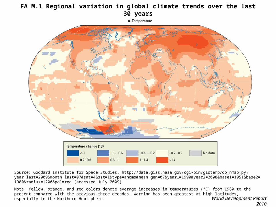
FA M.1 Regional variation in global climate trends over the last 30 years
World Development Report 2010
Source: Goddard Institute for Space Studies, http://data.giss.nasa.gov/cgi-bin/gistemp/do_nmap.py?year_last=2009&month_last=07&sat=4&sst=1&type=anoms&mean_gen=07&year1=1990&year2=2008&base1=1951&base2=1980&radius=1200&pol=reg (accessed July 2009).
Note: Yellow, orange, and red colors denote average increases in temperatures (°C) from 1980 to the present compared with the previous three decades. Warming has been greatest at high latitudes, especially in the Northern Hemisphere.
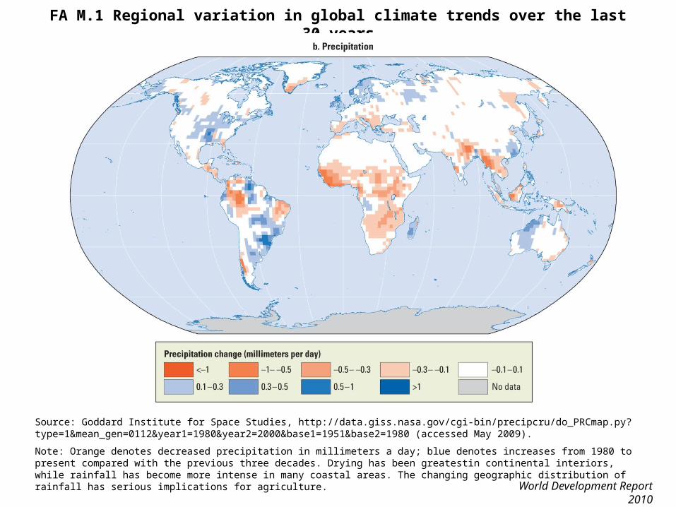
FA M.1 Regional variation in global climate trends over the last 30 years
World Development Report 2010
Source: Goddard Institute for Space Studies, http://data.giss.nasa.gov/cgi-bin/precipcru/do_PRCmap.py?type=1&mean_gen=0112&year1=1980&year2=2000&base1=1951&base2=1980 (accessed May 2009).
Note: Orange denotes decreased precipitation in millimeters a day; blue denotes increases from 1980 to present compared with the previous three decades. Drying has been greatestin continental interiors, while rainfall has become more intense in many coastal areas. The changing geographic distribution of rainfall has serious implications for agriculture.

FA M.2 Potential tipping elements in the climate system: Global distribution
World Development Report 2010
Source: Adapted from Lenton and others 2008.
Note: Several regional-scale features of the climate system have tipping points, meaning that a small climate perturbation at a critical point could trigger an abrupt or irreversible shift in the system. These could be triggered this century depending on the pace and magnitude of climate change.