final infograph development
TRANSCRIPT
Greyscale map of the worldLast accessed 27th December 2013 at http://upload.wikimedia.org/wikipedia/commons/b/b2/BlankMap-World-Continents.PNG
Seating plan of planeLast accessed 27th December athttp://www.popularmechanics.com/cm/popularmechanics/images/XG/aircrash-seat-illo-0807.gif
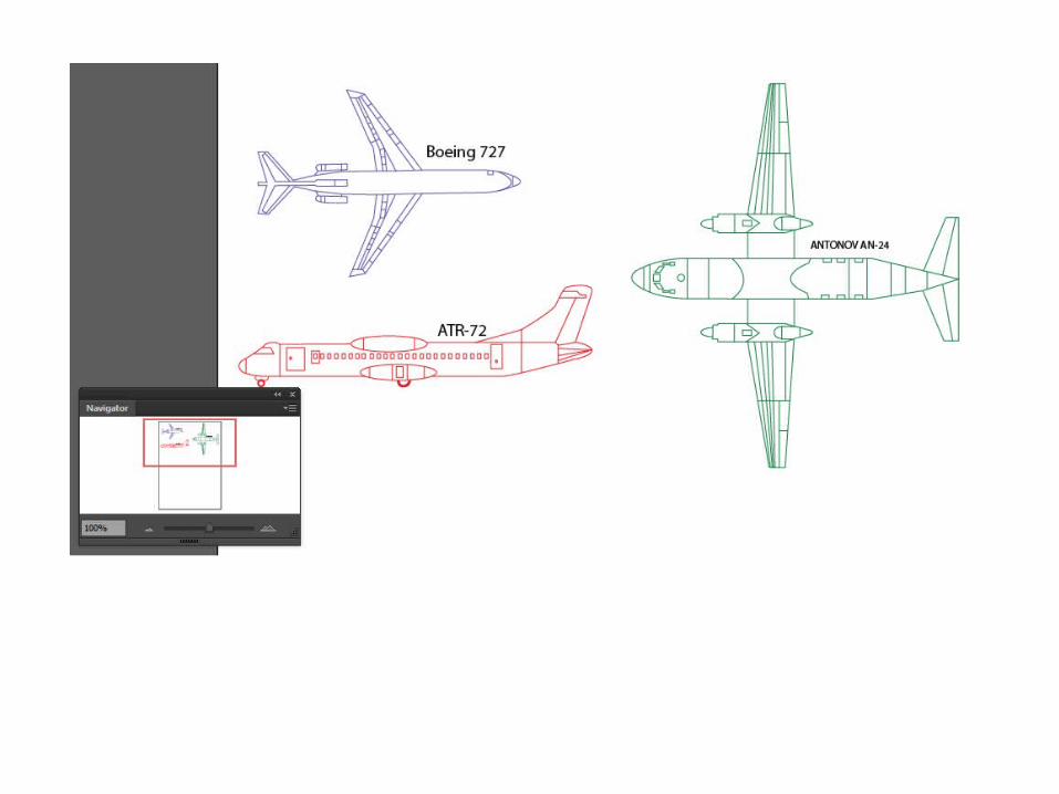
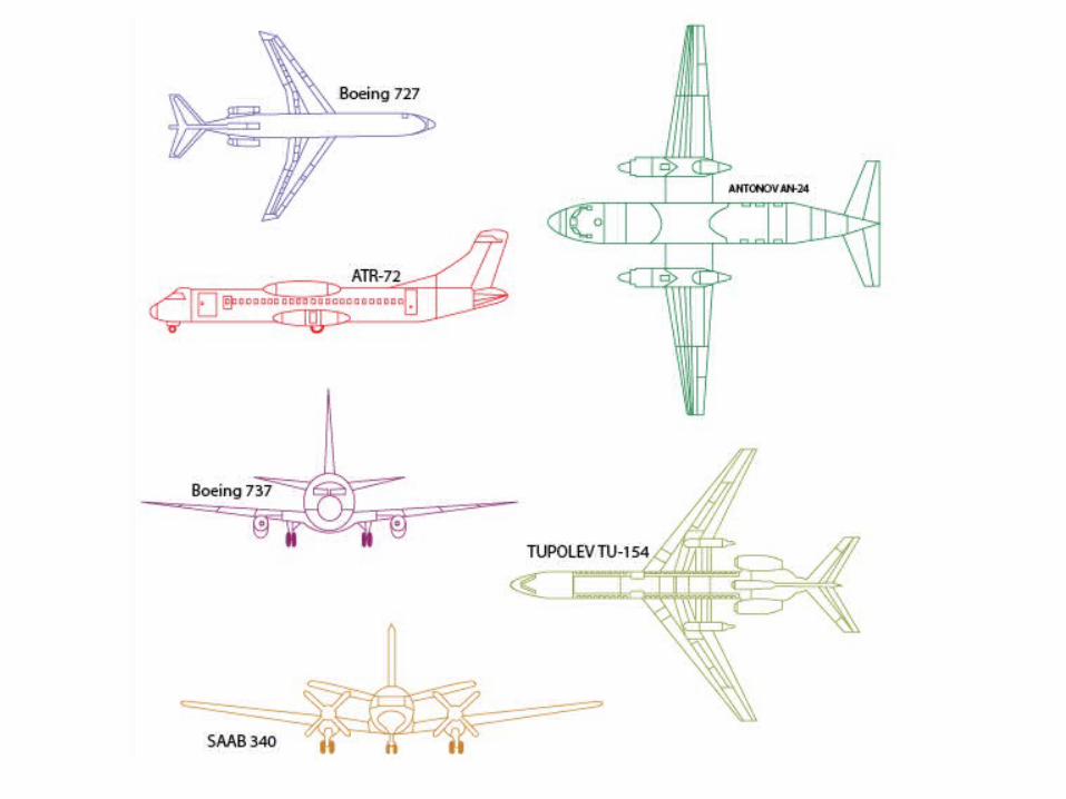
Blueprints of the following aircrafts:-Boeing 727, Boeing 737, Antonov AN-24, ATR - 72Last accessed 16th December athttp://www.the-blueprints.com/
World mapLast accessed 16th December at http://www.freeusandworldmaps.com/images/WorldPrintable/WorldMercatorContinents.jpg
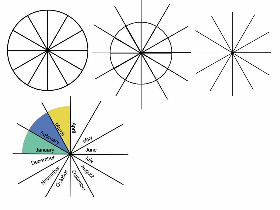
Circle for monthsLast accessed 17th December athttp://etc.usf.edu/clipart/40600/40633/pie_01-12a_40633_lg.gif
SAAB 340 InfoLast accessed 28th December at http://en.wikipedia.org/wiki/SAAB_340
TUPOLEV TU -154 infoLast accessed 28th December athttp://en.wikipedia.org/wiki/TUPOLEV_TU-154
BOEING 737 infoLast accessed 28th December athttp://en.wikipedia.org/wiki/BOEING_737
BOEING 727 infoLast accessed 28th December athttp://en.wikipedia.org/wiki/BOEING_727
Atr-72 infoLast accessed 28th December athttp://en.wikipedia.org/wiki/ATR-72
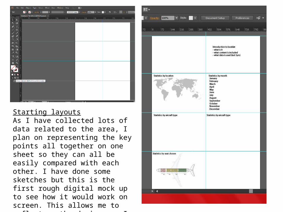
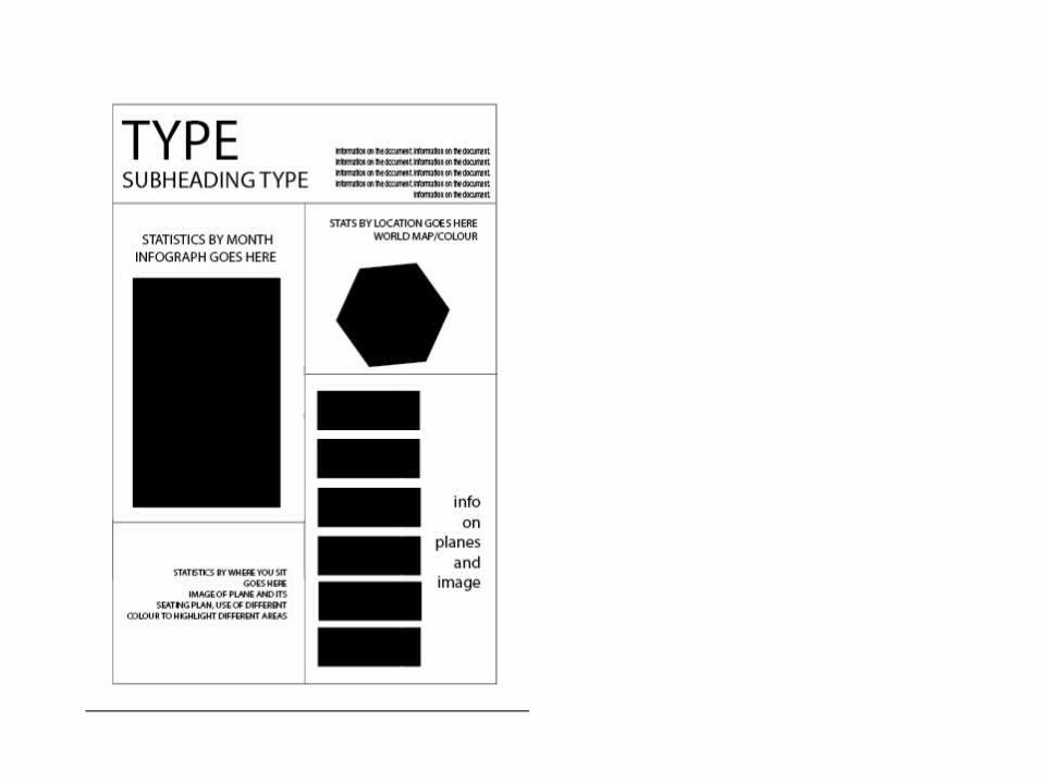
Starting layoutsAs I have collected lots of data related to the area, I plan on representing the key points all together on one sheet so they can all be easily compared with each other. I have done some sketches but this is the first rough digital mock up to see how it would work on screen. This allows me to reflect on the designs as I am developing them.
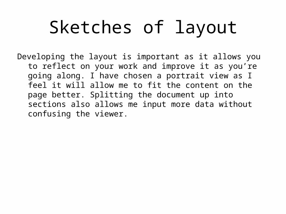
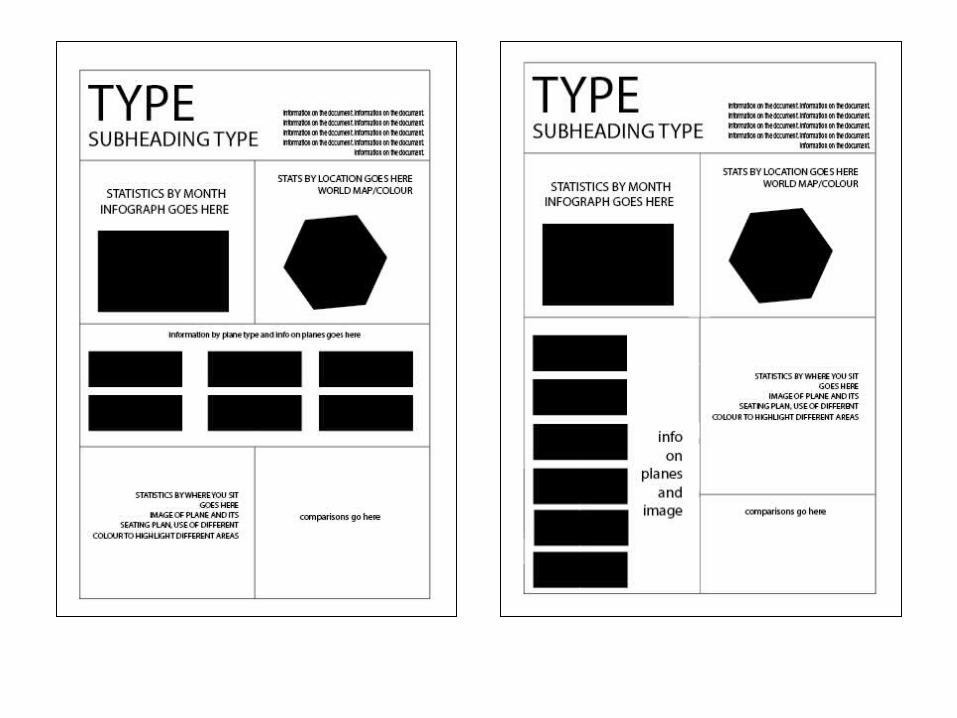
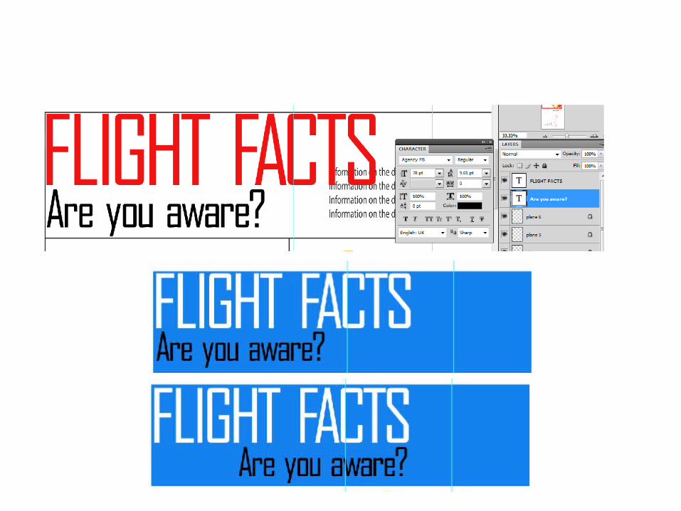
Sketches of layoutDeveloping the layout is important as it allows you to reflect on your work
and improve it as you’re going along. I have chosen a portrait view as I feel it will allow me to fit the content on the page better. Splitting the document up into sections also allows me input more data without confusing the viewer.
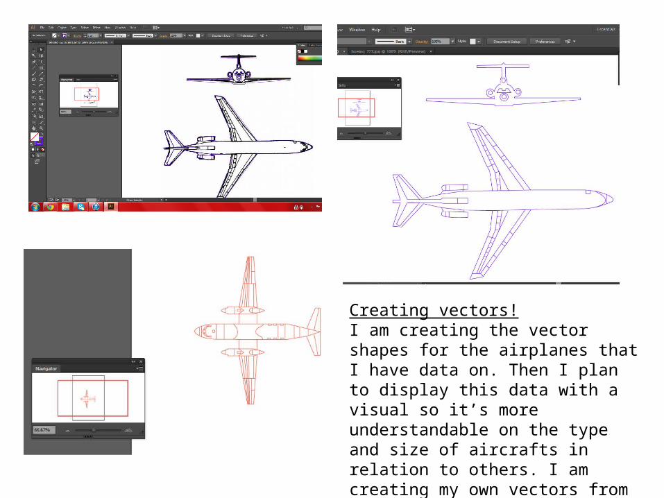
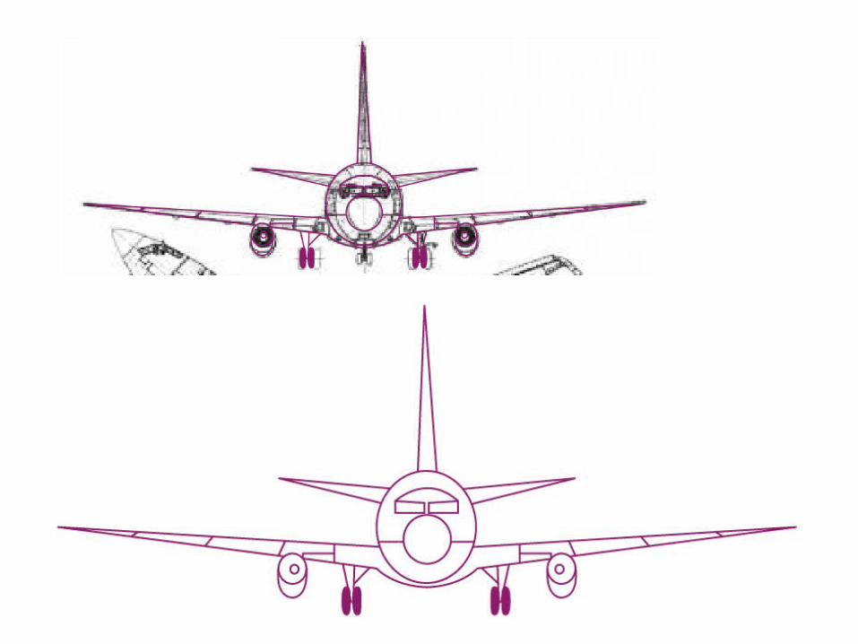
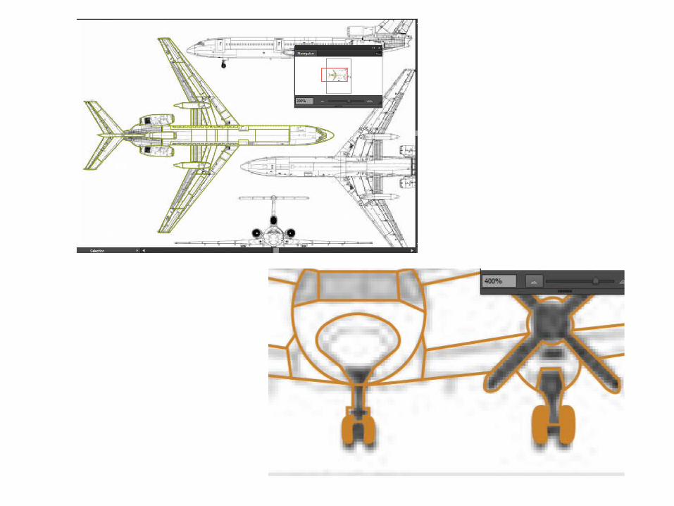
Creating vectors!I am creating the vector shapes for the airplanes that I have data on. Then I plan to display this data with a visual so it’s more understandable on the type and size of aircrafts in relation to others. I am creating my own vectors from blueprints I have found on the internet.
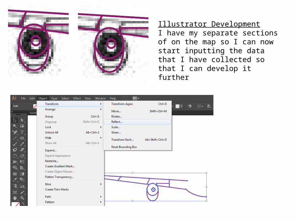
Illustrator DevelopmentI have my separate sections of on the map so I can now start inputting the data that I have collected so that I can develop it further
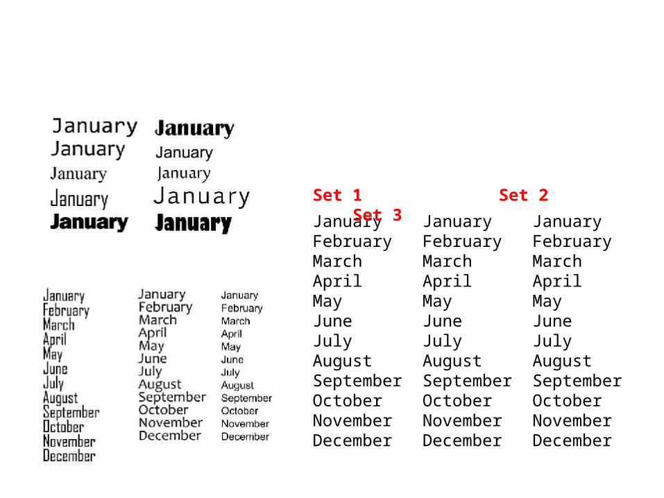
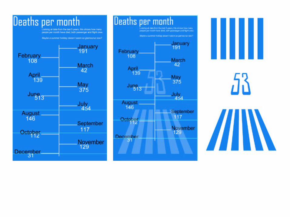
JanuaryFebruaryMarchAprilMayJuneJulyAugustSeptemberOctoberNovemberDecember
JanuaryFebruaryMarchAprilMayJuneJulyAugustSeptemberOctoberNovemberDecember
JanuaryFebruaryMarchAprilMayJuneJulyAugustSeptemberOctoberNovemberDecember
Set 1 Set 2 Set 3
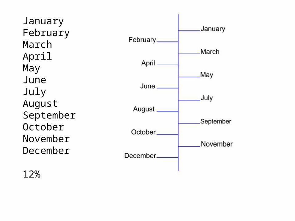
JanuaryFebruaryMarchAprilMayJuneJulyAugustSeptemberOctoberNovemberDecember
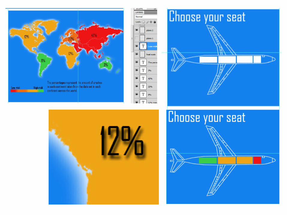
12%

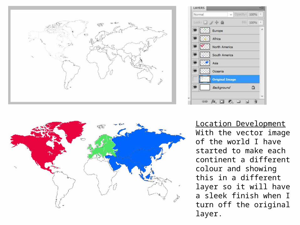
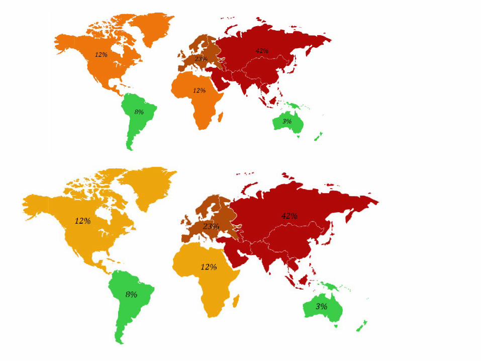
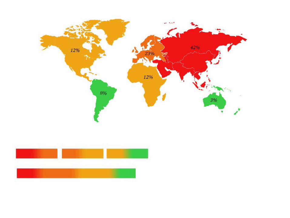
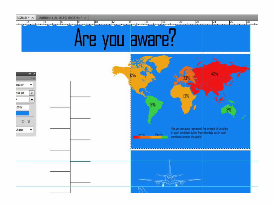
Location DevelopmentWith the vector image of the world I have started to make each continent a different colour and showing this in a different layer so it will have a sleek finish when I turn off the original layer.
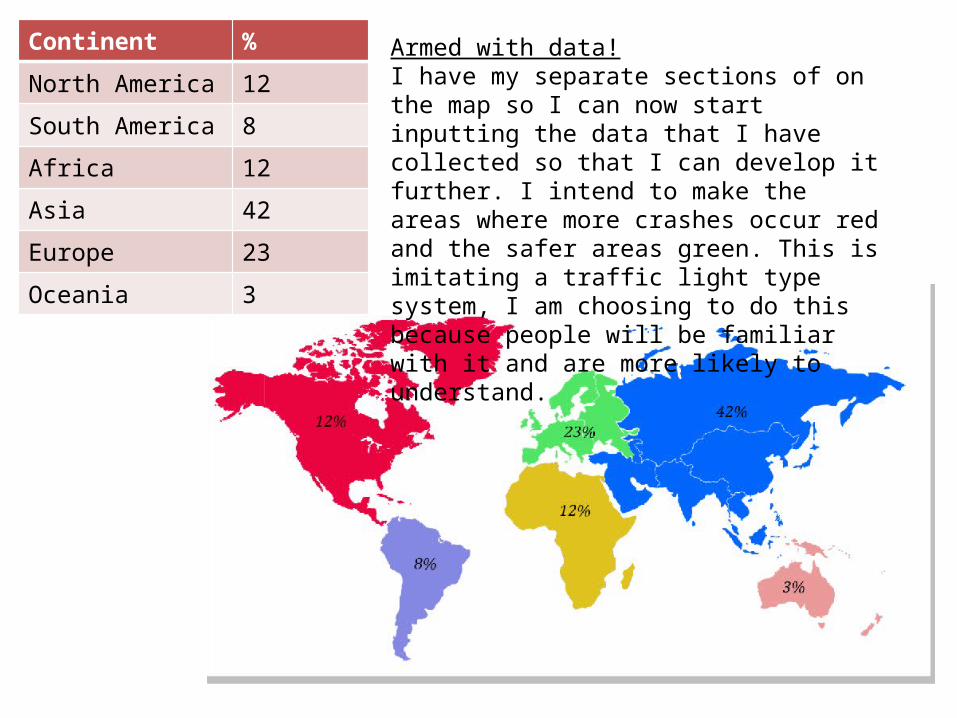
Continent %
North America 12
South America 8
Africa 12
Asia 42
Europe 23
Oceania 3
Armed with data!I have my separate sections of on the map so I can now start inputting the data that I have collected so that I can develop it further. I intend to make the areas where more crashes occur red and the safer areas green. This is imitating a traffic light type system, I am choosing to do this because people will be familiar with it and are more likely to understand.
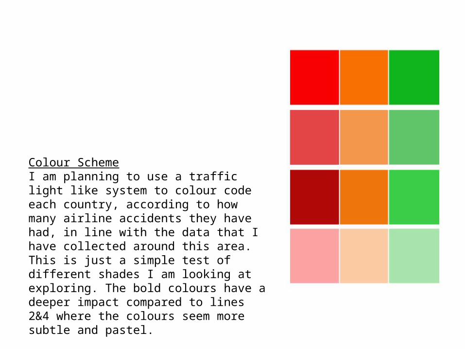
Colour SchemeI am planning to use a traffic light like system to colour code each country, according to how many airline accidents they have had, in line with the data that I have collected around this area.This is just a simple test of different shades I am looking at exploring. The bold colours have a deeper impact compared to lines 2&4 where the colours seem more subtle and pastel.
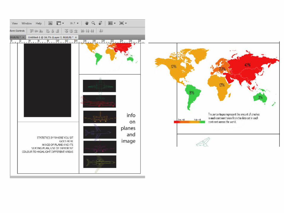
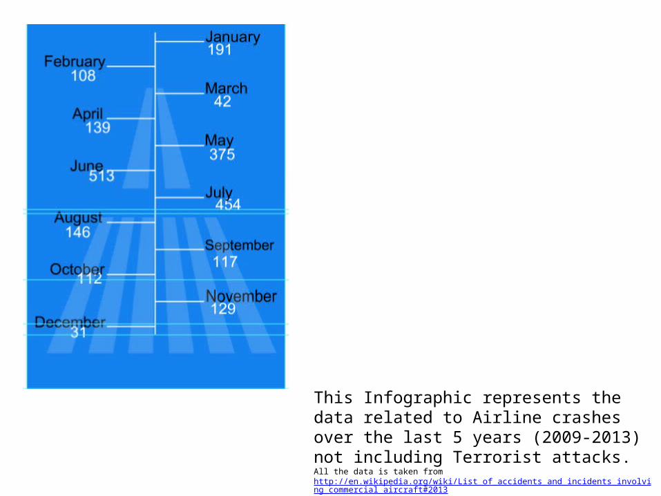
This Infographic represents the data related to Airline crashes over the last 5 years (2009-2013) not including Terrorist attacks. All the data is taken from http://en.wikipedia.org/wiki/List_of_accidents_and_incidents_involving_commercial_aircraft#2013