final major project
DESCRIPTION
Name: William SpeedStudent Number: 0706839Stage 3 Semester 6FINAL MAJOR PROJECTIndependent Practice 3B: Summation & Production EGRD3015TRANSCRIPT
Name: William SpeedStudent Number: 0706839Stage 3 Semester 6FINAL MAJOR PROJECTIndependent Practice 3B: Summation & Production EGRD3015

FMP PROPOSALThe origin of my project.
FMP PROPOSALName: William Speed
Proposed title: The Creative Type
Outcome: book and posters
Description: I want to take this project further but in a slightly different direction. I intend to make a series of books and posters from created type. The type will be made from various outcomes and in three dimensions, then it will be photographed. The idea is to create words and phrases from made type in three dimensions. This will be a hand made form and then photographed and collated in to an alphabet style book and series of posters. Works I have been looking at are, for example, “Tactile-High Tack Visuals,” a book I have been using as reference material and Andy Altman‘s “Why Not Associates,” about thecreating of an advert for Smirnoff.
The experiences I will need are: book binding, layout design, photography and, of course typography. I am more of a hands-on worker, before I go the computer I like to explore. I will make the letters from a variety of techniques to get the best outcome. I will start experimenting in February when we go back to university for the 6th semester. I will spend from February to March experimenting with the outcomes, March to April creating final pieces of type and photographing, the rest of the time collating and laying out the books and posters.


PAPER LETTER FORMSMaking nets from helvetica bold.
I looked at Tom Davie’s work as a starting point because it reflects some of the ideas I wanted to explore such as three-dimensional type that is patterned and very ornamental. I began testing letterforms on paper using Tom Davie’s work as a
start for my project, I used his template and then made letters using paper and drew out the letters in Illustrator using Helvetica Bold and made them as 3D objects. Through only exploring one typeface, my experience of the letterforms was limited.
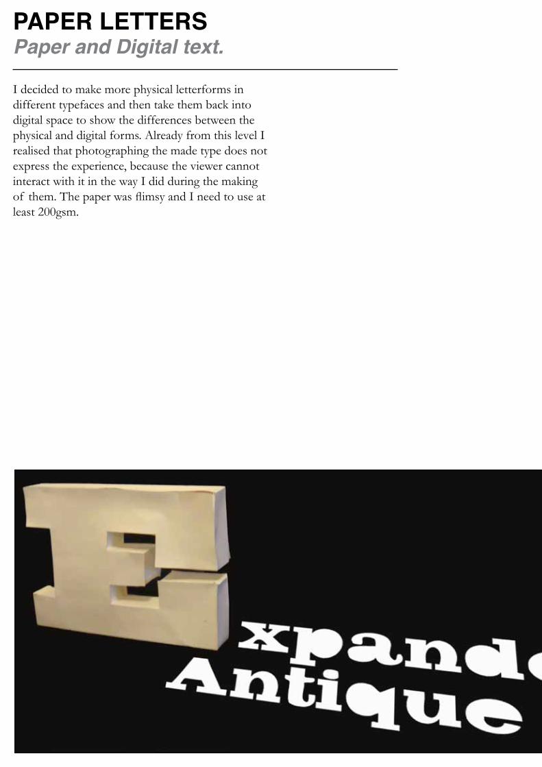
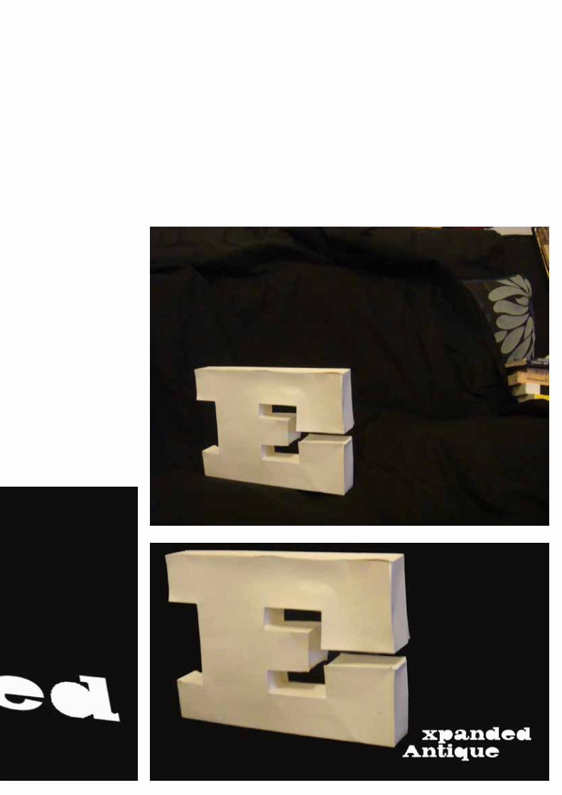
PAPER LETTERSPaper and Digital text.
I decided to make more physical letterforms in different typefaces and then take them back into digital space to show the differences between the physical and digital forms. Already from this level I realised that photographing the made type does not express the experience, because the viewer cannot interact with it in the way I did during the making of them. The paper was flimsy and I need to use at least 200gsm.

LETTERPRESSLearning from lettering.
By using the letterpress I have been able to interact with type in a way I have not before. This allowed me to gain a deeper understanding for type than I have had from just typing in to a computer programme and engage with type in a whole different way. This marked the beginning of my fuller understanding of letterforms, which has had a significant impact on the rest of this project.
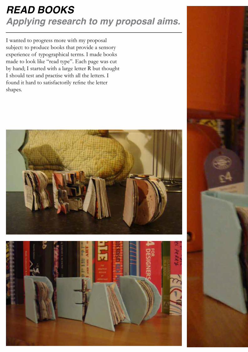
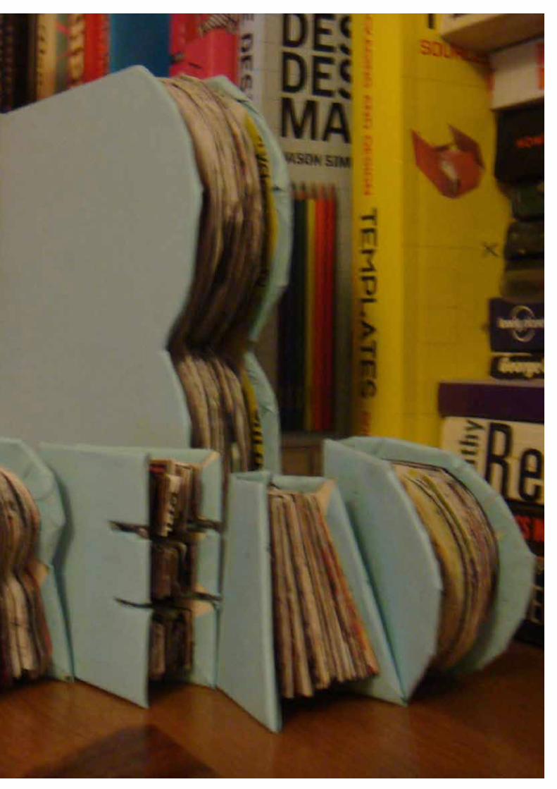
READ BOOKSApplying research to my proposal aims.
I wanted to progress more with my proposal subject: to produce books that provide a sensory experience of typographical terms. I made books made to look like “read type”. Each page was cut by hand; I started with a large letter R but thought I should test and practise with all the letters. I found it hard to satisfactorily refine the letter shapes.
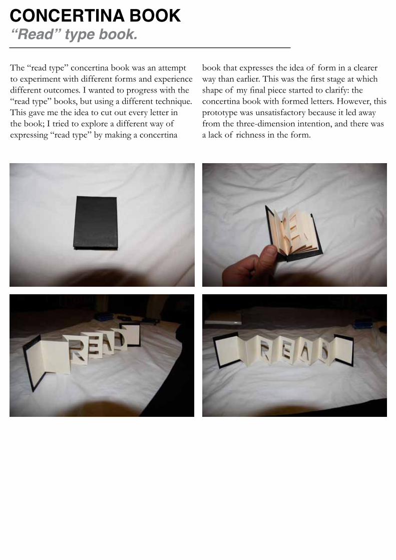
CONCERTINA BOOK“Read” type book.
The “read type” concertina book was an attempt to experiment with different forms and experience different outcomes. I wanted to progress with the “read type” books, but using a different technique. This gave me the idea to cut out every letter in the book; I tried to explore a different way of expressing “read type” by making a concertina
book that expresses the idea of form in a clearer way than earlier. This was the first stage at which shape of my final piece started to clarify: the concertina book with formed letters. However, this prototype was unsatisfactory because it led away from the three-dimension intention, and there was a lack of richness in the form.

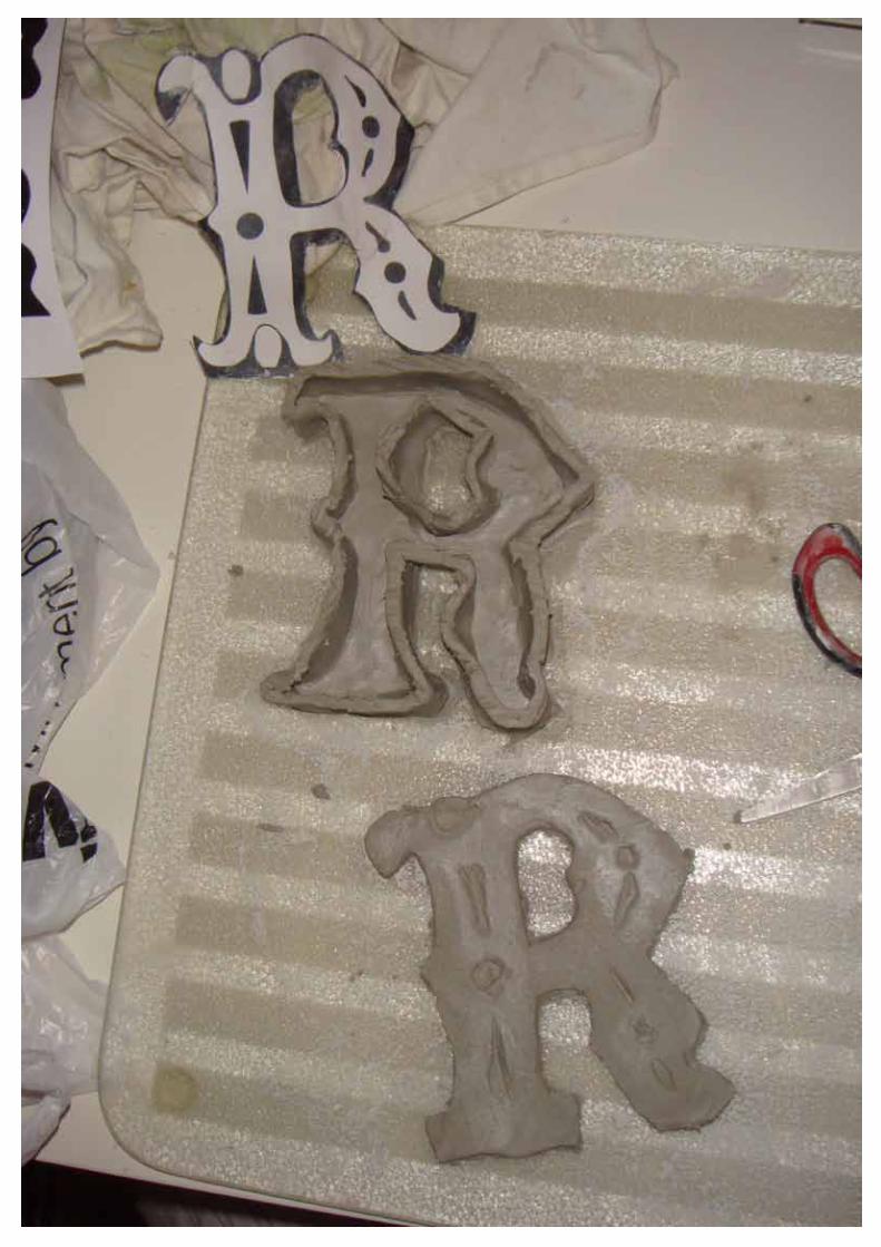
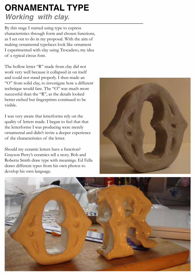
ORNAMENTAL TYPEWorking with clay.By this stage I started using type to express characteristics through form and chosen functions, as I set out to do in my proposal. With the aim of making ornamental typefaces look like ornament I experimented with clay using Trocadero, my idea of a typical circus font.
The hollow letter “R” made from clay did not work very well because it collapsed in on itself and could not stand properly. I then made an “O” from solid clay, to investigate how a different technique would fare. The “O” was much more successful than the “R”, as the details looked better etched but fingerprints continued to be visible.
I was very aware that letterforms rely on the quality of letters made. I began to feel that that the letterforms I was producing were merely ornamental and didn’t invite a deeper experience of the characteristics of the letter.
Should my ceramic letters have a function? Grayson Perry’s ceramics tell a story. Bob and Roberta Smith draw type with meanings. Ed Fella draws different types from his own photos to develop his own language.

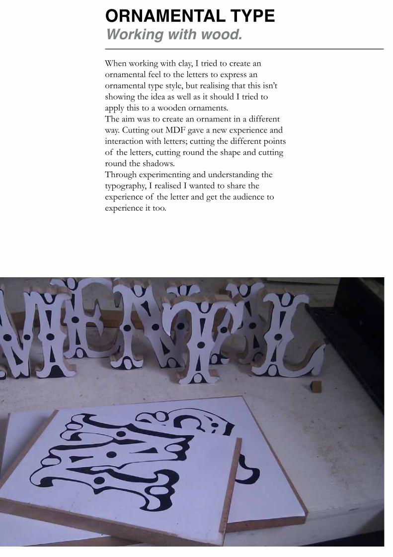
ORNAMENTAL TYPEWorking with wood.
When working with clay, I tried to create an ornamental feel to the letters to express an ornamental type style, but realising that this isn’t showing the idea as well as it should I tried to apply this to a wooden ornaments.The aim was to create an ornament in a different way. Cutting out MDF gave a new experience and interaction with letters; cutting the different points of the letters, cutting round the shape and cutting round the shadows. Through experimenting and understanding the typography, I realised I wanted to share the experience of the letter and get the audience to experience it too.
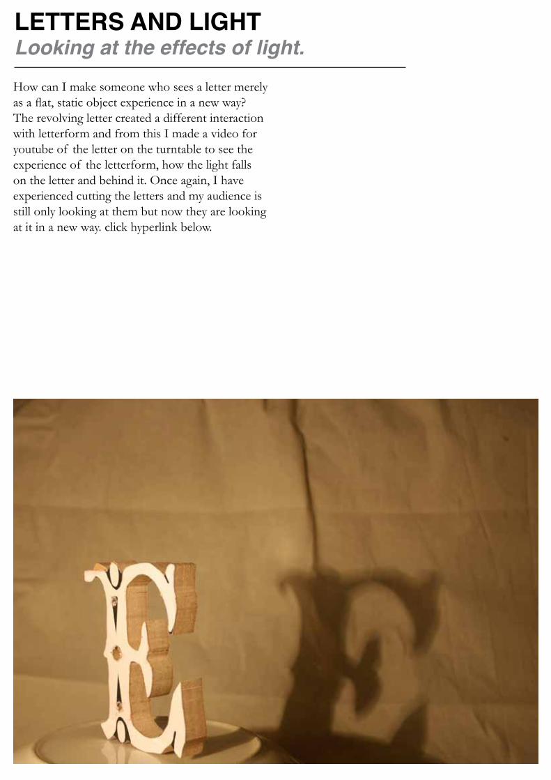
LETTERS AND LIGHTLooking at the effects of light.How can I make someone who sees a letter merely as a flat, static object experience in a new way?The revolving letter created a different interaction with letterform and from this I made a video for youtube of the letter on the turntable to see the experience of the letterform, how the light falls on the letter and behind it. Once again, I have experienced cutting the letters and my audience is still only looking at them but now they are looking at it in a new way. click hyperlink below.


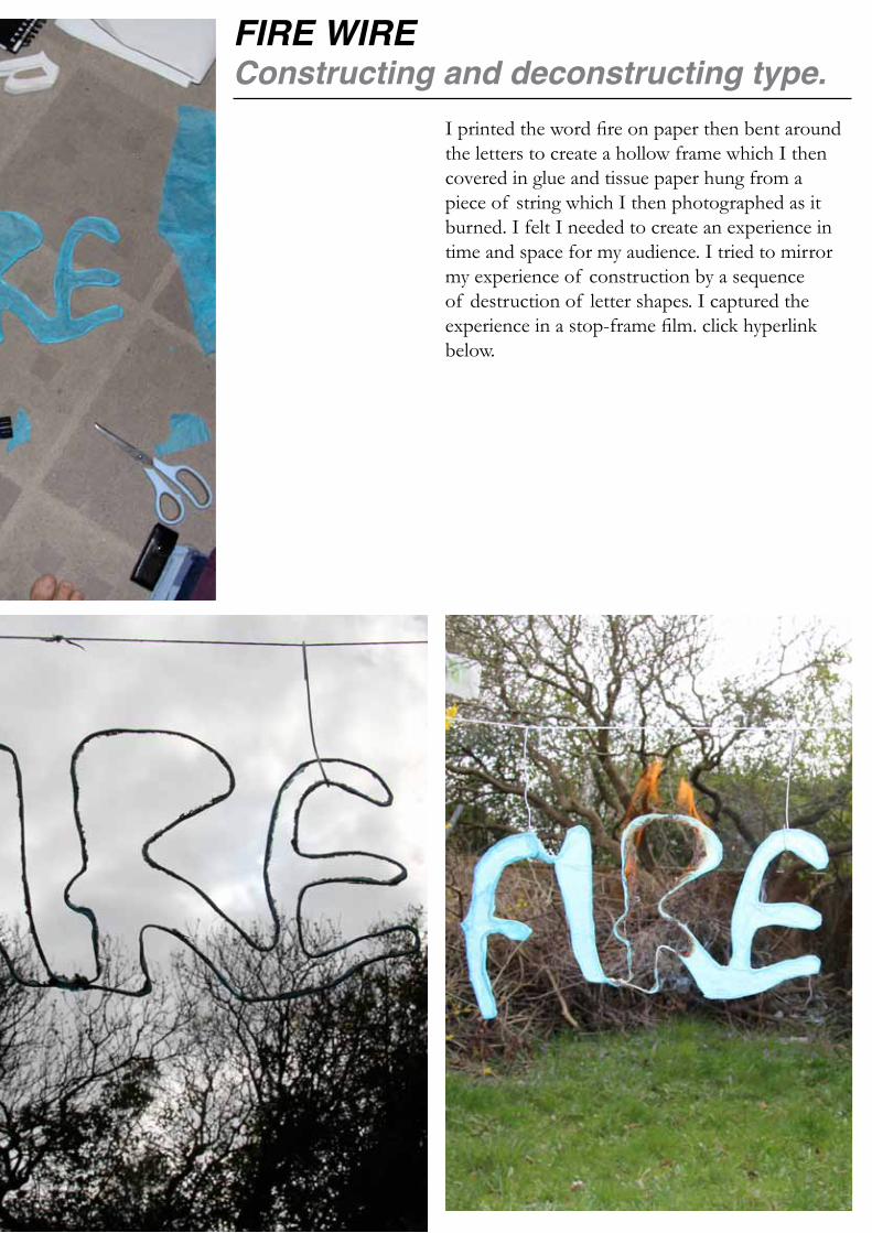
FIRE WIRE Constructing and deconstructing type.
I printed the word fire on paper then bent around the letters to create a hollow frame which I then covered in glue and tissue paper hung from a piece of string which I then photographed as it burned. I felt I needed to create an experience in time and space for my audience. I tried to mirror my experience of construction by a sequence of destruction of letter shapes. I captured the experience in a stop-frame film. click hyperlink below.

PEOPLEIt’s like ‘meta’ or something …
Meta, meaning self-referential. This piece features pictures of people screen-printed onto the word ‘People.’ After the experiment with fire, I wanted to explore the idea of words illustrating themselves using a more stable medium. I collaged the images and incorporated catalogues and telephone books as these have a close relationship to people as the clothes we wear and our telephone use helps to define us as individuals, much like how typefaces have their own personalities.
I used the Bauhaus font as it is bold enough for the images to be seen and the letters to be appreciated. The look of this piece came from a Pop Art influence.
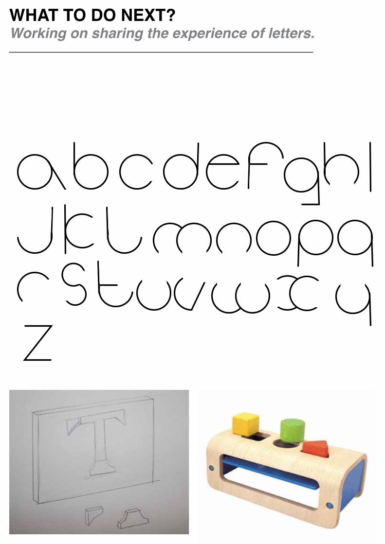
WHAT TO DO NEXT?Working on sharing the experience of letters.
I have made my own font, which reflects Herbert Bayer’s reductive Bauhaus font, which aimed to maximise the differences between letters for greater legibility. My font is made of circles and lines stripped down to the simplest possible form. Letters are very over used, we read words but don’t experience the actual letter. What I want to do from this point is to get people to experience letters that haven’t previously appreciated.The wood block toy sketch (to the left) was where I started to think of ways we experience type.
As of the mid point review this is the direction I wanted to take my project. The wood block toy shows shapes and I wanted to reflect the intricacies of the letterform based on this toy design.
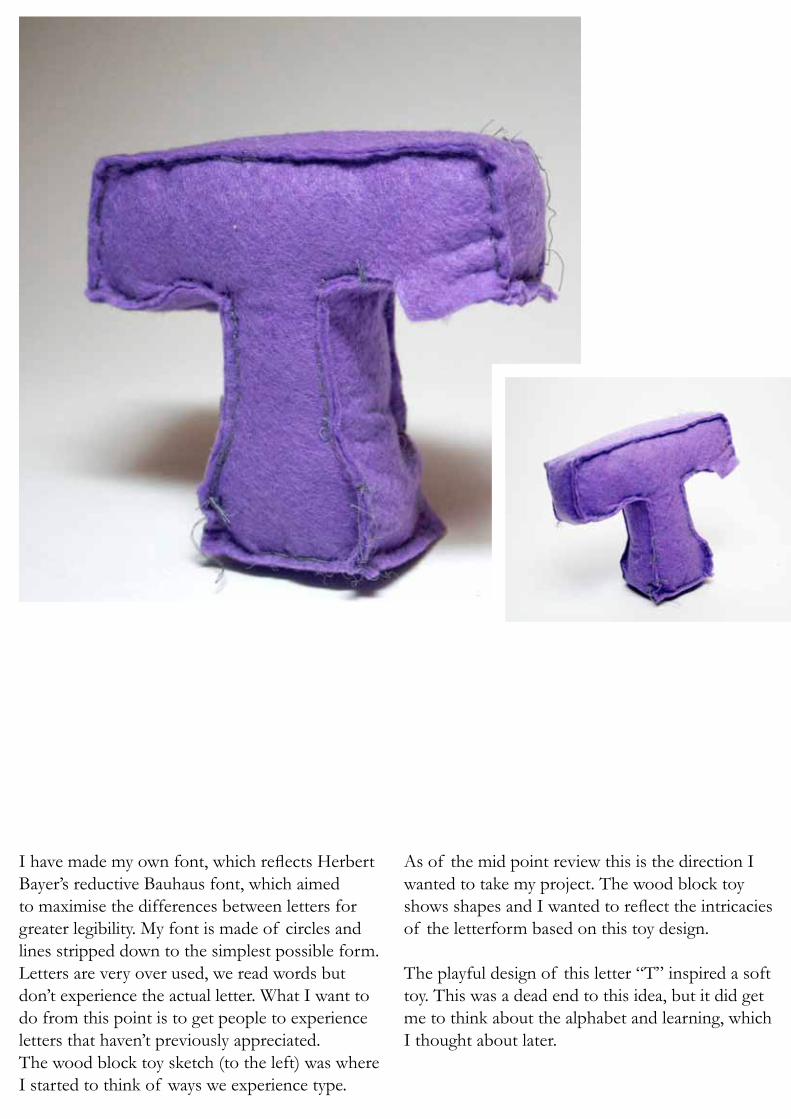
The playful design of this letter “T” inspired a soft toy. This was a dead end to this idea, but it did get me to think about the alphabet and learning, which I thought about later.

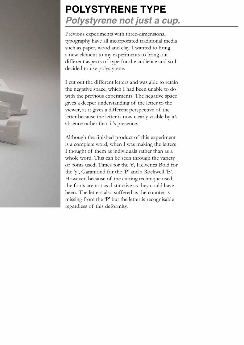
POLYSTYRENE TYPEPolystyrene not just a cup.Previous experiments with three-dimensional typography have all incorporated traditional media such as paper, wood and clay. I wanted to bring a new element to my experiments to bring out different aspects of type for the audience and so I decided to use polystyrene.
I cut out the different letters and was able to retain the negative space, which I had been unable to do with the previous experiments. The negative space gives a deeper understanding of the letter to the viewer, as it gives a different perspective of the letter because the letter is now clearly visible by it’s absence rather than it’s presence.
Although the finished product of this experiment is a complete word, when I was making the letters I thought of them as individuals rather than as a whole word. This can be seen through the variety of fonts used; Times for the ‘t’, Helvetica Bold for the ‘y’, Garamond for the ‘P’ and a Rockwell ‘E’. However, because of the cutting technique used, the fonts are not as distinctive as they could have been. The letters also suffered as the counter is missing from the ‘P’ but the letter is recognisable regardless of this deformity.
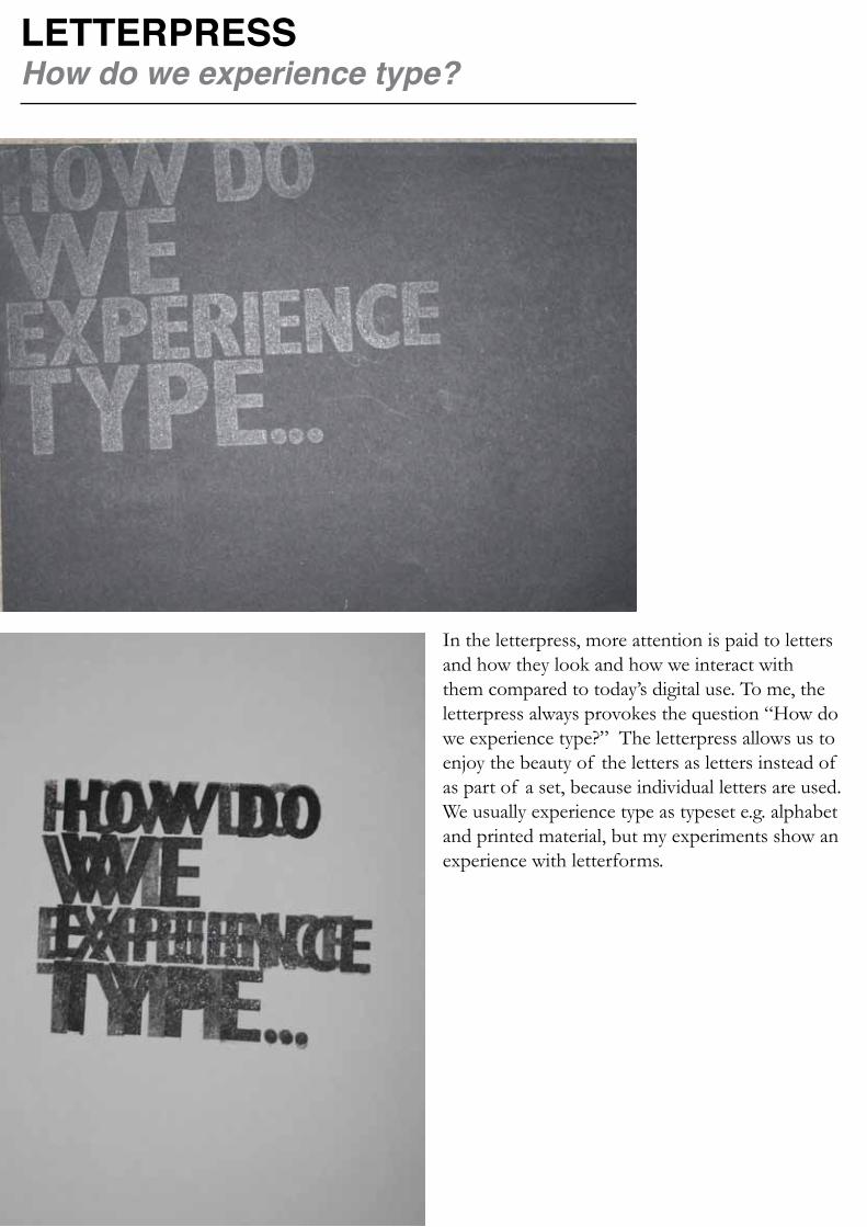
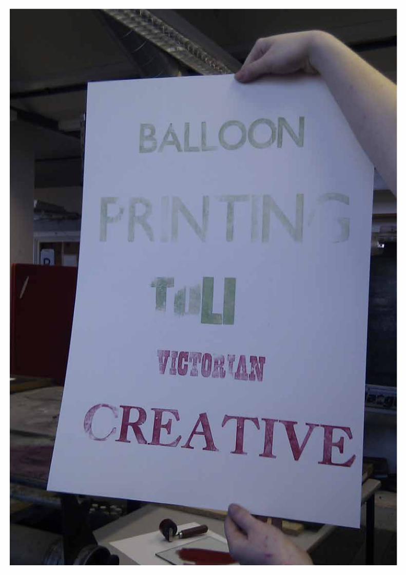
LETTERPRESSHow do we experience type?
In the letterpress, more attention is paid to letters and how they look and how we interact with them compared to today’s digital use. To me, the letterpress always provokes the question “How do we experience type?” The letterpress allows us to enjoy the beauty of the letters as letters instead of as part of a set, because individual letters are used. We usually experience type as typeset e.g. alphabet and printed material, but my experiments show an experience with letterforms.

SCREEN PRINTINGScreen printing more fun than print screening.
I gathered together a collection of fonts. The fonts were a-z with each font being represented by a different font that matched the letter e.g. A for Ariel, B for Bauhaus and so on. I was able to utilise a range of different font types such as Old Face, Sans Serif and Black letter.
This experiment made me realise I was looking at fonts as a collection and I began to wonder if I should include punctuation in this collection.
Screen-printing gives a more tactile experience of printing, and, like the polystyrene experiment it provides a negative image of the letter.
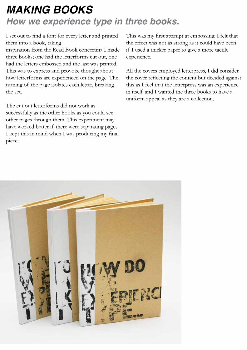
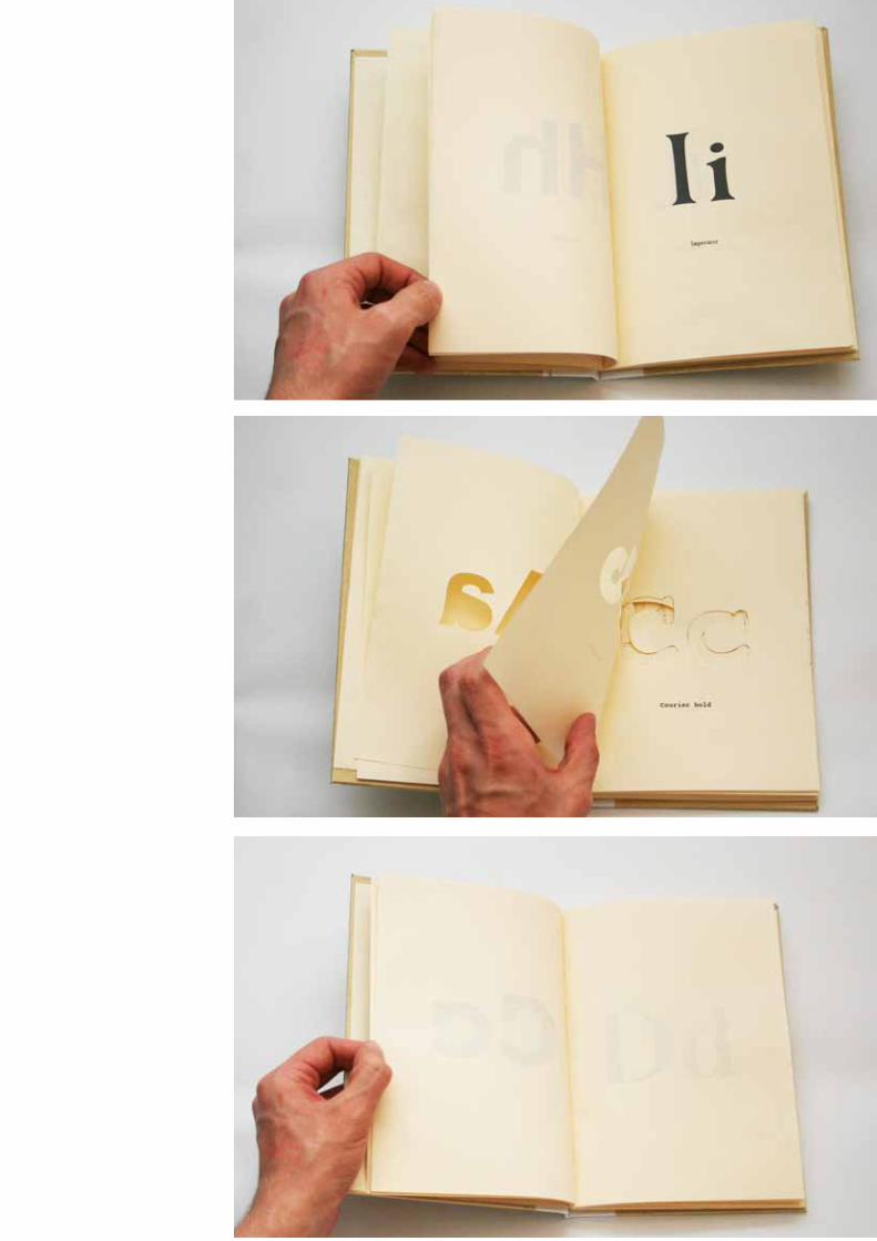
MAKING BOOKSHow we experience type in three books.I set out to find a font for every letter and printed them into a book, taking inspiration from the Read Book concertina I made three books; one had the letterforms cut out, one had the letters embossed and the last was printed.This was to express and provoke thought about how letterforms are experienced on the page. The turning of the page isolates each letter, breaking the set.
The cut out letterforms did not work as successfully as the other books as you could see other pages through them. This experiment may have worked better if there were separating pages. I kept this in mind when I was producing my final piece.
This was my first attempt at embossing. I felt that the effect was not as strong as it could have been if I used a thicker paper to give a more tactile experience.
All the covers employed letterpress, I did consider the cover reflecting the content but decided against this as I feel that the letterpress was an experience in itself and I wanted the three books to have a uniform appeal as they are a collection.
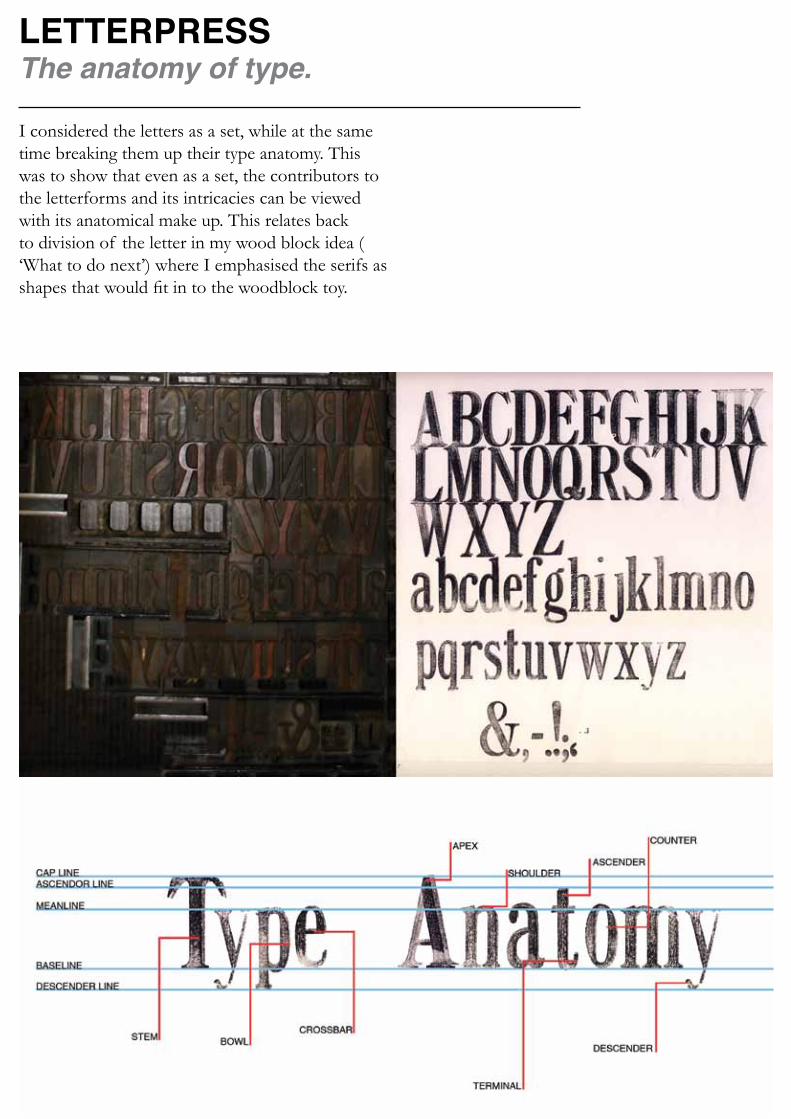
LETTERPRESSThe anatomy of type.
I considered the letters as a set, while at the same time breaking them up their type anatomy. This was to show that even as a set, the contributors to the letterforms and its intricacies can be viewed with its anatomical make up. This relates back to division of the letter in my wood block idea ( ‘What to do next’) where I emphasised the serifs as shapes that would fit in to the woodblock toy.
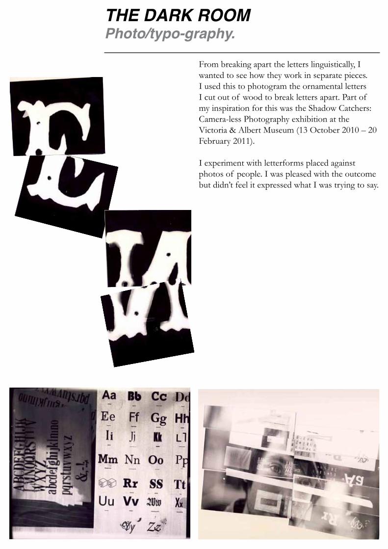
THE DARK ROOMPhoto/typo-graphy.
From breaking apart the letters linguistically, I wanted to see how they work in separate pieces. I used this to photogram the ornamental letters I cut out of wood to break letters apart. Part of my inspiration for this was the Shadow Catchers: Camera-less Photography exhibition at the Victoria & Albert Museum (13 October 2010 – 20 February 2011).
I experiment with letterforms placed against photos of people. I was pleased with the outcome but didn’t feel it expressed what I was trying to say.

AaAa is for the eiffel tower
Aa= EIFFEL TOWERRelearning your ABC.
The idea was that as we are trained from such a young age to think that a letter stands for something e.g. A is for apple. I wanted to get away from semantic meanings and view the shapes as letters. I wanted to emphasise the visual anatomy, thus Aa = Eiffel Tower. This simplistic form breaks letters away from their usual associations.
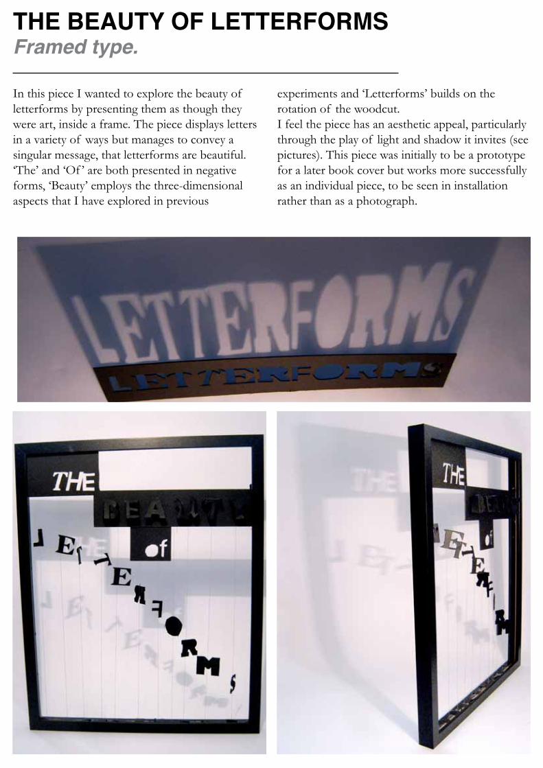
THE BEAUTY OF LETTERFORMSFramed type.
In this piece I wanted to explore the beauty of letterforms by presenting them as though they were art, inside a frame. The piece displays letters in a variety of ways but manages to convey a singular message, that letterforms are beautiful. ‘The’ and ‘Of ’ are both presented in negative forms, ‘Beauty’ employs the three-dimensional aspects that I have explored in previous
experiments and ‘Letterforms’ builds on the rotation of the woodcut. I feel the piece has an aesthetic appeal, particularly through the play of light and shadow it invites (see pictures). This piece was initially to be a prototype for a later book cover but works more successfully as an individual piece, to be seen in installation rather than as a photograph.

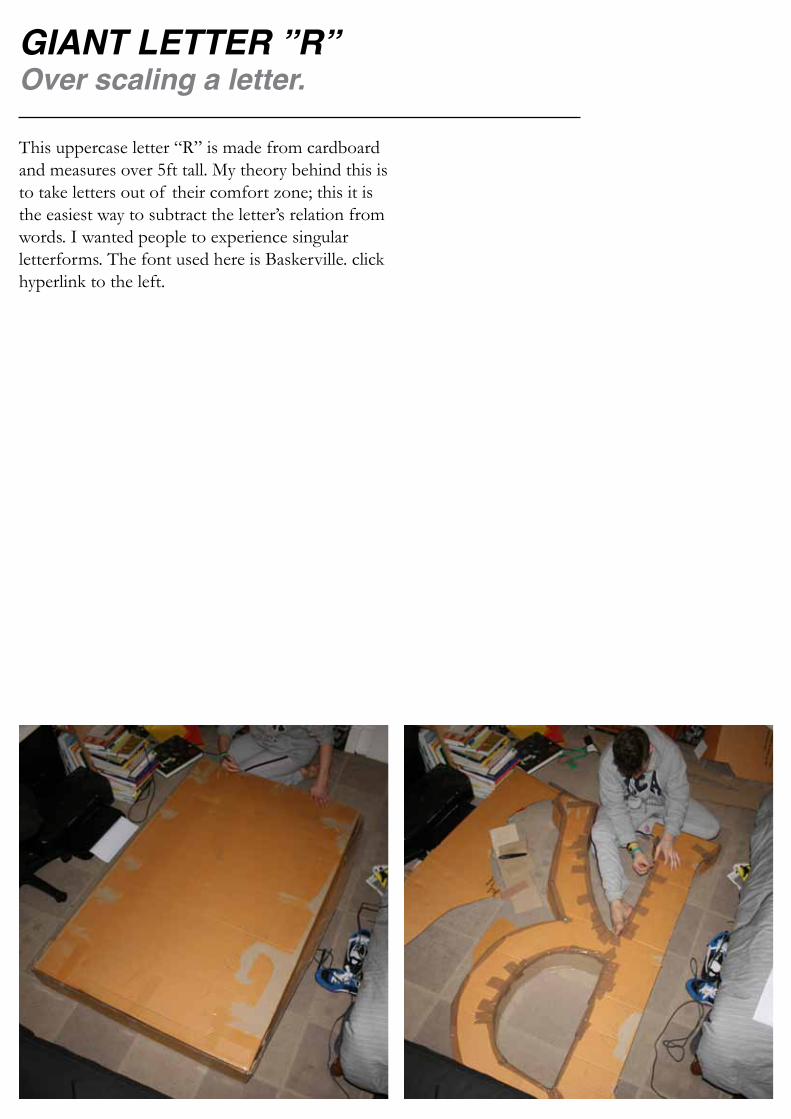
GIANT LETTER ”R”Over scaling a letter.
This uppercase letter “R” is made from cardboard and measures over 5ft tall. My theory behind this is to take letters out of their comfort zone; this it is the easiest way to subtract the letter’s relation from words. I wanted people to experience singular letterforms. The font used here is Baskerville. click hyperlink to the left.

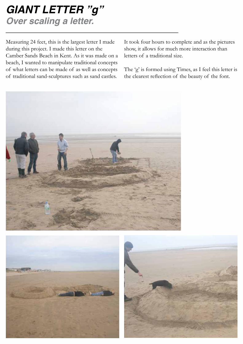
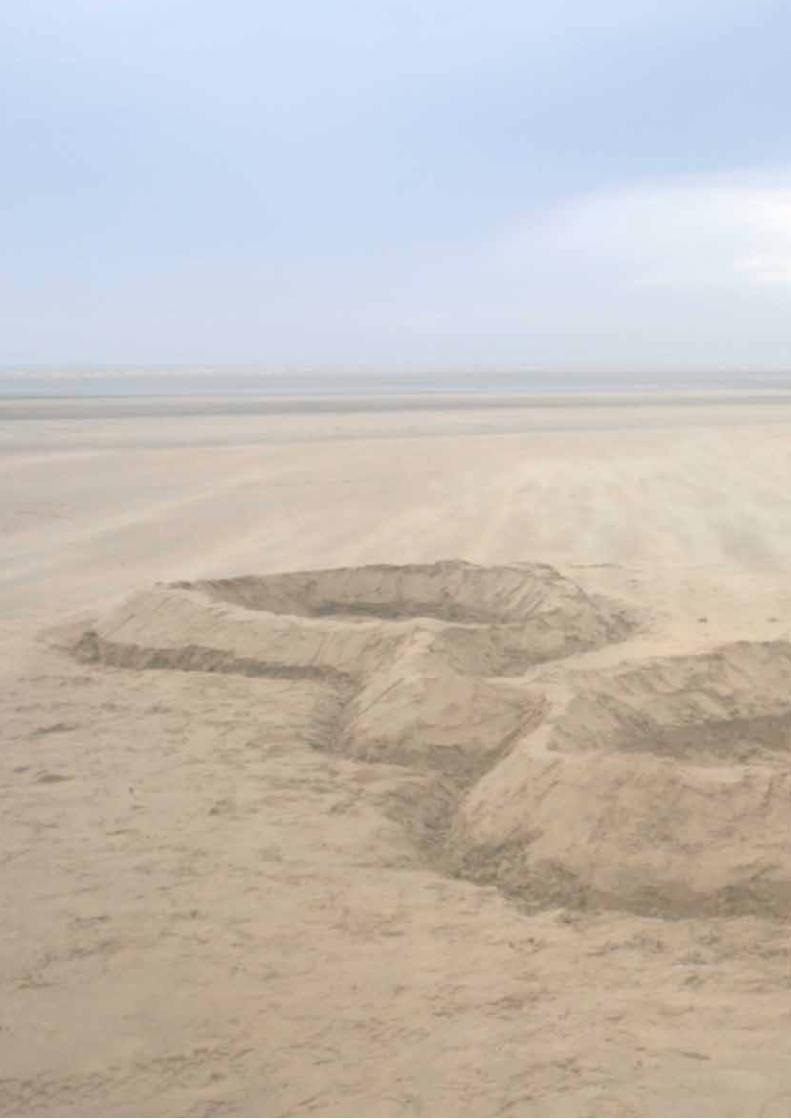
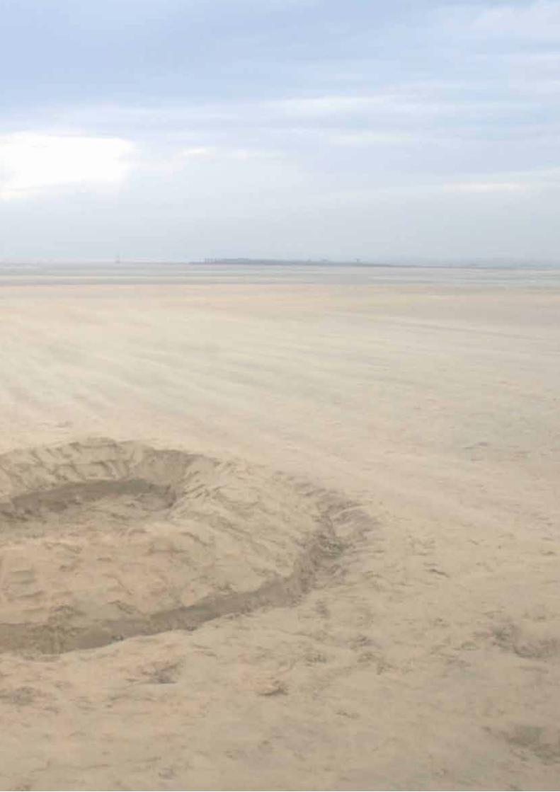
GIANT LETTER ”g”Over scaling a letter.
Measuring 24 feet, this is the largest letter I made during this project. I made this letter on the Camber Sands Beach in Kent. As it was made on a beach, I wanted to manipulate traditional concepts of what letters can be made of as well as concepts of traditional sand-sculptures such as sand castles.
It took four hours to complete and as the pictures show, it allows for much more interaction than letters of a traditional size.
The ‘g’ is formed using Times, as I feel this letter is the clearest reflection of the beauty of the font.
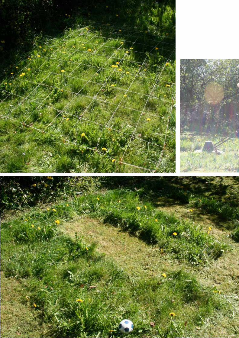
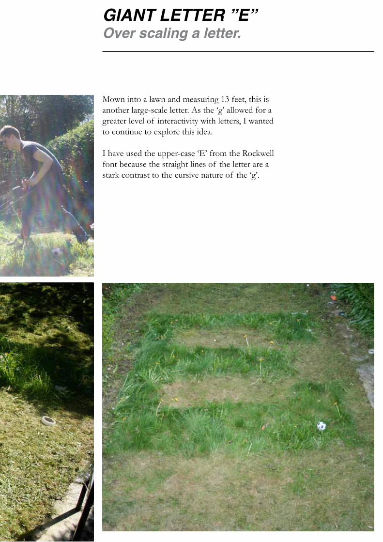
GIANT LETTER ”E”Over scaling a letter.
Mown into a lawn and measuring 13 feet, this is another large-scale letter. As the ‘g’ allowed for a greater level of interactivity with letters, I wanted to continue to explore this idea.
I have used the upper-case ‘E’ from the Rockwell font because the straight lines of the letter are a stark contrast to the cursive nature of the ‘g’.
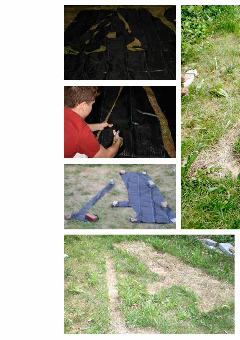
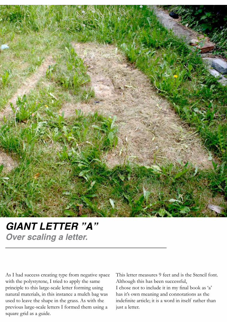
GIANT LETTER ”A”Over scaling a letter.
As I had success creating type from negative space with the polystyrene, I tried to apply the same principle to this large-scale letter forming using natural materials, in this instance a mulch bag was used to leave the shape in the grass. As with the previous large-scale letters I formed them using a square grid as a guide.
This letter measures 9 feet and is the Stencil font. Although this has been successful, I chose not to include it in my final book as ‘a’ has it’s own meaning and connotations as the indefinite article; it is a word in itself rather than just a letter.

MOULDED”Tt”Expanding foam ‘t’.
As I had yet to experiment with moulded letters, I felt it was time. So, using a card base I formed a Time ‘t’ using expanding foam. Although the original intention was the upper and lower cases of ‘t,’ I preferred the stem and finial of the lower case.

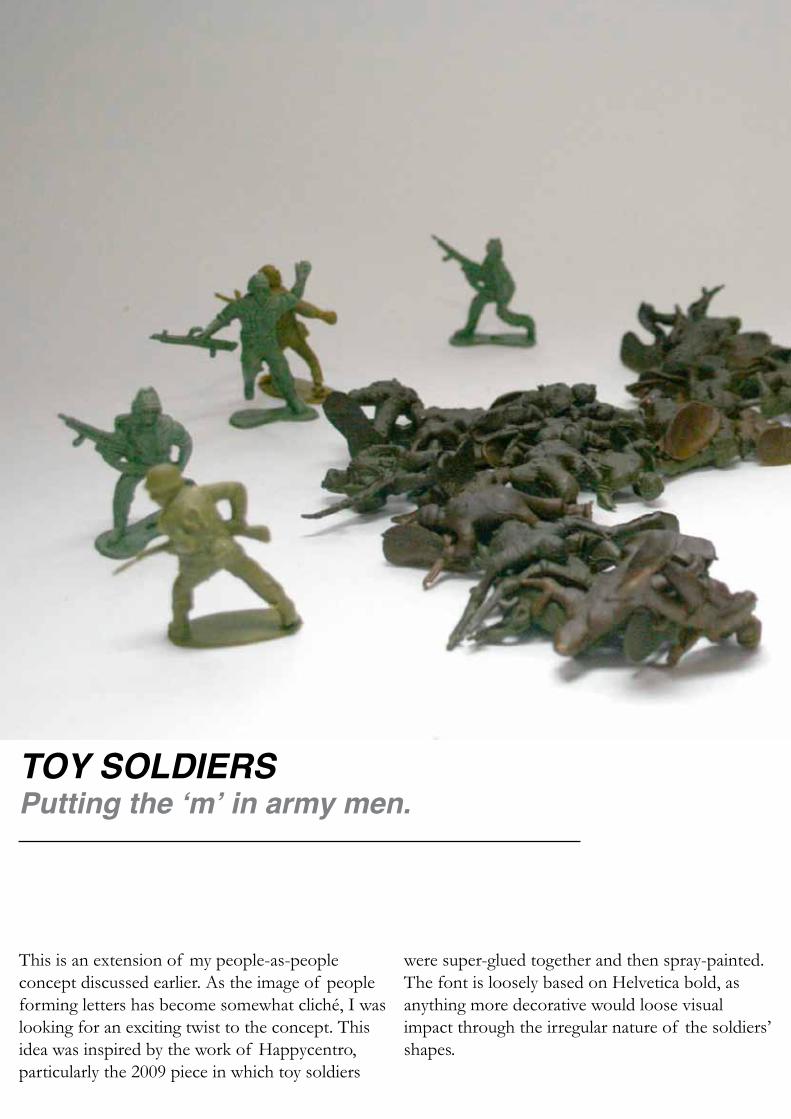
TOY SOLDIERSPutting the ‘m’ in army men.
This is an extension of my people-as-people concept discussed earlier. As the image of people forming letters has become somewhat cliché, I was looking for an exciting twist to the concept. This idea was inspired by the work of Happycentro, particularly the 2009 piece in which toy soldiers
were super-glued together and then spray-painted. The font is loosely based on Helvetica bold, as anything more decorative would loose visual impact through the irregular nature of the soldiers’ shapes.

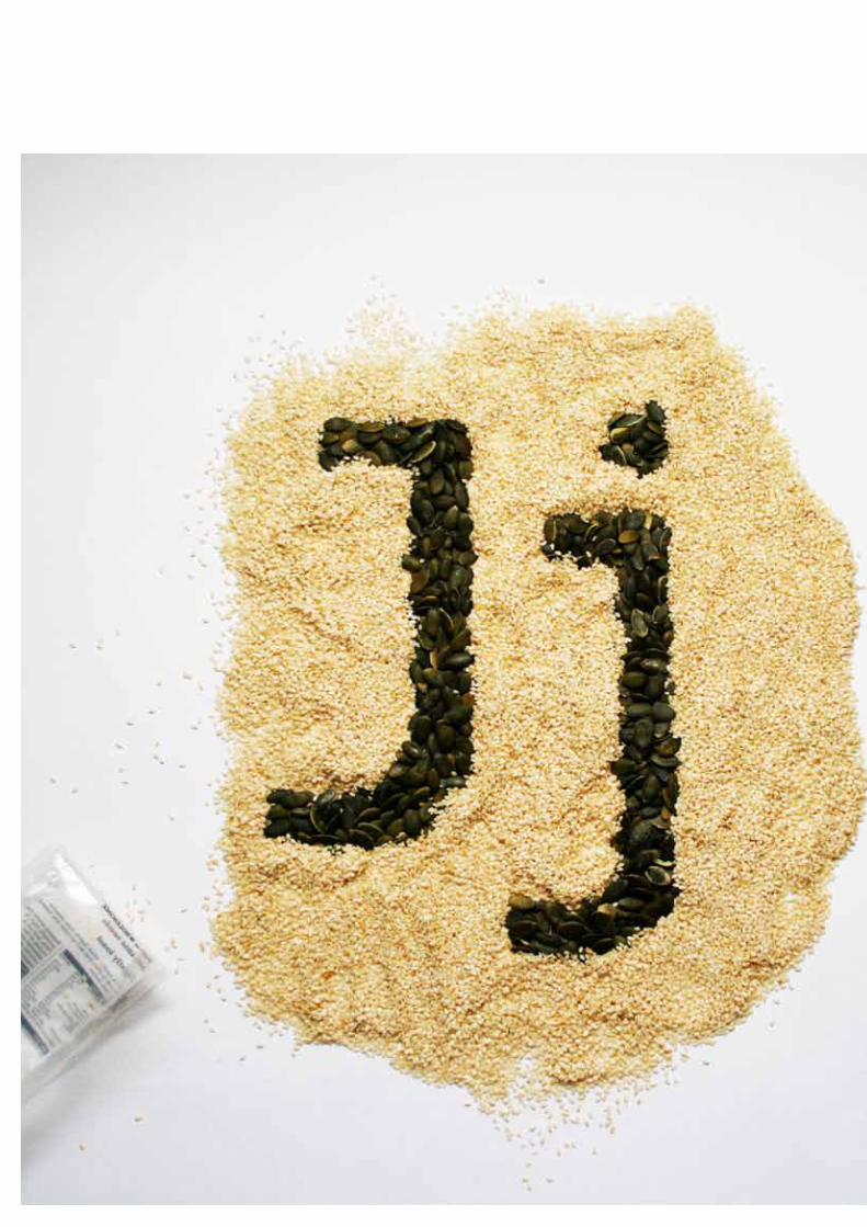
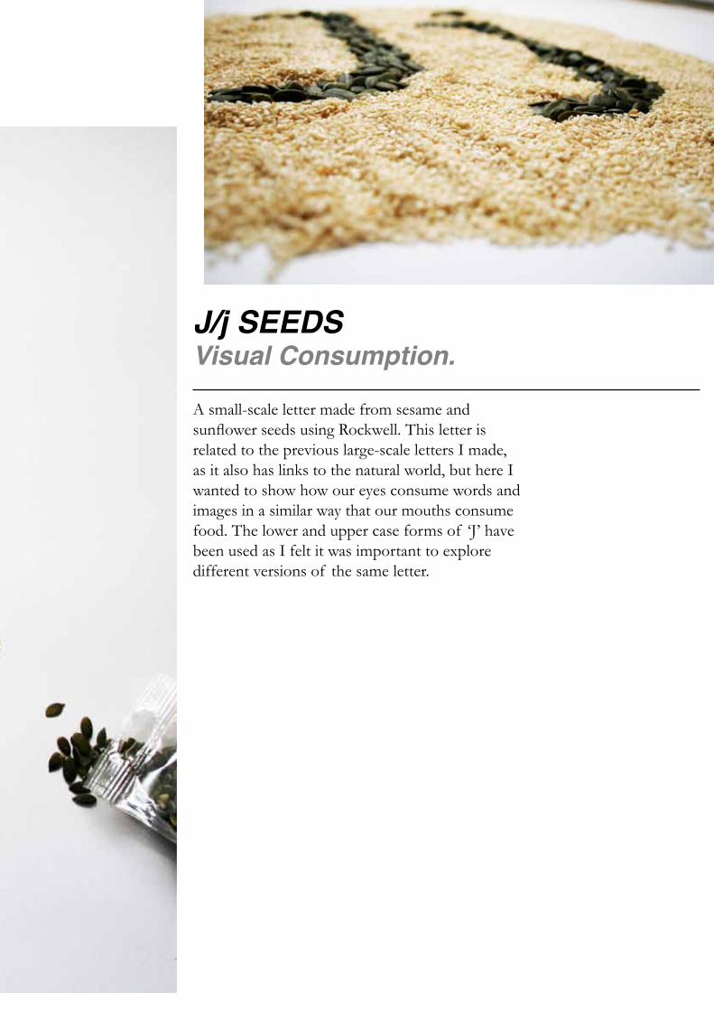
J/j SEEDSVisual Consumption.
A small-scale letter made from sesame and sunflower seeds using Rockwell. This letter is related to the previous large-scale letters I made, as it also has links to the natural world, but here I wanted to show how our eyes consume words and images in a similar way that our mouths consume food. The lower and upper case forms of ‘J’ have been used as I felt it was important to explore different versions of the same letter.

CAKE LETTERINGOven baking a letter.
Originally this piece was going to consist solely of the ‘c’ but I felt that the ‘c’ had too close a connection to the cake and so decided that another letter would be more appropriate as it would be more abstract. I have used Helvetica as the flavour of this piece comes from the material used rather than the aesthetics of the font. click hyperlink below.

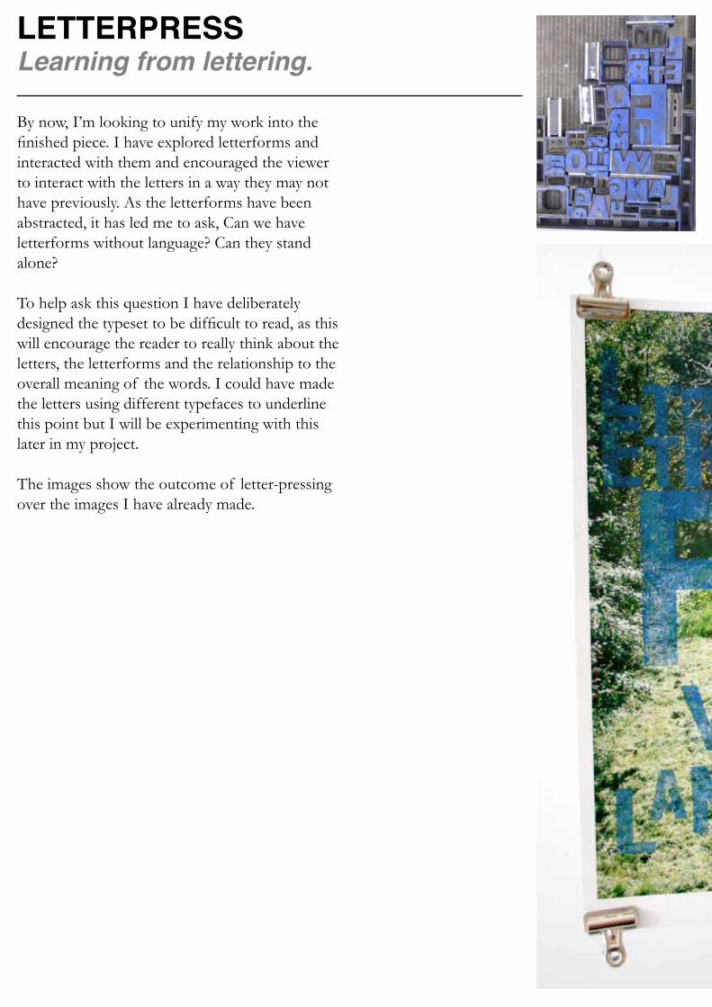
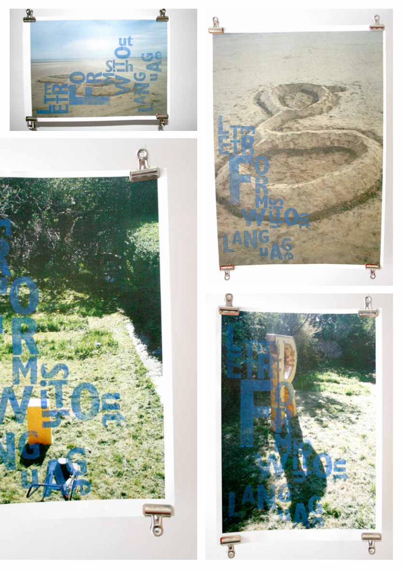
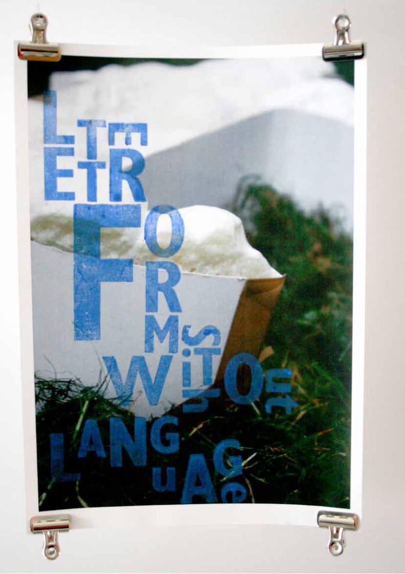
By now, I’m looking to unify my work into the finished piece. I have explored letterforms and interacted with them and encouraged the viewer to interact with the letters in a way they may not have previously. As the letterforms have been abstracted, it has led me to ask, Can we have letterforms without language? Can they stand alone?
To help ask this question I have deliberately designed the typeset to be difficult to read, as this will encourage the reader to really think about the letters, the letterforms and the relationship to the overall meaning of the words. I could have made the letters using different typefaces to underline this point but I will be experimenting with this later in my project.
The images show the outcome of letter-pressing over the images I have already made.
LETTERPRESSLearning from lettering.

To further abstract letters to explore whether they retain meaning, I have deconstructed an ‘x’. The images show that the deconstructed images, if viewed singularly, could be a variety of letters. It is only when they are viewed together do we see the ‘x’ emerge.
LETTERPRESSLearning from lettering.
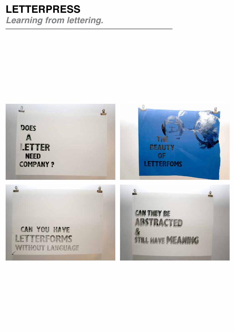
LETTERPRESSLearning from lettering.
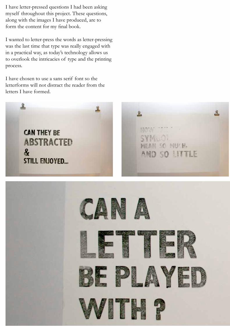
I have letter-pressed questions I had been asking myself throughout this project. These questions, along with the images I have produced, are to form the content for my final book.
I wanted to letter-press the words as letter-pressing was the last time that type was really engaged with in a practical way, as today’s technology allows us to overlook the intricacies of type and the printing process.
I have chosen to use a sans serif font so the letterforms will not distract the reader from the letters I have formed.
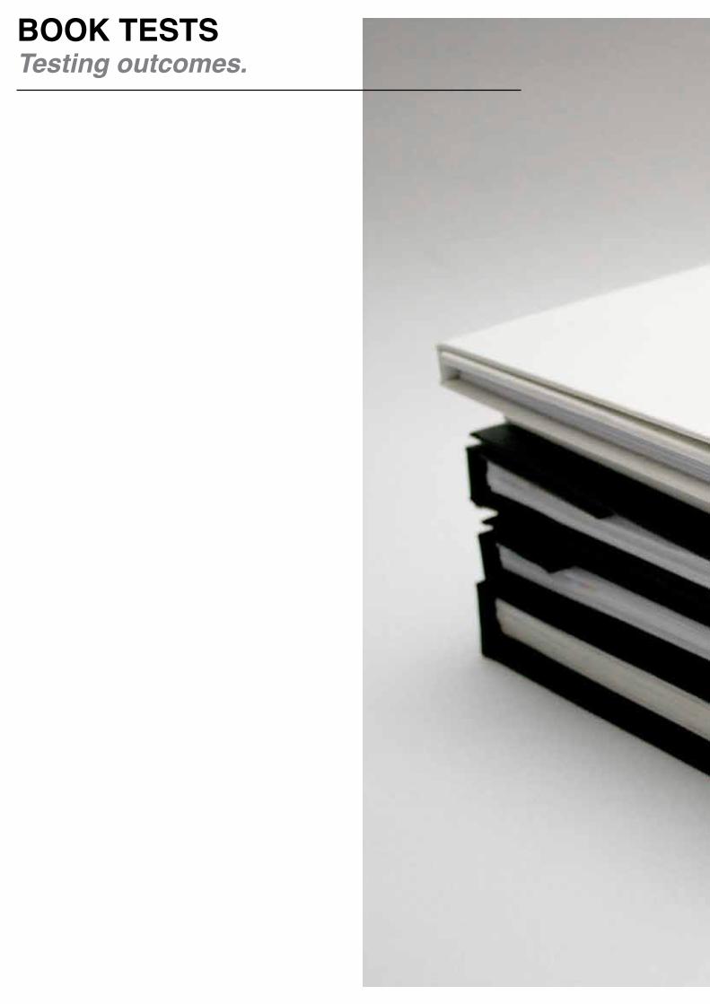
BOOK TESTSTesting outcomes.


I have decided to make my final piece as a concertina style book. This is due to several factors: the concertina book offers more opportunities for interactivity than the standard book form, it allows for me to further abstract the shape of the letter forms and because it is the natural progression of my previous work as it organically comes from my ‘Read type’ and ‘How We Experience Type’ books.
I am also drawn to this style as it allows me to have abstracted cut-out shapes of the letterforms but with greater control over what is seen through the holes, as one can only see the picture underneath. This solves the problem I experienced
with my previous book. As the letters have been photographed from unusual angles, it enhances the viewer’s experience of the letter as a shape.
The prototype was made from one long piece of paper. This gave me an initial idea of what I was working with, but it was clear that the process would have to be refined as the finish was not as polished as I would like. There were further issues with this method of making a concertina book, as I was unable to print directly onto the paper. I had to print my images on a separate sheet and glue it to the book. This did mean, however, that I could get a more concrete grasp of the overall layout.
CONCERTINA BOOKTest 1:

As the previous method for making a concertina book did not produce results that were to my satisfaction, I experimented to find a better way to manufacture them. My new method used several individual sheets of 160gsm paper rather than just the one long sheet. The result was a much stronger and sturdier book, with much neater edges.
However, I felt that the cover still needed refining, as I want the viewer to have a clear idea of the structure of my work. This current version does not make it clear where to start reading. Although this would add to the abstract nature of the letterforms, it would subtract from the overall work, as my meaning would be lost.
CONCERTINA BOOKTest 2:
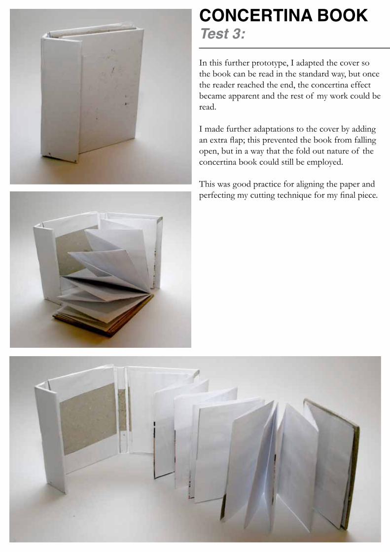
In this further prototype, I adapted the cover so the book can be read in the standard way, but once the reader reached the end, the concertina effect became apparent and the rest of my work could be read.
I made further adaptations to the cover by adding an extra flap; this prevented the book from falling open, but in a way that the fold out nature of the concertina book could still be employed.
This was good practice for aligning the paper and perfecting my cutting technique for my final piece.
CONCERTINA BOOKTest 3:

Vince Frost of Frost Design and The Wapping Project were my inspirations for this design. At this stage of my project I was beginning to doubt whether my designs were right for this format, and so I conducted some extra research, where I discovered Frost’s work.
This new design incorporates the improved concertina cover from the previous prototype, but the content has been radically altered. It now more prominently features the letterpress, which has been enlarged and edited so each spread contains abstracted letters. When the concertina is fully extended the full message becomes clear and the words “Does a letter need company?” can be read. The background features a heavily manipulated version of my ‘g’ image.
I did not like this outcome as it featured the letterpress too prominently at the expense of my made letters. However, it did help me understand how the concertina form worked and how I can lay out my content.
CONCERTINA BOOKTest 3:
CONCERTINA BOOKTest 4:
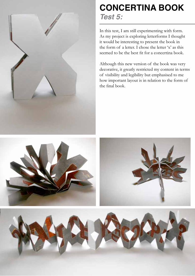
In this test, I am still experimenting with form. As my project is exploring letterforms I thought it would be interesting to present the book in the form of a letter. I chose the letter ‘x’ as this seemed to be the best fit for a concertina book.
Although this new version of the book was very decorative, it greatly restricted my content in terms of visibility and legibility but emphasised to me how important layout is in relation to the form of the final book.
CONCERTINA BOOKTest 5:

This tested how the concertina book would work with printed pages and the letterpress.
I realised that the letterpress still required some work, as it seemed rather flat in comparison to my made letters.
This test cast light on the gluing process, as some of the pages are not as I envisaged them. The test also highlighted that the flap needed to be secured in some way. It seems that although my idea was coming together, it still required a lot of work.
CONCERTINA BOOKTest 5:
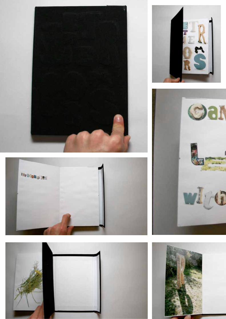
CONCERTINA BOOKTest 6:
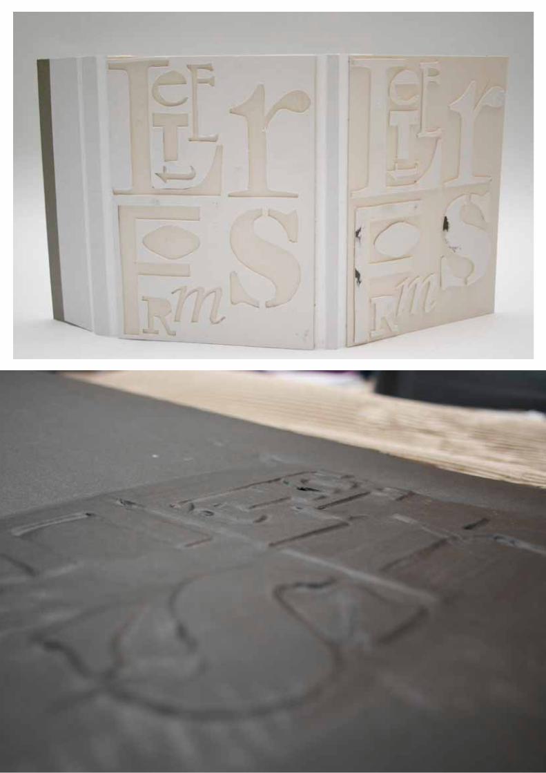

EMBOSSINGTests:
To add extra depth and dimension to my cover, I decided to emboss it. This adds a tactile element to the visual aesthetic. The title for the cover is a progression of the challenging typeset concept I experimented with previously, it has been adapted for this new function, as I have cut unneeded text.
I have embossed the front cover and de-bossed the back, as I wanted to play with the idea of creating letters from negative space.
I began by using card, which was unsuitable as it ripped. I experimented with stickers, which gave the cover a pleasing gloss, but was not as strong a finish as the embossing. I finally used book cloth for the cover, which did not rip and gave the whole book a professional feel.

I drew inspiration from ‘Techniques in Typography’ written and designed by Cal Swann and Lund Humphries (1969). Their influence can be most clearly seen in the picture showing the set letterpress next to the outcome (top right). Although I liked this, I still felt that the work was becoming too much about the letterpress and distracting from my made letters.
This led me to consider using my own letters for the text rather than the letterpress. Although the legibility would suffer as a result of this, it would force the reader to really focus on the letters and the overall word, which is what I set out to do in this project: encourage viewers to pay more attention to letters.
In terms of developing the book, I experimented with magnetic tape to secure the flap. This worked but only with limited success.
CONCERTINA BOOKTest 7:
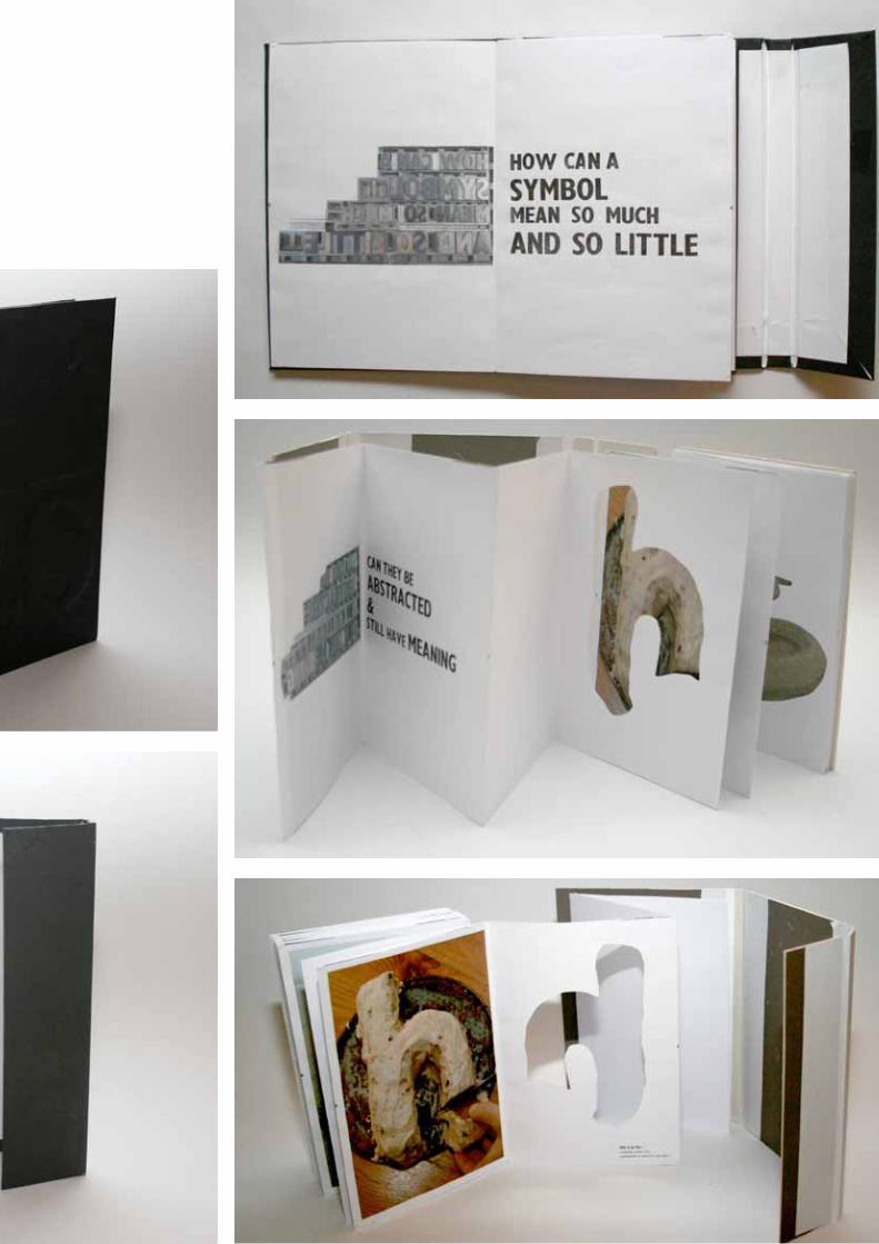
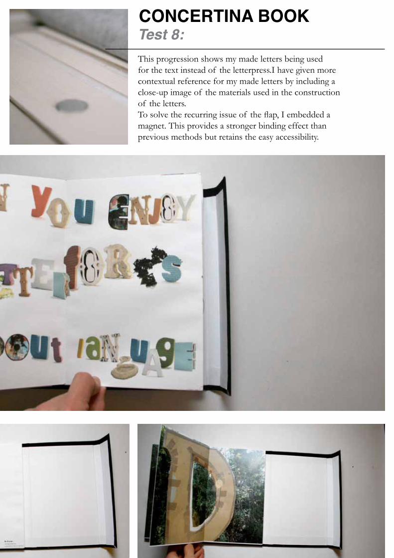
This progression shows my made letters being used for the text instead of the letterpress.I have given more contextual reference for my made letters by including a close-up image of the materials used in the construction of the letters.To solve the recurring issue of the flap, I embedded a magnet. This provides a stronger binding effect than previous methods but retains the easy accessibility.
CONCERTINA BOOK Test 8:

This is the final test, and only had to under-go some minor changes in order to meet my standards. Firstly, the introduction was too far aligned to the left and needed centralising. I also resized the letters so they were more aesthetically pleasing.
Interestingly, it was only at this stage that I created punctuation. This is because I had only concentrated on the beauty of letterforms beforehand, but as I was using my made type rather than a letterpress I had to create a question mark (?) for grammatical correctness and to help convey meaning.

CONCERTINA BOOKTest 9: the final test