flow-based scatterplots for sensitivity...
TRANSCRIPT

Flow-based Scatterplots for Sensitivity Analysis
Yu-Hsuan Chan ∗ Carlos D. Correa † Kwan-Liu Ma ‡
University of California at Davis
ABSTRACT
Visualization of multi-dimensional data is challenging due to thenumber of complex correlations that may be present in the data butthat are difficult to be visually identified. One of the main causesfor this problem is the inherent loss of information that occurs whenhigh-dimensional data is projected into 2D or 3D. Although 2Dscatterplots are ubiquitous due to their simplicity and familiarity,there are not a lot of variations on their basic metaphor.
In this paper, we present a new way of visualizing multi-dimensional data using scatterplots. We extend 2D scatterplots us-ing sensitivity coefficients to highlight local variation of one vari-able with respect to another. When applied to a scatterplot, thesesensitivities can be understood as velocities, and the resulting visu-alization resembles a flow field. We also present a number of oper-ations, based on flow-field analysis, that help users navigate, selectand cluster points in an efficient manner. We show the flexibilityand generality of this approach using a number of multidimensionaldata sets across different domains.
Keywords: Uncertainty, Data Transformations, Principal Compo-nent Analysis, Model Fitting
Index Terms: K.6.1 [Management of Computing and InformationSystems]: Project and People Management—Life Cycle; K.7.m[The Computing Profession]: Miscellaneous—Ethics
1 INTRODUCTION
Incorporating uncertainty and sensitivity analysis in visual analyticstools is essential to improve the decision-making process. On onehand, it provides the analysts a means to assign confidence levelsto the insight gained through the analysis. On the other hand, itgives tool makers a methodology for measuring and comparing therobustness of data and visual transformations.
To gain insight from complex multi-dimensional data, a num-ber of data analysis approaches have been proposed, such as multi-dimensional scaling, projections and sampling, which reduce eitherthe number of observations or the number of variables in a largedata set [31]. With the advent of interactive graphics, a numberof techniques have been made possible that alleviate the issues ofcomplexity, large size and multi-dimensionality, such as interactivePCA [23], multi-dimensional navigation [14], among others.
The purpose of visual analytics, however, remains the same: togain insight on possible correlations and trends in a complex dataset. In this paper, we focus on a general strategy, sensitivity analysis(SA), which is a common approach to understand the relationshipsbetween variables and outputs.
Sensitivity analysis is the analysis of changes in the output ofa transformation as we vary the inputs. When we study pairwisecorrelations, sensitivity analysis tells us the rate of change of onevariable Y with respect to another variable X. The variables can
∗[email protected]†[email protected]‡[email protected]
be input random variables, in which case sensitivity indicates thevariational relationship between the two, or one of them could be aderived (dependent) variable, in which case sensitivity indicates thesensitivity of the data transformation used to derive that variable.
Therefore, sensitivity analysis is essential for discovering thefactors that most contribute to output variability, finding stabilityregions of various transformations over the data, and understandingthe interaction between variables, outputs and transformations. Al-though numerous approaches have been proposed to find the sensi-tivity coefficients of transformations, we focus on differential anal-ysis, where sensitivities are defined as the partial derivatives of agroup of variables with respect to another group of variables. Dif-ferential analysis is attractive when the data and visual transforma-tion can be defined in closed form. When this is not possible, ap-proximating them by exploring the parameter space becomes com-putationally expensive. For this reason, approximations based onsampling approaches are more appropriate.
In this paper, we present a novel augmentation of traditional scat-terplots, which are useful for sensitivity analysis and general explo-ration of multidimensional data. The key idea behind our augmen-tation is the analogy of scatterplots with flow. In a XY scatterplot, ifthe position of a data point is given by the coordinates (x,y), then thederivative ∂y/∂x is analogous to a velocity measure at that point.Therefore, one can understand a scatterplot as a scattered collec-tion of position and velocity measures. Based on these derivatives,one can predict the positions of interpolated points in the XY spaceand extract a global sense of flow. This analogy has a number ofapplications for visual analysis, which we explore in this paper:(1) the explicit representation of sensitivity parameters as tangentlines helps analysts discover local and global trends in a 2D pro-jection. (2) sensitivity parameters can be quantified to measure thecomplexity of a given 2D projection and find pair-wise correlationsbetween variables. For example, one can augment an xy scatterplot with the derivatives of a third variable z with respect to, say x.When the flow appears smooth, one can safely re-project the scat-terplot in the axes zy and expect a smooth transition, which helpsunderstand how different variables are related. (3) One can clusterand select data points based on the similarity of the flow propertiesaround each point.
To this end, we propose certain key operations on flow-basedscatterplots that are not possible using traditional means: (1) Simul-taneous visualization of tri-variate correlations, using the deriva-tive of a third variable, (2) smooth transitions and navigation ofmulti-dimensional scatterplots, and (3) selection and clustering bystreamline, which groups data points together that lie closer to thestreamlines generated by a data point. We demonstrate the feasibil-ity and potential uses of our approach through a number of exam-ples in a variety of domains.
2 RELATED WORK
2.1 Multivariate Analysis
Multivariate analysis is at the core of visual analytics. Approachescan be categorized as data-centered approaches, such as regres-sion [13], generalized additive models [19] and response surfaceanalysis [5], or visual-centered approaches. Since data is oftenlarge and complex, data-driven approaches often employ simplifi-
43
IEEE Symposium on Visual Analytics Science and Technology October 24 - 29, Salt Lake City, Utah, USA 978-1-4244-9487-3/10/$26.00 ©2010 IEEE

cation techniques, which either reduce the number of observations,such as binning, sampling [32] or clustering [4], or reduce the num-ber of dimensions in the data, such as projections [27] and multi-dimensional scaling. Visual-centered approaches follow a differentstrategy, where correlations and trends emerge as salient structuresin the human visual system. Often times, these approaches are cou-pled with interactive manipulation. For example, Jeong et al. pro-pose to augment traditional data analysis tools such as PrincipalComponent Analysis with interactive manipulation for a better un-derstanding of the transformation and the data itself [23]. Yang etal. integrate analysis tools with visual exploration of multivariatedata [35] using the Nugget Management System, which incorpo-rates user interest to guide the analysis. In this paper, we presenta combination of analysis and visualization tools that exploit sen-sitivity analysis for effective exploration and navigation of multidi-mensional data.
2.2 Sensitivity Analysis
Sensitivity analysis refers in general to the analysis of the variationof the outputs in a model to small perturbation of their inputs. Nu-merous approaches have been proposed to this end. A number ofmethods fall into the class of local analysis, such as adjoint anal-ysis [6] and automated differentiation [17], where the sensitivityparameters are found by simply taking the derivatives of the outputwith respect to the input, si j = ∂Yi/∂X j. Because this is usuallydone in a small neighborhood of the data, they are usually calledlocal methods. Others have proposed global estimates of sensitiv-ity, which use sampling or statistical techniques. The most commonstatistical method is based on variance, which provides an estimateof the sensitivity in terms of the probability distribution of the in-puts [1,7,20,22,29]. Other approaches directly introduce perturba-tion on the input data by manipulating certain parameters and com-pute the ensuing variation on the output. Since it is computationallyexpensive to try the entire parameter space, numerous approachesuse sampling-based methods as extensively surveyed by Helton etal [20]. Different simulation strategies have been applied, includingrandom, importance and Latin hypercube sampling [21].
Frey and Patil also reviewed a number of sensitivity analysismethods [16]. Tanaka surveyed the sensitivity analysis in the scopeof multivariate data analysis [30]. Specific analyses for certaincommon data analysis tools have been proposed. Chan et al. pre-sented a sensitivity analysis for variance-based methods in gen-eral [7]. Cormode et al. [10], Chau et al. [8] and Ngai et al. [26]proposed extensions to perform k-means clustering on uncertaindata. Similar studies have been carried out to quantify the sensi-tivity and uncertainty of the principal components of multi-variatedata [33, 34]. Kurowicka and Cooke extended the issue of uncer-tainty analysis with high dimensional dependence modeling, com-bining both analytical tools with graphic representations [25].
Barlowe et al. [3] proposed the use of histograms and scatter-plot matrices to visualize the partial derivatives of the dependentvariable over the independent variables and to reveal the positiveor the negative correlations between the output and the factors ina multivariate visual analysis. Correa et al. [11] used sensitivityanalysis to propagate the uncertainty in a series of data transforma-tions and propose a number of extensions to show this uncertaintyin 2D scatter plots. In this paper, we generalize the idea of sensi-tivity visualization as flow-based scatterplots. Bachthaler et al. [2]presented the continuous scatterplot, which generates a continuousdensity function for a scatterplot and alleviates the issues with miss-ing data. Our idea of flow-based scatterplots has a similar concept,which attempts to find a continuous representation of the densitythat explains the 2D plot. However, we use a local analysis basedon derivatives to find local trends in a scattered manner.
Projection is a commonly used dimension reduction techniquefor multi-variate data sets, useful when visualizing high dimen-
sional data in 2D or 3D spaces. Scatter plots are intuitive to under-stand when studying the relationship between two variables. How-ever, projected points may result in clutter and overlap for large andhigh dimensional data sets. To solve this problem, Keim et al. [24]proposed generalized scatter plots to augment the degree of over-lap and the distortion. Other augmentations have been proposed byCollins et al. [9], that enhance the spatial layout of plots with clus-tering information, and Shneiderman et al., [28], that link multiplesubstrate plots to superimpose the cross-substrate relationships.
Another issue of scatter plots is that we can only see a limitednumber of variables after projection. It is common to show a scat-terplot matrix to enumerate all possible combinations of projectionsof variables, but we need an effective navigation between these dif-ferent projections. Scatter dice [14] is an alternative that exploitsinteractive capabilities to navigate a large scatter matrix and helpvisual analytics. However, the evaluation and the effectiveness ofa projection is a topic often overlooked in visualization. In our pa-per, we propose a novel mechanism for navigating the dimensionsof a multidimensional dataset, based on the sensitivity of variablesto one another.
3 FLOW-BASED SCATTERPLOTS
2D scatterplots are a commonly used visual representation that helpsee the relationship between two variables in a multidimensionaldata set. As shown in Figure 1(a), a 2D scatter plot is only ableto show a limited number of variables as the number of visual at-tributes, such as position, size, color and transparency, can onlybe used sparingly. In certain cases, the overuse of these attributesmakes it difficult to understand correlations between variables dueto visual clutter.
In this paper, we propose a new type of scatterplot, called flow-based scatterplot, which augments the traditional metaphor usingsensitivity information. Sensitivity refers to the change in an outputvariable in terms of a change in the input. In the case of a 2Dscatterplot, the simplest representation of sensitivity is through anexplicit depiction of the derivative of the variable in the y axis withrespect to the derivative of the variable in the x axis.
To illustrate our technique, let us consider the Boston housingprice data set. This data set is a collection of environmental, geo-graphic, economic and social variables to predict the median valueof housing in the Boston metropolitan area [18], which contains506 records and fifteen continuous variables. Some variables in-clude geographic information, such as DIS, the weighted distancesto five Boston employment centers, LSTAT, the percentage of thelower status of the population, CRIM, per capita crime rate by town,and RM, the average number of rooms per dwelling, among others.
Figure 1 shows a scatterplot of two variables named DIS andLSTAT, with color encoding the median housing price. Withoutaugmentation, this scatterplot shows the same information as inFigure 1(a). After adding the sensitivity information, we obtaina sense of the flow of the data. This can be seen in Figure 1(b)as a collection of line segments. The slope of that segment indi-cates how sensitive is the Y variable in a local neighborhood andwhether that sensitivity is positive or negative. For example, wecan clearly see global trends indicated by dotted lines. Moreover,it gives us an idea of more localized trends. For example, points inregions A, B and C exhibit different behavior in the LSTAT vari-able as we increase the DIS variable. For data points in region A,LSTAT decreases rapidly as DIS increases, while data points in re-gion C do not change dramatically. Conversely, data points in Bincrease in LSTAT as DIS increases. Therefore, such sensitivity vi-sualization not only helps users understand how variables behavetoward changes in another, but also recognizes whether data pointshave differed locally in terms of sensitivity.
One of the advantages of plotting sensitivity is that now we canrepresent more dimensions in a single plot. Therefore, we are less
44

(a) (b) (c)
Figure 1: (a) Traditional scatter plot between two variables (b) Sensitivity visualization of the same two variables, where data points are aug-mented with derivatives. (c) Sensitivity visualization for a third variable, useful for analyzing tri-variate correlations.
Figure 2: Smoothness ranking view. Next to each augmented scat-terplot, we show the smoothness ranking of other variables.
bound by the inherent loss of information that occurs when project-ing high dimensional data into a 2D space. In our case, we can plotthe sensitivity of another variable with respect to one of the scatter-plot axes. If we show the derivatives of a variable with respect toanother variable (different from the ones used in projection), thenwe can begin making queries and formulating hypotheses about tri-variate correlations, instead of bi-variate queries that are typical of2D scatterplots. An example is shown in Figure 1(c), where weshow the same data points as before, using two variables namedLSTAT and DIS, but we plot the sensitivity of the variable in Y(LSTAT) with respect to another variable named CRIM. Note that,although the data points have the same location in the X-Y plane,the sensitivities differ. We immediately have a different sense offlow, which changes the way we begin to formulate hypothesesabout the three variables. For example, we see that, for points inregion D in Figure 1(c), variable CRIM increases as DIS increases,but the same cannot be said about LSTAT, which only seems toincrease when LSTAT is larger and decreases when LSTAT is low.Therefore, we may regard sensitivity derivatives as another attributeof nodes that represents relationships between two particular vari-ables. Sensitivity derivatives of U with respect to V shows the re-lationship between U and V for each data point, and the projectionvariables (X, Y) decide where to locate these nodes of such deriva-tive attribute. Some particular projections might place these nodesin a way that show global trends and correlations between variablesU and V, which helps us understand the relationship between both Uand V, and X and Y. In this paper, we show a number of operations,based on flow analysis, to help us identify these relationships.
3.1 Computing Sensitivities
As described before, there are different ways to compute the sen-sitivity of one variable with respect to another. In this paper, wefollow a variational approach, where the sensitivity can be approx-imated by the partial derivative of one variable with respect to an-other. Since we do not know the analytic closed form of the func-tion between two variables in the general case, we approximate thepartial derivatives using linear regression. Because we do this indifferent neighborhoods around each point, we employ the methodof moving least squares. We obtain the partial derivatives of a vari-able y with respect to x considering the Taylor approximation of yaround a given point (x0,y0):
yi = y0 +∂y
∂x(xi − x0) (1)
Then, we approximate the partial derivatives for point (x0,y0) in aneighborhood of N points, as:
∂y
∂x≈
∑Ni=0(yi − y0)(xi − x0)
∑Ni=0(xi − x0)2
(2)
With this information, we augment the scatterplot using tangentline segments on each data point. Each tangent line is com-puted as follows. For a given point (x0,y0), we trace a line be-tween points (x0 − δvx,y0 − δvy) and (x0 + δvx,y0 + δvy), where
(vx,vy) = normalize(1, ∂y∂x
) and δ is a parameter that controls thelength of the tangent lines.
In our experiments, we compute the neighborhood of N pointsas an isotropic region around each point of a radius W . This radiuscontrols how local or global is the flow. When W is small, thederivatives capture the local variability of data and reveal localizedtrends. On the other hand, when W is large, the flow representsthe global trend in the data. An example is shown in Section 5.2.The variable width helps us reveal local trends where the globalcorrelation is low. Instead of making an automatic decision in termsof correlation, flow-based scatterplots offer the option to the analystto explore the spectrum of trends and correlations interactively.
3.2 The Smoothness of a Flow Scatterplot
As can be seen from Figures 1(b-c), sensitivities provide a senseof flow of the data points in the projection space. This flow helpsreveal overall trends. For some projections, these sensitivities showcertain critical regions, where linear trends coincide at some pointbut then diverge. This means that data points in that region can ei-ther go up or down, possibly depending on other variables. Thissuggests that this particular projection is hiding a lot of complex-ity that may be identified through a different projection. To mea-sure the complexity of a flow-based scatterplot, we turn to secondderivatives, which tell us how fast the tangent lines change in a
45
(a) (b) (c)
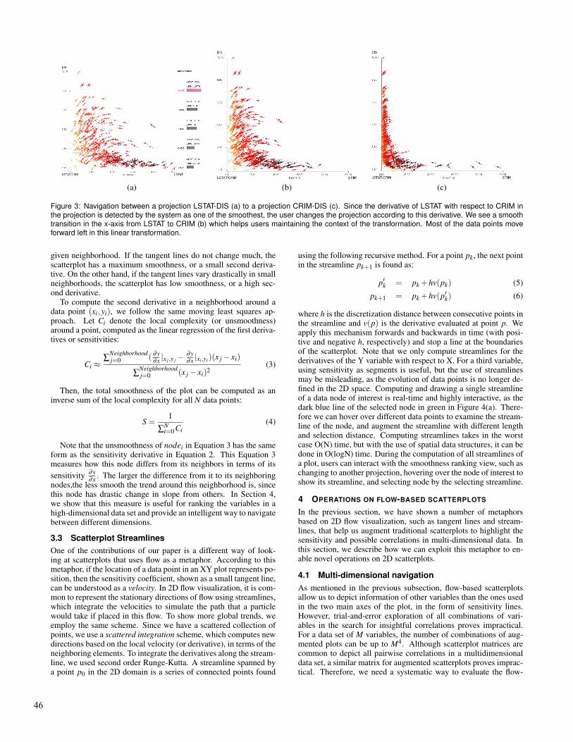
Figure 3: Navigation between a projection LSTAT-DIS (a) to a projection CRIM-DIS (c). Since the derivative of LSTAT with respect to CRIM inthe projection is detected by the system as one of the smoothest, the user changes the projection according to this derivative. We see a smoothtransition in the x-axis from LSTAT to CRIM (b) which helps users maintaining the context of the transformation. Most of the data points moveforward left in this linear transformation.
given neighborhood. If the tangent lines do not change much, thescatterplot has a maximum smoothness, or a small second deriva-tive. On the other hand, if the tangent lines vary drastically in smallneighborhoods, the scatterplot has low smoothness, or a high sec-ond derivative.
To compute the second derivative in a neighborhood around adata point (xi,yi), we follow the same moving least squares ap-proach. Let Ci denote the local complexity (or unsmoothness)around a point, computed as the linear regression of the first deriva-tives or sensitivities:
Ci ≈∑
Neighborhoodj=0 ( ∂y
∂x|x j ,y j
− ∂y∂x|xi,yi
)(x j − xi)
∑Neighborhoodj=0 (x j − xi)2
(3)
Then, the total smoothness of the plot can be computed as aninverse sum of the local complexity for all N data points:
S =1
∑Ni=0 Ci
(4)
Note that the unsmoothness of nodei in Equation 3 has the sameform as the sensitivity derivative in Equation 2. This Equation 3measures how this node differs from its neighbors in terms of its
sensitivity∂y∂x
. The larger the difference from it to its neighboringnodes,the less smooth the trend around this neighborhood is, sincethis node has drastic change in slope from others. In Section 4,we show that this measure is useful for ranking the variables in ahigh-dimensional data set and provide an intelligent way to navigatebetween different dimensions.
3.3 Scatterplot Streamlines
One of the contributions of our paper is a different way of look-ing at scatterplots that uses flow as a metaphor. According to thismetaphor, if the location of a data point in an XY plot represents po-sition, then the sensitivity coefficient, shown as a small tangent line,can be understood as a velocity. In 2D flow visualization, it is com-mon to represent the stationary directions of flow using streamlines,which integrate the velocities to simulate the path that a particlewould take if placed in this flow. To show more global trends, weemploy the same scheme. Since we have a scattered collection ofpoints, we use a scattered integration scheme, which computes newdirections based on the local velocity (or derivative), in terms of theneighboring elements. To integrate the derivatives along the stream-line, we used second order Runge-Kutta. A streamline spanned bya point p0 in the 2D domain is a series of connected points found
using the following recursive method. For a point pk, the next pointin the streamline pk+1 is found as:
p′k = pk +hv(pk) (5)
pk+1 = pk +hv(p′k) (6)
where h is the discretization distance between consecutive points inthe streamline and v(p) is the derivative evaluated at point p. Weapply this mechanism forwards and backwards in time (with posi-tive and negative h, respectively) and stop a line at the boundariesof the scatterplot. Note that we only compute streamlines for thederivatives of the Y variable with respect to X. For a third variable,using sensitivity as segments is useful, but the use of streamlinesmay be misleading, as the evolution of data points is no longer de-fined in the 2D space. Computing and drawing a single streamlineof a data node of interest is real-time and highly interactive, as thedark blue line of the selected node in green in Figure 4(a). There-fore we can hover over different data points to examine the stream-line of the node, and augment the streamline with different lengthand selection distance. Computing streamlines takes in the worstcase O(N) time, but with the use of spatial data structures, it can bedone in O(logN) time. During the computation of all streamlines ofa plot, users can interact with the smoothness ranking view, such aschanging to another projection, hovering over the node of interest toshow its streamline, and selecting node by the selecting streamline.
4 OPERATIONS ON FLOW-BASED SCATTERPLOTS
In the previous section, we have shown a number of metaphorsbased on 2D flow visualization, such as tangent lines and stream-lines, that help us augment traditional scatterplots to highlight thesensitivity and possible correlations in multi-dimensional data. Inthis section, we describe how we can exploit this metaphor to en-able novel operations on 2D scatterplots.
4.1 Multi-dimensional navigation
As mentioned in the previous subsection, flow-based scatterplotsallow us to depict information of other variables than the ones usedin the two main axes of the plot, in the form of sensitivity lines.However, trial-and-error exploration of all combinations of vari-ables in the search for insightful correlations proves impractical.For a data set of M variables, the number of combinations of aug-mented plots can be up to M4. Although scatterplot matrices arecommon to depict all pairwise correlations in a multidimensionaldata set, a similar matrix for augmented scatterplots proves imprac-tical. Therefore, we need a systematic way to evaluate the flow-
46

(a) (b) (c)
Figure 4: Selection by a streamline allows us to group neighboring data points by a particular trend pattern of interest, with different selectiondistance d. (a) A streamline in blue of a selected data pointed in green (b) Selection of a small d = 0.03 (c) Selection of a larger d = 0.10. Notethat the line segments of sensitivity and the background streamlines are computed with a larger neighborhood parameter W=10.0, and thus theydepict the vertical patterrn of the overall data distribution.
based scatterplots, in the search for the salient combinations thathelp reveal correlations and patterns.
Here, we present a method that evaluates a scatterplot to findthe variables that are interesting, in terms of the smoothness of thesensitivity derivatives in the projection, and that should be usedin subsequent projections and enable intelligent navigation of themulti-dimensional space.
Our approach is as follows: for a given projection XY, we mea-sure the smoothness of the flow-based scatterplot with derivativesdZ/dX with respect to every variable Z. We then rank the variablesZ in terms of their smoothness. The rationale for the ranking isquite simple. Let us assume that a projection XY with derivativesdZ/dX has a maximal smoothness, i.e., its second derivative is 0.
Therefore, if ∂ 2Z/∂X2 = 0, then the derivative ∂Z/∂X is a constantand variables Z and X are related linearly. Therefore, if we repro-ject the points in axes ZY , we expect data points to move smoothlyin the new x-direction, by a linear factor, which is easy to followand comprehend while doing the re-projection. Now, as the com-plexity of the scatter plot increases (i.e., it becomes less smooth),the relationship between the transition variables Z and X increasesin complexity and is more difficult to understand when we repro-ject along these variables. For this reason, the ranking provides amechanism to intelligently navigate the data.
Figure 2 shows the visual design of the ranking view using theBoston housing price data set. On the left, we show a list of dif-ferent projections of the data. In this case, we show a multidimen-sional data set of Boston housing prices and the variables that affectthem. In this view, we plot a variable called NOX (pollution) vs.LSTAT (A socio-economical variable). On the left, we see a rank-ing of other candidate variables that the user can explore, namelyAGE, DIS, PCA2, etc. Hovering over each of these variables showsthe corresponding derivatives on the XY projection. Once a vari-able is selected, the scatterplot smoothly changes the projection toZY, where Z is the new selected variable. The ranking provides away for the analyst to pick the variables that have the smoothestre-projection. We believe this method of guided navigation is moreintuitive than arbitrary re-projection, even if we alleviate the issuesof re-projection with rotation and 3D projection, as obtained in sys-tems like scatter dice [14]. An example is shown in Figure 3. Inthis ranking view, we found that the projection (LSTAT,DIS) withderivatives ∂LSTAT/∂CRIM has the maximal smoothness, and thederivative indicates that variables CRIM and LSTAT are closelyrelated. The second figure shows an example of the reprojectionhalfway between LSTAT and CRIM. We can see the smooth lineartransition at this time. The third figure shows the newly reprojectedimage in the LSTAT-CRIM plane.
4.2 Selection by streamline
Another issue with scatterplots is the selection of meaningfulgroups. A number of ways have been proposed to select groupsof data points. The simplest one is by dragging a rectangular regionin the scatterplot and selecting all points that fall inside that region.Unfortunately, this method often groups data points that may notbe related or that are projected together in that particular view. An-other mechanism is brushing, which allows the user to select anarbitrary region by “painting” the regions in the 2D plot. In thispaper, we present another method, which uses streamlines. Stream-lines, as described before, are lines that represent the imaginaryflow of a particle in a given XY plot, by following the sensitivitiesof the corresponding points along that path. In a sense, a streamlinerepresents the predicted change in the variable Y as we increase thevariable X. Therefore, it is intuitive to select elements that are neara streamline, since those points locally exhibit a similar trend alongthe selected streamline. This trend, in turn, may help discover in-teresting correlations between the variables in the scatterplot thatcannot be identified from the projection itself.
To select points based on a streamline, we allow the user to ex-plore the streamlines interactively. When the user hovers over adata point, we show the streamline that emanates from this point,both forward and backwards in time (i.e., the streamline representsthe trend for values of X before and after the data point). Then, wecan select points in the 2D plot that have a distance d to the stream-line less than a given threshold. An example is shown in Figure 4for the Boston data set. Here, we show a scatterplot of LSTAT vsRM (average number of rooms per dwelling). As we increase thedistance d of selection, we can pick data points that locally share asimilar trend to the one selected. This is a good alternative to brush-ing and rectangular selection that highlights the linear relationshipbetween the two variables.
4.3 Clustering by streamline
Finally, we see that, depending on the streamline we select, weget different groupings of data, all of which highlight certain de-gree of similarity between the local trends of each data point. Thisprompted us to try a more automatic approach, which clusters datatogether based on streamline. This clustering is in fact a classifica-tion of data points by their local trend and vicinity. If two pointsproduce similar streamlines, we expect them to be related, sincethey predict a similar behavior as we vary the variable in the x-axis.Once we identify clusters, the classification may hint at differentcritical regions, where the local trends change dramatically. Sincethe streamlines represent trends, we hypothesize that the cluster-
47

Figure 5: Clustering by streamlines. By applying streamlines to theflow, we can now classify data points based on similar trends. Whenwe do that, we obtain a classification that may help identify salientdata points or critical regions. In this case, we classify the Bostonhousing dataset in terms of the sensitivity of variable TRACT withrespect to LSTAT. These ten groups are not linearly separable in this(LSTAT, TRACT) projection. In the bottom figure we show that thesegroups are in another projection (MEDV, TRACT).
ing based on streamlines provides a more robust classification ofdata. To classify streamlines, we follow a bottom-up hierarchicalapproach where each streamline is considered as its own clusterinitially, and then clusters are merged hierarchically based on theirsimilarity. We use Euclidean distance to compute the similarity oftwo streamlines.
An example is shown in Figure 5. In this projection(LSTAT,TRACT), we cluster those streamlines constructed fromsensitivity measured by the derivative of TRACT with respect toLSTAT, which results in six main clusters (numbered as No.346,268, 241, 1, 392, and 370 respectively) whose centroids lie diago-nally in the plot, suggesting an inverse relationship between LSTATand TRACT. Nodes are colored by such streamline clustering re-sults. This clustering helps identify groups when used in anotherprojection, such as when looking at classes in the median housingvalue (MEDV) in the scatterplot below.
5 RESULTS
In addition to the Boston housing price dataset, we explored differ-ent aspects on three multidimensional datasets.
5.1 Iris
The iris data set consists of 150 records and 4 variables regardingthe classification of a number of species of the iris plant, includingthe length and width of the sepal and petal of the plant [15]. Oneof the challenges of this data set is that two of the classes, namelyIris-virginica and Iris-versicolor, cannot be linearly separated. InFigure 6 we illustrate the use of clustering by streamline to find the
variables involved in this classification. On top, we see the threeclasses in terms of the Petal and Sepal length of the iris plant. Oneof the two classes is clearly separated. In the middle, we show theresult of applying clustering by streamline using three clusters. Wesee that this clustering gets close to the actual classification of theplants, except for five points, highlighted in circles. Compare tothe image at the bottom, where we classify the data using k-meansbased on the 2D proximity in this projection. Clearly, clusteringby streamline behaves better, which indicates that the classificationcan be explained not in terms of the variables themselves, but interms of their derivatives.
5.2 Forest Fires
The forest fires data set comprises 517 records of forest fires inPortugal, to predict the occurrence and size of forest fires in termsof environmental and meteorological properties, such as tempera-ture and wind [12]. We use this example to illustrate the effectsof neighborhood size when computing the derivative to reveal localand global trends. In Figure 7, we show a scatterplot of two vari-ables, DMC (Duff Moisture Code) and DC (Drought Code), whichare both indexes used by the Fire Weather Index to measure the dan-ger involved in a fire. We see some local linear trends in the midstof a more global linear trend. In Figures 7(b-d), the color shows theresult of clustering by streamline for varying neighborhoods withW = 0.1,2.5 and 10.0, respectively. When W is small, the stream-lines follow individual linear trends. For W = 2.5, the clusteringnow reveals that data has a rather horizontal trend when data pointsare grouped together in larger neighborhoods, indicating increas-ingly large variance in the X dimension. When the variance is low,such as in the cluster in blue, the streamlines follow a similar trendto the local one. However, for the purple group, where the varianceis large, a different trend emerges. For a large W , on the other hand,we are able to extract the global trend, which, in this case, happensto align to the local trends nicely. This is usually the case for corre-lated variables. Choosing a right neighborhood depends on the sizeof features the analyst wants to identify and whether correlations inthe data can be explained locally or globally. In our experiments,W is a free parameter tuned by the user.
5.3 Wine
The wine data set comprises 13 variables of 178 observations ofthe chemical composition of wines growing in a particular regionin Italy and the relationship to color intensity and hue. Figure 8shows that we have found a smooth flow-based scatterplot of (Al-cohol,Color) and examined this in the smoothness ranking. We seea rather simple distribution of sensitivities, as shown in Figure 8(a).From this view we would like to know which variable is a goodreprojection to navigate next. By viewing the scatterplot of thesame Y (Color) axis but different X axis, we found that AlcAshvariable may be a good candidate for x-axis in the new projection.Therefore, we examined the relationship between the previous x-axis Alcohol and the new x-axis candidate AlcAsh by computingthe streamline-augmented scatterplots of each. Figure 8(b) is a scat-terplot of (Alcohol, AlcAsh) with the derivative of AlcAsh overAlcohol, while Figure 8(c) it is a scatterplot of (AlcAsh, Alcohol)with the derivative of Alcohol over Alcash. Both the scatterplotshave smooth streamlines, which means that the change in one ofthese two variables does not cause a dramatic change in the other,and suggests that they are interchangeable. Thus we changed the xaxis from Alcohol to AlcAsh, as shown in Figure 8 (a) and (d). Wesee that this transition is indeed smooth as verified by the smoothanimation. Also, we compare the clustering by streamlines for thetwo views (a) and (d), as shown in (f) and (d) respectively. Wecan see that the clustering results of these two views are very simi-lar. They both contain a large main cluster at the bottom, a smallercluster at the top of the main cluster, and the rest of data points at
48

Figure 6: Visual exploration and streamline-based classification of the Iris data set. Although two of the classes are not linearly separable,the streamline classification helps identify the two groups visually in terms of their trend. Now the difference between the two classes can beexplained in terms of, not only the two variables, but also the partial derivatives.
(a) Scatter plot (b) W = 0.1 (c) W = 2.5 (d) W = 10.0
Figure 7: Flow-based clustering for the Forest fire data set. Clustering helps identify groups regarding the relationship between the two indexes,DC and DMC, that are used by the FIre Weather Index to meature the danger involved in a fire. We change the neighborhood size parameter W
to show how local and global trend can be revealed by streamlines and clusters.
(a) (b) (c)
(d) (e) (f)
Figure 8: Example navigation using a Wine dataset. The sensitivity ranking view suggests smooth transition between projections from Alcoholto Alcalinity of Ash (AlcAsh).
49

the top are classified to eight different clusters because these nodeshave very different local trends.
6 CONCLUSIONS AND FUTURE WORK
We have presented a novel visual representation of scatterplots use-ful for sensitivity analysis. Analogous to traditional scatterplots,which help elucidate pairwise correlations between two variables,flow-based scatterplots help us understand correlations between thechange in one variable with the change in another. In addition, theyhelp us understand tri-variate correlations, and we can formulatehypotheses of the relationship between two variables and the rateof change of another. In our proof of concept we have introducedvisual analysis methods that help discover patterns in the data diffi-cult to obtain through linear analysis. For example, we have shownthat selection by streamline helps group points in a non-linear man-ner, often aligned with the boundaries of classes. The ranking ofsensitivities is a novel way of navigating multidimensional data setsthat combines automated analysis with visual and interactive con-trol. We envision that, as data sets become larger and more com-plex, a combination of both analysis and visualization is critical. Inour future work, we will explore the use of flow-based analysis toimprove the classification of complex data, and also extend it to vi-sualize the workings of parameterized models from machine learn-ing. Moreover, we would like to conduct a thorough user study toverify whether users can interpret flow-based scatterplots and drawcorrect conclusions.
ACKNOWLEDGEMENTS
This research was supported in part by the U.S. National Sci-ence Foundation through grants CCF-0938114, CCF-0808896,CNS-0716691, and CCF-1025269, the U.S. Department of En-ergy through the SciDAC program with Agreement No. DE-FC02-06ER25777 and DE-FG02-08ER54956, and HP Labs and AT&TLabs Research.
REFERENCES
[1] Leon M. Arriola and James M. Hyman. Being sensitive to uncertainty.
Computing in Science and Engg., 9(2):10–20, 2007.
[2] Sven Bachthaler and Daniel Weiskopf. Continuous scatterplots. IEEE
Transactions on Visualization and Computer Graphics, 14(6):1428–
1435, 2008.
[3] S. Barlowe, Tianyi Zhang, Yujie Liu, Jing Yang, and D. Jacobs. Mul-
tivariate visual explanation for high dimensional datasets. pages 147–
154, Oct. 2008.
[4] Pavel Berkhin. Survey of clustering data mining techniques. Technical
report, Accrue Software, San Jose, CA, 2002.
[5] G. Box and N. Draper. Empirical Model-Building and Response Sur-
faces. John Wiley & Sons, 1987.
[6] D. Cacuci. Sensitivity and Uncertainty Analysis: Theory Vol.1. Chap-
man & Hall/CRC, 2003.
[7] Karen Chan, Andrea Saltelli, and Stefano Tarantola. Sensitivity anal-
ysis of model output: variance-based methods make the difference.
In WSC ’97: Proceedings of the 29th conference on Winter simula-
tion, pages 261–268, Washington, DC, USA, 1997. IEEE Computer
Society.
[8] Michael Chau, Reynold Cheng, Ben Kao, and Jackey Ng. Uncertain
data mining: An example in clustering location data. In Proc. of the
10th Pacific-Asia Conference on Knowledge Discovery and Data Min-
ing (PAKDD 2006), pages 199–204, 2006.
[9] Christopher Collins, Gerald Penn, and Sheelagh Carpendale. Bubble
sets: Revealing set relations over existing visualizations, 2009.
[10] Graham Cormode and Andrew McGregor. Approximation algorithms
for clustering uncertain data. In PODS ’08: Proceedings of the twenty-
seventh ACM SIGMOD-SIGACT-SIGART symposium on Principles of
database systems, pages 191–200, New York, NY, USA, 2008. ACM.
[11] Carlos D. Correa, Yu-Hsuan Chan, and Kwan-Liu Ma. A framework
for uncertainty-aware visual analytics. In IEEE VAST 2009 Sympo-
sium, pages 51–58, 2009.
[12] P. Cortez and A. Morais. A data mining approach to predict forest fires
using meteorological data. In J. Neves, M. F. Santos and J. Machado
Eds., New Trends in Artificial Intelligence, Proceedings of the 13th
EPIA 2007 - Portuguese Conference on Artificial Intelligence, pages
512–523, 2007.
[13] Norman R. Draper and Harry Smith. Applied Regression Analysis
(Wiley Series in Probability and Statistics). John Wiley & Sons Inc, 2
sub edition, 1998.
[14] N. Elmqvist, P. Dragicevic, and J.-D. Fekete. Rolling the dice:
Multidimensional visual exploration using scatterplot matrix naviga-
tion. Visualization and Computer Graphics, IEEE Transactions on,
14(6):1539 –1148, nov.-dec. 2008.
[15] R.A. Fisher. The use of multiple measurements in taxonomic prob-
lems. Annals of Eugenics, 7(2):179 – 188, 1936.
[16] H.C. Frey and S.R. Patil. Identification and review of sensitivity anal-
ysis methods. Risk Analysis, 22(3):553–578.
[17] Andreas Griewank. Evaluating derivatives: principles and techniques
of algorithmic differentiation. Society for Industrial and Applied
Mathematics, Philadelphia, PA, USA, 2000.
[18] David Jr. Harrison and Daniel L. Rubinfeld. Hedonic housing prices
and the demand for clean air. Journal of Environmental Economics
and Management, 5(1):81–102, March 1978.
[19] T. Hastie and R. Tibshirani. Generalized Additive Models. Chapman
and Hall, 1990.
[20] J.C. Helton, J.D. Johnson, C.J. Sallaberry, and C.B. Storlie. Survey
of sampling-based methods for uncertainty and sensitivity analysis.
Reliability Engineering and System Safety, 91(10-11):1175 – 1209,
2006. The Fourth International Conference on Sensitivity Analysis of
Model Output (SAMO 2004) - SAMO 2004.
[21] R. L. Iman and J. C. Helton. An investigation of uncertainty and
sensitivity analysis techniques for computer models. Risk Analysis,
1(8):71–90, 1988.
[22] Michiel J.W. Jansen. Analysis of variance designs for model output.
Computer Physics Communications, 117(1-2):35 – 43, 1999.
[23] Dong Hyun Jeong, Caroline Ziemkiewicz, Brian Fisher, William Rib-
arsky, and Remco Chang. ipca: An interactive system for pca-based
visual analytics. Comput. Graph. Forum, 28(3):767–774, 2009.
[24] Daniel A. Keim, Ming C. Hao, Umeshwar Dayal, Halldor Janetzko,
and Peter Baka. Generalized scatter plots. Information Visualization,
2009.
[25] Dorota Kurowicka and Roger Cooke. Uncertainty Analysis with High
Dimensional Dependence Modelling. John Wiley and Sons, 2006.
[26] Wang Kay Ngai, Ben Kao, Chun Kit Chui, R. Cheng, M. Chau, and
K.Y. Yip. Efficient clustering of uncertain data. pages 436–445, Dec.
2006.
[27] Jonathon Shlens. A tutorial on principal component analysis, Decem-
ber 2005.
[28] Ben Shneiderman and Aleks Aris. Network visualization by semantic
substrates. Visualization and Computer Graphics, IEEE Transactions
on, 12(5):733 –740, sept.-oct. 2006.
[29] I. M. Sobola. Global sensitivity indices for nonlinear mathematical
models and their monte carlo estimates. Math. Comput. Simul., 55(1-
3):271–280, 2001.
[30] Yutaka Tanaka. Recent advance in sensitivity analysis in multivariate
statistical methods. Journal of the Japanese Society of Computational
Statistics, 7(1):1–25, 1994.
[31] James J. Thomas and Kristin A. Cook. Illuminating the Path: The
Research and Development Agenda for Visual Analytics. National Vi-
sualization and Analytics Center, 2005.
[32] Steven Thompson. Sampling. John Wiley , Sons, Inc., 1992.
[33] Vaclav Smıdl and Anthony Quinn. On bayesian principal component
analysis. Comput. Stat. Data Anal., 51(9):4101–4123, 2007.
[34] Yoshihiro Yamanishi and Yutaka Tanaka. Sensitivity analysis in
functional principal component analysis. Computational Statistics,
20(2):311–326, 2005.
[35] Di Yang, E. A. Rundensteiner, and M. O. Ward. Analysis guided
visual exploration of multivariate data. In Visual Analytics Science
and Technology, 2007. VAST 2007. IEEE Symposium on, pages 83–
90, 2007.
50