foa/algebra 1 unit 6: describing data notes unit 6: describing data · 2019-10-12 · foa/algebra 1...
TRANSCRIPT

FOA/Algebra 1 Unit 6: Describing Data Notes
Unit 6: Describing Data
After completion of this unit, you will be able to…
Learning Target #1: Data Analysis
Construct appropriate graphical displays (dot plots, histograms, and box plots) to describe
sets of data.
Select the appropriate measures to describe and compare the center and spread of two or
more data sets.
Use the context of the data to explain why its distribution takes on a particular shape.
Explain the effect of outliers on the shape, center, and spread of the data sets.
Learning Target #2: Frequency Tables
Create two way frequency tables from a set of data on two categorical variables
Calculate joint, marginal, and conditional relative frequencies and interpret in context.
Recognize associations and trends in data from a two way table.
Learning Target #3: Regression Models
Create and interpret a scatterplot
Interpret the correlation coefficient
Discuss the differences between correlation and causation
Determine which type of function best models a set of data
Interpret constants and coefficients in the context of the data.
Use the function model to make predictions and solve problems in the context of the data
Timeline for Unit 6
Monday Tuesday Wednesday Thursday Friday
16
17
Day 1:
Calculating
Measures of
Central Tendency
& Spread
18
Day 2:
Dot Plots and
Histograms
Box Plots
19
Day 3:
Comparing Data
Sets
20
Day 4:
Changing of the
chairs
23
Day 5:
Frequency Tables
24
Day 6:
Associations with
Conditional
Frequencies
25
Day 7:
Interpret Linear
Models, Line of
Best Fit
26
Day 8:
Unit 6 Review
27
Day 9:
Unit 6 Test
30
EOC Review
1
EOC Review
2
EOC Review
3
EOC Test
4
EOC Test
FOA/Algebra 1 Unit 6: Describing Data Notes
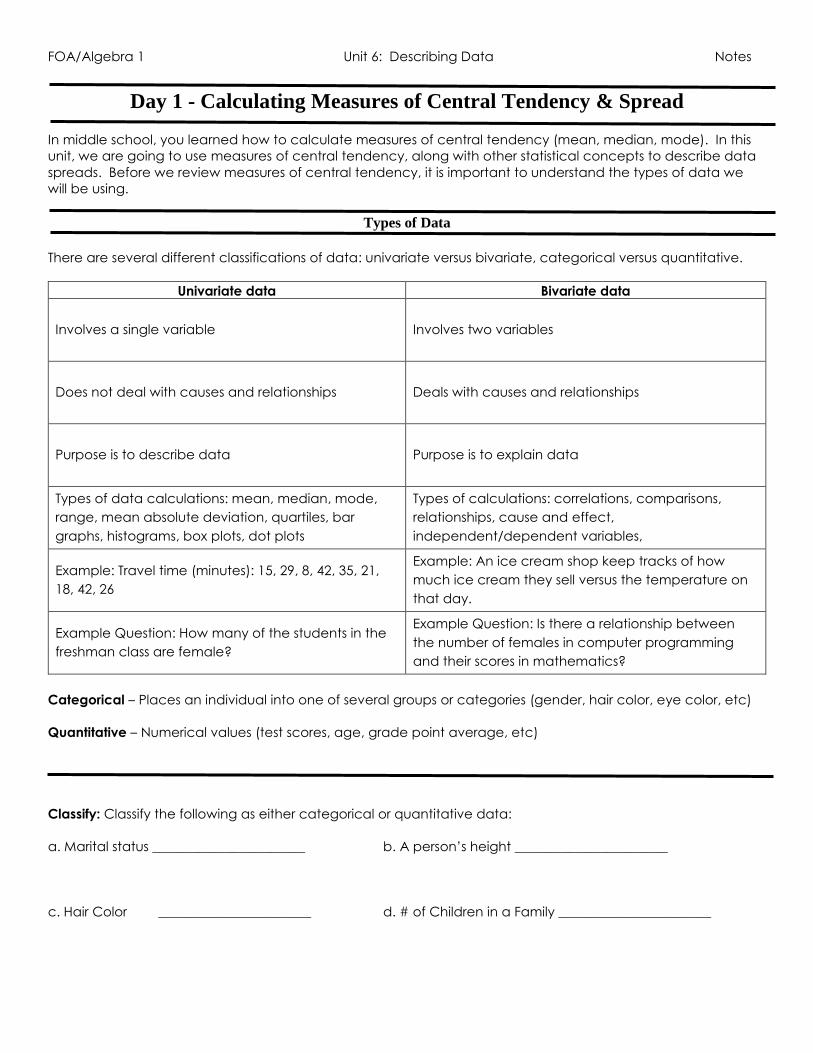
Day 1 - Calculating Measures of Central Tendency & Spread In middle school, you learned how to calculate measures of central tendency (mean, median, mode). In this
unit, we are going to use measures of central tendency, along with other statistical concepts to describe data
spreads. Before we review measures of central tendency, it is important to understand the types of data we
will be using.
Types of Data
There are several different classifications of data: univariate versus bivariate, categorical versus quantitative.
Univariate data Bivariate data
Involves a single variable Involves two variables
Does not deal with causes and relationships Deals with causes and relationships
Purpose is to describe data Purpose is to explain data
Types of data calculations: mean, median, mode,
range, mean absolute deviation, quartiles, bar
graphs, histograms, box plots, dot plots
Types of calculations: correlations, comparisons,
relationships, cause and effect,
independent/dependent variables,
Example: Travel time (minutes): 15, 29, 8, 42, 35, 21,
18, 42, 26
Example: An ice cream shop keep tracks of how
much ice cream they sell versus the temperature on
that day.
Example Question: How many of the students in the
freshman class are female?
Example Question: Is there a relationship between
the number of females in computer programming
and their scores in mathematics?
Categorical – Places an individual into one of several groups or categories (gender, hair color, eye color, etc)
Quantitative – Numerical values (test scores, age, grade point average, etc)
Classify: Classify the following as either categorical or quantitative data:
a. Marital status _______________________ b. A person’s height _______________________
c. Hair Color _______________________ d. # of Children in a Family _______________________

FOA/Algebra 1 Unit 6: Describing Data Notes
Measures of Central Tendency
Measures of Central Tendency are used to generalize data sets and identify common values.
Mean
Definition: Average of a numerical data set, denoted as x
Calculation: Add up all the data values and divide by the number of data values
Useful When: - Data values do not vary greatly
- No outliers
- Distribution is symmetric
Example: Find the mean of the following numbers.
a. 76 77 79 80 82 88 90 92 95 b. 15, 10, 12, 18, 10, 22
Median
Definition: The middle number when the values are written in numerical order
Calculation: Rewrite your data values in numerical order to find the middle number.
o If your data set is ODD, then the median will be the number that falls
directly in the middle.
o If your data set is EVEN, then the median is the average of the two
middle numbers.
Useful When: - Distribution is skewed
- Data values contain an outlier
Example: Find the median of the following numbers.
a. 76 77 79 80 82 88 90 92 95 b. 15, 10, 12, 18, 10, 22
First and
Third
Quartiles
Definition: Quartiles are values that divide a list of numbers into quarters
First (Q1) Quartile: Median of the lower half of a data set
o Calculation: Find the middle number of the values to the left of the median
Third (Q3) Quartile: Median of the upper half of a data set
o Calculation: Find the middle number of the values to the right of the median
Example: Find the lower and upper quartiles of the following numbers.
a. 76 77 79 80 82 88 90 92 95 b. 15, 10, 12, 18, 10, 22

FOA/Algebra 1 Unit 6: Describing Data Notes
Mode Definition: Value that occurs most frequently. There can be no, one, or several modes
Calculation: Find the numbers that are repeated
o NO MODE (No numbers repeat)
Say “no mode”
o ONE MODE (One number repeats)
State the number that repeats
o MORE THAN ONE MODE (Several numbers repeat the same amount of
times)
State the numbers that repeat.
Useful When: - Data set contains categorical data
Example: Find the mode of the following numbers.
a. 76 77 79 80 82 88 90 92 95 b. 15, 10, 12, 18, 10, 22
Outliers Data value that is much greater than or much less than the rest of the data in a data set
If an outlier is present, you would use the median to describe the data, NOT the mean!
Example: Identify any outliers in the data set. Then determine if the median or mean best represents the data
sets.
a. 15, 10, 12, 18, 10, 22 b. 128, 152, 170, 41, 161
Measures of Spread
Measures of Spread describe the “diversity” of the values in a data set. Measures of spread are used to help
explain whether data values are very similar or very different.
Range
Definition: Difference between the greatest and least values in the set
Calculation: Subtract the smallest data value from the biggest data value
Range = Biggest # - Smallest #
Example: Find the range of the following numbers.
a. 76 77 79 80 82 88 90 92 95 b. 15, 10, 12, 18, 10, 22

FOA/Algebra 1 Unit 6: Describing Data Notes
Interquartile
Range (IQR)
Definition: The difference between the third and first quartiles (Q3 – Q1). It finds the distance
between two data values that represent the middle 50% of the data.
Calculation: Subtract the first quartile value from the third quartile value (Q3 – Q1).
Example: Find the interquartile range of the following numbers.
a. 76 77 79 80 82 88 90 92 95 b. 15, 10, 12, 18, 10, 22
Mean
Absolute
Deviation
Definition: Average absolute value of the difference between each data point and the
mean. It essentially takes the average distance of the data points from the mean.
A data set with a smaller mean absolute deviation has data values that are closer to the
mean than a data set with a great mean absolute deviation. The greater the mean absolute
deviation, the more the data is spread out.
The formula for mean absolute deviation is:
Calculation: - Find the mean of the set of numbers
- Subtract each number in the set by the mean and take the absolute value
of each new number (new number will be positive)
- Find the sum of the new numbers and divide by the number of data values
Example: Find the MAD of the following numbers.
a. 76 77 79 80 82 88 90 92 95 b. 15, 10, 12, 18, 10, 22
X1 = data value
x = mean
= sum
N = number of data values

FOA/Algebra 1 Unit 6: Describing Data Notes
Putting Measures of Center and Spread Together
Use the data set below to answer the following questions:
5, 2, 9, 10, 3, 7, 2, 18, 12, 15, 1, 6, 9, 5, 2, 7
1.) Find the mean. 2.) Find the median(Q2). 3.) Find the mode.
4.) Find the range. 5.) Find Q1. 6.) Find Q3.
7.) Find the IQR. 8.) Find the MAD.
FOA/Algebra 1 Unit 6: Describing Data Notes
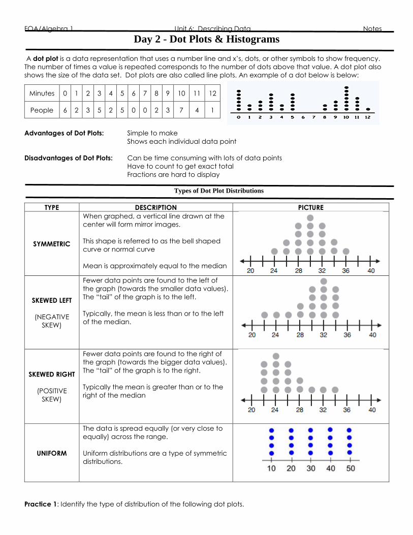
Day 2 - Dot Plots & Histograms
A dot plot is a data representation that uses a number line and x’s, dots, or other symbols to show frequency.
The number of times a value is repeated corresponds to the number of dots above that value. A dot plot also
shows the size of the data set. Dot plots are also called line plots. An example of a dot below is below:
Advantages of Dot Plots: Simple to make
Shows each individual data point
Disadvantages of Dot Plots: Can be time consuming with lots of data points
Have to count to get exact total
Fractions are hard to display
Types of Dot Plot Distributions
TYPE DESCRIPTION PICTURE
SYMMETRIC
When graphed, a vertical line drawn at the
center will form mirror images.
This shape is referred to as the bell shaped
curve or normal curve
Mean is approximately equal to the median
SKEWED LEFT
(NEGATIVE
SKEW)
Fewer data points are found to the left of
the graph (towards the smaller data values).
The “tail” of the graph is to the left.
Typically, the mean is less than or to the left
of the median.
SKEWED RIGHT
(POSITIVE
SKEW)
Fewer data points are found to the right of
the graph (towards the bigger data values).
The “tail” of the graph is to the right.
Typically the mean is greater than or to the
right of the median
UNIFORM
The data is spread equally (or very close to
equally) across the range.
Uniform distributions are a type of symmetric
distributions.
Practice 1: Identify the type of distribution of the following dot plots.
Minutes 0 1 2 3 4 5 6 7 8 9 10 11 12
People 6 2 3 5 2 5 0 0 2 3 7 4 1

FOA/Algebra 1 Unit 6: Describing Data Notes
a. b.
Practice 2: Find the following values:
Describe the following:
Mean: Mean: Mean:
Median: Median: Median:
Mode: Mode: Mode:
Range: Range: Range:
Distribution: Distribution: Distribution:
Practice 3: The following dot plot represents gold medals won at the Special Olympics:

FOA/Algebra 1 Unit 6: Describing Data Notes
a. How many participants are represented in the dot plot?
b. How many participants won10 or more medals?
c. How many participants won less than 4 medals?
d. Describe the data distribution and interpret its meaning in terms of this problem situation.

FOA/Algebra 1 Unit 6: Describing Data Notes
Histograms
A histogram is a bar graph used to display the frequency of data divided into equal intervals, called bins. The
bars must be of equal width and should touch, but not overlap. The height of each bar gives the frequency of
the data.
An example of a histogram is below:
How many students read 4-7 books?
How many more students read 4-7 books than 12-15 books?
Advantages of Histograms: Good for determining the shape of data
Convenient for representing large quantities of data
Disadvantages of Histograms: Cannot read exact values because data is grouped into categories
More difficult to compare two data sets because measures of center and
spread cannot be determined
TYPE DESCRIPTION PICTURE
SYMMETRIC
When graphed, a vertical line drawn at the center
will form mirror images.
This shape is referred to as the bell shaped curve or
normal curve
The median will be in or close to the center of the
number line.
SKEWED LEFT
(NEGATIVE
SKEW)
Fewer data points are found to the left of the graph
(towards the smaller data values). The “tail” of the
graph is to the left.
The median will be shifted right and the “tail” on the
left. Typically, the mean is less than or to the left of
the median.
SKEWED RIGHT
(POSITIVE
SKEW)
Fewer data points are found to the right of the
graph (towards the bigger data values). The “tail”
of the graph is to the right.
The median will be shifted left and the “tail’ on the
right. Typically the mean is greater than or to the
right of the median
UNIFORM
The data is spread equally (or very close to equally)
across the range.
Uniform distributions are a type of symmetric
distributions.
The median will be in or close to the center of the
number line.
FOA/Algebra 1 Unit 6: Describing Data Notes
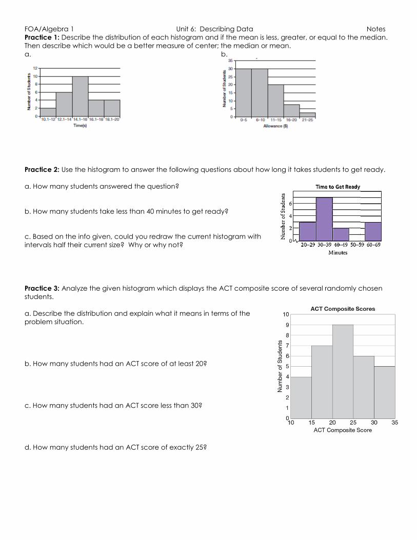
Practice 1: Describe the distribution of each histogram and if the mean is less, greater, or equal to the median.
Then describe which would be a better measure of center; the median or mean.
a. b.
Practice 2: Use the histogram to answer the following questions about how long it takes students to get ready.
a. How many students answered the question?
b. How many students take less than 40 minutes to get ready?
c. Based on the info given, could you redraw the current histogram with
intervals half their current size? Why or why not?
Practice 3: Analyze the given histogram which displays the ACT composite score of several randomly chosen
students.
a. Describe the distribution and explain what it means in terms of the
problem situation.
b. How many students had an ACT score of at least 20?
c. How many students had an ACT score less than 30?
d. How many students had an ACT score of exactly 25?
FOA/Algebra 1 Unit 6: Describing Data Notes
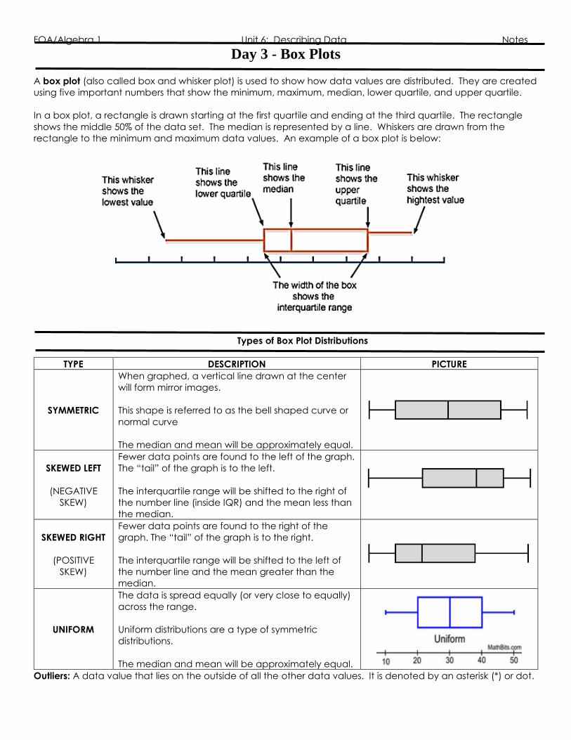
Day 3 - Box Plots
A box plot (also called box and whisker plot) is used to show how data values are distributed. They are created
using five important numbers that show the minimum, maximum, median, lower quartile, and upper quartile.
In a box plot, a rectangle is drawn starting at the first quartile and ending at the third quartile. The rectangle
shows the middle 50% of the data set. The median is represented by a line. Whiskers are drawn from the
rectangle to the minimum and maximum data values. An example of a box plot is below:
Types of Box Plot Distributions
TYPE DESCRIPTION PICTURE
SYMMETRIC
When graphed, a vertical line drawn at the center
will form mirror images.
This shape is referred to as the bell shaped curve or
normal curve
The median and mean will be approximately equal.
SKEWED LEFT
(NEGATIVE
SKEW)
Fewer data points are found to the left of the graph.
The “tail” of the graph is to the left.
The interquartile range will be shifted to the right of
the number line (inside IQR) and the mean less than
the median.
SKEWED RIGHT
(POSITIVE
SKEW)
Fewer data points are found to the right of the
graph. The “tail” of the graph is to the right.
The interquartile range will be shifted to the left of
the number line and the mean greater than the
median.
UNIFORM
The data is spread equally (or very close to equally)
across the range.
Uniform distributions are a type of symmetric
distributions.
The median and mean will be approximately equal.
Outliers: A data value that lies on the outside of all the other data values. It is denoted by an asterisk (*) or dot.

FOA/Algebra 1 Unit 6: Describing Data Notes
Identifying Distributions
Identify the type of distribution of the following box plots.
a.
b.
c.
Calculating the Parts of a Box Plot
Before you can even create a box plot, you have to know how to calculate the “five number summary”, which
consists of the minimum, maximum, median, lower quartile, and upper quartile.
Using the following data set, find the five number summary:
{15, 10, 12, 18, 10, 22, 11, 17, 13}
Minimum: Smallest number of the data set _________
Maximum: Largest number of the data set _________
Median: Middle number of the data set _________
Lower Quartile: Median of the lower half of the data set (Q1 or First Quartile) _________
Upper Quartile: Median of the upper half of the data set (Q3 or Third Quartile) _________

FOA/Algebra 1 Unit 6: Describing Data Notes
Interpreting Box Plots
Practice with Box Plots
Example 1: Analyze the box plot below about the cost, in dollars, of 12 CD’s. Answer the questions.
A. Which cost is the upper quartile? B. What is the range?
C. What is the median? D. Which cost represents the 100th percentile?
E. How many CD’s cost between $14.50 F. How many CD’s cost less than $14.50?
and $26.00?
List the data values that fall below 25%:
List the data values that fall above 75%:
List the data values that fall above 50%:
Calculate the IQR:
FOA/Algebra 1 Unit 6: Describing Data Notes
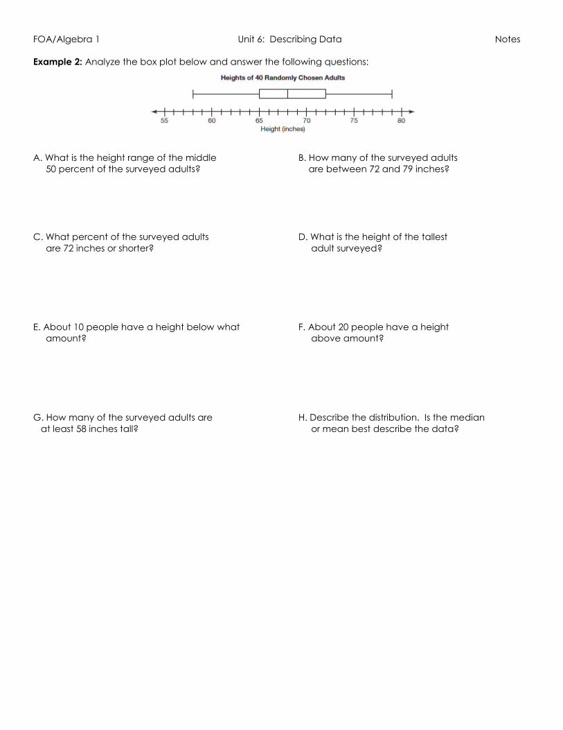
Example 2: Analyze the box plot below and answer the following questions:
A. What is the height range of the middle B. How many of the surveyed adults
50 percent of the surveyed adults? are between 72 and 79 inches?
C. What percent of the surveyed adults D. What is the height of the tallest
are 72 inches or shorter? adult surveyed?
E. About 10 people have a height below what F. About 20 people have a height
amount? above amount?
G. How many of the surveyed adults are H. Describe the distribution. Is the median
at least 58 inches tall? or mean best describe the data?
FOA/Algebra 1 Unit 6: Describing Data Notes
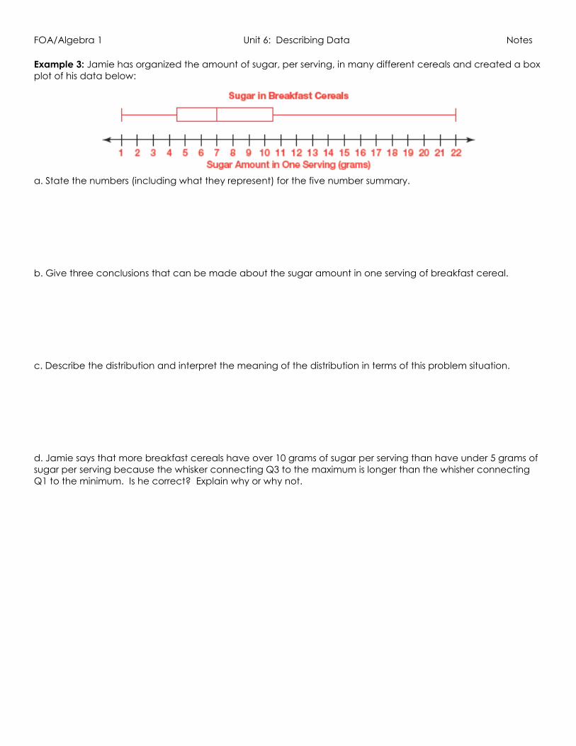
Example 3: Jamie has organized the amount of sugar, per serving, in many different cereals and created a box
plot of his data below:
a. State the numbers (including what they represent) for the five number summary.
b. Give three conclusions that can be made about the sugar amount in one serving of breakfast cereal.
c. Describe the distribution and interpret the meaning of the distribution in terms of this problem situation.
d. Jamie says that more breakfast cereals have over 10 grams of sugar per serving than have under 5 grams of
sugar per serving because the whisker connecting Q3 to the maximum is longer than the whisher connecting
Q1 to the minimum. Is he correct? Explain why or why not.

FOA/Algebra 1 Unit 6: Describing Data Notes
Day 4 – Comparing Data Sets Scenario: Coach Smith is trying to decide which two of his point guards he wants to start for the first round of
play-offs. The data below shows the numbers of points scored by Jace and Tyler from the past six games.
Jace: 11, 11, 6, 26, 6, 12 Tyler: 15, 12, 13, 10, 9, 13
1. Who do you think Coach Smith should select as a starting player and why?
2. What is the mean for Jace: ________ Tyler: ________?
3. Calculate the deviations for the points scored for each player. Then describe the deviation.
Jace
Points Scored Describe Deviation
11
11
6
26
6
12
What do you notice about the deviations for each player?
4. Add the deviations for each player and divide by the number of data values.
Jace Tyler
5. What does the mean absolute deviation tell you about the points scored by each player?
6. If you were Coach Webb, which player would you choose to start in the play-off game and why?
Tyler
Points Scored Describe Deviation
15
12
13
10
9
13

FOA/Algebra 1 Unit 6: Describing Data Notes
Comparing Measures of Center and Spread
Comparing Measures of Center and Spread
Center Spread
Mean Data is Symmetric
No Outliers More Spread
Data values are spread
out
Greater MAD
Median
Skewed Data
Outliers
(Skewed left – mean < median)
(Skewed right – mean > median)
Less Spread
Data values are close
together
Smaller MAD
Example 1: Which data set will have the greater mean absolute deviation? Why?
Example 2: The following data represents test scores from Unit 11 test.
Unit 11 Test Scores: 81, 41, 89, 92, 80, 86, 77, 66, 84, 92, 97, 88, 77, 38
a. Compare the mean and median.
b. What type of distribution does the data create? What does this mean?
c. Are there any outliers?
d. What measure of center best describes the grades and why?

FOA/Algebra 1 Unit 6: Describing Data Notes
Example 3: The histograms below show the scores of Mrs. Smith’s first and second block class at Red Rock High
School.
1. How many students are in her 1st and 2nd block class?
2. How many students failed the test in each class?
3. Which measure of center best describes the data and why?
4. Which class seemed to do better overall?
FOA/Algebra 1 Unit 6: Describing Data Notes
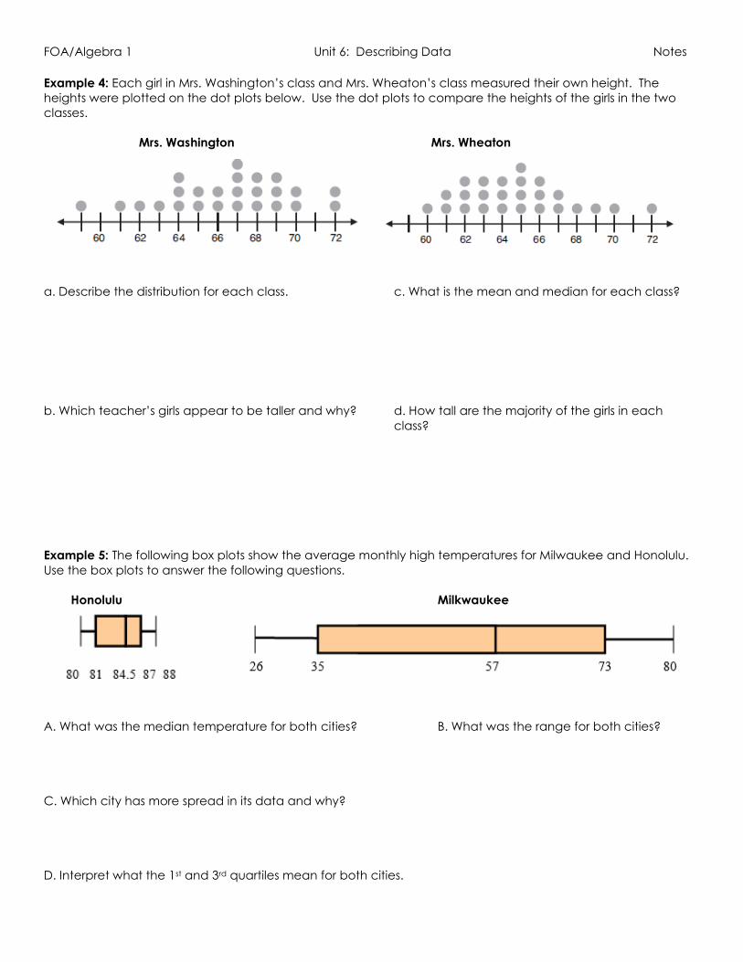
Example 4: Each girl in Mrs. Washington’s class and Mrs. Wheaton’s class measured their own height. The
heights were plotted on the dot plots below. Use the dot plots to compare the heights of the girls in the two
classes.
Mrs. Washington Mrs. Wheaton
a. Describe the distribution for each class. c. What is the mean and median for each class?
b. Which teacher’s girls appear to be taller and why? d. How tall are the majority of the girls in each
class?
Example 5: The following box plots show the average monthly high temperatures for Milwaukee and Honolulu.
Use the box plots to answer the following questions.
Honolulu Milkwaukee
A. What was the median temperature for both cities? B. What was the range for both cities?
C. Which city has more spread in its data and why?
D. Interpret what the 1st and 3rd quartiles mean for both cities.
FOA/Algebra 1 Unit 6: Describing Data Notes
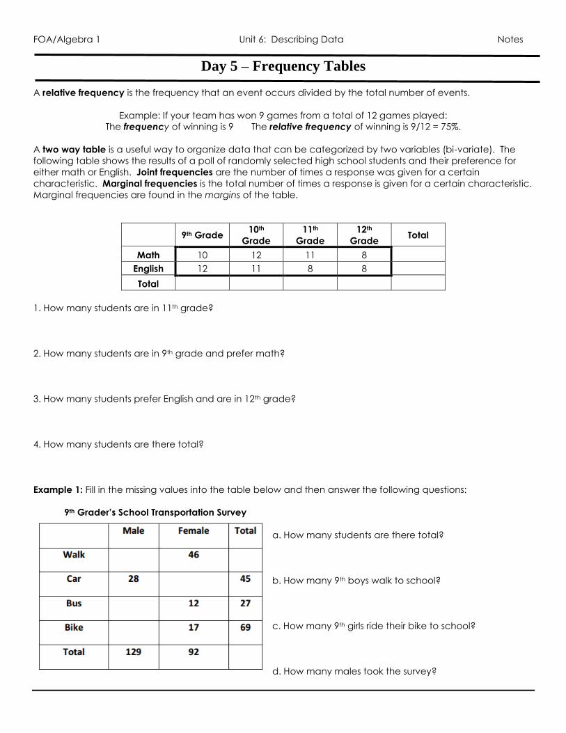
Day 5 – Frequency Tables
A relative frequency is the frequency that an event occurs divided by the total number of events.
Example: If your team has won 9 games from a total of 12 games played:
The frequency of winning is 9 The relative frequency of winning is 9/12 = 75%.
A two way table is a useful way to organize data that can be categorized by two variables (bi-variate). The
following table shows the results of a poll of randomly selected high school students and their preference for
either math or English. Joint frequencies are the number of times a response was given for a certain
characteristic. Marginal frequencies is the total number of times a response is given for a certain characteristic.
Marginal frequencies are found in the margins of the table.
9th Grade 10th
Grade
11th
Grade
12th
Grade Total
Math 10 12 11 8
English 12 11 8 8
Total
1. How many students are in 11th grade?
2. How many students are in 9th grade and prefer math?
3. How many students prefer English and are in 12th grade?
4. How many students are there total?
Example 1: Fill in the missing values into the table below and then answer the following questions:
9th Grader’s School Transportation Survey
a. How many students are there total?
b. How many 9th boys walk to school?
c. How many 9th girls ride their bike to school?
d. How many males took the survey?

FOA/Algebra 1 Unit 6: Describing Data Notes
Example 2: The table below represents the favorite meals of 9th and 10th graders. Use the table to answer the
following questions.
a. How many 9th graders participated in the survey? b. How many students prefer chicken nuggets?
c. How many students prefer burgers? d. Which meal is the least favorite of all students?
e. Which meal is the least favorite of 9th graders? f. Which meal is most favorite of 10th graders?
Joint and Marginal Relative Frequencies
The joint relative frequencies are the values in each category divided by the total number of values and written
as percents (or decimals). They provide the ratio of occurrences in each category to the total number of
occurrences.
The marginal relative frequencies are found by adding the joint relative frequencies in each row and column
(totals) and are written as percents (or decimals). They provide the ratio of total occurrences for each category
to the total number of occurrences. Marginal frequencies are written in the MARGINS of the table. The marginal
frequency totals in each row and column should always total 1 or 100%.
Calculate the joint and marginal relative frequencies for the table:
9th Grade 10th Grade 11th Grade 12th Grade Total
Math
English
Total
a. What percent of students are 10th graders & like English?
b. What percent of students like Math and are 12th graders?
c. What percent of students like Math? d. What percent of those surveys were seniors?
FOA/Algebra 1 Unit 6: Describing Data Notes
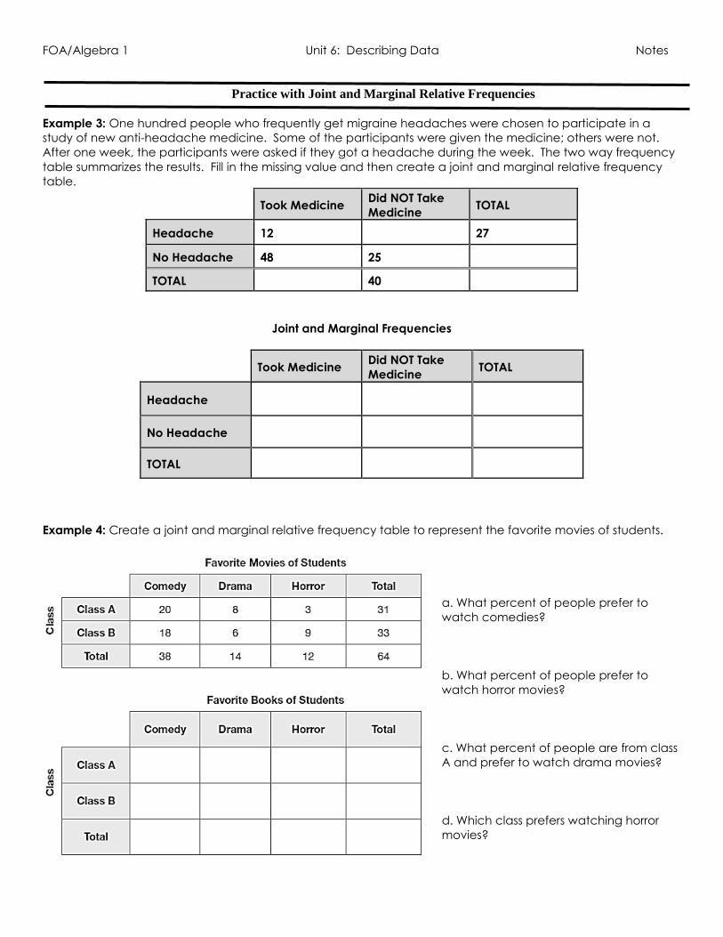
Practice with Joint and Marginal Relative Frequencies
Example 3: One hundred people who frequently get migraine headaches were chosen to participate in a
study of new anti-headache medicine. Some of the participants were given the medicine; others were not.
After one week, the participants were asked if they got a headache during the week. The two way frequency
table summarizes the results. Fill in the missing value and then create a joint and marginal relative frequency
table.
Took Medicine Did NOT Take
Medicine TOTAL
Headache 12 27
No Headache 48 25
TOTAL 40
Joint and Marginal Frequencies
Took Medicine Did NOT Take
Medicine TOTAL
Headache
No Headache
TOTAL
Example 4: Create a joint and marginal relative frequency table to represent the favorite movies of students.
a. What percent of people prefer to
watch comedies?
b. What percent of people prefer to
watch horror movies?
c. What percent of people are from class
A and prefer to watch drama movies?
d. Which class prefers watching horror
movies?

FOA/Algebra 1 Unit 6: Describing Data Notes
Conditional Frequencies
A conditional frequency is restricted to a particular group (or subgroup). Conditional frequencies are typically
identified by the words “given that” or “if” or “what percent of (insert condition)”. They do NOT come from the
total data, but from a row or column total. To calculate a conditional frequency, divide the joint relative
frequency by the marginal relative frequency (does not matter if they are the frequencies or
percents/decimals). Conditional frequencies are used to find conditional probabilities.
Took Medicine Did NOT Take
Medicine TOTAL
Headache 12 15 27
No Headache 48 25 73
TOTAL 60 40 100
1. What is the probability that a participant did not get a headache if they took the medicine?
2. What is the probability that a participant took medicine given they did not have a headache?
3. What is the probability that a participant took medicine given they did have a headache?
4. Calculate the joint and marginal frequencies from the table above.
Took Medicine Did NOT Take
Medicine TOTAL
Headache
No Headache
TOTAL
5. What is the probability that a participant who did not get a headache took the medicine?
6. What is the probability that a participant took medicine given they did not have a headache?
7. What is the probability that a participant took medicine given they did have a headache?
8. What do you notice about the answers from problems 1 – 3 and problems 5 – 7?

FOA/Algebra 1 Unit 6: Describing Data Notes
Example 5: Students were surveyed about whether or not they have a pet and if they are allergic or not to
animals. The results are below:
a. What percent of those surveyed who are allergic to animals have a pet?
b. What percent of those surveyed who are not allergic to animals have a pet?
c. What percent of those who have a pet are allergic to animals?
d. What percent of those who have a pet are not allergic to animals?
Example 6: The following contains the scores of the latest math project. Use the table to answer the following
questions:
a. What percentage of males earned a score of an “A”?
b. What percentage of those who earned an “A” were male?
c. What percentages of females earned a score of a “B”?
d. What percentage of those who earned an “F” were female?

FOA/Algebra 1 Unit 6: Describing Data Notes
Day 6 - Associations with Conditional Relative Frequencies
Scenario: Mr. Lewis teaches three science classes at South Creek High School. He wants to compare the
grades of the three classes of his students. He created a frequency chart as shown below:
a. Create a joint and marginal relative frequency chart below:
b. Which class is his biggest? c. What percent of his students earned an A?
d. What percent of his Chemistry students earned a B? e. Which class did the best overall? Why?

FOA/Algebra 1 Unit 6: Describing Data Notes
Because each science class has a different number of students, the relative frequencies cannot help
determine which class is doing the best. Instead, we need to use a conditional relative frequency chart to
determine which class did the best. A conditional relative frequency chart is the percent or ratio of occurrence
of a category given a specific value of another category. For example, what percent of his Biology students
earned an A? If I calculate this, I am only going to take the number of occurrence of getting an A for the
number of biology students only (6 students got an A in biology out of 20 biology students).
f. Create a conditional relative frequency table below:
Answer the following and consider passing as earning only an A, B, or C.
g. What percent of biology students are passing?
h. What percent of chemistry students are passing?
i. What percent of physics students are passing?
j. Which science class is doing the best according to their grades?

FOA/Algebra 1 Unit 6: Describing Data Notes
The differences in conditional relative frequencies can be used to assess whether or not there is an association
between two categorical variables. The greater the difference in the conditional relative frequencies, the
stronger the evidence lies that an association exists. An observed association between two variables does not
necessarily mean that there is a cause and effect relationship between the two variables. Take a look at the
following scenario below:
Example 1: The following table surveyed students about their homework completion and skipping class.
a. What do you notice between skipping class and doing homework?
b. Does there seem to be an association between doing homework and skipping class?
Example 2: The conditional relative frequency table shown below shows the sports that females and male
students participate in. Is there an association between your gender and the sport you choose to play?

FOA/Algebra 1 Unit 6: Describing Data Notes
Example 3: The table below shows the frequencies of having a sports car and running regularly. Use the table
to answer the following questions.
a. What percent of people who have a sports car also run regularly?
b. What percent of people who do not run regularly do not own a sports car?
c. Create a conditional relative frequency chart below.
d. Does there appear to be an association between having a sports car and running regularly? Why or why
not?
Has a Sports Car Does Not have a
Sports Car Total
Runs Regularly
Does Not Run
Regularly
Total

FOA/Algebra 1 Unit 6: Describing Data Notes
Example 4: Students were given the opportunity to prepare for a college placement test in mathematics by
taking a review course. Not all students took advantage of this opportunity. The following results were
obtained from a random sample of students who took the placement test.
a. What percent of the students took the review course?
b. What percent of students placed in math 200?
c. What percent of students who took the review course placed in Math 50?
d. What percent of students who placed in math 200 did not take the review course?
e. Create a conditional relative frequency chart below.
f. Is there an association between taking the review class and placing in a math class? Why or why not?
Placed in Math
200
Placed in Math
100 Placed in Math 50 Total
Took Review
Course
Did Not Take
Review Course
Total

FOA/Algebra 1 Unit 6: Describing Data Notes
Day 7 – Scatterplots A scatterplot is a graph of data pairs (x, y). Scatterplots are typically used to describe relationships, called
correlations, between two variables (bi-variate). The correlation coefficient describes how well a line fits the
data. A trend line can be drawn to help determine correlation.
Correlation Coefficients
0.70 to 1.00 Strong Positive 0.70 to 1.00 Strong Negative
0.30 to 0.69 Moderate Positive 0.30 to 0.69 Moderate Negative
0.00 to 0.29 None to Weak Positive 0.00 to 0.29 None to Weak Negative
Example: Determine if the following graphs have positive, negative, or no correlations. Then tell if the
correlation coefficient is strong, moderate, or weak positive or negative.
a. b. c. d. e.
Positive Correlation
As x values increase,
y values increase
Correlation Coefficient is
close to 1
Positive Slope
Negative Correlation
As x values increase,
y values decrease
Correlation Coefficient is
close to -1
Negative Slope
No Correlation
No relationship between
x and y
Correlation Coefficient is
close to 0
No line

FOA/Algebra 1 Unit 6: Describing Data Notes
Example: Describe the scatterplot that best describes the scenario below and explain why:
The relationship between the number of days since a sunflower seed was planted and the height of the plant.
Example: Describe the correlation you would expect to see between each pair of data sets. Explain your
choice:
a. The number of hours you work vs the amount of money in your bank account:
b. The number of hours workers receive safety training vs the number of accidents on the job:
c. The number of students at Hillgrove vs the number of dogs in Atlanta:
d. The number of heaters sold versus the months in order from April to September:
e. The number of rice dishes eaten vs the number of cars on I-75 throughout the day:
f. The number of calories burned/lost vs the amount of hours you worked out:

FOA/Algebra 1 Unit 6: Describing Data Notes
Correlation vs Causation
Correlation: implies a mutual relationship between two or more things. It is very IMPORTANT to understand that
just because two variables are strongly correlated does NOT imply a cause and effect relationship. A strong
relationship between two variables could be a coincidence or caused by additional factors. Typically,
correlations use the words noticed and showed.
Correlations only show relationships…they cannot be used to make conclusions!!
Causation: implies a relationship in which one action or event is the direct consequence of another (cause and
effect).
Correlation Causation
Smoking is correlated with alcoholism (but it
doesn’t cause it).
The more ice cream consumed on a beach,
the increased number of people who go in
the water (eating ice cream doesn’t cause
you to go in the water more).
The more you smoke, the chances of
developing lung cancer increase. (Does
smoking cause lung cancer?)
The less calories you eat, the more weight you
lose (Does eating less cause you to lose
weight?)
Example: Determine if the following relationships show a correlation or causation:
A. A recent study showed that college students were more likely to vote than their peers who were not
in school.
B. Dr. Shaw noticed that there was more trash in the hallways after 2nd period than 1st period.
C. You hit your little sister and she cries.
D. The number of miles driven and the amount of gas used on your trip to Disneyworld.
E. The age of a child and his/her shoe size.
F. The amount of cars a salesman sells and the amount of commission he makes during the month of
July.

FOA/Algebra 1 Unit 6: Describing Data Notes
Steps for Calculating the Correlation Coefficient & Creating a Model 1. Once your data is entered into a list, Press [STAT] [CALC] and choose your regression.
4: LinReg – Linear Regression y = mx + b (a = m)
5: QuadReg – Quadratic Regression y = ax2 + bx + c
0: ExpReg – Exponential Regression y = abx
2. If you want your graphing calculator to automatically input the equation into y = , do the following:
On the 2nd screen, hit ENTER until STORE REGEQ is highlighted.
Hit Vars Y-VARS 1: Function 1: Y1
3. Hit ENTER until CALCULATE is highlighted. You should see your variables (a, b, and possibly c) unless with r2
and r.
R: correlation coefficient – this tells you how much correlation exists
between your data
R2: this tells you how well the equation fits your data. The closer to 1,
the better the fit.
Practice Predicting with Scatter Plots
1. What can be concluded from the scatterplot below?
A. The older a person gets, the more television they watch. B. As a person gets older, their taste in television changes. C. The older a person gets, the less television they watch. D. There is no relationship between age and television watching.
FOA/Algebra 1 Unit 6: Describing Data Notes
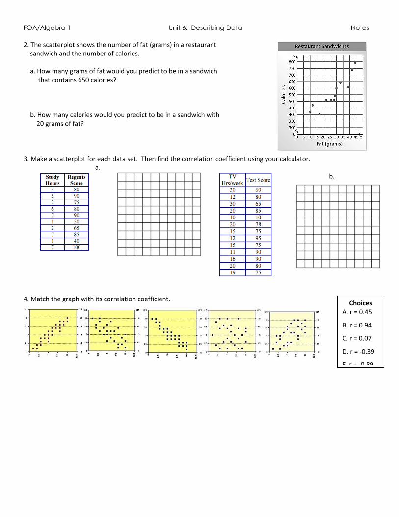
2. The scatterplot shows the number of fat (grams) in a restaurant sandwich and the number of calories. a. How many grams of fat would you predict to be in a sandwich that contains 650 calories? b. How many calories would you predict to be in a sandwich with 20 grams of fat? 3. Make a scatterplot for each data set. Then find the correlation coefficient using your calculator.
a. b.
4. Match the graph with its correlation coefficient.
Choices A. r = 0.45
B. r = 0.94
C. r = 0.07
D. r = -0.39
E. r = -0.89

FOA/Algebra 1 Unit 6: Describing Data Notes
Day 8 – Linear Regression Yesterday, we drew trend lines to help us see if a scatter plot had any types of correlation. A trend line is a line
that closely models the data. A line of best fit is the line that comes closest to all of the points in the data set.
The line of best fit provides the predicted values for a set of data.
If a line is a good line of best fit, it will have data points above and below the line.
Example: Draw a line of best fit for each graph:
Example: The table shows test averages of eight students. The equation that best models the data is
y = 0.77x + 18.12 and the correlation coefficient is 0.87. Discuss correlation and causation for the data set.
Example: Eight adults were surveyed about their education and earnings. The table shows the survey results.
The equation that models the data Is y = 0.59x + 30.28 and the correlation coefficient is 0.86. Discuss correlation
and causation for the data set.

FOA/Algebra 1 Unit 6: Describing Data Notes
Calculating a Line of Best Fit
Scenario 1: A weather team records the weather each hour after sunrise one morning in May. The hours after
sunrise and the temperature in degrees Fahrenheit are in the table below. Create a graph to represent the
data and calculate a linear equation to represent the table.
a. Interpret what the slope of each equation means in terms of the problem context.
b. Interpret what the y-intercept of each equation means in terms of the problem context.
Calculate by Hand Step 1: Pick two points and calculate the slope (must go
through trend line:
Step 2: Estimate/determine the y-intercept:
Step 3: Enter into y = mx + b
Calculate using Regression Step 1: Enter data into a list (Stat Edit)
Step 2: Calculate a regression (Stat Calc 4: Lin Reg)
a:
b:
r:
3. Enter into y = mx + b