forside - aau
TRANSCRIPT
Forside


PrefaceThe following report containts the documentation related to the project “Den Lille Maler - An interactive painting ap-plication.”
The project was developed at Aalborg University, Department of Architecture, Design and Media Technology’s de-partment of Medialogy as a master thesis during the spring semester of 2011.
The report assumes that the reader has a basic understanding of the courses given on previous semesters on Me-dialogy. During the report, sources will be cited by a [] containing a number corresponding to a source in the biblio-graphy. Entries in the appendix will be listed as () containing the directory to the folder on the CD accompanying the project.
The external figures used in the report will be listed with a source in the footnote.
The accompanying CD also contains a copy of the report in .PDF-format, the source code for the product developed during the project and a video showing the functionality of the product.

Table of contents1. Introduction 9
1.1. Vision 10
1.1.1. Target audience 10
1.1.1.1. KUNSTEN and tweens 11
2. Analysis of participatory projects 13
2.1. Participatory models 13
2.2. Understanding museumgoers 13
2.3. Personal profiles 14
2.4. Recommendation engines 15
2.5. Bringing home the experience 15
2.6. Platform 16
2.7. The participant’s perspective 16
2.8. Participation thrives on constraints 17
2.9. Examples of participatory projects from museums 17
2.9.1. The Cicero Project at the Marble Museum of Carrara 17
2.9.2. California Academy of Sciences 18
2.9.3. eXspot at the Exploratorium 20
2.9.4. The Art of Storytelling at the Delaware Art Museum 20
2.9.5. Lessons learned from examples 22
3. Product requirements 23
3.1. Project idea 23
3.1.1. Initial ideas 23
3.1.2. Final idea 24
3.2. Requirements 24
3.2.1. Functional requirements 25
3.2.1.1. Painting applications 26
3.2.2. Data requirements 28
3.2.3. Environmental requirements 29
3.2.4. User characteristics 29
3.2.5. Usability goals 30
3.2.6. User experience goals 30
3.2.7. List of requirements 30
4. Low-fidelity prototype 33
4.1. Prototype limitations 33
4.2. Designing the elements 33
4.2.1. The main screen 33
4.2.2. The canvases 34
4.2.3. The gallery 37
4.3. Testing the low-fidelity prototype 37
4.3.1. Test design 37
4.3.2. Test results 38
5. Den Lille Kunstner 43
5.1. Walkthrough 43
5.2. Changes from the low-fidelity prototype 45
5.3. Implementation 47
5.4. Testing the high-fidelity prototype 48
5.4.1. The test on the target audience 48
5.4.1.1. Purpose of the test 48
5.4.1.2. Data gathering 49
5.4.1.3. Results 49
5.4.2. The test on the experts 50
5.4.2.1. Purpose of the test 50
5.4.2.2. Data gathering 50
5.4.2.3. Results 50
6. Discussion 51
Page 9
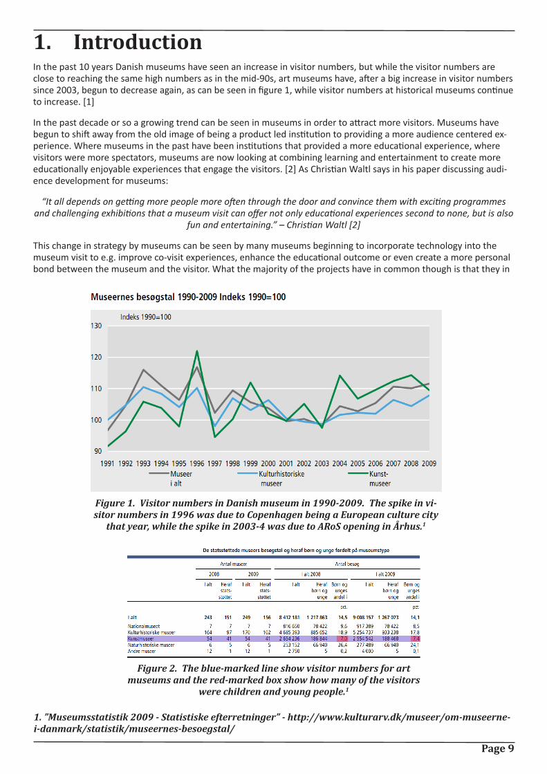
1. IntroductionIn the past 10 years Danish museums have seen an increase in visitor numbers, but while the visitor numbers are close to reaching the same high numbers as in the mid-90s, art museums have, after a big increase in visitor numbers since 2003, begun to decrease again, as can be seen in figure 1, while visitor numbers at historical museums continue to increase. [1]
In the past decade or so a growing trend can be seen in museums in order to attract more visitors. Museums have begun to shift away from the old image of being a product led institution to providing a more audience centered ex-perience. Where museums in the past have been institutions that provided a more educational experience, where visitors were more spectators, museums are now looking at combining learning and entertainment to create more educationally enjoyable experiences that engage the visitors. [2] As Christian Waltl says in his paper discussing audi-ence development for museums:
“It all depends on getting more people more often through the door and convince them with exciting programmes and challenging exhibitions that a museum visit can offer not only educational experiences second to none, but is also
fun and entertaining.” – Christian Waltl [2]
This change in strategy by museums can be seen by many museums beginning to incorporate technology into the museum visit to e.g. improve co-visit experiences, enhance the educational outcome or even create a more personal bond between the museum and the visitor. What the majority of the projects have in common though is that they in
Figure 1. Visitor numbers in Danish museum in 1990-2009. The spike in vi-sitor numbers in 1996 was due to Copenhagen being a European culture city
that year, while the spike in 2003-4 was due to ARoS opening in Århus.1
Figure 2. The blue-marked line show visitor numbers for art museums and the red-marked box show how many of the visitors
were children and young people.1
1. ”Museumsstatistik 2009 - Statistiske efterretninger” - http://www.kulturarv.dk/museer/om-museerne-i-danmark/statistik/museernes-besoegstal/
Page 10
some way try to engage the visitor rather than having the visitor being passive throughout the visit as was previously the case. Examples of how different projects try to achieve this will be examined in chapter 2.
So with visitor numbers decreasing, art museums might need to look at attracting new audiences with participatory projects and with the youth segment only accounting for 7.4% of the current visits, as can be seen in figure 2, muse-ums need to focus part of their efforts on creating experiences that will attract this segment.
1.1. Vision
Based on the above introduction it is found that one way to try to increase visit numbers and attract new visitors is by diverging from the regular and old-fashioned passive museum visit and create a participatory experience for the visi-tor.
As this participatory project will take place at KUNSTEN, an art museum located in Aalborg, Denmark [3], the vision of KUNSTEN should be taken into consideration before deciding on the vision for the project. The part of KUNSTEN’s vision that is relevant for the project is:
”KUNSTEN vil give publikum oplevelser, og vil være det inspirerende og berigende sted, hvor publikum og billedkunst mødes i arkitektonisk unikke rammer.”[4]
Which can be translated to:
“KUNSTEN wants to give audiences experiences and wants to be the inspiring and enriching place, where audience and art meets in an architectural unique setting.”
Furthermore, in an interview on the 15th of March 2011, Lars Ulrich Tarp Hansen, who is in charge of communication and PR at KUNSTEN, said that KUNSTEN wants to make tools available to the visitor that will aid the visitor to discuss the experience and allow them to reflect on the exhibited art and that without aid it can be difficult for visitors to generate an impression. It is however important that the visitor is not told what to feel and think, but is only aided in generating an impression. [5]
In short, KUNSTEN wants to give visitors meaningful experiences and aid them in the meaning-making process so they will be able to discuss the experience. This is important to remember when designing the participatory project to make sure that the project is in line with what the vision of the museum is.
With the above in mind, the vision for this project is:
A participatory tool will be developed that can aid visitors in understanding art, while also creating a personal bond between the visitor and the museum.
1.1.1. Target audience
Now that the vision has been decided, a target audience will be selected. As mentioned previously in the introduc-tion, the segment that visits the museums the least is the youth segment and therefore it makes sense to focus on developing experiences that will entice this segment to visit the museum.
The word ”tweens” is a term with roots in the marketing world and is used to describe a sub-teen consumer segment that lies in-between children and teenagers.[6] The age span of the segment varies depending on the source describ-ing the segment, where About.com[7] defines the segment as being between the ages of 9 to 12, the Free Diction-ary[8] defines it as between 8 and 12, and Wilkening and Chung[9] define it as 11 to 14. However, as Andersen, Tufte et al. [6] state, an average 8 year old and an average 14 year old can be very different and defining the age span can therefore be difficult. However, for this project the term “tweens” will cover the 8 to 14 year olds, which will also be the target audience for the project.
Tweens are a segment that has considerable spending power, as they are both considered as a powerful influence on how their parents spend their money, but are also consumers themselves, and in 2003 the segment spent 1.18 trillion American dollars globally, indirectly and directly, and as tweens are a segment that are in a phase of their life where they are establishing preferences for brands [6], this segment is a valuable and important segment for compa-nies to get a hold of.
Page 11
1.1.1.1. KUNSTEN and tweens
With the target audience chosen, the following section will shortly discuss which activities KUNSTEN already offers to tweens.
For the younger visitors, the museum has a picture hunt, where the visitor is given a piece of paper with clippings from various artworks. The visitor must then find the correct paintings and will afterwards be rewarded with a small prize. The instructions and clippings that are given to the visitor can be seen in the appendix(KUNSTEN/ Billedjagt_samling).
During school visits, the museum furthermore shows a short movie called “Linnea i Monets have” [9], which revolves around Monet and his art works and art in general.
Sometimes the museum also has workshops that teach children about vaious subject, such as the artistics process.
With the vision and target audience in place, the next chapter of the report will discuss different design consider-ations that one should consider when designing a participatory experience.

Page 12
Page 13
2. Analysis of participatory projectsThe following chapter will describe different aspects that should be considered when designing a participatory proj-ect. The chapter will be based on Nina Simon’s book ”The participatory Museum” [11], unless otherwise noted, and examples from various projects and museums.
If the reader is familiar with the book, the chapter can be skipped, or the reader can skip the chapter and refer back to it when later chapters refer back to specific sections of it.
The first part of the chapter will focus on “The Participatory Museum”, while the second part will focus on the ex-amples and evaluate them using the knowledge gained from the book.
2.1. Participatory models
Nina Simon says in “The Participatory Museum” that one of the first steps in designing a participatory project is to understand the different types of participatory models that exist. There are four models that describe how the visitor participates with the institution, being contributory projects, collaborative projects, co-creative projects and hosted projects.
In a contributory project, visitors provide limited and specified objects, actions or ideas to a process that is controlled by the museum. Examples of contributory projects could be comment boards or story-sharing kiosks. In a collabora-tive project, visitors are active partners in creating a project that originates from the museum and is also controlled by the museum, where visitors’ choices shape the design and content. In co-creative projects, visitors and the mu-seum work together to produce exhibits and programs based on community members’ interests and the museum’s collection. Finally, hosted projects are where the museum lends its facilities or resources to present program that are developed by either public groups or visitors.
Furthermore, when developing a contributory project, there are three basic approaches:
Necessary contribution: Where the success of the participatory project relies on visitors’ active participation.
Supplemental contribution: Where visitor participation enhances an institutional project.
Educational contribution: Where contributing provides visitors with skill or experiences that are relevant to the mis-sion of the museum.
2.2. Understanding museumgoers
An important part of designing experiences for institutions such as museums is to understand your audience. Nina Simon compares museumgoers in regards to participatory projects to the users of the video-sharing website YouTube (www.youtube.com), where users can be split into three different user groups; the lurkers, the judge and the con-tributor.
The lurker is defined as a user, who watches videos, but do not take any other actions, while the judge watches vid-eos, but also rate, tag and comment on the videos, and finally there is the contributor, who is the user that actually uploads the videos to YouTube. [12] When transferring these roles to museumgoers, the lurker is the average visitor, who wants to be able to browse through the museum without being forced to participate in activities. The judge likes having the ability to comment on what he or she sees, but also want the comment to have meaning for the museum in order to do so. The contributor likes to participate in activities and share what they experience with friends, but they also want to know what happens to their contribution in case of user-generated content. [12] The three types are normally considered to be split with 90% being lurkers, 9% being judges and 1% being contributors.
Nina Simon suggests the following considerations when designing participatory activities, in order to satisfy the three different types of museumgoers: [12]
The lurker:
• Make the content easy to access and navigate and update the content frequently.
The judge:
• Give the visitor the possibility to judge and/or classify content, such as through comments, tags or ratings.
Page 14
• Connect people to other visitors who have made similar judgments.
• Give meaning to the judgment, such as to prioritize content for other visitors.
The contributor:
• If the performance of the participant matters, make it clear and also offer a reward.
• If the participant is to give his or her view on a given object, show how this opinion relates to previous contri-butions
• Make it possible to have a personal profile that in some way is based on their interaction at the museum.
These considerations should be kept in mind when designing the participatory project so as to not alienate a part of the museumgoers by, as an example, forcing the museumgoer to participate, which would alienate the lurker.
2.3. Personal profiles
In regards to the abovementioned suggestion of making it possible for museumgoers to have a personal profile, the following section will discuss how this can be done and what it can be used for.
When designing a participatory project that will in some way present information to the visitor, the project can ben-efit from using personal profiles as this will allow for customized content viewing. In order to achieve this customiza-tion it is necessary for the visitor to be able to self-identify in relation to the museum. By this is meant that the visitor can in some way enter details that are relevant to the museum experience, such as which genre they like or if they prefer one language over another in regards to viewing content.
According to Nina Simon, a successful personal profile-system will help accomplish the following goals:
• It frames the entry experience in a way that makes visitors feel valued.
• It gives people opportunities to deepen and satisfy their pre-existing interests.
If the goal of one’s project is to get the visitor to either share stories, ideas, comments or generate content, then it is important that the visitors feel respected and valued as individuals, so they feel that their contribution matters. Furthermore, by knowing the visitor’s interests, it will be possible to provide the information that the visitor will be most interested in, such as certain paintings. Museums visitors evaluate their experience at the museum from the museum’s ability to cater to their needs.
Profiles should not necessarily only be limited to the users however. If the museum staff has profiles, they can rec-ommend paintings in a more personal manner than if it is simply being recommended by a program. By encouraging museum staff to express themselves, it shows that the museum values individuals and it encourages visitors to con-tribute their opinion as well.
There are basically two kinds of profiles, which are aspirational and you are what you do profiles. An aspirational pro-file is one that is based on one’s self-concept and is created via their personalities, interests and preferences. You are what you do profiles are based on facts generated by the visitor, such as which exhibits the visitor attends, how long they spend looking at certain paintings and nothing is self-defined but rather generated.
When considering using personal profiles, there is however certain pitfalls that needs to be considered. The system must not over-classify the visitor and most importantly, the privacy of the visitors should be respected.
To avoid over-classifying, the system must be flexible. Nina Simon compares this to the experience of shopping on-line. If a person buys a book on poetry, the person will be suggested every new book on poetry, and this can ultimate-ly turn into an annoyance for the user. Consider the following, when visiting the museum with family, one might want to view one type of art, while when visiting alone, the interest will lie with a whole different type of art. It is therefore important that the profile system is flexible towards this.
In regards to privacy, it is important that it is made clear to the visitor how the profile information will be used and stored so the visitor will trust the institution with the information.
Page 15
2.4. Recommendation engines
The following section will discuss how the use of personal profiles can be used to improve the visitor experience through a recommendation engine. By recommendation engine is meant an engine that uses the visitor’s data to group the visitor with other visitors to make recommendations that match the preferences of the visitor.
A good example of how a recommendation engine could be implemented is Netflix. Netflix is a US online movie rental company and they use a recommendation engine to provide its users with recommendations based on ratings. Using a rating system is not as such unordinary, but Netflix encourages its users to rate movies upon registration and in the following logins to build on your profile and thereby improving its recommendation engine.
While recommendation engines most often make recommendation based on what people are likely to like, it can also be used in an opposite manner to try broadening the experience. An example of how this could work is the social cataloging web application LibraryThing (www.librarything.com), where besides the ordinary function of a recom-mendation engine, the application also has a function called “Unsuggester” that recommends book you would other-wise not have considered yourself. This could just as well be implemented in a recommendation engine for a muse-um, as Nina Simons puts it, the purpose of a recommendation engine is to provide meaningful responses to profiles, but is does not have to be its only purpose, It might also be used to try to inspire people to broaden their horizon.
While the recommendation engines mentioned so far rely on connecting recommendations through either users or ratings, it can also be done expert analyses. The online music service Pandora uses a song or an artist as a starting point and then uses a complex filter of signifiers to find other songs that is interpreted in the same way as the start-ing point. The user can then tweak the filter by disliking or liking new songs. The advantage of using signifiers found through expert analysis is that users might not be able to identify what it is they like about a song, or for that matter a painting, and the recommendation engine might improve their understanding of what it is about the object that interests them, and it might even expand their vocabulary and thereby improve their ability to discuss the art.
2.5. Bringing home the experience
When designing experiences for institutions, the ideal cultural experience should not necessarily end once the visit is over, but should in some way continue to maintain the visitor’s interest and hopefully get a first-time visitor to come back. As Nina Simon says:
“Most cultural institutions treat visitors like one-night stands; they don’t call, they don’t write, and they don’t pine.”
Most museums have the option for visitors to sign up for newsletters, but this is considered impersonal communica-tion and does not as such enhance the social bond between the visitor and the museum. This however has in recent times been improved by many institutions getting a page on the social network Facebook (www.facebook.com), where the interaction between the museum and visitor seems to be of a more personal nature as there is direct com-munication between a person writing as the museum and the person visiting the page.
When offering a personalized experience where the visitor must actively choose to participate, rather than having a standardized experience, the visitor is more likely to follow up on the experience afterwards. Nina Simon lists three factors that will help increase the number of visitors who follow up on the experience:
1. The extent to which the content is personalized
2. The amount of investment in the activity
3. How easy the content is accessible from home
Taking a photo of oneself or expressing oneself through writing are identity-building experiences, and as people can be considered as self-interested beings, we are more likely to want to revisit a personal item that represents a fun or perhaps educational experience that we had at a museum, rather than some generic souvenir. Furthermore, such experiences promote more emotional connections than generic experiences, which make them more memorable and encourage people to re-engage with the content. As mentioned earlier, impersonal contact between the museum and the visitor does not do much to enhance the social connection, which instead can be done through more personal com-munication, such as personal e-mails, messages on Facebook or for that matter, a normal letter.
Page 16
2.6. Platform
When designing the platform for which the content is to be presented in, Nina Simon suggests considering the fol-lowing three questions:
• Which actions will be available for the visitor?
• How will the museum respond, incorporate and use them?
• How will the museum display the collective outcome of the different actions?
Deciding which actions should be available for the visitor goes together with deciding what the goal of the project is; should it promote social learning, creative participation or meaning conversations about institutional content? This means taking into consideration how the visitors are able to interact with the content and means considering things such as; How do you want visitors to learn from or interact with each other? Do you want to promote visitors to col-laborate? Should visitors be able to vote on institutional content?
Typically, the three most used platforms to display user-generated content are through recency or quality or a mix-ture of both. By recency is meant that the content on display is the most recent generated content, while older content is either archived or has to be found deeper in the application, whereas a platform where the content is displayed through quality the content shown is that of the highest quality or ranking. Using either of these types of platforms has both drawbacks and advantages. Recency means that the visitor will be able to see their contribution added to the content, which will encourage visitors to participate as there is an immediate satisfaction, but also runs the risk of including material of a lesser quality, while a quality platform will be less encouraging, as the content of each user is not guaranteed to be shown, but it might also mean that those who do contribute make the extra ef-fort. There are of course ways that a certain quality of the content can be ensured, being if the museum staff has to approve user-generated content before it is shown, but this means that if a high number of visitors choose to par-ticipate, the timeline from when content is added to when it is actually shown can be quite long. This can be tackled by using the visitors as curators of the content. As mentioned earlier in this chapter, museum visitors fall into three categories, lurkers, judges and contributors, and the museum can benefit from using the judges to rate the content. Having the visitors judge the content shows that the museum values their input, and it gives the visitor a chance to influence which content is shown, but is also promotes the visitor to learn how to make judgments. However, one risk is that the visitors will not be sure how to judge the content or that they will vote for content generated by friends or family. One way of addressing this is to ask visitors to judge content from particular criteria. Furthermore, social scientist James Surowiecki says that people only make “wise” judgments if they are not influenced by others. By this he means that if a visitor has to judge user-generated content, the judgment will be more accurate if the judg-ments made by others are not visible before the judgment is made. The example he gives is if people have to guess the number of jellybeans in a jar. If guessing privately, the average guess will be closer to the actual number, than if everybody guessed openly, as people would then be influenced by the guesses of others.
2.7. The participant’s perspective
The final bit of theoretic considerations that will be discussed before moving on to examples from museums, is to discuss what makes a good participatory project from the participant’s point of view. There are four key aspects that need to be considered:
1. The museum respects visitors time and abilities.
2. The project provides clear and specific opportunities for the visitor to express him- or herself.
3. The museum scaffolds the participatory experience, so that visitors can participate regardless of prior knowl-edge.
4. It is made clear how the contributions will be used and stored.
When given the opportunity to get personal information from one’s visitors it is important to remember that every additional question that the museums asks puts a burden on the visitor and requires more time from them. There-fore it is important to not require more information than what is needed and try and keep it as simple as possible and also to respect that everybody might not want to share their personal details.
The diversity, quality and recency of user-contributed content and the extent to which the system appears full or empty will impact whether or not visitors are encouraged to participate. By diversity and quality is meant if the goal is to encourage visitors of all ages and backgrounds to participate you should not over-curate content, but make sure
Page 17
that there are contributions from a wide range of visitors, children and adults alike, but also viewpoints that might vary from the norm. Furthermore, if visitors think that the views of some are valued higher than others, they might feel secondary and less important and will not be as strongly motivated to participate. By recency is meant that is important that the visitors feel that their contribution matter. If the last content added is several months old, then the visitor might feel that the contribution will not be seen or heard. Visitors should be provided with feedback in case content is moderated by the staff that says when and where the content will be available, but if possible, partici-pant’s wants their contribution added immediately to see that their contribution matters and is valued.
With platforms like comment boards it is furthermore important that the visitor feels that the board is open to their contribution. They don’t want to be the only contributors, so it is a good idea to have recent entries, but neither do they want to feel that their contribution is lost in the crowd. By having recent contributions displayed and older contributions archived, but still accessible, visitors will have access to their contribution and not feel that it is lost. Furthermore, to make is visible to the user that the board is open to contributions; it is a good idea to clearly show where their contribution will appear.
2.8. Participation thrives on constraints
When creating a participatory project that requires participants to contribute user-generated content, one problem aries: Open-ended self-expression requires self-directed creativity. By that is meant that the participant is expected to contribute but is left with no means of help on what or how to contribute. The idea “instructional scaffolding” comes from contemporary learning theories and means that the participant is provided with supportive ressources, tasks and guidance that is meant to help the participant and build their confidence and abilities. However, the problem with many participatory projects is that the creators think that by removing the instructional scaffolding, the partici-pants are given full control of their creative experience. This means that the participant has to have an idea of what to contribute, which can be hard to know on the spot during a casual museum visit. Nina Simon gives the following comparison:
“What if I walked up to you on the street and asked you to make a video about your ideas of justice in the next three minutes?”
A good participatory experience should be scaffolded to help the participant feel comfortable engaging in the activity. Participants should not be asked to contribute something from scratch, but rather the participatory project should offer them an opportunity of partial self-expression, e.g. a partially scaffolded experience and not a blank canvas. Meaningful constraints do not limit the creativity of participants, but rather motivate and focus their participation. There exist a misguided perception that it is more respectful to participants to allow them to do their own thing, but participants do not want a blank slate, they need well-scaffolded experiences that put their contributions to mean-ingful use.
2.9. Examples of participatory projects from museums
The following section will present different examples of participatory projects and discuss what can be learned from them in regards to creating a new project.
2.9.1. The Cicero Project at the Marble Museum of Carrara
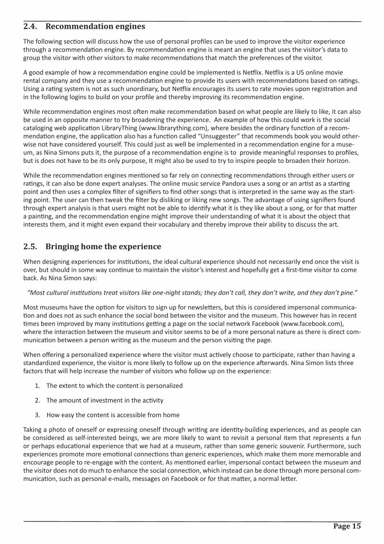
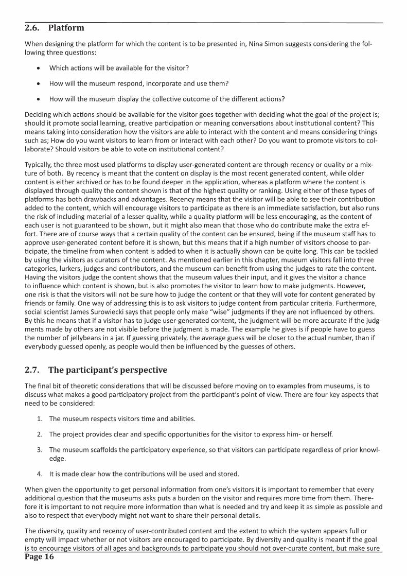
The Cicero project at the Marble Museum of Carrara [13] is a project investigating co-visiting through educational games. The project consists of an educational game on a PDA, where visitors have to gather clues and solve enig-mas in order to find a particular artwork that is hidden beneath puzzle pieces, as can be seen in figure 3. In order to remove the puzzle pieces, visitors must find clues in the museum, which will then remove a puzzle piece and make a piece of information about the hidden artwork available. The visitors will be rewarded points based on the perfor-mance throughout the game and additional points are given when visitors cooperate, and if they get enough points they will be represented on a high score list.
An example of a visit could be: 3 visitors are playing the game and have to find the artwork representing the statue of the goddess Luni, who was a goddess protecting the colony of Luni near the town of Carrara. One player is play-ing an educational mini-game, where the object is to associate a type of marble with a picture, which he solves and furthermore solves another mini-game, which provides the group with two clues – which then reveals two pieces of information about the hidden artwork, from which the group is able to guess which artwork it is.
Laurillau and Paternò do not reflect on which aspects of their project worked or not, they only say that early feed-
Page 18
back from users has been encouraging, so the project will have to be evaluated from the information provided by the paper.
The idea of creating a game that encourages learning through a social context is interesting, and delivering educa-tional content in a fun way through a game is a good way of teaching the visitor something cultural, but without it seeming forced. With that said, Laurillau and Paternò state that the focus of the project was not the educational aspect, but more designing the HCI and designing the collaborate activity, but the interface of the game seems to be too cluttered with icons, when considering that the visitor will likely only be using the interface for a short period of time. The interface can be seen in figure 4. Examining the project in regards to the four key aspects from section 2.7, the project to some extent fulfill two of the four considerations, being that the visitor is not required to have prior knowledge on the artworks used in the game, even though it of course would make the game easier, and that it is stated by the museum how the visitor’s contribution will be used, where the contribution in this case is the score the visitors get in the game that if high enough will be entered on a high score list. However, by having an interface that seems like it might be confusing for some visitors, especially if they also are new to using a PDA and have to become comfortable with that as well, the project does not really consider the ability of its users.
2.9.2. California Academy of Sciences
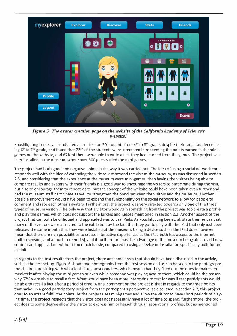
While the Cicero project focused on creating an edutainment experience at the museum, a project carried out at the California Academy of Sciences [14] focused on creating an experience both at the museum, but also for when you leave the museum. The idea was to draw in the visitors by using trendsetting technology, the iPad, and connect the visitors through a social network, and the target audience for the project was 6th and 7th-grade students.
The visitor started out by creating a personal profile on the California Academy of Science’s website, where they were able to make a few limited customizations to their avatar. The avatar creation page can be seen in figure 5. The visi-tor then had to visit the museum and earn points to buy more customizations. These points were earned by playing mini-games at iPad kiosks. Besides being able to customize the avatar, the visitor could also compare his or her scores to the scores of the friends and compare avatars. There were five mini-games available at the museum, which the visitor could play at various iPad kiosks in the museum. The games were all educational games that related to the exhibit they were located at. Besides being able to play mini-games on the iPad, the application developed also had additional information about the exhibits at the museum.
Figure 3. Puzzle pieces are removed when visitors find clues and solve enig-
mas.2
Figure 4. The interface of the Cicero project.2
2. [13]
Page 19
Figure 5. The avatar creation page on the website of the California Academy of Science’s website.3
3. [14]
Koushik, Jung Lee et. al. conducted a user test on 50 students from 4th to 8th-grade, despite their target audience be-ing 6th to 7th-grade, and found that 72% of the students were interested in redeeming the points earned in the mini-games on the website, and 67% of them were able to write a fact they had learned from the games. The project was later installed at the museum where over 300 guests tried the mini-games.
The project had both good and negative points in the way it was carried out. The idea of using a social network cor-responds well with the idea of extending the visit to last beyond the visit at the museum, as was discussed in section 2.5, and considering that the experience at the museum were mini-games, then having the visitors being able to compare results and avatars with their friends is a good way to encourage the visitors to participate during the visit, but also to encourage them to repeat visits, but the concept of the website could have been taken even further and had the museum staff participate as well to strengthen the bond between the visitors and the museum. Another possible improvement would have been to expand the functionality on the social network to allow for people to comment and rate each other’s avatars. Furthermore, the project was very directed towards only one of the three types of museum visitors. The only way that a visitor would gain something from the project was too create a profile and play the games, which does not support the lurkers and judges mentioned in section 2.2. Another aspect of the project that can both be critiqued and applauded was to use iPads. As Koushik, Jung Lee et. al. state themselves that many of the visitors were attracted to the exhibition by the fact that they got to play with the iPad that only just been released the same month that they were installed at the museum. Using a device such as the iPad does however mean that there are rich possibilities to create interactive experiences as the iPad both has access to the internet, built-in sensors, and a touch screen [15], and it furthermore has the advantage of the museum being able to add new content and applications without too much hassle, compared to using a device or installation specifically built for an exhibit.
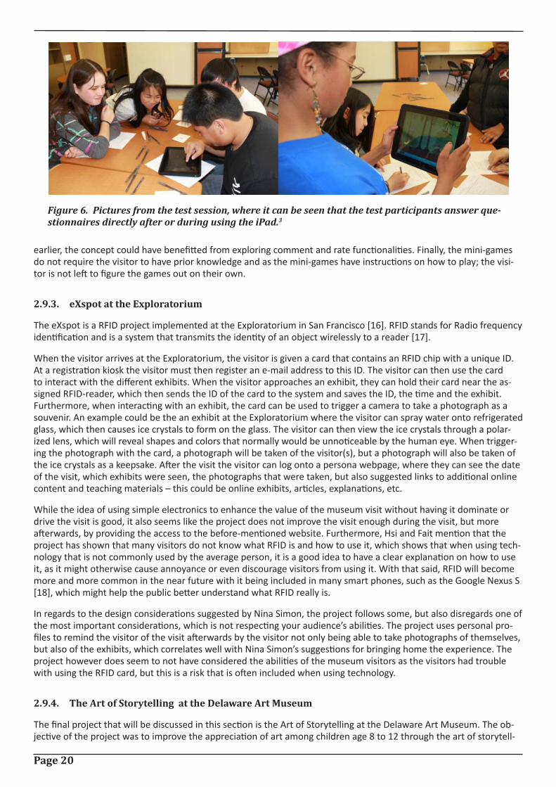
In regards to the test results from the project, there are some areas that should have been discussed in the article, such as the test set-up. Figure 6 shows two photographs from the test session and as can be seen in the photographs, the children are sitting with what looks like questionnaires, which means that they filled out the questionnaires im-mediately after playing the mini-games or even while someone was playing next to them, which could be the reason why 67% were able to recall a fact. What would have been more interesting to test for was if test participants would be able to recall a fact after a period of time. A final comment on the project is that in regards to the three points that make up a good participatory project from the participant’s perspective, as discussed in section 2.7, this project does to an extent fulfill the points. As the project uses mini-games and allow the visitor to have short periods of play-ing time, the project respects that the visitor does not necessarily have a lot of time to spend, furthermore, the proj-ect does to some degree allow the visitor to express him or herself through aspirational profiles, but as mentioned
Page 20
earlier, the concept could have benefitted from exploring comment and rate functionalities. Finally, the mini-games do not require the visitor to have prior knowledge and as the mini-games have instructions on how to play; the visi-tor is not left to figure the games out on their own.
2.9.3. eXspot at the Exploratorium
The eXspot is a RFID project implemented at the Exploratorium in San Francisco [16]. RFID stands for Radio frequency identification and is a system that transmits the identity of an object wirelessly to a reader [17].
When the visitor arrives at the Exploratorium, the visitor is given a card that contains an RFID chip with a unique ID. At a registration kiosk the visitor must then register an e-mail address to this ID. The visitor can then use the card to interact with the different exhibits. When the visitor approaches an exhibit, they can hold their card near the as-signed RFID-reader, which then sends the ID of the card to the system and saves the ID, the time and the exhibit. Furthermore, when interacting with an exhibit, the card can be used to trigger a camera to take a photograph as a souvenir. An example could be the an exhibit at the Exploratorium where the visitor can spray water onto refrigerated glass, which then causes ice crystals to form on the glass. The visitor can then view the ice crystals through a polar-ized lens, which will reveal shapes and colors that normally would be unnoticeable by the human eye. When trigger-ing the photograph with the card, a photograph will be taken of the visitor(s), but a photograph will also be taken of the ice crystals as a keepsake. After the visit the visitor can log onto a persona webpage, where they can see the date of the visit, which exhibits were seen, the photographs that were taken, but also suggested links to additional online content and teaching materials – this could be online exhibits, articles, explanations, etc.
While the idea of using simple electronics to enhance the value of the museum visit without having it dominate or drive the visit is good, it also seems like the project does not improve the visit enough during the visit, but more afterwards, by providing the access to the before-mentioned website. Furthermore, Hsi and Fait mention that the project has shown that many visitors do not know what RFID is and how to use it, which shows that when using tech-nology that is not commonly used by the average person, it is a good idea to have a clear explanation on how to use it, as it might otherwise cause annoyance or even discourage visitors from using it. With that said, RFID will become more and more common in the near future with it being included in many smart phones, such as the Google Nexus S [18], which might help the public better understand what RFID really is.
In regards to the design considerations suggested by Nina Simon, the project follows some, but also disregards one of the most important considerations, which is not respecting your audience’s abilities. The project uses personal pro-files to remind the visitor of the visit afterwards by the visitor not only being able to take photographs of themselves, but also of the exhibits, which correlates well with Nina Simon’s suggestions for bringing home the experience. The project however does seem to not have considered the abilities of the museum visitors as the visitors had trouble with using the RFID card, but this is a risk that is often included when using technology.
2.9.4. The Art of Storytelling at the Delaware Art Museum
The final project that will be discussed in this section is the Art of Storytelling at the Delaware Art Museum. The ob-jective of the project was to improve the appreciation of art among children age 8 to 12 through the art of storytell-
Figure 6. Pictures from the test session, where it can be seen that the test participants answer que-stionnaires directly after or during using the iPad.3
Page 21
ing. The Delaware Art Museum collaborated with Night Kitchen Interactive on the project, [19] which is an interactive design firm focusing on online exhibitions and interpretative installations [20].
The museum asked storytellers, artists, writers and dramatists around the world to send in stories, and they received over 350 stories from 116 people, from which twenty stories were chosen to be used as podcasts and would function as narrated stories that visitors could use for a guided tour of the gallery. The goal of these podcasts was to try and spark a new interest, excitement and meaning to the artworks at the gallery, but also to give the visitors an experi-ence that was different than how they would normally experience a visit at an art museum. The museum then de-veloped a kiosk activity, called Picture a Story, where visitors had the opportunity to create their own stories through their own unique composition of images and words from the museum collection. The visitor must first build the scene, which consists of selecting a genre, background, characters and props. The visitor is then encouraged to write and record a narration of their story, which consists of their interpretation of what is happening in their scene. Part of the concept of the project was as well to develop an accompanying website, where visitors of the website could read the contributed stories, but also create their own stories.
The project was evaluated in two parts with one evaluation focusing on how whether or not visitor-contributed con-tent had value to the participants and the other evaluation being on how the project impacted visitors who used the stories, but not contributed.
As said, the first evaluation was on the 116 contributors and their experiences after the project. The contributors were contacted by e-mail and asked how they project had impacted their life, especially in regards to the way the think about art. 64 of the contributors responded to the e-mail and 92% of the 64 said that they after the project felt more connected to the artwork they had written their story on or to the museum. 59% of those 92% said that they felt more connected to museums in general. 94% of the 64 had visited a museum since the project, while 35% of the 64 said that they look at museums differently after the project. 52% of those 35% said that they now look for stories in art, while 24% of them said they find more personal meaning from looking at art, and 10% said that they find it more fun to look at art. Furthermore, 34 of the contributors said that the project had inspired them, from which 26% said that it had changed the way they look at art, 29% said that they had continued to think about the specific art-work and some of them had even done additional research on the artwork, and finally, 33% felt that they were now more creative in their own art.
The goal of the second evaluation was to see how the project would impact visitors who listened to the contributed stories and was done on elementary school students – more precisely; the goal was to see if the project had an im-pact on the creativity of the students, e.g. length of stories, number of adjectives and inclusion of visual details of the art. The museum selected some of the contributed stories and presented them to the students, who had to write sto-ries before and after their visit to the museum, and the stories had to be inspired from an artwork. In order to have some data to compare the impact too, the students were split in two groups, where one group had the iPod podcasts and were given the opportunity to use the Picture a Story kiosk, while the second group would conduct a normal visit without any tools available. Two different runs of the evaluation was done, one on students from a charter school that regularly visited the museum and therefore were more experienced visitors, and one on students from a school in the neighborhood who seldom visited museums. The evaluation found that the students from the neighborhood school showed a slight improvement in creativity between the story pre-visit and the story after the visit, however, the evaluation did not show any significant impact had occurred, but the students were able to recall details from the podcast tours or about the artworks.
This project is very interesting in the way it explores new ways to promote curiosity among visitors and tries to ex-plore new ways to look at art. The idea to use narratives created by storytellers instead of curators as podcasts is very interesting as it might encourage the visitor to look differently at the art than had it been a curator talking about the art. Furthermore, the Picture a Story activity is an interesting way to encourage the visitor to be creative and play around the artworks. By having both podcasts and the Picture a Story kiosk, the museum caters both to the needs of lurkers and contributors, as mentioned in section 2.2, which is certainly a strength of the project. However, as the pa-per also mentions, one key dilemma was not solved, which is how to use the contributed visitor narratives as visitors will not be encouraged to contribute if their contribution is not going to be used for anything. Examining the project in regards to section 2.7, the project certainly provides the visitor with the opportunity to express him or herself cre-atively in a unique experience, but when the project however fails to provide an outlet for the contribution, the proj-ect seems like a good, although lacking attempt at creating a new and creative experience for museum visitors.
Page 22
2.9.5. Lessons learned from examples
The final subsection of this chapter will focus on what can be learned from the examples discussed in the above sec-tion.
From the Cicero Project the lesson learned would be that it is important to make the interface as simple as possible, as it is important to remember that the visitor is likely to only use the product for a short period of time, and the learning curve of the product must therefore be very easy. If the product looks cluttered or is difficult to use, the visi-tor might be discouraged from using it. One way to ensure that the product is easy to use for the target audience is to test the interface of the product on them during the design phase.
The lesson that can be taken from the project carried out at the California Academy of Sciences is that social websites are well-worth considering using in some way in one’s product due to several reasons. One reason is that social web-sites offer a valuable opportunity to extend the museum visit beyond the single visit and this could help strengthen the social bond between the visitor and the museum, and possibly turning a single visit into multiple visits. Further-more, by having the visitor post e.g. a photo or simply a message on his or her Facebook Wall, the museum will get free viral advertisement to a segment that might otherwise be difficult for the museum to attract.
eXspot from the Exploratorium basically showed the same lesson as the Cicero Project, which is when using technol-ogy that the visitor might not be accustomed to using, it is important that the visitor will know how to perform the available tasks.
The Art of Storytelling from the Delaware Art Museum was a very interesting project, but an important lesson that can be taken from it is to ensure that if the visitors are providing user-generated content for the museum, it is ex-tremely important that there is an appropriate outlet for the content, so the visitors will both be encouraged to gen-erate content and so that they will feel that the content is valued.
This chapter has focused on important considerations that should be made when designing a participatory activity for museum visitors and examples of activities have been examined. The next chapter will focus on the activity that will be developed for this project and will use the considerations and lessons from this chapter as an inspiration in the design thereof.
Page 23
3. Product requirementsIn the book “Interaction Design: Beyond human-computer interaction” [21] the authors Sharp, Rogers and Preece say that there are three fundamental activities that are a part of every design, being understanding the requirements for one’s product, producing a design that satisfies those requirements and evaluating the design. Therefore, the fol-lowing chapter will focus on the requirements for the product, while the next chapters will focus on the design and evaluation of the design.
The first section will focus on determining the idea that will be developed, while the second section will focus on the requirements for this idea.
3.1. Project idea
As mentioned above, this section will focus on determing the project idea with the first subsection discussing the intial ideas and which idea was selected and the subsection describing this idea more fully.
3.1.1. Initial ideas
Having explored the different areas that Nina Simon suggests need to be considered when designing a participatory project, and having looked at and evaluated former participatory projects, three initial project ideas have been made.
The first idea is primarily based on the idea of creating a personalized museum visit through the use of an adaptive museum guide. The idea is inspired by the section on recommendation engines from the previous chapter, section 2.4, and the idea is to create a museum guide application that will learn from the actions of the visitor and continu-ously adapt the guide to match the preferences of the visitor. When the visitor enters the application for the first time, the visitor must either log-in with a Facebook account or create a user. The visitor is then presented with a number of paintings, where the visitor is asked to click on the paintings that he or she likes. The selected paintings will then be used to create a filter based on these paintings that will represent the interests of the visitor. The filter will consist of signifiers describing the paintings that will be selected by art experts. Additionally, if the visitor has logged in with a Facebook account, information could as well be gathered from Facebook to get additional informa-tion on the visitor’s interest to improve the filter. The application will now be able to provide the visitor with a per-sonalized guide to the visit, while also enticing the visitor to experience art that lies outside the interest of the visitor.
The second idea is a more user-contributed project. The idea is to create a painting application where the visitor will be able to create a painting of their own based on a certain painting style; this could be abstract, pointillism or other styles. When selecting a style, the visitor will be prompted with a short introduction to this style that explains shortly what signifies the style, such as that pointillism is a painting consisting of a large amount of tiny dots that together form a larger scene [11]. After having finished the painting, the visitor is provided with the opportunity to share the painting either by uploading the painting to the museum’s database, where it will be shown on both the Facebook page of the museum, but also on flat screens placed in the museum.
The third and final idea is also a painting application. However, this idea is of a more social nature than the second idea. This painting application would instead of having the visitor create a painting of his or her own, have the visitor continue a social painting. By that is meant that the visitor is presented with the outer right side of the previous visi-tor’s painting, and the visitor must then continue this painting. Furthermore, the object is not to merely continue a painting, but to continue a story. The museum, or a staff member really, will create the first piece of the social paint-ing story, which consists of a painting and a story. An example could be that the painting, or what is more a scene, is of a small cottage and the storyline is “The story begins at a small cottage in the countryside of Denmark…”, the visi-tor is then shown this storyline along with the outer right side of the scene. What is shown of the scene is very lim-ited and the visitor is encouraged to use his or her imagination to visualize what the previous scene looked like, but must now continue the story. The story should only continue for a certain amount of time, after which the full story and painting should be uploaded to the museum’s Facebook page and put on display at the museum.
With three ideas created, the next step is to select one of the ideas to further explore. Each of the three ideas have both drawbacks and interesting aspects. The adaptive museum guide would be an interesting approach to improving a standard museum guide to adapt to each visitor to better cater to the visitor’s needs and wants, but at the same time, the visitor would not be very involved other than providing data to the filter. The second idea is an interesting way to try to teach the visitor about the different styles of paintings, but without it seeming like learning is being forced upon the visitor, but rather provided in a fun and creative setting. However, in its current form, the idea might as well be a project that is unrelated to KUNSTEN, as it does not as such include the museum or its collection. While

Page 24
the third idea could be a fun, entertaining and creative project, the idea seems again too unrelated to KUNSTEN and seems more like an entertaining project, rather than one that is of value to the visit at the museum.
With the abovementioned reflections on the ideas in mind, the second idea has been chosen as the one to be further explored as it seems to be the idea that is most suited for the target audience, but also the one that correlates best to the vision of the project, as mentioned in section 1.1.
3.1.2. Final idea
The selected idea will be a contributory project with a necessary contribution approach, as discussed in section 2.1, as without any user contributions, the project cannot run. The idea has been named “Den Lille Maler, or “The Little Painter” in English, and the idea is to create an educational painting application that will teach the user how different painting styles are defined and what signifies them.
The application will be developed for the Apple iPad, which was chosen because of a desire to have the application on a mobile device, so it would not be bound to a stationary area at the museum, which left the choice between a smartphone and a tablet. A smartphone could have been a possibility, but the larger screen that tablets provide was considered important, considering that the application would be a painting application. Choosing the iPad over other tablets was mostly based on the fact that KUNSTEN already owns three iPads.
When the user enters the application, the user can choose a style to paint in or choose to browse the gallery of con-tributions made by previous users. Choosing a style will direct the user to a new screen, where the user will be given a short introduction to that specific style. The information provided in the introduction must be designed in a fashion that does not make the learning aspect seem forced, but rather as inspiring. When the user is ready to continue, the user is directed to a screen consisting of a canvas and a toolbar with the tools available for that style. When the user feels that the painting is done, the user will have various options; the user can get a printed copy of the painting in the museum shop, the user can e-mail the painting to an e-mail of his or her choosing, the painting can be uploaded to the user’s Facebook Wall, or the painting can be submitted to the application’s database.
Besides the iPad, there should furthermore be placed a couple of touch screens at the museum, where visitor-con-tributions will be shown. The standard setting of the touch screen should be to show the newest additions to the ap-plication’s database, but it should furthermore be possible to view the contributions in order of rating. When viewing the gallery, which consists of the contributions from the database, visitors can rate the paintings and every 3 months or so the museum puts the highest rated contributions on display.
The idea has taken inspiration from chapter 2 on the participatory museum in various ways. From section 2.5. on “Bringing home the experience”, the content is made easy accessible for the visitor from home by having the options of both printing out a copy of the painting made with the application, sending the painting to an e-mail or even up-loading the painting to a Facebook account, which will make the experience more memorable for the visitor and pos-sibly create a more social bond between the museum and the visitor. Furthermore, the product will use a mixture of recency and quality for showing user-contributions, which correlates with one of the platform methods mentioned in section 2.6. By having a mixture, it will be possible to show both the best contributions, but also the newest contribu-tions, thereby making sure that the visitor will always see their contribution added to the collection, which gives an immediate satisfaction.
3.2. Requirements
With the idea in place, the following section will set up specific requirements that should be fulfilled in the design of the product. The section will start with explaining what is meant by requirements, before delving into the different requirements.
Sharp, Rogers and Preece explain requirements as:
“…a statement about an intended product that specifies what it should do or how it should perform.”[21, p.]
Sharp, Rogers and Preece describe two different categories of requirements, being functional requirements and non-functional requirements. Functional requirements say what the system should do, while non-functional requirements are requirements determined by the system and the development. Non-functional requirements can however be di-vided into several subcategories; Data, environmental, user characteristics, usability goals and user experience goals.
Page 25
3.2.1. Functional requirements
The following subsection will discuss the functional requirements for the product, being what the application should do.
The purpose of the product is to try to teach the target audience about different painting styles in an edutainment-like environment, where the educational aspect do not seem forced, but rather as complementing the experience. For the prototype, the painting styles have been limited to abstract and pointilism.
Furthermore, besides the educational aspect, the purpose is as well to create a social bond between the museum and the visitor by having the visitor contributing user-generated art and ratings of art, thereby creating a personal connection between the two parties and giving the visitor the feeling that the museum values the visitor as an indi-vidual. In order to the strengthen the feeling that the content is valued, the idea is that the art can be rated by other visitors and every 2-3 months, the museum displays the highest rated art on the walls at the museum.
Given the purpose of the product, it is necessary to understand how the two painting styles are defined before being able to design and implement a product that incorporates them.
Abstract
About.com describes abstract art as being art without a recognizable subject, but instead the color and form is the painting’s subject and it is completely non-objective or non-representational. Abstract art are also often of figurative abstractions, meaning simplifications of reality from which detail is eliminated from a recognizable subject leaving only a form that is only recognizable to a certain extent. Abstract art is also often found to be either very geometric or very fluid, where spontaneity belies planning. Piet Mondrian is an example of a painter who painted geometric ab-stract paintings and an example of one of his paintings can be seen in figure 7, while Wassily Wassilyevich Kandinsky is an example of one who painted fluid abstract and one of his paintings can be seen in figure 8. [22]
Pointilism
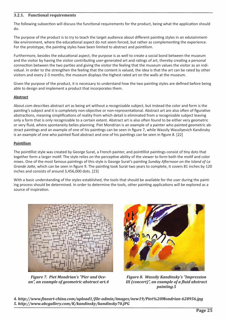
The pointillist style was created by George Surat, a French painter, and pointillist paintings consist of tiny dots that together form a larger motif. The style relies on the perceptive ability of the viewer to form both the motif and color mixes. One of the most famous paintings of this style is George Surat’s painting Sunday Afternoon on the Island of La Grande Jatte, which can be seen in figure 9. The painting took Surat two years to complete, it covers 81 inches by 120 inches and consists of around 3,456,000 dots. [23]
With a basic understanding of the styles established, the tools that should be available for the user during the paint-ing process should be determined. In order to determine the tools, other painting applications will be explored as a source of inspiration.
Figure 7. Piet Mondrian’s ”Pier and Oce-an”, an example of geometric abstract art.4
Figure 8. Wassily Kandinsky’s ”Impression III (concert)”, an example of a fluid abstract
painting.5
4. http://www.fineart-china.com/upload1/file-admin/images/new19/Piet%20Mondrian-628956.jpg5. http://www.abcgallery.com/K/kandinsky/kandinsky70.JPG
Page 26
3.2.1.1. Painting applications
The following subsection will look at other painting applications to get inspiration for which tools should be consid-ered for the application.
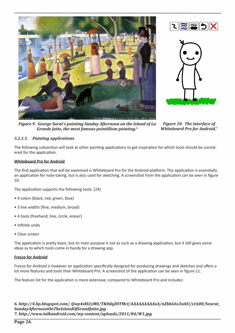
Whiteboard Pro for Android
The first application that will be examined is Whiteboard Pro for the Android platform. The application is essentially an application for note-taking, but is also used for sketching. A screenshot from the application can be seen in figure 10.
The application supports the following tools: [24]
• 4 colors (black, red, green, blue)
• 3 line widths (fine, medium, broad)
• 4 tools (freehand, line, circle, eraser)
• Infinite undo
• Clear screen
The application is pretty basic, but its main purpose it not as such as a drawing application, but it still gives some ideas as to which tools come in handy for a drawing app.
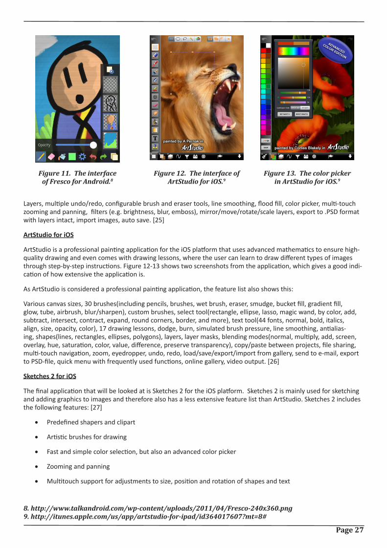
Fresco for Android
Fresco for Android is however an application specifically designed for producing drawings and sketches and offers a lot more features and tools than Whiteboard Pro. A screenshot of the application can be seen in figure 11.
The feature list for the application is more extensive, compared to Whiteboard Pro and includes:
Figure 9. George Surat’s painting Sunday Afternoon on the Island of La Grande Jatte, the most famous pointillism painting.6
Figure 10. The interface of Whiteboard Pro for Android.7
6. http://4.bp.blogspot.com/_Qwp4xl02sM0/TK0dqZOTMcI/AAAAAAAAAoA/nZbkG6s3wkU/s1600/Seurat_SundayAfternoonOnTheIslandOfGrandJatte.jpg7. http://www.talkandroid.com/wp-content/uploads/2011/04/W1.jpg
Page 27
Layers, multiple undo/redo, configurable brush and eraser tools, line smoothing, flood fill, color picker, multi-touch zooming and panning, filters (e.g. brightness, blur, emboss), mirror/move/rotate/scale layers, export to .PSD format with layers intact, import images, auto save. [25]
ArtStudio for iOS
ArtStudio is a professional painting application for the iOS platform that uses advanced mathematics to ensure high-quality drawing and even comes with drawing lessons, where the user can learn to draw different types of images through step-by-step instructions. Figure 12-13 shows two screenshots from the application, which gives a good indi-cation of how extensive the application is.
As ArtStudio is considered a professional painting application, the feature list also shows this:
Various canvas sizes, 30 brushes(including pencils, brushes, wet brush, eraser, smudge, bucket fill, gradient fill, glow, tube, airbrush, blur/sharpen), custom brushes, select tool(rectangle, ellipse, lasso, magic wand, by color, add, subtract, intersect, contract, expand, round corners, border, and more), text tool(44 fonts, normal, bold, italics, align, size, opacity, color), 17 drawing lessons, dodge, burn, simulated brush pressure, line smoothing, antialias-ing, shapes(lines, rectangles, ellipses, polygons), layers, layer masks, blending modes(normal, multiply, add, screen, overlay, hue, saturation, color, value, difference, preserve transparency), copy/paste between projects, file sharing, multi-touch navigation, zoom, eyedropper, undo, redo, load/save/export/import from gallery, send to e-mail, export to PSD-file, quick menu with frequently used functions, online gallery, video output. [26]
Sketches 2 for iOS
The final application that will be looked at is Sketches 2 for the iOS platform. Sketches 2 is mainly used for sketching and adding graphics to images and therefore also has a less extensive feature list than ArtStudio. Sketches 2 includes the following features: [27]
• Predefined shapers and clipart
• Artistic brushes for drawing
• Fast and simple color selection, but also an advanced color picker
• Zooming and panning
• Multitouch support for adjustments to size, position and rotation of shapes and text
Figure 11. The interface of Fresco for Android.8
Figure 12. The interface of ArtStudio for iOS.9
Figure 13. The color picker in ArtStudio for iOS.9
8. http://www.talkandroid.com/wp-content/uploads/2011/04/Fresco-240x360.png9. http://itunes.apple.com/us/app/artstudio-for-ipad/id364017607?mt=8#
Page 28
• Changeable background
• Maps integration
• Export options with possibility of sharing via twitter and mail
• Eraser, undo, redo and revert
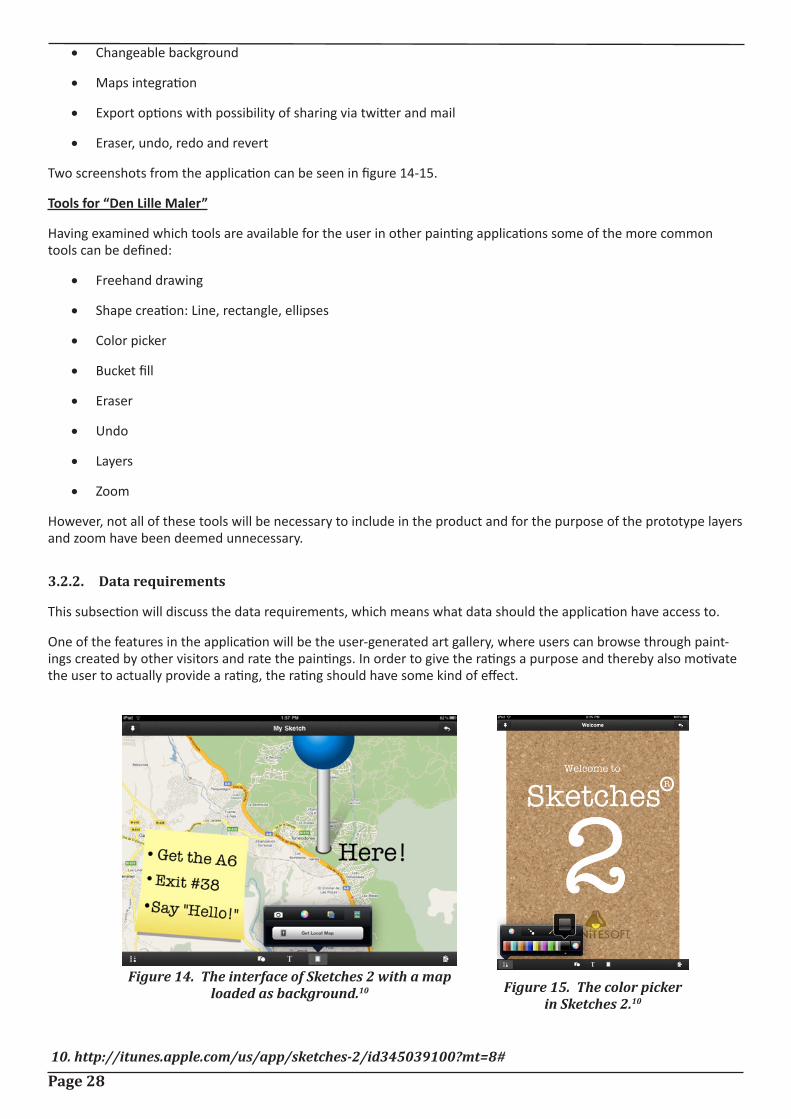
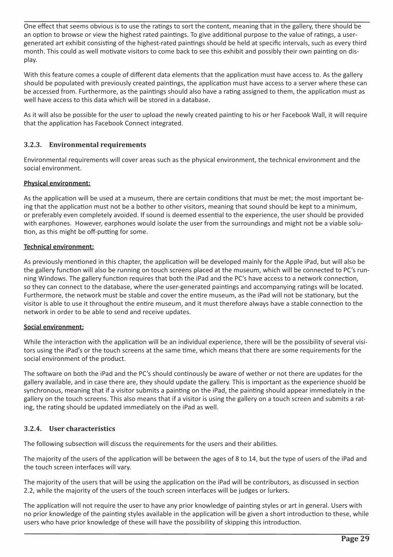
Two screenshots from the application can be seen in figure 14-15.
Tools for “Den Lille Maler”
Having examined which tools are available for the user in other painting applications some of the more common tools can be defined:
• Freehand drawing
• Shape creation: Line, rectangle, ellipses
• Color picker
• Bucket fill
• Eraser
• Undo
• Layers
• Zoom
However, not all of these tools will be necessary to include in the product and for the purpose of the prototype layers and zoom have been deemed unnecessary.
3.2.2. Data requirements
This subsection will discuss the data requirements, which means what data should the application have access to.
One of the features in the application will be the user-generated art gallery, where users can browse through paint-ings created by other visitors and rate the paintings. In order to give the ratings a purpose and thereby also motivate the user to actually provide a rating, the rating should have some kind of effect.
Figure 14. The interface of Sketches 2 with a map loaded as background.10 Figure 15. The color picker
in Sketches 2.10
10. http://itunes.apple.com/us/app/sketches-2/id345039100?mt=8#
Page 29
One effect that seems obvious is to use the ratings to sort the content, meaning that in the gallery, there should be an option to browse or view the highest rated paintings. To give additional purpose to the value of ratings, a user-generated art exhibit consisting of the highest-rated paintings should be held at specific intervals, such as every third month. This could as well motivate visitors to come back to see this exhibit and possibly their own painting on dis-play.
With this feature comes a couple of different data elements that the application must have access to. As the gallery should be populated with previously created paintings, the application must have access to a server where these can be accessed from. Furthermore, as the paintings should also have a rating assigned to them, the application must as well have access to this data which will be stored in a database.
As it will also be possible for the user to upload the newly created painting to his or her Facebook Wall, it will require that the application has Facebook Connect integrated.
3.2.3. Environmental requirements
Environmental requirements will cover areas such as the physical environment, the technical environment and the social environment.
Physical environment:
As the application will be used at a museum, there are certain conditions that must be met; the most important be-ing that the application must not be a bother to other visitors, meaning that sound should be kept to a minimum, or preferably even completely avoided. If sound is deemed essential to the experience, the user should be provided with earphones. However, earphones would isolate the user from the surroundings and might not be a viable solu-tion, as this might be off-putting for some.
Technical environment:
As previously mentioned in this chapter, the application will be developed mainly for the Apple iPad, but will also be the gallery function will also be running on touch screens placed at the museum, which will be connected to PC’s run-ning Windows. The gallery function requires that both the iPad and the PC’s have access to a network connection, so they can connect to the database, where the user-generated paintings and accompanying ratings will be located. Furthermore, the network must be stable and cover the entire museum, as the iPad will not be stationary, but the visitor is able to use it throughout the entire museum, and it must therefore always have a stable connection to the network in order to be able to send and receive updates.
Social environment:
While the interaction with the application will be an individual experience, there will be the possibility of several visi-tors using the iPad’s or the touch screens at the same time, which means that there are some requirements for the social environment of the product.
The software on both the iPad and the PC’s should continously be aware of wether or not there are updates for the gallery available, and in case there are, they should update the gallery. This is important as the experience shuold be synchronous, meaning that if a visitor submits a painting on the iPad, the painting should appear immediately in the gallery on the touch screens. This also means that if a visitor is using the gallery on a touch screen and submits a rat-ing, the rating should be updated immediately on the iPad as well.
3.2.4. User characteristics
The following subsection will discuss the requirements for the users and their abilities.
The majority of the users of the application will be between the ages of 8 to 14, but the type of users of the iPad and the touch screen interfaces will vary.
The majority of the users that will be using the application on the iPad will be contributors, as discussed in section 2.2, while the majority of the users of the touch screen interfaces will be judges or lurkers.
The application will not require the user to have any prior knowledge of painting styles or art in general. Users with no prior knowledge of the painting styles available in the application will be given a short introduction to these, while users who have prior knowledge of these will have the possibility of skipping this introduction.
Page 30
3.2.5. Usability goals
This subsection will set up specific usability goals that the design and implementation of the application should ad-here to.
One of the most important issues, when creating an interactive product is to make the product safe for the user, which basically means to reduce the risk of the user making errors or faulty selections. In the application being devel-oped in this project, there will be various ways in which the user can make mistakes, such as drawing a wrong shape, drawing in the wrong color, deleting something that should not have been deleted or mistakenly switching back to the main screen without saving the painting. Therefore, there must be taken measures to cope with the varies ways in which mistakes can occur. This means that in cases where the action of the user might have a serious effect on the painting, the user should be asked to confirm the choice to avoid any mistakes. Furthermore, notifications should be shown in various situations throughout the application in order to provide the user with visual feedback on choices. Another way of providing the user with a sense of security is by implementing an undo, which will give the user the possiblity of undoing any mistakenly performed action. The GUI can as well be designed to reduce the risk of select-ing the wrong action, this can be done by not placing buttons that perform opposite actions of each other close to-gether, e.g placing a delete button next to a save button could produce a grave error.
Another usability aspect is the learnability of the application. Learnability refers to how easy the application is to learn to use [21]. Considering that the application will most likely only be used for a short period of time by the user, the application should be designed in a way that makes it easy for a visitor to pick it up and quickly learn to use it. One way of ensuring this is to follow the Apple iOS Human Interface Guidelines [28], which will ensure that the expe-rience of using the application is somewhat similar to the experience of using other iOS applications. By follow those guidelines, people who have used either a iPhone, iPod or iPad will feel more familiar with the application. To further enhance the learnability of the interface, it would be wise to use icons that will be recognizable by the users.
3.2.6. User experience goals
This final subsection will set up requirements for the experience of using the application.
The user experience goals should reflect both the vision, which was described in section 1.1, and the usability of the application, and therefore the following keywords have been chosen as the ones that should describe the experience the user has of using the application:
• Satisfying
• Enjoyable
• Engaging
• Entertaining
• Motivating
• Supportive of creativity
Having gone through the different types of requirements, the following section will sum up the requirements found.
3.2.7. List of requirements
The following section will sum up the different requirements that have been determined earlier in the chapter.
Functional requirements:
• The application will teach the user about the painting styles abstract and pointilism.
• The application will enhance the social bond between the user and the museum.
• The following tools will be available for the user: Freehand drawing, shape creation, color picker, bucket fill, eraser, undo.
Page 31
Data requirements:
• The application must have access to a server containing the previously generated paintings.
• The application must have access to a database, which contains the ratings associated with the paintings from the gallery.
• The application must integrate Facebook Connect to allow for the user to upload a painting to his or her Facebook Wall.
Environmental requirements:
• The use of sound in the application must be kept to a minimum.
User characteristics:
• The majority of the users are between 8 to 14.
• The main users of the iPad application will be of the category contributors, while the main users of the touch screen will be judges and lurkers.
• The user is not required to have any prior knowledge of painting styles or art.
Usability goals:
• The user feels safe in using the application.
• Notifications provide the user with visual feedback on choices.
• The learning curve of the application is easy.
User experience goals:
• The following keywords and phrases describes the user experience of the application: Satisfying, enjoyable, engaging, entertaining, motivating and supportive of creativity.
With the requirements set, the next chapter will focus on designing the first iteration of the prototype of the product.
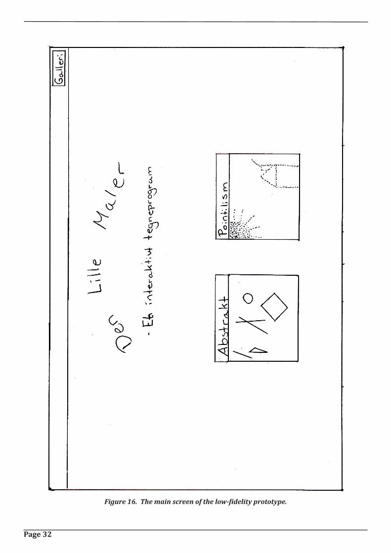
Page 32
Figure 16. The main screen of the low-fidelity prototype.
Page 33
4. Low-fidelity prototypeThe following chapter will go through the limitation, design and test of the low-fidelity prototype.
The first section will focus on how the prototype has been limited in regards to the concept described in the previ-ous chapter, whil the secon section will discuss the design of the individual element according to guidelines specified by Apple. The final section will discuss how the test of the low-fidelity prototype was conducted and what the test showed.
4.1. Prototype limitations
The following section will discuss what will be included in the first prototype of the application, and why the specific limitations have been chosen.
It has been decided that the first prototype should focus mainly of the core functionality of the application, which is the painting feature. The main reason for this is the desire that the learning aspect of the application should not seem forced, which has sparked the idea to test how little learning can be included for the user to actually learn so-mething from the application. Therefore the introduction that was discussed in section 3.1.2. will be replaced in the first prototype and a visual cue of each style will instead be used. By visual cue is meant that on the main screen of the application, the styles will be represented by a painting of each style, and it will be tested if this cue would be enough to give the user a notion of what defines that style.
Another limitation has been to focus on the application on the iPad and not develop the content for the touch scree-ns. This was chosen as the touch screens are a part of the concept as a whole, but they will not be essential for the purpose of the test that will be carried out.
Some limitations have been set as well for the application for the iPad. Facebook has in the first iteration of the pro-totype been deemed unnecessary and will not be included until a later iteration. Furthermore, the styles that will be available to choose between have been limited to the two styles discussed in section 3.1, being abstract and pointil-lism.
With the limitations set, the next section will focus on the designing the different elements of the prototype.
4.2. Designing the elements
The following section will break down the prototype into the different screens and elements that will be needed and then design these according to the Apple iOS Human Interface Guidelines [28].
The prototype can be broken down into the following screens; the main screen, the abstract canvas, the pointillism canvas, the gallery (with two subscreens, sorted by rating and sorted by recency) and the screen for viewing a certain painting.
4.2.1. The main screen
The main screen is the first screen that the user sees when entering the application. The main screen should provide the user with 3 different possibilities; to view the gallery or to paint in one of the two available styles. Therefore ap-propriate methods of providing these options should be found.
As the gallery function is not considered the main function of the application, the focus should be on the possibil-ity of choosing between the two styles. iOS provides the possibility of displaying a navigation bar at the top of one’s application, which can be used for, as the name might suggest, navigational purposes, such as allowing the user to easily navigate back to the previous screen. It therefore seems like the appropriate place to place a button that would navigate the user to a new screen, so the gallery function has been given a button in the right side of the navigation bar, as can be seen in figure 16.
The two styles are the main functions of the screen and should therefore draw the user’s attention and be easy to recognize as being buttons, so the user will know how to interact with them. It has therefore been chosen to place two custom-made buttons at the center of the screen with each button showing a painting representing the specific style, as can be seen in figure 16.
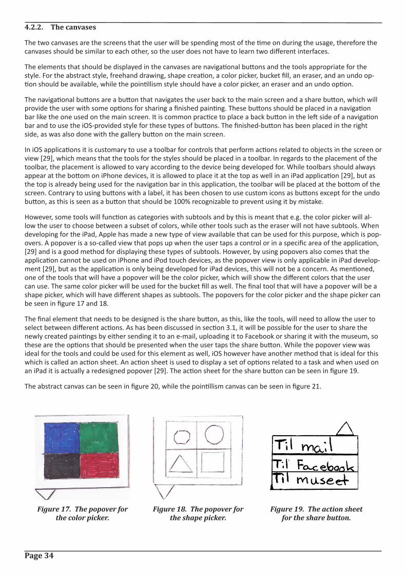
Page 34
4.2.2. The canvases
The two canvases are the screens that the user will be spending most of the time on during the usage, therefore the canvases should be similar to each other, so the user does not have to learn two different interfaces.
The elements that should be displayed in the canvases are navigational buttons and the tools appropriate for the style. For the abstract style, freehand drawing, shape creation, a color picker, bucket fill, an eraser, and an undo op-tion should be available, while the pointillism style should have a color picker, an eraser and an undo option.
The navigational buttons are a button that navigates the user back to the main screen and a share button, which will provide the user with some options for sharing a finished painting. These buttons should be placed in a navigation bar like the one used on the main screen. It is common practice to place a back button in the left side of a navigation bar and to use the iOS-provided style for these types of buttons. The finished-button has been placed in the right side, as was also done with the gallery button on the main screen.
In iOS applications it is customary to use a toolbar for controls that perform actions related to objects in the screen or view [29], which means that the tools for the styles should be placed in a toolbar. In regards to the placement of the toolbar, the placement is allowed to vary according to the device being developed for. While toolbars should always appear at the bottom on iPhone devices, it is allowed to place it at the top as well in an iPad application [29], but as the top is already being used for the navigation bar in this application, the toolbar will be placed at the bottom of the screen. Contrary to using buttons with a label, it has been chosen to use custom icons as buttons except for the undo button, as this is seen as a button that should be 100% recognizable to prevent using it by mistake.
However, some tools will function as categories with subtools and by this is meant that e.g. the color picker will al-low the user to choose between a subset of colors, while other tools such as the eraser will not have subtools. When developing for the iPad, Apple has made a new type of view available that can be used for this purpose, which is pop-overs. A popover is a so-called view that pops up when the user taps a control or in a specific area of the application, [29] and is a good method for displaying these types of subtools. However, by using popovers also comes that the application cannot be used on iPhone and iPod touch devices, as the popover view is only applicable in iPad develop-ment [29], but as the application is only being developed for iPad devices, this will not be a concern. As mentioned, one of the tools that will have a popover will be the color picker, which will show the different colors that the user can use. The same color picker will be used for the bucket fill as well. The final tool that will have a popover will be a shape picker, which will have different shapes as subtools. The popovers for the color picker and the shape picker can be seen in figure 17 and 18.
The final element that needs to be designed is the share button, as this, like the tools, will need to allow the user to select between different actions. As has been discussed in section 3.1, it will be possible for the user to share the newly created paintings by either sending it to an e-mail, uploading it to Facebook or sharing it with the museum, so these are the options that should be presented when the user taps the share button. While the popover view was ideal for the tools and could be used for this element as well, iOS however have another method that is ideal for this which is called an action sheet. An action sheet is used to display a set of options related to a task and when used on an iPad it is actually a redesigned popover [29]. The action sheet for the share button can be seen in figure 19.
The abstract canvas can be seen in figure 20, while the pointillism canvas can be seen in figure 21.
Figure 17. The popover for the color picker.
Figure 18. The popover for the shape picker.
Figure 19. The action sheet for the share button.
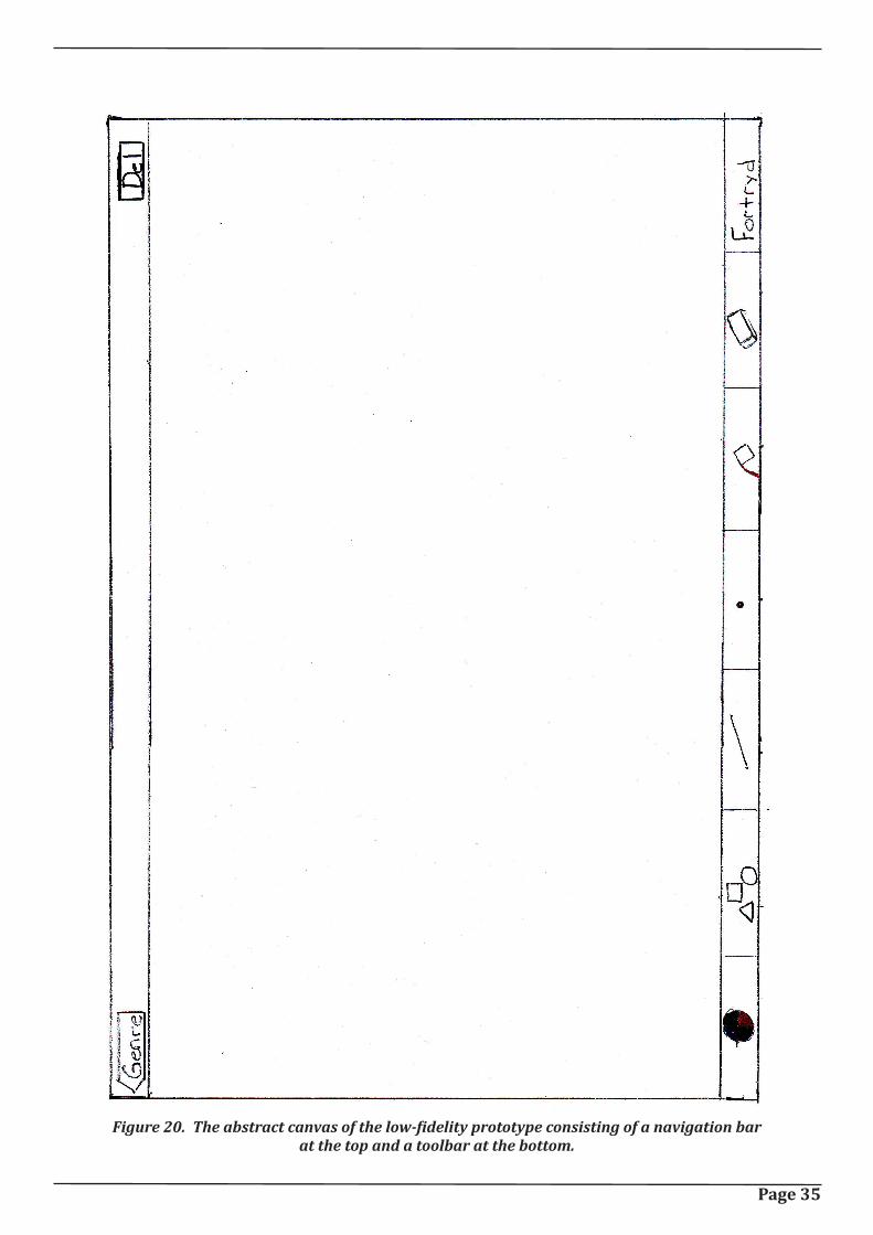
Page 35
Figure 20. The abstract canvas of the low-fidelity prototype consisting of a navigation bar at the top and a toolbar at the bottom.
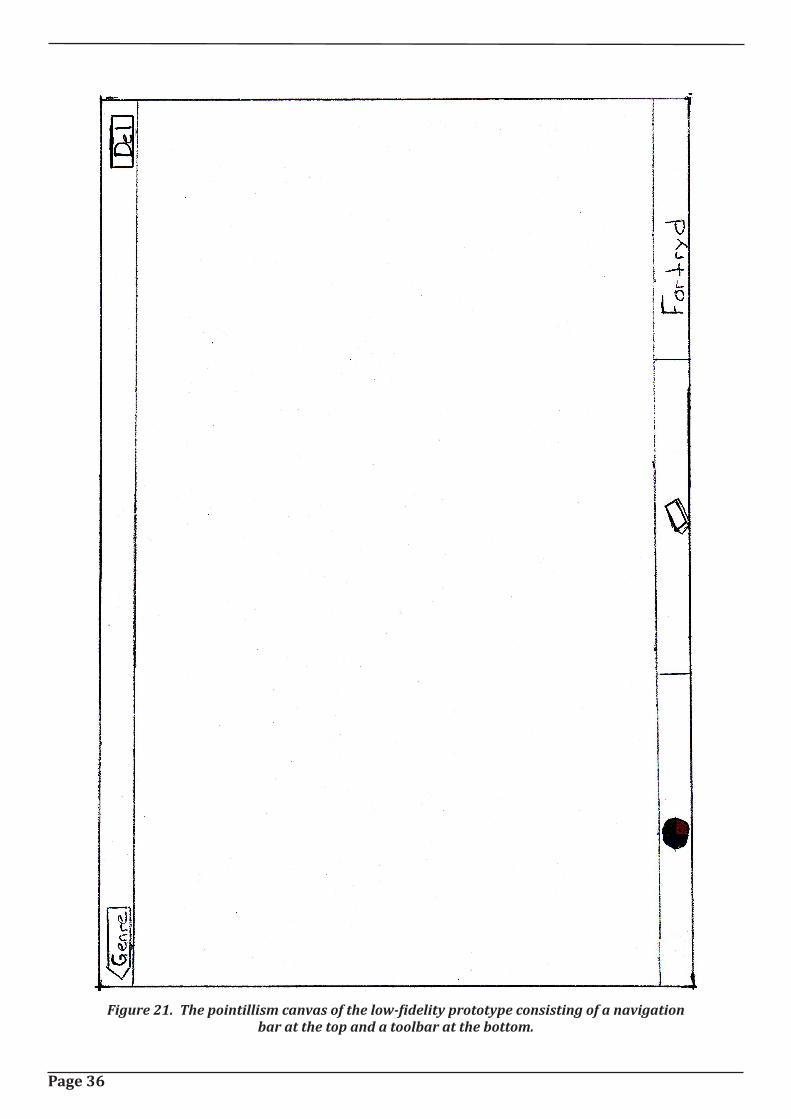
Page 36
Figure 21. The pointillism canvas of the low-fidelity prototype consisting of a navigation bar at the top and a toolbar at the bottom.
Page 37
4.2.3. The gallery
As previously mentioned, the gallery will consist of three different subscreens. As it will be possible for the user to view the gallery sorted either by top rated or by recency, there will be a subscreen for each of these, and there will furthermore be a subscreen for when the user is viewing a painting.
If it should be possible for a user to switch between more than one subscreen, iOS applications customarily use a tab bar, which is placed at the bottom of the screen. [29] So a tab bar will be used and it will contain two tabs, one for the top rated subscreen and one for the recency subscreen. A tab is presented by an icon and a label and iOS provides standard icons that developers can use for both top rated and for most recent, so these will be used [29]. In order for the user to see which tab is currently being shown, the chosen tab will be highlighted.
In addition to the tab bar to control the sorting order, the user should also be provided with a navigational button at the top left corner of a navigation bar, which will send the user back to the main screen.
While the elements discussed so far are elements that will be the same for all the gallery screens, the only difference will be in what content is presented in the middle of the screen. The top rated screen will list the user-generated paintings in order, from left to right, the recency screen will list the paintings in order of recency, from left to right, and the viewing screen will show the selected painting and a slider and a submit button for rating the painting.
The three screens can be seen in figure 22-24.
4.3. Testing the low-fidelity prototype
The following section will discuss how the previously designed low-fidelity prototype will be tested, what will be tested for and what the results of the test showed.
4.3.1. Test design
This first subsection will discuss the low-fidelity test design, which will consist of who will be tested on, what will be tested for, which type of test will be carried out, and how the prototype will be tested.
The first thing that will be discussed is who will be tested on. The test will actually be divided in two tests with differ-ent test participants. The first test will be on the target audience as these are the people that actually be using the application, so their input is essential in this part of the development as in the current stage of development changes can still be made without too much hassle. The second test will be on students from the 10th semester of Medialogy, who have almost 5 years experience with developing human-computer interfaces and interactive products, and they are therefore seen as being able to provide extremely valuable feedback on the design.
The next thing that will be discussed is what will be tested for in these two tests and what the tests should enlighten about the design. The main purpose of the tests is to test whether or not the design choices made in the previous section are the right choices or if the design should be redesigned, therefore the tests will focus on the navigational aspects of the design and on the choices of words and icons.
The final thing that will need to be clarified is which type of test will be carried out and how the test will be done. There exists various ways in which one can test a low-fidelity prototype, and the one that will be used in this project is known as “prototyping with index cards” [21]. What this means is that an index card, or in this case a piece of pa-per, will be made for each of the screens in the application and the test participant will be given some assignments that will guide him or her through the different screens to see whether or not the design choices made match the way that the user will be interacting with the application. While the two tests will be of the same type, the way that they will be run will vary. The test on the target audience will be focusing on giving the test participants tasks and seeing if they can figure out how to perform the given task in the application, while the test on the experts will be carried out as a discussion between the expert and the test leader while the experts carry out the same tasks as the ones given to the target audience. The tasks given to the test participants can be found in the appendix (Tests/Low-fidelity).
After the test on the target audience, they will be asked a few questions to provide some data on areas such as their experience with touch interfaces and their museum habits. The questions can be found in the appendix as well.
Page 38
4.3.2. Test results
The final subsection of this chapter will discuss how many people were tested on, what the low-fidelity test showed and if something should have been done differently.
The number of test participants wound up being 3 from the target audience and 3 experts. While only 3 from the target audience was slightly below the desired number of people, it still gave some valuable feedback. The test on the experts however showed to be the most informative, as they provided much more information than the target audience. The target audience seemed to be less talkative than the experts and simply did what was asked and not much more.
The results and valuable information gained from the two test runs was rather mixed. The test on the target audi-ence showed that the 3 test participants had no problems navigating around in the application, but some icons were less recognizable than others. The icon that all of them had some difficulty recognizing was the icon for the freehand tool, while the rest of the design worked well. The biggest issue with the test was that the 2nd and 3rd test participant seemed to not be fully comfortable with a low-fidelity test, when the test first began, but they slowly became more comfortable during the test. This was seen in the fact that with the first couple of tasks, they were a bit hesitant and needed to be told how to interact with the prototype. As mentioned, the tasks did not show any other noticeable difficulties besides the freehand icon, but some interesting information was found during the questions after the test. When asked if they would want to share their painting with other visitors or on Facebook, all three from the target audience gave the exact same response. “Yes… if the painting is pretty enough”. This provides some very valu-able feedback that should be used in the design of the high-fidelity prototype. This means that while the application must continuously auto-save the painting during painting, it should not share the painting with others unless asked to do so by the user. When asked if they understood the icons, the 2nd and 3rd said that they icons reminded them of the interface from Microsoft Paint. The final interesting feedback that the questions gave was that despite the test participants being 12, 12 and 14, only the 14 year old girl actually had noticeable experience with a touch device (she owned a HTC smartphone), while the 2nd test participant has minimal experience with a touch device (he had used his sister smartphone one or twice) and the 3rd test participant had no experience with touch devices. This might explain why the two 12 year olds were more hesitant than the 14 year old, but it could just as well be that they were simply shyer.
The test on the experts highlighted some other factors regarding both the design choices made, how they would expect the application to act and possible features that should be added. However, as was the issue as well with the target audience, the experts found the freehand icon to be poorly chosen, and as this has been the case with all the test participants, the icon should clearly be redesigned. The 1st test participant of the experts noted that while he would assume that the application would auto-save his progress, it might be an idea to inform the user of this. The 1st and 2nd test participant both commented on the fact that they could not see which color was chosen, when being on the canvas screens and that some feedback on the current color could be an idea. The rest of the useful feedback obtained from the test was mainly concerning how they would prefer to draw the different shapes, as this is feedback that would be useful to know when having to implement the tools in the high-fidelity prototype.
Even though valuable feedback was obtained through the two test runs, it would have been ideal if more test partici-pants from the target audience had been used, especially since the lower end of the age span in the target audience was not represented in the test, as the youngest participant was 12, but the testing would suffice for this prototype, and the next chapter will focus on the high-fidelity prototype and will be discussing what has been changed from the low-fidelity.
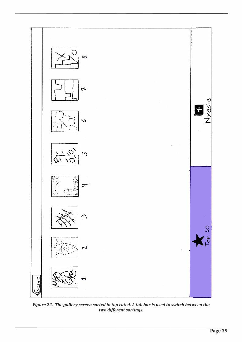
Page 39
Figure 22. The gallery screen sorted in top rated. A tab bar is used to switch between the two different sortings.
Page 40
Figure 23. The gallery screen sorted in recency.
Page 41
Figure 24. The picture viewing screen with a slider for passing a rating.

Page 42
Page 43
5. Den Lille KunstnerThe following chapter will discuss the high-fidelity prototype of the application ”Den Lille Kunstner”. The first section will give a short walkthrough of the different screens from the high-fidelity prototype, while the second section will focus on what has been altered from the low-fidelity design to the new design. The third section will discuss some of the difficulties that were encountered in the implementation of the prototype, while the final section will discuss the test of the high-fidelity prototype.
Before moving on to the walkthrough it will first shortly be explained how the prototype has been developed. The high-fidelity prototype is implemented in Objective-C and tested on a 1st generation iPad running version 4.2.1 of the iOS mobile operating system.
5.1. Walkthrough
The following short section will provide a quick walkthrough of the screens of the prototype and will be used to refer back to when discussing elements in the following sections.
The first screen of the application is the main screen, which can be seen in figure 25. The screen is very simple and currently only consists of three buttons and the application name. Tapping one of the paintings will direct the user to the canvas of the chosen style, either abstract or pointillism. Tapping the gallery button will direct the user to the painting screen. The gallery screen can be seen in figure 26, and as can be seen, the design of the gallery has been changed since the low-fidelity prototype, but this change will be discussed later. In figure 27, the abstract canvas screen can be seen, and the pointillism canvas screen can be seen in figure 28. When the user is directed to either of these screens, there will be a light grey overlay on the canvas, symbolizing that the canvas is currently inactive and must be tapped to become active, and the reason for this will be discussed later.
Figure 25. The main screen of the high-fidelity proto-type of the application.
Page 44
Figure 26. The new gallery screen with a painting se-lected.
Figure 27. The abstract canvas.
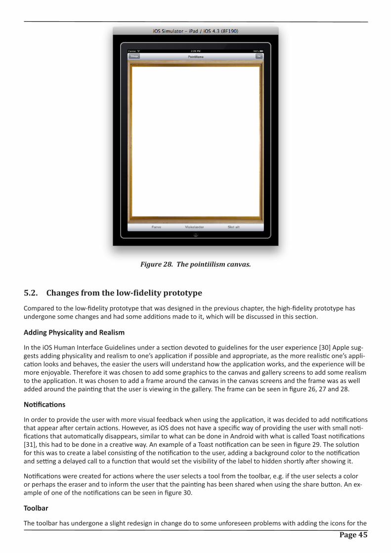
Page 45
5.2. Changes from the low-fidelity prototype
Compared to the low-fidelity prototype that was designed in the previous chapter, the high-fidelity prototype has undergone some changes and had some additions made to it, which will be discussed in this section.
Adding Physicality and Realism
In the iOS Human Interface Guidelines under a section devoted to guidelines for the user experience [30] Apple sug-gests adding physicality and realism to one’s application if possible and appropriate, as the more realistic one’s appli-cation looks and behaves, the easier the users will understand how the application works, and the experience will be more enjoyable. Therefore it was chosen to add some graphics to the canvas and gallery screens to add some realism to the application. It was chosen to add a frame around the canvas in the canvas screens and the frame was as well added around the painting that the user is viewing in the gallery. The frame can be seen in figure 26, 27 and 28.
Notifications
In order to provide the user with more visual feedback when using the application, it was decided to add notifications that appear after certain actions. However, as iOS does not have a specific way of providing the user with small noti-fications that automatically disappears, similar to what can be done in Android with what is called Toast notifications [31], this had to be done in a creative way. An example of a Toast notification can be seen in figure 29. The solution for this was to create a label consisting of the notification to the user, adding a background color to the notification and setting a delayed call to a function that would set the visibility of the label to hidden shortly after showing it.
Notifications were created for actions where the user selects a tool from the toolbar, e.g. if the user selects a color or perhaps the eraser and to inform the user that the painting has been shared when using the share button. An ex-ample of one of the notifications can be seen in figure 30.
Toolbar
The toolbar has undergone a slight redesign in change do to some unforeseen problems with adding the icons for the
Figure 28. The pointiilism canvas.
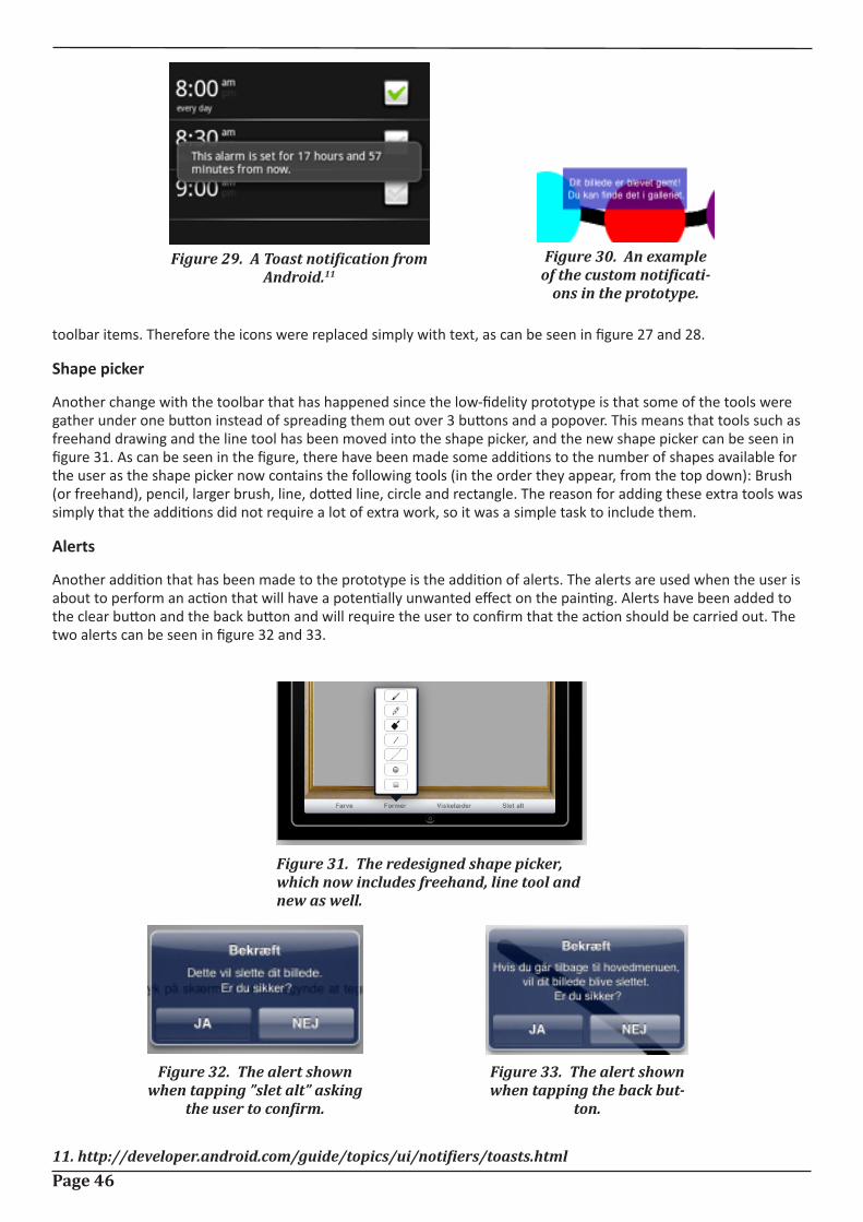
Page 46
toolbar items. Therefore the icons were replaced simply with text, as can be seen in figure 27 and 28.
Shape picker
Another change with the toolbar that has happened since the low-fidelity prototype is that some of the tools were gather under one button instead of spreading them out over 3 buttons and a popover. This means that tools such as freehand drawing and the line tool has been moved into the shape picker, and the new shape picker can be seen in figure 31. As can be seen in the figure, there have been made some additions to the number of shapes available for the user as the shape picker now contains the following tools (in the order they appear, from the top down): Brush (or freehand), pencil, larger brush, line, dotted line, circle and rectangle. The reason for adding these extra tools was simply that the additions did not require a lot of extra work, so it was a simple task to include them.
Alerts
Another addition that has been made to the prototype is the addition of alerts. The alerts are used when the user is about to perform an action that will have a potentially unwanted effect on the painting. Alerts have been added to the clear button and the back button and will require the user to confirm that the action should be carried out. The two alerts can be seen in figure 32 and 33.
Figure 29. A Toast notification from Android.11
11. http://developer.android.com/guide/topics/ui/notifiers/toasts.html
Figure 30. An example of the custom notificati-
ons in the prototype.
Figure 31. The redesigned shape picker, which now includes freehand, line tool and new as well.
Figure 32. The alert shown when tapping ”slet alt” asking
the user to confirm.
Figure 33. The alert shown when tapping the back but-
ton.
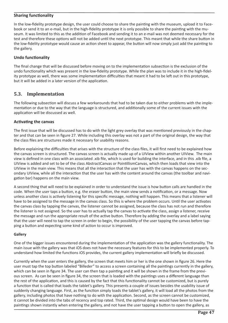
Page 47
Sharing functionality
In the low-fidelity prototype design, the user could choose to share the painting with the museum, upload it to Face-book or send it to an e-mail, but in the high-fidelity prototype it is only possible to share the painting with the mu-seum. It was limited to this as the addition of Facebook and sending it to an e-mail was not deemed necessary for the test and therefore these options will not be added until the next prototype. This meant that while the share button in the low-fidelity prototype would cause an action sheet to appear, the button will now simply just add the painting to the gallery.
Undo functionality
The final change that will be discussed before moving on to the implementation subsection is the exclusion of the undo functionality which was present in the low-fidelity prototype. While the plan was to include it in the high-fidel-ity prototype as well, there was some implementation difficulties that meant it had to be left out in this prototype, but it will be added in a later version of the application.
5.3. Implementation
The following subsection will discuss a few workarounds that had to be taken due to either problems with the imple-mentation or due to the way that the language is structured, and additionally some of the current issues with the application will be discussed as well.
Activating the canvas
The first issue that will be discussed has to do with the light grey overlay that was mentioned previously in the chap-ter and that can be seen in figure 27. While including this overlay was not a part of the original design, the way that the class files are structures made it necessary for usability reasons.
Before explaining the difficulties that arises with the structure of the class files, it will first need to be explained how the canvas screen is structured. The canvas screen is actually made up of a UIView within another UIView. The main view is defined in one class with an associated .xib file, which is used for building the interface, and in this .xib file, a UIView is added and set to be of the class AbstractCanvas or PointillismCanvas, which then loads that view into the UIView in the main view. This means that all the interaction that the user has with the canvas happens on the sec-ondary UIView, while all the interaction that the user has with the content around the canvas (the toolbar and navi-gation bar) happens on the main view.
A second thing that will need to be explained in order to understand the issue is how button calls are handled in the code. When the user taps a button, e.g. the eraser button, the main view sends a notification, or a message. Now unless another class is actively listening for this specific message, nothing will happen. This means that a listener will have to be assigned to the message in the canvas class. So this is where the problem occurs. Until the user activates the canvas class by tapping the canvas, the listener cannot be assigned, because the class has not run and therefore the listener is not assigned. So the user has to actually tap the canvas to activate the class, assign a listener, receive the message and run the appropriate result of the active button. Therefore by adding the overlay and a label saying that the user will need to tap the screen in order to begin, the possibility of the user tapping the canvas before tap-ping a button and expecting some kind of action to occur is improved.
Gallery
One of the bigger issues encountered during the implementation of the application was the gallery functionality. The main issue with the gallery was that iOS does not have the necessary features for this to be implemented properly. To understand how limited the functions iOS provides, the current gallery implementation will briefly be discussed.
Currently when the user enters the gallery, the screen that meets him or her is the one shown in figure 26. Here the user must tap the top button labeled “Billeder” to access a screen containing all the paintings currently in the gallery, which can be seen in figure 34. The user can then tap a painting and it will be shown in the frame from the previ-ous screen. As can be seen in figure 34, the screen that is loaded with the paintings uses a different language than the rest of the application, and this is caused by the fact that this functionality cannot be customized, but is purely a function that is called that loads the tablet’s gallery. This presents a couple of issues besides the usability issue of suddenly changing language. First, as the function simply loads the tablet’s gallery, it will load all the photos from the gallery, including photos that have nothing to do with the application. Second, as the screen cannot be customized, it cannot be divided into the tabs of recency and top rated. Third, the optimal design would have been to have the paintings shown instantly when entering the gallery, and not have the user tapping a button to open the gallery, as
Page 48
this would have been more intuitive to use.
This means that in order to get a satisfactory gallery functionality, the next prototype should contain a third-party library specifically designed to implement a gallery view.
5.4. Testing the high-fidelity prototype
The following section will discuss the tests that were carried out on the high-fidelity prototype and the results that the tests showed.
As was the case with the test of the low-fidelity prototype, two tests were conducted on different test participants, with one being the target audience and the other being experts.
5.4.1. The test on the target audience
The first test that will be discussed is the test that was carried out on the target audience. The test was conducted on 5 test participants between the ages of 9 to 14 (9, 10, 13, 14 and 14) who were visiting the museum. The test con-sisted of the user first being given a short introduction to the context of the project, being that a painting application was being designed in collaboration with the museum with the purpose of teaching children about different painting styles. After the introduction, the user was handed the iPad and given the task of painting two paintings in each of the two genres after which a short interview was conducted.
5.4.1.1. Purpose of the test
The purpose of the user test was to gain insight into whether or not the current version of the application would be enough to give the target audience a basic understanding of the presented styles. Furthermore, the secondary pur-pose of the test was to see how the target audience interacted with the application to see if some unforeseen usabil-ity issues occurred.
Figure 34. The result of the iOS provided gal-lery function that opens the photo album of
the iPad.
Page 49
5.4.1.2. Data gathering
During the test information was gathered in two ways. While the users performed the test, the test leader took notes on how they interacted with the application and afterwards a short interview was conducted. The interview was or-ganized according to the structure mentioned by Sharp, Rogers and Preece [21], where it is suggested that the inter-view is organized into five steps:
1. Introduction
2. Warm-up
3. Main session
4. Cool-off
5. Closing
The introduction was given to the test participant before the actual test started. The warm-up section of the inter-view consisting of a few non-threatening questions meant to get the test participant to relax. This was considered extremely important as the test participants were all between the ages of 9 to 14, and the low-fidelity test conducted earlier had shown a certain level of shyness amongst these ages. The main section consisted of semi-structured ques-tions meant to uncover the information that the test should show, such as how they would describe the styles with a few words. The main section was followed by a couple of easy questions to defuse any tension that might had arisen.
The questions from the interview can be found in the appendix (High-fidelity/test/target audience test) along with the answers from the interview, the notes taken during the test and the paintings made by the test participants.
5.4.1.3. Results
The high-fidelity test on the target audience, while only conducted on 5 test participants, showed some clear indica-tions that the current prototype with minimal scaffolding would not be enough to teach the target audience on pain-ting styles.
The 1st test participant, which was a 9 year old boy, drew one painting that looked like an abstract painting and one that was a regular drawing, and he drew two paintings that could to some extent be considered pointillism. However, as he could not describe what neither abstract nor pointillism were, it cannot be said that he had learned what poin-tillism was from the visual cue. He mentioned that he had drawn pointillism before in school, which might have been why he drew two pointillism paintings, but he still could not put into words what the style was.
The 2nd test participant was a 10 year old girl, who did not draw abstract paintings, but drew pointillism paintings. However, it was again the case that the test participant could not desccribe the styles, and at this point it was con-sidered that the reason why the test participants could draw pointillism might be because the simplicity of the style simply makes it seem like they can draw it.
The 3rd test participant was a 13 year old boy, and he gave decent describtions of the styles, by describing abstract as being ”something that does not look like anything”, which to some extent often is what people associate with the style, and he described pointillism as ”something with a lot of dots”, which is to an extent true, but not that descrip-tive. However, despite giving a somewhat description of the abstract style, he still painted a regular drawing.
The 4th test participant was a 14 year old boy, who described the abstract style as ”random things” and the pointil-lism style as ”dots”, which to some extent is true, but still not descriptive enough. He was the only test participant who actually drew abstract, but he also drew random pictures in pointillism and not a larger motif.
The final and 5th test participant was a 14 year old girl. She gave decent answer on the styles, describing abstract as ”not real, fantasy” and pointillism as ”a painting made of dots”, but the answers can again only be considered true to some extent. ”A painting made of dots” could just as well be a painting with no motif as it could be a true pointillism painting.
Despite only having tested on 5 test participants, a tendency has become clear. While the current prototype works fine as a stand-alone painting application, the learning aspect will need to be improved. However, some concerns did arise during the test. This was the second test conducted on the target audience and in both tests the test parti-
Page 50
cipants were not as talkative as could have been hoped. This could be because they were talking to a stranger about a subject they did not feel confident on, or it could be something completely different, but nevertheless, the target audience proved to be rather difficult to test the product on.
5.4.2. The test on the experts
While the test on the target audience had been clearly structured to get results that could be compared, the test on the experts were of a more relaxed nature. As in the low-fidelity test, the experts who took part in the test were all students from 10th semester Medialogy, and the test was carried out on 4 experts. The test was carried out as a dis-cussion between the test leader and the test participant, while the test participant explored the application without any specific tasks.
5.4.2.1. Purpose of the test
The purpose of the expert test was to gather a variety of information with the main focus being on the usability of the application and missing features.
5.4.2.2. Data gathering
During the test, the test leader took notes while discussing with the test participant, but in retrospect, an idea could have been to record the test session, as this would have meant the test leader could fully concentrate on the discus-sion without having to take notes along the way.
The test notes can be found in the appendix (High-fidelity/test/expert test).
5.4.2.3. Results
The following subsection will discuss the test results gained from the expert test and will be divided into each of the test participants with the most valuable feedback that was gained.
The first expert test participant’s main comments were regarding the use of notifications and alerts. He suggested removing the notifications and limiting when the alerts were shown. Currently the alerts are shown whenever the user presses one of the buttons that can have a critical effect on the painting, but the suggestion was that they should only occur when a painting was in progress, which is a good suggestion as it might otherwise confuse the user.
Contrary to the first expert test participant, the second test participant liked that notifications and alerts appeared, as he liked the fact that he got a visual feedback on the action he had performed. He however felt that considering that the iPad can register multitouch, it was a shame that it was not used in the application.
The third participant mentioned that a nice addition to the pointillism style would have been if it was possible to change the size of the dot that was made, and furthermore mentioned that a dot tool was missing from the abstract style.
The fourth and final participant suggested a redesign of the current toolbar design, where he suggested that the pop-over were removed and the options were placed directly accessible in the GUI. He furthermore suggested that the eraser was customizable, so the user could input a size and shape.
A comment that all the expert test participants made was that the current way of using the eraser was not the best suitable. Currently the eraser is in the form of a circle, as it was felt it would be more precise than a rectangle, but this also means that if the user drags his or her finger too fast small spaces will appear between the spots being era-ser, as the eraser cannot keep up with the user.
Page 51
6. DiscussionThe final chapter of the report will be a short discussion on the project and on the potential of the current product.
The test results from the high-fidelity test confirmed the theory that Nina Simon mentions in The Participatory Muse-um, which was discussed in section 2.8, that instructional scaffolding actually gives users a better and more creative experience than by giving them a blank canvas and almost no scaffolding. The high-fidelity prototype was an attempt to see if it would be possible to teach the target audience about the two included styles with minimal instructions, but the test showed that when the users are not given more instructions or limitations, the outcome of what they draw will be more or less random. This means that while the idea of teaching them about painting styles could possi-bly work with the proper scafforlding and instructions, the current prototype does not function as more than a pain-ting application.
Additionally, the current prototype might not be the most suitable product for a museum visit, as the product in its current form would alienate the person using it. Two things come in mind. Either the product could try to incorporate the art from KUNSTEN in the learning aspect of the application and through that become better integrated in the museum visit, or the application, once the learning aspect was implemented, could be used in workshops as a tool of teaching the kids.

Page 52
Page 53
References[1] Title: ”Museumsstatistik 2009 - Statistiske efterretninger”
Link: http://www.kulturarv.dk/museer/om-museerne-i-danmark/statistik/museernes-besoegstal/ - Appendix: Mu-seer_2009.pdf
[2] Title: Museum for visitors: Audience development – A crucial role for successful museum management strategies (INTERCOM 2006 Conference Paper)
Author: Christian Waltl
Appendix: Museums for visitors - Audience development.pdf
[3] Title: General information
Link: http://www.kunsten.dk/Default.aspx?ID=350
Last checked: 31st of May, 2011
[4] Title: Vision og mission
Link: http://www.kunsten.dk/Default.aspx?ID=1056
Last checked: 31st of May, 2011
[5] Interview of Lars Ulrich Tarp Hansen, conducted by Jan Christian Hjorth Hansen.
Appendix: KUNSTEN
[6] Title: Tweens and new media in Denmark and Hong Kong
Authors: Lars P. Andersen, Birgitte Tufte, Jeanette Rasmussen, Kara Chan
Appendix: TweensNewMedia.pdf
[7] Title: Definition of tween
Author: Jennifer O’Donnell
Link: http://tweenparenting.about.com/od/tweenculture/g/TweenDefinition.htm
Last checked: 31st of May, 2011
[8] Title: Tweens
Author: N/A
Link: http://www.thefreedictionary.com/Tweens
Last checked: 31st of May, 2011
Page 54
[9] Title: Tweens: The Mall Over the Museum
Author: Susie Wilkening and James Chung
Link: http://www.aam-us.org/pubs/mn/tween.cfm
Last checked: 31st of May, 2011
[10] Title: Linnea i malerens have
Link: http://www.filmstriben.dk/bibliotek/film/details.aspx?filmid=2050203700
Last checked: 31st of May, 2011
[11] Title: The Participatory Museum
Author: Nina Simon
Link: http://www.participatorymuseum.org/read/
[12] Title: Just looking? Lurkers, judges and contributors
Author: Nina Simon
Link: http://museumtwo.blogspot.com/2007/03/just-looking-lurkers-judges-and.html
Last checked: 31st of May, 2011
[13] Title: Supporting museum co-visits using mobile devices
Author: Yann Laurillau, Fabio Paternò
Appendix: cicero
[14] Title: Re-envisioning the Museum Experience: Combining New Technology with Social-Networking
Author: Madhuri Koushik, Eun Jung Lee, Laura Pieroni, Emily Sun, and Chun-Wei Yeh
Appendix: cali
[15] Title: iPad
Link: http://en.wikipedia.org/wiki/IPad
[16] Title: RFID ENHANCES VISITORS’ MUSEUM EXPERIENCE AT THE EXPLORATORIUM
Author: Sherry Hsi and Holly Fait
Appendix: exspot
[17] Title: What is RFID
Link: http://www.aimglobal.org/technologies/rfid/what_is_rfid.asp
Page 55
Last checked: 31st of May, 2011
[18] Title: Google’s Nexus S CAN do mobile payments — SDK on its way soon
Author: Sarah Clarke
Link: http://www.nearfieldcommunicationsworld.com/2010/12/10/35404/google-nexus-s-can-do-mobile-payments-sdk-on-its-way-soon/
Last checked: 31st of May, 2011
[19] Title: The Art of Storytelling: Enriching Art Museum Exhibits and Education through Visitor Narratives
Author: Matthew Fisher, Night Kitchen Interactive, USA; Beth A. Twiss-Garrity, The University of the Arts, USA; Alex-andra Sastre, Night Kitchen Interactive, USA
Appendix: artofstorytelling
[20] Title: Night Kitchen Interactive
Author: Same
Link: http://www.whatscookin.com/html/
[21] Title: Interaction Design: Beyond human-computer interaction, 2nd edition
Author: Sharp, Rogers and Preece
[22] Title: Abstract art
Author: About.com
Link: Abstract fra about.com: http://painting.about.com/od/abstractart/a/abstract_art.htm
Last checked: 31st of May, 2011
[23]Title: Pointilism
Link: http://library.thinkquest.org/J0110603/pointillism.html
Last checked: 31st of May, 2011
[24] Title: Drawings…Sketches…Tic Tac Toe, Oh Yeah. Do It All With Whiteboard Pro
Author: Joe Sirianni
Link: http://www.talkandroid.com/37915-drawings-sketches-tic-tac-toe-oh-yeah-do-it-all-with-whiteboard-pro/
Last checked: 31st of May, 2011
[25] Title: Be The Next Picasso From Your Android Device With Fresco
Author: Joe Sirianni
Page 56
Link: http://www.talkandroid.com/38866-be-the-next-picasso-from-your-android-device-with-fresco/
[26] Title: ArtStudio for iPad
Link: http://itunes.apple.com/us/app/artstudio-for-ipad/id364017607?mt=8#
[27] Title: Sketches 2
Link: http://itunes.apple.com/us/app/sketches-2/id345039100?mt=8#
[28] Title: Introduction
Author: Apple
Link: http://developer.apple.com/library/ios/#documentation/UserExperience/Conceptual/MobileHIG/Introduction/Introduction.html
[29] Title: iOS UI Element Usage Guidelines
Author: Apple
Link: http://developer.apple.com/library/ios/#documentation/UserExperience/Conceptual/MobileHIG/UIElement-Guidelines/UIElementGuidelines.html#//apple_ref/doc/uid/TP40006556-CH13-SW1
[30]
Title: User Experience Guidelines
Link: http://developer.apple.com/library/ios/#documentation/UserExperience/Conceptual/MobileHIG/UIElement-Guidelines/UIElementGuidelines.html
[31] Title: Toasts
Author: Android
Link: http://developer.android.com/guide/topics/ui/notifiers/toasts.html

Page 57