frbclev_econtrends_200802.pdf
TRANSCRIPT

In Th is IssueTh e Economy in Perspective
Th is old house...Infl ation and Prices
December Price Statistics Money, Financial Markets, and Monetary Policy
Another Move, but with Less SurpriseWhat is the Yield Curve Telling Us?
International MarketsChinese Infl ation and the Renminbi
Economic Activity and Labor MarketsReal GDP Fourth-Quarter 2007 Advance EstimateTh e Pass-through of Oil Prices to Gasoline PricesTh e Employment SituationManufacturing EmploymentHousing Markets
Regional ActivityTh e Ups and Downs in Regional Employment Statistics Th e Erie Metropolitan Statistical Area
Banking and Financial Markets Fourth District Community Banks
Economic TrendsFebruary 2008
(Covering January 10, 2008, to February 14, 2008)

1Federal Reserve Bank of Cleveland, Economic Trends | February 2008
Th e Economy in Perspective Th is old house…1.25.08by Mark S. Sniderman
Th ere once were some bankers from Gaff Whose products were layered with math.With assets worth billionsNow stated in millions,Th ose chaps were too clever by half!
With the U.S. mortgage fi nance industry in a serious state of disrepair, now is the time to draw up the blue-prints, acquire some new tools, roll up our sleeves, and get to work building a sounder structure.
Houses have foundations and support elements, plumb-ing and electrical, heating and cooling systems, insulation, and, of course, décor. So too, the mortgage fi nance indus-try is made up of a set of components such as property appraisers, and loan brokers, originators, servicers; and holders. And just as houses cannot be built without the consent of local offi cials who determine zoning and build-ing codes, the mortgage fi nance industry operates under the jurisdiction of various federal and state regulators.
Back in the day, mortgage holders were most likely the originating banks and thrift institutions (as they were fondly called), but the residents of that staid “buy and hold” bungalow have been displaced by occupants of glamorous “originate and sell” mansions. Th ese oc-cupants include independent brokers selling loans on behalf of mortgage banks, which themselves raise funds in capital markets instead of relying on insured deposits. And now the family of mortgage holders include not only the familiar secondary market entities Fannie Mae, Freddie Mac, Ginnie Mae, and FHA/VA, but also and importantly, global investors who hold claims to por-tions of mortgage pools that have been aggregated by investment banks, layered with private insurance, and graded by private rating agencies.
Explanations of the mortgage debacle range from lend-ers’ greed and borrowers’ naiveté on the one hand, to all actors in the drama merely responding to the incentives in front of them. Th e greed-cum-naiveté story leads us
in the direction of sturdier consumer protection, such as the Federal Reserve’s proposed revisions to its Truth in Lending regulation (adopted under the Home Owner-ship and Equity Protection Act), higher standards for state banking supervisors, who license mortgage brokers, and stronger fi nancial literacy programs.
Th e incentives story reminds us that human nature is susceptible to the lure of the fast buck, such as the chance to earn excessive returns from mortgage-backed securities or buying a house with no money down. In recent years, mortgage lures became so powerful that in-vestors happily fi lled the entire structure—from whole-sale investment bankers to retail mortgage brokers—with cash, all fees and commissions paid up front. And many borrowers, it is said, tried to live beyond their means either by borrowing heavily to acquire a home or main-taining their living standards by cashing out equity built up in better times. Not having to put much equity into the deal, and having low monthly payments, created strong incentives for home buyers hoping to live the American Dream.
So how can we build a stronger structure for fi nancing mortgages? Several ideas are being advanced, including more borrower equity in the deals; more disclosure to borrowers about the terms and conditions of the loan; better education for borrowers before they shop for loans; greater investor liability for any illegal, unfair, or abusive practices committed earlier in the ownership chain.
Lawmakers and regulators are fi nding some holes in the mortgage fi nance industry that merit repair, but they should realize that the industry participants—brokers, originators, investment bankers, rating agencies, and consumers—are also likely to change their behavior in response to the market forces unleashed by the current fi asco. Th ere is every reason to believe that the rehabbed industry will be sturdier than the one it replaces and able to protect everyone it serves from losing the roofs over their heads.

2Federal Reserve Bank of Cleveland, Economic Trends | February 2008
Infl ation and Prices December Price Statistics
02.15.08by Michael F. Bryan and Brent Meyer
Th e Consumer Price Index (CPI) rose at an annu-alized rate of 10.0 percTh e Consumer Price Index (CPI) rose at an annualized rate of 3.4 percent in December, down from November’s 10.0 percent increase, but still slightly elevated compared to its long-term (5-year) trend. Measured over the last three months, retail prices have outpaced their 6-month, 12-month, and 5-year averages. Th e CPI advanced 4.3 percent in the fourth quarter, compared with 1.9 percent in the third. Th e CPI excluding food and energy (core CPI) increased 2.9 percent during the month, outpacing all of its longer-term trends. Both the median and 16 per-cent trimmed-mean CPI measures increased more than 3.0 percent in December, rising 3.2 and 3.3 percent, respectively.
Th e 12-month growth rate in the CPI ticked down to 4.1 percent in December from 4.4 in the previ-ous month, but it is still substantially higher than August’s 2.0 percent reading.
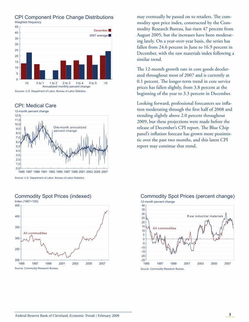
Almost 57 percent of the components of the CPI advanced at rates exceeding 3 percent in December, compared to a little less than 50 percent for 2007 on average. Another fact attesting to some upward price pressure from the component-price-change distribution is that only 14 percent of the index’s components declined during the month, while the average over 2007 was 24 percent.
An example of the recent price pressures refl ected in the component price change distribution is the recent trend in medical care prices. Over the past six months, medical care prices have risen at an annualized average of 5.6 percent, compared to an average monthly increase of 4.2 percent over the past 10 years. Th is has pushed the longer-term growth rate from 4.0 percent to 5.1 percent during the last six months.
Some argue that commodity prices are a leading indicator of infl ation, as they measure material input costs for producers, and increases in them
December Price Statistics Percent change, last 1mo.a 3mo.a 6mo.a 12mo. 5yr.a
2006 avg.
Consumer Price Index All items 3.4 5.6 3.3 4.1 3.0 2.6 Less food and
energy2.9 2.7 2.6 2.4 2.1 2.6
Medianb 3.2 3.3 2.9 2.9 2.5 3.1 16% trimmed
meanb3.3 3.5 2.8 2.8 2.4 2.7
Producer Price Index Finished goods −0.7 13.3 7.0 6.8 4.3 1.6 Less food and
energy 2.2 2.2 2.0 2.1 1.8 2.1
a. Annualized.b. Calculated by the Federal Reserve Bank of Cleveland.Sources: U.S. Department of Labor, Bureau of Labor Statistics; and Federal Reserve Bank of Cleveland.
1.001.251.501.752.002.252.502.753.003.253.503.754.004.254.504.75
1995 1997 1999 2001 2003 2005 2007
12-month percent change
C ore C PI
Median CPI a
16% trimmed-mean C PI a
C PI
CPI, Core CPI, and Trimmed-Mean CPI Measures
a. Calculated by the Federal Reserve Bank of Cleveland.Sources: U.S. Department of Labor, Bureau of Labor Statistics, and Federal Reserve Bank of Cleveland.
3Federal Reserve Bank of Cleveland, Economic Trends | February 2008
may eventually be passed on to retailers. Th e com-modity spot price index, constructed by the Com-modity Research Bureau, has risen 47 percent from August 2005, but the increases have been moderat-ing lately. On a year-over-year basis, the series has fallen from 24.6 percent in June to 16.9 percent in December, with the raw materials index following a similar trend.
Th e 12-month growth rate in core goods deceler-ated throughout most of 2007 and is currently at 0.1 percent. Th e longer-term trend in core service prices has fallen slightly, from 3.8 percent at the beginning of the year to 3.3 percent in December.
Looking forward, professional forecasters see infl a-tion moderating through the fi rst half of 2008 and trending slightly above 2.0 percent throughout 2009, but these projections were made before the release of December’s CPI report. Th e Blue Chip panel’s infl ation forecast has grown more pessimis-tic over the past two months, and this latest CPI report may continue that trend.
0
5
10
15
20
25
30
35
40
45
<0 0 to 1 1 to 2 2 to 3 3 to 4 4 to 5 >5
Weighted frequency
Annualized monthly percent change
CPI Component Price Change Distributions
Sources: U.S. Department of Labor, Bureau of Labor Statistics.
2007 average
December
0.01.02.03.04.05.06.07.08.09.0
10.011.012.0
1985 1987 1989 1991 1993 1995 1997 1999 2001 2003 2005 2007
12-month percent changeCPI: Medical Care
Source: U.S. Department of Labor, Bureau of Labor Statistics
One-month annualized percent change
200
250
300
350
400
450
1995 1997 1999 2001 2003 2005 2007
Index (1967=100)Commodity Spot Prices (indexed)
Source: Commodity Research Bureau.
A ll commodities
-25-20-15-10-505
10152025303540
1995 1997 1999 2001 2003 2005 2007
12-month percent changeCommodity Spot Prices (percent change)
Source: Commodity Research Bureau.
R aw indus trial materials
All commodities

4Federal Reserve Bank of Cleveland, Economic Trends | February 2008
Money, Financial Markets, and Monetary Policy Another Move, but with Less Surprise
01.31.08 by John Carlson and Sarah Wakefi eld
At its scheduled meeting yesterday, the Federal Open Market Committee (FOMC) lowered its target for the federal funds rate 50 basis points to 3 percent. In the post-meeting statement the FOMC noted that, “Financial markets remain under con-siderable stress, and credit has tightened further for some businesses and households. Moreover, recent information indicates a deepening of information of the housing contraction as well as some soften-ing in labor markets.”
In its assessment of risks the FOMC indicated that the “policy action, combined with those taken ear-lier, should help to promote moderate growth over time and mitigate the risks to economic activity. However, downside risks to growth remain.”
Yesterday’s decision followed just nine days after the January 21 decision to lower the target 75 basis points to 3.5 percent. Th at move, taken at an unscheduled meeting, surprised participants in fed funds futures and options markets. Until that decision, traders had not seriously entertained the prospect that the fed funds rate would be as low as 3 percent after yesterday’s meeting. After the new target was announced, market participants began to place some probability that the outcome could go as low as 2.5 percent.
-0.20
0.00
0.20
0.40
0.60
0.80
1.00
1.20
12/06 03/07 06/07 09/07 01/08
PercentOne-Month LIBOR Spread
Note: Daily observations. LIBOR spread is the one-month LIBOR rate minus the one-month OIS Rate. Sources: Bloomberg Financial Services and Financial Times.
-3.0
-2.0
-1.0
0.0
1.0
2.0
3.0
4.0
5.0
6.0
7.0
3/06 12/06 9/07 6/08 3/09 12/09
Annualized quarterly percent changeCPI and Forecasts
Sources: Blue Chip panel of economists, January 10, 2007.
Forecast
Actual
Top 10 forecast
Bottom 10 forecast
-6.0-5.0-4.0-3.0-2.0-1.00.01.02.03.04.05.06.07.08.0
1995 1997 1999 2001 2003 2005 2007
12-month percent change
C ore goodsOne-month annualized percent change
Core CPI Goods and Core CPI Services
Source: U.S. Department of Labor, Bureau of Labor Statistics.
C ore s ervices
One-month annualized percent change
0.00.10.20.30.40.50.60.70.80.91.0
12/11 12/16 12/21 12/26 12/31 01/05 01/10 01/15 01/20 01/25
January Meeting Outcomes Implied probability
3.75%
4.25%3.50%
4.00%
2.75%3.25%
3.00%
New home sales
2.50%
Durable goodsFOMC meeting

5Federal Reserve Bank of Cleveland, Economic Trends | February 2008
Over the past week, however, the market gained confi dence that the FOMC would choose 3 percent as its new target.
Equity markets greeted the FOMC decision by swinging wildly. Initially equity prices reacted favorably, jumping almost two percentage points. Th e excitement was short-lived, however, as prices fell sharply near the end of trading, ending the day down about one-half percentage point.
Although credit terms have tightened further for some businesses and households, concerns about liquidity have lessened substantially. Th e spread between the term borrowing rate in the London interbank market (LIBOR) and the cash market rate (OIS), is a closely watched indicator of liquid-ity conditions. Spreads for both one-month and three-month borrowings have declined well off recent peaks, although they remain above more normal levels.
Money, Financial Markets, and Monetary Policy What Is the Yield Curve Telling Us?
01.30.08by Joseph G. Haubrich and Katie Corcoran
Since last month, both long-term and short term interest rates have decreased, with short rates dip-ping more, leading to a steeper yield curve. One reason for noting this is that the slope of the yield curve has achieved some notoriety as a simple forecaster of economic growth. Th e rule of thumb is that an inverted yield curve (short rates above long rates) indicates a recession in about a year, and yield curve inversions have preceded each of the last six recessions (as defi ned by the NBER). Very fl at yield curves preceded the previous two, and there have been two notable false positives: an inversion in late 1966 and a very fl at curve in late 1998. More generally, though, a fl at curve indi-cates weak growth, and conversely, a steep curve indicates strong growth. One measure of slope, the spread between 10-year bonds and 3-month T-bills, bears out this relation, particularly when real GDP growth is lagged a year to line up growth with the spread that predicts it.
0.00
0.20
0.40
0.60
0.80
1.00
1.20
12/06 03/07 06/07 09/07 01/08
PercentThree-Month LIBOR Spread
Note: Daily observations. LIBOR spread is the three-month LIBOR rate minus the three-month OIS Rate. Sources: Bloomberg Financial Services and Financial Times.
R eal GDP growth
P
-4
-2
0
2
4
6
8
10
12
1953 1963 1973 1983 1993 2003
Percent
Yield Spread and Real GDP Growth*
Sources: Bureau of Economic Analysis; Federal Reserve Board.*Shaded bars represent recessions.
10-year minus 3-month yield s pread
(year-to-yearpercent change)
6Federal Reserve Bank of Cleveland, Economic Trends | February 2008
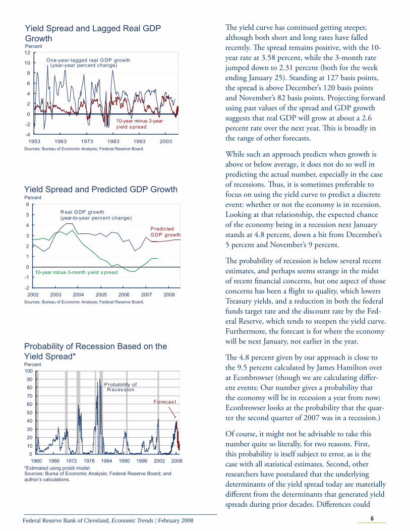
Th e yield curve has continued getting steeper, although both short and long rates have falled recently. Th e spread remains positive, with the 10-year rate at 3.58 percent, while the 3-month rate jumped down to 2.31 percent (both for the week ending January 25). Standing at 127 basis points, the spread is above December’s 120 basis points and November’s 82 basis points. Projecting forward using past values of the spread and GDP growth suggests that real GDP will grow at about a 2.6 percent rate over the next year. Th is is broadly in the range of other forecasts.
While such an approach predicts when growth is above or below average, it does not do so well in predicting the actual number, especially in the case of recessions. Th us, it is sometimes preferable to focus on using the yield curve to predict a discrete event: whether or not the economy is in recession. Looking at that relationship, the expected chance of the economy being in a recession next January stands at 4.8 percent, down a bit from December’s 5 percent and November’s 9 percent.
Th e probability of recession is below several recent estimates, and perhaps seems strange in the midst of recent fi nancial concerns, but one aspect of those concerns has been a fl ight to quality, which lowers Treasury yields, and a reduction in both the federal funds target rate and the discount rate by the Fed-eral Reserve, which tends to steepen the yield curve. Furthermore, the forecast is for where the economy will be next January, not earlier in the year.
Th e 4.8 percent given by our approach is close to the 9.5 percent calculated by James Hamilton over at Econbrowser (though we are calculating diff er-ent events: Our number gives a probability that the economy will be in recession a year from now; Econbrowser looks at the probability that the quar-ter the second quarter of 2007 was in a recession.)
Of course, it might not be advisable to take this number quite so literally, for two reasons. First, this probability is itself subject to error, as is the case with all statistical estimates. Second, other researchers have postulated that the underlying determinants of the yield spread today are materially diff erent from the determinants that generated yield spreads during prior decades. Diff erences could
-2
-1
0
1
2
3
4
5
6
2002 2003 2004 2005 2006 2007 2008
Percent
10-year minus 3-month yield s pread
R eal GDP growth(year-to-year percent change)
P redicted GDP growth
Yield Spread and Predicted GDP Growth
Sources: Bureau of Economic Analysis; Federal Reserve Board.
0
10
20
30
40
50
60
70
80
90
100
1960 1966 1972 1978 1984 1990 1996 2002 2008
Percent
Forecas t
P robability of R eces s ion
Probability of Recession Based on the Yield Spread*
Sources: Burea of Economic Analysis; Federal Reserve Board; and author’s calculations.
*Estimated using probit model.
-4
-2
0
2
4
6
8
10
12
1953 1963 1973 1983 1993 2003
Percent
10-year minus 3-year yield s pread
One-year-lagged real GDP growth (year-year percent change)
Yield Spread and Lagged Real GDP Growth
Sources: Bureau of Economic Analysis; Federal Reserve Board.

7Federal Reserve Bank of Cleveland, Economic Trends | February 2008
arise from changes in international capital fl ows and infl ation expectations, for example. Th e bottom line is that yield curves contain important information for business cycle analysis, but, like other indicators, they should be interpreted with caution.
For more detail on these and other issues related to us-ing the yield curve to predict recessions, see the Com-mentary “Does the Yield Curve Signal Recession?”
International Markets Chinese Infl ation and the Renminbi
02.07.08By Owen F. Humpage and Michael Shenk
China is increasingly worried about its infl ation rate, which topped 6.5 percent on a year-over-year basis in December. One thing that the People’s Bank of China might do to garner more control over infl ation is to allow its exchange rate more fl exibility.
Over the last decade, China has managed the renminbi-dollar exchange rate closely. Between 1998 and July 2005, the People’s Bank pegged the renminbi at 8.28 per U.S. dollar. In mid 2005, the People’s Bank loosened its reigns on the exchange rate and has since allowed the renminbi to appreci-ate 12½ percent relative to the dollar. Given China’s trade surplus with the United States, many observers think that a larger renminbi appreciation is in order.
Many believe that China manages the renminbi–dol-lar exchange rate to encourage a large trade surplus with the United States and to attract strong inward direct foreign investments. Th ere is, however, an-other element to the story. China limits the ability of its residents to reinvest the dollars that they acquire through trade and inward investments outside of the country. Instead, they must exchange the lion’s share of these dollars—and other foreign currencies—for renminbi with the People’s Bank. Th is strategy has contributed to China’s acquisition of a huge portfo-lio of foreign exchange. Economists guess that nearly 70 percent of this portfolio is held in liquid U.S. dollar assets, like U.S. Treasury securities.
When Chinese residents fork over the funds to the People’s Bank, they receive renminbi in exchange, and the renminbi monetary base—a narrow mea-
-5
0
5
10
15
20
25
30
1990 1992 1994 1996 1998 2000 2002 2004 2006 2008
Inflation Rates12-month percent change
C hina
U.S .
Sources: International Monetary Fund, International Financial Statistics and Bureau of Labor Statistics.

8Federal Reserve Bank of Cleveland, Economic Trends | February 2008
sure of money—expands. For many years, this was not a problem. China’s economy grew quickly, and the expanding monetary base accommodated that growth. If anything, money growth often seemed too slow. Between 1998 and 2003, prices in China frequently fell, suggesting that money growth was not keeping pace with the economic expansion. By 2003, however, China’s reserve accumulation started to accelerate, and infl ation began warming up.
In 2003, the People’s Bank started to off set—or sterilize—the expansionary eff ects of its offi cial re-serve accumulation on its monetary base by selling renminbi bonds to the banking system. Th e bond sales drained away part of the renminbis created when the People’s Bank bought dollars. Since then, the People’s Bank has sterilized nearly one-half of the eff ects of its reserve accumulation on the mon-etary base. Th is suggests that the banking system is holding a lot of low-yielding sterilization bonds, which, in such a vibrant growing economy, must have a signifi cant opportunity cost.
But the People’s Bank has probably made money from the deal over the past few years, since the yield on U.S. Treasury securities has exceeded the inter-est rate on short-term Chinese securities. Since last summer, however, those profi ts may have disap-peared, as infl ation in China has pushed rates on the Bank’s short-term instruments up and turmoil in fi nancial markets has pushed yields on U.S. Trea-sury securities lower.
Th e People’s Bank has taken other measures to reduce infl ationary pressures in China. Since the beginning of 2007, it has raised reserve requirement 11 times, reaching a new high. In addition, the central bank has hiked offi cial (and administered) lending and deposit rates. Observers widely antici-pate further moves to tighten monetary policy and lower the infl ation rate.
Ironically, China’s tight management of the ren-minbi–dollar exchange rate seems to be eroding its competitive position, albeit ever so slightly thus far. Exchange rates are not the only thing that matters for a country’s competitive position. Infl ation in China relative to infl ation in the United States also aff ects the relative price of goods. Over the past year, the rate of infl ation in China has exceeded the rate
0.0
0.5
1.0
1.5
2.0
2.5
3.0
3.5
4.0
Q1 Q3 Q1 Q3 Q1 Q3 Q1 Q3 Q1 Q3
Sterilization of Reserve FlowsTrillions of renminbis
Four-quarter change in monetary baseFour-quarter change in foreign exchange reserves
2003 2004 2005 2006 2007Sources: International Monetary Fund, International Financial Statistics.
5.0
5.5
6.0
6.5
7.0
7.5
8.0
8.5
9.0
1992 1994 1996 1998 2000 2002 2004 2006 2008
Renminbi Dollar Exchange RateRenminbi per U.S. dollar
Nominal
R eal
Dollar depreciationDollar appreciationDollar depreciationDollar depreciationDollar appreciationDollar appreciation
Sources: Sources: International Monetary Fund, International Financial Statistics and Bureau of Labor Statistics.
0.0
0.2
0.4
0.6
0.8
1.0
1.2
1.4
1.6
1990 1992 1994 1996 1998 2000 2002 2004 2006
China’s Foreign Exchange Reserves Trillions of U.S. dollars
Sources: International Monetary Fund, International Financial Statistics.

9Federal Reserve Bank of Cleveland, Economic Trends | February 2008
of infl ation in the United States. Th e real renminbi–dollar exchange rate combines all three of these variables—the conventional exchange rate, infl ation in China, and infl ation in the United States—into a convenient metric. Since its peak in August 2006, the dollar has depreciated 9 percent against the renminbi in real terms, compared to 7½ percent in conventional exchange-rate terms. To be sure, this diff erential is not a big deal, but it does bolster our point. China might get better control over infl ation by adopting more exchange-rate fl exibility.
Ironically, China’s tight management of the ren-minbi–dollar exchange rate seems to be eroding its competitive position, albeit ever so slightly thus far. Exchange rates are not the only thing that matters for a country’s competitive position. Infl ation in China relative to infl ation in the United States also aff ects the relative price of goods. Over the past year, the rate of infl ation in China has exceeded the rate of infl ation in the United States. Th e real renminbi–dollar exchange rate combines all three of these variables—the conventional exchange rate, infl ation in China, and infl ation in the United States—into a convenient metric. Since its peak in August 2006, the dollar has depreciated 9 percent against the renminbi in real terms, compared to 7½ percent in conventional exchange-rate terms. To be sure, this diff erential is not a big deal, but it does bolster our point. China might get better control over infl ation by adopting more exchange-rate fl exibility.

10Federal Reserve Bank of Cleveland, Economic Trends | February 2008
Economic ActivityReal GDP Fourth-Quarter 2007 Advance Estimate
02.05.07By Brent Meyer
Real GDP grew at an annualized rate of 0.6 per-cent (weaker than expected) in the fourth quarter of 2007, according to the advance release by the Bureau of Economic Analysis. Th is marked de-celeration from the third quarter’s growth of 4.9 percent primarily refl ects a slowdown in private investment, personal consumption, exports, and federal government expenditures. Gross private domestic investment decreased 10.2 percent in the fourth quarter, as residential investment continued to lose ground, falling 23.9 percent in the fourth quarter after having fallen 20.5 percent in the third. Business inventories fell $34.0 billion during the quarter, after adding $24.8 billion last quarter. Ex-ports decelerated from an increase of 19.1 percent in the third quarter to a gain of 3.9 percent in the fourth. Imports and federal government consump-tion were left virtually unchanged from a quarter ago, both series rising only 0.3 percent. Personal consumption rose 2.0 percent in the fourth quarter, compared to 2.8 percent in the third.
Personal consumption contributed 1.4 percentage points to the percent change in real GDP, which is slightly off its pace over the past four quar-ters, when it contributed 2.0 percentage points to growth. Th e housing correction continued to dampen GDP growth in the fourth quarter, taking away 1.2 percentage points, after having reduced it a similar 1.1 percentage points last quarter. Inven-tories more than reversed last quarter’s 0.9 percent-age point addition, deducting 1.3 percentage points from growth.
Real private inventories fell $3.4 billion at a (sea-sonally adjusted annualized) rate in the fourth quarter, their fi rst decrease since the second quarter of 2003. Since the beginning of 2004, inventory growth has been trending down and has averaged $27.1 billion since coming out of the last recession, compared to a $43.0 billion quarterly average dur-ing the last business cycle.
-2
-1
0
1
2
3
4
Contribution to Percent Change in Real GDPPercentage points
Last four quarters2007:IIIQ2007:IVQ
Personal consumption
Businessfixed
investment
Residentialinvestment
Change in inventories
Exports
Imports
Governmentspending
Source: Bureau of Economic Analysis.
Real GDP and Components 2007: Fourth-Quarter Advance Estimate
Annualized percent change, last:
Quarterly change (billions of 2000$) Quarter Four quarters
Real GDP 18.5 0.6 2.5Personal consumption 40.5 2.0 2.5 Durables 12.8 4.2 4.8 Nondurables 11.2 1.9 1.7Services 18.7 1.6 2.5Business fi xed investment 25.4 7.5 7.4 Equipment 9.9 3.7 3.7 Structures 11.6 15.8 16.0Residential investment -30.6 -23.9 -18.3Government spending 13.1 2.6 2.5 National defense -0.8 -0.6 1.4Net exports 12.1 — — Exports 13.8 3.9 7.7 Imports 1.6 0.3 1.4Change in business inventories
-34.0 — —
Source: Bureau of Labor Statistics.

11Federal Reserve Bank of Cleveland, Economic Trends | February 2008
Looking forward, the Blue Chip panel of econo-mists expect below-trend real GDP growth of 2.2 percent in 2008. Recent data releases have been somewhat weak, especially on the housing side, hinting that fi rst-quarter growth will be slow. Indeed, the Blue Chip panel expects fi rst-quarter growth to be 1.3 percent, before steadily rising closer to trend growth by 2009.
-100-80-60-40-20
020406080
100120140
1980 1982 1984 1986 1988 1990 1992 1994 1996 1998 2000 2002 2004 2006
Real Change in Private Inventories Billions (Chained 2000$, SAAR)
Source: Bureau of Economic Analysis.
0
1
2
3
4
5
6
IVQ IQ IIQ IIIQ IVQ IQ IIQ IIIQ IVQ IQ IIQ IIIQ IVQ
Annualized quarterly percent change
2009
Real GDP Growth
Source: Blue Chip Economic Indicators, January 2008; Bureau of Economic Analysis.
2006 2007
Final estimate
2008
Advance estimateBlue Chip forecast
Forecast period
Average 1981-2007 Blue Chip top ten and
bottom ten average
1
2
3
4
5
6
1978 1983 1988 1993 1998 2003
Gas Expenditure as a Portion of Total Consumption Expenditure Percent
Source: Bureau of Economic Analysis.
Economic ActivityTh e Pass-through of Oil Prices to Gasoline Prices
02.06.07By Andrea Pescatori and Beth Mowry
Changes in the price of gasoline, particularly in the last few years, have been closely watched by con-sumers. Gasoline expenditure is a substantial part of the average household’s total consumption expen-diture, ranging from 2 percent to 5 percent since the late 1970s. Moreover, the share of household expenditure that must be devoted to gasoline is aff ected by changes in the relative price of gasoline, tending to rise when gas prices spike, because it is hard to adjust the quantity of gasoline consumed, especially in the short run. Economists say that the demand for gasoline has a low price-elasticity of substitution. In other words, changes in gasoline prices have a strong impact on the consumption of other goods and services as well as of gasoline.

12Federal Reserve Bank of Cleveland, Economic Trends | February 2008
Th e single most important factor aff ecting the price of gasoline is the price of crude oil, which accounts for roughly half of the price of a gallon of gas at the pump. About 45 percent of the oil refi ned in the world today winds up as gasoline, which makes it the primary product of the downstream oil industry. Th e remainder of each barrel of oil yields byproducts like jet fuel, kerosene, heating oil, and diesel. After the cost of oil, a substantial share of the pump price comes from federal, state, and sometimes local taxes, refi ning margins (that is, the costs and return of refi ners), the retailer’s markup, and distribution and marketing margins.
Th e ratio between the price of a gallon of average-grade gasoline at the pump and the price of crude oil per gallon—which we refer to as the gas-oil ratio—trended up from the late 1980s until 1999 but has been trending down recently.
Most of the change in the ratio over time has been caused by the eff ect of taxes. An excise tax is a given tax per unit, which means that when the gasoline price goes up the tax rate falls and vice versa. No-tice that the highest tax rate, 60.7 percent, occurred when oil prices were at their record low of $12.01 per barrel in February 1999.
However, taxes cannot account for the entire path of the gas-oil ratio and, in particular, for the recent downward trend. Th is trend might be explained by a compression of the margins in the downstream oil industry when oil prices are high. In particular, refi ners—who contribute 10 percent–30 percent to the gasoline price—have been shrinking their mar-gins on gasoline products, refl ecting both a higher oil–gasoline transformation rate (thanks to techno-logical progress) and lower returns on gasoline.
Lower returns could be due to higher competition in the industry or to the fact that companies have been trying to absorb some of the recent upward trend in oil prices rather than pass it entirely on to consumers. By doing so they hope to prevent a substantial change in the future demand for gaso-line (its long-run price elasticity is higher than the short-run elasticity because consumers have more time to adjust to any price change). However, this tactic will be sustainable only if the trend in the price of crude oil reverses.
0.0
1.0
2.0
3.0
4.0
1986 1991 1996 2001 20060
20
40
60
80Price ratio
a. Gas/oil price ratio is U.S. city average retail gasoline price divided by WTI crude spot price.b. Gas/oil net of tax ratio is gas price excluding tax divided by oil price.c. Tax rate is gas price with tax divided by gas price without tax.Source: Energy Information Administration and The Wall Street Journal.
Gas/Oil Price Ratio
Gas/oil ratioGas tax rateGas/oil net of tax ratio
Percent
0
50
100
150
200
250
300
350
1978 1983 1988 1993 1998 2003
Price, cents/gal
a. All types of gasoline, U.S. city average retail price, including taxes.b. West Texas Intermediate monthly spot crude oil prices. Source: Energy Information Administration and The Wall Street Journal.
Gasoline and Crude Oil Prices
Oil priceRetail gas price
-25
-15
-5
5
15
25
1978 1983 1988 1993 1998 2003
Month-to-month rate
Note: Shaded bar represents 1999.Source: Department of Energy and Energy Information Administration.
Gas and Oil Price Growth
GasolineCrude oil

13Federal Reserve Bank of Cleveland, Economic Trends | February 2008
A glance at fi gure 3 above will confi rm that the price of gas and the price of crude are highly cor-related. But to determine how much of an oil price increase is passed on to the gasoline consumer, we need to look at the “oil-price pass-through,” which refers to the eff ect of changes in oil prices on changes in gas prices.
When we calculate the eff ect of contemporane-ous and past changes in oil prices and gas taxes on the retail price of gasoline from 1986 to today, we fi nd that, on average, less than half of an oil price change is passed to consumers. Th e time that it takes is relatively short; it passes through within the same month of the oil-price increase or in the month month after; on the other hand, changes in excise taxes do not appear to have a signifi cant ef-fect on the price of gasoline.
A casual observation of gas price changes over time suggests a remarkable change in the volatility of gasoline price after 1998 (the sample variance triples after 1999). Because the two periods diff er so markedly, we redo the calculation of the pass-through, this time splitting the sample into two subsamples, one pre-1999 and one post-1998. In the earlier subsample, the pass-through is much lower and slower, amounting to about 30 percent over the course of two months. Furthermore, changes in taxes have a signifi cant eff ect before 1999. In the more recent period, there has been a dramatic increase in the pass-through. After 1998, about 72 percent of a change in the price of oil passes through to gasoline consumers within a month’s time. If one looks at the pass-through be-fore the eff ects of taxes are added to the calculation, the pass-through amounts to about 96 percent!
What the results from splitting the samples sug-gest is that the higher volatility of the gas price series could be attributed to a higher pass-through from oil prices. In fact, even if oil prices have not shown any particular increase in their volatility, the transmission of crude price fl uctuations to gasoline prices has changed. Th e downstream oil industry is no longer smoothing fl uctuations in the price of crude for U.S. households and it is no longer guaranteeing relatively stable gasoline prices. Th is could be due to more compressed margins within

14Federal Reserve Bank of Cleveland, Economic Trends | February 2008
the industry (a hypothesis not really supported by the data) or by limits in refi neries’ capacity (capac-ity utilization has been averaging above 90 percent in the past 10 years).
Finally, we recalculate the pass-through to see if positive and negative changes in oil prices aff ect gas prices the same way, and whether their pass-throughs have changed over time. We observe that in the pre-1999 sample, a decline in the price of oil had no eff ect on gas prices within one month, while in more recent years, a price decline has a strong pass-through of almost 50 percent within the same amount of time. In fact, after 1998, 95 percent of a decline in the price of oil passes through to gasoline prices within a month—this fi gure is about 100 percent after taking taxes into account. However, we also fi nd that after 1998, the pass-through of oil price changes is often erased at the pump after about fi ve months. Th is is true especially for oil price declines, which show a strong reversion ef-fect at about fi ve months. Oil price increases also show a somewhat weaker reversion eff ect. In other words, an initial reduction in gasoline prices due to a reduction in the price of crude oil will not last for long, unless the oil price reduction is sustained.
Economic ActivityTh e Employment Situation
02.01.08By Murat Tasci and Beth Mowry
Nonfarm payroll employment declined by 17,000 in January to 138,102. Th is indicates the fi rst de-cline in nonfarm employment since August 2003. Th e total unemployment rate declined to 4.9 per-cent from the previous month’s 5 percent, mostly due to a 42,000 decline in the civilian labor force. Th e Bureau of Labor Statistics (BLS) also revised its payroll employment numbers for the last two months. Th e November payroll employment gain was revised downward, from 115,000 to 60,000, whereas the December payroll employment change was revised upward, from 18,000 to 82,000. Over-all, monthly payroll employment rose by 94,000 on average in the last quarter of 2007 and by 95,000 for the whole year.
-50
0
50
100
150
200
250
2004 2005 2006 2007 I II III IV Nov Dec Jan
Average Nonfarm Employment Change Change, thousands of jobs
RevisedPrevious estimateRevisedPrevious estimate
2007Source: Bureau of Labor Statistics.

15Federal Reserve Bank of Cleveland, Economic Trends | February 2008
Large contributors to January’s job loss were con-struction (-27,000 jobs), manufacturing (-28,000), and government (-18,000). Among these sectors, construction and manufacturing have been declin-ing throughout the past year, falling by 19,000 and 22,000 per month on average, respectively. Perhaps the main reason behind the decline in January’s report was the weak service sector. Even though nonfarm payroll employment in services increased by 132,000 per month on average last year, it in-creased by only 34,000 in January, 2008, mostly led by a 47,000 gain in education and health services.
Th e three-month moving average of private sec-tor employment growth shows a defi nite declining trend over the past year, and even more broadly over the past two years. Currently, the three-month moving average of private sector employment growth stands at 42,000, the lowest value since September 2003.
January’s diff usion index slipped to 46.2, indicating that more industries cut back payrolls than added to them. Once again, this index value is the lowest it’s been since August 2003.
Th ese numbers all point to a weak labor market in January, with many sectors worsening from the previous month. However, as we always caution, monthly data are volatile and subject to revision. Payroll gains in December and January are subject to revision in the next report. Th e BLS also revises annual payroll numbers once a year, refl ecting changes in seasonal adjustment factors and updates to the industrial classifi cation system. Th e revision released with January’s employment report also aff ected the past several years. As a result of this revi-sion, the average monthly change in nonfarm pay-roll employment declined from 111,000 to 95,000 for 2007, and from 189,000 to 175,000 for 2006, and virtually did not change for 2004 and 2005.
Private Sector Employment Growth
-200-150-100
-500
50100150200250300350
2002 2003 2004 2005 2006 2007 2008
Source: Bureau of Labor Statistics
Change, thousands of jobs: 3-month moving average
Labor Market ConditionsAverage monthly change
(thousands of employees, NAICS)
2004 2005 2006 2007 YTD Jan 2008Payroll employment 176 212 175 95 −17
Goods-producing 26 32 3 −37 −51 Construction 25 35 13 −19 −27
Heavy and civil engineering
1 4 3 −1 −8
Residentiala 10 11 −2 −10 −28 Nonresidentialb 2 4 7 1 9 Manufacturing −1 −7 −14 −22 −28 Durable goods 8 2 −4 −15 −12 Nondurable
goods −9 −8 −10 −7 −16
Service-providing 148 179 172 132 34 Retail trade 16 19 5 7 11 Financial activitiesc 8 14 9 −8 −2 PBSd 39 56 46 27 −11 Temporary help
svcs. 11 17 1 −7 −9
Education and health svcs.
33 36 39 45 47
Leisure and hospitality 26 23 32 30 19 Government 14 14 16 19 −18 Local educational svcs. 9 6 6 5 −4
Average for period (percent) Civilian unemployment rate
5.5 5.1 4.6 4.6 4.9
a. Includes construction of residential buildings and residential specialty trade contractors.b. Includes construction of nonresidential buildings and nonresidential specialty trade contractors.c. Includes the fi nance, insurance, and real estate sector and the rental and leasing sector.d. PBS is professional business services (professional, scientifi c, and technical services, management of companies and enterprises, administrative and support, and waste man-agement and remediation services.Source: Bureau of Labor Statistics.

16Federal Reserve Bank of Cleveland, Economic Trends | February 2008
Economic Activity and Labor Manufacturing Employment
01.29.08by Yoonsoo Lee and Beth Mowry
Manufacturing in the United States has been on the decline since the early 1980s, shedding more than 5½ million jobs over the past three decades. Th e 13.9 million workers employed in manufacturing today are just a shadow of the peak of the 19.5 mil-lion employed in the sector back in 1979. Manufac-turing employment also seems not to be recovering after recessions. It used to follow the same pattern as nonmanufacturing employment over the business cycle, contracting during recessions and rebounding and growing during recoveries. During the last two recoveries, however, manufacturing gains appear to have softened or disappeared altogether.
8,000
10,000
12,000
14,000
16,000
18,000
20,000
22,000
1940 1950 1960 1970 1980 1990 20000
20,000
40,000
60,000
80,000
100,000
120,000
140,000
8,000
10,000
12,000
14,000
16,000
18,000
20,000
22,000
1940 1950 1960 1970 1980 1990 20000
20,000
40,000
60,000
80,000
100,000
120,000
140,000
Payrolls In Manufacturing and Nonmanufacturing
Note: Shaded bars indicate recession.Source: Bureau of Labor Statistics.
Thousands of workers
Manufacturing
Nonmanufacturing
Labor Market Conditions and RevisionsAverage monthly change (thousands of employees, NAICS)
Nov current
Revision to Nov
Dec current
Revision to Dec
Jan 2008
Payroll employment 60 −55 82 64 −17 Goods-producing −52 −7 −61 14 −51 Construction −57 −20 −45 4 −27 Heavy and civil engineering −0.5 2 −4.9 −1 −8 Residentiala −52.4 −23 −32.3 −4 −28 Nonresidentialb −4.3 1 −8.1 9 9 Manufacturing −3 10 −20 11 −28 Durable goods 2 4 −19 1 −12 Nondurable goods −5 6 −1 10 −16 Service-providing 112 −48 134 50 34 Retail trade 44 12 −12 12 11 Financial activitiesc −23 −7 −1 3 −2 PBSd 9 −30 70 27 −11 Temporary help svcs. −8 −20 −7 −7 −9 Education and health svcs. 32 3 56 12 47 Leisure and hospitality 24 −11 22 0 19 Government 16 −12 28 −3 −18 Local educational svcs. 5 −5 14 −3 −4
a. Includes construction of residential buildings and residential specialty trade contractors.b. Includes construction of nonresidential buildings and nonresidential specialty trade contractors.c. Includes the fi nance, insurance, and real estate sector and the rental and leasing sector.d. PBS is professional business services (professional, scientifi c, and technical services, management of companies and enterprises, administrative and support, and waste management and remediation services.Source: Bureau of Labor Statistics.

17Federal Reserve Bank of Cleveland, Economic Trends | February 2008
During the most recent recession in 2001, overall nonfarm employment growth stalled but eventually resumed its upward trend. Manufacturing employ-ment, on the other hand, never recovered from its fall. An index of employment since the 2001 pre-recession peak shows that manufacturing employ-ment is now only 85 percent of what it was at the peak. Nonfarm employment excluding manufactur-ing, in the meantime, has increased 8 percent.
Manufacturing and nonmanufacturing employ-ment both took a big dive during the 2001 reces-sion. Although the pace of expansion for both had started to soften in advance of the recession’s onset, the nonmanufacturing sector continued to add jobs up until it started. In contrast, manufacturing started losing jobs during the summer of 2000, well before the recession began. Nonmanufacturing pay-rolls experienced a rebound afterward and worked back into expanding territory. Th e monthly decline in manufacturing payroll numbers, by comparison, has merely become less pronounced.
Economic indicators have received increased at-tention in recent months, as economists try to determine the extent to which housing troubles may have spilled over into the broader economy. Employment reports indicate a defi nite softening in the labor market. Nonmanufacturing jobs are still being added, but at a slowing pace. December’s recent employment report, for example, showed a small gain of 18,000 nonfarm payrolls with a loss of 31,000 in manufacturing. Manufacturing num-bers have been on a long-term decline and have not experienced even a modest gain since June 2006. While the manufacturing sector is losing employ-ees, it is not losing them at such a dramatic rate as was observed before or during the 2001 recession. However, direct comparisons between 2001 and re-cent months requires caution because employment fi gures are subject to monthly and annual revisions.
Th e pie chart above includes some of the largest manufacturing sectors. Transportation equipment, fabricated metal products, and food manufactur-ing account for about a third of manufacturing employment. Of all the subsectors within manu-facturing, not a single one has added payrolls over the past decade. However, some sectors have borne
80
85
90
95
100
105
110
2001 2002 2003 2004 2005 2006 2007
Thousands of workers
Source: Bureau of Labor Statistics.
Nonfarm Employment Change since March 2001
Nonmanufacturing
Manufacturing
-300
-200
-100
0
100
200
300
400
500
600
1997 1999 2001 2003 2005 2007
Monthly change, thousands of workers
Note: Seasonally-adjusted; Shaded bar indicates recession.Source: Bureau of Labor Statistics.
Nonmanufacturing
Manufacturing
Nonfarm Employment Change Before and After 2001 Recession
Major Manufacturing Sectors, 2007
Other
Fabricated metal products
Machinery
Plastics and rubberproducts
Transportation equipment
Food manufacturing
Computer and electronic products
35.8%
5.6%6.3%
11.3%
8.8%
9.3%
12.1%
10.8%
Note: Employment shares as of December 2007.Source: Bureau of Labor Statistics.
Chemicals
18Federal Reserve Bank of Cleveland, Economic Trends | February 2008
a larger brunt of the industry’s decline than oth-ers. While fabricated metal products and the food manufacturing sectors have held onto employees relatively well, losing just 7.5 percent and 3.9 percent of their payrolls since 1997, most areas did not fare so well. Computer and electronic products lost nearly 30 percent of their employees, and the printing and related activities sector lost nearly 25 percent. Apparel manufacturing took the worst hit of all categories and now has only 31 percent of the employees it had a decade ago. However, this sector is smaller than the others mentioned and accounted for only 4 percent of all manufacturing payrolls even before the drop.
3.0
3.5
4.0
4.5
5.0
5.5
6.0
6.5
1995 1997 1999 2001 2003 2005 2007100
120
140
160
180
200
220
240
Existing Single-Family Home SalesMillions of units Thousands of dollars
Median sales price
Note: Shaded bar indicates recession.Source: National Association of Realtors.
1.2
1.6
2
2.4
2.8
3.2
3.6
4
4.4
1990 1994 1998 2002 20063
4
5
6
7
8
9
10
11
Existing Single-Family Homes for SaleMillions of units Months of supply
Note: Shaded bars indicate recession.Source: National Association of Realtors.
Employment Change in Major Manufacturing Sectors
400 800 1,200 1,600 2,000 2,400
Thousands of workers
Source: Bureau of Labor Statistics, Haver Analytics.
Fabricated metal products
Chemicals
Food manufacturing
Transportation equipment
Computer and electronic products
Machinery
Plastics and rubber products 19972007
Economic Activity and Labor Housing Markets
01.18.07by Michael Shenk
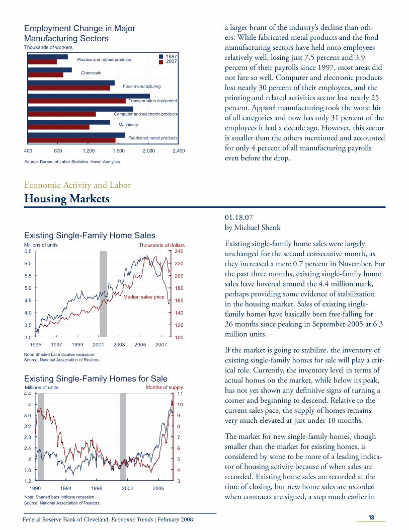
Existing single-family home sales were largely unchanged for the second consecutive month, as they increased a mere 0.7 percent in November. For the past three months, existing single-family home sales have hovered around the 4.4 million mark, perhaps providing some evidence of stabilization in the housing market. Sales of existing single-family homes have basically been free-falling for 26 months since peaking in September 2005 at 6.3 million units.
If the market is going to stabilize, the inventory of existing single-family homes for sale will play a crit-ical role. Currently, the inventory level in terms of actual homes on the market, while below its peak, has not yet shown any defi nitive signs of turning a corner and beginning to descend. Relative to the current sales pace, the supply of homes remains very much elevated at just under 10 months.
Th e market for new single-family homes, though smaller than the market for existing homes, is considered by some to be more of a leading indica-tor of housing activity because of when sales are recorded. Existing home sales are recorded at the time of closing, but new home sales are recorded when contracts are signed, a step much earlier in

19Federal Reserve Bank of Cleveland, Economic Trends | February 2008
the home-buying process. Th us the fact that new single-family home sales fell 9.0 percent in Novem-ber after three months of relative stability may give some optimists cause for concern.
Inventories of new homes for sale remained elevat-ed in November. Th e actual number of homes on the market declined over the month, as it has done fairly regularly since peaking in July 2006. How-ever, the level of inventory measured relative to the current sales pace has continued to increase during this period, as sales continued their rapid decline. 0.5
0.6
0.7
0.8
0.9
1.0
1.1
1.2
1.3
1.4
1995 1997 1999 2001 2003 2005 2007100
120
140
160
180
200
220
240
260
280
New Single-Family Home SalesMillions of units Thousands of dollars
Median sales price
Note: Shaded bar indicates recession.Source: Census Bureau.
250
300
350
400
450
500
550
600
1990 1994 1998 2002 20063
4
5
6
7
8
9
10
New Single-Family Homes for SaleThousands of units Months of supply
Note: Shaded bars indicate recession.Source: Census Bureau.
3
4
5
6
7
8
1990 1992 1994 1996 1998 2000 2002 2004 2006 2008
Percent
Fourth DistrictUnited States
Unemployment Rates
a
a. Seasonally adjusted using the Census Bureau’s X-11 procedure.Note: Shaded bars represent recessions. Some data reflect revised inputs, reestimation, and new statewide controls. For more information, see http://www.bls.gov/lau/launews1.htm.Source: U.S. Department of Labor and Bureau of Labor Statistics.
December increase inU.S. unemployment rate
Regional ActivityTh e Ups and Downs in Regional Employment Statistics
01.31.08By Tim Dunne, Guhan Venkatu and Kyle Fee
Our standard monthly employment report typi-cally provides various employment statistics for the Fourth District and its major metropolitan areas. Th is month we take a diff erent tack, as the District’s November employment numbers varied widely from our expectations. Th e Fourth District’s unemployment rate dropped sharply in November, falling to 5.2 percent from 5.7 percent in the previ-ous month. Meanwhile, the national unemploy-ment rate held relatively steady until December, when it saw a substantial increase of 0.3 percent. However, we are cautious about interpreting the large drop in the District’s unemployment rate as a sign of an improving labor market.

20Federal Reserve Bank of Cleveland, Economic Trends | February 2008
For one thing, the drop in the district’s unemploy-ment rate is more likely the result of an atypical cal-endar and its eff ect on the way the data are reported than on something in the labor market.
First, Th anksgiving fell very early this year and may have caused retailers to move their seasonal hiring up further in the month than in recent years. Second, in response to the early Th anksgiving holiday, the Labor Department and Census Bureau moved the “refer-ence week” for the Current Population Survey—a key input into the estimation of state and county un-employment rates—to the week of November 4–10. Th e reference week is the week in a month during which individuals are asked about their employ-ment status; normally, this is the week that contains the 12th of the month. Th e change in the reference week this month may have infl uenced November’s state-level statistics. Finally, the change of the refer-ence week, combined with the early Th anksgiving, may have introduced more noise into the seasonal-adjustment process that is applied to remove from the data any seasonally-induced swings in the labor force, employment, and unemployment series.
A look at state-level unemployment rates supports this idea. November’s declines were completely reversed in December in Fourth District states. Ohio’s unemployment rate went from 5.6 percent to 6.0 percent, Pennsylvania’s from 4.2 percent to 4.7 percent, and Kentucky’s from 5.0 percent to 5.7 percent.
We can’t construct December’s unemployment rate for the Fourth District because data are not available yet for individual counties. However, we believe the trends in the state-level data will hold for the Fourth District as a whole.
A fi nal word of caution on comparing monthly labor statistics. Th e 2007 data have not yet been revised and are not equivalent to those of earlier years. Revised data are updated and adjusted for seasonal factors, but they are also markedly less volatile, because the revision process smoothes out natural month-to-month fl uctuations. To see this, look at the graph below, which shows the monthly percent changes in employment for Kentucky, Ohio, and Pennsylvania from 1988 to 2007. Th e data for 2007, which are unrevised,
3
4
5
6
7
8
1990 1992 1994 1996 1998 2000 2002 2004 2006 2008
Percent
United States
Unemployment Rates in Three Fourth District States
Note: Shaded bars represent recessions. Some data reflect revised inputs, reestimation, and new statewide controls. For more information, see http://www.bls.gov/lau/launews1.htm.Source: U.S. Department of Labor, Bureau of Labor Statistics.
OhioKentucky
Pennsylvania
-0.6
-0.4
-0.2
-0
0.2
0.4
0.6
0.8
1
1.2
1976 1980 1984 1988 1992 1996 2000 2004 2008
Ohio Employment Data
Source: U.S. Department of Labor, Bureau of Labor Statistics.
End of 2006 DataCurrent Data
Month over month percent change

21Federal Reserve Bank of Cleveland, Economic Trends | February 2008
show considerably more variation than the data for previous years. Note though that diff erent degrees of smoothing emerge across states after revision. Ohio’s post-revision data are relatively smooth, while Pennsylvania’s retain signifi cant month-to-month fl uctuations. However, these diff erences are not evidence necessarily that Ohio’s economy has lower month-to-month employment fl uctuations than Pennsylvania’s. Rather, they are more likely the result of diff erences in the way states modify their data during the revision process.
Th e next chart illustrates the degree of smooth-ing that can occur in these data series. Th e chart displays the month-to-month percentage change in the employment data both before and after the last annual revision for Ohio. Note that the data for 2006 prior to the revision (the red line) show high volatility but following the revision the series is smoothed for 2006 (the blue line). Revised 2007 employment data will be released at the end of Feb-ruary and will undoubtedly show much less month-to-month volatility.
Regional ActivityTh e Erie Metropolitan Statistical Area
01.22.08By Tim Dunne and Kyle Fee
Th e Erie metropolitan statistical area (MSA) is located in the northwest corner of Pennsylvania on Lake Erie. Home to 279,811 people, Erie, a Great Lakes city, has an employment history of heavy industry and manufacturing. In 2006, Erie was still heavily invested in manufacturing industries, having about an 80 percent higher proportion of its workforce in manufacturing than the nation as a whole. Meanwhile, Erie’s service industry work-force was proportionately higher in health services industries relative to the nation and lower in in-formation, fi nancial, and professional business and services industries.
Looking at the components of annual employ-ment growth in the Erie MSA, the strongest driver of employment growth from year to year has been the service sector industries of education, health, leisure, government and other services. Not surpris-
0 0.2 0.4 0.6 0.8 1 1.2 1.4 1.6 1.8
GovernmentOther services
Leisure and hospitalityEducation and health services
Professional and business servicesFinancial activities
InformationTrade, transportation, utilities
Manufacturing Natural resources, mining, construction
Location Quotients for Erie MSA and the U.S., 2006
Note: A location quotient is the simple ratio of a given industry’s employment share in one region to the industry’s employment share in the nation. A location quotient of one indicates that the industry accounts for the same share of employment in the region and the nation.Sources: U.S. Department of Labor, Bureau of Labor Statistics.

22Federal Reserve Bank of Cleveland, Economic Trends | February 2008
ingly, manufacturing employment is the biggest drag on Erie’s employment growth.
Erie’s most recent employment growth has come from growth in tourism-related industries. Erie’s total nonfarm employment growth from October 2006 to October 2007 is 0.7 percent, while employ-ment in the leisure and hospitality industries has jumped 6.6 percent over the same period. On the down side, goods-producing industries lost employ-ment at a rate substantially above the national rate.
Since the last business cycle peak in March 2001, Erie lost 0.9 percent of its total nonfarm employ-ment, compared to Pennsylvania’s gain of 1.6 per-cent and the nation’s gain of 4.4 percent. From its lowest employment levels in July of 2003, Erie has expanded its employment 4.5 percent. Over that same period, Pennsylvania’s employment grew 3.7 percent and the nation’s grew 6.5 percent.
Compared to other cities on Lake Erie, Erie actu-ally has performed reasonably well. While employ-ment is still below the city’s 2001 level (similar to the decline experienced by its neighbor to the north, Buff alo, New York), the Erie labor market has been stronger than Cleveland’s or Toledo’s.
Disaggregating employment into manufacturing and nonmanufacturing components, we see that the Erie metropolitan area underperformed rela-tive to the U.S. average in both sectors. Since the last business cycle peak in March 2001, Erie lost 25.5 percent of its manufacturing jobs, while the nation lost 17.5 percent. Th is manufacturing drag on Erie’s economy is particularly important because Erie has a much higher share of manufacturing than the United States as a whole. Alternatively, Erie’s nonmanufacturing employment growth has tracked the national trend pretty closely over the past six years.
Like Buff alo and Cleveland, Erie’s manufacturing employment has suff ered a steep decline, though the time-series patterns for Buff alo and Cleveland diff er. Erie’s steepest drop occurred in the 2001–2003 period, but since mid-2003 it has stabilized somewhat, while in Buff alo and Cleveland it has continued to contract. Toledo’s decline has mir-rored that of the United States, though recently,
-3 -2 -1 0 1 2 3 4 5 6 7
GovernmentOther services
Leisure and hospitalityEducation and health services
Professional and business servicesFinancial activities
InformationTrade, transportation, and utilities
Service-providingNatural resources, mining & construction
ManufacturingGoods-producing
Total nonfarm
Payroll Employment Growth, October 2006 - October 2007
U.S. Erie MSA
Year-over-year percent change
Sources: U.S. Department of Labor, Bureau of Labor Statistics.
94
96
98
100
102
104
106
2001 2002 2003 2004 2005 2006 2007
Payroll Employment since March 2001Index, March 2001 = 100
Erie MSA
Pennsylvania
U.S.
Sources: U.S. Department of Labor, Bureau of Labor Statistics.
Retail and wholesale tradeManufacturingTransportation, warehousing and utilities
Natural resources, mining & construction
-3
-2
-1
0
1
2
3
4
2001 2002 2003 2004 2005 2006
Components of Employment Growth, Erie MSA
U.S.
Percent change
Financial, information and business servicesEducation, health, leisure, government and other services
Note: The white bars represent total annual growth for the Erie MSA. The red line is U.S. growth.Sources: U.S. Department of Labor and Bureau of Labor Statistics.

23Federal Reserve Bank of Cleveland, Economic Trends | February 2008
Toledo is showing some relative weakness.
Where Erie looks quite diff erent from the other cities along Lake Erie is in the growth of nonmanu-facturing employment. Erie has consistently added nonmanufacturing jobs at a faster rate than the other Lake Erie cities. Erie’s 6.8 percent nonmanufacturing growth exceeds Buff alo’s 2.7 percent gain, Toledo’s 0.6 percent loss, and Cleveland’s 1.5 percent loss.
Th e relatively slow growth of Erie’s labor market is also refl ected in the metro area’s statistics on per capita personal income. Over the last six years, Erie’s nominal growth in per capita income has been substantially lower than Pennsylvania’s or the United States’. Nominal per capita income grew in Erie at 17.9 percent, while Pennsylvania and the United States had similar rates of 23.5 percent and 22.7 percent, respectively. Moreover, Erie has substantially lower per capita income. In 2006, the Erie metro area’s per capita income was only 79 percent that of Pennsylvania’s and the United States’.
92
94
96
98
100
102
104
106
2001 2002 2003 2004 2005 2006 2007
Payroll Employment since March 2001Index, March 2001 = 100
Erie
Toledo
U.S.
Buffalo
Cleveland
Sources: U.S. Department of Labor, Bureau of Labor Statistics.
70
75
80
85
90
95
100
105
110
2001 2003 2005 2007
Index, March 2001 = 100
U.S. NonmanufacturingU.S. ManufacturingErie Manufacturing
Erie Nonmanufacturing
Payroll Employment since March 2001
Sources: U.S. Department of Labor, Bureau of Labor Statistics.
70
75
80
85
90
95
100
105
2001 2003 2005 2007
Index, March 2001 = 100
Toledo
U.S.
Erie
Cleveland
Payroll Employment since March 2001, Manufacturing
Buffalo
Sources: U.S. Department of Labor, Bureau of Labor Statistics.
96
98
100
102
104
106
108
110
2001 2003 2005 2007
Index, March 2001 = 100
Toledo
U.S.
Erie
Cleveland
Payroll Employment since March 2001,Nonmanufacturing
Buffalo
Sources: U.S. Department of Labor, Bureau of Labor Statistics.
0
5
10
15
20
25
30
Erie Pennsylvania U.S.
PercentPer Capita Income Growth since 2000
$28,941 in 2006
$36,689 in 2006 $36,629 in 2006
Source: Bureau of Economic Analysis.

24Federal Reserve Bank of Cleveland, Economic Trends | February 2008
Banking and Financial Institutions Fourth District Community Banks
01.22.08by Joe Haubrich and Saeed Zaman
Overall, fi nancial indicators point to some weaken-ing of Fourth District banks’ balance sheets. As-set quality, as measured by net charge-off s (losses realized on loans and leases currently in default minus recoveries on previously charged-off loans and leases) deteriorated in the third quarter of 2007. Net charge-off s increased to 0.37 percent of total loans (from 0.34 percent at the end of 2006). Problem assets (nonperforming loans and repos-sessed real estate) as a share of total assets rose to 0.95 percent, from 0.72 percent at the end of 2006. Th e increase in problem assets may translate into higher charge-off s in the future if borrowers cannot catch up with their late payments. At the national level, the picture is similar; both asset quality ratios have deteriorated. Net charge-off s and nonperform-ing loans rose to 0.43 percent of loans (up from 0.33 percent at the end of 2006) and 0.56 percent of assets (up from 0.45 percent at the end of 2006).
Fourth District banks held $12.45 in equity capital and loan loss reserves for every dollar of problem loans, which is above the recent coverage ratio low of 10.75 at the end of 2002, but well below the record high of 24.97 at the end of 2004.
Equity capital as a percent of Fourth District banks’ assets (the leverage ratio) rose to 9.73 percent (from 9.34 percent at the end of 2006).
Th e percent of unprofi table institutions in the Fourth District rose to 8.66 percent for the third quarter of 2007 (from 6.36 percent at the end of 2006). Unprofi table banks’ asset size also rose, as the share of District banks’ assets accounted for by unprofi table banks increased from 0.23 percent to 0.45 percent. Industrywide, the percent of unprof-itable institutions rose from 7.7 percent to 9.67 percent at the end of the third quarter of 2007. Th e asset size of unprofi table banks also went up from 0.59 percent at the end of 2006 to 1.93 percent at the end of the third quarter of 2007. So, the in-dustrywide increase in the number of unprofi table
0.2
0.3
0.4
0.5
0.6
0.7
0.8
0.9
1.0
1.1
1.2
1994 1996 1998 2000 2002 2004 2006
Percent
Net charge-offs, excluding JP Morgan Chase
Problem assets , excluding JP Morgan Chase
a
aProblem assets , including JP Morgan Chase
Net charge-offs, including JP Morgan Chase
Asset Quality
Notes: Data are through 2007:IIIQ only. Data for 2007 are annualized.a. Problem assets are shown as a percent of total assets, net charge-offs as a percent of total loans. Source: Authors’ calculation from Federal Financial Institutions Examination Council, Quarterly Banking Reports of Condition and Income, third quarter 2007.
9
12
15
18
21
24
27
30
1994 1996 1998 2000 2002 2004 2006
Percent
Excluding JP Morgan Chase
Including JP Morgan Chase
Coverage Ratio
Notes: Data are through 2007:IIIQ only. Data for 2007 are annualized. Efficiency is operating expenses as a percent of net interest income plus non-interest income. Source: Authors’ calculation from Federal Financial Institutions Examination Council, Quarterly Banking Reports of Condition and Income, third quarter 2007.

25Federal Reserve Bank of Cleveland, Economic Trends | February 2008
banks was restricted not only to smaller fi nancial institutions but broad based.
Net income posted by FDIC-insured commercial banks headquartered in the Fourth Federal Reserve District for the fi rst three quarters of 2007 was $7.6 billion —$10.14 billion on an annual basis. (JP Morgan Chase, chartered in Columbus, is not included in this discussion because its assets are mostly outside the District and its size—roughly $1 trillion—dwarfs other District institutions.) Th e U.S. banking industry as a whole posted earnings of $107.09 billion for the same period—$142.78 billion on an annual basis.
Fourth District banks’ net interest margins (core profi tability computed as interest income minus interest expenses divided by average earning as-sets) fell to 2.96 percent of total income at the end of the third quarter of 2007, but it is still higher than the U.S. average of 2.87 percent. Non-interest income relative to total income slipped for both Fourth District banks and the national average, to 28.51 percent for District banks, and to 28.42 percent for the nation.
Fourth District banks’ effi ciency (operating ex-penses as a percent of total income) continued to worsen in the third quarter of 2007, deteriorating to 56.69 percent from the 52.64 percent record set in 2002. (Lower numbers correspond to greater ef-fi ciency.) Banks outside the Fourth District also de-teriorated, as the national average climbed to 55.05 percent, from 54.64 percent at the end of 2006.
At the end of the third quarter of 2007, District banks posted a 1.20 percent return on assets (down from 1.41 percent at the end of 2006) and a 12.37 percent return on equity (down from 15.05 percent at the end of 2006). Th e District’s decline resonated the with the downward trend nationwide: Return on assets nationwide was down to 1.01 percent (from 1.14 percent at the end of 2006), and return on equity was down to 10.92 percent (from 12.23 percent at the end of 2006).
4
5
6
7
8
9
10
11
1994 1996 1998 2000 2002 2004 2006
Percent
Capital Ratio, excluding JP Morgan Chase Capital Ratio, including JP Morgan Chase
Core Capital (Leverage) Ratio
Notes: Data are through 2007:IIIQ only. Data for 2007 are annualized. Efficiency is operating expenses as a percent of net interest income plus non-interest income. Source: Authors’ calculation from Federal Financial Institutions Examination Council, Quarterly Banking Reports of Condition and Income, third quarter 2007.
-1
0
1
2
3
4
5
6
7
8
9
1994 1996 1998 2000 2002 2004 2006
Percent
Assets in unprofitable institutions excluding JP Morgan
Unprofitable institutions including JP Morgan
Assets in unprofitable institutions including JPMorgan
Unprofitable institutions excluding JP Morgan
Unprofitable Institutions
Notes: Data are through 2007:IIIQ only. Data for 2007 are annualized. Efficiency is operating expenses as a percent of net interest income plus non-interest income. Source: Authors’ calculation from Federal Financial Institutions Examination Council, Quarterly Banking Reports of Condition and Income, third quarter 2007.

26Federal Reserve Bank of Cleveland, Economic Trends | February 2008
Economic Trends is published by the Research Department of the Federal Reserve Bank of Cleveland.
Views stated in Economic Trends are those of individuals in the Research Department and not necessarily those of the Fed-eral Reserve Bank of Cleveland or of the Board of Governors of the Federal Reserve System. Materials may be reprinted provided that the source is credited.
If you’d like to subscribe to a free e-mail service that tells you when Trends is updated, please send an empty email mes-sage to [email protected]. No commands in either the subject header or message body are required.
ISSN 0748-2922
50
52
54
56
58
60
62
64
66
68
70
1994 1996 1998 2000 2002 2004 2006
Percent
Excluding JP Morgan Chase
Including JP Morgan Chase
Efficiency Ratio
Notes: Data are through 2007:IIIQ only. Data for 2007 are annualized. Efficiency is operating expenses as a percent of net interest income plus non-interest income. Source: Authors’ calculation from Federal Financial Institutions Examination Council, Quarterly Banking Reports of Condition and Income, third quarter 2007.
0.7
0.8
0.9
1.0
1.1
1.2
1.3
1.4
1.5
1.6
1.7
1995 1997 1999 2001 2003 2005 20070
2
4
6
8
10
12
14
16
18
20Percent Percent
Return on equity excluding JP Morgan
Return on assets excluding JP Morgan
Return on equity including JP Morgan
Return on assets including JP Morgan
Earnings
Note: Data are through 2007:IIIQ only. Data for 2007 ammualized.Source: Authors’ calculation from Federal Financial Institutions Examination Council, Quarterly Banking Reports of Condition and Income, third quarter 2007.
2.00
2.25
2.50
2.75
3.00
3.25
3.50
3.75
4.00
4.25
4.50
4.75
5.00
1995 1997 1999 2001 2003 2005 200720
22
24
26
28
30
32
34
36
38
40
42
44Percent Percent
Net interest margin excludingJP Morgan Chase
Non-interest income/income including JP Morgan Chase
Non-interest income/income excluding JP Morgan Chase
Net interest margin including JP Morgan Chase
Income Ratios
Note: Data are through 2007:IIIQ only. Data for 2007 are annualized.Source: Authors’ calculation from Federal Financial Institutions Examination Council, Quarterly Banking Reports of Condition and Income, third quarter 2007.
0
2
4
6
8
10
12
14
16
18
20
22
1995 1997 1999 2001 2003 2005 2007
Billions of dollars
Excluding JP Morgan ChaseIncluding JP Morgan Chase
Annual Net Income
Note: Data are through 2007:IIIQ only. Data for 2007 are annualized.Source: Authors’ calculation from Federal Financial Institutions Quarterly Examination Council, Banking Reports of Condition and Income, third quarter 2007.