from traffic to twitter--exploring networks with sas...
TRANSCRIPT
1
Paper SAS045-2014
From Traffic to Twitter – Exploring Networks with SAS Visual Analytics®
Falko Schulz, SAS Institute Inc., Brisbane, Australia
Nascif Abousalh-Neto, SAS Institute Inc., Cary, NC
ABSTRACT
In this interconnected world, it is more important than ever to understand not just the details about your data, but also how different parts of your data are related to each other. From social networks to supply chains to text analytics, network analysis is becoming a critical requirement – and network visualization is one of the best ways to understand the results. The new SAS Visual Analytics® network visualization shows links between related nodes as well as additional attributes such as color, size, or labels. This paper will explain the basic concepts of networks as well as provides detailed background information about how to use network visualizations within SAS Visual Analytics.
INTRODUCTION
Bad news is not the only thing traveling fast. Diseases, financial meltdowns, social unrest; disruptive events can spread across the globe faster than ever before. What these diverse events have in common is that they spread or propagate over connected structures: transportation, information, and social networks.
Networks are at the core of complex systems and one of the reasons why their behavior is often surprising and unpredictable. Networks can’t be understood using traditional reductionist methods [Barabási2002]. To quote Aristotle, “the whole is larger than the sum of its parts”. The difference lies in how the parts are connected and influence each other.
If being oblivious to the nature of networks can leave one vulnerable to disruptive change, a deep understanding of networks can unlock massive gains. The reason is simple: networks are everywhere. Unlike the abstract world of relational databases, in the real world everything is interrelated. In recent years, companies like Facebook, Google, and Walmart harnessed the power of networks of relationships, information, and supply-chains to dominate their competitors.
Gartner [Gartner2012] identifies five graphs in the world of business—social, intent, consumption, interest, and mobile—and says that the ability to leverage these graphs provides a “sustainable competitive advantage.”
We will see how you too can gain this advantage with the new network analysis and visualization features in SAS Visual Analytics.
ABOUT NETWORK VISUALIZATION
A network is defined as a collection of objects, or nodes, in which some pairs of nodes are connected by links. A link can represent any type of relationship. This definition is very generic, explaining why we can find networks in many diverse domains.
In mathematical terms, networks are represented by graphs (not to be confused with the common term used to describe some data visualizations). The interconnected objects are represented by mathematical abstractions called vertices, and the links that connect some pairs of vertices are called edges. Graph properties are the subject of study of a branch of discrete mathematics called graph theory.
Along the same lines, network visualization is based on the visual display of graphs. The most common form is the node-link diagram, which uses a set of dots or circles to represent the vertices, joined by lines or curves to represent the edges.
Vertex attributes can be mapped to visual node characteristics like size, color, and shape. Edge attributes can be mapped to link width and color.
One edge attribute is particularly important: direction. Most relationships are undirected or symmetric. For example, the “friends” relationship in Facebook is undirected. But some network relationships are directed, or asymmetric - meaning that a link from A to B doesn’t imply a corresponding link from B to A. An example is the “follows” relationship in Twitter. In this case, the visualization will use arrows or tapered edges to indicate the direction of the relationship.
The biggest challenge in network visualization is finding an optimal spatial placement for the nodes that makes the main characteristics of the network structure clearly visible. In a few specific cases, like transportation networks, node position is a simple mapping of node attributes that represent spatial coordinates. This is how SAS Visual Analytics
2
overlays network diagrams over geographical maps.
But in general, node positions are generated dynamically based on the network structure. This is accomplished using a special type of algorithm called a network layout, which attempts to minimize edge length and crossings for
maximum readability.
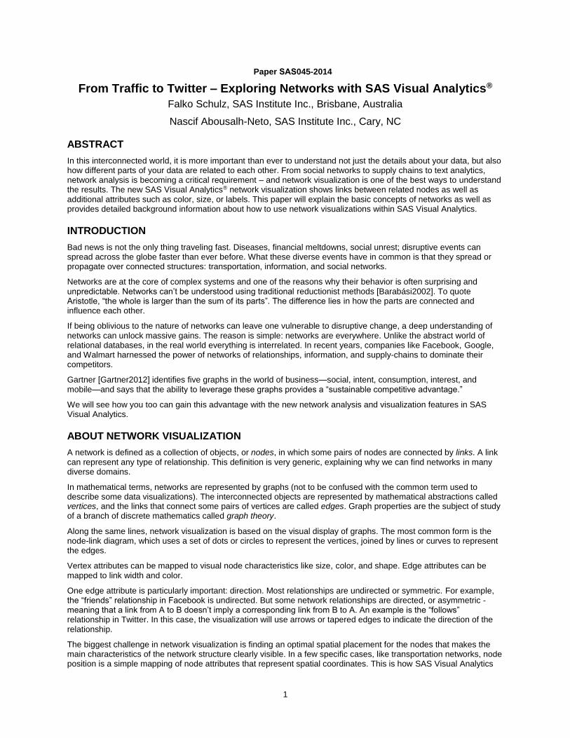
NETWORK VISUALIZATION IN SAS VISUAL ANALYTICS
SAS Visual Analytics is a high-performance, interactive application for visualizing and exploring large amounts of data. Exploratory data analysis is done through an intuitive graphical user interface that enables manipulation of graphs in real time. Visualization techniques enable users to detect patterns and extract information of interest. Visualizing networks in SAS Visual Analytics gives the user additional insights about the underlying structures of associations between entities or objects. Analyzing social networks shows connections between people and reveals entire communities or group of friends.
Note: In the current release (6.4) of SAS Visual Analytics, network visualization is supported only in the SAS Visual Analytics Explorer.
Figure 1 - Example Network Visualization
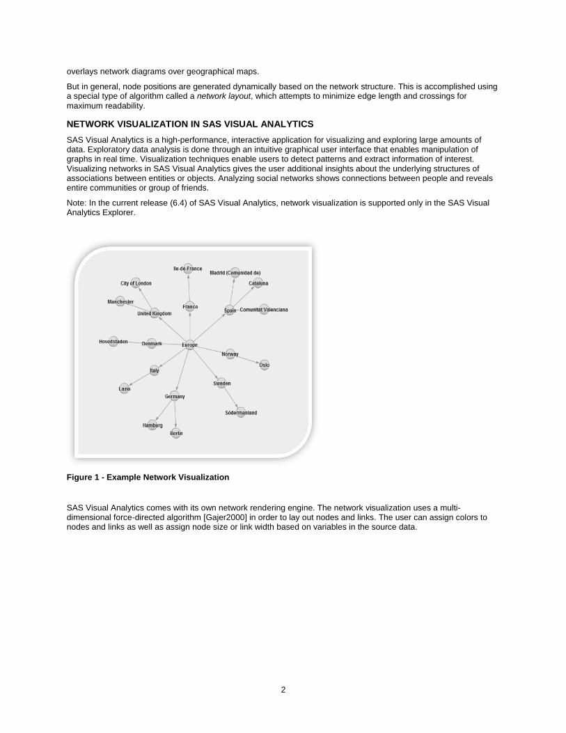
SAS Visual Analytics comes with its own network rendering engine. The network visualization uses a multi-dimensional force-directed algorithm [Gajer2000] in order to lay out nodes and links. The user can assign colors to nodes and links as well as assign node size or link width based on variables in the source data.
3
Figure 2 - Network with Color and Size Attributes
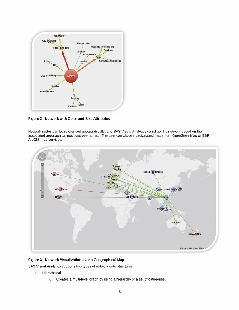
Network nodes can be referenced geographically, and SAS Visual Analytics can draw the network based on the associated geographical positions over a map. The user can choose background maps from OpenStreetMap or ESRI ArcGIS map services:
Figure 3 - Network Visualization over a Geographical Map
SAS Visual Analytics supports two types of network data structures:
Hierarchical
o Creates a multi-level graph by using a hierarchy or a set of categories.

4
Ungrouped
o Creates a flat structure by using a source data item and a target data item. A node is created for each value of the source data item, and a link is created from each node to the node that corresponds to the value of the target data item.
DATA PREPARATION
SAS Visual Analytics supports hierarchical and ungrouped input data. The following section explains the expected data structure in detail and what to look for when preparing data.
In the current release, network-related statistics such as betweenness, closeness, and so on can be pre-calculated during data preparation and added to the graph data for later visualization and analysis in SAS Visual Analytics.
HIERARCHICAL DATA SOURCE
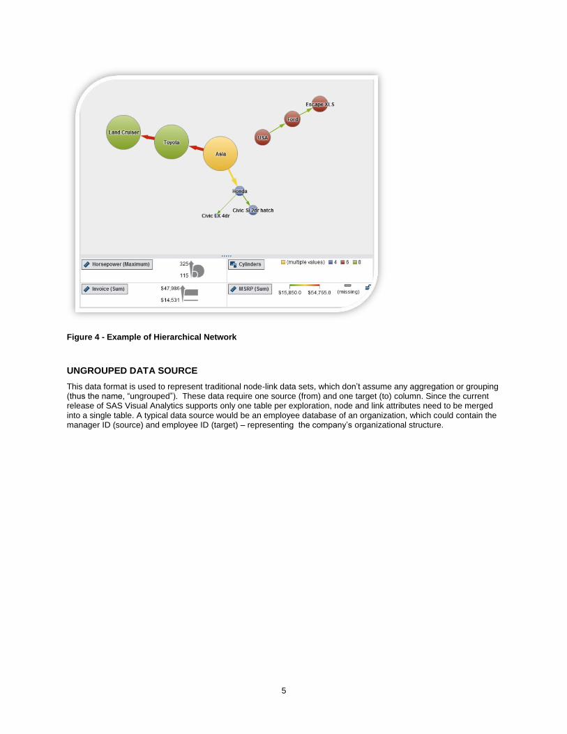
Hierarchical data are the most common data format the user will have access to in SAS Visual Analytics. This is not because it is best to visualize in a network but rather a more common data structure used by organizations to store information. Hierarchical data structures can also be visualized using treemaps, grouped bar charts, and even cross tabulations. In order to build a hierarchical network, SAS Visual Analytics enables you to assign either a pre-built hierarchy or one or more levels (data items) to the network.
A typical example of a hierarchical data source is SASHELP.CARS, which is part of any SAS environment. The CARS data set contains information about various car makers including the models they produce in different parts of
the world. Table 1 shows a small sample of the data:
ORIGIN MAKE MODEL CYLINDERS INVOICE MSRP HORSEPOWER
Asia Honda Civic LX 4dr 4 $14,531 $15,850 115
Asia Honda Civic Si 2dr hatch 4 $17,849 $19,490 160
Asia Toyota Land Cruiser 8 $47,986 $54,765 325
USA Ford Escape XLS 6 $20,907 $22,515 201
Table 1 – The CARS Data Set
The first three columns (ORIGIN, MAKE, and MODEL) represent the hierarchy, and we can expect a network
visualizing the 4 car models and their relation to the car make as well as location. Additional attribute columns such as horsepower or cylinders can be assigned as node color, node size, and link color or link width in order to describe each node and links.
Numeric columns or measures are aggregated based on the aggregation associated with the corresponding data item (or items in the case of link attributes). All aggregations are supported, with the exception of average. In Figure 4
we can see HORSEPOWER assigned as node size using the associated “Maximum” aggregation. The user can also
assign categorical columns to node and link attributes. In this case an underlying categorical value will be assigned only if it is unique for the set of observations represented by the node or link. Otherwise, the special value ‘multiple values’ is assigned. In Figure 4 the column CYLINDERS is used as node color and the special value ‘multiple values’
assigned to ‘Asia’ indicates that there is more than one categorical value associated to this node (for example, Asia has models with 4 and 8 cylinders) while ‘USA’ and ‘Honda’ have unique values assigned to them because all their observations share that same value (6 and 4 cylinders, respectively).
5
Figure 4 - Example of Hierarchical Network
UNGROUPED DATA SOURCE
This data format is used to represent traditional node-link data sets, which don’t assume any aggregation or grouping (thus the name, “ungrouped”). These data require one source (from) and one target (to) column. Since the current release of SAS Visual Analytics supports only one table per exploration, node and link attributes need to be merged into a single table. A typical data source would be an employee database of an organization, which could contain the manager ID (source) and employee ID (target) – representing the company’s organizational structure.
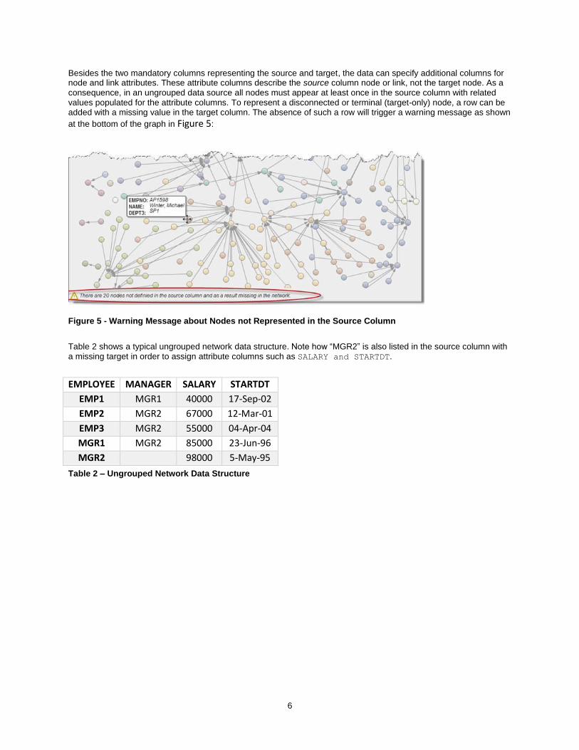
6
Besides the two mandatory columns representing the source and target, the data can specify additional columns for node and link attributes. These attribute columns describe the source column node or link, not the target node. As a consequence, in an ungrouped data source all nodes must appear at least once in the source column with related values populated for the attribute columns. To represent a disconnected or terminal (target-only) node, a row can be added with a missing value in the target column. The absence of such a row will trigger a warning message as shown
at the bottom of the graph in Figure 5:
Figure 5 - Warning Message about Nodes not Represented in the Source Column
Table 2 shows a typical ungrouped network data structure. Note how “MGR2” is also listed in the source column with a missing target in order to assign attribute columns such as SALARY and STARTDT.
EMPLOYEE MANAGER SALARY STARTDT
EMP1 MGR1 40000 17-Sep-02
EMP2 MGR2 67000 12-Mar-01
EMP3 MGR2 55000 04-Apr-04
MGR1 MGR2 85000 23-Jun-96
MGR2 98000 5-May-95
Table 2 – Ungrouped Network Data Structure
7
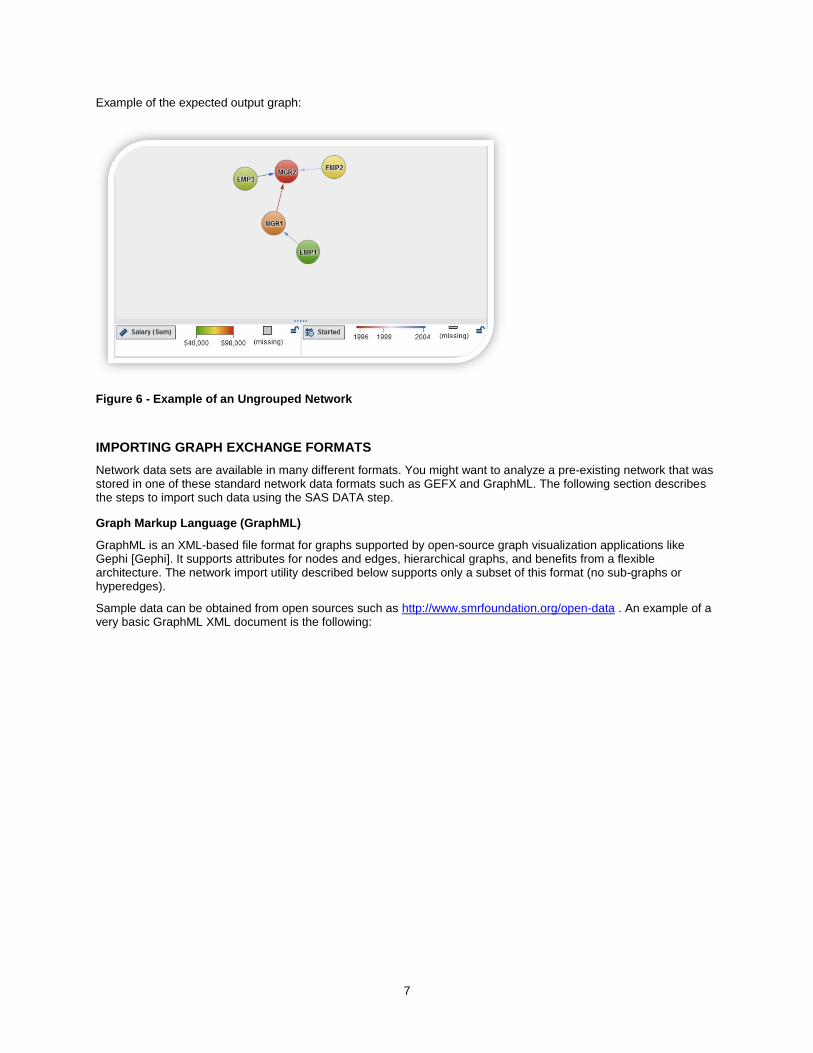
Example of the expected output graph:
Figure 6 - Example of an Ungrouped Network
IMPORTING GRAPH EXCHANGE FORMATS
Network data sets are available in many different formats. You might want to analyze a pre-existing network that was stored in one of these standard network data formats such as GEFX and GraphML. The following section describes the steps to import such data using the SAS DATA step.
Graph Markup Language (GraphML)
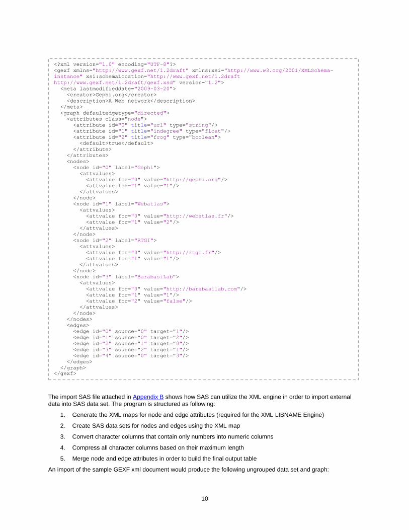
GraphML is an XML-based file format for graphs supported by open-source graph visualization applications like Gephi [Gephi]. It supports attributes for nodes and edges, hierarchical graphs, and benefits from a flexible architecture. The network import utility described below supports only a subset of this format (no sub-graphs or hyperedges).
Sample data can be obtained from open sources such as http://www.smrfoundation.org/open-data . An example of a very basic GraphML XML document is the following:

8
The import SAS file attached in Appendix A shows how SAS can utilize the XML engine in order to import external data into a SAS data set. The program is structured as following:
1. Generate the XML maps for node and edge attributes (required for the XML LIBNAME Engine)
2. Create SAS data sets for nodes and edges using the XML map
3. Convert character columns that contain only numbers into numeric columns
4. Compress all character columns based on their maximum length
5. Merge node and edge attributes in order to build the final output table
An import of the sample GraphML XML document would produce the following ungrouped data set and graph:
<?xml version="1.0" encoding="UTF-8"?>
<graphml xmlns="http://graphml.graphdrawing.org/xmlns"
xmlns:xsi="http://www.w3.org/2001/XMLSchema-instance"
xsi:schemaLocation="http://graphml.graphdrawing.org/xmlns
http://graphml.graphdrawing.org/xmlns/1.0/graphml.xsd">
<graph id="G" edgedefault="undirected">
<node id="n0"/>
<node id="n1"/>
<node id="n2"/>
<node id="n3"/>
<node id="n4"/>
<node id="n5"/>
<node id="n6"/>
<node id="n7"/>
<node id="n8"/>
<node id="n9"/>
<node id="n10"/>
<edge source="n0" target="n2"/>
<edge source="n1" target="n2"/>
<edge source="n2" target="n3"/>
<edge source="n3" target="n5"/>
<edge source="n3" target="n4"/>
<edge source="n4" target="n6"/>
<edge source="n6" target="n5"/>
<edge source="n5" target="n7"/>
<edge source="n6" target="n8"/>
<edge source="n8" target="n7"/>
<edge source="n8" target="n9"/>
<edge source="n8" target="n10"/>
</graph>
</graphml>
9
Graph Exchange XML Format (GEXF)
GEXF is a XML-based language for describing complex networks structures, their associated data, and dynamics. Started in 2007 at the Gephi project by different actors, deeply involved in graph exchange issues, the GEXF specifications are mature enough to claim being both extensible and open, and are suitable for real specific applications.
Sample data can be obtained from open sources such as http://gexf.net/format/basic.html . An example of a very basic GEXF XML document is the following:
SOURCE TARGET ID
n0 n2 n0
n1 n2 n1
n2 n3 n2
n3 n5 n3
n3 n4 n3
n4 n6 n4
n6 n5 n6
n5 n7 n5
n6 n8 n6
n8 n7 n8
n8 n9 n8
n8 n10 n8
n10 n10
n7 n7
n9 n9
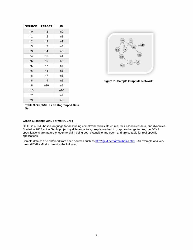
Table 3 GraphML as an Ungrouped Data Set
Figure 7 - Sample GraphML Network
10
The import SAS file attached in Appendix B shows how SAS can utilize the XML engine in order to import external data into SAS data set. The program is structured as following:
1. Generate the XML maps for node and edge attributes (required for the XML LIBNAME Engine)
2. Create SAS data sets for nodes and edges using the XML map
3. Convert character columns that contain only numbers into numeric columns
4. Compress all character columns based on their maximum length
5. Merge node and edge attributes in order to build the final output table
An import of the sample GEXF xml document would produce the following ungrouped data set and graph:
<?xml version="1.0" encoding="UTF-8"?>
<gexf xmlns="http://www.gexf.net/1.2draft" xmlns:xsi="http://www.w3.org/2001/XMLSchema-
instance" xsi:schemaLocation="http://www.gexf.net/1.2draft
http://www.gexf.net/1.2draft/gexf.xsd" version="1.2">
<meta lastmodifieddate="2009-03-20">
<creator>Gephi.org</creator>
<description>A Web network</description>
</meta>
<graph defaultedgetype="directed">
<attributes class="node">
<attribute id="0" title="url" type="string"/>
<attribute id="1" title="indegree" type="float"/>
<attribute id="2" title="frog" type="boolean">
<default>true</default>
</attribute>
</attributes>
<nodes>
<node id="0" label="Gephi">
<attvalues>
<attvalue for="0" value="http://gephi.org"/>
<attvalue for="1" value="1"/>
</attvalues>
</node>
<node id="1" label="Webatlas">
<attvalues>
<attvalue for="0" value="http://webatlas.fr"/>
<attvalue for="1" value="2"/>
</attvalues>
</node>
<node id="2" label="RTGI">
<attvalues>
<attvalue for="0" value="http://rtgi.fr"/>
<attvalue for="1" value="1"/>
</attvalues>
</node>
<node id="3" label="BarabasiLab">
<attvalues>
<attvalue for="0" value="http://barabasilab.com"/>
<attvalue for="1" value="1"/>
<attvalue for="2" value="false"/>
</attvalues>
</node>
</nodes>
<edges>
<edge id="0" source="0" target="1"/>
<edge id="1" source="0" target="2"/>
<edge id="2" source="1" target="0"/>
<edge id="3" source="2" target="1"/>
<edge id="4" source="0" target="3"/>
</edges>
</graph>
</gexf>
11
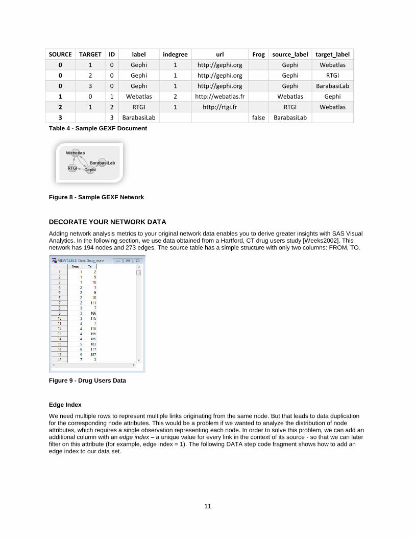
SOURCE TARGET ID label indegree url Frog source_label target_label
0 1 0 Gephi 1 http://gephi.org Gephi Webatlas
0 2 0 Gephi 1 http://gephi.org Gephi RTGI
0 3 0 Gephi 1 http://gephi.org Gephi BarabasiLab
1 0 1 Webatlas 2 http://webatlas.fr Webatlas Gephi
2 1 2 RTGI 1 http://rtgi.fr RTGI Webatlas
3
3 BarabasiLab
false BarabasiLab
Table 4 - Sample GEXF Document
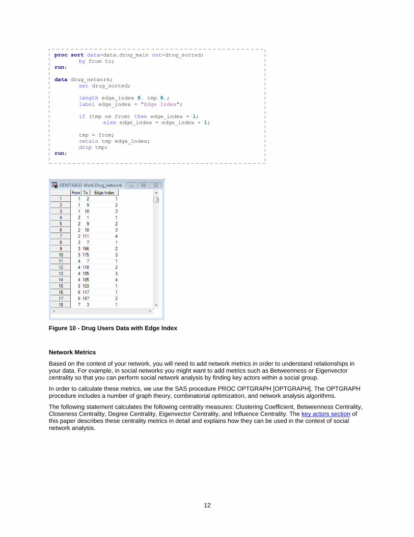
Figure 8 - Sample GEXF Network
DECORATE YOUR NETWORK DATA
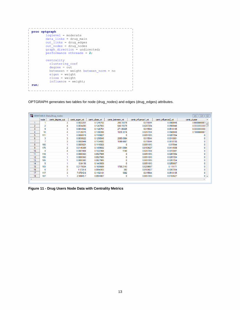
Adding network analysis metrics to your original network data enables you to derive greater insights with SAS Visual Analytics. In the following section, we use data obtained from a Hartford, CT drug users study [Weeks2002]. This network has 194 nodes and 273 edges. The source table has a simple structure with only two columns: FROM, TO.
Figure 9 - Drug Users Data
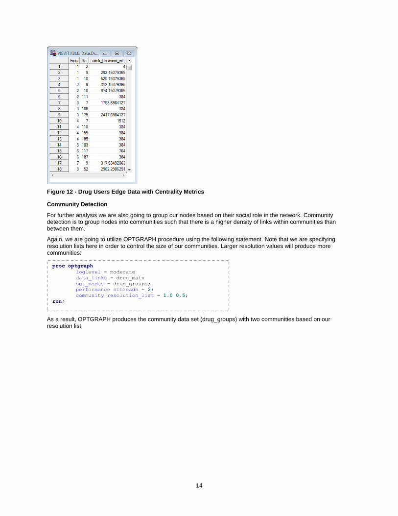
Edge Index
We need multiple rows to represent multiple links originating from the same node. But that leads to data duplication for the corresponding node attributes. This would be a problem if we wanted to analyze the distribution of node attributes, which requires a single observation representing each node. In order to solve this problem, we can add an additional column with an edge index – a unique value for every link in the context of its source - so that we can later filter on this attribute (for example, edge index = 1). The following DATA step code fragment shows how to add an edge index to our data set.
12
Figure 10 - Drug Users Data with Edge Index
Network Metrics
Based on the context of your network, you will need to add network metrics in order to understand relationships in your data. For example, in social networks you might want to add metrics such as Betweenness or Eigenvector centrality so that you can perform social network analysis by finding key actors within a social group.
In order to calculate these metrics, we use the SAS procedure PROC OPTGRAPH [OPTGRAPH]. The OPTGRAPH procedure includes a number of graph theory, combinatorial optimization, and network analysis algorithms.
The following statement calculates the following centrality measures: Clustering Coefficient, Betweenness Centrality, Closeness Centrality, Degree Centrality, Eigenvector Centrality, and Influence Centrality. The key actors section of this paper describes these centrality metrics in detail and explains how they can be used in the context of social network analysis.
proc sort data=data.drug_main out=drug_sorted;
by from to;
run;
data drug_network;
set drug_sorted;
length edge_index 8. tmp 8.;
label edge_index = "Edge Index";
if (tmp ne from) then edge_index = 1;
else edge_index = edge_index + 1;
tmp = from;
retain tmp edge_index;
drop tmp;
run;
13
OPTGRAPH generates two tables for node (drug_nodes) and edges (drug_edges) attributes.
Figure 11 - Drug Users Node Data with Centrality Metrics
proc optgraph
loglevel = moderate
data_links = drug_main
out_links = drug_edges
out_nodes = drug_nodes
graph_direction = undirected;
performance nthreads = 2;
centrality
clustering_coef
degree = out
betweeen = weight between_norm = no
eigen = weight
close = weight
influence = weight;
run;
14
Figure 12 - Drug Users Edge Data with Centrality Metrics
Community Detection
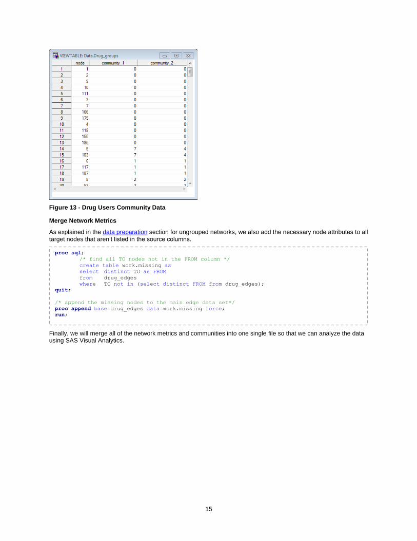
For further analysis we are also going to group our nodes based on their social role in the network. Community detection is to group nodes into communities such that there is a higher density of links within communities than between them.
Again, we are going to utilize OPTGRAPH procedure using the following statement. Note that we are specifying resolution lists here in order to control the size of our communities. Larger resolution values will produce more communities:
As a result, OPTGRAPH produces the community data set (drug_groups) with two communities based on our resolution list:
proc optgraph
loglevel = moderate
data_links = drug_main
out_nodes = drug_groups;
performance nthreads = 2;
community resolution_list = 1.0 0.5;
run;
15
Figure 13 - Drug Users Community Data
Merge Network Metrics
As explained in the data preparation section for ungrouped networks, we also add the necessary node attributes to all target nodes that aren’t listed in the source columns.
Finally, we will merge all of the network metrics and communities into one single file so that we can analyze the data using SAS Visual Analytics.
proc sql;
/* find all TO nodes not in the FROM column */
create table work.missing as
select distinct TO as FROM
from drug_edges
where TO not in (select distinct FROM from drug_edges);
quit;
/* append the missing nodes to the main edge data set*/
proc append base=drug_edges data=work.missing force;
run;
16
EXPLORING NETWORKS IN SAS VISUAL ANALYTICS
We saw how different aspects of the network topology can be extracted and added to the network data using a SAS procedure like OPTGRAPH as part of the data preparation phase. In future versions of Visual Analytics, this type of analysis will be incorporated to the application itself, joining other features like forecasting and text analytics.
Analyzing the network topology and its statistical properties goes hand-in-hand with network visualization and filtering to provide a comprehensive understanding of its nature. This combination extends the exploratory data analysis model supported by SAS Visual Analytics in a way that is perfectly suitable for the exploration of networks.
In the following sections, we will see a practical application of this specialized exploration in two domains where networks play a crucial role: transportation and social media.
TRANSPORTATION
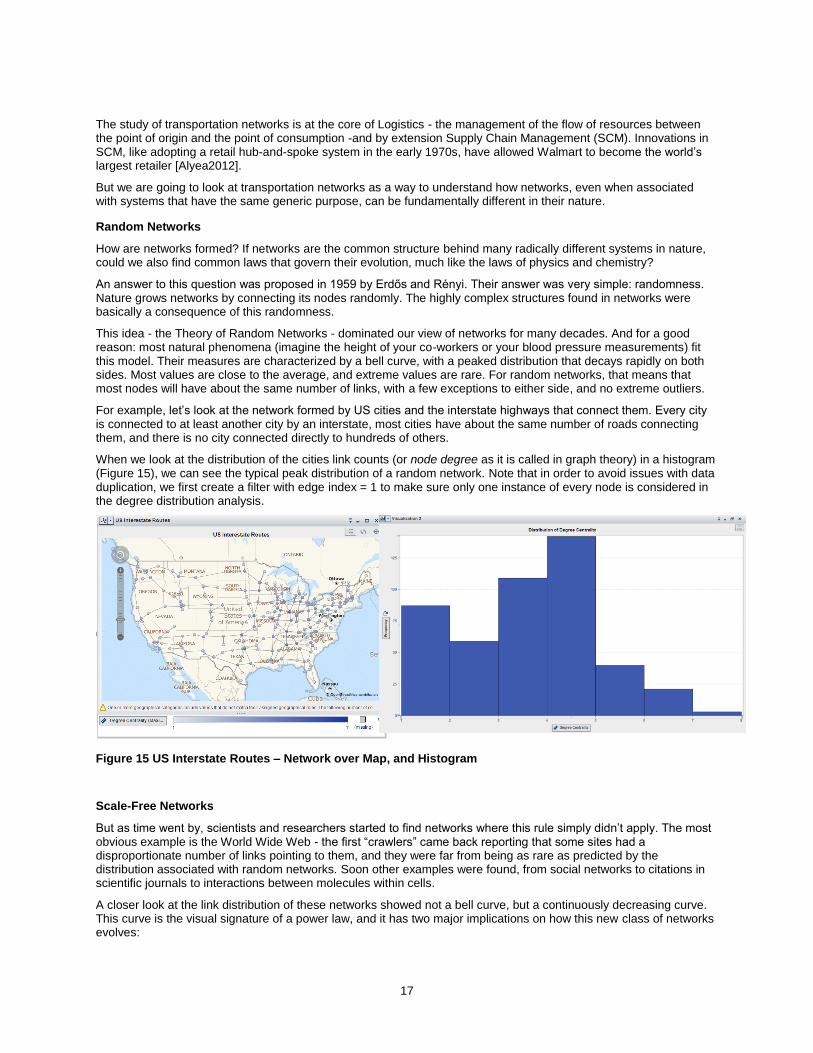
Transportation has long been a fertile ground for the study of networks. In fact, graph theory - the science that studies network topology - started when Euler solved the Seven Bridges of Königsberg [Barabási2002] problem in 1736, introducing the now common abstraction of nodes and links to represent a real-life network of islands connected by bridges (as seen in Figure 14).
Figure 14 - 17th Century Map of Königsberg (River and Bridges Highlighted)
proc sql;
create table drug_network as
select distinct
a.from,
a.to,
a.centr_between_wt as centr_between_edge label="Betweenness Centrality (Edge)",
b.centr_between_wt as centr_between_node label="Betweenness Centrality (Node)",
b.centr_eigen_wt as centr_eigen_node label="Eigenvector Centrality (Node)",
b.centr_close_wt as centr_close_node label="Closeness Centrality (Node)",
b.centr_cluster as centr_cluster_node label="Clustering Coefficient (Node)",
b.centr_degree_out as centr_degree_node label="Degree Centrality (Node)",
b.centr_influence1_wt as centr_influence1_node label="Influence Centrality (Node)",
c.community_1 label="Community 1",
c.community_2 label="Community 2"
from drug_edges a
left join
drug_nodes b
on a.from = b.node
left join
drug_groups c
on a.from = c.node
order by a.from;
quit;
17
The study of transportation networks is at the core of Logistics - the management of the flow of resources between the point of origin and the point of consumption -and by extension Supply Chain Management (SCM). Innovations in SCM, like adopting a retail hub-and-spoke system in the early 1970s, have allowed Walmart to become the world’s largest retailer [Alyea2012].
But we are going to look at transportation networks as a way to understand how networks, even when associated with systems that have the same generic purpose, can be fundamentally different in their nature.
Random Networks
How are networks formed? If networks are the common structure behind many radically different systems in nature, could we also find common laws that govern their evolution, much like the laws of physics and chemistry?
An answer to this question was proposed in 1959 by Erdős and Rényi. Their answer was very simple: randomness. Nature grows networks by connecting its nodes randomly. The highly complex structures found in networks were basically a consequence of this randomness.
This idea - the Theory of Random Networks - dominated our view of networks for many decades. And for a good reason: most natural phenomena (imagine the height of your co-workers or your blood pressure measurements) fit this model. Their measures are characterized by a bell curve, with a peaked distribution that decays rapidly on both sides. Most values are close to the average, and extreme values are rare. For random networks, that means that most nodes will have about the same number of links, with a few exceptions to either side, and no extreme outliers.
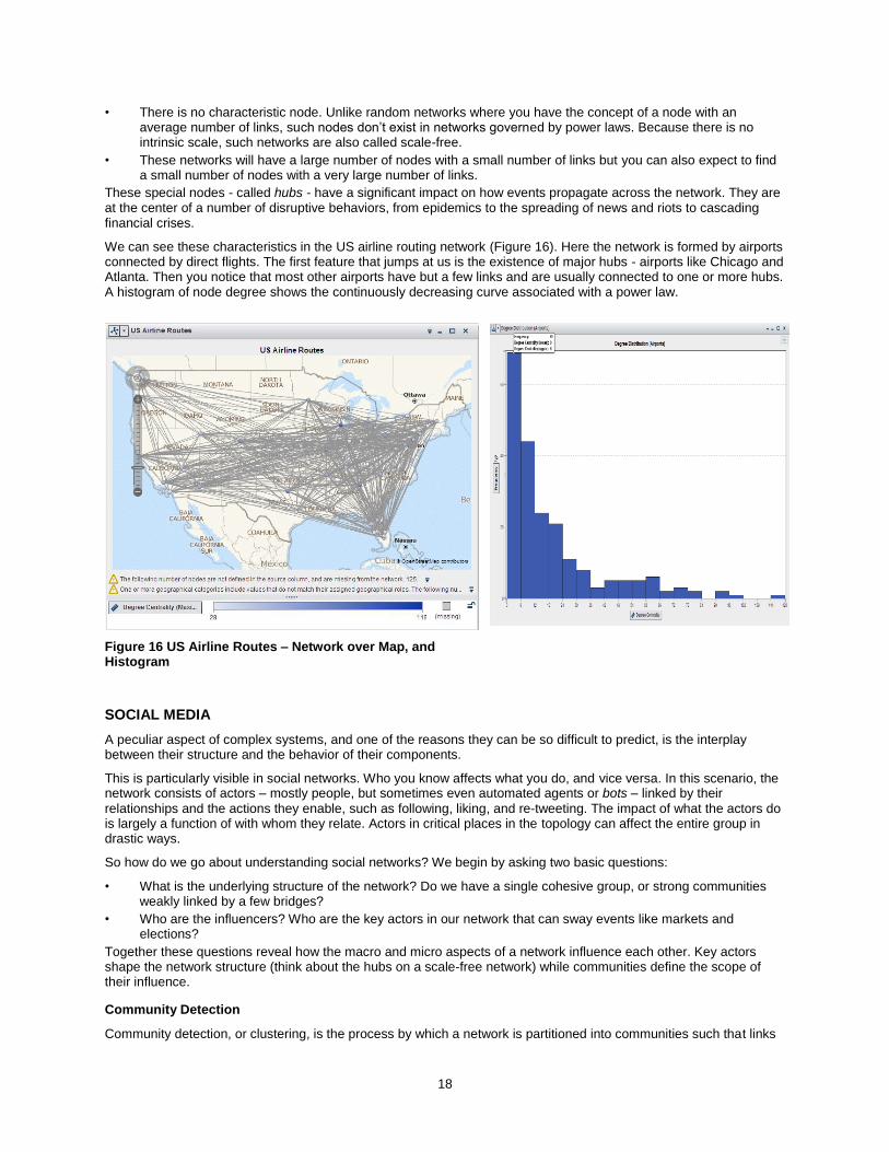
For example, let’s look at the network formed by US cities and the interstate highways that connect them. Every city is connected to at least another city by an interstate, most cities have about the same number of roads connecting them, and there is no city connected directly to hundreds of others.
When we look at the distribution of the cities link counts (or node degree as it is called in graph theory) in a histogram (Figure 15), we can see the typical peak distribution of a random network. Note that in order to avoid issues with data duplication, we first create a filter with edge index = 1 to make sure only one instance of every node is considered in the degree distribution analysis.
Figure 15 US Interstate Routes – Network over Map, and Histogram
Scale-Free Networks
But as time went by, scientists and researchers started to find networks where this rule simply didn’t apply. The most obvious example is the World Wide Web - the first “crawlers” came back reporting that some sites had a disproportionate number of links pointing to them, and they were far from being as rare as predicted by the distribution associated with random networks. Soon other examples were found, from social networks to citations in scientific journals to interactions between molecules within cells.
A closer look at the link distribution of these networks showed not a bell curve, but a continuously decreasing curve. This curve is the visual signature of a power law, and it has two major implications on how this new class of networks evolves:
18
• There is no characteristic node. Unlike random networks where you have the concept of a node with an average number of links, such nodes don’t exist in networks governed by power laws. Because there is no intrinsic scale, such networks are also called scale-free.
• These networks will have a large number of nodes with a small number of links but you can also expect to find a small number of nodes with a very large number of links.
These special nodes - called hubs - have a significant impact on how events propagate across the network. They are at the center of a number of disruptive behaviors, from epidemics to the spreading of news and riots to cascading financial crises.
We can see these characteristics in the US airline routing network (Figure 16). Here the network is formed by airports connected by direct flights. The first feature that jumps at us is the existence of major hubs - airports like Chicago and Atlanta. Then you notice that most other airports have but a few links and are usually connected to one or more hubs. A histogram of node degree shows the continuously decreasing curve associated with a power law.
Figure 16 US Airline Routes – Network over Map, and Histogram
SOCIAL MEDIA
A peculiar aspect of complex systems, and one of the reasons they can be so difficult to predict, is the interplay between their structure and the behavior of their components.
This is particularly visible in social networks. Who you know affects what you do, and vice versa. In this scenario, the network consists of actors – mostly people, but sometimes even automated agents or bots – linked by their
relationships and the actions they enable, such as following, liking, and re-tweeting. The impact of what the actors do is largely a function of with whom they relate. Actors in critical places in the topology can affect the entire group in drastic ways.
So how do we go about understanding social networks? We begin by asking two basic questions:
• What is the underlying structure of the network? Do we have a single cohesive group, or strong communities weakly linked by a few bridges?
• Who are the influencers? Who are the key actors in our network that can sway events like markets and elections?
Together these questions reveal how the macro and micro aspects of a network influence each other. Key actors shape the network structure (think about the hubs on a scale-free network) while communities define the scope of their influence.
Community Detection
Community detection, or clustering, is the process by which a network is partitioned into communities such that links
19
within community subgraphs are more densely connected than the links between communities.
The study of communities has great practical value as the nodes in these communities usually display common properties or have similar preferences – for example, the partition of the blogosphere along political lines [Linkfluence] or gang membership among criminals [Dillow2014].
Thus, identifying the communities in a network can further the understanding of how network function and topology affect each other. This has direct applications in marketing, sociology, and many other areas.
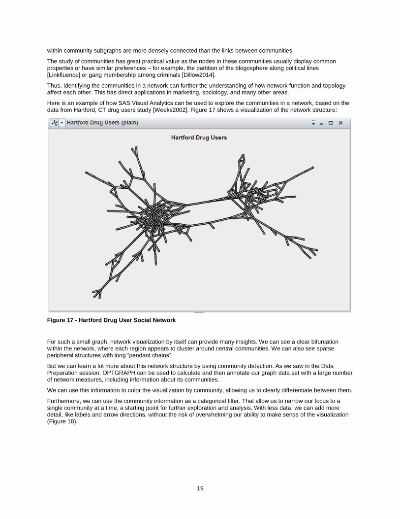
Here is an example of how SAS Visual Analytics can be used to explore the communities in a network, based on the data from Hartford, CT drug users study [Weeks2002]. Figure 17 shows a visualization of the network structure:
Figure 17 - Hartford Drug User Social Network
For such a small graph, network visualization by itself can provide many insights. We can see a clear bifurcation within the network, where each region appears to cluster around central communities. We can also see sparse peripheral structures with long “pendant chains”.
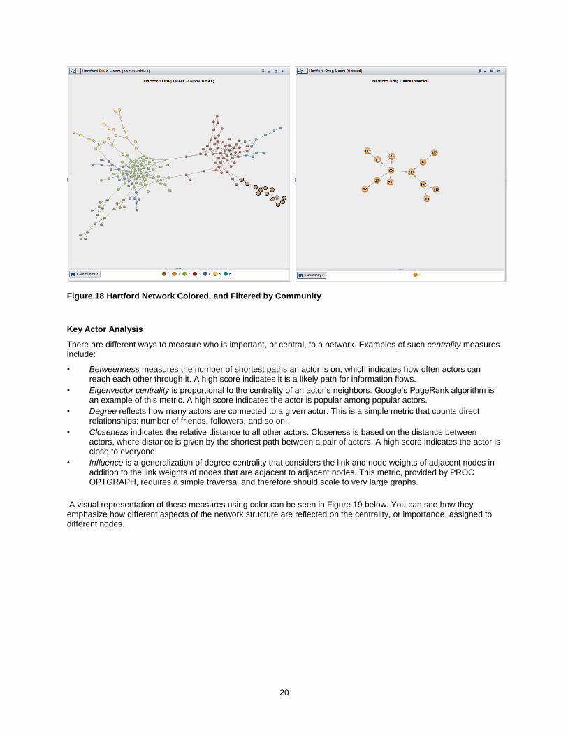
But we can learn a lot more about this network structure by using community detection. As we saw in the Data Preparation session, OPTGRAPH can be used to calculate and then annotate our graph data set with a large number of network measures, including information about its communities.
We can use this information to color the visualization by community, allowing us to clearly differentiate between them.
Furthermore, we can use the community information as a categorical filter. That allow us to narrow our focus to a single community at a time, a starting point for further exploration and analysis. With less data, we can add more detail, like labels and arrow directions, without the risk of overwhelming our ability to make sense of the visualization (Figure 18).
20
Figure 18 Hartford Network Colored, and Filtered by Community
Key Actor Analysis
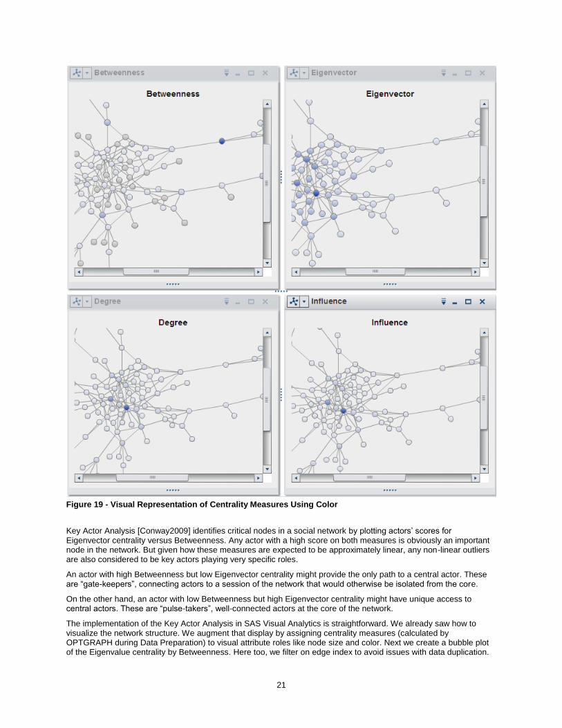
There are different ways to measure who is important, or central, to a network. Examples of such centrality measures include:
• Betweenness measures the number of shortest paths an actor is on, which indicates how often actors can reach each other through it. A high score indicates it is a likely path for information flows.
• Eigenvector centrality is proportional to the centrality of an actor’s neighbors. Google’s PageRank algorithm is an example of this metric. A high score indicates the actor is popular among popular actors.
• Degree reflects how many actors are connected to a given actor. This is a simple metric that counts direct relationships: number of friends, followers, and so on.
• Closeness indicates the relative distance to all other actors. Closeness is based on the distance between actors, where distance is given by the shortest path between a pair of actors. A high score indicates the actor is close to everyone.
• Influence is a generalization of degree centrality that considers the link and node weights of adjacent nodes in
addition to the link weights of nodes that are adjacent to adjacent nodes. This metric, provided by PROC OPTGRAPH, requires a simple traversal and therefore should scale to very large graphs.
A visual representation of these measures using color can be seen in Figure 19 below. You can see how they emphasize how different aspects of the network structure are reflected on the centrality, or importance, assigned to different nodes.
21
Figure 19 - Visual Representation of Centrality Measures Using Color
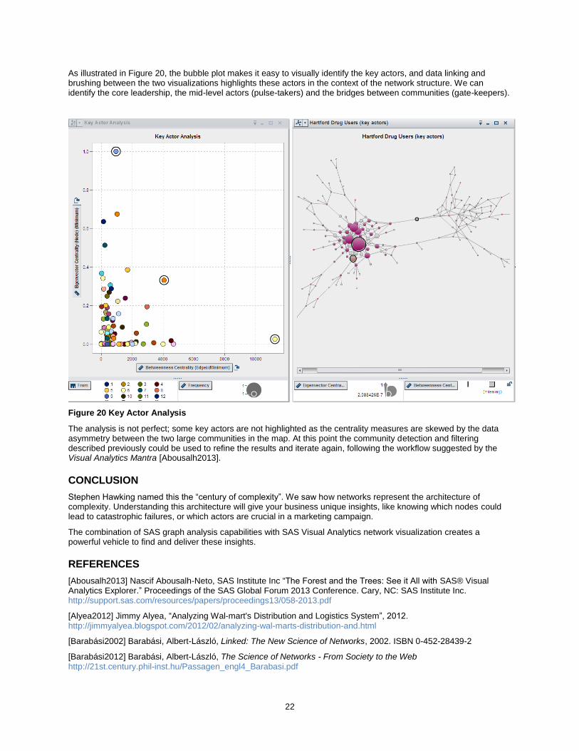
Key Actor Analysis [Conway2009] identifies critical nodes in a social network by plotting actors’ scores for Eigenvector centrality versus Betweenness. Any actor with a high score on both measures is obviously an important node in the network. But given how these measures are expected to be approximately linear, any non-linear outliers are also considered to be key actors playing very specific roles.
An actor with high Betweenness but low Eigenvector centrality might provide the only path to a central actor. These are “gate-keepers”, connecting actors to a session of the network that would otherwise be isolated from the core.
On the other hand, an actor with low Betweenness but high Eigenvector centrality might have unique access to central actors. These are “pulse-takers”, well-connected actors at the core of the network.
The implementation of the Key Actor Analysis in SAS Visual Analytics is straightforward. We already saw how to visualize the network structure. We augment that display by assigning centrality measures (calculated by OPTGRAPH during Data Preparation) to visual attribute roles like node size and color. Next we create a bubble plot of the Eigenvalue centrality by Betweenness. Here too, we filter on edge index to avoid issues with data duplication.
22
As illustrated in Figure 20, the bubble plot makes it easy to visually identify the key actors, and data linking and brushing between the two visualizations highlights these actors in the context of the network structure. We can identify the core leadership, the mid-level actors (pulse-takers) and the bridges between communities (gate-keepers).
Figure 20 Key Actor Analysis
The analysis is not perfect; some key actors are not highlighted as the centrality measures are skewed by the data asymmetry between the two large communities in the map. At this point the community detection and filtering described previously could be used to refine the results and iterate again, following the workflow suggested by the Visual Analytics Mantra [Abousalh2013].
CONCLUSION
Stephen Hawking named this the “century of complexity”. We saw how networks represent the architecture of complexity. Understanding this architecture will give your business unique insights, like knowing which nodes could lead to catastrophic failures, or which actors are crucial in a marketing campaign.
The combination of SAS graph analysis capabilities with SAS Visual Analytics network visualization creates a powerful vehicle to find and deliver these insights.
REFERENCES
[Abousalh2013] Nascif Abousalh-Neto, SAS Institute Inc “The Forest and the Trees: See it All with SAS® Visual Analytics Explorer.” Proceedings of the SAS Global Forum 2013 Conference. Cary, NC: SAS Institute Inc. http://support.sas.com/resources/papers/proceedings13/058-2013.pdf
[Alyea2012] Jimmy Alyea, “Analyzing Wal-mart's Distribution and Logistics System”, 2012. http://jimmyalyea.blogspot.com/2012/02/analyzing-wal-marts-distribution-and.html
[Barabási2002] Barabási, Albert-László, Linked: The New Science of Networks, 2002. ISBN 0-452-28439-2
[Barabási2012] Barabási, Albert-László, The Science of Networks - From Society to the Web http://21st.century.phil-inst.hu/Passagen_engl4_Barabasi.pdf

23
[Bettinger2007] Ross Bettinger “Sample 24804: %SQUEEZE-ing Before Compressing Data, Redux,”, 2007. http://support.sas.com/kb/24/804.html
[Bogard2010] Matt Bogard. “Using Twitter to Demonstrate Basic Concepts from Network Analysis”, 2010. http://works.bepress.com/matt_bogard/9
[Bost2010] Christopher J. Bost, “Automatically Converting Character Variables That Store Numbers to Numeric Variables”, 2010. http://www.nesug.org/Proceedings/nesug10/ff/ff01.pdf
[Conway2009] Drew Conway, “Social Network Analysis in R”, 2009. http://files.meetup.com/1406240/sna_in_R.pdf
[Dillow2014] Clay Dillow, “Building A Social Network Of Crime - Can software distill mayhem into a database?”, Popular Science, 2014. http://www.popsci.com/article/science/building-social-network-crime
[Easley2010] David Easley, Jon Kleinberg “Networks, Crowds, and Markets: Reasoning about a Highly Connected World”, 2010. http://www.cs.cornell.edu/home/kleinber/networks-book/networks-book.pdf
[Gajer2000] Pawel Gajer, Michael T. Goodrich, and Stephen G. Kobourov, “A Fast Multi-Dimensional Algorithm for Drawing Large Graphs”, https://cs.arizona.edu/~kobourov/grip_paper.pdf
[Gartner2012] Gartner, “The Competitive Dynamics of the Consumer Web: Five Graphs Deliver a Sustainable Advantage”, 2012. https://www.gartner.com/doc/2081316
[Gephi] Gephi, “The Open Graph Viz Platform” https://gephi.org/
[Linkfluence] Linkfluence, “Discover the Map of the U.S. Political Web”, http://politicosphere.net/map/
[OPTGRAPH] SAS Social Network Analysis, product documentation https://support.sas.com/documentation/onlinedoc/socialnetworkinfo/index.html
[Schutt2013] Rachel Schutt, Cathy O’Neil. Doing Data Science - Straight Talk from the Frontline, 2013. ISBN 978-1-4493-5865-5
[Weeks2002] M. Weeks et al., “Social Networks of Drug Users in High-Risk Sites: Finding the Connections”, 2012
ACKNOWLEDGMENTS
We would like to thank Matthew Galati for his assistance with PROC OPTGRAPH, Sumeyye Kazgan for helping with data preparation, and Bill Yakowenko for his critical role in improving the network visualization component and associated network layout algorithms.
RECOMMENDED READING
Base SAS® Procedures Guide
SAS® For Dummies®
Linked: The New Science of Networks
Networks, Crowds, and Markets: Reasoning about a Highly Connected World
CONTACT INFORMATION
Your comments and questions are valued and encouraged. Contact the author:
Falko Schulz SAS Institute Australia 1 Eagle St Brisbane, QLD, 4001, Australia Phone: +61 7-3233 3320 [email protected] http://au.linkedin.com/in/falkoschulz Nascif Abousalh-Neto SAS Institute Inc SAS Campus Drive S4082 Cary, NC 27513-2414, USA

24
Phone: (919) 531-0123 [email protected] http://www.linkedin.com/in/nascif
SAS and all other SAS Institute Inc. product or service names are registered trademarks or trademarks of SAS Institute Inc. in the USA and other countries. ® indicates USA registration.
Other brand and product names are trademarks of their respective companies.
25
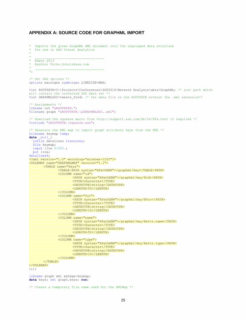
APPENDIX A: SOURCE CODE FOR GRAPHML IMPORT
* Imports the given GraphML XML document into the ungrouped data structure
* for use in SAS Visual Analytics
*
* ____________________________________
* @date 2013
* @author [email protected]
* ____________________________________
*;
/* Set SAS options */
options macrogen symbolgen LINESIZE=MAX;
%let ROOTPATH=C:\Projects\Conferences\SGF2014\Network Analysis\data\GraphML; /* root path which
will contain the converted SAS data set */
%let GRAPHMLDOC=tweets_ford; /* the data file in the ROOTPATH without the .xml extension*/
/* Assignments */
libname out "&ROOTPATH.";
filename graph "&ROOTPATH.\&GRAPHMLDOC..xml";
/* Download the squeeze macro from http://support.sas.com/kb/24/804.html if required */
%include "&ROOTPATH.\squeeze.sas";
/* Generate the XML map to import graph attribute keys from the XML */
filename keymap temp;
data _null_;
infile datalines truncover;
file keymap;
input line $1000.;
put line;
datalines4;
<?xml version="1.0" encoding="windows-1252"?>
<SXLEMAP name="GRAPHMLMAP" version="1.1">
<TABLE name="keys">
<TABLE-PATH syntax="XPathENR">/graphml/key</TABLE-PATH>
<COLUMN name="id">
<PATH syntax="XPathENR">/graphml/key/@id</PATH>
<TYPE>character</TYPE>
<DATATYPE>string</DATATYPE>
<LENGTH>50</LENGTH>
</COLUMN>
<COLUMN name="for">
<PATH syntax="XPathENR">/graphml/key/@for</PATH>
<TYPE>character</TYPE>
<DATATYPE>string</DATATYPE>
<LENGTH>10</LENGTH>
</COLUMN>
<COLUMN name="name">
<PATH syntax="XPathENR">/graphml/key/@attr.name</PATH>
<TYPE>character</TYPE>
<DATATYPE>string</DATATYPE>
<LENGTH>50</LENGTH>
</COLUMN>
<COLUMN name="type">
<PATH syntax="XPathENR">/graphml/key/@attr.type</PATH>
<TYPE>character</TYPE>
<DATATYPE>string</DATATYPE>
<LENGTH>10</LENGTH>
</COLUMN>
</TABLE>
</SXLEMAP>
;;;;
libname graph xml xmlmap=keymap;
data keys; set graph.keys; run;
/* Create a temporary file name used for the XMLMap */
26
%macro tempFile( fname );
%if %superq(SYSSCPL) eq %str(z/OS) or %superq(SYSSCPL) eq %str(OS/390) %then
%let recfm=recfm=vb;
%else
%let recfm=;
filename &fname TEMP lrecl=2048 &recfm;
%mend;
options nocardimage;
%macro xmlMapHeader;
data _null_;
file map encoding="utf-8";
put '<?xml version="1.0" encoding="utf-8"?>';
put '<SXLEMAP name="GRAPHMLMAP" version="1.1">';
run;
%mend xmlMapHeader;
%macro xmlMapTable(for);
data _null_;
file map encoding="utf-8" mod;
put ' <TABLE name="' "&for." '">';
put ' <TABLE-PATH syntax="XPathENR">/graphml/graph/' "&for." '</TABLE-PATH>';
if ("&for" eq "node") then do;
put ' <COLUMN name="id">';
put ' <PATH syntax="XPathENR">/graphml/graph/' "&for."
'/@id</PATH>';
put ' <TYPE>character</TYPE>';
put ' <DATATYPE>string</DATATYPE>';
put ' <LENGTH>50</LENGTH>';
put ' </COLUMN>';
end; else do;
put ' <COLUMN name="source">';
put ' <PATH syntax="XPathENR">/graphml/graph/' "&for."
'/@source</PATH>';
put ' <TYPE>character</TYPE>';
put ' <DATATYPE>string</DATATYPE>';
put ' <LENGTH>50</LENGTH>';
put ' </COLUMN>';
put ' <COLUMN name="target">';
put ' <PATH syntax="XPathENR">/graphml/graph/' "&for."
'/@target</PATH>';
put ' <TYPE>character</TYPE>';
put ' <DATATYPE>string</DATATYPE>';
put ' <LENGTH>50</LENGTH>';
put ' </COLUMN>';
end;
run;
data _null_;
file map encoding="utf-8" mod;
set keys;
where for eq "&for.";
put ' <COLUMN name="' name +(-1) ' (' "&for." ')">';
put ' <PATH syntax="XPathENR">/graphml/graph/' "&for." '/data[@key="' id +(-1)
'"]</PATH>';
if (count(lowcase(id), "Date (UTC)") > 0) then do;
put ' <TYPE>numeric</TYPE>';
put ' <DATATYPE>datetime</DATATYPE>';
put ' <FORMAT width="19">DATETIME</FORMAT>';
put ' <INFORMAT width="32">ANYDTDTM</INFORMAT>';
end; else do;
put ' <TYPE>character</TYPE>';
put ' <DATATYPE>string</DATATYPE>';
put ' <LENGTH>500</LENGTH>';
end;
put ' </COLUMN>';
run;
27
data _null_;
file map encoding="utf-8" mod;
put ' </TABLE>';
run;
%mend xmlMapTable;
%macro xmlMapFooter;
data _null_;
file map encoding="utf-8" mod;
put '</SXLEMAP>';
run;
%mend xmlMapFooter;
%tempFile(map);
%xmlMapHeader;
%xmlMapTable(node);
%xmlMapTable(edge);
%xmlMapFooter;
/* import GraphML xml document using XML map */
libname graph xml xmlmap=map;
data node; set graph.node; run;
data edge; set graph.edge; run;
/* credits for the char2num macro
go to Christopher J. Bost, http://www.nesug.org/Proceedings/nesug10/ff/ff01.pdf */
%macro char2num(inputlib=work, /* libref for input data set */
inputdsn=, /* name of input data set */
outputlib=work, /* libref for output data set */
outputdsn=, /* name of output data set */
excludevars=); /* variables to exclude */
proc sql noprint;
select name into :charvars separated by ' '
from dictionary.columns
where libname=upcase("&inputlib") and memname=upcase("&inputdsn") and type="char"
and not indexw(upcase("&excludevars"),upcase(name));
quit;
%let ncharvars=%sysfunc(countw(&charvars));
data _null_;
set &inputlib..&inputdsn end=lastobs;
array charvars{*} &charvars;
array charvals{&ncharvars};
do i=1 to &ncharvars;
if input(charvars{i},?? best12.)=. and charvars{i} ne ' ' then
charvals{i}+1;
end;
if lastobs then do;
length varlist $ 32767;
do j=1 to &ncharvars;
if charvals{j}=. then varlist=catx(' ',varlist,vname(charvars{j}));
end;
call symputx('varlist',varlist);
end;
run;
%let nvars=%sysfunc(countw(&varlist));
data temp;
set &inputlib..&inputdsn;
array charx{&nvars} &varlist;
array xxx{&nvars} ;
do i=1 to &nvars;
xxx{i}=input(charx{i},best12.);
end;
drop &varlist i;
%do i=1 %to &nvars;
rename xxx&i = %scan(&varlist,&i) ;
%end;
run;
28
proc sql noprint;
select name into :orderlist separated by ' '
from dictionary.columns
where libname=upcase("&inputlib") and memname=upcase("&inputdsn")
order by varnum;
select catx(' ','label',name,'=',quote(trim(label)),';') into :labels separated by
' '
from dictionary.columns
where libname=upcase("&inputlib") and memname=upcase("&inputdsn") and
indexw(upcase("&varlist"),upcase(name));
quit;
data &outputlib..&outputdsn;
retain &orderlist;
set temp;
&labels
run;
%mend char2num;
/* convert columns with numbers to char */
%char2num(inputdsn=node,outputdsn=nodes_attr,excludevars=id);
%char2num(inputdsn=edge,outputdsn=edges_attr,excludevars=id);
/* reduce the total character column width */
%squeeze( nodes_attr, node);
%squeeze( edges_attr, edge);
proc sql;
/* find all target nodes not in source*/
create table work.missing as
select distinct target as source
from work.edge
where target not in (select distinct source from work.edge);
/* merge node attributes to the missing targets */
create table work.targets as
select a.*, b.*
from work.missing a
left join
work.node b
on a.source = b.id;
/* merge node and edge table */
create table work.node_edge as
select a.*, b.*
from work.edge a
left join
work.node b
on a.source = b.id;
quit;
/* append missing targets */
proc append base=work.node_edge data=targets force;
run;
/* write out final data set*/
data out.&GRAPHMLDOC;
set work.node_edge;
run;
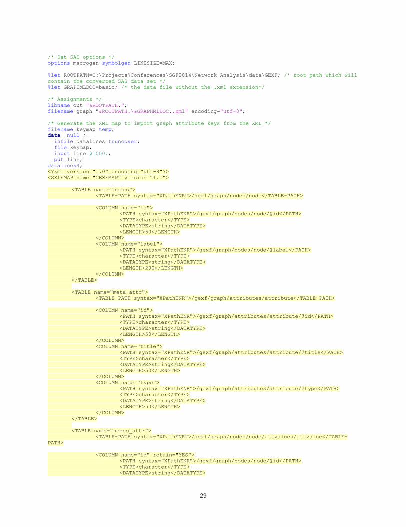
APPENDIX B: SOURCE CODE FOR GEXF IMPORT
* Imports the given GEXF XML document into SAS
*
* ____________________________________
* @author [email protected]
* ____________________________________
*;
29
/* Set SAS options */
options macrogen symbolgen LINESIZE=MAX;
%let ROOTPATH=C:\Projects\Conferences\SGF2014\Network Analysis\data\GEXF; /* root path which will
contain the converted SAS data set */
%let GRAPHMLDOC=basic; /* the data file without the .xml extension*/
/* Assignments */
libname out "&ROOTPATH.";
filename graph "&ROOTPATH.\&GRAPHMLDOC..xml" encoding="utf-8";
/* Generate the XML map to import graph attribute keys from the XML */
filename keymap temp;
data _null_;
infile datalines truncover;
file keymap;
input line $1000.;
put line;
datalines4;
<?xml version="1.0" encoding="utf-8"?>
<SXLEMAP name="GEXFMAP" version="1.1">
<TABLE name="nodes">
<TABLE-PATH syntax="XPathENR">/gexf/graph/nodes/node</TABLE-PATH>
<COLUMN name="id">
<PATH syntax="XPathENR">/gexf/graph/nodes/node/@id</PATH>
<TYPE>character</TYPE>
<DATATYPE>string</DATATYPE>
<LENGTH>50</LENGTH>
</COLUMN>
<COLUMN name="label">
<PATH syntax="XPathENR">/gexf/graph/nodes/node/@label</PATH>
<TYPE>character</TYPE>
<DATATYPE>string</DATATYPE>
<LENGTH>200</LENGTH>
</COLUMN>
</TABLE>
<TABLE name="meta_attr">
<TABLE-PATH syntax="XPathENR">/gexf/graph/attributes/attribute</TABLE-PATH>
<COLUMN name="id">
<PATH syntax="XPathENR">/gexf/graph/attributes/attribute/@id</PATH>
<TYPE>character</TYPE>
<DATATYPE>string</DATATYPE>
<LENGTH>50</LENGTH>
</COLUMN>
<COLUMN name="title">
<PATH syntax="XPathENR">/gexf/graph/attributes/attribute/@title</PATH>
<TYPE>character</TYPE>
<DATATYPE>string</DATATYPE>
<LENGTH>50</LENGTH>
</COLUMN>
<COLUMN name="type">
<PATH syntax="XPathENR">/gexf/graph/attributes/attribute/@type</PATH>
<TYPE>character</TYPE>
<DATATYPE>string</DATATYPE>
<LENGTH>50</LENGTH>
</COLUMN>
</TABLE>
<TABLE name="nodes_attr">
<TABLE-PATH syntax="XPathENR">/gexf/graph/nodes/node/attvalues/attvalue</TABLE-
PATH>
<COLUMN name="id" retain="YES">
<PATH syntax="XPathENR">/gexf/graph/nodes/node/@id</PATH>
<TYPE>character</TYPE>
<DATATYPE>string</DATATYPE>
30
<LENGTH>50</LENGTH>
</COLUMN>
<COLUMN name="attr_id">
<PATH
syntax="XPathENR">/gexf/graph/nodes/node/attvalues/attvalue/@for</PATH>
<TYPE>character</TYPE>
<DATATYPE>string</DATATYPE>
<LENGTH>50</LENGTH>
</COLUMN>
<COLUMN name="attr_value">
<PATH
syntax="XPathENR">/gexf/graph/nodes/node/attvalues/attvalue/@value</PATH>
<TYPE>character</TYPE>
<DATATYPE>string</DATATYPE>
<LENGTH>200</LENGTH>
</COLUMN>
</TABLE>
<TABLE name="edges">
<TABLE-PATH syntax="XPathENR">/gexf/graph/edges/edge</TABLE-PATH>
<COLUMN name="source">
<PATH syntax="XPathENR">/gexf/graph/edges/edge/@source</PATH>
<TYPE>character</TYPE>
<DATATYPE>string</DATATYPE>
<LENGTH>50</LENGTH>
</COLUMN>
<COLUMN name="target">
<PATH syntax="XPathENR">/gexf/graph/edges/edge/@target</PATH>
<TYPE>character</TYPE>
<DATATYPE>string</DATATYPE>
<LENGTH>50</LENGTH>
</COLUMN>
<COLUMN name="weight (edge)">
<PATH syntax="XPathENR">/gexf/graph/edges/edge/@weight</PATH>
<TYPE>numeric</TYPE>
<DATATYPE>integer</DATATYPE>
</COLUMN>
</TABLE>
</SXLEMAP>
;;;;
libname graph xml xmlmap=keymap access=readonly;
data nodes; set graph.nodes; run;
data edges; set graph.edges; run;
/* create nodes attributes */
proc sql;
create table work.nodes_attr as
select a.id,
b.title as attr_name,
trim(b.title) || " (node)" as attr_label,
a.attr_value
from graph.nodes_attr a
left join
graph.meta_attr b
on a.attr_id eq b.id
order by a.id;
quit;
proc transpose data=work.nodes_attr out=work.nodes_attr(drop=_NAME_ _LABEL_);
var attr_value;
id attr_name;
idlabel attr_label;
by id;
run;
/* credits for the char2num macro
go to Christopher J. Bost, http://www.nesug.org/Proceedings/nesug10/ff/ff01.pdf */
%macro char2num(inputlib=work, /* libref for input data set */
inputdsn=, /* name of input data set */
31
outputlib=work, /* libref for output data set */
outputdsn=, /* name of output data set */
excludevars=); /* variables to exclude */
proc sql noprint;
select name into :charvars separated by ' '
from dictionary.columns
where libname=upcase("&inputlib") and memname=upcase("&inputdsn") and type="char"
and not indexw(upcase("&excludevars"),upcase(name));
quit;
%let ncharvars=%sysfunc(countw(&charvars));
data _null_;
set &inputlib..&inputdsn end=lastobs;
array charvars{*} &charvars;
array charvals{&ncharvars};
do i=1 to &ncharvars;
if input(charvars{i},?? best12.)=. and charvars{i} ne ' ' then
charvals{i}+1;
end;
if lastobs then do;
length varlist $ 32767;
do j=1 to &ncharvars;
if charvals{j}=. then varlist=catx(' ',varlist,vname(charvars{j}));
end;
call symputx('varlist',varlist);
end;
run;
%let nvars=%sysfunc(countw(&varlist));
data temp;
set &inputlib..&inputdsn;
array charx{&nvars} &varlist;
array xxx{&nvars} ;
do i=1 to &nvars;
xxx{i}=input(charx{i},best12.);
end;
drop &varlist i;
%do i=1 %to &nvars;
rename xxx&i = %scan(&varlist,&i) ;
%end;
run;
proc sql noprint;
select name into :orderlist separated by ' '
from dictionary.columns
where libname=upcase("&inputlib") and memname=upcase("&inputdsn")
order by varnum;
select catx(' ','label',name,'=',quote(trim(label)),';') into :labels separated by
' '
from dictionary.columns
where libname=upcase("&inputlib") and memname=upcase("&inputdsn") and
indexw(upcase("&varlist"),upcase(name));
quit;
data &outputlib..&outputdsn;
retain &orderlist;
set temp;
&labels
run;
%mend char2num;
/* convert columns with numbers to char */
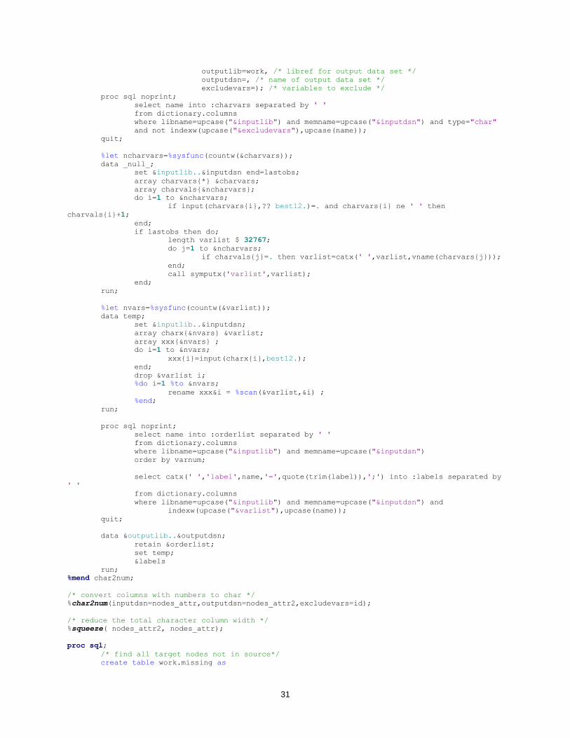
%char2num(inputdsn=nodes_attr,outputdsn=nodes_attr2,excludevars=id);
/* reduce the total character column width */
%squeeze( nodes_attr2, nodes_attr);
proc sql;
/* find all target nodes not in source*/
create table work.missing as
32
select distinct target as source
from work.edges
where target not in (select distinct source from work.edges);
/* merge node attributes to the missing targets */
create table work.targets as
select a.*, b.*, c.*
from work.missing a
left join
work.nodes b
on a.source = b.id
left join
work.nodes_attr c
on b.id = c.id;
/* merge node and edge table */
create table work.node_edge as
select a.*, b.*, c.*
from work.edges a
left join
work.nodes b
on a.source = b.id
left join
work.nodes_attr c
on b.id = c.id;
quit;
/* append missing targets */
proc append base=work.node_edge data=targets force nowarn;
run;
/* add source/target labels */
proc sql;
create table work.node_edge as
select a.*, b.label as source_label label="source label", c.label as target_label
label="target label"
from work.node_edge a
left join
work.nodes b
on a.source = b.id
left join
work.nodes c
on a.target = c.id
;quit;
/* write out final data set*/
data out.&GRAPHMLDOC;
set work.node_edge;
run;