front cover analysis - fitness
TRANSCRIPT


We can appreciate it is a large masthead, posi.oned just below the skyline of the page, to straight away catch the reader’s a9en.on. The colour chosen was red, a very vivid and strong colour which connotes passion, strength, power and determina.on, as well as ero.se and sensuality. So it really matches the content of the magazine and represents its male target audience; their needs and wants, and the ideal to which they aspire. In addi.on red is one of the most successful colours to encourage people to take quick decisions, so the use of it in the masthead will contribute even more to get the reader to buy the magazine. The main image covers a small part of the masthead but magazines like “Men’s Health” are able to carry out this technique and s.ll be very well recognized and chosen by consumers because of their huge and well-‐established brand iden7ty, they are very famous. The use of upper case le8ers and a serif style of font, gives the magazine an elegant and sophis.cated touch, as well as making it as a whole more empha.c.
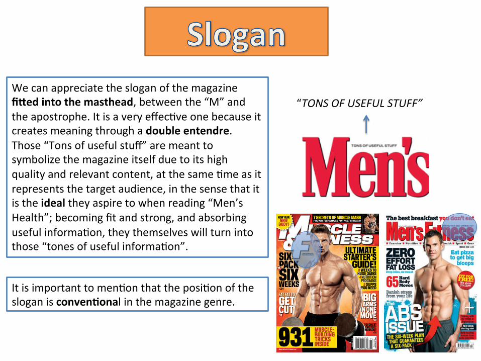
“TONS OF USEFUL STUFF” We can appreciate the slogan of the magazine fi8ed into the masthead, between the “M” and the apostrophe. It is a very effec.ve one because it creates meaning through a double entendre. Those “Tons of useful stuff” are meant to symbolize the magazine itself due to its high quality and relevant content, at the same .me as it represents the target audience, in the sense that it is the ideal they aspire to when reading “Men’s Health”; becoming fit and strong, and absorbing useful informa.on, they themselves will turn into those “tones of useful informa.on”.
It is important to men.on that the posi.on of the slogan is conven7onal in the magazine genre.

This copy of Men’s Health uses a direct mode of address. This is done to establish a strong connec.on with the reader making it seem as if the whole magazine was exclusively made for him. The reader feels more involved and is much more likely to buy it.
We can find examples of this in the main image first of all. It is establishing a direct mode of address by looking straight into the reader’s eyes, transmiMng confidence and a small sense of defiance, as if challenging him to buy the magazine.
The direct mode of address is also manifested in the use of language in the sell lines, taking the shape of inclusive pronouns like: “your”, as well as impera7ves like: “Score” or “Steal”. This conveys the target audience directly and makes them feel part of the magazine by emphasizing the relevancy of the content and how they should quickly jump into it.

This “Men’s Health” issue features the worldwide known footballer Cris.ano Ronaldo as the main image in the front cover, moreover his upper body is uncovered. They made this choice to increase their sales and create a greater appeal from the target audience; mainly towards this specific issue, and in a second place, for the magazine as a whole. It is an effec.ve technique because Cris.ano Ronaldo is a real-‐life ideal the target audience keeps on encountering in the media and acts as a source of inspira.on for many people due to his successful career in football and his sculpted figure. This main image takes up the vast majority of the space in the front cover and is laid on top of a blank background, drawing in this way all the reader’s a9en.on to it and le=ng the image seduce them.
This medium-‐long shot portrays Cris.ano Ronaldo as a confident and trendy man.

The main sell line clearly appeals one of the target audience’s main wants: to keep a nice figure and exaggerates the relevance and quality of its content using the superla.ve “best”. The font used is big and bold contribu.ng even more to catching the a9en.on of the reader.
The other sell lines are also to do with fitness and giving 7ps and advice on how to achieve a figure like the ideal one the magazine portrays (Ronaldo’s), as well as challenging the reader to buy the magazine and find out himself even more informa.on. This la9er technique is carried out through the use of exclusivity in the language: “WORKOUT & DIET SECRETS”. Target audience feels special in this way and a deeper appeal for the magazine is created.

This text appears at the skyline of the page. No other sell line has a background in the front cover, moreover a bright, outstanding yellow one. In the second place, the sell line breaks up with the font code of the produc.on being in a bold sans-‐serif, although it does not differ a lot from the others so that “Men’s health” brand iden.ty is not altered. S.ll it catches more a9en.on than the other sell lines, because of its posi.on and design, as I’ve men.oned. It is done this way because it is a “SPECIAL EDITION” and no common, conven.onal informa.on, therefore it needs to be transmi9ed to the audience successfully to increase their appeal towards the magazine.
There is a free giM in this issue of the magazine, however it is not in a puff or banner, neither inside a boxed to gain greater visibility and draw greater a9en.on from the reader, moreover the font used to indicate it does not have a big size. This is very unconven.onal because the free giZ should act as an incen7ve for extra-‐appeal from the reader towards the magazine. So we can deduce that the magazine is not using it in this way; it wants the reader’s focus on other components of the front cover like the main image for example or the main sell line.

We can appreciate a barcode at the bo9om right of the front cover, which is a very conven.onal item. However we do not have the respec.ve website of the magazine next to it or any further informa.on for the reader to use and par.cipate in a way. This has not been a mistake from the edi.on. “Men’s Health” is such a well-‐known magazine and has such a large brand iden.ty, that it is always in the back of the target audience’s mind and even in that of readers who are not regular buyers. In addi.on, most magazines of the same genre do not provide such informa.on along with the barcode, since it is merely technical.