gcse art and design - wordpress.com · ao1 developing ideas through investigations, demonstrating...
TRANSCRIPT

GCSE ART and DESIGN
Information for students
These notes are to help you think, structure your thoughts, and plan how you will produce your work.
Students should;
Work in sketchbooks (Homework & School) Post twice a week to Wordpress Work from life (record using own photos) Research and think (Homework) Express and construct ideas Experiment with materials and methods Refer to the work of other artists Be interpretive rather than narrative or descriptive Start straight away
When you have got an idea
Try to explore your idea in words as well as drawings, photographs, etc. All this will help you to think. Even if you change your mind, keep all your notes. They will show how your idea has originated and developed and will get you more marks.
Write down: Your idea. Your viewpoint, opinion, interests about the idea. Thoughts on artists and their work
Care should be taken to ensure that any relevant preparatory, exploratory or supporting work is included in the assessment.
Important Information The work you produce in your sketchbook and final piece/pieces are all assessed and marked by your teachers as well as the AQA Examiner. These marks go towards your final grade. Course work is worth 60% of the final grade. Your course work will include two themes one in the Fourth year and one in the Fifth year. Preparatory studies are vital in the assessment of the project as they will show how YOU have explored, developed, refined, recorded and presented your work. Good preparatory work will often be reflected in the final work. This preparatory work is a journey of exploration that will meet all assessment objectives. All work must be handed in for assessment on the dates included in this document. Late work will not be accepted for assessment after the submission date.
Street Wise
Deadline date:
Start Date :
Assessment date:
September
May
June

You are to compile all you studies in your sketchbook using various media with a strong sense of design and post twice a week to Wordpress your progress.
Students will be expected to demonstrate a response to all of the assessment objectives.
AO1 Developing ideas through investigations, demonstrating critical understanding of sources.
AO2 Refine work by exploring ideas, selecting and experimenting with appropriate media, materials, techniques and processes.
AO3 Record ideas, observations and insights relevant to intentions as work progresses.
AO4 Present a personal and meaningful response that realises intentions and demonstrates understanding of visual language.
Assessment Objectives
Investigation Period (A01) Artists ref. & Resources (September)Experimentation (A02) 3 weeksDevelopment Period (A0 3) 3 weeksFinal pieces Period (A0 4) 7 weeks
Timings

Experiment-DevelopYour research may be concerned with atmosphere, space, desolation, rhythm, active, still or it might try to evoke a particular emotional quality. Figures within a architectural environment could be considered.
Work to produce:Photographs from the street (See street photography worksheet)Compositional Studies from observation in line and tone Composition studies in various mediaSequential enquiry A1/A2 developmental drawings plus sketchbook work A4Minimum of 5 A1 or A2 drawing/painted studiesTry new and old techniques to create a rich and varied investigationPost your progress to your Wordpress blog
-STREETWISEWith the 19th century Industrial Revolution and the reconstruction of Paris into a modern city, the city scene Paris became one of the Impressionists’ favourite subjects: “women wearing the latest fashions, the airy new streets and suburbs of Paris, modern modes of transportation ..., and the riverside and seacoast resorts where Parisians spent their leisure time.”
The Impressionists broke the traditional rules of composition and opened their style to experimenting. In their attempts to capture a given moment, they omitted detail in favour of the overall effect of the painting. They looked at their subjects from unusual angles and often cropped or framed their work in a way that was new to painting. A scene is often captured as if in passing or through the lens of a camera (a new invention at the time that enabled the Impressionists to study movement and gesture in real-life situations).
The following pages are examples of Artists who have used the city as their chosen theme / subject. These are just a suggestion as there are many others that you could reference.

Traditionally artist who have used the landscape and Cityscape as inspiration have made pencil, pen and colour wash sketches in situ. Artists such as Turner, Constable and Monet would travel far and wide making numerous sketches in preparation for their larger oil paintings back in their studio. The Urban sketch has become an art form in its own right and is globally very popular in the many vibrant cities throughout the world..The following pages are examples of artists working from the city as their chosen theme / subject. These are just a suggestion as there are many others that you could reference.
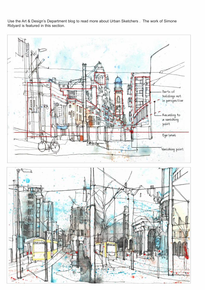
Use the Art & Design’s Department blog to read more about Urban Sketchers . The work of Simone Ridyard is featured in this section.
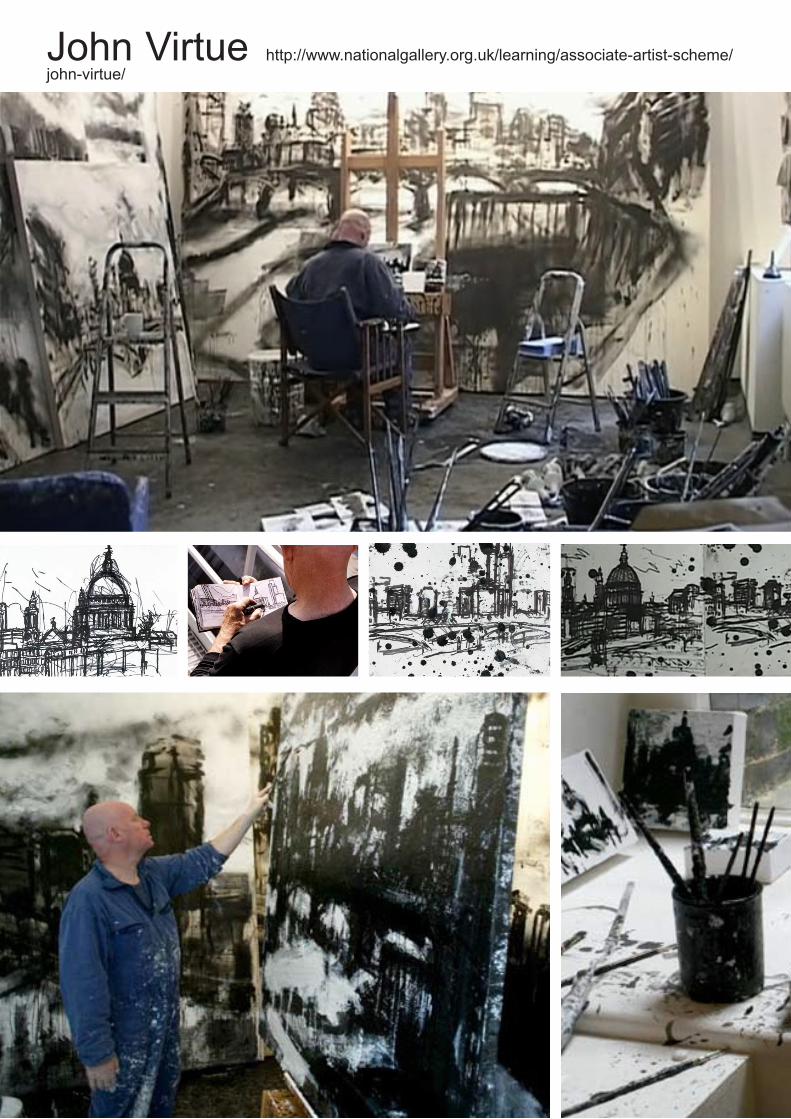
John Virtue http://www.nationalgallery.org.uk/learning/associate-artist-scheme/john-virtue/
John Virtue's paintings are compositions made up of white patches amongst blackness, the patches revealing slight definitions of buildings through the haze of darkness. The works are dark and brooding. Close-up the picture surface asserts only itself, as an abrasive mass of marks after layers of paint and ink have been applied, shifted and reworked. Step back and the image emerges detail by detail. But the further back you move, the more the effect of an image emerging from the darkness is lost: Now it's a turbulent image of the world, where the atmosphere batters every surface in its wake; and glimmers of light emerge as islands lost and isolated from other neighbouring glimmers. The scale of the works allows the mark-making and details to switch as the focus, because of the large intervals between incidents. This also allows you to consider your own position in relation to the work, and appreciate the vast distances between each place within the scene. Virtue's works show the process of their making: the passage of time and the passage of effort, where guidance and gravity alternately lend a hand in the formation of the image. The drips and runs of paint and ink betray an intention to portray nothing but the inherent qualities of their chemical consistency. Yet stand out prominently because of the clarity of the edges formed by the abrupt contrast of tone: Black against white. Yet then again, the slight of hand that drags the brush full of white acrylic across the painting is equally in dilemma as it registers the certainty of direction, shape and contour through its coordinates, but non-the-less struggles to emerge unaffected by the previous layer of substance which is having non of this pictorial nonsense: stating as it does, 'I am substance, I am texture, I am surface, and I am still wet and will engulf you'.
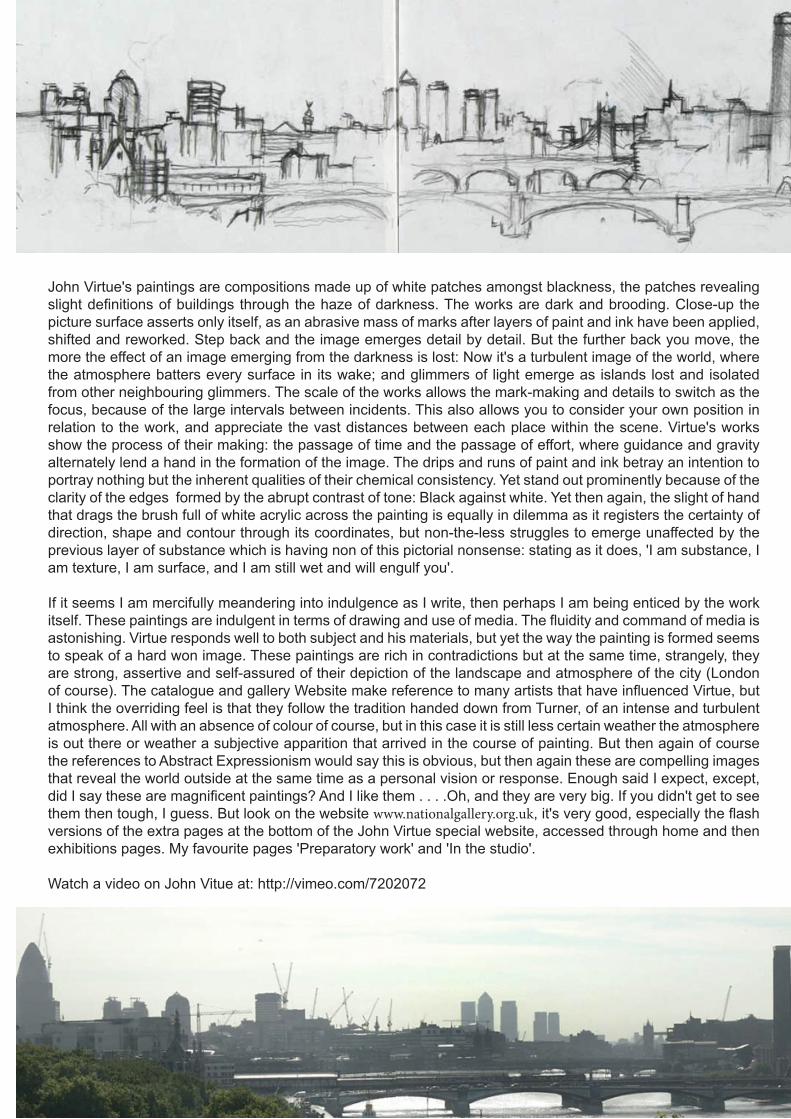
If it seems I am mercifully meandering into indulgence as I write, then perhaps I am being enticed by the work itself. These paintings are indulgent in terms of drawing and use of media. The fluidity and command of media is astonishing. Virtue responds well to both subject and his materials, but yet the way the painting is formed seems to speak of a hard won image. These paintings are rich in contradictions but at the same time, strangely, they are strong, assertive and self-assured of their depiction of the landscape and atmosphere of the city (London of course). The catalogue and gallery Website make reference to many artists that have influenced Virtue, but I think the overriding feel is that they follow the tradition handed down from Turner, of an intense and turbulent atmosphere. All with an absence of colour of course, but in this case it is still less certain weather the atmosphere is out there or weather a subjective apparition that arrived in the course of painting. But then again of course the references to Abstract Expressionism would say this is obvious, but then again these are compelling images that reveal the world outside at the same time as a personal vision or response. Enough said I expect, except, did I say these are magnificent paintings? And I like them . . . .Oh, and they are very big. If you didn't get to see them then tough, I guess. But look on the website www.nationalgallery.org.uk, it's very good, especially the flash versions of the extra pages at the bottom of the John Virtue special website, accessed through home and then exhibitions pages. My favourite pages 'Preparatory work' and 'In the studio'.
Watch a video on John Vitue at: http://vimeo.com/7202072
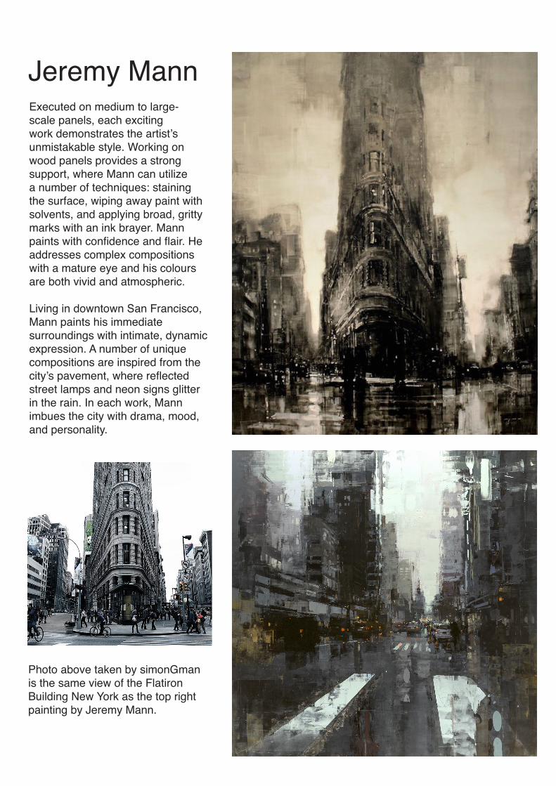
Jeremy MannExecuted on medium to large-scale panels, each exciting work demonstrates the artist’s unmistakable style. Working on wood panels provides a strong support, where Mann can utilize a number of techniques: staining the surface, wiping away paint with solvents, and applying broad, gritty marks with an ink brayer. Mann paints with confidence and flair. He addresses complex compositions with a mature eye and his colours are both vivid and atmospheric.
Living in downtown San Francisco, Mann paints his immediate surroundings with intimate, dynamic expression. A number of unique compositions are inspired from the city’s pavement, where reflected street lamps and neon signs glitter in the rain. In each work, Mann imbues the city with drama, mood, and personality.
Photo above taken by simonGman is the same view of the Flatiron Building New York as the top right painting by Jeremy Mann.

Street photographyIn producing Street/Urban inspired artwork photography will be the key to your success. Street photography is about getting out there, observing the public, overcoming your shyness, and documenting the world around you. It shows the world as it is, like holding up a mirror to society, capturing a moment in time. So let’s see your best street photo! Remember: Photos in this theme must have been taken on a public street. And we’re not looking for photos of streets, we’re looking for photos taken on streets. Strangers on the streets is an area to explore.
The Art & design Department’s Blog has a wealth of information on photography and direct you towards the blog of:
Eric Kim as a start point. Other photographers to look at are:
Laid bare the sole of the 1950’s USA, producing a “Paper Movie” , “The Americans” where he travelled around the USA. It became a foundation stone of modern photography. He advocated to stand in the middle of the picture and be part of the experience and shoot from the hip. In his book he superimposed one picture over another.The book featured flags and a series of coded crosses. Qualities he displayed are agility, mystery, sadness, genius & secret strangeness.
Robert Frank
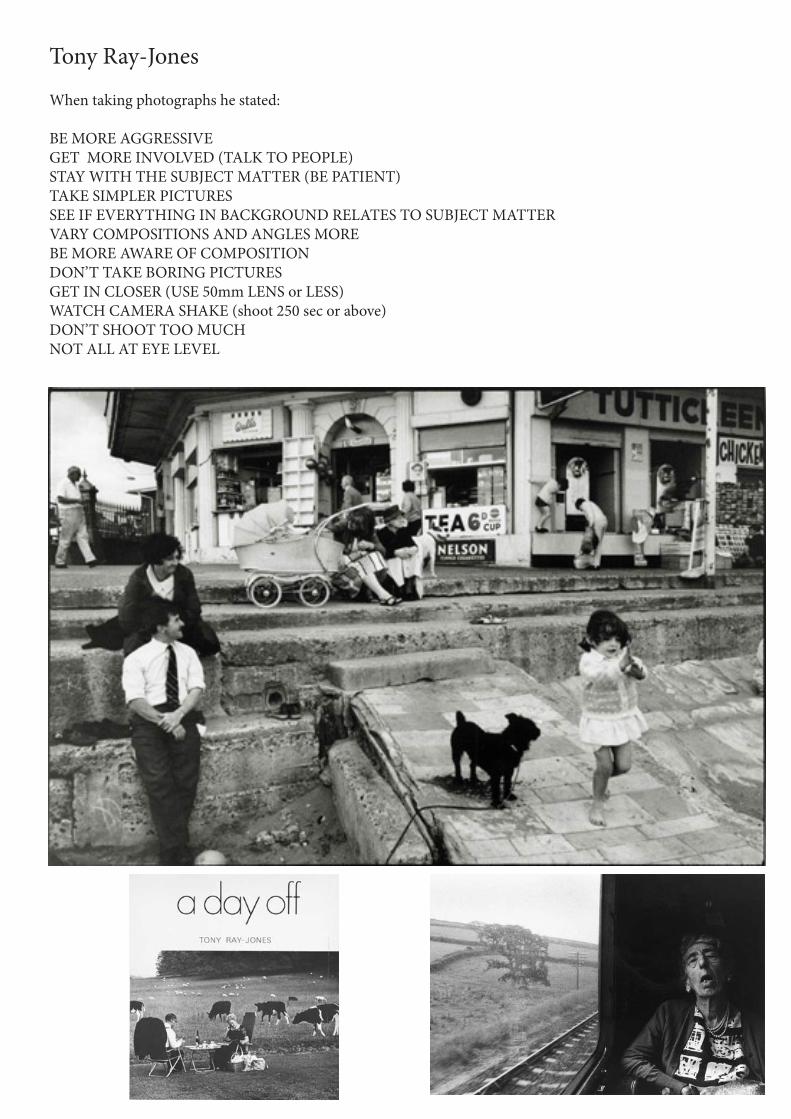
Tony Ray-Jones
When taking photographs he stated:
BE MORE AGGRESSIVE GET MORE INVOLVED (TALK TO PEOPLE) STAY WITH THE SUBJECT MATTER (BE PATIENT) TAKE SIMPLER PICTURES SEE IF EVERYTHING IN BACKGROUND RELATES TO SUBJECT MATTER VARY COMPOSITIONS AND ANGLES MORE BE MORE AWARE OF COMPOSITION DON’T TAKE BORING PICTURES GET IN CLOSER (USE 50mm LENS or LESS) WATCH CAMERA SHAKE (shoot 250 sec or above) DON’T SHOOT TOO MUCH NOT ALL AT EYE LEVEL
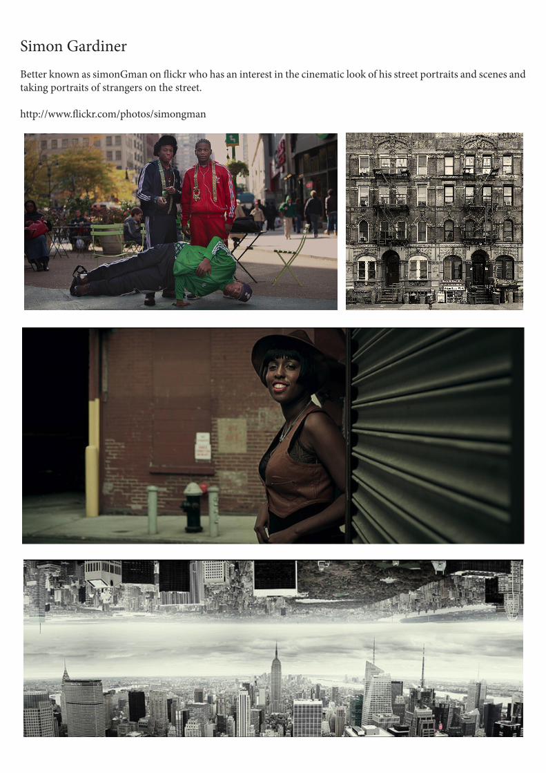
Simon GardinerBetter known as simonGman on flickr who has an interest in the cinematic look of his street portraits and scenes and taking portraits of strangers on the street.
http://www.flickr.com/photos/simongman

Techniques
Ways of transferring your photograph to your sketchbook or another piece of
paper/surface.
Technique 1The basics on how to do an inkjet transfer:
1). take a sheet of label paper (the kind used to print out address labels on your computer) and remove all the labels so that all that is left is the wax backing paper.
2) print out your image on the wax paper. It’s been suggested that you increase the darkness by about 20% and contrast by 5%.
3) while the paper is printing or just after, soak a sheet of paper in water (it doesn't need to be soaking for long). this is the paper you will be transferring the ink from the wax paper to. Once the paper is wet, wipe off the excess water (a paper towel works well for this) so that the paper is damp. If the paper is too wet your transfer will come out all muddy, if it's too dry it'll be more difficult to transfer.
4) press the two papers together. I prefer to place the damp paper on top of the wax paper, but either will work.
5) pull the papers apart. Now most of the ink should be on the damp paper. You can air dry, or if you are impatient like me you can use a hair dryer to blow dry the paper.
6) wipe off the excess ink on the wax paper. This paper can be used over and over again until it doesn't hold the ink very well.
And that's basically it. The most important thing is to experiment and see what works best for you, and of course post the results!
-Image transfer
Technique 21) Convert the photo of your choice, increase the saturation of colours.2) Print out a mirror version of your image into a standard printer paper.5) Spread Golden Medium gel or PVA on your image and press it face down into the card/paper/canvas over the collage.6) Wait about an hour until the mod podge/acrylic gel/pva is completely dry. Rub your transfer with wet fingers and gently remove the excess paper to reveal the transfer.
More details can be found at:
http://nonphotography.com/