george michael brower (603483460) desma 11a - …georgebrower/11hmidterm.pdf · pencil and not...
TRANSCRIPT

I really can’t remember what my first drawing was. I assume its buried
somewhere in my mom’s closet, in one of those gigantic blue Tupperware bins. I
think it’s also safe to assume that it depicts some sort of smiley outdoor scene with
a green stripe of grass, a stick figure, and a yellow circle in the top right corner, on
some monstrous piece of newsprint.
My mother, an ex-fashion designer and illustrator, has always saved that
sort of thing, and she’s really short on closet space because of it. I loved to draw
as a kid, absolutely loved it. It’s what I did all the time. I could spend days on
end meticulously recreating an image of something I’d found in a video game’s
instruction manual. I’d fill up entire scrolls of tracing paper with doodles of my
babysitter, cartoon characters, whatever I could think of. Mom taught me her sense
keen sense of motion, composition and repetition at an early age.
I still haven’t decided whether I’m bitter about getting my own computer as
a kid. I was maybe nine at the time, and it’s safe to say that ninety five percent
of my drawing activity halted immediately thereafter. I think had I never been
introduced to computers at such an early age I might have been studying to become
an illustrator right now. For a long period in time, I seldom drew anything. My
creative process became more abstract. Less and less was I concerned with the
details and execution of an illustration or drawing, and more and more was I
concerned with its composition, layout, movement and balance. That’s why I’m
studying to become a designer.
George Michael Brower (603483460)DESMA 11a - Midterm
Despite the fact that most of the work we’ve seen thus far is the product
of illustrators, fine artists and painters, I certainly see some strong visual and
conceptual similarities between work I’ve produced in the last few years, and work
we’ve seen during class. I was fascinated to recognize likeness in both process
and aesthetic to some of history’s most significant artists, and excited to draw
comparison between my work and theirs.
It was only a few years ago that I decided to reincorporate hand-drawn
images into my work. I feared it was losing its sense of life—that organic visual
quality you can only achieve through a hand-drawn line. I picked up a pencil in my
sophomore year of high school and was delighted to see that my hand still knew its
way around a sketchbook. I bought a scanner, a Wacom—anything I could to help
my hand interface with a computer the way it could best—wrapped tightly around a
pencil and not lying limply on a mouse.
A CD I designed for the band I was in during high school is probably the
earliest example of work I’m comfortable showing anyone. It might not be true in
a few years, but for now I still appreciate it. It certainly signified a major change
in my method. Somewhere around the time my band mates told me they’d like
me to design the album cover for our latest EP, I had started to create collages by
arranging images I’d drawn by hand on my computer screen.
I’d take a sheet of paper and fill it with different doodles, shapes, gestures, and
images centered around one theme, just as I had done as kid. Only then, I traced
George Michael Brower (603483460)DESMA 11a - Midterm

them into my computer using a Wacom tablet and arranged them using digital
imaging software like Adobe Illustrator. I couldn’t help but think of this transition
when discussing the notion of “tools” during class. I can absolutely see a distinct
shift in the nature and feeling of my work once I decided to use new tools in order to
incorporate organic drawing into my compositions.
The most immediate comparison I can make from
this album cover to the work of an artist we’ve
touched upon in class is that of Aubrey
Beardsley. I was first impressed by
Beardsley’s work in that I felt he had
created some of the very few black
and white images that can be aptly
described as “vibrant.” Usually a
description reserved for work in color,
Beardsley compensated for his lack of hue
with stark line and dramatic black and white
shapes.
Take for example this border design by Aubrey Beardsley for Morte d’Arthur
(1893). A dense collection of vines and leaves twist and intermingle about a group
of nymphs. There’s but a single color in the design, which is surprising considering
the incredible amount of depth it suggests. As were that of most border designs
George Michael Brower (603483460)DESMA 11a - Midterm

of the period, Beardsley’s ornamentation is
extremely thick and very dense. When one
squints their eyes, the decoration around the text
resolves to a very dark gray, perhaps even black,
which creates a very attractive juxtaposition
against the white area containing the type.
In creating the Seamless Cities cover I
aimed to express the personality of the album’s
eponymous title track. While I think words
are often used in vain while attempting to
communicate the nature of music, the song is
best described as sprightly, sprawling, majestic, perhaps even budding. The song
grows from its center to become much more than what it starts as, in the same way
that the simple juxtaposition of pure black and pure white can often suggest more
the sum of its parts. With this in mind I laid down a few images I thought best
express these qualities.
George Michael Brower (603483460)DESMA 11a - Midterm
A number of hand-drawn “assets” used in the creation of the Seamless Cities design
Border design by Aubrey Beardsley from Morte d’Arthur (1893), with text ommitted.

With the exception of faint color accents behind the
band’s name, the image is purely two-tone. The nature of
vector graphics is similar to those present in Beardsley’s work,
and most other lithographic and printed work of the time, in
that they produce very crisp, high contrast edges.
In his border design for Morte d’Arthur, this very thick
ornamentation takes on the shape of its container, almost as if
it was a liquid. I’m fascinated by the way Beardsley can use
such organic forms and gestures to emphasize such a strictly
geometrical shape. The viewer’s eye is directed around the
edge of the page in a cyclical manner. In the same way that
Beardsley’s vines create a visual path by looping around the
center of the page, I aimed to compose the different elements
of the album cover in a way that would at once encourage
the viewer to circle their eyes around disc and acknowledge
their growth from its center. The “hole” in the center of the
CD itself can even be seen as roughly analogous to the area of text enveloped by
Beardsley’s ornamentation.
If I seemed infatuated with the process of illustration at the beginning of this
paper its because of Alphonse Mucha. His work is by far my favorite thing we’ve
been introduced to over the course of the last five weeks. There’s something to be
George Michael Brower (603483460)DESMA 11a - Midterm
Similar border design from Morte d’Arthur
More like minded Beradsley work
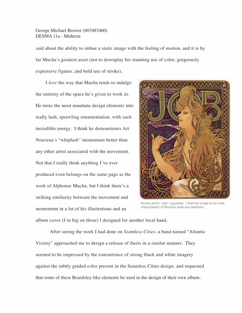
said about the ability to imbue a static image with the feeling of motion, and it is by
far Mucha’s greatest asset (not to downplay his stunning use of color, gorgeously
expressive figures, and bold use of stroke).
I love the way that Mucha tends to indulge
the entirety of the space he’s given to work in.
He turns the most mundane design elements into
really lush, sprawling ornamentation, with such
incredible energy. I think he demonstrates Art
Nouveau’s “whiplash” momentum better than
any other artist associated with the movement.
Not that I really think anything I’ve ever
produced even belongs on the same page as the
work of Alphonse Mucha, but I think there’s a
striking similarity between the movement and
momentum in a lot of his illustrations and an
album cover (I’m big on those) I designed for another local band.
After seeing the work I had done on Seamless Cities, a band named “Atlantic
Victory” approached me to design a release of theirs in a similar manner. They
seemed to be impressed by the concurrence of strong black and white imagery
against the subtly graded color present in the Seamless Cities design, and requested
that some of these Beardsley-like elements be used in the design of their own album.
George Michael Brower (603483460)DESMA 11a - Midterm
Mucha ad for “Job” cigarettes. I find this image to be most characteristic of Mucha’s style and aesthetic.

The format and packaging of this CD, entitled Before and After the Tragedy
certainly afforded me a lot more freedom in design. I wanted to depict the transition
from the “before” to the “after” using a fluid illustration that would seamlessly cross
from the front to the back cover. I wanted the viewer to be able to open the booklet
and see this transition from front to back, side by side. To best facilitate this sort of
design we decided upon the use of what’s known as a “digipak,” as opposed to the
traditional jewel-case. A digipak is made in its entirety (even its spine) from a sort
of cardboard like material, and can’t be taken apart the way a jewel-case can.
The composition of these two covers side by side can be reduced to a single
gesture, best represented by a swift curve that dips in the center. So many of these
gestures are present in Mucha’s works, and that’s what gives them such beautiful
sense of flowing energy.
George Michael Brower (603483460)DESMA 11a - Midterm
Cover designs for Atlantic Victory’s Before and After the Tragedy. Atlantic Victory decided on a last minute album title change in favor of In a World Full of Liars ... We Coexist. They’re a very melodramatic bunch.
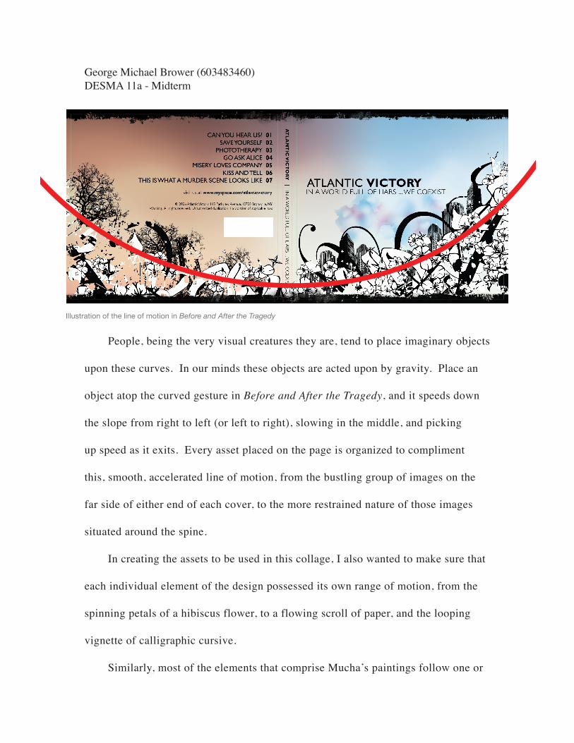
People, being the very visual creatures they are, tend to place imaginary objects
upon these curves. In our minds these objects are acted upon by gravity. Place an
object atop the curved gesture in Before and After the Tragedy, and it speeds down
the slope from right to left (or left to right), slowing in the middle, and picking
up speed as it exits. Every asset placed on the page is organized to compliment
this, smooth, accelerated line of motion, from the bustling group of images on the
far side of either end of each cover, to the more restrained nature of those images
situated around the spine.
In creating the assets to be used in this collage, I also wanted to make sure that
each individual element of the design possessed its own range of motion, from the
spinning petals of a hibiscus flower, to a flowing scroll of paper, and the looping
vignette of calligraphic cursive.
Similarly, most of the elements that comprise Mucha’s paintings follow one or
George Michael Brower (603483460)DESMA 11a - Midterm
Illustration of the line of motion in Before and After the Tragedy

two of these overarching curved gestures, but
the smaller details of the image tend to follow
paths of their own, giving the image a much
more sophisticated sense of motion.
Take for example Alphonse Mucha’s
Dance (1898). The painting’s main path
of motion is created by the bit of fabric the
subject holds in her right hand, wrapping
around her legs, and leaving the image below
her feet. Mucha uses the natural contours of
the female body to emphasize this quality of
motion quite beautifully, in a manner that is
all at once delicate, seductive, and entirely
feminine.
While Mucha uses these qualities to establish the image’s most general range
of motion, smaller gestures created by finer details of the painting serve to give the
work an extraordinarily refined sense of momentum. Flecks of red and pink flutter
about the image in all directions, perhaps to suggest flower petals falling from the
model’s headdress. The bit of fabric draped around the model’s left arm has, in
itself, an infinite number of these flowing contour lines. Her hair flies from the
captivating expression on her face only to curl back towards it. Even the circular
George Michael Brower (603483460)DESMA 11a - Midterm
Dance, Alphonse Mucha (1898)
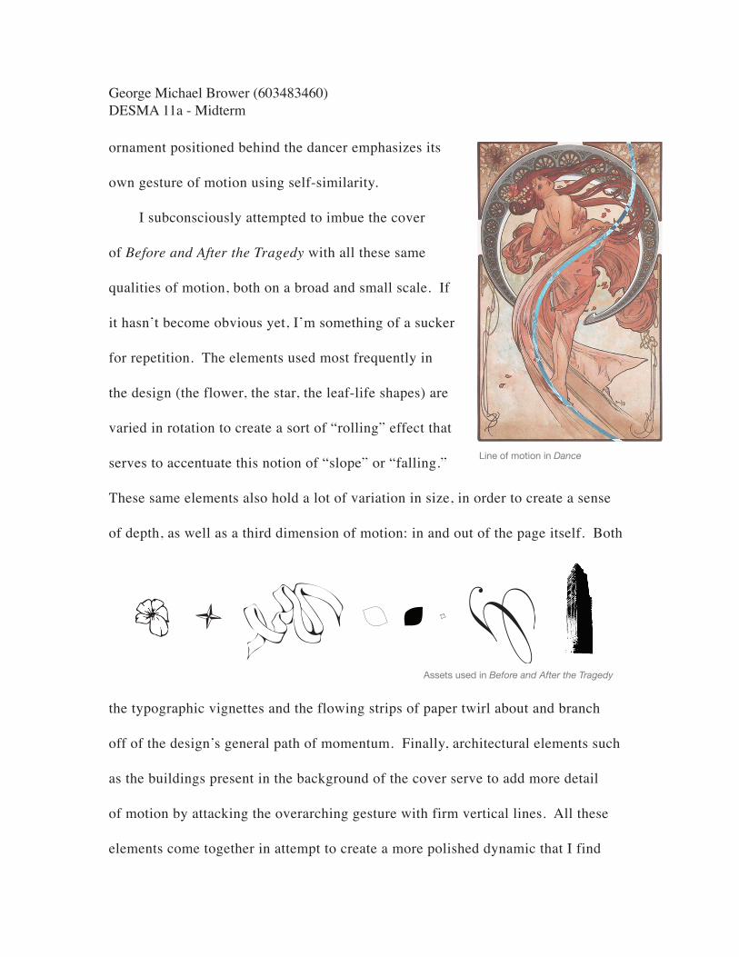
ornament positioned behind the dancer emphasizes its
own gesture of motion using self-similarity.
I subconsciously attempted to imbue the cover
of Before and After the Tragedy with all these same
qualities of motion, both on a broad and small scale. If
it hasn’t become obvious yet, I’m something of a sucker
for repetition. The elements used most frequently in
the design (the flower, the star, the leaf-life shapes) are
varied in rotation to create a sort of “rolling” effect that
serves to accentuate this notion of “slope” or “falling.”
These same elements also hold a lot of variation in size, in order to create a sense
of depth, as well as a third dimension of motion: in and out of the page itself. Both
the typographic vignettes and the flowing strips of paper twirl about and branch
off of the design’s general path of momentum. Finally, architectural elements such
as the buildings present in the background of the cover serve to add more detail
of motion by attacking the overarching gesture with firm vertical lines. All these
elements come together in attempt to create a more polished dynamic that I find
George Michael Brower (603483460)DESMA 11a - Midterm
Assets used in Before and After the Tragedy
Line of motion in Dance
very reminiscent of Mucha’s work as well as other artists associated with the Art
Nouveau movement.
So many of these qualities present in both my work, and that of Aubrey
Beardsley and Alphonse Mucha, are simply not within a machine’s scope of
capability. It’s certainly not to say that all artworks, designs or illustrations created
using a computer alone are lifeless, because it’s impossible to for a computer to
create such things without the aid of human imagination. However, I think many
modern designers, especially those among today’s youth, are losing touch with a
sense of “life” and craftsmanship that was certainly present in graphic design at the
turn of the 1900’s. By involving something as simple as drawing in one’s creative
process, this organicness is immediately restored.
Despite the fact that the title of “Graphic Designer” wouldn’t exist for more
than another half-century, the people we’ve studied in this class thus far were
forced to deal with the endeavor in a much more tangible way. Because of this
physical, hands-on interaction, designers much more often imbued their work with
life, motion, depth, and most importantly themselves as human beings. I think
that today’s design community places a waning importance on these qualities. By
looking to the past of design history I realize how truly powerful they are, and how
truly powerful they will continue to be.
George Michael Brower (603483460)DESMA 11a - Midterm