georgia 2015 community profile report - komen
TRANSCRIPT

GEORGIA

2 | P a g e Susan G. Komen®
Table of Contents ........................................................................................................................ 2
Introduction ................................................................................................................................. 3
About Susan G. Komen® ........................................................................................................... 3
Susan G. Komen Affiliate Network ............................................................................................ 3
Purpose of the State Community Profile Report ....................................................................... 4
Quantitative Data: Measuring Breast Cancer Impact in Local Communities ........................ 5
Quantitative Data ....................................................................................................................... 5
Conclusions: Healthy People 2020 Forecasts ......................................................................... 80
Health Systems Analysis ......................................................................................................... 87
Health Systems Analysis Data Sources .................................................................................. 87
Breast Cancer Continuum of Care .......................................................................................... 93
Health Systems Analysis Findings .......................................................................................... 94
Public Policy Overview ............................................................................................................. 97
Susan G. Komen Advocacy .................................................................................................... 97
National Breast and Cervical Cancer Early Detection Program .............................................. 97
State Comprehensive Cancer Control Plan ............................................................................ 99
Affordable Care Act ............................................................................................................... 100
Medicaid Expansion .............................................................................................................. 101
Affordable Care Act, Medicaid Expansion and Unisured Women ......................................... 103
Community Profile Summary ................................................................................................. 105
Introduction to the Community Profile Report ....................................................................... 105
Quantitative Data: Measuring Breast Cancer Impact in Local Communities ......................... 105
Health Systems Analysis ....................................................................................................... 111
Public Policy Overview .......................................................................................................... 114
Conclusions ........................................................................................................................... 116
References ............................................................................................................................... 118
Appendix .................................................................................................................................. 121
Table of Contents

3 | P a g e Susan G. Komen®
About Susan G. Komen® Susan G. Komen is the world’s largest breast cancer organization, funding more breast cancer research than any other nonprofit while providing real-time help to those facing the disease. Since 1982, Komen has funded more than $889 million in research and provided $1.95 billion in funding to screening, education, treatment and psychosocial support programs serving millions of people in more than 30 countries worldwide. Komen was founded by Nancy G. Brinker, who promised her sister, Susan G. Komen, that she would end the disease that claimed Suzy’s life. Since 1982, Komen has contributed to many of the advances made in the fight against breast cancer and transformed how the world treats and talks about this disease and have helped turn millions of breast cancer patients into breast cancer survivors:
More early detection and effective treatment. Currently, about 70 percent of women 40 and older receive regular mammograms, the single most effective screening tool to find breast cancer early. Since 1990, early detection and effective treatment have resulted in a 34 percent decline in breast cancer death in the US.
More hope. In 1980, the five-year relative survival rate for women diagnosed with early stage breast cancer was about 74 percent. Today, it’s 99 percent.
More research. The federal government now devotes more than $850 million each year to breast cancer research, treatment and prevention, compared to $30 million in 1982.
More survivors. Today, there are more than three million breast cancers survivors in the US.
Visit komen.org or call 1-877 GO KOMEN. Connect with us on social at ww5.komen.org/social.
Susan G. Komen Affiliate Network Thanks to survivors, volunteers and activists dedicated to the fight against breast cancer, the Komen Affiliate Network is working to better the lives of those facing breast cancer in the local community. Through events like the Komen Race for the Cure® series, the local Komen Affiliates invest funds raised locally into community health programs to provide evidence-based breast health education and breast cancer screening, diagnostic and treatment programs, and contribute to the more than $889 million invested globally in research. For more information or to connect with a local Affiliate, contact the following Komen Affiliates that are located in or provide services to the State of Georgia as of February 2017:
Susan G. Komen® Central Georgia
277 Martin Luther King Jr. Blvd. Suite 101 Macon, GA 31201 478-952-8439 www.komencentralga.org
Introduction

4 | P a g e Susan G. Komen®
Susan G Komen® Chattanooga 6025 Lee Hwy. Suite 203 Chattanooga, TN 37421 423-499-9155 www.komenchattanooga.org Susan G. Komen® Coastal Georgia 2250 E. Victory Dr. Ste. 107 Savannah, GA 31404 912-232-2535 www.komencoastalgeorgia.org Susan G. Komen®
Greater Atlanta 3525 Piedmont Road Building 5, Suite 215 Atlanta, Georgia 30305 404-814-0052 www.komenatlanta.org
Purpose of the State Community Profile Report The purpose of the Georgia Community Profile is to assess breast cancer burden within the state by identifying areas at highest risk of negative breast cancer outcomes. Through the Community Profile, populations most at-risk of dying from breast cancer and their demographic and socioeconomic characteristics can be identified; as well as, the needs and disparities that exist in availability, access and utilization of quality care.
The Community Profile consists of the following three sections: Quantitative Data: This section provides secondary data on breast cancer rates and
trends that include incidence, deaths and late-stage diagnosis along with mammography screening proportions. This section also explores demographic, social and geographic characteristics that influence breast cancer outcomes such as race/ethnicity, socioeconomic status, educational attainment and insurance status.
Health System Analysis: This section tells the story of the breast cancer continuum of care and the delivery of quality health care in the community. Key to this section is the observation of potential strengths and weaknesses in the health care system that could compromise a women’s health as she works her way through the continuum of care (e.g., screening, diagnosis, treatment and follow-up/survivorship services).
Public Policy Overview: This section provides an overview of key breast cancer policies that affect the ability of at-risk women in accessing and utilizing quality care. This section covers the state’s National Breast and Cervical Cancer Early Detection Program, the state’s National Comprehensive Cancer Control Program and the Affordable Care Act.

5 | P a g e Susan G. Komen®
The purpose of the quantitative data report for the State of Georgia is to provide quantitative data from many credible sources and use the data to identify the highest priority areas in the state for evidence-based breast cancer programs. The quantitative data report provides the following data at the state and county-level as well as for the United States:
Female breast cancer incidence (new cases) Female breast cancer death rates Late-stage diagnosis Screening mammography proportions Population demographics (e.g. age, race/ethnicity) Socioeconomic indicators (e.g. income and education level)
The data provided in the report can be used to identify priorities within the state based on estimates of how long it would take an area to achieve Healthy People 2020 objectives for breast cancer late-stage diagnosis and death rates (Healthy People 2020, 2010).
Quantitative Data This section of the report provides specific information on the major types of data that are included in the report. Incidence Rates
“Incidence” means the number of new cases of breast cancer that develop in a specific time period. If the breast cancer incidence rate increases, it may mean that more women are getting breast cancer. However, it could also mean that more breast cancers are being found because of an increase in screening.
The breast cancer incidence rate shows the frequency of new cases of breast cancer among women living in an area during a certain time period. Incidence rates may be calculated for all women or for specific groups of women (e.g. for Asian/Pacific Islander women living in the area). How incidence rates are calculated The female breast cancer incidence rate is calculated as the number of females in an area who were diagnosed with breast cancer divided by the total number of females living in that area. Incidence rates are usually expressed in terms of 100,000 people. For example, suppose there are 50,000 females living in an area and 60 of them are diagnosed with breast cancer during a
Quantitative Data: Measuring Breast Cancer Impact in Local Communities

6 | P a g e Susan G. Komen®
certain time period. Sixty out of 50,000 is the same as 120 out of 100,000. So the female breast cancer incidence rate would be reported as 120 per 100,000 for that time period. Adjusting for age Breast cancer becomes more common as women grow older. When comparing breast cancer rates for an area where many older people live to rates for an area where younger people live, it’s hard to know whether the differences are due to age or whether other factors might also be involved. To account for age, breast cancer rates are usually adjusted to a common standard age distribution. This is done by calculating the breast cancer rates for each age group (such as 45- to 49-year-olds) separately, and then figuring out what the total breast cancer rate would have been if the proportion of people in each age group in the population that’s being studied was the same as that of the standard population. Using age-adjusted rates makes it possible to spot differences in breast cancer rates caused by factors other than differences in age between groups of women. Trends over time To show trends (changes over time) in cancer incidence, data for the annual percent change in the incidence rate over a five-year period were included in the report. The annual percent change is the average year-to-year change of the incidence rate. It may be either a positive or negative number.
A negative value means that the rates are getting lower. A positive value means that the rates are getting higher. A positive value (rates getting higher) may seem undesirable—and it generally is.
However, it’s important to remember that an increase in breast cancer incidence could also mean that more breast cancers are being found because more women are getting mammograms. So higher rates don’t necessarily mean that there has been an increase in the occurrence of breast cancer.
Confidence intervals Because numbers for breast cancer rates and trends are not exact, this report includes confidence intervals. A confidence interval is a range of values that gives an idea of how uncertain a value may be. It’s shown as two numbers—a lower value and a higher one. It is very unlikely that the true rate is less than the lower value or more than the higher value. For example, if a breast cancer incidence rate was reported as 120 per 100,000 women, with a confidence interval of 105 to 135, the real rate might not be exactly 120 per 100,000, but it’s very unlikely that it’s less than 105 or more than 135.

7 | P a g e Susan G. Komen®
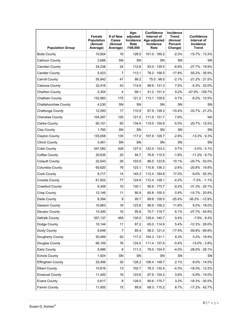
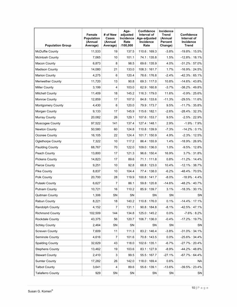
Breast cancer incidence rates and trends Breast cancer incidence rates and trends are shown in Table 2.1 for:
United States State of Georgia Each county of Georgia
For the State of Georgia, rates are also shown by race for Whites, Blacks/African-Americans, Asians and Pacific Islanders (API), and American Indians and Alaska Natives (AIAN). In addition, rates are shown by ethnicity for Hispanics/Latinas and women who are not Hispanic/Latina (regardless of their race).
The rates in Table 2.1 are shown per 100,000 females from 2006 to 2010.
Table 2.1. Female breast cancer incidence rates and trends
Population Group
Female Population
(Annual Average)
# of NewCases
(AnnualAverage)
Age- adjustedIncidence
Rate /100,000
ConfidenceInterval of
Age-adjustedIncidence
Rate
Incidence Trend
(Annual Percent Change)
Confidence Interval of Incidence
Trend
US (states with available data) 145,332,861 198,602 122.1 121.9 : 122.4 -0.2% -2.0% : 1.7%
Georgia 4,838,820 5,997 121.5 120.1 : 122.9 -0.3% -3.6% : 3.2%
White 3,082,915 4,247 122.6 120.9 : 124.3 -0.2% NA
Black/African-American 1,565,807 1,629 120.9 118.2 : 123.6 -0.3% -6.2% : 6.0%
AIAN 22,989 5 30.6 18.3 : 47.8 -14.6% -49.8% : 45.3%
API 167,109 100 73.1 66.2 : 80.5 -3.8% -9.9% : 2.7%
Non-Hispanic/ Latina 4,481,679 5,860 122.8 121.4 : 124.2 0.0% -3.1% : 3.2%
Hispanic/ Latina 357,141 137 85.8 78.5 : 93.6 -3.2% -19.8% : 16.8%
Appling County 9,000 11 108.1 81.3 : 141.2 19.4% -2.8% : 46.6%
Atkinson County 4,117 4 87.0 51.2 : 138.4 -6.1% -47.5% : 68.0%
Bacon County 5,526 5 75.5 49.1 : 111.9 -5.0% -41.0% : 52.8%
Baker County 1,880 SN SN SN SN SN
Baldwin County 22,834 29 120.0 100.8 : 141.8 -13.1% -26.1% : 2.3%
Banks County 8,806 10 109.2 81.0 : 144.3 -22.3% -43.8% : 7.5%
Barrow County 33,595 33 104.1 88.6 : 121.4 -2.1% -12.3% : 9.3%
Bartow County 49,310 58 115.4 102.3 : 129.8 -1.5% -8.2% : 5.6%
Ben Hill County 9,183 13 123.2 94.0 : 158.8 -6.4% -29.8% : 24.9%
Berrien County 9,524 11 103.0 77.8 : 134.1 9.5% -20.9% : 51.5%
Bibb County 82,277 114 125.2 114.9 : 136.0 3.4% -7.9% : 16.2%
Bleckley County 6,771 8 100.4 70.3 : 139.5 3.1% -41.6% : 82.0%
Brantley County 8,828 6 60.2 39.8 : 87.5 3.3% -20.4% : 34.1%
Brooks County 8,363 9 90.3 65.5 : 121.7 11.8% NA
Bryan County 14,737 19 132.1 106.1 : 162.5 -4.1% -20.7% : 16.0%
Bulloch County 33,810 34 119.4 102.0 : 139.0 -1.0% -11.3% : 10.3%
Burke County 12,038 14 107.7 83.8 : 136.4 1.1% -17.9% : 24.4%
8 | P a g e Susan G. Komen®
Population Group
Female Population
(Annual Average)
# of NewCases
(AnnualAverage)
Age- adjustedIncidence
Rate /100,000
ConfidenceInterval of
Age-adjustedIncidence
Rate
Incidence Trend
(Annual Percent Change)
Confidence Interval of Incidence
Trend
Butts County 10,924 16 128.0 101.0 : 160.2 -2.3% -15.7% : 13.3%
Calhoun County 2,688 SN SN SN SN SN
Camden County 24,238 24 112.8 93.0 : 135.5 -6.9% -27.7% : 19.9%
Candler County 5,423 7 113.1 78.2 : 158.5 -17.8% -50.2% : 35.9%
Carroll County 55,942 47 86.2 75.5 : 98.0 -2.1% -21.2% : 21.5%
Catoosa County 32,416 43 114.6 99.6 : 131.3 7.5% -5.3% : 22.0%
Charlton County 5,304 4 66.1 41.2 : 101.4 9.2% -47.9% : 128.7%
Chatham County 132,983 175 121.2 113.1 : 129.6 0.7% -8.2% : 10.5%
Chattahoochee County 4,230 SN SN SN SN SN
Chattooga County 12,593 17 110.9 87.9 : 138.3 -10.4% -33.7% : 21.2%
Cherokee County 104,297 125 121.5 111.9 : 131.7 7.6% NA
Clarke County 60,151 60 134.6 119.5 : 150.9 -5.5% -20.7% : 12.5%
Clay County 1,760 SN SN SN SN SN
Clayton County 135,658 135 117.0 107.9 : 126.7 -2.6% -13.3% : 9.3%
Clinch County 3,461 SN SN SN SN SN
Cobb County 347,082 428 127.5 122.0 : 133.2 0.7% -3.5% : 5.1%
Coffee County 20,635 20 94.7 76.8 : 115.5 -1.8% -11.2% : 8.7%
Colquitt County 22,543 26 103.9 86.5 : 123.8 10.1% -20.7% : 53.0%
Columbia County 60,620 76 123.1 110.8 : 136.3 -2.6% -20.8% : 19.8%
Cook County 8,717 14 145.3 112.4 : 184.8 17.0% -9.0% : 50.3%
Coweta County 61,922 77 124.8 112.4 : 138.1 -4.2% -7.3% : -1.1%
Crawford County 6,349 10 130.1 95.6 : 173.7 -9.2% -31.3% : 20.1%
Crisp County 12,146 11 80.9 60.8 : 105.5 0.9% -15.7% : 20.8%
Dade County 8,394 9 95.7 69.8 : 128.5 -25.4% -36.2% : -12.9%
Dawson County 10,863 16 123.8 96.9 : 156.2 11.8% 6.0% : 18.0%
Decatur County 14,300 16 95.8 75.7 : 119.7 6.1% -27.7% : 55.8%
DeKalb County 357,137 465 135.0 129.4 : 140.7 0.4% -7.9% : 9.4%
Dodge County 10,144 11 87.2 65.0 : 114.9 5.4% -12.3% : 26.6%
Dooly County 6,648 7 85.4 58.2 : 121.4 -17.4% -59.8% : 69.9%
Dougherty County 50,489 62 117.2 104.3 : 131.1 8.3% 0.3% : 16.9%
Douglas County 66,109 76 124.0 111.4 : 137.6 -5.4% -13.0% : 2.8%
Early County 5,996 8 111.2 78.0 : 154.0 -4.0% -28.0% : 28.1%
Echols County 1,924 SN SN SN SN SN
Effingham County 25,406 30 126.2 106.4 : 148.7 2.1% -9.0% : 14.5%
Elbert County 10,616 13 102.7 78.3 : 132.4 -4.3% -18.3% : 12.2%
Emanuel County 11,400 16 123.6 97.9 : 154.2 3.6% -5.9% : 14.0%
Evans County 5,617 8 128.0 90.6 : 175.7 3.2% -18.3% : 30.5%
Fannin County 11,955 15 89.9 69.3 : 115.2 8.7% -17.2% : 42.7%

9 | P a g e Susan G. Komen®
Population Group
Female Population
(Annual Average)
# of NewCases
(AnnualAverage)
Age- adjustedIncidence
Rate /100,000
ConfidenceInterval of
Age-adjustedIncidence
Rate
Incidence Trend
(Annual Percent Change)
Confidence Interval of Incidence
Trend
Fayette County 54,387 85 131.8 119.2 : 145.5 -3.8% -15.0% : 8.9%
Floyd County 49,377 70 121.9 109.2 : 135.6 -4.5% NA
Forsyth County 82,179 99 125.0 113.9 : 136.8 5.3% -1.2% : 12.3%
Franklin County 11,284 15 106.5 83.2 : 134.5 3.1% -18.8% : 30.8%
Fulton County 453,948 590 135.1 130.2 : 140.2 -0.7% -2.9% : 1.5%
Gilmer County 13,988 14 79.3 60.9 : 101.6 -0.6% -15.8% : 17.3%
Glascock County 1,564 SN SN SN SN SN
Glynn County 40,657 60 121.6 107.9 : 136.5 0.2% -2.0% : 2.4%
Gordon County 27,228 35 124.8 106.9 : 144.8 3.0% -11.8% : 20.3%
Grady County 12,794 15 103.4 81.0 : 130.1 -7.0% -36.5% : 36.1%
Greene County 8,110 16 142.0 110.4 : 180.4 -0.6% -13.2% : 13.8%
Gwinnett County 392,752 437 127.8 122.2 : 133.5 1.2% -4.3% : 7.0%
Habersham County 21,970 34 126.6 108.0 : 147.6 -4.8% -18.4% : 11.1%
Hall County 87,284 109 123.9 113.7 : 134.9 -1.7% -7.7% : 4.8%
Hancock County 4,360 6 105.2 70.4 : 152.9 -27.7% -53.5% : 12.5%
Haralson County 14,613 15 89.0 70.0 : 111.8 -14.3% -29.8% : 4.7%
Harris County 15,503 21 110.9 90.3 : 135.2 -10.8% -26.6% : 8.4%
Hart County 12,658 20 112.4 90.8 : 138.0 -5.5% -22.0% : 14.5%
Heard County 5,902 4 61.9 38.1 : 95.7 -4.3% -33.5% : 37.7%
Henry County 100,440 109 118.2 108.2 : 129.0 1.0% -11.8% : 15.6%
Houston County 69,121 74 107.3 96.6 : 118.9 -5.4% -16.9% : 7.7%
Irwin County 4,804 5 84.9 54.4 : 127.2 9.3% -24.3% : 57.9%
Jackson County 29,369 41 131.0 113.5 : 150.5 1.5% -12.4% : 17.5%
Jasper County 6,913 12 154.0 116.7 : 199.7 -2.8% -29.3% : 33.5%
Jeff Davis County 7,369 8 91.1 63.9 : 126.1 -0.4% -32.2% : 46.4%
Jefferson County 8,767 15 145.6 114.0 : 183.6 2.3% -31.6% : 53.0%
Jenkins County 4,371 4 78.0 47.6 : 121.3 0.7% -16.7% : 21.9%
Johnson County 4,391 5 88.8 55.3 : 135.7 11.6% -41.4% : 112.5%
Jones County 14,606 18 111.1 88.9 : 137.4 4.5% -21.8% : 39.5%
Lamar County 9,259 14 135.5 104.9 : 172.4 7.1% -19.2% : 42.0%
Lanier County 4,697 5 95.0 59.9 : 143.3 31.1% 1.9% : 68.6%
Laurens County 25,119 32 113.6 96.4 : 132.9 6.4% 0.9% : 12.3%
Lee County 13,972 17 133.8 106.1 : 166.5 1.4% -24.1% : 35.6%
Liberty County 32,070 24 99.5 81.4 : 120.3 -14.4% -33.3% : 9.8%
Lincoln County 4,143 6 93.2 61.9 : 137.4 -19.6% -47.9% : 24.1%
Long County 6,637 4 63.9 37.5 : 101.3 6.1% NA
Lowndes County 53,662 60 120.0 106.7 : 134.6 -0.3% -18.7% : 22.4%
Lumpkin County 14,503 21 135.7 110.2 : 165.5 3.6% -17.8% : 30.4%
10 | P a g e Susan G. Komen®
Population Group
Female Population
(Annual Average)
# of NewCases
(AnnualAverage)
Age- adjustedIncidence
Rate /100,000
ConfidenceInterval of
Age-adjustedIncidence
Rate
Incidence Trend
(Annual Percent Change)
Confidence Interval of Incidence
Trend
McDuffie County 11,533 19 137.5 110.6 : 169.3 -3.8% -19.8% : 15.5%
McIntosh County 7,065 10 101.1 74.1 : 135.8 1.5% -12.8% : 18.1%
Macon County 6,873 8 98.5 69.6 : 135.9 4.0% -31.2% : 57.0%
Madison County 14,080 21 133.0 108.3 : 161.7 1.7% -16.9% : 24.5%
Marion County 4,275 6 120.4 78.6 : 176.8 -2.4% -42.3% : 65.1%
Meriwether County 11,720 13 90.8 69.3 : 117.0 10.8% -14.6% : 43.8%
Miller County 3,199 4 103.0 62.9 : 160.8 -3.7% -38.2% : 49.8%
Mitchell County 11,409 18 145.2 116.3 : 179.0 11.6% -0.9% : 25.6%
Monroe County 12,859 17 107.0 84.8 : 133.6 -11.3% -29.5% : 11.6%
Montgomery County 4,430 6 120.0 79.9 : 173.7 9.5% -11.7% : 35.8%
Morgan County 9,133 17 145.9 115.6 : 182.1 -2.6% -28.4% : 32.3%
Murray County 20,082 26 129.1 107.6 : 153.7 9.5% -2.5% : 22.9%
Muscogee County 97,522 141 137.4 127.4 : 148.1 2.9% -1.9% : 7.9%
Newton County 50,580 60 124.8 110.8 : 139.9 -7.3% -14.2% : 0.1%
Oconee County 16,105 22 124.4 101.7 : 150.9 4.9% -2.3% : 12.5%
Oglethorpe County 7,322 10 117.2 86.4 : 155.9 1.4% -18.9% : 26.9%
Paulding County 68,767 70 122.0 109.0 : 136.0 1.0% -9.5% : 12.8%
Peach County 13,800 17 121.3 96.6 : 150.4 16.9% 3.7% : 31.8%
Pickens County 14,823 17 89.6 71.1 : 111.8 0.8% -11.2% : 14.4%
Pierce County 9,251 10 92.8 68.8 : 123.0 10.4% -12.1% : 38.7%
Pike County 8,837 10 104.4 77.4 : 138.0 -6.2% -48.4% : 70.5%
Polk County 20,700 28 119.9 100.8 : 141.7 -8.0% -18.9% : 4.4%
Pulaski County 6,627 7 86.1 59.8 : 120.8 -14.6% -48.2% : 40.7%
Putnam County 10,721 16 110.2 85.9 : 139.7 3.1% -18.3% : 30.1%
Quitman County 1,306 SN SN SN SN SN
Rabun County 8,221 18 140.2 110.8 : 176.0 0.1% -14.4% : 17.1%
Randolph County 4,152 7 131.1 90.8 : 184.8 -8.1% -42.5% : 47.1%
Richmond County 102,509 144 134.8 125.0 : 145.2 0.0% -7.6% : 8.2%
Rockdale County 43,375 56 120.7 106.7 : 136.0 -0.4% -17.2% : 19.7%
Schley County 2,464 SN SN SN SN SN
Screven County 7,609 11 111.3 83.2 : 146.4 -3.8% -31.0% : 34.1%
Seminole County 4,616 7 101.6 70.8 : 143.5 0.0% -25.6% : 34.4%
Spalding County 32,629 43 118.0 102.6 : 135.1 -6.7% -27.7% : 20.4%
Stephens County 13,462 19 103.6 83.1 : 127.9 -8.9% -44.2% : 48.8%
Stewart County 2,410 3 99.5 55.5 : 167.7 -27.1% -67.7% : 64.4%
Sumter County 17,282 26 142.0 118.0 : 169.4 0.6% NA
Talbot County 3,641 4 89.6 55.6 : 139.1 -13.6% -39.5% : 23.4%
Taliaferro County 929 SN SN SN SN SN

11 | P a g e Susan G. Komen®
Population Group
Female Population
(Annual Average)
# of NewCases
(AnnualAverage)
Age- adjustedIncidence
Rate /100,000
ConfidenceInterval of
Age-adjustedIncidence
Rate
Incidence Trend
(Annual Percent Change)
Confidence Interval of Incidence
Trend
Tattnall County 10,315 14 116.7 90.9 : 147.8 -3.9% -17.6% : 12.2%
Taylor County 4,582 5 98.8 63.7 : 146.9 -14.5% -58.9% : 78.1%
Telfair County 6,792 9 97.6 70.2 : 133.0 -18.1% -47.4% : 27.5%
Terrell County 4,970 10 164.9 120.3 : 221.1 21.6% -9.8% : 64.0%
Thomas County 23,387 33 115.6 98.3 : 135.2 -3.2% -7.7% : 1.4%
Tift County 20,641 23 103.2 85.0 : 124.3 16.9% -5.8% : 45.0%
Toombs County 14,225 20 119.3 96.5 : 145.9 -6.4% -25.6% : 17.7%
Towns County 5,475 12 122.0 90.9 : 163.4 -10.6% -61.3% : 106.5%
Treutlen County 3,414 4 81.1 47.6 : 130.9 16.0% -16.1% : 60.5%
Troup County 34,068 46 122.0 106.5 : 139.1 7.2% -2.2% : 17.4%
Turner County 4,646 8 134.8 95.0 : 186.5 19.7% -5.5% : 51.4%
Twiggs County 4,843 8 120.3 84.4 : 167.7 17.6% -32.9% : 105.9%
Union County 10,815 19 112.8 89.3 : 141.4 -8.3% -24.7% : 11.6%
Upson County 14,198 18 97.5 77.8 : 120.9 6.0% -28.3% : 56.8%
Walker County 34,570 41 97.8 84.5 : 112.5 3.0% -18.4% : 30.1%
Walton County 41,863 56 123.9 109.7 : 139.5 -4.8% -14.9% : 6.6%
Ware County 18,125 23 101.6 83.5 : 122.7 3.9% -30.0% : 54.2%
Warren County 3,191 6 150.8 101.0 : 218.1 -0.6% -21.2% : 25.4%
Washington County 10,574 13 103.2 79.3 : 132.4 1.2% -32.8% : 52.3%
Wayne County 14,182 17 106.3 84.5 : 132.1 4.2% NA
Webster County 1,375 SN SN SN SN SN
Wheeler County 2,778 SN SN SN SN SN
White County 13,523 22 120.0 98.2 : 145.8 5.1% -16.7% : 32.6%
Whitfield County 49,877 53 105.0 92.7 : 118.5 -7.8% NA
Wilcox County 3,835 5 94.8 59.7 : 144.6 -7.5% -29.3% : 21.1%
Wilkes County 5,443 10 134.7 98.3 : 181.1 -6.4% -29.6% : 24.6%
Wilkinson County 5,064 6 88.7 58.3 : 130.3 45.9% -7.3% : 129.5%
Worth County 11,276 15 103.3 80.5 : 130.9 -7.1% -15.4% : 2.1%
NA – data not available. SN – data suppressed due to small numbers (15 cases or fewer for the 5-year data period). Data are for years 2006-2010. Rates are in cases per 100,000. Age-adjusted rates are adjusted to the 2000 US standard population. Source: NAACCR – CINA Deluxe Analytic File.

12 | P a g e Susan G. Komen®
Map of incidence rates Figure 2.1 shows a map of breast cancer incidence rates for the counties in Georgia. When the numbers of cases used to compute the rates are small (15 cases or fewer for the 5-year data period), those rates are unreliable and are shown as “small numbers” on the map.
*Map with counties labeled is available in Appendix. Data are for years 2006-2010. Rates are in cases per 100,000. Age-adjusted rates are adjusted to the 2000 US standard population. Source: NAACCR – CINA Deluxe Analytic File.
Figure 2.1. Female breast cancer age-adjusted incidence rates

13 | P a g e Susan G. Komen®
Conclusions: Breast cancer incidence rates and trends Overall, the breast cancer incidence rate and trend in the State of Georgia were similar to that observed in the US as a whole. For the United States, breast cancer incidence in Blacks/African-Americans is similar to Whites overall. The most recent estimated breast cancer incidence rates for APIs and AIANs were lower than for Non-Hispanic Whites and Blacks/African-Americans. The most recent estimated incidence rates for Hispanics/Latinas were lower than for Non-Hispanic Whites and Blacks/African-Americans. For the State of Georgia, the incidence rate was lower among Blacks/African-Americans than Whites, significantly lower among APIs than Whites, and significantly lower among AIANs than Whites. The incidence rate among Hispanics/Latinas was significantly lower than among Non-Hispanics/Latinas. The following counties had an incidence rate significantly higher than the state as a whole:
DeKalb County (Komen Greater Atlanta) Fulton County (Komen Greater Atlanta) Muscogee County Richmond County
The incidence rate was significantly lower in the following counties:
Bacon County Brantley County Carroll County Charlton County Coffee County Crisp County Decatur County Dodge County Fannin County (Komen Chattanooga) Gilmer County Haralson County Heard County Houston County (Komen Central Georgia) Long County (Komen Coastal Georgia) Meriwether County Pickens County Walker County (Komen Chattanooga) Whitfield County (Komen Chattanooga)
Significantly less favorable trends in breast cancer incidence rates were observed in the following counties:
Dawson County Peach County (Komen Central Georgia)

14 | P a g e Susan G. Komen®
Significantly more favorable trends in breast cancer incidence rates were observed in the following county:
Dade County (Komen Chattanooga) The rest of the counties had incidence rates and trends that were not significantly different than the state as a whole or did not have enough data available. It’s important to remember that an increase in breast cancer incidence could also mean that more breast cancers are being found because more women are getting mammograms.
Death Rates
A fundamental goal is to reduce the number of women dying from breast cancer. Death rate trends should always be negative: death rates should be getting lower over time.
The breast cancer death rate shows the frequency of death from breast cancer among women living in a given area during a certain time period. Like incidence rates, death rates may be calculated for all women or for specific groups of women (e.g. Black/African-American women). How death rates are calculated The death rate is calculated as the number of women from a particular geographic area who died from breast cancer divided by the total number of women living in that area. Like incidence rates, death rates are often shown in terms of 100,000 women and adjusted for age. Death rate trends As with incidence rates, data are included for the annual percent change in the death rate over a five-year period. The meanings of these data are the same as for incidence rates, with one exception. Changes in screening don’t affect death rates in the way that they affect incidence rates. So a negative value, which means that death rates are getting lower, is always desirable. A positive value, which means that death rates are getting higher, is always undesirable. Confidence intervals As with incidence rates, this report includes the confidence interval of the age-adjusted breast cancer death rates and trends because the numbers are not exact. The confidence interval is shown as two numbers—a lower value and a higher one. It is very unlikely that the true rate is less than the lower value or more than the higher value.

15 | P a g e Susan G. Komen®
Breast cancer death rates and trends Breast cancer death rates and trends are shown in Table 2.2 for:
United States State of Georgia Each county of Georgia
For the state, rates are also shown by race for Whites, Blacks/African-Americans, Asians and Pacific Islanders (API), and American Indians and Alaska Natives (AIAN). In addition, rates are shown by ethnicity for Hispanics/Latinas and women who are not Hispanic/Latina (regardless of their race). The rates in Table 2.2 are shown per 100,000 females from 2006 to 2010. The HP2020 death rate target is included for reference.
Table 2.2. Female breast cancer death rates and trends
Population Group
Female Population
(Annual Average)
# of Deaths(Annual
Average)
Age- adjusted
Death Rate/100,000
Confidence Interval of
Age-adjusted Death Rate
Death Trend
(Annual Percent Change)
Confidence Interval of Death
Rate Trend
US 154,540,194 40,736 22.6 22.5 : 22.7 -1.9% -2.0% : -1.8%
HP2020 - - 20.6* - - -
Georgia 4,838,820 1,146 23.4 22.8 : 24.1 -1.4% -1.6% : -1.1%
White 3,082,915 757 21.4 20.8 : 22.1 -1.6% -2.0% : -1.3%
Black/African-American 1,565,807 378 29.6 28.3 : 31.1 -0.9% -1.5% : -0.3%
AIAN 22,989 SN SN SN SN SN
API 167,109 10 9.1 6.4 : 12.5 -1.4% -5.6% : 3.0%
Non-Hispanic/ Latina 4,481,679 1,136 23.9 23.3 : 24.5 -1.3% -1.5% : -1.0%
Hispanic/ Latina 357,141 8 6.0 4.0 : 8.5 -5.8% -9.4% : -2.1%
Appling County 9,000 3 28.4 16.0 : 47.1 NA NA
Atkinson County 4,117 SN SN SN SN SN
Bacon County 5,526 SN SN SN SN SN
Baker County 1,880 SN SN SN SN SN
Baldwin County 22,834 4 18.1 11.3 : 27.7 NA NA
Banks County 8,806 SN SN SN SN SN
Barrow County 33,595 7 23.8 16.6 : 32.9 -0.7% -3.4% : 2.0%
Bartow County 49,310 10 20.7 15.4 : 27.3 -1.7% -3.4% : 0.1%
Ben Hill County 9,183 5 43.1 27.0 : 65.5 4.0% 0.0% : 8.2%
Berrien County 9,524 SN SN SN SN SN
Bibb County 82,277 21 21.8 17.8 : 26.5 -0.9% -2.4% : 0.5%
Bleckley County 6,771 SN SN SN SN SN

16 | P a g e Susan G. Komen®
Population Group
Female Population
(Annual Average)
# of Deaths(Annual
Average)
Age- adjusted
Death Rate/100,000
Confidence Interval of
Age-adjusted Death Rate
Death Trend
(Annual Percent Change)
Confidence Interval of Death
Rate Trend
Brantley County 8,828 SN SN SN SN SN
Brooks County 8,363 SN SN SN SN SN
Bryan County 14,737 3 26.4 14.8 : 43.1 NA NA
Bulloch County 33,810 7 22.5 15.4 : 31.8 -2.4% -4.9% : 0.3%
Burke County 12,038 3 25.1 14.3 : 41.1 NA NA
Butts County 10,924 4 29.1 17.1 : 46.5 NA NA
Calhoun County 2,688 SN SN SN SN SN
Camden County 24,238 4 21.5 12.9 : 33.5 NA NA
Candler County 5,423 SN SN SN SN SN
Carroll County 55,942 13 23.6 18.1 : 30.2 -1.5% -3.7% : 0.9%
Catoosa County 32,416 8 20.4 14.4 : 28.1 -1.4% -4.6% : 2.0%
Charlton County 5,304 SN SN SN SN SN
Chatham County 132,983 32 21.5 18.3 : 25.2 -2.3% -3.7% : -0.8%
Chattahoochee County 4,230 SN SN SN SN SN
Chattooga County 12,593 4 23.3 13.5 : 37.6 -1.2% -4.9% : 2.7%
Cherokee County 104,297 21 21.7 17.6 : 26.5 -0.8% -2.6% : 1.0%
Clarke County 60,151 10 20.6 15.3 : 27.1 -0.8% -3.6% : 2.1%
Clay County 1,760 SN SN SN SN SN
Clayton County 135,658 28 26.9 22.4 : 32.0 0.9% -0.5% : 2.3%
Clinch County 3,461 SN SN SN SN SN
Cobb County 347,082 70 22.3 19.9 : 24.8 -1.3% -2.4% : -0.3%
Coffee County 20,635 4 20.4 12.7 : 31.0 NA NA
Colquitt County 22,543 4 16.3 10.0 : 25.2 NA NA
Columbia County 60,620 12 21.1 16.1 : 27.2 -0.7% -3.3% : 2.0%
Cook County 8,717 4 35.9 21.2 : 57.2 1.3% -2.6% : 5.3%
Coweta County 61,922 12 21.6 16.4 : 27.9 -3.3% -5.5% : -1.2%
Crawford County 6,349 SN SN SN SN SN
Crisp County 12,146 4 27.2 16.1 : 43.3 -0.9% -4.2% : 2.6%
Dade County 8,394 3 32.3 18.3 : 53.4 NA NA
Dawson County 10,863 SN SN SN SN SN
DeKalb County 357,137 87 26.1 23.6 : 28.7 -1.2% -2.3% : -0.1%
Decatur County 14,300 4 22.6 13.5 : 35.7 -2.4% -6.2% : 1.6%
Dodge County 10,144 3 25.5 14.5 : 42.2 NA NA
Dooly County 6,648 SN SN SN SN SN

17 | P a g e Susan G. Komen®
Population Group
Female Population
(Annual Average)
# of Deaths(Annual
Average)
Age- adjusted
Death Rate/100,000
Confidence Interval of
Age-adjusted Death Rate
Death Trend
(Annual Percent Change)
Confidence Interval of Death
Rate Trend
Dougherty County 50,489 13 22.5 17.2 : 28.9 -0.7% -3.0% : 1.6%
Douglas County 66,109 15 25.1 19.6 : 31.7 -0.6% -2.3% : 1.1%
Early County 5,996 SN SN SN SN SN
Echols County 1,924 SN SN SN SN SN
Effingham County 25,406 5 20.4 12.9 : 30.7 -42.5% -76.6% : 41.5%
Elbert County 10,616 4 24.5 14.4 : 39.8 NA NA
Emanuel County 11,400 3 24.9 14.4 : 40.5 NA NA
Evans County 5,617 SN SN SN SN SN
Fannin County 11,955 4 25.1 14.9 : 40.4 NA NA
Fayette County 54,387 14 21.0 16.3 : 26.8 -2.4% -5.7% : 0.9%
Floyd County 49,377 13 20.9 16.0 : 27.0 -3.8% -5.5% : -2.0%
Forsyth County 82,179 10 13.9 10.2 : 18.5 -2.3% -5.6% : 1.1%
Franklin County 11,284 3 24.8 14.1 : 40.6 NA NA
Fulton County 453,948 124 29.2 26.9 : 31.6 -1.1% -1.9% : -0.4%
Gilmer County 13,988 4 22.3 13.4 : 35.3 NA NA
Glascock County 1,564 SN SN SN SN SN
Glynn County 40,657 12 23.1 17.6 : 30.1 -0.4% -3.0% : 2.3%
Gordon County 27,228 7 24.0 16.5 : 33.8 -2.3% -4.6% : 0.1%
Grady County 12,794 3 22.8 13.2 : 37.0 -0.8% -4.0% : 2.4%
Greene County 8,110 4 36.7 22.0 : 58.6 1.7% -2.2% : 5.8%
Gwinnett County 392,752 67 21.9 19.5 : 24.5 -2.0% -3.0% : -0.9%
Habersham County 21,970 5 18.3 11.8 : 27.3 NA NA
Hall County 87,284 21 23.3 19.0 : 28.4 -0.8% -2.7% : 1.2%
Hancock County 4,360 SN SN SN SN SN
Haralson County 14,613 4 23.9 14.5 : 37.4 NA NA
Harris County 15,503 3 17.8 10.2 : 29.3 -1.6% -5.6% : 2.6%
Hart County 12,658 4 22.2 13.4 : 35.3 -2.3% -5.7% : 1.1%
Heard County 5,902 SN SN SN SN SN
Henry County 100,440 22 25.1 20.4 : 30.5 -0.9% -2.8% : 1.0%
Houston County 69,121 14 20.8 16.2 : 26.3 -2.5% -4.0% : -1.0%
Irwin County 4,804 SN SN SN SN SN
Jackson County 29,369 8 24.7 17.3 : 34.1 0.9% -2.6% : 4.5%
Jasper County 6,913 SN SN SN SN SN
Jeff Davis County 7,369 SN SN SN SN SN

18 | P a g e Susan G. Komen®
Population Group
Female Population
(Annual Average)
# of Deaths(Annual
Average)
Age- adjusted
Death Rate/100,000
Confidence Interval of
Age-adjusted Death Rate
Death Trend
(Annual Percent Change)
Confidence Interval of Death
Rate Trend
Jefferson County 8,767 3 31.5 17.9 : 51.6 -2.6% -6.7% : 1.8%
Jenkins County 4,371 SN SN SN SN SN
Johnson County 4,391 SN SN SN SN SN
Jones County 14,606 SN SN SN SN SN
Lamar County 9,259 SN SN SN SN SN
Lanier County 4,697 SN SN SN SN SN
Laurens County 25,119 6 20.6 13.9 : 29.5 -0.6% -3.3% : 2.2%
Lee County 13,972 4 30.0 17.3 : 48.1 NA NA
Liberty County 32,070 5 23.7 14.5 : 36.2 -2.3% -6.4% : 2.0%
Lincoln County 4,143 SN SN SN SN SN
Long County 6,637 SN SN SN SN SN
Lowndes County 53,662 9 18.2 13.2 : 24.4 -1.8% -4.2% : 0.6%
Lumpkin County 14,503 6 37.0 24.3 : 54.0 2.2% -1.6% : 6.1%
Macon County 6,873 SN SN SN SN SN
Madison County 14,080 3 19.5 11.0 : 32.1 -2.4% -4.9% : 0.2%
Marion County 4,275 SN SN SN SN SN
McDuffie County 11,533 SN SN SN SN SN
McIntosh County 7,065 SN SN SN SN SN
Meriwether County 11,720 SN SN SN SN SN
Miller County 3,199 SN SN SN SN SN
Mitchell County 11,409 4 29.1 17.5 : 45.7 NA NA
Monroe County 12,859 SN SN SN SN SN
Montgomery County 4,430 SN SN SN SN SN
Morgan County 9,133 3 29.9 17.3 : 48.9 NA NA
Murray County 20,082 7 37.8 26.2 : 52.7 NA NA
Muscogee County 97,522 31 29.1 24.6 : 34.1 -0.8% -2.4% : 0.9%
Newton County 50,580 13 27.6 21.1 : 35.4 -0.5% -2.7% : 1.8%
Oconee County 16,105 SN SN SN SN SN
Oglethorpe County 7,322 SN SN SN SN SN
Paulding County 68,767 13 25.5 19.5 : 32.7 -1.1% -3.4% : 1.3%
Peach County 13,800 SN SN SN SN SN
Pickens County 14,823 5 27.3 17.6 : 40.9 NA NA
Pierce County 9,251 SN SN SN SN SN
Pike County 8,837 SN SN SN SN SN

19 | P a g e Susan G. Komen®
Population Group
Female Population
(Annual Average)
# of Deaths(Annual
Average)
Age- adjusted
Death Rate/100,000
Confidence Interval of
Age-adjusted Death Rate
Death Trend
(Annual Percent Change)
Confidence Interval of Death
Rate Trend
Polk County 20,700 7 28.1 19.4 : 39.5 -1.0% -2.8% : 0.9%
Pulaski County 6,627 SN SN SN SN SN
Putnam County 10,721 SN SN SN SN SN
Quitman County 1,306 SN SN SN SN SN
Rabun County 8,221 3 23.4 13.6 : 39.7 -1.1% -4.5% : 2.5%
Randolph County 4,152 SN SN SN SN SN
Richmond County 102,509 25 23.2 19.3 : 27.7 -1.1% -2.5% : 0.3%
Rockdale County 43,375 9 21.1 15.4 : 28.2 -2.3% -4.4% : -0.1%
Schley County 2,464 SN SN SN SN SN
Screven County 7,609 SN SN SN SN SN
Seminole County 4,616 SN SN SN SN SN
Spalding County 32,629 9 24.4 17.7 : 32.8 -2.7% -5.2% : -0.1%
Stephens County 13,462 3 17.8 10.3 : 29.3 NA NA
Stewart County 2,410 SN SN SN SN SN
Sumter County 17,282 7 35.1 24.2 : 49.5 0.3% -2.5% : 3.1%
Talbot County 3,641 SN SN SN SN SN
Taliaferro County 929 SN SN SN SN SN
Tattnall County 10,315 4 32.4 19.9 : 50.2 NA NA
Taylor County 4,582 SN SN SN SN SN
Telfair County 6,792 SN SN SN SN SN
Terrell County 4,970 SN SN SN SN SN
Thomas County 23,387 7 22.5 15.7 : 31.6 -3.4% -6.4% : -0.4%
Tift County 20,641 4 17.7 10.8 : 27.5 -2.6% -6.0% : 0.9%
Toombs County 14,225 5 28.5 18.1 : 43.0 SN SN
Towns County 5,475 SN SN SN SN SN
Treutlen County 3,414 SN SN SN SN SN
Troup County 34,068 10 24.6 18.1 : 32.7 0.2% -2.6% : 3.1%
Turner County 4,646 SN SN SN SN SN
Twiggs County 4,843 SN SN SN SN SN
Union County 10,815 5 28.0 17.4 : 43.8 NA NA
Upson County 14,198 4 19.7 11.8 : 31.4 -4.1% -7.1% : -0.9%
Walker County 34,570 12 28.0 21.2 : 36.3 -1.2% -3.2% : 0.8%
Walton County 41,863 9 19.9 14.5 : 26.8 -4.1% -6.9% : -1.2%
Ware County 18,125 6 25.9 17.2 : 37.6 4.3% -0.8% : 9.6%

20 | P a g e Susan G. Komen®
Population Group
Female Population
(Annual Average)
# of Deaths(Annual
Average)
Age- adjusted
Death Rate/100,000
Confidence Interval of
Age-adjusted Death Rate
Death Trend
(Annual Percent Change)
Confidence Interval of Death
Rate Trend
Warren County 3,191 SN SN SN SN SN
Washington County 10,574 SN SN SN SN SN
Wayne County 14,182 3 18.7 10.6 : 30.9 NA NA
Webster County 1,375 SN SN SN SN SN
Wheeler County 2,778 SN SN SN SN SN
White County 13,523 4 18.3 10.8 : 29.8 NA NA
Whitfield County 49,877 10 19.0 14.0 : 25.1 -2.6% -5.1% : -0.1%
Wilcox County 3,835 SN SN SN SN SN
Wilkes County 5,443 3 42.7 22.8 : 73.7 NA NA
Wilkinson County 5,064 SN SN SN SN SN
Worth County 11,276 SN SN SN SN SN
*Target as of the writing of this report. NA – data not available. SN – data suppressed due to small numbers (15 deaths or fewer for the 5-year data period). Data are for years 2006-2010. Rates are in deaths per 100,000. Age-adjusted rates are adjusted to the 2000 US standard population. Source of death rate data: CDC – NCHS death data in SEER*Stat. Source of death trend data: NCI/CDC State Cancer Profiles.

21 | P a g e Susan G. Komen®
Map of death rates Figure 2.2 shows a map of breast cancer death rates for the counties in Georgia. When the numbers of deaths used to compute the rates are small (15 cases or fewer for the 5-year data period), those rates are unreliable and are shown as “small numbers” on the map.
*Map with counties labeled is available in Appendix. Data are for years 2006-2010. Rates are in deaths per 100,000. Age-adjusted rates are adjusted to the 2000 US standard population. Source: CDC – NCHS death data in SEER*Stat.
Figure 2.2. Female breast cancer age-adjusted death rates

22 | P a g e Susan G. Komen®
Conclusions: Breast cancer death rates and trends Overall, the breast cancer death rate in the State of Georgia was similar to that observed in the US as a whole and the death rate trend was significantly higher than the US as a whole. For the United States, breast cancer death rates in Blacks/African-Americans are substantially higher than in Whites overall. The most recent estimated breast cancer death rates for APIs and AIANs were lower than for Non-Hispanic Whites and Blacks/African-Americans. The most recent estimated death rates for Hispanics/Latinas were lower than for Non-Hispanic Whites and Blacks/African-Americans. For the State of Georgia, the death rate was significantly higher among Blacks/African-Americans than Whites and significantly lower among APIs than Whites. There were not enough data available within the state to report on AIANs so comparisons cannot be made for this racial group. The death rate among Hispanics/Latinas was significantly lower than among Non-Hispanics/Latinas. The following counties had a death rate significantly higher than the state as a whole:
Ben Hill County Fulton County (Komen Greater Atlanta) Lumpkin County Murray County (Komen Chattanooga) Muscogee County Sumter County
The death rate was significantly lower in the following counties:
Clinch County Forsyth County (Komen Greater Atlanta)
Significantly less favorable trends in breast cancer death rates were observed in the following counties:
Ben Hill County Clayton County (Komen Greater Atlanta) Ware County
Significantly more favorable trends in breast cancer death rates were observed in the following county:
Floyd County The rest of the counties had death rates and trends that were not significantly different than the state as a whole or did not have enough data available.

23 | P a g e Susan G. Komen®
Late-Stage Diagnosis
People with breast cancer have a better chance of survival if their disease is found early and treated. The stage of cancer indicates the extent of the disease within the body. Most often, the higher the stage of the cancer, the poorer the chances for survival will be. If a breast cancer is determined to be regional or distant stage, it’s considered a late-stage diagnosis.
Medical experts agree that it’s best for breast cancer to be detected early. Women whose breast cancers are found at an early stage usually need less aggressive treatment and do better overall than those whose cancers are found at a late-stage (US Preventive Services Task Force, 2009). How late-stage breast cancer incidence rates are calculated For this report, late-stage breast cancer is defined as regional or distant stage using the Surveillance, Epidemiology and End Results (SEER) Summary Stage definitions (SEER Summary Stage, 2001). State and national reporting usually uses the SEER Summary Stage. It provides a consistent set of definitions of stages for historical comparisons. The late-stage breast cancer incidence rate is calculated as the number of women with regional or distant breast cancer in a particular geographic area divided by the number of women living in that area. Like incidence and death rates, late-stage incidence rates are often shown in terms of 100,000 women and adjusted for age. Proportion of late-stage diagnoses Another way to assess the impact of late-stage breast cancer diagnosis on a community is to look at the proportion (percentage) of breast cancers that are diagnosed at late-stage. By lowering the proportion of female breast cancer cases that are diagnosed at late-stage in a given community, it is reasonable to expect that the community will observe a lower breast cancer death rate. A change in the proportion of late-stage breast cancer cases can be a good indicator of the direction the breast cancer death rate will move over time. In addition, the proportion of late-stage breast cancer is an indicator of the success of early detection efforts (Taplin et al., 2004). So, in addition to the late-stage breast cancer incidence rate, this report includes the late-stage breast cancer proportion (the ratio of late-stage cases to total cases). Note that the late-stage incidence rate may go down over time yet the late-stage proportion may not if the overall incidence rate is declining as well.

24 | P a g e Susan G. Komen®
How late-stage breast cancer proportions are calculated The late-stage breast cancer proportion is the ratio between the number of cases diagnosed at regional or distant stages and the total number of breast cancer cases that have been diagnosed and staged in a particular geographic area. It is important to note that cases with unknown stage are excluded from this calculation. However, assuming the size and distribution of cases with unknown stage does not change significantly, the late-stage proportion can be a very good indicator of the need for or effectiveness of early detection interventions. Confidence intervals As with incidence and death rates, this report includes the confidence interval of the late-stage incidence rates and trends, and the late-stage proportions and trends because the numbers are not exact. The confidence interval is shown as two numbers—a lower value and a higher one. It is very unlikely that the true rate is less than the lower value or more than the higher value. Late-stage breast cancer incidence, proportions and trends Late-stage breast cancer incidence rates, proportions and trends are shown in Tables 2.3 and 2.4 for:
United States State of Georgia Each county of Georgia
For the State of Georgia, rates are also shown by race for Whites, Blacks/African-Americans, Asians and Pacific Islanders (API), and American Indians and Alaska Natives (AIAN). In addition, rates are shown by ethnicity for Hispanics/Latinas and women who are not Hispanic/Latina (regardless of their race). The rates in Table 2.3 are shown per 100,000 females from 2006 to 2010. The HP2020 late-state incidence rate target is included for reference.

25 | P a g e Susan G. Komen®
Table 2.3. Female breast cancer late-stage incidence rates and trends
Population Group
Female Population
(Annual Average)
# of NewLate- stage Cases
(AnnualAverage)
Age- adjusted
Late- stage
Incidencerate
/100,000
ConfidenceInterval of
Age-adjustedIncidence
Rate
Late stage Trend
(Annual Percent Change)
Confidence Interval of Late-stage
Trend
US (states with available data) 145,332,861 70,218 43.7 43.5 : 43.8 -1.2% -3.1% : 0.8%
HP2020 - - 41.0* - - -
Georgia 4,838,820 2,253 45.5 44.6 : 46.3 -0.4% -2.6% : 1.8%
White 3,082,915 1,466 42.7 41.7 : 43.7 0.1% -3.2% : 3.6%
Black/African-American 1,565,807 741 54.0 52.3 : 55.9 -1.3% -3.9% : 1.5%
AIAN 22,989 SN SN SN SN SN
API 167,109 39 27.9 23.8 : 32.6 -4.7% -23.8% : 19.2%
Non-Hispanic/ Latina 4,481,679 2,193 45.9 45.1 : 46.8 -0.2% -2.2% : 1.7%
Hispanic/ Latina 357,141 61 34.7 30.3 : 39.5 -2.3% -16.9% : 14.9%
Appling County 9,000 6 59.5 39.7 : 85.7 67.3% NA
Atkinson County 4,117 SN SN SN SN SN
Bacon County 5,526 SN SN SN SN SN
Baker County 1,880 SN SN SN SN SN
Baldwin County 22,834 12 50.1 37.9 : 65.1 -6.6% -35.1% : 34.4%
Banks County 8,806 3 35.0 20.0 : 57.0 -32.1% -61.2% : 18.9%
Barrow County 33,595 13 39.4 30.2 : 50.6 -9.4% -24.3% : 8.3%
Bartow County 49,310 21 41.5 33.8 : 50.4 9.3% -8.8% : 31.0%
Ben Hill County 9,183 6 57.8 38.1 : 83.9 -3.9% -48.7% : 80.0%
Berrien County 9,524 5 47.0 30.6 : 69.5 8.2% -48.6% : 127.7%
Bibb County 82,277 43 47.5 41.3 : 54.4 1.8% -9.8% : 14.9%
Bleckley County 6,771 SN SN SN SN SN
Brantley County 8,828 SN SN SN SN SN
Brooks County 8,363 4 42.5 25.8 : 66.2 6.2% -41.9% : 94.1%
Bryan County 14,737 8 55.1 38.9 : 75.7 10.7% -18.1% : 49.6%
Bulloch County 33,810 12 43.1 33.0 : 55.5 4.3% -23.8% : 42.7%
Burke County 12,038 6 47.6 31.9 : 68.3 -3.5% -30.0% : 32.9%
Butts County 10,924 6 49.4 33.3 : 70.9 -0.3% -18.2% : 21.5%
Calhoun County 2,688 SN SN SN SN SN
Camden County 24,238 11 47.4 35.2 : 62.5 -15.0% -27.8% : 0.1%
Candler County 5,423 SN SN SN SN SN
Carroll County 55,942 19 34.3 27.7 : 42.0 6.0% NA
Catoosa County 32,416 17 47.0 37.5 : 58.3 8.2% -20.2% : 46.7%
Charlton County 5,304 SN SN SN SN SN
Chatham County 132,983 65 45.8 40.8 : 51.1 4.2% -6.8% : 16.4%
Chattahoochee County 4,230 SN SN SN SN SN
Chattooga County 12,593 6 44.2 29.5 : 63.6 1.2% -45.0% : 85.9%

26 | P a g e Susan G. Komen®
Population Group
Female Population
(Annual Average)
# of NewLate- stage Cases
(AnnualAverage)
Age- adjusted
Late- stage
Incidencerate
/100,000
ConfidenceInterval of
Age-adjustedIncidence
Rate
Late stage Trend
(Annual Percent Change)
Confidence Interval of Late-stage
Trend
Cherokee County 104,297 42 39.9 34.5 : 45.8 7.9% -5.8% : 23.6%
Clarke County 60,151 25 55.9 46.3 : 66.7 -11.9% -27.1% : 6.5%
Clay County 1,760 SN SN SN SN SN
Clayton County 135,658 57 46.1 40.7 : 52.0 3.0% -13.2% : 22.4%
Clinch County 3,461 SN SN SN SN SN
Cobb County 347,082 149 43.7 40.6 : 47.1 -4.7% NA
Coffee County 20,635 8 37.7 26.6 : 51.9 -2.7% -15.9% : 12.7%
Colquitt County 22,543 10 42.4 31.5 : 55.9 5.0% -28.1% : 53.4%
Columbia County 60,620 27 43.5 36.4 : 51.7 -7.0% -24.3% : 14.3%
Cook County 8,717 5 61.0 39.9 : 89.0 9.0% -28.8% : 66.7%
Coweta County 61,922 29 46.4 39.0 : 54.8 -8.1% -21.1% : 7.1%
Crawford County 6,349 5 61.2 38.6 : 93.1 -11.3% -48.6% : 53.0%
Crisp County 12,146 4 30.6 18.4 : 47.7 3.1% -33.5% : 59.9%
Dade County 8,394 4 39.8 23.5 : 63.3 -25.3% -49.8% : 11.0%
Dawson County 10,863 4 33.8 20.6 : 52.9 6.6% -19.7% : 41.6%
Decatur County 14,300 5 29.3 18.8 : 43.7 -0.8% -29.1% : 38.7%
DeKalb County 357,137 183 51.8 48.5 : 55.4 0.2% -12.8% : 15.2%
Dodge County 10,144 3 28.1 16.3 : 45.7 6.6% -34.8% : 74.2%
Dooly County 6,648 SN SN SN SN SN
Dougherty County 50,489 27 50.2 41.9 : 59.6 6.4% -5.9% : 20.3%
Douglas County 66,109 30 46.9 39.6 : 55.3 -5.9% -23.4% : 15.7%
Early County 5,996 SN SN SN SN SN
Echols County 1,924 SN SN SN SN SN
Effingham County 25,406 11 43.2 32.2 : 56.7 -2.3% -18.6% : 17.1%
Elbert County 10,616 6 53.3 35.8 : 76.3 -0.3% -15.9% : 18.2%
Emanuel County 11,400 6 47.3 32.0 : 67.7 -8.2% -36.4% : 32.5%
Evans County 5,617 SN SN SN SN SN
Fannin County 11,955 5 31.3 19.7 : 47.8 3.2% -38.5% : 73.1%
Fayette County 54,387 26 42.6 35.4 : 50.9 3.2% NA
Floyd County 49,377 21 36.6 29.7 : 44.5 -3.8% -29.1% : 30.6%
Forsyth County 82,179 32 39.3 33.3 : 46.1 -1.0% -13.6% : 13.3%
Franklin County 11,284 5 37.5 23.4 : 57.1 1.2% NA
Fulton County 453,948 218 49.6 46.7 : 52.7 -0.5% -3.8% : 3.0%
Gilmer County 13,988 5 27.2 16.9 : 41.9 -6.2% -42.6% : 53.4%
Glascock County 1,564 SN SN SN SN SN
Glynn County 40,657 26 53.2 44.3 : 63.5 6.0% -3.1% : 15.9%
Gordon County 27,228 14 48.0 37.1 : 60.9 -0.5% -36.1% : 54.9%

27 | P a g e Susan G. Komen®
Population Group
Female Population
(Annual Average)
# of NewLate- stage Cases
(AnnualAverage)
Age- adjusted
Late- stage
Incidencerate
/100,000
ConfidenceInterval of
Age-adjustedIncidence
Rate
Late stage Trend
(Annual Percent Change)
Confidence Interval of Late-stage
Trend
Grady County 12,794 5 33.5 21.5 : 49.9 -14.9% -54.6% : 59.5%
Greene County 8,110 7 71.0 48.7 : 100.5 -4.5% -41.4% : 55.7%
Gwinnett County 392,752 163 46.1 42.8 : 49.6 2.5% -3.9% : 9.4%
Habersham County 21,970 12 43.8 33.1 : 56.9 -3.3% NA
Hall County 87,284 35 40.3 34.6 : 46.8 -3.1% -9.5% : 3.7%
Hancock County 4,360 SN SN SN SN SN
Haralson County 14,613 6 34.2 22.9 : 49.3 2.6% -22.3% : 35.6%
Harris County 15,503 7 40.9 28.6 : 57.1 5.3% -27.2% : 52.3%
Hart County 12,658 7 41.0 28.5 : 57.8 -9.1% -30.6% : 19.1%
Heard County 5,902 SN SN SN SN SN
Henry County 100,440 43 45.6 39.5 : 52.4 5.1% -18.3% : 35.2%
Houston County 69,121 32 46.1 39.2 : 54.0 -6.9% -22.6% : 12.0%
Irwin County 4,804 SN SN SN SN SN
Jackson County 29,369 15 46.7 36.5 : 58.9 -5.3% -26.6% : 22.2%
Jasper County 6,913 5 62.4 39.6 : 93.8 18.6% -17.1% : 69.4%
Jeff Davis County 7,369 3 41.7 23.5 : 68.4 -0.4% -56.2% : 126.4%
Jefferson County 8,767 6 56.8 37.6 : 82.6 -11.3% -20.8% : -0.7%
Jenkins County 4,371 SN SN SN SN SN
Johnson County 4,391 SN SN SN SN SN
Jones County 14,606 6 41.0 27.8 : 58.3 0.4% -21.6% : 28.7%
Lamar County 9,259 6 59.2 39.5 : 85.5 6.1% -25.3% : 50.9%
Lanier County 4,697 SN SN SN SN SN
Laurens County 25,119 10 37.0 27.5 : 48.9 15.6% -8.2% : 45.7%
Lee County 13,972 6 46.1 30.1 : 67.4 -9.0% -44.8% : 49.9%
Liberty County 32,070 9 34.6 24.4 : 47.5 -19.7% -46.5% : 20.6%
Lincoln County 4,143 SN SN SN SN SN
Long County 6,637 SN SN SN SN SN
Lowndes County 53,662 24 48.4 40.0 : 57.9 -2.1% -15.3% : 13.1%
Lumpkin County 14,503 6 34.6 22.6 : 50.8 -3.0% -31.5% : 37.3%
McDuffie County 11,533 7 52.0 35.9 : 73.0 9.6% -28.3% : 67.4%
McIntosh County 7,065 4 36.4 21.4 : 59.4 33.9% -18.2% : 119.3%
Macon County 6,873 3 39.4 22.2 : 65.3 6.4% -37.9% : 82.2%
Madison County 14,080 9 59.9 43.9 : 80.1 5.6% -32.8% : 65.9%
Marion County 4,275 SN SN SN SN SN
Meriwether County 11,720 4 30.1 18.3 : 47.0 6.7% -21.2% : 44.6%
Miller County 3,199 SN SN SN SN SN
Mitchell County 11,409 8 64.5 45.2 : 89.1 -8.3% -36.1% : 31.6%

28 | P a g e Susan G. Komen®
Population Group
Female Population
(Annual Average)
# of NewLate- stage Cases
(AnnualAverage)
Age- adjusted
Late- stage
Incidencerate
/100,000
ConfidenceInterval of
Age-adjustedIncidence
Rate
Late stage Trend
(Annual Percent Change)
Confidence Interval of Late-stage
Trend
Monroe County 12,859 7 45.6 31.5 : 64.1 -0.1% -26.8% : 36.4%
Montgomery County 4,430 SN SN SN SN SN
Morgan County 9,133 7 61.4 42.2 : 87.0 -5.3% -40.3% : 50.2%
Murray County 20,082 9 45.3 33.1 : 60.5 17.5% -8.5% : 50.9%
Muscogee County 97,522 59 57.8 51.3 : 64.9 4.5% -9.2% : 20.2%
Newton County 50,580 20 40.6 32.9 : 49.6 -4.7% -24.8% : 20.7%
Oconee County 16,105 8 43.4 30.4 : 60.3 -15.8% -53.6% : 52.8%
Oglethorpe County 7,322 5 62.2 39.9 : 92.7 2.9% -23.4% : 38.2%
Paulding County 68,767 25 41.9 34.5 : 50.3 -4.3% -17.3% : 10.7%
Peach County 13,800 8 54.8 38.7 : 75.4 24.3% -7.4% : 66.7%
Pickens County 14,823 6 32.3 21.3 : 47.3 4.4% -6.9% : 17.0%
Pierce County 9,251 4 37.6 22.9 : 58.6 13.2% -25.3% : 71.6%
Pike County 8,837 4 42.8 26.6 : 65.8 NA NA
Polk County 20,700 10 45.7 33.9 : 60.2 1.5% -13.7% : 19.2%
Pulaski County 6,627 SN SN SN SN SN
Putnam County 10,721 7 53.7 36.6 : 76.3 7.4% -42.1% : 99.3%
Quitman County 1,306 SN SN SN SN SN
Rabun County 8,221 7 53.2 35.8 : 77.4 11.2% -34.0% : 87.3%
Randolph County 4,152 3 65.9 37.5 : 108.7 -26.9% -63.5% : 46.2%
Richmond County 102,509 54 50.2 44.4 : 56.7 -0.8% -8.3% : 7.4%
Rockdale County 43,375 18 38.7 31.0 : 47.7 -9.8% -36.9% : 28.7%
Schley County 2,464 SN SN SN SN SN
Screven County 7,609 5 47.3 29.8 : 72.0 2.5% NA
Seminole County 4,616 SN SN SN SN SN
Spalding County 32,629 16 44.9 35.6 : 56.1 -8.1% -54.9% : 87.1%
Stephens County 13,462 9 48.4 34.8 : 65.9 -0.2% -29.4% : 41.1%
Stewart County 2,410 SN SN SN SN SN
Sumter County 17,282 10 55.9 41.2 : 74.0 -4.4% -30.3% : 31.1%
Talbot County 3,641 SN SN SN SN SN
Taliaferro County 929 SN SN SN SN SN
Tattnall County 10,315 7 53.1 36.3 : 75.3 -6.1% -31.2% : 28.2%
Taylor County 4,582 SN SN SN SN SN
Telfair County 6,792 SN SN SN SN SN
Terrell County 4,970 4 69.8 41.7 : 109.9 30.4% 10.8% : 53.4%
Thomas County 23,387 13 46.6 35.9 : 59.7 -2.1% -22.2% : 23.4%
Tift County 20,641 9 41.2 29.7 : 55.5 -1.3% -15.8% : 15.8%
Toombs County 14,225 7 45.7 32.0 : 63.5 -16.7% -53.9% : 50.7%

29 | P a g e Susan G. Komen®
Population Group
Female Population
(Annual Average)
# of NewLate- stage Cases
(AnnualAverage)
Age- adjusted
Late- stage
Incidencerate
/100,000
ConfidenceInterval of
Age-adjustedIncidence
Rate
Late stage Trend
(Annual Percent Change)
Confidence Interval of Late-stage
Trend
Towns County 5,475 3 38.3 21.0 : 67.7 NA NA
Treutlen County 3,414 SN SN SN SN SN
Troup County 34,068 16 42.0 33.1 : 52.5 -2.5% -15.7% : 12.8%
Turner County 4,646 SN SN SN SN SN
Twiggs County 4,843 SN SN SN SN SN
Union County 10,815 5 27.8 16.9 : 44.3 -5.5% -45.5% : 63.8%
Upson County 14,198 7 36.3 24.7 : 51.6 -5.4% -38.9% : 46.5%
Walker County 34,570 19 45.7 36.8 : 56.3 8.2% -13.4% : 35.1%
Walton County 41,863 19 43.0 34.8 : 52.6 -4.6% -24.2% : 20.0%
Ware County 18,125 10 42.3 31.0 : 56.6 15.6% -28.5% : 86.9%
Warren County 3,191 SN SN SN SN SN
Washington County 10,574 5 40.3 25.9 : 60.1 14.9% -22.9% : 71.1%
Wayne County 14,182 5 33.3 21.6 : 49.3 6.2% -31.3% : 64.1%
Webster County 1,375 SN SN SN SN SN
Wheeler County 2,778 SN SN SN SN SN
White County 13,523 4 24.5 15.1 : 38.0 35.7% -60.7% : 368.7%
Whitfield County 49,877 23 45.3 37.3 : 54.5 -8.9% NA
Wilcox County 3,835 SN SN SN SN SN
Wilkes County 5,443 5 74.3 47.0 : 112.3 -18.4% -54.0% : 44.6%
Wilkinson County 5,064 SN SN SN SN SN
Worth County 11,276 6 43.9 29.2 : 63.7 3.3% -35.2% : 64.4%
* Target as of the writing of this report. NA – data not available. SN – data suppressed due to small numbers (15 cases or fewer for the 5-year data period). Data are for years 2006-2010. Rates are in cases per 100,000. Age-adjusted rates are adjusted to the 2000 US standard population. Source: NAACCR – CINA Deluxe Analytic File.

30 | P a g e Susan G. Komen®
Table 2.4. Female breast cancer late-stage proportion and trends and distant-stage proportion for women age 50-74
Population Group
# of New Staged Cases
(Annual Average)
# of CasesDiagnosed
at Late- stage
(Annual Average)
ProportionDiagnosed
at Late-stage
Confidence Interval of Late-stage Proportion
Late-stageProportion
Trend (Annual Percent Change)
Confidence Interval of Late-stage Proportion
Trend
ProportionDiagnosed
at Distant-
stage
US 111,487 39,543 35.5% 35.3% : 35.6% -1.4% -1.7% : -1.1% 5.6%
Georgia 3,450 1,274 36.9% 36.2% : 37.6% -0.2% -3.7% : 3.5% 6.2%
White 2,497 848 34.0% 33.1% : 34.8% 0.5% -3.9% : 5.1% 5.3%
Black/African-American
889 402 45.2% 43.7% : 46.7% -1.4% -4.9% : 2.2% 8.9%
AIAN SN SN SN SN SN SN SN
API 55 21 37.2% 31.5% : 42.9% -5.7% -20.4% : 11.7% 5.4%
Non-Hispanic/Latina 3,389 1,248 36.8% 36.1% : 37.6% -0.3% -3.7% : 3.3% 6.2%
Hispanic/Latina 61 26 42.4% 36.9% : 48.0% 3.4% -7.9% : 16.1% 7.2%
Appling County 7 4 48.6% 32.5% : 64.8% 34.1% 24.6% : 44.3% SN
Atkinson County SN SN SN SN SN SN SN
Bacon County 4 3 61.9% 41.1% : 82.7% NA NA SN
Baker County SN SN SN SN SN SN SN
Baldwin County 18 7 36.7% 26.7% : 46.6% 13.2% -27.3% : 76.4% 6.7%
Banks County 7 2 28.6% 13.6% : 43.5% -2.8% -17.5% : 14.6% SN
Barrow County 19 7 34.4% 24.9% : 43.9% -11.1% -24.4% : 4.4% 4.2%
Bartow County 31 10 33.8% 26.3% : 41.2% 7.7% -22.6% : 49.9% 2.6%
Ben Hill County 7 3 44.4% 28.2% : 60.7% 5.0% -34.0% : 66.9% SN
Berrien County 8 4 50.0% 34.5% : 65.5% NA NA SN
Bibb County 63 25 39.1% 33.7% : 44.5% 2.2% -9.7% : 15.6% 4.7%
Bleckley County 4 2 47.6% 26.3% : 69.0% NA NA SN
Brantley County 4 2 50.0% 26.9% : 73.1% NA NA 22.2%
Brooks County 5 2 47.8% 27.4% : 68.2% NA NA SN
Bryan County 12 5 42.4% 29.8% : 55.0% 2.9% -17.6% : 28.3% 6.8%
Bulloch County 20 8 38.4% 28.8% : 48.0% 3.7% -15.4% : 27.0% 7.1%
Burke County 8 3 41.5% 26.4% : 56.5% -9.9% -38.3% : 31.7% SN
Butts County 10 4 38.8% 25.1% : 52.4% 16.2% -13.9% : 57.0% 8.2%
Calhoun County SN SN SN SN SN SN SN
Camden County 13 5 39.4% 27.6% : 51.2% -9.9% -34.8% : 24.6% 6.1%
Candler County 5 2 39.1% 19.2% : 59.1% NA NA SN
Carroll County 28 13 45.0% 36.8% : 53.2% 8.0% NA 9.3%
Catoosa County 22 9 42.0% 32.8% : 51.1% -3.9% -31.8% : 35.4% 8.9%
Charlton County 3 2 58.8% 35.4% : 82.2% NA NA SN
Chatham County 99 35 34.8% 30.6% : 39.0% 10.4% 5.3% : 15.8% 5.0%
Chattahoochee County
SN SN SN SN SN SN SN
Chattooga County 9 2 23.9% 11.6% : 36.2% NA NA SN
Cherokee County 73 24 32.8% 28.0% : 37.6% 0.9% -25.9% : 37.3% 5.5%

31 | P a g e Susan G. Komen®
Population Group
# of New Staged Cases
(Annual Average)
# of CasesDiagnosed
at Late- stage
(Annual Average)
ProportionDiagnosed
at Late-stage
Confidence Interval of Late-stage Proportion
Late-stageProportion
Trend (Annual Percent Change)
Confidence Interval of Late-stage Proportion
Trend
ProportionDiagnosed
at Distant-
stage
Clarke County 32 13 41.4% 33.8% : 48.9% -7.8% -32.7% : 26.2% 3.7%
Clay County SN SN SN SN SN SN SN
Clayton County 76 30 39.6% 34.7% : 44.5% 4.8% -19.3% : 36.0% 7.9%
Clinch County SN SN SN SN SN SN SN
Cobb County 243 83 34.0% 31.4% : 36.7% -5.6% -15.6% : 5.7% 6.2%
Coffee County 11 3 32.1% 19.5% : 44.6% 2.2% -27.9% : 44.8% SN
Colquitt County 14 6 41.7% 30.3% : 53.1% -1.9% -31.0% : 39.5% 5.6%
Columbia County 44 16 36.5% 30.2% : 42.8% -11.7% -20.6% : -1.8% 5.9%
Cook County 8 3 35.0% 20.2% : 49.8% NA NA SN
Coweta County 43 16 36.6% 30.1% : 43.1% -3.8% -18.8% : 14.0% 4.7%
Crawford County 6 3 43.3% 25.6% : 61.1% NA NA SN
Crisp County 6 2 37.5% 20.7% : 54.3% NA NA SN
Dade County 6 3 40.6% 23.6% : 57.6% NA NA 12.5%
Dawson County 10 2 22.4% 10.8% : 34.1% -14.1% -48.8% : 43.8% 8.2%
Decatur County 10 3 34.7% 21.4% : 48.0% NA NA SN
DeKalb County 255 96 37.5% 34.9% : 40.2% -2.1% -10.9% : 7.6% 5.8%
Dodge County 6 2 31.0% 14.2% : 47.9% -13.6% -44.3% : 34.0% SN
Dooly County 4 1 35.0% 14.1% : 55.9% NA NA SN
Dougherty County 37 15 40.4% 33.3% : 47.5% 4.3% -14.3% : 26.9% 7.7%
Douglas County 42 18 42.0% 35.3% : 48.6% -1.5% -13.3% : 12.0% 11.8%
Early County 4 1 23.8% 5.6% : 42.0% NA NA SN
Echols County SN SN SN SN SN SN SN
Effingham County 18 6 36.4% 26.3% : 46.4% -11.1% -35.0% : 21.6% 6.8%
Elbert County 5 2 46.2% 27.0% : 65.3% NA NA SN
Emanuel County 9 4 38.3% 24.4% : 52.2% -13.7% -43.2% : 31.2% SN
Evans County 4 1 28.6% 9.2% : 47.9% NA NA SN
Fannin County 8 3 39.0% 24.1% : 54.0% -7.8% NA 12.2%
Fayette County 50 13 25.2% 19.8% : 30.6% 5.0% -19.4% : 36.7% 4.8%
Floyd County 44 13 29.8% 23.7% : 35.9% -12.7% -33.7% : 14.8% 4.6%
Forsyth County 57 19 33.3% 27.9% : 38.8% -3.6% -12.7% : 6.5% 4.9%
Franklin County 10 2 21.6% 10.3% : 32.9% NA NA SN
Fulton County 342 124 36.1% 33.8% : 38.4% -1.2% NA 7.3%
Gilmer County 7 2 32.4% 17.3% : 47.5% 15.4% -18.5% : 63.4% SN
Glascock County SN SN SN SN SN SN SN
Glynn County 38 17 45.8% 38.7% : 52.9% 0.1% NA 8.4%
Gordon County 21 8 39.8% 30.4% : 49.3% 0.1% -32.1% : 47.8% 5.8%
Grady County 8 3 34.1% 19.6% : 48.7% NA NA SN
Greene County 10 4 36.5% 23.5% : 49.6% -15.3% -38.2% : 15.9% SN
Gwinnett County 236 83 35.1% 32.4% : 37.9% -1.4% -7.9% : 5.5% 5.2%

32 | P a g e Susan G. Komen®
Population Group
# of New Staged Cases
(Annual Average)
# of CasesDiagnosed
at Late- stage
(Annual Average)
ProportionDiagnosed
at Late-stage
Confidence Interval of Late-stage Proportion
Late-stageProportion
Trend (Annual Percent Change)
Confidence Interval of Late-stage Proportion
Trend
ProportionDiagnosed
at Distant-
stage
Habersham County 20 6 28.4% 19.7% : 37.2% 7.6% -35.5% : 79.5% SN
Hall County 65 20 30.1% 25.1% : 35.0% 0.5% -9.2% : 11.3% 6.1%
Hancock County 4 2 42.1% 19.9% : 64.3% NA NA SN
Haralson County 9 4 46.8% 32.5% : 61.1% 9.1% -19.0% : 47.0% 10.6%
Harris County 11 4 35.8% 22.9% : 48.8% 21.0% -21.6% : 86.6% 9.4%
Hart County 13 5 37.5% 25.6% : 49.4% -2.7% NA 7.8%
Heard County SN SN SN SN SN SN SN
Henry County 53 20 37.1% 31.3% : 42.9% 3.2% -13.5% : 23.2% 7.1%
Houston County 44 19 43.2% 36.6% : 49.7% -6.8% -22.9% : 12.6% 5.9%
Irwin County SN SN SN SN SN SN SN
Jackson County 26 8 32.3% 24.3% : 40.3% -7.1% -24.7% : 14.7% 4.6%
Jasper County 8 3 42.1% 26.4% : 57.8% NA NA SN
Jeff Davis County 5 1 30.4% 11.6% : 49.2% NA NA SN
Jefferson County 8 3 38.1% 23.4% : 52.8% -9.6% -36.3% : 28.5% SN
Jenkins County SN SN SN SN SN SN SN
Johnson County SN SN SN SN SN SN SN
Jones County 9 3 37.0% 23.0% : 50.9% -3.8% NA SN
Lamar County 9 4 46.7% 32.1% : 61.2% -16.0% -29.2% : -0.3% 8.9%
Lanier County 3 2 47.1% 23.3% : 70.8% NA NA SN
Laurens County 19 6 30.9% 21.7% : 40.1% 0.9% -23.6% : 33.1% 4.1%
Lee County 10 3 30.8% 18.2% : 43.3% -12.5% -33.1% : 14.6% SN
Liberty County 13 4 31.8% 20.6% : 43.1% -4.2% -25.9% : 24.0% SN
Lincoln County 4 2 60.0% 38.5% : 81.5% NA NA SN
Long County SN SN SN SN SN SN SN
Lowndes County 39 16 41.8% 34.9% : 48.7% -2.8% -31.6% : 38.3% 6.6%
Lumpkin County 14 4 29.4% 18.6% : 40.2% 6.6% -30.0% : 62.3% SN
McDuffie County 12 4 35.5% 23.6% : 47.4% -6.7% -43.8% : 54.9% SN
McIntosh County 8 3 41.0% 25.6% : 56.5% 12.5% -14.0% : 47.3% SN
Macon County 4 2 40.0% 18.5% : 61.5% NA NA SN
Madison County 12 6 48.4% 35.9% : 60.8% 8.1% -23.9% : 53.6% SN
Marion County 3 1 29.4% 7.8% : 51.1% NA NA SN
Meriwether County 7 3 38.2% 21.9% : 54.6% -3.0% -33.1% : 40.5% SN
Miller County 3 1 43.8% 19.4% : 68.1% NA NA SN
Mitchell County 10 3 35.4% 21.9% : 48.9% -38.4% NA 8.3%
Monroe County 10 4 42.0% 28.3% : 55.7% 15.5% -10.1% : 48.3% SN
Montgomery County 3 2 47.1% 23.3% : 70.8% NA NA SN
Morgan County 10 4 38.8% 25.1% : 52.4% 7.9% -23.4% : 52.0% SN
Murray County 17 6 34.5% 24.4% : 44.7% 9.0% -17.2% : 43.4% 8.3%
Muscogee County 84 35 42.2% 37.5% : 47.0% 4.1% -10.8% : 21.5% 9.3%

33 | P a g e Susan G. Komen®
Population Group
# of New Staged Cases
(Annual Average)
# of CasesDiagnosed
at Late- stage
(Annual Average)
ProportionDiagnosed
at Late-stage
Confidence Interval of Late-stage Proportion
Late-stageProportion
Trend (Annual Percent Change)
Confidence Interval of Late-stage Proportion
Trend
ProportionDiagnosed
at Distant-
stage
Newton County 32 10 31.4% 24.2% : 38.7% 4.7% -10.4% : 22.2% 3.1%
Oconee County 13 5 37.5% 25.6% : 49.4% -11.5% -48.6% : 52.4% 7.8%
Oglethorpe County 6 2 39.3% 21.2% : 57.4% NA NA SN
Paulding County 36 11 31.7% 24.9% : 38.5% -4.3% -28.0% : 27.2% 6.1%
Peach County 10 4 45.8% 31.7% : 59.9% -9.8% -33.4% : 22.2% 8.3%
Pickens County 11 3 31.5% 19.1% : 43.9% 23.5% -16.9% : 83.5% SN
Pierce County 7 3 38.2% 21.9% : 54.6% 13.4% -36.8% : 103.5% 11.8%
Pike County 8 3 44.7% 28.9% : 60.5% NA NA SN
Polk County 17 5 31.4% 21.6% : 41.2% -6.3% -29.5% : 24.6% 7.0%
Pulaski County 4 1 33.3% 13.2% : 53.5% NA NA SN
Putnam County 11 5 42.9% 29.9% : 55.8% 30.4% -19.1% : 110.4% SN
Quitman County SN SN SN SN SN SN SN
Rabun County 11 5 43.6% 30.5% : 56.7% 17.4% -45.2% : 151.4% SN
Randolph County 5 2 41.7% 21.9% : 61.4% NA NA SN
Richmond County 84 34 40.7% 36.0% : 45.4% -2.7% NA 7.2%
Rockdale County 32 10 31.3% 24.1% : 38.4% -14.0% -38.7% : 20.6% 4.4%
Schley County SN SN SN SN SN SN SN
Screven County 7 3 50.0% 33.2% : 66.8% -7.9% -43.9% : 51.5% 14.7%
Seminole County 5 1 26.1% 8.1% : 44.0% SN SN SN
Spalding County 25 10 41.6% 33.0% : 50.2% 5.0% -29.5% : 56.5% 7.2%
Stephens County 11 6 52.6% 39.7% : 65.6% 20.3% -3.9% : 50.5% 10.5%
Stewart County SN SN SN SN SN SN SN
Sumter County 14 5 37.7% 26.2% : 49.1% -9.8% -31.8% : 19.2% 14.5%
Talbot County SN SN SN SN SN SN SN
Taliaferro County SN SN SN SN SN SN SN
Tattnall County 8 5 57.1% 42.2% : 72.1% -9.5% -23.9% : 7.6% 16.7%
Taylor County SN SN SN SN SN SN SN
Telfair County 5 2 33.3% 15.6% : 51.1% NA NA SN
Terrell County 6 3 46.4% 28.0% : 64.9% NA NA SN
Thomas County 20 9 44.0% 34.3% : 53.7% 4.2% -19.9% : 35.5% 7.0%
Tift County 13 4 33.8% 22.3% : 45.3% -9.7% -32.5% : 20.9% 6.2%
Toombs County 12 4 36.1% 24.0% : 48.1% -9.9% -43.0% : 42.5% 6.6%
Towns County 7 2 27.0% 12.7% : 41.3% NA NA SN
Treutlen County SN SN SN SN SN SN SN
Troup County 25 9 36.6% 28.1% : 45.1% 0.2% -25.7% : 35.1% 4.1%
Turner County 5 2 33.3% 14.5% : 52.2% NA NA SN
Twiggs County 4 2 40.9% 20.4% : 61.5% NA NA SN
Union County 11 3 26.4% 14.5% : 38.3% NA NA SN
Upson County 9 3 32.6% 18.6% : 46.6% -5.2% -52.3% : 88.5% 14.0%

34 | P a g e Susan G. Komen®
Population Group
# of New Staged Cases
(Annual Average)
# of CasesDiagnosed
at Late- stage
(Annual Average)
ProportionDiagnosed
at Late-stage
Confidence Interval of Late-stage Proportion
Late-stageProportion
Trend (Annual Percent Change)
Confidence Interval of Late-stage Proportion
Trend
ProportionDiagnosed
at Distant-
stage
Walker County 24 11 47.1% 38.1% : 56.0% 4.0% -9.3% : 19.2% 7.6%
Walton County 34 12 36.7% 29.4% : 44.0% 5.0% -20.6% : 38.9% 7.1%
Ware County 14 7 47.1% 35.4% : 58.8% 30.1% 6.4% : 59.0% 7.1%
Warren County 4 2 50.0% 26.9% : 73.1% NA NA SN
Washington County 8 3 39.0% 24.1% : 54.0% 21.6% -7.9% : 60.5% SN
Wayne County 10 3 30.8% 18.2% : 43.3% NA NA SN
Webster County SN SN SN SN SN SN SN
Wheeler County SN SN SN SN SN SN SN
White County 15 3 20.0% 10.9% : 29.1% NA NA SN
Whitfield County 32 14 43.5% 35.8% : 51.1% 0.0% -16.7% : 20.0% 9.9%
Wilcox County SN SN SN SN SN SN SN
Wilkes County 6 3 54.8% 37.3% : 72.4% -15.3% -30.7% : 3.5% SN
Wilkinson County 4 1 25.0% 6.0% : 44.0% NA NA SN
Worth County 10 4 35.3% 22.2% : 48.4% -11.6% -44.3% : 40.3% SN
NA – data not available. SN – data suppressed due to small numbers (15 cases or fewer for the 5-year data period). Data are for years 2006-2010. Source: NAACCR – CINA Deluxe Analytic File.

35 | P a g e Susan G. Komen®
Map of late-stage incidence rates Figure 2.3 shows a map of late-state incidence rates for the counties in Georgia. When the numbers of cases used to compute the rates are small (15 cases or fewer for the five-year data period), those rates are unreliable and are shown as “small numbers” on the map.
*Map with counties labeled is available in Appendix. Data are for years 2006-2010. Rates are in cases per 100,000. Age-adjusted rates are adjusted to the 2000 US standard population. Source: NAACCR – CINA Deluxe Analytic File.
Figure 2.3. Female breast cancer age-adjusted late-stage incidence rates

36 | P a g e Susan G. Komen®
Conclusions: Breast cancer late-stage rates, proportions and trends Late-stage incidence rates and trends Overall, the breast cancer late-stage incidence rate in the State of Georgia was significantly higher than that observed in the US as a whole and the late-stage incidence trend was higher than the US as a whole. For the United States, late-stage incidence rates in Blacks/African-Americans are higher than among Whites. Hispanics/Latinas tend to be diagnosed with late-stage breast cancers more often than Whites. For the State of Georgia, the late-stage incidence rate was significantly higher among Blacks/African-Americans than Whites and significantly lower among APIs than Whites. There were not enough data available within the state to report on AIANs so comparisons cannot be made for this racial group. The late-stage incidence rate among Hispanics/Latinas was significantly lower than among Non-Hispanics/Latinas. The following counties had a late-stage incidence rate significantly higher than the state as a whole:
DeKalb County (Komen Greater Atlanta) Fulton County (Komen Greater Atlanta) Greene County Muscogee County Wilkes County
The late-stage incidence rate was significantly lower in the following counties:
Carroll County Decatur County Floyd County Gilmer County Union County White County
Significantly less favorable trends in breast cancer late-stage incidence rates were observed in the following county:
Terrell County The rest of the counties had late-stage incidence rates and trends that were not significantly different than the state as a whole or did not have enough data available. Late-stage proportions and trends Overall, the breast cancer late-stage proportion in the State of Georgia was slightly higher than that observed in the US as a whole and the late-stage proportion trend was higher than the US as a whole. For the State of Georgia, the late-stage proportion was significantly higher among Blacks/African-Americans than Whites and slightly higher among APIs than Whites. There were

37 | P a g e Susan G. Komen®
not enough data available within the state to report on AIANs so comparisons cannot be made for this racial group. The late-stage proportion among Hispanics/Latinas was higher than among Non-Hispanics/Latinas. The following counties had a late-stage proportion significantly higher than the state as a whole:
Bacon County Glynn County (Komen Coastal Georgia) Lincoln County Stephens County Tattnall County Walker County (Komen Chattanooga)
The late-stage proportion was significantly lower in the following counties:
Dawson County Fayette County (Komen Greater Atlanta) Floyd County Franklin County Hall County White County
Significantly less favorable trends in breast cancer late-stage proportions were observed in the following counties:
Appling County Chatham County (Komen Coastal Georgia) Ware County
The rest of the counties had late-stage proportions and trends that were not significantly different than the state as a whole or did not have enough data available.
Mammography Screening
Getting regular screening mammograms (along with treatment if diagnosed) lowers the risk of dying from breast cancer. Knowing whether or not women are getting regular screening mammograms as recommended by their health care providers can be used to identify groups of women who need help in meeting screening recommendations.
Why mammograms matter Getting regular screening mammograms (and treatment if diagnosed) lowers the risk of dying from breast cancer. Screening mammography can find breast cancer early, when the chances of survival are highest. The US Preventive Services Task Force found that having screening

38 | P a g e Susan G. Komen®
mammograms reduces the breast cancer death rate for women age 40 to 74. The benefit of mammograms is greater for women age 50 to 74. It’s especially high for women age 60 to 69 (Nelson et al., 2009). Because having mammograms lowers the chances of dying from breast cancer, it’s important to know whether women are having mammograms when they should. This information can be used to identify groups of women who should be screened who need help in meeting the current recommendations for screening mammography. Mammography recommendations Table 2.5 shows some screening recommendations among major organizations for women at average risk.
Table 2.5. Breast cancer screening recommendations for women at average risk.*
American Cancer Society
National Comprehensive Cancer Network
US Preventive Services Task Force
Informed decision-making with a health care provider
at age 40
Mammography every year starting
at age 45
Mammography every other year beginning at age 55
Mammography every year starting
at age 40
Informed decision-making with a health care provider
ages 40-49
Mammography every 2 yearsages 50-74
*As of October 2015
Where the data come from The Centers for Disease Control and Prevention’s (CDC) Behavioral Risk Factors Surveillance System (BRFSS) collected the data on mammograms that are used in this report. The data come from interviews with women age 50 to 74 from across the United States. During the interviews, each woman was asked how long it has been since she has had a mammogram. BRFSS is the best and most widely used source available for information on mammography usage among women in the United States, although it does not collect data matching Komen screening recommendations (i.e., from women age 40 and older). For some counties, data about mammograms are not shown because not enough women were included in the survey (less than 10 survey responses). The data have been weighted to account for differences between the women who were interviewed and all the women in the area. For example, if 20 percent of the women interviewed are Hispanic/Latina, but only 10 percent of the total women in the area are Hispanic/Latina, weighting is used to account for this difference.

39 | P a g e Susan G. Komen®
Calculating the mammography screening proportion This report uses the mammography screening proportion to show whether the women in an area are getting screening mammograms when they should. Mammography screening proportion is calculated from two pieces of information:
The number of women living in an area whom the BRFSS determines should have mammograms (i.e., women age 50 to 74).
The number of these women who actually had a mammogram during the past two years. The number of women who had a mammogram is divided by the number who should have had one. For example, if there are 500 women in an area who should have had mammograms and 250 of those women actually had a mammogram in the past two years, the mammography screening proportion is 50.0 percent. Confidence intervals As with incidence and death rates, this report includes the confidence interval of the screening proportions because numbers are not exact. The confidence interval is shown as two numbers—a lower value and a higher one. It is very unlikely that the true rate is less than the lower value or more than the higher value. In general, screening proportions at the county level have fairly wide confidence intervals. The confidence interval should always be considered before concluding that the screening proportion in one county is higher or lower than that in another county. Breast cancer screening proportions Breast cancer screening proportions are shown in Table 2.6 for:
United States State of Georgia Each county of Georgia
For the State of Georgia, proportions are also shown for Whites, Blacks/African-Americans, Asians and Pacific Islanders (API), and American Indians and Alaska Natives (AIAN). In addition, proportions are shown for Hispanics/Latinas and women who are not Hispanic/Latina (regardless of their race). The proportions in Table 2.6 are based on the number of women age 50 to 74 who reported in 2012 having had a mammogram in the last two years. The data source is the BRFSS, which only surveys women in this age range for mammography usage. The data on the proportion of women who had a mammogram in the last two years have been weighted to account for differences between the women who were interviewed and all the women in the area. For example, if 20.0 percent of the women interviewed are Hispanic/Latina, but only 10.0 percent of the total women in the area are Hispanic/Latina, weighting is used to account for this difference.

40 | P a g e Susan G. Komen®
Table 2.6. Proportion of women ages 50-74 with screening mammography in the last two years, self-report
Population Group
# of Women Interviewed
(Sample Size)
# w/ Self- Reported
Mammogram
Proportion Screened (Weighted Average)
Confidence Interval of Proportion Screened
US 174,796 133,399 77.5% 77.2% : 77.7%
Georgia 2,341 1,874 81.0% 78.8% : 83.1%
White 1,709 1,333 78.8% 76.1% : 81.2%
Black/African-American 555 479 86.6% 82.2% : 90.0%
AIAN 16 12 52.0% 24.5% : 78.4%
API 13 12 93.6% 54.1% : 99.4%
Hispanic/ Latina 37 29 77.3% 55.5% : 90.3%
Non-Hispanic/ Latina 2,296 1,837 81.1% 78.9% : 83.1%
Appling County SN SN SN SN
Atkinson County SN SN SN SN
Bacon County SN SN SN SN
Baker County SN SN SN SN
Baldwin County 12 11 71.8% 42.0% : 90.0%
Banks County SN SN SN SN
Barrow County 12 10 63.7% 28.2% : 88.7%
Bartow County 12 9 69.3% 36.3% : 90.0%
Ben Hill County SN SN SN SN
Berrien County 11 10 95.1% 51.1% : 99.7%
Bibb County 46 41 88.7% 71.2% : 96.2%
Bleckley County SN SN SN SN
Brantley County SN SN SN SN
Brooks County 12 10 90.3% 55.0% : 98.6%
Bryan County SN SN SN SN
Bulloch County 13 13 100% 67.2% : 100%
Burke County SN SN SN SN
Butts County SN SN SN SN
Calhoun County SN SN SN SN
Camden County 12 11 85.4% 46.4% : 97.5%
Candler County SN SN SN SN
Carroll County 21 15 60.8% 33.2% : 82.8%
Catoosa County 25 20 79.6% 54.9% : 92.6%
Charlton County SN SN SN SN
Chatham County 47 38 81.2% 61.1% : 92.2%

41 | P a g e Susan G. Komen®
Population Group
# of Women Interviewed
(Sample Size)
# w/ Self- Reported
Mammogram
Proportion Screened (Weighted Average)
Confidence Interval of Proportion Screened
Chattahoochee County SN SN SN SN
Chattooga County 14 11 82.7% 49.2% : 95.9%
Cherokee County 41 29 77.5% 57.2% : 89.9%
Clarke County 20 18 94.3% 61.2% : 99.4%
Clay County SN SN SN SN
Clayton County 93 79 88.4% 75.6% : 94.9%
Clinch County SN SN SN SN
Cobb County 85 67 80.0% 67.3% : 88.6%
Coffee County SN SN SN SN
Colquitt County 16 14 94.0% 59.5% : 99.4%
Columbia County 27 23 87.6% 62.1% : 96.8%
Cook County 10 8 86.9% 55.1% : 97.3%
Coweta County 27 22 79.5% 54.1% : 92.8%
Crawford County SN SN SN SN
Crisp County 10 8 88.2% 52.2% : 98.1%
Dade County SN SN SN SN
Dawson County SN SN SN SN
DeKalb County 137 113 85.4% 75.9% : 91.6%
Decatur County 18 14 58.8% 33.1% : 80.5%
Dodge County 16 13 87.9% 55.1% : 97.7%
Dooly County SN SN SN SN
Dougherty County 29 26 89.1% 67.8% : 97.0%
Douglas County 27 20 83.5% 60.7% : 94.4%
Early County SN SN SN SN
Echols County SN SN SN SN
Effingham County SN SN SN SN
Elbert County SN SN SN SN
Emanuel County SN SN SN SN
Evans County SN SN SN SN
Fannin County SN SN SN SN
Fayette County 19 14 89.0% 66.8% : 97.0%
Floyd County 28 22 83.0% 59.1% : 94.3%
Forsyth County 23 18 79.6% 56.7% : 92.0%
Franklin County SN SN SN SN
Fulton County 137 117 86.4% 76.4% : 92.6%

42 | P a g e Susan G. Komen®
Population Group
# of Women Interviewed
(Sample Size)
# w/ Self- Reported
Mammogram
Proportion Screened (Weighted Average)
Confidence Interval of Proportion Screened
Gilmer County SN SN SN SN
Glascock County SN SN SN SN
Glynn County 30 25 85.9% 59.4% : 96.2%
Gordon County 11 11 100% 62.4% : 100%
Grady County SN SN SN SN
Greene County SN SN SN SN
Gwinnett County 76 61 83.7% 70.8% : 91.6%
Habersham County 16 13 91.8% 64.9% : 98.6%
Hall County 36 28 75.9% 52.7% : 89.9%
Hancock County SN SN SN SN
Haralson County SN SN SN SN
Harris County SN SN SN SN
Hart County SN SN SN SN
Heard County SN SN SN SN
Henry County 32 29 87.7% 66.1% : 96.3%
Houston County 23 19 92.4% 63.1% : 98.8%
Irwin County SN SN SN SN
Jackson County 17 14 85.7% 56.7% : 96.5%
Jasper County SN SN SN SN
Jeff Davis County SN SN SN SN
Jefferson County 10 8 83.5% 44.7% : 96.9%
Jenkins County SN SN SN SN
Johnson County SN SN SN SN
Jones County SN SN SN SN
Lamar County SN SN SN SN
Lanier County SN SN SN SN
Laurens County 45 34 74.5% 53.9% : 87.9%
Lee County 13 10 90.6% 54.6% : 98.7%
Liberty County 11 9 81.9% 46.1% : 96.0%
Lincoln County SN SN SN SN
Long County SN SN SN SN
Lowndes County 45 35 85.2% 66.4% : 94.4%
Lumpkin County SN SN SN SN
Macon County SN SN SN SN
Madison County 12 9 83.8% 47.3% : 96.7%

43 | P a g e Susan G. Komen®
Population Group
# of Women Interviewed
(Sample Size)
# w/ Self- Reported
Mammogram
Proportion Screened (Weighted Average)
Confidence Interval of Proportion Screened
Marion County SN SN SN SN
McDuffie County 10 8 78.0% 43.2% : 94.3%
McIntosh County SN SN SN SN
Meriwether County SN SN SN SN
Miller County SN SN SN SN
Mitchell County SN SN SN SN
Monroe County 12 9 71.4% 39.8% : 90.4%
Montgomery County SN SN SN SN
Morgan County SN SN SN SN
Murray County 15 8 57.6% 30.6% : 80.7%
Muscogee County 61 50 76.2% 58.3% : 88.1%
Newton County 19 15 79.2% 51.7% : 93.1%
Oconee County SN SN SN SN
Oglethorpe County SN SN SN SN
Paulding County 20 12 57.1% 29.8% : 80.7%
Peach County 10 7 66.8% 32.5% : 89.4%
Pickens County 12 8 65.1% 36.8% : 85.7%
Pierce County SN SN SN SN
Pike County SN SN SN SN
Polk County 13 5 70.2% 39.9% : 89.3%
Pulaski County SN SN SN SN
Putnam County SN SN SN SN
Quitman County SN SN SN SN
Rabun County SN SN SN SN
Randolph County SN SN SN SN
Richmond County 48 42 89.8% 71.5% : 96.9%
Rockdale County 17 11 80.8% 56.3% : 93.2%
Schley County SN SN SN SN
Screven County 10 7 54.0% 22.3% : 82.7%
Seminole County SN SN SN SN
Spalding County 11 9 82.2% 44.4% : 96.4%
Stephens County SN SN SN SN
Stewart County SN SN SN SN
Sumter County 12 9 56.5% 23.4% : 84.7%
Talbot County SN SN SN SN
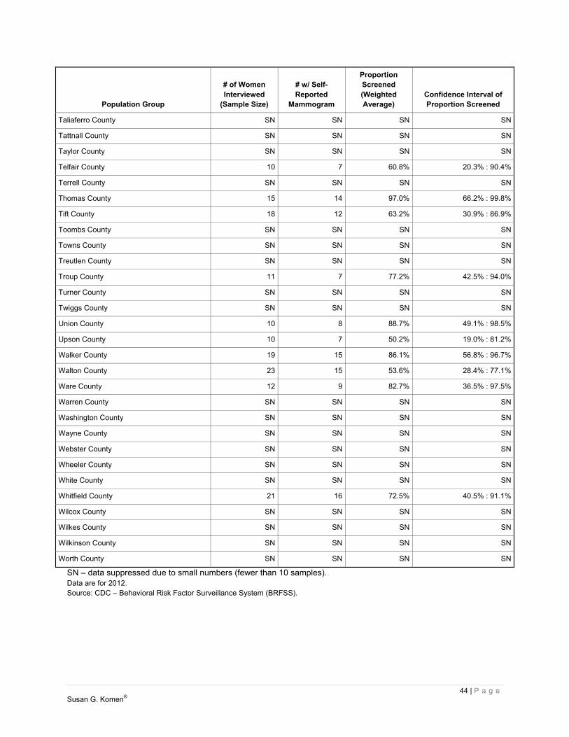
44 | P a g e Susan G. Komen®
Population Group
# of Women Interviewed
(Sample Size)
# w/ Self- Reported
Mammogram
Proportion Screened (Weighted Average)
Confidence Interval of Proportion Screened
Taliaferro County SN SN SN SN
Tattnall County SN SN SN SN
Taylor County SN SN SN SN
Telfair County 10 7 60.8% 20.3% : 90.4%
Terrell County SN SN SN SN
Thomas County 15 14 97.0% 66.2% : 99.8%
Tift County 18 12 63.2% 30.9% : 86.9%
Toombs County SN SN SN SN
Towns County SN SN SN SN
Treutlen County SN SN SN SN
Troup County 11 7 77.2% 42.5% : 94.0%
Turner County SN SN SN SN
Twiggs County SN SN SN SN
Union County 10 8 88.7% 49.1% : 98.5%
Upson County 10 7 50.2% 19.0% : 81.2%
Walker County 19 15 86.1% 56.8% : 96.7%
Walton County 23 15 53.6% 28.4% : 77.1%
Ware County 12 9 82.7% 36.5% : 97.5%
Warren County SN SN SN SN
Washington County SN SN SN SN
Wayne County SN SN SN SN
Webster County SN SN SN SN
Wheeler County SN SN SN SN
White County SN SN SN SN
Whitfield County 21 16 72.5% 40.5% : 91.1%
Wilcox County SN SN SN SN
Wilkes County SN SN SN SN
Wilkinson County SN SN SN SN
Worth County SN SN SN SN
SN – data suppressed due to small numbers (fewer than 10 samples). Data are for 2012. Source: CDC – Behavioral Risk Factor Surveillance System (BRFSS).

45 | P a g e Susan G. Komen®
Conclusions: Breast cancer screening proportions The breast cancer screening proportion in the State of Georgia was significantly higher than that observed in the US as a whole. For the United States, breast cancer screening proportions among Blacks/African-Americans are similar to those among Whites overall. APIs have somewhat lower screening proportions than Whites and Blacks/African-Americans. Although data are limited, screening proportions among AIANs are similar to those among Whites. Screening proportions among Hispanics/Latinas are similar to those among Non-Hispanic Whites and Blacks/African-Americans. For the State of Georgia, the screening proportion was significantly higher among Blacks/African-Americans than Whites, not significantly different among APIs and Whites, and not significantly different among AIANs and Whites. The screening proportion among Hispanics/Latinas was not significantly different from the proportion among Non-Hispanics/Latinas. The following county had a screening proportion significantly lower than the state as a whole:
Walton County The remaining counties had screening proportions that were not significantly different than the state as a whole. Demographic and Socioeconomic Measures
Demographic and socioeconomic data can be used to identify which groups of women are most in need of help and to figure out the best ways to help them.
The report includes basic information about the women in each area (demographic measures) and about factors like education, income, and unemployment (socioeconomic measures) in the areas where they live. Demographic measures in the report include:
Age Race Ethnicity (whether or not a woman is Hispanic/Latina – can be of any race)
It is important to note that the report uses the race and ethnicity categories used by the US Census Bureau, and that race and ethnicity are separate and independent categories. This means that everyone is classified as both a member of one of the four race groups as well as either Hispanic/Latina or Non-Hispanic/Latina. Socioeconomic measures for the areas covered in this report include:
Education level Income Unemployment

46 | P a g e Susan G. Komen®
Immigration (how many of the people living in an area were born in another country) Use of the English language Proportion of people who have health insurance Proportion of people who live in rural areas Proportion of people who in areas that don’t have enough doctors or health care facilities
(medically underserved areas)
Why these data matter Demographic and socioeconomic data can be used to identify which groups of women need the most help and to figure out the best ways to help them. Important details about these data The demographic and socioeconomic data in this report are the most recent data available for US counties. All the data are shown as percentages. However, the percentages weren’t all calculated in the same way.
The race, ethnicity, and age data are based on the total female population in the area (e.g. the percent of females over the age of 40).
The socioeconomic data are based on all of the people in the area, not just women. Income, education and unemployment data don’t include children. They’re based on
people age 15 and older for income and unemployment and age 25 and older for education.
The data on the use of English, called “linguistic isolation”, are based on the total number of households in the area. The Census Bureau defines a linguistically isolated household as one in which all the adults have difficulty with English.
Where the data come from The demographic and socioeconomic sources of data are:
Race/ethnicity, age, and sex data come from the US Census Bureau estimates for July 1, 2011.
Most of the other data come from the US Census Bureau’s American Community Survey program. The most recent data for counties are for 2007 to 2011.
Health insurance data come from the US Census Bureau’s Small Area Health Insurance Estimates program. The most recent data are for 2011.
Rural population data come from the US Census Bureau’s 2010 population survey. Medically underserved area information comes from the US Department of Health and
Human Services, Health Resources and Services Administration. The most recent data are for 2013.
Population characteristics Race, ethnicity, and age data for the US, the state, and each of the counties in the state is presented in Table 2.7:
Race percentages for four race groups: White, Black, American Indian and Alaska Native (AIAN), and Asian and Pacific Islander (API).

47 | P a g e Susan G. Komen®
Percentages of women of Hispanic/Latina ethnicity (who may be of any race). Percentages of women in three age-groups: 40 and older, 50 and older, and 65 and
older. Table 2.8 shows socioeconomic data for the US, the state, and each of the counties in the state:
Educational attainment as the percentage of the population 25 years and over that did not complete high school
Income relative to the US poverty level. Two levels are shown – the percentage of people with income less than the poverty level (below 100 percent) and less than 2.5 times the poverty level (below 250 percent).
Percentage of the population who are unemployed Percentage of the population born outside the US Percentage of households that are linguistically isolated (all adults in the household have
difficulty with English) Percentage living in rural areas Percentage living in medically underserved areas as determined by the Health
Resources and Services Administration (HRSA) Percentage between ages 40 and 64 who have no health insurance
Table 2.7. Population characteristics – demographics
Population Group White
Black/
African-
American AIAN API
Non- Hispanic/
Latina Hispanic/
Latina
Female Age
40 Plus
Female Age
50 Plus
Female Age
65 Plus
US 78.8 % 14.1 % 1.4 % 5.8 % 83.8 % 16.2 % 48.3 % 34.5 % 14.8 %
Georgia 62.8 % 32.9 % 0.5 % 3.7 % 91.8 % 8.2 % 45.5 % 31.0 % 12.3 %
Appling County 79.3 % 19.4 % 0.5 % 0.9 % 92.4 % 7.6 % 49.8 % 36.5 % 15.9 %
Atkinson County 77.3 % 20.2 % 1.2 % 1.3 % 78.0 % 22.0 % 41.7 % 28.7 % 11.3 %
Bacon County 82.1 % 16.8 % 0.3 % 0.8 % 93.9 % 6.1 % 47.0 % 34.9 % 14.7 %
Baker County 50.1 % 48.4 % 0.4 % 1.0 % 95.8 % 4.2 % 49.9 % 36.1 % 11.3 %
Baldwin County 55.7 % 42.4 % 0.3 % 1.6 % 98.0 % 2.0 % 44.3 % 32.4 % 13.5 %
Banks County 94.9 % 3.5 % 0.5 % 1.1 % 94.7 % 5.3 % 48.9 % 34.4 % 13.8 %
Barrow County 82.8 % 13.0 % 0.5 % 3.7 % 91.6 % 8.4 % 42.9 % 28.4 % 11.4 %
Bartow County 86.7 % 11.5 % 0.6 % 1.2 % 92.8 % 7.2 % 46.4 % 31.2 % 12.3 %
Ben Hill County 61.6 % 37.1 % 0.5 % 0.8 % 94.8 % 5.2 % 48.5 % 36.1 % 16.2 %
Berrien County 86.4 % 12.7 % 0.4 % 0.6 % 96.1 % 3.9 % 49.8 % 36.2 % 16.1 %
Bibb County 43.1 % 54.8 % 0.3 % 1.9 % 97.4 % 2.6 % 46.6 % 34.2 % 14.9 %
Bleckley County 68.7 % 30.4 % 0.1 % 0.8 % 98.0 % 2.0 % 47.0 % 34.1 % 17.2 %
Brantley County 94.8 % 4.4 % 0.4 % 0.4 % 98.2 % 1.8 % 48.6 % 33.6 % 12.5 %
Brooks County 61.8 % 37.0 % 0.4 % 0.8 % 95.5 % 4.5 % 53.6 % 40.1 % 17.9 %
Bryan County 80.6 % 16.4 % 0.5 % 2.5 % 94.9 % 5.1 % 43.8 % 28.6 % 10.1 %
Bulloch County 67.2 % 30.8 % 0.4 % 1.7 % 96.9 % 3.1 % 35.1 % 24.9 % 10.3 %

48 | P a g e Susan G. Komen®
Population Group White
Black/
African-
American AIAN API
Non- Hispanic/
Latina Hispanic/
Latina
Female Age
40 Plus
Female Age
50 Plus
Female Age
65 Plus
Burke County 46.6 % 52.6 % 0.3 % 0.6 % 97.7 % 2.3 % 47.3 % 33.7 % 13.4 %
Butts County 73.5 % 25.5 % 0.3 % 0.7 % 97.5 % 2.5 % 50.8 % 36.7 % 16.2 %
Calhoun County 37.5 % 61.6 % 0.4 % 0.5 % 97.3 % 2.7 % 52.9 % 40.4 % 21.2 %
Camden County 75.2 % 21.9 % 0.6 % 2.3 % 95.1 % 4.9 % 42.7 % 28.5 % 10.5 %
Candler County 71.6 % 27.4 % 0.1 % 0.9 % 91.1 % 8.9 % 48.2 % 35.9 % 15.7 %
Carroll County 78.5 % 19.9 % 0.5 % 1.2 % 94.3 % 5.7 % 43.3 % 30.2 % 12.5 %
Catoosa County 95.0 % 3.1 % 0.3 % 1.6 % 97.7 % 2.3 % 50.2 % 35.4 % 15.2 %
Charlton County 73.7 % 25.0 % 0.6 % 0.8 % 98.2 % 1.8 % 50.5 % 35.7 % 15.9 %
Chatham County 54.4 % 42.2 % 0.4 % 3.0 % 95.0 % 5.0 % 44.6 % 32.7 % 13.9 %
Chattahoochee County 69.5 % 25.6 % 1.4 % 3.5 % 86.9 % 13.1 % 24.3 % 14.6 % 5.6 %
Chattooga County 90.3 % 8.6 % 0.3 % 0.8 % 96.5 % 3.5 % 52.5 % 39.0 % 18.0 %
Cherokee County 90.3 % 6.9 % 0.6 % 2.3 % 90.9 % 9.1 % 46.0 % 29.7 % 10.7 %
Clarke County 66.5 % 28.4 % 0.4 % 4.8 % 90.4 % 9.6 % 31.0 % 22.7 % 10.2 %
Clay County 37.2 % 62.0 % 0.4 % 0.3 % 99.1 % 0.9 % 55.3 % 44.1 % 20.2 %
Clayton County 24.7 % 69.3 % 0.7 % 5.3 % 88.2 % 11.8 % 39.8 % 24.8 % 7.7 %
Clinch County 69.0 % 29.9 % 0.7 % 0.4 % 97.6 % 2.4 % 47.5 % 35.1 % 14.7 %
Cobb County 66.5 % 27.9 % 0.5 % 5.1 % 88.4 % 11.6 % 45.0 % 29.0 % 10.0 %
Coffee County 71.6 % 27.1 % 0.3 % 1.0 % 90.5 % 9.5 % 45.4 % 31.9 % 13.5 %
Colquitt County 74.0 % 23.9 % 1.1 % 1.0 % 85.1 % 14.9 % 45.8 % 32.6 % 15.2 %
Columbia County 77.5 % 17.1 % 0.4 % 5.0 % 95.0 % 5.0 % 47.0 % 31.4 % 11.3 %
Cook County 69.5 % 29.3 % 0.4 % 0.8 % 95.5 % 4.5 % 47.5 % 34.0 % 15.4 %
Coweta County 78.2 % 19.3 % 0.4 % 2.1 % 93.8 % 6.2 % 46.7 % 30.8 % 11.8 %
Crawford County 74.3 % 24.6 % 0.5 % 0.6 % 97.7 % 2.3 % 53.3 % 37.9 % 14.3 %
Crisp County 53.4 % 45.6 % 0.1 % 0.9 % 97.2 % 2.8 % 49.5 % 36.9 % 15.9 %
Dade County 96.6 % 1.8 % 0.6 % 1.1 % 98.3 % 1.7 % 50.8 % 37.7 % 16.1 %
Dawson County 97.3 % 1.3 % 0.4 % 1.0 % 96.3 % 3.7 % 53.1 % 38.2 % 15.5 %
Decatur County 55.6 % 43.0 % 0.7 % 0.7 % 95.3 % 4.7 % 49.5 % 36.2 % 16.7 %
DeKalb County 36.6 % 57.5 % 0.6 % 5.4 % 91.8 % 8.2 % 44.0 % 29.4 % 10.7 %
Dodge County 69.5 % 29.3 % 0.4 % 0.7 % 97.1 % 2.9 % 51.7 % 37.8 % 18.4 %
Dooly County 48.4 % 50.6 % 0.2 % 0.8 % 94.7 % 5.3 % 52.6 % 39.6 % 17.3 %
Dougherty County 29.8 % 68.8 % 0.3 % 1.1 % 97.8 % 2.2 % 44.5 % 32.7 % 14.0 %
Douglas County 55.1 % 42.4 % 0.5 % 2.0 % 92.0 % 8.0 % 44.2 % 27.7 % 9.9 %
Early County 48.4 % 50.8 % 0.4 % 0.4 % 98.2 % 1.8 % 51.8 % 38.7 % 19.1 %
Echols County 90.6 % 6.2 % 2.8 % 0.4 % 73.3 % 26.7 % 39.0 % 26.4 % 10.7 %
Effingham County 83.6 % 14.8 % 0.3 % 1.3 % 97.2 % 2.8 % 44.7 % 28.9 % 10.3 %
Elbert County 67.5 % 31.5 % 0.3 % 0.8 % 95.6 % 4.4 % 53.7 % 39.9 % 19.3 %

49 | P a g e Susan G. Komen®
Population Group White
Black/
African-
American AIAN API
Non- Hispanic/
Latina Hispanic/
Latina
Female Age
40 Plus
Female Age
50 Plus
Female Age
65 Plus
Emanuel County 63.9 % 35.0 % 0.3 % 0.8 % 96.5 % 3.5 % 48.5 % 36.1 % 16.2 %
Evans County 66.8 % 31.4 % 0.3 % 1.4 % 89.0 % 11.0 % 47.8 % 34.9 % 16.3 %
Fannin County 98.3 % 0.8 % 0.4 % 0.5 % 98.3 % 1.7 % 62.8 % 50.1 % 23.7 %
Fayette County 73.2 % 21.7 % 0.4 % 4.7 % 93.7 % 6.3 % 56.4 % 39.0 % 14.8 %
Floyd County 81.9 % 15.6 % 0.7 % 1.8 % 91.4 % 8.6 % 48.8 % 35.6 % 16.2 %
Forsyth County 88.8 % 3.5 % 0.5 % 7.1 % 91.0 % 9.0 % 46.0 % 27.3 % 10.1 %
Franklin County 89.3 % 9.8 % 0.2 % 0.6 % 96.5 % 3.5 % 53.1 % 39.9 % 19.5 %
Fulton County 46.2 % 47.5 % 0.4 % 5.8 % 92.7 % 7.3 % 42.7 % 28.3 % 10.6 %
Gilmer County 97.4 % 1.1 % 0.6 % 0.9 % 90.7 % 9.3 % 55.8 % 43.1 % 19.5 %
Glascock County 90.1 % 9.7 % 0.1 % 0.1 % 98.9 % 1.1 % 50.7 % 37.2 % 17.9 %
Glynn County 69.9 % 27.8 % 0.5 % 1.7 % 94.2 % 5.8 % 51.2 % 38.1 % 16.7 %
Gordon County 93.1 % 4.8 % 0.6 % 1.6 % 87.0 % 13.0 % 46.3 % 31.9 % 13.4 %
Grady County 67.0 % 30.9 % 1.2 % 0.9 % 91.5 % 8.5 % 49.1 % 36.1 % 16.3 %
Greene County 59.7 % 39.4 % 0.4 % 0.5 % 95.1 % 4.9 % 59.2 % 48.1 % 22.8 %
Gwinnett County 60.8 % 26.8 % 0.9 % 11.4 % 81.0 % 19.0 % 42.1 % 25.5 % 8.1 %
Habersham County 91.0 % 5.5 % 1.0 % 2.5 % 88.4 % 11.6 % 49.4 % 35.9 % 16.7 %
Hall County 88.2 % 8.6 % 1.0 % 2.3 % 74.8 % 25.2 % 44.3 % 30.4 % 12.9 %
Hancock County 23.6 % 75.5 % 0.4 % 0.5 % 99.4 % 0.6 % 58.9 % 45.7 % 20.6 %
Haralson County 93.2 % 5.9 % 0.3 % 0.6 % 98.8 % 1.2 % 50.0 % 35.7 % 16.4 %
Harris County 79.9 % 18.3 % 0.3 % 1.4 % 97.1 % 2.9 % 55.4 % 39.0 % 14.8 %
Hart County 79.6 % 19.2 % 0.2 % 1.1 % 97.0 % 3.0 % 56.0 % 42.3 % 20.6 %
Heard County 87.2 % 11.5 % 0.6 % 0.7 % 98.2 % 1.8 % 51.2 % 36.1 % 15.0 %
Henry County 56.2 % 39.8 % 0.4 % 3.6 % 94.2 % 5.8 % 44.4 % 27.1 % 9.5 %
Houston County 64.9 % 31.3 % 0.5 % 3.4 % 94.2 % 5.8 % 44.5 % 29.9 % 11.7 %
Irwin County 72.9 % 26.0 % 0.1 % 1.0 % 97.6 % 2.4 % 51.8 % 38.4 % 18.5 %
Jackson County 90.0 % 7.7 % 0.3 % 2.0 % 93.8 % 6.2 % 47.6 % 32.9 % 14.2 %
Jasper County 75.0 % 23.8 % 0.5 % 0.6 % 96.1 % 3.9 % 50.7 % 37.1 % 14.9 %
Jeff Davis County 82.8 % 16.1 % 0.6 % 0.5 % 90.1 % 9.9 % 46.1 % 33.0 % 14.4 %
Jefferson County 42.5 % 56.7 % 0.2 % 0.7 % 97.8 % 2.2 % 51.5 % 38.6 % 17.1 %
Jenkins County 55.0 % 43.9 % 0.5 % 0.6 % 96.6 % 3.4 % 51.4 % 39.5 % 17.9 %
Johnson County 65.7 % 33.6 % 0.3 % 0.4 % 98.2 % 1.8 % 52.6 % 39.9 % 18.0 %
Jones County 72.7 % 26.2 % 0.3 % 0.8 % 98.8 % 1.2 % 50.1 % 35.0 % 14.1 %
Lamar County 65.5 % 33.6 % 0.3 % 0.6 % 97.9 % 2.1 % 48.2 % 35.3 % 15.3 %
Lanier County 72.7 % 25.2 % 0.6 % 1.5 % 95.4 % 4.6 % 41.9 % 29.0 % 11.5 %
Laurens County 60.7 % 37.8 % 0.3 % 1.2 % 98.0 % 2.0 % 49.5 % 36.3 % 16.5 %
Lee County 77.6 % 19.7 % 0.3 % 2.5 % 98.0 % 2.0 % 45.1 % 29.3 % 9.5 %

50 | P a g e Susan G. Komen®
Population Group White
Black/
African-
American AIAN API
Non- Hispanic/
Latina Hispanic/
Latina
Female Age
40 Plus
Female Age
50 Plus
Female Age
65 Plus
Liberty County 50.3 % 45.2 % 0.9 % 3.6 % 89.8 % 10.2 % 34.0 % 21.6 % 7.1 %
Lincoln County 65.1 % 33.9 % 0.3 % 0.8 % 98.4 % 1.6 % 59.1 % 44.9 % 19.7 %
Long County 68.8 % 28.3 % 0.9 % 2.1 % 88.8 % 11.2 % 36.7 % 23.9 % 7.7 %
Lowndes County 59.2 % 38.2 % 0.6 % 2.1 % 95.3 % 4.7 % 39.0 % 27.1 % 11.3 %
Lumpkin County 96.5 % 1.9 % 0.8 % 0.8 % 95.6 % 4.4 % 47.7 % 35.5 % 14.1 %
McDuffie County 57.0 % 42.2 % 0.4 % 0.5 % 97.9 % 2.1 % 50.0 % 36.5 % 15.9 %
McIntosh County 60.8 % 38.1 % 0.5 % 0.6 % 98.6 % 1.4 % 57.7 % 43.8 % 18.9 %
Macon County 37.2 % 61.0 % 0.4 % 1.4 % 96.9 % 3.1 % 52.0 % 39.1 % 15.8 %
Madison County 89.3 % 9.5 % 0.3 % 0.9 % 95.9 % 4.1 % 51.0 % 36.6 % 15.2 %
Marion County 62.3 % 35.8 % 0.7 % 1.3 % 94.6 % 5.4 % 52.4 % 37.6 % 16.0 %
Meriwether County 57.8 % 41.2 % 0.4 % 0.7 % 98.7 % 1.3 % 53.6 % 40.0 % 18.2 %
Miller County 68.5 % 30.9 % 0.3 % 0.3 % 98.3 % 1.7 % 54.6 % 41.3 % 21.8 %
Mitchell County 50.2 % 48.6 % 0.5 % 0.8 % 96.6 % 3.4 % 49.8 % 36.9 % 17.0 %
Monroe County 74.4 % 24.0 % 0.4 % 1.1 % 98.1 % 1.9 % 53.8 % 38.9 % 15.6 %
Montgomery County 72.5 % 26.9 % 0.1 % 0.5 % 94.9 % 5.1 % 49.4 % 36.2 % 15.8 %
Morgan County 73.2 % 25.6 % 0.5 % 0.8 % 97.5 % 2.5 % 53.2 % 39.4 % 17.4 %
Murray County 96.7 % 1.5 % 0.8 % 0.9 % 87.1 % 12.9 % 45.9 % 30.9 % 12.5 %
Muscogee County 47.8 % 48.7 % 0.6 % 2.9 % 94.0 % 6.0 % 44.4 % 31.8 % 13.7 %
Newton County 55.0 % 43.4 % 0.3 % 1.2 % 95.5 % 4.5 % 44.6 % 29.0 % 11.3 %
Oconee County 89.8 % 6.4 % 0.2 % 3.6 % 95.7 % 4.3 % 50.6 % 33.9 % 12.3 %
Oglethorpe County 80.0 % 18.9 % 0.3 % 0.9 % 96.5 % 3.5 % 52.7 % 37.4 % 16.3 %
Paulding County 79.2 % 19.0 % 0.4 % 1.4 % 94.9 % 5.1 % 41.7 % 24.7 % 8.5 %
Peach County 49.8 % 48.9 % 0.4 % 1.0 % 94.1 % 5.9 % 45.3 % 32.6 % 13.7 %
Pickens County 97.4 % 1.6 % 0.3 % 0.7 % 97.4 % 2.6 % 55.2 % 41.4 % 18.2 %
Pierce County 88.3 % 10.5 % 0.6 % 0.6 % 95.6 % 4.4 % 49.7 % 35.6 % 15.8 %
Pike County 87.0 % 12.2 % 0.3 % 0.6 % 98.9 % 1.1 % 49.1 % 33.5 % 13.8 %
Polk County 84.1 % 14.3 % 0.6 % 1.1 % 89.4 % 10.6 % 47.7 % 34.8 % 15.6 %
Pulaski County 63.3 % 35.4 % 0.4 % 0.9 % 97.0 % 3.0 % 52.0 % 36.8 % 15.6 %
Putnam County 70.3 % 28.5 % 0.3 % 0.9 % 94.2 % 5.8 % 55.2 % 42.9 % 19.1 %
Quitman County 49.4 % 49.9 % 0.2 % 0.5 % 98.5 % 1.5 % 59.8 % 48.1 % 25.5 %
Rabun County 96.7 % 1.7 % 0.5 % 1.1 % 93.1 % 6.9 % 58.8 % 47.3 % 23.5 %
Randolph County 36.2 % 63.3 % 0.1 % 0.4 % 98.6 % 1.4 % 55.2 % 43.4 % 21.3 %
Richmond County 39.8 % 57.4 % 0.5 % 2.3 % 96.1 % 3.9 % 44.7 % 32.5 % 13.3 %
Rockdale County 48.3 % 49.1 % 0.4 % 2.2 % 91.5 % 8.5 % 48.1 % 32.3 % 12.2 %
Schley County 73.9 % 25.1 % 0.2 % 0.8 % 96.4 % 3.6 % 47.7 % 33.4 % 15.1 %
Screven County 55.2 % 44.0 % 0.3 % 0.5 % 98.7 % 1.3 % 52.2 % 39.1 % 17.3 %

51 | P a g e Susan G. Komen®
Population Group White
Black/
African-
American AIAN API
Non- Hispanic/
Latina Hispanic/
Latina
Female Age
40 Plus
Female Age
50 Plus
Female Age
65 Plus
Seminole County 64.1 % 35.3 % 0.1 % 0.6 % 97.5 % 2.5 % 56.0 % 43.2 % 21.3 %
Spalding County 63.4 % 34.9 % 0.5 % 1.2 % 96.8 % 3.2 % 48.8 % 35.7 % 15.5 %
Stephens County 86.1 % 12.5 % 0.4 % 1.1 % 97.8 % 2.2 % 52.6 % 40.0 % 18.6 %
Stewart County 37.8 % 61.1 % 0.4 % 0.7 % 97.7 % 2.3 % 57.2 % 44.6 % 21.8 %
Sumter County 44.1 % 54.0 % 0.6 % 1.4 % 95.4 % 4.6 % 45.7 % 33.4 % 14.9 %
Talbot County 37.6 % 61.8 % 0.3 % 0.3 % 98.6 % 1.4 % 59.4 % 44.6 % 18.5 %
Taliaferro County 40.5 % 58.4 % 0.5 % 0.6 % 98.1 % 1.9 % 59.9 % 46.6 % 22.3 %
Tattnall County 75.6 % 22.9 % 0.7 % 0.9 % 90.5 % 9.5 % 49.2 % 35.3 % 16.4 %
Taylor County 58.8 % 40.5 % 0.0 % 0.7 % 98.6 % 1.4 % 53.6 % 39.5 % 17.7 %
Telfair County 63.1 % 36.3 % 0.2 % 0.4 % 96.5 % 3.5 % 52.8 % 39.8 % 18.6 %
Terrell County 36.6 % 62.4 % 0.4 % 0.5 % 98.4 % 1.6 % 53.4 % 40.2 % 17.9 %
Thomas County 59.7 % 38.9 % 0.5 % 0.9 % 97.2 % 2.8 % 51.3 % 37.7 % 17.2 %
Tift County 65.7 % 32.3 % 0.4 % 1.5 % 90.8 % 9.2 % 44.9 % 32.6 % 14.3 %
Toombs County 70.6 % 27.7 % 0.7 % 1.0 % 90.7 % 9.3 % 47.1 % 34.4 % 16.4 %
Towns County 98.2 % 0.9 % 0.3 % 0.6 % 97.9 % 2.1 % 64.3 % 54.6 % 31.8 %
Treutlen County 65.8 % 33.7 % 0.2 % 0.2 % 98.4 % 1.6 % 48.7 % 36.5 % 17.2 %
Troup County 61.9 % 35.9 % 0.4 % 1.8 % 97.1 % 2.9 % 46.7 % 33.3 % 14.3 %
Turner County 57.7 % 41.2 % 0.4 % 0.7 % 97.1 % 2.9 % 52.1 % 38.3 % 18.4 %
Twiggs County 56.3 % 43.0 % 0.4 % 0.3 % 98.7 % 1.3 % 57.5 % 43.3 % 18.3 %
Union County 98.0 % 1.0 % 0.4 % 0.6 % 97.5 % 2.5 % 65.8 % 53.8 % 28.0 %
Upson County 69.6 % 29.5 % 0.3 % 0.6 % 98.0 % 2.0 % 52.8 % 39.1 % 18.0 %
Walker County 94.6 % 4.5 % 0.3 % 0.6 % 98.4 % 1.6 % 52.1 % 38.5 % 17.7 %
Walton County 80.9 % 17.2 % 0.4 % 1.5 % 96.7 % 3.3 % 48.2 % 32.9 % 14.1 %
Ware County 69.3 % 29.4 % 0.4 % 1.0 % 97.0 % 3.0 % 51.3 % 38.9 % 19.0 %
Warren County 36.9 % 62.6 % 0.2 % 0.4 % 99.0 % 1.0 % 56.3 % 43.2 % 20.6 %
Washington County 44.6 % 54.7 % 0.2 % 0.5 % 98.6 % 1.4 % 52.1 % 38.4 % 17.4 %
Wayne County 79.1 % 19.6 % 0.4 % 0.9 % 95.7 % 4.3 % 47.9 % 34.2 % 15.0 %
Webster County 56.4 % 43.0 % 0.3 % 0.4 % 96.5 % 3.5 % 52.3 % 39.0 % 16.7 %
Wheeler County 71.3 % 28.2 % 0.2 % 0.3 % 95.7 % 4.3 % 50.6 % 38.8 % 16.3 %
White County 96.2 % 2.7 % 0.5 % 0.6 % 97.6 % 2.4 % 55.3 % 41.4 % 19.3 %
Whitfield County 92.3 % 4.6 % 1.3 % 1.7 % 69.4 % 30.6 % 43.9 % 30.0 % 12.9 %
Wilcox County 68.5 % 30.6 % 0.3 % 0.6 % 97.5 % 2.5 % 53.5 % 41.1 % 20.5 %
Wilkes County 53.5 % 45.7 % 0.2 % 0.6 % 97.3 % 2.7 % 57.7 % 44.3 % 21.4 %
Wilkinson County 59.0 % 40.1 % 0.5 % 0.4 % 98.1 % 1.9 % 53.4 % 39.7 % 18.4 %
Worth County 68.2 % 31.0 % 0.2 % 0.6 % 98.3 % 1.7 % 51.0 % 37.8 % 16.7 %
Data are for 2011. Data are in the percentage of women in the population. Source: US Census Bureau – Population Estimates.

52 | P a g e Susan G. Komen®
Table 2.8. Population characteristics – socioeconomics
Population Group
Less than HS
Education
Income Below 100%
Poverty
IncomeBelow 250%
Poverty(Age: 40-64)
Un- employed
ForeignBorn
Linguis-tically
Isolated In Rural Areas
In Medically
Under-servedAreas
No HealthInsurance
(Age: 40-64)
US 14.6 % 14.3 % 33.3 % 8.7 % 12.8 % 4.7 % 19.3 % 23.3 % 16.6 %
Georgia 16.0 % 16.5 % 37.6 % 9.9 % 9.7 % 3.3 % 24.9 % 37.3 % 20.7 %
Appling County 24.9 % 23.2 % 46.3 % 6.6 % 5.7 % 0.9 % 71.4 % 100.0 % 23.2 %
Atkinson County 35.1 % 31.5 % 61.2 % 12.5 % 10.9 % 6.0 % 100.0 % 100.0 % 33.2 %
Bacon County 28.1 % 20.1 % 54.5 % 6.2 % 5.0 % 0.7 % 69.3 % 0.0 % 25.8 %
Baker County 18.7 % 35.9 % 52.3 % 9.6 % 0.4 % 0.2 % 100.0 % 100.0 % 19.1 %
Baldwin County 18.7 % 27.2 % 42.9 % 9.1 % 2.5 % 1.0 % 35.1 % 72.8 % 16.9 %
Banks County 24.8 % 17.0 % 46.8 % 8.7 % 3.1 % 1.8 % 93.8 % 100.0 % 23.9 %
Barrow County 20.5 % 13.2 % 40.0 % 11.0 % 7.2 % 2.1 % 30.1 % 0.1 % 22.1 %
Bartow County 20.5 % 15.4 % 40.6 % 8.6 % 5.0 % 2.6 % 35.2 % 100.0 % 22.8 %
Ben Hill County 26.8 % 26.1 % 56.3 % 11.8 % 1.8 % 0.2 % 34.0 % 100.0 % 22.7 %
Berrien County 27.8 % 23.7 % 55.1 % 11.3 % 2.4 % 1.4 % 76.1 % 100.0 % 25.0 %
Bibb County 18.5 % 23.0 % 45.3 % 10.3 % 3.5 % 1.3 % 14.4 % 18.8 % 18.6 %
Bleckley County 24.7 % 20.2 % 41.1 % 6.9 % 2.6 % 1.2 % 51.6 % 100.0 % 16.6 %
Brantley County 23.1 % 21.7 % 51.9 % 9.6 % 0.4 % 0.2 % 99.4 % 100.0 % 25.3 %
Brooks County 20.9 % 20.3 % 50.5 % 11.9 % 3.3 % 2.4 % 71.0 % 0.0 % 23.4 %
Bryan County 12.2 % 11.8 % 29.7 % 6.7 % 3.8 % 0.9 % 52.3 % 100.0 % 17.7 %
Bulloch County 14.2 % 30.5 % 45.2 % 7.5 % 3.7 % 1.8 % 48.3 % 100.0 % 22.4 %
Burke County 23.5 % 28.6 % 55.0 % 10.0 % 0.8 % 0.1 % 75.0 % 0.0 % 21.1 %
Butts County 23.7 % 12.3 % 41.6 % 11.7 % 2.3 % 0.6 % 77.9 % 100.0 % 20.6 %
Calhoun County 34.0 % 35.8 % 57.0 % 6.4 % 5.1 % 0.3 % 100.0 % 100.0 % 24.1 %
Camden County 10.7 % 16.2 % 34.1 % 9.3 % 1.6 % 1.2 % 31.4 % 100.0 % 17.6 %
Candler County 21.8 % 19.0 % 54.2 % 9.9 % 6.3 % 0.5 % 67.0 % 100.0 % 24.5 %
Carroll County 20.3 % 18.1 % 40.9 % 11.5 % 4.8 % 2.0 % 41.8 % 100.0 % 20.0 %
Catoosa County 17.3 % 12.2 % 39.0 % 7.8 % 2.0 % 0.3 % 28.1 % 10.8 % 17.9 %
Charlton County 34.5 % 15.0 % 48.6 % 13.0 % 6.5 % 0.0 % 51.0 % 100.0 % 21.0 %
Chatham County 12.0 % 18.1 % 38.3 % 7.8 % 6.4 % 2.0 % 4.5 % 1.6 % 20.8 %
Chattahoochee County 6.4 % 10.9 % 56.9 % 10.3 % 5.6 % 0.2 % 29.5 % 0.0 % 17.3 %
Chattooga County 31.8 % 19.2 % 52.6 % 10.6 % 2.7 % 1.2 % 57.6 % 100.0 % 21.0 %
Cherokee County 11.0 % 7.7 % 24.4 % 7.3 % 8.5 % 2.7 % 17.1 % 12.3 % 18.1 %
Clarke County 15.1 % 34.6 % 43.6 % 7.1 % 11.2 % 3.7 % 5.9 % 20.9 % 20.1 %
Clay County 23.1 % 43.1 % 59.0 % 23.1 % 0.0 % 0.0 % 100.0 % 100.0 % 22.2 %
Clayton County 17.9 % 18.4 % 48.1 % 14.4 % 14.7 % 5.9 % 0.9 % 0.0 % 25.3 %

53 | P a g e Susan G. Komen®
Population Group
Less than HS
Education
Income Below 100%
Poverty
IncomeBelow 250%
Poverty(Age: 40-64)
Un- employed
ForeignBorn
Linguis-tically
Isolated In Rural Areas
In Medically
Under-servedAreas
No HealthInsurance
(Age: 40-64)
Clinch County 30.8 % 27.9 % 52.1 % 5.8 % 0.7 % 0.9 % 60.4 % 100.0 % 20.6 %
Cobb County 9.5 % 11.3 % 26.2 % 8.5 % 15.2 % 4.0 % 0.2 % 0.0 % 18.2 %
Coffee County 26.4 % 23.5 % 54.0 % 8.1 % 6.9 % 2.0 % 66.6 % 100.0 % 24.4 %
Colquitt County 28.3 % 24.5 % 53.8 % 8.1 % 11.0 % 6.3 % 58.9 % 100.0 % 26.1 %
Columbia County 9.4 % 7.7 % 23.9 % 6.4 % 6.7 % 1.8 % 16.2 % 9.0 % 14.1 %
Cook County 28.1 % 23.0 % 52.1 % 11.5 % 3.7 % 1.5 % 59.4 % 100.0 % 25.0 %
Coweta County 12.8 % 11.1 % 28.7 % 7.0 % 5.7 % 2.1 % 32.9 % 91.6 % 16.6 %
Crawford County 22.1 % 23.9 % 45.5 % 7.8 % 1.9 % 0.1 % 100.0 % 100.0 % 21.8 %
Crisp County 23.8 % 28.0 % 53.6 % 11.9 % 1.2 % 0.3 % 47.0 % 0.0 % 19.7 %
Dade County 19.7 % 16.3 % 42.0 % 10.8 % 1.7 % 0.5 % 72.1 % 100.0 % 17.8 %
Dawson County 14.5 % 13.5 % 33.6 % 10.1 % 3.2 % 1.4 % 80.3 % 100.0 % 20.4 %
Decatur County 22.8 % 26.9 % 51.7 % 7.5 % 2.8 % 0.3 % 56.5 % 100.0 % 21.1 %
DeKalb County 11.7 % 17.1 % 36.4 % 12.5 % 16.3 % 5.6 % 0.3 % 9.0 % 23.1 %
Dodge County 22.2 % 21.9 % 49.8 % 9.1 % 1.6 % 0.9 % 72.2 % 100.0 % 20.6 %
Dooly County 28.6 % 28.2 % 50.8 % 9.8 % 3.6 % 0.6 % 53.7 % 100.0 % 21.9 %
Dougherty County 20.0 % 28.7 % 51.3 % 13.5 % 2.2 % 1.0 % 14.0 % 39.4 % 20.5 %
Douglas County 13.7 % 12.7 % 34.1 % 12.3 % 8.6 % 2.3 % 15.8 % 0.0 % 20.0 %
Early County 23.8 % 29.5 % 52.3 % 8.6 % 0.5 % 0.0 % 66.0 % 100.0 % 19.6 %
Echols County 37.3 % 39.0 % 57.8 % 10.7 % 26.3 % 23.0 % 100.0 % 100.0 % 33.3 %
Effingham County 14.7 % 10.4 % 31.8 % 7.4 % 2.2 % 0.1 % 67.1 % 100.0 % 17.2 %
Elbert County 24.2 % 22.1 % 53.4 % 11.7 % 2.6 % 1.1 % 70.6 % 100.0 % 22.3 %
Emanuel County 26.5 % 24.5 % 56.6 % 12.0 % 3.0 % 4.1 % 66.9 % 100.0 % 24.4 %
Evans County 24.1 % 22.0 % 48.5 % 7.2 % 7.5 % 3.4 % 61.3 % 100.0 % 24.2 %
Fannin County 21.7 % 18.9 % 49.0 % 12.4 % 1.2 % 0.5 % 100.0 % 100.0 % 24.0 %
Fayette County 6.5 % 5.9 % 16.1 % 7.0 % 9.1 % 1.6 % 18.2 % 0.1 % 11.4 %
Floyd County 23.2 % 18.9 % 43.0 % 10.4 % 6.5 % 2.5 % 36.8 % 0.0 % 20.4 %
Forsyth County 9.4 % 6.6 % 16.8 % 7.4 % 13.2 % 3.6 % 9.9 % 100.0 % 14.6 %
Franklin County 26.5 % 20.4 % 50.4 % 8.3 % 2.4 % 1.2 % 88.9 % 100.0 % 22.7 %
Fulton County 9.9 % 15.9 % 34.8 % 9.8 % 12.8 % 3.8 % 1.1 % 13.0 % 22.1 %
Gilmer County 24.5 % 20.3 % 46.0 % 9.2 % 5.8 % 4.1 % 87.6 % 100.0 % 25.8 %
Glascock County 26.2 % 20.7 % 47.3 % 6.9 % 0.6 % 0.0 % 100.0 % 100.0 % 19.0 %
Glynn County 13.9 % 15.8 % 33.8 % 9.1 % 5.4 % 1.7 % 20.6 % 0.0 % 19.5 %
Gordon County 25.7 % 18.4 % 43.8 % 8.9 % 8.7 % 6.1 % 51.6 % 12.6 % 24.0 %
Grady County 26.4 % 27.7 % 50.9 % 10.7 % 5.8 % 5.4 % 62.4 % 0.0 % 26.1 %

54 | P a g e Susan G. Komen®
Population Group
Less than HS
Education
Income Below 100%
Poverty
IncomeBelow 250%
Poverty(Age: 40-64)
Un- employed
ForeignBorn
Linguis-tically
Isolated In Rural Areas
In Medically
Under-servedAreas
No HealthInsurance
(Age: 40-64)
Greene County 26.0 % 23.2 % 43.1 % 12.2 % 3.8 % 0.3 % 82.7 % 100.0 % 20.7 %
Gwinnett County 12.9 % 12.4 % 31.6 % 9.2 % 25.5 % 9.8 % 0.5 % 0.0 % 22.3 %
Habersham County 23.3 % 19.8 % 41.3 % 8.3 % 8.8 % 4.8 % 58.8 % 0.0 % 24.2 %
Hall County 22.0 % 15.1 % 37.8 % 7.6 % 15.8 % 8.3 % 20.6 % 0.0 % 24.8 %
Hancock County 25.2 % 24.8 % 60.6 % 15.3 % 1.2 % 0.2 % 61.6 % 100.0 % 21.6 %
Haralson County 28.8 % 20.4 % 45.7 % 15.2 % 1.0 % 0.1 % 77.4 % 30.4 % 19.4 %
Harris County 11.1 % 7.8 % 24.9 % 7.4 % 2.5 % 0.2 % 96.7 % 100.0 % 14.0 %
Hart County 22.9 % 20.6 % 46.6 % 9.0 % 1.6 % 1.2 % 74.5 % 100.0 % 22.5 %
Heard County 30.5 % 24.6 % 46.3 % 12.7 % 0.6 % 0.3 % 100.0 % 100.0 % 19.7 %
Henry County 10.3 % 9.5 % 29.8 % 9.6 % 7.4 % 1.5 % 13.9 % 100.0 % 17.8 %
Houston County 12.5 % 12.7 % 31.6 % 9.1 % 5.1 % 1.8 % 10.0 % 25.8 % 15.8 %
Irwin County 24.0 % 20.1 % 50.8 % 9.4 % 0.6 % 0.0 % 64.7 % 100.0 % 24.0 %
Jackson County 20.6 % 14.6 % 36.9 % 7.7 % 4.8 % 1.8 % 60.0 % 74.5 % 21.5 %
Jasper County 18.1 % 19.7 % 44.5 % 14.4 % 3.9 % 0.9 % 81.8 % 100.0 % 23.1 %
Jeff Davis County 23.6 % 23.7 % 54.4 % 9.0 % 4.1 % 1.7 % 69.5 % 100.0 % 24.9 %
Jefferson County 28.0 % 28.7 % 55.8 % 14.1 % 1.5 % 0.5 % 80.7 % 100.0 % 21.9 %
Jenkins County 31.6 % 30.4 % 59.3 % 15.0 % 5.6 % 1.7 % 66.1 % 100.0 % 26.4 %
Johnson County 30.1 % 25.5 % 51.6 % 7.7 % 1.2 % 0.1 % 65.4 % 100.0 % 20.6 %
Jones County 11.2 % 15.1 % 37.1 % 7.7 % 2.3 % 0.1 % 67.7 % 100.0 % 17.7 %
Lamar County 21.0 % 20.5 % 46.8 % 19.1 % 1.3 % 0.5 % 60.9 % 34.9 % 20.9 %
Lanier County 25.9 % 20.9 % 56.0 % 8.3 % 2.8 % 0.5 % 71.1 % 100.0 % 25.5 %
Laurens County 20.0 % 21.4 % 46.5 % 5.7 % 2.1 % 1.4 % 56.6 % 100.0 % 18.0 %
Lee County 16.3 % 10.3 % 27.7 % 6.5 % 2.5 % 0.8 % 36.2 % 100.0 % 14.8 %
Liberty County 10.0 % 17.1 % 49.1 % 10.7 % 6.1 % 1.5 % 23.2 % 100.0 % 22.2 %
Lincoln County 20.0 % 25.8 % 44.9 % 13.0 % 1.0 % 0.6 % 100.0 % 100.0 % 22.3 %
Long County 22.5 % 21.5 % 53.7 % 8.0 % 5.7 % 2.6 % 81.3 % 100.0 % 26.8 %
Lowndes County 16.4 % 22.4 % 44.9 % 10.9 % 4.3 % 1.3 % 27.2 % 16.8 % 23.0 %
Lumpkin County 18.5 % 16.3 % 42.1 % 11.2 % 4.2 % 1.8 % 83.9 % 100.0 % 22.3 %
McDuffie County 28.2 % 19.2 % 47.3 % 8.9 % 0.9 % 0.2 % 61.0 % 100.0 % 18.9 %
McIntosh County 22.5 % 15.5 % 45.7 % 9.1 % 0.9 % 0.1 % 74.3 % 100.0 % 21.6 %
Macon County 28.5 % 27.0 % 56.4 % 10.9 % 6.7 % 1.4 % 53.2 % 100.0 % 23.8 %
Madison County 26.1 % 18.4 % 42.9 % 8.1 % 2.1 % 0.7 % 91.9 % 100.0 % 21.6 %
Marion County 24.2 % 21.6 % 48.1 % 13.4 % 4.9 % 2.6 % 100.0 % 100.0 % 22.3 %
Meriwether County 29.9 % 18.8 % 50.4 % 11.5 % 0.6 % 0.4 % 83.3 % 100.0 % 21.1 %

55 | P a g e Susan G. Komen®
Population Group
Less than HS
Education
Income Below 100%
Poverty
IncomeBelow 250%
Poverty(Age: 40-64)
Un- employed
ForeignBorn
Linguis-tically
Isolated In Rural Areas
In Medically
Under-servedAreas
No HealthInsurance
(Age: 40-64)
Miller County 21.9 % 18.3 % 49.0 % 8.3 % 1.9 % 0.0 % 100.0 % 100.0 % 21.7 %
Mitchell County 31.9 % 24.1 % 52.9 % 10.0 % 2.3 % 1.2 % 54.5 % 100.0 % 20.5 %
Monroe County 21.3 % 13.6 % 32.4 % 8.8 % 1.8 % 0.4 % 80.2 % 100.0 % 15.8 %
Montgomery County 18.3 % 21.6 % 50.7 % 5.2 % 5.1 % 1.8 % 98.7 % 100.0 % 23.2 %
Morgan County 19.5 % 15.9 % 38.7 % 8.5 % 2.9 % 1.3 % 75.4 % 100.0 % 19.3 %
Murray County 31.6 % 19.4 % 50.4 % 12.9 % 8.1 % 4.0 % 70.1 % 100.0 % 23.3 %
Muscogee County 15.7 % 18.8 % 43.1 % 10.4 % 5.0 % 1.7 % 3.0 % 40.7 % 17.9 %
Newton County 16.4 % 14.0 % 40.2 % 12.6 % 6.5 % 1.3 % 31.2 % 100.0 % 22.1 %
Oconee County 10.0 % 8.2 % 18.8 % 6.2 % 4.8 % 1.1 % 50.3 % 100.0 % 13.4 %
Oglethorpe County 23.9 % 16.1 % 44.0 % 6.8 % 1.8 % 0.2 % 99.3 % 100.0 % 22.8 %
Paulding County 12.1 % 9.0 % 30.4 % 10.3 % 4.2 % 0.9 % 20.1 % 0.0 % 18.3 %
Peach County 19.8 % 26.0 % 41.7 % 12.0 % 5.4 % 1.8 % 38.2 % 100.0 % 19.2 %
Pickens County 19.6 % 11.8 % 35.0 % 9.6 % 2.8 % 0.9 % 73.1 % 100.0 % 19.5 %
Pierce County 22.5 % 18.6 % 48.5 % 6.8 % 2.4 % 2.2 % 79.4 % 100.0 % 22.0 %
Pike County 16.7 % 11.6 % 35.5 % 8.9 % 1.0 % 0.3 % 99.0 % 100.0 % 19.7 %
Polk County 27.2 % 22.2 % 49.1 % 11.4 % 7.5 % 2.8 % 51.4 % 100.0 % 23.3 %
Pulaski County 23.8 % 13.2 % 45.6 % 7.9 % 2.4 % 3.0 % 66.7 % 100.0 % 19.0 %
Putnam County 18.3 % 12.3 % 40.9 % 8.2 % 5.1 % 2.7 % 80.9 % 100.0 % 20.6 %
Quitman County 32.2 % 25.1 % 55.6 % 13.1 % 0.5 % 0.0 % 73.1 % 100.0 % 24.6 %
Rabun County 16.6 % 20.8 % 48.1 % 8.6 % 6.8 % 2.3 % 79.3 % 100.0 % 27.4 %
Randolph County 27.9 % 24.2 % 57.9 % 16.9 % 1.6 % 0.3 % 50.6 % 100.0 % 21.9 %
Richmond County 17.7 % 23.7 % 47.7 % 12.0 % 3.6 % 1.0 % 9.2 % 5.0 % 20.2 %
Rockdale County 14.9 % 12.9 % 35.5 % 12.6 % 11.4 % 3.0 % 14.9 % 0.0 % 22.1 %
Schley County 32.5 % 22.9 % 48.0 % 6.0 % 4.4 % 3.3 % 100.0 % 100.0 % 22.8 %
Screven County 25.0 % 25.4 % 51.3 % 16.3 % 0.3 % 0.3 % 78.9 % 100.0 % 20.5 %
Seminole County 18.9 % 27.3 % 52.6 % 9.6 % 1.9 % 0.1 % 68.6 % 0.0 % 23.2 %
Spalding County 25.0 % 20.9 % 48.0 % 13.9 % 3.1 % 1.0 % 41.6 % 100.0 % 21.1 %
Stephens County 22.8 % 21.9 % 47.9 % 10.7 % 2.1 % 0.7 % 58.6 % 0.0 % 20.4 %
Stewart County 28.6 % 23.4 % 56.3 % 10.0 % 5.9 % 0.0 % 100.0 % 100.0 % 22.3 %
Sumter County 23.9 % 27.9 % 52.6 % 13.1 % 3.9 % 1.3 % 41.8 % 100.0 % 22.3 %
Talbot County 22.6 % 24.5 % 51.4 % 15.7 % 0.6 % 0.0 % 93.9 % 100.0 % 20.9 %
Taliaferro County 39.9 % 30.6 % 58.3 % 15.8 % 3.4 % 0.0 % 100.0 % 100.0 % 25.5 %
Tattnall County 25.9 % 25.1 % 50.3 % 11.4 % 6.5 % 3.3 % 68.2 % 100.0 % 23.8 %
Taylor County 29.7 % 29.1 % 54.2 % 12.7 % 1.8 % 0.2 % 100.0 % 100.0 % 21.1 %

56 | P a g e Susan G. Komen®
Population Group
Less than HS
Education
Income Below 100%
Poverty
IncomeBelow 250%
Poverty(Age: 40-64)
Un- employed
ForeignBorn
Linguis-tically
Isolated In Rural Areas
In Medically
Under-servedAreas
No HealthInsurance
(Age: 40-64)
Telfair County 26.7 % 32.9 % 57.2 % 2.8 % 10.8 % 2.6 % 47.0 % 100.0 % 21.5 %
Terrell County 36.1 % 30.9 % 54.8 % 15.7 % 2.1 % 0.2 % 52.1 % 100.0 % 21.0 %
Thomas County 18.3 % 24.6 % 46.6 % 12.3 % 2.1 % 1.0 % 46.0 % 100.0 % 19.7 %
Tift County 23.8 % 23.3 % 47.4 % 9.1 % 6.1 % 3.6 % 40.8 % 22.5 % 24.7 %
Toombs County 18.7 % 24.7 % 50.6 % 6.1 % 6.0 % 5.0 % 51.1 % 100.0 % 21.9 %
Towns County 14.7 % 12.5 % 44.0 % 7.1 % 2.3 % 0.3 % 100.0 % 0.0 % 21.0 %
Treutlen County 25.9 % 23.3 % 51.8 % 3.7 % 1.0 % 0.0 % 58.9 % 100.0 % 21.7 %
Troup County 20.2 % 20.4 % 43.9 % 12.0 % 3.7 % 1.3 % 44.3 % 17.1 % 20.8 %
Turner County 30.9 % 24.1 % 60.2 % 11.7 % 1.6 % 0.6 % 49.7 % 100.0 % 26.6 %
Twiggs County 34.8 % 22.6 % 51.0 % 9.7 % 0.7 % 0.0 % 100.0 % 100.0 % 20.0 %
Union County 16.4 % 15.3 % 42.7 % 11.2 % 2.4 % 1.9 % 100.0 % 100.0 % 22.5 %
Upson County 24.5 % 20.1 % 49.7 % 14.6 % 1.8 % 0.9 % 46.9 % 18.1 % 19.6 %
Walker County 22.8 % 16.0 % 46.0 % 12.3 % 1.5 % 0.5 % 43.9 % 15.3 % 19.9 %
Walton County 19.3 % 13.8 % 35.8 % 9.1 % 4.4 % 1.2 % 42.7 % 100.0 % 19.0 %
Ware County 19.1 % 22.4 % 50.6 % 8.3 % 3.3 % 0.7 % 29.4 % 48.9 % 20.7 %
Warren County 28.2 % 25.3 % 56.6 % 11.6 % 1.1 % 0.0 % 100.0 % 100.0 % 21.1 %
Washington County 22.9 % 25.2 % 50.5 % 10.0 % 1.5 % 0.4 % 65.6 % 100.0 % 20.6 %
Wayne County 21.2 % 18.6 % 48.2 % 9.3 % 3.7 % 0.9 % 57.9 % 100.0 % 21.9 %
Webster County 18.9 % 22.3 % 50.9 % 7.3 % 1.6 % 1.7 % 100.0 % 100.0 % 24.9 %
Wheeler County 24.5 % 27.7 % 53.3 % 4.3 % 0.5 % 0.0 % 100.0 % 100.0 % 23.2 %
White County 15.7 % 17.7 % 41.0 % 7.4 % 1.7 % 0.1 % 83.8 % 100.0 % 22.6 %
Whitfield County 31.5 % 19.2 % 45.8 % 10.1 % 18.1 % 10.3 % 29.1 % 0.0 % 26.5 %
Wilcox County 25.1 % 27.4 % 53.5 % 11.9 % 1.8 % 0.9 % 100.0 % 100.0 % 23.8 %
Wilkes County 25.7 % 25.0 % 51.2 % 13.3 % 1.4 % 0.2 % 67.4 % 100.0 % 20.6 %
Wilkinson County 20.1 % 19.7 % 46.9 % 6.1 % 1.2 % 0.4 % 100.0 % 100.0 % 20.3 %
Worth County 26.8 % 22.6 % 46.6 % 13.6 % 1.2 % 0.5 % 69.2 % 100.0 % 22.5 %
Data are in the percentage of people (men and women) in the population. Source of health insurance data: US Census Bureau – Small Area Health Insurance Estimates (SAHIE) for 2011. Source of rural population data: US Census Bureau – Census 2010. Source of medically underserved data: Health Resources and Services Administration (HRSA) for 2013. Source of other data: US Census Bureau – American Community Survey (ACS) for 2007-2011.

57 | P a g e Susan G. Komen®
Conclusions: Population characteristics Proportionately, the State of Georgia has a substantially smaller White female population than the US as a whole, a substantially larger Black/African-American female population, a slightly smaller Asian and Pacific Islander (API) female population, a slightly smaller American Indian and Alaska Native (AIAN) female population, and a substantially smaller Hispanic/Latina female population. The state’s female population is slightly younger than that of the US as a whole. The state’s education level is slightly lower than and income level is slightly lower than those of the US as a whole. The state's unemployment level is slightly larger than that of the US as a whole. The state has a slightly smaller percentage of people who are foreign born and a slightly smaller percentage of people who are linguistically isolated. There are a substantially larger percentage of people living in rural areas, a slightly larger percentage of people without health insurance, and a substantially larger percentage of people living in medically underserved areas. The following counties have substantially larger Black/African-American female population percentages than that of the state as a whole:
Baker County Baldwin County (Komen Central Georgia) Bibb County (Komen Central Georgia) Burke County Calhoun County Chatham County (Komen Coastal Georgia) Clay County Clayton County (Komen Greater Atlanta) Crisp County Decatur County DeKalb County (Komen Greater Atlanta) Dooly County Dougherty County Douglas County (Komen Greater Atlanta) Early County Fulton County (Komen Greater Atlanta) Greene County Hancock County Henry County (Komen Greater Atlanta) Jefferson County Jenkins County Liberty County (Komen Coastal Georgia) Lowndes County McDuffie County McIntosh County (Komen Coastal Georgia) Macon County Meriwether County Mitchell County

58 | P a g e Susan G. Komen®
Muscogee County Newton County (Komen Greater Atlanta) Peach County (Komen Central Georgia) Quitman County Randolph County Richmond County Rockdale County (Komen Greater Atlanta) Screven County Stewart County Sumter County Talbot County Taliaferro County Taylor County Terrell County Thomas County Turner County Twiggs County (Komen Central Georgia) Warren County Washington County Webster County Wilkes County Wilkinson County
The following counties have substantially larger API female population percentages than that of the state as a whole:
Forsyth County (Komen Greater Atlanta) Gwinnett County (Komen Greater Atlanta)
The following counties have substantially larger Hispanic/Latina female population percentages than that of the state as a whole:
Atkinson County Colquitt County Echols County Gwinnett County (Komen Greater Atlanta) Hall County Whitfield County (Komen Chattanooga)
The following counties have substantially older female populations than that of the state as a whole:
Brooks County Calhoun County Chattooga County

59 | P a g e Susan G. Komen®
Clay County Dodge County Early County Elbert County Fannin County (Komen Chattanooga) Franklin County Gilmer County Glascock County Greene County Hancock County Hart County Irwin County Jenkins County Johnson County Lincoln County McIntosh County (Komen Coastal Georgia) Meriwether County Miller County Morgan County Pickens County Putnam County Quitman County Rabun County Randolph County Seminole County Stephens County Stewart County Talbot County Taliaferro County Taylor County Telfair County Terrell County Towns County Turner County Twiggs County (Komen Central Georgia) Union County Upson County Walker County (Komen Chattanooga) Ware County Warren County Washington County White County

60 | P a g e Susan G. Komen®
Wilcox County Wilkes County Wilkinson County
The following counties have substantially lower education levels than that of the state as a whole:
Appling County Atkinson County Bacon County Banks County Ben Hill County Berrien County Bleckley County Brantley County Burke County Butts County Calhoun County Candler County Charlton County Chattooga County Clay County Clinch County Coffee County Colquitt County Cook County Crawford County (Komen Central Georgia) Crisp County Decatur County Dodge County Dooly County Early County Echols County Elbert County Emanuel County Evans County Fannin County (Komen Chattanooga) Floyd County Franklin County Gilmer County Glascock County Gordon County Grady County

61 | P a g e Susan G. Komen®
Greene County Habersham County Hall County Hancock County Haralson County Hart County Heard County Irwin County Jeff Davis County Jefferson County Jenkins County Johnson County Lanier County Long County (Komen Coastal Georgia) McDuffie County McIntosh County (Komen Coastal Georgia) Macon County Madison County Marion County Meriwether County Miller County Mitchell County Monroe County (Komen Central Georgia) Murray County (Komen Chattanooga) Oglethorpe County Pierce County Polk County Pulaski County Quitman County Randolph County Schley County Screven County Spalding County Stephens County Stewart County Sumter County Talbot County Taliaferro County Tattnall County Taylor County Telfair County Terrell County

62 | P a g e Susan G. Komen®
Tift County Treutlen County Turner County Twiggs County (Komen Central Georgia) Upson County Walker County (Komen Chattanooga) Warren County Washington County Wayne County Wheeler County Whitfield County (Komen Chattanooga) Wilcox County Wilkes County Worth County
The following counties have substantially lower income levels than that of the state as a whole:
Appling County Atkinson County Baker County Baldwin County (Komen Central Georgia) Ben Hill County Berrien County Bibb County (Komen Central Georgia) Brantley County Bulloch County (Komen Coastal Georgia) Burke County Calhoun County Clarke County Clay County Clinch County Coffee County Colquitt County Cook County Crawford County (Komen Central Georgia) Crisp County Decatur County Dodge County Dooly County Dougherty County Early County Echols County Elbert County

63 | P a g e Susan G. Komen®
Emanuel County Evans County Grady County Greene County Hancock County Heard County Jeff Davis County Jefferson County Jenkins County Johnson County Lincoln County Lowndes County Macon County Marion County Mitchell County Montgomery County Polk County Quitman County Randolph County Richmond County Schley County Screven County Seminole County Stephens County Stewart County Sumter County Talbot County Taliaferro County Tattnall County Taylor County Telfair County Terrell County Thomas County Tift County Toombs County Treutlen County Turner County Twiggs County (Komen Central Georgia) Ware County Warren County Washington County Webster County

64 | P a g e Susan G. Komen®
Wheeler County Wilcox County Wilkes County Worth County
The following counties have substantially lower employment levels than that of the state as a whole:
Charlton County Clay County Clayton County (Komen Greater Atlanta) Dougherty County Hancock County Haralson County Jasper County Jefferson County Jenkins County Lamar County Lincoln County Marion County Quitman County Randolph County Screven County Spalding County Sumter County Talbot County Taliaferro County Terrell County Upson County Wilkes County Worth County
The counties with substantial foreign born and linguistically isolated populations are:
Echols County Gwinnett County (Komen Greater Atlanta) Hall County Whitfield County (Komen Chattanooga)
The following counties have substantially larger percentages of adults without health insurance than does the state as a whole:
Atkinson County Bacon County Colquitt County

65 | P a g e Susan G. Komen®
Echols County Gilmer County Grady County Jenkins County Long County (Komen Coastal Georgia) Rabun County Turner County Whitfield County (Komen Chattanooga)
Healthy People 2020 Forecasts
Healthy People 2020 is a major federal government program that has set specific targets (called “objectives”) for improving Americans’ health by the year 2020. This report shows whether areas are likely to meet the two Healthy People 2020 objectives related to breast cancer: reducing breast cancer death rate and reducing the number of late-stage breast cancers.
Healthy People 2020 (HP2020) is a major federal government initiative that provides specific health objectives for communities and for the country as a whole (Healthy People 2020, 2010). Many national health organizations use HP2020 targets to monitor progress in reducing the burden of disease and improve the health of the nation. Likewise, Komen believes it is important to refer to HP2020 to see how areas across the country are progressing towards reducing the burden of breast cancer. HP2020 has several cancer-related objectives, including:
Reducing women’s death rate from breast cancer. Reducing the number of breast cancers that are found at a late-stage.
The HP2020 objective for breast cancer death rates As of the writing of this report, the HP2020 target for the breast cancer death rate is 20.6 breast-cancer related deaths per 100,000 females – a 10 percent improvement in comparison to the 2007 rate. To see how well counties in Georgia are progressing toward this target, this report uses the following information:
County breast cancer death rate data for years 2006 to 2010. Estimates for the trend (annual percent change) in county breast cancer death rates for
years 2006 to 2010. Both the data and the HP2020 target are age-adjusted.
These data are used to estimate how many years it will take for each county to meet the HP2020 objective. Because the target date for meeting the objective is 2020 and 2008 (the

66 | P a g e Susan G. Komen®
middle of the 2006-2010 period) was used as a starting point, a county has 12 years to meet the target. Death rate data and trends are used to calculate whether an area will meet the HP2020 target, assuming that the trend seen in years 2006 to 2010 continues for 2011 and beyond. The calculation was conducted using the following procedure:
The annual percent change for 2006-2010 was calculated. Using 2008 (the middle of the period 2006-2010) as a starting point, the annual percent
change was subtracted from (or added to) the expected death rate (based on the 2006-2010 death rate) for each year between 2010 and 2020.
These calculated death rates were then compared with the target. o If the breast cancer death rate for 2006-2010 was already below the target, it is
reported that the area “Currently meets target.” o If it would take more than 12 years (2008 to 2020) to meet the target, it is
reported that the area would need “13 years or longer” to meet the target. o If the rate is currently below the target but the trend is increasing such that the
target will no longer be met in 2020, it is reported that the area would need “13 years or longer” to meet the target.
o In all other cases, the number of years it would take for the area to meet the target is reported. For example, if the area would meet the target in 2016, it would be reported as “eight years,” because it’s eight years from 2008 to 2016.
The HP2020 objective for late-stage breast cancer diagnoses Another Healthy People 2020 objective is a decrease in the number of breast cancers diagnosed at a late stage. As of the writing of this report, the HP2020 target for late-stage diagnosis rate is 41.0 late-stage cases per 100,000 females. For each county in the state, the late-stage incidence rate and trend are used to calculate the amount of time, in years, needed to meet the HP2020 target, assuming that the trend observed from 2006 to 2010 continues for years 2011 and beyond. The calculation was conducted using the following procedure:
The annual percent change for 2006-2010 was calculated. Using 2008 (the middle of the period 2006-2010) as a starting point, the annual percent
change was subtracted from (or added to) the expected late-stage incidence rate (based on the 2006-2010 rate) for each year between 2010 and 2020.
The calculated late-stage incidence rates were then compared with the target. o If the late-stage incidence rate for 2006-2010 was already below the target, it is
reported that the area “Currently meets target.” o If it would take more than 12 years (2008 to 2020) to meet the target, it is
reported that the area would need “13 years or longer” to meet the target. o If the rate is currently below the target but the trend is increasing such that the
target will no longer be met in 2020, it is reported that the area would need “13 years or longer” to meet the target.

67 | P a g e Susan G. Komen®
o In all other cases, the number of years it would take for the area to meet the target is reported.
Identification of HP2020 breast cancer at-risk areas
Identifying geographic areas and groups of women with high needs will help develop effective, targeted breast cancer programs. Priority areas are identified based on the time needed to meet Healthy People 2020 targets for breast cancer.
The purpose of this report is to combine evidence from many credible sources and use it to identify the highest HP2020 breast cancer priority areas (at-risk areas) for breast cancer programs (i.e., the areas of greatest need). Classification of at-risk areas is based on the time needed to achieve HP2020 targets in each area. These time projections depend on both the starting point and the trends in death rates and late-stage incidence. Late-stage incidence reflects both the overall breast cancer incidence rate in the population and the mammography screening coverage. The breast cancer death rate reflects the access to care and the quality of care in the healthcare delivery area, as well as cancer stage at diagnosis. There has not been any indication that either one of the two HP2020 targets is more important than the other. Therefore, the report considers them equally important. How counties are classified by need Counties are classified as follows.
Counties that are not likely to achieve either of the HP2020 targets are considered to have the highest needs.
Counties that have already achieved both targets are considered to have the lowest needs.
Other counties are classified based on the number of years needed to achieve the two targets.
Table 2.9 shows how counties are assigned to at-risk categories.

68 | P a g e Susan G. Komen®
Table 2.9. Needs/At-risk classification based on the projected time to achieve HP2020 breast cancer targets
Time to Achieve Late-stage Incidence Reduction Target
Time to Achieve Death Rate
Reduction Target
13 years or longer
7-12 yrs. 0 – 6 yrs. Currently meets target
Unknown
13 years or longer
Highest High Medium
High Medium Highest
7-12 yrs. High
Medium High
Medium Medium
Low Medium
High 0 – 6 yrs. Medium
High Medium
Medium Low
Low Medium
Low Currently
meets target Medium
Medium Low
Low Lowest Lowest
Unknown Highest Medium High
Medium Low
Lowest Unknown
If the time to achieve a target cannot be calculated for one of the HP2020 indicators, then the county is classified based on the other indicator. If both indicators are missing, then the county is not classified. This doesn’t mean that the county may not have high needs; it only means that sufficient data are not available to classify the county. Healthy People 2020 forecasts and at-risk areas The results presented in Table 2.10 help identify which counties have the greatest needs when it comes to meeting the HP2020 breast cancer targets.
For counties in the “13 years or longer” category, current trends would need to change to achieve the target.
Some counties may currently meet the target but their rates are increasing and they could fail to meet the target if the trend is not reversed.
Trends can change for a number of reasons, including:
Improved screening programs could lead to breast cancers being diagnosed earlier, resulting in a decrease in both late-stage incidence rates and death rates.
Improved socioeconomic conditions, such as reductions in poverty and linguistic isolation could lead to more timely treatment of breast cancer, causing a decrease in death rates.
The data in this table should be considered together with other information on factors that affect breast cancer death rates such as screening percentages and key breast cancer death determinants such as poverty and linguistic isolation.

69 | P a g e Susan G. Komen®
Table 2.10. Breast cancer at-risk area for Georgia with predicted time to achieve the HP2020 breast cancer targets and key population characteristics
County Komen Affiliate Priority
Predicted Time toAchieve Death
Rate Target
Predicted Time to Achieve Late-stage
Incidence Target Key Population Characteristics
Appling County Highest SN 13 years or longer Education, poverty, rural, medically underserved
Berrien County Highest SN 13 years or longer Education, poverty, rural, medically underserved
Brooks County Highest SN 13 years or longer Older, rural
Bryan County Komen Coastal Georgia Highest SN 13 years or longer Rural, medically underserved
Butts County Highest SN 13 years or longer Education, rural, medically underserved
Clayton County Komen Greater Atlanta Highest 13 years or longer 13 years or longer %Black/African-American, employment, foreign
Colquitt County Highest NA 13 years or longer %Hispanic/Latina, education, poverty, rural, insurance, medically underserved
Cook County Highest 13 years or longer 13 years or longer Education, poverty, rural, medically underserved
Crisp County Highest 13 years or longer 13 years or longer %Black/African-American, education, poverty, rural
Dawson County Highest SN 13 years or longer Rural, medically underserved
DeKalb County Komen Greater Atlanta Highest 13 years or longer 13 years or longer %Black/African-American, foreign
Dodge County Highest NA 13 years or longer Older, education, poverty, rural, medically underserved
Dougherty County Highest 13 years or longer 13 years or longer %Black/African-American, poverty, employment
Elbert County Highest NA 13 years or longer Older, education, poverty, rural, medically underserved
Fannin County Komen Chattanooga Highest NA 13 years or longer Older, education, rural, medically underserved
Franklin County Highest NA 13 years or longer Older, education, rural, medically underserved
Fulton County Komen Greater Atlanta Highest 13 years or longer 13 years or longer %Black/African-American
Glynn County Komen Coastal Georgia Highest 13 years or longer 13 years or longer
Haralson County Highest NA 13 years or longer Education, employment, rural
Henry County Komen Greater Atlanta Highest 13 years or longer 13 years or longer %Black/African-American, medically underserved

70 | P a g e Susan G. Komen®
County Komen Affiliate Priority
Predicted Time toAchieve Death
Rate Target
Predicted Time to Achieve Late-stage
Incidence Target Key Population Characteristics
Jasper County Highest SN 13 years or longer Employment, rural, medically underserved
Jones County Komen Central Georgia Highest SN 13 years or longer Rural, medically underserved
Lamar County Highest SN 13 years or longer Employment, rural
Macon County Highest SN 13 years or longer %Black/African-American, education, poverty, rural, medically underserved
McDuffie County Highest SN 13 years or longer %Black/African-American, education, rural, medically
underserved
McIntosh County Komen Coastal Georgia Highest SN 13 years or longer %Black/African-American, older, education, rural, medically
underserved
Meriwether County Highest SN 13 years or longer %Black/African-American, older, education, rural, medically
underserved
Monroe County Komen Central Georgia Highest SN 13 years or longer Education, rural, medically underserved
Murray County Komen Chattanooga Highest NA 13 years or longer Education, rural, medically underserved
Muscogee County Highest 13 years or longer 13 years or longer %Black/African-American
Oglethorpe County Highest SN 13 years or longer Education, rural, medically underserved
Peach County Komen Central Georgia Highest SN 13 years or longer %Black/African-American, rural, medically underserved
Pickens County Highest SN 13 years or longer Older, rural, medically underserved
Pierce County Highest SN 13 years or longer Education, rural, medically underserved
Polk County Highest 13 years or longer 13 years or longer Education, poverty, rural, medically underserved
Putnam County Highest SN 13 years or longer Older, rural, medically underserved
Screven County Highest SN 13 years or longer %Black/African-American, education, poverty, employment,
rural, medically underserved
Stephens County Highest NA 13 years or longer Older, education, poverty, rural
Terrell County Highest SN 13 years or longer %Black/African-American, older, education, poverty, employment,
rural, medically underserved

71 | P a g e Susan G. Komen®
County Komen Affiliate Priority
Predicted Time toAchieve Death
Rate Target
Predicted Time to Achieve Late-stage
Incidence Target Key Population Characteristics
Walker County Komen Chattanooga Highest 13 years or longer 13 years or longer Older, education, rural
Ware County Highest 13 years or longer 13 years or longer Older, poverty, medically underserved
Washington County Highest SN 13 years or longer %Black/African-American, older, education, poverty, rural, medically underserved
Wayne County Highest NA 13 years or longer Education, rural, medically underserved
White County Highest NA 13 years or longer Older, rural, medically underserved
Worth County Highest SN 13 years or longer Education, poverty, employment, rural, medically underserved
Ben Hill County High 13 years or longer 9 years Education, poverty, rural, medically underserved
Bibb County Komen Central Georgia High 7 years 13 years or longer %Black/African-American, poverty
Carroll County High 9 years 13 years or longer Rural, medically underserved
Chattooga County High 11 years 13 years or longer Older, education, rural, medically underserved
Cherokee County Komen Greater Atlanta High 7 years 13 years or longer
Gordon County High 7 years 13 years or longer Education, rural
Greene County High 13 years or longer 12 years %Black/African-American, older, education, poverty, rural, medically underserved
Rabun County High 12 years 13 years or longer Older, rural, insurance, medically underserved
Richmond County High 11 years 13 years or longer %Black/African-American, poverty
Sumter County High 13 years or longer 7 years %Black/African-American, education, poverty, employment,
rural, medically underserved
Bartow County Medium High 1 year 13 years or longer Rural, medically underserved
Bulloch County Komen Coastal Georgia Medium High 4 years 13 years or longer Poverty, rural, medically underserved
Chatham County Komen Coastal Georgia Medium High 2 years 13 years or longer %Black/African-American
Douglas County Komen Greater Atlanta Medium High 13 years or longer 3 years %Black/African-American
Fayette County Komen Greater Atlanta Medium High 1 year 13 years or longer

72 | P a g e Susan G. Komen®
County Komen Affiliate Priority
Predicted Time toAchieve Death
Rate Target
Predicted Time to Achieve Late-stage
Incidence Target Key Population Characteristics
Gwinnett County Komen Greater Atlanta Medium High 4 years 13 years or longer %API, %Hispanic/Latina, foreign, language
Jackson County Medium High 13 years or longer 3 years Rural, medically underserved
Jefferson County Medium High 13 years or longer 3 years %Black/African-American, education, poverty, employment,
rural, medically underserved
Morgan County Medium High NA 8 years Older, rural, medically underserved
Paulding County Medium High 13 years or longer 1 year
Troup County Medium High 13 years or longer 1 year Rural
Barrow County Medium 13 years or longer Currently meets target
Rural
Catoosa County Komen Chattanooga Medium Currently meets target
13 years or longer
Cobb County Komen Greater Atlanta Medium 7 years 2 years Foreign
Grady County Medium 13 years or longer Currently meets target
Education, poverty, rural, insurance
Hall County Medium 13 years or longer Currently meets target
%Hispanic/Latina, education, foreign, language
Harris County Medium Currently meets target
13 years or longer Rural, medically underserved
Laurens County Medium Currently meets target
13 years or longer Rural, medically underserved
Lumpkin County Medium 13 years or longer Currently meets target
Rural, medically underserved
Madison County Medium Currently meets target
13 years or longer Education, rural, medically underserved
Newton County Komen Greater Atlanta Medium 13 years or longer Currently meets target
%Black/African-American, rural, medically underserved
Spalding County Medium 7 years 2 years Education, employment, rural, medically underserved
Baldwin County Komen Central Georgia Medium Low SN 3 years %Black/African-American, poverty, rural, medically underserved
Burke County Medium Low SN 5 years %Black/African-American, education, poverty, rural
Camden County Komen Coastal Georgia Medium Low NA 1 year Rural, medically underserved
Columbia County Medium Low 4 years 1 year

73 | P a g e Susan G. Komen®
County Komen Affiliate Priority
Predicted Time toAchieve Death
Rate Target
Predicted Time to Achieve Late-stage
Incidence Target Key Population Characteristics
Coweta County Komen Greater Atlanta Medium Low 2 years 2 years Rural, medically underserved
Crawford County Komen Central Georgia Medium Low SN 4 years Education, poverty, rural, medically underserved
Emanuel County Medium Low SN 2 years Education, poverty, rural, medically underserved
Habersham County Medium Low NA 2 years Education, rural
Houston County Komen Central Georgia Medium Low 1 year 2 years
Jeff Davis County Medium Low SN 4 years Education, poverty, rural, medically underserved
Lee County Medium Low NA 2 years Rural, medically underserved
Liberty County Komen Coastal Georgia Medium Low 7 years Currently meets target
%Black/African-American, medically underserved
Lowndes County Medium Low Currently meets target
8 years %Black/African-American, poverty
Mitchell County Medium Low NA 6 years %Black/African-American, education, poverty, rural, medically underserved
Oconee County Medium Low SN 1 year Rural, medically underserved
Randolph County Medium Low SN 2 years %Black/African-American, older, education, poverty, employment,
rural, medically underserved
Tattnall County Medium Low NA 5 years Education, poverty, rural, medically underserved
Thomas County Medium Low 3 years 6 years %Black/African-American, poverty, rural, medically underserved
Toombs County Medium Low NA 1 year Poverty, rural, medically underserved
Wilkes County Medium Low NA 3 years %Black/African-American, older, education, poverty, employment,
rural, medically underserved
Clarke County Low Currently meets target
3 years Poverty
Decatur County Low 4 years Currently meets target
%Black/African-American, education, poverty, rural, medically underserved
Effingham County Komen Coastal Georgia Low Currently meets target
3 years Rural, medically underserved
Floyd County Low 1 year Currently meets target
Education, rural

74 | P a g e Susan G. Komen®
County Komen Affiliate Priority
Predicted Time toAchieve Death
Rate Target
Predicted Time to Achieve Late-stage
Incidence Target Key Population Characteristics
Hart County Low 4 years Currently meets target
Older, education, rural, medically underserved
Rockdale County Komen Greater Atlanta Low 2 years Currently meets target
%Black/African-American
Tift County Low Currently meets target
1 year Education, poverty, rural
Walton County Low Currently meets target
1 year Rural, medically underserved
Whitfield County Komen Chattanooga Low Currently meets target
2 years %Hispanic/Latina, education, foreign, language, insurance
Banks County Lowest SN Currently meets target
Education, rural, medically underserved
Coffee County Lowest NA Currently meets target
Education, poverty, rural, medically underserved
Dade County Komen Chattanooga Lowest NA Currently meets target
Rural, medically underserved
Forsyth County Komen Greater Atlanta Lowest Currently meets target
Currently meets target
%API, medically underserved
Gilmer County Lowest NA Currently meets target
Older, education, rural, insurance, medically underserved
Union County Lowest SN Currently meets target
Older, rural, medically underserved
Upson County Lowest Currently meets target
Currently meets target
Older, education, employment, rural
Atkinson County Undetermined SN SN %Hispanic/Latina, education, poverty, rural, insurance, medically underserved
Bacon County Undetermined SN SN Education, rural, insurance
Baker County Undetermined SN SN %Black/African-American, poverty, rural, medically underserved
Bleckley County Undetermined SN SN Education, rural, medically underserved
Brantley County Undetermined SN SN Education, poverty, rural, medically underserved
Calhoun County Undetermined SN SN %Black/African-American, older, education, poverty, rural, medically underserved
Candler County Undetermined SN SN Education, rural, medically underserved
Charlton County Undetermined SN SN Education, employment, rural, medically underserved
Chattahoochee County
Undetermined SN SN

75 | P a g e Susan G. Komen®
County Komen Affiliate Priority
Predicted Time toAchieve Death
Rate Target
Predicted Time to Achieve Late-stage
Incidence Target Key Population Characteristics
Clay County Undetermined SN SN %Black/African-American, older, education, poverty, employment,
rural, medically underserved
Clinch County Undetermined SN SN Education, poverty, rural, medically underserved
Dooly County Undetermined SN SN %Black/African-American, education, poverty, rural, medically underserved
Early County Undetermined SN SN %Black/African-American, older, education, poverty, rural, medically underserved
Echols County Undetermined SN SN %Hispanic/Latina, education, poverty, foreign, language, rural, insurance, medically underserved
Evans County Undetermined SN SN Education, poverty, rural, medically underserved
Glascock County Undetermined SN SN Older, education, rural, medically underserved
Hancock County Undetermined SN SN %Black/African-American, older, education, poverty, employment,
rural, medically underserved
Heard County Undetermined SN SN Education, poverty, rural, medically underserved
Irwin County Undetermined SN SN Older, education, rural, medically underserved
Jenkins County Undetermined SN SN %Black/African-American, older, education, poverty, employment,
rural, insurance, medically underserved
Johnson County Undetermined SN SN Older, education, poverty, rural, medically underserved
Lanier County Undetermined SN SN Education, rural, medically underserved
Lincoln County Undetermined SN SN Older, poverty, employment, rural, medically underserved
Long County Komen Coastal Georgia Undetermined SN SN Education, rural, insurance, medically underserved
Marion County Undetermined SN SN Education, poverty, employment, rural, medically underserved
Miller County Undetermined SN SN Older, education, rural, medically underserved
Montgomery County Undetermined SN SN Poverty, rural, medically underserved
Pike County Undetermined SN SN Rural, medically underserved

76 | P a g e Susan G. Komen®
County Komen Affiliate Priority
Predicted Time toAchieve Death
Rate Target
Predicted Time to Achieve Late-stage
Incidence Target Key Population Characteristics
Pulaski County Undetermined SN SN Education, rural, medically underserved
Quitman County Undetermined SN SN %Black/African-American, older, education, poverty, employment,
rural, medically underserved
Schley County Undetermined SN SN Education, poverty, rural, medically underserved
Seminole County Undetermined SN SN Older, poverty, rural
Stewart County Undetermined SN SN %Black/African-American, older, education, poverty, rural, medically underserved
Talbot County Undetermined SN SN %Black/African-American, older, education, poverty, employment,
rural, medically underserved
Taliaferro County Undetermined SN SN %Black/African-American, older, education, poverty, employment,
rural, medically underserved
Taylor County Undetermined SN SN %Black/African-American, older, education, poverty, rural, medically underserved
Telfair County Undetermined SN SN Older, education, poverty, rural, medically underserved
Towns County Undetermined SN NA Older, rural
Treutlen County Undetermined SN SN Education, poverty, rural, medically underserved
Turner County Undetermined SN SN %Black/African-American, older, education, poverty, rural,
insurance, medically underserved
Twiggs County Komen Central Georgia Undetermined SN SN %Black/African-American, older, education, poverty, rural, medically underserved
Warren County Undetermined SN SN %Black/African-American, older, education, poverty, rural, medically underserved
Webster County Undetermined SN SN %Black/African-American, poverty, rural, medically underserved
Wheeler County Undetermined SN SN Education, poverty, rural, medically underserved
Wilcox County Undetermined SN SN Older, education, poverty, rural, medically underserved
Wilkinson County Undetermined SN SN %Black/African-American, older, rural, medically underserved
NA – data not available. SN – data suppressed due to small numbers (15 cases or fewer for the 5-year data period).

77 | P a g e Susan G. Komen®
Map of intervention at-risk areas Figure 2.4 shows a map of the intervention categories for the counties in Georgia. When both of the indicators used to establish a category for a county are not available, the priority is shown as “undetermined” on the map.
*Map with counties labeled is available in Appendix.
Figure 2.4. Intervention categories

78 | P a g e Susan G. Komen®
Data Limitations The quantitative data in this report have been gathered from credible sources and uses the most current data available at the time. Recent data The most recent data available were used but, for cancer incidence and death, these data are still several years behind. The most recent breast cancer incidence and death rates available in 2013 were data from 2010. For the US as a whole and for most states, breast cancer incidence and death rates do not often change rapidly. Rates in individual counties might change more rapidly. In particular if a cancer control program has been implemented in 2011-2013, any impact of the program on incidence and death rates would not be reflected in this report. Over the planning period for this report (2015 to 2019), the data will become more out-of-date. The trend data included in the report can help estimate more current values. Also, the State Cancer Profiles Web site (http://statecancerprofiles.cancer.gov/) is updated annually with the latest cancer data for states and can be a valuable source of information about the latest breast cancer rates for your community. Data availability For some areas, data might not be available or might be of varying quality. Cancer surveillance programs vary from state to state in their level of funding and this can impact the quality and completeness of the data in the cancer registries and the state programs for collecting death information. There are also differences in the legislative and administrative rules for the release of cancer statistics for studies such as these. These factors can result in missing data for some of the data categories in this report. Small populations Areas with small populations might not have enough breast cancer cases or breast cancer deaths each year to support the generation of reliable statistics. Because breast cancer has relatively good survival rates, breast cancer deaths occur less often in an area than breast cancer cases. So it may happen that breast cancer incidence rates are reported for a county with a small number of people but not breast cancer death rates. The screening mammography data have a similar limitation because they are based on a survey of a small sample of the total population. So screening proportions may not be available for some of the smaller counties. Finally, it may be possible to report a late-stage incidence rate but not have enough data to report a late-stage trend and to calculate the number of years needed to reach the HP2020 late-stage target. Data on population characteristics were obtained for all counties, regardless of their size. These data should be used to help guide planning for smaller counties where there are not enough specific breast cancer data to calculate a priority based on HP2020 targets.

79 | P a g e Susan G. Komen®
Other cancer data sources If a person has access to other sources of cancer data for their state, they might notice minor differences in the values of the data, even for the same time period. There are often several sources of cancer statistics for a given population and geographic area. State registries and vital statistics offices provide their data to several national organizations that compile the data. This report used incidence data compiled by the North American Association of Central Cancer Registries (NAACCR) and the National Cancer Institute (NCI) and death data compiled by the National Center for Health Statistics (NCHS). Individual state registries and health departments often publish their own cancer data. These data might be different from the data in this report for several reasons. The most common reason is differences in the timing of when cases are reported. Sometimes, a small number of cancer cases are reported to cancer registries with as much as a five year delay. Because of this delay, counts of cancer cases for a particular year may differ. In addition, data need to be checked to see whether the same case might have been counted twice in different areas. If a case is counted twice, one of the two reports is deleted. These small adjustments may explain small inconsistencies in the number of cases diagnosed and the rates for a specific year. However, such adjustments shouldn’t have a substantial effect on cancer rates at the state level. Specific groups of people Data on cancer rates for specific racial and ethnic subgroups such as Somali, Hmong, or Ethiopian are not generally available. Records in cancer registries often record where a person was born if they were born in a foreign country. However, matching data about the population in an area are needed to calculate a rate (the number of cases per 100,000 people) and these matching population data are often not available. Inter-dependent statistics The various types of breast cancer data in this report are inter-dependent. For example, an increase in screening can result in fewer late-stage diagnoses and fewer deaths. However, an increase in screening mammography can also result in an increase in breast cancer incidence – simply because previously undetected cases are now being diagnosed. Therefore, caution is needed in drawing conclusions about the causes of changes in breast cancer statistics. It is important to consider possible time delay between a favorable change in one statistic such as screening and the impact being reflected in other statistics such as the death rate. There can take 10 to 20 years for favorable changes in breast cancer control activities to be reflected in death rates. Missing factors There are many factors that impact breast cancer risk and survival for which quantitative data are not available. Some examples include family history, genetic markers like HER2 and BRCA, other medical conditions that can complicate treatment, and the level of family and

80 | P a g e Susan G. Komen®
community support available to the patient. Good quantitative data are not available on how factors such as these vary from place to place. The quantitative data in this report should be supplemented by qualitative information about these other factors from your communities whenever possible. Trend limitations The calculation of the years needed to meet the HP2020 objectives assume that the current trends will continue until 2020. However, the trends can change for a number of reasons. For example, breast cancer programs, if they are successful, should change the trends. In fact, this is the primary goal of breast cancer programs. However, trends could also change from differences in the population characteristics of the area such as shifts in the race or ethnicity of the people in the area or changes in their general socioeconomics. Areas with high migration rates, either new people moving into an area or existing residents moving elsewhere, are particularly likely to see this second type of change in breast cancer trends. Late-stage data and un-staged cases Not all breast cancer cases have a stage indication. Breast cancer might be suspected in very elderly women and a biopsy may not be performed. Also, some breast cancer cases may be known only through an indication of cause-of-death on a death certificate. When comparing late-stage statistics, it is assumed that the rates of unknown staging don’t change and are similar between counties. This may not be a good assumption when comparing data between urban and rural areas or between areas with younger and older populations. It is also assumed that the size and types of unknown cases do not change over time when the trends in late-stage statistics are calculated. In this report, both late-stage incidence rates and late-stage proportions are provided. These two statistics differ in how un-staged cases are represented. With late-stage incidence rates, un-staged cases are excluded from the numerator (the number of late-stage cases) but are included in the denominator (total number of people in the population). With late-stage proportions, un-staged cases are excluded from both the numerator (the number of late-stage cases) and the denominator (number of staged cases). These differences can explain why comparisons using the two late-stage statistics may get different results
Conclusions: Healthy People 2020 Forecasts Breast Cancer Death Rates The State of Georgia as a whole is likely to achieve the HP2020 death rate target. The state had a base rate of 23.4 breast cancer deaths per 100,000 females per year from 2006 to 2010 (age-adjusted). This rate coupled with a desirable direction (decrease) in the recent death rate trend, indicates that the State of Georgia will likely achieve the HP2020 target of 20.6 female breast cancer deaths per 100,000.

81 | P a g e Susan G. Komen®
The following counties currently meet the HP2020 breast cancer death rate target of 20.6:
Catoosa County (Komen Chattanooga) Clarke County Effingham County (Komen Coastal Georgia) Forsyth County (Komen Greater Atlanta) Harris County Laurens County Lowndes County Madison County Tift County Upson County Walton County Whitfield County (Komen Chattanooga)
The following counties are likely to miss the HP2020 breast cancer death rate target unless the death rate falls at a faster rate than currently estimated:
Barrow County Ben Hill County Clayton County (Komen Greater Atlanta) Cook County Crisp County DeKalb County (Komen Greater Atlanta) Dougherty County Douglas County (Komen Greater Atlanta) Fulton County (Komen Greater Atlanta) Glynn County (Komen Coastal Georgia) Grady County Greene County Hall County Henry County (Komen Greater Atlanta) Jackson County Jefferson County Lumpkin County Muscogee County Newton County (Komen Greater Atlanta) Paulding County Polk County Sumter County Troup County Walker County (Komen Chattanooga) Ware County

82 | P a g e Susan G. Komen®
Because data for small numbers of people are not reliable, it can’t be predicted whether Appling County, Atkinson County, Bacon County, Baker County, Baldwin County, Banks County, Berrien County, Bleckley County, Brantley County, Brooks County, Bryan County, Burke County, Butts County, Calhoun County, Camden County, Candler County, Charlton County, Chattahoochee County, Clay County, Clinch County, Coffee County, Colquitt County, Crawford County, Dade County, Dawson County, Dodge County, Dooly County, Early County, Echols County, Elbert County, Emanuel County, Evans County, Fannin County, Franklin County, Gilmer County, Glascock County, Habersham County, Hancock County, Haralson County, Heard County, Irwin County, Jasper County, Jeff Davis County, Jenkins County, Johnson County, Jones County, Lamar County, Lanier County, Lee County, Lincoln County, Long County, McDuffie County, McIntosh County, Macon County, Marion County, Meriwether County, Miller County, Mitchell County, Monroe County, Montgomery County, Morgan County, Murray County, Oconee County, Oglethorpe County, Peach County, Pickens County, Pierce County, Pike County, Pulaski County, Putnam County, Quitman County, Randolph County, Schley County, Screven County, Seminole County, Stephens County, Stewart County, Talbot County, Taliaferro County, Tattnall County, Taylor County, Telfair County, Terrell County, Toombs County, Towns County, Treutlen County, Turner County, Twiggs County, Union County, Warren County, Washington County, Wayne County, Webster County, Wheeler County, White County, Wilcox County, Wilkes County, Wilkinson County and Worth County will reach the death rate target. The remaining counties are likely to achieve the target by 2020 or earlier. Breast Cancer Late-Stage Incidence Rates The State of Georgia as a whole is likely to miss the HP2020 late-stage incidence rate target. The state had a base rate of 45.5 new late-stage cases per 100,000 females per year from 2006 to 2010 (age-adjusted). This rate coupled with the recent late-stage incidence rate trend, indicates that the State of Georgia is likely to miss the HP2020 target of 41.0 new late-stage cases per 100,000. The following counties currently meet the HP2020 late-stage incidence rate target of 41.0:
Banks County Barrow County Coffee County Dade County (Komen Chattanooga) Decatur County Floyd County Forsyth County (Komen Greater Atlanta) Gilmer County Grady County Hall County Hart County Liberty County (Komen Coastal Georgia) Lumpkin County Newton County (Komen Greater Atlanta)
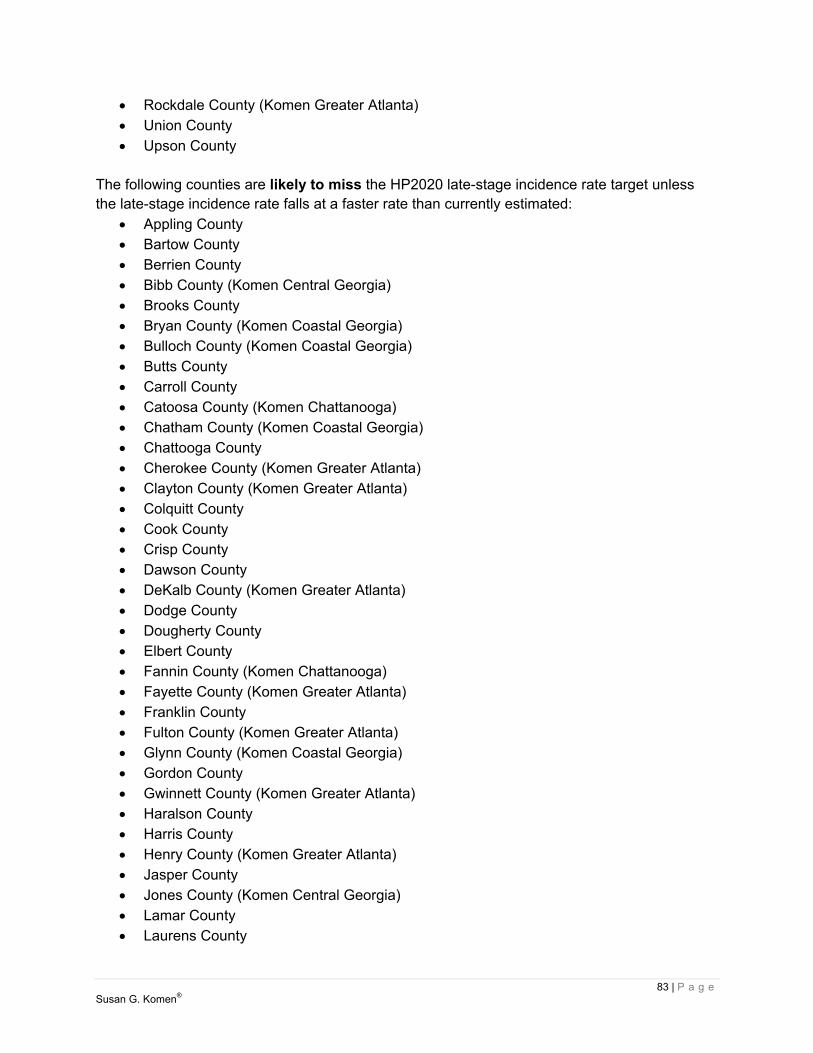
83 | P a g e Susan G. Komen®
Rockdale County (Komen Greater Atlanta) Union County Upson County
The following counties are likely to miss the HP2020 late-stage incidence rate target unless the late-stage incidence rate falls at a faster rate than currently estimated:
Appling County Bartow County Berrien County Bibb County (Komen Central Georgia) Brooks County Bryan County (Komen Coastal Georgia) Bulloch County (Komen Coastal Georgia) Butts County Carroll County Catoosa County (Komen Chattanooga) Chatham County (Komen Coastal Georgia) Chattooga County Cherokee County (Komen Greater Atlanta) Clayton County (Komen Greater Atlanta) Colquitt County Cook County Crisp County Dawson County DeKalb County (Komen Greater Atlanta) Dodge County Dougherty County Elbert County Fannin County (Komen Chattanooga) Fayette County (Komen Greater Atlanta) Franklin County Fulton County (Komen Greater Atlanta) Glynn County (Komen Coastal Georgia) Gordon County Gwinnett County (Komen Greater Atlanta) Haralson County Harris County Henry County (Komen Greater Atlanta) Jasper County Jones County (Komen Central Georgia) Lamar County Laurens County

84 | P a g e Susan G. Komen®
McDuffie County McIntosh County (Komen Coastal Georgia) Macon County Madison County Meriwether County Monroe County (Komen Central Georgia) Murray County (Komen Chattanooga) Muscogee County Oglethorpe County Peach County (Komen Central Georgia) Pickens County Pierce County Polk County Putnam County Rabun County Richmond County Screven County Stephens County Terrell County Walker County (Komen Chattanooga) Ware County Washington County Wayne County White County Worth County
Because data for small numbers of people are not reliable, it can’t be predicted whether Atkinson County, Bacon County, Baker County, Bleckley County, Brantley County, Calhoun County, Candler County, Charlton County, Chattahoochee County, Clay County, Clinch County, Dooly County, Early County, Echols County, Evans County, Glascock County, Hancock County, Heard County, Irwin County, Jenkins County, Johnson County, Lanier County, Lincoln County, Long County, Marion County, Miller County, Montgomery County, Pike County, Pulaski County, Quitman County, Schley County, Seminole County, Stewart County, Talbot County, Taliaferro County, Taylor County, Telfair County, Towns County, Treutlen County, Turner County, Twiggs County, Warren County, Webster County, Wheeler County, Wilcox County and Wilkinson County will reach the late-stage incidence rate target. The remaining counties are likely to achieve the target by 2020 or earlier. HP2020 Conclusions Highest at-risk areas Forty-five counties in the State of Georgia are in the highest priority category. Twelve of the forty-five, Clayton County, Cook County, Crisp County, DeKalb County, Dougherty County, Fulton County, Glynn County, Henry County, Muscogee County, Polk County, Walker County

85 | P a g e Susan G. Komen®
and Ware County, are not likely to meet either the death rate or late-stage incidence rate HP2020 targets. Thirty-three of the forty-five, Appling County, Berrien County, Brooks County, Bryan County, Butts County, Colquitt County, Dawson County, Dodge County, Elbert County, Fannin County, Franklin County, Haralson County, Jasper County, Jones County, Lamar County, McDuffie County, McIntosh County, Macon County, Meriwether County, Monroe County, Murray County, Oglethorpe County, Peach County, Pickens County, Pierce County, Putnam County, Screven County, Stephens County, Terrell County, Washington County, Wayne County, White County and Worth County, are not likely to meet the late-stage incidence rate HP2020 target. The age-adjusted incidence rates in DeKalb County (135.0 per 100,000), Fulton County (135.1 per 100,000) and Muscogee County (137.4 per 100,000) are significantly higher than the state as a whole (121.5 per 100,000). Incidence trends in Dawson County (11.8 percent per year) and Peach County (16.9 percent per year) are significantly less favorable than the state as a whole (-0.3 percent per year). The age-adjusted death rates in Fulton County (29.2 per 100,000), Murray County (37.8 per 100,000) and Muscogee County (29.1 per 100,000) are significantly higher than the state as a whole (23.4 per 100,000). Death trends in Clayton County (0.9% per year) and Ware County (4.3 percent per year) are significantly less favorable than the state as a whole (-1.4 percent per year). The age-adjusted late-stage incidence rates in DeKalb County (51.8 per 100,000), Fulton County (49.6 per 100,000) and Muscogee County (57.8 per 100,000) are significantly higher than the state as a whole (45.5 per 100,000). Late-stage incidence trends in Terrell County (30.4 percent per year) are significantly less favorable than the state as a whole (-0.4 percent per year). Appling County has low education levels and high poverty levels. Berrien County has low education levels and high poverty levels. Brooks County has an older population. Butts County has low education levels. Clayton County has a relatively large Black/African-American population, high unemployment and a relatively large foreign-born population. Colquitt County has a relatively large Hispanic/Latina population, low education levels and high poverty levels. Cook County has low education levels and high poverty levels. Crisp County has a relatively large Black/African-American population, low education levels and high poverty levels. DeKalb County has a relatively large Black/African-American population and a relatively large foreign-born population. Dodge County has an older population, low education levels and high poverty levels. Dougherty County has a relatively large Black/African-American population, high poverty levels and high unemployment. Elbert County has an older population, low education levels and high poverty levels. Fannin County has an older population and low education levels. Franklin County has an older population and low education levels. Fulton County has a relatively large Black/African-American population. Haralson County has low education levels and high unemployment. Henry County has a relatively large Black/African-American population. Jasper County has high unemployment. Lamar County has high unemployment. McDuffie County has a relatively large Black/African-American population and low education levels. McIntosh County has a relatively large Black/African-American population, an older population and low education levels. Macon County has a relatively large Black/African-American population, low education levels and high poverty levels. Meriwether County has a relatively large Black/African-American

86 | P a g e Susan G. Komen®
population, an older population and low education levels. Monroe County has low education levels. Murray County has low education levels. Muscogee County has a relatively large Black/African-American population. Oglethorpe County has low education levels. Peach County has a relatively large Black/African-American population. Pickens County has an older population. Pierce County has low education levels. Polk County has low education levels and high poverty levels. Putnam County has an older population. Screven County has a relatively large Black/African-American population, low education levels, high poverty levels and high unemployment. Stephens County has an older population, low education levels and high poverty levels. Terrell County has a relatively large Black/African-American population, an older population, low education levels, high poverty levels and high unemployment. Walker County has an older population and low education levels. Ware County has an older population and high poverty levels. Washington County has a relatively large Black/African-American population, an older population, low education levels and high poverty levels. Wayne County has low education levels. White County has an older population. Worth County has low education levels, high poverty levels and high unemployment. High at-risk areas Ten counties in the State of Georgia are in the high priority category. Three of the ten, Ben Hill County, Greene County and Sumter County, are not likely to meet the death rate HP2020 target. Seven of the ten, Bibb County, Carroll County, Chattooga County, Cherokee County, Gordon County, Rabun County and Richmond County, are not likely to meet the late-stage incidence rate HP2020 target. The age-adjusted incidence rates in Richmond County (134.8 per 100,000) are significantly higher than the state as a whole (121.5 per 100,000). The age-adjusted death rates in Ben Hill County (43.1 per 100,000) and Sumter County (35.1 per 100,000) are significantly higher than the state as a whole (23.4 per 100,000). Death trends in Ben Hill County (4.0 percent per year) are significantly less favorable than the state as a whole (-1.4 percent per year). The age-adjusted late-stage incidence rates in Greene County (71.0 per 100,000) are significantly higher than the state as a whole (45.5 per 100,000). Ben Hill County has low education levels and high poverty levels. Bibb County has a relatively large Black/African-American population and high poverty levels. Chattooga County has an older population and low education levels. Gordon County has low education levels. Greene County has a relatively large Black/African-American population, an older population, low education levels and high poverty levels. Rabun County has an older population. Richmond County has a relatively large Black/African-American population and high poverty levels. Sumter County has a relatively large Black/African-American population, low education levels, high poverty levels and high unemployment.

87 | P a g e Susan G. Komen®
This section of the state report tells the story of the breast cancer continuum of care and the delivery of quality health care in the community. Key to this section is the observation of potential strengths and weaknesses in the health care system that could compromise a women’s health as she works her way through the continuum of care (e.g., screening, diagnosis, treatment and follow-up/survivorship services).
Health Systems Analysis Data Sources Breast Cancer Programs and Services An inventory of breast cancer programs and services in the state were collected through a comprehensive internet search to identify the following types of health care facilities or community organizations that may provide breast cancer related services:
Hospitals- Public or private, for-profit or nonprofit. Community Health Centers (CHC) - Community based organizations that provide
primary care regardless of ability to pay; include Federally Qualified Health Centers (FQHCs) and FQHC look-alikes.
Free Clinic- Free and charitable clinics are safety-net health care organizations that utilize a volunteer/staff model and restrict eligibility for their services to individuals who are uninsured, underinsured and/or have limited or no access to primary health care.
Health Department- Local health department run by government entity (e.g. county, city) focused on the general health of its citizens.
Title X Provider- Family planning centers that also offer breast and cervical cancer screening. Services are provided through state, county, and local health departments; community health centers; Planned Parenthood centers; and hospital-based, school-based, faith-based, other private nonprofits.
Other- Any institution that is not a hospital, CHC, free clinic, health department or Title X provider (e.g., FDA certified mammography center that is not a hospital/CHC, community organization that is not a medical provider but does connect people to services or provide support services such as financial/legal assistance).
Information collected through these means was inputted into a Health Systems Analysis spreadsheet by service type: screening, diagnostics, treatment, and support. The screening service category encompasses clinical breast exams (CBEs), screening mammograms, mobile mammography units, ultrasounds, and patient navigation. The category of diagnostics includes diagnostic mammograms, ultrasounds, biopsy, MRI, and patient navigation. Treatment modalities counted were chemotherapy, radiation, surgery consultations, surgery, reconstruction, and patient navigations. Support encompasses a broad range of services including support groups, wigs, mastectomy wear, individual counseling/psychotherapy, exercise/nutrition programs, complementary therapies, transportation assistance, financial assistance for cost of living expenses, as well as end of life care, legal services, and education. In order to understand the effect available health systems have on the state, the identified resources were plotted on an asset map by Susan G. Komen Information Technology (IT) staff to visually illustrate the services (or lack thereof) available in the state. While every effort was
Health Systems Analysis

88 | P a g e Susan G. Komen®
made to ensure these findings were comprehensive, it may be possible that a facility or organization was missed or has since closed; as a result, these findings should not be considered exhaustive and/or final. Quality of Care Indicators For all health care facilities and hospitals, an additional layer of analysis was applied using quality of care indicators. Quality of care indicators are quantifiable measures related to the process of care, outcomes of care, and patient satisfaction levels from a particular program and/or organization. Multiple national organizations have developed key quality of care indicators for breast health services, and if an organization meets all of the key indicators they are designated an “accredited” health care institution. These accreditations outline key quality of care indicators health care institutions must meet in order to obtain and/or retain accreditation status. The following five accreditations were considered high quality of care indicators in the state’s health system analysis.
FDA Approved Mammography Facilities The Food and Drug Administration (FDA) passed the Mammography Quality Standards Act (MQSA) in 1992 to ensure facilities meet standards for performing high quality mammography. Accreditation bodies administer the MQSA to evaluate and accredit mammography facilities based upon quality standards. These quality standards are extensive and outline how a facility can operate. For instance, physicians interpreting mammograms must be licensed to practice medicine, be certified to interpret radiological procedures including mammography, and must complete continuing experience or education to maintain their qualifications (US Food and Drug Administration [US FDA], 2014). Radiologic technologists must also be trained and licensed to perform general radiographic procedures and complete continuing experience or education to maintain their qualifications. Facilities are required to maintain personnel records to document the qualifications of all personnel who work at the facility such as physicians, radiologic technologists or medical physicists.
All radiographic equipment used in FDA approved mammography centers must be specifically designed for mammography and must not be equipment designed for general purpose or equipment that has been modified with special attachments for mammography. Equipment regulations also apply to compression paddles, image receptor size, light fields and magnification, focal spot selection, x-ray film, film processing solutions, lighting and film masking devices. Facilities must also prepare a written report of the results of each mammography examination performed under its certificate. The report must include the name of the patient and an additional patient identifier, date of examination, the name of the interpreting physician, and the overall final assessment of findings. Findings from mammograms are classified into four different categories, including negative, benign, probably benign, and highly suggestive of malignancy. An assessment can also be assigned as incomplete indicating additional imaging evaluation is needed.
89 | P a g e Susan G. Komen®
FDA approved mammography facilities are obligated to communicate the results of mammograms to the patient and the patient’s primary care provider in a written report within 30 days. Each facility must also maintain mammography films and reports in a permanent medical record for a period of no less than five years or longer if mandated by State or local law. Patients can request to permanently or temporarily transfer the original mammograms and patient report to a medical institution, physician, health care provider, or to the patient directly. Any fees for providing transfer services shall not exceed the documented costs associated with this service.
A quality assurance program must be established at each facility to ensure safety, reliability, clarity, and accuracy of mammography services. At least once a year, each facility undergoes a survey by a medical physicist that includes the performance of tests to ensure the facility meets quality assurance requirements. The FDA evaluates the performance of each certificated agency annually through the use of performance indicators that address the adequacy of program performance in certification, inspection, and enforcement activities. Only facilities that are accredited by FDA accrediting bodies or are undergoing accreditation by accrediting bodies may obtain a certificate from the FDA to legally perform mammography (US FDA, 2014). Only FDA approved mammography centers were included in the health system analysis for each target community.
American College of Surgeons Commission on Cancer Certification (CoCC)
Applying and sustaining an American College of Surgeons Commission on Cancer Certification (CoCC) is a voluntary effort a cancer program can undertake to ensure a range of services necessary to diagnose and treat cancer, as well as rehabilitate and support patients and their families, are available (American College of Surgeons [ACoS], 2013). There are various categories of cancer programs, and each facility is assigned a category based on the type of facility or organization, services provided, and cases accessioned or recorded. Program categories include: Integrated Network Cancer Program (INCP); NCI-Designated Comprehensive Cancer Center Program (NCIP); Academic Comprehensive Cancer Program (ACAD); Veterans Affairs Cancer Program (VACP); Comprehensive Community Cancer Program (CCCP); Hospital Associate Cancer Program (HACP); Pediatric Cancer Program (PCP); and Freestanding Cancer Center Program (FCCP) (ACoS, 2013).
CoCC cancer programs are surveyed every three years. In preparation for survey, the cancer committee for that facility must assess program compliance with the requirements for all standards outlined in Cancer Program Standards 2012: Ensuring Patient-Centered Care. An individual must then review and complete an online Survey Application Record (SAR). In addition, the individual responsible for completing the SAR will perform a self-assessment and rate compliance with each standard using the Cancer Program Ratings Scale.

90 | P a g e Susan G. Komen®
The surveyor’s role is to assist in accurately defining the standards and verifying the facility’s cancer program is in compliance. To accomplish this task, the surveyor will meet with the cancer committee, cancer registry staff and cancer liaison physicians, review pathology reports, and attend a cancer conference to observe the multidisciplinary patient management discussions and confirm treatment is planned using nationally recognized, evidence-based treatment guidelines. CoCC-accredited programs must also submit documentation of cancer program activities with the SAR using multiple sources such as policies, procedures, manuals, and grids.
Each cancer program standard is rated on a compliance scale that consists of the score of (1+) commendation, (1) compliance, (5) noncompliance, and (8) not applicable. A deficiency is defined as any standard with a rating of five. A deficiency in one or more standards will affect the accreditation award. Commendation ratings (+1) are valid for eight standards, can only be earned at the time of survey, and are used to determine the accreditation award and award level (bronze, silver, or gold). Accreditation awards are based on consensus ratings by the cancer program surveyor, CoCC staff and when necessary, the Program Review Subcommittee. A program can earn one of the following Accreditation Awards; three-year with commendation accreditation, three-year accreditation, three-year accreditation with contingency, provisional accreditation, or no accreditation. Programs are surveyed at three-year intervals from the date of survey.
Award notification takes place within 45 days following the completed survey and will include The Accredited Cancer Program Performance Report. This report includes a comprehensive summary of the survey outcome and accreditation award, the facility’s compliance rating for each standard, an overall rating compared with other accredited facilities nation- and state-wide, and the category of accreditation. In addition, a narrative description of deficiencies that require correction, suggestions to improve or enhance the program, and commendations awarded are also included.
American College of Surgeons National Accreditation Program for Breast Centers (NAPBC) The American College of Surgeons’ National Accreditation Program for Breast Centers (NAPBC) is a consortium of national professional organizations focused on breast health and dedicated to improving quality of care and outcomes for patients with diseases of the breast (ACoS, 2014). The NAPBC utilizes evidence-based standards as well as patient and provider education, and encourages leaders from major disciplines to work together to diagnose and treat breast disease. The NAPBC has defined 28 program standards and 17 program components of care that provide the most efficient and contemporary care for patients diagnosed with diseases of the breast. Quality standards cover a range of topics and levels of operation including leadership, clinical management, research, community outreach, professional education, and quality improvement (ACoS, 2014).

91 | P a g e Susan G. Komen®
To be considered for initial survey, breast center leadership must ensure clinical services, interdisciplinary/multidisciplinary conference(s), and quality management programs are in place and ensure a facility can meet the requirements outlined for all standards. Critical standards include having breast program leadership that is responsible and accountable for services and also establishes, monitors, and evaluates the interdisciplinary breast cancer conference frequency, multidisciplinary and individual attendance, prospective case presentation, and total case presentation annually. In addition, the interdisciplinary patient management standard requires patient management to be conducted by an interdisciplinary team after a patient is diagnosed with breast cancer.
Breast center leadership then completes a pre-application to participate and pay for the survey fee within 30 days of the receipt from the NAPBC. To prepare for a survey, the breast center must complete a Survey Application Record (SAR) prior to the on-site visit. The SAR is intended to capture information about the breast center activity and includes portions of individuals to perform a self-assessment and rate compliance with each standard using a provided rating system. The NAPBC will then complete a survey of the facility within six months. A survey of a facility typically includes a tour of the center, a meeting between the surveyor and breast center leadership and staff, chart and medical record review, and the attendance of a breast conference.
Accreditation awards are based on consensus ratings by the surveyor, the NAPBC staff, and, if required, the Standards and Accreditation Committee. Accreditation award is based on compliance with 28 standards. A three year, full accreditation is granted to centers that comply with 90 percent or more of the standards with resolution of all deficient standards documented within 12 months of survey. Centers that do not resolve all deficiencies within the 12 month period risk losing NAPBC accreditation status and are required to reapply. Once a performance report and certificate of accreditation are issued, these centers are surveyed every three years.
A three-year contingency accreditation is granted to centers that meet less than 90 percent, but more than 75 percent of the standards at the time of survey. The contingency status is resolved by the submission of documentation of compliance within 12 months from the date of survey. A performance report and certificate of accreditation are issued, and these facilities are surveyed every three years. An accreditation can be deferred if a center meets less than 75 percent of the standards at the time of the survey. The deferred status is resolved by the submission of documentation of compliance within 12 months from the date of survey. Based on the resolution of deficiencies and survey results, a performance report and certificate of accreditation are issued, and these facilities are surveyed every three years. For the complete list of NAPBC quality standards, visit: http://www.napbc-breast.org/standards/standards.html.

92 | P a g e Susan G. Komen®
American College of Radiology Breast Imaging Centers of Excellence (BICOE) The American College of Radiology (ACR) Breast Imaging Centers of Excellence (BICOE) designation is awarded to breast imaging centers that seek and earn accreditation in the ACR’s entire voluntary breast imaging accreditation programs and modules, in addition to the Mandatory Mammography Accreditation Program (MMAP) (American College of Radiology [ACR], n.d.). The ACR MMAP is designed to provide facilities with peer review and constructive feedback on staff qualifications, equipment, quality control, quality assurance, image quality, and radiation dose. This ensures facilities comply with the 1992 Mammography Quality Standards Act (MQSA), which requires all mammography facilities be accredited. In order to receive the ACR’s BICOE designation, a facility must be accredited by the ACR in mammography, stereotactic breast biopsy, breast ultrasound, and effective January 1, 2016, breast MRI.
The ACR will send a BICOE certificate to each facility that fulfills the necessary requirements. The designation remains in effect as long as all breast imaging facilities (an organizations home location or a different location) remain accredited in all required breast imaging services provided. If the center or facility neglects to renew any of its accreditations or fails during renewal, the facility will be notified that it no longer has the BICOE designation and the BICOE certificate must be removed from public display. Some centers will need to specifically request a BICOE designation, while in most cases the ACR will consult its database and automatically provide an eligible center a BICOE certificate if the center is at a single physical location and meets all breast imaging requirements (ACR, n.d.).
National Cancer Institute Designated Cancer Centers
A National Cancer Institute (NCI) designated Cancer Center is an institution dedicated to researching the development of more effective approaches to the prevention, diagnosis, and treatment of cancer (National Cancer Institute [NCI], 2012). A NCI-designated Cancer Center conducts cancer research that is multidisciplinary and incorporates collaboration between institutions and university medical centers. This collaboration also provides training for scientists, physicians, and other professionals interested in specialized training or board certification in cancer-related disciplines. NCI-designated Cancer Centers also provide clinical programs that offer the most current forms of treatment for various types of cancers and typically incorporate access to clinical trials of experimental treatments. In addition, public education and community outreach regarding cancer prevention and screening are important activities of a NCI-designated Cancer Center (NCI, 2012).
HRSA Shortage Designations The US Department of Health and Human Services-Health Resources and Services Administration (HRSA) designations for Health Professional Shortage Areas (HSPAs) and Medically Underserved Areas/Populations (MUA/Ps) were used to identify areas within the state where individuals may have inadequate access to primary care providers and facilities (US Department of Health and Human Services, n.d.).

93 | P a g e Susan G. Komen®
Health Professional Shortage Areas (HPSAs) are designated by HRSA as having shortages of primary medical care, dental or mental health providers and may be geographic (a county or service area), population (e.g. low income or Medicaid eligible) or facilities (e.g. federally qualified health center or other state or federal prisons).
Medically Underserved Areas/Populations (MUA/Ps) are areas or populations designated by HRSA as having too few primary care providers, high infant death, high poverty or a high elderly population.
Breast Cancer Continuum of Care The Breast Cancer Continuum of Care (CoC), shown in Figure 3.1, is a model that shows how a woman typically moves through the health care system for breast care. A woman would ideally move through the CoC quickly and seamlessly, receiving timely, quality care in order to have the best outcomes. Education can play an important role throughout the entire CoC. While a woman may enter the continuum at any point, ideally, a woman would enter the CoC by getting screened for breast cancer – with a clinical breast exam or a screening mammogram. If the screening test results are normal, she would loop back into follow-up care, where she would get another screening exam at the recommended interval. Education plays a role in both providing education to encourage women to get screened and reinforcing the need to continue to get screened routinely thereafter. If a screening exam resulted in abnormal results, diagnostic tests would be needed, possibly several, to determine if the abnormal finding is in fact breast cancer. These tests might include a diagnostic mammogram, breast ultrasound, or biopsy. If the tests were negative (or benign) and breast cancer was not found, she would go into the follow-up loop and return for screening at the recommended interval. The recommended intervals may range from three to six months for some women to 12 months for most women. Education plays a role in communicating the importance of proactively getting test results, keeping follow-up appointments, and understanding what everything means. Education can empower a woman and help manage anxiety and fear. The woman would proceed to treatment if breast cancer is diagnosed. Education can cover such topics as treatment options, how a pathology reports determines the best options for
Figure 3.1. Breast Cancer Continuum of Care (CoC)

94 | P a g e Susan G. Komen®
treatment, understanding side effects and how to manage them, and helping to formulate questions a woman may have for her providers. For some breast cancer patients, treatment may last a few months and for others, it may last years. While the CoC model shows that follow-up and survivorship come after treatment ends, they actually may occur at the same time. Follow-up and survivorship may include things like navigating insurance issues, locating financial assistance, symptom management, such as pain, fatigue, sexual issues, bone health, etc. Education may address topics such as making healthy lifestyle choices, long term effects of treatment, managing side effects, the importance of follow-up appointments, and communication with their providers. Most women will return to screening at a recommended interval after treatment ends, or for some, during treatment (such as those taking long term hormone therapy). There are often delays in moving from one point of the continuum to another – at the point of follow-up of abnormal screening exam results, starting treatment, and completing treatment – that can all contribute to poorer outcomes. There are also many reasons why a woman does not enter or continue in the breast cancer CoC. These barriers can include things such as lack of transportation, system issues including long waits for appointments and inconvenient clinic hours, language barriers, fear, and lack of information or the wrong information (myths and misconceptions). Education can address some of these barriers and help a woman enter and progress through the CoC more quickly.
Health Systems Analysis Findings In the State of Georgia there were 601 locations found to provide breast cancer services varying between screening, diagnostic, treatment, and survivorship (Figure 3.2). There were 599 locations that provided screening services, 248 locations in the state that provide diagnostic services and 83 locations providing treatment services. In the state there were 58 locations that provided survivorship services or care. Identified facilities that provide mammography services were all accredited by the Federal Drug Administration. There were 48 locations that are accredited by the American College of Surgeons Commission on Cancer, 33 locations accredited by the American College of Radiology as a Breast Imaging Center of Excellence and 14 locations accredited a an American College of Surgeons NAPBC program. There was one location designated as a NCI Cancer Center. The following counties are designated as a Medically Underserved Area/Population and/or a Health Professional Shortage Area for primary care: Appling, Atkinson, Bacon, Baker, Baldwin, Banks, Bartow, Ben Hill, Berrien, Bibb, Bleckley, Brantley, Brooks, Bryan, Bulloch, Burke, Butts, Calhoun, Camden, Candler, Carroll, Catoosa, Charlton, Chatham, Chattahoochee, Chattooga, Cherokee, Clarke, Clay, Clayton, Clinch, Cobb, Coffee, Colquitt, Columbia, Cook, Coweta, Crawford, Crisp, Dade, Dawson, Decatur, Dekalb, Dodge, Dooly, Dougherty, Early, Echols, Effingham, Elbert, Emanuel, Evans, Fannin, Floyd, Forsyth, Franklin, Fulton, Gilmer, Glascock, Glynn, Gordon, Grady, Greene, Gwinnett, Habersham, Hall, Hancock, Haralson, Harris, Hart, Heard, Henry, Houston, Irwin, Jackson, Jasper, Jeff Davis, Jefferson, Jenkins, Johnson, Jones,

95 | P a g e Susan G. Komen®
Lamar, Lanier, Laurens, Lee, Liberty, Lincoln, Long, Lowndes, Lumpkin, Macon, Madison, Marion, McDuffie, McIntosh, Meriwether, Miller, Mitchell, Monroe, Montgomery, Morgan, Murray, Muscogee, Newton, Oconee, Oglethorpe, Peach, Pickens, Pierce, Pike, Polk, Pulaski, Putnam, Quitman, Rabun, Randolph, Richmond, Schley, Screven, Spalding, Stewart, Sumter, Talbot, Taliaferro, Tattnall, Taylor, Telfair, Terrell, Thomas, Tift, Toombs, Towns, Treutlen, Troup, Turner, Twiggs, Union, Upson, Walker, Walton, Ware, Warren, Washington, Wayne, Webster, Wheeler, White, Whitfield, Wilcox, Wilkes, Wilkinson and Worth.

96 | P a g e Susan G. Komen®
Figure 3.2. Breast cancer services available in Georgia
97 | P a g e Susan G. Komen®
In recent years, public policies pertaining to breast cancer have undergone substantial changes that will affect at-risk women across the United States. States have responded differently to the public policy developments concerning access to services within the breast cancer continuum of care (screening, diagnostic, treatment and survivorship care); therefore, women are dependent on their state’s agenda and action on health care reform. This section of the state report will focus on the following public policies that affect breast cancer care in the state: National Breast and Cervical Cancer Early Detection Program, State Comprehensive Cancer Control Plan, the Affordable Care Act and Medicaid Expansion.
Susan G. Komen Advocacy Susan G. Komen is the voice for the more than three million breast cancer survivors and those who love them, working to ensure that the fight against breast cancer is a priority among policymakers in Washington, D.C., and every Capitol across the country. Each year, Komen works to identify, through a transparent and broad-based, intensive vetting and selection process, the policy issues that have the greatest potential impact on Komen’s mission. This process includes the collection of feedback from Komen Headquarters leadership, policy staff, and subject matter experts; Komen Affiliates from across the country; advisory groups including the Komen Advocacy Advisory Taskforce (KAAT), Advocates in Science (AIS), and Komen Scholars; and other stakeholders with a vested interest in breast cancer-related issues.
The selected issues are the basis for Komen’s state and federal advocacy work in the coming year. While the priority issues may change on an annual basis, the general focus for Komen’s advocacy work is to ensure high-quality, affordable care for all, though access to services and an increased investment in research to ensure the continued development of the latest technologies and treatments. For more information on Komen’s current Advocacy Priorities, please visit: http://ww5.komen.org/WhatWeDo/Advocacy/Advocacy.html.
National Breast and Cervical Cancer Early Detection Program The United States Congress passed the Breast and Cervical Cancer Mortality Prevention Act of 1990, which directed the Centers for Disease Control and Prevention (CDC) to create the National Breast and Cervical Cancer Early Detection Program (NBCCEDP) to improve access to screening (CDC, 2015a). NBCCEDP is a federal-state partnership which requires states to satisfy a 1:3 matching obligation ($1 in state funds or in-kind funds for every $3 in federal funds provided to that state) (CDC, n.d.). Currently, the NBCCEDP funds all 50 states, the District of Columbia, five US territories, and 11 American Indian/Alaska Native tribes or tribal organizations, to provide the following services to women (CDC, 2015a; CDC, n.d.):
Breast and cervical cancer screening for women with priority to low-income women. Providing appropriate follow-up and support services (i.e., case management and
referrals for medical treatment). Developing and disseminating public information and education programs.
Public Policy Overview

98 | P a g e Susan G. Komen®
Improving the education, training and skills of health professionals. Monitoring screening procedure quality and interpretation.
To be eligible to receive NBCCEDP services, uninsured and underinsured women must be at or below 250 percent of the federal poverty level and between the ages of 40 to 64 for breast cancer screening (CDC, 2015a; CDC, n.d.). Uninsured women between the ages of 50 and 64 who are low-income (up to 250 percent federal poverty level) and who have not been screened in the past year are a priority population for NBCCEDP (CDC, n.d.). While federal guidelines are provided by the CDC, there are some variations among states, tribal organizations and territories (CDC, 2015b):
Program funding, clinical costs and additional eligibility guidelines vary by state, tribal organization and territory which influence the number of services that can be provided.
Flexibility of the program allows each state, tribal organization and territory to adopt an operational model that is appropriate for their respective public health infrastructure and legislative polices.
Since the launch of the program in 1991, NBCCEDP has served more than 4.8 million women providing over 12 million breast and cervical cancer screening services that has resulted in more than 67,900 women being diagnosed with breast cancer (CDC, 2015a). Congress passed the Breast and Cervical Cancer Prevention and Treatment Act in 2000 to provide states the option to offer Medicaid coverage for breast cancer treatment for women who were diagnosed when receiving services through from the NBCCEDP (CDC, 2015a). To date, all 50 states and the District of Columbia have approved provision of Medicaid coverage for cancer treatment; therefore, providing low-income, uninsured and underinsured women coverage from screening through completion of treatment (CDC, 2015a). Congress expanded this option 2001, with the passage of the Native American Breast and Cervical Cancer Treatment Technical Amendment Act, to include eligible American Indians and Alaska Natives that receive services by the Indian Health Service or by a tribal organization (CDC, 2015a). In the State of Georgia, the NBCCEDP is known as Georgia’s Breast and Cervical Cancer Program and is administered by the Office of Cancer Prevention, Screening and Treatment. From July 2009 to June 2014, Georgia’s Breast and Cervical Cancer Program provided breast cancer and cervical cancer screening and diagnostic services to 38,022 women. The program provided 49,427 mammograms that resulted in 8,279 women receiving an abnormal result and 537 women being diagnosed with breast cancer (NBCCEDP Minimum Data Elements, 2015). To find out more information about getting screened and eligibility, contact the Breast and Cervical Cancer Program (1-404-657-7735).

99 | P a g e Susan G. Komen®
State Comprehensive Cancer Control Plan Comprehensive cancer control is a process through which communities and partner organizations pool resources to reduce cancer risk, find cancers earlier, improve treatments, increase the number of people who survive cancer and improve quality of life for cancer survivors to ultimately reduce the burden of cancer in the state (CDC, 2015d). The National Comprehensive Cancer Control Program (NCCCP) (http://www.cdc.gov/cancer/ncccp/) is an initiative by the CDC to help states, tribes, US affiliated Pacific Islands, and territories form or support existing coalitions to fight cancer by using local data to determine the greatest cancer-related needs in their area (2015d). Once areas have been identified, the state coalition works collaborative to develop and implement a State Comprehensive Cancer Control Plan to meet the identified needs (CDC, 2015d). These plans include initiatives involving healthy lifestyles, promotion of cancer screening tests, access to good cancer care, and improvement in the quality of life for people who survive cancer (CDC, 2015d). State Comprehensive Cancer Control Plans (2015c) can be located at the following link: http://www.cdc.gov/cancer/ncccp/ccc_plans.htm. Georgia’s comprehensive cancer control plan for 2014-2019 (https://dph.georgia.gov/sites/dph.georgia.gov/files/related_files/site_page/CancerPlan.pdf) includes the following objectives, strategic activities and targets specific for screening and breast cancer: Objectives:
Ensure all women, regardless of income, race or employment status, have access to high quality breast and cervical cancer screening as well as genetic screening, counseling, and preventive clinical services related to HBOC.
Strategic Initiatives and Activities Sustain existing community-based breast and cervical cancer screening programs that
screen at least 60 percent of women from racial/ethnic minority groups. Promote genetic screening to all low income and rarely screened women 18 years of
age and older. Seek Medicaid and State Health Benefit Plan reimbursement for genetic testing and
counseling, as well as preventive surgeries such as bilateral mastectomies and/or oophorectomy/salpingectomy for women with BRCA mutation.
Carry out educational campaigns targeting physicians and patients regarding screening for breast and cervical cancer and HBOC.
Promote breastfeeding, which lowers a woman’s risk of breast cancer, in pregnant and post-partum women statewide through Georgia’s WIC program.

100 | P a g e Susan G. Komen®
Targets by 2019 Increase from 77 percent to 81.1 percent, the proportion of women who receive breast
cancer screenings based on the most recent USPSTF guidelines of females aged 50 to 74 years.
Increase from 87 percent to 93 percent, the proportion of women who receive cervical cancer screenings based on the most recent USPSTF guidelines.
Reduce income and insurance coverage disparities in breast and cervical cancer screening proportions by 10 percent.
Increase by 25 percent the proportion of individuals at high risk for breast cancer who receive evidence-based genetic risk assessment and appropriate screening.
For more information regarding Georgia’s comprehensive cancer plan please visit: https://dph.georgia.gov/comprehensive-cancer-control-program.
Affordable Care Act In 2010, Congress passed the Patient Protection and Affordable Care Act (commonly known as Affordable Care Act or ACA) to expand access to care through insurance coverage, enhance the quality of health care, improve health care coverage for those with health insurance and to make health care more affordable (US Department of Health and Human Services, 2015a). The ACA includes the following mandates to improve health insurance coverage and enhance health care quality (US Department of Health and Human Services, 2015a):
Prohibit insurers from denying coverage based on pre-existing conditions Prohibit insurers from rescinding coverage Prohibit annual and lifetime caps on coverage Provide coverage of preventive services with no cost-sharing (including screening
mammography, well women visits) Establish minimum benefits standards, known as the Essential Health Benefits (EHB)
The ACA provides tax subsidies for middle-income individuals to purchase insurance through the health insurance exchanges (commonly called the Marketplace). To be eligible to receive health coverage through the Marketplace, an individuals must live in the United States, be a US citizen or national (or lawfully present), cannot be incarcerated, fall into certain income guidelines and cannot be eligible for other insurance coverage (i.e., Medicaid, Medicare and employer sponsored health care coverage) (US Centers for Medicare and Medicaid Services, n.d.). Based on 2015 data, of the estimated 1,524,000 total number of uninsured in Georgia, 13.0 percent are Medicaid eligible, 27.0 percent are eligible for tax subsidies and 40.0 percent are ineligible for financial assistance due to income, employer sponsored insurance offer or citizenship status (Garfield et al., 2015).

101 | P a g e Susan G. Komen®
Some of the ways that the ACA has affected Georgia over the past five years include (US Department of Health and Human Service, 2015b):
Making health care more affordable and accessible through Health Insurance Marketplaces.
o In Georgia, 541,080 consumers selected or were automatically re-enrolled in health insurance coverage.
Reducing the number of uninsured. o The number of uninsured in Georgia decreased to 19.1 percent (2014) from 21.4
percent (2013). Removing lifetime limits on health benefits and discrimination for pre-existing conditions
resulting in cancer patients not having to worry about going without treatment. o In Georgia, over 1,256,000 women no longer have to worry about lifetime limits
on coverage. Making prescription drug coverage more affordable for those on Medicare.
o In Georgia, Medicare covered individuals have saved nearly $420,400,965 on prescription drugs.
Covering preventive services, such as screening mammograms, with no deductible or co-pay.
o In Georgia, over 933,000 women received preventive services without cost-sharing.
Providing increased funding to support health care delivery improvement projects that offer a broader array of primary care services, extend hours of operations, employ more providers and improve health care facilities.
o Georgia received $165,023,270 under the health care law. For more information about the Affordable Care Act or to obtain coverage, please visit the following websites:
US Department of Health and Human Services: http://www.hhs.gov/healthcare Information about health insurance coverage: 1-800-318-2596 or www.healthcare.gov ACA assistance in the local community: https://localhelp.healthcare.gov/#intro
Medicaid Expansion Traditional Medicaid had gaps in coverage for adults because eligibility was restricted to specific categories of low-income individuals (i.e., children, their parents, pregnant women, the elderly, or individuals with disabilities) (Figure 4.1) (The Henry J. Kaiser Family Foundation, 2014). In most states, non-elderly adults without dependent children were ineligible for Medicaid, regardless of their income. Under the ACA, states were provided the option to expand Medicaid coverage to a greater number of non-elderly adults with incomes at or below 138 percent of poverty (about $16,242 per year for an individual in 2015); thus reducing the number of uninsured, low-income adults (The Henry J. Kaiser Family Foundation, n.d.). As of January 2016, 32 states including the

Susan G. Ko
District oconsidertime (The
Additiona T U
c
As of JanMedicaidMedicaid4.2) (Gar
omen®
of Columbia hing adoptinge Henry J. K
Figure 4
al informatioThe Henry J. US Centers fohip/medicaid
nuary 2016, d Expansion,d eligibility limrfield and Da
have adopteg Medicaid EKaiser Family
4.1. The ACA
n regarding Kaiser Fam
or Medicared-expansion
Georgia has, low-incomemits but beloamico, 2016
ed and impleExpansion any Foundation
A Medicaid
Medicaid Exmily Foundati
and Medica-and-you/
s not adoptee “adults fall ow the lower).
emented Mednd 16 are non, n.d.).
Expansion f
xpansion caon State He
aid Services
ed Medicaid into a ‘cove
r limit for Ma
dicaid Expaot adopting M
fills current g
an be found aealth Facts: : https://www
Expansion. erage gap’ ofrketplace pr
nsion, threeMedicaid Ex
gaps in cove
at the followhttp://kff.org
w.healthcare
In states thf having incoremium tax c
102 | P
states are sxpansion at t
erage
wing websitesg/ e.gov/medica
hat did not adomes abovecredits (Figu
P a g e
still his
s:
aid-
dopt e ure

103 | P a g e Susan G. Komen®
Figure 4.2. Gap in coverage for adults in states that do not expand Medicaid under ACA
In Georgia, 139,000 people fall within the “coverage gap”. Of those in the “coverage gap”, 74.0 percent are people of color, 72.0 percent are adults without dependent children, 51.0 percent are female and 57.0 percent are part of a working family (the individual, or a family member, is employed but still living below the poverty line) (Note: individuals can be classified in more than one category) (Garfield and Damico, 2016). If Georgia would have adopted Medicaid Expansion, an estimated 521,000 uninsured adults (including those in the coverage gap) would have been eligible for Medicaid coverage (Garfield and Damico, 2016).
Affordable Care Act, Medicaid Expansion and Unisured Women Even after implementation of the ACA and Medicaid Expansion (in some states), there are approximately 12.8 million women (ages 19 to 64) in the US that remain uninsured (The Henry J. Kaiser Family Foundation, 2016). Uninsured women have been found to have inadequate access to care and receive a lower standard of care within health systems that lead to poorer health outcomes (Kaiser Commission on Medicaid and the Uninsured, 2013). Women that are single parents, have incomes below 100 percent federal poverty level, have less than a high school education, are women of color or immigrants are at greatest risk of being uninsured (Figure 4.3) (The Henry J. Kaiser Family Foundation, 2016).

104 | P a g e Susan G. Komen®
Figure 4.3. Women at greatest risk of being uninsured, 2014
A 2014 survey by The Henry J. Kaiser Family Foundation (2016) found that 47.0 percent of uninsured women indicated that insurance was too expensive, 13.0 percent were unemployed/work does not offer/not eligible through work, 8.0 percent tried to obtain coverage but were told they were ineligible, 7.0 percent were not eligible due to immigration status and 4.0 percent indicated that they did not need coverage. Of the 3,182,000 women in Georgia, 636,400 (20.0 percent) were without health insurance coverage in 2014 (The Henry J. Kaiser Family Foundation, 2016).

105 | P a g e Susan G. Komen®
Introduction to the Community Profile Report Susan G. Komen is the world’s largest breast cancer organization, funding more breast cancer research than any other nonprofit while providing real-time help to those facing the disease. Since its founding in 1982, Komen has funded more than $889 million in research and provided $1.95 billion in funding to screening, education, treatment and psychosocial support programs serving millions of people in more than 30 countries worldwide. Komen was founded by Nancy G. Brinker, who promised her sister, Susan G. Komen, that she would end the disease that claimed Suzy’s life.
The purpose of the Georgia Community Profile is to assess breast cancer burden within the state by identifying areas at highest risk of negative breast cancer outcomes. Through the Community Profile, populations most at-risk of dying from breast cancer and their demographic and socioeconomic characteristics can be identified; as well as, the needs and disparities that exist in availability, access and utilization of quality care.
Quantitative Data: Measuring Breast Cancer Impact in Local Communities After review of breast cancer late-stage diagnosis and death rates and trends for each county in the state, areas of greatest need were identified based on if the county would meet Healthy People 2020 late-stage diagnosis rate (41.0 per 100,000 women) and death rate (20.6 per 100,000 women) targets. Breast Cancer Death Rates The State of Georgia as a whole is likely to achieve the HP2020 death rate target. The state had a base rate of 23.4 breast cancer deaths per 100,000 females per year from 2006 to 2010 (age-adjusted). This rate coupled with a desirable direction (decrease) in the recent death rate trend, indicates that the State of Georgia will likely achieve the HP2020 target of 20.6 female breast cancer deaths per 100,000. The following counties currently meet the HP2020 breast cancer death rate target of 20.6:
Catoosa County (Komen Chattanooga) Clarke County Effingham County (Komen Coastal Georgia) Forsyth County (Komen Greater Atlanta) Harris County Laurens County Lowndes County Madison County Tift County Upson County Walton County Whitfield County (Komen Chattanooga)
Community Profile Summary

106 | P a g e Susan G. Komen®
The following counties are likely to miss the HP2020 breast cancer death rate target unless the death rate falls at a faster rate than currently estimated:
Barrow County Ben Hill County Clayton County (Komen Greater Atlanta) Cook County Crisp County DeKalb County (Komen Greater Atlanta) Dougherty County Douglas County (Komen Greater Atlanta) Fulton County (Komen Greater Atlanta) Glynn County (Komen Coastal Georgia) Grady County Greene County Hall County Henry County (Komen Greater Atlanta) Jackson County Jefferson County Lumpkin County Muscogee County Newton County (Komen Greater Atlanta) Paulding County Polk County Sumter County Troup County Walker County (Komen Chattanooga) Ware County
Because data for small numbers of people are not reliable, it can’t be predicted whether Appling County, Atkinson County, Bacon County, Baker County, Baldwin County, Banks County, Berrien County, Bleckley County, Brantley County, Brooks County, Bryan County, Burke County, Butts County, Calhoun County, Camden County, Candler County, Charlton County, Chattahoochee County, Clay County, Clinch County, Coffee County, Colquitt County, Crawford County, Dade County, Dawson County, Dodge County, Dooly County, Early County, Echols County, Elbert County, Emanuel County, Evans County, Fannin County, Franklin County, Gilmer County, Glascock County, Habersham County, Hancock County, Haralson County, Heard County, Irwin County, Jasper County, Jeff Davis County, Jenkins County, Johnson County, Jones County, Lamar County, Lanier County, Lee County, Lincoln County, Long County, McDuffie County, McIntosh County, Macon County, Marion County, Meriwether County, Miller County, Mitchell County, Monroe County, Montgomery County, Morgan County, Murray County, Oconee County, Oglethorpe County, Peach County, Pickens County, Pierce County, Pike County, Pulaski County, Putnam County, Quitman County, Randolph County, Schley County, Screven County, Seminole County, Stephens County, Stewart County, Talbot County, Taliaferro County, Tattnall

107 | P a g e Susan G. Komen®
County, Taylor County, Telfair County, Terrell County, Toombs County, Towns County, Treutlen County, Turner County, Twiggs County, Union County, Warren County, Washington County, Wayne County, Webster County, Wheeler County, White County, Wilcox County, Wilkes County, Wilkinson County and Worth County will reach the death rate target. The remaining counties are likely to achieve the target by 2020 or earlier. Breast Cancer Late-Stage Incidence Rates The State of Georgia as a whole is likely to miss the HP2020 late-stage incidence rate target. The state had a base rate of 45.5 new late-stage cases per 100,000 females per year from 2006 to 2010 (age-adjusted). This rate coupled with the recent late-stage incidence rate trend, indicates that the State of Georgia is likely to miss the HP2020 target of 41.0 new late-stage cases per 100,000. The following counties currently meet the HP2020 late-stage incidence rate target of 41.0:
Banks County Barrow County Coffee County Dade County (Komen Chattanooga) Decatur County Floyd County Forsyth County (Komen Greater Atlanta) Gilmer County Grady County Hall County Hart County Liberty County (Komen Coastal Georgia) Lumpkin County Newton County (Komen Greater Atlanta) Rockdale County (Komen Greater Atlanta) Union County Upson County
The following counties are likely to miss the HP2020 late-stage incidence rate target unless the late-stage incidence rate falls at a faster rate than currently estimated:
Appling County Bartow County Berrien County Bibb County (Komen Central Georgia) Brooks County Bryan County (Komen Coastal Georgia) Bulloch County (Komen Coastal Georgia) Butts County Carroll County

108 | P a g e Susan G. Komen®
Catoosa County (Komen Chattanooga) Chatham County (Komen Coastal Georgia) Chattooga County Cherokee County (Komen Greater Atlanta) Clayton County (Komen Greater Atlanta) Colquitt County Cook County Crisp County Dawson County DeKalb County (Komen Greater Atlanta) Dodge County Dougherty County Elbert County Fannin County (Komen Chattanooga) Fayette County (Komen Greater Atlanta) Franklin County Fulton County (Komen Greater Atlanta) Glynn County (Komen Coastal Georgia) Gordon County Gwinnett County (Komen Greater Atlanta) Haralson County Harris County Henry County (Komen Greater Atlanta) Jasper County Jones County (Komen Central Georgia) Lamar County Laurens County McDuffie County McIntosh County (Komen Coastal Georgia) Macon County Madison County Meriwether County Monroe County (Komen Central Georgia) Murray County (Komen Chattanooga) Muscogee County Oglethorpe County Peach County (Komen Central Georgia) Pickens County Pierce County Polk County Putnam County Rabun County

109 | P a g e Susan G. Komen®
Richmond County Screven County Stephens County Terrell County Walker County (Komen Chattanooga) Ware County Washington County Wayne County White County Worth County
Because data for small numbers of people are not reliable, it can’t be predicted whether Atkinson County, Bacon County, Baker County, Bleckley County, Brantley County, Calhoun County, Candler County, Charlton County, Chattahoochee County, Clay County, Clinch County, Dooly County, Early County, Echols County, Evans County, Glascock County, Hancock County, Heard County, Irwin County, Jenkins County, Johnson County, Lanier County, Lincoln County, Long County, Marion County, Miller County, Montgomery County, Pike County, Pulaski County, Quitman County, Schley County, Seminole County, Stewart County, Talbot County, Taliaferro County, Taylor County, Telfair County, Towns County, Treutlen County, Turner County, Twiggs County, Warren County, Webster County, Wheeler County, Wilcox County and Wilkinson County will reach the late-stage incidence rate target. The remaining counties are likely to achieve the target by 2020 or earlier. HP2020 Conclusions Highest at-risk areas Forty-five counties in the State of Georgia are in the highest priority category. Twelve of the forty-five, Clayton County, Cook County, Crisp County, DeKalb County, Dougherty County, Fulton County, Glynn County, Henry County, Muscogee County, Polk County, Walker County and Ware County, are not likely to meet either the death rate or late-stage incidence rate HP2020 targets. Thirty-three of the forty-five, Appling County, Berrien County, Brooks County, Bryan County, Butts County, Colquitt County, Dawson County, Dodge County, Elbert County, Fannin County, Franklin County, Haralson County, Jasper County, Jones County, Lamar County, McDuffie County, McIntosh County, Macon County, Meriwether County, Monroe County, Murray County, Oglethorpe County, Peach County, Pickens County, Pierce County, Putnam County, Screven County, Stephens County, Terrell County, Washington County, Wayne County, White County and Worth County, are not likely to meet the late-stage incidence rate HP2020 target. The age-adjusted incidence rates in DeKalb County (135.0 per 100,000), Fulton County (135.1 per 100,000) and Muscogee County (137.4 per 100,000) are significantly higher than the state as a whole (121.5 per 100,000). Incidence trends in Dawson County (11.8 percent per year) and Peach County (16.9 percent per year) are significantly less favorable than the state as a whole (-0.3 percent per year). The age-adjusted death rates in Fulton County (29.2 per 100,000), Murray County (37.8 per 100,000) and Muscogee County (29.1 per 100,000) are significantly

110 | P a g e Susan G. Komen®
higher than the state as a whole (23.4 per 100,000). Death trends in Clayton County (0.9% per year) and Ware County (4.3 percent per year) are significantly less favorable than the state as a whole (-1.4 percent per year). The age-adjusted late-stage incidence rates in DeKalb County (51.8 per 100,000), Fulton County (49.6 per 100,000) and Muscogee County (57.8 per 100,000) are significantly higher than the state as a whole (45.5 per 100,000). Late-stage incidence trends in Terrell County (30.4 percent per year) are significantly less favorable than the state as a whole (-0.4 percent per year). Appling County has low education levels and high poverty levels. Berrien County has low education levels and high poverty levels. Brooks County has an older population. Butts County has low education levels. Clayton County has a relatively large Black/African-American population, high unemployment and a relatively large foreign-born population. Colquitt County has a relatively large Hispanic/Latina population, low education levels and high poverty levels. Cook County has low education levels and high poverty levels. Crisp County has a relatively large Black/African-American population, low education levels and high poverty levels. DeKalb County has a relatively large Black/African-American population and a relatively large foreign-born population. Dodge County has an older population, low education levels and high poverty levels. Dougherty County has a relatively large Black/African-American population, high poverty levels and high unemployment. Elbert County has an older population, low education levels and high poverty levels. Fannin County has an older population and low education levels. Franklin County has an older population and low education levels. Fulton County has a relatively large Black/African-American population. Haralson County has low education levels and high unemployment. Henry County has a relatively large Black/African-American population. Jasper County has high unemployment. Lamar County has high unemployment. McDuffie County has a relatively large Black/African-American population and low education levels. McIntosh County has a relatively large Black/African-American population, an older population and low education levels. Macon County has a relatively large Black/African-American population, low education levels and high poverty levels. Meriwether County has a relatively large Black/African-American population, an older population and low education levels. Monroe County has low education levels. Murray County has low education levels. Muscogee County has a relatively large Black/African-American population. Oglethorpe County has low education levels. Peach County has a relatively large Black/African-American population. Pickens County has an older population. Pierce County has low education levels. Polk County has low education levels and high poverty levels. Putnam County has an older population. Screven County has a relatively large Black/African-American population, low education levels, high poverty levels and high unemployment. Stephens County has an older population, low education levels and high poverty levels. Terrell County has a relatively large Black/African-American population, an older population, low education levels, high poverty levels and high unemployment. Walker County has an older population and low education levels. Ware County has an older population and high poverty levels. Washington County has a relatively large Black/African-American population, an older population, low education levels and high poverty levels. Wayne County has low education levels. White County has an older population. Worth County has low education levels, high poverty levels and high unemployment.

111 | P a g e Susan G. Komen®
High at-risk areas Ten counties in the State of Georgia are in the high priority category. Three of the ten, Ben Hill County, Greene County and Sumter County, are not likely to meet the death rate HP2020 target. Seven of the ten, Bibb County, Carroll County, Chattooga County, Cherokee County, Gordon County, Rabun County and Richmond County, are not likely to meet the late-stage incidence rate HP2020 target. The age-adjusted incidence rates in Richmond County (134.8 per 100,000) are significantly higher than the state as a whole (121.5 per 100,000). The age-adjusted death rates in Ben Hill County (43.1 per 100,000) and Sumter County (35.1 per 100,000) are significantly higher than the state as a whole (23.4 per 100,000). Death trends in Ben Hill County (4.0 percent per year) are significantly less favorable than the state as a whole (-1.4 percent per year). The age-adjusted late-stage incidence rates in Greene County (71.0 per 100,000) are significantly higher than the state as a whole (45.5 per 100,000). Ben Hill County has low education levels and high poverty levels. Bibb County has a relatively large Black/African-American population and high poverty levels. Chattooga County has an older population and low education levels. Gordon County has low education levels. Greene County has a relatively large Black/African-American population, an older population, low education levels and high poverty levels. Rabun County has an older population. Richmond County has a relatively large Black/African-American population and high poverty levels. Sumter County has a relatively large Black/African-American population, low education levels, high poverty levels and high unemployment.
Health Systems Analysis The Breast Cancer Continuum of Care (CoC), shown in Figure 5.1, is a model that shows how a woman typically moves through the health care system for breast care. A woman would ideally move through the CoC quickly and seamlessly, receiving timely, quality care in order to have the best outcomes. Education can play an important role throughout the entire CoC. There are often delays in moving from one point of the continuum to another – at the point of follow-up of abnormal screening exam results, starting treatment, and completing treatment – that can all contribute to poorer outcomes. There are also many reasons why a woman does not enter or continue in the breast cancer CoC. These barriers can include things Figure 5.1. Breast Cancer
Continuum of Care (CoC)

112 | P a g e Susan G. Komen®
such as lack of access to services, lack of transportation, system issues including long waits for appointments and inconvenient clinic hours, language barriers, fear, and lack of information or the wrong information (myths and misconceptions). In the State of Georgia there were 601 locations found to provide breast cancer services varying between screening, diagnostic, treatment, and survivorship (Figure 5.2). There were 599 locations that provided screening services, 248 locations in the state that provide diagnostic services and 83 locations providing treatment services. In the state there were 58 locations that provided survivorship services or care. Identified facilities that provide mammography services were all accredited by the Federal Drug Administration. There were 48 locations that are accredited by the American College of Surgeons Commission on Cancer, 33 locations accredited by the American College of Radiology as a Breast Imaging Center of Excellence and 14 locations accredited a an American College of Surgeons NAPBC program. There was one location designated as a NCI Cancer Center. The following counties are designated as a Medically Underserved Area/Population and/or a Health Professional Shortage Area for primary care: Appling, Atkinson, Bacon, Baker, Baldwin, Banks, Bartow, Ben Hill, Berrien, Bibb, Bleckley, Brantley, Brooks, Bryan, Bulloch, Burke, Butts, Calhoun, Camden, Candler, Carroll, Catoosa, Charlton, Chatham, Chattahoochee, Chattooga, Cherokee, Clarke, Clay, Clayton, Clinch, Cobb, Coffee, Colquitt, Columbia, Cook, Coweta, Crawford, Crisp, Dade, Dawson, Decatur, Dekalb, Dodge, Dooly, Dougherty, Early, Echols, Effingham, Elbert, Emanuel, Evans, Fannin, Floyd, Forsyth, Franklin, Fulton, Gilmer, Glascock, Glynn, Gordon, Grady, Greene, Gwinnett, Habersham, Hall, Hancock, Haralson, Harris, Hart, Heard, Henry, Houston, Irwin, Jackson, Jasper, Jeff Davis, Jefferson, Jenkins, Johnson, Jones, Lamar, Lanier, Laurens, Lee, Liberty, Lincoln, Long, Lowndes, Lumpkin, Macon, Madison, Marion, McDuffie, McIntosh, Meriwether, Miller, Mitchell, Monroe, Montgomery, Morgan, Murray, Muscogee, Newton, Oconee, Oglethorpe, Peach, Pickens, Pierce, Pike, Polk, Pulaski, Putnam, Quitman, Rabun, Randolph, Richmond, Schley, Screven, Spalding, Stewart, Sumter, Talbot, Taliaferro, Tattnall, Taylor, Telfair, Terrell, Thomas, Tift, Toombs, Towns, Treutlen, Troup, Turner, Twiggs, Union, Upson, Walker, Walton, Ware, Warren, Washington, Wayne, Webster, Wheeler, White, Whitfield, Wilcox, Wilkes, Wilkinson and Worth.

113 | P a g e Susan G. Komen®
Figure 5.2. Breast cancer services available in Georgia

114 | P a g e Susan G. Komen®
Public Policy Overview In recent years, public policies pertaining to breast cancer have undergone substantial changes that will affect at-risk women across the United States. States have responded differently to the public policy developments concerning access to services within the breast cancer continuum of care (screening, diagnostic, treatment and survivorship care); therefore, women are dependent on their state’s agenda and action on health care reform. National Breast and Cervical Cancer Early Detection Program (NBCCEDP) The NBCCEDP is a nationwide program that provides low-income women with breast and cervical cancer screening, follow-up and support services (i.e., case management and referrals for medical treatment), developing and disseminating public information and education programs and improving the education, training and skills of health professionals. In the State of Georgia, the NBCCEDP is known as Georgia’s Breast and Cervical Cancer Program and is administered by the Office of Cancer Prevention, Screening and Treatment. From July 2009 to June 2014, Georgia’s Breast and Cervical Cancer Program provided breast cancer and cervical cancer screening and diagnostic services to 38,022 women. The program provided 49,427 mammograms that resulted in 8,279 women receiving an abnormal result and 537 women being diagnosed with breast cancer (NBCCEDP Minimum Data Elements, 2015). To find out more information about getting screened and eligibility, contact the Breast and Cervical Cancer Program (1-404-657-7735). State Comprehensive Cancer Control Plan Comprehensive cancer control is a process through which communities and partner organizations pool resources to reduce cancer risk, find cancers earlier, improve treatments, increase the number of people who survive cancer and improve quality of life for cancer survivors to ultimately reduce the burden of cancer in the state. Under the National Comprehensive Cancer Control Program (NCCCP), state cancer coalitions develop and implement a State Comprehensive Cancer Control Plan to meet identified cancer needs. Georgia’s comprehensive cancer control plan for 2014-2019 (https://dph.georgia.gov/sites/dph.georgia.gov/files/related_files/site_page/CancerPlan.pdf) includes the following objectives, strategic activities and targets specific for screening and breast cancer: Objectives:
Ensure all women, regardless of income, race or employment status, have access to high quality breast and cervical cancer screening as well as genetic screening, counseling, and preventive clinical services related to HBOC.
Strategic Initiatives and Activities Sustain existing community-based breast and cervical cancer screening programs that
screen at least 60 percent of women from racial/ethnic minority groups.

115 | P a g e Susan G. Komen®
Promote genetic screening to all low income and rarely screened women 18 years of age and older.
Seek Medicaid and State Health Benefit Plan reimbursement for genetic testing and counseling, as well as preventive surgeries such as bilateral mastectomies and/or oophorectomy/salpingectomy for women with BRCA mutation.
Carry out educational campaigns targeting physicians and patients regarding screening for breast and cervical cancer and HBOC.
Promote breastfeeding, which lowers a woman’s risk of breast cancer, in pregnant and post-partum women statewide through Georgia’s WIC program.
Targets by 2019 Increase from 77 percent to 81.1 percent, the proportion of women who receive breast
cancer screenings based on the most recent USPSTF guidelines of females aged 50 to 74 years.
Increase from 87 percent to 93 percent, the proportion of women who receive cervical cancer screenings based on the most recent USPSTF guidelines.
Reduce income and insurance coverage disparities in breast and cervical cancer screening proportions by 10.0 percent.
Increase by 25 percent the proportion of individuals at high risk for breast cancer who receive evidence-based genetic risk assessment and appropriate screening.
For more information regarding Georgia’s comprehensive cancer plan please visit: https://dph.georgia.gov/comprehensive-cancer-control-program. Affordable Care Act In 2010, Congress passed the Patient Protection and Affordable Care Act (commonly known as Affordable Care Act or ACA) to expand access to care through insurance coverage, enhance the quality of health care, improve health care coverage for those with health insurance and to make health care more affordable. The ACA includes the following mandates to improve health insurance coverage and enhance health care quality (US Department of Health and Human Services, 2015a):
Prohibit insurers from denying coverage based on pre-existing conditions Prohibit insurers from rescinding coverage Prohibit annual and lifetime caps on coverage Provide coverage of preventive services with no cost-sharing (including screening
mammography, well women visits) Establish minimum benefits standards, known as the Essential Health Benefits (EHB)
The ACA provides tax subsidies for middle-income individuals to purchase insurance through the health insurance exchanges (commonly called the Marketplace). To be eligible to receive health coverage through the Marketplace, an individuals must live in the United States, be a US citizen or national (or lawfully present), cannot be incarcerated, fall into certain income guidelines and cannot be eligible for other insurance coverage (i.e., Medicaid, Medicare and

116 | P a g e Susan G. Komen®
employer sponsored health care coverage) (US Centers for Medicare and Medicaid Services, n.d.). Based on 2015 data, of the estimated 1,524,000 total number of uninsured in Georgia, 13.0 percent are Medicaid eligible, 27.0 percent are eligible for tax subsidies and 40.0 percent are ineligible for financial assistance due to income, employer sponsored insurance offer or citizenship status (Garfield et al., 2015). Medicaid Expansion Traditional Medicaid had gaps in coverage for adults because eligibility was restricted to specific categories of low-income individuals (i.e., children, their parents, pregnant women, the elderly, or individuals with disabilities). In most states, non-elderly adults without dependent children were ineligible for Medicaid, regardless of their income. Under the ACA, states were provided the option to expand Medicaid coverage to a greater number of non-elderly adults with incomes at or below 138 percent of poverty (about $16,242 per year for an individual in 2015); thus reducing the number of uninsured, low-income adults. As of January 2016, Georgia has not adopted Medicaid Expansion. If Georgia would have adopted Medicaid Expansion, an estimated 521,000 uninsured adults (including those in the coverage gap) would have been eligible for Medicaid coverage (Garfield and Damico, 2016). Affordable Care Act, Medicaid Expansion and Uninsured Women Even after implementation of the ACA and Medicaid Expansion (in some states), there are approximately 12.8 million women (ages 19 to 64) in the US that remain uninsured. Of the 3,182,000 women in Georgia, 636,400 (20.0 percent) were without health insurance coverage in 2014. Uninsured women have been found to have inadequate access to care and receive a lower standard of care within health systems that lead to poorer health outcomes. Women that are single parents, have incomes below 100 percent federal poverty level, have less than a high school education, are women of color or immigrants are at greatest risk of being uninsured.
Conclusions Overall, Georgia is likely to miss the HP2020 late-stage incidence target and is likely to achieve the HP2020 death rate target. A total of 601 locations were identified as providing at least one type of breast cancer service along the continuum of care. While all of the facilities providing mammography services were accredited by the FDA, only 16.0 percent of the locations have been recognized as receiving additional quality of care accreditations. Georgia also has many designated areas that are rural and/or medically underserved - where individuals may have inadequate access to health care. Although Georgia has implemented programs (i.e., NBCCEDP) to assist low-income and uninsured individuals, there are still far too many

117 | P a g e Susan G. Komen®
individuals that have inadequate access to health care and may be receiving a lower standard of care. Both may contribute to poorer breast cancer outcomes. The information provided in this report can be used by public health organizations, local service providers and policymakers to identify areas of greatest need and the potential demographic and socioeconomic factors that may be causing suboptimal breast cancer outcomes. Susan G. Komen will continue to utilize evidence-based practices to reduce breast cancer late-stage diagnosis and death rates by empowering others, ensuring quality care for all and energizing science to find the cures.

118 | P a g e Susan G. Komen®
American College of Radiology. n.d. Mammography accreditation. Accessed on 07/11/2014 from http://www.acr.org/~/media/ACR/Documents/Accreditation/BICOE/BICOErequirements. American College of Surgeons. 2013. About accreditation. Accessed on 07/11/2014 from http://www.facs.org/cancer/coc/whatis.html.
American College of Surgeons. 2014. National accreditation program from breast centers. Accessed on 07/11/2014 from http://napbc-breast.org/. Centers for Disease Control and Prevention. n.d. NBCCEDP program manual: NBCCEDP policies and procedures. Atlanta, GA: Author. Centers for Disease Control and Prevention. 2015a. National Breast and Cervical Cancer Early Detection Program (NBCCEDP)- About the program. Accessed on 02/03/2016 from http://www.cdc.gov/cancer/nbccedp/about.htm. Centers for Disease Control and Prevention. 2015b.NBCCEDP minimum data elements: Five-year summary: July 2009-June 2014. Accessed on 02/03/2016 from http://www.cdc.gov/cancer/nbccedp/data/index.htm. Centers for Disease Control and Prevention. 2015c. National Comprehensive Cancer Control Plans. Accessed on 02/03/2016 from http://www.cdc.gov/cancer/ncccp/ccc_plans.htm. Centers for Disease Control and Prevention. 2015d. What is comprehensive cancer control. Accessed on 02/03/2016 from http://www.cdc.gov/cancer/ncccp/what_is_cccp.htm. Garfield, R., Damico, A., Cox, C., Claxton, G. and Levitt, L. 2015. New estimates of eligibility for ACA coverage among the uninsured. Accessed on 02/05/2016 from The Henry J. Kaiser Family Foundation website at http://kff.org/uninsured/issue-brief/new-estimates-of-eligibility-for-aca-coverage-among-the-uninsured/. Garfield, R. and Damico, A. 2016. The Coverage Gap: Uninsured poor adults in states that do not expand Medicaid- An update. Accessed on 02/12/2016 from The Henry J. Kaiser Family Foundation website- http://kff.org/health-reform/issue-brief/the-coverage-gap-uninsured-poor-adults-in-states-that-do-not-expand-medicaid-an-update/. Healthy People 2020. 2010. Healthy People 2020 homepage. Accessed on 08/02/2013 from US Department of Health and Human Services at http://www.healthypeople.gov/. Henry J. Kaiser Family Foundation, The. n.d. The ACA and Medicaid expansion waivers. Accessed on 02/03/2016 from http://kff.org/health-reform/state-indicator/state-activity-around-expanding-medicaid-under-the-affordable-care-act/.
References

119 | P a g e Susan G. Komen®
Henry J. Kaiser Family Foundation, The. 2014. State Profiles: How will the uninsured fare under the Affordable Care Act?. Accessed on 02/05/2016 from http://kff.org/state-profiles-uninsured-under-aca/. Henry J. Kaiser Family Foundation, The. 2016. Women’s health insurance coverage. Accessed on 02/05/2016 from http://kff.org/womens-health-policy/fact-sheet/womens-health-insurance-coverage-fact-sheet/. Kaiser Commission on Medicaid and the Uninsured. 2013. The uninsured: A primer. Accessed on 02/08/2016 from http://kff.org/about-kaiser-commission-on-medicaid-and-the-uninsured/. National Cancer Institute. 2012. NCI-Designated cancer centers. Accessed on 07/11/2014 from http://www.cancer.gov/researchandfunding/extramural/cancercenters/about. Nelson, H.D., Tyne, K., Naik, A., Bougatsos, C., Chan, B.K. and Humphrey, L. 2009. Screening for breast cancer: an update for the US Preventive Services Task Force. Annals of Internal Medicine,151:727-37. SEER Summary Stage. Young, J.L. Jr., Roffers, S.D., Ries, L.A.G., Fritz, A.G. and Hurlbut, A.A. (eds). 2001. SEER Summary Staging Manual - 2000: Codes and coding instructions, National Cancer Institute, NIH Pub. No. 01-4969, Bethesda, MD. Accessed on 08/02/2013 from http://seer.cancer.gov/tools/ssm/. Taplin, S.H., Ichikawa, L., Yood, M.U., Manos, M.M., Geiger, A.M., Weinmann, S., Gilbert, J., Mouchawar, J., Leyden, W.A., Altaras, R., Beverly, R.K., Casso, D., Westbrook, E.O., Bischoff, K., Zapka, J.G. and Barlow, W.E. 2004. Reason for late-stage breast cancer: Absence of screening or detection, or breakdown in follow-up. Journal of the National Cancer Institute, 96 (20): 1518-1527. US Centers for Medicare and Medicaid Services. n.d. Are you eligible to use the Marketplace? Accessed on 02/05/2016 from https://www.healthcare.gov/quick-guide/eligibility/. US Department of Health and Human Services. n.d. HRSA shortage designation. Accessed on 02/16/2016 from http://www.hrsa.gov/shortage/ US Department of Health and Human Services. 2015a. About the law. Accessed on 02/03/2016 from http://www.hhs.gov/healthcare/about-the-law/. US Department of Health and Human Services. 2015b. 5 years later: How the Affordable Care Act is working – State by state. Accessed on 02/03/2016 from http://www.hhs.gov/healthcare/facts-and-features/state-by-state.
120 | P a g e Susan G. Komen®
US Food and Drug Administration. 2014. About the mammography program. Accessed on 07/11/2014 from http://www.fda.gov/Radiation-EmittingProducts/MammographyQualityStandardsActandProgram/AbouttheMammographyProgram/default.htm. US Preventive Services Task Force. 2009. Screening for breast cancer: US Preventive Services Task Force. Annals of Internal Medicine, 151:716-726.

121 | P a g e Susan G. Komen®
Appendix A. State Map with County Names
Source: US Census Bureau, 2014
Appendix